For all photos, click to enlarge
The Bengals unveiled their new uniforms yesterday morning. The team has a pretty decent page devoted to the new set here.
Let’s start with some basic facts and information:
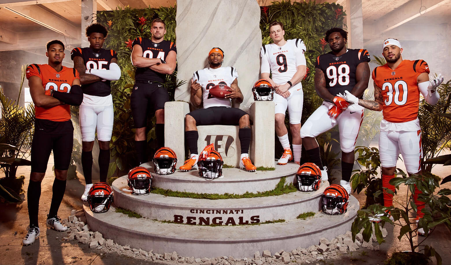
• Just like before, the black and white jerseys will be the primaries, and the orange jersey will be the alternate.
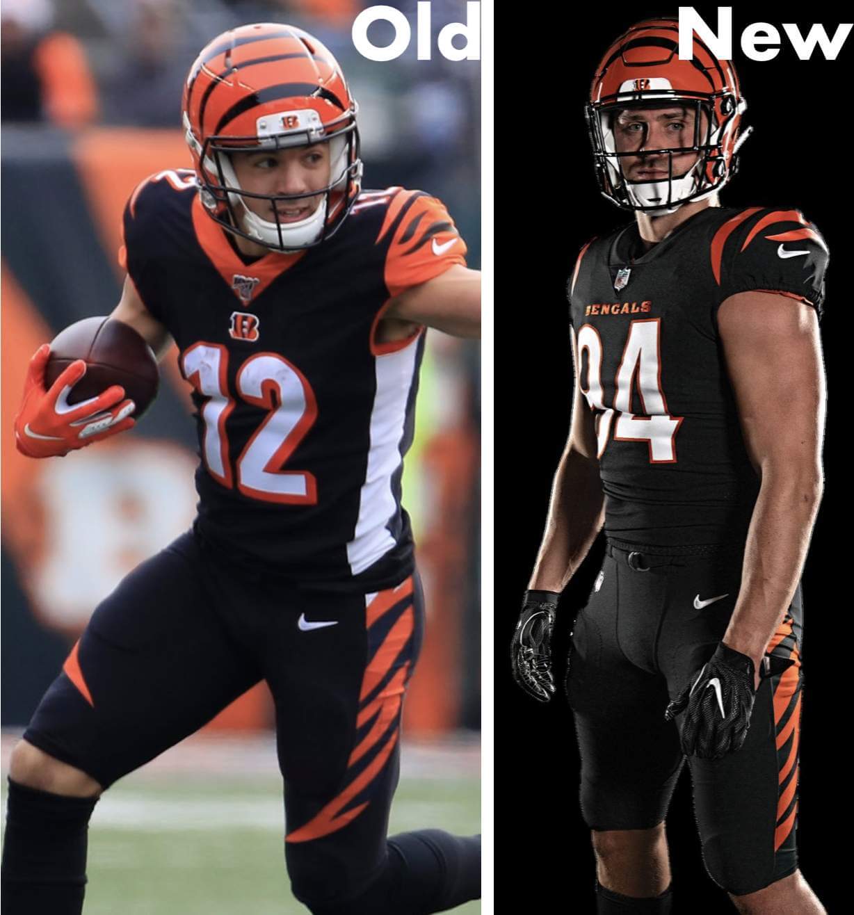
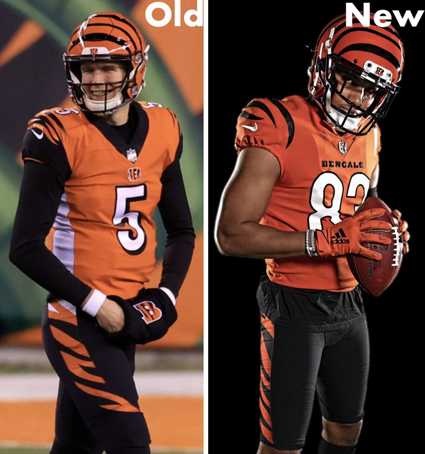
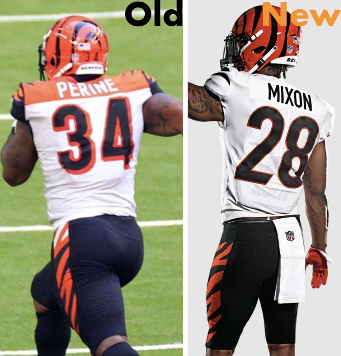
• The photo above shows seven players wearing seven different uni combos. It may look like there are two guys wearing the same black-over-white combo, but there are actually two different white pant designs — one with white/orange striping and one with white/black striping:
• According to sports color guru Donovan Moore (aka TruColor), the shade of orange has been slightly darkened:
I mentioned this somewhere, but the #Bengals have indeed darkened their Orange slightly for 2021 (along with the uniform change)…old vs. new:
(cc: @UniWatch , @PhilHecken , @sportslogosnet) pic.twitter.com/CNHgJoKgtk
— TruColor (@TruColorNet) April 20, 2021
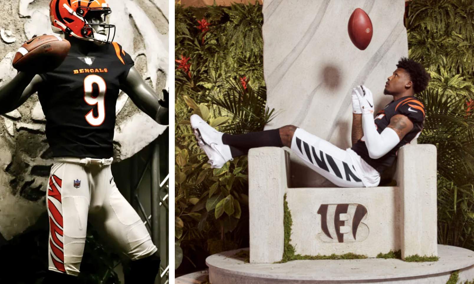
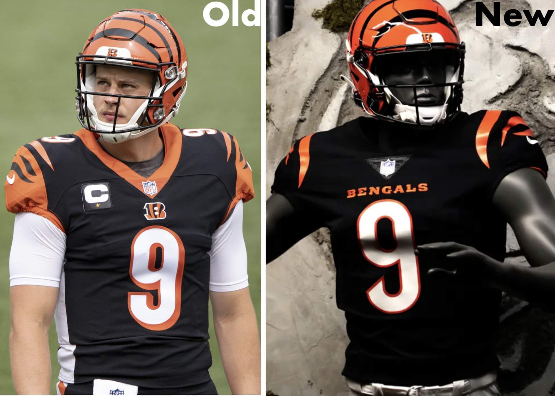
• The helmet, as the team announced in advance, is completely unchanged.
• Here are some side-by-side comparisons of various uni combos:
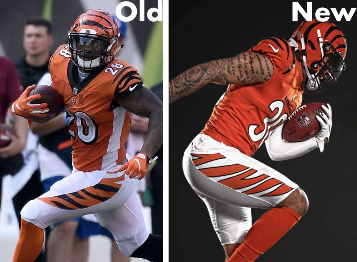
• As you can see in those photos, the shape of the stripe panel on the pants has changed significantly. But the actual stripe pattern within that panel appears to be the same as before:
Black pants comparison. They also match up. pic.twitter.com/y6wHiTgbZ6
— Goodberry (@JoeGoodberry) April 19, 2021
• The set continues the recent NFL trend of jerseys without TV numbers (a format recently embraced by the Chargers, Pats, and Rams [although, it should be noted, not by the Bucs, Falcons, or Browns]). As I mentioned in yesterday’s post, the Bengals didn’t add TV numbers to their original uni set until 1980, becoming the last NFL team to do so, so the new jerseys return them to their roots in that regard.
• No sign of a white helmet, so the one-shell rule still holds sway, at least for now.
• We’d been told that a new tailoring template was in the works for the upcoming season. If so, either the Bengals won’t be among the teams wearing it or they’re not yet ready to debut it.
• The new jerseys match the Bengals jersey leaks from early March. That adds presumptive legitimacy to the Browns and 49ers designs that were also part of that leak. (Related: The Athletic has a paywalled story about how the Bengals’ staff was really bummed out when the leaks surfaced.)
———
And now some thoughts and observations on the designs:
• The Bengals’ helmet has long been polarizing — many fans love it, others hate it. I’m in the latter camp (I’ve always thought it looks clownish), so I’m disappointed that they didn’t take this opportunity to change the shell design. But I understand that it has become the team’s visual signature and will likely never be changed.
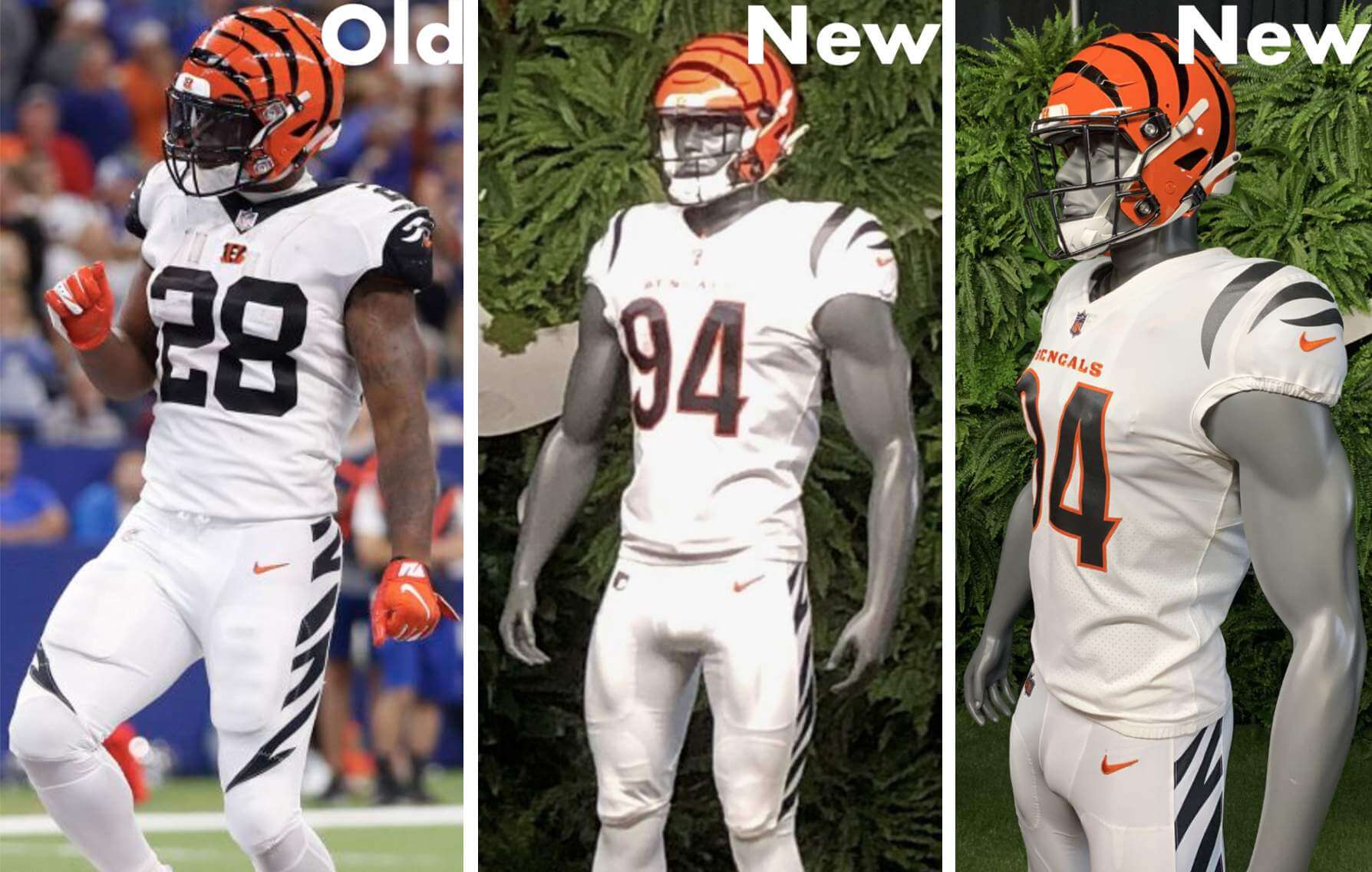
• The elimination of the side panels on the black and orange jerseys is obviously a huge upgrade.
• I’m glad that the stripe panels on the pants no longer wrap around to the lower thigh, but I don’t like how they finish at the bottom with a sort of soft, halfhearted taper. I’d prefer to keep the panel the same width from top to bottom.
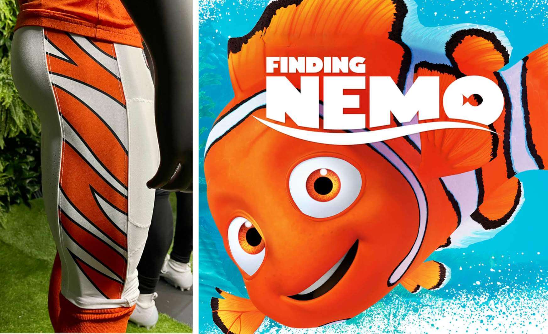
• Speaking of the pants striping, it’s sorta weird the orange/white striping includes black outlining on the orange stripes. Can’t say I’m a fan of that — simple orange/white (or, for that matter, orange/black), without the outlining, would look better, plus the new version brings to mind an unfortunate comparison:
• As many observers pointed out when the leaks surfaced last month, the number treatment makes the jerseys look very Bears-like. I feel like they should have either kept the block-shadow or gone with a block font (like the one they used on the Color Rash jerseys). Instead they chose something that feels like it’s being leased from another NFL team. (And yes, I realize the Bears use dark navy, not black, but it often presents as black in photos and on TV. Considering the similarity of the color combos, I think the Bengals should have gone with a more distinct number treatment.)
• I’m probably the only person who feels this way, but I liked the orange yoke on the back of the white jerseys. The loss of that, and also the loss of the contrast-colored collars, feels like a downgrade to me.
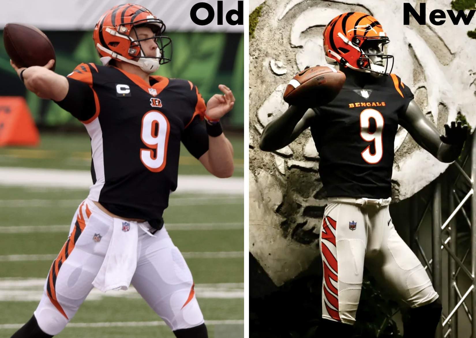
• I hate wordmarks on football jersey chests. But at least this one doesn’t take up as much vertical space as the “B” logo did, so now the front numbers aren’t pushed down quite as far, which has apparently allowed them to make the numbers a bit larger, or at least that’s how it looks to me:
• I appreciate that they’ve used a fairly simplified stripe pattern on the shoulders, especially since we rarely see a “less is more” approach in today’s uni-verse. But in this case, I think less might be less. If you look at the player head-on, you mostly see just the long inner stripe, which looks more or less like a conventional shoulder stripe — similar to what the Texans wear, for example:
Which jersey is your favorite?@Tide | #NewStripes pic.twitter.com/s8YKCxfD08
— Cincinnati Bengals (@Bengals) April 19, 2021
Viewed from that perspective, it doesn’t look animal/jungle-y enough.
———
Overall: The Bengals are still one of the league’s poorer-dressed teams, but at least they’ve gotten rid of the side panels and the wraparound pants stripes — those moves alone qualify this as an upgrade. In the big picture, though, they didn’t do anywhere near enough to climb out of the lower echelon of NFL aesthetics. The new set mainly feels like a lateral move.
For all caps, click to enlarge
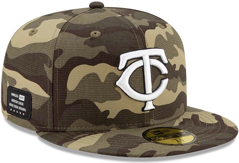
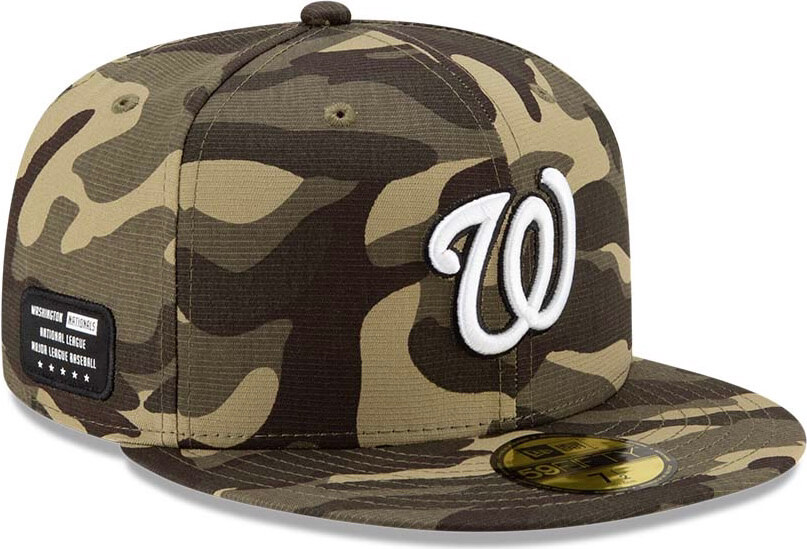
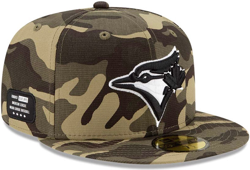
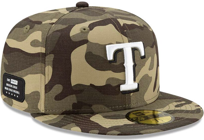
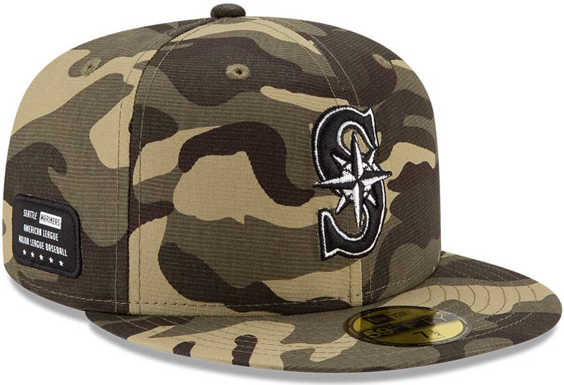
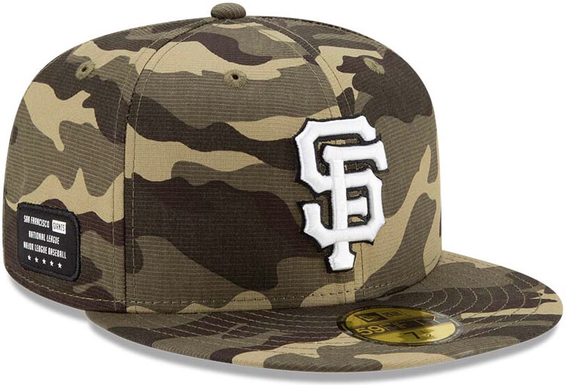
EXCLUSIVE! MLB G.I. Joke caps leak: Reader Mike Burke noticed yesterday that a European website was selling a bunch of this year’s MLB’s silly Armed Forces Day caps. The site in question had 21 of the 30 MLB teams represented (including the one based in a country that doesn’t even observe this “holiday”). Six of those are shown above; here are the other 15, plus an additional image I obtained via another source:
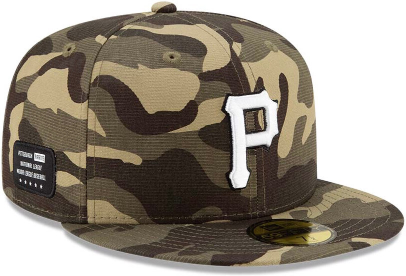
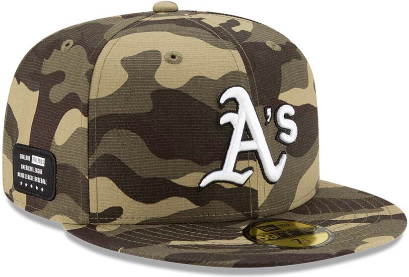
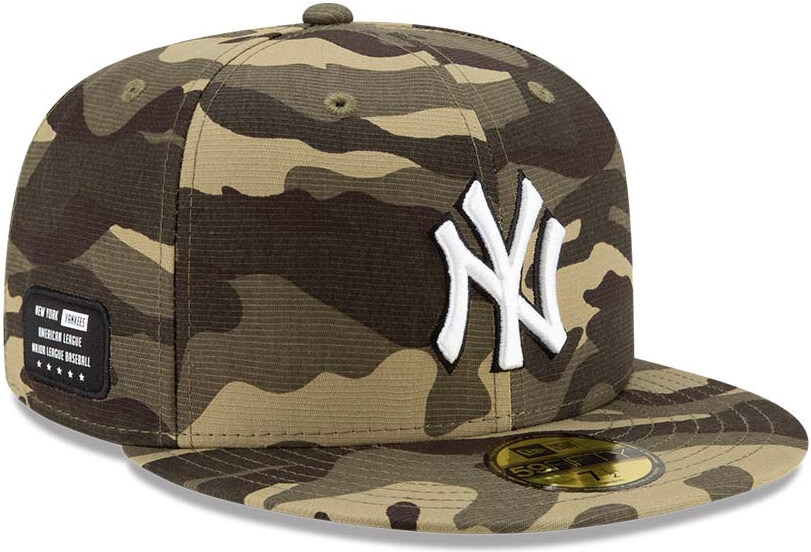
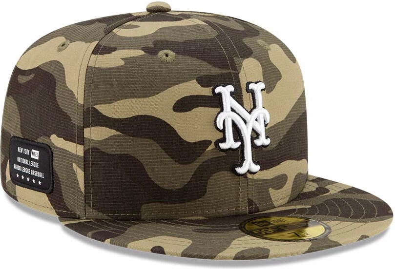
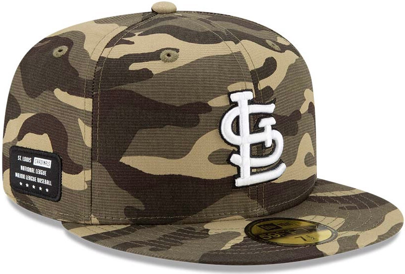
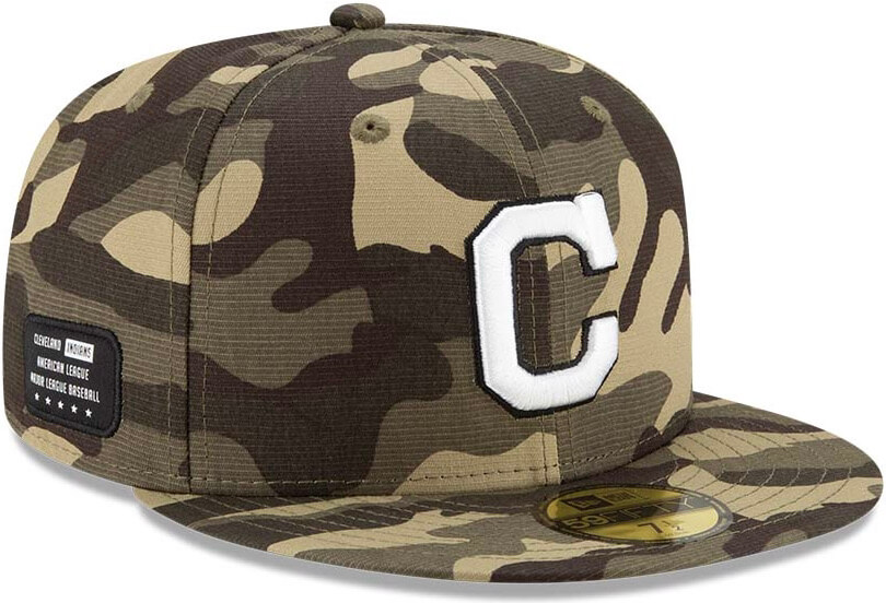
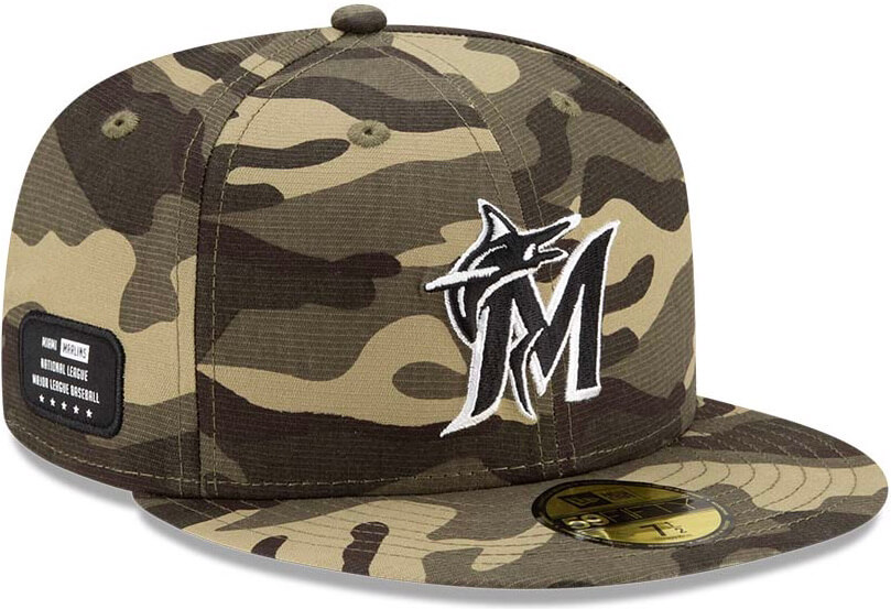
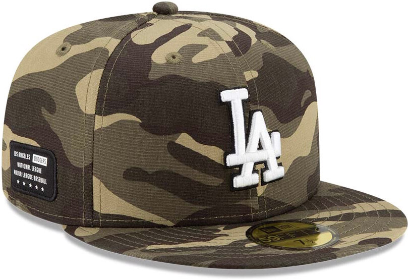
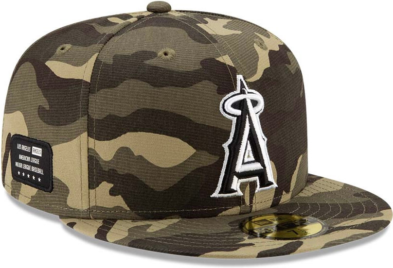
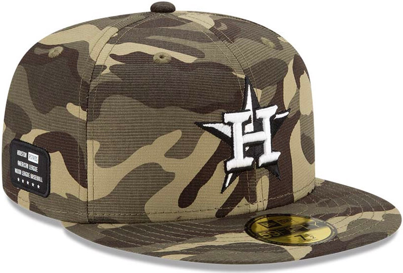
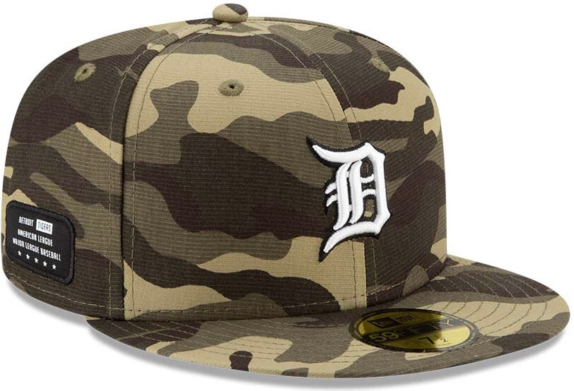
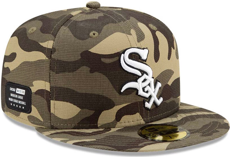
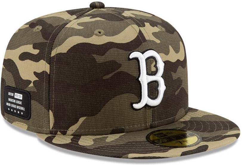
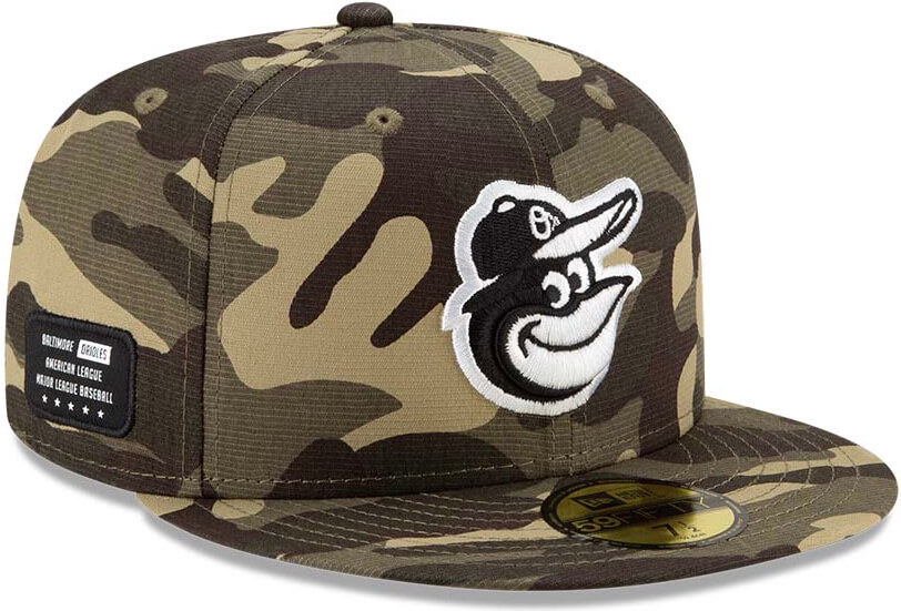
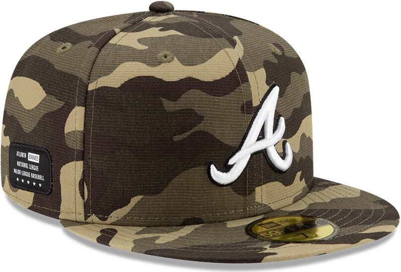
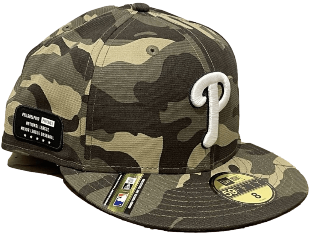
Y’all know what I think of this crap. Bonus dress-up-soldier points for the dog tag-style patch on the side — a particularly risible touch.
Meanwhile: Quick, when is Armed Forces Day? Right, I didn’t know either until I looked it up. To everyone at MLB who’s reading this, stop with the “holiday” charade and just admit that you want to sell a bunch of camouflage lifestyle slop, the end.
(Big thanks to Mike Burke, and also to @FSBabyHuey.)
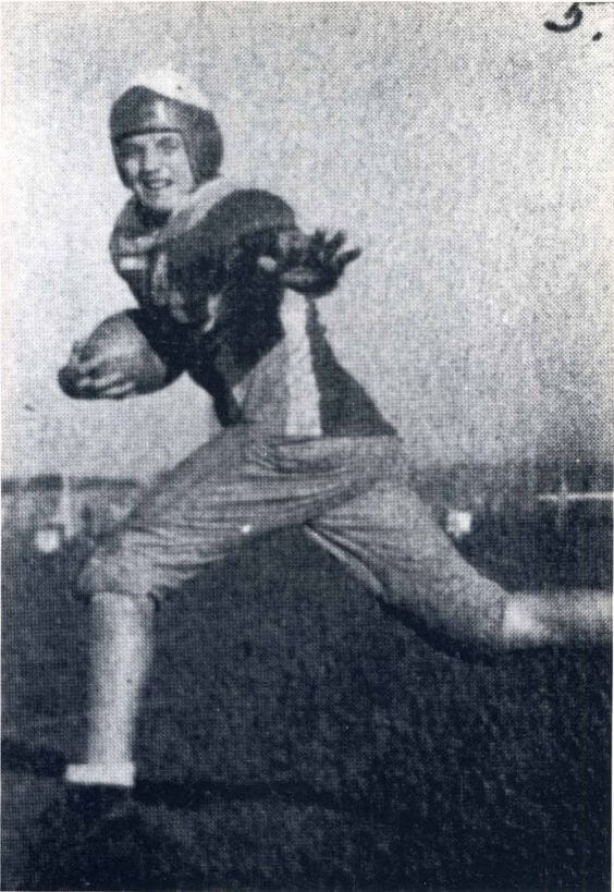
Fritzball: Former Vice President and presidential candidate Walter Mondale died yesterday. The photo above shows him on his high school football team in Elmore, Minn. Looks like a doozy of a jersey. R.I.P.
Click to enlarge
Collector’s Corner
By Brinke Guthrie
Follow @brinkeguthrie
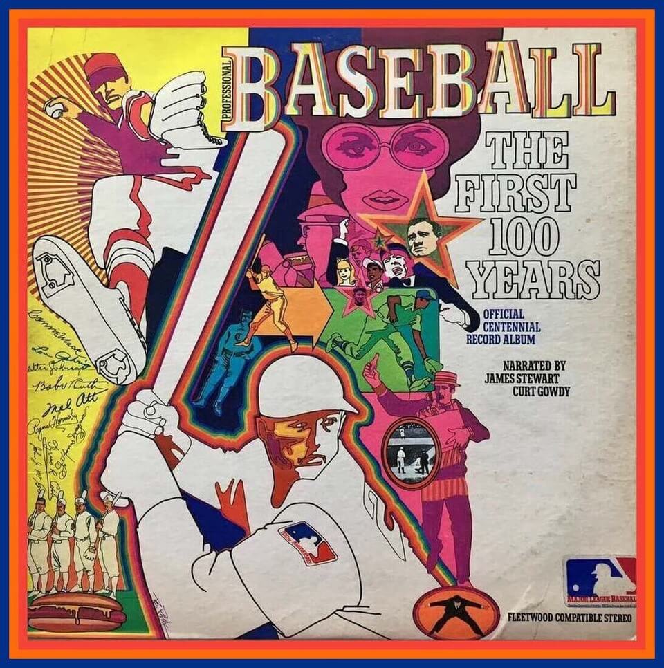
Dig this: If you were old enough to be watching big league baseball in 1969, the cover art of the record album Professional Baseball: The First 100 Years will probably make you start humming “The Age of Aquarius.” Narrated by none other than Curt Gowdy and Jimmy Stewart, this LP is a classic snapshot of where the game was during the summer of the Apollo 11 moon landing … when the moon was in the seventh house, and Jupiter aligned with Mars. Or something. Far out!
Now for the rest of this week’s picks:
• Instant Ovaltine (official drink of the MLB Players Association) “scores with richer chocolate flavor,” according to this 1968 baseball-themed store sign.
• Always liked the wavy helmet logo of the USFL’s Breakers football team. They were the Boston Breakers (1983); the New Orleans Breakers (1984); and finally the Portland Breakers (1985). The wavy design is shown on this New Orleans Breakers bumper sticker. I used to see this design in newspaper ads for televisions — a player wearing this helmet was often shown in the ad.
• This is a 49ers sign that used to be displayed outside of San Francisco’s now long-bulldozed Candlestick Park.
• Speaking of bulldozers: To commemorate Pittsburgh’s Three Rivers Stadium era (1970-2001), someone decided that a wooden jewelry box was the appropriate keepsake.
• Look at the prices of NY Rangers/Knicks merch on this 1971-1972 season Madison Square Garden souvenir list! Rangers water globe, a buck. Pennants, $1.25, sweatshirts $4.50!
• Learn the “secret language of baseball” with this “Finger Tip Movies” booklet booklet called Signals. More on this 1957 Gillette promo item here.
• Phil may want to bid on this New York Mets lapel pin featuring the Grateful Dead’s “Stealie” logo. (I have a T-shirt like this for the SF Giants.)
• Here’s a Drew Bledsoe Patriots rubber “Bendos” figure sponsored by the folks at Papa Gino’s.
• If your baseball glove needs some TLC, give it the treatment with this rather rumpled/crumpled tube of Stan Musial Glove Conditioner (“The Best on the Diamond”). The Man retired in 1963, so this tube is at least that old.
• Quarterback Jim Hart wore No. 17 for the 1970s St. Louis Cardinals, so it’s quite likely this Sears Cardinals jersey was a big seller in St. Louis.
Too good for the Ticker: Reader Sean Walsh recently came across this 1946 promotional film about the Pacific Coast League. It’s full of footage of teams like the Sacramento Solons, the Hollywood Stars (pre-shorts, alas), and a lot more. None of the uniforms are particularly spectacular, but color footage of mid-1940s wool flannels is pretty rare, and the overall vibe of the film is plenty enjoyable — recommended.
For all photos, click to enlarge
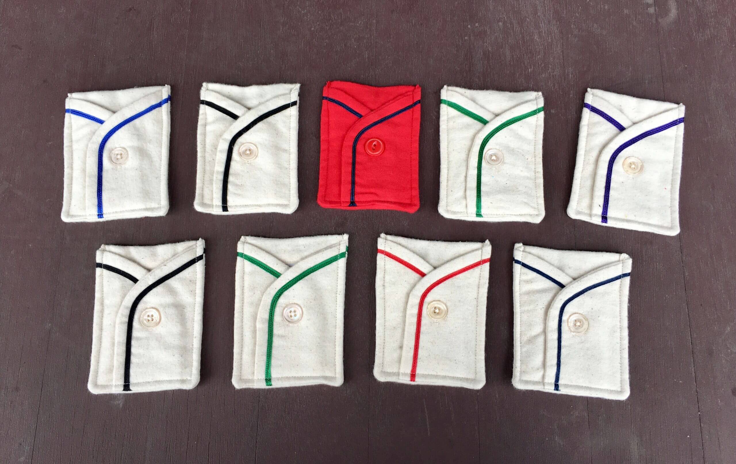
Membership drive reminder: In case you missed it on Monday, our April membership drive is taking place this week. Out of all the people who sign up for a membership card this week, three randomly chosen enrollees will get to choose one of the card pockets shown above (except for the purple one, which I’m saving for Purple Amnesty Day).
The pockets were made by the great Wafflebored. Here are some additional pics:
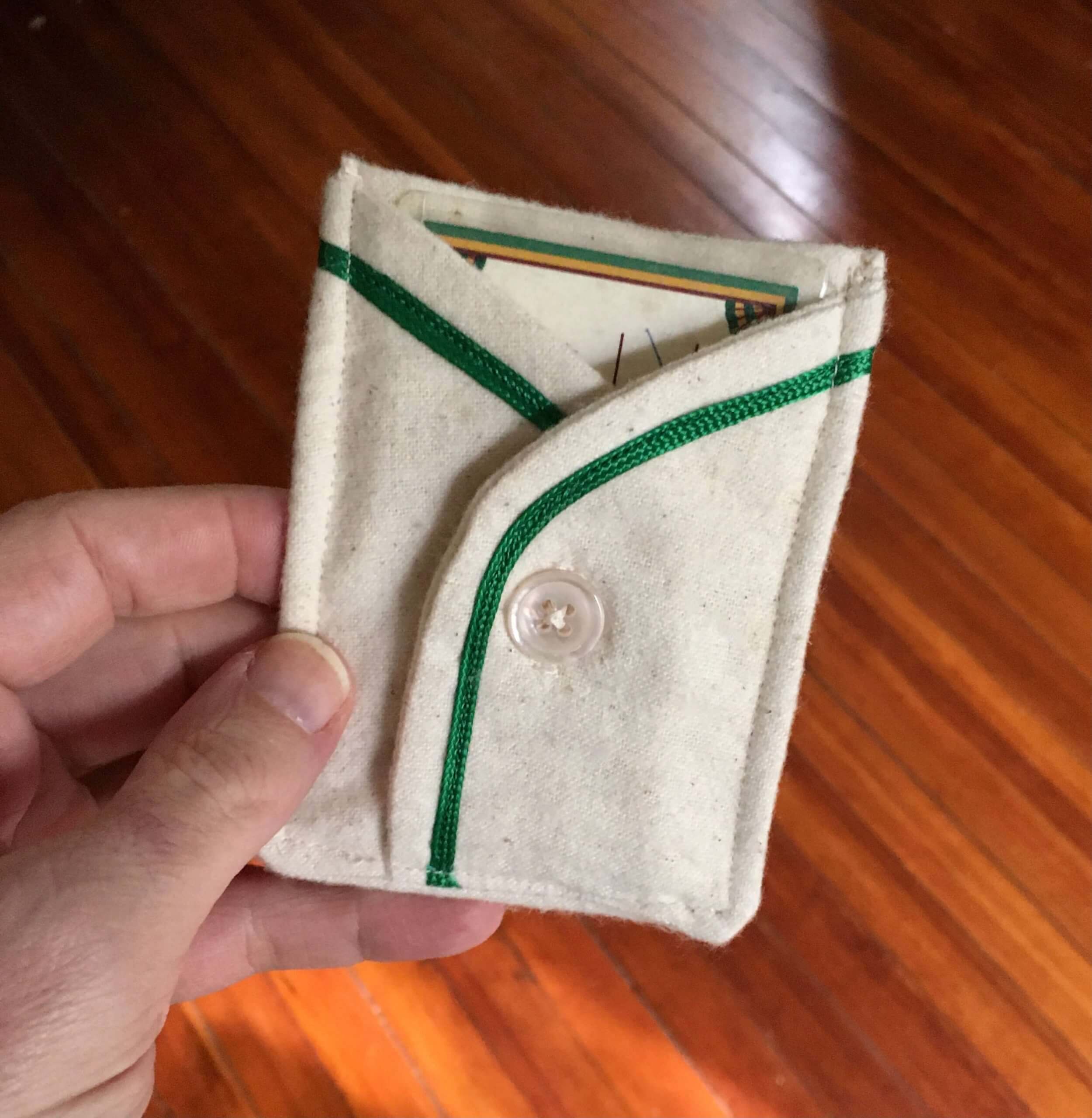
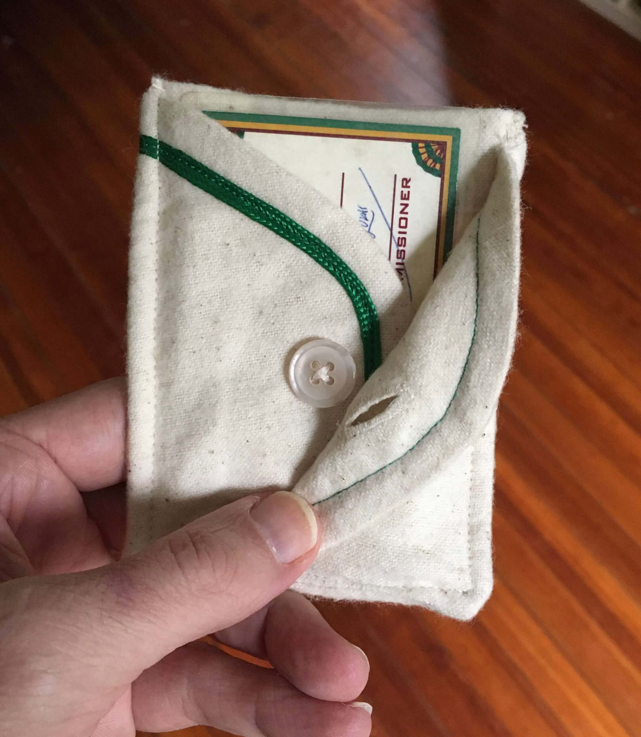
If you order a membership card this week, go ahead and specify which pocket you’d prefer if you turn out to be one of the winners. I’ll try to accommodate the winners’ preferences.
I’ll announce plans for the remaining pockets later this year. Thanks for your consideration, and of course doubleplusthanks to Wafflebored.
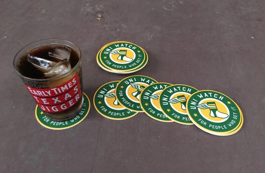
Coasters reminder: I have a few dozen of these great-looking Uni Watch coasters. They’re made in the USA from sturdy pressboard and measure 3.7″ across.
As has been the case in the past, I’m selling these in groups of three coasters for nine bucks, including shipping. USA orders only, sorry.
To order, send me $9 via Venmo (use @Paul-Lukas-2 as the payee), Zelle (plukas64@gmail.com), or Google Pay (plukas64@gmail.com). If you want to use Apple Pay, a paper check, or well-concealed cash, get in touch and I’ll give you the appropriate info.
After paying, email me with your shipping info. Thanks!
If you want to combine a coaster purchase with an order for a Uni Watch koozie, a trading card, a magnet, a seam ripper, or a chain-stitched patch, please email me and I’ll give you a price that includes a combined shipping fee for the whole shebang. (Sorry, these are the only Uni Watch items I can combine into one shipment, because all our other items ship from separate locations.)
The Ticker
By Alex Hider

Baseball News: Last night, the Nats paired their red stars-and-stripes caps with navy jerseys — a rare (and possibly unprecedented?) combo for them (from David Raglin and @RailBourbon). … Andrew Cosentino notes that the Orioles broke with precedent on Sunday by wearing their black jerseys, which are typically reserved for Friday night games. … A ton of MiLB teams have unveiled alternate identities for their annual Copa de la Diversión promotion (from Kary Klismet). … Staying in MiLB, the Springfield Cardinals are permanently adding powder blue unis to their rotation (thanks to all who shared). … Georgia Tech is among the many college teams that wear pullover jerseys with non-functional buttons (from Britton Thomas). … Kentucky State will wear Negro Leagues throwbacks tomorrow (from Phil). … Paul, Chris Creamer, Todd Radom, and others are interviewed in this paywalled piece at The Athletic about whether it’s time for the Reds to change their uniforms.

Football News: Here’s an explainer of the Easter eggs hidden in Alabama’s national championship rings (from Griffin T. Smith).

Hockey News: Sharks C Patrick Marleau broke the all-time NHL record for games played last night, passing Gordie Howe. The team marked the occasion in several ways: First, they replaced their anniversary patch with a Marleau patch; second, the patch design was also used for a helmet decal; third, Sharks G Martin Jones wore a one-off mask design; and fourth, during the pregame skate, Marleau wore gloves commemorating the occasion. But several readers noted that Marleau never wore the version of the Leafs’ logo that appears on left glove, and the right glove included a grammatical error (thanks to all who shared). … Lightning C Alex Killorn apparently has his own personal logo. … The Bruins published a profile about their equipment manager, Keith Robinson, on their website yesterday (from Skott Daltonic). … Staying in Beantown, a Boston College blog recapped the school’s best hockey uniforms through the years (form Phil and Kary Klismet).

Basketball News: The Pacers have added a black memorial band for Bobby “Slick” Leonard, who died last week (from Blaine Williams and Chuck Weiss). … Alabama has unveiled its SEC championship rings (from Kary Klismet). … Vanessa Bryant and the Kobe Bryant estate have ended their relationship with Nike. … James Gilbert is trying to assemble a U.S. map based on college hoops teams that have state outlines at center court.

Soccer News: Players for Premier League club Leeds United protested against the clubs who plan to join the new European Super League by wearing T-shirts that read “Earn It” during warm-ups prior to a match against Liverpool (thanks to all who shared). … Speaking of Super League protests, English League 2 side Grimsby Town FC is giving away team jerseys to any person who trades in the jersey of one of the six English clubs that plan to break away (from Ed Żelaski and our own Anthony Emerson). … The naming rights advertiser for FC Cincinnati’s new stadium has reportedly leaked. … A bunch of 2022-23 Adidas kits have leaked, and they feature longer three-stripe branding (from Trevor Williams).

Grab Bag: The participants in the AFL’s traditional ANZAC Day game, Collingwood and Essendon, released their guernseys for the game. They’re both primarily black because Collingwood’s white stripes are a pattern instead of solid, but that’s not considered to be a problem because Essendon are wearing white shorts (from our own Jamie Rathjen). … Mizuno has released background on the designs of all the Japanese women’s volleyball uniforms (from Jeremy Brahm). … The latest step in our collective descent into Idiocracy: This depressing story from the BBC notes that product placements may soon be digitally inserted into classic films (from Christian M. Zummer). … Rugby United New York debuted its “Neighborhoods” jersey on Sunday. The design, which includes the names of city neighborhoods and an NYC subway map-inspired graphic on the sleeve, was created by longtime Uni Watch pal/collaborator Todd Radom — his first rugby project! — and Paul will have an interview with him shortly (from Sy Hart).

In the hockey section, you have Patrick Marleau spelled as Mareleau…
-Jet
Fixed throughout.
I personally love the orange look with the white pants with the orange stripe
Based on TruColor’s website, the Bengals have adopted the same shade of orange as the Bears, PMS 1665
As a Bears fan I’m trying not to PMS over it.
But they seem to love our numbers, too.
Take a look at the Marleau patch again. The silhouette looks like a pitcher mid wind-up. I can’t unsee it now.
I’m not as much of a downer about the Bengals Jerseys, but those white/orange pants were a poor choice. Overall I think it’s much cleaner, less clutter.
Alex Killorn plays for the Lightning, not the Sharks.
Already fixed, but thanks!
Ok, I’m going to try to explain why the Bengals uniforms always underwhelm, so near with me—I think it has a lot to do with the division they play in.
Their color scheme is black and orange—which I’m not faulting them for because they are a tiger-themed team. But the browns are brown and orange, and we’ve seen games in the past when they play each other and look very similar (remember the all orange game??). Then you’ve got the Steelers and Ravens who wear a ton of black but have far superior uniforms to the Bengals (the Ravens might be debatable, but not that black uniform they wear). So Cincy is always at an aesthetic disadvantage in that division.
That’s why I think the white tiger color rush design was so popular. For once, the Bengals uniforms stood out in their division of similar colors. The orange alternates have always been popular as well, and that’s because orange is not a primary color of anyone in their division, or really anyone else in the league other than the Broncos.
In conclusion, if Cincy did almost this exact uniform set but with a focus on orange and white (maybe and orange version of the color rush uniform with white pants and then the color rush uniform with white or orange pants for the road, all with slight adjustments), I think people would be saying they knocked it out of the park. Black has always been best used as stripes for them, not their primary color. But that’s just my opinion. What they’ve released is better than what they wore, but still just kinda meh.
Bear with me* typo sorry
I think the Ravens unis are much worse than even the Bengal’s old look. The Bengal’s new look is many times better than the Ravens. And I hate the Bengal’s new look.
I think the Bengal’s new look is still in the bottom third of the NFL. There are just so many teams with really ugly uniforms.
I like the Armed Forces Day caps, but not as much as the darker versions with the gold trim that was used in 2019. Curious to see what MLB comes up with for Independence Day!
This may speak to my age/the era I grew up in, but what the heck was wrong with their 90s uniforms? Clean, crisp, but still with enough stripes to be Bengal-y and jungle-y. Throw the current leaping Bengal head (that you used on yesterday’s lede) on the shoulders, current wordmark on the chest if you ABSOLUTELY HAVE TO, and you’re golden. Job done.
Also, I still don’t really understand their aversion to orange pants. A black jersey/orange pant combo would be their best possible look. I definitely would’ve preferred those as a 3rd option instead of a 2nd pair of white pants.
To me, the late-90’s tweaks of adding the not-so-well-executed leaping tiger (following suit with any number of teams that started putting logos on the sleeves for retail purposes?) and the addition of black topped socks threw off the balance of the original ’81 redesign. I see the helmet and I know it’s the Bengals; the logo was subtraction by addition, as is the use of the wordmark they slapped on these new tops.
As for the orange pants, I’m glad the Bengals steered clear of them. Given all the combinations this new set provides and their history of mixing/matching, the temptation to go all-orange from time to time would be very tough to resist and to watch. The CR Broncos look terrible doing that (and they shouldn’t have an orange pants option either despite what at least one Uni Watcher has to say about that…sorry Jim Vilk!).
Apology acknowledged…but not accepted. ;)
i am surprised they didn’t take the opportunity to introduce some orange pants.. i think black over orange would have looked good. for some reason i thought at some point in their history they had orange pants, but according to Gridiron Database they never did.
link
My brothers and I, while watching the Leafs v Canucks game on Sunday, thought out loud that the Leafs second line of forwards may have the highest numerical total in the NHL this season / in Leafs history / in league history? 88, 91, 89 for Nylander, Tavares, Robertson respectively. My wife has decided that we’ve finally lost it even thinking about this stuff…
Cool windmill save by Braden Holtby in that game:
link
It is an upgrade for the Bengals uniform. However, don’t really understand the decision about the orange and black striping on the white pants. Should be an orange stripe with the black tiger striping in it. Pant stripe should match how the helmet looks.
Exactly. Isn’t the whole point of the uniforms to look like a tiger???
The Bengals should be thankful for the Falcons, Patriots, and Rams.
Paul, I agree that the shoulder stripes are a bit underwhelming when looking at the jersey’s from straight ahead. But remember, we need to look at the whole uniform, not just the jerseys. The photos you referenced show players that are not wearing their helmets. My feeling is that less will be more when you see the uniforms from the front and not have the same over-the-top stripes on the shoulders as you get with the helmets. I think that’s an upgrade.
Agree with almost everything you’ve said on the Bengals, not quite a “likely 5 and done launch”, but still a lot of ugly combo possibilities. I love the “Nemo” comparison. The Bengals wanted something iconic, how can you have something iconic, when you have 7 different combinations?
Oh, definitely not five-and-done. If their history is any indication, they’ll keep this set for a long time.
Yep agreed, they’ve proven to have a high “uniform pain threshold” I kind of think just as there the “Northwestern” stripe and the “UCLA” strip, the Bengals pant strip with the orange and black outlining – should be officially dub (in the uni watch world) as the “Nemo stripe”
This is a late note regarding yesterday’s piece showing Paul Brown with a bunch of prototype helmets in 1968. I heard once that he always wanted to go with the stripes, but as an expansion team that would be expected to take their lumps for at least a few years, he wanted a more standard design until the team got established and was a contender
Is it just me, or do the jerseys look like they are old Bears jersey that were washed incorrectly which made the sleeves shrink weird?
Paul, and whoever else feels the same, what would you prefer the Bengals helmet look like? I have no skin in the game, but I have always felt it is one of the better helmets in the NFL. It just works.
I would love the leaping tiger logo on both sides.
Ah, ok. I do like that logo, but I feel like that would make it like just about every other helmet in the NFL.
Thanks for your quick reply though, I appreciate it!
I agree Steve. I came here to say I love the Bengals’ helmet because they are one of the very few NFL teams that can pull something like that off. Putting the leaping tiger on the helmet is the epitome of generic. I think the new set is a massive upgrade but agree there could be some room for improvement. As far as taking a concept and making the uniform represent the logo I think it’s one of the best in the league. While many teams have great color combinations or block numbers or tradition, many uniform aesthetics have little or nothing to do with the team name/mascot. In that regard I don’t see how the Bengals uniform isn’t a huge success.
No love for “B E N G A L S”?
At first glance, yeah, the Bengals’ number font reminds one of the Bears’, but if you do a side-by-side comparison there are a lot of differences.
I think the uniforms look awesome. IDK how you can look at this and think it’s a lateral move. clearly an upgrade to me.
I agree!
RE: TV numbers, while Paul is right that the Falcons, Browns, and Bucs all have TV numbers, I’d argue that the Browns and Bucs were essentially resets to past designs. So in that regard, of teams with new uniforms that are also new designs, 4 of 5 do not have TV numbers.
The Bengals orange jersey is the best of the bunch, and matches up the best with the rest of the uniform program. Should really be the primary because 1) tigers are orange with black stripes, not the other way around, 2) they’d be distinctive as no other team has an orange helmet paired with an orange jersey, 3) they’d be less derivative of the Browns, where the orange helmet and black jersey look too similar to the Browns orange and brown.
The link in the last item in the Collector’s Corner doesn’t work. The rest of them do work.
Fixed. Here’s the proper link, so you don’t have to scroll back up.
link
I really like the shoulder stripes, and jersey in general. I don’t like the pants because of the wide stripes, but it is an upgrade from the previous stripes. I’ve never liked the striped helmets, but I understand why they kept it. Overall a solid B grade.
I am surprised by the amount of attention and column inches given, here and elsewhere, about the Bengals non-redesign. It must be an extremely dead period for so much attention to be given to what you correctly described as a lateral move to an already mediocre design. I don’t see why such small moves garnered so much attention.
Mike, this is the Uni-Watch website. A new NFL uniform is BIG news in the Uni-Verse, regardless of how mediocre or amazing the design may be. Just an FYI, this is a site that obsesses over the mundane and fills column after column covering the most minute of details… and that is precisely why most, myself included, are here.
As long as the Brown family owns the Bengals their visual look won’t stray too far from what founder Paul Brown had in mind.
I hate the GI Joke caps too but I will say in defense of MLB, and with apologies to Canadians, that thanks to the pandemic every franchise is now based in the USA as the Blue Jays are now in their 2nd season in Buffalo/Dunedin so they fit in with the rest of the clubs in wearing and making a buck off military themed holiday wear.
the shade of orange has been slightly darkened
Are we still doing this? I thought when the Chargers brightened up, the tide was turning away from the “darker/more menacing” trend.
Oh well, it’s still better than last year’s uni.
The change to a darker orange is to match the jerseys to the helmets. On the prior sets, the orange jersey (and the orange shoulders on the white jersey) was noticeably lighter than the helmet.
Always liked the wavy helmet logo of the USFL’s Breakers football team.
Same here!
Paul, what about you? I get the same vibe from it as I do from the Bengals’ striped helmet.
Was it by the grace of God the USFL Breakers faced the Atlantic, the Gulf of Mexico, and the Pacific during their tenure?
If they had one more year they could’ve moved to Cleveland and faced Lake Erie.
“Of all the Starbucks in all the towns in all the world, she walks into mine.”
Perhaps it has to do with helmet size(?), but I see some different stripe placement (particularly the first/front stripe) in some of those Bengals photos.
Is that a thing mentioned here before?
Most of the Bengals changes are pushes for me, and mostly in exactly the terms that Paul’s analysis presents. For me the two most significant up/down changes are:
1) Pants stripes. Even with the unfortunate Finding Nemo pattern, the straight stripe is a significant upgrade. The “taper” at the bottom reads as natural stretchy fabric flex to me, and is neither particularly visible nor obtrusive, as the old horn-shaped stripe was.
2) Number treatment. The block shadow was one of the few legitimately great elements of the old uniforms for me. It’s not just that the new number treatment looks too much like the bears – though it does – it’s that it just doesn’t look like the Bengals anymore. Significant downgrade.
I think I would just barely take the new uniform set over the old, but the Bengals have gone from having a minimally OK uniform to having a differently OK uniform. They’ve gone a C-minus to, at best, a low-C.
I think my only significant disagreement with Paul is on the helmet. For me, the helmet has been the best part of the Bengals uniforms these last decades. For a team named after a tiger, a tiger-striped helmet seems to me like an obviously optimal helmet design. But then again, I strongly prefer skeuomorphic helmet designs like the Eagles’ wings or the Vikings’ horns to the more common team-logo-on-the-side approach. So a tiger-striped helmet is very much up my alley. The fact that I literally cannot comprehend how anyone would find the Bengals helmets in any way objectionable probably says more about my aesthetic prejudices than about the helmet’s merits.
You just wanted the chance to say “skeuomorphic,” didn’t you? ;)
My only major complaint about the Bengals’ new set is the pants striping; for one thing, I think the panel is too wide. I like the idea of having two white pants options, one with plain black stripes and one with orange stripes, but in the latter case it’s not the black outlining that bothers me so much as the white “background.” There are link, and there are link, but I don’t think there are any white Bengal tigers with orange stripes. The panel should be link.
Could the Bengals uniforms have been more improved? Yes. Are they light years better than the trash they had before? Yes. That being said, much more than a lateral move in my book. They went from 31st in my NFL uni ranks to 17th. So, from the bottom to top of the bottom.
When Paul posted the Bengals jersey leak, I was a little dissapointed with how much they looked like the Bears. But I must say, I love these uniforms. Only the orange alternate screams BEARS to me, and the rest have returned to the cleaner, refined look they had in the 80’s while removing some of the older/clunkier parts to update it.
To me, they straddled the line between cleaning up and still looking like a modern Bengals team. They clearly leaned in on the color rush designs. I think the reason people liked the color rush so much originally because it lacked the busier elements: Yoke, side panels, block shadow, wrap around leg stripes, etc. that made it all clash too much.
As a Browns fan, I hated watching their uniforms twice a year, especially when we had the gross 2015 uniforms. Now, I think the Battle of Ohio will be two of the cleanest games of the year.
After years and years of calling the Bengals unis one of the worst in the league, primarily for being too busy, I’m pretty surprised you call it a lateral move when they simplify a ton. Complaints that the shoulder stripes are now too plain, and that the shoulder yoke is gone? Huh. It sort of feels like there’s nothing the Bengals could have done to get a good review here.
Actually, Michael, I don’t think I’ve ever said they were “too busy.” What I’ve usually said is that they looked like clown costumes.
Could they have gotten a good review here? Sure — I’ve gone into significant detail to explain which parts of this redesign do and don’t work for me. Maybe you should re-read what I wrote..?
Your NFL rankings from just last year said about the Bengals: “The jersey side panels, the tiger-striped sleeves, the tiger-striped “tails” on the pants, the tiger-striped “B” on the chest — it’s all too much.” Sure, you didn’t use the word “busy,” but that’s clearly what that sentence is saying — “It’s all too much.”
Now, the Bengals have eliminated or restrained all four of the elements you mentioned there. I understand there are things you still don’t like (I agree this is not an upper echelon uni). I’m just saying it’s surprising you think this is essentially a lateral move.
What’s the single most important element to a football uniform?
Answer: the helmet. They haven’t changed that. And I don’t like the helmet. So that’s the first problem.
Plus they’ve made the number font worse, ditched the orange yoke that I liked, messed up one of the pants-stripe patterns, etc.
However, they’ve improved the side panels and the size/shape of the pants stripe panels.
So some things are better, some are worse, and the most important thing is unchanged.
So, yeah: a push, a lateral move, etc. The math, such as it is, seems easy enough to comprehend.
I get the “trade off of parts” math, but I think it’s somewhat objective to say they look less busy, less clownish now. Sort of boring? Sure. But as a total package, they’re not in the Arizona world anymore. Which seems like an upgrade. Anyways, I respect your position and don’t need to go farther than this.
I suppose “clownish” in this context could be used to mean “goofy looking”, but nothing about the Bengals new or older uniforms resembles a clown costume.
Now, the KC Chiefs and those awful red pants…those are clownish!
The Bengals uniforms are indeed underwhelming. There is an element of Denver Broncos at play: Twenty years ago, the Broncos came out with a uniform design that was revolutionary and ahead of the trends (and not nearly as nice as what they’d had before). They were successful in that get-up, a generation of fans equated that get-up with success, so they’re stuck with it.
The Bengals unveiled the first Cincy Fancy Stripey look 40 years ago. They keep it (to the casual eye, what they unveiled today doesn’t look much different than what they unveiled in 1981), not because it’s equated with success, but because they’re the Cincinnati Bengals, and innovative thought, risk taking, and creativity are foreign to them. The uniform is what happens when an organization knows its place is secure, no matter how lackluster, how mediocre, how uninspired its performance. It’s Sears in the 1970s, or what Spurs and Arsenal will be in the looming Superleague.
The thing about the Bengals that bothers me the most is their lunging tiger alternate logo. I’ve not been around tigers, but I’ve seen my share of cats. When cats are on the attack, their entire body, including their head, is fixed on the prey. Look at Lunging Tiger. His body is outstretched, his forelegs extending menacingly, but his head is turned to the side. He’s looking at us, and we are not his prey. And his expression seems a little casual, like he’s saying, “Oh, hey, fellas. What’s happening?” He lacks focus, like Bengals management.
You know what would be crazy, and daring, and a tiny bit revolutionary? Bring back the Virgil Carter era uniforms. Slap a big ol’ “BENGALS” decal on those helmets. No stripes. No silly back story. No lame attempts to appeal to the replica jersey market (as if there’s a burgeoning market for Bengals gear).
I quite enjoyed your analysis.
Thank you!
All I want is just ONE MLB player to go capless on Armed Forces Day, and to play dumb when someone asks him where his headgear is.
They should pull a John Olerud and wear their batting helmet in the field instead of the camo cap.
Bengals uniform tweaks make the team look more modern and less outdated, it’s their B logo that needs to go.
Ovaltine is not the official drink. It’s the official food drink, whatever that means.
Ralphie knows!
Does appear that the Bengals may switch to black facemask clips from clear ones.
The Bengals’ uniforms are a definite improvement, which isn’t necessarily saying much. The one aspect I definitely don’t care for are the Finding Nemo side panels on the white pants of the regular uni. I don’t mind the stripes on the black or colour rash pants but they’re overwhelmingly garish on the regular whites.
The first association that comes to mind when I see those MLB caps make is that they are meant to be worn for First Day of Hunting Season, not something military related.
Does it not seem odd the stripes on the side panels on the Cincinnati Bengals new pants are colored orange? The Nemo comparison is spot on. The pattern they have used on those white pants does not resemble a tiger’s coat.
Is it me, but is the rollout of Copa de la Diversion a bit “meh”? Most of the team identities are the same as the first year, and a lot of them are retreads from the unused jerseys and caps of last year.
Also, a lot of these jerseys seem to have come off the MLB Players Weekend assembly line. But the uniforms for the Down East Wood Ducks are awesome — the Fighting Avocados!!!!
One more thing: Trenton could have used a secondary identity since you’re going to have Buffalo Bisons playing their home games at Arm and Hammer Park. Instead of having the Thunder uniforms being used for all of Buffalo’s home games as well as the Draft League home games, why not have Buffalo play as the Trueno? Just a thought.
Glad the yoke is gone, but way too little orange on the white jerseys. Both of the past two uni sets are downgrades from the Esiason-era. They should have followed the Bucs example and reverted to a better look (although ideally the Bucs should have reverted all the way back to the Creamsicles).
The Rams, Chargers and Bengals all try to incorporate a unique helmet shape into their uniforms. For the Chargers, the bolt works well as a long straight line (pants) or a curvier line (shoulders), so of course they use it on the pants. For the Rams, the circular horn works well as a curvy line on the shoulder, but they don’t even try to put it on the pants. They “punt” and use an unrelated stripe. The Bengals’ tiger stripe is somewhere between the bolt and the horn. The tiger stripe could be straightened vertically, but instead they try to use the horizontal stripes. I would prefer either a vertical version of the stripe (as shown on the mockup below), or a plain stripe.
link
That said, for a Nike redesign, this was an improvement.
In recent years, most of Nike’s NFL redesigns have fallen into two camps:
(1) Good-looking throwbacks (such as Browns and Bucs); or
(2) Bad-looking over modern sets (such as Jets and Falcons).
Here, Nike streamlined an existing brand and took out some of the gaudy items.
I wish the Bengals had brought back the varying stripe design – unique to each player. I’d never noticed that before, only learning about it here a week or so ago. Now, I think it was a pretty cool idea – even if I’m 20 years late in appreciating it!
Regarding the “Super” soccer league – looks like it’s dead in the water: link
I don’t like the idea of the one off camouflage hats to begin with, but if you’re going to do it, why wouldn’t you put the Blue Jays in camouflage that the Canadian military actually uses? I guess it is a quick one off to try and make a few bucks, and it’s probably cheaper to just mass produce using the same camo for all of the teams, but if you’re going to pretend you’re paying honour to the military, how about the Blue Jays pay tribute to our military…from their temporary home in Florida.
I imagine they will plop those down on top of regular uniforms creating yet another aesthetic nightmsre…
I’m shocked you like the orange yoke on the back. (Wasn’t there an issue with them not being consistent a while back?) I don’t mind them – I’m a big fan of the Flyers nameplate and this kind of looks like that.
I’m kind of surprised to see your lukewarm response to the Bengals new threads. I see it as a huge upgrade. Sure, they could have done some things differently (block numbers, orange/black stripe on the white pants) but I appreciate the simplicity. As for the observation about seeing only the inner stripe on the shoulders when viewing players head-on, luckily, fans at home and in the stadium will have a side view of them most of the time.
Now…can we get the Cardinals to go next please????