By Phil Hecken, with Kyle Evans & CJ Fleck
Follow @PhilHecken
Good Saturday Morning, everyone! Hope you guys had a good week.
It’s time for the annual MLS Preview, and I’m back once again (for their sixth season) with soccer guys Kyle Evans and CJ Fleck, who’ve not only previewed and reviewed the MLS kits and jerseys from previous years, but have also reviewed other leagues plus the Olympics and World Cup.
There’s a lot to get to today — we’ll begin with the Eastern Conference and conclude with the Western Conference tomorrow — so let’s get started.
2021 MLS Uni Preview — Eastern Conference
by Kyle Evans & CJ Fleck
Thanks Phil! We’re glad to be back to preview yet another MLS season which kicked off last night. Here’s the basics: the league is now up to 27 teams with the addition of expansion Austin FC this season (with Charlotte joining next year and St. Louis in 2023), Austin and the two Ohio teams (Columbus Crew and FC Cincinnati) will open brand-new stadiums this season, Columbus are the defending MLS Cup champions, and the Philadelphia Union are the defending Supporters’ Shield winners.
In terms of the uniforms, the biggest news is that MLS is bringing back third kits for the first time in 5 years…well sort of. Third kits disappeared due to lack of sales and their return is contingent on jersey sales and as a result of meeting a quota, Atlanta will be the only team with a third kit this season. Sleeve advertisements return for the second season and as always, the uniforms are (for the most part) on a 2-year rotation with teams alternating new kit reveals between their primary and secondary options each season.
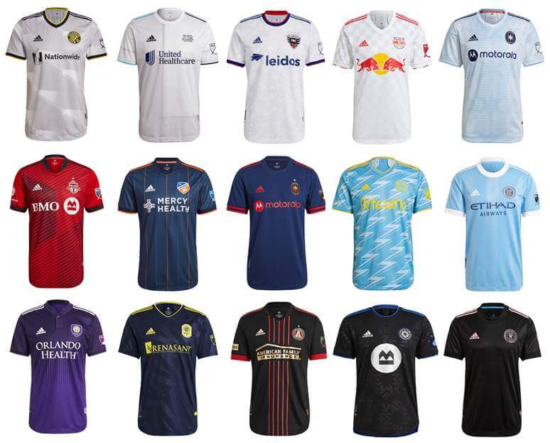
Eastern Conference
Atlanta United (primary)
A different approach on the “5 Stripes”, this time as thin red vertical stripes in the center over a black jersey
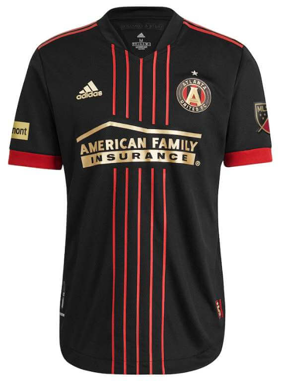
Note: As mentioned above, Atlanta will be the only team with a third option this season but has not officially revealed the uniform yet. (It’s rumored to be maroon.)
Kyle: As a variation on the “classic” thick stripes look, I like it.
CJ: Subtle. Understated. Boring? Just maybe.
Chicago Fire
Primary: Navy with red accents
Secondary: City-flag inspired light blue/white with sublimated city stars
Kyle: A shame to not see a red option in their set, here’s to an improved logo and a fresh look for next season.
CJ: Agree with Kyle on the color choice, and that rebrand is desperately needed.
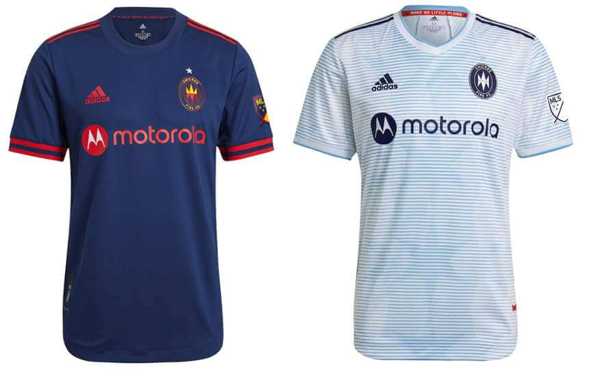
FC Cincinnati (primary)
Navy with thin orange and blue vertical stripes
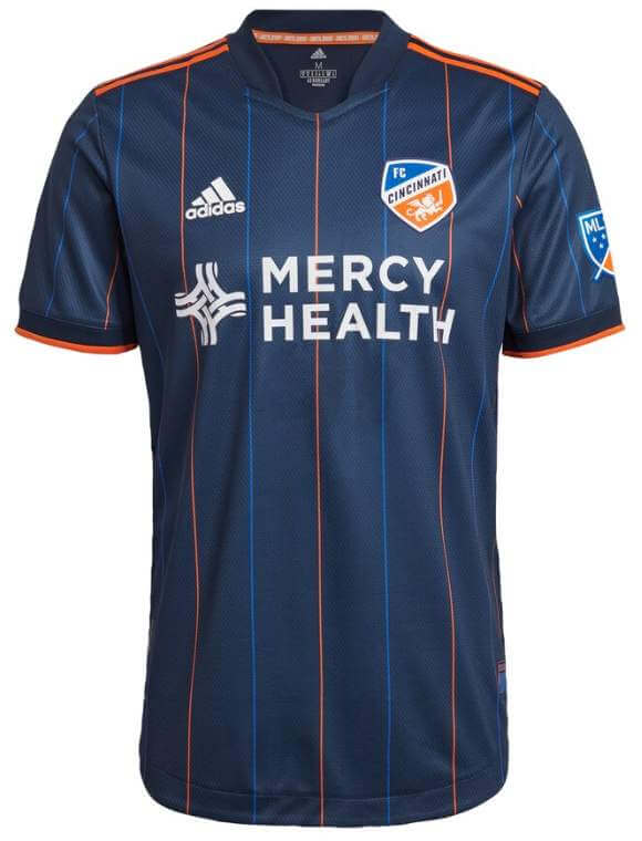
Kyle: I think Cincinnati is struggling to determine which color is their primary color but this design is a nice one.
CJ: I actually like this look. I enjoy multiple colors on thin stripes, when done well. FCC did well.
Columbus Crew (primary)
New stadium-inspired gray with sublimated architecture design
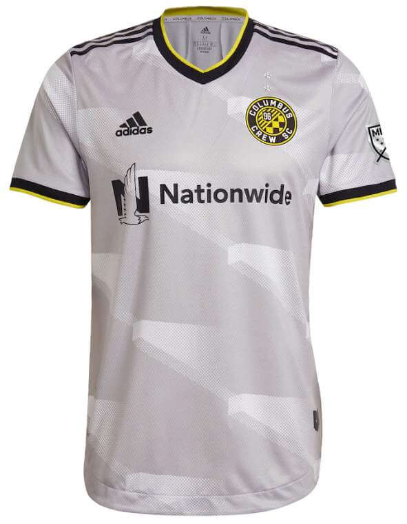
Kyle: No yellow kit this season? And I have no problem using a pattern from architecture but shouldn’t it at least be unique? Looks like a standard beam to me.
CJ: I can’t tell what this is, but points for trying something I suppose. It’s not bad by any stretch, at least.
DC United (secondary)
“Marble”-pattern white jersey with red and blue accents
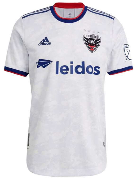
Kyle: The simple red, white, and blue theme is a nice secondary option for the District’s team. And sure why not on the monument-style marble pattern.
CJ: I love the marble idea but if you can’t really tell it’s there, is it effective?
Inter Miami (secondary)
Essentially identical to their inaugural secondary jersey, black with pink accents on a newer Adidas template
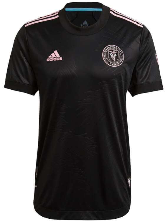
Kyle: Simple and does the job. Love seeing the pink in the league.
CJ: Pink is great, although when you only see it as advertising, not so great.
CF Montreal (primary)
Black with sublimated new “M snowflake” crest
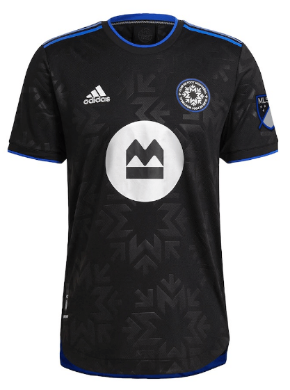
Note: Previously Montreal Impact, now rebranded as “Club de Foot Montreal” or CF Montreal, with this new crest
Kyle: The new crest is alright, but a primary kit without their blue and black vertical stripes is a big downgrade for me.
CJ: Have to agree with Kyle, the older striped kits were beauties.
Nashville SC (secondary)
Similar to inaugural secondary jersey, navy with yellow accents, sublimated “N” pattern
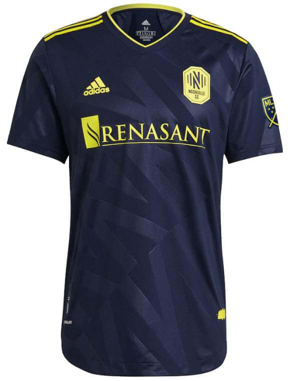
Kyle: Another nice and simple look with a sublimation mainly for the consumer.
CJ: It could obviously be worse but it could certainly be better.
New England Revolution (secondary)
Revolutionary-war fort inspired block white design with sky blue stripes on one sleeve and navy on the other
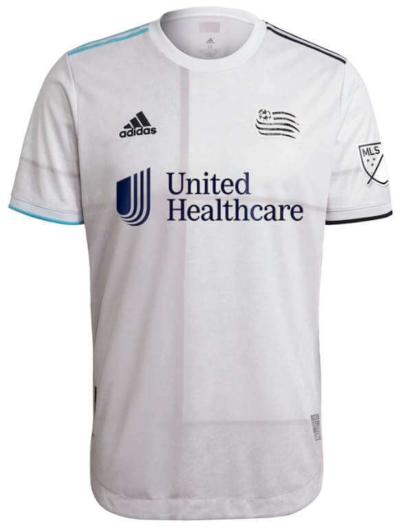
Kyle: Ehh, hard for me to follow the narrative when it’s a reused template from a recent Spanish national team jersey.
CJ: One enormous yawn from me.
New York City FC (primary)
Sky blue with subtle sublimated sky blue vertical stripes and interlocking “NYC” from the crest
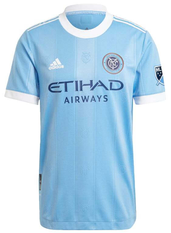
Kyle: No need for those “fake” vertical stripes.
CJ: It’s a light blue kit for NYC, I can’t see any stripes.
New York Red Bulls (primary)
White with fading gradient gray checkerboard pattern
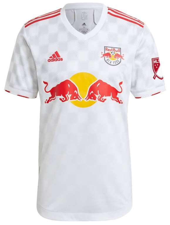
Kyle: Would’ve liked to see a return to white with red sleeves.
CJ: Checkerboard? Well, it’s something different, but you can barely see it!
Orlando City SC (primary)
Dark purple to light purple gradient meeting with vertical stripes in the center
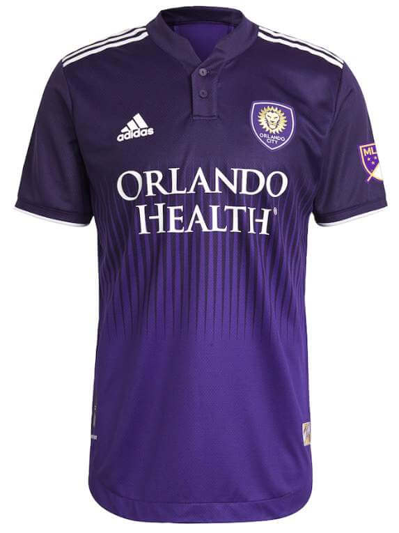
Kyle: I’m not strictly against gradient designs but this one doesn’t work for me. CJ will like the mini collar.
CJ: Correct, I do! Buttons forever. The gradient isn’t terrible but it isn’t good either.
Philadelphia Union (secondary)
Light blue with yellow accents and lightning bolt pattern
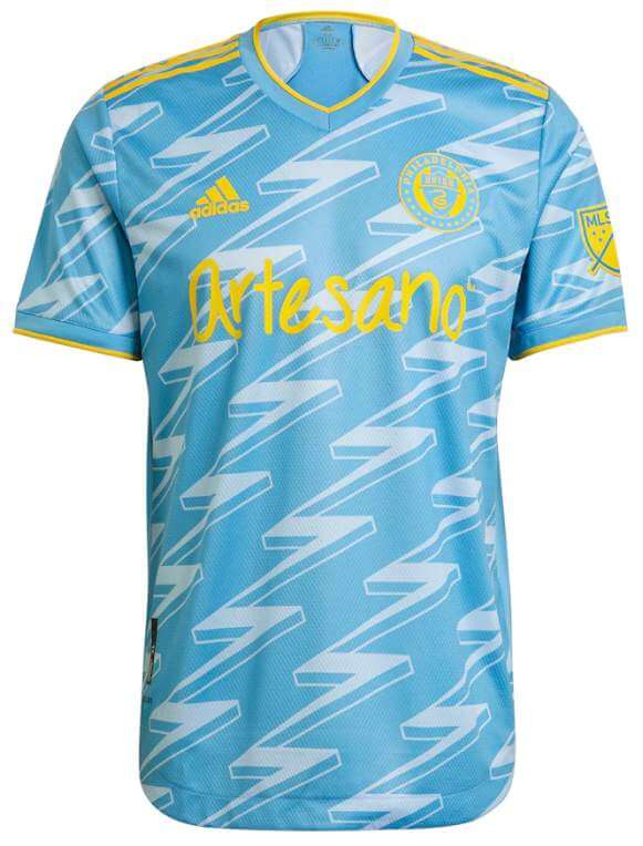
Kyle: Bold design, but I like the color scheme and props to CJ’s team for being able to stand out on the field in the right way for a change.
CJ: Fan input helped create this monster of a kit, and I guess Philadelphia fans have some taste.
Toronto FC (primary)
Red with diagonal dark grey stripes of varying widths that give the front of the jersey a “quartered” look
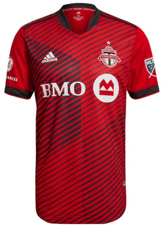
Kyle: My initial reaction was negative but you know what? Why not for Toronto who lack a singular “classic” primary look.
CJ: I agree with Kyle here, TFC have definitely been a simply red team for a long time. A little flair isn’t bad.
Thanks, guys! They’ll be back again with Part II — the Western Conference — tomorrow.


Atlanta Patch (non) Update
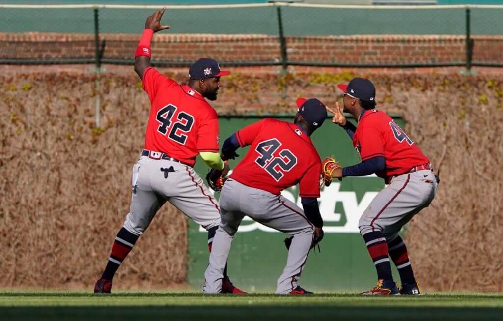
For those of us anxiously waiting to see if/when Atlanta decides to add memorial patches for Henry Aaron and Phil Niekro to the right sleeve of their jerseys, the waiting continues.
As you can see above, the team again wore their “42” Jackie Robinson jerseys yesterday in Chicago, after having worn them on JRR day, at home, the day before. Because their opponents, the Chicago Cubs, did not play on April 15, they wore their JRR jerseys yesterday, so Atlanta played along. It’s also believed to be the first time the team has worn the red jerseys on the road, so that is somewhat uni-notable.
While it’s not the greatest photo to show the right sleeve patch, it is again the JRR patch, which we first saw on Thursday.
So the wait continues…will we (finally) get to see Hammer & Knucksie get the memorial-patch-on-sleeve treatment they so richly deserve? Hopefully we find out today.

Guess The Game…
from the scoreboard
Today’s scoreboard comes from SABR BioProject.
The premise of the game (GTGFTS) is simple: I’ll post a scoreboard and you guys simply identify the game depicted. In the past, I don’t know if I’ve ever completely stumped you (some are easier than others).
Here’s the Scoreboard. In the comments below, try to identify the game (date & location, as well as final score). If anything noteworthy occurred during the game, please add that in (and if you were AT the game, well bonus points for you!):
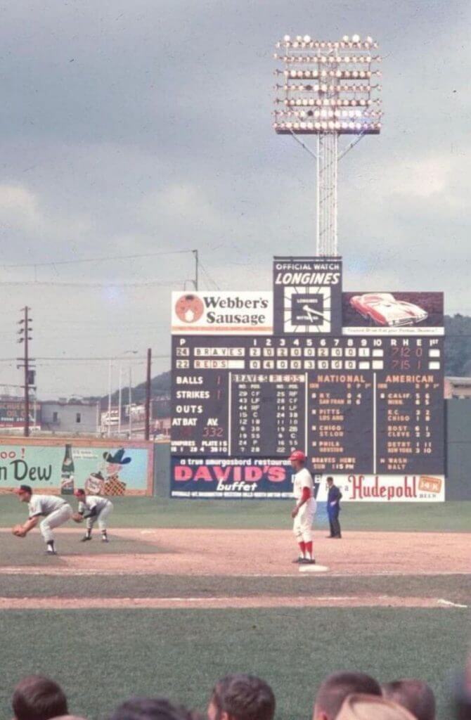
Please continue sending these in! You’re welcome to send me any scoreboard photos (with answers please), and I’ll keep running them.

Uni Concepts & Tweaks
Time for more Uni Tweaks from the UW readership.
I hope you guys like this feature and will want to continue to submit your concepts and tweaks to me. If you do, Shoot me an E-mail (Phil (dot) Hecken (at) gmail (dot) com).
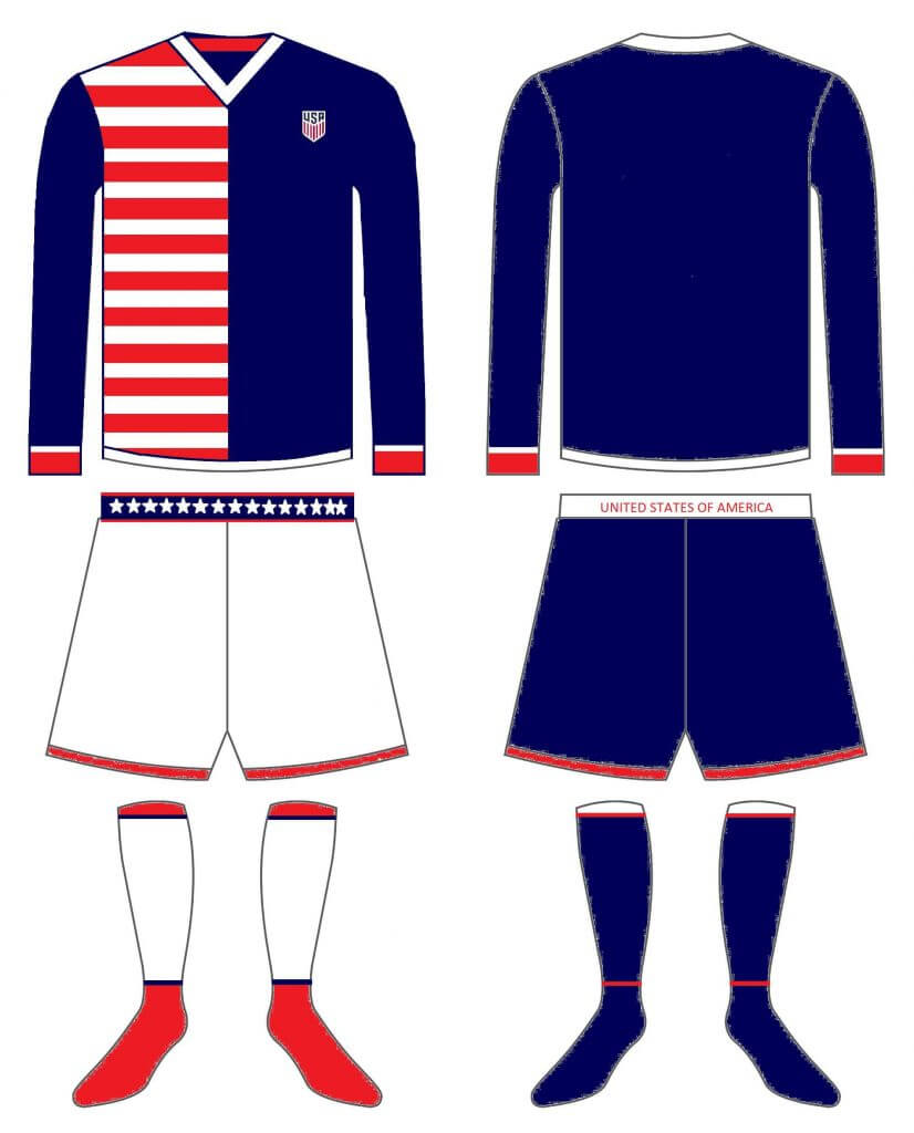
Got a double set of tweaks today. The first comes from Alan Berch with a Team USA soccer kit:
He writes…
Hi,
This is my attempt at redesigning the current USA soccer jersey. It is the front and back of a single jersey. 2 different shorts and socks types. They need to get rid of their current blue jersey.
Thanks for all the content over the years!
Alan
And here are his designs:
And the second set of tweaks comes from Walter Helfer with a new Knicks uniform. He writes:
Dear Phil,
I hate succumbing to Nike marketing-speak, but this proposal for a new Knicks’ uniform bears a resemblance to other NBA teams’ Earned designs. The biggest influence was the 2012 monochromatic Xmas uniforms, which would have looked great with all those tones of orange against a neutral background: In this case, the navy blue of their 1979 suits. Key to the design is a pop-art Empire State Building running from the hem of the shorts to the base of the arm cutout. No longer the tallest skyscraper in NYC, but still easy on the eyes and a close neighbor to MSG.
All the Best,
-Walter
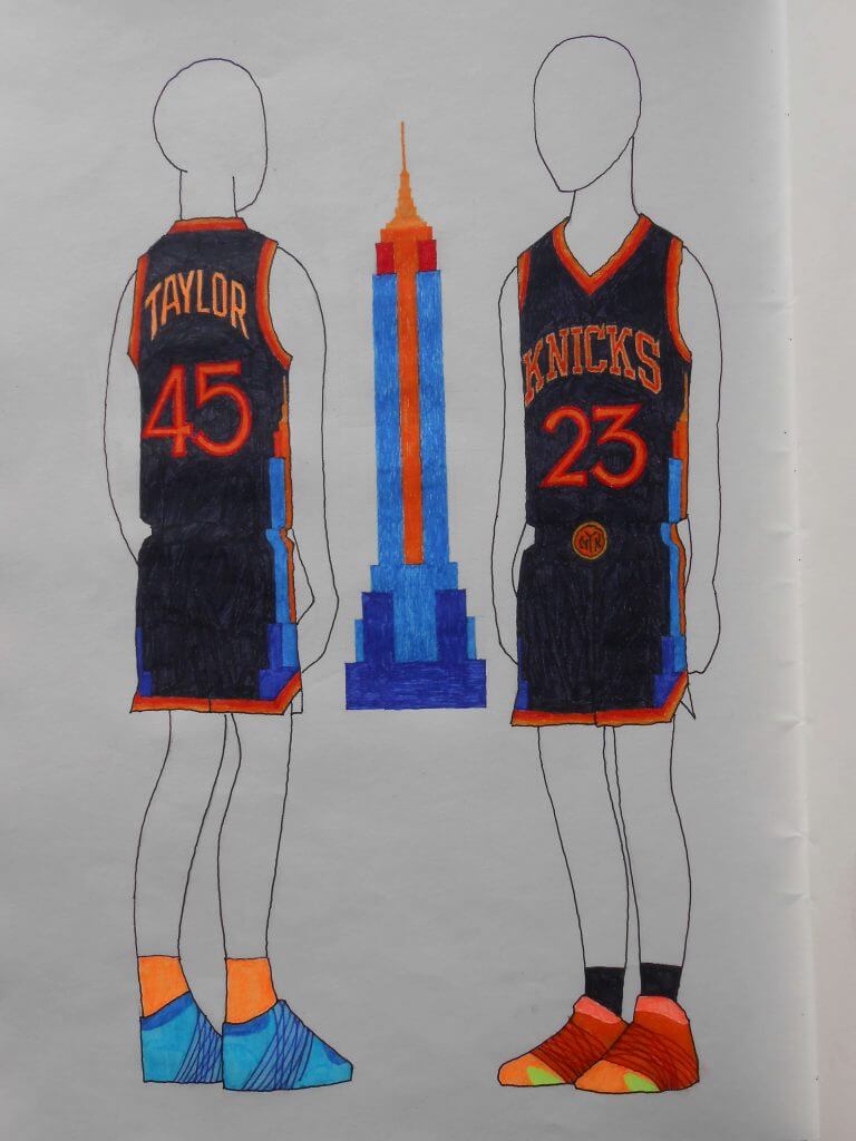
Thanks Alan and Walt!
OK readers (and concepters). If you have some tweaks or concepts, shoot ’em my way with a brief description of your creation and I’ll run ’em here.
Bill Hetrick, Super Collector
Over the years, I’ve featured the sports memorabilia collection of Bill Hetrick several times on Uni Watch, but recently, Bill had a segment on my buddy Shawn Anderson’s “HOVG Cribs” (HOVG is an acronym for “Hall Of Very Good”), where he really was able to show off his vast, vast collection. If you’ve never seen pictures of it (or even if you did), this is definitely worth the 15 minute look-see. Enjoy!
The Ticker
By Anthony Emerson

Baseball News: Today, the Red Sox’s new City Connect unis will make their on-field debut against the Rays. Sox IF Kiké Hernández and Rays P Tyler Glasnow will also be wearing special cleats to support the More Than Baseball initiative. … The New Shea Stadium vaccination site is giving away Mets-themed vaccination stickers (from David Landesberg). … The Cardinals wore their home red caps in Philly, perhaps due to belated Jackie Robinson Day celebrations — maybe the blue road caps didn’t have the Jackie patch applied (from Jay Wright). … Ryan Davis purchased a Reds St. Patrick’s Day jersey from MLB’s official auction site, but the NOB included a very strange looking apostrophe. Anyone have any more info on that?

NFL News: Cardinals QB Kyler Murray shared a new uni concept on his Instagram, leading to a resurgence of calls for new uniforms from the fanbase (from Kary Klismet). … Also from Kary: Bengals team exec Elizabeth Blackburn has revealed a few key details of the team’s new uniforms, which will be unveiled on Monday. … During his show on Thursday, Pat McAfee discussed the potential new names for the WFT (from @redbuppy). … The Dolphins celebrated new WR Will Fuller’s birthday by photoshopping him into a numberless jersey. I guess they haven’t assigned him a number yet (from Preston Feiler).
College/High School Football News: Utah will wear helmets honoring RB Ty Jordan for their spring game on Saturday. Jordan was killed last December in an accidental shooting incident (from Kary Klismet). … FAU will wear a helmet decal and jersey patch honoring the late Howard Schnellenberger this coming season (thanks, Phil).

Hockey News: The Central Collegiate Hockey Association has a new logo (from @artofscorebug).

Hoops News: The WNBA’s Dallas Wings’ new “Rebel Edition” unis lasted all of a few days before being pulled. The unis were to honor the US Army’s World War II-era Women’s Airforce Service Pilots or “WASP”, an all-female group that tested aircraft and trained new pilots to free up more experienced (read: male) pilots for combat roles. It was, however, the only portion of the armed forces that was available only to white people at that time. Though full integration of the armed forces would come after the war, Black men were able to serve in the Army, Army Air Corps, Navy, and Marines in segregated platoons and squads — but Black women were excluded completely from WASP service. Paul will have more on this topic on Monday (thanks to all who shared). … Blazers PG Damian Lillard wants the team to retire former C LaMarcus Aldridge’s No. 12. Aldridge, who last played for Portland in 2015 and was playing for the Spurs and Nets this season, retired on Thursday citing concerns around an irregular heartbeat (thanks, Phil). … A guy made a portrait of Joel Embiid out of 768 Rubik’s Cubes (from @PhillyPartTwo). … There’s ad encroachment on jerseys, and then there’s ad encroachment on jerseys. Can anyone even figure out what the team name is? (from @benonsports). … Pascal Siakam, who did not play, was wearing a Toronto FC jersey on the Raptors bench last night (from Mask In Victoria).

Soccer News: Here are the kit matchups for MLS’s first matchweek (from John Flory). … Italy’s Euro 2020 away kit has been released. The kit features the Puma maker’s mark right next to the Italian crest, putting the two on equal footing. In a related piece, rumor has it that Puma’s club teams — including Manchester City, AC Milan and Borussia Dortmund — may be receiving the same treatment for next season (both from Kary Klismet). … So, something non-soccer fans might not know is that there’s no regulation pitch size — as long as a pitch falls within certain regulations, it’s fine. DC United coach Hernán Losada requested that his home pitch be three yards shorter this season, and now it is (from our own Jamie Rathjen). … What appear to be Chelsea’s new home kit has leaked, and after seeing that I feel bad for Chelsea fans for the first time ever (from @texastrevor).

Olympics News: Team Canada’s Olympic Opening Ceremony unis have been revealed, and they’re perfect (from Ted Arnold and Phil).
.

Grab Bag: Here’s a cool story about the history of lace-up jumpers in Australian rules football (from Kary Klismet). … Also from Kary: The Fiji Rugby Union has revealed new kits for teams in its top flight as well as a redesigned trophy for the champions.
And finally… that’s it for today. Big thanks to CJ and Kyle for their MLS Eastern Conference review. Make sure to check back in tomorrow for the Western Conference.
Everyone stay safe and I’ll catch you then.
Uni Tweet of the Day…
When the team is wearing uniforms that are this awesome, even the bat boy is gonna have to get used to signing autographs. 1976 @Indians pic.twitter.com/5XE14nviKo
— Vintage Jerseys & Hats (@PolyesterUnis) April 16, 2021
Peace,
PH
Word in Chicago is that even with the new crest, the Fire will still wear navy next year due to some two-year minimum requirement imposed by Adidas or the league or something. The team has made it known they are well aware of the fans’ overwhelming preference for red.
Navy is a perfectly valid uniform for the Fire (think of the duty uniforms of Chicago firemen); but not as the primary.
The Chelsea leak link is asking me o log into the UW CMS.
Likewise.
I’m getting the same thing. I think this link shows more or less the same content that was intended to be shown in the Ticker item:
link
Sorry guys — there must have been a coding error in Anthony’s link. I’ve now swapped in the link Kary just gave (above).
Thanks, Phil!
The Cardinals should take the link link on the link; (3) put the AZ state flag on the sleeve; and (4) put red, white and blue pants stripes in place of the link. If I had the skills I’d do a mockup.
That is a really interesting idea. The first pro football game I ever attended was the Arizona Wranglers vs the Chicago Blitz at Sun Devil Stadium. Be great to see how it looks to meld the two looks.
I like the new Cardinal logo, but ditch the rest of the current uniform. And not a fan of the state flag and navy blue, since their colors are cardinal red, white, and black. They aren’t the St. Louis Cardinals.
I like the old one better; to me it looks regal, whereas the current one just looks annoyed.
And even though they “aren’t the St. Louis Cardinals,” their colors are still the same as when they were. Ergo, they can change their colors.
Or, maybe adopt the Wranglers uniform and change the royal blue to black. That would look good too.
Cardinals of the NFL variety should wear what amounts to an Ohio State uniform with no silver. Put the AZ flag on the back of the helmet where the US flag currently resides and call it a day.
Thanks for the preview and the commentary. Good stuff as always! One quibble re Cincinnati: Not every team needs to choose a primary color. Cincy will look just fine with light blue and orange in equal measure. I mean, imagine complaining that West Ham just can’t seem to decide whether blue or claret is its primary home uniform color.
Was that Cardinals news item submitted by THE Jay Wright? I mean, it involves Philly…
I really like the Union’s kit, which is tough for me to say as a NYRB supporter. I always liked the navy/sand combination, too.
I don’t think… because on the last Unified there was a question and the twitter handle was different that the coach’s.
I think there’s too much concern being placed on the Braves’ memorial patch location. Where is it decreed that the sleeve is a higher place of honor than the cap? I’m not feeling the slight here.
There is literally no higher place of honor than the cap.
But beyond that, I’ve never understood the hand-wringing here when a team does something just a little bit different.
The apostrophe on that Reds jersey sorta looks like the shape of Ohio.
The Rays are playing in Boston and New York today?
One more Ticker correction: it appears there’s no link for the Fiji rugby story. Here’s the story:
link
…and here’s a higher resolution version of the featured photo:
link
Should be fixed now (sorry Kary)
No worries, Phil! Thanks for the fix!
I love this website, but for the love of god please never refer to ‘basketball news’ as ‘hoop news’ again. It’s painful to read two old white guys talking like this. Please. How hard is it to type basketball if you can spell out every sport lol.
Actually, it was Anthony who prepared the ticker today (and he’s not an old white guy), but point taken. I’ll let him know your thoughts.
soccer kits are an abomination with the massive chest advertisments …..ruins the look
only the red bulls pull it off as it looks like a logo for a tem called…well, duh….red bulls
the rest are trash bin
Agreed. It’s interesting that given all the fuss over NBA teams adding a small ad patch and Nike adding a swoosh to MLB jerseys it’s just sort of accepted that soccer players being basically walking billboards is just the way things are.
soccer kits are an abomination with the massive chest advertisments …..ruins the look
only the red bulls pull it off as it looks like a logo for a team called…well, duh….red bulls
the rest are trash bin
The Red Sox play the White Sox today, not the Rays. Glasnow is still reportedly wearing the special cleats, though.
GTGFTS is Braves at Reds, 6/3/67. Appears to have been a standard issue slugfest. Five total home runs, 27 total hits, 16 total left on base, only one error.
Regarding your photo of the Crosley Field scoreboard, my father, Chuck Keiger, painted every one of those signs. Each spring when I was a kid, I knew baseball season was approaching because he would drag out this ridiculous sun lamp to tan his balding head, face, and arms in preparation for long days in the sun getting the ballpark ready for Opening Day (which back then was always *the* ceremonial opening day of the season, because the Reds were the first professional team). Thanks for the memories.
Not big on that DCU away shirt. The “marble” has the same appears-insufficiently-laundered look as the LA Rams’ “bone” uniforms. Hopefully it just looks white on the field. I believe this is the first time they’ve worn blue as well, which I’m not huge on, but I’m given to understand that soccer teams go through oddball colors on their road unis at a regular clip. Would still prefer them to stick to their solid black/red identity.
Ryan Davis purchased a Reds St. Patrick’s Day jersey from MLB’s official auction site, but the NOB included a very strange looking apostrophe. Anyone have any more info on that?
That’s not an apostrophe, that’s a molar!
That USA Soccer uniform tweak is an eyesore
I know I’m going to get heat for this, but…
Those Canada Olympic uniforms are complete trash.
They look like the side of a railroad car with all of the tagging “art” on it.