Click to enlarge
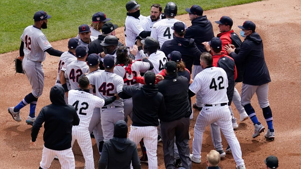
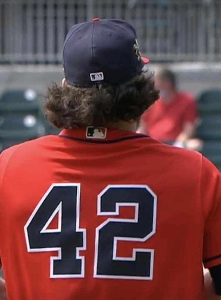
Mild hilarity yesterday in Chicago, as the White Sox and Cleveland emptied their benches and bullpens for some on-field pushing and shoving, resulting in the very entertaining mono-numerical spectacle shown above. Granted, it’s not the best way to honor Jackie’s legacy. But if you’re going to stage an embarrassing pretend-brawl (the only players truly angry in a typical baseball fight are the two guys who started it; everyone else is just there for show), I figure you may as well do it on a day when everyone’s wearing the same number, just to provide a bit more visual interest (and to make everyone harder to identify).
If you want to see the whole thing unfold, here’s video of the incident:
In other uni-notable developments from Jackie Day:
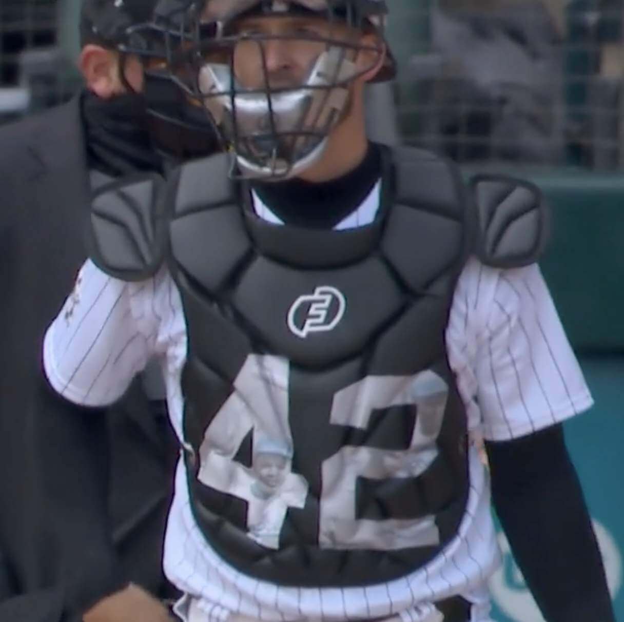
• In that same game in Chicago, White Sox catcher Yasmani Grandal had a giant “42” emblazoned on his chest protector, with images of Jackie in the numerals:
• The Pirates, playing at home against the Padres, wore their black road alternate jerseys with their standard white pants:
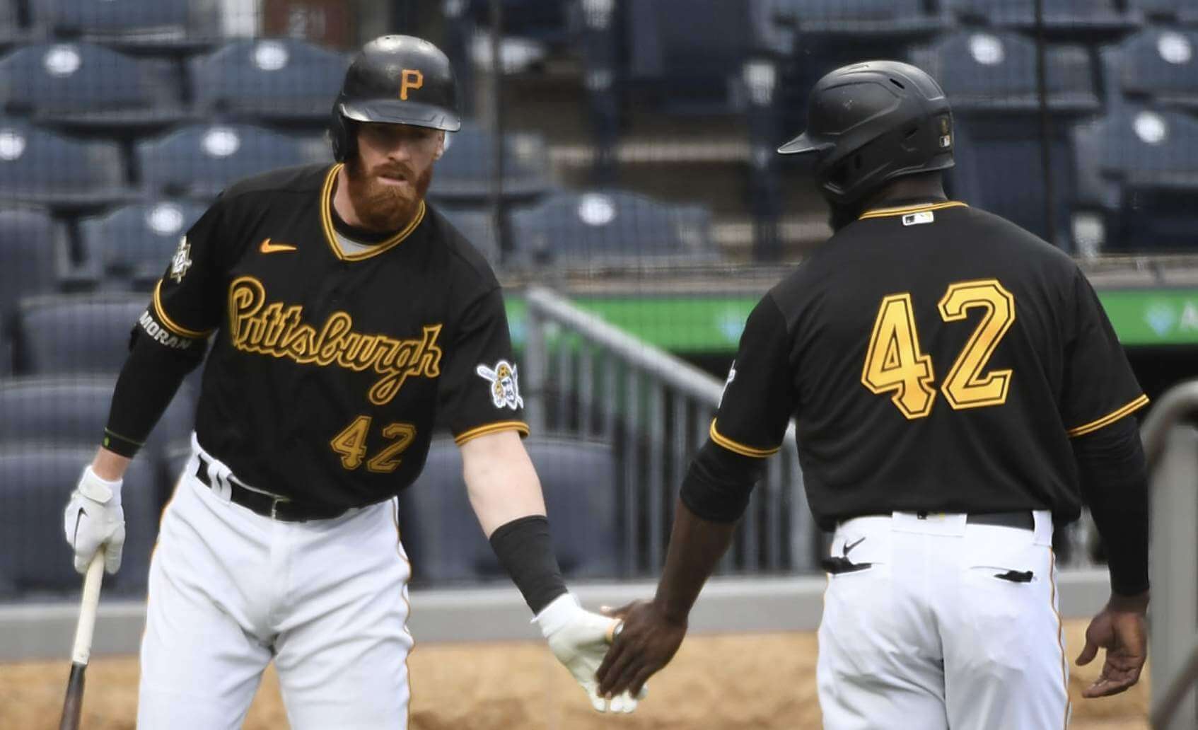
Why did they do that? Because today they’re playing in Milwaukee, where the Brewers will be doing the Jackie/42 thing (they had an off-day yesterday), so the Pirates decided to double up and wear the same jerseys for both games.
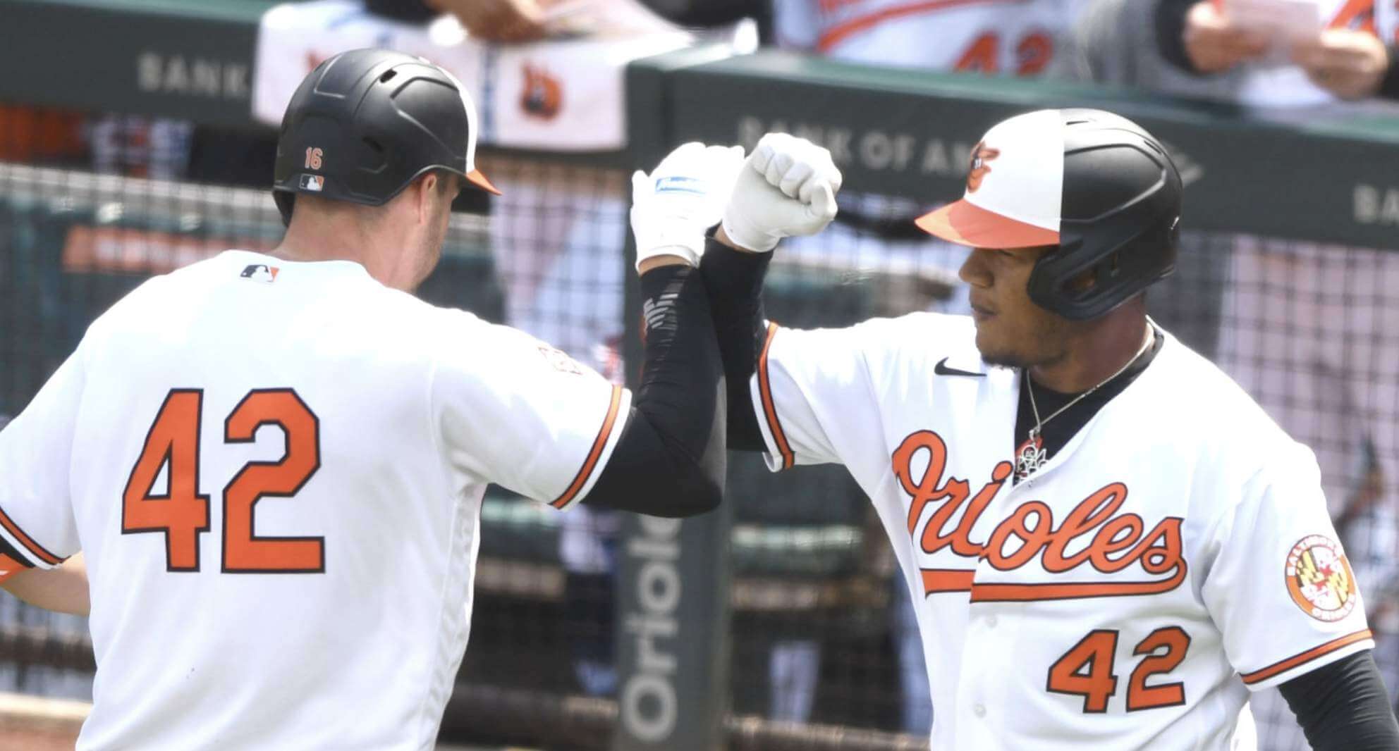
• The Orioles and Mariners played a doubleheader in Baltimore. For the first game, both teams wore 42 (and the M’s wore their home alternates on the road, because today they’re back home hosting the Astros, who had yesterday off, so both teams will wear 42):
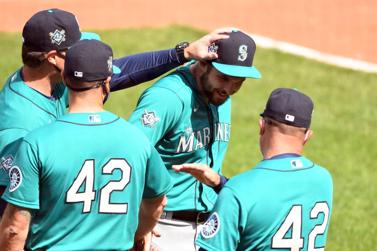
For the second game — a makeup of an earlier rainout — players wore their regular uni numbers and the Mariners were back in their navy road alternates, but both teams wore the Jackie Day cap patch:
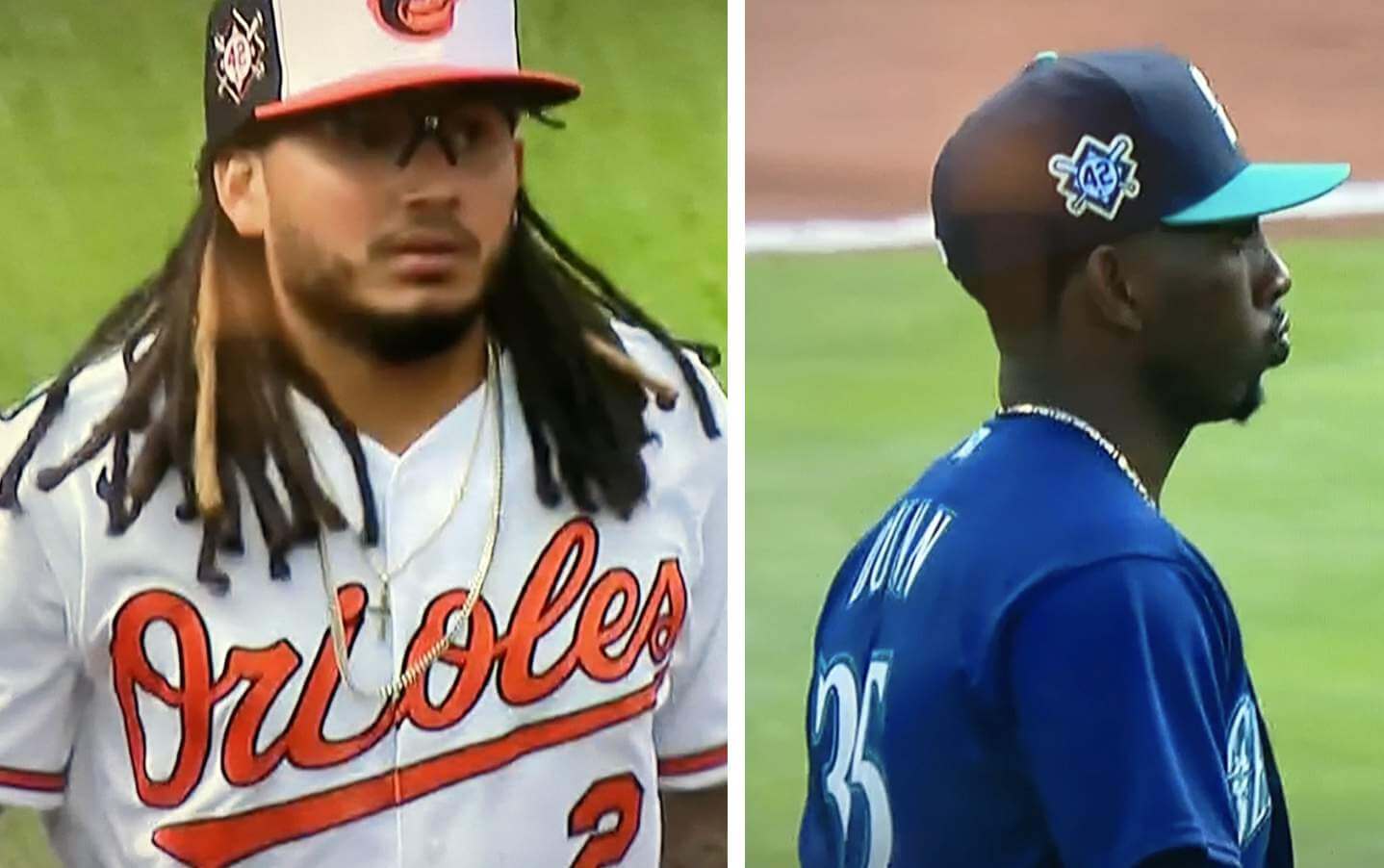
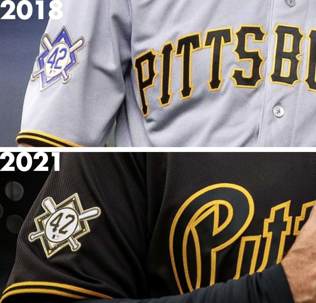
• The Jackie Day cap and right-sleeve patches, which were introduced in 2018, had previously been the same blue/Dodgers-themed design for all clubs, but this year the patches were customized to match each team’s colors and number font:
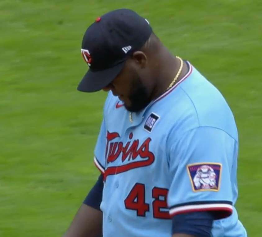
• Patches normally worn on the right sleeve — including the Twins’ Mike Bell memorial patch and the Dodgers’ Tommy Lasorda and Don Sutton memorial patches — were superseded by the Jackie Day patch and were not worn. Update: Reader/commenter Brett G. notes that the Twins actually moved their Mike Bell patch from the right sleeve to the left chest:
• Similarly, Atlanta’s rear-cap memorials for Henry Aaron and Phil Niekro were not worn (even though, obviously, there was nothing competing for the space):
• The Mets/Phils game was rained out and will be made up as part of a doubleheader on June 25. I suspect the teams will do the 42 thing for the makeup game, but I wish they wouldn’t. Jackie Day is April 15 for a reason — it commemorates the anniversary of a historical event. Just leave it at that instead of watering it down by moving it around the calendar. If you’re rained out or you have an off-day or whatever, it’s no biggie because you’ll get to wear 42 next year.
• Eight teams did not play yesterday: the aforementioned Brewers and Astros, and also the Angels, Cardinals, Cubs, Giants, Reds, and Yankees. Their eight opponents today — the aforementioned Pirates and Mariners, and also the Marlins, Phillies, Rays, Twins, Atlanta, and Cleveland — will presumably wear 42 again, even though they wore it yesterday (or, in the case of the Phillies, even though they were scheduled to wear it yesterday). It’s worth noting that the Yankees’ Whitey Ford memorial and the Cardinals’ Bob Gibson memorial are worn on the left sleeve, so there’s nothing preventing them from being worn today.
Finally, while not related to yesterday’s games, MLB posted a good article about the last player to wear No. 42 for each MLB team (well, except for the Rays and D-backs, who never issued that number because it had already been retired MLB-wide by the time they came into existence). Interestingly, Mo Vaughn was the last 42er for three different clubs — the Red Sox, Angels, and Mets!
(My thanks to Marcus Hall for the M’s/O’s info.)
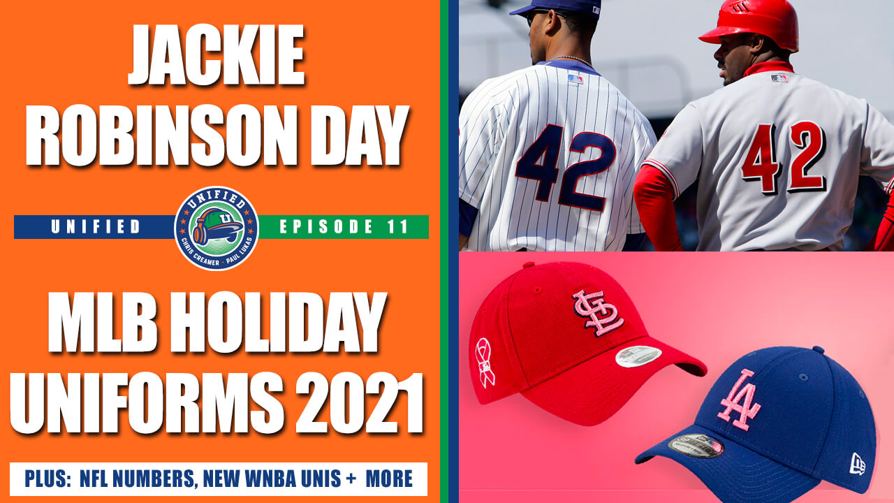
Podcast reminder: For this week’s episode, Chris Creamer and I discussed a bunch of things, including:
• MLB’s new holiday caps
• The history of Jackie Robinson Day, and how it should be handled going forward
• The proposed changes to the NFL’s uni number rules
• The new WNBA uniforms
• The ongoing saga of the Braves, the MLB All-Star Game, and all the related issues
• Our favorite uniforms from fictitious teams in movies
As always, you can listen to us on Apple, Google, Stitcher, TuneIn, and Spotify, or just use the player below:
The show notes for this episode, which include photos of many of the things we discussed, are available at the podcast’s newly redesigned website. Those photos (and some additional ones) also appear in the video version of the episode, which you can see here:
We have great deals from this episode’s advertisers: Streaker Sports (get 20% off any order with checkout code UNIFIED), Ebbets Field Flannels (10% off, except on NFL items, with checkout code UNIFIED), and Homefield Apparel (15% off with checkout code UNIFIED).
Enjoy the episode, and thanks for listening.
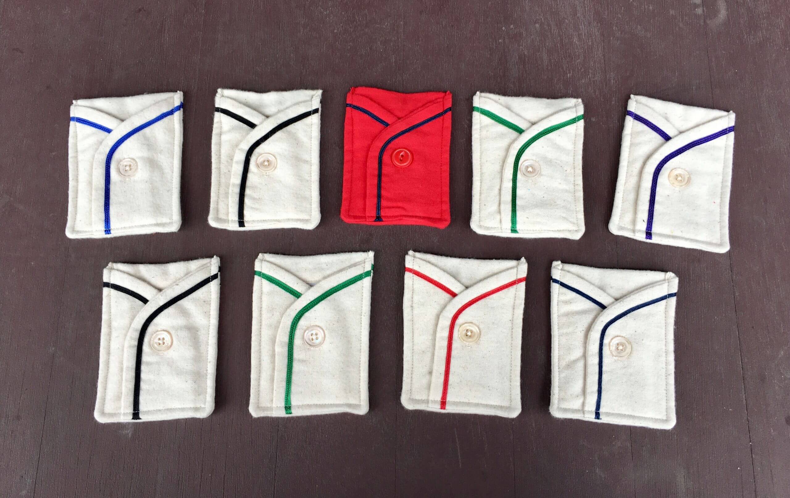
Click to enlarge
ITEM! Wafflebored scores again: Hmmm, what have we here? It’s a set of custom jersey-style pockets made by the DIYer extraordinaire Wafflebored. Much like the Durene pockets he made in March, these all have No. 7 on the back and are just the right size for holding a Uni Watch membership card:
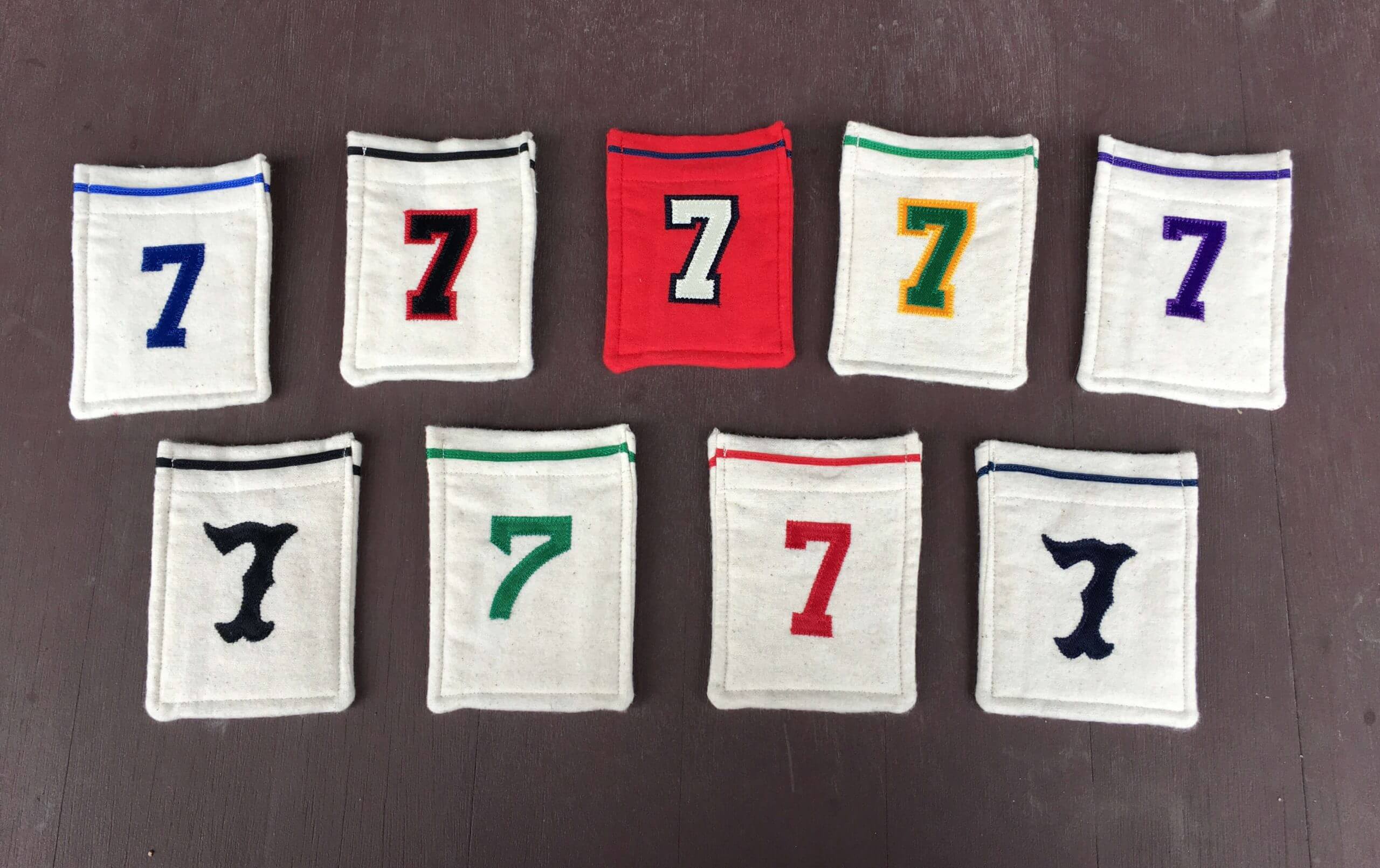
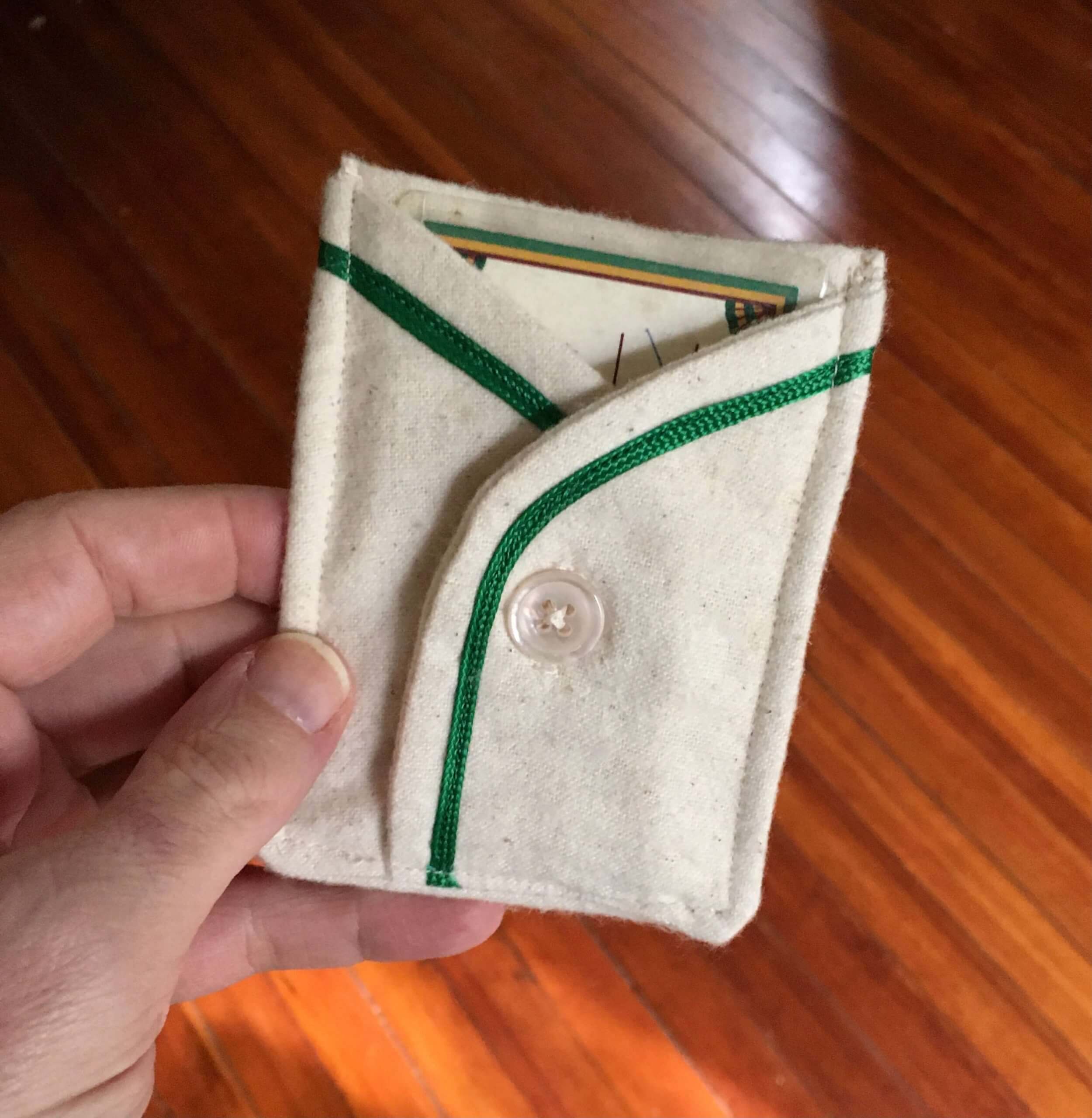
But wait, it gets better — the button is actually functional! Check this out:
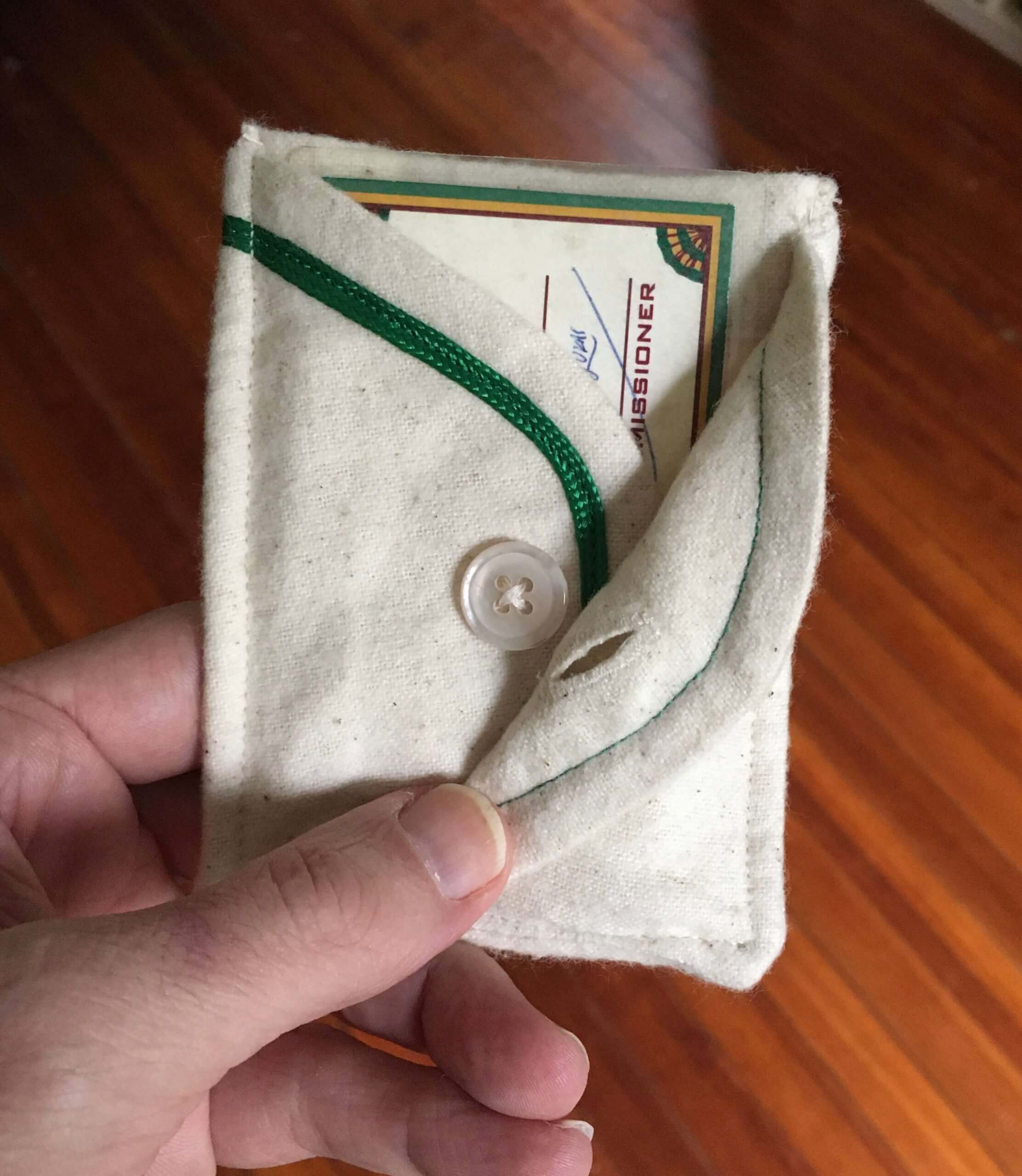
How awesome is that? Wafflebored is the best.
As you probably noticed, one of the pockets is purple, so that one will have a starring role on Purple Amnesty Day (which is one month from tomorrow!). As for the others, I’ll announce my plans for them on Monday — stay tuned.
The Ticker
By Anthony Emerson

Baseball News: The Triple-A Gwinnett Stripers have unveiled their promotion schedule, which includes three games with special jerseys. No images of the jerseys have been released yet (from David Clemons). … The Pensacola Blue Wahoos, Double-A affiliates of the Marlins, will wear Negro Leagues tribute unis on June 19, which is Juneteenth, the holiday celebrating the emancipation of slaves in the United States (from Timmy Donahue). … The American Association’s Kane County Cougars have unveiled a new logo (from Steve Johnston). … Also posted in the Olympics section: Japan has revealed a new alternate Olympics baseball jersey (from multiple readers).

Football News: New Bills QB Mitchell Trubisky will wear No. 8 (from multiple readers). … Miami has added a Howard Schnellenberger memorial decal for its spring game. A closer look here (from multiple readers).

Hockey News: All Capitals players wore No. 19 during last night’s pregame activities to honor C Nicklas Backstrom’s 1,000th game (from David Wilock). … The Bruins wore G.I. Joke pregame sweaters last night (from Mike Franzosa). … Very cool to watch a goalie mask undergo the hydrodipping process (from Moe Khan). … The Henderson Silver Knights, AHL affiliates of the Golden Knights, appear to have changed their uni number color from gold to white. … No picture, but Flyers rookie RW Wade Allison last night became the first Flyer ever to wear No. 57 (thanks, Paul).

NBA News: A Celtics fan blog has ranked every primary logo in the team’s history (from @CTabatabaie).

Soccer News: We’ve covered legendary Dutch player Johan Cruyff’s loyalty to Puma before — he famously refused to wear Adidas’s three stripes on his national team kit and instead wore two. His Puma devotion extended to his late-career stint with the NASL’s Washington Diplomats. Here, he wears his initials instead of the Adidas maker’s mark, and what appears to be a solid sleeve stripe instead of three smaller ones (great find by Kenn Tomasch). … Brazilian side Grêmio’s new kits for the 2021 season have been leaked (from Kary Klismet). … Also from Kary: the NWSL’s OL Reign have unveiled their new kits (also from our own Jamie Rathjen). … The Columbus Crew appear to have a new wordmark (from John Flory). … Volkswagen has changed the ad that appears on VfL Wolfsburg’s kits. The kit’s design is centered around the circular VW logo, making the new text-based logo look a little silly (from Fred, who didn’t give his last name). … Speaking of Wolfsburg, the club is now advertising on the National Independent Soccer Association side Chattanooga FC’s kits — a rare case of a team advertising on another team’s uniform (from @nordeckian). … USL Championship team OKC Energy have unveiled their new kit. A little crazy, but I like it (from Ed Żelaski). … Also from Ed: USL League One side Union Omaha have unveiled all three of their new kits and their new keeper kit. … Another USL League One team, the Richmond Kickers, have unveiled their new kits as well (thanks, Phil).

Olympics News: Cross-posted from the baseball section: Japan has revealed a new alternate baseball jersey (from multiple readers). … Another Olympic year, another article bashing Ralph Lauren for their Olympics casualwear line (from @bryanwdc).

Grab Bag: F1 driver Antonio Giovinazzi has a new helmet for this weekend’s Emilia Romagna Grand Prix (from @latenightwreck). … The Albany NLL team has revealed its logo and name — the Firewolves (from @PhillyPartTwo). … Alexandria City High School, formerly known as T.C. Williams High School, is having a logo design contest (from William F. Yurasko). … AFL side Melbourne is honoring ANZAC Day by putting a giant poppy on their guernsey surrounded by the names of players killed during the world wars (from our own Jamie Rathjen). … Dakota High School in Fargo, N.D., has unveiled their new logo and mascot since their renaming (from Kary Klismet).
That’s it for this week. Stay safe, enjoy Phil’s weekend content, and I’ll see you back here on Monday morning — right when the Bengals will be unveiling their new uniforms! See you then. — Paul
I found it unusual to see women modeling Samurai Japan men’s baseball jerseys.
Those are players from the Samurai Japan women’s team, which wears the same uniform design.
Twins moved the MB memorial patch on the upper left chest:
link
link
Oh, I missed that! Will adjust text accordingly.
Cool! I am not complaining – you credit me as “Mike G” in the text – it is “Brett G” :-)
D’oh! Fixed.
Talking about the last players to get to wear 42 reminds me of the debate on retiring numbers at all.
While I am not at all against retiring Robinson’s 42 league wide, I tend to think one of factors when players pick numbers in their youth based on their favorite players. So I think it is sort of unfortunate that some players cant wear 42 full time to honor Jackie. But at the same time I get the idea that nobody else gets to wear it to make it always his number.
I know a few young kids who play baseball now who started wearing the number after seeing the movie 42, which I think is awesome.
I always liked seeing players wearing a number of a former great and would be OK if teams never retired numbers. Perhaps they could issue numbers that would otherwise be retired to players who they feel would be a good candidate to wear it with distinction.
I second that, Alexander. I don’t want to see any numbers retired; I want to see future generations wearing the same numbers as past greats and feeling connections to them.
I think this is the first time since the Mariners brought back the teal jerseys in 2011 that they’ve worn them with their road grays. I strongly dislike the teal, but it looks much better over gray.
I would be for the cap with the teal brim becoming the permanent home cap again for the Mariners.
I wish they would retire the teal and move back to the royal/yellow combo like their Sunday alt.
I dislike the navy jersey they can’t bring themselves to retire. The silver and teal lettering is dull in spite of the glittery fabric the M’s use. The Latin serifs on the numerals and player names make the letters kern funny. I’d retreat to the white home jersey, grey road uniform, and blue+yellow home alt. Also, lose the fussy patch on the sleeve and replace it with the trident (Expansion year or All-Star version, both are fine).
Wafflebored is a dang genius. Love his stuff.
I read UW every single day, but rarely comment….but, I definitely like that they wear 42 today if they didn’t have a game yesterday. It’s a special day for the baseball family. If you missed it, you would feel gipped. If I were a player, and I missed it I would be bummed, and all the more so if I were black.
I was scrolling though today’s entry, saw the Wafflebored pictures and thought, before reading the text, that’s a creative way to keep your vaccine card safely stored.
Oooh, excellent point!!
Here’s a photo of Flyers RW Wade Allison on the far left.
link
I’m pretty sure the 57 sweater was issued to Flyer prospects in exhibition games, but I would not be surprised if this was the first time that number was worn in an actual game.
Paul, with Purple Amnesty Day about a month away, any chance you could give us a little preview of what type of items will be available?
I just gave you a preview today with the card pocket!
Isn’t the PAD SnapBack now offered each year?
That’s the plan, yes.
I haven’t listened to the new Unified episode yet, but here’s one of my favorite fictional uniforms: the Nagoya Wyverns baseball team from the video game Yakuza 5.
See pictures here: link
I love the shade of green, the wacky “Wy” cap logo, the racing stripes on the pants. On the other hand, the green side belt tunnels are bizarre, and the jersey back numbers are too small. But overall, I like it.
Long time reader, first time writer. Any reason that some days there is a 15 between Uni and Watch (like today) and other days it’s a 7?
Was originally 7. We changed it to 15 for Uni Watch’s 15th anniversary. Now it alternates randomly.
Ray Lamb will help me win my next bar bet!
The Pittsburgh Pirates numeral font gives me indigestion, particularly the “2”.
The 2 is fine; it’s the 7 that is awful. It’s like they lopped the base off a 2.
T. C. Williams was the high school from Remember the Titans. Glad to read that they’re keeping the Titans name. I don’t remember whether the movie points out that the namesake of the integrated high school was a segregationist, but as he was a school board leader in VA in the 1930s, that’s not surprising.
More interesting, perhaps, is that the football coach behind the Denzel character in the movie maybe wasn’t the best guy either (link below).
Er, link above (click on my name). Sorry folks.
Seeing all these NNOB #42 jerseys really makes me wish fewer teams had names on their jerseys.
Especially uniforms with heavy or multi-layered numbers, like the Nationals and Tigers: they look much better with just a number on the back. And look at the Rangers; that triple-layer-shadowed font with the little bumps on it looks horrible when there are names above the numbers, but all the busy parts stop being too busy when there’s no name.
The 42 patches with team specific number styles aren’t new, they had them last year.
link