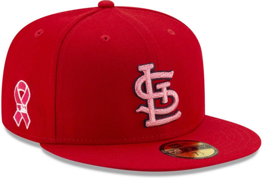
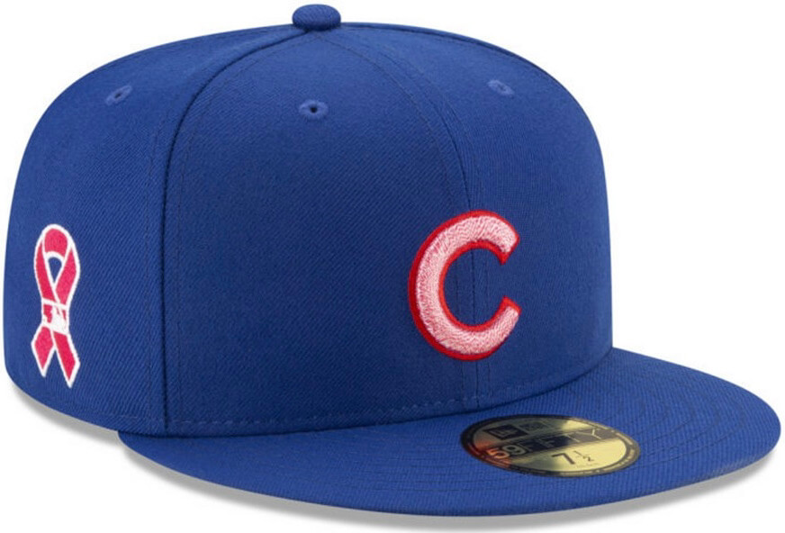
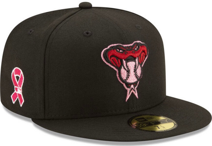
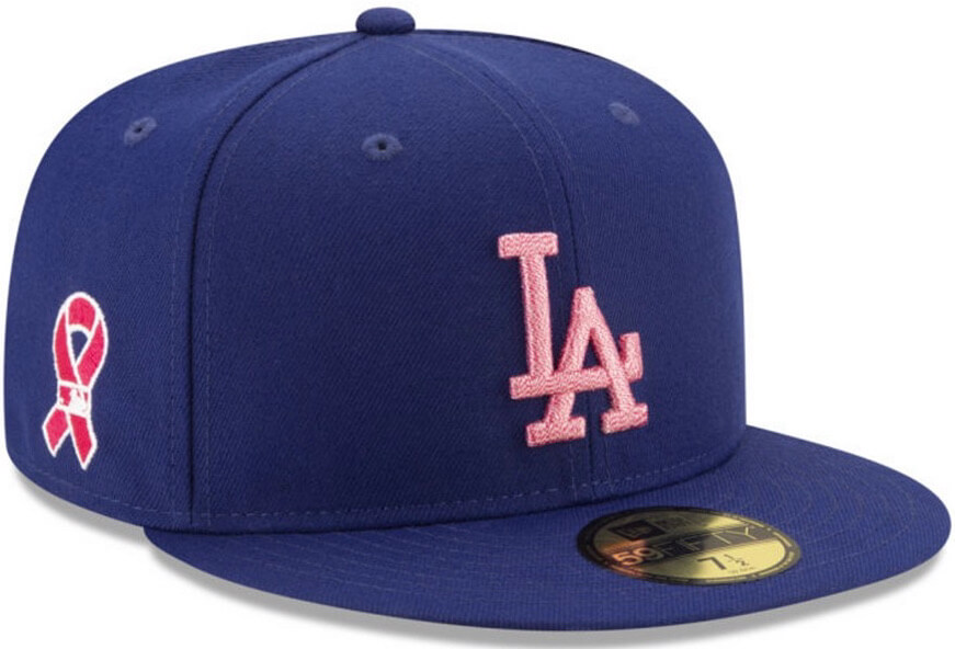
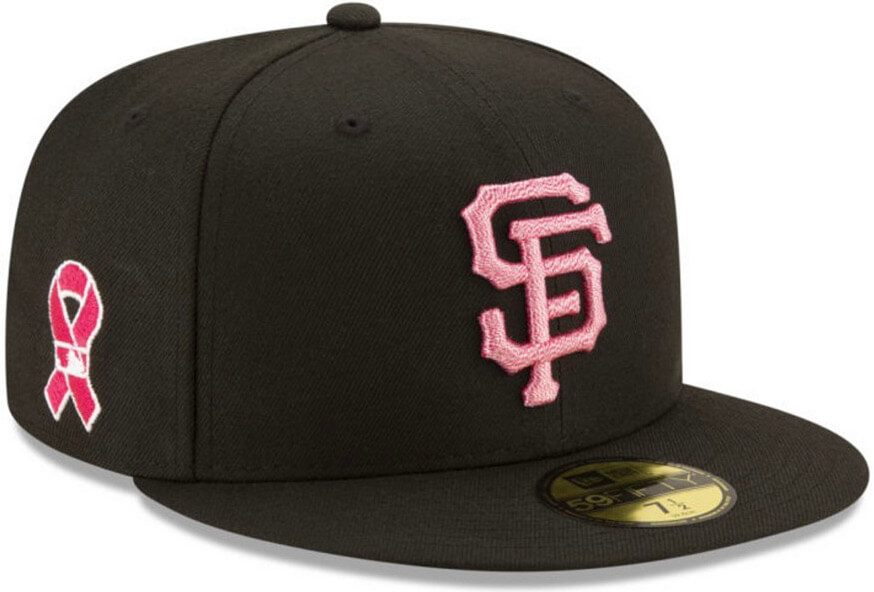
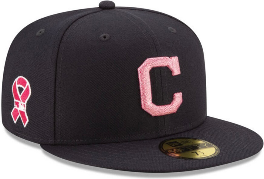
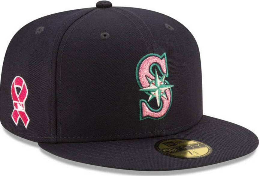
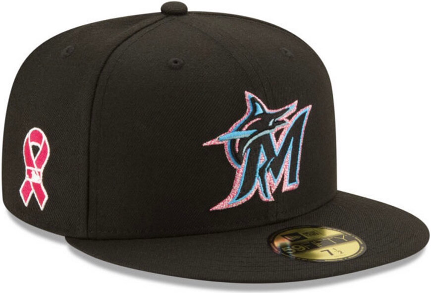
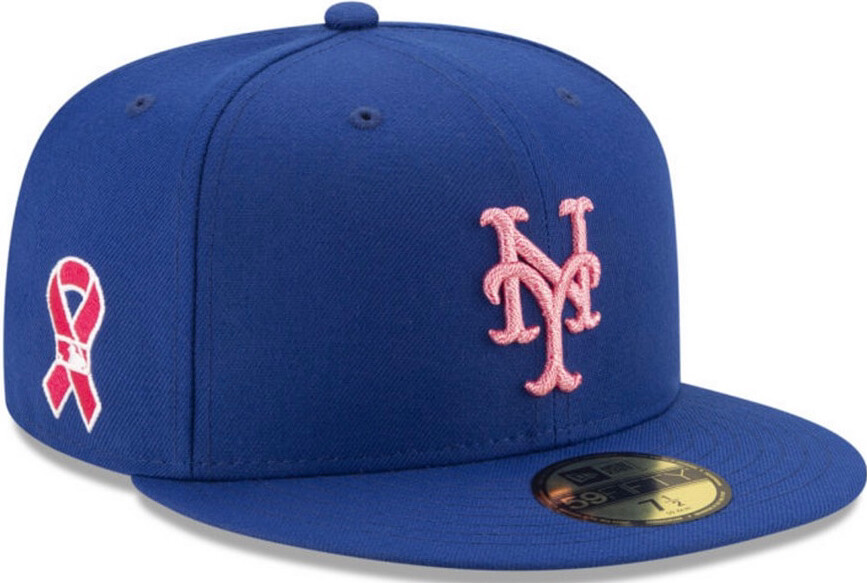
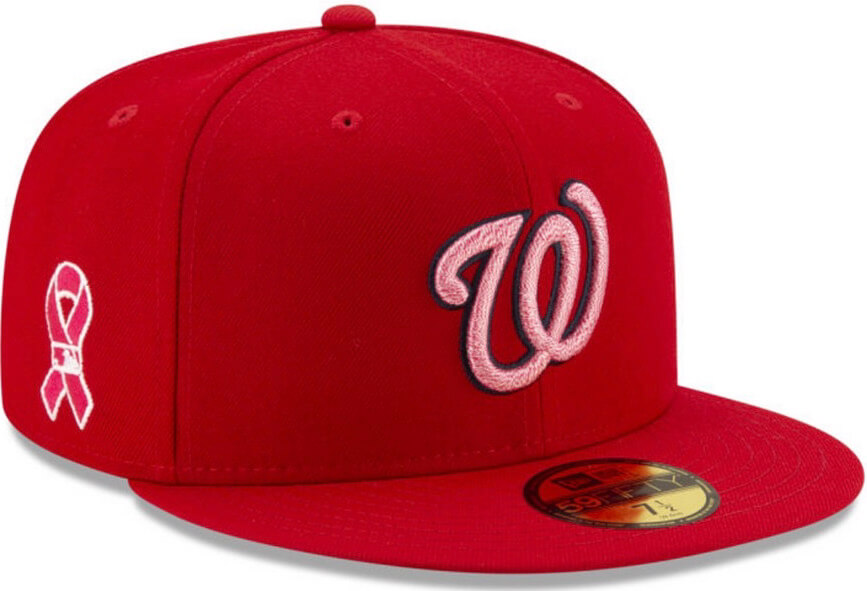
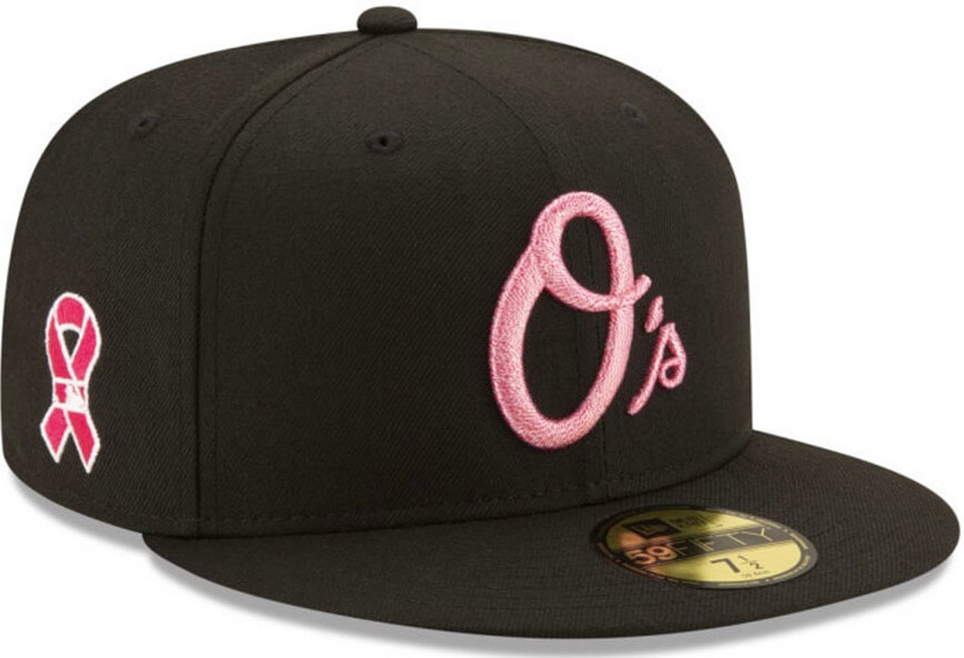
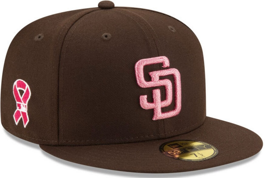
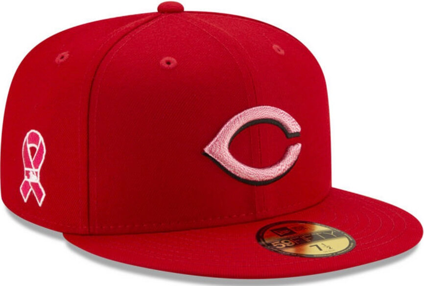
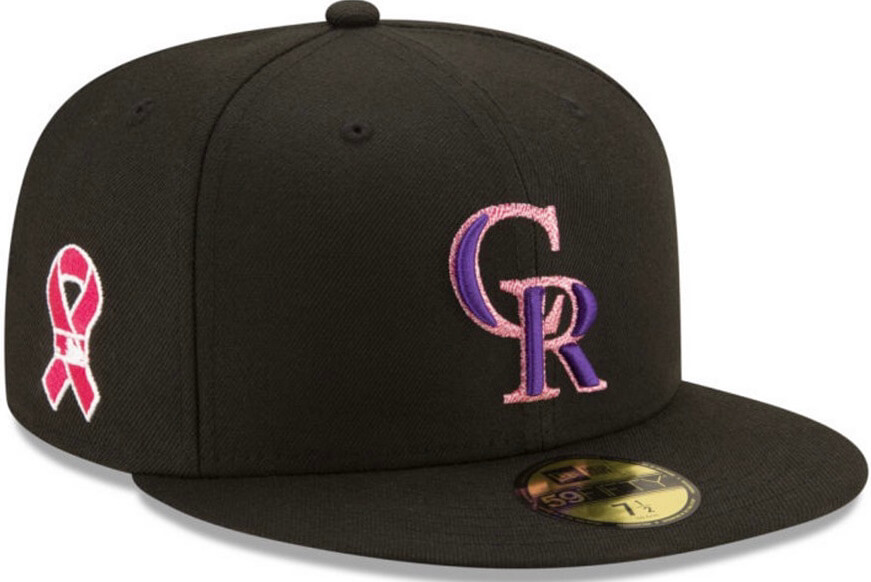
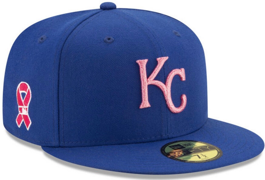
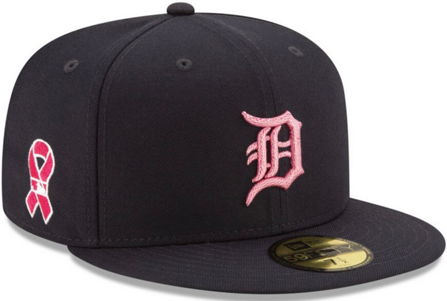
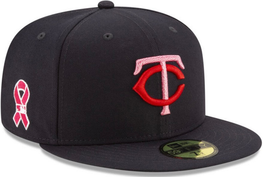
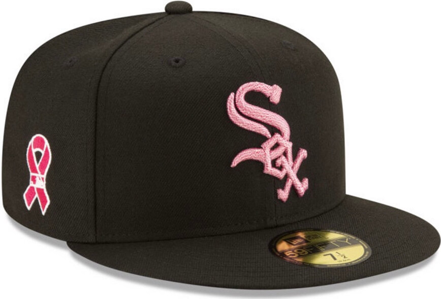
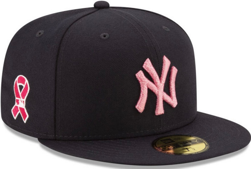
For all caps, click to enlarge
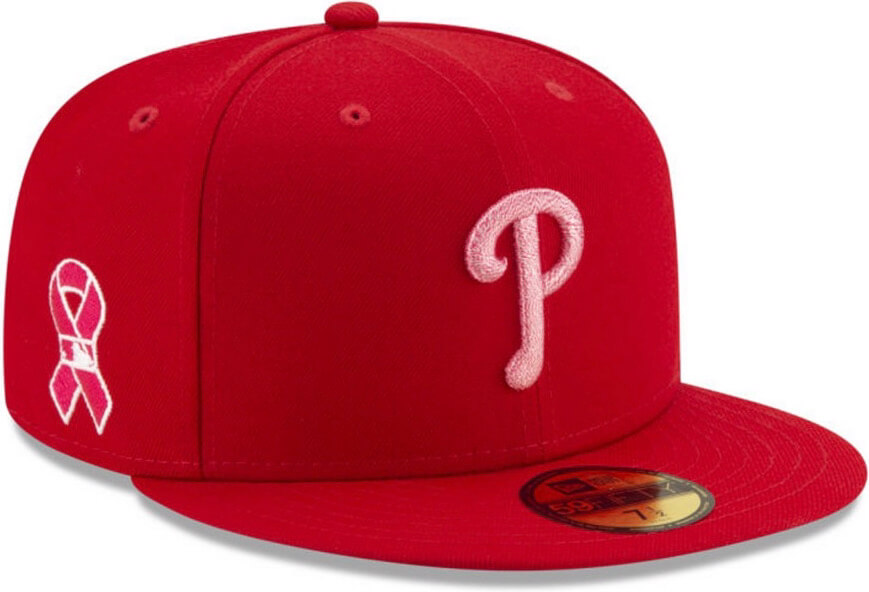
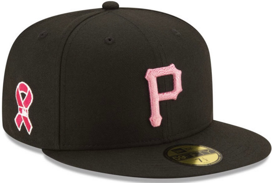
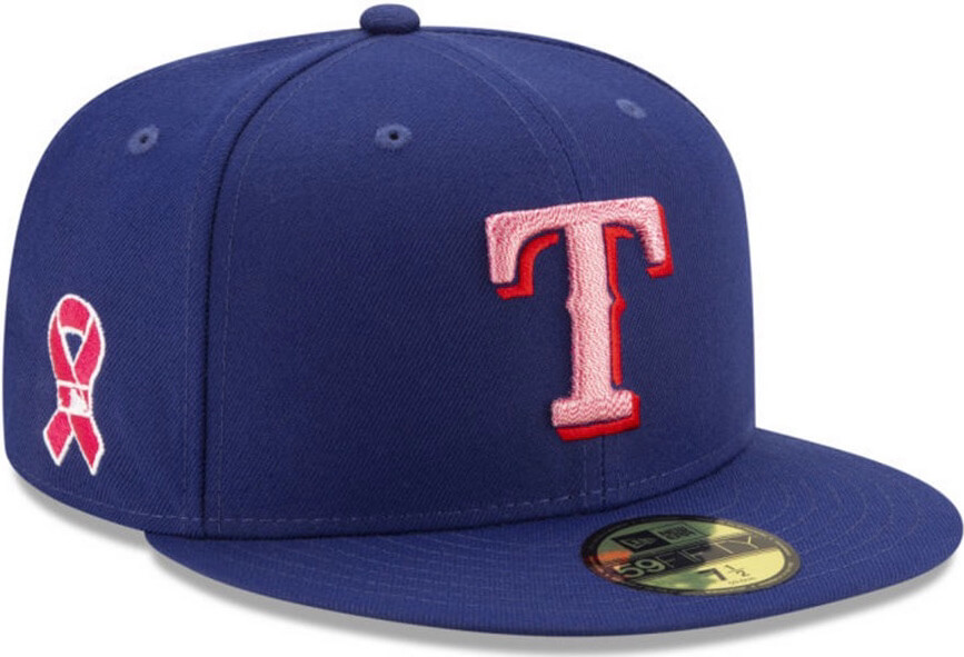
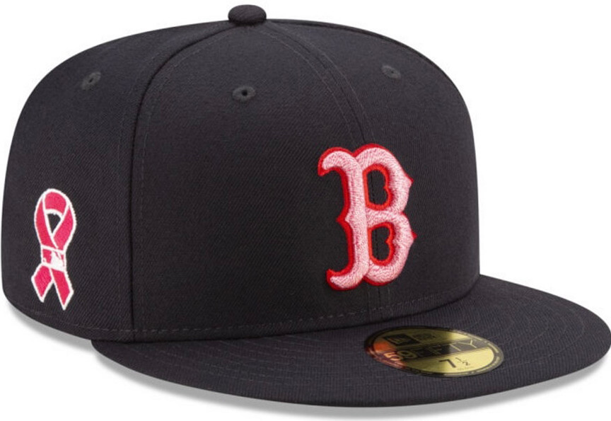
Almost all of MLB’s 2021 Ma’s Day caps briefly leaked yesterday on the Macy’s website. As you can see from the six designs shown above, they’re going with a simple (and mostly brutal) design approach this year, changing the standard cap logos to pink. Looks awful to me, but this is the world we live in now.
Three teams — the Blue Jays, Rays, and Atlanta — were not shown in this leak. But here are the caps for all the other teams:
———
Let’s shift into FAQ mode:
They look like they got put in the wash with a red T-shirt and got stained when the shirt dye bled all over everything else!
Yes, they do.
That’s a weird choice for the A’s logo!
Yes, it is. Don’t recall seeing that before.
They’re not as bad as the ones with full pink crowns and/or visors!
No, they’re not. But they’re still pretty awful.
What about the maker’s mark and the MLB logo on the back — are they pink?
No, they’re in their usual colors.
Will there be pink-accented jerseys to go along with the caps?
They haven’t used holiday jerseys since 2018. In 2019, they had the pink caps but teams wore their regular jerseys with the pink ribbon patch, and my understanding is that they planned to do the same thing last year before the pandemic wiped out all of last year’s holiday dates (well, except for Labor Day, which MLB chooses not to recognize in any special way, presumably because you can’t pander about the labor movement the way you can about patriotism and cancer, plus someone might start pointing out that the caps and jerseys are made outside the USA, mostly by exploited workers, blah-blah-blah — but I digress). Here’s hoping they don’t do holiday jerseys this year either.
Are they going to wear these for the full holiday weekend, or just on May 9?
Except for Independence Day, they ditched the weekend format in 2019 and went back to wearing the holiday merch only on the actual holidays. Again, here’s hoping that’s the case this year.
Are the caps that leaked yesterday just the ones they had planned for last year?
I don’t know that for a fact, but it seems likely.
When will we see the caps for the other holidays?
Soon-ish, I’d think, but I have no specific info on that — sorry.
(My thanks to Macy’s for leaking the caps, and to Ken Bartelt for letting me know about it.)
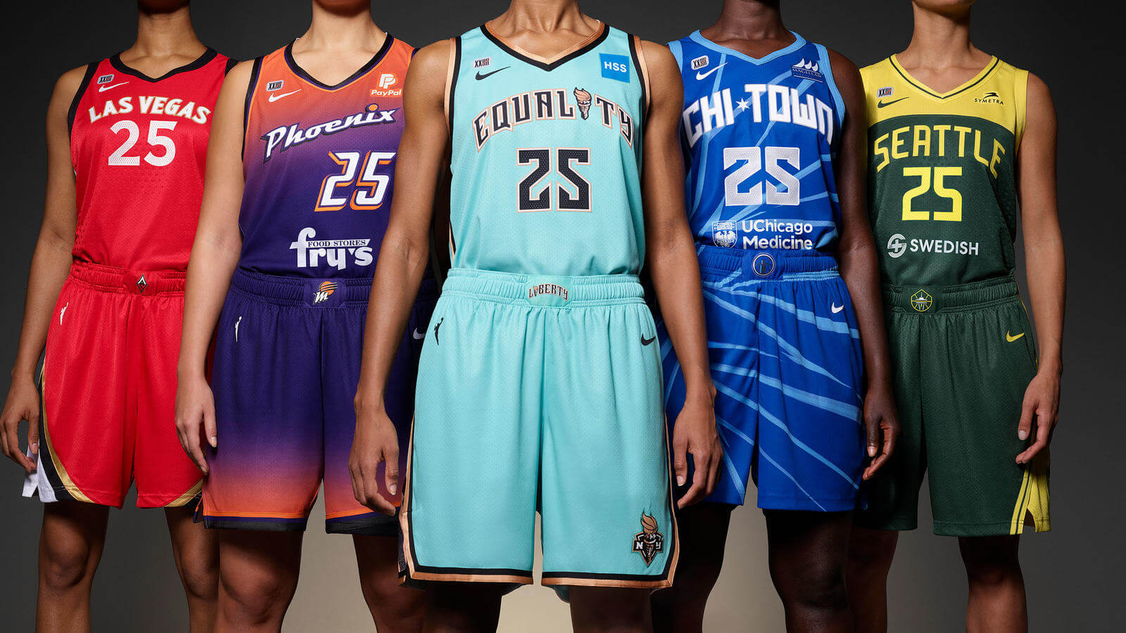
Click to enlarge
WNBA, NWSL Team Up for Big Day of Uni Reveals
By Jamie Rathjen
Thanks to several coincidences of timing, yesterday was a banner day, — possibly the banner day in a long while — for uniform releases in women’s sports. The biggest news came from the WNBA, which released three new uniforms for every team — the “Heroine,” “Explorer,” and “Rebel” editions. (Yes, the first letters of those words spell out “H-E-R.” Nike is nothing if not subtle.)
The major WNBA changes include the following:
• For the first time since 2015, each team has a white uniform.
• Ads, which previously were prominent on the jersey front, sometimes in place of a team name or insignia, have generally been moved to two spots: below the back numbers and to the same upper-left front spot as NBA ad patches. Some teams, but not all, also have them below the front numbers.
• The jerseys also have the WNBA 25th-anniversary logo as a patch.
One of the three uniforms for each team — the “Rebel” design — at least vaguely represents either the team’s city or some aspect of women’s empowerment while not necessarily sticking to team colors. You can see those jerseys here (click to enlarge):
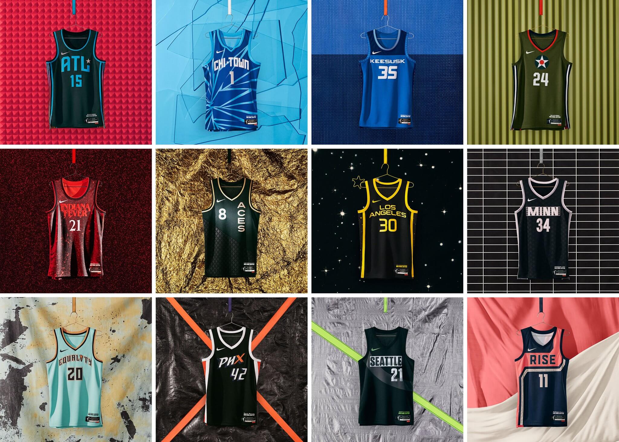
Two of the more obvious inspirations for these uniforms are the New York Liberty’s “Equality” design and the Washington Mystics’ design, which references the 19th Amendment to the U.S. Constitution. There are some outliers, though: The Indiana Fever chose to represent the Netflix series Stranger Things, which takes place in Indiana, and the Connecticut Sun went with an Indigenous theme by rendering “Sun” in Mohegan.
The other two uniforms are conventional colored and white options. Just as in the NBA, there are no home, away, or alternate designations. You can see each team’s two colored jerseys, but not the white ones, on this page, which also has lots of background info.
Meanwhile, yesterday also featured some uniform releases from NWSL teams (who’ve been procrastinating ahead of today’s season opener). The expansion Racing Louisville released their first two kits, and the newly renamed NJ/NY Gotham FC, formerly Sky Blue FC, did likewise with their first two shirts since Tuesday’s renaming.
Y'all want to see the full team in the kits? 🤔 pic.twitter.com/s9DlU2ubaS
— Racing Louisville FC (@RacingLouFC) April 8, 2021
Colossal/Black ‘21 https://t.co/tSxerjKVLM pic.twitter.com/KwoF2wbDWZ
— NJ/NY Gotham FC (@GothamFC) April 8, 2021
Kansas City NWSL, which moved from Utah in the offseason, also announced that they’ll wear a plain white shirt, at least for the season-opening Challenge Cup.
I’ll have more to say about those and other new releases in the NWSL next week, but it’s safe to say that Louisville’s dark shirt is the latest in a series of well-received NWSL shirts, and in general the league’s current designs blow MLS out of the water.
In still more women’s soccer news, Scottish Women’s Premier League club Forfar Farmington switched outfitters, from Adidas to Joma, and released a new kit:
Our new kit sponsored by @DirectSoccer, will get its first run out this Sunday live on BBC Sport Online, as we host Glasgow City at Station Park, KO 1pm.https://t.co/8hPMDjOFkR#localbusiness #SponsorshipOpportunities #fclub pic.twitter.com/nHKqMLnAFR
— Forfar Farmington FC (@Farmington_FC) April 8, 2021
That change comes even though they’re in the middle of the recently restarted SWPL 1 season, and surely makes the town of Forfar one of the smallest places to have a pro team showcased on Uni Watch above the Ticker!
Our Opening Week threads: #For44 and #ForKnucksie 💙❤️ pic.twitter.com/Ox4heiPeTK
— Atlanta Braves (@Braves) April 9, 2021
Atlanta update: For a week now, we (or at least I) have been wondering if Atlanta would move their rear-cap memorial patches for Henry Aaron and Phil Niekro to the right-sleeve spot that suddenly became available when MLB decided to move the All-Star Game out of Georgia. I figured if they were going to give Aaron and Niekro the proper sleeve treatment, they’d do it for their home opener, which is today.
Instead, they announced last night that they’ll honor Aaron and Niekro by wearing 1970s throwbacks for “Opening Week.” Their first homestand is indeed seven games in seven days, so the plan is apparently to wear these throwbacks for that full week.
Although I haven’t confirmed this, I’m fairly certain that this was the team’s plan all along for the first homestand, irrespective of the All-Star drama. Meanwhile, we’ll have a wait until they go back on the road next Friday to see what happens with the cap memorials, the sleeve situation, and so on (well, unless they make some announcement before then).
Meanwhile, still no All-Star patch for the Rockies. I’ve asked them about this and will report back if they respond.

Podcast reminder: For this week’s podcast episode, Chris Creamer and I talked about the Red Sox’s new yellow “City Connect” uniforms, plus we have the second and concluding part of our interview with Dodgers senior design director Ross Yoshida, who gave us a scoop about how the Dodgers almost ended up wearing purple in the late 1990s!
In addition, we discussed the situation regarding the 2021 MLB All-Star Game patch now that the game has been relocated from Atlanta to Colorado, plus the question of the week and more. It’s a really good episode!
As always, you can listen to us on Apple, Google, Stitcher, TuneIn, and Spotify, or just use the player below:
The show notes for this episode, which include photos of many of the things we discussed, are here. Those photos (and some additional ones) also appear in the video version of the episode, which you can see here:
Please consider supporting this episode’s advertisers, Streaker Sports (get 20% off any order with checkout code UNIFIED), Ebbets Field Flannels (10% off, except on NFL items, with checkout code UNIFIED), and Homefield Apparel (15% off with checkout code UNIFIED).
Enjoy the episode, and thanks for listening.
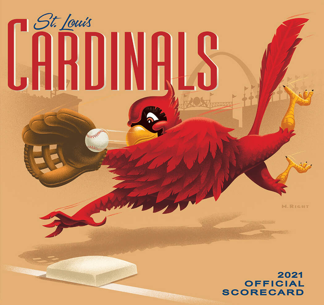
Click to enlarge
Hot corner: The Cardinals have a history of great program/scorecard covers, and this year’s is no exception. What a beauty!
(Big thanks to Kevin Eckhoff for sending this one my way.)
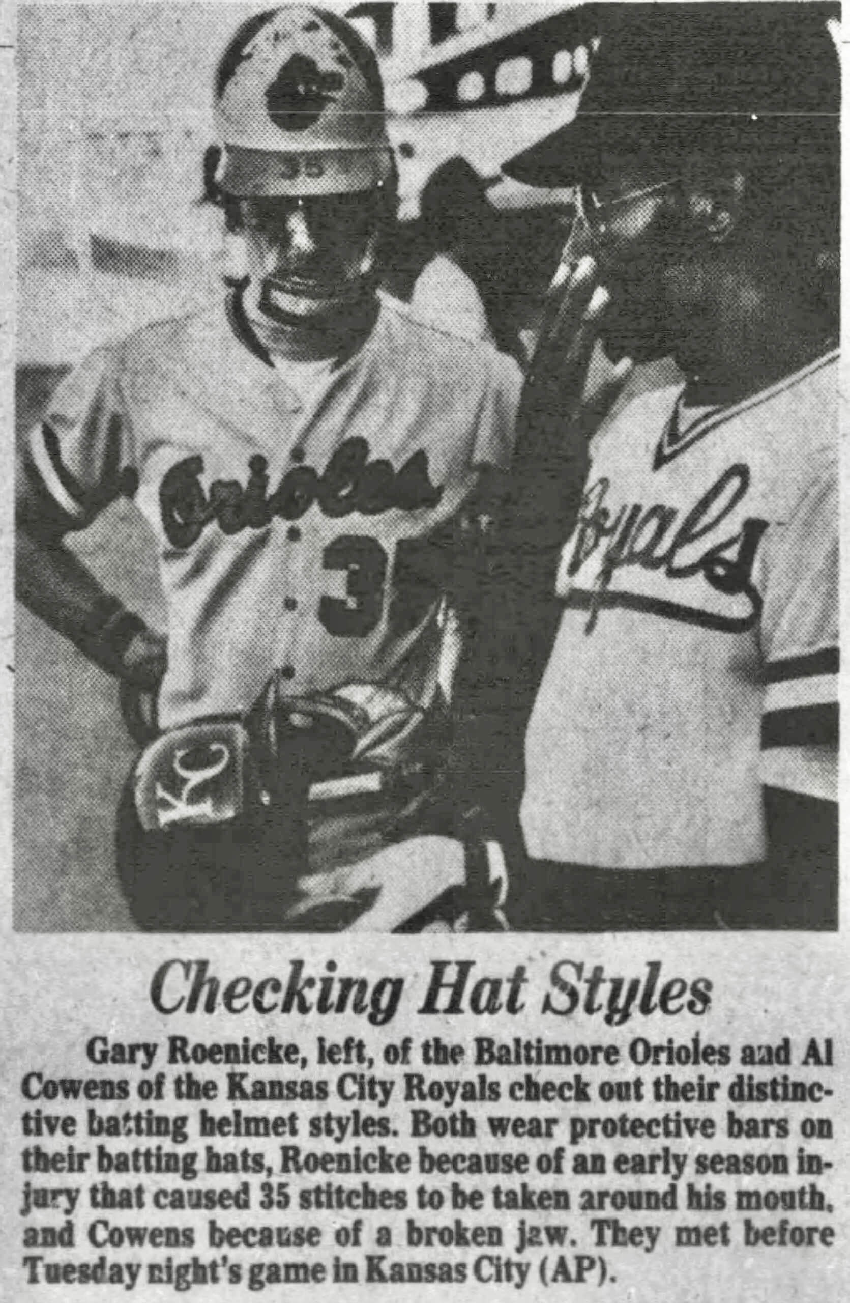
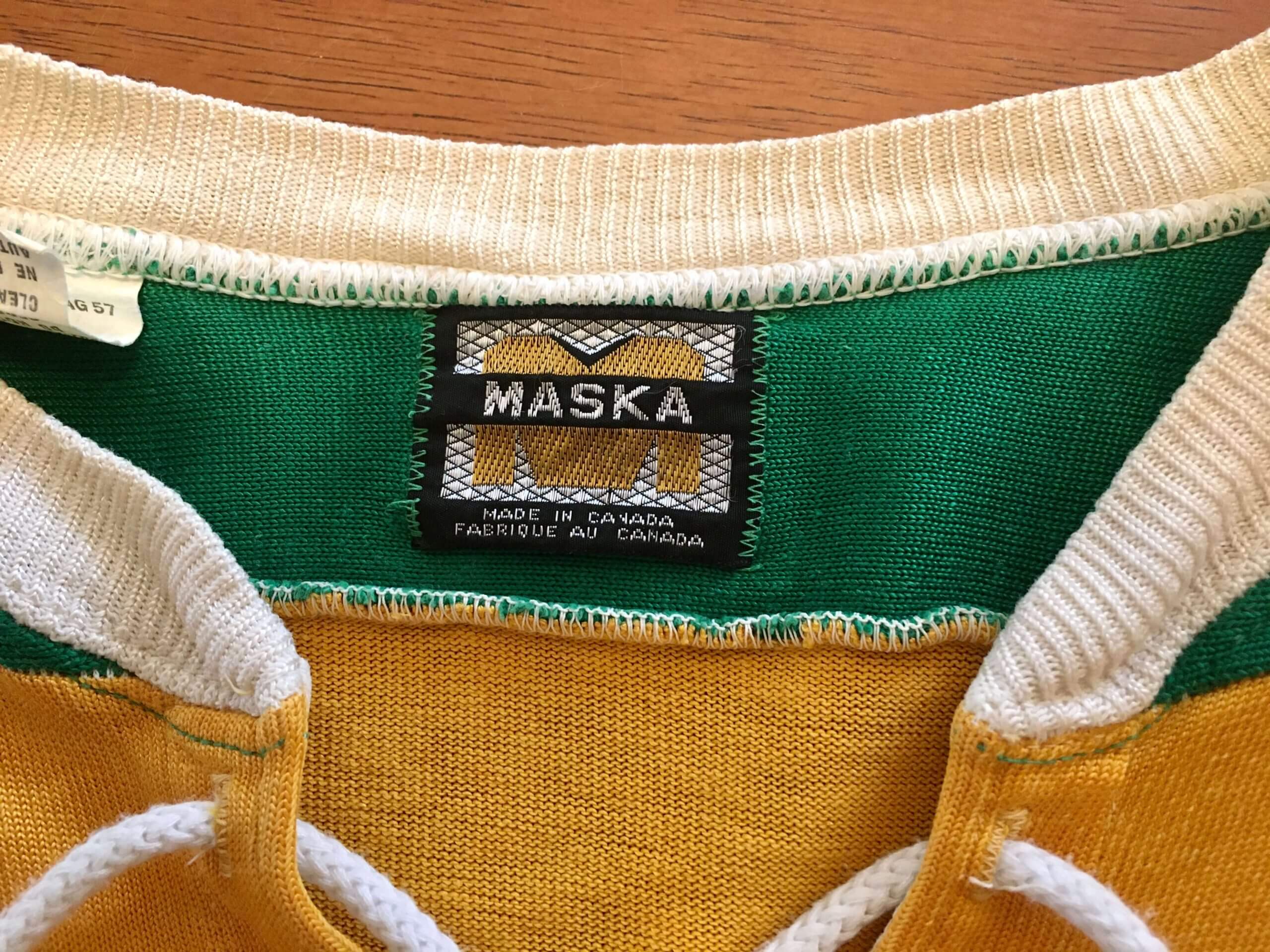
Click to enlarge
Mask mystery: I’ve always been fascinated by MLBers who’ve worn masks connected to their batting helmets after suffering facial injuries. That definitely includes Orioles outfielder Gary Roenicke, who wore a football-style facemask in 1979 (as immortalized on one of his Topps cards).
The photo above, which appeared in The Hartford Courant on May 30, 1979, shows Roenicke comparing headwear with Royals outfielder Al Cowens because, according to the caption, “Both wear protective bars on their batting hats.”
I don’t know about you, but I can’t discern the mask on Cowens’s helmet — frustrating! Moreover, I’d never seen a photo of him wearing a mask, so I went looking for one. No dice. Grrrrrr.
If anyone can shed some light on this situation of Cowens apparently wearing some sort of protective attachment on his batting helmet in May of 1979, I’m all ears. Thanks.
(Big thanks to Matt Edwards for finding and sharing this photo.)
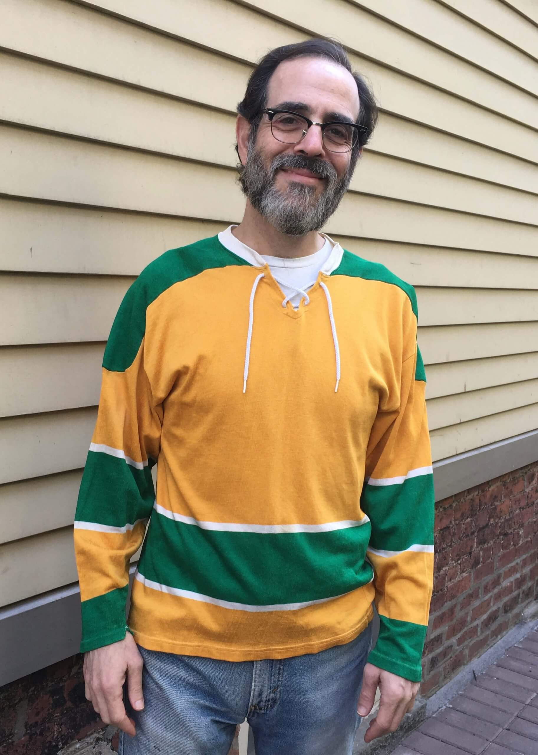
Click to enlarge
Sweet: Earlier in the week I mentioned that I’d scored a vintage Golden Seals blank jersey on eBay for a mere 35 beans. It arrived in the mail yesterday, and I absolutely could not be happier with how it fits — it really looks and feels like it was made for me.
As a bonus, check out the tagging:
Isn’t that great? The jersey on the tag mimics the actual jersey — very meta!
Here are two more shots:
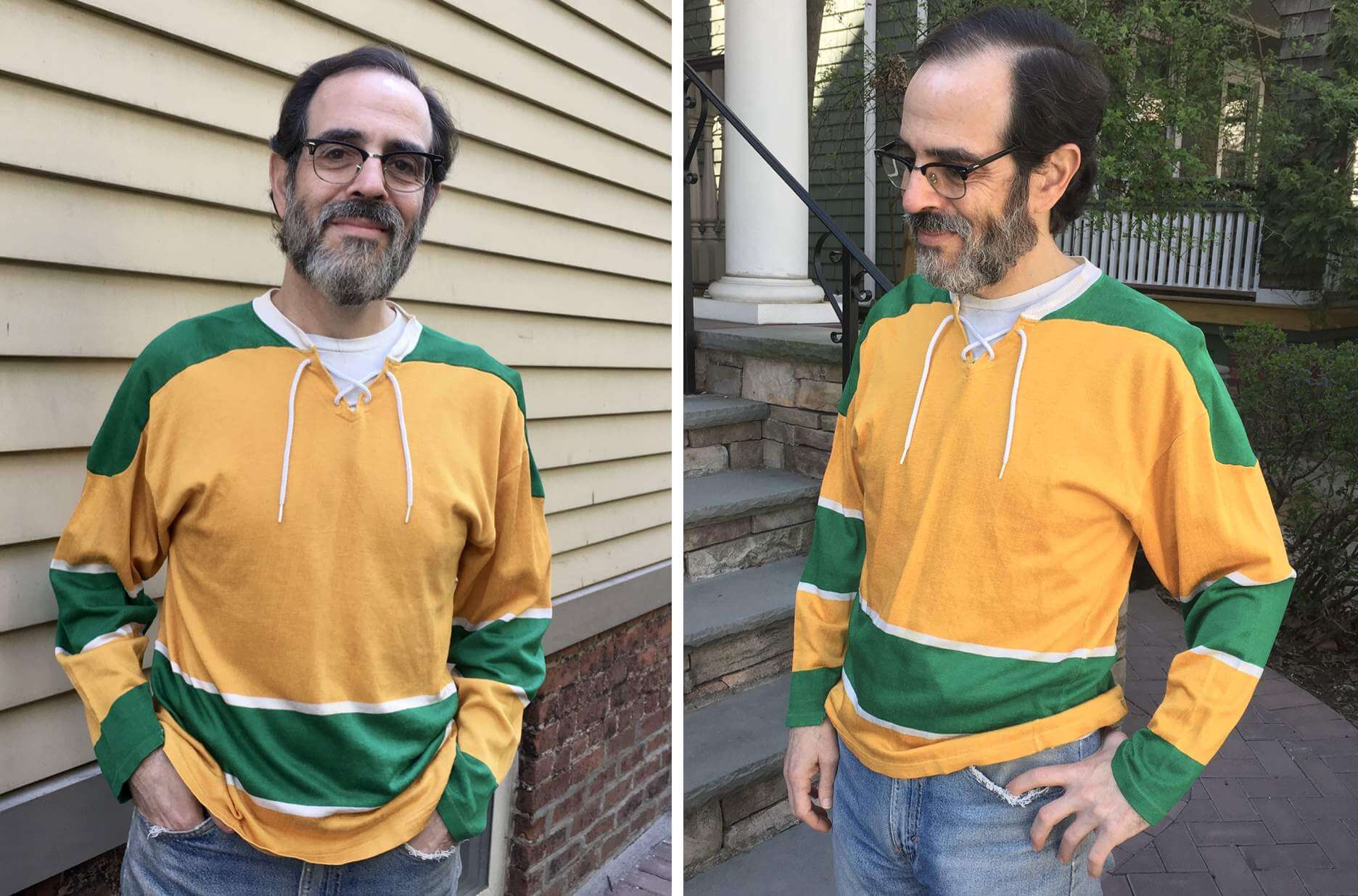
A very satisfying purchase. Now the only question is whether I should leave it as is or put a big winged stirrup crest in the center of it. Hmmmmmm…..
Click to enlarge

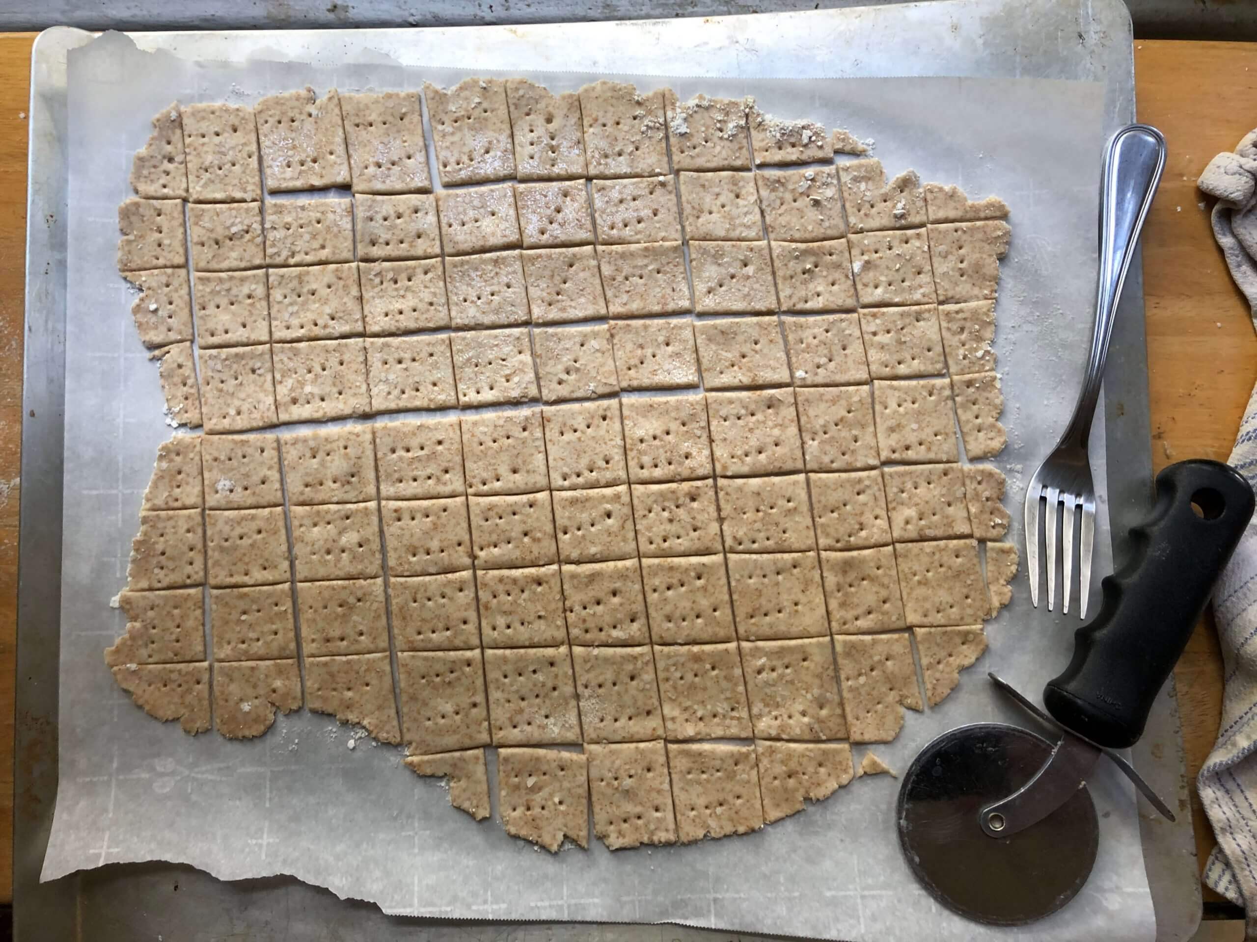
Culinary Corner: The Tugboat Captain, like so many people during the pandemic, has been making a lot of sourdough bread. She usually uses the discard to make sourdough waffles (we have a shitload of those in our freezer), but this week she decided to make homemade sourdough wheat thins! They turned out really well, plus they form a very pleasing grid pattern on the baking sheet. The photo above shows some of the raw dough before it went into the oven, and here are some shots of the finished product:
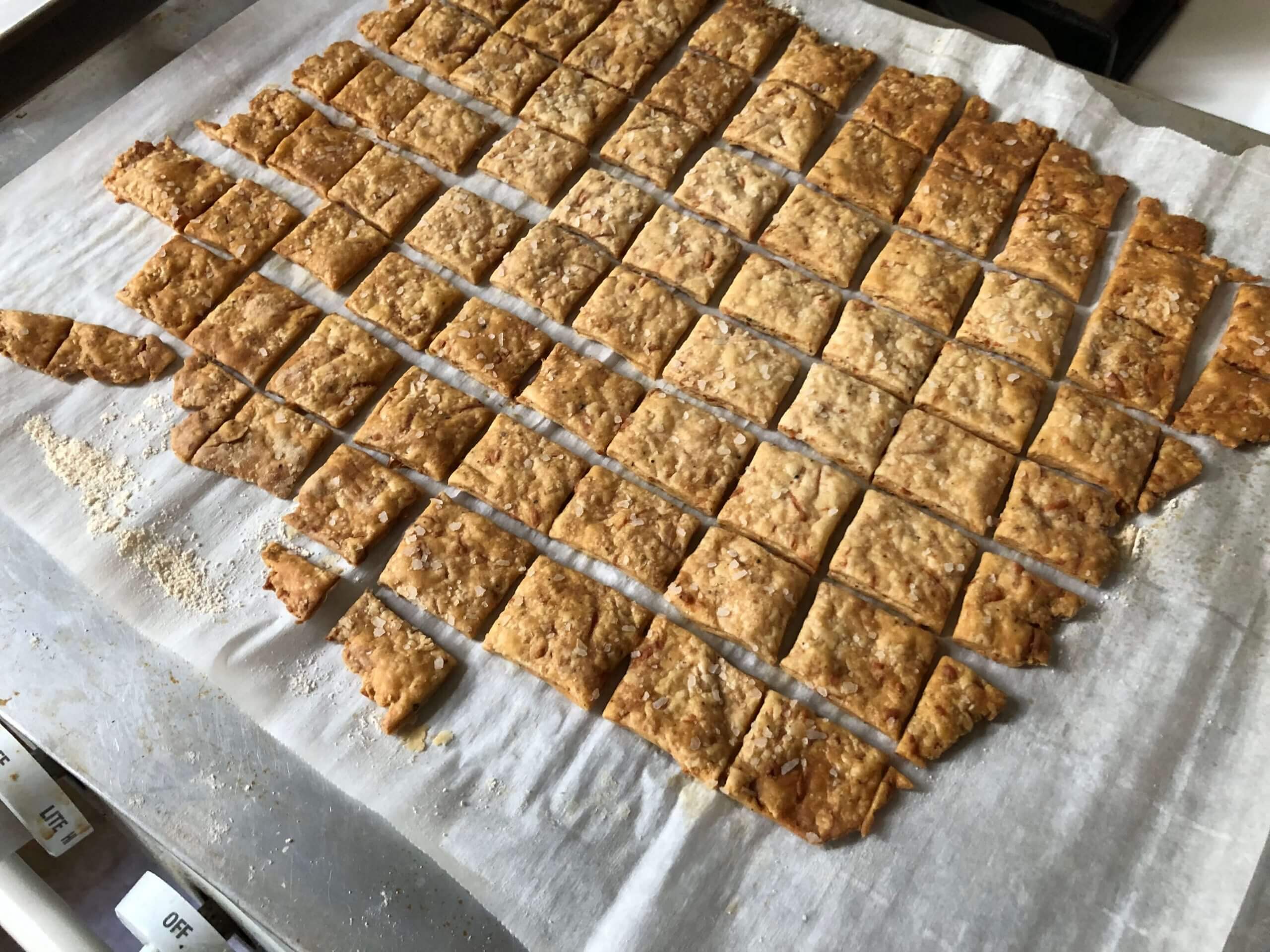
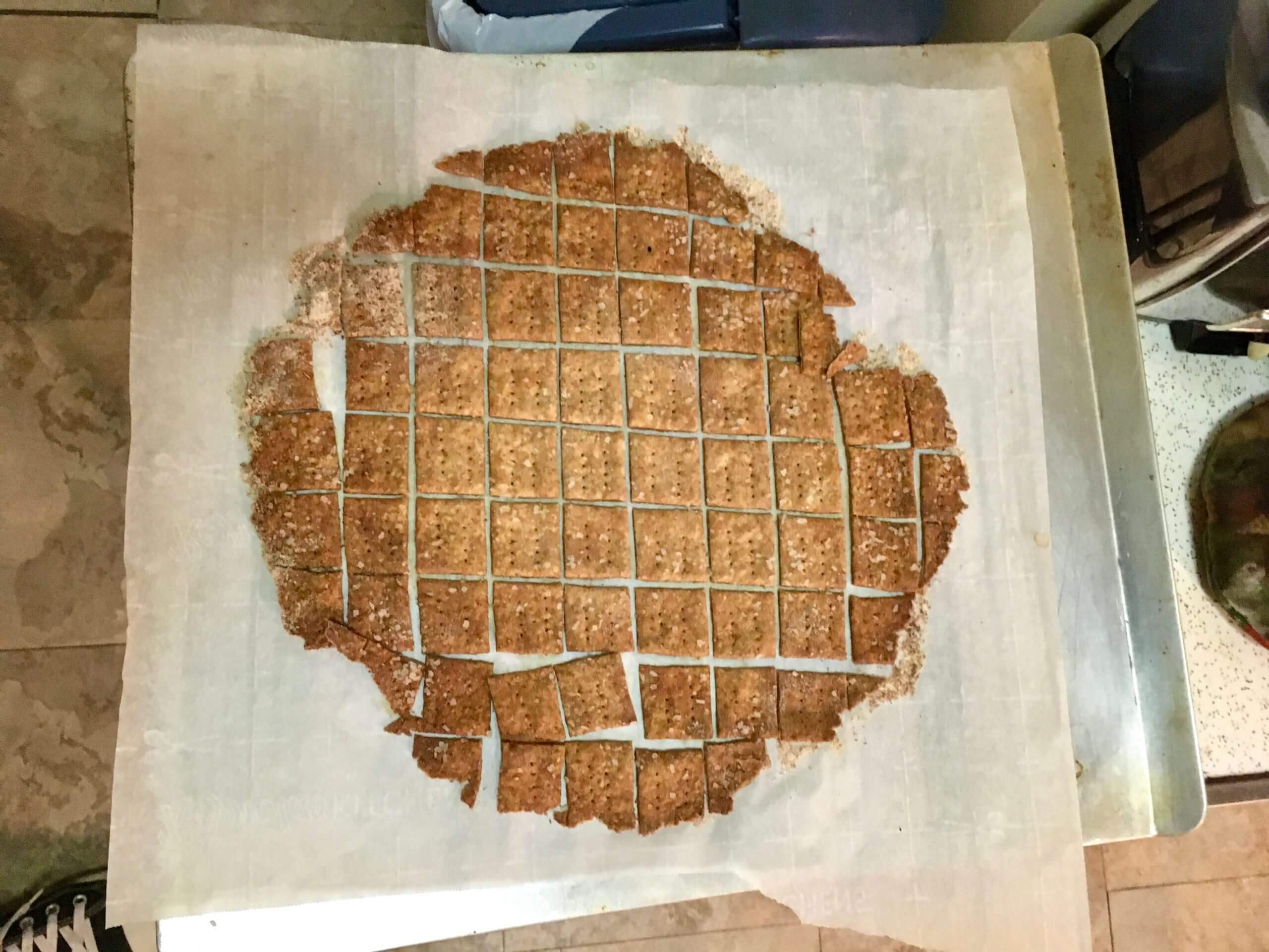
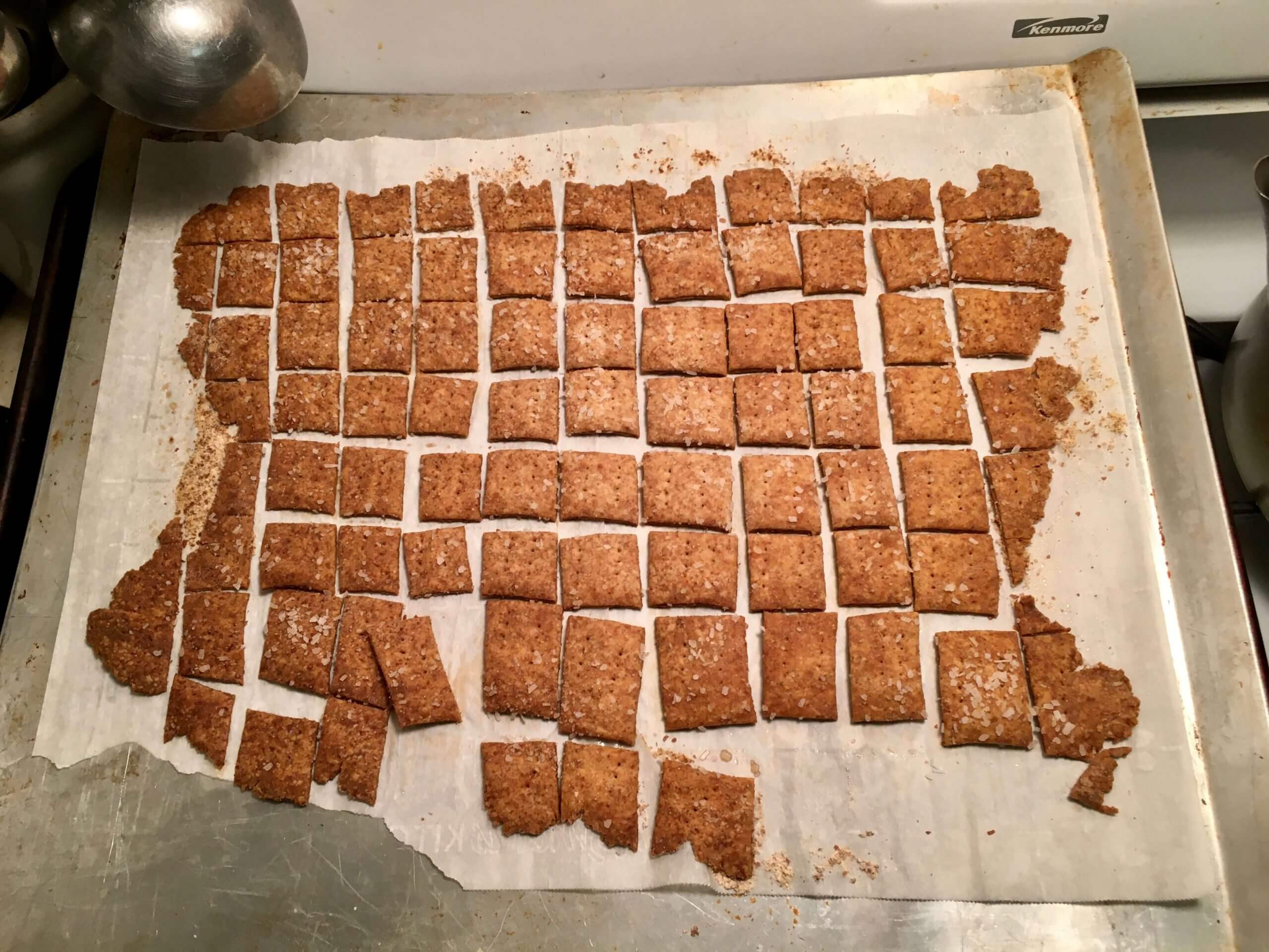
Cool-looking, right? That last photo looks a bit like a map of the lower 48!
Addictively tasty, too.

Membership update: Card designer Scott M.X. Turner is always upping his game. Lately he’s come up with a speckle effect that really makes gold elements pop, as you can see here on Sam Mostow’s card, which is part of a new batch that’s been added to the membership card gallery and is based on the Nats’ gold-trimmed championship jersey from last year. Great work!
Ordering a membership card is a good way to support Uni Watch (which, frankly, could use your support these days). And remember, a Uni Watch membership card entitles you to a 15% discount on any of the merchandise in the Uni Watch, Uni Rock, and Naming Wrongs shops, plus the discount also applies to our Uni Watch Classic Cap. (If you’re an existing member and would like to have the discount code, email me and I’ll hook you up.)
As always, you can sign up for your own custom-designed card here, you can see all the cards we’ve designed so far here (now more than 3,100 of them!), and you can see how we produce the cards here.
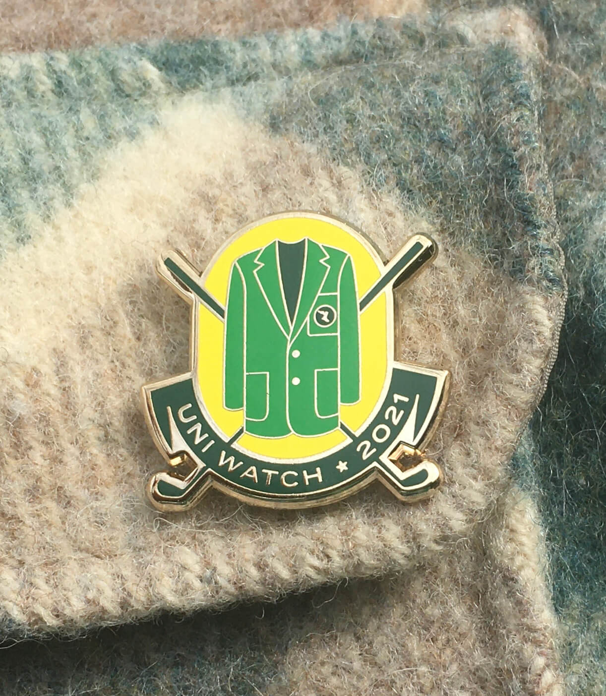
Pin Club reminder: With the Masters now under way, here’s one last reminder about the Uni Watch Pin Club’s April release, which has a golf/Masters theme. It’s a numbered edition of 200, with each pin individually numbered on the back, and there are now about 60 remaining. It’s available here, and we’re donating all the profits from this one to Fair Fight. (You can learn more about why we’ve chosen to do that here.)
The Ticker
By Anthony Emerson

Baseball News: Cap chaos in yesterday’s Mets/Marlins game, as Mets P Miguel Castro mistakenly wore the team’s alternate home cap and Marlins manager Don Mattingly wore his team’s BP cap (from multiple readers). … Authentic versions of the Red Sox’s City Connect jerseys will retail for an eye-popping $435 (thanks, Phil). … A’s P Cole Irvin appears to still be using the glove from his Oregon Ducks days (from Brendon Smith).

Football News: A new Vicis helmet has received the best score ever in the Virginia Tech youth football concussion tests. … The XFL’s Houston Roughnecks, who were being sued by the NFL for trademark infringement over their very Oilers-esque helmet logo and Patriots-esque alternate logo, have chosen to drop said logos (thanks, Phil).

Hockey News: Rangers RW Vitali Kravtsov had his NOB misspelled last night (from multiple readers). … A ski resort in Idaho has a new logo that looks very similar to the Kraken’s logo (from Eric Taylor). … The Islanders have revealed the sweater numbers of new acquisitions Kyle Palmieri and Travis Zajac (from Jacob Zaldin).

NBA News: New NBA uni number news from Etienne Catalan: Heat C Dewayne Dedmon will wear No. 21 and Rondae Hollis-Jefferson will wear No. 2 for the Blazers.

Soccer News: Haitian side Arcahaie has some uni number size inconsistencies during the CONCACAF Champions League (from Bob Wilmot). … Neither Ajax nor Roma can wear their primary kits for their Europa League quarterfinal, as it’s been decided that they clash (from our own Jamie Rathjen). … Napoli’s new kits have leaked and they are, uh, something all right (thanks, Phil).

Grab Bag: New athletics logo for Lawrence University in Wisconsin (from Kary Klismet). … T.C. Williams High, the school featured in Remember the Titans and the largest high school in Virginia, is being renamed to Alexandria City High School. The school’s original namesake, Thomas Chambliss Williams, was a longtime segregationist (from William F. Yurasko).

Today is my indestructible mom’s (97th!) birthday, so I’m heading out to see her. And this time I’ll be permitted to hug her! My brother, who I haven’t seen in well over a year, will be there as well, so this will be a long-overdue family gathering.
Have a great weekend, enjoy Phil’s weekend, and I’ll see you back here on Monday. — Paul
A big winged stirrup would be great.
What number would you add, if you could?
Probably 7. But my instinct at the moment is to leave it blank. I like classic hockey jersey templates — the color blocking and striping feel Just Right. It makes a great pullover shirt as is, and my current inclination is to leave it that way.
As much as my own instinct is to sew something on anything, if that was my jersey I’d leave it blank! Perfect the way it is.
The pink in the Marlins cap actually looks appropriate. Can’t say the same for any of the other teams.
Agreed about Miami, but Washington also works for me, given the city’s cherry blossom traditions, including the cherry trees inside Nationals Park behind left field.
But more broadly, the Nats, Reds, and Twins versions serve as “proof of concept” for me that a red-and-pink color scheme could look good, especially with a dark accent or secondary color. Whereas the Phillies version demonstrates that pink and red don’t work together well without a dark accent to provide some contrast.
Pink and black work well together, as fans of Brett “The Hitman” Hart will attest. So the teams such as the Pirates and Giants don’t look bad at all here.
I 100% agree on the Marlins.
& will add that the Mariners really pairs nicely for me too.
RS – I like your point on the cherry blossoms. Possible city connect? However I disagree on the other reds. All of the red w/ pink looks like a color bleeding to me.
I feel the pink works best on its own with very dark (black/navy) or paired with another pastel color.
I was going to say the same thing. Miami should adopt that as their logo. It goes really with their color scheme.
This may have been answered already and I missed it, but was wondering something about the Mets Seaver patch. I’ve read that the Mets darkened their colors in 1993 and trucolor confirms this, so is the patch using the current team colors or the Seaver era colors? Probably not something you can answer, but it is interesting considering they’d be using colors similar to but not exactly of his era.
Trust me — there’s nobody in the Mets organization who even knows that they changed the shade of blue in 1993.
Yeah kinda figured that. Wonder what the purpose even was for darkening the colors.
They should’ve sold the Sox jerseys for $617 because that would “tell a story”
All-time great comment.
Genius!
I can’t believe I’m saying this, but that should be the permanent Marlins cap (if they keep their color scheme). When watching the Marlins in their black uniforms yesterday, there were instances where the jersey looked completely blank except for the stupid white Nike logo.
The Marlins mother’s day hat actually makes the logo more visible.
Marlins are a team in the category of Got It Right The First Time. The original teal, black, and silver uniforms and their later tweaks still better than the 2 looks they have adopted since becoming the Miami Marlins. Won the World Series twice with that original look.
I agree! Love the original Marlins uniforms and that’s what they should go back to. They had too much black in the later iterations of the original uniform by the time the early 2000s rolled around.
I do not think of black when I think of Florida. Florida makes me think of light, soft colors. That’s what the teal does.
Pink squatchees would be the icing on the cake for those Mothers’ Day caps, right?
I think it’s embarrassing that to honour Mom’s, they just splash pink. What says Mom better than a dated cliche that girls like pink!? I think it’s actually pretty lame, and am wondering why they don’t put every team in blue for fathers day.
I’m wondering where pink is across pro sports, and why isn’t there more of it? (or why is there so little of it?) I know that marketing likely has something to do with it, but the only two examples I can think of are Palermo (Italian soccer team), and periodically the Scottish national soccer team (though they would wear it is a seemingly primary jersey, it has only been done in stretches).
Do you forget that they did have teams in blue (usually powder blue accents) for Fathers Day in prior years?
I could be wrong, but I believe the pink on Mother’s Day thing began as a tie in to breast cancer awareness. It’s certainly the reason for it now as evidenced by the ribbon on the side of the caps. And they do put every team in blue for Father’s Day. Prostate cancer awareness.
Miami’s MLS team wears pink as another example, but yes it’s a color that’s not represented very much.
The Giro d’Italia also has a pink leader’s jersey because the sports newspaper La Gazzetta dello Sport, which started and still runs it, uses pink paper.
Scotland wearing pink (usually with yellow so it’s called “primrose and pink”) is a reference to link, and that was limited to a few times primarily in the early 20th century, but was also revived recently.
Precisely because pink is not that common of a team color, you’ll also see it on goalie and clash shirts, and in fact there is a Puma template this season that uses it (link is one example).
It is pretty interesting that apparently the concept of applying pink and blue to represent gender didn’t really start until the mid-19th century. But originally, pink was considered the masculine color and light blue was feminine.
This seems to be the case even as late as the early 20th century. It was only around WWII that retailers and marketers flipped the two and it caught on. Nothing I’ve read really explains what the reasoning was.
Growing up as a Phillies fan, I remember Curt Schilling pitching on sweltering hot days in Veterans Stadium. He would sweat so much, his red cap would bleed and turn the Phillies logo pink. The Mother’s Day caps look terrible, but at the very least I’m thankful that seeing the Phillies cap took me down memory lane.
Are you sure it wasn’t from ketchup packets?
LOL true, can’t be sure!
Apparently, these colors do run.
That Phillies hat looks like my current Phillies hat. Which I bought when they changed their uniforms in 1992.
The A’s hat is interesting, its the O from their inaugural jerseys when they moved to Oakland. Wouldn’t mind that as an altnernate hat (Though a gold O, not pink)
It’s their ‘tertiary’ logo
Anyone else notice the sponsorship on the Louisville FC… GE Appliances?
Does marketing appliances to a female audience feed into a classic sexist point of view that “A woman’s place is in the kitchen or home”
Of course I do not believe very many (if any) people still seriously believe that. I think it is much more of a tired/old joke at this point, but I suspect there is at least potential it would offend someone. Any chance that is why they all folded arms & covered it in the main photo?
Any chance that is why they all folded arms & covered it in the main photo?
No. A team wouldn’t accept however much money for an ad and then decide they were embarrassed about it. And as with many women’s soccer teams, the ad is the same as worn by the corresponding men’s team (here, Louisville City).
In any case, there are and will be tons of pictures of players wearing it where they do not cross their arms.
Also, plenty of men (like me) watch women’s sports, so it’s not really a “female audience.”
The Oakland “O” also goes back to the PCL Oakland Oaks-forget what year. EFF has offered a version of that hat (in red and blue) at different times.
When Al Cowens was with KC he was injured by a pitch from Ed Farmer of the Rangers. This led to one of the all-time strange brawls. Farmer joined the White Sox and Cowens went to Detroit. One night, Cowens hit a routine ground ball but instead of heading to first, he went straight to the mound and jumped Farmer unexpectedly.
Al Cowens helmet photos coming to your email Paul.
Have a good weekend, Paul.
First, happy birthday to your mom! It is so awesome that she is still doing great at 97!
Second, out of curiosity, I thought you had gotten a talking to about “The Tugboat Captain” nickname because I noticed you’d started recently referring to her as Mary, lol. Glad to see it back, I always loved the nickname.
And third, holy moly do those Atlanta throwbacks look gorgeous. I don’t think I’ve ever been more tempted to buy a jersey of a team I could care less about!
I now use the nickname sometimes and the real name sometimes, depending on my mood.
And third, holy moly do those Atlanta throwbacks look gorgeous.
I hope they go the extra mile and create the ’70s-era pants… and royal blue stirrups. The first time around they used the regular home uniform trousers.
I think that these version of the Mother’s Day Uniform are the best. They aren’t going overboard with the completely pink cap or anything like previous years, but still they are able to incorporate the pink into it. I think the MLB finally got it right
The Chicago Sky colored uniforms have bunk storytelling (surprise surprise). Chicago’s grid is 8 blocks to a mile not 10 (like NY). Grid should be 8 x 8.
Paul, my vote is to leave the jersey as is. You are only the current caretaker/owner of it. Leave it as is for future generations.
Wishing your mom a very happy 97th (!) birthday, Paul. It’s wonderful that you’ll be able to spend it with her and your brother.
Ye gods, that Rockies hat is the worst of the bunch. They could have kept the CR with a silver outline and changed the purple to pink, but… ugh.
The pink Oakland O is a Vagina? Hard to unsee it. Way to go New Era.
Great news about your Mom and brother. Wishing you a joyous time with them. The Cardinals scorecard is awesome!
Paul, what’s up with the quarantine beard? Keeping it, or going back to the more groomed pre-pandemic facial hair? Does the Tugboat Captain have a preference?
We both like it. Probably gonna keep it.
I’ve been wanting the A’s to don an “Old English O” cap for decades!
Pity it’s pink.
Fingers crossed regular green gold and white one.
cycling team jumbo visma (which usually wear primarily yellow) looks like they’re doing something different for the tour de france. it’s not stated in the article, but I’d imagine it’s so it’s distinguished from the leader’s jersey. but they have three designs open to voting. here’s the article
link
To emphasize how much the Oakland cap doesn’t work, I assumed that was the ORIOLES’ Mother’s Day cap. I know the Old English “O” has history with both the Athletics and the PCL Oaks … but at this point Baltimore basically owns the letter, and that’s all there is to it.
One of the reasons Baltimore owns the “O” is because Oakland never cared to use it. The “A” (or “A’s”) is the eternal hat insignia of the Athletics, except for a few seasons in KC.
I like when the team wears “Oakland” on its jerseys as that creates the entire name when reading the uniform from head to toe.
It’s curious that all the W teams have white unis. The LA Sparks, for one, have never had white uniforms before. They’ve always been purple on the road and gold at home.
More from the designer doing the Cardinals’ scorecards: “OFFICIAL ST. LOUIS CARDINALS SCORECARD ARTIST SINCE 2003”
link
“They look like they got put in the wash with a red T-shirt and got stained when the shirt dye bled all over everything else!”
That statement reminded me of an old uni-centric commercial featuring Eric Lindros:
link
“Authentic versions of the Red Sox’s City Connect jerseys will retail for an eye-popping $435 (thanks, Phil).”
But it’s not about the merch, is it? Yeesh. I think my entire wardrobe of polo and dress shirts probably cost less than $435.
Thanks I’ve missed culinary corner recently, best of luck with you family this weekend.