This season, we tip our caps #For44 and #ForKnucksie 💙❤️ pic.twitter.com/CIAqoqh3jH
— Atlanta Braves (@Braves) March 31, 2021
Good morning! Today is April 1, so I want to begin by saying two things: First, I promise you that today’s Uni Watch post is 100% prank-free. No jokes, no fake news, no foolin’. All of today’s content is legit!
And second, it’s a safe bet that there will be lots of bogus uni content circulating on the internet today. So if you see something that sounds outrageous or gonzo or whatever, take a glance at the calendar before pulling your hair out and going bananas on social media. We’ll all be better off if we maintain a bit of healthy skepticism today!
Now then: Depending on when you read my annual MLB Season Preview yesterday (and if you haven’t yet read it, by all means do so now!), you may have missed the late-breaking news that the Braves will be memorializing Henry Aaron and Phil Niekro by wearing their respective uni numbers as small rear-cap patches flanking the MLB logo, as shown above. (They were forced to go this route because their jersey sleeves are already occupied by patches for the All-Star Game and the team’s sesquicentennial.)
Of course, there are countless previous instances of players creating impromptu memorials by writing someone’s number or initials on their cap. But is this the first time a team has used a cap patch as an official team-wide, season-long uniform memorial? The only vaguely similar example I can think of was on July 18, 2014, when the Padres wore a “19” cap patch for Tony Gwynn:
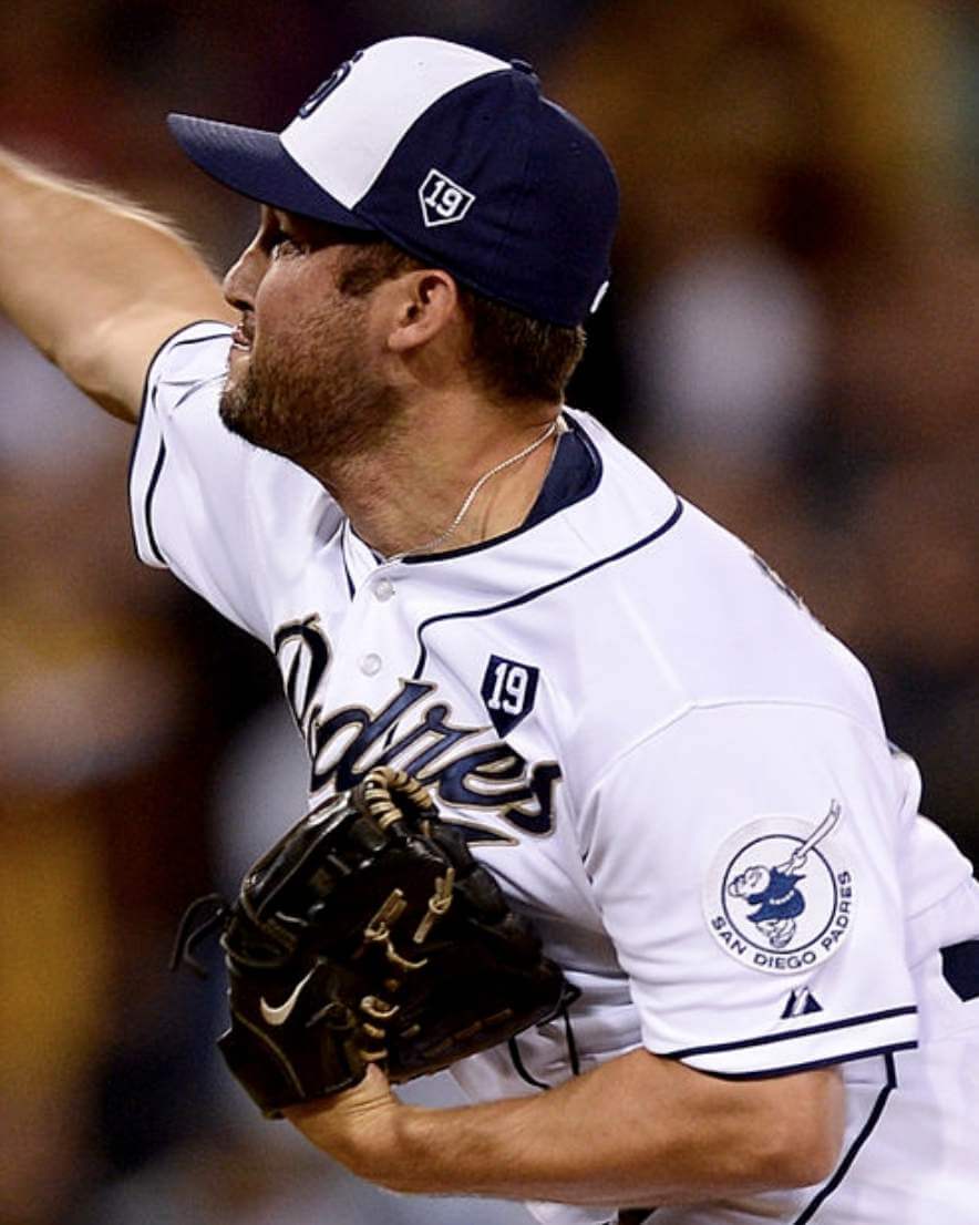
But as you can see in that photo, they also wore a jersey patch in addition to the cap patch. The cap memorial was only for that one game, while the jersey memorial remained for the rest of the season. The Braves’ cap memorials, by contrast, will have no corresponding jersey patch, and will be worn all season long. I think that might be an MLB first.
A few other late-breaking items that didn’t make it into the Season Preview piece:
• Speaking of memorials, we got our first look at how the Mets’ new pinstriped Tom Seaver patch will look on the team’s pinstriped home jersey. I think it’s fair to say that the combination of the two pinstripe patterns is a bit awkward-looking:
• Padres pitcher Blake Snell, who wore No. 4 during his years with the Rays, has been wearing No. 24 this spring. But now teammate Wil Myers, who had been wearing No. 4, has switched to No. 5, allowing Snell to reclaim his preferred single-digit number. This also means that when MacKenzie Gore, who wears No. 1, makes his anticipated MLB debut at some point this season, the Padres will have two single-digitized pitchers in their starting rotation.
• The Cubs have changed the flags at Wrigley Field, and have produced a nice little animation showing the changes:
As we welcome fans back to the Friendly Confines, be sure to look up!
The flags on the Wrigley Field roof will now honor Cubs Hall of Famers and postseason appearances. #CubTogether pic.twitter.com/6TXrkp3aGY
— Chicago Cubs (@Cubs) March 31, 2021
• The Cardinals’ regional TV network announced a change to their score bug design:
Here's how the "score box" will look on #Cardinals telecasts this season. @BallySportsMW said in a statement: "This placement enhances the space on screen for game action." pic.twitter.com/6weTvjJK9A
— Benjamin Hochman (@hochman) March 31, 2021
• One thing we haven’t yet seen: the Phillies’ memorial patch for Dick Allen. It was announced more than three weeks ago, but still no sign of the design. The Phils open their season today at 3pm, so we’ll presumably see it no later than that.
All 30 teams will be playing today, making this a true MLB-wide Opening Day (although four of the 15 games, including the one that includes my favorite team, will be played at night — booooo). Whoever you’re rooting for, make yourself a hot dog, pour yourself a beverage, and enjoy the annual return of Uni Watch’s favorite sport. Play ball!
Update: My favorite team’s game has been postponed. Now what am I gonna do with all these hot dogs and capers??
ITEM! New podcast episode: With the MLB season opening today, Chris and I interviewed Dodgers design director Ross Yoshida for this week’s episode of Unified — our first guest! You might think he doesn’t have a lot to do, since the Dodgers’ visual identity is so traditional and static, but he’s designed lots of the team’s sleeve patches, fixed their iconic script after it somehow got altered, and a lot more. This is the first installment of a two-part interview with him, which we think you’ll really enjoy.
As always, you can listen to us on Apple, Google, Stitcher, TuneIn, and Spotify, or just use the player below:
The show notes from this episode, which include photos of many of the things we discussed, are here. Those photos (and some additional ones) also appear in the video version of the episode, which you can see here:
Please consider supporting this episode’s advertisers, Oxford Pennant (get 20% off any order with checkout code UNIFIED), Ebbets Field Flannels (10% off, except on NFL items, with checkout code UNIFIED), and Tokens & Icons (free shipping by checking the “For Office Use Only” box and then entering the checkout code UNIFIED).
Enjoy the episode, and thanks for listening.
Click to enlarge
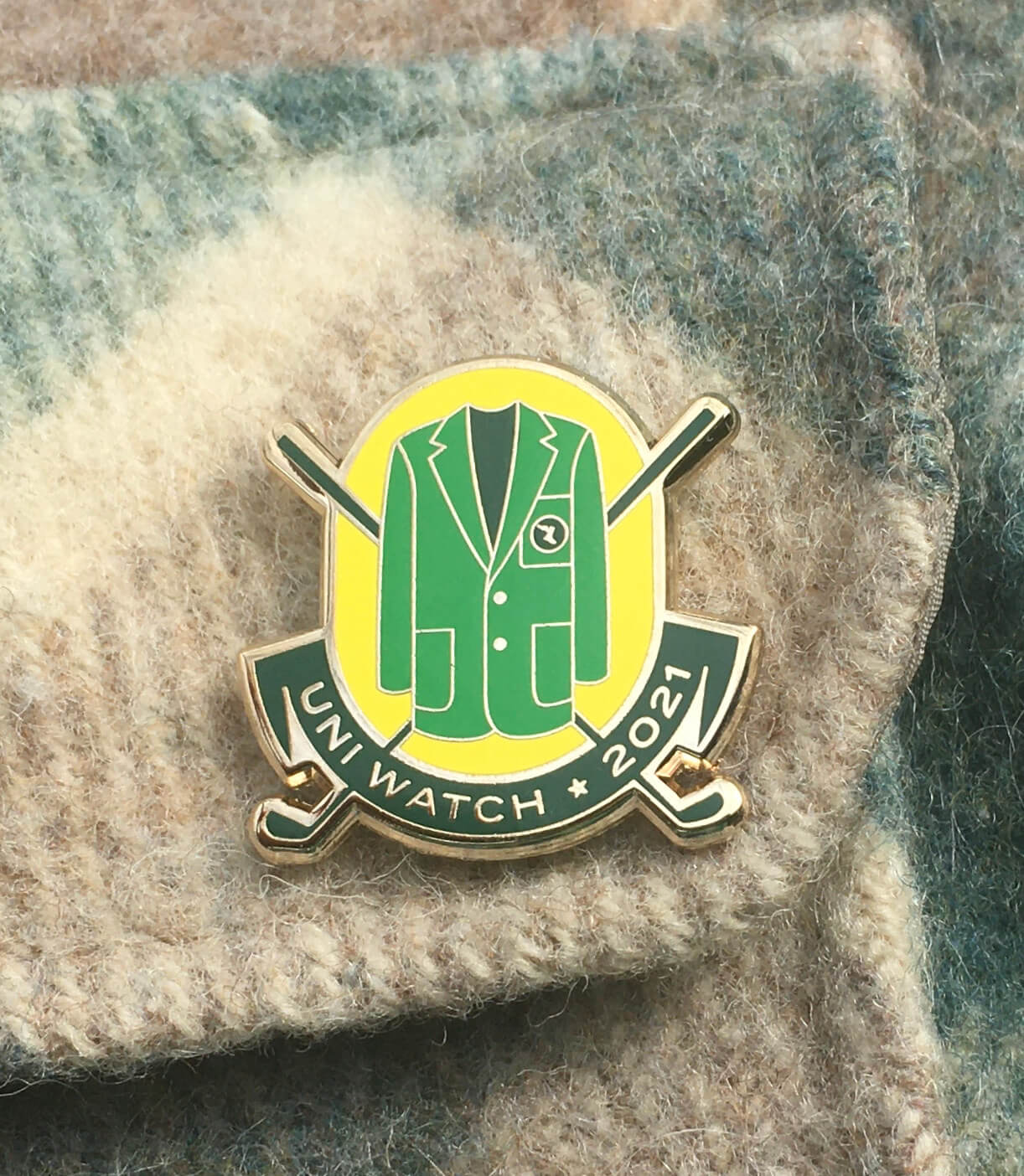
ITEM! April Pin Club launch: When we launched last year’s November pin, someone — I don’t remember who — said, “I thought you’d do a golf pin, since they moved the 2020 Masters to November.” Honestly, that hadn’t even occurred to me, but I liked the idea — after all, what could be more Uni Watch than the famous Green Jacket? So when pin designer Todd Radom and I were plotting out this year’s pin calendar, I said, “We should do a golf/Masters pin for April.” (Then we kept our fingers crossed that this year’s Masters would actually take place on schedule.) You can see the results above.
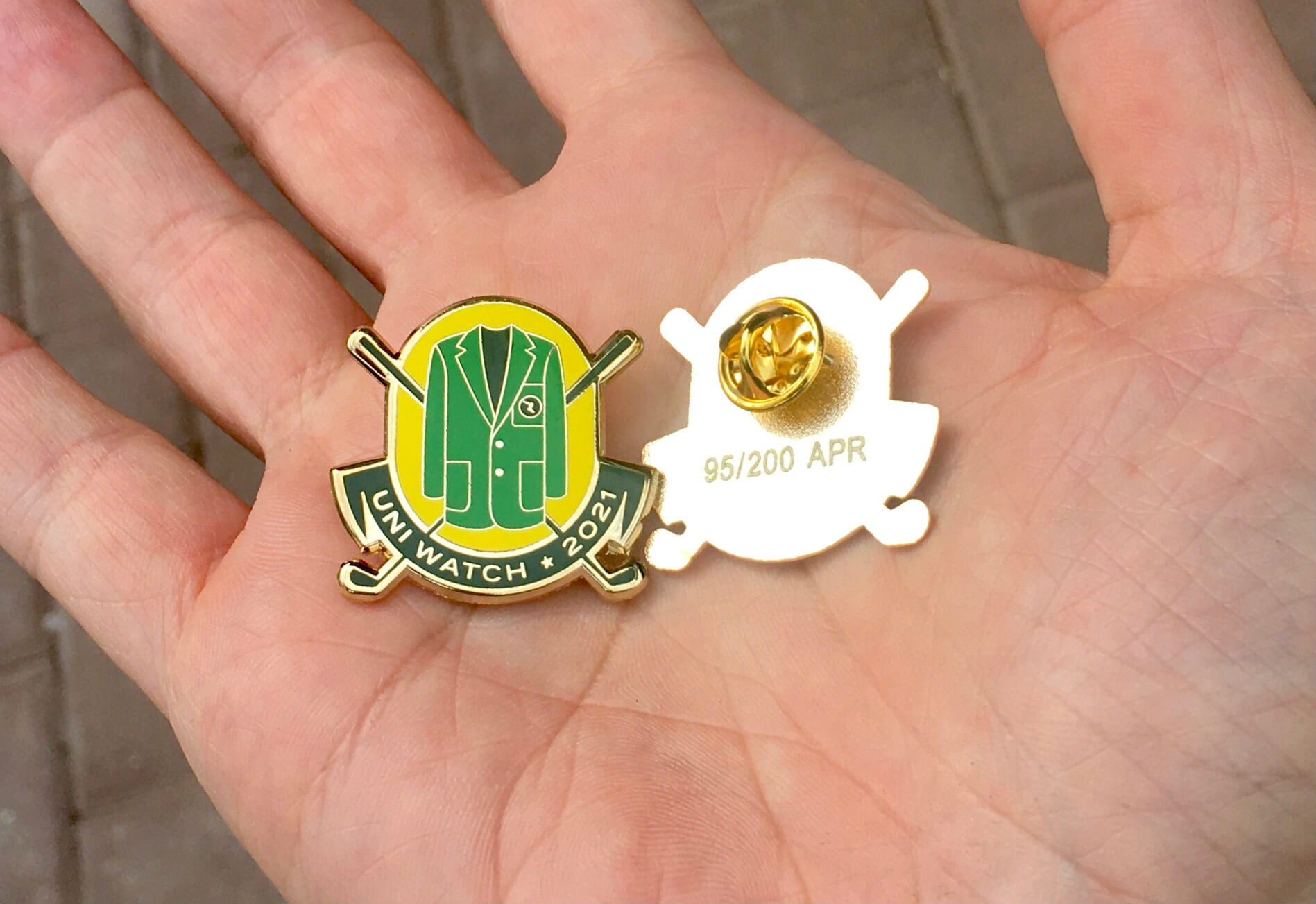
This is a numbered edition of 200 pins. As always, each pin is individually numbered on the back:
It’s a really good-looking pin, right? But here’s the thing: Georgia-based sports, including the Masters, have become a thorny issue over the past week or so. In response to the state enacting a set of restrictive voter-suppression measures, the MLB players’ union has talked about the possibility of moving the MLB All-Star Game out of Atlanta; Dodgers manager Dave Roberts, who would normally be skippering this year’s National League All-Star squad, has said he might opt out of the game; a number of Georgia-based companies, including the NFL’s Atlanta Falcons and the NBA’s Atlanta Hawks — both of which operated early voting sites last fall — have condemned the new law; and a civil rights group has said that the Masters should be moved out of the state.
Obviously, Todd and I didn’t foresee any of this happening when we designed and produced the pin. After talking about it, we’ve decided that this isn’t the right time for us to profit off of a playful visual reference to the Masters. We’re proud of this pin design and are happy to offer it for sale, but we will be donating all of the profits from this one to Fair Fight, the Georgia-based voting access group founded by Stacey Abrams.
We realize some of you may not like this approach, and that others may be sympathetic to our sentiments but wish we could just sell the pin without getting embroiled in politics. Frankly, so do we — but that’s not the world we’re living in at the moment, and this is the course of action that makes the most sense to us.
The pin is available here. If you need to get caught up, here are our January and February pins from this year (sorry, March is sold out), plus all of our remaining 2020 pins are available at a discounted price.
My thanks, as always, for your consideration of our products.
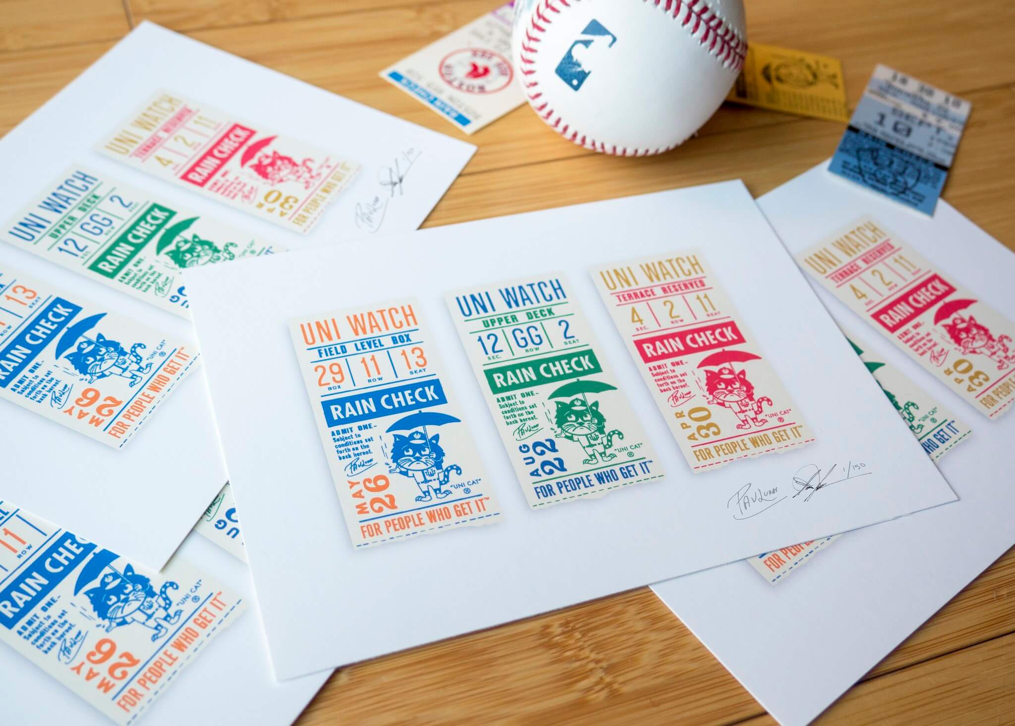
Click to enlarge
Going, going…: Todd and I are down to about a dozen of these museum-quality “Rain Check” prints, produced in a numbered edition of 150 and signed by each of us at a Brooklyn diner back in 2018. As I recently mentioned, we thought we had sold out but recently found a stash we had set aside and then forgotten about. If you want one, they’re available on Todd’s website until we run out.
The Ticker
By Paul

’Skins Watch: MLB’s Cleveland Indians have banned Native American headdresses and red face paint from their ballpark (from @DoogieStardust). … Skowhegan Area High School in Maine, which dropped “Indians” as its team name in 2019, is now engaged in a community debate about whether its new team name should be spelled “River Hawks” or “RiverHawks” (from Kary Klismet). … The Ontario Lacrosse League’s Mississauga Tomahawks will now be known as the Mississauga Badgers (from Michael Sullivan). … The Manitoba Junior Hockey League team formerly known as the Neepawa Natives will soon unveil their new identity (from Jim Wooley). … Frontier Regional School in Massachusetts, which recently changed its team name from “Redskins” to “Redhawks,” has unveiled new logos (from Kary Klismet).

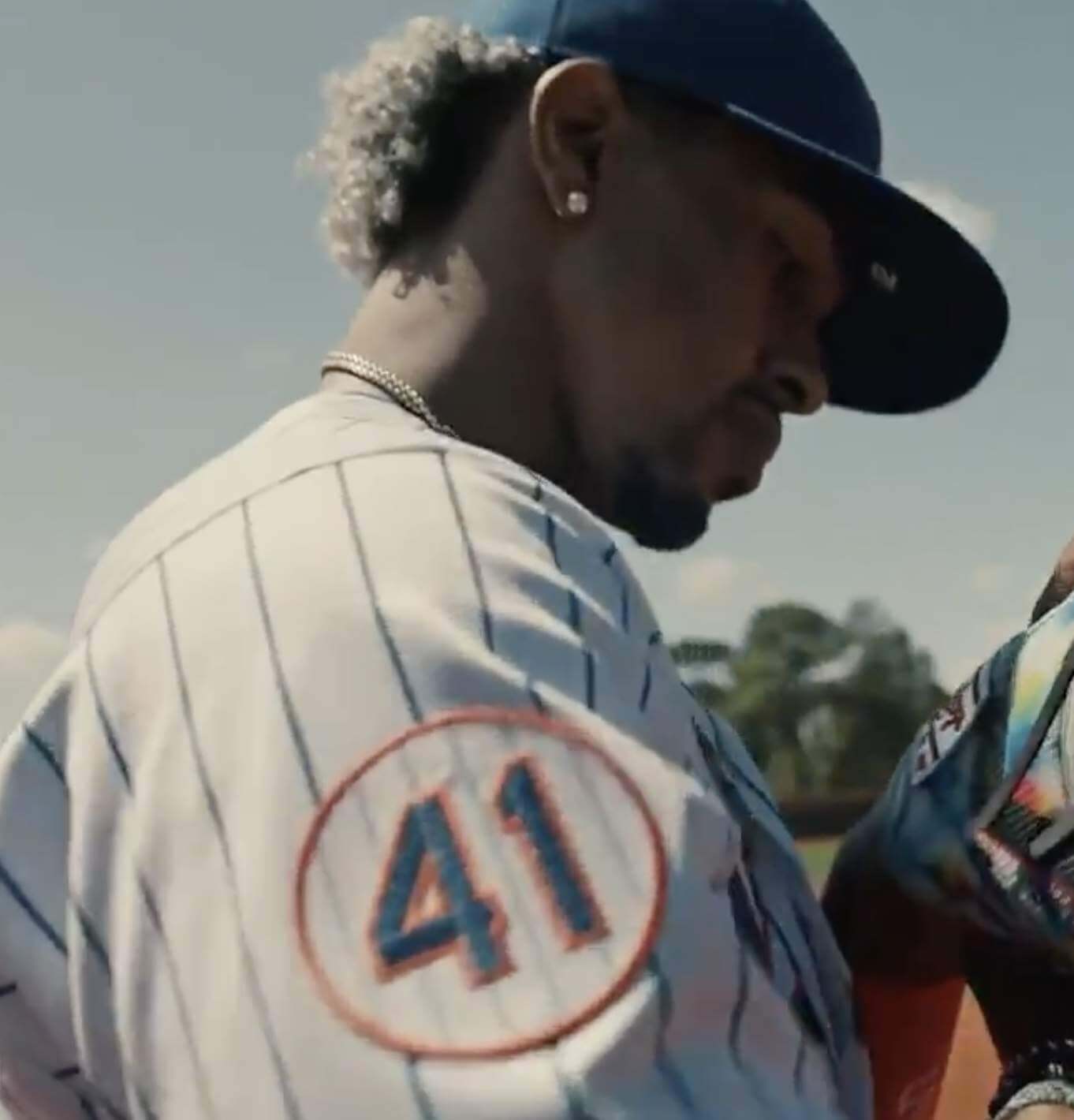
Baseball News: Here are some changes that fans can expect to see at Nats Park this season (from Tom Turner). … Police have recovered the Chattanooga Lookouts’ costumed mascot, which had been stolen (thanks to all who shared). … There’s a new line of MLB caps based on state flowers (from my old ESPN editor Mike Philbrick). … The Athletic has a good (but paywalled) article on how the White Sox developed their current silver/black identity (from Thomas Juettner). … The Double-A Somerset Patriots will apparently be unveiling new uniforms today (from Timmy Donahue). … Southern Illinois has added a memorial rear-helmet decal for alum Mark Newman, who played for the team and then went on to become an exec with the Yankees (from @mrmichael21). … Korean team SK Wyverns is rebranding as Shinsegae Landers. … Brewers OF Christian Yelich has some interesting thoughts about how his state of mind relates to his uniform (from @CreamCityPro).

Football News: More NFL draft caps appear to have leaked. … When President Biden arrived in Pittsburgh for a speech yesterday, the jet bridge had the logo for the 171st Air Refueling Wing, which is very Steelers-esque, or maybe just U.S. Steel-esque (from @J8771). … Lions prexy Rod Wood is apparently considering some uni changes, although that would be for 2022 at the earliest. … Clemson players received their ACC championship rings (from James Gilbert).

Hockey News: The Blues have added a giant Bob Plager memorial graphic to their arena exterior (from @mrmichael21). … The Lightning held Pride Night on Tuesday, featuring rainbow-striped stick tape for pregame activities (from Wade Heidt).

Basketball News: The Australian women’s basketball team is bringing back the unitards for this year’s Olympics (from Chadd Mann).

Soccer News: Chelsea’s home kit has leaked (thanks, Phil). … New kits for two USL League One teams: North Texas SC and Greenville Triumph SC (thanks to all who shared). … Interesting article on how soccer design has been influenced by streetwear (NYT link). … Spain’s government has never recognized Kosovo as an independent nation. One very petty-seeming aspect of this is that the score bug on Spain’s national TV network puts “kos” in lowercase letters (from Ben Isaacs). … The NWSL’s Orlando Pride have a new shirt, featuring a black-to-purple gradient. “It’s something, that’s for sure,” says our own Jamie Rathjen. … In a related item, Orlando Pride keeper Ashlyn Harris explained the message of the team’s new shirt.

Grab Bag: New logo for MSNBC. … A Connecticut AutoZone shop was robbed by a man wearing a UPS uniform. … Did you know that some people find the Disney logo confusing? I didn’t, but it’s apparently a thing. … You may have seen this elsewhere on the internet, but I love this graphic showing all the colors of Mr. Rogers’s cardigans over the years (from Anthony Nuccio). … Here’s a look at all of this season’s F1 helmet designs. … Here’s a really cool animation showing the spread of post offices across the United States (from the Tugboat Captain). … Australia’s new Olympics uniforms, which were featured on the site just yesterday, are now embroiled in controversy because they’re made by Asics, which is under fire for using cotton harvested by forced laborers in China. … Here’s a list of notable instances of a movie studio’s logo being changed in the credits. … Here are some graphics that explore color combos on F1 cars (from Jeremy Brahm). … New uniforms for the Punjab Kings of the Indian Premier League, the country’s top-flight Twenty20 cricket competition (from Kary Klismet). … Also from Kary: Hays High School in Texas, which recently changed its team name from “Rebels” to “Hawks,” has unveiled its new logo.

Our latest raffle winner is Aaron Wiens, who’s won himself $25 worth of Uni Watch merchandise. Congrats to him, and big thanks to Michael Brantner for sponsoring this one. — Paul
Those MLB state flower caps, at least for the Orioles, are super disappointing. The Maryland state flower is the black eyed susan… yet the flowers they used have red eyes, for some reason. I don’t know what flower that is. Overall, pretty underwhelming.
I think that with the World Series embroidery, it seems like they did this as a way to blow out unsold inventory.
What market research led to the conclusion that there is a demographic that likes baseball, state flowers and state pride enough to shell out $42 for a hat? I would love to see the Venn diagram for this one.
Florida and California, according to New Era, have the same flower only different in color, but according to Google, the state flower of Florida is the Orange Blossom while the Golden State’s is the California Poppy. And who woulda thunk The District of Columbia’s official flower was the American Beauty Rose? I would have guessed the Cherry Blossom. Hard pass.
And, I’d like to know what ‘State’ the Blue Jays are in. LMAO. Either don’t include the Blue Jays in this hot mess or at least call t a ‘Provincial’ flower. For Pete’s sake!
While I can understand Nicholas’ reasons for finding these caps “underwhelming”, I actually think they are pretty tastefully done compared to most of the alternate cap ideas New Era has offered up in the past. A nice subtle detail instead of something large and garish.
I’d pay $25 for the Cubs version if they ever get marked down, but as MJ points out $42 (plus shipping) is a bit much.
The Minnesota Flower is super wrong too. Its a lady slipper more or less, but the wrong shade of pink, and the pink should be where the yellow is, and where the pink is should be white. Just dumb.
Is there any significance to the colors of the Cubs’ new postseason flags? There doesn’t seem to be, since their 3 World Series flags are each in a different color. But there is no pattern to it either. I know at Citizens Bank Park in Philadelphia, the colors of the flags denote what accomplishment is being celebrated, and I doubt the Phillies are the only team that does it like that.
Just red-white-blue from what I can tell. So the next postseason appearance will be a red flag
Edit: except for the first 3 – hmmm
Yeah, it’s odd to go BWR then RWB for the remainder. Should’ve done white for postseason appearance, red for pennant, blue for championship.
If they’re wrapping from pole to pole they may have wanted to start and end in blue
I’m very confused as well.
I’m sure I’m the only one sad to see the flags of each team in the league go away. It was a classy thing to display, and as such, belongs to an earlier time. Ah, well.
The flags on the inner roof were a motley mix that I enjoyed even when they mystified me. 66? KW?
Seems like the Cubs just want to drive home that they’ve had some success now. Like every other team. Bummer.
Kerry Wood (20 K game) and Sosa’s 66 HRs, I believe.
Yes, and Hack Wilson’s RBI record and I believe the “8” flag signifies the “Let there be lights” game at Wrigley Field Aug. 8, 1988.
Me too on the team flags. That was one of my favorite Wrigley customs. I guess with fans coming back, they needed to update the Brewers flag, and all that yellow fabric broke the bank.
I find it appealing that Australia calls its women basketball team “Opals” and their men’s team “Boomers” which is a nickname for kangaroos
Man the memorial on he hats just seems so cheap. I understand the reasoning but still facepalm.
From what I remember, in the late 90’s the Yankees put Darryl Strawberry’s number on their caps when he was diagnosed with cancer.
Yes. But that is not a memorial.
Boston got rained out, so not gonna get all 30 teams today, alas.
I am not a pin collector, but I applaud your stance Paul.
Good on ya!
I was amazed to make it through the description of the Masters without any admonitions about Augusta’s “troubling” or “problematic” history. Glad you nonetheless found a way to keep politics involved.
Collin, why the quotation marks around the words troubling and problematic? Are you implying that those words are NOT accurate descriptors of the Masters civil rights history?
If so, it stands you reason you might also see Georgia’s current attack on equal voting rights (enacted despite zero evidence of widespread fraud) as a political issue rather than an ethical one.
As a Georgia resident and a lawyer, I can promise you I’ve spent more time thinking about this than most. I’ll thank you not to put words in my mouth, even if I was more coy than I should have been.
I’m asking what consistent logic leads one to conclude that profiting from a tournament with a history of racism and sexism is OK, but that a voter restriction law is a bridge too far.
By the way, the green jacket is a registered trademark. I wouldn’t be surprised if a cease-and-desist letter is in Uni Watch’s future.
As a lawyer, Collin, surely you can grasp the difference between the past and the present.
That said, if you think we shouldn’t have considered doing a Masters-related pin to begin with, that’s certainly a valid point of view. Thanks for the feedback.
You can feel like words were put in your mouth, but by putting those words in quotation marks, I sure got the impression that you were making light of them.
Paul, thanks for your message. That’s a fair distinction and I acknowledge and appreciate the consideration you put in complex situations like these.
I understand that it can be unfair to apply the morality of today to decisions made in the distant past. That said, Augusta only welcomed its first African-American and female members within the living memory of many readers.
Oh, for sure — their past is shameful. But they ultimately changed their policies.
Similarly, Georgia’s Jim Crow past is shameful (again, within living memory). The same could be said for many places and institutions that have since enacted more enlightened policies. At one time, for example, I would never have considered traveling to South Africa, due to Apartheid. Now, however, I would gladly travel there. That mirrors the larger worldwide Apartheid boycott/divestiture movement, which helped get the policy changed. And once it changed, the boycott was lifted.
Does that make sense to you? Or is there a nuance to your position that I’m missing?
Paul, thanks again. Institutional change strikes me as a sensible way to draw the line.
Thanks for the good back-and-forth, Collin — appreciated.
If the Masters learned anything from the decades of institutional change regarding civil rights, now would be a great time to show it in some meaningful (i.e. impactful) way.
What’s with the quotation marks? I don’t want to be accused of putting words in your mouth, so I’d like to hear your thoughts.
Well done on the pin and the donation to Fair fight!
This one from Pro Football Talk MUST be an April Fools Joke!!! NFL may allow defensive backs, linebackers, running backs to wear single-digit numbers.
link
I think it’s legit (see point No. 7):
link
Also: Note that there’s nothing about the one-shell rule.
What state is Toronto in?
The state of Canada, of course, whose capital is Canada City, according to the second-best ever story published in America’s greatest newspaper: link
That’s hilarious. Thanks for post it
Wait, if that’s the second best story ever, then what is #1?
I always loved the Disney Tron Castle.
link
Just dropped by to make my weekly entreaty for Chris to please use the “Torontosaurus” nickname for his beloved Raptors.
Mets-Nationals postponed due to Covid issues with the Nationals.
I was very confused by the MSNBC logo article because I didn’t see a new logo anywhere. I think that qualifies as more of a “minor tweak” than a “new logo”.
As a Georgia resident, I am appalled by the new voter suppression bill signed into law. And as a fan, I would love to see the All-Star Game played in my hometown. But if players choose to boycott the game, or force a move, I would certainly understand.
As for The Masters, it is never going to be moved. No golf tournament is so tied to it’s location. The Masters IS Augusta National.
With all that said, I must say I am experiencing a little bit of whiplash with just how fast the prevailing opinion went from “Thank you, Georgia!” (Biden, Warnock, Ossoff) to “F*** you, Georgia!” (Jim crow 2.0).
It’s causal, not a coincidence. The Jim Crow 2.0 effort is a direct (shameful) response to the D victories in GA, with the goal of them never happening again.
I’m sure most people have figured this out by now, but the on-screen graphics for the Cardinals RSN apply to all those teams that were broadcast on the former Fox Sports Networks, as they fully switched over to the Bally Sports branding yesterday.
Dick Allen’s memorial patch refused to talk to the media.
Fairly simple. Black Circle with a white 15 in it. Much like the Yankees Patch for Whitey Ford.
It’s not just the “Cardinals’ regional TV network”, it’s the entire Fox Sports family of regional sports networks.
They’re now “Bally Sports” and all of them have changed their on-screen graphics from the standard Fox package.
We’re talking Cleveland, Tigers, Royals, Angels, Twins, Rays, Rangers, D-Backs, Braves, Reds, Marlins, Brewers, Cards, and Padres.
Going out on a limb here, but since it’s naming rights deal for the regional network, Paul may have intentionally left the network name out.
Is the the first time major sports has been broadcast on a station with a name sold to the highest bidder?
Nope, didn’t leave it out intentionally.
Not sure about the answer to your question.
The Dodgers will now be broadcast on Bally Sports West rebranded from Fox Sports West.
link
The Angels are the team on Bally (formerly Fox) Sports West. The Dodgers are broadcast on their own Spectrum Sportsnet channel.
whats interesting is that in the tweet there is one out and its indicated on the left side of the two spots where outs are shown. Watching the Twins-Brewers game now, and the first out shows up on the right side.
On the bright side, very few people can actually see the horrible scorebug on Bally’s telecasts due to their ridiculous dealings with carriers.
Curious about the design of the Masters pin. Artistic license and all that is perfectly acceptable and expected for a representation at such a small scale, but wondering about the conversations/decisions behind changing iconic elements. For example, the jacket has three buttons, not two. It has flap pockets and a standard breast pocket, not patch pockets. I’m all for art, but this feels like the kind of thing UW would write about if someone else got it wrong.
Great questions! When the jacket is buttoned (and often even when it’s not buttoned), only two buttons are visible:
link
So that’s what we showed. The other details were, as you say, issues of artistic license and scale. Just putting a line to represent the welt chest pocket, for example, would communicate well visually.
Thanks, Paul! Every April I wonder if the winners considered whether their well-planned Sunday outfits would match well with green.
Wait! I thought that was a red jacket:)
MLB.com’s gamecast doesn’t look updated for Brewers’ park. Looks like they still have the “wheat/barley” that was underneath Miller’s sign.
link
That was me who suggested the Masters pin in November. :) I will back up my words with a purchase and love what you’re doing with the proceeds Paul!
Thanks so much for the suggestion, Matt, and for letting us know that you were the one who made it!
Just placed the order. I am honored that my idea became an awesome pin!
I used to be able to click on the top banner and get the latest post…not working now.
“Top banner”?
The masthead that says Uni Watch with the 7 or 15.
Just watching the Phils Braves game… Aaron Nola is missing the New Era logo on the left side of his hat.
Great spot — thanks!
Here’s a Uni-Watch pin collection up for bids on eBay.
link
Well done! I see you’re located in Georgia — a nice touch.
I look forward to hearing how you’ll be spending or donating the proceeds.
Yes, and Hack Wilson’s RBI record and I believe the “8” flag signifies the “Let there be lights” game at Wrigley Field Aug. 8, 1988.
I’ve never had a problem with the D in Disney. Rather, my pet peeve is with the circle over the i, rather than dotting it. I dislike when people do this. I’m no graphologist but I’ve heard it’s an indicator of being conceited.
Your Uni preview was the first time I saw loandepot park in a serif font. I had just assumed it was named after a Romanian guy named Ioan.
I’d have loved a pin, but will not have anything to do with Abrams name attached to it. Too bad because it’s a great design.
I agree.
I also agree. I’m glad not to have purchased any of these pins, even though I thought some of the designs fantastic. I like my sports without politics, thank you very much. Those that feel otherwise should read the Georgia law more carefully rather than relying on what others tell them.