The Mets made it official last night, announcing that the team’s BFBS jerseys (and presumably caps) will be returning “for a limited number of games later this summer.” Further details will presumably be forthcoming soon-ish, but one of the BFBS games will almost certainly be on Sept. 11, when the Mets host the Yankees on the 20th anniversary of the 2001 terrorist attacks.
Some quick background: The Mets wore the BFBS uniforms from 1998 through 2012. At one point they were actually listed in the MLB Style Guide as the team’s “Club Preferred” uni option, even though they were alternates. They were designed by Bob Halfacre, who at the time worked for the small uniform supplier AIS and who also designed the team’s black-drop-shadowed script. You can read more about how that all took place here.
New Mets owner Steve Cohen has been teasing the return of the BFBS uni for months, and several of the team’s players have been lobbying for it, so yesterday’s announcement feels almost anti-climactic to me. I’m disappointed, yes, but not surprised.
Moreover, I can absolutely understand why a certain generation of fans feels a connection to this design. If you grew up watching the Piazza/Alfonzo/Leiter team that went to the postseason in 1999 and to the World Series in 2000, and if you then watched Wright/Reyes/Delgado squad win the National League East in 2006, of course you’re going to feel a bond with the BFBS unis — that’s what your heroes were wearing. If I were running the team, there’s no way I’d bring back these uniforms, but I could certainly see why some fans might want me to.
Hell, as much as I hated those uniforms at the time, and still hate them now, I’ll admit that I still feel a pang of recognition when I see the old photos or highlight footage of the team wearing them. I wouldn’t exactly call it nostalgia, since nostalgia usually involves an idealized fiction with all the harsh edges buffed smooth, and I can assure you that is not how I feel about the BFBS look. It’s like your hometown greasy spoon when you were growing up — the food may have sucked, but there’s a comfortable familiarity about your memories of the place, the people, the experience. For better or worse, all of that becomes part of you. That’s how the BFBS feels for me as a Mets fan. I suspect many of you feel similarly about certain unfortunate chapters in your favorite teams’ uniform histories.
Of course, that doesn’t mean you want to eat that same shitty food now, and I absolutely do not want to see the BFBS uniforms return as full-fledged alternates. A one-off throwback game where we can all laugh at how misguided the whole BFBS thing was? Be my guest. Even an annual one-off throwback? Not ideal, but sure, knock yourself out. But the idea of using this design for multiple games this year raises the possibility of having it become a standard Friday alternate (or Sunday alternate, or whatever) for future seasons, and that is completely unacceptable.
The thing that scares me the most, though, is this: The return of the BFBS jerseys will presumably also mean the return of all the accompanying BFBS accessories — not just caps, but also base-layer shirts, socks, and belts. And the way players are today, you just know some chucklehead in the clubhouse is gonna say, “Hey, why don’t we wear wear those black caps and undershirts with the home pinstripes tonight? You know, just to change things up!” That would pave the way for black to regain parity with blue in the team’s color scheme, a nightmare scenario of the worst order.
Mets fans, myself included, have been cheering the departure of the previous owners, Fred and Jeff Wilpon. But the Wilpons are getting the last laugh here: They’re the ones who oversaw the team’s BFBS phase, and now it’s become part of the team’s DNA. It will likely be their most enduring legacy. Sigh.
Click to enlarge
Collector’s Corner
By Brinke Guthrie
Follow @brinkeguthrie
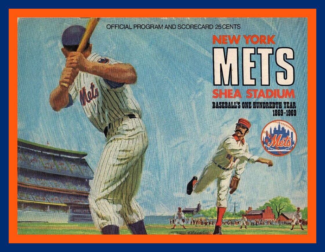
MLB’s Opening Day is just two days away, so CC is all baseball today. Let’s start with this New York Mets program from April 8, 1969! This was MLB’s 100th-anniversary season for MLB, and the artist nailed it with the pitcher in a vintage uniform and the Mets batter in the more contemporary look (but, oddly, without the front uni number). A great cover concept!
Now for the rest of this week’s picks — play ball!
• This is a nice-looking late-1970s game-worn dugout jacket for the Toronto Blue Jays. The seller adds, “The jacket has a nylon satin outer with a fairly heavy inner lining for those cold nights at old Exhibition Stadium next to Lake Ontario.”
• Here’s a full ticket for the first game ever played at the San Francisco Giants’ then-new Pacific Bell Park on April 11, 2000. That was the stadium’s first name; it’s now on its fourth one.
• Here we have an actual sack of Kirby Puckett & Homestead Mills Pancake Batter from 1992. The seller says, “This was Kirby’s first advertisement to market a product. We purchased it locally the year it came out.” Note that the illustration of Puckett on the back shows him wearing an “All-Star” jersey.
• Moving from Minnesota pancakes to burgers, this chef’s apron was a Minnesota Twins 1992 season giveaway, with “Turn a Real Double Play with a Double Cheese Burger” on the front.
• This 1990 box says “Suit Up with the Pros” and contains a “B.F. Goodrich”-stamped promo baseball. Hmmm, what do tires have to do with “suiting up?”
• I never knew the Phillie Phanatic had a cousin! His name is Phred and here he is as a little stuffed plush character.
• Here’s a really good-looking charm for the 1971 World Champion Pittsburgh Pirates. The seller notes these were given to “wives or special press agents.”
• Another Pirates item here, of unknown vintage: Maybe this “Phry The Phillies button” was worn by Wendy’s restaurant employees in the Pittsburgh area.
• The Milwaukee Braves honored their longtime ace pitcher by holding Warren Spahn Night on Sept. 17, 1963. If you were at Milwaukee County Stadium that day, you got this card that says, “I Helped Salute Spahnie.” They also sold this button. (You can see a bit more about this promo event here.)
Got an item to include on Collector’s Corner? Tweet submissions to @brinkeguthrie.
Click to enlarge
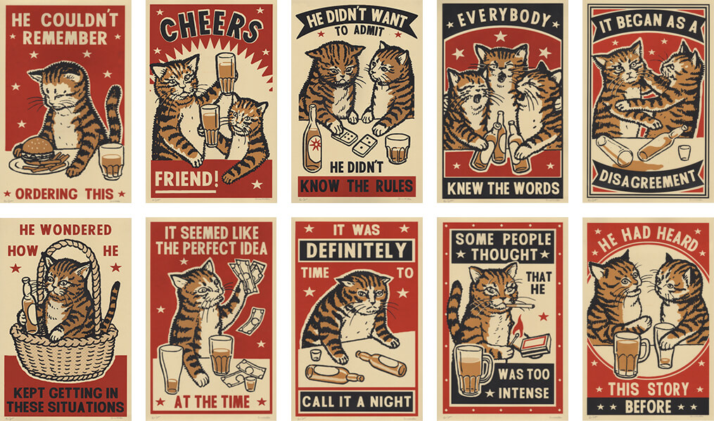
Too good for the Ticker: Look at these great designs designs showing cats at bars. As soon as I saw them, I thought to myself, “They look just like old matchbox art.” And sure enough, the artist who made them is offering them on custom matchboxes! Dig:
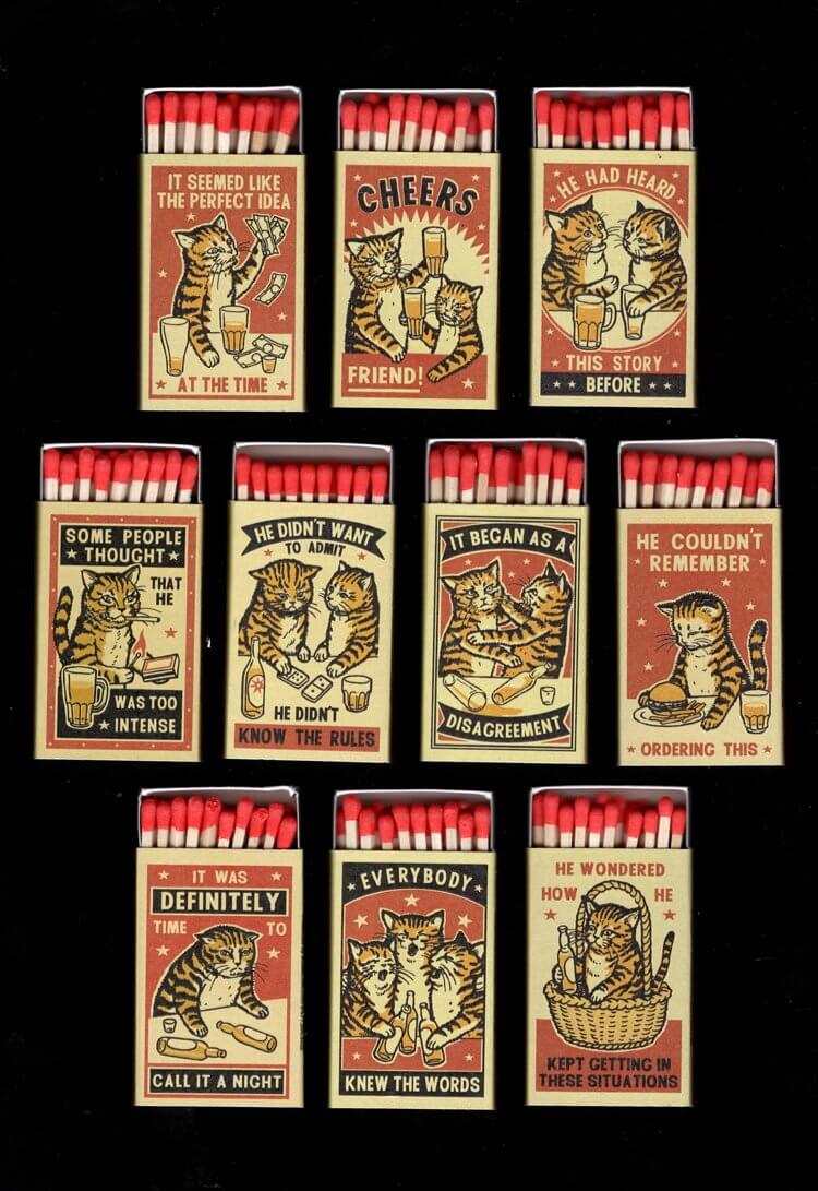
They’re also available as posters and, maybe best of all, sheets of stamps:
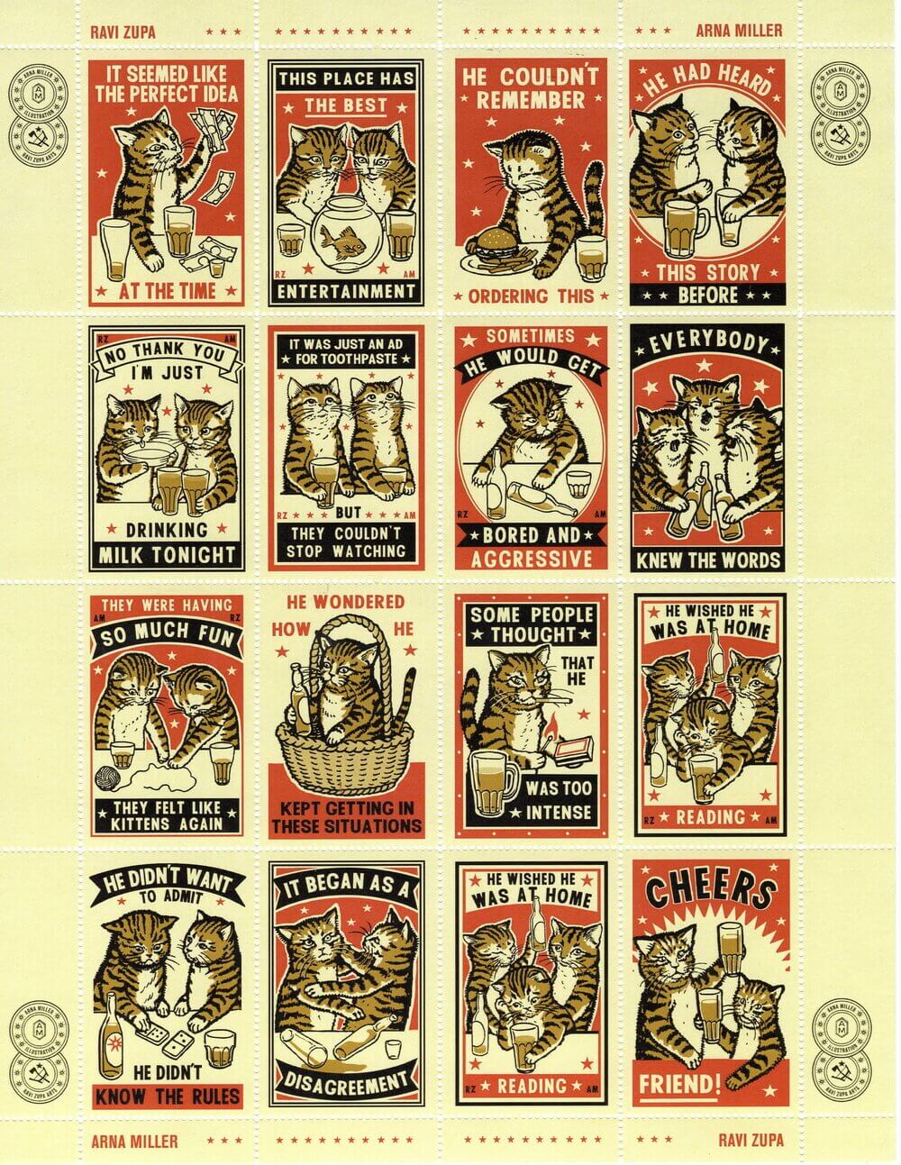
So brilliant. There’s a sort of uni-related spirit behind all of it, don’t you think?
The genius behind all of this is a Colorado illustrator named Arna Miller. As you can see on her website, she appears to specialize in semi-absurdist depictions of animals. Here’s what she has to say about the “Drunk Cats” series:
The series features cats drinking at the bar, and the good, embarrassing, and confusing situations we have all found ourselves in.
The style is inspired by vintage matchboxes and Russian and Chinese propaganda posters.
The original title was “Strike Your Fancy.” It was a project that I did in collaboration with Ravi Zupa in 2018 for an art show in Denver. We designed, drew, and hand-printed the images on matchboxes, and I made little frames for them. I posted the images on instagram, and the design blog This Is Colossal featured them, which opened the door for people to discover this series.
It has been the most popular series I have ever created, and since then we created a poster series, and the stamp sheets. Many people have printed bootleg designs on shirts, and many people have gotten tattoos of the series.
It’s interesting that she didn’t choose to do T-shirts herself, and even more interesting that she seems unbothered — maybe even pleased! — by the fact that people have created bootleg shirts of her work. That shows an impressive spirit of generosity, which I really admire.
(Major thanks to reader Michael Rich for putting this one on my radar.)
Click to enlarge
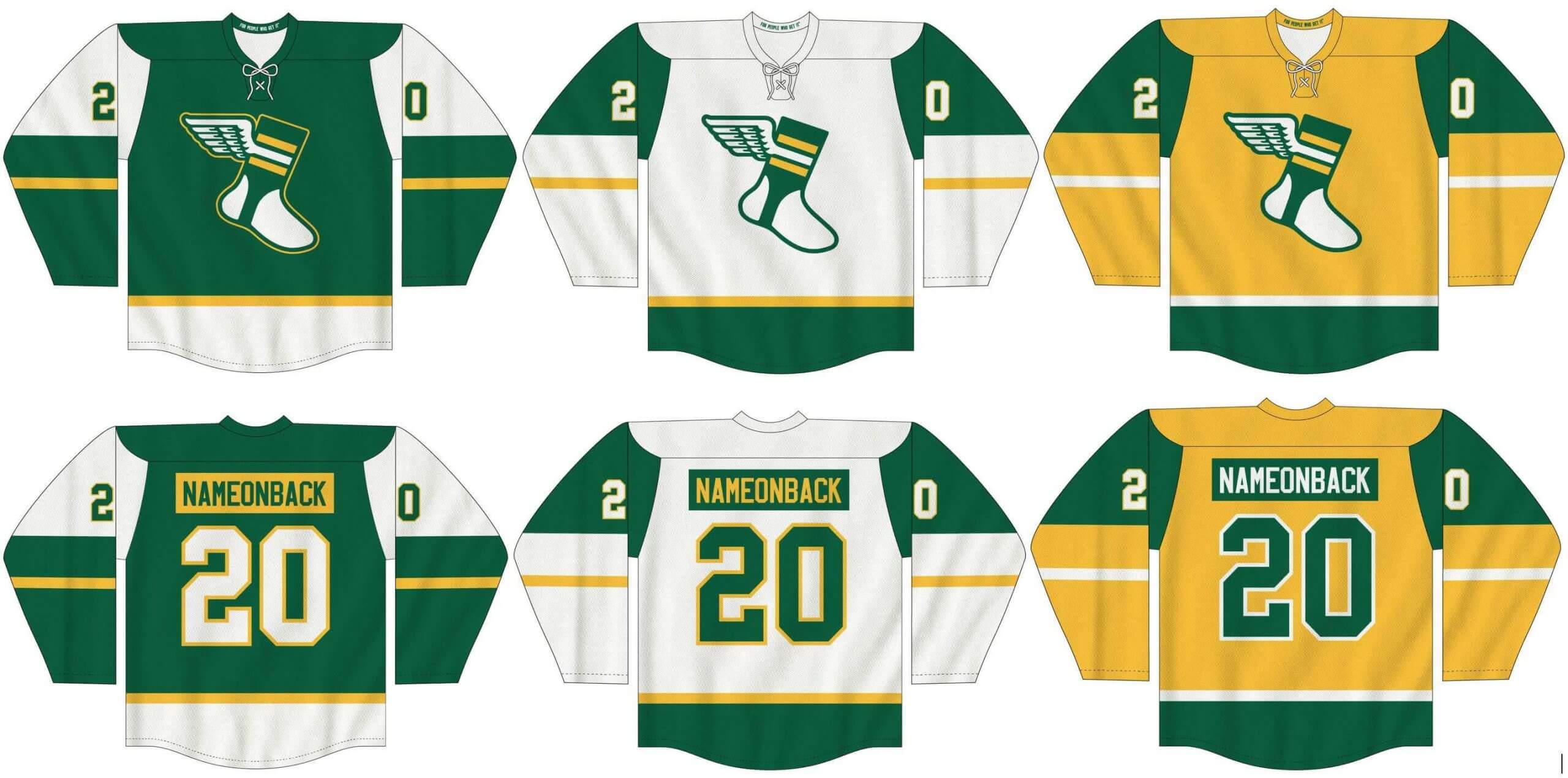
Next-to-last call: We’re almost at the deadline for you to place your pre-orders for our new Uni Watch hockey jerseys (customizable with your choice of number and NOB, of course), socks, and stirrups.
In order to get in on these items, you must place your pre-order by tomorrow, March 31. You can do that here. We expect the finished product to ship out by the end of April.
My thanks, as always, for your consideration.
Membership update: A new batch of designs has been added to the membership card gallery. That includes Mike Oberholtzer’s card, based on the Phillie Phanatic’s Saturday Night Special throwback jersey — an inspired choice!
Ordering a membership card is a good way to support Uni Watch (which, frankly, could use your support these days). And remember, a Uni Watch membership card entitles you to a 15% discount on any of the merchandise in the Uni Watch, Uni Rock, and Naming Wrongs shops, plus the discount also applies to our Uni Watch Classic Cap. (If you’re an existing member and would like to have the discount code, email me and I’ll hook you up.)
As always, you can sign up for your own custom-designed card here, you can see all the cards we’ve designed so far here (now more than 3,000 of them!), and you can see how we produce the cards here.
The Ticker
By Alex Hider

Baseball News: Looks like Rangers LF Joey Gallo is adding a powder blue glove to his rotation this year (from Phil). … The Reds have added an on-field ad behind the plate, in addition to the ads they had last year near the coaches boxes (from Michael Kinney). … This has probably been mentioned before, but it’s worth bringing up again: Noted Red Sox fan Ben Affleck allegedly made a big stink on the set of Gone Girl when he refused to wear a Yankees cap in a few scenes (from Andrew Barbot).

NFL News: The Bills have sold their stadium’s naming rights to a new advertiser (thanks to all who shared). … Reader Dan Cichalski got his first vaccine shot over the weekend (congrats!) at the Meadowlands Racetrack, located right next door to the home of the Jets and Giants. He noted that the Super Bowl XLVII logo is still etched on the windows of some of the track’s doors. … Several readers spotted a real estate listing for a silver-and-black house for sale in the Baltimore area that includes a number of Raiders decorations. … The Steelers are the latest team to have their draft cap leak (from Noah Kastroll). … Here’s some great footage of the 1951 49ers/Rams game.
College Football News: Reader Bradley Davis notes that Miami defensive ends Gregory Rousseau and Jealan Phillips could end up being the first pair of players to wear the same number from the same school to be drafted in the same year. Rousseau wore No. 15 for the Hurricanes in 2019, but opted out of the 2020 season. Phillips then transferred into Miami and wore No. 15 for the 2020 seasons. Anyone know if that’s happened before?

Hockey News: New color-changing mask for Flames G Louis Domingue (from Wade Heidt). … The Islanders’ new arena is changing the environment around the adjacent Belmont Park and providing an impetus for upgrades to the historic horse racing track (from Kary Klismet).

Basketball News: Several new WNBA jerseys have leaked in retail stores in recent days. Jamie noted in yesterday’s Ticker that a Washington Mystics jersey had leaked. Yesterday, a second Mystics jersey leaked — Julie Streeter notes that Elena Delle Donne doesn’t have a hyphen in her name, so that leak actually contains a typo — along with a Minnesota Lynx jersey, two New York Liberty jerseys, and a Dallas Wings jersey. We also got some hints as to what one of the Connecticut Sun’s new uniforms will look like. “The most exciting change for me — no front jersey ads!” says Julie said (thanks also to Cork Gaines and Phil). … Blazers G/F Norman Powell ripped his own jersey in frustration Sunday after missing a late free throw, prompting many “Rip City” jokes (from Jeremy Brahm). … NBA numbers guru Etienne Catalan has several post-trade deadline updates. Head over to his Twitter account to see more. … Someone spotted a Lamborghini with a Michael Jordan paint scheme (from Ignacio Salazar).

College Hoops: Uniforms played a crucial role in Sunday’s Sweet 16 game between UCLA and Alabama, as officials took several minutes to determine whether a loose ball grazed a Bama player’s shorts (from Griffin T. Smith). … Indiana introduced its new head coach, Mike Woodson, at a press conference yesterday, and presented him with a jersey the team last wore in 2018 — note the neck and sleeve piping, which has been changed in recent years. As Jarrod Campbell notes, many Hoosier fans were excited to see the old uniform come out (from Ryan Cotter). … Before playing in the state championship, East Anchorage High School in Alaska received a complaint for wearing warmups with “Black Lives Matter” messaging. However, the team was cleared to wear them in the finals, which they won. The team also received sneakers from Puma as a result of the controversy (from Timmy Donahue).

Soccer News: The next three submissions are from Kary Klismet: LAFC has unveiled its new second jersey for the 2021 season. … Speaking of MLS, here’s a rundown of each team’s new uniforms. … Parkes Cobras of Australia’s sixth-tier Western Premier League have new jerseys for the 2021 season. … Scottish club Partick Thistle revealed a throwback for the 100th anniversary of their 1921 Scottish Cup win (from our own Jamie Rathjen and Ed Żelaski). … Line Of Duty, a BBC police procedural filmed in Belfast, Ireland, has agreed to advertise on the Belfast Celtic FC’s youth girls uniforms (from Colm Heaney).

Grab Bag: The Utah Warriors of Major League Rugby are holding a contest to name their mascot (from Kary Klismet). … The Canadian Lacrosse Association has renamed itself Lacrosse Canada and has a new logo (from Michael Sullivan). … New uniforms for the San Diego Metropolitan Transit System’s compliance and security officers. Their previous uniforms were blue, which sometimes led officers to be mistaken for cops (from Timmy Donahue). … Also from Timmy: The Air Force is changing its uniform requirements, as airmen will now be required to wear the Operational Camouflage Pattern as a utility uniform starting April 1. … New logo for the Buffalo Fenians, a Gaelic sports club (from @BirtMC). … The Autism Society of Cincinnati has a new logo for its 50th anniversary (from Bill Fenbers). … Nike has sued a Brooklyn company after it made a series of Satan-themed sneakers, each supposedly containing a drop of human blood, in collaboration with rapper Lil Nas X (from @texastrevor). … The Maryland state legislature has voted to repeal the state song, which was an ode to the Confederacy that referred to Abraham Lincoln as a “despot” and to Union soldiers as “northern scum.”

Our latest raffle winner is Michael Taylor, who’s won himself a Uni Watch membership card. Congrats to him, and thanks to Kary Klismet for sponsoring this one.
Tomorrow: The 23rd annual Uni Watch MLB Season Preview!
Quick correction: The review of “did the ball touch the shorts” was UCLA vs Alabama, not Arkansas.
Fixed.
I’m not happy about this, for essentially the same reasons Paul said; the BFBS jersey is a “gateway drug” for infesting the other uniforms with black accessories and trim — just as it was in 1998. We waited nearly a decade-and-a-half to be rid of this scourge, and now it’s back again.
I suppose I can live with it if it’s a once- or twice- or three-times-a-season throwback, fully segregated from the other uniforms, but anything more than that would be a disaster.
But you know that won’t happen. Most players don’t give a thought to aesthetics, they will mix and match as much as they’re allowed, and God help us if the Mets win a few games wearing any shred of black.
As a die hard Met fan, I can honestly say that I’m disappointed in the return of the single worst uniform in our history. These softball tops were horrible in the 90’s and will still be horrible today. The 90’s are over and so is the “there’s money in black merchandise” logic. Yuck!
I feel the exact same. I am not thrilled, but I was expecting this and if it stays as “a few games”, then that will be fine. I cannot begrudge younger Mets fans their right to nostalgia and it is indeed part of club history. But as a Mets fan since 1973, The Amazins will always be “Blue and Orange”, BFBS was just a fad.
Us longtime Mets fans also remember 2001 (pre-September, 64-71), 2002 (75-86), 2003 (66-95), 2004 (71-91), September 2007 (worst collapse in Mets history), September 2008 (back-to-back collapse), 2009 (70-92), 2010 (79-83) and 2011 (77-85); two historic collapses, three 90-loss seasons, four managers fired, Mo Vaughn and Robbie Alomar, Kaz Matsui and K-Rod, Luis Castillo and Jason Bay. That’s what I think of when I think of the BFBS uniforms.
If the Mets win the 2015 World Series, the black stays in the closet.
What would’ve happened to them if they had won the 2000 Subway Series though? They probably wouldn’t NEED to come back in 2021, because they would’ve never gone away.
I think the cat matchbox things are some of the best things I have ever seen
I agree – I have already ordered some! All of her stuff looks great!
I think that is really awesome the artist is cool with people using her art to make t-shirts and stuff without a license. Kind of like how MLB allows those shirts using trademarks but saying Meats, Pierogis, etc.
Nice dig at Paul.
For those unaware, Paul is afraid to sell those shirts out in the open so you need to contact him for the secret URL.
In his words, gross.
FWIW, I believe a lot of “small-time” (for lack of a better term) artists and musicians don’t mind “bootleg” versions of their creations under the idea that it increases their exposure and thus the lack of revenue that would come from people buying their work legitimately is made up for with what amounts to free marketing.
I don’t think it’s totally out of line to wonder if Paul’s major-league themed “meat” t-shirts violate MLB’s trademarks or if they’d fall under the umbrella of satire or what have you. But either way, it’s not criminal and if MLB doesn’t decide to challenge them then it’s no harm, no foul. Probably the worst that would happen is that Paul might get a “cease and desist” letter from a MLB lawyer and he could decide if it would be worth the cost and trouble to defend the shirts or simply stop offering them.
I remember when the Mets introduced the black alt at first they wore the black cap with the blue brim and paired them with their blue undershirts, belts and socks which made wearing the black jerseys a little more tolerable. Damn you Cohen…
Think of this: what if the Yankees had gone to the navy jerseys with the white pinstripes in the mid-70s?
(Heresy, I know).
But you might have had navy vs. black for interleague matches!
As a Phillies fan, I have no love for the Mets. But I thought your take on the return of BFBS uniforms was spot-on and evenhanded. A run of success in competition can make a bad uniform seem less garish, and it causes understandable feelings of nostalgia. (For as much as people clamor for the Eagles to go back to kelly green, they won the Super Bowl in midnight green, and that will always resonate with fans.) And for what it’s worth, royal and orange are unique in MLB and always made the Mets stand out and look good, even if I don’t like the team.
Paul’s offering his opinion, which is fine and his usually very informed views are a part of the reason we all enjoy Uni Watch. That said, in this case his take was more “over-the-top” than “even-handed”, as if the Mets are committing some great moral affront by returning to black jerseys on occasion.
For example, saying that if the team makes the black uniforms a standard alternate for a certain day of the week it would be “completely unacceptable” (emphasized with italics) strikes me as being a bit too dramatic a reaction for a jersey look that simply is not to his taste.
And I even agree that the “BFBS” look is totally unnecessary for the Mets and if up to me they’d not return to them. But they’re not the worst looking uniforms either, and having them worn every so often strikes me as being pretty harmless.
Several Met players, mostly guys who have been here no more than 2 seasons like Stroman, Walker and Alonso have already tweeted their excitement for wearing the black in games this year. Two are pitchers, and that is obviously not a good sign for the future. So my wishes as a fan of 50 years go down the drain. Many younger fans are excited as well and I get a sense they relish sticking it to “boomer” fans of my generation who are against the black jerseys. Now if the Mets have success in these, I see an avenue for them to become really entrenched.
Those black jerseys also evolved to where the M in Mets had the stupidest, unexplainable angle and spacing with the rest of the wordmark. It looks worst in the Ventura pic above, but I have seen it even worse than that. Will that return as well?
Many younger fans are excited as well and I get a sense they relish sticking it to “boomer” fans of my generation who are against the black jerseys.
Hmmmm. What do you base that on, Steve? I realize there can be generational differences in taste, but I haven’t detected any generational *animosity.* Then again, I don’t hang out on Mets Twitter, Mets fan blogs, etc., so you may be tuned in to something that I’ve missed.
Yeah, it’s mostly on Twitter…more when the issue was being debated than what I am seeing today. Maybe it is a bit less than animosity, but the Met fans that fight against the black are mainly from an older generation and some can’t resist the urge to tweak us for it…the stuff that happens a lot on Twitter.
I’m a millennial that grew up in Chicago during the 90s, back when the Bulls BFBS alternates became a staple during the second Jordan three-peat. I hate the trend and think it’s an aesthetic crime. But let’s remember when this trend became ascendant — several decades ago…so I don’t believe it’s exclusively a “current generation” taste.
At least black is a Bulls color. Not so Mets.
I think at its core this is a bit more of a generational thing — and I’d say it’s on par with the team bringing back the ’86 throwbacks (also not a great uniform, though not as bad as BFBS) as an alternate for a year or two. There’s a generation of fans who saw (a modicum of) success in those uniforms and have the disposable income to relive those memories through retail capitalism. If it sticks to the team shop and a night or two a month I’m fine with it, but it shouldn’t become a full-time alternate or at the starting pitcher’s discretion beacause we’re back to where we started again.
In regards to the Ben Affleck thing. I totally get it.TM
Five years ago was my son’s last little league season. I had coached the previous three, but a change in work schedule made me decide not to coach and just watch. But they had a huge number of kids sign up and needed another coach so I got roped in.
At the first coaches’ meeting, I was told the only team available was the Dodgers. This Giants fan wasn’t having it. I told them that under no circumstances would I wear Dodgers colors or gear. (I literally do not wear that shade of blue. Ever)
We became the Pirates that year and I had the most fun as a little league coach I’ve ever had.
The Mets have a great traditional look, but they are also (in my opinion) the team that pulls black off better than any other without black in their main color scheme. If the players want them back and it excites them on a game day to be wearing the black jerseys, by all means their opinions are happily valued over the keyboard warriors looking for them to be gone. I, for one, am very excited these are back and hope they don’t go anywhere soon.
Why the “keyboard warriors” insult? Does this insult basically apply to anyone who isn’t on the team’s active roster? And if so, do you think players should make all of the uniform decisions and the rest of us should just watch quietly and say nothing?
Now I’m just imagining uniforms that look like collages, à la hockey goalie masks.
I think Cincinnati pulled off black trim pretty well in the late 90s.
Nope. If there was to be ANY trim, it would’ve been a dark navy.
My own two cents on Mets BFBS; hate hate HATE them. But if they are inevitable, a couple of thoughts (pleas?)
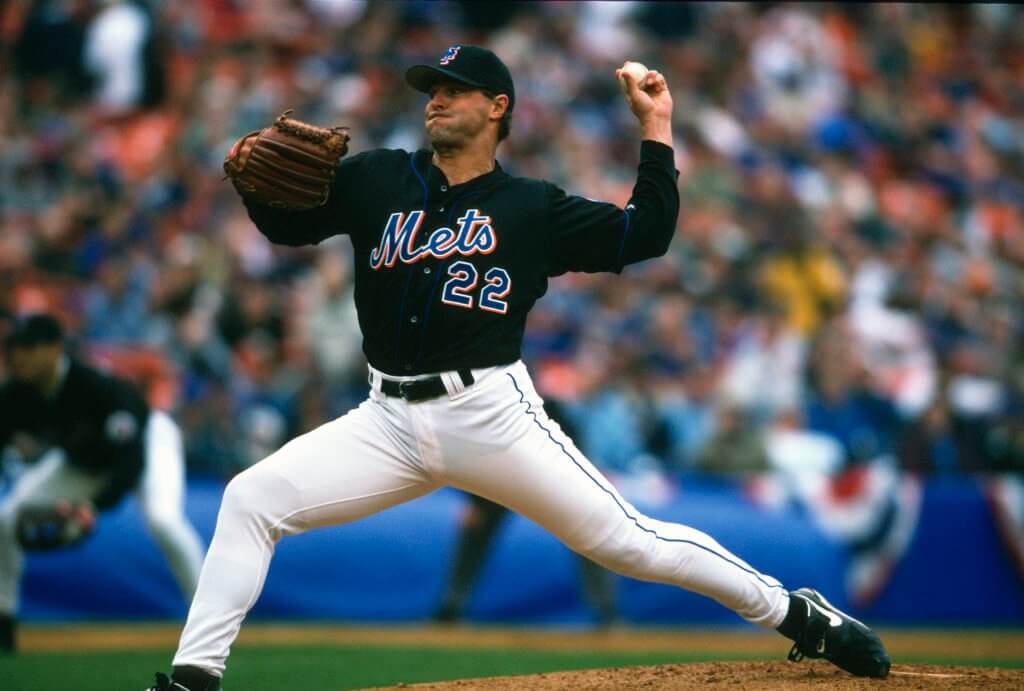
1) Pair with all-white pants with a thin BLUE stripe (as in the Leiter photo.) Never with pinstriped pants. Blue stirrups and undershirts.
2) ‘NEW YORK’ Old Tyme letters across the chest, instead of ‘Mets.’ (I actually thought the road black jerseys paired with gray pants were the least excrable look of the bunch, especially at night. Had a certain sheen.)Then again, if they do NY-chest, that just opens the road door for more black. Eh, maybe not …
3) No alteration/blackening of the patch.
My only request with the black is that they not have NOBs. With the drop shadows, link with only a number on the back. Same for the link.
I’m wearing my black Mets hat today in celebration!
Not seeing the link to the Blue Jays jacket in the first bullet of Collectors Corner.
Fixed. Here’s the proper link:
link
Re the college football same team/number/draft thing, I assume it’s common now that single digit numbers are given to high profile players on both offense and defense.
I quickly found the 2014 draft when Stephon Tuitt and TJ Jones both came out of Notre Dame wearing #7
Colt McCoy and Earl Thomas, both #12 for Texas, were drafted in 2010. Thomas #14 overall to the Seahawks and McCoy #85 overall to the Browns.
Dual numbers almost cost ND an undefeated season in 2012. Pitt missed a short game winning FG in overtime. ND had two #2’s on the field. If the refs had spotted it, there would have been a penalty and a do-over for Pitt’s kicker
Thanks Paul. I am not sure why some of my fellow Mets fans (and players e.g. Alonso) have such an affinty for a uniform the Mets wore during some of their most gut wrenching losses in franchise history.
From an aesthetic stand point, having black jerseys mixed into the crowd again makes my stomach turn. I like what the 7 Line helped do which was streamline the color scheme again. Blue and orange through out the crowd. Continuity much like you see in Chicago, LA, Boston and STL. No silly black mixed in.
And don’t get me started on the drop shadow. I couldn’t find a jersey that didn’t cost $300 without that drop shadow for over ten years!
I’m resigned that more Mets BFBS is inevitable, but the Mets will screw this up if they don’t approach it from the right POV. Paul, why don’t you issue a challenge to the imaginative community here to come up with a Mets uni that utilizes black and doesn’t look like crap? Maybe that will get Steve Cohen’s attention as well
Did something happen to the site today? It’s illegible for me, black text on green background, and the header looks completely different today.
Just happened – thanks for alerting me. Working on it.
Seems to be back for me. Thanks.
I really thought it was a not-so-subtle commentary on the lead story, like Uni Watch goes BFBS for the day.
Me too. Can’t read it.
Me too. Can’t read it.
Same here – I thought the site went G(reen)FGS to protest the Mets’ BFBS!!
Update: back to normal for me, thanks!
Experiencing the same issues as Clevo.
Count me among the people who don’t mind the Mets use of black.
Don’t get me wrong, I prefer they wear the blue caps and pinstripes most of the time–but used sparingly I think it’s ok. The bigger problem, as Paul alluded to, are the other ways the Mets used black in the late 90s/00s. The drops hadow, the black hats worn with the snow white unis, never wearing the blue hats on the road, etc… didn’t work for me.
Same with the backgrounf and text issues.
Is anyone else seeing a green flower-like image in the upper left at the top of the screen?
Yes.
Like Clevo and TBDRO, I can’t read anything.
Really like those cat illustrations. On the Porch today: is this the first time someone was repping Uni Watch colors?
I hate BFBS for the Mets, but at least it stays with the colors of the two teams that left NY.
This justification makes it worse for me. Where’s the red? Each of the two departed NL teams wore two colors; orange and black and royal and red. Royal and orange, aside from echoing the city flag, evenly combines colors from the two previous teams. Adding Giants black throws off the balance. (It also looks like crap, but as a Nats fan, I’m 100% OK with the Mets choosing to wear ugly clothes.) So if we’re gonna pretend that the black is about NYC baseball heritage instead of chasing fashion to sell merchandise, where’s the Dodgers red in the new multicolor team scheme? Red headspoon piping on the black jersey, or a red bill on the black cap, or the jersey numbers in red with orange outlines and a royal drop shadow. You know, something classy like that, just like the way the team uses black carefully and thoughtfully to dial up the tastefulness of their duds.
I never was a fan of the color jersey paired with white or grey pants with the sole exception of the Pirates 1977-1984 (excluding the pinstripes). Those Pirates’ uniforms worked because black was one of their colors.
Agree with you Paul, not a fan of the Mets’ decision to return to black jerseys, but I understand the nostalgia attached to them.
Why not go the “Full Monty:” pair those jerseys with black pants.
Now that’s a blackout!
(tongue-in-cheek … off)
You may have tongue in cheek, but I’d like to see that combo!
Since college football teams have many offensive and defensive players wearing the same numbers, I’ve got to think that players from the same school with the same number have been drafted in the same year. The one that came to mind for me were USC players John David Booty and Brian Cushing, who both wore number 10. However when I looked it up Booty was drafted in 2008 and Cushing in 2009.
USC players Matt Barkley and T.J. McDonald both wore number 7, and were both drafted in 2013.
Noteworthy quote from Steve Cohen’s Q&A, regarding the Mets’ black jerseys. On if he’s surprised by the nostalgia for them:
“No, not at all. I think people want to…[it’s] another example of celebrating Mets history. The team performed well at that time, and people have fond memories of that and I’m happy to accommodate the fans who…you know, most of the fans want it. And the players want it. In fact, I’m going to have the players…ya know, we have some designs and I want the players to be involved in picking out the right design.”
So if we take this at face value, it might not be a straight rehash of the old design.
“The team performed well at that time,” but not from 2001 through 2005, September 2007, September 2008, or 2009 through 2011. Not only were there some pretty lean years in there, but the worst late-season collapse — and the worst back-to-back late-season collapses — ever.
If “it might not be a straight rehash of the old design,” maybe they’ll try wearing the standard blue caps with it. Or maybe they’ll use the standard primary logo sleeve patch instead of the “midnight” (or “blackout” or whatever TF it was called) version. Or maybe they’ll use blue accessories.
Wow, San Diego transit guys are required to arrest people in a major American city, but be unarmed?! That’s dumb and unsafe. California really is different than the rest of the country.
Actually, Kevin, there are entire *countries* where police officers don’t carry guns, including the UK, New Zealand, Iceland, and Norway. Perhaps you should go to those places and tell them that they’re “dumb.” Let us know how that goes.
Meanwhile: California is not “different from the rest of the country”; it is *part* of the country.
I think the point he’s trying to make is that in an American city vs those other countries, the people they’re arresting are much more likely to be armed themselves; ergo disarming the cops trying to arrest them is not the safest idea. At least that’s how I interpreted the comment.
They gloss over it in the article (I’m not saying they did that because the U/T is a bootlicking rag; you can decide that for yourself) but their “officers” are REQUIRED at all times to be accompanied by a “security officer” who does in fact have a gun.
Site looked fine on Chrome, but I usually view on Edge and it had problems there today.
I think the BFBS works better for the Mets than it does many other teams, but I wish they retired it. The classic Mets uniforms with the home white pinstripes and road grays with New York on the chest are just perfect. Any time they wear something else it is inferior to that.
Like others, I fear the players will start to choose the Black unis or mix and match elements from them with the others.
Yep … I said this before about all teams in a city having the same colors. My utter disdain for the Steelers and the local high school wearing black and “gold” meant I told me late wife that if we had had kids that we would have to move when they got to school or they were going to Catholic schools. My kids would not wear Steelers colors. Period. It would have been implied support for the Steelers to the “yinzer crowd in my hometown.
A cynical person might think these WNBA “leaks” at Dick’s are an orchestrated effort to build buzz and start a mini scavenger hunt to bring traffic to stores. Luckily we all know that neither the W nor Dick’s are that clever.
The BFBS phenomenon is the worst thing that has happened to sports uniforms in my lifetime. But it’s not just that. So many teams have bought into the “darker shades are more intimidating” nonsense as well. I think this started back in the ’90s, which was a terrible time for sports uniforms. I’m a fan of bright colors so I would love to see less monochrome unis and more contrast. Less navy blue and more royal and sky. Less forest green and more kelly. If you have silver or gold as one of your colors, use it. Don’t just go with white pants or worse, monochrome. But trends are what they are and I thought that they were changing again, for the better. Perhaps not. I guess we’ll never see the Bucs and their creamsicles again.
So many teams have bought into the “darker shades are more intimidating” nonsense as well
That’s actually worse than BFBS. I don’t like a team without black in their color scheme having a black alt, but at least an alt is a limited thing. A team opting for a darker “more intimidating” shade, on the other hand, means every single game is tarnished.
Agreed, Jim, but at least we’re seeing that trend reverse itself somewhat. The Bills returning to royal blue after switching to navy for a while comes to mind. The Rams also went to a lighter shade with their new set. The Chargers have de-emphasized navy in favor of powder blue as well. Now if the Broncos, Cowboys and Patriots would follow suit.
Uh oh… the WNBA might have shown the secret formula to getting us to accept uniform ads. First, spend several years with hideous sponsor-centric logos covering the front of the jersey, and then suddenly move the ads to the back, at the bottom, allowing the fronts to look like, you know, actual team jerseys again. Do we still hate the ads? Of course? Are these leaks a colossal improvement? They sure are (and several of them are pretty sharp designs!)
As a non-Mets fan, I found myself having more thoughts/feelings about this than I expected to have:
1. I’m old enough that my childhood nostalgia version of the Mets involves racing stripes (possibly my all-time favorite baseball uniform). So seeing the Mets in black still feels a bit weird.
2. The uniform itself is probably a 5/10 for me. It definitely could use more color (more “pop”, if you will), but it isn’t ugly. I don’t think it’s a great uni, but I don’t think it’s an eyesore either.
3. And now for my controversial thought: I think uni watchers get too worked up over the use of black in general. Technically black isn’t even a color; it’s the absence of color. It’s the opposite of white, which results from all colors of light being combined. So in theory, a team adding black to its uniform ensemble is no different chromatically than a team adding white to its uniform ensemble. It’s not a new color because it’s not a color at all. It’s more like a universal background, so to speak.
As a Mets fan, I agree as to (2), in that it’s not terribly aesthetically displeasing if one sets aside that the New York Mets should never, ever wear black.
As to (3), I agree to the extent that one can regard the black jersey/cap as merely a canvas on which the blue, orange and white graphics are “painted,” which makes it less offensive than the black-drop-shadowed graphics that infested the other uniforms and ruined the overall look. The problem is that the former is what enabled the latter, and we’re all properly concerned that it’s about to happen again.
I absolutely despise the Mets wearing black, both in general principle that it’s not a team color and in specific practice that the Mets’ black uniforms are sloppy, ugly, and just badly designed. But I’m a big fan of royal and black as a color scheme, if it’s done well. It rarely is, though, which is a problem. The Royals came closer to succeeding with it than the Mets during the BFBS era, and the Royals still mostly failed. But when it’s done well, as with the St. Paul Saints before they adopted their current Dodgers copycat uniforms, it’s a beautiful and highly distinctive color scheme. If the Mets ditched the orange and switched to royal and black, and put an ounce of thought into their new look, they could have amazing uniforms.
But that’s the problem, isn’t it; black, blue, and orange is a terrible combination.
I’ve started seeing the porch cocktail photos in a different way lately. It looks as if, every evening, Mary pours you a drink and sits there waiting for you to arrive. And you never do. Come home already, Paul!
Then what is grey? Half of all colors and half of none?
Oops….meant this for Daniel E.
The new San Diego Metropolitan Transit System uniforms still look police-like to me.
They do, but I guess the idea here is so that if a passenger is approached by a Transit official they’ll be put somewhat at ease by recognizing quickly that they’re probably just going to be asked to confirm they bought a ticket and not some more serious issue. But the uniforms still need to convey a sense of authority.
I would, however, argue that someone who has the legal authority to issue citations and make arrests is by definition a police officer even if their scope of duties is limited.
I appreciate Paul’s even-keeled take on the Mets’ BFBS uniforms. I get the sense that a lot of the anti-BFBS grumbling takes something of a “those damn kids and their bad tastes” angle. However, it’s amusing to consider that the sense of nostalgia towards the BFBS 90’s that younger generations might feel is the fault of the older generations that foisted BFBS uniforms on them in their formative years. It’s not like there were any 8 year olds in the marketing/design departments of the New York Mets in 1998.
The “anti-BFBS grumbling” is all about the “FBS” part of it; it has nothing to do with “kids” and has less to do with “bad tastes” than with bad design. Or at least, misguided design, focused on what sells merchandise instead of what looks good on the field. Either way, black, blue and orange is just a bad color combination.
While I tend to agree that there isn’t an aesthetic reason for the Mets to have black alternatives or add black trim to the color scheme, I don’t really see what difference it makes if black is an “official team color” or is just added “for black’s sake”.
Couldn’t then the issue be resolved simply by the Mets or other teams “officially” adding black to their color scheme? And thus isn’t this mostly a semantic issue? And doesn’t the “for it’s own sake” argument apply to every team’s choice of colors and other design elements? (For example, don’t the Yankees wear pinstripes for pinstripes’ sake?)
But, I guess such discussions are part of what makes this site so much fun…
The “for black’s sake” part of BFBS is not so much about “adding” black as an “official” team color, which the Mets in fact did, in 1998, and through 2011; the issue there was that in nearly four decades it had never been a team color and was added for the sake of selling merchandise, not making the team look better on the field.
In other words, “adding” black as an “official” team color for the sake of adding black as an official team color is adding black “for black’s sake;” you’re correct that there is no difference, but incorrect that “‘officially’ adding black to their color scheme” “resolve[s]” anything.
The Yankees wear pinstripes because they looked slimming on Babe Ruth (or so the story goes). But regardless, even if long-ago, original choices of colors and designs were in some sense arbitrary, that’s not remotely analogous to BFBS as a design trend. Indeed, arguably, the even more recent trend to infuse literally every color and every design element with some kind of profound symbolic meaning is a gross overcompensation for the notion that “every team’s choice of colors and other design elements” is wholly arbitrary, and that everything is selected and designed “for its own sake.”
The discussion always comes back to what Paul always says, which I agree with, as to why older/”classic” uniforms tend to be better-designed than newer/”modern” ones: the former were designed to look good on the field, within the limits of contemporary manufacturing, whereas the latter are designed to sell merchandise and are less beholden to what manufacturers can actually produce. The former need not be sacrificed for the latter, but it often is.
I guess the counter to that argument is that professional sports have always been about “selling” something, be it tickets, team-related merchandise, or even in the broader sense the team’s “brand”.
In other words, having the team look good on the field was part of what teams offered in exchange for their fan’s money. And even if it’s true that today’s trends of multiple uniform sets are designed to offer more merchandise choices, one assumes that the teams aren’t releasing designs that they don’t think look good as well, no?
Jasper, I know you like to engage in these little mental exercises, but come on.
There’s a big difference between a uniform whose first function is to be worn by players on the field and a uniform whose first function is to drive retail sales to the subset of the fan base that is willing to purchase and wear such things. Pretending otherwise is sophistry.
I have a black Mets hat I wear and was happy to see it relegated to throwback pile the last decade- though I may also be the only Met fan that liked the 1993-94 home uniforms with the script tail
I recall the Meadowlands Racetrack got used as sort of the VIP/ club area for Giants Stadium back in the day- went to a sponsor brunch there before a 1994 World Cup game
I hated learning this year about the design of the black Mets uniforms. The script was inspired an LA guy’s impression of New York City? I hate LA and I certainly do not care what they think of us…
By a staggering coincidence, the cap that Affleck wound up wearing in that scene, was a BFBS Mets cap, several years after the Mets had stopped wearing it on the field.
Those who study the complex interplay of cause and effect in the history of the universe say that this sort of thing is going on all the time.
Site looks fine in Firefox and Safari.
RE: San Diego Police Uniforms
link
They’ve worn Blue, Olive, Blue, Tan, and since 1996 back to Blue. At one point, I’d assume, the uniforms of transit security didn’t look like that of SDPD (like before 1996).
When I was in college in San Diego, they were in the Tan uniforms. Was surprising on one of my visits back there in the late 90’s to see that they had changed from Tan to Blue.
HEY! That’s my membership card!!
Outside of Dazed and Confused I’m not a fan of Ben Afleck. Not even close. However I have to say, that’s a legitimate beef.
BTW, speaking of BFBS; let’s not forget the 49ers from a few years back. Wait- yes, let’s forget those.
Re the college football same team/number/draft thing, last year Chase Young and JK Dobbins both wore #2 for Ohio State and then got drafted.
The Mets going back to black in the uniforms is just a terrible idea. Royal blue and black just don’t go well together. Even with the orange added, it still doesn’t work. The Mets have great colors with the royal blue and orange.
When you start adding black as an alternate color that isn’t even a part of the original color scheme, it just seems forced and you are trying to sell more merchandise for lack of a true identity.
I just hope they don’t bring back the black hats and drop-shadows to the link and link sets.
Why do I feel like it’s ok to use black bc Mets took Dodgers/Giants colors but also absolutely loathe the BFBS unis?
The Mets have a unique look to start with; adding more color to it
is like being told “The New Coke” is replacing “Classic Coke”. Don’t fix something that isn’t broken. I like the black alts, but I’m prepared to leave them in the past. I used to say they made the Mets look like the San Francisco Giants, but that’s why we have the Giants! A throwback game or two wouldn’t kill anybody, and Mike Piazza or Edgardo Alfonso could throw out the first pitch.
What? No comments on that Raiders house in Baltimore? Gonna be a helluva job for that Realtor. Raiders theme mixed in with goth. The coffin in the house really pulled it together. And don’t get me started on those Schindler’s List red pillows.
That Raiders house is the kid of thing I would have wanted during my unfortunate, regrettable Raiders fan phase.
That Raiders house is the kid of thing I would have wanted during my unfortunate, regrettable Raiders fan phase.
Came here to see Paul’s predictable take on the Mets jerseys. Feel satisfied with the outcome. We’ll always disagree on this one as I think the Mets pulled off the best BFBS uniform in the history of BFBS uniforms. Their non-pinstriped white uniforms with black, blue, and orange chest script and the black hat with the blue brim is my favorite uniform for any team in any sport ever. It’s okay if we vehemently disagree on this particular thing, Paul. I’ll still read you. LGM!
Yes, that’s my favorite, too. It appears to upset a lot of fans, but in a vacuum, I like it more than any other Mets’ uniform.
I don’t know man, I always thought that the Mets black jerseys were a clean look.