By Phil Hecken, with Jordan Grimes
Follow @PhilHecken
Good Palm Sunday morning Uni Watchers. As always, I hope everyone is staying safe (and getting those COVID-19 vaccinations!) and doing well otherwise.
A little over a month ago, I ran an article in which uniform designer Jordan Grimes redesigned the New Orleans Saints, and today Jordan is back, this time with a redesign for the Cincinnati Bengals. As you’re all aware (or should be), the Bengals will soon be unveiling a redesign of their own, so I wanted to feature Jordan’s efforts before that reveal.
If you look at the splash photo, you’ll notice Jordan has designed a helmet in green and orange — “Green?” you say? Well, we know the Bengals won’t be going in this direction, and when I first looked at Jordan’s designs, I wasn’t so sure it would work. But, please read on, as Jordan takes us through his design process and gives his take on how the Bengals would take these colors and run with them!
I’ll let Jordan take it from here (click any image below to enlarge)…
Bengals Redesign
by Jordan Grimes
Hey fellow Uni-Nerds! The Cincinnati Bengals have a bright future ahead with a franchise QB, and that started this rebrand project — not the recent uniform leaks. Out with the old, in with the new. My take on this is a major departure in most areas, so be ready and enjoy!
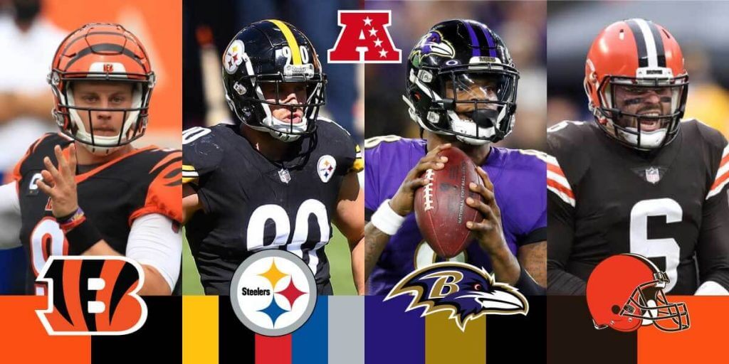
AFC North Division
Looking at the division Cincinnati plays in, AFC North, there are some similarities. The first and obvious is the Cleveland Browns and the use of orange. I read an interesting story on that: When the team was first founded by legend Paul Brown, he still owned equipment from his time in Cleveland and made use of it in Cincinnati. The other two teams in the division are the Pittsburgh Steelers and Baltimore Ravens. Both teams favor black in their color schemes as well.
Taking all of this in made it clear to break from the divisional opponents color schemes and set a fresh identity for the Bengals.
Color Update
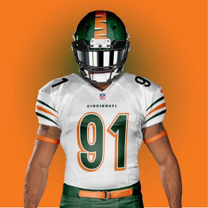
The shade of orange is going to stay similar, more yellow like the tiger, but create distance between them and the Browns who also use orange heavily.
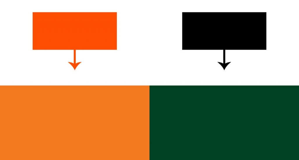
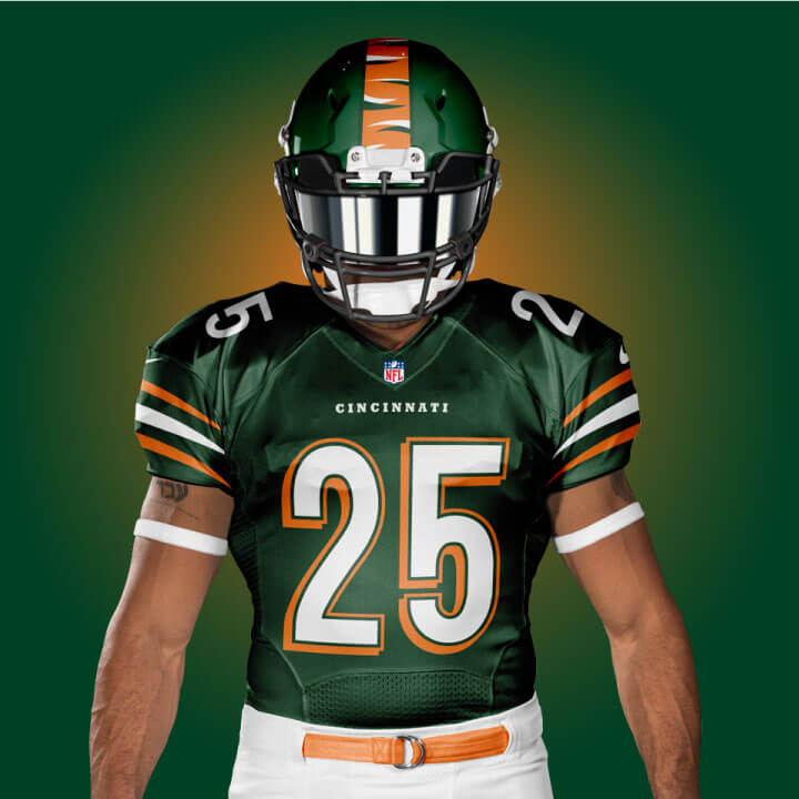
For the first time in team history the color scheme will not include the color black. With this refresh it will be forest green as the secondary color, a nod to nature and Bengal tiger habitat.
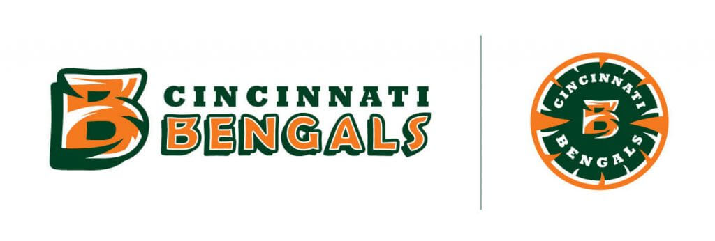
Primary Logo
The new color and energy of this rebrand is reflected in the primary logo update.
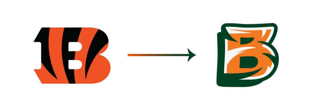
I did not want to model the stripes after the Bengal per se, but more-so create a mark that felt organic. It has orange and white for the tiger, then green for its habitat, and it’s all composed together. For extra depth, there is a stroke and drop shadow applied.

When I think of the Bengals, one of the first things I think of are those drop shadow numbers, and I wanted to bring that over to the primary mark.
Logotype and Alternate Logos
Now with a theme, color, and primary logo it was time to extend the logo set.
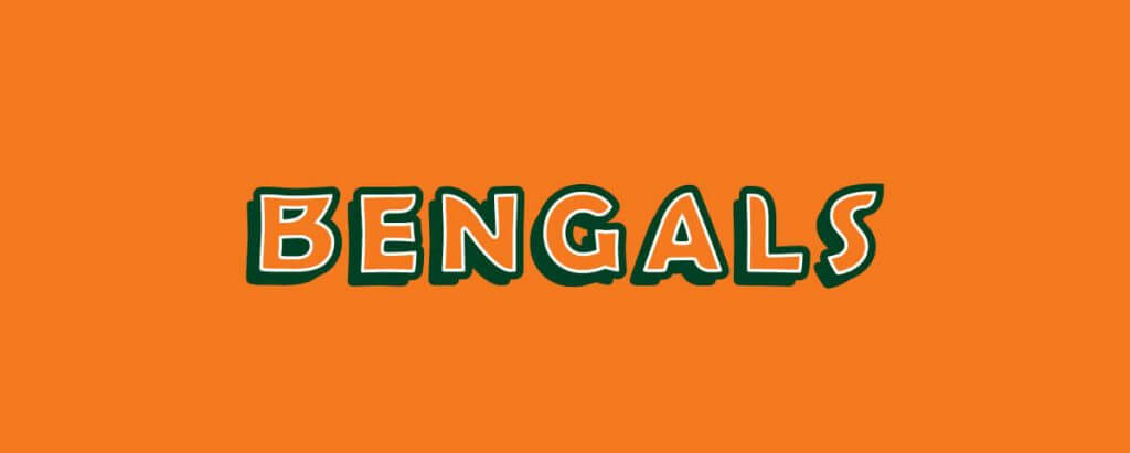
For the logotype I simplified the B and used the font Berlin Sans for the remainder of the logotype. For the alternate logos I used Rockwell Extra Bold.
Okay, let’s get to the uniform mockups!
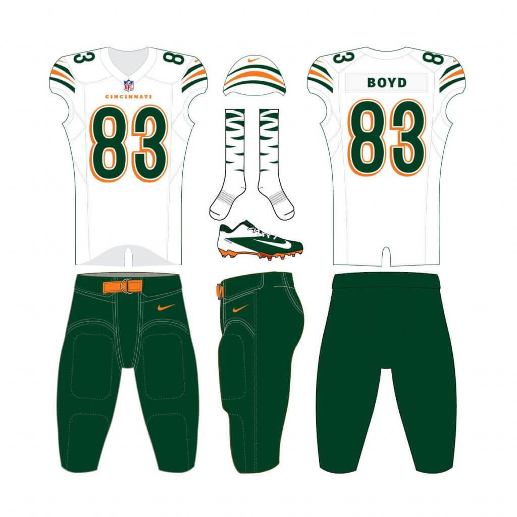
Numbers
The jersey numbers are very similar to the old set.
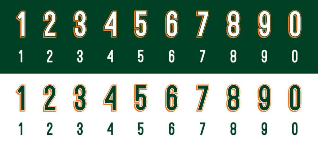
I wanted to keep the drop shadow as stated earlier, and the number style still works. For smaller application the numbers have a simple solid color variation as well.
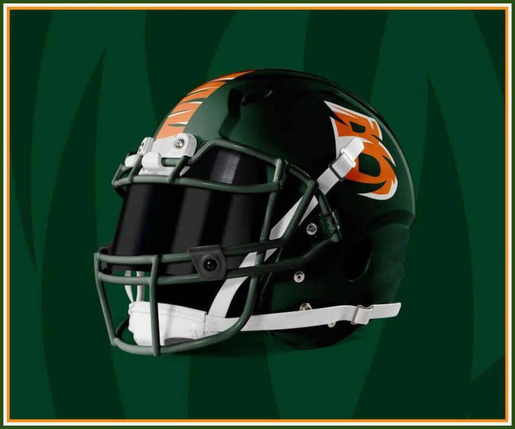
Helmet
By far the biggest departure came when I started on the helmet. First was the color. I wanted to use that new green to really set the Bengals apart from the division. I typically go with the same face mask color as the shell, and I made that move here.
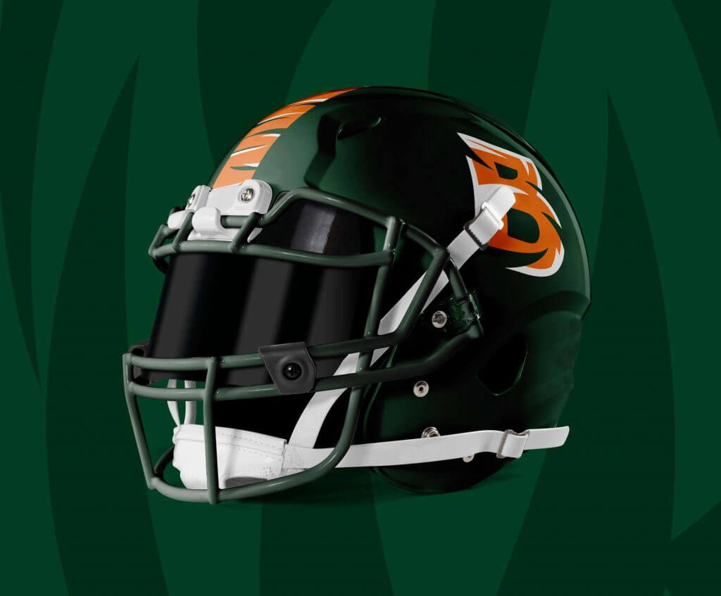
The primary logo sits on both sides. And not only to appease the stripe lovers out there, but to add some flavor to the helmet, I have a striped orange stripe down the middle. Not just any stripe though.
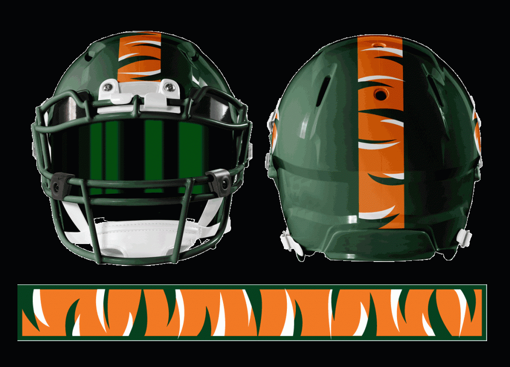
My grand idea for this element is that each helmet stripe is different because the stripe is cut from a random repeating pattern.
Jersey
Some of the elements created thus far can be quite busy, so on the jersey I wanted it to take a back seat and be simple.
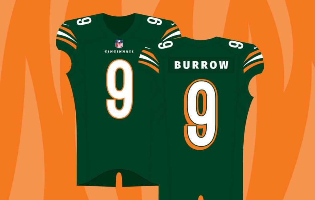
Triple stripes on the shoulder. Cincinnati on the chest. Shadow numbers on front/back and solid numbers for the shoulder.
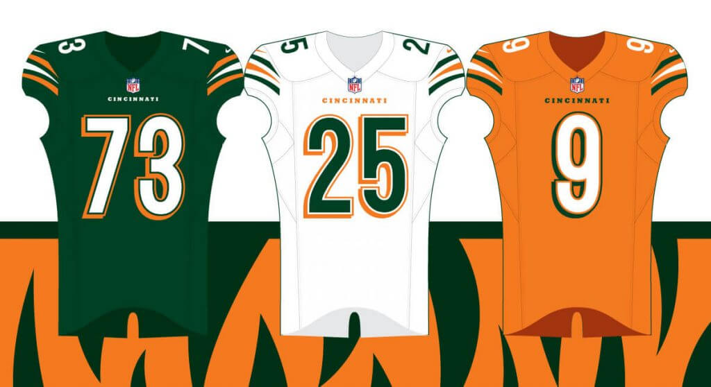
Green for home games, white for away, then orange for a rainy day. Every team needs an alternate right?!
Uniform set
Keeping the theme of staying simple, the pants are a solid contrasting color to the jersey. The socks get fun with this tiger-stripe gradient.
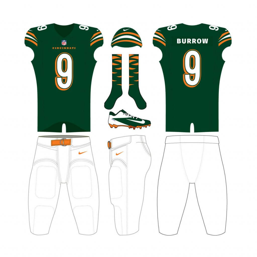
As a last breath for this post, here are some realistic mockups.
I know this is a uniform audience so I will end it here, but check out my website for further brand application in this project! Follow me on Twitter (@j7grimes) for my in-progress takes and attempts.
Thanks, Jordan! This was (another) really fun concept to look at, and I love how you go through your thought process for this redesign!
OK readers — what do you think?


Guess The Game…
from the scoreboard
Today’s scoreboard comes from Chuck Schick.
The premise of the game (GTGFTS) is simple: I’ll post a scoreboard and you guys simply identify the game depicted. In the past, I don’t know if I’ve ever completely stumped you (some are easier than others).
Here’s the Scoreboard. In the comments below, try to identify the game (date & location, as well as final score). If anything noteworthy occurred during the game, please add that in (and if you were AT the game, well bonus points for you!):
Please continue sending these in! You’re welcome to send me any scoreboard photos (with answers please), and I’ll keep running them.
Are You Ready For Some…
…5 & 1 NCAA Football?
It’s technically not football season, but as you’re all probably aware, COVID-19 did a number on all sports this past year, and FCS (Football College Subdivision) schools opted out of a fall schedule, instead choosing to play their normal fall games this spring. We haven’t really given it (any) coverage, but one of my 5 & 1 selectors, Eric Bangeman, offered up his services to give a 5 & 1, FCS edition. We were going to start it a couple weeks ago, but stuff happened, so today will mark the first (and as it turns out, only) FCS 5 & 1 edition. The reason? You’d be surprised how difficult it is to find photos of any of the games, though Eric did manage. Unfortunately it took him three or four times longer than the normal 5 & 1, so we both decided it’s probably not worth the effort going forward.
Nevertheless, Eric did a nice writeup for this weekend’s games, so I’m going to run it below. Are you ready for some football?
FCS 5 & 1
by Eric Bangeman
On the last Sunday of March, it’s not unusual to be talking about college sports unis. After all, it’s March Madness, one of the most popular sporting events on the calendar. There’s also lots of college baseball going on, and on the pro sports level, spring training is winding down, while the NBA and NHL seasons are rounding the last turn into the homestretch.
But I’m not here for any of the above. I spent much of my Saturday with an eye on ESPN+, watching week 6 of the college football season.
That’s not a typo: With the exception of the Ivy League and Mid-Eastern Athletic Conference, Division I-FCS schools are halfway through the 2020 regular season, which was delayed due to the pandemic. Instead of Northwestern vs. Illinois or Cal-Berkeley vs. Washington, we’ve got Northern Iowa vs. Western Illinois and Cal Poly vs. Eastern Washington. Different teams, different togs, but the same 5&1. Strap in—we’re going where college football uni-watching has never gone before.
Honorable mention:
Incarnate Word at Nicholls State
We head down to Thibodaux, Louisiana for this tilt between the University of the Incarnate Word Cardinals and the Colonels of Nicholls state. Normally a red-on-red matchup like this wouldn’t get a second glance from me, but silver pants and silver helmets worn by the Colonels really made the game pop. The Cardinals white helmets and jerseys, which were paired with red britches, made for a solid-looking matchup.
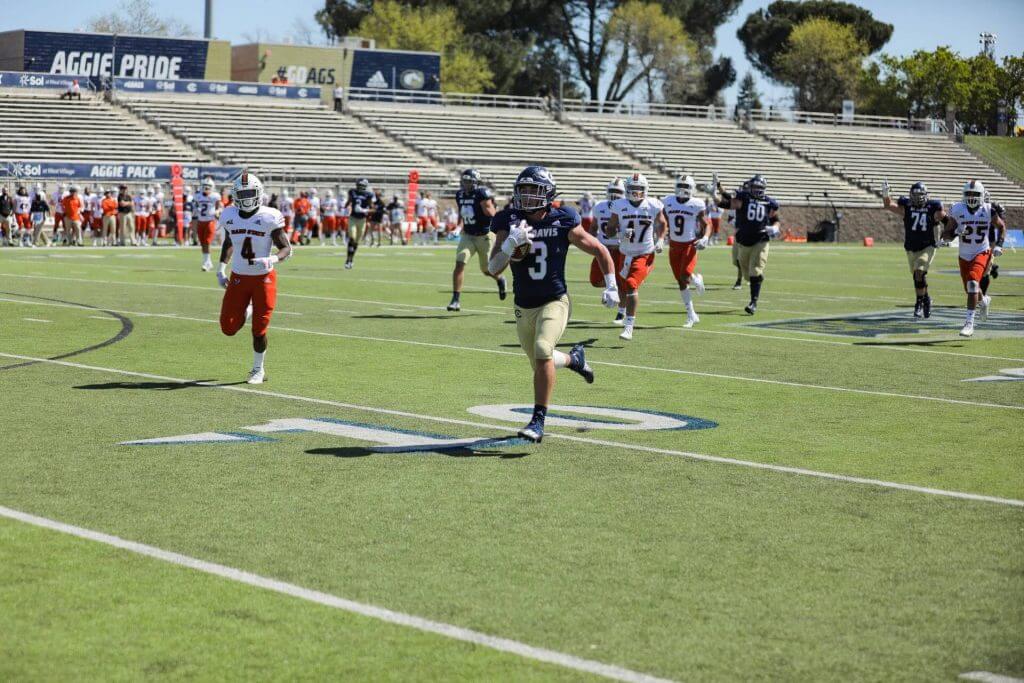
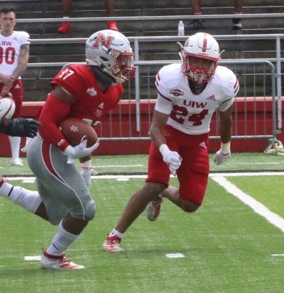
5. Idaho State at Cal-Davis
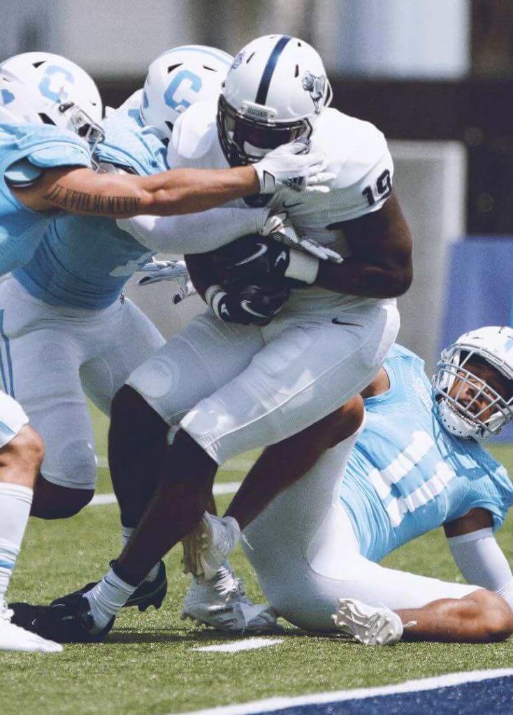
California sunshine and wishbone Cs abounded in Davis, as the Idaho State Bengals crossed the Sierra Nevadas to take on the University of Califonia-Davis Aggies. You’ll have to trust me, given the scarcity of game photos online, but Idaho State does a better job of being the Bengals than Cincy. I have to dock them for a stupid font, but their white-white-orange combo has no other downside. I love the wishbone C on the Aggies’ helmets, and the dark blue hats and shirts combine nicely with the light gold pants.
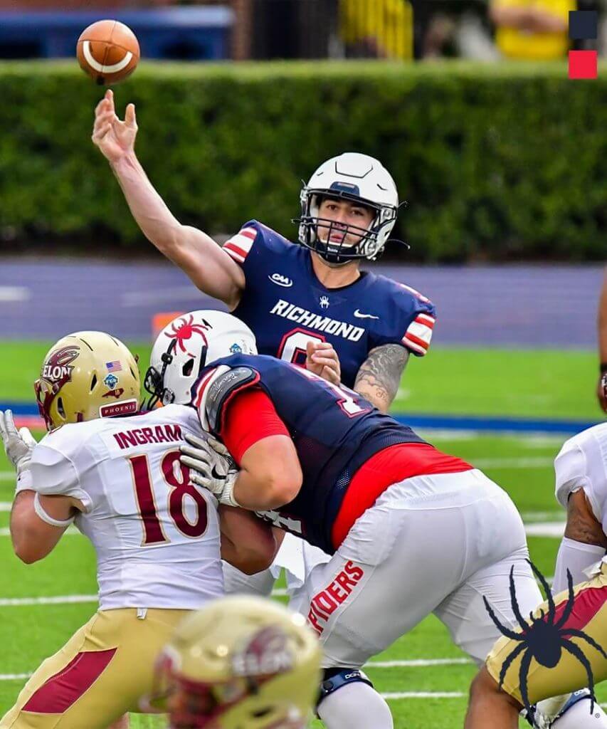
4. Elon at Richmond
Spider. He is my hero. At least the Richmond University Spiders are when they look this good. Sure, they get a deduction for team name on leg, but actual sleeve stripes more than make up for it. I also the look of the white helmet with no blue on it with the blue jerseys. The Phoenix of Elon University remind me of the Birmingham Stallions of the long-gone USFL. Gold-white-gold always pairs nicely with blue and white.
3. Southern Utah at Idaho
Up to Moscow for our second Big Sky tilt. Not only does the University of Idaho have the coolest nickname in Division 1, but yellow helmets, black jerseys, and gray pants are a seriously underrated uniform combination. The Southern Utah University Thunderbirds showed up with white-white-red, and both teams sported the big, classic block numbers. I would have ranked this game higher had it been played outside.
2. Samford at The Citadel
I’ve got three questions for you: Do you like it when both teams have the same nickname? Do you like military academy football and the option? Better yet, do you like really awesome football uniforms? If you answered “yes” or “no” to any of these questions, read on. It was Bulldog on Bulldog on the bright green field turf of Johnson Hagood Memorial Stadium in Charleston, SC. The Citadel had gorgeous “Citadel blue” jerseys paired with white helmets and pants. Samford showed up in an all-white combo with dark blue accents, and the result was something I’d stare on any fall Saturday.
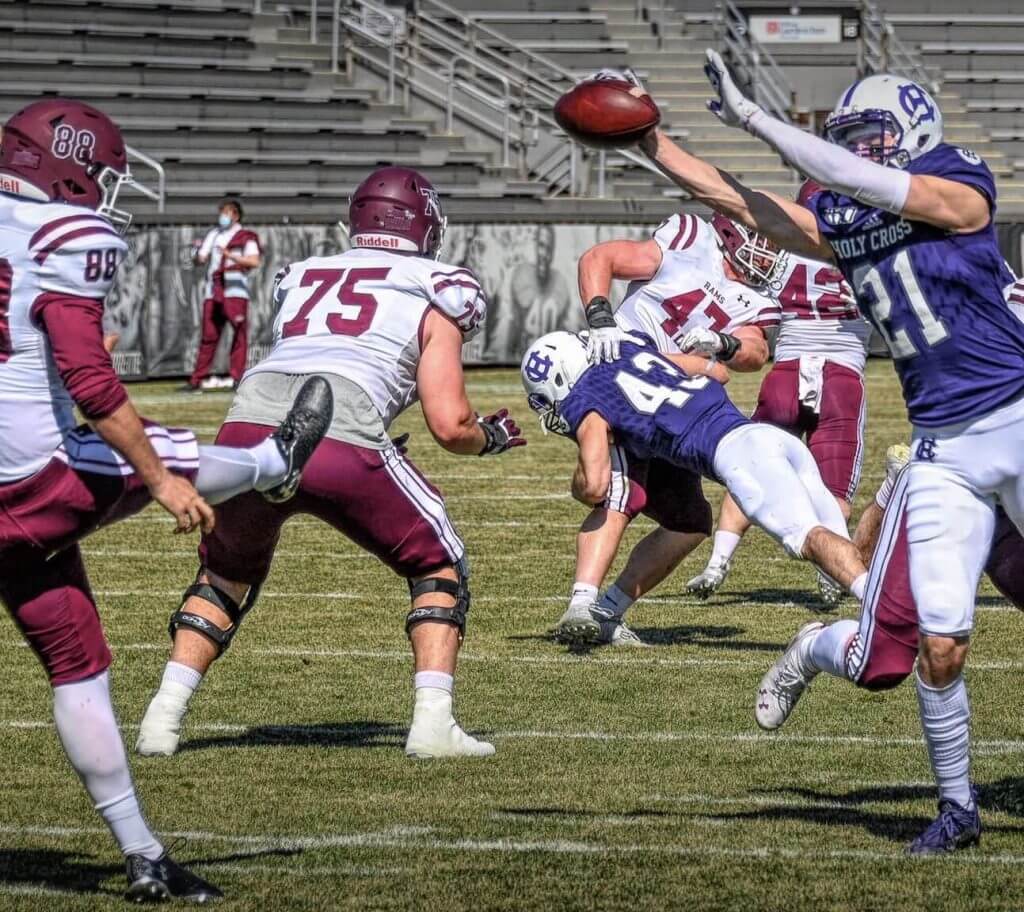
1. Fordham at Holy Cross
We head up to New England where the spring sunshine made the Rams-Crusaders matchup pop. What pushed this matchup into the #1 spot was the timeless uniforms that wouldn’t have looked out of place in 1971 or 2021—UCLA stripes, block numbers, pants stripes, with nary a side panel or italic font to be found. The visiting Fordham Rams were decked out in maroon hats, white jerseys, and maroon pants. The Holy Cross Crusaders (it may be time to rethink that mascot à la >Valparaiso University) looked resplendent in white-purple-white.
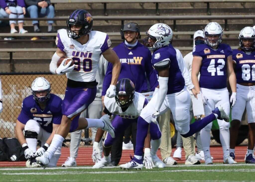
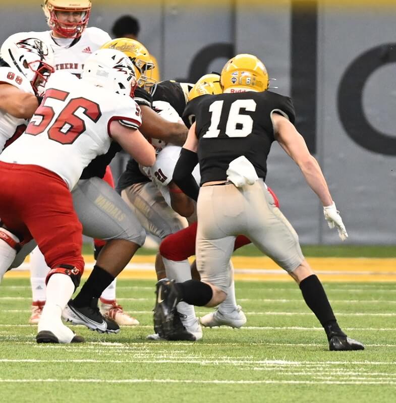
& 1 Northern Iowa at Western Illinois
Unlike our fearless leader, I like purple. Don’t tell Paul, but purple is my favorite color. I wore it proudly during my D-III college football days in the mid-80s. But while I’m a fan of purple unis, I am appalled and offended by purple-on-purple violence. In this case, the crime scene is in Macomb, Illinois, where the Western Illinois University Leathernecks hosted the University of Northern Iowa Panthers. On a crisp fall afternoon with bright sunshine on a freshly mowed grass field, this game would’ve looked much better. Instead we had gray skies and a grassy field still waking up from a winter slumber. The Leathernecks donned their white-purple-white home duds while Northern Iowa went black-white-purple. A few seconds of this was enough to send me searching for a better-looking game.
Thanks, Eric!
The “BEST OF” Kreindler’s Korner
Hey guys & gals. You’ve enjoyed Kreindler’s Korner for several years now, mostly on the weekends, on Uni Watch, but with the recent coronavirus outbreak, Graig’s time is just too precious and he needs to tend to other things besides coming up with a new writeup each weekend.
So, going forward, for as long as the COVID-19 situation is bad in New York, I’m going to run a few “Best of’s” until Graig returns.
Here’s today’s offering:
Title: “Josh Gibson, 1931” (color study)
Subject: Josh Gibson, 1931
Medium: Oil on linen mounted to board
Size: 5” x 7”The 1931 Homestead Grays are considered one of the greatest Negro League teams of all-time. Playing in the American Negro League that year, it’s been said that they had a record of 163-23 against all levels of competition. We won’t ever know whether those numbers are fully legitimate, but it’s very probable that they did dominate their competition – the club boasted the likes of Oscar Charleston, Jud Wilson, Smokey Joe Williams, Vic Harris, Tubby Scales and a young catcher named Josh Gibson.
Many sources credit Josh with hitting 75 home runs that season, though ‘officially’ he only had 10, while slugging at a .545 clip. Regardless of the actual numbers, the following years instilled very little doubt that Gibson was one of the league’s premier sluggers. One of his most famous (and perhaps apocryphal) feats is the ball he supposedly hit out of Yankee Stadium during game action. In an article written by the great Gary Ashwill for his blog Agate Type (which you NEED to follow), he discusses a home run in 1930 that at least one player claimed to have gone out of the ballpark.
This small portrait is one of 200+ such paintings of mine that were on display at the Negro Leagues Baseball Museum in the spring of 2020.
Thanks, Graig! You can (and should!) follow Graig on Twitter.
Too Good For The Ticker!
Got an e-mail yesterday from Eric Starke which included the following image:
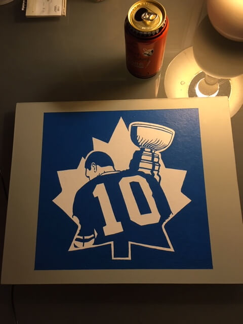
And the body read as follows:
I’m no (Graig) Kreidler (sic). Nor do I have the Gashouse gear but I painted this tonight for no reason other than this is the greatest patch of all time. To give context, I’m from Winnipeg and was bred to hate the Leafs but now that I’m pushing up on 50 years old, I’ve left behind loyalty in favor of iconography. I didnt put my “twist” on the image because you cannot improve this. It is the perfect wordless distillation of hockey.
Beautiful. Thanks for sharing.
Uni Watch News Ticker
By Phil

Baseball News: Check out this fantastic colorization of Willie Mays, Willie McCovey and Orlando Cepeda (from Chris Whitehouse). … New Era is now selling historical logo hats for NPB teams, “I don’t think that they will sell them stateside. Actually the Hawks’ Head for Daiei was only a batting helmet. Still love the Swallows YS shown here which started in 1994” (from Jeremy Brahm). … Boston College LHP Samrath Singh, who is Sikh, wears a turban with what appears to be a pro-cap when pitching (from Alex Giobbi). … Some serious throwbacks here in this Vintage Game (from Dustin Wood).

NFL News: We keep hearing chatter that the NFL could finally end its one shell rule in time for the 2021 season. If so, that would allow such fan favorites as the Bucs’ Creamsicles, Pat Patriot and a Falcons throwback with a red helmet to return.
College/High School Football News: On Friday night, fans at South Point High School (in Charlotte, North Carolina) protested against the continued use of the school’s “Red Raider” mascot, which “depicts a Native American man with red skin.” … Fansided continues ranking Power 5 unis, and like most of their others, you’ll probably disagree. … On the final play of scrimmage for Duke, they put in a robotic tackling dummy (from James Gilbert). James also notes the “Jersey number of announcer and former Georgia Tech player” is what was put on the dummy. Make sure to watch the clip to the end! … New uniforms (or at least jerseys) for Bucknell football (via Paul).

Hockey News: Eric Staal has been assigned #21 in the scorecard. He’s been #12 everywhere else in his career, but that number is retired twice by the Habs for Dickie Moore and Yvan Cournoyer. Submitter Mike Engle adds, “Flip the digits, there it is. Source: this screenshot I grabbed from Tricolore Sports, the official merchandise arm of the Canadiens that runs the in-arena gift shop.” … The BC Division in the WHL finally kicked off their season on Friday night, a little later than the other divisions. The Kelowna Rockets played their season opener debuting their new alternate uniforms. Here is a look (from Wade Heidt). … Also from Wade, Regina Pats backup G Spencer Welke received his first playing time in the crease this season on Friday. Here is a look at his new logo-abundant pads and gloves. … If you’re dying to own an official Seattle Kracken sweater, this article (scroll down) thinks they’ll be available in August. … The South Carolina Stingrays dressed in superhero costumes last night (from R-El E-Lee). … Last evening, the Calgary Flames wore special Canadian Armed Forces sweaters in warmups (from Wade Heidt). … Does this bode well for the NHL? Tony T. noticed this little faux pas (hockey has 3 periods, not 4 quarters).

NBA News: The Portland Trail Blazers recently acquired Norman Powell, who will take jersey number 5. That will mean the number’s former owner, Derrick Jones, Jr. will be switching from 5 to 55, a rare in-season switch. … Speaking of in-season number changes, the Chicago Bulls rookie Patrick Williams will give up his #9 jersey to newly acquired Nikola Vucevic. That article also notes other numbers for other newly acquired Bulls. … ICYMI: The Lakers had a couple of memorials for Elgin Baylor on Friday night — a patch on their warm ups and a strip with initials on the game jersey. Submitter Matthew Wolfram notes the warm up patch is similar to recent patches used on game jerseys for Kobe Bryant and Jerry Buss. The similarities are accentuated by the fact that all three had surnames ending in ‘B’.

College/High School Hoops News: Before yesterday’s games tipped off, here is the updated NCAA uniform tracker (from Brandon Wright-Rowan). … Check out these pinstripe shorts being worn by Rowan County HS in it’s 16th Region championship game against Ashland Blazer at Morehead State. The winner advanced to the KHSAA Sweet 16 (from Chad Hensley). … Yesterday, Oregon State University’s warmups featured patches with 16 stars (for the sweet sixteen). From Jeremy Brahm. … Frederick Douglass HS in Kentucky has uniforms that say “The Farm,” an homage to where the school was built in Lexington (from Josh Claywell). … Last night, Syracuse guard Kadary Richmond’s shoes didn’t match. One was black, one was orange (from Max Weintraub).

Soccer News: Art of Scoreboard wants to know why Hofstra is represented in purple on this scorebug (his, and my, alma mater, btw). Hofstra’s official colors are Hofstra blue & Hofstra gold. … Manchester United’s 2021-22 home kit has been leaked.

Grab Bag: The National Olympic Committee of the Republic of Belarus (NOCRB) has revealed its team’s kit for Tokyo 2020 amid a threat of further sanctions from the International Olympic Committee (IOC). … “Alabama what?” read the subject of an e-mail from Johnny V, which included this photo of…something. He adds, “Not sure what this is” and I am in agreement. … Lacoste now features competition level shoes, after previously having been only a “lifestyle” brand (thanks, Brinke). … Check out Colorado’s “Rocky Mountain” court in this v-ball match between Colorado & ASU (from Jeremy Brahm). … Tweeter Mark Healey found a “random logo” he’d never seen before (that’s the Manhattan Bridge, if anyone is wondering). … The Mount Royal University in Calgary has their volleyball court sharing the same floor as the basketball court. To avoid confusion, the volleyball court has a light brown color, compared to the white/grey color of the basketball court that surrounds it (from Terry Mark). … The Mumbai Indians, who play in the Indian Premier League, have unveiled a new jersey for their 2021 season.
And finally… that will do it for today — BIG thanks to Jordan for the really detailed Bengals redesign project, as well as to all the other contributors. You guys are all aces.
Everyone have a good Sunday and I’ll catch you here next weekend. I can’t believe it but by then we’ll be watching regular season baseball games, the NCAA will be down to their final four teams (both the men and women) and the Masters will be less than a week away. Things are finally beginning to (slowly, but surely) return to normal. You guys stay safe!
Peace,
PH
As a stand-alone, I llove Jordan’s concept. There is a lot of creative thought that went into it, down to the slightest detail. And the execution is on point, as always.
That said, looking at it as a Bengals concept, I am lukewarm to it.
PRO: the socks, the shoulder stripes, the helmet stripe, the word mark; the lighter orange.
CON: the bespoke number font is a little too cute for professional football; the use of team nickname rather than city/state for the helmet logo/monogram.
The color scheme makes me instantly think of the University of Miami. Not sure that a pro team wants to associate down with a team from the college ranks, especially a middling program whose best days are decades ago. I get adding the dark green for the jungle and I love the attempt, but the loss of black is noticeable, even in the AFC North. I don’t know if there is a way to integrate a shade of green that dark with black, either, so I don’t have a solution. This is a fun concept and maybe elements could be incorporated into a new design, but I can’t see professional athletes wearing this on the same field against a team wearing what the Bears, Packers, Browns or Steelers wear.
I thought Jordan’s designs were one of the better “concept” entries we’ve seen here in a while. I love that he went with a totally new color scheme and overall look instead of just “tweaking” the current design. I agree with MJ that the colors might be too closely associated with U. of Miami but don’t mind the number font – I’m in the minority here I think in the sense that I like custom numerals as long as they are easy to read from a distance and don’t want an NFL were everybody is using the standard block font just because that’s the way it always used to be.
Overall grade: A-. Great work.
I love this redesign, one of the best I have seen on here.
I do not like drop shadows, but think they look good here. Might be interesting to see a C instead of a B for the helmet logo. I do not love having a word mark on the jersey but again I think it looks good.
It bums me out when I think about how much better this design would be than what they will actually do.
Not to be a buzzkill but as long as the Brown family owns the Bengals such a drastic overhaul would never happen. The Bengals colors and original uniforms were not only similar to Cleveland, but Massillon high school where Brown coached. The current striped helmet is similar to a prototype from the team’s creation. As revered as Paul Brown is, I just don’t see the family altering what he created in such a drastic way. To the design itself, I’m not sold on the green and orange pairing. I don’t care for it with U of Miami, FL either.
As a bengal fan, changing the helmet is a nonstarter. Cool idea though. The unique helmet striping is a great concept. No drop shadows. Had enough of that.
I agree with you Allan – a lot of great ideas in this redesign, but leave the helmet alone and don’t use drop shadows.
“Unfortunately I can’t quite tell what team he pitches for, but LHP Samrath Singh, who is Sikh, wears a turban with what appears to be a pro-cap when pitching (from Alex Giobbi).”
Samrath Singh plays for Boston College:
link
Thanks Kary. Will adjust text.
Re: Bengals concept: Looks like the Bears, but with green.
I’m generally inclined against Bengals redesigns, and I actually generally like the Bengals real-life uniforms. But Jordan won me over on this one; he manages to balance the competing virtues of the Bengals visual identity – subtlety and loudness – while turning the dial up a notch on each. Well done! Though the feature image of the helmet leans too dark and black-ish for a division that already has two black helmets. If this concept were ever put into production, it would be important to choose a shade of green (and/or a helmet glossiness level) that ensures the the helmet never, ever looks black under any lighting.
The Bengals redesign is a cool approach. The one thing I don’t like is the use of a “B” as the primary logo. I think a single-initial logo always works better when it reflects the city rather than the nickname. Should be a “C” for Cincinnati IMO.
“The Portland Trail Blazers recently acquired Norman Powell, who will take jersey number 5. That will mean the number’s former owner, Derrick Jones, Jr. will be switching from 5 to 55, a rare in-season switch”
Powell is 24 for the Blazers and Jones Jr. is switching from 55 to 5. Rodney Hood vacated 5 letting Jones Jr. to take it.
Yeah where on Earth did that come from?
This article on Singh has a couple of interesting uni-related tidbits. Only player on the BC team that doesn’t have to be clean-shaven. Also when he was being recruited he felt many teams wanted the Uni-notoriety of having a player who wears a turban more than him as a player. Also, he seems like a pretty amazing guy!
link
“Spider. He is my hero.” Now I must listen to They Might Be Giants all day!
I promise not to kill you.
There May Be Giantst? Who’s There Must Be Giants?
What’s that blue thing doing here?
If you hear only one new song this year, there must be something terribly wrong with you.
“Vandals”: supercool nickname
“Crusaders”: in need of rethinking
Someone is going to have to explain that one to me. Extinct tribes fair game, Catholic imagery from a Catholic school verboten?
Extinct European tribes—who cares? I don’t
Crusaders: That nickname has some terrible connotations for Muslims due to that whole Crusading thing during the Middle Ages. Also, not a good look to have your mascot match the title of a KKK publication.
Absolutely absurd that you would try to link Holy Cross to the KKK.
Eric doesn’t care about extinct European tribes. Does he care about extinct American tribes, or is there a double standard at work here?
Especially absurd to try to make that link as the Klan hates Catholics. Someone thinks he knows history but shows himself to be clueless.
Should teams that are the Storm or the Pride also change their names because those words are sometimes used by hate groups? What about the White Sox?
Eric Boyd was a kidnapper, rapist, and murderer. Not a good look to have your name match his, Eric B.
link
My son teaches at a high school who are the Bengals and they are orange and green
My son teaches at a high school who use the Bengals nickname. Their colors are green and orange.
link
I like the “E” logo and colors! Too bad they don’t have an original tiger logo.
No pants stripe, the colors are wrong and look like a prominent college team, the helmet is needlessly changed, the numbers are too cute and the sock design probably would look terrible in real life. Other than that, this concept is totally worthy of being a lead item.
I really like this redesign Bengals uniform. The only change I’d make is to put the triple stripes on the shoulder and not the arm. Like where the USC Trojans shoulder stripe is. I came into this having my mind made up that the forrest green should be black, and it could easily be done with black, but I now agree that green is the way to go to differentiate from the other teams in the AFC North.
But it does resemble the U of Miami.
For the scoreboard, it was during the first round of the East Regional in the 2019 NCAA Tournament. The game of Duke and ND State was played on March 22nd at Colonial Life Arena in Columbia, SC. The final score was 85 to 62 in favor of the top seeded Blue Devils.
Appreciate all of the effort that went into that Bengals redesign, but the team will never move away from black and orange. That’s their identity. Also, and I admit that this is me being a stodgy traditionalist, I want the NFL to mandate the standard “varsity block” number font and a standard nameplate alphabet to be used by all teams. Makes it much easier to identify players on TV. Even if we’re in a world where 4K broadcasts are a reality, there’s only so much you can see on TV, or in person. The whole point of numbers on jerseys is to easily identify which player is which. Pretty much every main soccer league around the world does this. American sports should as well.
I’ll have to respectfully disagree, especially now that Tampa Bay has gotten rid of the awful “digital alarm clock” numbers, I can’t really think of an NFL teams that have numbers that are difficult to read and prefer that there be some variety. A well-done custom font adds a lot to a team’s visual identity, a for teams like the Bears to return to the “standard” font would be a downgrade, IMO.
We sometimes do see such issues with college basketball and football, but it’s usually due to a lack of contrast in the colors, for example Loyola’s black numbers on dark maroon jerseys we saw recently in the NCAA tournament.
hofstra presenting purple: my guess ishofstras ultra marine blue is fairly purple, so maybe someone was lightening/darkening the hofstra colour in the bug so there would be some differentiation with their opponent, and didn’t think too much of it because he was the guy tending to a hofstra soccer game, and it is a miracle you can even watch a hofstra soccer game.
I took a crack at redesigning the Bengals’ uniforms myself. That said I find a lot to like in Jordan Grimes’ proposal; specifically, the team wordmark, helmet stripe and the bespoke font. Forest green looks black to me, anyway, so that’s practically a distinction without a difference.
Why don’t teams in the western part of the country that are saddled with the “Redskins” name change it to “Redwoods”?
This strikes more as a redesign of Florida A&M’s uniforms than of the Bengals’.
For a person who is color blind red/green. To me it look too close to the Browns uniform. The forrest green was not a simple green to distinguish. Interesting concept but it looked like a Browns uniform to me.
I can totally appreciate the design effort it took for these- and I applaud the artistic talent it took. But the green/orange just doesn’t work. The Bengals are black/orange. Maybe stick a tiny green accent somewhere so they can add it to the PR release. But the helmet stays except for a BENGALS retro if they lift the helmet rule.
Can’t the Bengals already do a retro “BENGALS” design under the current one-shell policy? The underlying helmet color is still the same, so all they have to do is strip off and replace the tiger stripe decals with the old-school wordmark.
“Check out Colorado’s “Rocky Mountain” court in this v-ball match between Colorado & ASU (from Jeremy Brahm).”
For the record, that’s Colorado’s regular basketball court, which they’ve been using link. The mountains in the design link, a series of red rock formations that form link to the University of Colorado campus in Boulder.
It’s a super-cool court design that’s definitely worthy of a Ticker mention. So kudos to Jeremy for the sharp eyes and for finally helping to give this the attention it’s deserved for the better part of five years!
Once the drop shadow was added to the B it reminded me of a Hurricane flag for some reason
Thanks for sharing your design, Jordan! It’s well-thought out and nicely balanced in terms of unique flourishes and classic design elements. The forest green and orange works better than I would have expected. I’m eager to see more of your design concepts!
The NBA ticker is wildly off with regard to the Blazers. Norman Powell is wearing #24 (which he wore in Toronto before the trade). Rodney Hood’s departure to Toronto frees up #5, which is Derrick Jones Jr’s preferred number. So Jones Jr is switching from #55 to #5 midseason.
Not at all true about the Portland Trail Blazers. Just clicking and reading the linked article would tell you that.
In theory I have no problem with teams having colors that don’t match the animal (we all know lions aren’t naturally Honolulu blue), and I also don’t really care that any color scheme might look like somebody else (if neither LSU nor the Lakers “own” purple and gold, then Miami-FL doesn’t own orange and green either).
But in practice, no matter how well done this concept is and no matter how otherwise orange and black the division is (in other words, yeah go wild on orange and green, good for contrast), the Cincinnati Bengals are too invested in orange and black. It’s been so since their (non-charter) AFL days. They shouldn’t throw away that brand equity. And won’t.
Holy Cross has “moved away” from the Crusaders in recent years. They have eliminated the physical Crusader mascot & changed their primary logo to the interlocked HC (previously it was a crusader/knight helmet and years a ago it a crusader w/ shield & lance on horseback)
As a catholic & Jesuit institution it is surprising they would not stand behind a historic religious mascot or imagery?
I’ve seen that Crusader mascots around the country are being given a second look because the Crusades were literally white Christians fighting against brown Muslims. Mayyybe trying to kill Muslims isn’t something to promote anymore.
From what I can tell, you are the only one reporting anything on the one helmet rule. Anything to share (in general obviously) about your sources or why nobody else is reporting it?
It’s not just the colors that remind me of U Miami. The helmet logo looks like hurricane warning flags flying.
It doesn’t have to be the traditional uni number font, but I always do prefer a more squared off look. Rounded just looks off to me.
GTGFTS: 1 Duke vs. 16 NDSU in 2019 NCAA Tournament round of 64. Duke won 85-62. Was played in Colonial Life Arena in Columbia, SC. The “2019 Men’s D1 Basketball” banner in the back made it pretty easy: find Duke’s games in the 2019 tourney (of which there are only a few).
Also: Zion’s hops are absurd. Jumping 5 feet in the air just because he can.
Bengals redesign looks like faded tattoo ink that used to be black but now has green tones. Can’t unsee it.
I agree with the commenters re the Bengals concept – particularly around the “B” logo. Besides the Oakland A’s (Athletics)- and to a lesser extent, the Mariners (retro “M” cap logo) – is there a professional team that actually brands itself with of the first letter of the team name vs. the City/Location name? Can anyone imagine the Packers with a “P” logo instead of the “G”?