For all photos, click to enlarge
[Editor’s Note: Today we have a guest entry from the great Wafflebored, who’s going to tell us about his latest DIY jersey project. Enjoy. — PL]
By Wafflebored
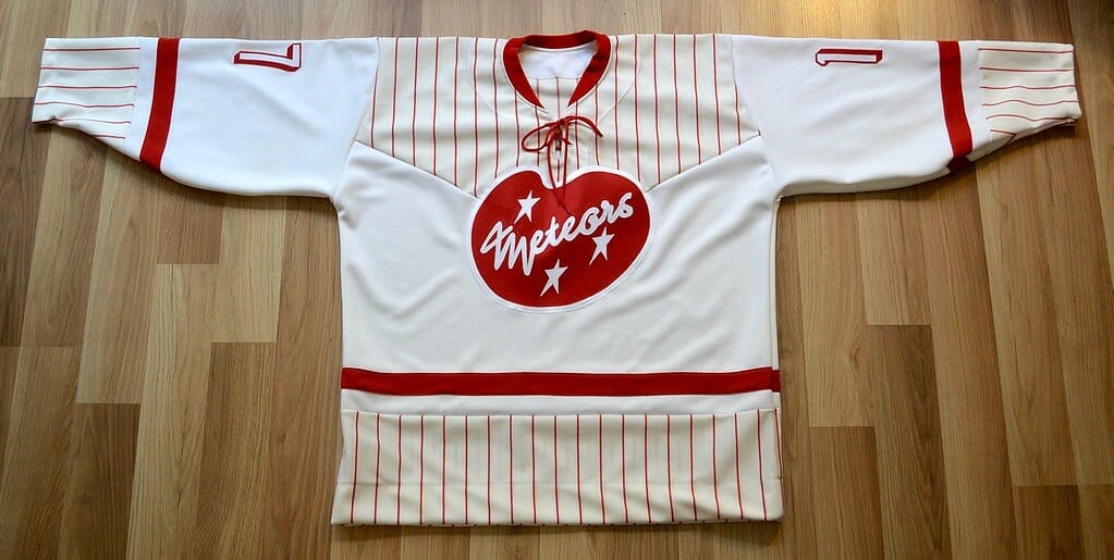
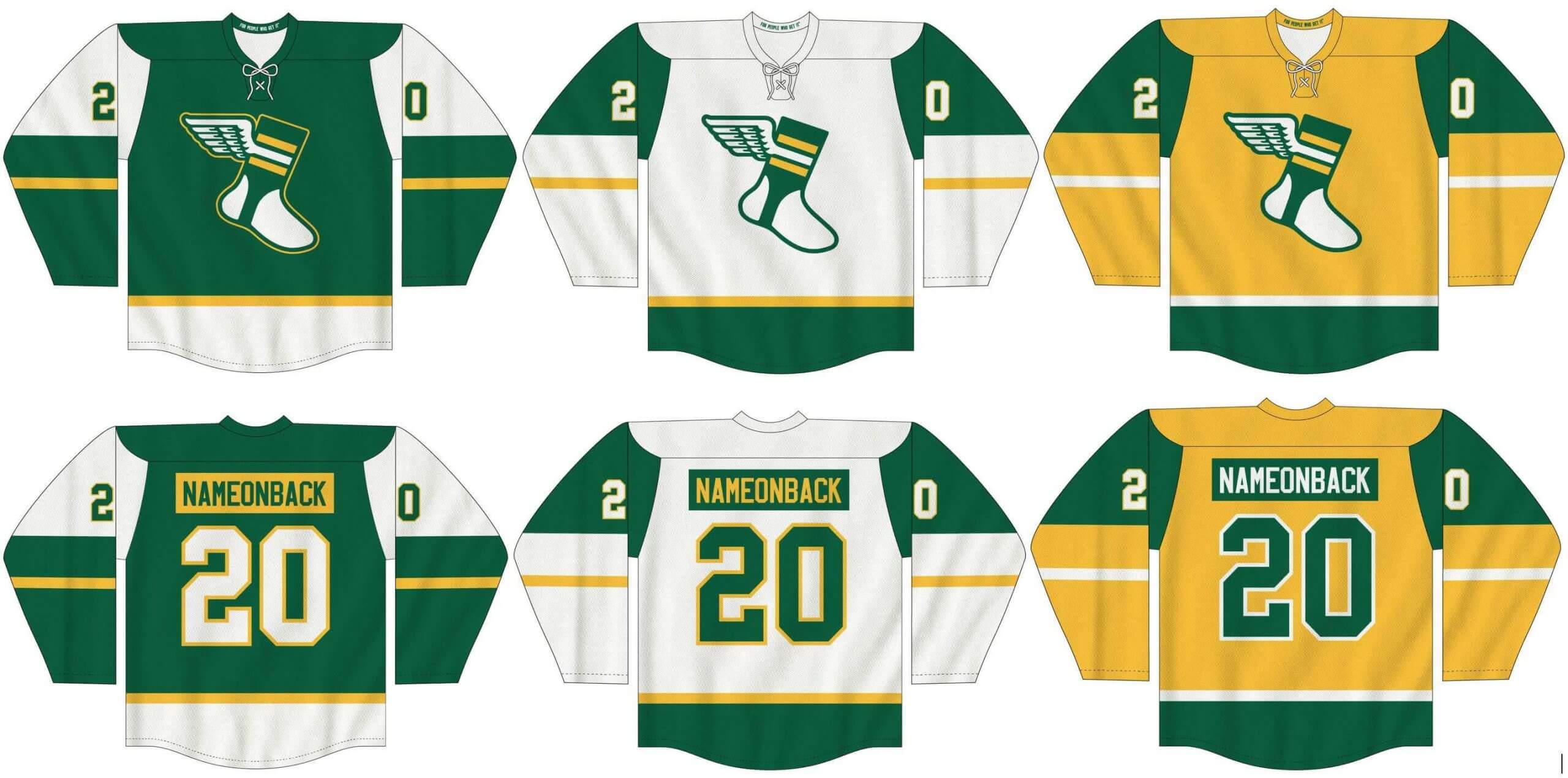
While the NHL is in Reverse Retro mode, things here at Wafflebored HQ are (as usual) in full retro mode. My latest project started when I acquired a nice piece of red-pinstriped baseball jersey fabric. I love pinstripes, especially interesting colors such as this red. But I don’t like making baseball jerseys, so I decided to make a hockey jersey incorporating the material. I didn’t want to just toss the pinstripes in randomly, however — I wanted to design the jersey in a way so that the pinstripes made some sense.
I’ve made several ’50s retro jerseys before, and it’s a theme I enjoy. I’m a huge fan of mid-century modern design, and I’ve always wondered why that mid-century style didn’t have much effect on sports uniforms, since it showed up in almost everything else from that era. So I’ve tried to fill that void in uniform history with my own designs.
The biggest advantage of making jerseys from scratch, as opposed to adding graphics to a blank stock jersey, is that I can make structural changes to create new tailoring patterns that don’t appear in standard uniforms. In this case, I needed to decide how to incorporate the pinstriped material in an interesting way. I opted for a chevron design to enhance the mid-century feel.The entire shoulder yoke piece is one piece that extends down to the chest in the front and in the same manner down the back, with no seam at the top. It can be tricky to get the point of the chevron to be perfectly centered, so I did the front first, since I knew the point would be covered by the crest, which would hide any slight asymmetry:
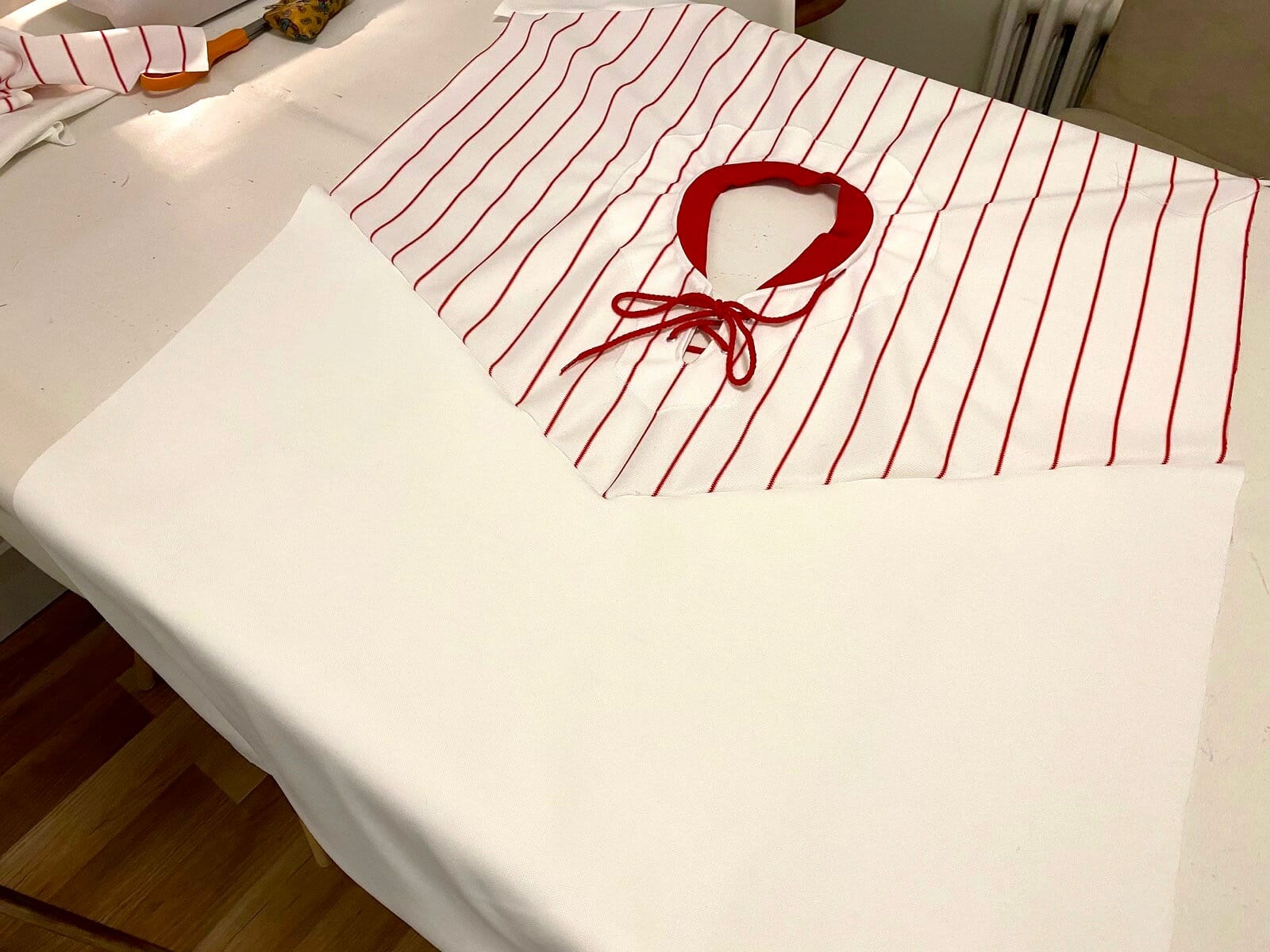
As it turned out, the point on the front worked out fine, but it gave me the practice I needed to make sure the one on the back looked right, which it did:
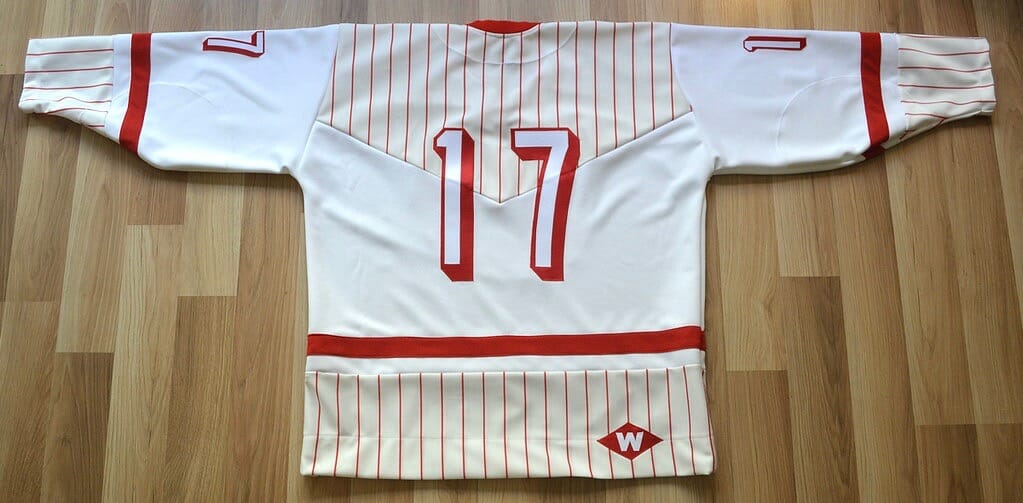
I used the rest of the pinstriped material to trim the bottom of the sleeves and body of the jersey. Initially this was all I was going to do, but the jersey just looked too white, so I added the solid red stripes which complemented the red collar nicely. (It’s unusual for me to make a design adjustment like that on the fly — I usually plan everything out in advance. But I wasn’t sure what to do with this one so I mostly winged it, and made numerous changes along the way.)
Of course, I incorporated a lace-up collar, which is my favorite. It’s actually easier to get consistent results with that format as opposed to a V-neck collar, which is hard to get symmetrical and to look good. I was able to find a perfect red lace in the correct length.
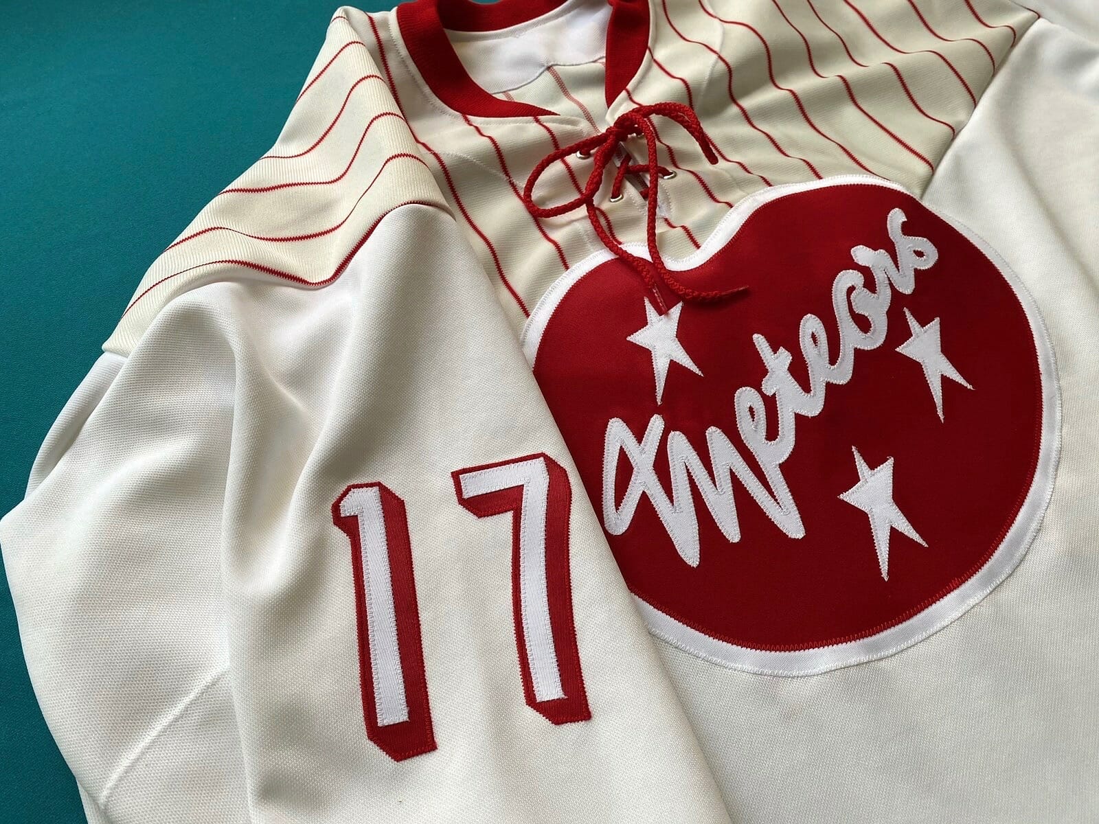
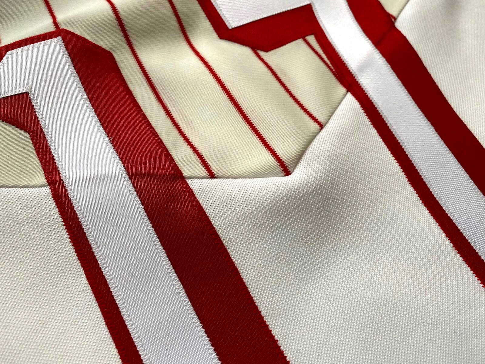
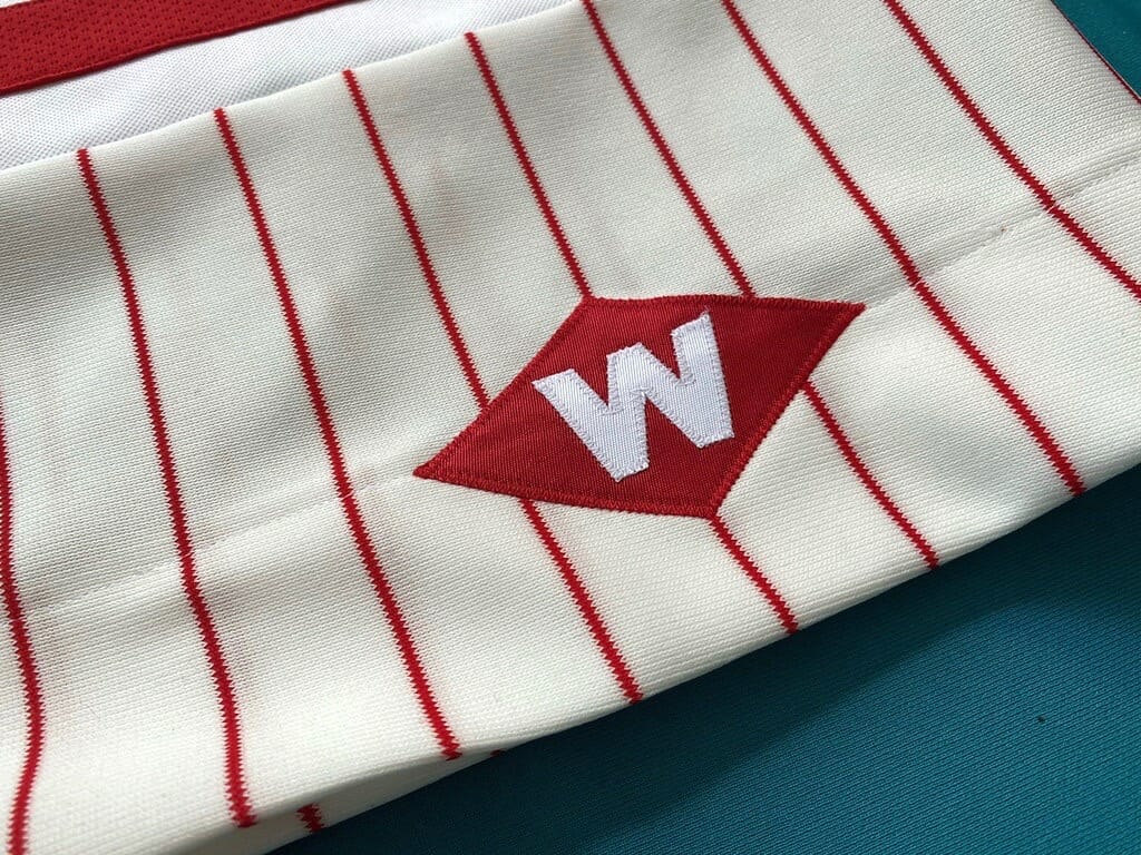
The pinstriped fabric is a heavy polyester, so I matched it with a heavy solid-white material. It’s a polyester double-knit, exactly the same as the ultrafil material used on hockey jerseys through the 1990s. I love heavyweight jerseys, and this one definitely feels like a pro model. As always, I included double-reinforced elbows to enhance the pro feel.
I chose “Meteors” as the team name because it felt era-appropriate. The cresting was done with twill. For the front logo, I knew I wanted a fun design similar to a neon motel sign, so I drew out the artist’s palette-style shape and added the team name and some stars.
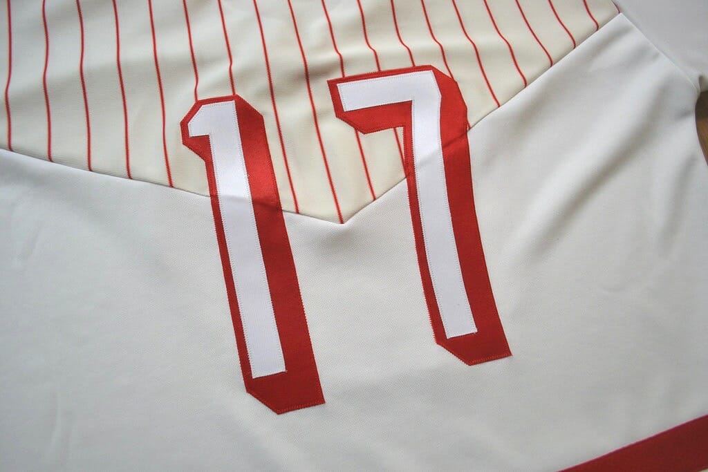
Since I wanted to keep the color scheme to just red and white, I opted for outline-only numbers with a block shadow:
Overall, this jersey looks and feels like a ’90s team wearing a ’50s throwback. Working with heavy fabrics like this is an absolute joy — much easier than working with thin or shiny fabrics. I have a big piece of teal fabric that’s exactly the same weight as this jersey, so my next project might be another retro jersey in teal and white, which will also suit the era.
———
Paul here. What a great project! My thanks, as always, to Wafflebored for sharing his inspired designs with us.
Click to enlarge
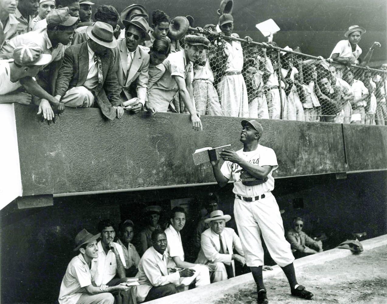
Too good for the Ticker: Oh man, check out this spectacular 1947 photo of Jackie Robinson signing autographs during spring training in Havana, Cuba. Magnificent!
(Surprised to hear that the Dodgers were training in Havana? You can learn more about that here.)
Podcast reminder: Why are so many people who are into uniforms and logos also into collecting stuff? What’s the difference between collecting and hoarding? What did Chris Creamer and I collect when we were kids? What do we collect now? And what does all of this have to do with the 1987 movie Throw Momma From the Train? Chris and I discuss all of that, along with the NBA’s new alternate unis, MiLB’s new logo, teams wearing green for St. Paddy’s Day, our listener-submitted question of the week, and more in the new episode of Unified.
It’s a really good episode — except that, for the second consecutive week, my vocals came out too echo-y, which is frustrating and embarrassing. We’re taking steps to ensure that it doesn’t happen again (please, no suggestions about mic settings, soundproofing foam, recording in a closet etc.) — thanks for your patience on that front.
As always, you can listen to us on Apple, Google, Stitcher, TuneIn, and Spotify, or just use the player below:
The show notes from this episode, which include photos of many of the things we discussed, are here. Those photos (and some additional ones) also appear in the video version of the episode:
Please consider supporting this episode’s advertisers, Oxford Pennant (get 20% off any order with checkout code UNIFIED), Ebbets Field Flannels (10% off, except on NFL items, with checkout code UNIFIED), and Homefield Apparel (15% off with checkout code UNIFIED).
Enjoy the episode, and thanks for listening.
Click to enlarge
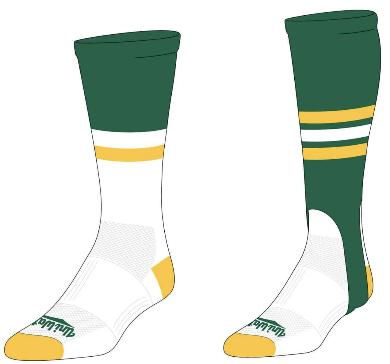
New merch reminder: In case you missed it earlier this week, I’ve teamed up once again with Adelph Wear — the brand run by longtime Uni Watch reader Nathan Haas — to create a new line of Uni Watch hockey jerseys (customizable with your choice of number and NOB, of course), as well as new Uni Watch socks and stirrups. We’re taking pre-orders on them now.
In order to get in on these items, you must place your pre-order by March 31. You can do that here. We expect the finished product to ship out by the end of April.
My thanks, as always, for your consideration.
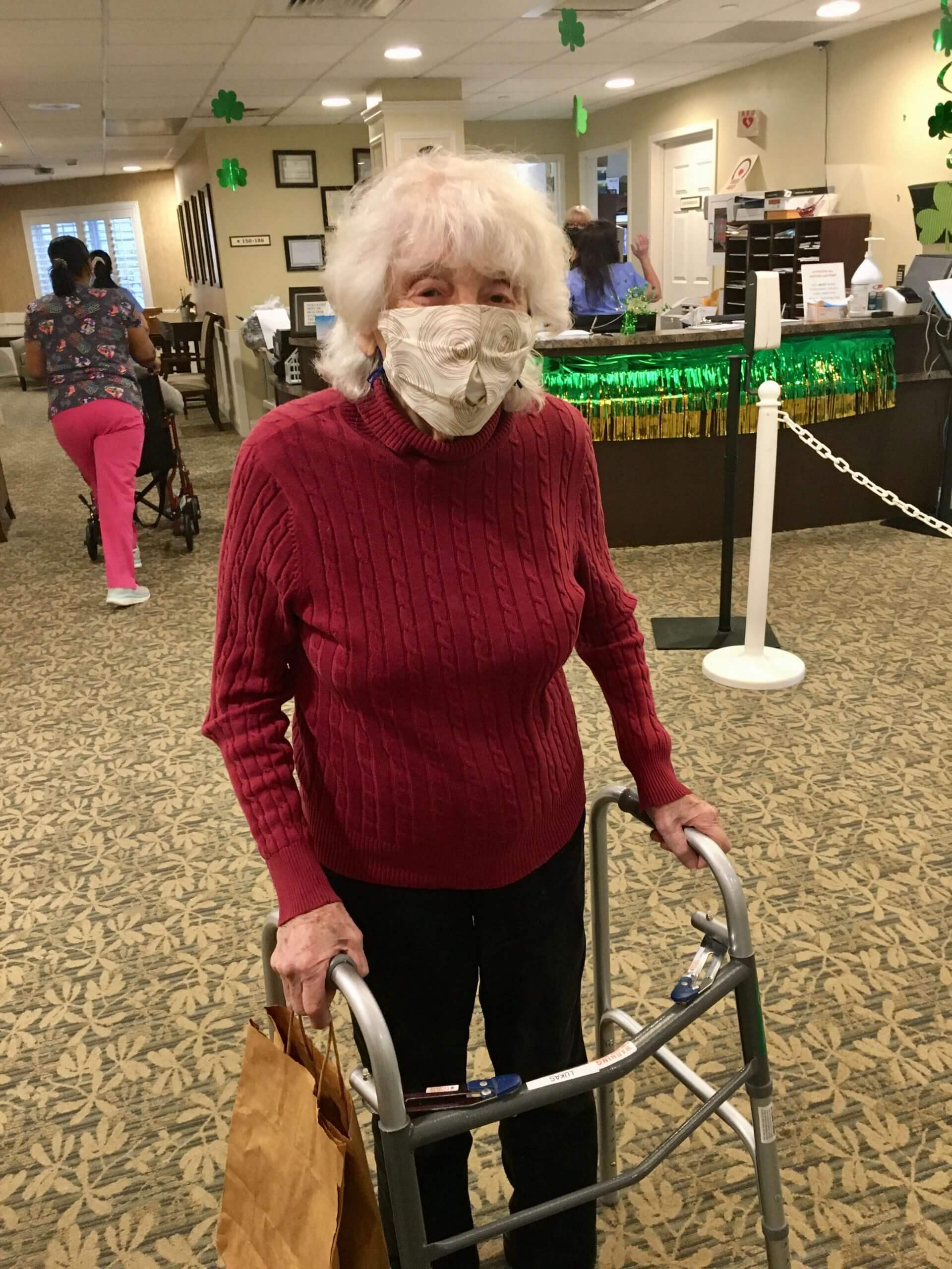
Finally: Yesterday Mary and I got to do something we hadn’t been able to do for more than a year: visit my mom, whose assisted living facility has been in total lockdown since the pandemic hit and just started allowing visitors a week ago.
The circumstances weren’t ideal. The visit, which we had to set up well in advance, was limited to 30 minutes (we stretched it to about 45) and had to take place in the dining hall, with Mom at one end of a six-foot-long table and us on the other end. Masks were required. No hugging or any other physical contact was permitted, which was heartbreaking for all of us.
Despite those limitations, it was so good to see her, and I know it was good for her as well. With my birthday coming up this weekend and hers in a few weeks (she’ll be 97!), this is the best present either of us could have hoped for.
I know many of you have likewise been separated from your loved ones for the past year. Here’s hoping you get to reunite with them soon, just as I did with my mom yesterday.
The Ticker
By Anthony Emerson

Baseball News: Triple-A will test bigger bases this season (thanks, Phil). … Also from Phil: The famous fish tanks behind home plate at Marlins Park have been removed, which seems like a disappointing move. … The Mets wore their green St. Paddy’s Day cap again yesterday (from multiple readers). … The new RBI Baseball 21 video game shows Cleveland wearing what appears to be a new white home alternate with “Cleveland” lettering, similar to the road jersey. I guess we’ll see soon enough if this exists in the real world (from Bryan Shaw). … Here’s a good article about the company that’s making custom-painted bats for many MLB players (from Akul Nishawala and our own Brinke Guthrie). … Also posted in the hockey section: Did you know Hockey Hall of Famer Eric Lindros had a tryout with the Blue Jays in 1990? He even had a baseball card made (from Brandon Weir). … MLB.com has a great article on Dave Parker’s famous “Boys Boppin'” T-shirt. … The local paper in Sylva, N.C., has a cool story about the sleuthing work used to identify the historical team that wore a vintage uniform that recently resurfaced in the town (from Kary Klismet_. … New York Gov. Andrew Cuomo wore a split Yankees/Mets mask while announcing yesterday that those teams would be able to have a limited number of live fans when the MLB season starts next month (from @ScottyBeats86 and @bryanwdc). … The Atlantic League’s new franchise in Gastonia, N.C. — the Gastonia Honey Hunters — have unveiled their new unis (thanks, Phil).

NFL News: New Lions QB Jared Goff will continue to wear No. 16, which is the same number that he wore with the Rams (thanks, Phil).

Hockey News: Here’s a good article about how 20 years ago, Penguins G Johan Hedberg became a fan favorite due to his Manitoba Moose mask (from Joe Werner). … There were a number of NOB irregularities during the 1974 Stanley Cup Final between the Bruins and the Flyers. The six photos in that sequence are from Games One through Six, respectively, and they show that some games had both teams wearing NOBs, other games had just one team wearing them, and still other games had neither team wearing them (from Jeff Ingalls). … Cross-posted from the baseball section: Did you know Hockey Hall of Famer Eric Lindros had a tryout with the Blue Jays in 1990? He even had a baseball card made (from Brandon Weir).

Hoops News: New Suns G/F Torrey Craig will wear No. 12 (from Etienne Catalan). … The 2022 March Madness logo has been revealed (from Forster Keenoy). … Jeez, do you think there are there enough patches on the Oklahoma State jerseys? (From @brw07.)

Soccer News: Manchester United’s 2021-22 away kit will apparently be inspired by the club’s famous early-’90s away kit (from Charles George). … FootyHeadlines has gotten their hands on Juventus’s 2021-22 third kit. … They’ve also gotten their hands on Real Madrid’s new away kit (thanks, Phil). … Swedish side Malmö FF have unveiled their 2021 kits (from Ed Żelaski). … USL League One has unveiled locally inspired “Culture Collection” kits for eight of its teams and will give away full uniforms to six fans of the winning team in an online bracket-style competition to determine the best design (from Kary Klismet). … New kits for the Madagascar national team (from Trevor Williams and Germán Cabrejo). … During last night’s Dominican Republic/Mexico match, the Dominican No. 7’s number appeared very off center, as if the jersey had originally been No. 17 (from Ty Ortega).

Grab Bag: A federal appeals court has issued a memo stating a preference that briefs be submitted in certain serif typefaces. Ironically, the memo itself is in a sans serif typeface (from Jason Hillyer). … The Australian Football League is allowing back-of-guernsey ads for the second season in a row, above the number. Here’s how it looks on the Western Bulldogs, who have moved their traditional F.F.C. inscription — a reference to their founding name, Footscray Football Club — to the front of their guernseys (from our own Jamie Rathjen). … New athletics logo for Michigan City (Ind.) High (from Kary Klismet). … @walbergLines shared a fascinating article about how superstitions around women’s clothes in Myanmar have basically stopped security forces from attacking protesters in the wake of February’s military coup d’état.
That’s it for this week. I have big birthday plans for this weekend (well, as big as the pandemic will allow). However you’re spending your weekend, make it a good one, enjoy Phil’s content over the next two days, and I’ll see you back here on Monday — a year older (and hopefully wiser). — Paul
Gastonia, not Gasonia, Honey Hunter. There is a “t” missing.
Fixed.
So great that you were able to see your mom! Wish the conditions were better, but hopefully SOON you’ll be able to give her that hug she so richly deserves.
So nice of the assisted living facility to break out the Uni-Watch colors on the front desk for you!
Happy Birthday Paul!
When you said you had something important to do yesterday, I was hoping it was this. So happy y’all got to see each other.
And as always, I am Uni Watch green with envy over Waffle’s skills.
Happy birthday!! Seeing your mom was the best gift you could have asked for- hopefully there will be more visits in the future.
My last name is spelled NishAwala, not Nishwala. Thanks!
Fixed.
Lol, thanks. I see you took my emphasized correction literally.
Wasn’t sure. Now lowercase!
The NCAA seems to have managed to do what the NFL couldn’t: standardize their graphics while allowing for some creativity from one year to the next while incorporating some design elements of the host city. You can see the continuity from one Final Four to the next but yet there are some differences with each year.
Wafflebored: killed it again.
HBD and props that you got to see Mom. I’m not a very social creature but this last year has taught me the importance of being able to be around people.
So glad you got to see your mom, Paul. And have a happy birthday! I’m curious, is the “rain on your birthday” streak still going strong?
It has been, but the forecast for Sunday is alarmingly sunny. Just one more messed-up thing about the pandemic — whaddaya gonna do!
Great news about seeing your mom. I know you got your shot, but are they allowing people to visit who haven’t been vaccinated yet?
Happy Birthday Paul!
Wafflebored, another brilliant jersey coming out of Wafflebored HQ! The logo reminds me of the old Edmonton Flyers jersey crest. I enjoy the details on this one, including the throwback Wafflebored maker’s mark.
In 2019, Topps used a colorized version of that Jackie image for their Stadium Club set:
link
So pleased you got to see your mum, Paul!
Happy early birthday, Paul! So glad you got to see your mom as something of a birthday present to the both of you. She looks great! And even though you can’t see the smile on her face because of the (very prudent and necessary) mask, you can see it in her eyes. Warms my heart!
Wafflebored, your newest creation may be my favorite of yours yet (and that’s saying something)! I love how the cream/off-white of the pinstriped material contrasts against the pure white of the rest of the jersey fabric. Kind of how an ivory dinner jacket you might see in a Bond film has a classy bit of contrast against the pure white dress shirt underneath it – but in this case with a ’50s diner twist!
Great news you got to see your mom! Hopefully everyone who hasn’t seen family will soon get to make plans to have safe reunions as well.
Perhaps your finest work Wafflebored, can’t wait to see what’s next! I absolutely love the crest and number font.
Oh and happy birthday Paul!
Happy Birthday, Paul!
It’s wonderful that you got a chance to see your mom.
I generally don’t like the use of red pinstripes, but Wafflebored’s latest has ‘just enough’ to avoid that pinkish look uniforms(Phillies)often take on when they are used. I love the DooWop/Googie-inspired crest…who doesn’t like mid-century design?
That jersey is awesome.
That’s awesome you got to finally see your mom, & hope that’s the first of many visits.
My grandma, who I was *very* close with, died of Covid-19 in January. She was in assisted living as well, & I’m still really bummed I was unable to see her one last time. She was my buddy.
She was also 103 years old!
So sorry about the loss of your grandmother, Justin — please accept my condolences.
Tyvm Paul ✌
Disappointed in the Marlins removing the fish – I thought that was a cool & unique feature. it’s probably done to add advertising space.
According to this story about the tank removal:
link
…the tanks weren’t quite as baseball-proof as originally thought. Additionally, there were some animal welfare activists (and perhaps even a few experts) who believed the vibrations from stadium noise would have a negative effects on the fish:
link
I’m not sure if either of these reasons factored into the Marlins’ decision. Probably not, and your suspicion that it was driven by ad revenue seems like the more obvious impetus behind it. But there are some reasonable-sounding rationales the Marlins can point to as cover for their decision.
I was happy they removed the Home Run sculpture, but I’m disappointed about having the fish tanks taken away.
I was scrolling down to comment about waffleboard’s awesome shirt! But once I read your update about visiting your mom, it put things into proper perspective. This year has been challenging for all, even those of us who are in many ways very fortunate. I can’t imagine the stress & anxiety of a year like this while in lockdown living alone. I am so happy for all of you that you got to visit yesterday.
Happy birthday
Very happy for you that you got to see your mom!
As for the Flyers-Bruins, I think (not 100% sure because I’m doing this from memory) that there was a period in the 70s where teams were required to wear NOB for the nationally (USA) televised network games, usually on Sunday afternoons. Games 3 and 6 were both on Sundays at the Spectrum, so that might explain why both teams are NOB for some of the clips where the Flyers are wearing white.
It wasn’t until 1977-78 that NOB was mandatory in the NHL, but I can’t come up with any reason why teams would have worn the same uniform with names one night and no names the next game. I do remember some owners, Harold Ballard in particular, complaining that if he put names on backs, he would sell fewer programs.
There was resistance to this. The Maple Leafs lettered their uniforms with the same color as their jersey — white on white, blue on blue.
There was also a lot of tension between NHL clubs and the televising network, NBC. There was an occasion when Fred Shero wanted to start Wayne Stephenson in goal instead of Bernie Parent, and the NBC producer tried to get Shero to reconsider the goalie switch, saying something on the order of, “… the storylines of this game hinge on Bernie Parent starting this game.”
I know Shero had some kind of pithy response, but I do not remember what it was.
Really disappointed about the fish tanks being removed at Marlins Park, though I’m not sure why you state matter-of-factly that the stadium overall is “soulless.” Based on my visit there I found it to have a lot more “soul” than the cavalcade of repetitive brick-lined old-timey parks we got in the ’00s and ’10s. Unlike most of those Marlins Park actually has its own architectural identity and represents the culture of its city pretty well.
Honestly, I’m not sure what Anthony meant by that either. I’ll remove that adjective.
I’m really glad you finally got to see your mom Paul.
An item for the ‘skins watch:
link
Looks like the Cleveland baseball team might not change the name as soon as thought.
There are some who believe that it’s not a coincidence that the stadium lease ends in 2023, the TV deal ends in 2022 and now the delay of the name. It could (hopefully) be a sale of the team and new ownership gets to announce a complete rebrand, or the Dolans are going to rebrand as part of a move out of Cleveland.
So happy you were able to see your mom in-person Paul. We lost my mom in ’19 and I’ve only been able to see my dad via Facetime for a year now (like everyone else of course). I’d take 45 minutes with either even at a distance right now. As someone pointed out before, she’s wearing a mask, but you can tell she’s smiling!
Wafflebored: good lord, every time I think you’ve topped out, you take it up a notch. What a great sweater!
NOB irregularities during the 1974 Stanley Cup Final:
The ’73-’74 Flyers had NOB on only their white jerseys that season, and the Bruins may have had them added only for nationally-televised games(the entire series was not carried by NBC?):
link
Thanks for sharing about getting to see your mom! It was really moving, and I try not to cry at work.
Glad you were able to see each other!
Thanks, Luke. It was a special day, for sure.
Hey Paul…got to see my mother, too in her New Jersey assisted care facility. First time in a year! Sounds like identical protocols. The efforts to keep residents “safe” has sometimes led to profoundly isolating experiences. Leaving after 30 minutes was pretty hard on my mom who got all dressed up for the occasion….we will see…
My heart goes out to both of you, Robert, especially since I know you live far away from NJ — that’s a long way to go for a 30-minute visit!
My mom is about a two-hour drive away, so I can schedule another visit soon. I’ll likely go out for her birthday in few weeks.
Happy Birthday Paul!
Paul,
Happy to hear that you got to spend some time with your mom.
-Rich in NOLA
Love the jersey Wafflebored – cant wait to see the teal.
Happy Birthday Paul!
Happy early birthday, Paul. It’s so great that you got to see your mom.
Wafflebored, what can I say? You, sir, are a genius.
Paul,
Seeing the picture of your mom and reading that you got to see her in person brought a smile to my face. So happy that you got to see her.
Early birthday wishes to you and your mom.
Happy Birthday, Paul! So wonderful you finally got to see your mother. Mazel Tov!
Meteors happens to be one of my favorite underused team names!
The closest any team has come to a Mid-Century Modern, or Googie, uniform was when the California Angels adopted all lower-case lettering across the front of their jersey. Of course, the giant “A” shaped scoreboard which now graces the entrance to their parking lot is a classic bit of Googie architecture. The Pilots and Expos also eschewed capital letters on their 1969 jerseys.
Excellent project, once again, Wafflebored! (And Flying V’s rule!)
Actually, the Expansion Six NHL teams were in that Mid ’60s sweet spot, particularly the Penguins, North Stars, and Seals. The Kings, Flyers, and Blues, were excellent too, but for different reasons.
Y’know, an interesting factoid concerning the mid-’60s: that era gave us the insignias of the Chicago Bulls and the Philadelphia Flyers. I welcome comments that prove otherwise, but AFAICT they are the only unchanged Big Four sports logos. For instance, the Yankees’ roundel with Uncle Sam hat and bat replaced the interlocking “NY” in 1947. Or, the St. Louis Blues have always had some form of the winged musical note, but the outline has been tweaked several times and it briefly had “ST. LOUIS” written across it. The Flyers’ feathered “P” may have had the Pantone swatch of the puck altered, but c’mon.
Happy Birthday and I am so glad you were able to see your Mom!
Have a great weekend.
Howard