Click to enlarge
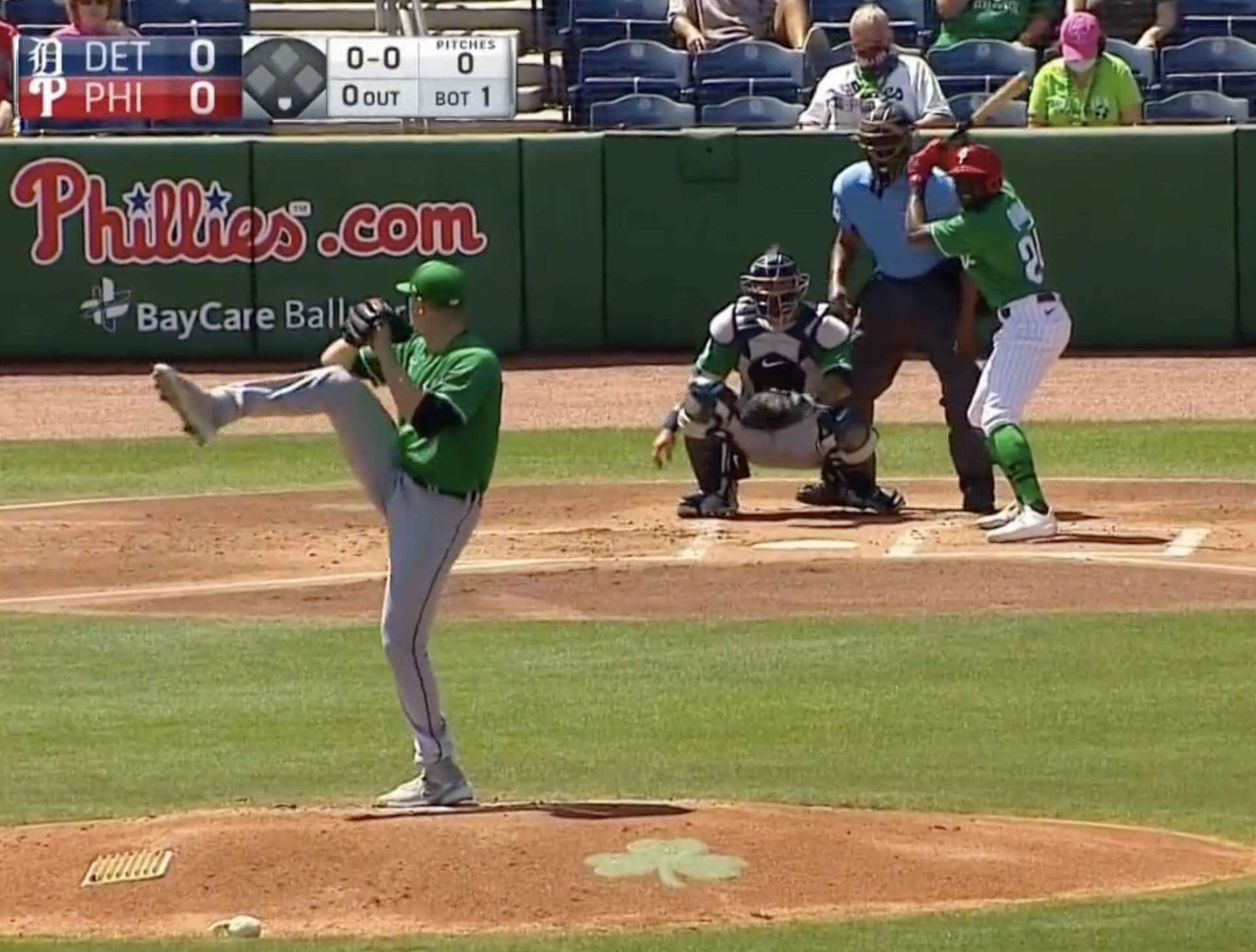
There are two primary ways for MLB teams to mark St. Paddy’s Day. The first, as exemplified by both teams in yesterday’s Tigers/Phillies game (see above), is to wear green jerseys and caps (and also green socks, for the handful of players who go high-cuffed). Other teams going that route yesterday included the Red Sox, Reds, and Royals.
To me, that’s the right way to do it. It’s a silly promotion to begin with, so why not go all in? Sure, you’d end up with a bunch of green-vs.-green games, but why not? It’s spring training — embrace the fun!
But some teams opt to half-ass it by just wearing green caps (and, again, green socks when they’re visible), as seen in yesterday’s Rays/Pirates game:
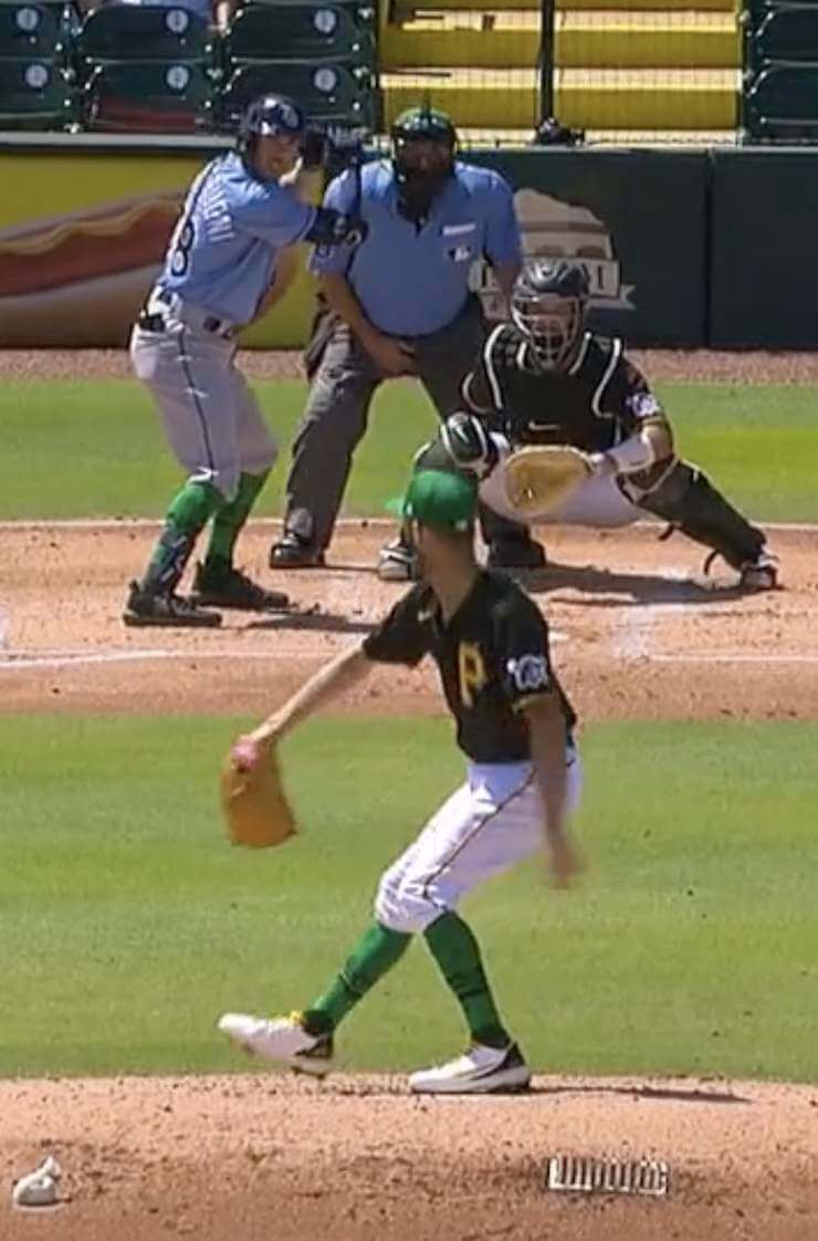
That doesn’t look endearingly silly; it just looks stupid, because the caps don’t match the jerseys. But that didn’t stop the Angels, Astros, Blue Jays, Cardinals (that’s the only shot I could find of the cap, but you can see they paired with the red jersey), Cubs, Diamondbacks, Dodgers, Giants, Mariners, Marlins, Mets (although shortstop Francisco Lindor gets bonus points for his green glove), Orioles, Padres, Rangers, Rockies (ewwww, although I give them credit for going the extra mile with the green belts), Twins, White Sox, Yankees, Atlanta, or Cleveland from doing it anyway.
I want to take a minute to talk about the A’s, who were notable yesterday for three reasons. First, they present an annual St. Paddy’s conundrum, because green is already one of their colors. They should really just wear their standard green jerseys and caps and call it a day, but instead they wore a cap in a non-matching shade of green because merchandising:
Feeling extra lucky today 🍀
OAK: 10 | KC: 5 pic.twitter.com/PAcSx2EUZa
— Oakland A's (@Athletics) March 17, 2021
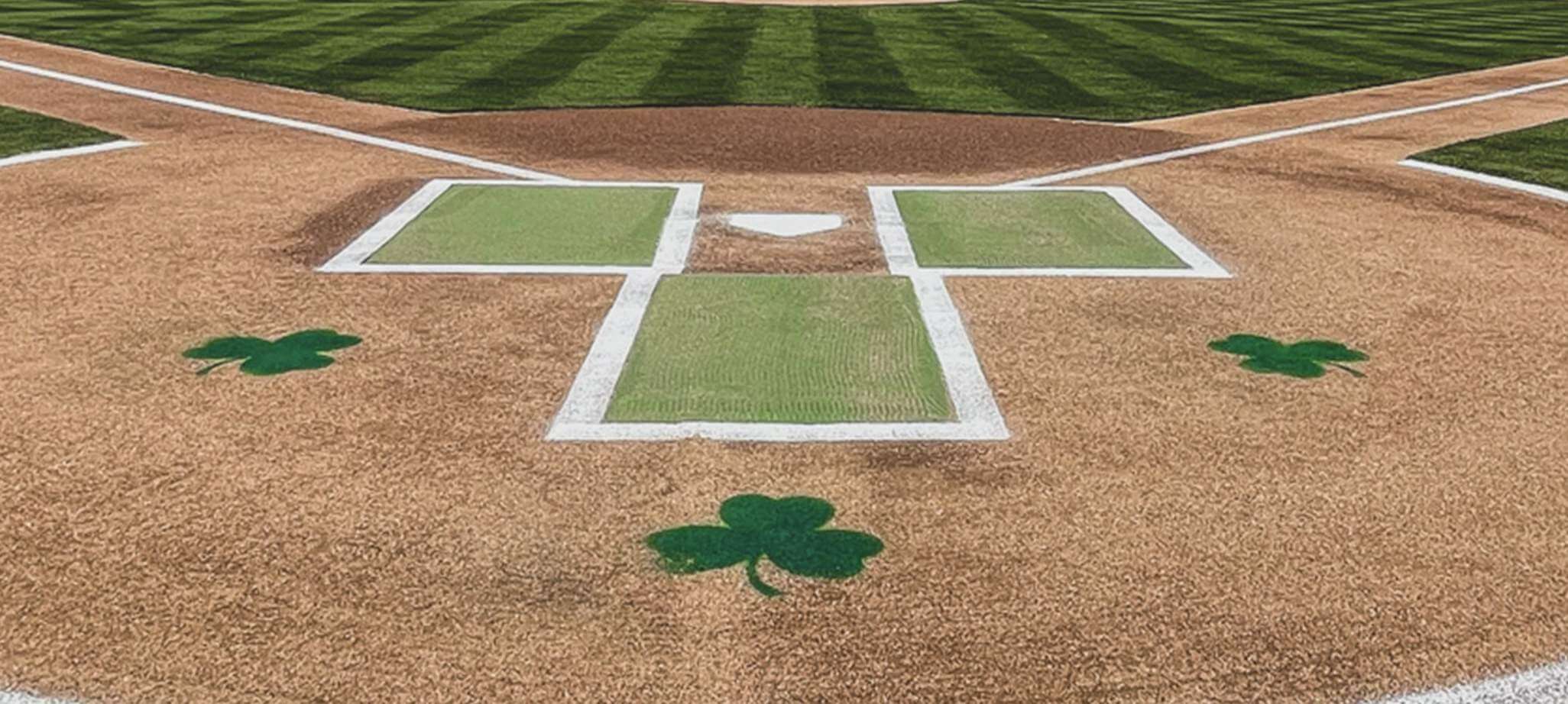
Second, they get bonus points for having green, shamrock-accented batter’s boxes:
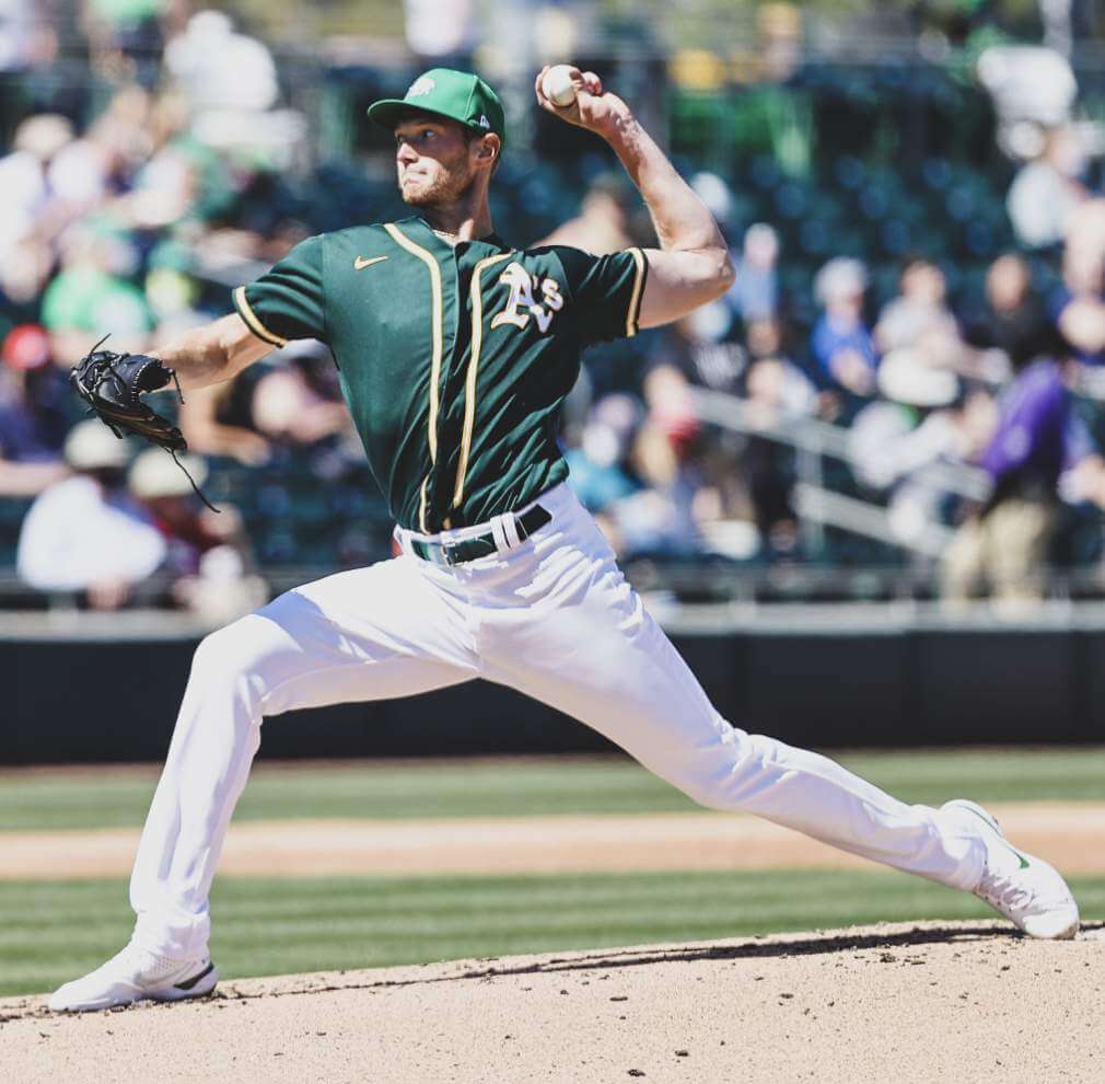
And third, although it has nothing to do with St. Paddy’s Day, pitcher A.J. Puk has provided us with something I’m not sure I’ve ever seen before — a nipple that’s visible through a baseball uniform:
Meanwhile, some NHL teams also got in on the fun, wearing green pregame sweaters and, in some cases, O’NOBs. Participating teams included the Senators, Canucks, Flyers, Kings, Golden Knights, and maybe a few others that I missed. Some teams that didn’t play last night will be going green over the next couple of days.
ITEM! New podcast episode: When Chris and I decided to do a podcast, we knew that it would mostly be about uniforms and logos, but that we also wanted to talk about related topics that were sort of uni-adjacent. This week we have our first episode of that sort, as we discuss a topic near and dear to both our hearts: collecting.
Why are so many people who are into uniforms and logos also into collecting stuff? What’s the difference between collecting and hoarding? What did Chris and I collect when we were kids, and what do we collect now? And what does all of this have to do with the 1987 movie Throw Momma From the Train? We discuss all of that, along with the NBA’s new alternate unis, MiLB’s new logo, teams wearing green for St. Paddy’s Day, our listener-submitted question of the week, and more.
It’s a really good episode — except that, for the second consecutive week, my vocals came out too echo-y, which is frustrating and embarrassing. We’re taking steps to ensure that it doesn’t happen again (please, no suggestions about mic settings, soundproofing foam, recording in a closet etc.) — thanks for your patience on that front.
As always, you can listen to us on Apple, Google, Stitcher, TuneIn, and Spotify, or just use the player below:
The show notes from this episode, which include photos of many of the things we discussed, are here. Those photos (and some additional ones) also appear in the video version of the episode:
Please consider supporting this episode’s advertisers, Oxford Pennant (get 20% off any order with checkout code UNIFIED), Ebbets Field Flannels (10% off, except on NFL items, with checkout code UNIFIED), and Homefield Apparel (15% off with checkout code UNIFIED).
Enjoy the episode, and thanks for listening.
Click to enlarge
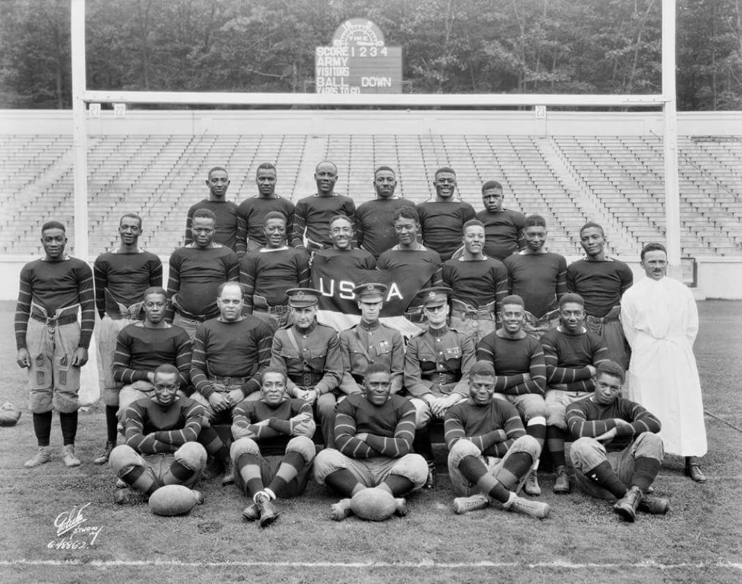
Too good for the Ticker: Oh man, look at this amazing photo of Black players posing at West Point sometime in the 1920s. “It’s from this really interesting National Archives piece about photos of Buffalo Soldiers at West Point, before the military officially integrated,” says longtime reader Max Weintraub. “The article contains this quote from Richard Schneider, a preservationist in the Still Pictures Branch of the National Archives, who was digitizing thousands of nitrate negatives that were transferred from the military academy: ‘Let’s face it, there weren’t that many Black faces in the 1920s at West Point. The first image I [found] was of this football team, and I only knew that it was Black players when I reversed the image. It was just an unusual image to come across.'”
Faaascinating. So many interesting visual details here: the striped sleeves, the striped socks, the old-school scoreboard in the background, the guy at far-right in the white robe (a trainer?), the three White guys in military uniforms, the “USA” banner whose lettering seems to pause in order to make room for center military guy’s head (maybe it said, “US of A”?) — amazing stuff.
Update: Reader/commenter Kevin Corcoran notes that the banner probably read, “USMA,” for “United States Military Academy.” Of course!
Click to enlarge
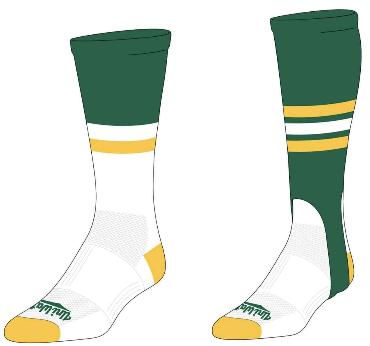
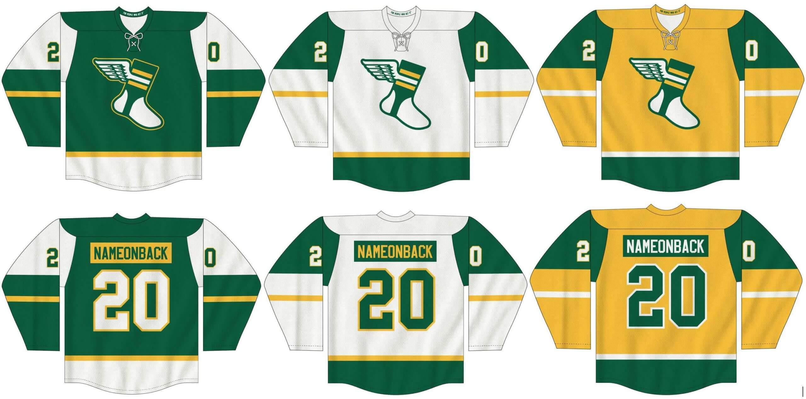
New merch reminder: In case you missed it on Tuesday, I’ve teamed up once again with Adelph Wear — the brand run by longtime Uni Watch reader Nathan Haas — to create a new line of Uni Watch hockey jerseys (customizable with your choice of number and NOB, of course), as well as new Uni Watch socks and stirrups. We’re taking pre-orders on them now.
In order to get in on these items, you must place your pre-order by March 31. You can do that here. We expect the finished product to ship out by the end of April.
My thanks, as always, for your consideration.
The Ticker
By Paul

’Skins Watch: Some residents of Rutland, Vt., fear that the local high school may resume using its former “Raiders” team name and associated Native American imagery, after recently changing to “Ravens,” now that three new school board members have been elected on a campaign to reverse the name change (from Kary Klismet). … The school board in Camanche, Iowa, is considering whether to change the local high school’s “Indians” team name and logo. … A state civil rights board in Nebraska has recommended that the state phase out Native American team names and mascots, saying that such team names “perpetuate dangerous stereotypes and beliefs and are ’emotionally harmful’ to Native American students” (from @kingsfan231). … Cheyenne Mountain High School in Colorado Springs and Gar-Field High School in Woodbridge, Va., will no longer use “Indians” as their team names (from Kary Klismet). … Also from Kary: Amesbury (Mass.) High School, which opted to retain its “Indians” team name in 2016, has now decided to revisit the issue.

Baseball News: A year ago I suggested that the pandemic might prompt teams to start honoring other types of heroes besides the military. Now Atlanta’s Triple-A affiliate, the Gwinnett Stripers, are planning to wear a jersey on May 28 featuring the names of local healthcare, foodservice, and municipal workers “and other essential employees who have kept us safe, fed, and going” during the pandemic. Good for them (thanks, Phil). … New logo for the Frontier League’s Evansville Otters (thanks to all who shared). … New logos for the American Association’s Cleburne Railroaders. … UNC OF Justice Thompson, leaping high to attempt a catch at the wall, looked a lot like the Jordan jumpman logo (from James Gilbert). … Forty years ago today: Check out this bizarre shot of Mets P Tom Hausman wearing a comically oversized glove that was brought to training camp by a glove company rep (great find by Jeff Ash).

NFL News: New acquired Colts QB Carson Wentz will wear No. 2 (thanks to all who shared). … Big Ditch Brewing of Buffalo has a new beer called You Make Me Wanna Stout, as a nod to the Bills playing “Shout” by the Isley Brothers after touchdowns. “The packaging features a football player in a generic uniform, but matching the Bills’ color scheme,” notes Joe Werner.
College and High School Football News: Here’s more about BYU’s new uniforms. … Vanderbilt’s spring practice jerseys don’t have uni numbers (from Griffin Smith). … Reagan High in Milwaukee is going with a Milwaukee skyline rear-helmet decal. Note that the “T” in the word “City” reflects the team’s offensive formation (from Jason Goede).

Hockey News: The Flames intentionally wore mismatched socks at Tuesday’s team practice for World Down Syndrome Day. Goalies also wore mismatched pads (from Wade Heidt). … Sacred Heart University is building a new hockey arena. The school’s costumed mascot and players wearing all three three different SHU jerseys were on hand for the groundbreaking ceremony (from John Muir and Kary Klismet).

Basketball News: The NBA has released a line of City Edition pennants (from Trevor Williams). … The Mavs and Clippers went green vs. grey last night, leading ESPN broadcaster Jeff Van Gundy to wonder aloud if a Mavs turnover was due to color confusion. … The middle section of this 1995 article has lots of observations and notes about then-current developments in NBA uniforms and merchandising (from @shoelesspodcast). … Man, North Texas’s court, which is being used for the NIT, is, uh, really something (from Anthony Cosentino).

Soccer News: New shirts for USL Championship side Sporting KC II (rare soccer-centric item from Phil). … Glentoran FC of the Northern Ireland Football League Premiership have unveiled renderings of the planned redevelopment of their stadium (from Kary Klismet). … Also from Kary: Sligo Rovers FC of the League of Ireland Premier Division have launched a program to provide a free jersey to every baby born at Sligo University Hospital this year. … “The Coupe de France is probably the uni-quirkiest competition in the world,” says our own Jamie Rathjen. “Everybody wears the same three ads instead of their normal ads; starters have to be numbered 1-11 and substitutes 12-18, regardless of their normal numbers; and it has its own font. This year’s font is new — compare the ‘2’ from last season and this season. And to add another quirk, the competition looks to be NNOB this season, whereas NOBs were below the number last season.” … New kit for Belarusian side Dynamo Brest, who are now being outfitted by Saller (from Ed Zelaski).

Grab Bag: Really interesting article about a startup company that allows college athletes — mostly from basketball, but also from other sports — to sell their gear after they’ve used up their eligibility (from Paul Dillon). … Slovenian cyclist Primož Roglič has spent more racing days since 2019 in a leader’s jersey than in his own team kit. … New logo for the Cambridge University Boat Club (from Timmy Donahue). … The man who committed last year’s mass shootings in Nova Scotia was wearing a Canadian Mountie uniform — not his own — so now the Mounties are considering new rules regarding mandatory disposal of unused uniforms (from Timmy Donahue). … The SUNY system, of which I am a proud graduate, is holding a “Mascot Madness” bracket (from Kary Klismet). … Also from Kary: NASCAR’s race at the Kansas Speedway on May 2 will be called the Buschy McBusch Race 400. As you can probably guess, the name was chosen via a fan contest. … You’d think a state flag design would be, you know, one official design. But there are no official standards for the South Carolina flag, which state legislators may soon address (from Mike Edgerley).

Our latest raffle winner is Geoff Poole, who’s won himself a pair of Uni Watch magnets and a pair of Uni Watch koozies. Congrats to him, and thanks to Chris Hickey for sponsoring this one.
I’m going to be busy for most of today with an extremely important activity. Play nice while I’m away, and I’ll see you back here tomorrow. — Paul
Re. the West Point photo of Black football players; the banner likely reads USMA (United States Military Academy), the official name for West Point.
Ah, of course. I’ll update the text accordingly.
Can’t tell if the guy on the right is wearing a robe or a cassock. Chaplain, maybe?
That was my guess too. It is more than likely the priest.
Oooh… I love when my religious and sports uni-watching overlap! It might be a priest, but that’s no cassock. It MIGHT be an alb, but unless he were blessing the athletes that would be weird. Definitely not definitive that he would be a chaplain.
I had a feeling I wasn’t using the right term there…couldn’t remember alb.
The Astros wore green socks yesterday.
My bad for omitting them. Now added!
Not a problem, Paul. I know you didn’t do it intentionally.
The senators green jersey link goes to the A’s tweet above it
Fixed. Here’s the proper link:
link
Not a fan of South Carolina’s attempt to standardize the state flag. The federal government has strict standards for the shapes, proportions, and colors of the U.S. flag, but those rules only apply to government purchases. For civilians and state and local governments, the colors and proportions of the U.S. flag vary widely from manufacturer to manufacturer, and that seems to be OK. Frankly, if you ever purchase a government-standard flag, such as from your member of Congress’s office, you’ll probably think the blue star field looks oddly purplish, where most retail flags have unions that vary from dark royal to medium navy. Even the number and pattern of stars is optional for non-government-purchased flags; as long as it has red and white stripes and a blue area with white stars and it looks even vaguely like an American flag, it’s an American flag. Similarly, I don’t think anyone would fail to recognize any of the variants of the South Carolina flag as a South Carolina flag.
I have seen more and more color variants of the South Carolina flag than any other. T-shirts, sunglasses, and even baseball uniforms — look at the nape of the neck of many Myrtle Beach Pelicans jerseys over the years and there’s a South Carolina flag, usually in the team’s colorway. A notable exception was their retro jersey with Rainbow Guts stripes.
Unless the South Carolina government passes legislation and/or a “flag code” like there is for the Federal government, manufacturers are free to do what they please with that state flag. And, frankly, others — I’ve seen Maryland flags with purple and black (Ravens) or orange and black (Orioles) colorways.
The thing is, manufacturers will always be free to fiddle with the colors and designs of the SC flags they make. Enacting a state law standardizing the design won’t change that. It will change what version of the flag state agencies purchase, but that’s about it. What with the First Amendment and all, there’s nothing the government can do to to stop someone from making and selling a Palmetto Flag in Garnet instead of navy for SCSU, for example. (Such as: link)
If the SC government wants to standardize the design and style of the flags used in government buildings and offices, that can be accomplished with simple administrative orders by the leader of each house of the Legislature and by the governor. No law is needed to accomplish the outcome that the state government actually has the constitutional power to accomplish.
A.J. Puk with the biggest uniform related nipple story since Joel Schumacher put nipples on the Batsuit in Batman Forever.
Maybe Paul can begin research for a story on uniforms and nipple visibility.
Regarding the Black football players at USMA, a little added trivia. There is still a “Buffalo Soldier Field” at West Point, which is used for intramural athletics by the Cadets, including football and rugby. The field is named as such because from 1907 until 1947, a detachment from the 9th and 10th Cavalry (the Buffalo Soldiers) was sent to West Point to teach cadets horseback riding. The stables are still located next to the field. I wonder if the football team in that photo was comprised primarily of those instructors.
Brutal placement of that parking lot for the UNC baseball shot.
Fun little item on the SUNY mascot madness bracket. I went to check it out. First off I did not realize there were so many SUNY & CC in the system. Makes sense for a large state, but 34 schools competing is higher than I expected.
Secondly the defending champ (2019) Rip Van Winkle is a 9 seed & part of a play in scenario. What is up with that? To be expected he is absolutely crushing the 1 & 8 seed in this round. The selection committee should be questioned about that seeding error.
What makes it worse for the teams just wearing green hats, and occasional socks, are that most of these teams are wearing colored jerseys. The Mariners don’t look as bad with their white uniforms, whereas the Orioles orange lettering isn’t the best complement.
Did I snooze and lose? Is Streaker Sports no longer sponsoring the podcast or are they just taking a break?
NASCAR’s race at the Kansas Speedway on May 2 will be called the Buschy McBusch Race 400. As you can probably guess, the name was chosen via a fan contest.
People, use the gift of democracy responsibly while you still have it. Do you really want this to be your legacy?
Streaker will be back as a podcast advertiser in April, and beyond!
I’m Calling It The Kansas Spring Cup Race.
Hopefully, the cause being supported by this promotion is flush with ‘poll tax’ cash.
That macro-brew was the lower-tier series title advertiser for years, so to this long time fan calling a Cup race a Busch-Anything race feels wrong; that silly name makes it even wronger.
You “because merchandising” the A’s for the different shade of green cap, but all those teams you deem look silly actually shy away from the potential merch dump buy not going full green jersey. Is there an actual right answer here?
That being said, the merch dump goes FAR beyond hats and jerseys. I had emails yesterday from every one of the four major leagues about special St. Pats merch (tees, sweats, etc). And I type this while wearing a green Pens shirt so I’m part of the problem too I suppose!!!
“…correct me if I’m wrong (Elaine), but I think I see… a nipple.”
This.
Wentz wearing #2. Isn’t that Jalen Hurts’ number also? Interesting. Wondering if that was Wentz’s number in HS or college.
Wentz wore 11 at NDSU, 20 in HS.
My guess: 1 + 1 = 2.
I’ll stop calling it the No Fun League if they let Wentz wear his high school number!
Slaps face with a hearty “duh”…
Defector.com had a great piece yesterday by Casey Taylor on collecting. I felt the same way about uni watching … it seems like this pursuit used to be about interest and passion, and sometime in the last 10 years, the leagues themselves caught on to this passion. Now, there are different jerseys every season, special one-offs regularly, etc. The desire to collect went from a passion project to a way for capital to produce revenue.
link
Don’t the A’s have a kelly green uniform they could have worn?
Hate to be the broken record at the High School Dance, but every school in the ‘Skins Watch has it wrong: Never name your team after American Indians, name your school after them. Should you be lucky enough to play in Tuckahoe, NY, Tomahawk, WI, or Keokuk, IA, congratulations! But if a tribute to our Indigenous citizens is what you really intend, you’d really be doing a mitzvah by naming your school after King Philip, Ely S. Parker, Jim Thorpe, or Alexander McGillivray.
But if you’ve got your heart set on that mascot, pick a benign vocation at which the Indians excelled: “Huntsmen”, “Archers”, “Riders”, “Horsemen”, “Code Talkers”, “Sentinels”. It sure beats “Redhawks”.
I’m from the village north of Tuckahoe, they had the decency to name their sports teams “Tigers”.
Nipple analysis is why I visit this blog daily. Just can’t find that hard hitting uni-journalism anywhere else
Hard-hitting, razor sharp and pointed analysis. I see what you did there…
In the USMA picture, I was struck by the expressions on the faces of the white cadets and the contrast with the expressions on almost all of the other faces.
“…Some teams that didn’t play last night will be going green over the next couple of days…”
Wait a second. This is St. Patrick’s Day. You either have a game on that day and wear green or you don’t. There’s no “we didn’t have a game that day so we wore green two days later when we did.” This isn’t like Jackie Robinson Day where if you did miss it it’s more than worthy to make up, this is St. Patrick’s Day. Come on man.
It was cool when the Reds appeared in startlingly green versions of their regular uniforms.
None of what they’re doing now is cool.
It was cool because they were being playful with their perception (at the time) of being a very staid, conservative team.
I wonder what would happen in a game if a Goalie wore mismatched pads? It would be an incredible advantage to them as the distraction of mismatched equipment could mess with the perception and timing.