Good morning, and happy Ides of March from Uni Watch HQ, where all three inhabitants continue to be safe and well. Hope everything is also good at your home.
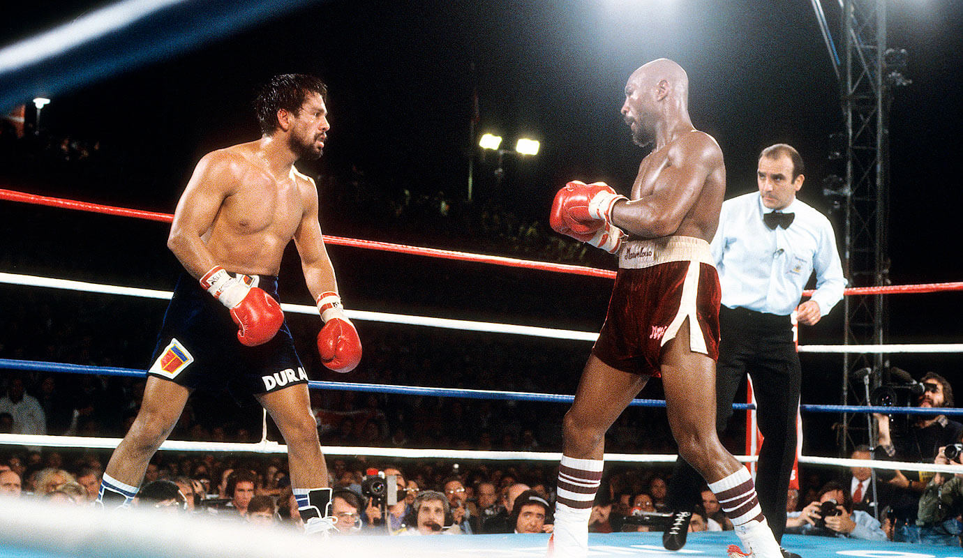
I know most of you don’t care about boxing, but I want to talk about it today because former undisputed world middleweight boxing champion Marvin Hagler (shown above in his 1986 title defense against John Mugabi) died over the weekend. He was my favorite boxer, in part because of his skills, demeanor, and professionalism, in part because of his combination of hand speed and power, and in part because he was the rare fighter who could switch back and forth between southpaw and orthodox — but mostly because of his aesthetics.
To me, Hagler always looked like the dictionary definition of a boxer: the sculpted body, the perfect physical proportions, the symmetry of his features, the bald head atop the naked torso. Plus I loved the striped tube socks, and I loved two things about his trunks: First, they were always tailored just right for his thighs and were therefore never too billowy. And second, the length of his trunks was always perfect.
Or so I thought.
Hagler’s trunks look a bit short in that photo shown above, no? When I found that photo yesterday, I initially thought the short trunks must have been a one-fight aberration. But then I looked at his 1983 fight against Roberto Durán (click to enlarge):
And then his 1984 bout against Juan Roldán:
And then his 1987 career finale against Ray Leonard:
And so on. In all of those bouts — and in every other Hagler fight I looked up yesterday — his trunks were classy-looking (and color-coordinated with his sock stripes!) but a bit shorter than I remembered. I really thought he wore them two or three inches longer, but he clearly didn’t. This doesn’t change the fact that Hagler was almost always the better-looking man in the ring, but his trunks definitely seem too short to me now. In some cases, the triangular cutouts on the sides allowed the trunks to ride up even higher, creating a loincloth-ish look, as seen in this shot from his 1983 bout against Wilford Scypion:
I watched all of Hagler’s fights during this period when they happened, yet I had no memory of his trunks being too short. The only conclusion I can come up with is that my tastes have changed. In the 1980s, when I watched Hagler in real time, his inseam length looked Just Right. But now, several decades later, it seems slightly but consistently too short. I’ve always said that fashions may change but good design standards are eternal, but it turns out that my design standards can change with the fashions, at least in this case.
It’s also interesting to see that as boxing trunks got longer, boxing socks got shorter, changing the leg exposure from the thigh to the calf — the exact same thing that happened in basketball.
Anyway: The trunks length notwithstanding, I still think Hagler looked like the consummate boxer. It was always a pleasure to watch him work. R.I.P.
Update: Shortly after I published today’s entry, I learned that my friend and former cat-sitter Laura got to meet Hagler and his family when she was a kid because her father worked for a sporting goods company. Here’s a sensational 1981 photo of her, at age 12, with Hagler (click to enlarge):
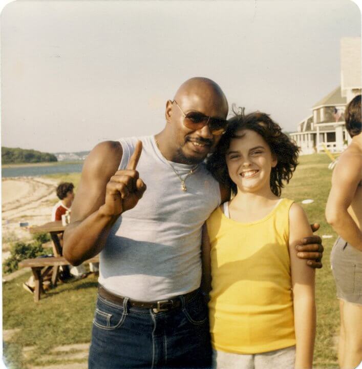
Oh man, is that pure gold or what?
For all pics, click to enlarge
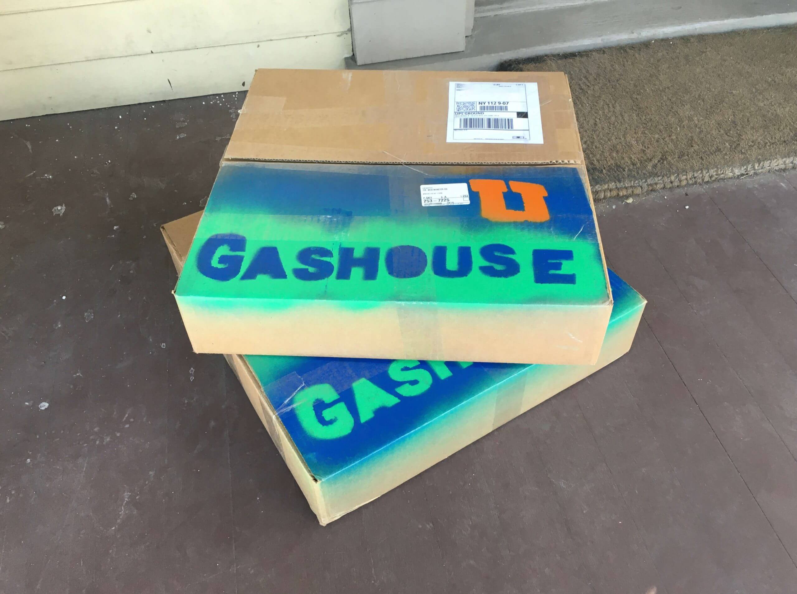
What have we here? A pair of large packages arrived at Uni Watch HQ on Friday with “Gashouse” stenciled on them — a sign that they were from 3D logo master Kevin Cearfoss. And what was inside? Let’s have a look:
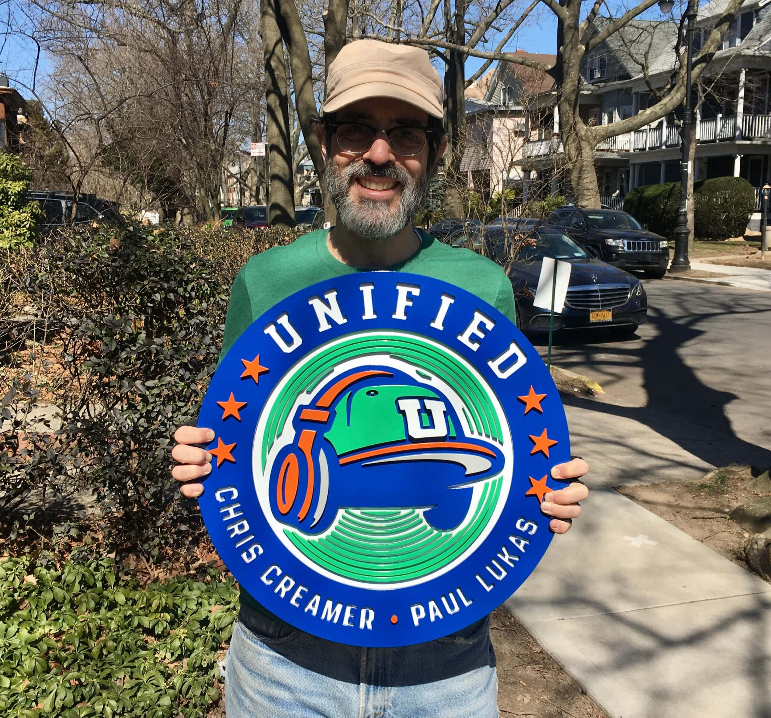
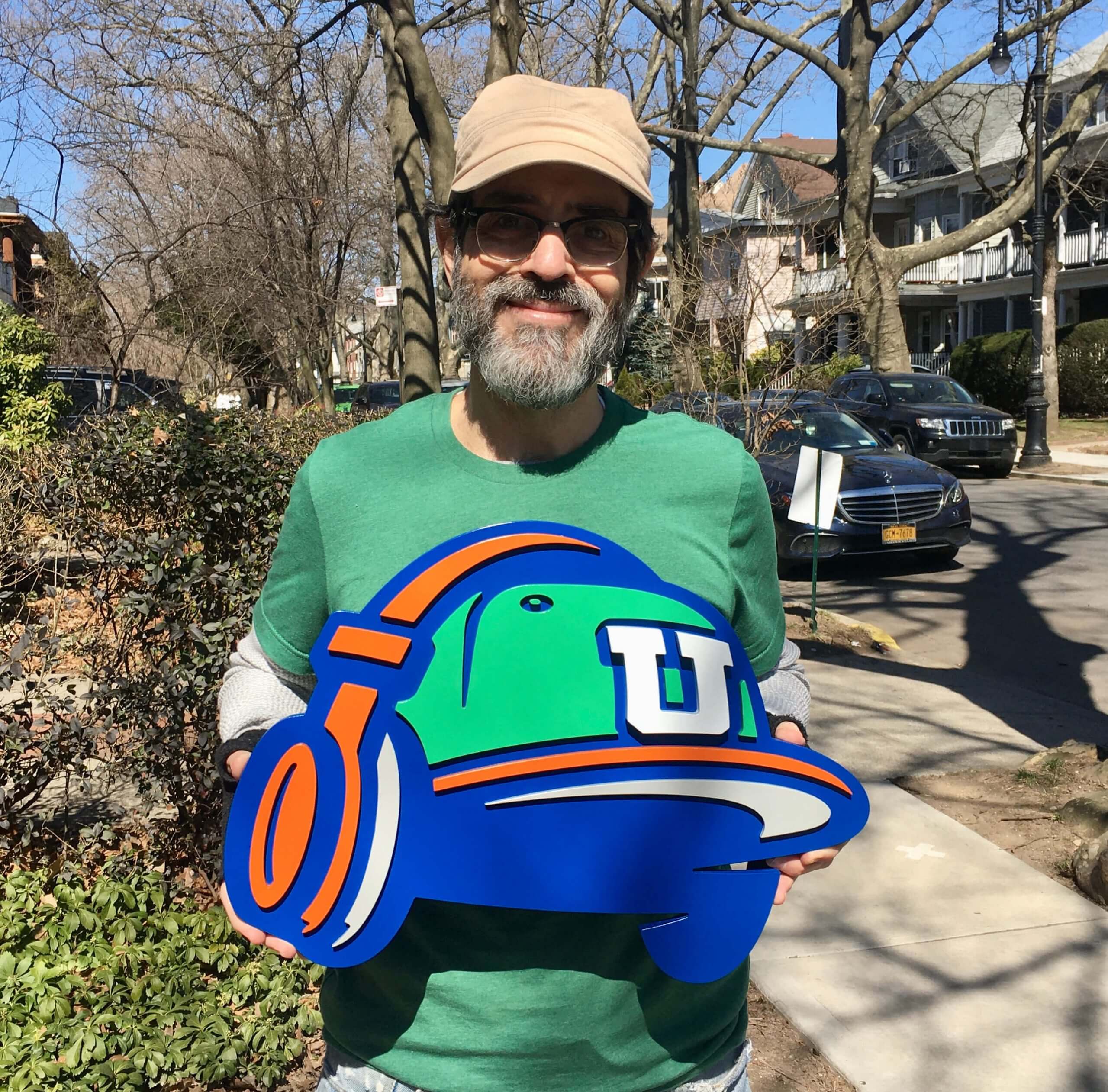
Oh, man — are those awesome or what? The primary logo is particularly impressive work, because of the lettering and all the little radio-wave arcs:
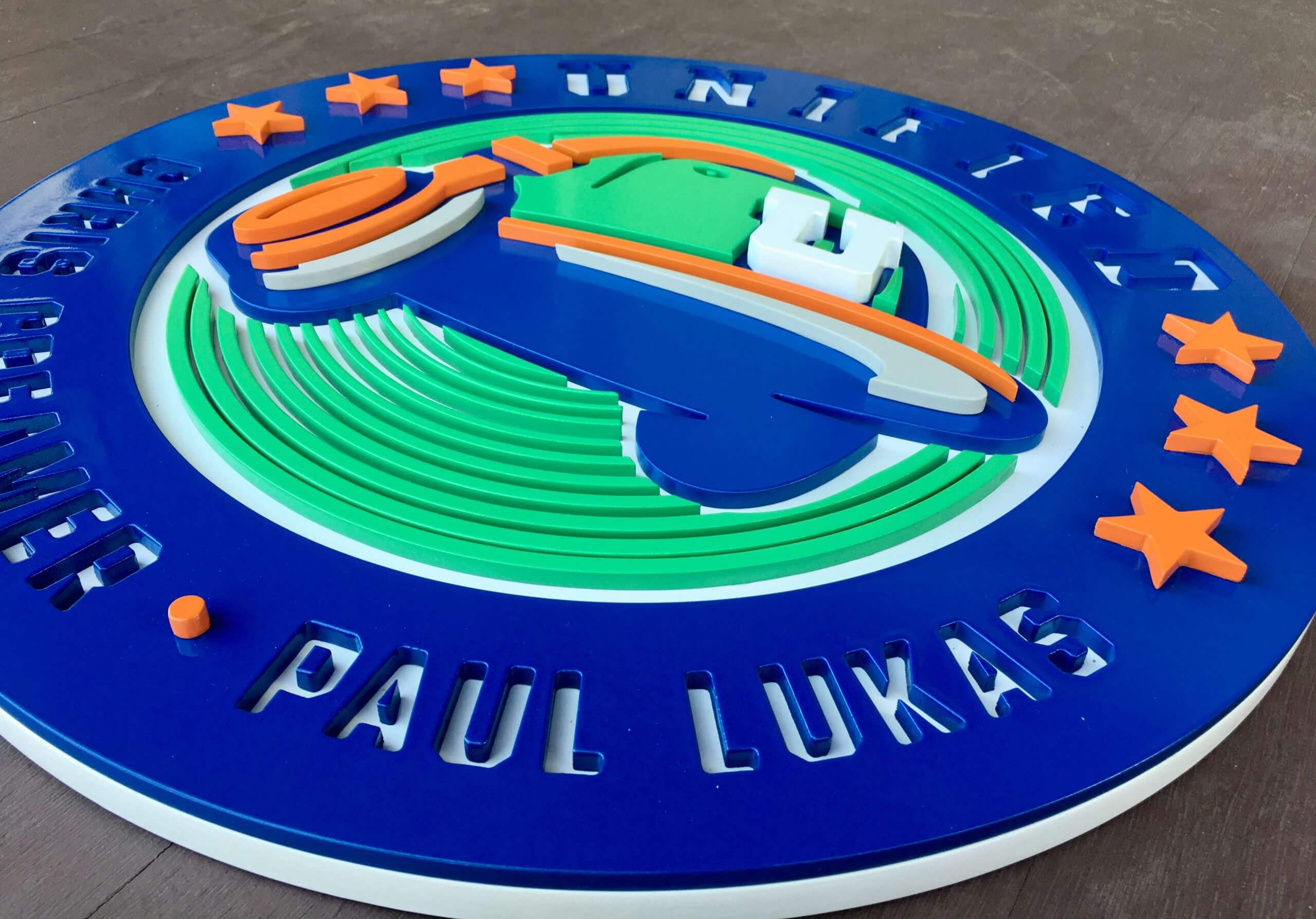
I should mention that Kevin took it upon himself to make these, just because he wanted to (thanks, buddy!). I don’t think he’ll do that for just anyone, but I do know that he takes commissions. You can see more of his logo projects, and also contact him, on Twitter.
Click to enlarge
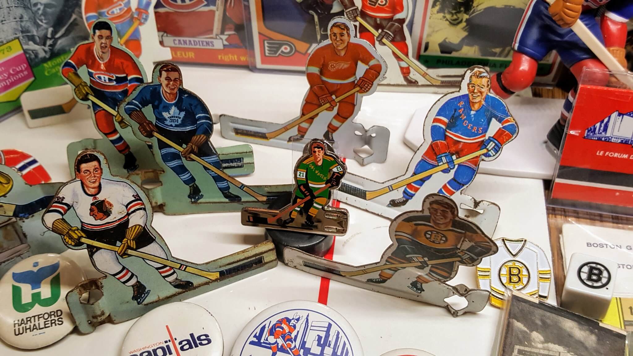
Undersized rookie: Reader Tim Jenkins liked our latest Uni Watch Pin Club release so much that he added it to the table hockey section of his memorabilia room. How great is that?
Reader Brett Mandel went a step further, putting his pin on the “ice”:
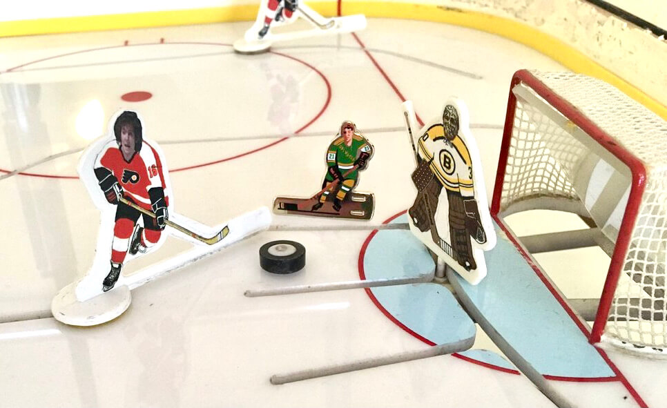
Great stuff, guys. Pin designer Todd Radom and I are honored to be part of your displays!


ITEM! Yet another membership raffle: Reader Jacob Olson recently purchased a membership for me to raffle off to a lucky winner outside the USA, so that’s what we’re going to to today.
This will be a one-day raffle, open only to non-USA entrants. To enter, send an email to the raffle in-box by 8pm Eastern tonight. One entry per person. I’ll announce the winner tomorrow. Big thanks to Jacob for sponsoring this one!
The Ticker
By Jamie Rathjen

Baseball News: Dodgers P Trevor Bauer received a warning from MLB for wearing his personal logo on his belt (from Jakob Fox and @juice2deuce). … Reader Art Savokinas found his dad’s 1983 Phillies media pass. Numbers on the back allowed the team indicate which home game of the season it was for. … Taiwan’s Chinese Professional Baseball League’s Fubon Guardians made some changes to their Sunday alternates (from Jeremy Brahm). … We’ve seen this before, but once more won’t hurt: It’s rare to see a photo of Henry Aaron with FIOB. That’s from either 1962 or ’63, when his brother, Tommie, was also on the team (from our own Phil Hecken).

Football News: The Bengals’ director of communications, Emily Parker, appeared on a podcast to talk about the new uniforms. Among other things, she said they’re not changing the logo (from Kary Klismet). … Saints QB Drew Brees made a video announcing his retirement. His sons, who appear in the video, are all wearing what appear to be game-worn jerseys because they all have patches (from Jonathan Earl). … FCS school Mississippi Valley State has grey jerseys with white numbers that are fine up close, but not from TV distance (from @Wilds_Lee).

Hockey News: The Maple Leafs wore Toronto St. Pats throwbacks last night. According to Sportslogos.net head Chris Creamer, they’re to appear again on Friday at home (from Chris Mack). … Devils C Janne Kuokkanen was victimized yesterday by an NOB typo (thanks to all who shared). … The University of New Brunswick women’s team added memorial helmet decals for program benefactor Anna Goddard (from Wade Heidt). … The next two are also from Wade: The Alberta Junior Hockey League’s Brooks Bandits have new black alternates. … The WHL’s Lethbridge Hurricanes and Red Deer Rebels went color-vs.-color.

Basketball News: Here is a short video of the court for the Division I men’s tournament at Indiana’s Assembly Hall being built. “Out of bounds graphics are stickers so I guess [the] courts can be reused,” says James Gilbert. … Six schools in the Midwest Region have orange as a team/uni color (from Randall J. Sanders and Tod Meisner). … Here’s a weird one: Reader Tom Bierbaum found some photos of the Warriors and Bullets going blue vs. blue, apparently in 1967. Anyone know more? … Israel’s Maccabi Tel Aviv added fans’ names to their warm-up shirts and jerseys yesterday (from Jeremy Brahm). … NBA numerologist Etienne Catalan has more new and changed player numbers. … The logo of a Québec City auto parts dealer is based on the early-2000s Pistons logo (from Daniel Marceau).

Soccer News: The two English Championship clubs that lost their front shirt advertiser at short notice because it went into administration, Queens Park Rangers and Nottingham Forest, handled the situation differently. Forest didn’t replace the advertiser, while QPR did with a new one on a patch. … The National Health Service patches worn by English clubs last season reappeared on Portsmouth and Salford City in the EFL Trophy final. … Italy’s Serie B’s U.S. Lecce wore late-’70s throwbacks yesterday for the 113th anniversary of the founding of their original predecessor, which is today. The only other immediately obvious reason for the throwbacks is that Aldo Nardin, Lecce’s goalie from that period, passed away last year (from Trevor Williams). … Part of Walton Hall Park, the stadium for Everton’s women’s team, was damaged by fire on Friday.

Grab Bag: North Melbourne’s AFL Women’s team plays occasional home games in Hobart, Tasmania, and each time wear guernseys with their logo modified to say “Tasmanian Kangaroos.” … Pro golfer Lee Westwood supports the soccer club Nottingham Forest and has their crest on his yardage book (from Rob Matuga). … A cricket club in Tampa, the Tampa Tigers, wears letters instead of numbers. As you can tell from that picture, they also poach the logo of the AFL’s Richmond (from Peter Della Penna). … New traffic officer uniforms for the Uganda Police (from Timmy Donahue).

Click to enlarge

What Paul did last night: Now that the clocks have changed, Pandemic Porch Cocktails™ should routinely be taking place in daylight once again. We’re hoping this means more foot traffic on our sidewalk — more neighbors, more kids, more doggies (although all of those were scarce yesterday).
As always, you can see the full set of daily Pandemic Porch Cocktails™ photos — now almost a full year’s worth — here.
Here’s hoping our Colorado readers, including Ticker stalwart Kary Klismet, are able to stay safe and warm during the fallout from the weekend storm and power outages. My thoughts are with you. — Paul
Awkward phrasing:
“they were never always”
Fixed.
I believe Final Four tradition is that the floor is donated to a college that needs it, either because their floor is worn out or because they’re opening a new arena. Hence the stickers so that the floor can be reused.
Actually I believe the Final Four court is offered for purchase to the winning school. Some schools then will cut the floor into pieces to be put on plaques that are then sold as souvenirs to fans. I seem to recall that some schools also will repaint the floor and replace their old arena floor with it. Perhaps the floor is donated to another school if the winning university declines to purchase it (but it’s hard to imagine the profit-mad NCAA from donating much of anything!
The above info is done strictly from my recollection so anybody who knows otherwise please correct me.
Paul with that hat and beard all you need is a flannel shirt and you would look like Red Green.
Tim Jenkins liked our latest Uni Watch Pin Club release so much that he added it to the table hockey section of his memorabilia room.
I love that the old table hockey figures are all smiling! Probably wouldn’t see that on a modern version.
I’m more intrigued by the other table hockey photo – Flyers’ Bobby Clarke vs. Bruins’ Gerry Cheevers … I wonder who else is on the ice. … More photos from Brett Mandel’s table, please!!!
Agreed on Hagler just looking like a boxer. I actually like the shorter shorts and the socks. A great look. And sadly, boxing trunks are now another place where we see advertising. Lots of advertising.
Nice piece from Paul on Marvelous Marvin Hagler. One note that perhaps should be added is that while I’m guessing that most folks would assume that “Marvelous” is just a nickname, Hagler did legally change his name to Marvelous Marvin Hagler in 1982.
This poses the question: was Marvelous his first name and Marvin his middle, or was Marvelous Marvin a double first name?
Not surprising that Hagler’s trunks now look shorter than remembered, being that it was the 1980s. So many sports can thank Michael Jordan for popularizing longer shorts.
And the Fab Five of Michigan …
“The Fab Five wore longer baggy basketball shorts because they wanted to pay homage to Michael Jordan. Michael Jordan was their idol and they all wanted to be like him. Wearing long baggy shorts in college basketball was unheard of at that time. The Fab Five helped initiate a new wave of fashion in college.”
1989 Flying Illini were doing it in CBK before the Fab Five
The alleged “Fab Five”were together fir almost three years, and never won a thing –
No Big Ten titles, no NCAA titles (yes, they did win a bunch of games and had that close call vs UNC.
I seem to remember that they were not the first to wear the baggy shorts, but their TV visibility, along with brand, helped to spread the mythology.
Bullets vs. Warriors blue vs. blue in the Ticker:
link
The Bullets of that period didn’t have white uniforms (orange at home, blue for away games)?
That’s what I’ve thought, Dave, that there was at least one season when the Bullets wore orange at home and navy on the road, though the NBA Jersey Database (link )doesn’t indicate this, just showing white / navy through the 1968-69 season and white / orange thereafter, which I don’t think is correct or at least is not the full story. In any case, the photo in question was apparently taken at the Baltimore Civic Center, acc. to its Getty listing, so the Bullets in any case should have been in white or orange. I’d guess something happened to their usual home unis, forcing them to wear the navy road set at home.
Whoops, the prior comment is to Chris rather than Dave.
It looks like it’s a neutral site game … Madison Square Garden? The NBA played lots of neutral site and Madison Square Garden doubleheader games in the 50s and 60s.
Sleuthing a bit, it looks like the Bullets and Warriors played each other in NYC on November 22, 1966. As far as why both wore blue, good question? The Warriors previous two road games were played in Nashville (against the Hawks) and LA, while the Bullets played the Royals in Cincinnati. Both played each other the next night in Washington, DC. I wonder if they wore the same jerseys?
That makes sense, Joshua, though the Getty listing specifies the Baltimore Civic Center as the setting for this odd photo. It makes perfect sense that both teams might show up in New York for a neutral-site game with their blue road uniforms, which would explain why one team or the other would not have been able to just go back into the locker room and change into their usual home uniforms.
The Bullets wore white and blue through 1967-68.
They did not have an orange jersey until 1968-69.
During that season, they did not wear white at all.
The following season, they brought back a white uni, this time with orange lettering instead of blue and discontinued the blue uniforms altogether.
For long time, I thought those uniforms were black instead of dark blue.
They had a white uniform through 1967-68.
1968-69 was the season they never wore white.
link
Why does the press pass stop at 80 not 81? Maybe a double header that year?
The detail going into the primary Unified logo sign is spectacular. Well done!
Right? Kevin clearly straddles the line between craftsman and artist!!
Back in the day, (70’s-80’s) there were always a couple doubleheaders on the original schedule. Now they only exist to makeup postponed games…
Thanks for the piece on Hagler. He was my favorite boxer as well. Classy guy, classy fighter.
RIP, Marvelous.
Thanks for the well wishes, Paul! We’re pretty well snowed in here in Denver, but everyone in the Klismet household is managing to stay safe and warm so far. We’re getting plenty of exercise shoveling snow, though!
Amazing work by Kevin on the Unified logos! The man makes straight eye candy!
Salford City and Pompey wearing last years patch is probably because they were technically playing last years [Pizza Company] Trophy final, which wasn’t played at the time due to lockdown. The same thing will be happening in Spain with 2 Copa Del Rey finals being played this year (with Real Bettis playing in both games).
Nice tribute to Marvelous Marvin!
Describing Hagler with “the sculpted body, the perfect physical proportions, the symmetry of his features, the bald head atop the naked torso” and his shorts as “tailored just right for his thighs” struck me as a bit racist in 2021 terms though.
I was ready for someone to tell me that that passage made me sound gay.
I was not ready for someone to tell me that admiring an athlete’s physique makes me racist if the athlete happens to be Black.
To be clear: I would have written the exact same things about Hagler if he had been White (well, assuming he had the same sculpted body, bald head, etc.).
Seriously, John?
Love the work by Gashouse on those logos, they look great. My first thought since you first featured them a week or 2 ago was that they would make a great podcast background.
Also, judging by the name “John Spunkington” it appears that guy is just trolling you by calling you a “bit racist”. If he’s not just trolling you, I dont see the connection he’s making.
So looking at those 3D logos all I can think is when shall the hat from the Unified logo be available for purchase? You could make it as it appears in the logo, then put the Unified roundel logo on the back, so even though it wouldn’t actually be an infinite regression, it would IMPLY there’s an infinite regression. What do you think?
We’ll have a hat soon. Instead of just a “U” logo on the front, it will probably be a “U” wearing headphones!
Paul! This is totally an opportunity to go with some infinite regression! Go for it!
link
In theory: Yes.
In practice: Very hard to render in embroidery.
Love the Hagler stuff – he and Duran were my 1 and 1A, so their fight killed me. And your former cat-sitter’s pic was indeed pure gold. Loved it.
There was literally not one word that was racist in your commentary.
Haglar. Leonard. Hearns. Durán. That was a Golden Age of boxing right there. My money was always on Sugar Ray but you’re 100% correct that Hagler was from the original mold.
Hagler was my favorite too ! RIP
Aaron pic is ’63; (1) first year of those uniforms with names on back but only worn for two years (2) last year of Mets in Polo Grounds (isn’t that Roger Craig pitching?)
Yes.