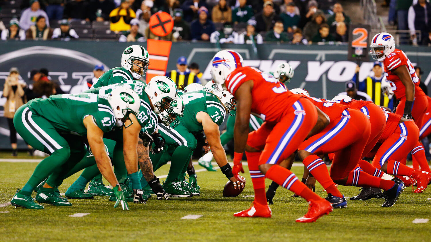
In the last week’s episode of Unified, Chris and I briefly mentioned the famous 2015 Jets/Bills game in which the teams went mono-green vs. mono-red, thus creating serious visual problems for fans with red-green colorblindness. That prompted a note from listener/reader David Versel, who happens to be colorblind himself. He’s written a really interesting and educational guest entry about what it’s like for him to watch sports. Take it away, David.
On Being a Colorblind Sports Fan
By David Versel
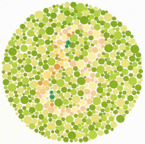
I have what is called red-green colorblindness. It was diagnosed in first grade via an exam I was given at my school, which involved looking at a series of circular dot patterns showing a numeral of one color overlaid on a background of different-colored dots [like the example shown at right — PL]. This test, known as the Ishihara Color Vision Test, revealed that I had trouble differentiating certain colors from others.
Over the course of my life, my colorblindness has mostly been a minor nuisance, and also a way of entertaining people who are curious about my condition. For the record, I do not see the world in just black and white or shades of grey. I can see the entire spectrum of colors and have no trouble identifying colors that are bold and bright, and I can easily differentiate between highly contrasting colors. But when I have to pick out muted, neutral, very light, or very dark colors, that can be challenging for me.
Interestingly, the famous Jets/Bills game wasn’t all that difficult for me, at least in terms of colorblindness. Yes, the game was a visual disaster, but each team was wearing a bold and bright color, so I was able to differentiate the teams. I also found it helpful each team was wearing the same color from neck to ankle. For some reason, the larger the “swatch” of color, the easier it is for me to identify it.
My greater struggles have come with trim colors or colors that only appear in small fields. For example:
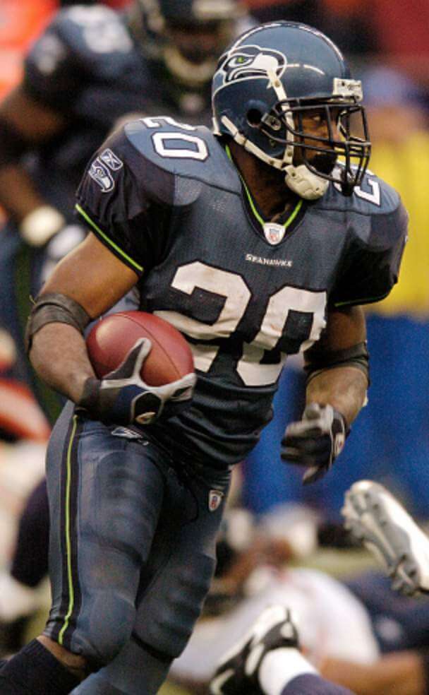
• When the Seahawks changed their uni set in 2002, I thought that the contrasting trim color was yellow, not neon green. It wasn’t until they brought out their neon green jerseys in 2009 that I realized my error.
• I always thought Clemson’s colors were orange and blue. I didn’t realize that the blue was actually purple until they started wearing purple alternates.
• During the Bills’ early-1990s heyday, when they wore primarily white and blue, I thought the red helmets and red trim were actually orange. Looking at this now, I’m still not convinced that it’s red!
• Until Uni Watch came along, I thought the Yankees’ main color was black, not midnight blue. I realize many others think the same thing, but to this day I still have a hard time telling their extremely dark blue from black. [I think this one is very common, as photos and TV sets often don’t capture the nuance between almost-black and truly black. — PL]
I also have trouble with neutral colors, especially grey. I frequently confuse different shades of grey with adjacent shades of green, brown, or blue. This has historically been less of a problem as a Uni Watcher and more of a problem in my daily life: Out of necessity I wear a lot of white, black, and grey clothing, but I have mistakenly purchased colored apparel, thinking it was grey. The one neutral-color problem in the uni-verse that stumps me is that I’ve never been able to differentiate between the Cowboys’ two shades of silver pants, even though most other fans can tell them apart.
My biggest challenge in recent years has been the explosion of grey as a primary uniform color and the use of GFGS uniforms. For example, when the Vegas Golden Knights first unveiled their uni set, I thought their colored sweater was green, not grey. The carousel of NBA alternate uniforms has also presented some tricky situations, such as a recent Nets/Rockets game that found the teams going grey vs. light blue.
One out of every 12 males is born colorblind (compared to just one out of every 200 females). Statistically speaking, that means there are probably thousands of competitive athletes out there who struggle with this condition. I wonder if the increasingly complex designs and frequent color clashes that seem to be happening more and more are impacting in-game performance by some of these players. For example, I found an article about Australian cricketer Matthew Wade, who apparently struggled to pick up the sport’s pink ball, but so far I haven’t found anything similar about any North American athletes.
I had my own brush with this phenomenon when I played on a soccer team that wore dark blue jerseys and we had a team in our league that wore purple. I often found myself inadvertently passing the ball to the other team. I told our coach about this and he shrugged it off, I guess because it wasn’t a problem for him.
I am grateful that my colorblindness isn’t a life-altering issue for me as it was for my grandfather (who was an aviator in the 1930s but was denied admission to the Army Air Corps due to his colorblindness). But I do hope that sharing all of this is enlightening for people, and that it will help raise awareness so that people in the sports design world will ensure that the action on the field, court, or ice is able to be fully processed by all fans. Even better, teams and leagues should consider having colorblindness consultants — I’m definitely available for that gig!
———
Paul here. Really interesting stuff, right? Please join me in thanking David for sharing his insights with us.
For another fascinating read about how sports can look different for certain fans, check out this 2017 piece written by a Uni Watch reader who has synesthesia.
Click to enlarge
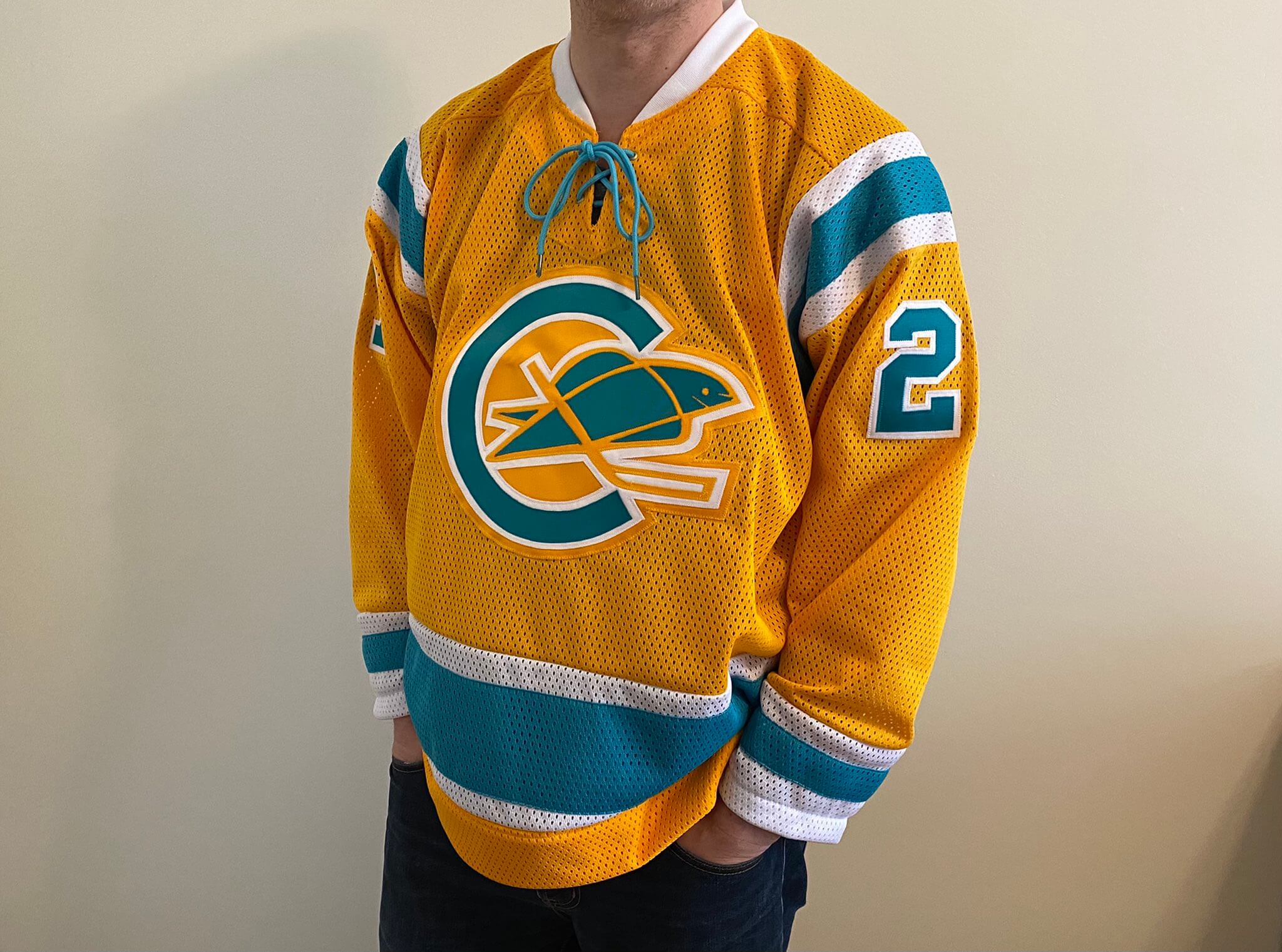
Oh. My. God. I know I tend to go on a bit about the remarkable talents of DIYer extraordinaire Wafflebored, but he’s outdone himself again. Behold — a California Golden Seals ЯR jersey, using elements from various eras of the team’s history. Genius!
Here’s how it looks from the back:
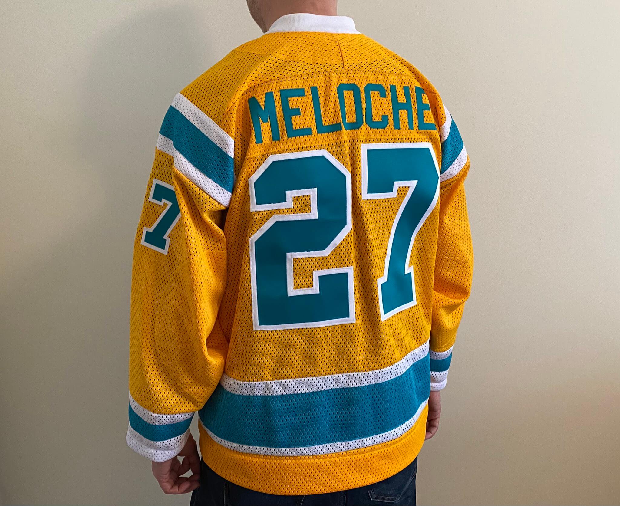
That, my friends, is a spectacular work of art. Let’s take a moment to ponder and appreciate the greatness that is Wafflebored, a giant who walks (and sews) among us.
Click to enlarge
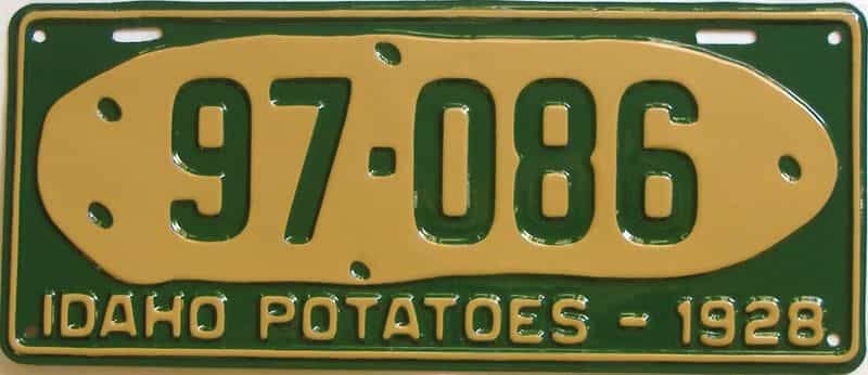
A potato on a plate: Did you know that this 1928 Idaho license plate with a depiction of a potato was the first example of a promotional design on a license plate? I didn’t, until I listened to the new episode of the great design podcast 99% Invisible, which provides an interesting and entertaining look at the history of license plate design. It’s really, really good, and you can listen to it here.
Click to enlarge
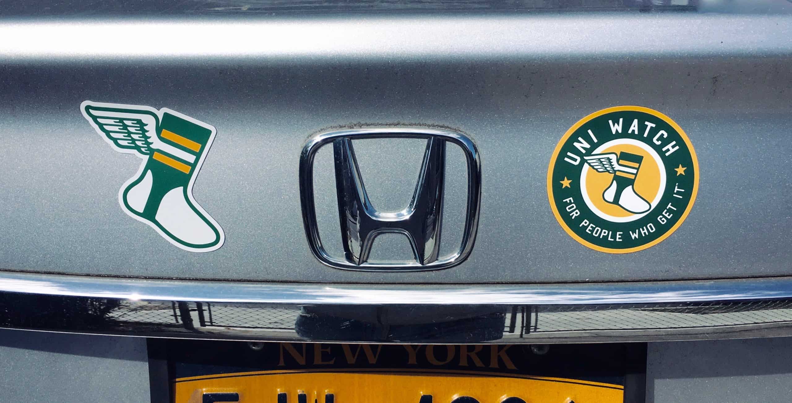
ITEM! Round magnets back in stock: I’m happy to announce that our round Uni Watch magnets are now back in stock — and I still have some of the winged stirrup magnets on hand as well. Both magnets are available here.
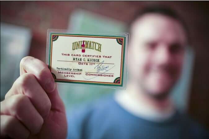

ITEM! Another membership raffle: Reader Ed Hahn recently purchased a membership for me to raffle off, so that’s what we’re going to to today.
This will be a one-day raffle, with no entry restrictions. To enter, send an email to the raffle in-box by 8pm Eastern tonight. One entry per person. I’ll announce the winner tomorrow. Big thanks to Ed for sponsoring this raffle!
Meanwhile, the winner of yesterday’s membership raffle was Reid Ostrom. Congrats to him, and thanks to Jarrod Reich for sponsoring that one.
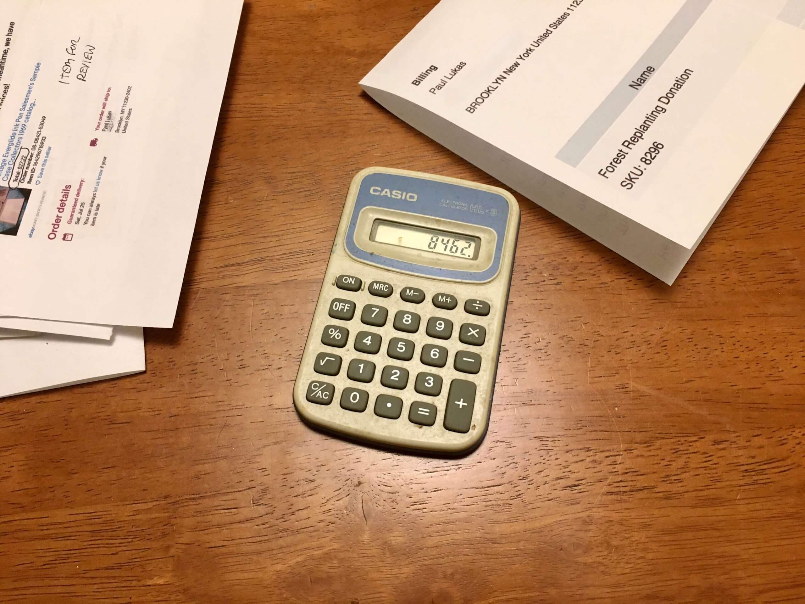
The little gadget that could: I tallied my 2020 tax receipts last night, which means it’s time for my annual post about my pocket calculator.
So: When I left my last office job 25 years ago and began working from home, I took a few items with me from my office, including a cheapo pocket calculator that probably cost $1.99 at most. I’d already owned it for at least a year at that point. I’ve never changed its battery (nor could I, even if I wanted to — it’s a solid one-piece case that can’t be opened). But it still works.
Granted, I barely use it anymore except for the annual tallying of the expense receipts. Still, it seems pretty amazing that it hasn’t died. For years I’ve been thinking, “Okay, so this is probably the last time I’ll get to use it,” but it keeps proving me wrong, so now I’m thinking it will probably outlive me. See you back here in a year!
The Ticker
By Lloyd Alaban

Baseball News: The Rays yesterday announced their promotional schedule, which among other things calls for them to wear Devil Rays throwbacks for five Saturday home games (from our own Phil Hecken). … One of the umpires in yesterday’s Mets/Cardinals game wore a Jackie Robinson Day patch on his cap (from @_RF30). … Also in that game, Mets CF Albert Almora Jr. wore a mesh-backed cap, something that a handful of Mets have been wearing during spring training (from Beau Parsons). … The Astros will now use QR codes instead of paper tickets at their ballpark (from Ignacio Salazar). … New BFBS unis for the Reading Fighting Phils, affiliate of the Phillies (from Josh Claywell). … A Vanderbilt player wore a football-style cage facemask on his batting helmet last night (from Max G.). … New unis for Charlotte (from @HollarDollar).

Football News: Here’s how the new Vicis Zero2 helmet looks with USF decals (from @SportsPSD). … Here’s a great article from 1976 about the equipment manager for the Seahawks and the University of Washington customizing equipment (from Michael Princip). … Virginia Tech just renovated its weight room (from Andrew Cosentino). … A new European football league has reached an agreement with the NFL to use two old NFL Europe team names (from Timmy Donahue).

Hockey News: New mask for Rangers G Keith Kinkaid (from Alan Kreit). … New unis for the Knoxville Ice Bears of the SPHL (from @Jodie2stroke). … A sportswriter believes that helmet ads in the NHL are “likely to persist” after this season. … Lots of uni-related and -adjacent items of interest in this Icethetics interview with Phil Esposito, including the inspiration for the Lightning’s name, how Espo didn’t want a name that ended in “s,” the story behind the victory stripes, and how the lightning bolt on the pants can give the team a slight advantage on the ice (from Trevor Williams). … The NHL is reportedly returning to ESPN.

Basketball News: It looks like the fashion pendulum is swinging the other way, as more NBA players are embracing shorter shorts (from Joel Dunn). … Color vs. color for Elon and Drexel men’s last night (from Gregory Zitelli). … Colorado State men’s wore warmup jackets with the school’s 1966 logo on them (from Rory Roth). … Iowa basketball has apologized to the family of former player Roy Marble for retiring the number of C Luka Garza while Marble’s No. 23 still remains unretired. … YouTube TV used Oral Roberts’s old logo during the men’s Summit Conference Championship Game last night (from Tim Brown). … The Menominee tribe, citing pandemic-related financial distress, is ending its naming rights deal for the D League’s Wisconsin Herd’s arena (from Brain Kerhin).

Soccer News: The Bundesliga’s Arminia Bielefeld will debut a fourth shirt April 21. They’re letting fans vote on three messages to put on the front: One translates roughly to “stubborn, persistent, combative,” which is a club motto of sorts; another says, “Football lives through its fans”; and the third says “East Westphalia,” which is where Bielefeld is located (from our own Jamie Rathjen). … Ukrainian club Balkany ditched its new logo after a day because it’s too similar to Polish club Zawisza Bydgoszcz’s logo (from Ed Zelaski). … New 120th-anniversary shirt for French Ligue 1 side Stade Rennais (from Germán Cabrejo).

Grab Bag: DC Comics has released Wonder Woman’s 80th-anniversary logo (from John Cerone). … In a new memoir, a Vietnam veteran claims to have lived in an abandoned concession stand in Philadelphia’s Veterans Stadium for three years (from @PhillyPartTwo). … Amazon founder Jeff Bezos reportedly loved his company’s logo so much that at one point he said people who didn’t like it must not like puppies either. … The famous MGM Pictures lion is getting a makeover. … New logo for car maker Renault. … Three University of South Alabama professors have been placed on leave after pictures surfaced of them wearing Confederate uniforms and posing with a whip and noose. … Here’s an amazing video of a drone flying through a bowling alley. Very much worth watching! (Thanks to all who shared.)

TO: Paul
RE: Calculator
I love that you live in a paradise devoid of mathematics to the extent that you only get your calculator out once a year. Also, I thought of you as soon as I saw that bowling alley drone video yesterday.
Oh, for sure, I periodically find myself using the calculator on my laptop. But it’s rare that I need a calculator in a non-laptop situation!
Your calculator is the Branch Rickety of office supplies.
If/when it stops working, you should turn the buttons into jersey buttons and make a Calculators jersey.
Gonna fire up some Kraftwerk later in celebration of another year of the Pocket Calculator!!!!
“I am adding…and subtracting…”
Or maybe in Paul’s case…just adding :)
Three University of Alabama professors have been placed on leave after pictures surfaced of them wearing Confederate uniforms and posing with a whip and noose.
In fact, the professors are from the University of South Alabama.
Thanks! Fixed.
Great article. To be fair, there are many types and degrees of color blindness but as I am not color-blind, it is interesting to hear such a perspective.
OMG, Wafflebored. Wow, that is awesome.
Thanks for the color blindness post from David. I have the exact same level of red green colorblindness, and it is definitely one of those things that is not a problem until it is a problem.
For example, I am a huge New Jersey Devils Fan but I do not like the shade of green on their new reverse retro jerseys. Being red green colorblind though means I am not sure if it is just my eyes see that shade green, or if everyone else thinks it’s a miss as well. For the record, I find that shade a bit muddy for my eyes.
I feel like I’m the same as you Morgan. Do you have issues with purples vs. maroons like me?
I don’t have any form of colorblindness, but when the Devils wore those jerseys against the Rangers I thought “why are they BLACK?” Up close you can see they’re somewhat greenish but they’re way too dark. Nice design but they would have been better with a shade of green closer to what they used to wear.
Thank you so much to David Versel for his post about color blindness. He perfectly explained what’s it’s like to have our particular type of red-green deficiency. The only thing missing is having people ask how I can tell if the traffic light is red or green. (Red is on top and looks red. Green is on the bottom and looks almost white).
I also have trouble with the score bug on many telecasts. As David mentioned, I need a large area of color to distinguish it. If the score bug uses only a small square to denote each team, it can be difficult to see the difference.
My color blindness is also the reason I am not a fan of NBA teams wearing multiple uniform sets with no consideration of home vs away colors. They are taking away my usual visual clues that allow me to instantly identify the teams.
When I was a kid, the Irish-American section of Syracuse had green on the top. Whenever it was periodically standardized, people would break the lenses with thrown rocks. At some point standardization succeeded, if I recall correctly.
Here you go. Its still there
link
link
Well I’ll be damned. I could have sworn it was the normal way now. Then again, I’ve not been there in almost thirty years. Thanks for the link!
Bob, thanks for the additional insight. Yes, I have the exact same reaction to traffic lights. As a kid I refused to believe that the bottom light was actually green and I’m more likely to confused the yellow with the red than the green with the red. And I have the same issue with the score bug too. Solidarity amongst the colorblind!!!
I’m curious, does colorblindness come up at all regarding a driver’s license? Do they test for it/do you have to volunteer it/is it indicated in any way on the license itself? And do auto insurers care?
Color blindness has never been mentioned by either the NJ DMV or my auto insurer.
Colorblinds unite! Same here. And if there is a flashing single unit light, (not the traditional red/yellow/green three unit lights), is it yellow? Is it red? Who knows!?!
Exactly. I treat the flashing light like it’s red just in case it is.
David – when I read your post I felt like I could have written it, although not nearly as well. Now I’m convinced we share a set of eyes.
Great UW today! Thanks for sharing your insights & experiences, David.
Kudos to Waffleboard for crafting what is by far the most beautiful of the RR jerseys. And I say this as someone who loooooves a lot of the real NHL’s RR uniforms.
I first encountered the history of Idaho’s potato plate at the Canadian Potato Museum in Prince Edward Island, where the museum has a display of the Idaho plate and a similar near-contemporary PEI plate. The PEI plate came later by a few months, if an recall the plaque, but was designed without knowledge of the Idaho plate. (I say knowing there’s a nonzero chance the 99pi episode covers the Idaho/PEI plate history with greater fidelity than my memory of a plaque on the wall of a small museum in 2019.)
I should clarify, the Canadian Potato Museum is a small museum, physically. But it’s also a great museum, easily one of the handful of most interesting and rewarding museums I’ve ever visited. Highly, highly recommended. I expected kitsch and a lot of dust, but instead it was like walking into a graduate seminar on global history and economics through the lens of a single staple crop.
Thanks for sharing, David! This is basically my exact experience as a color blind Uni Watcher as well. Lots of asking my wife and son what color teams are wearing too.
Are the Rays planning Devil Rays throwbacks, or fauxbacks? As I read it, they’re planning to wear blue-ized versions of their old green uniforms.
Those green uniforms (especially the vest version)rank high up in my “gone too soon” list.
It’d be nice to see those once in a while.
I almost agree – for me, they’re more like “almost got it right” uniforms. They always had too much black, but the green and blue had the potential to become an all-time great color combo.
The Rays have some nice promotional items.
It’s good to see that they are not resting on their laurels and getting over-confident after leading the American League in home attendance in 2020.
Great job, David! I really appreciate your willingness to share your experiences.
I found this very interesting , as my brother is colour blind and was denied admission into the police in the 80s because of it, how times have changed?
That bowling alley drone video is the best thing I’ve seen in a LONG time! Thanks.
PS: Is the anything better than a beer in a bowling alley bar?? “No” is the answer.
Downed many, many beers in our local bowling alley bar over the years. My uncle managed the place, and it was the hangout for all ages, from ten years old on up. Another relic of yesteryear that is (sadly) fading away in many parts of the country.
As for the video, I wish they’d spent more than just a passing glance at the back room. If you’re a machinery geek like me, you’ll be fascinated by the mechanics of automated pinsetting. Love all those old machines, both AMF and Brunswick.
Wait, Clemson wears purple? I thought it was blue as well.
Count me as another surprised Clemson wears purple – I only found out it wasn’t blue last week!
That drone video!
I don’t want to give anything away, but watch till the end.
It is an amazing bit of film making. The editing is seamless.
Love the Seals RR jersey by Wafflebored. One unsung but brilliant aspect of this design is how it cleans up the original Seals logo. I happen to have a replica of that old green-and-blue design which I’ve worn countless times, and in staring repeatedly at the original logo I’ve come to realize it’s unnecessarily cluttered with black outlines and have longed to see a cleaned-up version. Kudos to Wafflebored for recognizing the issue and so successfully addressing it, producing a greatly improved logo.
Seeing this Seals RR jersey is a reminder of how great the teal and yellow color combo is. Amazing how with 124 pro teams in the US none of them use that. And the closest thing we get is the Chargers baby blue and yellow.
Really appreciate the post about color blindness. I can definitely relate. I’ve noticed that more and more video games have been including a feature that alters colors for people who are color blind. I also have red/green color blindness and when enemies are marked red and allies are marked green, that can become confusing really fast. The ability to alter these colors has been super helpful.
In David’s defense, Clemson’s trim color was navy blue until 1993, when it was changed to purple in Ken Hatfield’s final season. In 1994, Tommy West changed it back to navy blue and it remained that way until 2000, when Tommy Bowden reinstated purple. It has remained purple since, with all of Clemson’s athletics teams now using purple, which is one of the school’s official colors.
What’s worse? BFBS or Promo video for it with Back in Black playing?
Paul, I have a similar calculator (mine has a small solar panel at the top) that I was given prior to changing schools back in 1990. For the past few years it’s sat next to the radio in our kitchen, ready to be used whenever I need to do any kind of basic maths.
I’ve got electrical and battery-operated items that are far older and still functional, but it’s still pretty good going for a cheap, flimsy calculator!
Great article on the color blindness. It brings up such an interesting philosophical thought experiment, such that we could all be seeing completely different colors, but would have no idea. We only know of color blindness because in that case people struggle to differentiate colors.
I just listened to that podcast yesterday and I think Paul and Chris both made great points RE the NBA uniform mess.
I’m 100% with Paul that color vs white 99.9% of the time is the way to go. It just provides the most visual contrast, which is obviously something you want when watching a game and trying to identify the teams clearly.
However when it comes to specifically fixing the NBA I can buy into Chris’ idea that has every team with a primary uniform in their primary color, which they wear as much as possible home or road, a white clash uniform for road games if they cant wear their primary. And then an alternate color jersey which is basically the same as the primary but just color swapped, thinking early 90s black Bulls or purple Hornets.
we could all be seeing completely different colors, but would have no idea.
This reminds me of an experience I had back when I was a book editor. I was part of a group taking a day-long seminar on color separation (i.e., the process of turning a color image into its CMYK components for color printing). At one point, the seminar leader asked, “How many people here are colorblind?” Two or three hands went up. The seminar leader said, “Good. Now, for the rest of you who *aren’t* colorblind — are you sure? How do you know?” It was a powerful moment!
My grandfather for years worked in the printing industry. One of his previous companies (I want to say it was Brenneman Printing, but I truly don’t remember anymore) would deliberately hire colorblind workers for some projects to make sure that things being printed were readable by colorblind and non-colorblind alike.
Thanks for the article David, I too struggle the same way you do with all the colors. I usually rely on my kids to let me know for sure what colors it is that I am looking at. The article was basically about me. I’ve had the same experiences with different shades of blue, purple, gray, etc. I thought too that Clemson was blue and no purple. I get messed up with neon yellow and green. I am not a huge fan of the color green, so that Jets game was more of an eye sore, and then throw in the red, it was like Christmas. I still ask my kids daily if what I am wearing matches, or does this go with this. My favorite color is blue, royal blue to be exact. (My favorite baseball team is the Royals) Blue has a special place with me, and I probably wear it too much. My kids will tell me if the blue matches my shoes if they have blue, if not I usually will wear white shoes. Either way, color blindness has been more of a quirk then a nuisance. Thanks again for letting me know I’m not the only one.
Thanks for the article David, I too struggle the same way you do with all the colors. I usually rely on my kids to let me know for sure what colors it is that I am looking at. The article was basically about me. I’ve had the same experiences with different shades of blue, purple, gray, etc. I thought too that Clemson was blue and no purple. I get messed up with neon yellow and green. I am not a huge fan of the color green, so that Jets game was more of an eye sore, and then throw in the red, it was like Christmas. I still ask my kids daily if what I am wearing matches, or does this go with this. My favorite color is blue, royal blue to be exact. (My favorite baseball team is the Royals) Blue has a special place with me, and I probably wear it too much. My kids will tell me if the blue matches my shoes if they have blue, if not I usually will wear white shoes. Either way, color blindness has been more of a quirk then a nuisance. Thanks again for letting me know I’m not the only one.
Thanks
I have a Texas Instruments calculator that I’ve had since the starting high school in ‘88. Still works and it comes out more often than yours Paul. It’s still what I use to balance the checkbook, every week, two at the most. I’ve been just as amazed as you at its staying power.
Waffleboard…..the Seals jersey is fantastic….bring them back and suit them up with these…!!!
If nothing else, instead of the garbage that the Sharks gave us for their RR. If the Canes can use the Whalers, why couldn’t the Sharks use the Seals?
Hello friends. Does anyone happen to have the link to those printout sheets for the 2020 and 2021 Pin Club?
Thanks!
Extra points to Wafflebored for making it a Gilles Meloche #27. When I was a kid I always thought it was cool when a goalie would sneak down into the high 20’s for their uni number instead of the standard #1 or 30-35.
Lifelong Yankees fan here. When I was very young watching games, I thought that their pinstripes were black. I remember owning a Yankee shirt and hat that were clearly navy blue at that age, but was still under the impression that the pinstripes were black because that’s how they looked to me. Of course, not having high definition back then may have played a part.
Am I the only one who was hoping the calculator would have showed “5318008”?
I was just thinking of that too! I used to have a really long “complex” equation I would give people to get to that answer!
Why guys?
For a site that really tries to promote not being crude, childish, or sexist…this?
thanks a ton for the article David. I am also color blind, and its nice to know that somebody can put what we don’t see into writing
The “drone” video is just an expert example of video editing.
It is far from a single take. It is very reminiscent of Gaspar Noé’s work (i.e. Irreversible and Into the Void).
Though it is very impressive, it is many shots expertly done and seamlessly stitched together.
Thanks for all the love for my piece from both the colorblind and non-colorblind populations. I appreciate the kind words from all of you. An article like this has been in the back of my head for a long time and it took the Unified podcast to bring it to the forefront, so thanks to Paul and Chris for their awesome new venture!
“A sportswriter believes that helmet ads in the NHL are “likely to persist” after this season.”
So you mean all those people who insisted that this was a one season thing, a “make good” to advertisers, and things would return to normal next year might have been wrong?
I, for one, am shocked.
No one should believe they’re going away
Great piece David. Here’s really hoping you are not limited in taking in the glorious Seals sweater by Waffleboard!
Great read on the color blindness article.
Got me thinking about how the transition from black & white TV to full color broadcasts influenced uniform design.
For example, I’ll bet the reason the Chicago Bears initially had a white “C” on their helmet, then switched to orange C in the early 70s was because of color broadcast and increasingly good TVs. On a 1960s b&W broadcast an orange “C” would have blended in with the navy helmet too easily.
I applaud the return of the round magnets!
Am I the only one who feels apprehensive when reading the comments section on days when the 1976 Seahawks are mentioned in The Ticker?
;)
You’re not alone, Chris…
What? ;)
Wafflebored, you are the man! What an absolutely gorgeous sweater. Insert “We’re not worthy” GIF here.
I’m not color blind, but I was today years old when I learned the Yankees don’t (technically) wear black. Still looks black to me, though!
Story about today’s topic:
A link in January was red vs. green. The Man U shirt in question is very dark green, so much so that I didn’t even realize it was green, and actually thought it was black, until that incident. But even so it was just as hard for color-blind people to distinguish.
I was going to mention there have a couple PL matches this year where the kit colts have caused problems.
The PL is supposed to have rules about color match ups to prevent the situation from happening, but well, you know, not always followed.
I’m colorblind as well, though more sever than David so I see things even more poorly on the field/tv/score bugs. That Bills/Jets game was hard for me to follow for example. I appreciate you sharing your experience though, I am going to share this with friends as a way to at least partially help explain to them what I see/experience.
To the question above about seeing MORE colors, that is a less common but verified condition called tetrachromacy. I’m so jealous of those people, I just want to see like the rest of you, let alone BETTER than the rest of you!
link
Nice piece on colorblindness. My dad was colorblind. He used to work for Foodtown (an east coast supermarket chain) as a buyer when I was a kid. He would purchase large amounts of products from salesmen and have them sent to various stores (eg, 100 cases of Heinz Ketchup, etc.). One time a salesman sold him orange soda in a green bottle. We all thought it was weird but my dad said he couldn’t see the problem.
Better than most (after all it is the week of Players Championship)….and definitely better than what the Sharks came up with for their RR
A brainy friend of mine posited our color-blind ancestors played a part in the survival of the species by being able to see predators in the forest when his friends could only (not) see the camouflaged fur lurking through the foliage.
Has a color-blind driver ever caused an accident at an intersection in Syracuse? The greatest virtue when driving is predictability, not misplaced patriotism.
I have a little red-green color blindness, but it is mild. The Jets/Bils game was wierd for me, but I feel lucky. I would think being color blind would be especially hard for sports fans.
I had a friend in high school who could not see yellow. He could see all the other colors but everything yellow he saw as orange. Our school colors were orange and blue and he was a catcher on our baseball team. It was the 80s – dark pullovers and sansabelts. We played another school that had our exact same uniform design except theirs were yellow and blue. Needless to say, he had a hard time with the throw down to second base to catch base stealers.
While I fully understand not doing a write-up each day on the Pandemic Porch Cocktail pic, I’m sure there is probably an interesting story in today’s.
Just two neighbors who walked by with their dogs, one of which was particularly enthusiastic!
At last with the basketball shorts! Michael Jordan has much to answer for, but the long shorts trend is the worst!