For all photos, click to enlarge
It’s been much too long since we’ve had a guest entry from baseball jersey restorer extraordinaire Bill Henderson, whose business, the Dream Shop, has been featured in several previous Uni Watch entries.
Today’s story from Bill is particularly interesting because in addition to showcasing his top-notch jersey-restoration skills, it also helps fill in some of the historical blanks regarding one of the biggest anomalies in MLB uniform history — the Tigers’ 1995 navy alternate, which was supposed to be worn on Sundays but was instead mothballed after one game after team management didn’t like the way they looked. Whatever happened to those jerseys? Take it away, Bill!
Finding a Rare 1995 Tigers Navy Jersey
By Bill Henderson
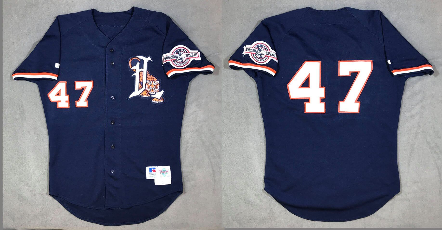
Collector Stephen K. was perusing jerseys for sale online when he stumbled on this Lakeland Tigers late-1990s jersey (see above). It was generally the same style as the Tigers’ one-game 1995 alternate, except it had the Lakeland Tigers’ logo on the chest and smaller numbers on the back, along with a Minor League Baseball anniversary patch on the sleeve. But a faded, barely legible tag, on the front below the Russell tag, said it was a “Diamond Collection” jersey — Russell’s branding for authentic on-field MLB wear in the mid to late ’90s. And while it’s true that a few minor league clubs wore jerseys with Diamond Collection tagging, most of those were repurposed MLB jerseys. Stephen decided to take a gamble and bought the jersey without asking too many questions. He figured that if it turned out to be a “nothing” — instead of a repurposed Detroit navy alternate, as he suspected and hoped — he could easily resell it the same way as he had purchased it.
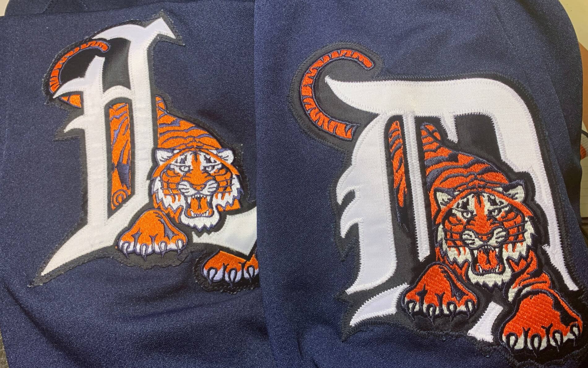
It’s only comparatively recently that MLB teams have stopped sending their hand-me-downs to the minors (some teams may still do it), because it wasn’t until the 1990s that MLB woke up to the collectability of its game-used uniforms. Prior to that, the Tigers were a team that wasted nothing, and at the start of the 1990s they were still sending their used jerseys and pants to the minors to be used and used until they were worn out and discarded. The Lakeland Tigers wore uniforms in the 1990s that had a stylized variant of the big club’s gothic logo, except theirs was a Gothic “L” instead of the Detroit “D”:
Let’s talk for a minute about the Tigers’ infamous one-day navy jerseys. Jim Schmakel, the team’s equipment manager, would normally mark the manufacturer locker tag on the front of each game-worn jersey with his initials and the letter “G,” signifying that the item was game worn. But not the navy one-gamers — they created such an unpleasant stir that they disappeared without a trace.
As the 25th anniversary of the navy jerseys approached last spring, MLB.com writer Jason Beck wrote an article about them (for which I was interviewed), which includes this passage:
Clubhouse manager Jim Schmakel, now in his 43rd year, saves every style of jersey the Tigers wear, from their traditional uniforms to special events to throwbacks. But he didn’t save the blue ones.
“I never saw them again,” [club president John] McHale said. “I don’t know what happened. There didn’t seem to be an enormous amount of affection to them.”
“They might have burned them,” [TV analyst Jim] Price joked.
What happened to them after that game is a mystery. But somehow, they ended up in the wild.
One of those navy uniforms “in the wild” ended up with me. I purchased it from used equipment dealer Murf Denny back around 1997, as an oddity. In all my years of searching, I think I’ve seen only two offered at auction, so they’re very rare.
Now let’s get back to collector Stephen K. and the Lakeland Tigers jersey that he purchased. When he received it, he could see that the well-worn MLB tag had some printing on it, but it was so faded it was nearly impossible to make out. He sent it me and asked me to take a look. The first thing I did was to take a high-resolution scan of the tagging and apply my Photoshop filters to it. And when I did, the writing popped right out — “95-3-42”:
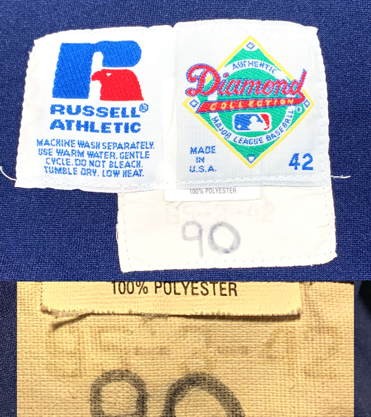
That translates to 1995, No. 3, size 42. And No. 3 was worn by, of course, future Hall of Famer Alan Trammell. Are you kidding me?
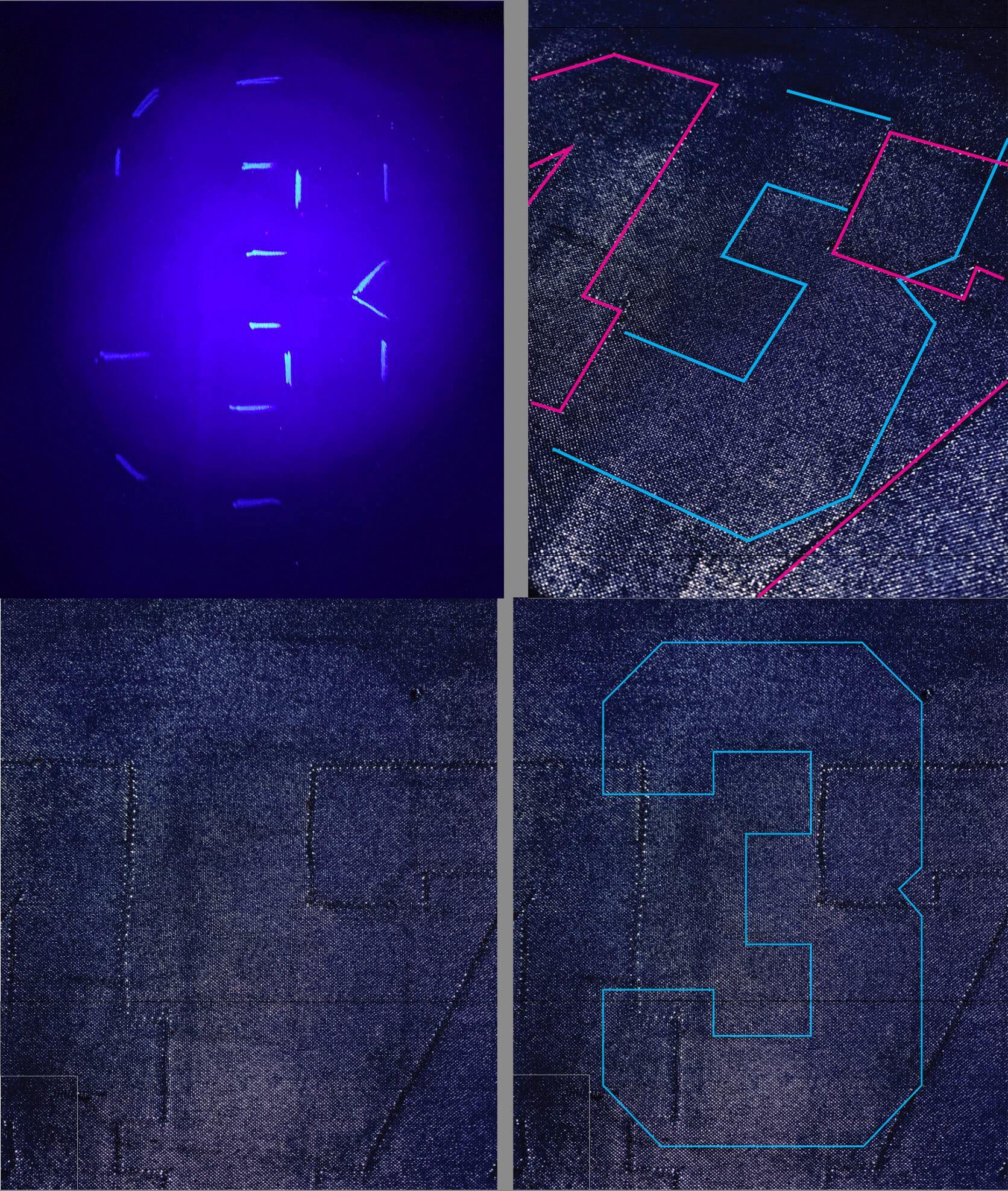
The next step was to look for evidence that this was indeed a 1995 Tigers jersey that had been converted to minor league use. I put it on the light table and could see a few marks where the front crest had been sewn:
I couldn’t see any evidence of old numbers being there, but that didn’t really surprise me. Fabric ghosts and shadows come to exist mostly from repeated washings and uniform wear in the sun, adhesive residue, and the addition of years of time. In this case, we knew that if this had indeed been a Tigers jersey it was only ever worn and washed once in its original configuration. Something sewn on in 1995 and then removed nearly immediately probably wouldn’t have left many marks. The minor league logo and numbers had been on there for a quarter-century and the jersey showed evidence of being worn and washed perhaps hundreds of times. This was going to take some sleuthing.
The first thing we needed to do after taking exacting photos of the jersey in its minor league configuration was to strip it completely, then photograph it again on the light table, superimposing images of the proposed original numbers and team crest onto it to see if we could find any points of intersection — holes, pulls, and fading that matched what once may have been there a quarter century ago.
I carefully removed the numbers, the crest, and the sleeve patch and went back to the light table. Taking a series of photographs with different exposures and applying my Photoshop filters, I was indeed able to clearly see edges of where the original (smaller) Tigers crest had been sewn on the front.
Stephen found a retail version of this jersey and sacrificed it for the restoration. I carefully removed the front “D” from the donor jersey, noting how tightly it was stitched in place, the edge bound with a satin embroidery stitch. This method of attachment left ample pinholes to show where it came off. It neatly covered the original outline on the Lakeland jersey like the missing piece of a jigsaw puzzle.
The numbers were much more difficult to see. But I found if I tipped the light table at a very sharp angle, I could see faint lines where fabric threads had been compressed closer together with sewing machine stitching. I used a black-light pen to lightly mark those lines in the spots where I saw them, and behold, a pattern began to emerge — the number 3, centered on the jersey back, and in the proper size to match the team template! I did the same on the front, and there had been a 3 there as well. We had a positive match!
I cut new numbers, using my own game jersey as a guide for their sizes, and then stitched everything onto Stephen’s jersey, using the light table for placement:
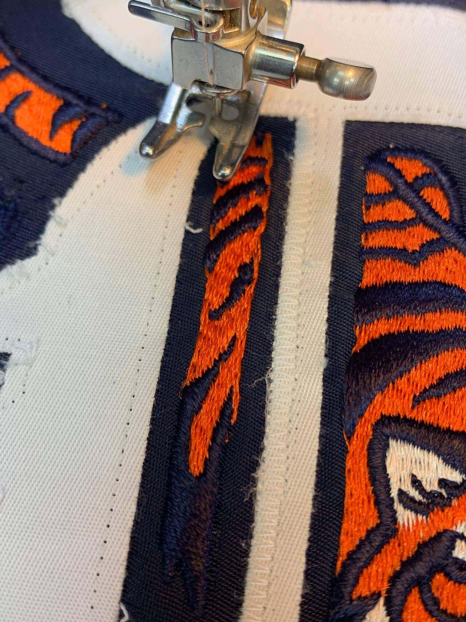
I fully documented the restoration and wrote up the authentication so that the next person looking at this on a light table would understand why there were ghosts of a 47 and a different team crest on the front. Without this step, the value of this historic jersey would possibly be lost. After all, who would believe that this wasn’t simply a Lakeland Tigers jersey converted to look like one belonging to a Hall of Fame player?
Here is the completed jersey, restored back to the original design:
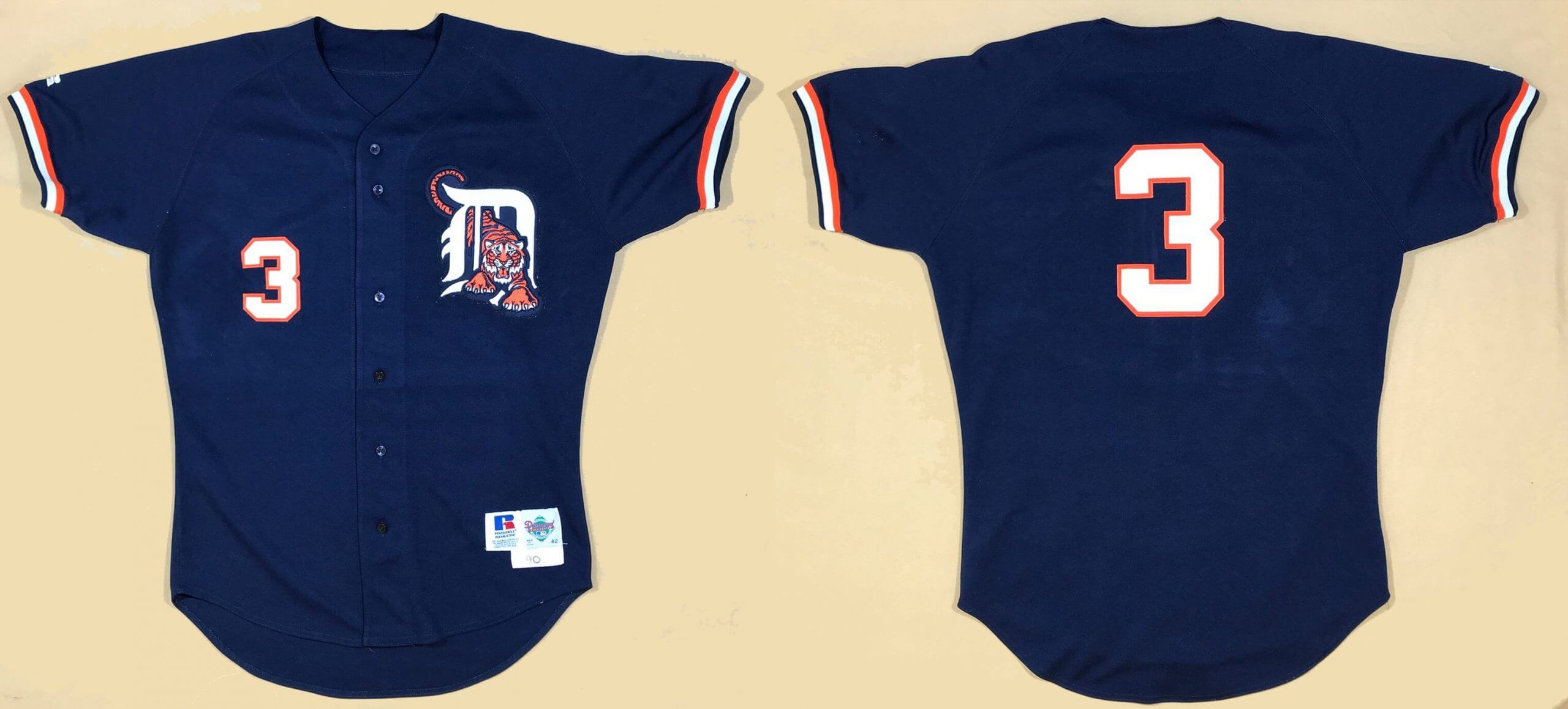
Stephen is justifiably pleased with his barn-find prize, and I’m happy to have helped solve the mystery of what happened to these Tigers jerseys.
———
Paul here. Fascinating stuff from Bill, as always! You can see more of his Tales from the Dream Shop here.
Click to enlarge
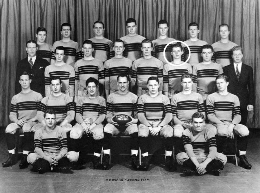
Too good for the Ticker: Oh man, check out the amazing striped jerseys worn by the 1937 Harvard JV team. So good! In the words of Jim Vilk, I’d wear that.
And who’s the gent with the white circle around his face? None other than future U.S. president John F. Kennedy.
(Big thanks to Max Weintraub for this one.)

Podcast reminder: In case you missed it on Thursday: On the new episode of Unified, Chris and I discuss the mess that the NBA uniform scene has become, and possible ways to fix it. Plus we talk about NBA All-Star uniforms, the potential uniform implications of J.J. Watt signing with the Arizona Cardinals, whether all the teams in a given city should wear the same colors, and more.
You can listen to this episode, and subscribe to future ones, on Apple, Google, Stitcher, TuneIn, and Spotify, or just use the player below:
The show notes from this episode, which include photos of most of the things we discussed, are here. Those photos also appear in the video version of this episode, which you can watch here:
Please consider supporting this episode’s advertisers, Streaker Sports (20% off with checkout code UNIFIED) and Homefield Apparel (15% off with checkout code UNIFIED).
Enjoy the episode, and thanks for all the enthusiasm and positive feedback on this project.
Click to enlarge
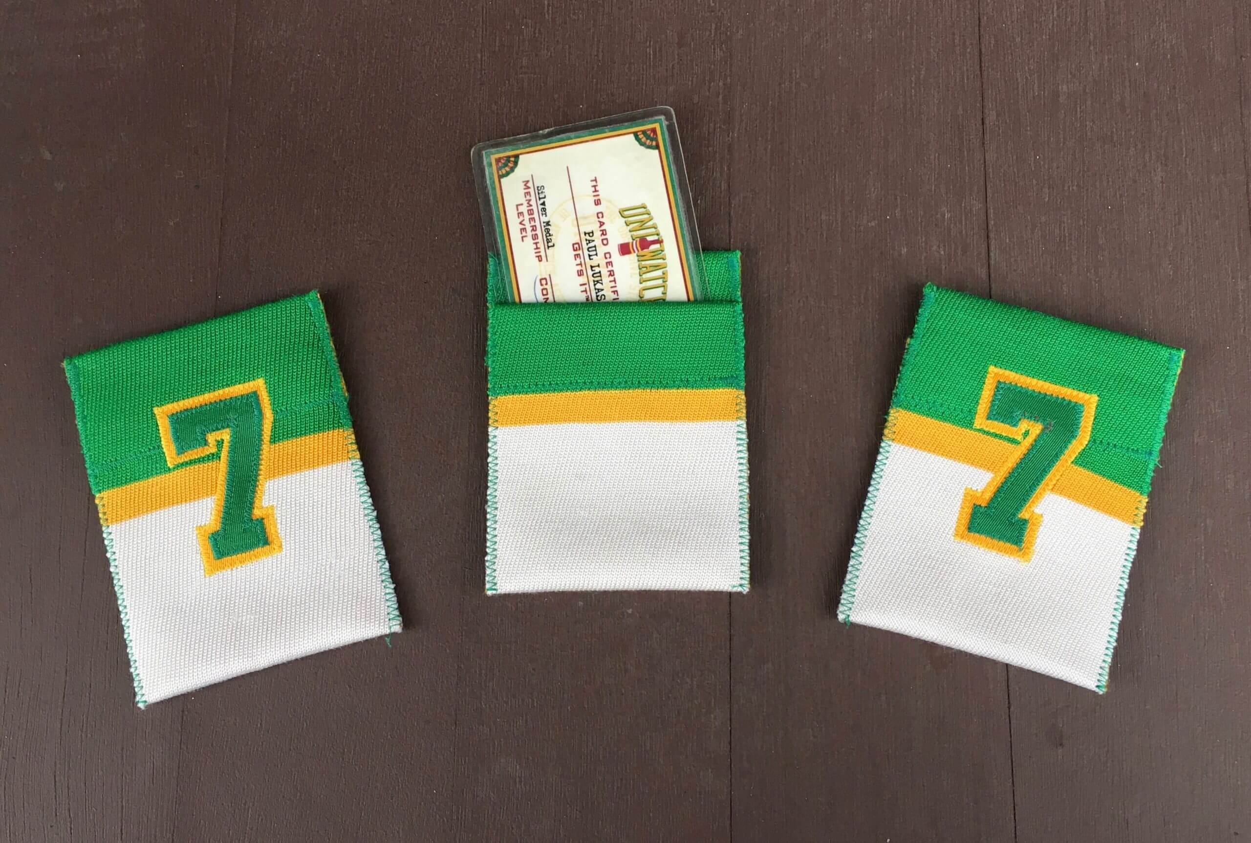
Membership drive reminder: As I’ve mentioned over the past few days, we’re currently in the midst of a membership drive. I will pick three people at random from everyone who orders a membership card this week (including this weekend), and those three people’s cards will come with one of these beautiful card pockets hand-sewn by DIYer extraordinaire Wafflebored.
In addition, reader Chris Hickey has decided to support the membership drive by purchasing three Uni Watch winged stirrup magnets, so the three winners of the card pockets will each get a magnet to boot!
Also: About a year ago, as a gesture of pandemic solidarity, I lowered the membership price to $20. After this week, the price will go back to $25. So signing up this week is a good move — you’ll get in at the discounted price and will also get a shot at one of the card pockets and magnets. You know what to do.
Click to enlarge
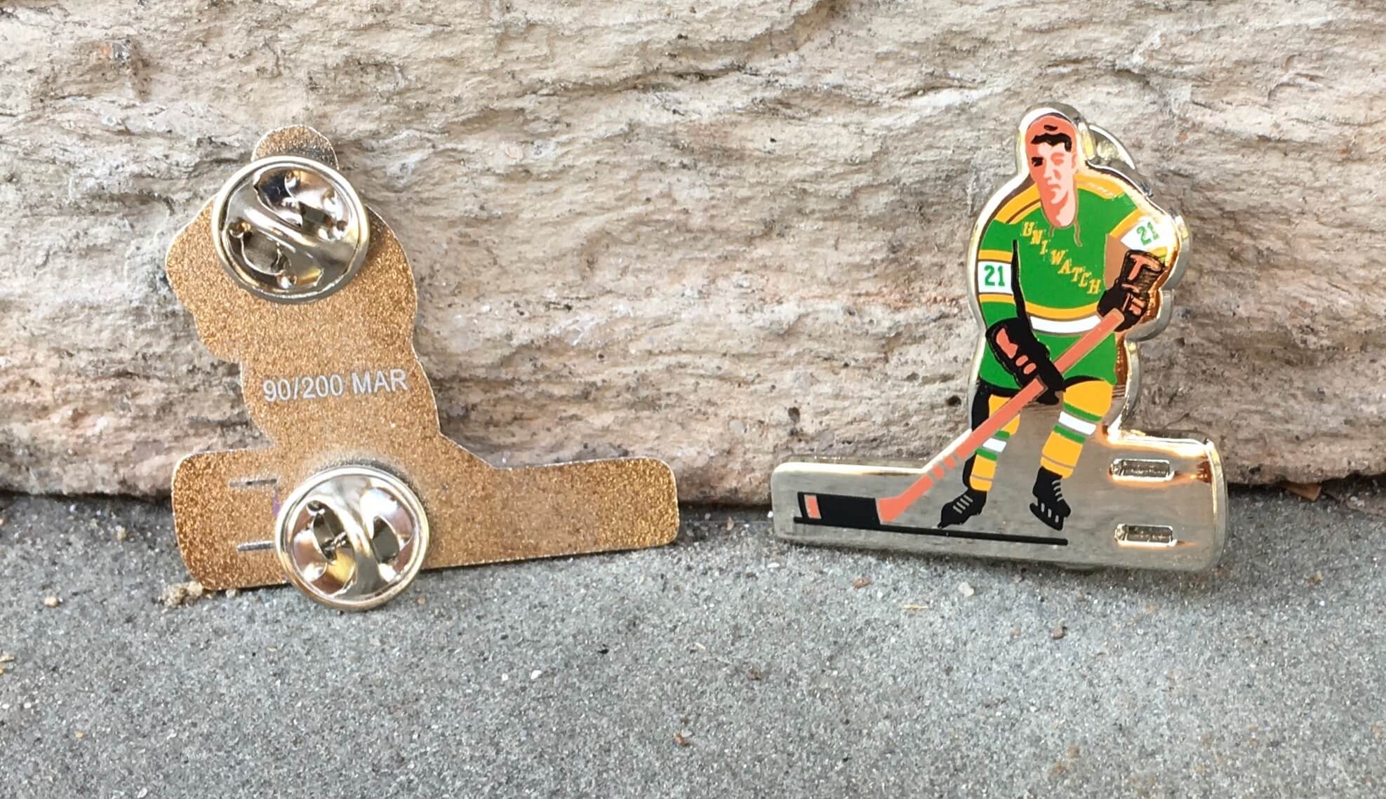
Pin Club reminder: Our new Uni Watch Pin Club design — a shout-out to classic table hockey players — continues to sell well. As of this morning, there are only 26 of them remaining, so move fast! Available here while supplies last.
The Ticker
By Anthony Emerson

Baseball News: I’m sure over the past 12 months, you’ve accidentally worn your mask upside down. And at first glance, it appeared that Mets GM Sandy Alderson had done just that during an interview. But look again — he’s wearing the mask correctly, just all the printing is upside down (great spot by Derek May and @artofscorebug). … Speaking of the Mets, their logo on the back of the mound was painted backwards yesterday. But hey, it’s spring training, everyone’s still working on their skills (from Niko Goutakolis and Kirk Anderson). … The Pirates and their stadium-name advertiser have extended their ad deal. As part of the new agreement, the advertiser’s logos will now be featured more prominently on the stadium’s façade and scoreboard (from multiple readers). … For the first time since 1995, Wisconsin-Eau Claire will have a baseball program. Here are their new uniforms (from Lukas Hoffland). … Only in spring training: The Reds had two No. 69s on the field simultaneously yesterday.

Football News: Gross: Arrowhead Stadium has a new corporate-advertised name (from multiple readers).

Hockey News: Canucks LW Nils Höglander had an umlaut added to his NOB (from Wade Heidt). … The Penguins apparently Photoshopped masks onto fans when posting an Instagram pic of the crowd at their first game with fans back in attendance (from Mike Chamernik).

NBA News: Here’s the court for Sunday night’s NBA All-Star Game (from Mike Chamernik and Andrew Cosentino). … Apparently every WNBA team is getting three new unis before the start of next season (from Kevin Brown). … NBC Sports Washington had its scorebug colors completely backwards for last night’s Clippers/Wizards game (from Corey Burnett).

College Hoops News: Looks like the Final Four court at Lucas Oil Stadium in Indianapolis is situated over one of the end zones, rather than at midfield as has been the standard in years past (from our own Alex Hider). … ECU wore autism-awareness unis last night (from Brian Weingartz). …

Soccer News: The Houston Dynamo and Houston Dash each unveiled their new home kits yesterday. “[They’re] almost as identical as possible with different manufacturers,” says our own Jamie Rathjen. … A ref from Wednesday’s Aston Villa/Sheffield United match had a circular red card. I’ve never seen that before, and I’ve watched a lot of soccer (from Robert Baker). … Chelsea is heating up players’ boots by putting them in the microwave (from Trevor Williams).

Grab Bag: Here’s a really interesting article about how the clothes worn by the Muppets were designed (from Akul Nishawala). … The Brampton Excelsiors of Major Series Lacrosse in Canada are relocating to Owen Sound, Ont. The team had been based out of Brampton, Ont., since 1883 (from Wade Heidt). … Starbucks has a 50th-anniversary logo (from John Cerone). … Haas F1 has unveiled their new livery, and it’s basically a Russian flag. Haas has a new title sponsor in Russia-based chemical company Uralkali, whose owner is the father of controversial new driver Nikita Mazepin. Ironically, Russian racing drivers are not allowed to compete under the Russian flag in 2021, as part of an extension of Russia’s ban from international sport due to government-sanctioned doping, so now the World Doping Agency is looking into the Haas livery (from Russell G. Flynn and Daniel Lavender).

That’s a wrap for this week. I’m getting my first vaccine shot this afternoon, so I’m excited about that, and then I’m going ice skating this weekend. However you’re spending your weekend, stay safe, stay well, enjoy Phil’s weekend content, and I’ll see you back here on Monday morning. — Paul
Best of luck with the vaccine shot Paul!
The court at Lucas Oil Stadium is in the end zone because they are going to have 2 courts.
link
Field hockey uses circular red cards, so if I had to guess that’s where I would say Robert Jones (the Premier League ref) borrowed his from.
I seem to remember there being a trend for them in the 90s for a while, then it faded out. not sure if it’s to make it easier to distinguish or not
here’s a better pic of Phil Jagielka being sent off:
link
A bit more about the Brampton Excelsiors. 1883 was the official year of the establishment of the lacrosse club. However, the history traces back to 1871 when it was indicated organized lacrosse play first began in Brampton. It was reported the Excelsiors team name first introduced/used back then.
There has been a 150th-anniversary logo for the Excelsiors floating around. Here is it. Of course, the team did not play in 2020 due to the pandemic.
link
Have to think there is no way they are changing the team name and traditional colours with the move. I would be disappointed and surprised if they did.
Unified started my weekend off. In a very good way. Thanks for getting vaccinated. It’s the way we come back together.
I’ve seen referees brandish circular red cards a few times in the past, although not for a few years. I was led to believe the differing shapes help players with certain types of colour blindness distinguish between the cards, so perhaps at least one of the players involved has the condition.
Good luck with the shot Paul. I received my first one this past Tuesday 3/2. Just a little arm soreness.
Very cool article on the 1995 Tigers jersey. I learned quite a bit from reading it!
I had no idea professional teams recycled jerseys to that extent in this modern era. It reminds me of playing JV basketball in the 90s. So excited to make the team & play in front of larger crowds only to get stuck with a 10 year old hand-me-down short short uniform. That sucked.
I understand minor league clubs reusing pants & other garments or equipment but rebuilding the whole jersey (changing the logo & numbers) seems like a lot of effort that would not outweigh the savings?
Also & maybe most importantly: That alternate is a great-looking uniform… Why would they get rid of it after 1 game???
I do not agree with their assessment. Bring it back.
I guess the jerseys initially were going to be paired with pinstriped pants, which wasn’t a good start. According to sources, immediately before game time the team was ordered by team president John McHale to, “take off those clown pants” and wear their regular white pants instead.
Beat me to it. They also have triangular green cards (for minor warnings, albeit with a two-minute power play to the other team).
I have great memories of seeing the Tigers in Lakeland at Joker Marchant Stadium during spring training since my grandparents lived there. I believe they may have the longest relationship, at this point, of a major league club at one spring training location in MLB.
Paul, how are you able to get the vaccine (I’ll assume Covid vaccine)? I don’t know the criteria in NY. I thought the age thing would preclude you from being eligible. ??
Just wondering.
I’m a mild asthmatic, which makes me eligible in NY.
Got it. I had asthma very bad as a kid. Like, oxygen tent in the hospital for days bad. By high school I had mostly “grown out of it”. Every now and then I get a bit of a flare up, but only if I’ve REALLY over exerted myself. But of luck to you with it.
Thank you!
Best of luck with the vaccine. It’s really exciting to see more and more people getting access. It’s a ray of hope, for sure. I got my 2nd shot on Sunday it pretty much put me out of commission on Monday. I was still dragging a bit Tuesday and Wednesday but I think I’m finally back to normal. Either way, it’s a small price to pay.
That navy Tigers jersey is a perfect example of something that has always really bothered me. When teams have jerseys with a number on one side of the buttons and a logo on the other side, the number is (always?) on the lower right chest and the logo is (always?) on the upper left chest. But we fans view jerseys from the front and we read English in America from left to right, top to bottom. So why is the number left low and logo right high? For as long as I can remember, I have thought this design style appears terribly lopsided. Looking at a jersey on a player, I want the logo to be upper left (right chest) and the number to be lower right (left chest.) I coached youth baseball for several years and had the jerseys made the way I think they should be. To me, our jerseys looked better and much more balanced.
My best guess is that the logo placement on upper left chest is basically hidebound tradition. That’s where a lapel pin/company logo/”Hello! My name is…” tag/military medal goes. Placement of the number is probably an attempt at some sort of balance.
The logo is placed over the heart.
Numbers have only one place to go on the left: Under the script. But when they go on the right, they have three potential positions: Up high (like the Cincinnati Reds), about in the middle (White Sox, 1969 Expos), or low, roughly with the same baseline as if they’d been on the left. Perhaps out of a misguided sense of design that they should always go there, left or right. A good designer would opt to make the numerals have the same baseline as the insignia over the player’s heart.
I really didn’t understand the lede since I am not a collector, but I really like those jerseys! The Tigers should go back to them.
Re: Vaccine shot, I got my first shot yesterday, be prepared for a lot of arm soreness for about a day
I think that largely depends upon which of the vaccines you get. I received the Pfizer vaccine and had minor arm soreness after dose 1, slightly increased soreness after dose 2 along with some mild body aches. My wife had more arm soreness with the Moderna vaccines, but far more body aches and fatigue.
I got the Moderna vaccine, so, wonderful to hear haha. Still worth it!
100% worth it!!!
Bill’s projects are the best. A combination of historical research and outstanding restoration skills.
Amazing story about that Tigers jersey. What a great find!!!!!!
Huge Tiger fan here. I always have despised the “tiger crawling through the D” logo. I actually thought it worked ok with the L that Lakeland used but the old English D should have been left alone in my opinion. If I was in charge the Tigers would take the cap D off of the home whites and go back to the D that doesn’t match the cap but worked in my opinion. I agree that the navy blue top looked good except for the logo. I wouldn’t mind if the Tigers had a road alternate or two. I do like seeing the same home uniform for every game though.
Seconded. A navy jersey with orange graphics and piping would make a nice addition to their wardrobe.
One further note on today’s lede: in 1995, Trammell was injured for the early part of the season. The game featuring that jersey was just his second of the year.
The weird thing about the Chief’s corporate stadium thing is that the company geha is a government focused insurance company (it stands for government employee health association, I believe). As a public employee I was once enrolled with them for my family’s health coverage, not sure if they just do benefits for feds or also state/local gov as well. So it’s weird that a somewhat exclusive product is advertising, since it’s a pretty limited pool of customers. But I may be off the mark as far as their product offerings.
Even though “Arrowhead” and other Indian references are being phased out of polite society, I’ve always felt the Kansas City stadium is the single most elegantly named sports facility in the country. It’s pretty easy on the eyes, too, much like its neighbor, Kauffman Stadium.
I guess the stadium is staying arrowhead, the field is being named geha. And I did fact check after the fact, geha is only available to federal employees, so it’s a weird thing, they are local to the chiefs, so it makes sense as far as local synergy or whatever, but it’s not like any regular joe can sign up for insurance through that company
So, the Tigers’ navy alternates were NNOB?
yes. It’s one of the reasons why team management didn’t like them and decided to get rid of them.
Well geez, that’s an easy enough problem to fix….
It looks like a batting practice jersey as is. What a mysterious garment.
Agree. Funny thing about some of these one-and done-jerseys. The Tigers got blown out in their one game wearing them, as did the Phillies in their 1979 maroon “Saturday Night Specials”. I wonder if the aspect of bad luck gets attached to the jerseys in these situations and, when combined with muted enthusiasm about their aesthetics, just causes people to throw in the towel.
Just think: in the NBA they could permanently discard a uniform after each loss, and the elite teams wouldn’t run out of unis for half a season.
Great article and restoration Bill!
I’ve always had a soft spot for that weird Tigers’ alternate. And the leaping Tiger logo, for that matter. My father is a big Tigers fan and has a jersey that looks exactly like it hanging in his closet (navy, leaping Tiger logo, piping). It’s definitely from the 90s, and I’m guessing authentics for the alternate were never sold, so it’s probably a BP jersey? Or maybe just a fashion jersey? No idea. One of these days I’ll check out the tag on it and see if I can figure it out.
Without looking through all of the pages of Membership Cards, can anyone tell me if there has been a Phanatic-type design done yet?
I’m through page 3 and realizing that it’s going to take me a little while to go through them all. lol
Thanks
Based on my notes and records, we have not had a Phanatic-based card.
Awesome, I’ll be ordering when I get home. Thanks!
link
There is one.
The mesh ones were BP tops and were used for several years. They had racing strip trim on the sleeve tops.
I notice that the Lakeland Tigers moved the number down a couple of inches; were they planning to add NOBs?
And I too really like these as Detroit jerseys. I wish they’d come back.