By Phil Hecken, with Jordan Grimes
Follow @PhilHecken
Good Saturday morning, everyone — hope all are safe and well, and if you live in most of the lower 48, that your weather is improving. Maybe I’m just getting old(er), but I am beginning to less and less enjoy the weather in December through March. After a series of some mild winters here in the northeast, mother nature wasn’t having any of it this time around.
Now then. Earlier this week, I received the following e-mail from designer Jordan Grimes:
Hey Phil!
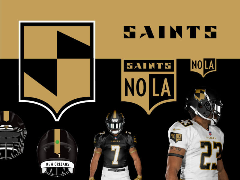
So excited about this new Uni tweaks and concepts feature. My submission today is for the New Orleans Saints.
The inspiration for this came from a logo competition for Super Design Bowl, and I went from a new logo to a new uniform. Digging into Saints logo history unraveled a mascot wielding a shield and I leaned on the shield with my own take. The color scheme is the same, and I am using their throwback number sets (love ’em).
Attached are a couple examples to include in the post, but more on my website!
Go and vote at Super Design Bowl! Voting on this ends on February 23rd! Thanks!
Jordan Grimes
Attached were four New Orleans Saints redesigns. I put them in my “Uni Tweaks” folder queue, almost without thinking, and was planning to run them in that section, and that would be that. But when I took a closer look, I noted he had linked both to his website and to the “Super Design Bowl” competition in which he’d entered his designs, noting there would be voting on his design that ends in a couple days. There were many more designs on his website, but no descriptions. So I asked Jordan if he could give me a few words of description — I got that, and more. What follows is the anatomy of a redesign (he calls it a rebrand, although I would call it more of a redesign).
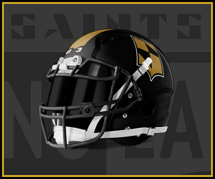
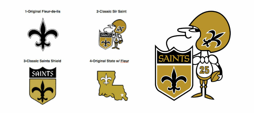
Now, the Saints current uniforms are a mess, so I’m open to a redesign for them. Interestingly, if there were one element I wouldn’t touch, it would be their gold helmet with the fleur-de-lis logo, but I really love the way Jordan thought out of the box on this one, and the more I look at the black helmet with his custom logo, the more I like it.
I’ll let Jordan take it from here (click any image below to enlarge)…
Saints Rebrand
by Jordan Grimes
I present to you my submission for Super Design Bowl (SBD) – New Orleans Saints.
What is SBD? A friendly competition where two designers duke it out with the same challenge: Design a new logo for your assigned team. One logo. That’s it. The public votes on them, and everyone has a good time. See my competition and others here!
Check out my work and process.
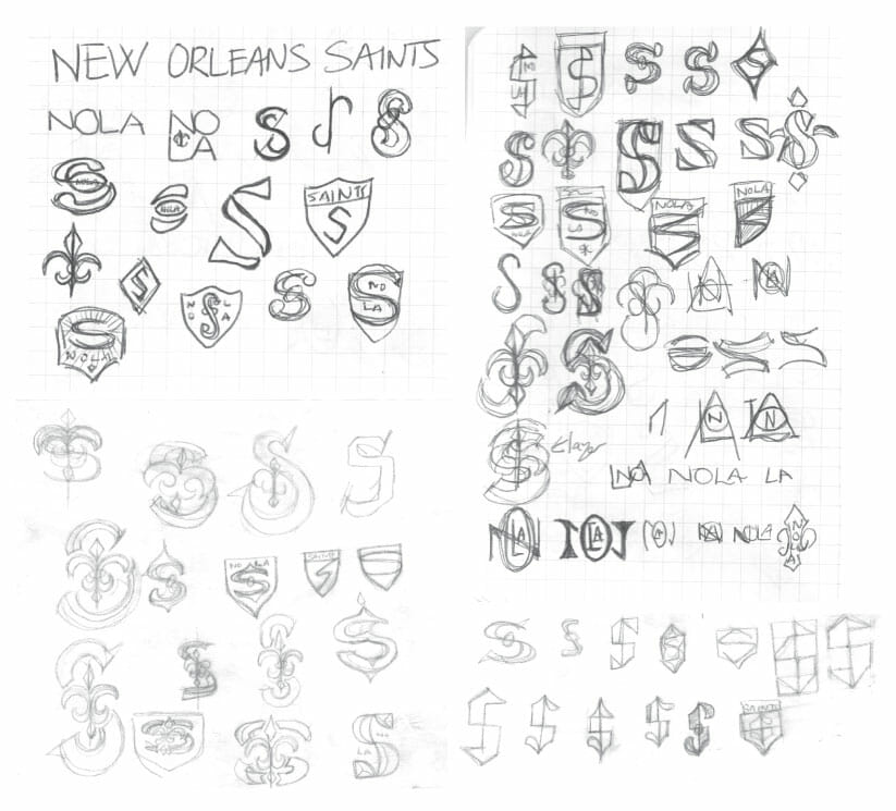
Inspiration & Sketches
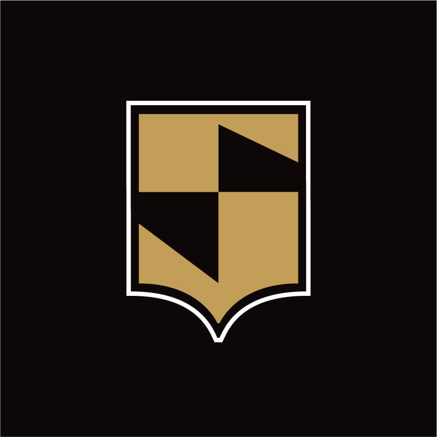
My inspiration came from reviewing the Saints logo history, and the shield graphic stuck out. From there, I wanted to see if I could combine the shield shape, and the letter ’S’. After getting enough sketch work in, I got to the computer and started to bring it to life.
Primary Logo
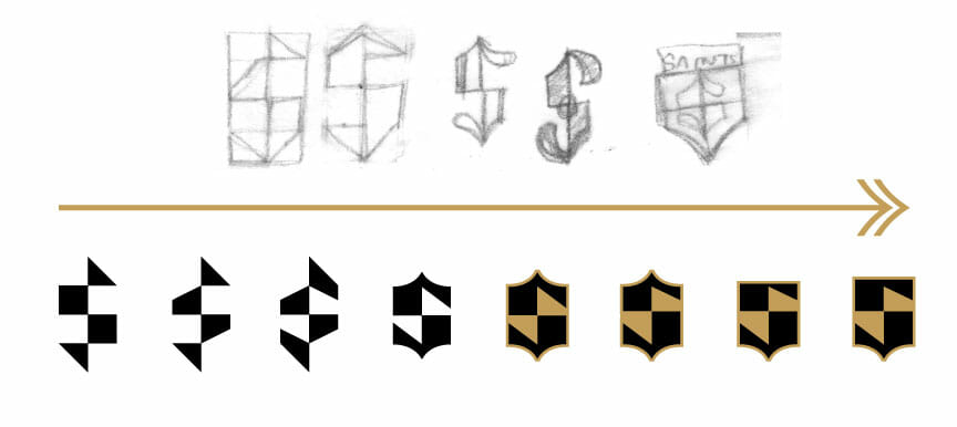
Here are some iterations that got me to the primary mark. The anatomy of an ’S’ is pretty simple, but when you shape it the way I did, the small details mattered. For instance, the ‘belly’ (middle) of the S is higher so it reads as a letter form as opposed to simply colors within a shield shape. Then came the sharp angles for the beginning and end of the letter. I kept them straight so it reads more as an ’s’ and not a ‘5’. When satisfied with that I put an outer stroke on it and called it done.
Kept Goin’
While nothing beyond the primary logo was submitted for the SBD competition, I kept up my efforts. There was too much meat on this rebranding bone that I count not resist, so I continued…
Logotype
Since ‘Saints’ is short enough in letters I wanted to also create a custom logotype to go with the brand package. You will notice the high contrast theme continued here.
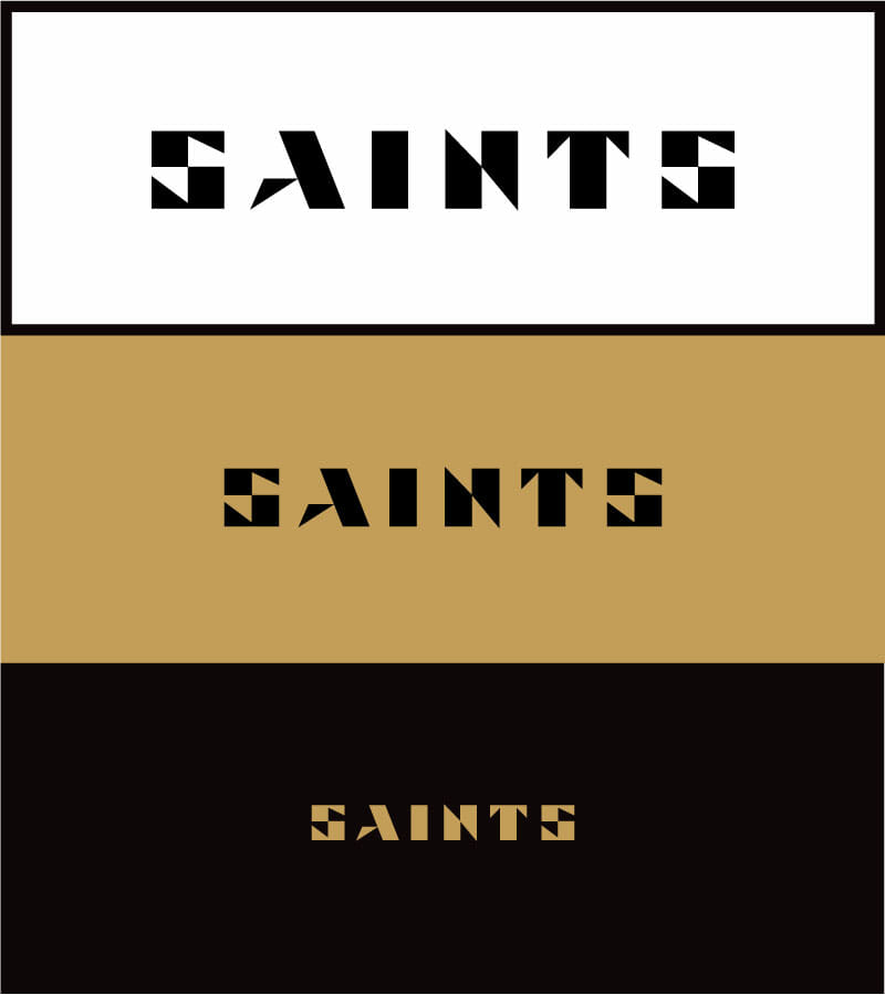
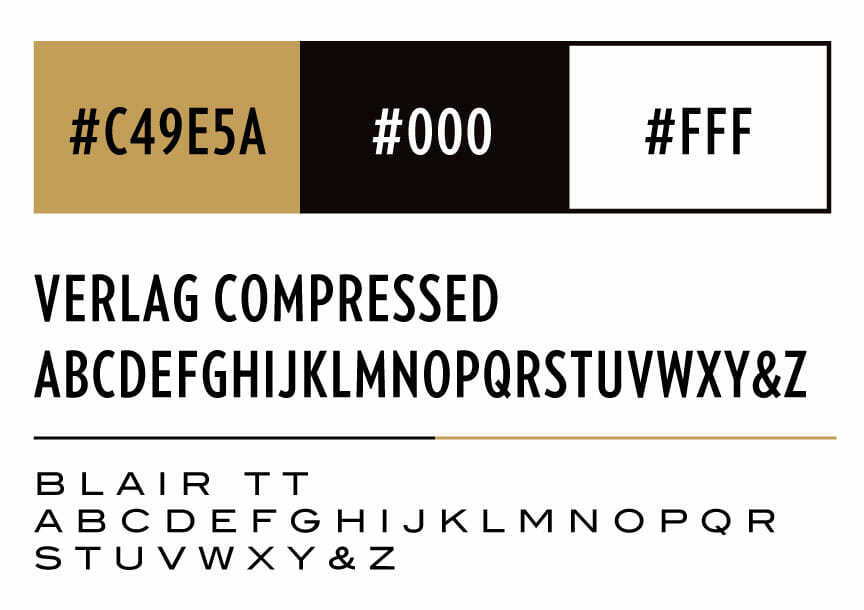
Color & Type
I kept the current color scheme the same, but added a couple secondary fonts for use elsewhere.
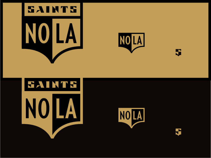
Alternate Logos
What I loved about the shield too is I envisioned from the start that it could easily scale to alternate logos. Notice the color swap as well when placed against a certain background color!
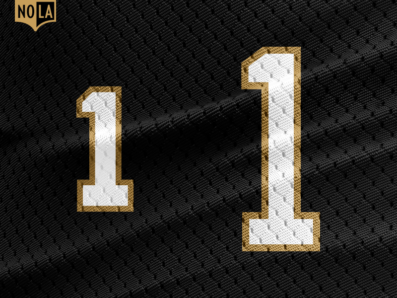
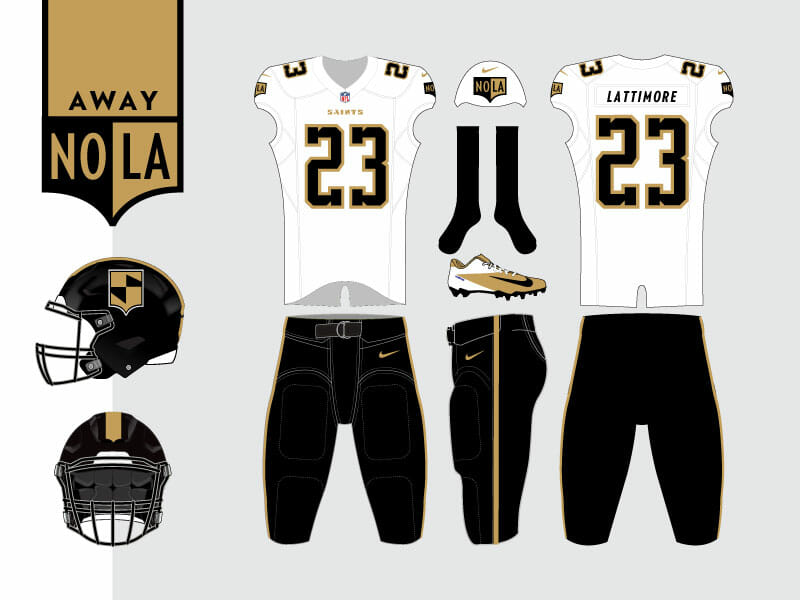
Jersey Numbers
So this is all great, but how does it look on the field? I started with the numeral set for the jerseys. The Saint throwback uniforms are some of the best in the NFL, and I had a numeral set on hand from previous designs. What I made sure to do is improve them by having a “shoulder” set which is more squatty, and also a “Front/Back” set which is slim. Having both of these maximize the space that are used on.

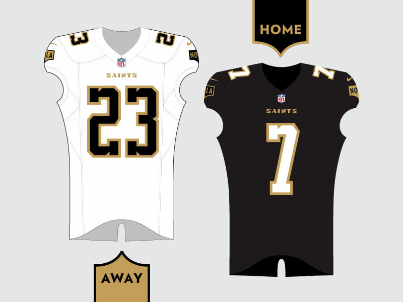
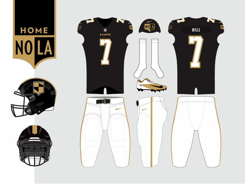
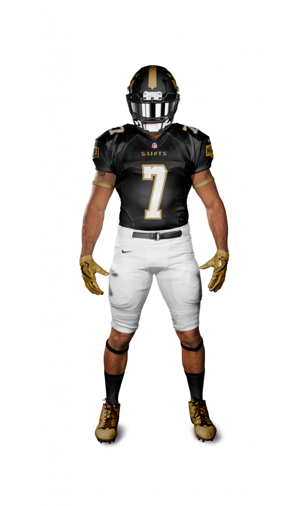
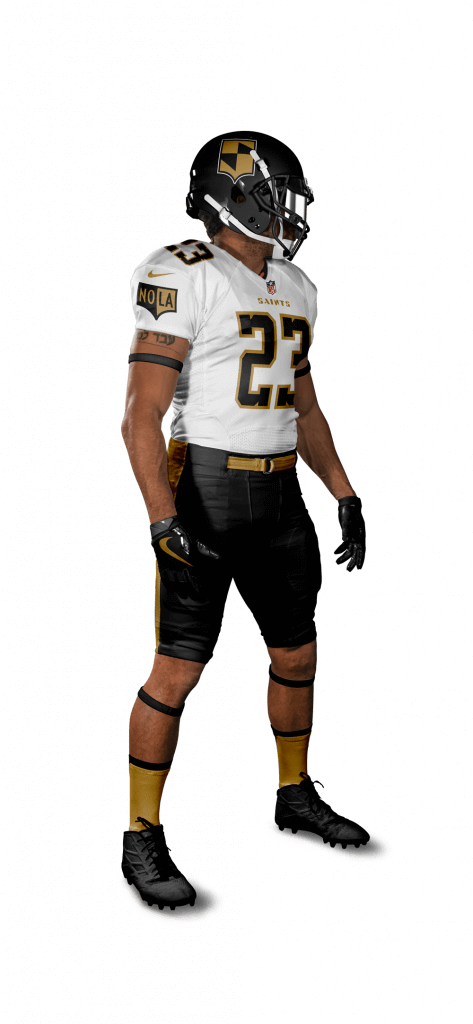
Uniforms
With the uniform as my canvas and these elements featured above, I had the tools for the uniform update.
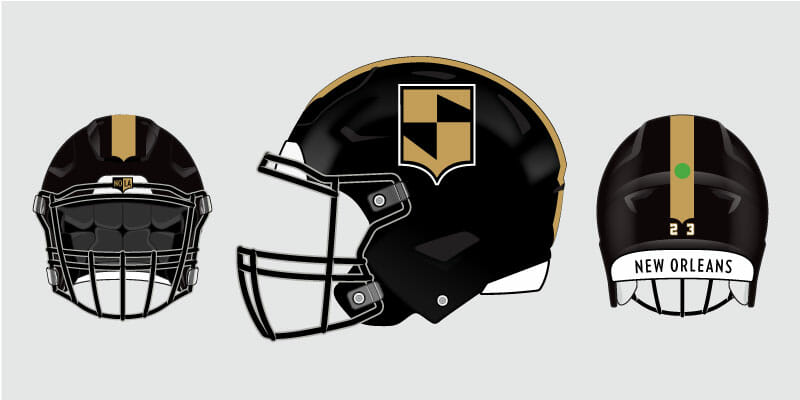
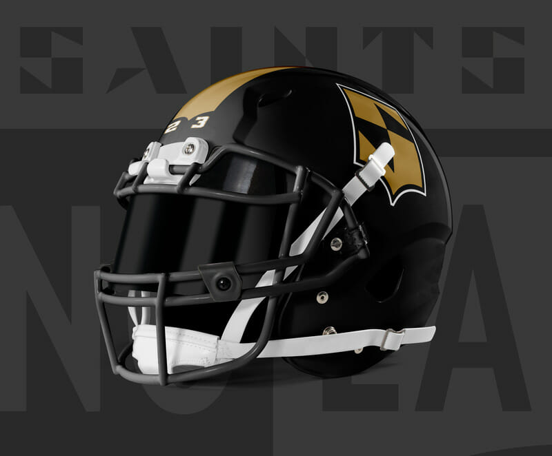
Helmet
The helmet and face mask stay glossy black. Primary logo on the side, and a unique gold stripe runs down the top of the shell. Each end of the stripe resembles the bottom curve of the shield logo. Player number goes on the back of the helmet. Single digit right-aligned; Double-digit occupies the left and right groove accordingly.
Below the neck
Colors, numbers, logotype, and alternate logos shine here. All working in balance for a refreshed look.
Action shots
Here is my concept brought to life. Templates used: Webpixum
Thanks for your time, and if you read this far, go vote! SBD ends the Saints voting on February 23!
Thanks Jordan! I love the insight and thought process that goes into a rebrand/redesign, and how you go from some rudimentary “doodles” to a full blown polished new logo. If you haven’t already clicked on the Super Design Bowl link, please do so and if you like Jordan’s logo design, throw a vote his way!

.
.
Outdoor Hockey Returns (and a look at the Reverse Retro unis worn so far…)
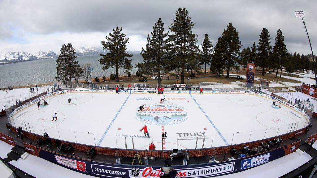
The NHL will play two outdoor games this weekend in Lake Tahoe (for more info, click here). The first game is today, with the Colorado Avalanche playing the Vegas Golden Knights, and tomorrow, the Boston Bruins and Philadelphia Flyers will take the ice. I’ve been a fan of outdoor hockey since 2003, when the first “Heritage Classic” took place. This wasn’t the first NHL outdoor game, but it basically paved the way for the Winter Classic/Heritage Classic/Stadium Series games that followed. For a full list of NHL outdoor games, click here).
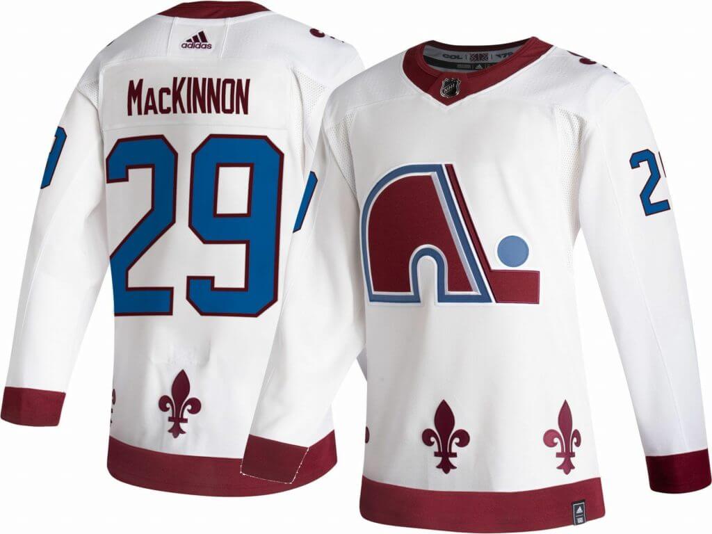
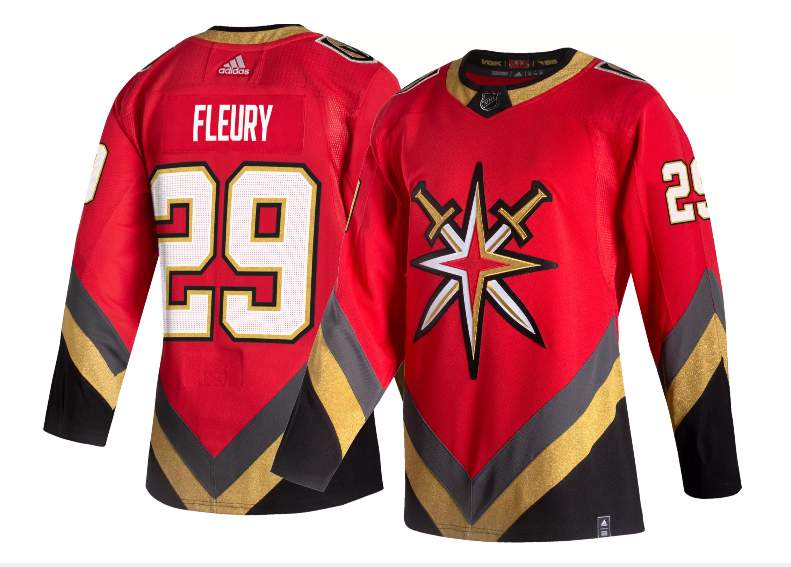
Usually when we have outdoor games, teams have specific uniforms designed for the game (and these unis are often subsequently worn for indoor games); this year, it’s a bit different. The four clubs playing this weekend will be sporting the “Reverse Retro” uniforms — Paul had a great rundown of all 31 unis (or at least jerseys) last fall. You may want to peruse that for some background on the individual uniforms which teams will be wearing as part of the Reverse Retro program.
Today, here’s the matchup:
Colorado Avalanche vs. Vegas Golden Knights
And tomorrow’s feature:
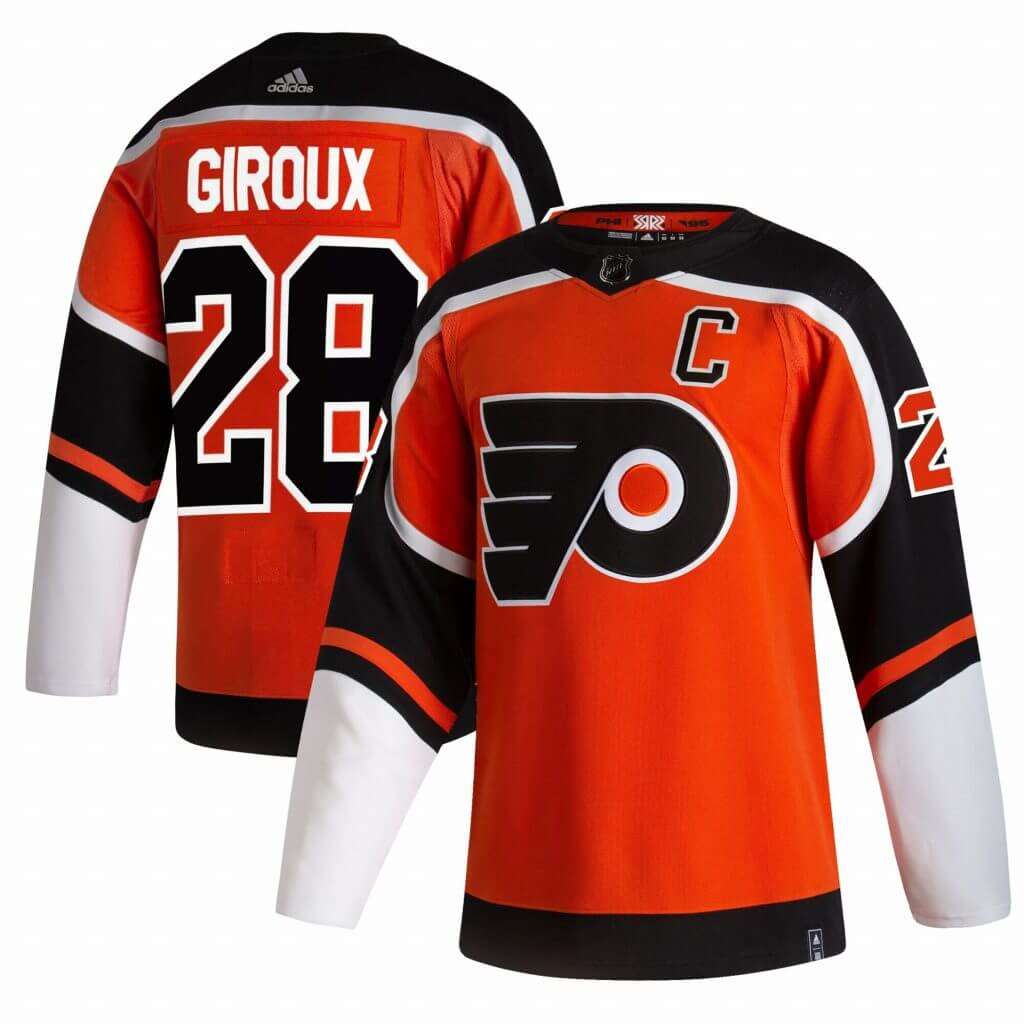
Boston Bruins vs. Philadelphia Flyers
Both the Golden Knights and Flyers have already debuted their RR’s (you can see them in action below).
The Reverse Retro (RR) program will feature every team wearing that particular uniform, and about half the teams have already done so — it would be more, but COVID/postponements have impacted several teams (I am assuming the teams will wear the uniforms during their rescheduled games, if necessary). The RR, like all unis, are one of those things where we can form an opinion on a jersey (but they’re not usually shown as full uniforms), but we “need to see” them on ice. I’ve cobbled together what I believe is a complete look at all the RR’s worn so far; apologies if I have missed any. Those teams not listed have not yet worn their RR’s on the ice.
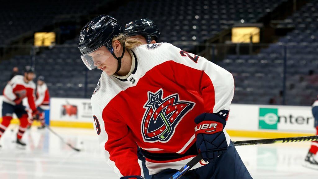
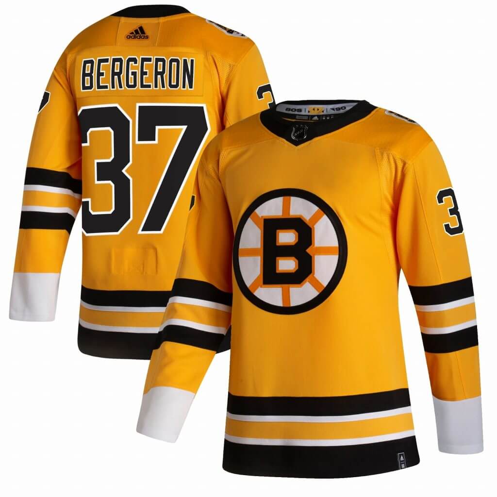
Columbus Blue Jackets
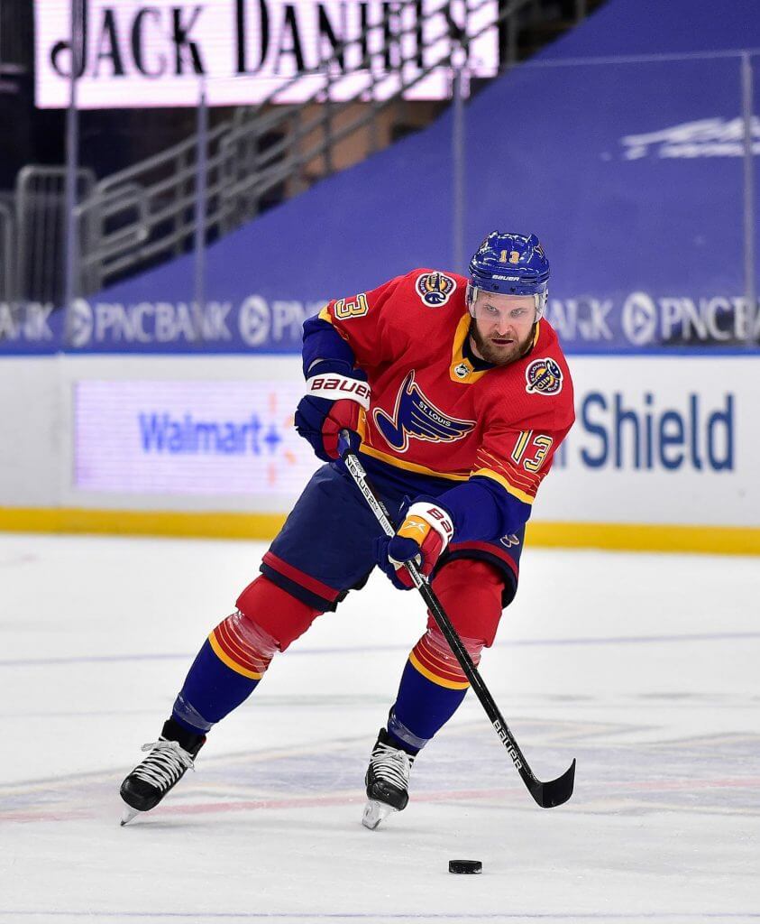
St. Louis Blues
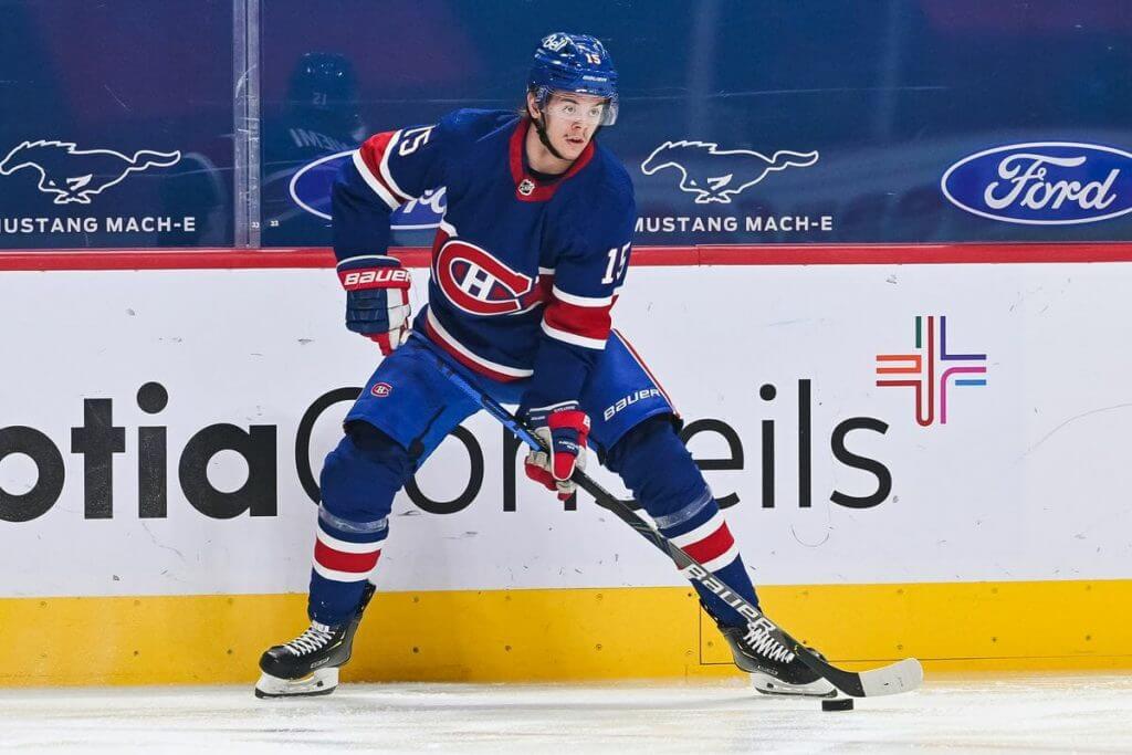
Montreal Canadiens
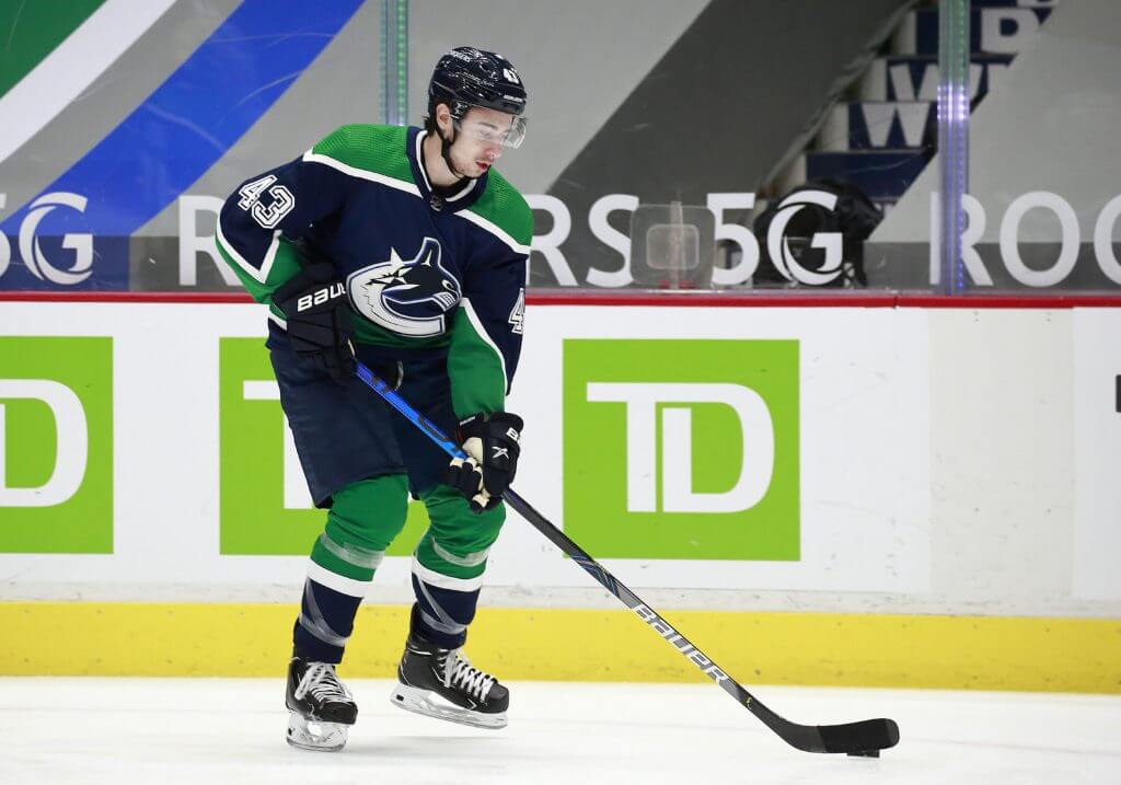
Vancouver Canucks
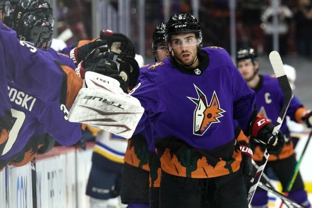
Arizona Coyotes
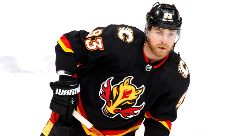
Calgary Flames
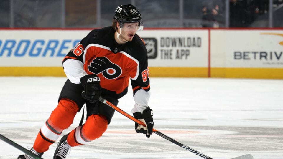
Philadelphia Flyers
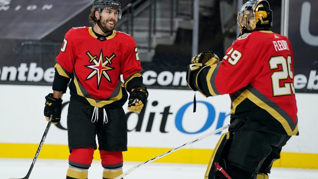
Vegas Golden Knights
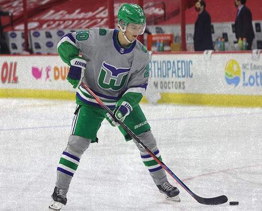
Carolina Hurricanes
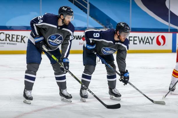
Winnipeg Jets
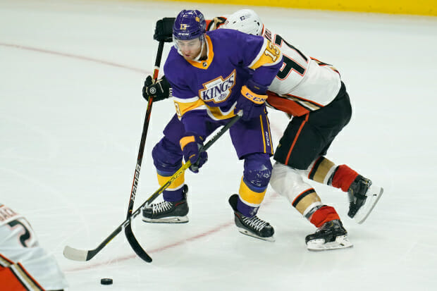
Los Angeles Kings

Tampa Bay Lightning
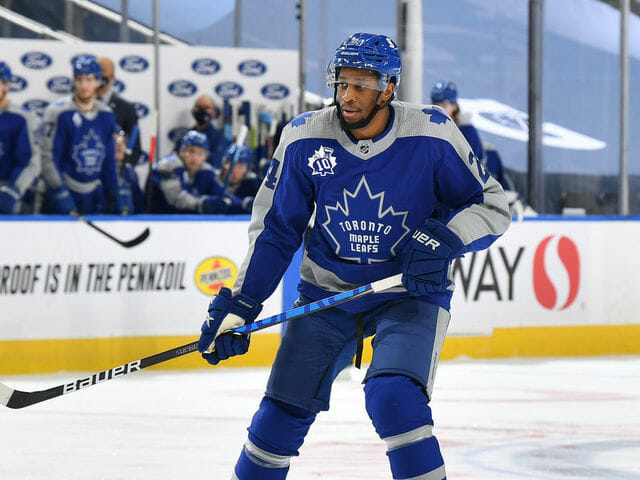
Toronto Maple Leafs
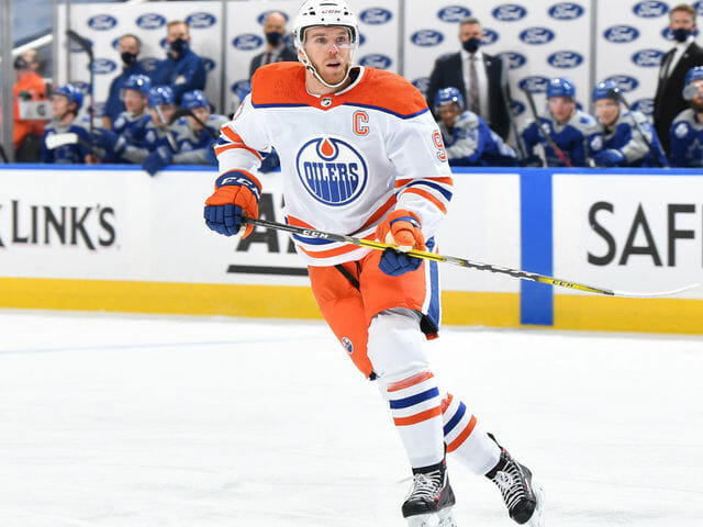
Edmonton Oilers
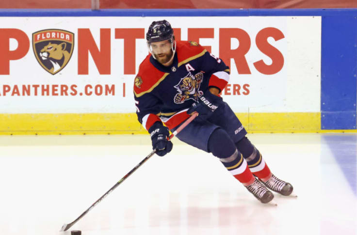
Florida Panthers
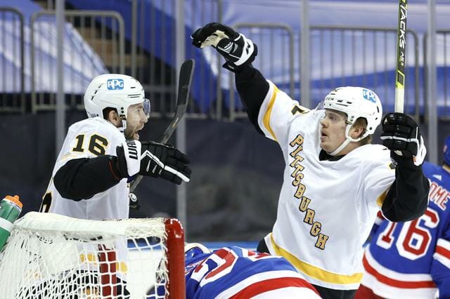
Pittsburgh Penguins
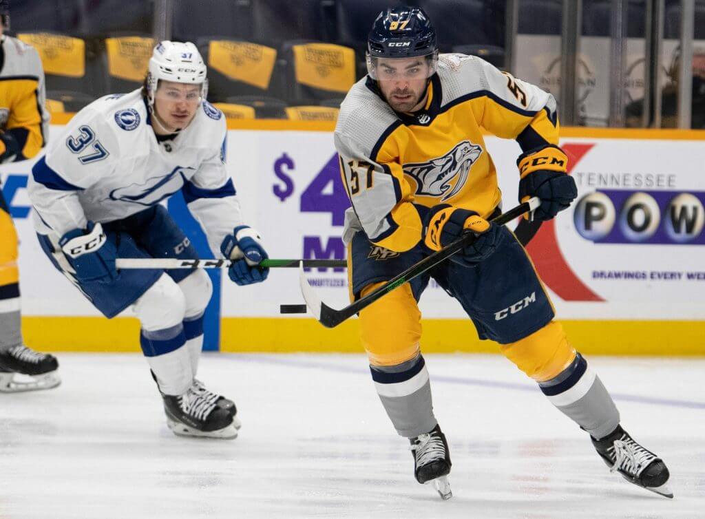
Nashville Predators
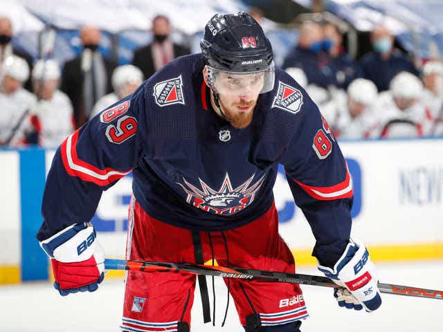
New York Rangers
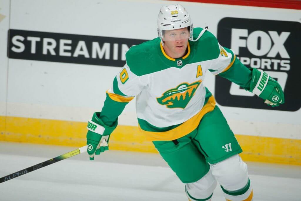
Minnesota Wild
.
.

Guess The Game…
from the scoreboard
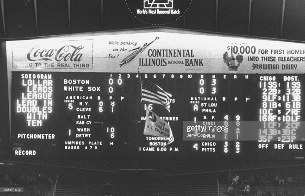
Today’s scoreboard comes from ojai67.
The premise of the game (GTGFTS) is simple: I’ll post a scoreboard and you guys simply identify the game depicted. In the past, I don’t know if I’ve ever completely stumped you (some are easier than others).
Here’s the Scoreboard. In the comments below, try to identify the game (date & location, as well as final score). If anything noteworthy occurred during the game, please add that in (and if you were AT the game, well bonus points for you!):
Please continue sending these in! You’re welcome to send me any scoreboard photos (with answers please), and I’ll keep running them.
.
.
Podcast reminder: Paul here. In case you missed it over the past few days, the new episode of Unified is now available for your listening and viewing pleasure. With pitchers and catchers reporting to spring training this week, we talked about this year’s upcoming MLB uniform uni changes, plus we each listed some MLB changes we’d like to see, plus-plus there’s some chatter about the Golden Knights’ new gold helmets and, in the first installment of what we hope will be a regular feature, we answered a question submitted by a listener.
You can listen to this episode, and subscribe to future installments, on Apple, Google, Stitcher, TuneIn, and Spotify, or just use the player below:
Photos of things we discussed in this episode are available on the Unified website, and those photos also appear in the video version of the episode:
Thanks for listening/watching. Now back to Phil.
.
.
The Ticker
By Anthony Emerson

Baseball News: Here’s a pic of Tommy Lasorda and Kirk Gibson during Spring Training in 1988. Lasorda is wearing a Vero Beach anniversary patch, which must’ve been worn only during Spring Training (from Bryan Beban). … Podcaster and baseball card aficionado Brady Phelps has acquired the original Padres prototype jersey and cap from 1985 and has provided some amazing shots of it (from Thomas Neumann). … Florida and Oklahoma State are finally opening their new baseball stadiums, a year late due to the pandemic (from Kary Klismet). … UIC’s pitcher and entire infield were wearing masks on the field during last night’s opening game at FIU. The hosts also went with metallic gold batting helmets (from @_rf30).

NFL News: Colts WR Michael Pittman Jr. is planning on keeping No. 11, meaning new QB Carson Wentz will need a new number (from Mike Chamernik). … New Orleans EMS has created a Black Lives Matter pin that looks kind of like a Saints logo (from Timmy Donahue).

Hockey News: I would pay a lot more than $2.95 for these amazing mid-70s Kings coasters (from Eli Langbaum). … Lightning G Andrei Vasilevskiy has a pretty cool new mask for “blackout” games. … Hurricanes G James Reimer has a very nice Whalers mask for ЯR games (from @IronCaniac). … Unfortunately, it wasn’t a very nice looking game, as the WhalerCanes’ grey didn’t provide enough contrast with the Blackhawks’ white. Plus the green numbers are nearly illegible (from @kirkcrimson). … The Coyotes are switching to their Kachina gloves for ЯR games (from Josh Pearlman).

College/High School Hoops News: Iowa and Penn State’s women’s teams went pink-with-black-trim and black-with-pink trim respectively for breast cancer awareness (from Kary Klismet). … Also from Kary: Washington men wore 1985 fauxbacks on Thursday night.

Soccer News: Argentinian side River Plate have revealed renovation plans for their historic stadium, El Monumental (from Kary Klismet). … Canada’s women’s team, which hadn’t played since the pandemic and before the resurgence of the Black Lives Matter movement, wore Black Lives Matters shirts before their match against the USWNT and kneeled during the playing of both anthems (from our own Jamie Rathjen). … Also from Jamie, Ireland’s St. Patrick’s Athletic has a new second shirt. … FootyHeadlines has noted that not a single team in Korean top division wears Adidas or Nike kits (from @texastrevor). … The San Jose Earthquakes are about to get a new corporate name for Earthquakes Stadium. The previous naming rights deal expired last year, and the stadium has been known as Earthquakes Stadium since then (from Timmy Donahue). … Spurs MF Erik Lamela appeared to zip up his outer jacket with the sweatshirt he was wearing underneath (from @benji_91).

Grab Bag: The IOC has ruled that Russian athletes, still banned from competing under their national flag due state-sanctioned doping regiments, can compete under the name “ROC” (from Kary Klismet). … With a bunch of Fox Sports regional sports networks being renamed after the Bally’s casino company, it seems even the names of where we watch sports are up for sale. … F1 team Scuderia Alpha Tauri has revealed their new livery for the 2021 season (from Ephraim Vorzman). … The kit for Faroese handball team Eydnudeild is really something — how many others have Viking puffins on them? (from Jeremy Brahm).
.
.
And finally… that’s it for today. Big thanks to Jordan Grimes for sharing his New Orleans Saints rebrand/redesign concepts, logo and processes. And if you liked his logo, be sure to vote for it (see link in the lede).
Enjoy the outdoor hockey today (or whatever uniform-wearing games you may wish to enjoy or partake in) and I’ll catch you guys back here tomorrow.
Peace,
PH
I know a lot of effort went into it, but I can’t say I’m really a fan of the new Saints logo. It took me a while to even see that it’s an S. It mostly looks like two almost triangles in a shield. Good luck in the vote, though!
It was funny – when I saw the progressions I could make out the S and it made sense. Scroll a few inches and see it on its own, however, and the S was gone.
On a side note, I wonder if anyone ever played with an Anaheim/LA/California Angels- style halo on the crown of the helmet.
Bingo. It looks like a sideways bowtie. Then, as RSB notes, it looks like a S again, just for a second, then a bowtie again.
Was the “2” that looks like an “S” (for Saints) intentional?
I really like that Saints concept. I might like to see a gold pants option, and I’m not completely sold on the logo (viz., ditching the fleur-de-lis), but this is one of the best redesign concepts I’ve seen. Well done. Really.
I wonder how many “awesome S’s” were done in sketchbooks prior to making that Saints mock-up…
I’m a fan of the current and historic Saints uniforms and logos. But Jordan’s designs are thoughtful and excellent. Well done! My only quibble would be that the white outline on the helmet logo makes the mark much less effective to me. It obscures the S shape in the shield and also breaks from the consistent two-tone look of the rest of the identity. The one thing I’d change is scrapping the helmet logo’s white outline.
Here’s a full story And plenty more photos from the Washington Huskies’ website about the fauxbacks they wore on Thursday night:
link
They’re calling them “reverse retro,” (must be an adidas thing) but really they’re just BFBS.
Aargh! I hated how comments inadvertently get posted as replies to other comments so frequently when posting on a mobile device. I will post the above again as a standalone, where it belongs.
Oklahoma State, not Oklahoma, is opening its new baseball stadium.
Thanks, fixed.
That’s Ok St
Link correction: “Oklahoma” under baseball should be “Oklahoma state” for their new stadium.
Meticulous concept, and I loved the look at the process. Some thoughts:
1. The shield no better represents New Orleans, sainthood or the Saints than the current logo.
2. GOLD PANTS, PLEASE!
3. The balance between black and old gold needs to be improved. The helmet is no longer gold. The pants are no longer gold. The current color scheme is unique in the league.
The Fleur-de-lys stands for the city, rather than the team. However, it also represents St. Louis, Louisville, and my hometown, New Rochelle. (And probably countless others.)
Yeah, that is my point. The blue star worn by the team from Dallas has nothing to do with cowboys but the connection is because of the team. The fleur-de-lis could represent other cities (as the lone star could represent a lot of places in Texas), but it has come to represent New Orleans, and by extension the Saints. And the reciprocal is true. If New Rochelle gets a team, I guess we’ll hash out who gets the flower then…
GTGFTS May 17 1960
Just after this photo was taken, Tom Brewer would throw a wild pitch to batter Al Smith, scoring Ted Kluszewski and sending Sherm Lollar to third with nobody out. Brewer would then strike Smith out.
Also of note, get a load of the start time for the next day’s game: 8:00. Sixty years on, a game that started that late could go nine inning and finish up after midnight.
Yep. The Sox regularly started night games at 8 well into the 70’s
The first year of the White Sox classic exploding scoreboard! Three additional AL games on the left, four NL games on the right. No pinwheels yet – they show up in the 70’s.
The initial paint job was two shades of blue: the AL and NL score areas were a dark navy, the rest a kind of flat royal blue.
I hadn’t seen this shot of the scoreboard – nice find!
Ticker correction: the new baseball stadium is for Oklahoma State, not Oklahoma.
Nicely done Jordan. The one element I really liked was the unique helmet stripe. However in your description you said the numbers would be on the back of the helmet, but there is a picture with the number on the front?
However like many I wouldn’t mess with the Saints look except for getting rid of their black pants and going back to their gold pants. I also would like to see them use their color rash jersey as their permanent white jersey. The Saints went from my favorite NFL uniform to one of the worst when they started wearing the black pants.
One last point why changing the Saints logo would possibly make sense. I believe the fleur-de-lis can’t be trademarked, so the NFL and Saints don’t own this logo. Anyone can make and sell shirts, hats, and other items with this logo in the Saints colors, with no recourse from the NFL and the Saints. You could even accompany this fleur-de-lis with “New Orleans”, in black and gold, with no laws broken.
Does the same rule apply to the Cowboys’ star?
The Saints design is definitely creative. But I’m super curious why the Super Design Bowl’s acronym is SBD.
And it still amazes me how great some Reverse Retro uniforms are, and how absolutely terrible some are. It’s almost as if there were 5 designers and 1 didn’t understand the project.
Pretty sure the teams had say in the project, as evidenced by the Islanders setup. No way Lou Lamoriellowas going to green light anything Fisherman.
Pretty sure the teams had say in the project, as evidenced by the Islanders setup. No way Lou Lamoriellowas going to green light anything Fisherman.
Grey hockey uniforms are for crap: That’s a universal law I just whipped up!
Prove me wrong.
The Henderson Silver Knights aren’t awful
You haven’t convinced me:) Making decrees about subjective issues is one of my flaws. But Battleship Grey (and Anthracite, while we’re at it) does not offer the contrast under the arena lighting from the ice surface that you get with Polar White and the colors of the spectrum. And doubling down by making the graphics in low-contrast color only compounds the mistake.
Silent But Deadly?
Here’s a full story and plenty more photos from the Washington Huskies’ website about the fauxbacks they wore on Thursday night:
link
They’re calling them “reverse retro,” (must be an adidas thing) but really they’re just BFBS.
I’m repeatedly struck by how good purple+yellow look against a black background.
Ticker errata: Oklahoma State has the new baseball stadium, not Oklahoma.
Fun redesign concept, Jordan! I’ll admit then I’m a huge fan of the saints fleur-de-lis logo, but as a creative exercise, you’ve come up with a visually interesting concept and a good description of the design process to explain how you arrived at it. Nicely done!
You hit the nail on the head, BvK. If you want to design new uniforms, go big and take on the Yankees, Celtics, Dodgers, Lakers, Cardinals, etc. Acknowledging they probably won’t see the light of day is in its way liberating. You might try to make them look more traditional than they already are; it makes the task at hand more interesting.
Grew up in South Louisiana, Saints fan from the beginning. The Saints uni concept is cool, but the black helmets with the fleur-de-lis that were briefly worn in the exhibition season in 1970 is still the best Saints look ever. Oversized logo and all, which the gold helmets need as well. Need to get the league approval and bring them back as the alternate helmet when those are finally allowed.
Big Saints fan here: I am anxious to see the current Color Rash uniforms adopted full-time, with gold pants *and* black pants based on that design, and black helmet. The Who Dats need stripes!
I love the Saints jersey concept. They should switch to these full time. I would stick to their current logo, gold helmet, and bring back the gold pants. I do really like the “NOLA” shield logo and think that it would look great on the sleeves as you have it.
That Bruins-Flyers, yellow-orange game will be brutal. Not enough contrast and too much color. Also, I assumed the Canes horrible, awful Whalers jerseys would be worn as an away, against color uniforms. Whatever, just never wear Whalers anything ever again please.
Whalers jersey has been worn as the colour jersey against white uniform in its one appearance so far.
link
The orange vs. yellow match-up was a regular thing seen every NHL season from 1970 to 1989. Back when the Flyers visited the Golden Seals, Kings, or Canucks. May be better contrast than a white vs. grey game.
“The Coyotes are switching to their Kachina gloves for ЯR games”.
Are the Kachina gloves really going to match better? There is no green in the Coyotes Reverse Retro uniforms other than really small amounts in the crest.
Might look a little less bad, if not “a better match.” Once upon a time the Phoenix Coyotes would have had the same gloves with the original Kachinas and the desert scape third…now since the RR is the desert scape in purple not green, I can see why the Kachina gloves might look less out of place. Can’t wait to see it in action to compare the looks!
Maybe I’m just getting old(er), but I am beginning to less and less enjoy the weather in December through March.
I’m getting older, but I have a snow blower now. Bring it on, Winter! #MostWonderfulTimeOfTheYear
Not a huge hockey fan, but I’ll probably watch (and possibly even tape) today’s matchup.
With a bunch of Fox Sports regional sports networks being renamed after the Bally’s casino company, it seems even the names of where we watch sports are up for sale.
You can bet I’m not happy about this.
I’m Still Calling It Earthquakes Stadium.
Ditch the Saints helmet logo? Simple logos work best. You shouldn’t have to explain the logo.
A good effort on the Saints concept – but not an improvement on the current set (especially if they could finally figure out that the white Color Rush set should be the basis of the rest of their uniform sets).
If it was for an expansion team in a new league, it would be more than fine; but in the current NFL, it reminds me way too much of the Ravens.
Anyone else see the old NBC logo in the Saints’ logotype?
Nice effort-clearly a lot of thought went into this redesign, but I can’t support dropping the gold helmet or the fleur-de-lis.
Isn’t it time for the Hurricanes to dump the franchise’s current identity and return the Whalers’ look to the ice full-time?
How to do that and retain the HW crest is a toughy.
Having a Major League franchise in Hartford was a toughy. Accept the fact good things weren’t meant to last.
Beyond that, at this point there’s more legacy of on-ice success in the red & black, with two trips to the finals and the 2006 cup win. It’s not a bad uni set, although they should bring back the racing style numbers.
I do like the Whaler throwbacks occasionally. Does anybody know if they played the Brass Bonanza last night when they wore the reverse retros?
Hadn’t considered their on-ice success as the Hurricanes(I don’t follow hockey all that much).
Thanks!
Doing a rebrand of the Saints without gold pants is like doing a rebrand for the Eagles without kelly green.
GTFO
Comiskey Park scoreboard from 5/17/1960.
Missed the Senators in the RR rundown. They wore their RR unis February 6 against Montreal.
In yesterday’s comments, Paul claimed that the dasher board ads would be virtual/projected in the Lake Tahoe game. However, they look to be of the standard variety. They are doing virtual ads in front of the blue lines though.
Interesting that the teams @Tahoe today have no ads on their helmets. Anyone know why we’re spared from them? Hopefully tomorrow’s game also sees them missing.
I admire the work it took to redesign the Saints uniforms but really don’t care for the look at all. Why mess with a classic?
Everybody’s good at something. If you discover that thing is designing athletic uniforms, messing with success is at the top of your agenda.