Good morning! I’m happy to announce that the new episode of Unified is now ready for your listening and viewing pleasure. With pitchers and catchers reporting to spring training this week, Chris and I talked about this year’s upcoming MLB uniform uni changes, plus we each listed some MLB changes we’d like to see, plus-plus there’s some chatter about the Golden Knights’ new gold helmets and, in the first installment of what we hope will be a regular feature, we answered a question submitted by a listener.
Chris and I are very happy with the way this one turned out, and I hope you’ll give it a listen. You can do that, and subscribe to future episodes, on Apple, Google, Stitcher, TuneIn, and Spotify, or you can just use the player below:
Photos of things we discussed in this episode are available on the Unified website, and those photos also appear in the video version of the episode:
———
A few other items regarding the podcast:
• We will continue to answer at least one listener-submitted question each episode. If you’d like to submit one for next week, you can reply to this tweet.
• Chris was interviewed on another podcast last night and talked a lot about Unified, about our friendship, and more. (I was invited to appear as well but was not available.) You can listen to that here.
• We need advertising support. Basically, we have two options: Either (a) we could sign up with a network, which would drop random corporate commercials into the audio stream in between discussion segments, similar to the way random banner ads appear here on Uni Watch, or (b) we could strike deals with specific companies that we feel comfortable with and read ad spots for them. We would strongly, strongly prefer the second option — the podcast format feels very personal, and there’s room for only three or four ad spots per episode, so we’d love to work with advertisers who we believe in and who feel similarly about us. If that sounds like you, or if you have any leads, you know what to do.
———
The podcast is fun, but it is also, frankly, a lot more work than I expected. Most of that work is enjoyable, but it’s still a significant time drain that takes away from other things, including the blog. So beginning today, in the interests of preserving my sanity, we won’t have a lede entry on days when there’s a new podcast episode (well, unless there was major uni news the day before). Instead, the new podcast episode will essentially serve as today’s lede item.
This is the same way I handled things for many years when I was at ESPN — if I had a new ESPN column, there was usually no lede blog entry that day. Of course, we’ll still have sub-ledes, the Ticker, and so on, even on podcast days. Thanks for understanding, and enjoy the new episode!
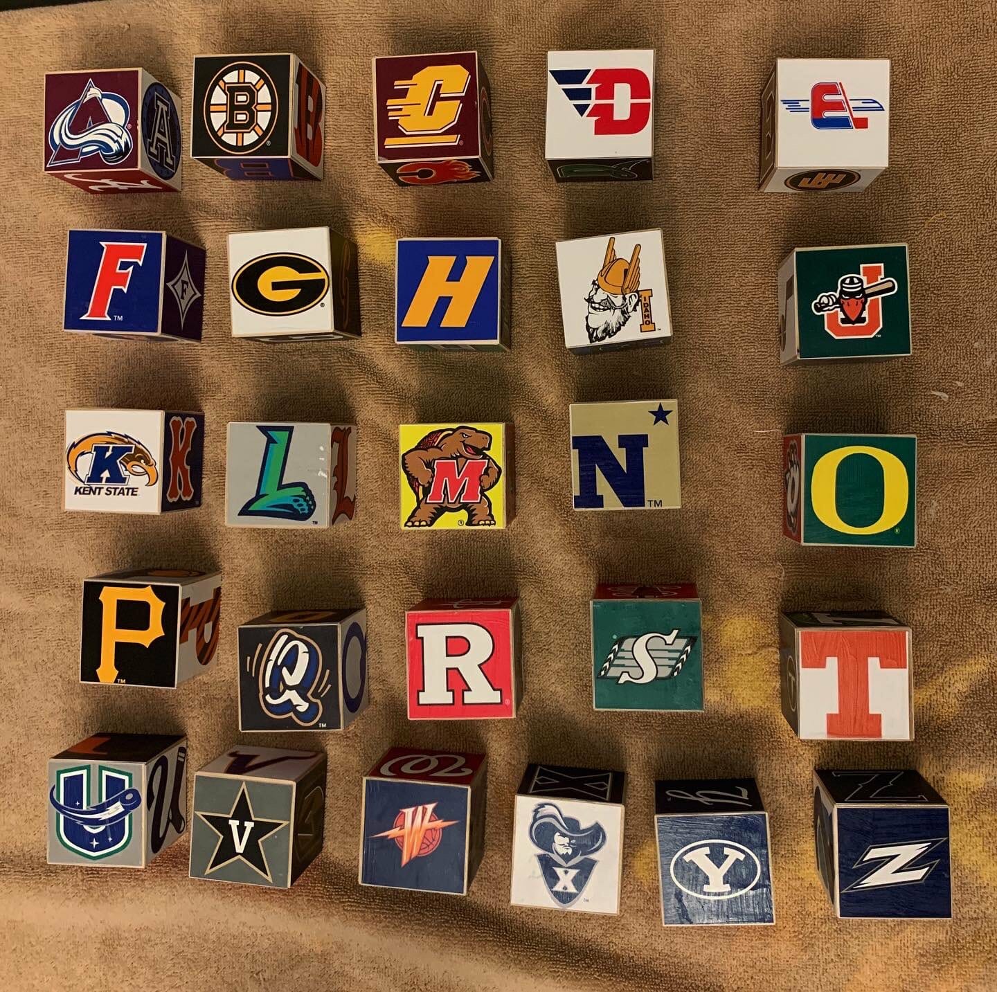
Click to enlarge
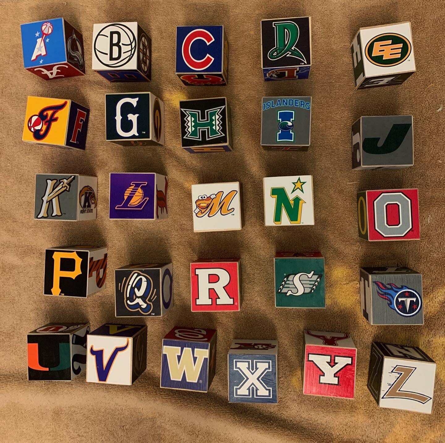
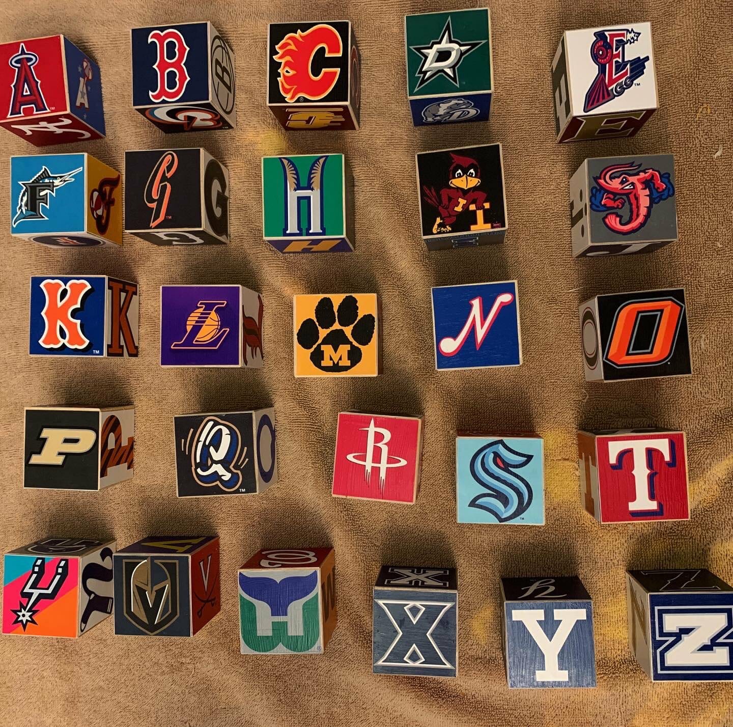
Another chip off the old block: Addison Walton is the latest Uni Watch reader to make a set of uni-themed building blocks. Aren’t they great? All my life I’ve been waiting to see the Montgomery Biscuits’ and Minnesota North Stars’ logos side by side, and I didn’t even realize it!
Addison made these for the upcoming arrival of his daughter, who’s due to be born this June. Here are some view of the other block sides:
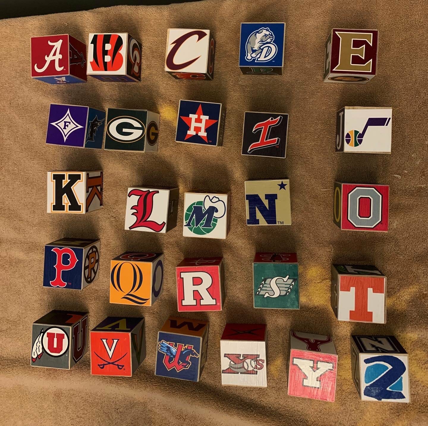
Nice, right?
To see more DIY uni-themed building blocks, look here and here.
Click to enlarge
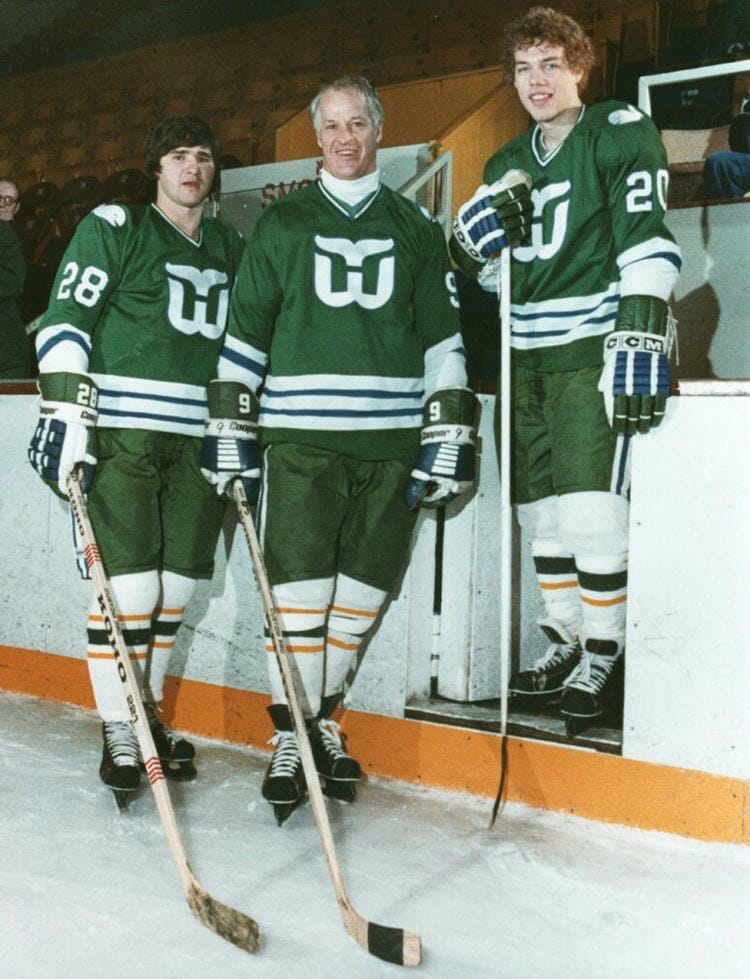
Too good for the Ticker: Check out this photo of Gordie Howe (center), Pat Boutette (left), and Mark Renaud (right) during their Whalers days. It’s uni-notable on several levels: First, they’re pairing the team’s green jersey with white socks — a combo that was never worn in a game. And second, the jersey they’re wearing is from the Whalers’ NHL period (it debuted in the 1979-80 season), while the gold-trimmed socks are from the club’s WHA period (they were last worn in the 1978-79 season).
I’m assuming this shot is from a practice session when they were wearing the outdated socks.
(Big thanks to @imgarthvolbeck for this one, and to reader/commenter Adrian for identifying the two non-Howe players.)
This motherfucker looks like he walked straight from invading Normandy to the game, drinks his water with a ladle, and there’s a goddamn hobo and a 19th century teenager behind him. Don’t tell me football’s better now. pic.twitter.com/lAKLtqCT2p
— Super 70s Sports (@Super70sSports) February 18, 2021
Tweet of the day: Not much to add here — I’ll let this one speak for itself.
(Thanks to Alan Kreit for pointing me toward this one.)
The Ticker
By Paul

’Skins Watch: The Cleveland Indians are conducting a survey to get fan input on the team’s new identity (thanks to all who shared). … A resolution in the Utah House that would have encouraged the state’s schools to retire Native American mascots has failed after one lawmaker wondered if animal mascots would next be considered too controversial (from Matt Jensen). … The teams at La Crosse Central High School in Wisconsin, which were previously called the Red Raiders, will now be called the RiverHawks (from Jerry Nitzh and Kary Klismet). … The rest of these are also from Kary: Marion (Ia.) High School, which previously announced that it is dropping “Indians” as its team name, is inviting the public to vote on the three finalists for its new name. … Cambridge (N.Y.) High School will vote next month on whether to retire its Native-themed team name and imagery.

Baseball News: Here’s some footage from the Mets’ first spring training camp in 1962. … Lots of photos of Hall of Famer Monte Irvin in this Instagram post. The first photo, interestingly, shows him in a 1951 Giants road jersey but without the usual orange outlining on the “New York” lettering (from William Yurasko). … MLB.com’s “Cut 4” column has a new logo (from @MoxMulder). … The numerals on the Royals’ spring jerseys appear to be a mix — some are solid twill and others are perforated (good spot by Brent Parsons). … Whoa, check out this old photo of Cubs SS Shawon Dunston wearing what might have been history’s most extreme ribbon stirrups.

NFL News: Our own Anthony Emerson reports that Buccaneers QB Tom Brady has a new “7” logo to match his number of Super Bowl wins. But if it’s about Supes, should it be a Roman numeral?

Hockey News: Nice piece about outdoor rinks in Ohio (from Sean Spitzer). … Speaking of the Blue Jackets, new pads for G Elvis Merzļikins (from Mike Chamernik). … The Prince George Spruce Kings of the Junior A British Columbia Hockey League have unveiled their own ЯR design (from Kary Klismet). … Jeff Brown has a new website devoted to college hockey history, including uniforms. … Good interview with Maple Leafs exec Brendan Shanahan talking about the history of the team’s logo (from Paul Keery). … Several NHLers, including Panthers LW Anthony Duclair, are wearing Willie O’Ree tribute skates this month (from @VerbDC). … New mask for Oilers G Mike Smith (from Wade Heidt). … Speaking of the Oilers, Daniel Estabrooks notes that they’ve worn their third/alt unis for five of their first 10 home games.

NBA News: The Lakers are looking for a new jersey partner sponsor advertiser (from Mike Chamernik). … Here’s a thread with lots of hints about the upcoming Earned alternates (from @unimockups).

College and High School Hoops News: New floor for Lewis & Clark Community College in Illinois (from Kary Klismet). … Also from Kary: The Hermon (Me.) High School girls’ basketball team wore pink cancer-awareness uniforms on Monday night. … Here’s a ranking of Ohio State’s six current men’s uni designs.

Soccer News: New shirt for second-tier Italian side Cosenza Calcio (from Trevor Williams). … England’s Prince William is such an Aston Villa fan that he once wore a pair of game-used Villa socks (paywalled) (from Max Weintraub). … In another item regarding the English royal family, Prince Harry could be banned from wearing his military uniforms, as the Queen plans to strip him of his royal patronages and honorary military titles. “He would still be entitled to wear the medals he earned on his civilian clothes,” notes Timmy Donahue. … New home and away kits for the NISA’s Maryland Bobcats. … Museum of Jerseys has started a series on Liverpool’s numbering systems in the 1980s and early ’90s. “Basically, you can click through all the games in one season and see how each formation they used had a consistent numbering pattern, with some changes from game to game,” says our own Jamie Rathjen. … New away shirt for Irish side Shelbourne (from Ed Zelaski).

Grab Bag: New paint scheme for NASCAR driver Cory LaJoie (from Mike Chamernik). … Edinburgh Rugby has opened a new stadium on the grounds of Murrayfield Stadium, which serves as the home field for Scotland’s national rugby union team (from Kary Klismet). … Also from Kary: New package designs for McDonald’s. … Officials in Arlington County, Va., are soliciting ideas for a new county logo (from William Yurasko). … Kings XI Punjab, a cricket team in the Indian Premier League, has renamed itself the Punjab Kings, complete with new logo (from Timmy Donahue). … Good news out of Virginia, where two more schools have scrapped their Confederate imagery (from Kary Klismet). … Interesting story about how the pandemic has made things complicated for a Massachusetts high school’s uni/equipment manager (from Kenneth Traisman). … New uniforms for Maryland women’s lacrosse.

To our readers in Texas, including Trevor Williams, Robert Eden, Robert Brashear, and many others, stay safe and warm. You’re in my thoughts. — Paul
That’s not Mark and Marty Howe. That’s Pat Boutette (left) and Mark Renaud (right)
Thank you! I just assumed (mistakenly, obviously) that it was the full Howe clan. Will fix!
You still have a reference to “the Howes” in there.
Fixed.
The link to the UniFied photos isn’t working.
Fixed. Here’s the proper link, so you don’t have to scroll back up:
link
Is that Curt Merz in the photo from Super70s?
This ebay photo listing seems to corroborate that notion:
link
Good eye, strong work.
I’m guessing that shot of Merz is from the ’66 AFL Championship (held 1/1/67, KC 31, Buffalo 7) at the Rockpile, possibly late in the game: there’s mud (ah, the good old days), and in the background are roof-support poles and a line of fans leaving early. More mud action here: link
Why do the Whalers have gold on their socks (even if old)? Did they used to have green/gold as a color scheme? I’ve only been aware of them as green/blue.
WHA New England Whalers were green and yellow before entering the NHL as the Hartford Whalers.
Ahhhh. Learned something new today. Thanks!
Why do the Whalers have gold on their socks (even if old)? Did they used to have green/gold as a color scheme? I’ve only been aware of them as green/blue.
During the WHA period the team’s colors were green and gold. The gold was replaced by royal blue when joining the NHL.
Yes, they did:
link
Not sure all those Royals jerseys are the same. Some could be BP jerseys and others are a team-color alternate. The Batterman is inside the headspoon on the non-perforated numbered jerseys, but outside it where there are perforated numbers.
Addison Walton has the Saskatchewan Roughriders logo upside down in the uni-themed building blocks picture.
It is the older logo prior to minor changes in 2016. How it looks right side up:
link
Thanks for posting my blocks, Paul. I received so much awesome feedback and was inspired by the awesome comm-UNI-ty on the site. Wanted to proactively point out that I used a different logo for every side of every block except X (had to double up Xavier.) I realize my photos don’t do the blocks justice since I didn’t rotate all the blocks for the photos. I’m happy to share any tips, tricks, my logo PDFs etc so I can continue to pay it forward like reader Thomas Miller did for me. Thanks again Paul and stay safe everyone!
Kudos on including minor league hockey teams (Fredericton Express! That’s obscure.)
Addison Walton, you must be from that state down south.
Almost like you purposely avoided the glorious old English D of the Detroit Tigers and block M of the Michigan Wolverines. C’mon, those are the 2 most ubiquitous and best looking versions of those letters, no? Gotta be a buckeye fan. Used that plain and boring “O” twice.
Just jiving. Anyway, overall I like it and the blocks look great. Just need some more BLUE in there!
Thought about using the old English D for Detroit, but had a lot of good options. As far as the O goes, I used a different logo for each side just rushed my photos like a moron. (Oregon, Ohio St, Oklahoma St, Orem Owlz, Ottawa Senators and Omaha Storm Chasers) I know no Michigan, but I did use the Flint Firebirds, CMU and EMU so there’s a little representation. Thanks for the feedback. Cheers!
The Whalers logo for W can also be used as an H thanks to the creative use of negative space!
So great to see another blocks project!…really great work Addison…never thought when I shared the project with Paul that it would take off!
Thanks Loren for the inspiration!
I’ve always felt the O’s logo wasn’t quite finished either… here’s my simple fix to it
link
fixed the orange squatchee on the top
link
Reading the link in ‘Skins Watch to the Utah State House vote was such a disappointing read. Politicians are skunks (I don’t mean to offend skunks, btw).
Man… I just got done reading it, the whole article just literally made me sad.
Shame on the governing body for indulging the one politician who insisted on using the “Slippery Slope” fallacy. When somebody actually argues the name “Cardinals” is harmful, that will be the time to argue the issue.
If the thought of not being able to wear Indian-branded apparel is too depressing to contemplate, Google search a reservation and offer to buy a t-shirt from one of their high schools. They’d be glad to have the money.
Yes, their actions are shameful, as well as seemingly disingenuous. (I don’t know if they’re really that ignorant or being purposely obtuse)
I LOVE your idea of buying a shirt from one of the high schools!
I hope others find Super 70s Sports on Twitter as hysterical as I do. The one Paul posted today is one the better ones, but they are all of similar humor. I’ve been following that poster on Twitter for a while; always good for a chuckle.
Here’s 2 uniform changes I’d love to see:
1) Have the Dodgers unis go back to white bordering around the NOBs and numbers. They’ve looked cheap and boring since being eliminated for no good reason.
2) Speaking of cheap, make the Nike jerseys NON-SEE-THRU. They’re as thin as onion skin. Maybe thinner.
Digging Unified!
Great Podcast today, Gentlemen! I totally agree about the Rays and Dodgers. But what was the lettering on the front of that AMAZING red baseball jersey you had on?
If COVID-19 has a lasting legacy on baseball jerseys in the manner of the 9/11 attacks, the most adept graphic element to add to a uniform might be sublimated structural formula diagrams of elemental compounds (such as caffeine, acetic acid, the benzene ring) in the fabric of the uniform. Overall, it would resemble a subtle honeycomb pattern.
There appears to be inconsistency regarding the Whale on the shoulders, along with Gordie appearing to not wear shoulder pads.
Shoulder pads then didn’t make much of an impression:
link
I loved the third show, guys. Well done. When I first heard you mention the show’s title I thought it would be pronounced Unee-fied, like Uni-watch is pronounced. I guess it’s jut unified, and that is, of course, ok.
I’d also like to note the plural of uni seems to be uni’s in most of these circles, but I thought an apostrophe is never a sign of plurality. (The old “Grocer’s apostrophe”) I suppose it really doesn’t matter since perhaps unis looks weird and we all know what uni’s means around here.
Socks notwithstanding, those Whalers unis are wonderful. What a look.
My love for the tweet from Super70s knows no bounds.
Unified is my go to podcast now! Great work and look (and hear) forward to more!
“Speaking of the Oilers, Daniel Estabrooks notes that they’ve worn their third/alt unis for five of their first 10 home games.”
Urgh! The navy alternate is not a great hockey uniform. The lack of white in it does not help.
Overall, the North Division (I still call it the Canadian Division) has made some good uniform change decisions over the past couple of seasons. The Senators and Flames going back to retro and better uniforms. The Canucks finally dumping the “Vancouver” script from the jersey chest.
The North Division has some good-looking uniform sets. However, I put the Oilers near the bottom of the standings. They had it so right when they were wearing royal blue and used the orange uniform as an alternate just a few years ago. Why did it have to go so wrong?
link