By Phil Hecken, with Timmy Brulia
Follow @PhilHecken
It Super Sunday, Uni Watchers! I hope everyone is doing well and staying safe.
Today is the day of the big game, and I’m again joined by Timmy Brulia, one of the head honchos over at the incredible Gridiron Uniform Database. If you missed yesterday’s article outlining the KC Chief uni history, please click that link. The Tampa Bay Buccaneers are the designated “home” team — both literally and figuratively! This is the first time ever the host city is featuring the team which calls their stadium home. The Bucs have opted to wear white (normally their road jersey) as they have first choice of uniform. Once again, there’s a lot to get to today (Tim writes the history, but I supply the links — so if there’s anything amiss with those, blame me, not him!) Here’s Timmy:
Tampa Bucs Uni History
by Timmy Brulia
1976: The Tampa Bay Buccaneers take the field with white helmets with a red/orange/red stripe pattern and orange facemasks. The helmet emblem features the head of a swashbuckling buccaneer with a cavalier hat with a large red plume and a knife clenched in his teeth. The logo eventually takes on the nickname of “Bucco Bruce.” The white jersey (used for the entire regular season) has orange front, back and sleeve numbers in orange outlined in red, and sleeve stripes with a thin red/thick orange/thin red pattern. Name on the back (NOBs) also were in orange with red outlines. The orange jerseys (worn only in the preseason) has white front, back and sleeve numbers, all outlined in red. Sleeve stripes are thin red/thick white/thin red and NOBs are white outlined in red. The pants are white with side stripes of thin red/medium orange/thin red. Socks match the jersey colors; white with a thin red/thick orange/thin red pattern worn with the white tops, orange have thin red/thick white/thin red stripes worn with orange jerseys.
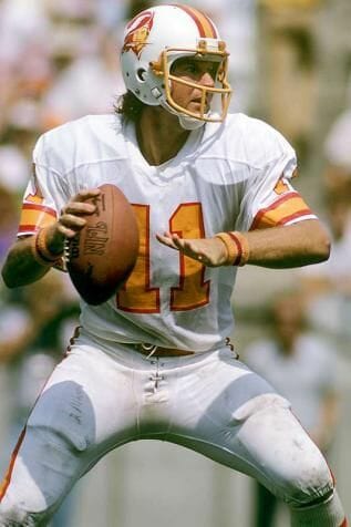
1977: Apparently due to difficulty picking out the the bright orange names and numbers on the white jerseys from the previous season, the Bucs switch colors on the numbers and NOBs to red with orange outlines. The socks are now solid orange and worn with both sets of jerseys.
1985: A 10 Years patch is affixed to the left breast of the jerseys for this season.
1992: Bucco Bruce’s image on the helmets in made larger. The Bucs add a pair of sharp orange pants with a thin red/medium white/thin red stripe pattern on the sides that are worn only with the white jersey. Speaking of the white jersey, the v-neck collar is now orange.
1993: A memorial script “Mr. C” is placed on the thick inner right sleeve stripe of both sets of jerseys in honor of deceased owner Hugh Culverhouse.
1994: The league-wide 75th NFL Season patch is placed on the left breast of both jerseys. For the “throwback’ look, the Bucs simply swap out the orange pants for the white pants with the white jerseys.
1997: The Buccaneers unload the creamsicle look completely. The helmets are now a pewter shade with black facemasks. Bucco Bruce is replace by a tattered red jolly rogeresque flag with a football superimposed on the cross-swords. The mast holding the flag is also a sword. The logo is outlined in white. Jerseys: white with red numbers double outlined in orange and black. The TV numbers are moved from the sleeves to the shoulders. A new “Buccaneers” wordmark is placed above the front numbers. A likeness of a pirate ship is on the sleeves. The sleeves and the collar are edged in black. NOBs are red. Red with white numbers double outlined in orange and black. TV numbers are moved from the sleeves to the shoulders. A new “Buccaneers” wordmark is placed above the front numbers. A likeness of a pirate ship is on the sleeves and outlined in white. Sleeves and collar are edged in black. NOBs are white. Pants are pewter with a side stripe pattern of medium black/thin orange/medium red/thin orange/medium black. A white pair is also worn with the exact same stripe pattern. The pewter and white pants are interchanged with the red and white jerseys. The socks are a solid black color.
1998: The white/white combo is not worn this season.
2000: The white/white combo is not worn during the regular season.
2001: Again, no white over white is worn.
2002: For Super Bowl XXXVII (37), the SB logo patch is worn on the left breast on the red jersey, trimmed in white.
2003: The white pants are not worn during the regular season. A special patch is worn for a pre-season game played against the Jets in Tokyo.
2004: No white pants!
2005: A 30 Seasons patch is worn on the left breast of both sets of jerseys. The white pants return and the red/white combo is benched for the season.
2006: Red over white is nixed again this season.
2007: No red over white for a 3rd straight season.
2008: All four uni combinations are worn. The league-wide Gene Upshaw patch is worn on Week 1 on the red jerseys.
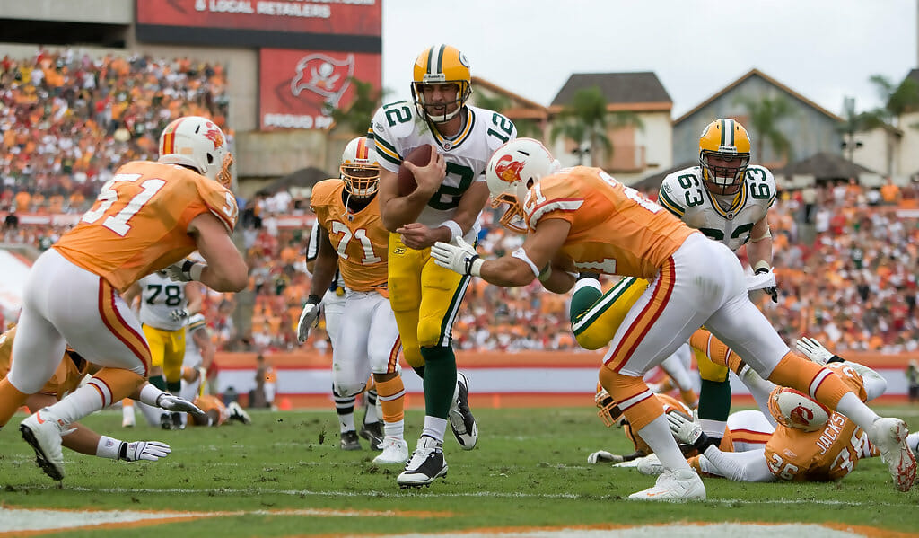
2009: All four combos are worn, with an “International Series” patch worn on the red jersey for the Bucs 10/25 game in London. And, and, and the orange creamsicle look is worn for their Week 9 duel with the Packers!!
2010: Again, all combos worn and the creamsicles make a comeback for a Week 13 encounter with the Falcons.
2011: Another game in London with an “International Series” patch for Week 7 against the Bears. Also, a special 9/11 patch for Week 1 vs. the Lions. Week 13 again features the creamsicles with the Panthers as opponents.
2012: The white pants go AWOL for the regular season. The 50th Anniversary Hall of Fame patch is worn with the red tops for Week 14 and the white shirts for Week 15. The creamsicles make the scene for Week 7 against the Saints.
2013: The black collars are no more. No white pants again for the regular season.
2014: Welp, the Bucs go total gonzo with another uni upheaval. The helmet remain pewter, but the logo is tweaked slightly and enlarged to an outrageous size, virtually smothering the shell. The facemasks are now chrome. The jerseys feature a bizarre numeric font that has (best) been described as “alarm clock.” For the white jersey, the front and back numbers are red with a triple outline of silver (?)/black/orange and on the shoulders red with white outline. A flared field of pewter from the neck to the “sleeve” edge with a patch of orange on the front features the aforementioned TV numbers and a pirate ship on the right sleeve and “BUCS” in red with white drop shadow on the left sleeve. NOBs are red with a stylized font. For the red jersey, the front and back numbers are white with a triple outline of silver/black/orange. The sleeve adornments are duplicated from the white jersey. The NOB is white with a stylized font. The collars on both sets are the pewter on the back and white on the front. Finally, a memorial patch for deceased owner Malcolm Glazer is worn on the left breast of the jerseys. The pants are pewter with the logo on each hip, with an angled flair of orange that becomes a thick red stripe to the edge. A white pair is also worn with the logo on each hip and an angled flair of orange that becomes a thick pewter stripe to the edge. Socks are either solid pewter, solid red or solid orange. The red jersey/white pants combo is not worn in the regular season.
2015: A 40 Seasons patch is on the left breast of the jerseys. The Bucs bring forth their version of Color Rush (CR) worn on Week 15 at St. Louis. The outfit is entirely in red. The CR red jersey features pewter alarm clock numbers outlined in silver and white. TV numbers (shoulders) and the pirate ship (right sleeve) and BUCS lettering (left sleeve) remain, nut there is no field of pewter on the sleeves, where there’s a patch of pewter where that would be orange on the normal jerseys. There is no 40 Seasons patch on the CR red top. The CR pants have the logo on each hip and an angled pewter stripe follow to the leg edge. Full length solid red socks and red cleats compliment the look. Back to the normal unis, the following combos are worn: white/pewter/red, white/pewter/pewter, white/white/red, white/white/pewter and red/pewter/red.
2016: The following combos are worn: white/white/red, white/white/pewter, white/pewter/pewter, red/pewter/red and the Color Rush togs as well (worn on Week 9 vs. Falcons).
2017: Same combos as 2016 worn.
2018: A new pair of white pants is added, which is similar to the other white pants, except the side stripe is red as opposed to pewter and is worn with red socks. Otherwise, no change in the combinations.
2019: Just three combinations are worn: white/white (pewter stripe)/pewter, red/pewter/red and CR.
2020: The Buccaneers ditch the wild alarm clock style worn since 2014 and pretty much return en masse to the 1997-2013 era unis. The only differences from those uniforms are that the helmets have the 2014-2019 logo (still oversized, but not as extreme as the ’14-’19 lids), and an all pewter combo with white numbers with red outline, white NOBs, red wordmark, red sleeve edge and a thin red collar edge on the jersey, a red/white/red stripe pattern on the pants, and plain pewter full-length socks. The other uniform combos worn were: white/white/black, white/pewter/black, red/pewter/black.
Thanks, Timmy! Once again, just a fantastic job with the uni history of the TB Bucs.

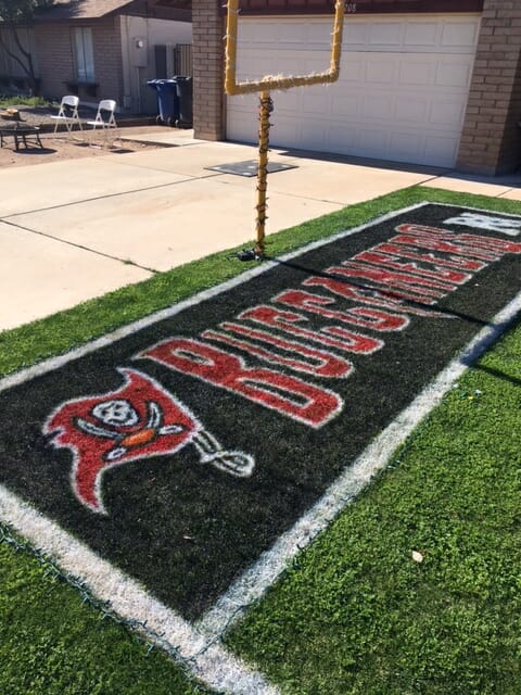
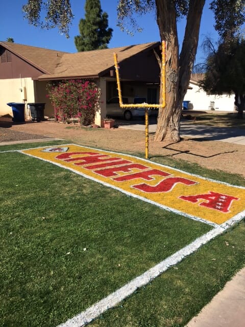
Field of Dreams
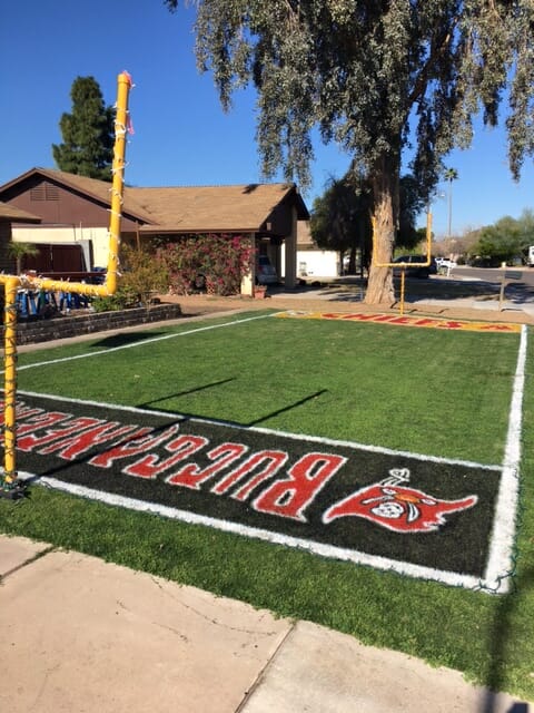
Got an e-mail from Scott Ross Steffes who writes,
Hi gang –
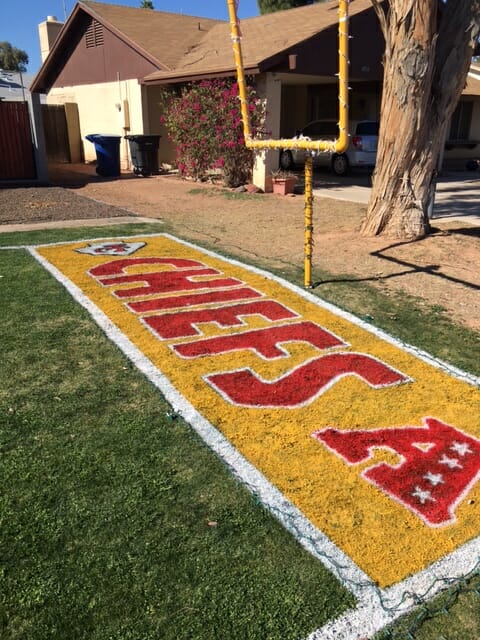
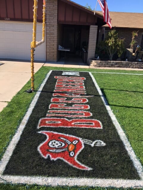
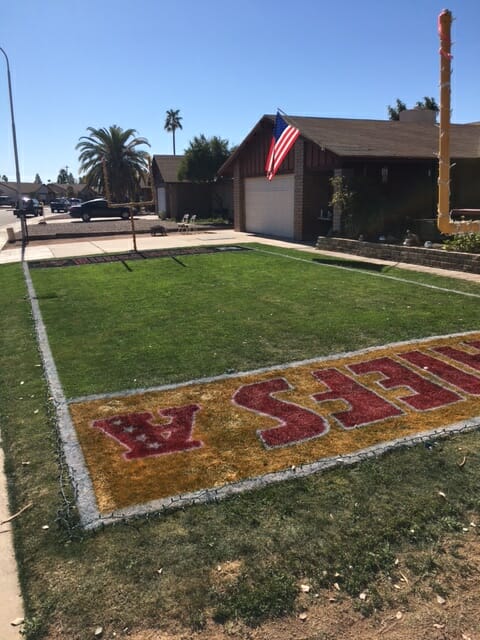
Cool thing my neighbor does every super bowl. Thought this year was his best year yet.
The mini field!!
Scott
This is awesome. You can see more pics below (click to enlarge):
Paul shot me the following e-mail on Friday, as it is relevant to today’s game.
Basically, the guys in charge of this project have taken it upon themselves to “reimagine” every Super Bowl logo since the league instituted the current “template” (and incredibly bland) logos we’ve been seeing for a decade now. They began with Super Bowl LIV and have continued designing logos for every Super Bowl since then, but have yet to reveal their concept for Super Bowl LV (today’s game). But that will be revealed today on their website, Second and 10. Here’s the e-mail:
Hi Paul,
I contacted you last year about the Second and 10, the Super Bowl logo redesign project I’m part of. I wanted to share with you and the UW team that we’re continuing the project and posting our logo for Super Bowl LV this Sunday before the game on our website and twitter and instagram feeds.
I’ve been loving the NFL redesign posts on the site, and the interview from the Colt’s logo update copying the high school coach was a great read. Thanks for all the work you and everyone put into UW. Looking forward to the podcast!
Dave Scott
Needless to say, I think — and I’m sure most of you would agree — that the decision to use the same basic design for the past 11 Super Bowls has really been a decision for the worst, and it’s so cool that Scott and his team have been creating logos that try to capture the spirit of the game and host city, the way previous logos have done. Definitely worth checking out to see what they come up with for this game!

Guess The Game…
from the scoreboard
Today’s scoreboard comes from Randall West.
The premise of the game (GTGFTS) is simple: I’ll post a scoreboard and you guys simply identify the game depicted. In the past, I don’t know if I’ve ever completely stumped you (some are easier than others).
Here’s the Scoreboard. In the comments below, try to identify the game (date & location, as well as final score). If anything noteworthy occurred during the game, please add that in (and if you were AT the game, well bonus points for you!):
Please continue sending these in! You’re welcome to send me any scoreboard photos (with answers please), and I’ll keep running them.
The “BEST OF” Kreindler’s Korner
Hey guys & gals. You’ve enjoyed Kreindler’s Korner for several years now, mostly on the weekends, on Uni Watch, but with the recent coronavirus outbreak, Graig’s time is just too precious and he needs to tend to other things besides coming up with a new writeup each weekend.
So, going forward, for as long as the COVID-19 situation is bad in New York, I’m going to run a few “Best of’s” until Graig returns.
Here’s today’s offering:
Last year, I ran the following edition of Kreindler’s Korner. Because the paintings are Supe-related I wanted to run them again today.
Title: “The Great Escape”, “The Throw”, & “Catch-42”
Subject: Eli Manning & David Tyree, 2008
Medium: Oil on linen
Size: All 30″ x 24″
The play itself is, at this point, legendary. The most memorable moment of that night. One that propelled the New York Giants to a come-from-behind touchdown to win Super Bowl XLII, pulling off one of the biggest upsets in sports history. Their opponents that evening, the New England Patroits, who were looking for ascension to immortal status as the only team to have a perfect season since the Dolphins in 1972. As the shirts would go on to say, “18 wins and one Giant loss.”
My client, like most of us, watched this whole thing unfold on national television. And in his mind, if he were to get a painting of this World Champion team, it had to be about that play. Thankfully, he was willing to trust that it would be best to depict it in a series of same-sized canvases, rather than a larger composite of sort on a single one. Even more thankfully, he chose me to do these paintings.
When Eli made his scramble, New York was down 14-10 with only 1:16 left on the clock. In the painting, it was important to work from an image that gave an idea of what kind of madness he attempted to escape, so the photograph I opted to work from was one that included as many players as possible, while still being close to the action so the viewer didn’t feel that removed from it. I also really happened to like the visual arrow created by the back of Eli’s jersey being tugged on.
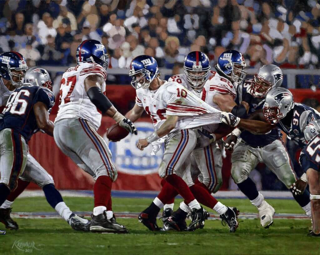
The Great Escape
The painting depicting the throw needed to have a different perspective. In a way, that one was more about suggesting the distance the ball had to travel, and less about the action of Manning’s desperate pass. So, with the cluster of Patriots on the left, there’s another visual arrow to the New York quarterback – I wanted the viewer’s eye to follow the painting from left to right and onto Eli. It also helps that he appears separated from the pack and surrounded by a halo of green turf, of which makes it more obvious that he’s the focal point.
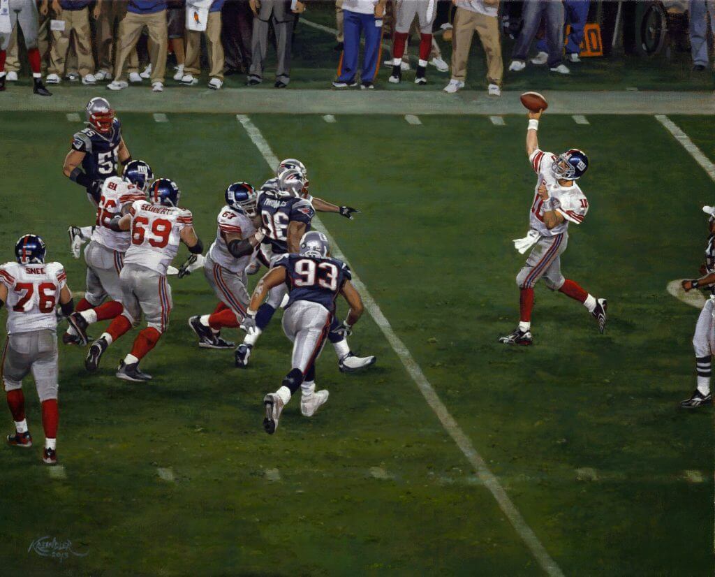
The Throw
The final piece, which would highlight Tyree’s outstanding catch, had to be about his athleticism. Clearly, the most important part of the painting would be David’s hand on the ball, but just as important were the bodies of the receiver, as well as Rodney Harrison’s – both seemingly mangled in mid-air. I also loved the juxtaposition of them undulating in space against a flat backdrop with the Super Bowl logo. There are barely any shadows on the ground, so it almost reads as a flat vertical background, which added to the uniqueness of the image. In other words, like the actual play, this last canvas had to defy normality.

Catch 42
In the end, my client was ecstatic for his three new paintings, as well as the Super Bowl Champion moniker. Me? I was thrilled to successfully tackle my first football paintings and plant the seeds that would lead to more.
Thanks, Graig! You can (and should!) follow Graig on Twitter.

Uni Concepts & Tweaks
Time for more Uni Tweaks from the UW readership.
I hope you guys like this feature and will want to continue to submit your concepts and tweaks to me. If you do, Shoot me an E-mail (Phil (dot) Hecken (at) gmail (dot) com).
Today’s set of concepts come from Mike Joseph, who wishes today’s game looked like this (well, at least the jerseys and helmets):
If the Super Bowl uniforms were up to me.
Buccaneers go white/Creamsicle with an updated white helmet while Chiefs go heavy on the ketchup and mustard, no black.
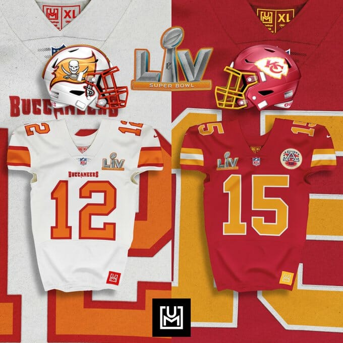
Thanks Mike!
OK readers (and concepters). If you have some tweaks or concepts, shoot ’em my way with a brief description of your creation and I’ll run ’em here.
NERDING out on the Supe!
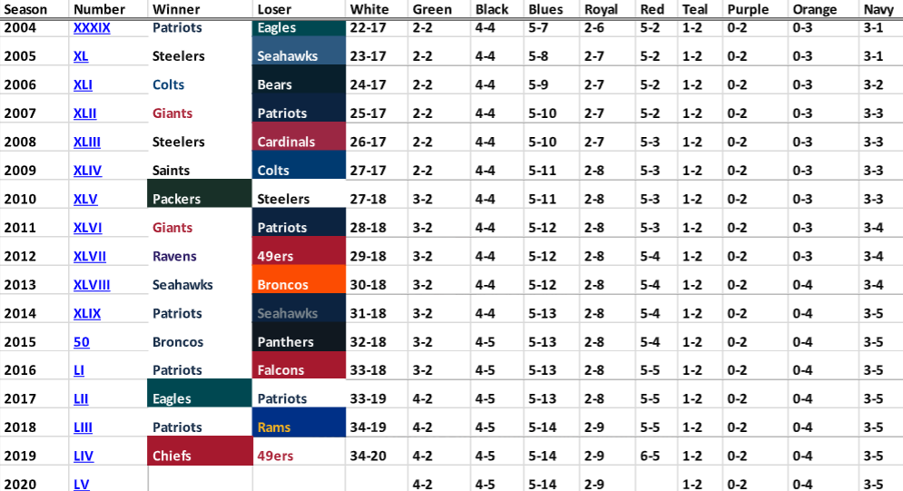
Paul forwarded me a late-arriving e-mail yesterday from reader Tim Shriver, which is just another absolute rabbit hole for us data/uni/field junkies. It’s already long enough, but I wanted to repost it in its entirety, with a link to the spreadsheet that accompanies all these data at the end. It’s really a fantastic piece of research.
Hey Paul,
Remember last year when I sent an email with my historic Super Bowl jersey and end zone matchups, but sent it way too late? Well, here it is again! (Again kind of late.)
So since we now know the uni and end zone matchups, I updated the spreadsheet as far as is known before the game, and looked to see if there’s anything interesting in there. Warning: Whole lot of stuff not related to football upcoming.
First up, the Buccaneers are the first team to ever enjoy a true home field advantage in the Super Bowl, amazing considering it took 55 editions of the game for that to happen. Or is it all that improbable? Remember the game was played several times in the old days at stadiums that weren’t an NFL home stadium. Back when the SB was only 50 years old I asked a friend whose work has something to do with the random number generators that make sure casinos are appealing enough to get customers to dump money in the machines but still come out on top. I gave him a historic list of how the number of teams changed over the years and how many years the game wasn’t in an NFL home and at the time he came up with, all teams being equal, about 35 to 1. Seems pretty long to me.
Anyway, to the delight of you and others, the Buccaneers, as the designated AND physical home team, chose NOT to wear their usual home red jerseys for the game. It seems an odd choice but they do pick white for some home games, presumably because they’re not so hot at the end of the muggy gulf coast summer, and after a look through the G.U.D. I learned they actually didn’t start wearing color at home until week 9 this season. In fact, they chose white for all the home games of the first half of the regular season and a color for each second half game. Sunday will be their first postseason game they actually have a choice. So the team’s no stranger to white at home, but maybe the decision was made because of their current 3-game white jersey win streak. In any case, it’s for the better.
So this will be the twelfth time the Super Bowl has seen a red vs. white jersey scenario, and considering how white tends to have an overwhelming advantage historically, thanks in no small part to its recent dominance from SB’s 38 through 51 which saw 12 white victories in 13 years, red has fared well. That run victimized three red-clad teams but still left the color at .500 overall, and then the Chiefs helped buck the trend a year ago and red now sits at 6-5, while white remains strong at 34-20.
You might recall that I have a weird fascination with the chosen colors of the end zones, and it turns out we get a repeat of last year, red vs. yellow. I thought that must be rare but looking back, Super Bowls 48 and 49 were both navy vs. navy affairs, and there have been others. However, it is notable that the game will again have a yellow end zone as that color has become rare in recent years, only used by the Steelers and Chiefs this century. Interestingly, red was non-existent in SB end zones for the first 15 contests until the 49ers decided they would become a really good team. With some help (two wins) from the Giants and (one win) from the Bucs, red end zones got out to a strong 8-3 start but are now riding a disappointing 4-game skid. Regarding end zones, red is now at 8-7 while yellow enjoys a 14-10 record.
Another note on the end zone design: I wonder how they choose which team gets which end of the field: I did a small deep dive and found some patterns. First, the back-to-back NFL champion Packers were represented in the west end zones of the coincidentally and unusually east-west oriented LA Memorial Coliseum and Miami Orange Bowl in the first two Championship Games. From the 2nd game through Super Bowl 7, the designated home team was represented in the end that is to one’s right as viewed from the press box side, usually the south end (in drum corps it’s Side B)…lets call it right. Starting with SB 8, they were switched for some reason and the home team was represented on the left, and this trend continued for many years, all the way through 44! But then it was switched back for some reason, maybe to celebrate the introduction of the new monochrome grayscale imagination-less Super Bowl logos, but for the next 8 games it was home-on-the-right again. Super Bowl 52 fit this pattern but started a whole new one: Ever since then, the AFC champion has been represented in the left end zone, and the NFC champ in the right. Why?! Who makes these decisions?
For research I used the amazing Gridiron Uniform Database, which has a great Fields section with a Super Bowl page.
Well, there you have it, that’s all I got for this year. I’ll be attaching the spreadsheet as updated as can be to current, and I’ll be sure to send off the new one after the game’s results are in. And again, super sorry I didn’t get around to sending it off earlier.
Cheers,
Tim Shriver
And here is a link to Tim’s spreadsheet. Enjoy!
Your 2021 Aussie Open Kit Preview
Hey kids — taking a brief break from the football action now, to reintroduce my doubles partner, the one and only Brinke Guthrie, who is back once again to give us the rundown on all the uni and shoe news you need to know for the year’s first major — the Australian Open — which begins this evening (or Monday, in Australia). Normally, the tourney is held in January, but due to COVID-19 issues, it has been moved back a few weeks from its normal start date. Here’s Brinke:
Australian Open Preview
by Brinke Guthrie
Follow @brinkeguthrie
Right, time to check out and see what new gear the pros will be using Down Undah at the Australian Open in Melbourne, which begins on Monday- three weeks later than normal.
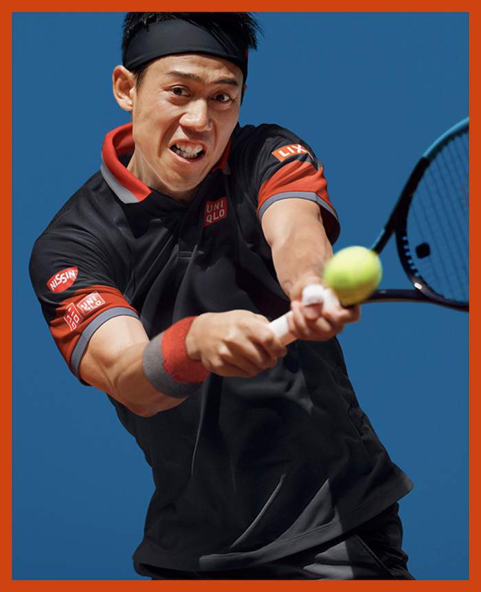
• Uniqlo: Kei Nishikori will be sporting this look.
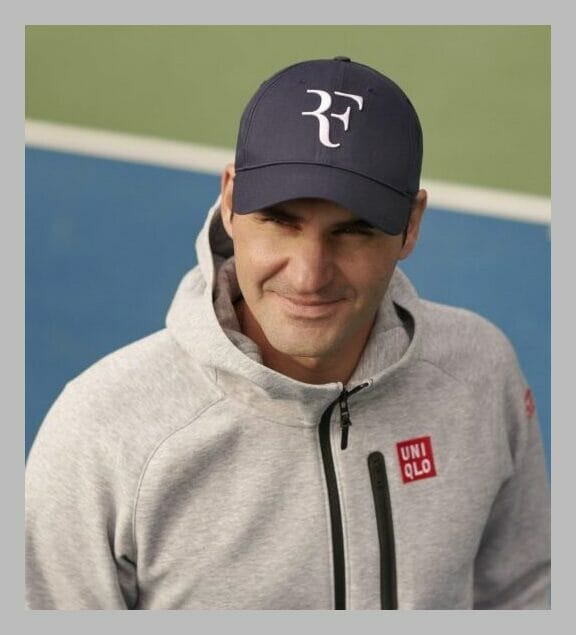
Roger Federer finally got his RF logo from Nike. (Uniqlo initially said they had no plans to use it.) He’s skipping the AO; expect to see him wearing it when he makes his 2021 debut next month in Doha.
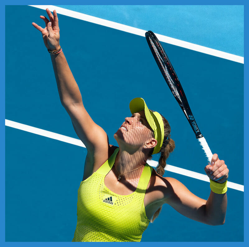
• Adidas: continues infusing recycled materials into their tennis gear. Adidas calls this line “PRIMEBLUE,” as shown below on 2016 AO winner Angelique Kerber. They say the line is “made in part with Parley Ocean Plastic; upcycled plastic waste which has been intercepted on remote islands, beaches, coastal communities and shorelines, preventing it from polluting the ocean.” The line is made with something called “HEAT.RDY,” a “lightweight fabric which maximizes airflow and keeps players feeling cool on the court.” In Melbourne, they’ll need it.
• Fila sponsors the women’s defending champ, Sophie Kenin (below) as well as World #1 Ash Barty, #6 Karolina Pliskova, and defending doubles champion Timea Babos. They’ll all sport the women’s “Back Court” line, in Purple Heather-Marlin Heather-Wild Lime. I always like what Fila does- they subscribe to the “less is more” theory, instead of a lot of bizarre patterns. Their stuff is always understated and minimalist.
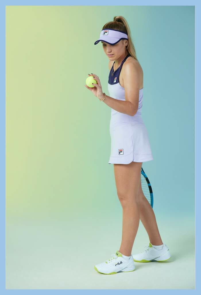
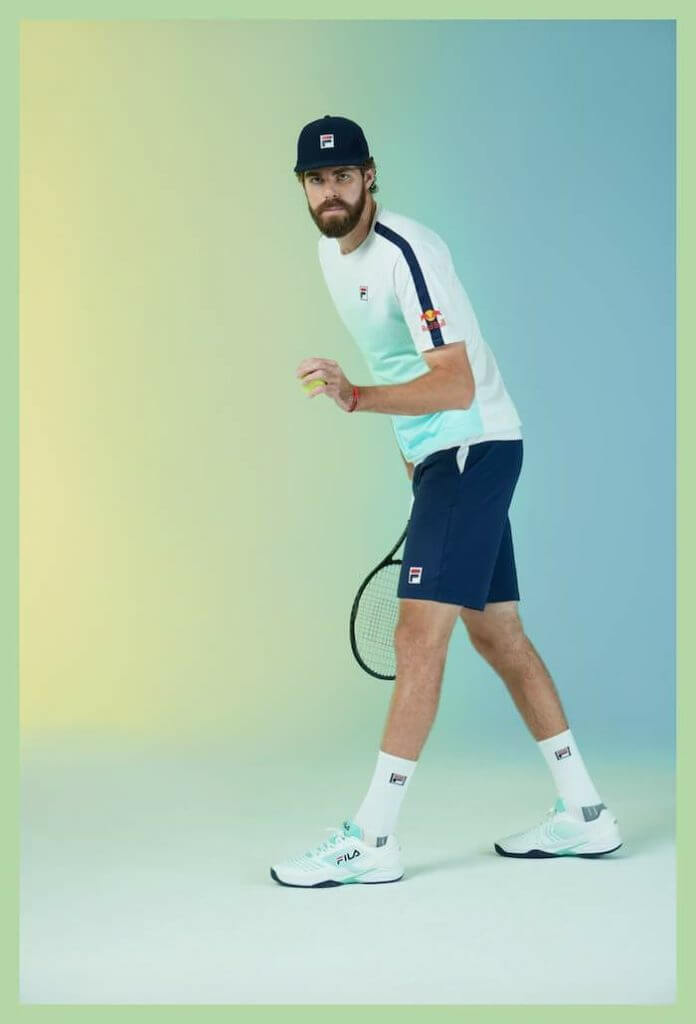
Fila’s male athletes will spot the crisp, clean Legends collection, featuring (their words;) “cool Zen hues and detailing, in a refreshing color palette of White-Navy-Beach Glass – Paradise.” That’s Reilly Opelka below, all 6 foot 11 of him. Yes, he’s got a huge serve.
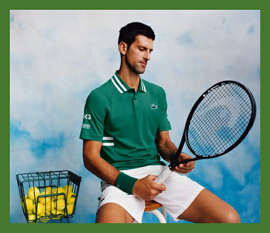
• Lacoste: Novak Djokovic continues with his personalized Lacoste line; he’ll be wearing green on the blue Melbourne courts. The Djoker will pair that look with the Asics Court FF Novak.
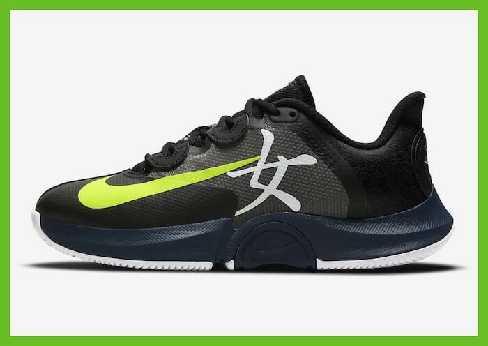
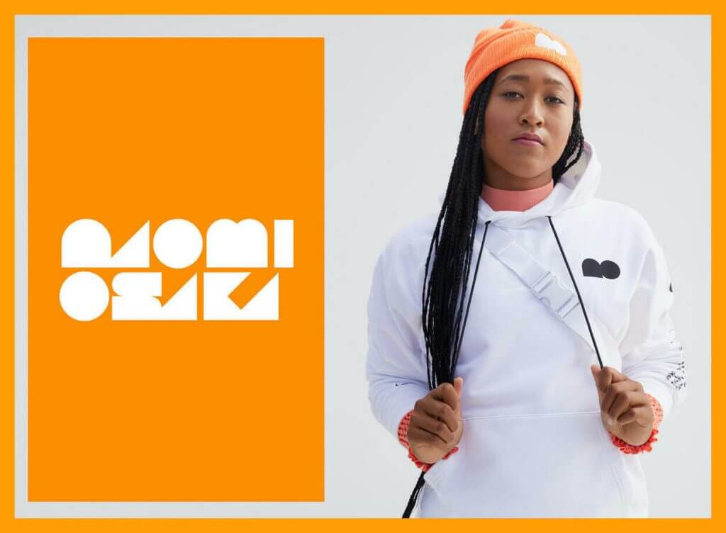
• Nike: Naomi Osaka’s signature Nike line debuted last November and includes her minimalist NO logo. She just tweeted about her new NikeCourt Air Zoom GP Turbo sneakers; for now they’re Japan-only:
For everyone asking me where to get these they’re from my collection with Nike but you can only get them from the Nike Japan website 😅 https://t.co/jh3kUNX2MO
— NaomiOsaka大坂なおみ (@naomiosaka) February 3, 2021
Expect to see her in trophy ceremonies sporting a pricey Tag Heuer watch in a deal just announced. She has also recently signed a deal with Louis Vuitton.
Nike has also just released the “Serena Iconic Tee Pack,” in honor of seven time Australian Open winner (and winner of 23 Slams overall) Serena Williams.
Thanks, Brinke!
And now a few words from Paul Hi there. In case you missed it over the past couple of days, I’ve partnered with SportsLogos.net founder Chris Creamer to create a new podcast, called Unified. You can listen to the first episode, and subscribe to future installments, on Apple, Google, Stitcher, TuneIn, and Spotify, or just use the player below:
You can also check out the video version of the episode, which is on Chris’s YouTube channel:
You can also check out the show notes on the podcast’s new website, plus you can follow us on Twitter.
We should have the second episode next week, probably on Thursday.
Meanwhile, with this being Super Bowl weekend, don’t forget that the Uni Watch Pin Club’s February design has a SB theme, with the year 2021 rendered in Roman numerals:
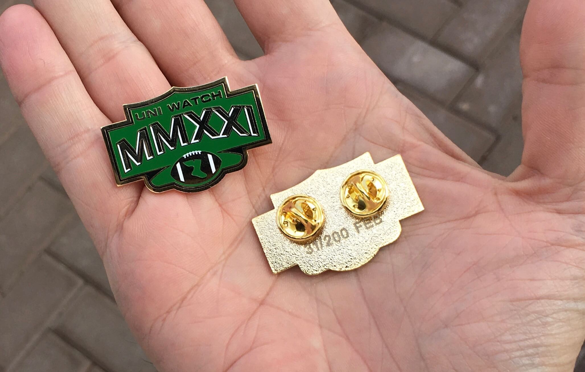
This is a numbered edition of 200 pins. They’re available here while supplies last.
Okay, that’s enough from me. Now back to Phil!
Uni Watch News Ticker
By Phil

NFL News: Though the Bucs won’t wear their throwback creamsicle uniforms for the Supe against Kansas City today, Tom Brady’s support among other Bucs has momentum trending toward creamsicle in the future — if the NFL allows it. … Here’s why the Bucs opting to wear white jerseys could give the KC Chiefs the edge in Super Bowl LV. … Having an NFL team “host” the Supe hasn’t ever happened, but up north in the CFL, it’s happened twelve times. Wade Heidt notes, “Unfamiliar territory to have a team play in the Super Bowl in their home stadium. We football fans north of the border more used to this. Have seen this a fair amount in the Grey Cup. Always a better chance as there are less teams.” … Check out this great video of the 1946 Cleveland Browns getting their uniforms (from Old Time Football). … Patrick Mahomes has his number on the inside of his suit coat (from Jakob Fox). … Clint Richardson writes, “The incredible YouTuber @MarkRober built a robot to kick the world’s longest field goal in his most recent video. The robot was outfitted in throwback Miami Dolphins jersey and pants with a modern Dolphins helmet and socks.” … Check out this socially distant team photo of the Bucs (from James Gilbert).
College Football News: Whenever you buy something, or click on an image on the Twitter, you always read the fine print, right? Of course not. Here’s a tale of what happens when Penn State made some graphics with a “gratuitous” use of fine print (from Max Weintraub).

Hockey News: The Ottawa Senators’ Derek Stepan has made a sudden number change. Submitter Mike Engle adds, “You don’t see a switch in the middle of a season too often. But I guess there’s not too much dead stock merchandise, so it happened!” … The Canucks will celebrate Lunar New Year by wearing special red jerseys in warm-ups on Feb 11. Here are teasers (from Wade Heidt). … Also from Wade, check out the new mask for Craig Anderson. “Now with the Capitals but on their taxi squad currently,” he adds. … Oops the Philadelphia Flyers’ James van Riemsdyk suffered a helmet logo malfunction (from Mark Morgan).

NBA News: A 1997-98 Upper Deck Game Jersey Michael Jordan autograph/jersey swatch sold for $1.44 million on early on Friday, February 5 through Heritage Auctions. … NBA Star Bradley Beal (who plays for the Washington Wizards) hooked up a fan wearing Beal’s high school jersey (from Mike Chamernik). … Check out this literal hardwood classic Kobe Bryant jersey (from Jakob Fox). … This is great: the commentary team was busting on this dude’s alleged knock off jersey. The Bulls retweeted it to say they were hooking him up with an authentic (from Cody Reeder).

College Hoops News: On the Twitter, Jakob Fox notes, “the scorebug for (yester)day’s Clemson-Syracuse basketball game is confusing. Clemson is in white but has the orange scorebug while Cuse is wearing orange and is navy on the scorebug.” … UNC, famous for its use of Carolina Blue, will wear navy blue uniforms vs NC State today (from James Gilbert). … Last night, the Kentucky Wildcats debuted a gray alternate uni. Here’s a game photo (from Josh Claywell). … “Looks like #12 Cam Christon and #2 Zahad Munford for Grambling dislike the width of the shoulder portion of their jerseys” says Timmy Donahue.

Soccer News: Yesterday, Southampton were wearing red shorts, which aren’t a part of any of their three kits, at Newcastle (from Mike Miller). … Looks like a new third shirt for Legia Warsaw (from Ed Żelaski).

Grab Bag: In 2009, a professor discovered a novel hue by accident in his university lab. Now, you can paint with it — check out the “New Blue” (NY Times link). From Tommy Turner. … Floaty Bois and Homo Spaciens: Space Force Reveals List of Rejected Troop Names (from Timmy Donahue). … Also from Timmy “Video shows NYPD officer with Trump patches on uniform in defiance of department policy.”
And finally… DEEP BREATH. Whew! Thanks to Timmy for the amazing Bucs uni history, Brinke for the AO, and to the several readers and contributors who combined for one ginormous post (apologies for the length — but hey, it’s Supe Sunday and this is traditionally the biggest post of the year). If you made it this far, my thanks and sympathies.
Everyone stay safe today (and this week), and if you are attending a Super Bowl party, please be smart and practice social distancing!
You guys and gals have a great week and I will catch you back here next weekend.
Peace,
PH
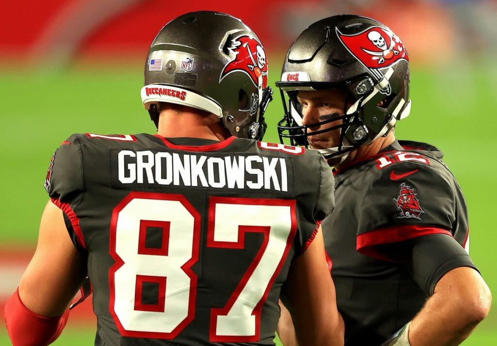
If you look closely at the last photo in the bucs history section it appears to be a photoshop of a patriots photo of Brady and Gronk.
Exactly my observation! Plus, people in the crowd.
And it looks like it’s been replaced, rendering my comment useless…
Those paintings are phenomenal. You have to look really close to determine they’re not photographs. Amazing skill, Mark.
Scoreboard…the beginning of a quarter Broncos fans will never forget.
Followed 2 years later by an entire game that Broncos fans would prefer to forget.
Any reason why the Patrick Mahomes suit is in NBA news?
No. Meant to put it in NFL. Now fixed.
Two questions:
1) Are the two “O”s on Gronk’s jersey really different sizes – or is that an optical illusion?
2) Are the Rams using that new blue?
Just curious – was the number of ticker items repeated from yesterday an intentional choice for their significance?
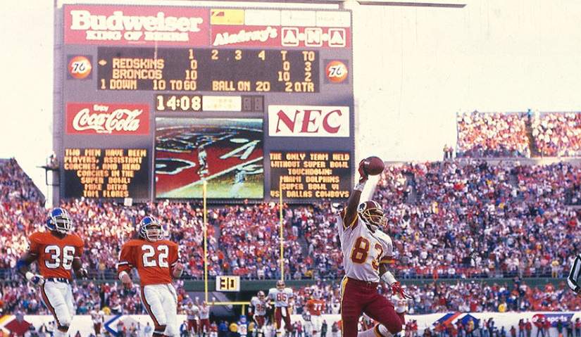
Super Bowl XXII – The Redskins defeated the Broncos by the score of 42–10, winning their second Super Bowl. The game was played on January 31, 1988 at Jack Murphy Stadium in San Diego, California, which was the first time that the Super Bowl was played there. The picture is the first TD that Washington scored after the Broncos were up 10-0 on their way to an explosive 2nd Qtr. Doug Williams was the first black QB to start a Super Bowl and was MVP. I am a Bronco fan so this was a disappointing day.
Super Bowl XXII – The Redskins defeated the Broncos by the score of 42–10, winning their second Super Bowl. The game was played on January 31, 1988 at Jack Murphy Stadium in San Diego, California, which was the first time that the Super Bowl was played there. The picture is the first TD that Washington scored after the Broncos were up 10-0 on their way to an explosive 2nd Qtr. Doug Williams was the first black QB to start a Super Bowl and was MVP. I am a Bronco fan so this was a disappointing day.
No mention of the black “Cannonball Marks” on the 2014 Bucs helmet. I don’t believe they lasted the entire season.
link
Look closely in Guess the Game and you’ll see the scoreboard refer to Ditka and Flores playing, asst. coach and head coaching on S.B. winning teams. Cool reference for getting into H.o.F. yesterday.
The incredible YouTuber @MarkRober built a robot to kick the world’s longest field goal in his most recent video.
This is a setback to the Kickers Are People Too movement…
Also, why are this and the socially distant Bucs photo in the basketball section of the ticker?
Grrrr. Apparently this wasn’t my best ticker effort (sorry…most of these items were added late last evening after I returned from curling). My bad and now moved to NFL.
We’ve played 54 SB’s. Tabulation so far. Old AFL teams – there were 10 at the time of the 1970 merger – 17 wins. Will the Chiefs make it 18 today? Only old AFL teams to not win a SB – Buffalo, Houston/Tennessee, Cincinnati, SD/LA.
Your observation only underscores what a shrewd move it was for Pittsburgh to cast its lot with the AFC after the merger. So many of the AFC Super Bowl victories can be attributed to this old NFL team, one that had virtually no traction in the Senior Circuit. The Colts’ transfer has been a wash, and we haven’t seen either of the Cleveland Browns (the Ravens notwithstanding) in the Supe since their move to the American Conference.
I could be wrong. But, I’ve always attributed Steelers, Colts and Browns being “selected” for the newly formed AFC because they were the smallest TV markets in the NFL at that time.
I looked this up last year. Between Super Bowl IV (Chiefs) and Super Bowl XXXII (Broncos), the Raiders were the *only* one of the Original Eight AFL teams to win a Supe (IX, XV, XVIII).
The other AFC Super Bowl champs during that time:
V – Colts, Original NFL team.
VII and VIII – Dolphins, AFL expansion team coached by former Colts coach Don Shula.
IX, X, XII, XIV – Steelers, Original NFL team. Chuck Noll was hired before they switched to the AFC.
The Raiders were the last AFC Super Bowl champion at all from XVIII until the Broncos won SB XXXII.
It’s only now that the AFL’s Original Eight are catching up, having won five of the last six (Patriots X3, Broncos, Chiefs).
AFL Original Eight teams have won 15 Super Bowls (and, again, five of those have come in the last six years), Former NFL teams have won 12 (Steelers, Colts, Browns/Ravens) and the Dolphins, an AFL expansion team, won the other two.
One point of interest that has been discussed in the past, Tampa Bay’s originally requested the NFL to have their colors light green and orange, but it was rejected by the NFL for looking too similar to the Dolphins. As each year passes I find this more and more ironic considering how the NFL today has no problem with about a third of it’s teams periodically dressing in all black.
I wonder how many Bucs’ fans would have put the team in solid black with a skull+crossbones on the side of the helmet, if they had no vested interest in the various iconographies Tampa Bay has worn? So, I see the team in Oklahoma Outlaws’ uniforms (more or less), naturally wearing the white tops during the humid summer months. Not really the Raiders since there would be no silver.
Man oh man, those secondand10 logos are such an improvement over the official cookie cutter SB logos.
The league needs to hire them yesterday.
The “New Blue” outlined in the NYTimes article interests me greatly. Even though I am colorblind, my “bad” colors are red and green; my sensitivity to blue is rather acute, and I can visually distinguish about ten different shades, all the way from ice blue to navy. I’m not sure the inventor’s purpose was to split the hairs between Honolulu Blue and Cobalt, so much as it was to remove the potentially harmful cobalt element from the artist’s environment.
IMO they got that first uni set for the Bucs so right. Its demoralizing to think they’ve spent the entire life of the franchise moving away from it.
Regarding the Bucs’ uni history, I would have included a mention of the collar change due to the new Nike template in 2012, since it resulted in the infamous “neck roll” look for Tampa Bay for that one year, and the discontinuation of the creamsicle throwbacks due to the enforcement of the “one shell” rule beginning in 2013.
Today will join a number of Super Bowls where both participating teams don’t have a helmet center stripe. KC vs Minn was the first. Also the Patriots vs Rams twice, Patriots vs Eagles twice, Patriots vs Seattle, Patriots vs Falcons. So every one of these games will have either the Patriots or KC participating.
Paintings are amazing, Graig!
The new SB score bug is driving me crazy. The team names and scores are vertically centered in their space, but the names are pushed up by the timeout blips underneath, making the scores look like subscripts. I want all my text aligned!
Question and a thought re: Bucs.
Q: Why did they only wear white in their first season? (Excepting exhibition games.)
T: Don’t see why they can’t wear a Creamsicle set with the pewter helmet. Swap out the red flag for orange or white, it would be “different” but just fine. Or tweak the Bucco Bruce logo colors to make it work with the pewter helmet. Someone who’s better than me with Photoshop, can you do this?
Question and a thought re: Buccaneers unis.
Q: Why did they only wear white in their first season? (Excepting exhibition games.)
T: Don’t see why they can’t wear a Creamsicle set with the pewter helmet. Swap out the red flag for orange or white, it would be “different” but just fine. Or tweak the Bucco Bruce logo colors to make it work with the pewter helmet. Someone who’s better than me with Photoshop, can you do this?