By Phil Hecken
Follow @PhilHecken
Good Sunday morning, Uni Watch readership. Hope everyone had a good Saturday!
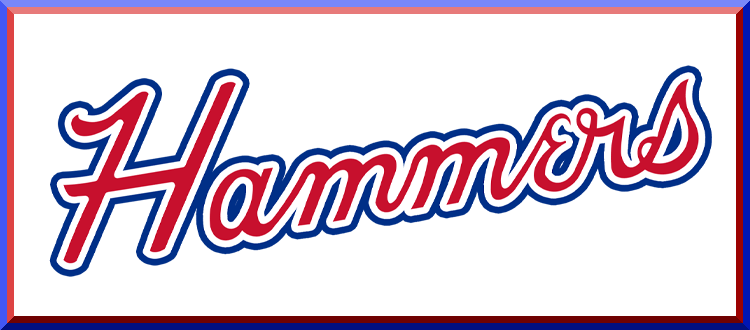
As weekend readers know, I often feature reader concepts on here, but usually they’re in the “Tweaks and Concepts” section, or, if it’s a league-wide redesign, then they will typically lede. Today, however, I have a set of concepts (a rebranding, rather than a redesign) from reader Jackson Morehouse for the Atlanta Braves, that I thought are so good and so timely as to feature them as the main story.
With the recent passing of Henry Aaron, both Paul and I delved into Aaron’s uni-history (myself with just his time in Braves uniforms, Paul in both Braves and other unis), and during his time with the Braves (both in Milwaukee and Atlanta), the team has featured some rather troubling native imagery (you can see “better” graphics here and here).
Now, I don’t want to get into a whole debate over the appropriateness of the use of such iconography, but let’s just say that most of us would agree it’s no longer appropriate — even if the team no longer uses racist caricature logos. But the team still does feature a tomahawk on its uniforms and they’re still called the “Braves”; with the Washington Football and Cleveland Baseball teams both in the process of transitioning away from their Native American nomenclature and iconography, it may not be much longer before the KC Chiefs, Chicago Blackhawks and Atlanta Braves embark on similar rebranding efforts.
As with any name/logo change, there will always be resistance, and I understand that. But what better way for the Atlanta team to transition away from their past than by rebranding with a new name and new uniforms which honor their greatest player (and a great humanitarian and civil rights advocate), Henry Aaron? That’s what Jackson has done here.
Here’s how he pitched his rebrand to me in an e-mail earlier this week:
“Hi, I hope everyone’s staying safe and healthy. This is my first time submitting anything to the UW site and today I’ve got an Atlanta Braves rebrand. I have recently seen on social media the idea of renaming the Braves, the Hammers after the recent passing of Braves legend Hammering’ Hank Aaron. With the increasing movement to erase Native American imagery from sports (and rightfully so) I thought, what better time to set this rebrand into motion. The uniforms are of course fashioned after the ones Hammering’ Hank wore when he broke Babe Ruth’s home run record. So this is my shot at the Atlanta Hammers, hope you enjoy it.”
And here are Jackson’s proposed designs:
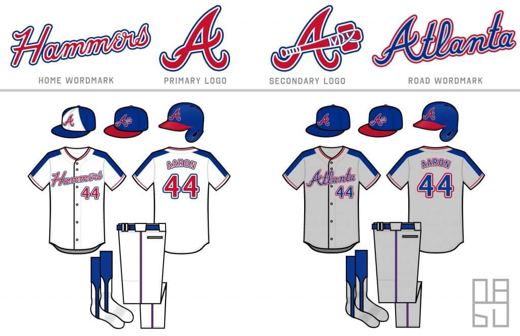
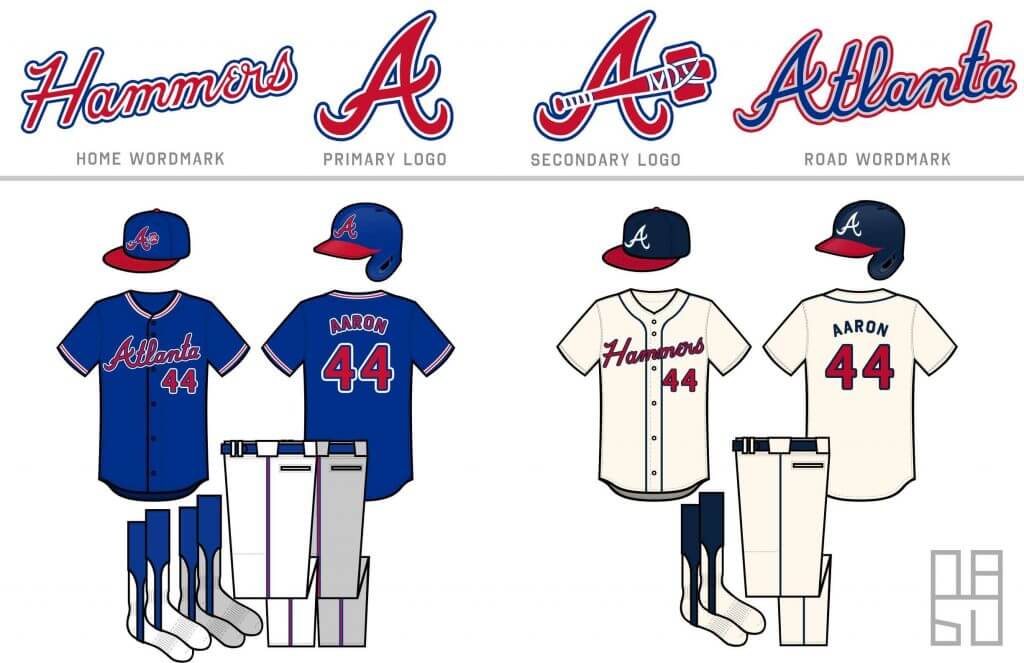
I’ve gotta say, I LOVE these! What better way to honor the memory of baseball’s Home Run King and overall statesman and humanitarian than with a rebranding from Braves to Hammers? I’ve always loved the innovative and lets face it, unique uniforms the team sported from 1972 through 1975, and these definitely hark back to those. The name change to “Hammers” would further cement Aaron’s place as one of the top three baseball players of all time (and many would successfully argue the greatest), and be a fitting tribute to his legacy.
Let’s keep the comments to Jackson’s rebranding proposal today, and not let the discussion devolve into a discussion over native iconography or whether or not the Braves should change their name. Thanks!

Guess The Game…
from the scoreboard
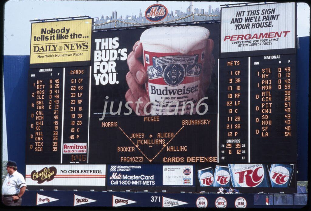
Today’s scoreboard comes from ojai67.
The premise of the game (GTGFTS) is simple: I’ll post a scoreboard and you guys simply identify the game depicted. In the past, I don’t know if I’ve ever completely stumped you (some are easier than others).
Here’s the Scoreboard. In the comments below, try to identify the game (date & location, as well as final score). If anything noteworthy occurred during the game, please add that in (and if you were AT the game, well bonus points for you!):
Please continue sending these in! You’re welcome to send me any scoreboard photos (with answers please), and I’ll keep running them.
The “BEST OF” Kreindler’s Korner
Hey guys & gals. You’ve enjoyed Kreindler’s Korner for several years now, mostly on the weekends, on Uni Watch, but with the recent coronavirus outbreak, Graig’s time is just too precious and he needs to tend to other things besides coming up with a new writeup each weekend.
So, going forward, for as long as the COVID-19 situation is bad in New York, I’m going to run a few “Best of’s” until Graig returns.
Here’s today’s offering:
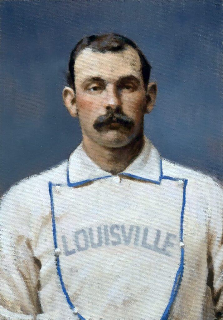
Title: “Jim Devlin, 1876” (color study)
Subject: Jim Devlin, 1876
Medium: Oil on linen mounted to board
Size: 5” x 7”For me, one of the most gripping stories from Ken Burns’ Baseball documentary involved that of Jim Devlin, a pitcher for the old Louisville Grays who was eventually banned for his involvement in throwing games in 1877. He and his three teammates cost their ballclub the pennant that year, and their subsequent ostracizing from the sport was considered the first scandal in National League history.
Jim’s story seems all the more tragic because of the annual letters he submitted to National League President William Hulbert, all of which were in the hopes of being reinstated. He wrote to other dignitaries of the league, including the likes of Charles Chase (club president of the Louisville Grays) and Harry Wright (then the manager of the Boston Red Caps). A letter to the latter still survives to this day.
In said correspondence, he pleaded for help from Wright, explaining that he was in need of any kind of work to support himself and his family, claiming that he hadn’t a dollar to his name. No response ever came, either from Wright or any of the other magnates he reached out to.
Devlin died in October of 1883 from tuberculosis. To read more about the scandal of the Louisville Four, MLB Historian John Thorn’s account is a must-read.
My painting depicts the man a year before those events, with the Louisville Grays in 1876.
Thanks, Graig! You can (and should!) follow Graig on Twitter.
Hi there. In case you missed it on Friday, I’m excited to announce that SportsLogos.net found Chris Creamer and I are partnering up on a new podcast project, which we hope will launch next week. You can learn all about it here.
Also: Teespring is currently running one of its periodic site-wide sales. From now through midnight on Monday, you can get 10% off of anything in the Uni Watch, Naming Wrongs, and Uni Rock shops by using the checkout code BYEBLUES (sorry, I don’t pick these code names). The 10% discount will come out of Teespring’s end, so you’ll save a bit of coin and Uni Watch will still make its full profit — a win-win!
Finally, I don’t usually plug weekday blog entries on the weekend, but Friday’s post, featuring an interview with the 95-year-old woman who designed the original uniforms for Shea Stadium ushers and ticket takers back in the early 1960s, was a big, big hit with readers. If you haven’t already seen it, you can check it out here.
Okay, that’s it from me. Handing the baton back to Phil now!
Uni Watch News Ticker
By Phil

Baseball News: It appears the Ole Miss baseball team will have a slight change to the navy baseball caps this season. The word mark matches that of the powder blue uniform now. New on left, old on right (from Timmy Donahue). … Also from Timmy, new uniforms for the Minnesota State University softball team. … Dennis Abrams asks, “Any idea why Mo Vaughn had the number 3 drawn onto his hat during the 1998 season (at least for this one photo)?” … Joe Nocella was watching the 1974 All Star game and noticed how the “G” was added later in Gaylord Perry’s jersey. (I’m guessing his brother Jim was possibly added later, necessitating the “G” — anyone know why?). … Check out this great handwritten letter from 1975 on Cincinnati Reds stationery (from Rob Laing).

Football News: Not quite a “5 & 1” but Bob Gassel writes, “I think it would be cool, at the end of each sports season, to choose a Uni Game of the Year. For the 2020 NFL season, I choose” this game. Readers? Do you have a nomination for “Uni Game” of the Year? … If you’re a fan of the Miami Hurricanes and are curious as to what new players have been assigned numbers, then click here. … ICYMI: The Browns will unveil an alternate uniform for the team’s 75th anniversary. … Good spot by Ryan Atkinson, who notes he combination of the uniform Super Bowl logos the NFL uses and the way the Roman numerals fall make this year’s patch look an awful lot like last year’s. … FanDuel seems to think the Bucs choice of white jerseys/pewter pants could give them the edge for Supe 55. … Looks like SEC graduates got color-coordinated patches on their unis (yes, I know that’s a pic from last year but it was tweeted at me yesterday). From PatrickJS412.

Hockey News: ICYMI: The Vancouver Canucks have announced they’ll wear their “reverse retro” unis exclusively during a four-game homestand, from February 19 to 25 against the Winnipeg Jets and the Edmonton Oilers. … Speaking of the RR’s, Wade Heidt writes, “Kings promo showing a player skating in full Reverse Retro uni. First time I seen it on ice. Kings just need to make the right decision now and make this their primary uni starting next season.” … Also from Wade, the Reverse Retro orange pants and gloves made an appearance on ice for the Oilers. … Check out the new pads, blocker and glove for NY Rangers goalie Igor Shesterkin. … Here’s a look at Montreal Canadiens goalie Jake Allen wearing the team’s red jersey for the first time, getting his first start in La Belle Province since coming over from St. Louis (from James Beattie).


NBA/College Hoops/Basketball News: On Saturday, Jan. 30, 1971, it was Ohio State Hoops vs. … Ohio State? Nope, that’s Michigan State in the dark uniforms. The MSU Basketball uniforms were stolen from their dressing room in Columbus earlier in the day, so they wore OSU’s road unis (from Jeff Ash). … LA Tech wore throwback uniforms yesterday (from Chris Mycoskie). … This was a R/T from Paul so I don’t know the context, but check out these burbury uniforms! … Is there anything better than Indiana’s candystripe warmup pants? Well, the girls of Geronimo Navarro certainly give them a run for their money (from Cameron Songer). … Art of Scorebug writes, “Thanks to FloHoops, I have learned that the alma mater can be represented by some odd shade of almost purple. While wearing yellow.” … Here’s a story about how Jason Arasheben, the jewelry designer who created the Lakers’ championship rings, visually incorporated storylines from the team’s season and title run into the design (from Kary Klismet). … Also from Kary: The Coe College Kohawks from Cedar Rapids, Iowa, have interesting basketball uniforms this year, including facemasks with team logos and diagonally slanted contrasting color blocks on the back of the shorts. … Still more from Kary: Duquesne will debut its new basketball arena on Tuesday, February 2nd, against Dayton. … Velti, a fuzzy orange creature with an upside-down basketball net on his head, is the mascot for Veltex Shizuoka basketball team (from Jeremy Brahm).

Soccer News: The Philadelphia Union will be unveiling a new “jersey” sometime next week. The dates for the kit launch “event” are February 5, 6 and 8. … Blake Jackson notes James at Everton playing with a split sock. The top looks like a regular sock but is more like a sleeve with a second sock bottom. His shin guards are in between. … Here is how King Kazu Miura has looked during every season of his playing career, including All-Star and International appearances, which began in 1986. He is still playing at 53 (from Jeremy Brahm). … Clubs in the Bundesliga remembered those persecuted and murdered by the Nazi regime because of their sexual and gender identity this weekend by donning commemorative rainbow jerseys and armbands. … USL League One team Forward Madison’s new live bovine mascot has been christened “Rose Cowbelle” (from Kary Klismet).

Grab Bag: Check out the NJIT Men’s volleyball team with rapid gradation switches on shirts and shorts (from Jeremy Brahm). … “Still can’t get enough of all those Bernie Sanders memes?” asks Kary Klismet. “Sports collectible company FOCO has joined the craze by creating a line of NFL team-branded mittens inspired by the ones worn by Sanders to the Inauguration, and they’ll throw in a Bernie bobblehead with every purchase!” … And one final one from Kary: Indiana University Fort Wayne is inviting the public to vote on its new mascot.
And finally… that’s it for today. Big thanks to Jackson Morehouse for sharing those Atlanta Hammers concepts!
Everyone stay safe and healthy this week, and next weekend I’ll be back with the fantastic Tim Brulia, who will once again bring us all the uni histories of the two Supe combatants, the Buccaneers and the Chiefs. You won’t want to miss those!
Peace,
PH
Re: Mo. Vaughn. That was the year Jeff Frye torn his ACL in spring training. Could be a tribute to him. He wore #3.
This is the only thing I can think of as well. Went through most of the Red Sox who wore #3 in their history, and the closest passing I could find was Norm Zauchin 22 years ago (1/31/99) today. Mo wasn’t on the team in 1999 so that eliminates that one.
Perhaps in first two letters in “Hammers”, the “a” could subtly be made into an upper case “A” to remind us of HAnks initials. Also, if the tomahawk style “hammer” is retained, maybe “HA” or “HLA” (Hanks initials) could be incorporated into the sheathing of the hammer.
If the tomahawk looking bat is redesigned, maybe Hanks initials could be subtly incorporated into the “tape” on the bat handle.
That would be interesting. Better than any other answer I could come up with myself (i.e. none).
I can’t seem to find anything about the #3, but Vaughn does have a history of uni-memorializing.
In 1993, he wore #35 on his cap (in at least 3 different styles) for Reggie Lewis:
link
link
link
And in 1999, he wore a “T” on both his cap and helmet (not sure what that was for either):
link.jpg?id=d78cb795-8a70-4e47-92b8-8b32d7d7f615&size=zoom
link
Frye just confirmed it. Wow.
link
Re: Hammers concept
PRO: the name; the double outline on the numbers.
CON: it’s all over the place and tried to be “all things Braves” from multiple generations of uniforms that were never meant to be together. 2 nearly-identical cap logos. A red/navy colorway and a red/royal colorway. The thick racing stripes down the sleeves of the jersey are unbalanced against the thin stripes on the pants. A hammer that isn’t a tomahawk but looks more like a tomahawk than a hammer, that’s also a bat. The awkward “er” in “Hammers” from trying to use the current Braves script font.
I love the idea and I think there is potential here, and simplifying it down to either royal or navy would go a long way. I would also ditch the “tomahawk A”, which always looked forced and overwrought. The tomahawk makes the monogram look very unbalanced and hard to position properly on a cap anyway. Maybe a simple capital Block A, playing off what the Braves used on their caps in Milwaukee?
I agree with MJ entirely. There’s a lot that’s conceptually very good here, but little that lives up to its potential in execution. I’d look to simplify all around. Start with the still-a-tomahawk bat element. What was Hank’s “hammer”? His bat. The nickname was a metaphorical reference in part to labor with actual literal tools, and in part a reference to the legend of John Henry. But Henry Aaron’s “hammer” was his bat. So drop the faux-primitivist adornment and work on a straightforward baseball bat icon that can serve the uniform in a more integrated way. As the cross of the A, sure, but also in the script, whether as an underline or as a cross in the H and the A. If you want to mirror the Aaron-era Braves sleeve feathers, then design the bat with enough patterning – maybe wood grain, or a stylized oval like an old bat logo – that the top of it can serve on the sleeve sides.
Conceptually, a bat as the handle to a cartoon hammer is very minor league. For a big league team, a simpler concept of the bat is our hammer, the tool we labor with, is stronger and deeper. Especially for a team identity built as a tribute to a legendary batter. Start with that simple, straightforward understanding of what the bat is, what it does, and what it represents, and a richer, deeper, and more coherent visual identity will result.
Potential roadblock: Making a red, navy, and white uniform with yellow accents and a bat underlining the script treads perilously close to the Cardinals’ intellectual property. I always thought it a tribute to good design that three teams (Atlanta, St. Louis, and, at the time, California) using the same colors managed to make three utterly different uniform designs.
“A hammer that isn’t a tomahawk but looks more like a tomahawk than a hammer”. Exactly this.
About the Reverse Retro equipment for the Edmonton Oilers in the Ticker. I had sent the tweet out in the morning. Later on, was discovered that the Oilers and the Maple Leafs wore their Reverse Retro uniforms against each other in Edmonton last night. Here is a source for many photos of the game:
link
Also about the Ticker item related to the Los Angeles Kings. I made the typo “First time I seen it on ice”. Meaning to say “First time I’ve seen it on ice”. My embarrassing typo from typing stuff in on my phone and not paying attention.
I watched part of the game, I believe it’s the first time ever a NHL team has worn orange pants, which makes the use of the term “retro” seem kind of odd. I actually liked the Oilers look as
a fresh and original “3rd jersey” look. Not sure I would want to see it all the time but now and then is fine.
The Leafs look on the other hand – has a “one season and done” look to it. Horrible.
The orange pants were daring. Looked better on the ice than I expected. Yes, would not want to see orange pants all the time as part of a regular alternate. If the Oilers were to embrace a white jersey with mostly orange trim like this, I would prefer to see them bring back the original WHA white jersey to wear. Similar to how they did that with the orange jersey some years back.
The blue logo and numbers do not work well on Leafs jersey. Leafs are one of those teams in a difficult spot with Reverse Retro as they have only blue and white as colours. Red Wings same way. No other trim colour which can become more prominent with the reverse uniform.
With the Canucks it will be 1 home stand and done with the their Reverse Retro. Then I hope that uniform goes in the closet for good. Did not want to see the Canucks celebrate one of their worst jerseys from the past. Don’t want to see the gradient again. Don’t want to see the Canucks in navy blue again.
I really hope Reverse Retro is not something that will happen every year. NHL should spread it out and have RR maybe every four years if program continues.
The Browns wore brown over orange against the Raiders who wore white over silver. It also snowed in Cleveland that day. I can’t even think of a way to top that game, aesthetically.
I 100% agree. :)
The Browns wore brown over orange against the Raiders who wore white over silver. It also snowed in Cleveland that day. I can’t even think of a way to top that game, aesthetically.
I vehemently disagree. :(
I think I’d rather see them keep their current color scheme, and no, no, no to the thick blue shoulder yokes. There’s also too much whitespace on the home wordmark, making it hard to read; any word longer than 4 or 5 letters shouldn’t have a floating outline. The throwback version is infinitely better; the road wordmark also looks much better with the gray. I wouldn’t mind seeing that secondary logo in a roundel patch on the left sleeve.
“There’s also too much whitespace on the home wordmark, making it hard to read; any word longer than 4 or 5 letters shouldn’t have a floating outline.”
Concur. To me the home wordmark reads “Hammors” not “Hammers”.
IDIOTIC IDEA
I would find a way to incorporate 755 to the sleeve of the Hammers jerseys
GTGFTS: October 2, 1988 @ Shea. Mets beat the Cardinals 7-5. Final game of the year and the last time the Mets won 100 games in a season?
Love the Hammers idea, and the concept of a hammer replacing graphically replacing the tomahawk . They could also keep the “Tomahawk Chop”, but do it with fists clenched and call it “The Hammer”.
Yeah that would be cool!!!
what would the crowd chant though? oww oww oww oww oww to mimic smashing your thumb with a hammer? LOL
Great job, Jackson Morehouse! I’d wear that.
Just noticed the gray socks to go with the gray pants. Love it.
OK, I’d tweak the e and maybe use an actual hammer on the jersey, but on the whole, I like.
last nights Leafs – Oilers game might just be the ugliest hockey game ever!
What were those abominations???? Some kind of throwback? To what?
Worst uniforms….*EVER*
For NFL Uni Game of the Year, you could go with any Bears-Packers, Chiefs-Raiders, or Steelers-Browns game every year. The Chargers also look great against the Chiefs when they wear yellow pants. This year we also got good looking games with the Packers-49ers and 49ers-Cowboys.
I think if other criteria are added such as lighting, weather you could probably have some more of debate. I always liked this Miami / Cleveland game from 1976, something about glamourous Miami playing on a gritty dark stadium
link
GTGFTS: The game was in 1988. Which of the nine STL@NYM games I can’t wager a guess.
You have to go through each boxscore on baseball-reference.com!
GTGFTS: 10/2/88, Cardinals at Mets. Last game of the season. Get a load of that St. Louis defense. Tom Brunansky in the outfield for the love of corn! Clearly mop up work, as the Mets won 100 games that season and the Cardinals were a faint image in the Mets’ rear view mirror. Not a great year to be a Cardinals fan. Ah, the ’80’s, the decade of “The Mets are Pond Scum” in St. Louis. Good times.
Glad to see someone else beat me to the “Mets are Pond Scum” reference!
The Browns wore brown over orange against the Raiders who wore white over silver. It also snowed in Cleveland that day. I can’t even think of a way to top that game, aesthetically.
I’m undecided about this one. I’ll have to give it some more thought. :/
Phil – You stated; “Now, I don’t want to get into a whole debate over the appropriateness of the use of such iconography” but then go on for two paragraphs making arguments doing just that. Also I find it more than ironic that you propose appropriating the nickname and possible iconography of an African American ball player for your own political purposes. Do you know what Mr. Aaron’s views were about the Braves’ name, logos or iconography? I don’t ever recall seeing any record of his views. If you have some evidence that Mr. Aaron agreed with what you claim to be that “most of us agree is inappropriate”, I’d love to be so enlightened . Finally, in order to be consistent in your logic, if you don’t have the Aaron’s family’s permission to use his nickname or iconography for submissions or contests,, you are appropriating in the same manner which you claim to find so abhorrent.
I’m not sure Mr. Aaron’s opinion about the Braves’ name and iconography is necessarily germane to the current argument that the time for Indian-themed teams is in the past. The overarching narrative of the day *is* that programs with Indian iconography are facing a reckoning. The voices pushing back on the subject are diminishing. And taking nothing away from Hank Aaron, he was a man of his time, and perhaps couldn’t anticipate the antipathy that would come to be directed at the team for which he used his ample talents.
The “overarching narrative of the day” is an empty phrase that implies no obligations on sensible men, and in fact should inspire nothing but suspicion in them.
Thumbs Up.
How about getting rid of the Native chant at Florida State, Kansas City and Atlanta. That would be a start.
Atlanta Hammers. I have one note. Tweak the font of the word mark so that the capital H matches Hank Aaron’s signature. Aside from that, awesome job!
Yeah, that “H” is butt-ugly.
Somehow make the “A” in Hammers capitalized in a subtle way – if that’s possible and you have Henry Aaron’s initials
Would I love to see Atlanta become the Hammers. nice touch to see the handle of the hammer looking like a bat. Would love to see 755 incorporated into the sleeve design something similar to the feather.
As a longtime Atlanta fan I love this concept! Let’s do it folks!
Anyone else having an issue with the site format being kinda wonky this morning? It’s almost like the mobile site is on desktop somehow.
And, of course, posting this comment seems to have fixed it for me. [shrug]
Yes…same here. Virtually impossible to read black text on dark green background. I gave up.
Mine is good now too
Ditto to the comment by Mainspark. You don’t want the discussion to evolve into the use of iconography, but yet you state your stance to start the article.
Now back to the uni: Although I’m fine with Atlanta’s current jerseys, these look great and are worth looking into when or if the team wants to make a change. IMO, there are three things that I’m not crazy about: (1) just don’t care for the blue jersey, and (2) don’t care for the blue shoulder stripes on the white and grey jerseys, and (3) I prefer blue numbers and wordmark instead of the red ones on the white jersey. Great job though.
If you’re looking for an NFL Uni game of the year, I would go with the Chargers/Dolphins game from 11/15/2020. The Chargers wearing their powder blue jerseys over yellow pants against the Dolphins wearing their solid white throwbacks in a late afternoon November game that started in sunlight and finished under the lights. Great look start to finish.
I like the name a lot, not so much with the uniforms. I’d like to see their current uniforms with just the name change. Also I’d like to see a uniform similar to the one that had the tomahawk, but just replace it with a hammer. Not a bat with something attached to it to resemble a hammer, but an actual hammer. I thought that changing “Braves” to “Brave” was a good idea, but I like this even better.
I appreciate the inclusive spirit of the Atlanta rebrand from “Braves” to “Hammers”, but I don’t appreciate taking an axe to Atlanta’s uniforms, which are close to the best in the league. Lose the double outline, make the blue navy again, tinker with the “Hammers” script to make it flow better, and underline it with a picture of a hammer. The Braves’ name is troublesome; their uniforms are most assuredly not. (Outside the issue of too many alternates) Don’t throw the baby out with the bathwater. That being said, I like the idea of making the “A” on the cap full block, to echo the Boston “B” and Milwaukee “M”.
Seems as if every time uni-watch brings up Hank Aaron they have to launch into a spiel about how abhorrent Native American imagery is. I think it’s gotten beyond ridiculous when a team called something admirable such as the Braves is shat upon every other blog post on this site. The only people who seem adamant that the team name should be changed are “woke” white people and that’s a damn shame.
It saddens me that some people seem to believe what Jon here writes about opposition to Native-American nicknames and mascots being the bugaboo only of “‘woke’ white people.” That. Is. Not. True. Thirty years ago I personally witnessed an all-Native American protest against the Braves name and iconography outside the Metrodome while I was on my way to attend Game 2 of the 1991 World Series. Native-led and -directed protests and activism on this issue is many generations old now. Here is New York Times coverage of the Native-led protests I witnessed:
link
For my own part, it wasn’t the 1991 protests that persuaded me of the righteousness of the cause, nor even witnessing the ugliness of a loud minority of Atlanta fans donning redface to perform the tomahawk chop. Rather, it was soon thereafter, when I was working as a reporter and I personally witnessed a mob of white protesters, including a legendary and locally beloved football hero – a man I had encountered previously as a kind, avuncular gentlemen when he regularly dropped off and picked up his granddaughter from my elementary school – shout insults, including “redskin,” at Native American sportsman exercising their tribal rights to hunt and fish. These white men used words and chants and costumes that exactly matched those used by fans of America’s Native-named sports teams. The same words. The same chants. The same redface and feathers and fringed leather jerkins. If you showed a Martian video footage of these men intending to insult and demean their fellow Americans, and video footage of hardcore Redskins or Indians or Braves fans intending to support their favorite sports team, the Martian would not have been able to tell the difference.
Speaking for myself, I think people who like Indian iconography for their favorite sports teams are not necessarily of bad character. It’s just that times change: You never see kids playing with cap pistols any more, you cannot buy a model of the “General Lee” nowadays, and you probably won’t hear “Brown Sugar” on the radio again. Instead of ruminating over what has been lost, try focusing on what has been gained; a spirit of inclusion and an emphasis on the American Mosaic.
Alternates for the Browns? Good. Let’s try a jersey that has no stripes, but has two-color numbers. Then, make the pants stripe brown/orange/brown instead of the other way around. Perhaps take that snazzy new patch of theirs and stich it to the shoulder yoke, a la the Steelers. Traditional, yet different.
How about the Browns go all white with orange helmets?
Stationary means “fixed,” “immobile,” or “unchanging.” … Stationery refers to paper, matching envelopes, and writing implements
The hyperlink for this ticker item isn’t working:
West Virginia linebacker Tony Fields II played in the final college football game of his life yesterday at the 2021 Senior Bowl, and he wore a WVU/Arizona frankenhelmet
I could quibble with the specific designs but I’ve got to say that pales to me compared to the general idea. Brilliant! I love coming to UniWatch every day, but today that idea produced an emotional reaction in me that is beyond my usual joy. Atlanta Hammers. Make it happen.
The link to the WVU/Arizona Frankenhelmet seems to be dead.
Sorry. Can’t find the link now. I’ve removed it from the ticker.
The acoreboard is from the last game of the 1988 season, Cards @ Mets, October 2, 1988. The Mets won 7-5.
I really like the Hammers prototype, this should be on the field!
A few designs for the Hammers.
Simply crossed the H and A with a hammer. Used the 70s outlines.
Note: just realized the Hammers and Atlanta have the same initials as Hank Aaron
link
I think Hammers is a great potential new name for Atlanta, but the bat-as-hammer element reads way more as a tomahawk than a hammer, especially at first glance. I can understand the inclination to repurpose the Braves’ tomahawk logo as a hammer, but I don’t think it can be done without having kids decades from now wondering why it looks more like a tomahawk than a hammer.
The ‘H’ in the wordmark needs work. I’d take more cues from the ‘A’ logo – maybe use the same horizontal line and curve the vertical lines to evoke the left and right of the ‘A’.
(Bug report: I started typing this, then clicked “reply” on another comment thinking it wouldn’t mess anything up, then the text I typed got populated in the Reply field and now it’s telling me that this comment that I haven’t posted yet is a duplicate.)
I think Hammers is a great potential new name for Atlanta, but the bat-as-hammer element reads way more as a tomahawk than a hammer, especially at first glance. I can understand the inclination to repurpose the Braves’ tomahawk logo as a hammer, but I don’t think it can be done without having kids decades from now wondering why it looks more like a tomahawk than a hammer.
The ‘H’ in the wordmark needs work. I’d take more cues from the ‘A’ logo – maybe use the same horizontal line and curve the vertical lines to evoke the left and right of the ‘A’.
Perhaps in first two letters in “Hammers”, the “a” could subtly be made into an upper case “A” to remind us of HAnks initials. Also, if the tomahawk style “hammer” is retained, maybe “HA” or “HLA” (Hanks initials) could be incorporated into the sheathing of the hammer.
If the tomahawk looking bat is redesigned, maybe Hanks initials could be subtly incorporated into the “tape” on the bat handle.
Whether Atlanta opts to use a sledgehammer or a big mallet to underline the script, they ought to use the yellow leather tomahawk thong on the handle as a symbol of continuity.
I love the Hammers idea, and as a Braves fan, I’d love to see that adopted. I’d prefer to keep the current Navy/Red color scheme, or to even get crazy with it and black/gold or navy/gold over the royal/red combo (there are way too many blue/red teams in baseball).
But unfortunately, most Braves fans seem to absolutely hate this. There will be rage either way, whether they are honoring a legend or not. They just want to keep chopping like idiots.
Regarding the added “G” on Gaylord Perry’s name-plate, Perry’s 1974 team (the Cleveland Indians) also had Gaylord’s brother Jim Perry on the team that year. Gaylord’s W/L record was 21-13 and Jim’s was 17-12. The G was added for the Indians’ regular season uniform, not just as an All-Star game special.
“Rather troubling” is a peculiar and wordy way to write “awesome.”