Click to enlarge
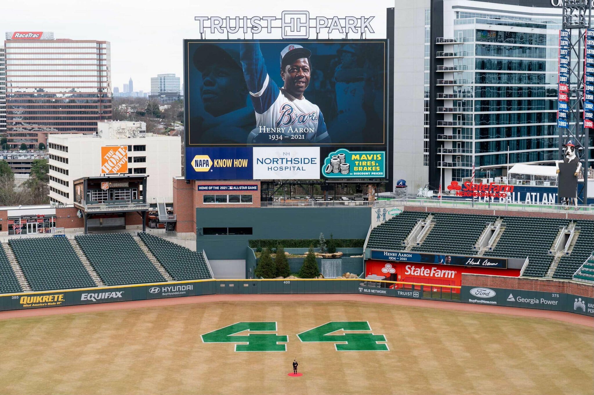
Strange doings yesterday in Atlanta, as a memorial service for Henry Aaron was held at the Braves’ ballpark. As you can see, they emblazoned a huge “44” in the ballpark’s outfield grass — a simple, straightforward gesture.
Or at least it should have been simple and straightforward. But it was puzzling on several levels:
First, why would they use green, a color that Aaron never wore at any point in his career? Why not use Braves colors?
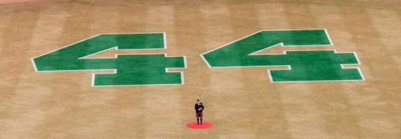
Second, the two numerals appear to have been misaligned, with the second “4” rotated slightly counterclockwise relative to the first one (click to enlarge):
Third, and most confoundingly (at least to me), what is the negative space in the numerals supposed to be? Here are some of the interpretations and guesses that I saw on Twitter during the course of yesterday afternoon, and my reactions to them:
• “They’re tomahawks.” Uh, really? If so, they’re the weirdest-looking tomahawks ever, and certainly nothing like the Braves’ signature tomahawk. I don’t see it.
• “They’re hammers, for Hammerin’ Hank.” That seems even less visually apparent than the tomahawks. Again, I don’t see it.
• “They’re spears.” I suppose you could make that case. But it would be very a strange choice, since the Braves have never used spear imagery (thankfully), plus spear tips are usually depicted as being symmetrical, not pointing down.
• “They’re arrows, like in the FedEx logo.” Okay, but what would that be symbolizing, especially since the arrows are pointing to the left (which in our culture indicates going backwards) and slightly downward (please, no “six feet under” jokes)? I don’t understand the rationale.
In short: There’s no plausible explanation, at least that I can think of, except maybe that they used a gimmicky font with a very funky “4.” But why would they use a gimmicky font for a memorial service? It doesn’t make any sense.
I figured there had to be something obvious that I was just missing, so I tweeted a query. To my surprise (and, I guess, relief), it turned out that I hadn’t missed anything — nobody else had a good explanation either. But one of my Twitter followers, Matt Snyder, suggested that I ask the Braves’ field/groundskeeper honcho, Tyler Lenz. That was an excellent idea, so I DM’d Lenz. While waiting for him to respond, I scrolled through his Twitter feed and found a photo that he posted on Saturday, showing the “44” before the white border had been added:
One the best to ever do it. #44 pic.twitter.com/h2DKsljnna
— Tyler Lenz (@T_LenzTurf) January 23, 2021
I figured one of his followers must have responded to that tweet by asking him about the negative space in the numerals — but nope.
A little later, Lenz got back to me. He said:
The font was chosen by people much higher up on the food chain than myself. And there is no subliminal message associated with it.
It was done in green because that’s what we’ve used in-season for Hank Aaron Week in the past.
So that’s our answer (or, in the case of the font, our non-answer). Very strange. I’ll contact the Braves today to see if I can learn more.
For all photos, click to enlarge
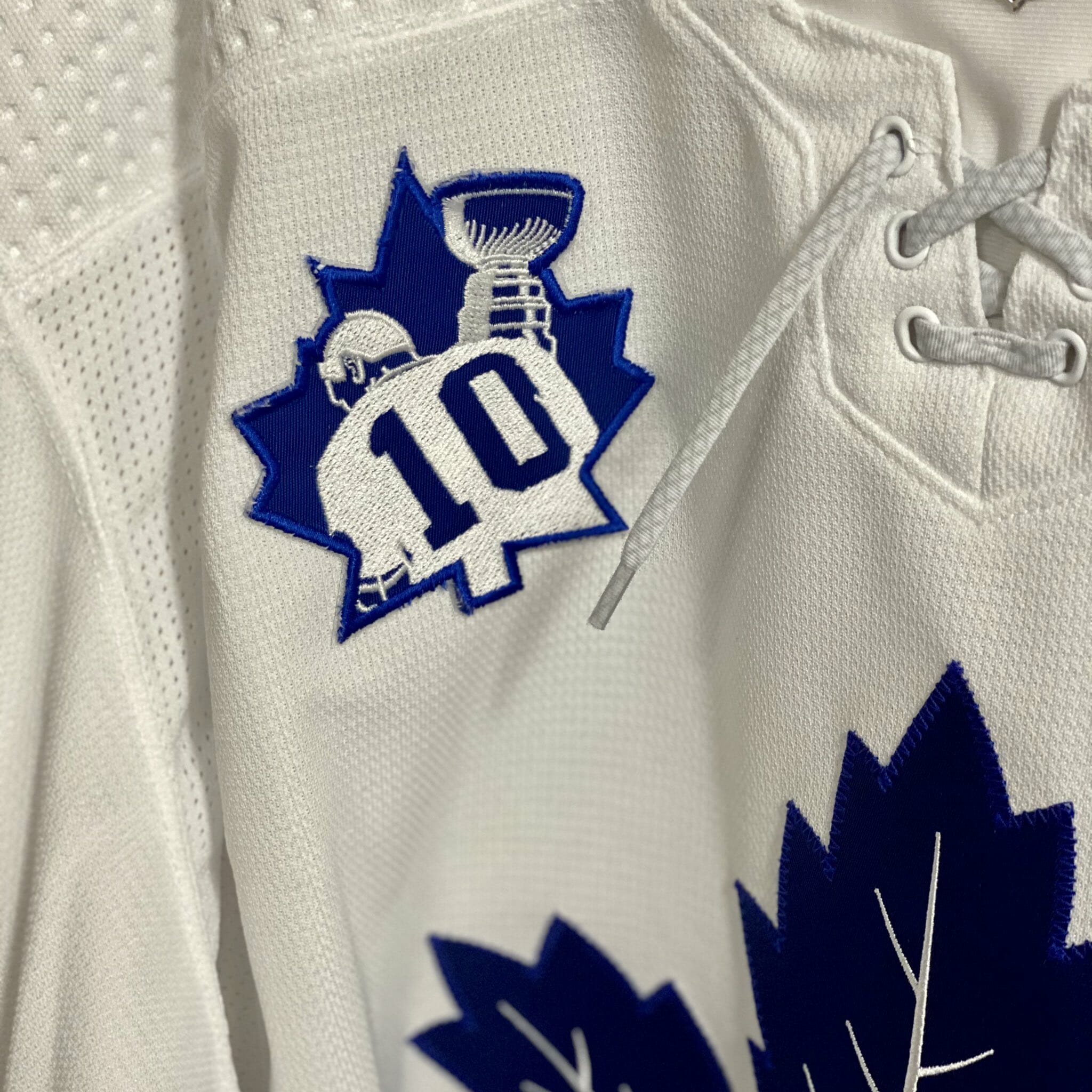
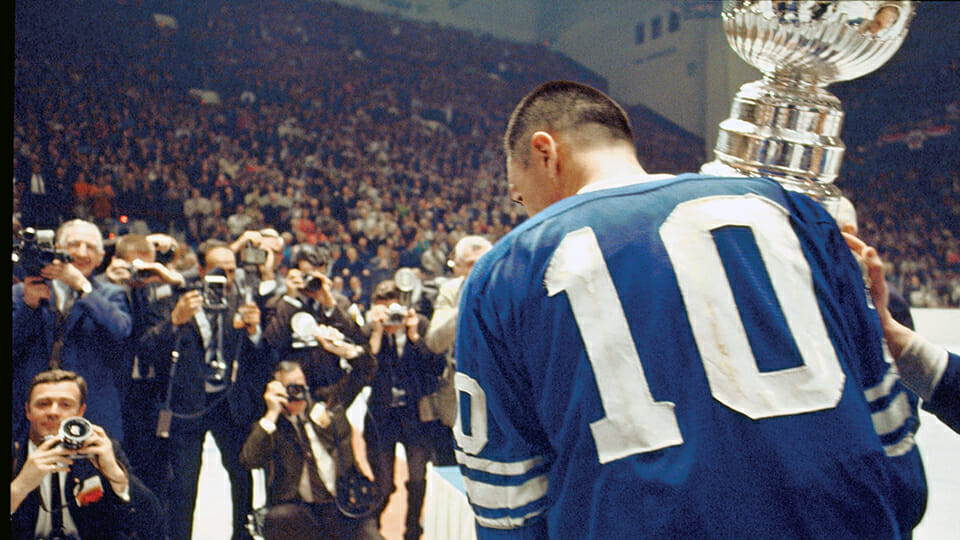
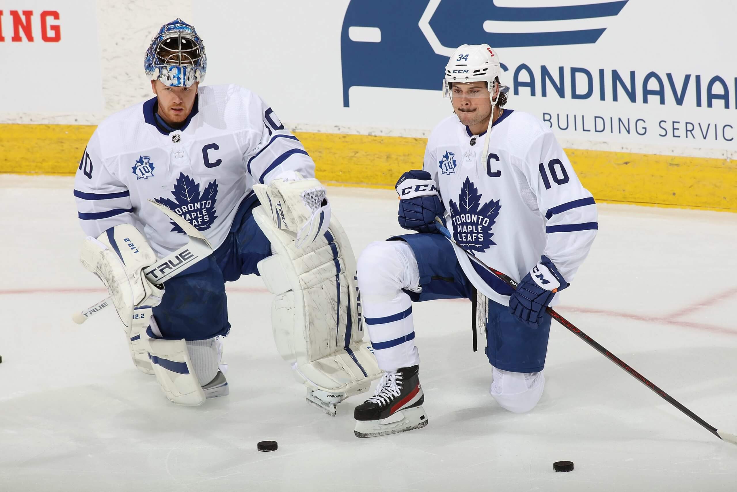
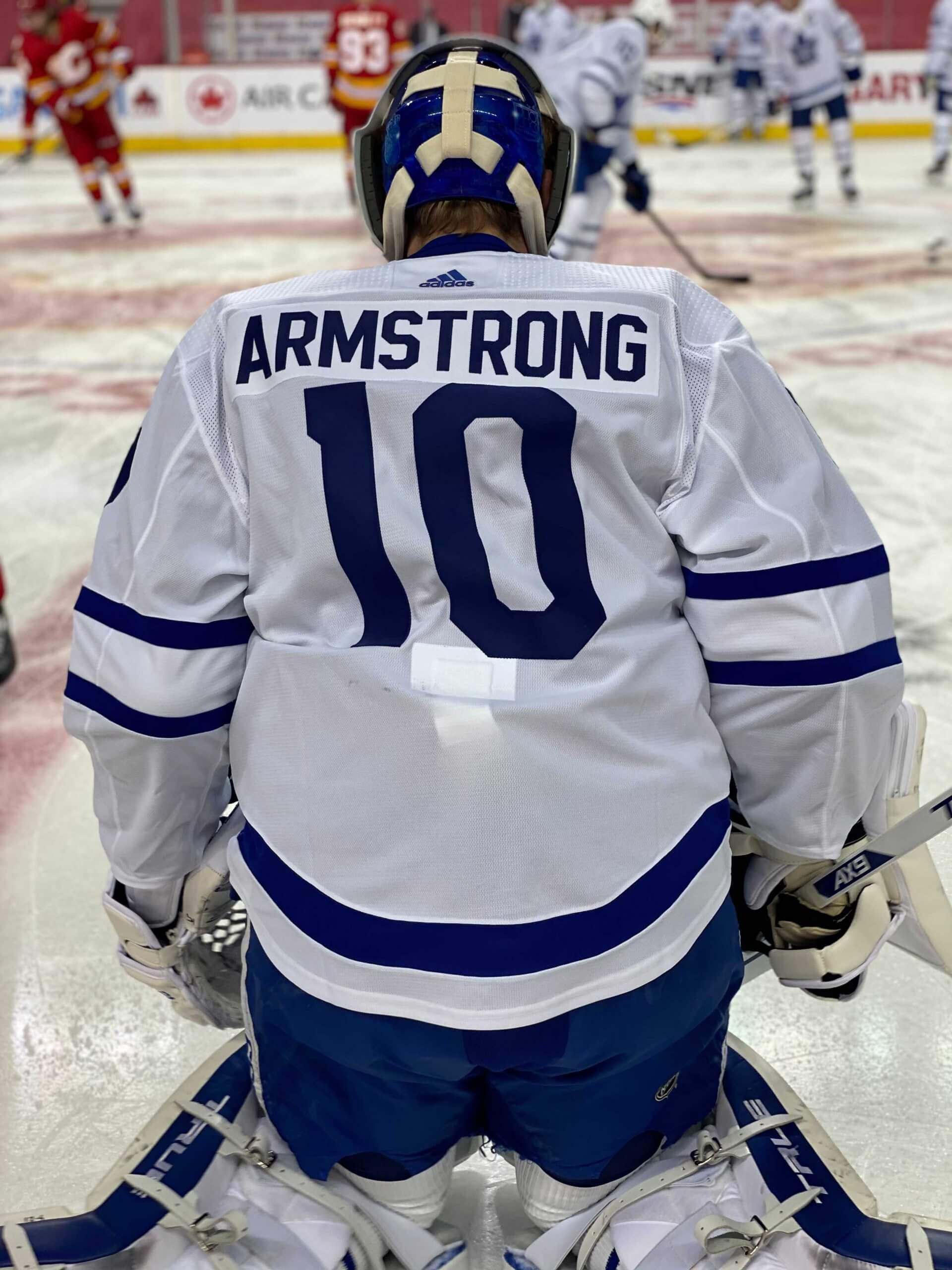
Speaking of memorials…: Longtime Maple Leafs star George Armstrong died on Sunday, and yesterday the Leafs honored him with a really interesting memorial patch. It’s based on this photo of Armstrong posing with the Stanley Cup after the Leafs won the 1967 championship (which was the last time they won the Cup, incidentally; click to enlarge):
In addition to adding the patch, the Leafs all wore Armstrong’s No. 10 and his NOB (even though Armstrong played entirely in the NNOB era) during pregame activities:
I’m trying to think of any other examples of memorial patches, from any sport, that show a rear view of the honoree, and for now I’m coming up empty. There are some non-memorial examples (in MLB, e.g., the Yankees saluted Mariano Rivera with a rear-view patch, but that was for his retirement, not for his death), but I can’t think of anything quite like this Leafs/Armstrong patch. Anyone..?
The Ticker
By Lloyd Alaban

Baseball News: Here’s a look at the new corporate naming signage that’s being installed at the Brewers’ ballpark (from @TheRealKiefer).

Football News: Cutouts will fill the stands at Raymond James Stadium for the Super Bowl (from Mike Chamernik). … This video follows some of the Patriots’ equipment staff while they speak about the team’s uniform history (from Chris Michael Gil). … Here’s a closer look at what would have been the NFC’s jerseys and AFC’s jerseys for this year’s Pro Bowl (from @thechodog and @philenespanol). … The National Bobblehead Hall of Fame released bobbleheads celebrating the 35th anniversary of the Bears’ Super Bowl XX win (from Kenneth Traisman). … New uniforms for Jackson State (from Jonte Robertson). … Here’s a uniform history of the CFL’s Edmonton Football Team (from Wade Heidt).

Hockey News: Black alternates last night for the Bruins. … Following up on an item from yesterday, the Capitals released some additional details about their new alternate uniform, which made its debut in last night’s game against the Islanders (from multiple readers). … Ducks G John Gibson wore a Kobe Bryant-themed mask last night to mark the first anniversary of Bryant’s death (from Wade Heidt). … We may have had this item before, but it’s worth repeating: The Wild have moved all of the Minnesota high school hockey sweaters from their arena concourse to the stands. Some have accompanying head cutouts too (from Jakob Fox). … The Huntsville Havoc of the SPHL will rebrand for one weekend as the Rocket City Long Dogs (from Tyler Earles). … Maybe it’s just the lighting, but it appears that Wild players have inconsistent helmet colors (from @PullThroughPerr).

Basketball News: Blue vs. blue last night for the Wizards and Rockets (from Jordan Wert). … The Clippers wore “Kobe” facemasks last night, to mark the first anniversary of Kobe Bryant’s death (from Jakob Fox). … Speaking of Bryant, the small city in Italy where he lived unveiled a plaza in his honor (from Timmy Donahue). … Ohio men’s wore gold shoelaces last night for pediatric cancer awareness (from our own Alex Hider). … Color vs. color last night for Pitt and Clemson women’s (from @FalcoNat38). … The NBA initially decided not to have an All-Star Game this season, but now there’s talk that the game may take place after all, perhaps in early March.

Soccer News: Manchester City went mono-sky blue, a rarity, yesterday (from Nicky Guerrero). … Wisla Krakow teased their new kits (from Ed Zelaski). … New uniforms for Japanese side Ehime FC. “The back of the uniform shows a detailed outline of the Ehime Prefecture on Shikoku island,” says Jeremy Brahm.

Grab Bag: Here is NASCAR driver Austin Cindric’s first NASCAR Cup Series car (from Jakob Fox). … New kits for the Toronto Arrows of Major League Rugby (from Andy Buck). … The next few items are from Timmy Donahue: Buffalo police officers will need to have their last names visible on their uniforms, except during a protest. … The Maine State Police revealed 100th-anniversary badges, which are replicas of the first badges issued to troopers. … The New Hampshire State Police is hoping to expand its applicant pool by ending a ban on arm tattoos. Tattoos deemed to be racist, sexist, or indecent are still not allowed. … The U.S. Army has introduced changes to its hair policy for female soldiers. … New logo for Anchor Steam beer (from Scott Rogers). … Amtrak has revealed its 50th-anniversary trains. One of them, named 46, was supposed to carry then-President elect Joe Biden to Washington for his inauguration, but the trip was canceled due to the Capitol insurrection earlier this month (from @bryanwdc). … All five teams in New Zealand’s Super Rugby Aotearoa have unveiled new alternate kits (from Sy Hart). … Australia’s national rugby union team, the Wallabies, is consulting with past players on the design of the team’s next shirt (from Mark Ward).

The Anchor Steam redesign just looks cheap and hasty. What the **** is “retro-modern” supposed to mean, especially next to the awesome, actually retro original?
Agreed. Anchor Steam’s label was iconic in craft beer. And they’ve completely abandoned it.
Yep. Generic, lazy, and sure to look dated in the future.
You know, I don’t think I’ve ever had an Anchor Steam. Is it good?
Anchor Steam is a great beer.
Actually, I really like it.
The only thing that irks me is link. The name works so much better as “Anchor Steam Beer” or simply “Anchor Steam”. I don’t know that they’ve ever separated those two words before.
I really like that Caps 3rd in a vacuum, but from any kind of distance it sure makes them look like the Rangers on the ice.
I also have to say, I’m really impressed with how well they kept this from the public. As far as I’m aware, everyone thought they were carrying over their red throwback 3rd until about two days ago.
Agreed. I love the look in the abstract, or maybe as fan apparel, but watching the game last night I had a hard time seeing Caps players as Caps players. The continuity of the red stripes, especially when seen from the back, and the white number on back, just seemed un-Caps to me. The more uneven striping of the otherwise very similar 2018 Annapolis game uniform made that blue Jersey work better on the ice for me.
I believe there was a preseason photo that showed Ovechkin wearing the new alternate socks during a practice, but that was the only hint I’m aware of.
Yeah, I am kind of on the fence about this Caps uniform. Strange feeling. I don’t hate it because it has proper striping and a simple, traditional feel. It doesn’t suck and I am thankful for that. However, it feels generic and uninspired. They do remind me of recent alternates the Rangers have worn.
A Capitals regular third should consider using the Weagle as the primary crest (though they should consider that for their primary uniforms). It is an alternate so they should put some more stars on the uniform.
I don’t like the big blocky white shoulder yoke. It looks unnecessary just like the white yoke looked unnecessary on the original red Caps sweater.
Look like Rangers winter classic rejected template
The white yoke on the Caps’ original sweaters was there to visually balance the rarely-seen white breezers. Just like the red yoke on the white jerseys was there to reflect the red pants. When Washington went full-time to dark blue shorts, it sacrificed an important part of the team’s intended visual identity, and they wound up looking like the Canadiens with stars.
Hey as a Canadian I’ll let ya know that the photo of George Armstrong is kind of an iconic shot up here. Recognized it as soon as I saw it. So it’s kinda cool that the Leafs went deep into the memory bag to pull that one.
That’s cool. Reminds me of the famous image of Joe Namath running off the field after SB III
That has to be the best memorial patch of all time. I love how it’s a creative expansion of the old “memorial number patch” concept (a circle with a number in it). This patch takes the number patch and expands it beautifully.
Instantly the memorial patch that all memorial patches should aspire to be. Such a touching and intelligent design.
Maybe it’s a limitation of the embroidery detail, but it looks like he’s wearing a helmet in the patch.
Maybe green because that was the most available paint they had in house. If they use it for painting the turf early in the season, to make it look greener, and did not have enough blue paint to do something that large. I would imagine they never have that much paint other than green and white available unless they are ordering it for a special reason.
Chris, did you read the part where the groundskeeper explained why they used green?
Wrote this on Facebook as well…Perhaps when green is used in-season it looks to a lay person (me included) as if the pattern is “mowed” in similar to the arch at Busch Stadium. But in the winter the grass is so yellow it stands out as a choice.
That still doesn’t explain the font choice.
The biggest loser in the Anchor rebrand is California Lager
link
That’s cool. Reminds me of the famous image of Joe Namath running off the field after SB III
Not sure what qualifies the navy trench coat on the DC police chief as “one-off custom” other than the badges and patches. Double breasted, belted trench coats – unadorned – are widely available in a range of prices, from $79:
link
to $1500:
link
The Leafs’ Chief memorial is my new favorite memorial patch. So evocative!
My previous favorites: Cubs’ Harry Carey, Twins’ Herb Carneal.
I’ll still take the Cowboys’ fedora for Tom Landry. But this Leafs patch is definitely in the discussion, I agree.
My Mt. Rushmore for memorial patches:
Tom Landry, Roger Nielson, Jack Ramsey, and Gene Autry.
Late comment to yesterday’s piece with the all time home run timeline. That was amazing. It occurred to me that except for Pujols possibly moving up a few spots, this list is frozen for the next several years. I don’t see anybody crashing the party until Mike Trout or Bryce Harper, who are still several hundred HR’s away from making the list
DC Chief Contee is wearing the “Authorized Command Staff Winter Long Coat”. It is issued to Commanders and above and mostly used during the inauguration. His 2 badges are his everyday badge that is the same as all officials and the Maltese Cross version, that is the Chief of Police Cerimonial Badge. Chief Contee is lauded by nearly every person or entity in DC. All agree he is the right officer for the job and an incredible leader.
-Sgt T. Steffes, MPDC retired.
Got it. Since it’s not remarkable or notable, I’ll remove it from the Ticker. Thanks!
Anchor Steam is Twisted Tea now?
It would appear so.
Paul, regarding yesterday’s mention that the SB featured two teams with standard block – if you look at the Bucs 7s, they’re definitely not the standard 7. There’s a vertical part on the top-right of the numeral. Not sure if that counts as custom, and in spirit they’re ‘standard block’, but it is an oddity.
My guess here is that because they have such thick (embarrassingly so) multi layered outlines that they have to modify the “7” so there is sufficient space for the vertical part to clear the left side of the top horizontal side.
I associate “standard block” with the diagonal angles on the left side of the “4’s”. But all that means is there are quite a few fonts that qualify as “standard block”.
You could definitely say George Armstrong was a well-dressed coach. He coached the major junior Toronto Marlboros in the 1970s. Here he is on ice in practice wearing a necktie.
link
Not everything has to make sense.
Sure. But certain things — like, say, giant numerals painted on the field as part of a preplanned event to salute one of the greatest baseball players in history — usually *do* make sense. Or at least they have an underlying rationale instead of being random.
100 bucks for the SB cutout, no thanks. Man, the NFL loves to squeeze the money out its fans.
About the Boston Bruins alternate that was worn last night. I would be all for keeping that same uniform, but make it brown instead of black:
-It is an alternate so this uniform would then differ more from the primary uniform.
-If they were brown an opporunity for the Bruins to celebrate their original colour scheme.
-Also, it would look damn good.
If the plan is to keep the 44 on the field during the regular season, they had to use green because it is an MLB rule. Teams are not allowed to use any other color in fair territory. This came up several years ago when I asked the Rays why they didn’t use a yellow sunburst in the outfield (colored logos in the outfield are common in college). Turns out MLB wants everything to look “natural” in fair territory, even when the teams are playing on artificial turf. Presumably the 44 will look more natural when the rest of the grass is green. From what I understand, other colors are fair game in foul territory (e.g., postseason logos, opening day/weekend/week logos, FieldTurf/AstroTurf logos).
Except for numbers/logos/etc. on the mound..?
Good point. That would seem to be an exception. If I had to guess, I’d say I was talking to the Rays about this before teams started using colors on the mound so it didn’t come up.
Some of those mound logos seen last year were/may have been superimposed by the broadcasters.
“The broadcaster could even place small logos on the back of the pitcher’s mound, all in an attempt to make up for the lost games this season and give advertisers as much exposure as possible.”
link
Right, but we’ve seen team-colored (i.e., not green) logos on the mounds for many years now.
And I think *some* of the ad logos were real, not digital.
We have, yes. But on the back of the mound is a little less distracting to the players than having a huge team colored logo in the middle of the outfield…
In either event, it’s distracting.
Not arguing about whether it is or isn’t distracting. Was just questioning Cork’s earlier point about only green being allowed in fair territory.
I’m assuming the white on Armstrong’s head is supposed to be his hair, since he wasn’t wearing a helmet, but it’s very odd looking. If I hadn’t seen the original picture, and wasn’t familiar with the history timeframe of helmets in the NHL, I would think this was a helmet.
First thing I thought, “why is does his patch show him in a helmet? He didn’t wear one.” Then, after comparing the photo, it looked a little more like it’s supposed to be hair. I agree, it does look strange, and very helmet-like.
All that said, I really dig that memorial patch design. Someone likened it to Namath’s walk-off after SB III. I wonder what other iconic photos or moments like that could ultimately be used for memorial patches. I do feel a little strange geeking out about potential remembrances for living folks though…
If they weren’t using a photo-negative of the original image, it wouldn’t look that way.
Dark hair against lighter skin would look better.
Howdy Paul,
Two things. I wonder if for the Aaron 44 it’s not so much negative space but the connecting piece of the stencil (sort of like how the old football yard numbers have spaces in them).
Second, for a memorial stick from the back, let’s go to … UNI-WATCH! In 2019 UNM unveiled its memorial sticker for Nahje Flowers, and it was the second time we had used that type of sticker, the first being for the 2016 season with Markel Byrd, who was depicted from the back.
link
Hope you guys are well!!!
Frank
Ah, thanks for refreshing my memory on that, Frank!
The memorial offered by Atlanta vs. Toronto is a great topic today. My take is that it highlights the difference between a memorial that is a perfunctory acknowledgment vs one that is presented with some real thought, emotion, and care. It may be controversial, but it’s how it looks to me.
I guess Anchor Steam only has to buy two colors of ink now.
I wonder if the font is just from the availability of a #4 stencil that large. Like if a nearby team/university uses that font and used it for something they did and Atlanta chose it because it was the best they could find on short notice?
I wouldn’t be surprised if the font chosen for Aaron’s 44 is the new uniform font for the Braves.
Nightmare scenario;)
FWIW, I’m not sure that the 44 possible misalignment isn’t just a perspective illusion: if you look at the grass cuts (which look parallel), both 4’s look as if they are aligned to them…
I thought that at first, too. But look at the photo in the groundskeeper’s tweet — looks misaligned there too, at least to me.
I saw the Bears Super Bowl bobble heads on the local news last night. Why in the world Urlacher is included is beyond me. Even the second Ditka in uniform isn’t right, obviously. How about Perry, Hampton, Dent, Singletary?
It really is terrible given how many ’85 Bears had and still have incredible personalities.
This is a stretch, but if you rotate the 4 clockwise it appears to form the initials “HA”.
It does! I’m sure that’s coincidental, but good spot. I’m going with the stencil theory for now.
Not sure if other people are having the issue, but photos aren’t displaying on the page. This has happened before.
If I click where the picture should be, then it opens a new tab with it.
One other person has reported that. I couldn’t duplicate it at my end (tried lots of browsers, devices), so I thought it was a tech issue at his end. But now that you’ve also reported this problem, I’ve alerted my webmaster. Sorry for the frustration.
If you are browsing from Safari on a Mac, hit the reload icon while holding the shift button down.
I had this happen in the past. I disabled my ad blocker and reloaded and it was fine. Then I reactiviated the blocker and it stayed fine. Dunno if that matters….
Just wanted to say 3 different rugby related articles in the ticker today, possibly a record.
Looks completely obvious to me that the negative spaces in the “4s” are tomahawks, for what it’s worth.
1983 Rutgers throwbacks on tap for tomorrow night: link
Nice uniforms, but it looks like the seamstress who cut out Jacob Young’s “42” had too much to drink last night.
Austin’s MLS team unveils new away shirt, complete with Adidas hype to make white sound like an interesting color choice.
link
Additional uni-verse interest in the Anchor rebrand: this article comparing it to the short-lived 49ers helmet logo change in 1991. link
For what its worth – the memorial inside the stadium has his number in the proper font that the team wore at the time
link
Although it looks like they wore numerals in both that font and a standard block font during the early 1970s.
link
link
I’m sure this has already been run down somewhere on this site, it was just interesting and new to me.
Calling mono blue a rarity for Manchester City is a stretch. While sky blue shirts over white shorts is the classic City look, they’ve worn plenty of mono blue. Mono blue was their standard kit from 1976 to 1985. It was also their primary kit in the 2011-2012, 2014-2015, and 2016-2017 seasons. They’ve also worn it as an occasional change kit for years.
“I’m trying to think of any other examples of memorial patches…that show a rear view of the honoree…”
On Roberto Clemente Day 1997 (the 25th anniversary of his death), the Pirates wore a sleeve patch which depicted a rear view of Clemente:
link
link
They removed the patch which celebrated the 50th anniversary of Jackie Robinson’s breaking of the color barrier (which all teams wore throughout the season) for the occasion.
In a vacuum, the new Anchor branding link.
I’m not sure it fits the product, or at least my personal conception of the product, but the design is sharp. I like the limited color palette and the cohesive design of their various beers.
It appears the “true believers” are having an attack of the “Old Good/New Bad” Syndrome.
Eh, I dunno. I’m not usually thrilled about trying to read the minds of our friends here.
And as I said, this certainly doesn’t match my perception of the product. That alone could be a reason to consider it a downgrade (although I don’t).
33 is another number that should return to the Cup Series full time (though I associate it with GM entries and it’s ill-fitting with the rest of the numbers used by Penske) but I’ll enjoy seeing that scheme whenever Cindric is entered/qualifies, even if it sorta-kinda looks like a Dale Sr Chevy.
Love how The Captain goes the extra mile by giving his Fords colored rims.