For all phtoos, click to enlarge
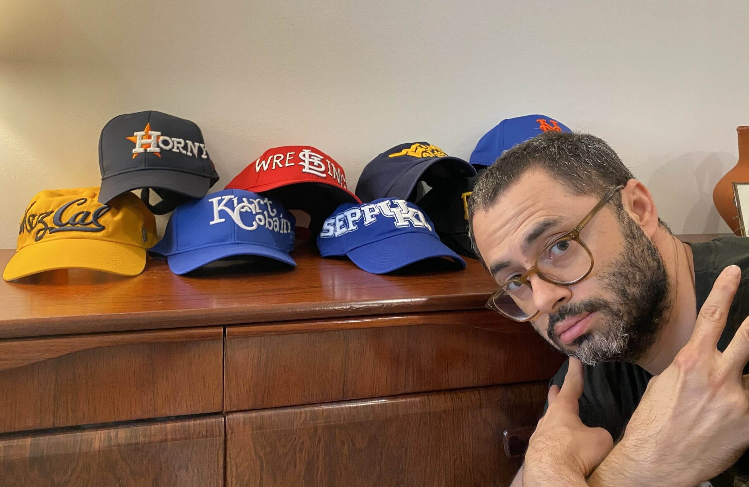
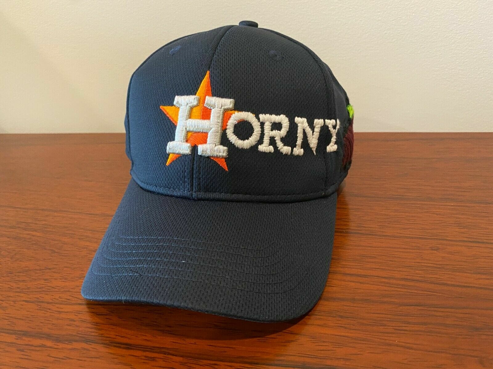
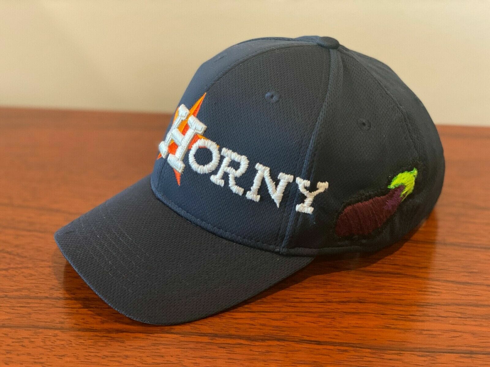
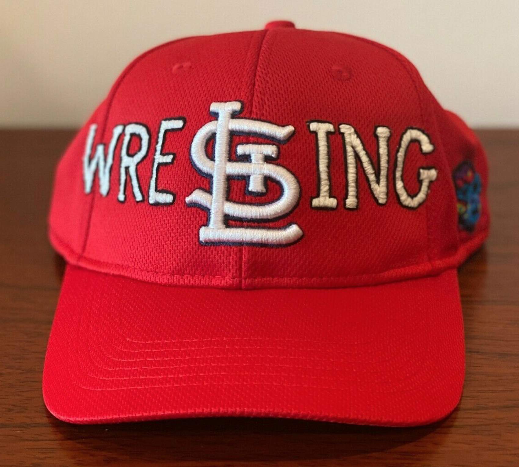
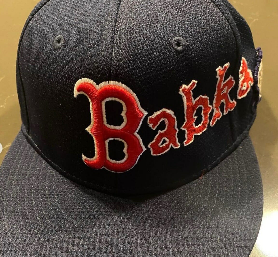
With a few exceptions, I don’t much care for stand-up comedy, and I also don’t watch much TV, so it’s not surprising that until a few days ago I’d never heard of Joe Mande, a comic who also works as a TV writer and actor. He first came across my radar two days ago, when Uni Watch reader Jeremy Cooper pointed me toward this cap on Mande’s Instagram feed:
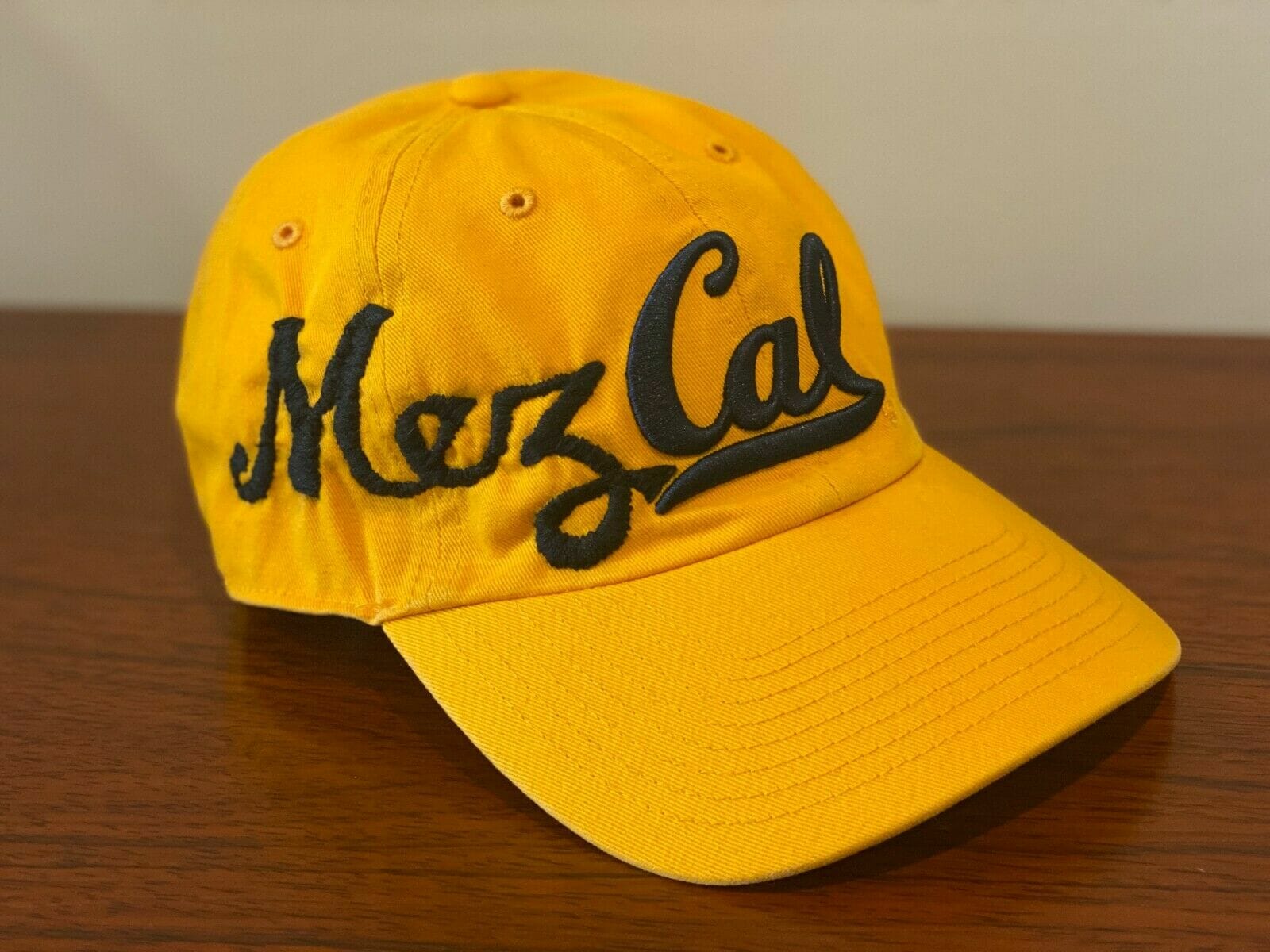
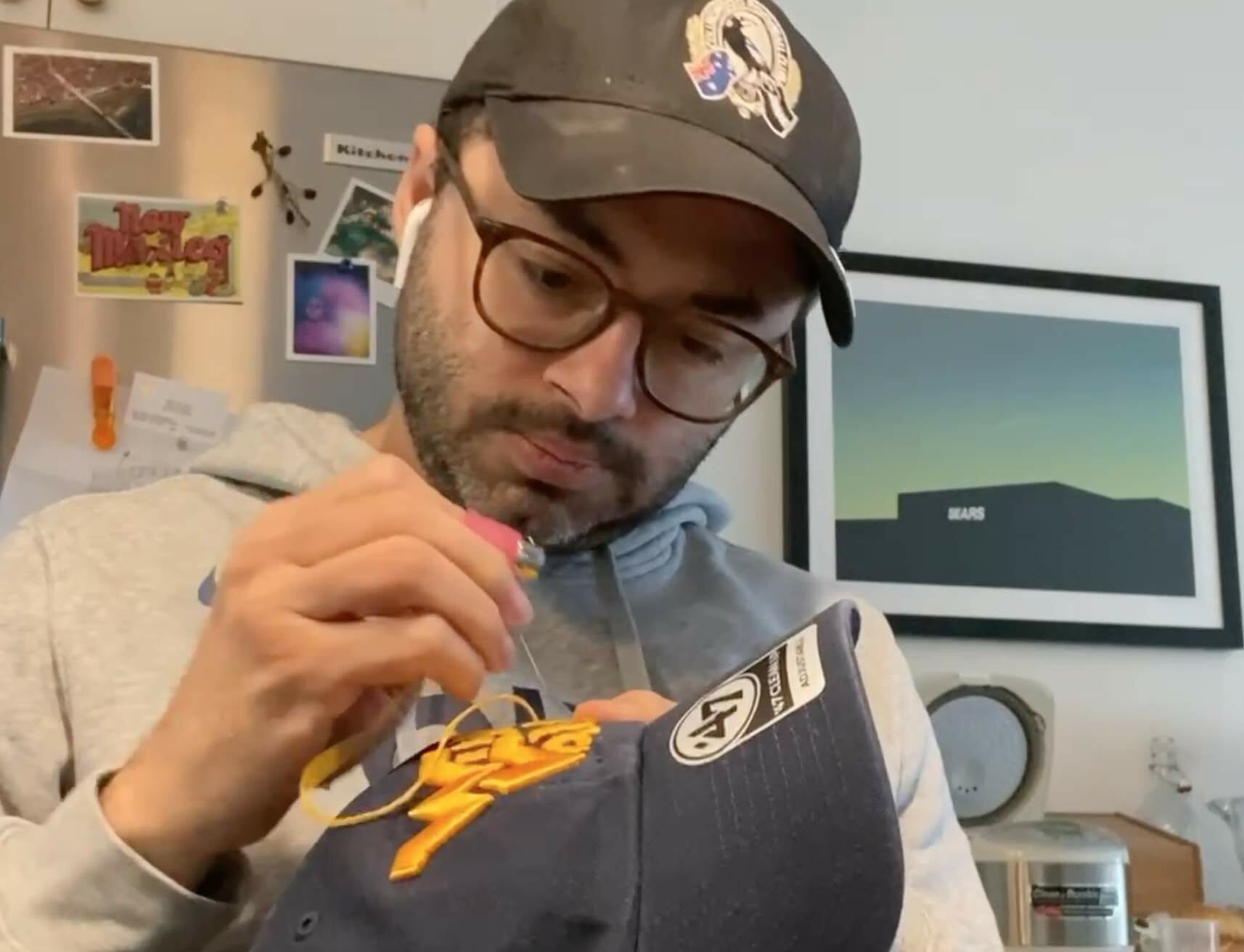
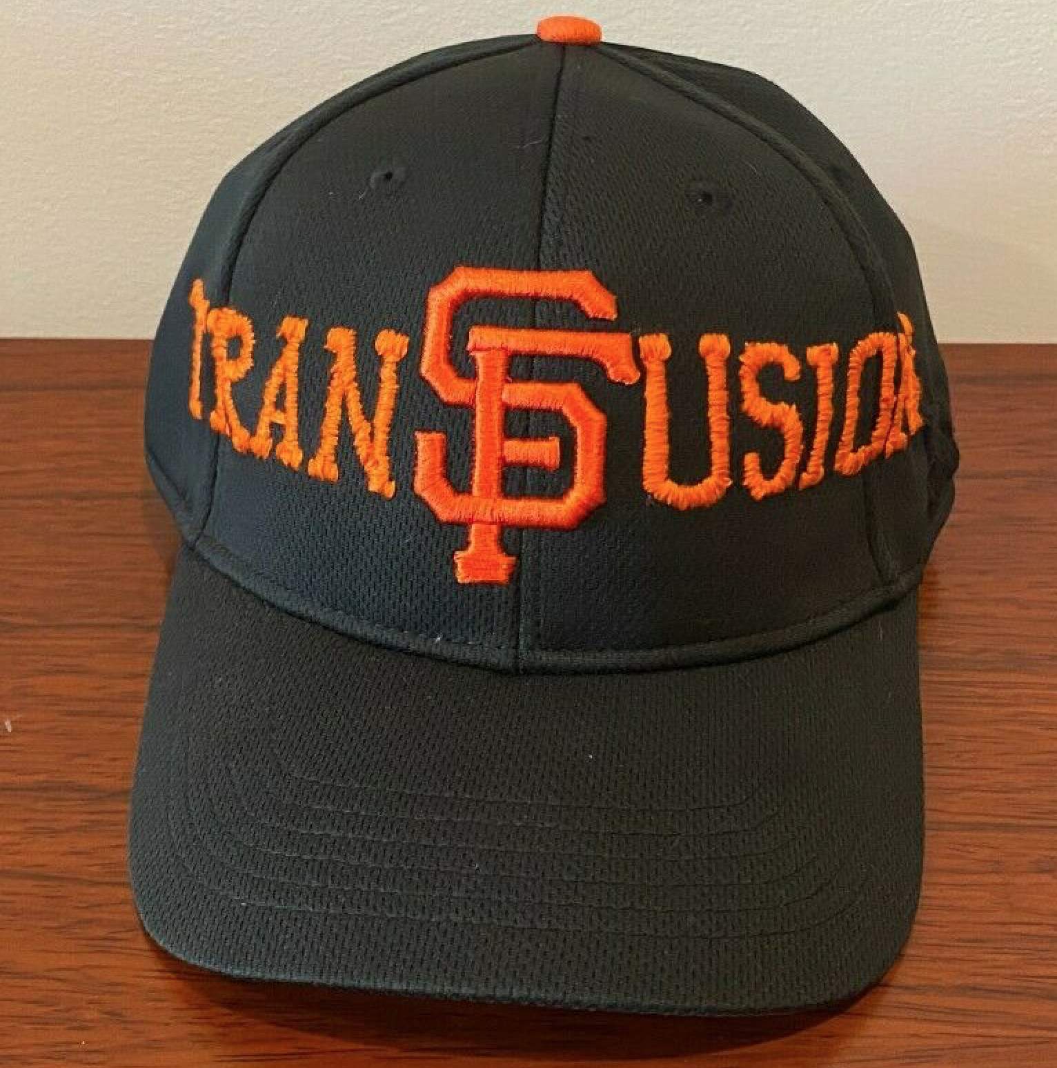
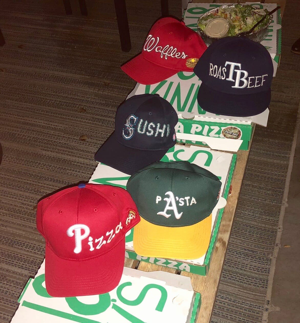
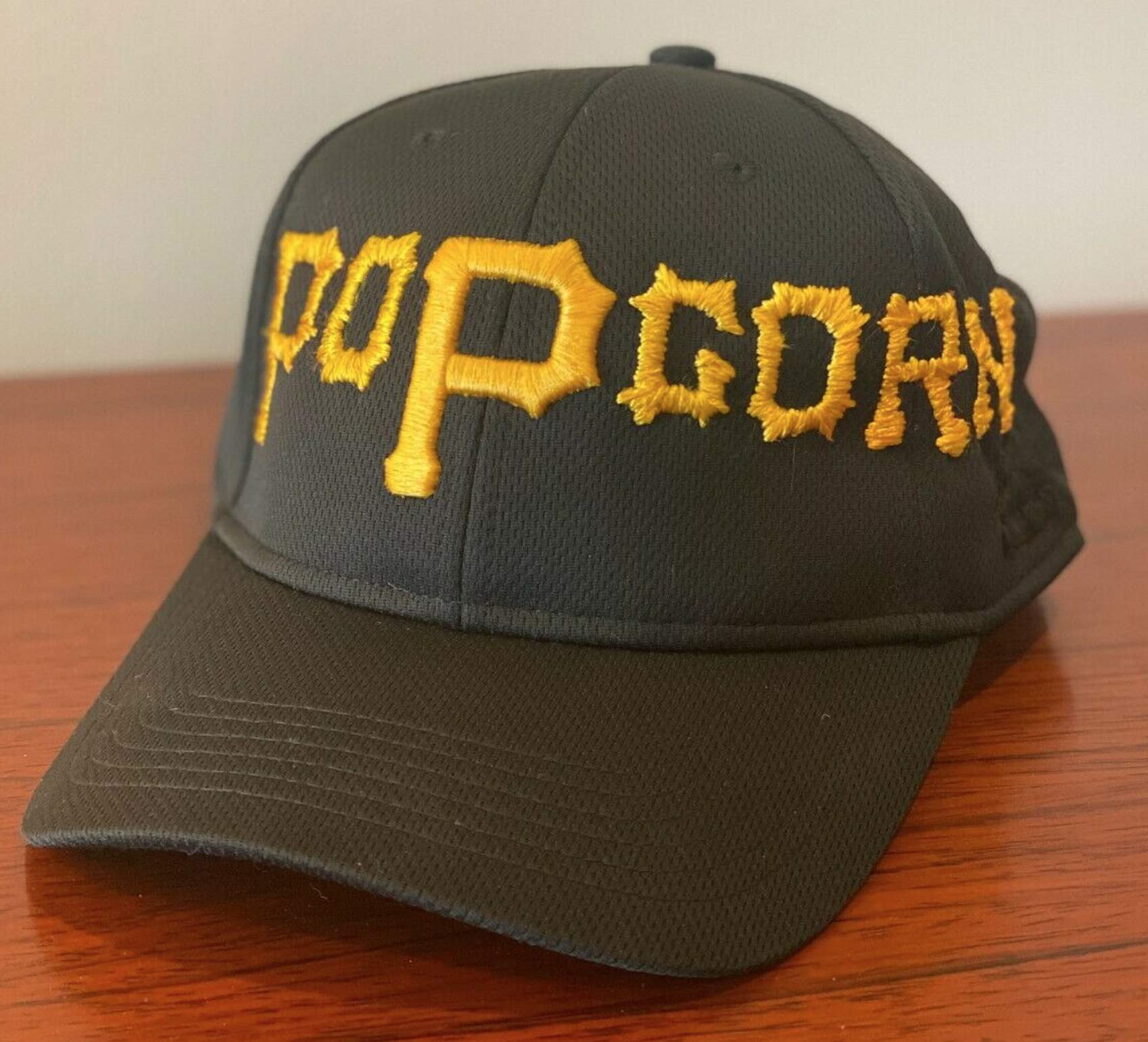
As I quickly discovered, this was just one of many ballcaps that Mande had been modifying lately. Many of them had food-based themes:
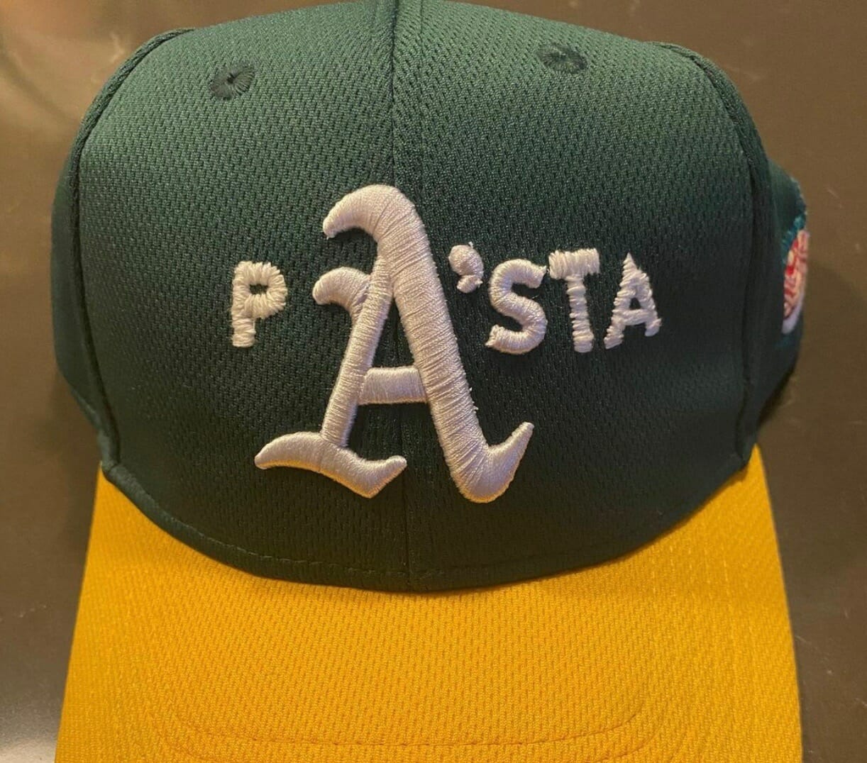
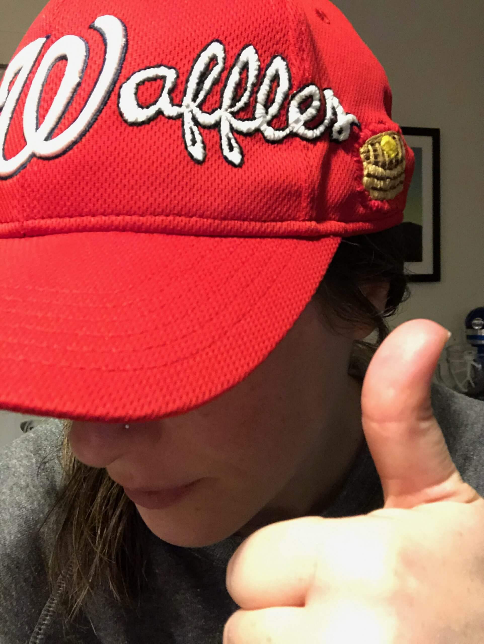
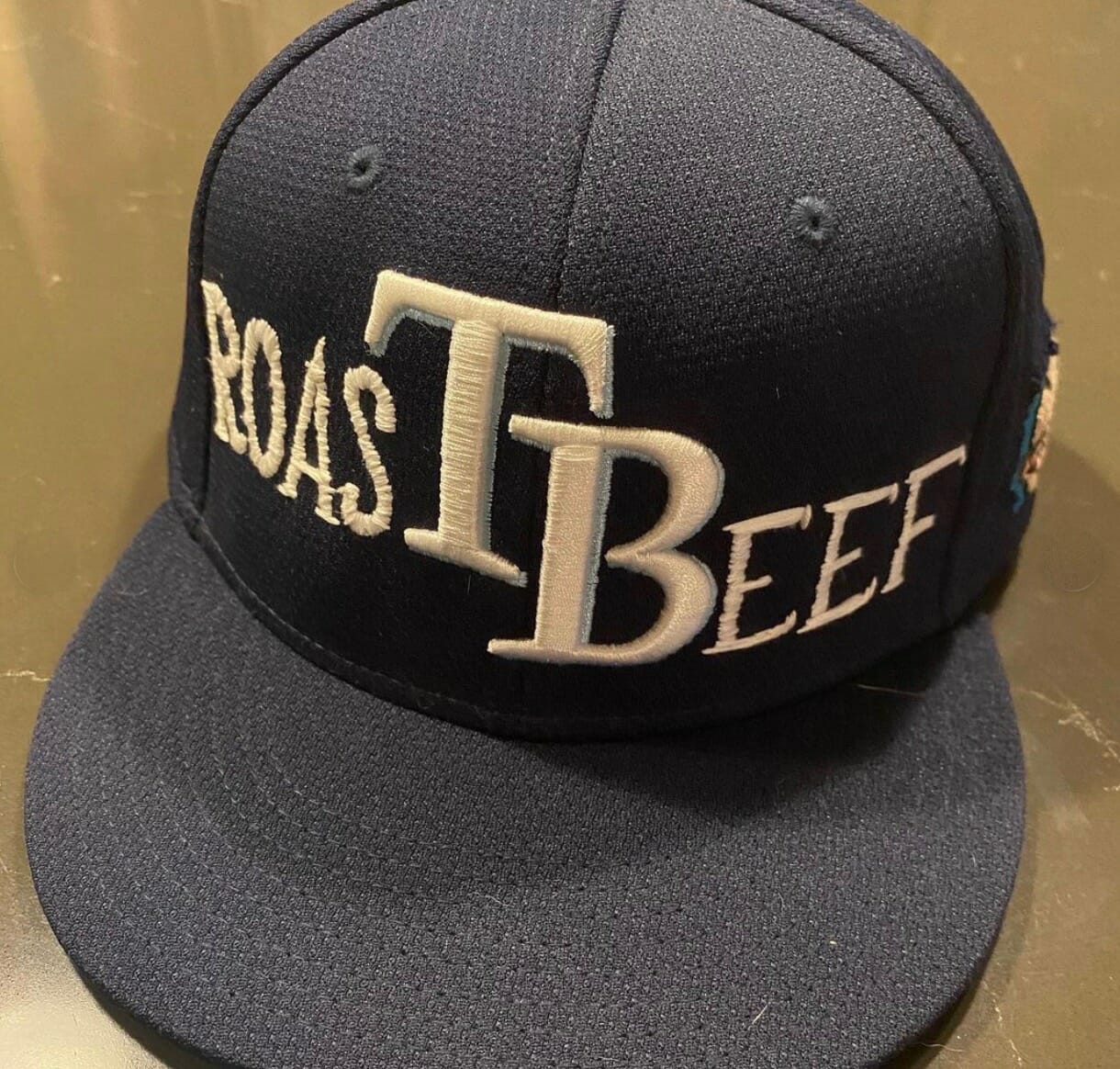
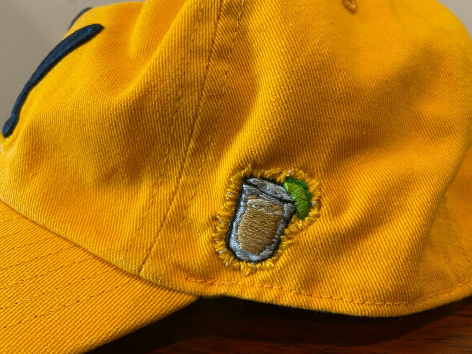
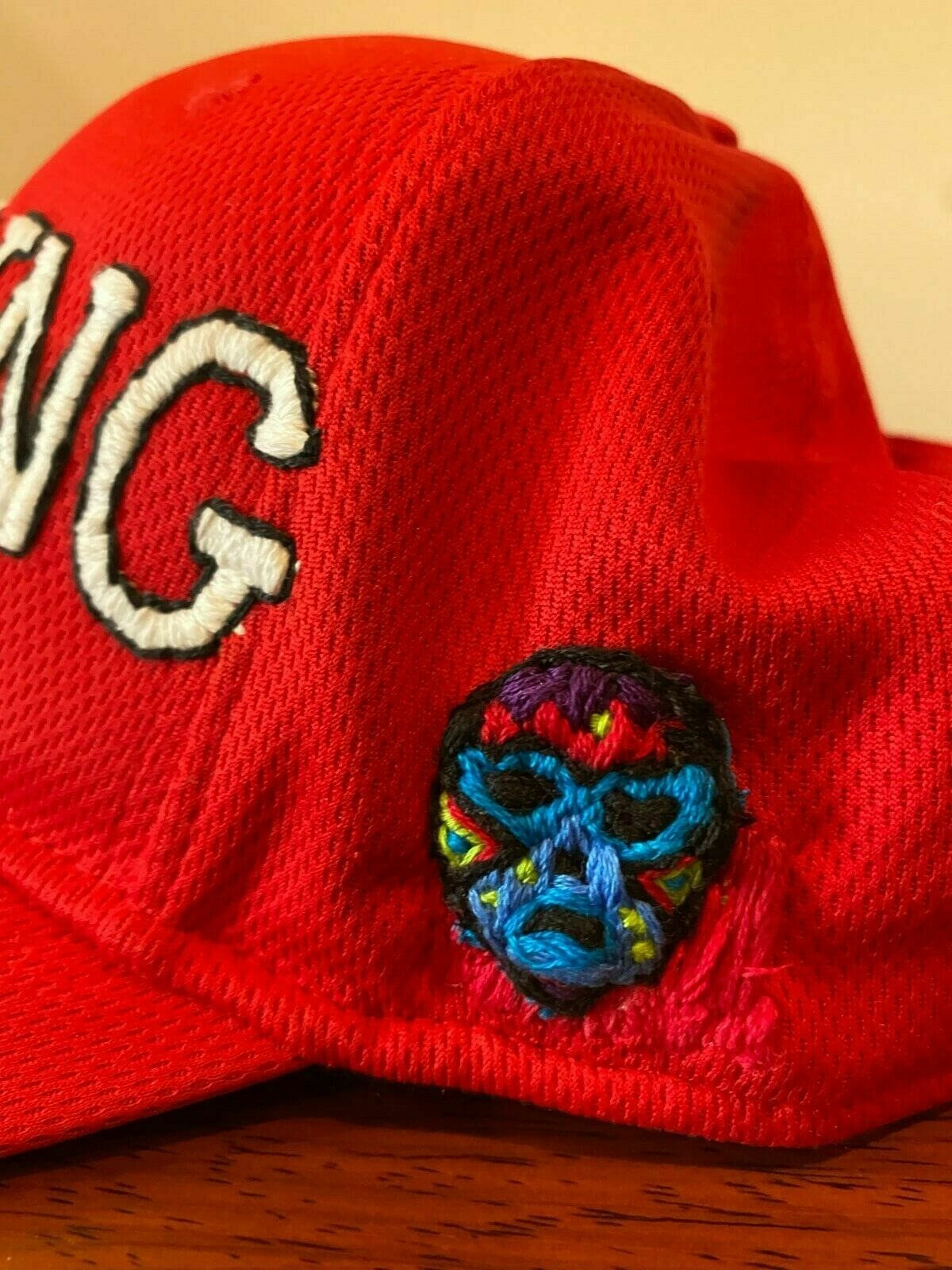
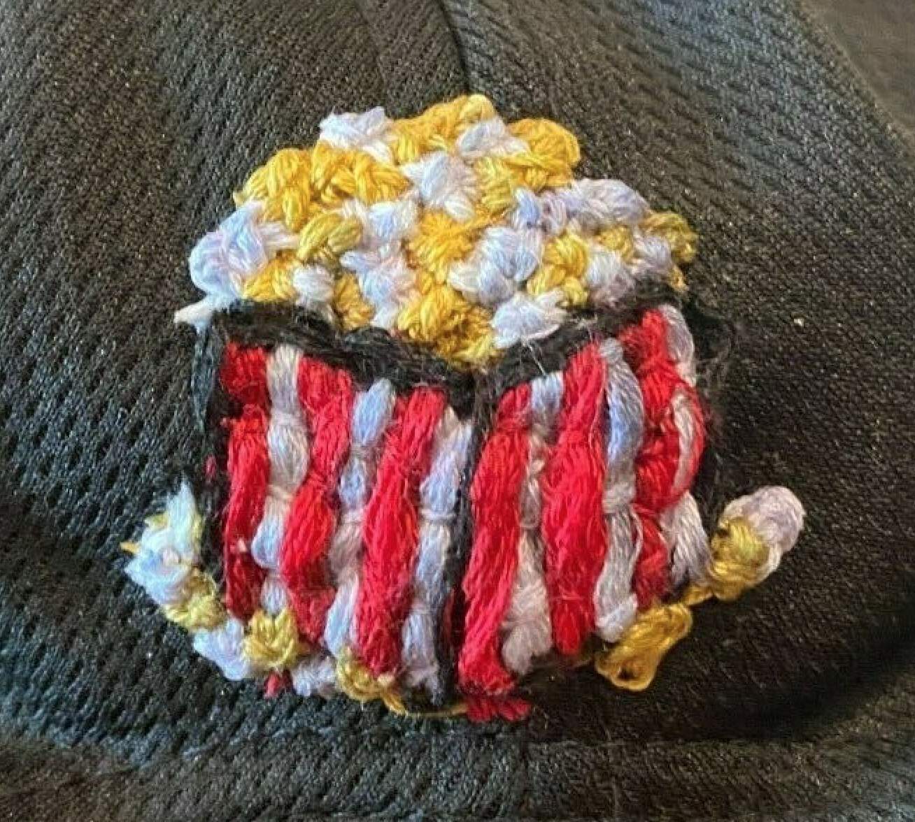
Most of the caps had little embroidered illustrations on the side, where the maker’s mark would normally be:
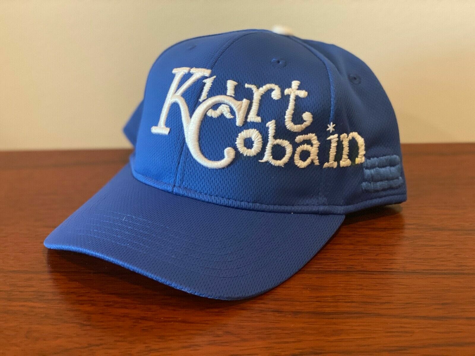
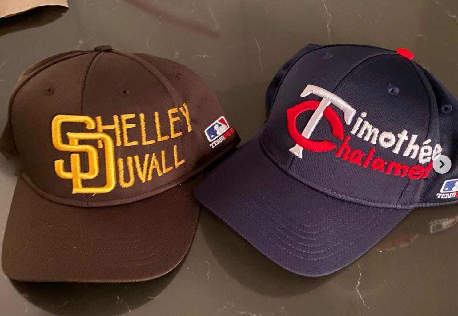
There were also caps that had nothing to do with food, and those were some of the most interesting ones:
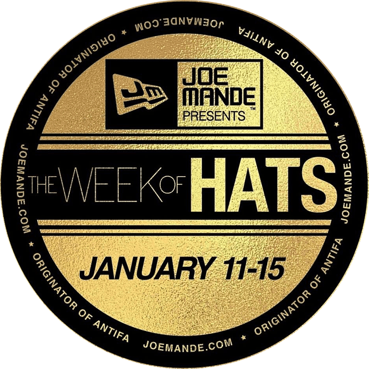
I also learned that Mande is currently in the midst of what he calls the Week of Hats, in which he’s auctioning off 10 of his modified ballcaps — two new ones each day — on eBay, with the proceeds going to charity.
It’s hard to express how much I love these designs. They combine my love of logos, typography, verbal/visual puns, the overlap of sports and food, and DIYism. I wanted to know more — ideally right away, so I could publish something about all of this before the Week of Hats was over — so I got in touch with Mande and asked if we could talk. He immediately agreed, so we talked on the phone yesterday afternoon. Here’s a transcript of our interview, edited for clarity:
Uni Watch: I know you used to follow me on Twitter, so are you a big sports guy and a big uniform guy?
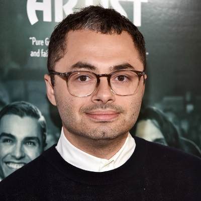
Joe Mande [shown at right]: I’ve been on [ESPN NBA writer] Zach Lowe’s podcast a couple of times, and I feel like we always end up just talking about like, the aesthetics of the new jerseys that come out every season and stuff. So yeah, that that’s always been an interest of mine, for sure. And I’ve definitely been on your website.
UW: When did you start doing embroidery on caps, and why?
JM: I was walking my dogs one day with my wife, early in the quarantine, and I found a Pittsburgh Pirates hat on the ground that I wanted to salvage. I had a yellow paint marker, and for whatever reason I was bored, so I wrote the word “Pizza” on it while I was on a phone call.
UW: Sort of like doodling?
JM: Yeah, I was just doodling as I wrote the word “Pizza” on this hat that I had found on the street. And it didn’t really work — the paint kind of bled into the fabric in an unappealing way. And my wife said that, you know, if I wanted to do what I was trying to do correctly, I would have to embroider.
I happened to have an old Los Angeles Dodgers hat in my closet, and we had some string in a drawer. And so I sort of, in a similar way, in a form of doodling, started writing the word “Lasagna” — or, you know, stitching it — into this L.A. Dodgers hat out of pure boredom.
And then one day while we were getting a Covid test, the person giving the test, who was like in a hazmat suit, complimented my Lasagna hat. I told that story to a few friends, and they all said that they wanted a hat. So then I proceeded to start making hats for a bunch of my friends, and then those people started posting photos of the hats, and I was getting inundated with requests. And then I decided, well, I might as well do this for a good cause, and that’s how we got the Week of Hats.
UW: Oh wow, so I’m very late to this party. You said you found the Pirates cap back at the beginning of quarantine — so that was in the spring? I only learned about it yesterday!
JM: Yeah, it’s been like a way for me to deal with the stress of lockdown and the election. It’s very meditative and tedious to stitch things by hand. So it was definitely a therapeutic exercise for me.
UW: And you actually do all the embroidery yourself?
JM: Yes, it’s all by hand. A lot of people assume that I have some sort of sewing machine, which I do not. I don’t think I could even get a hat under one if I wanted to. I mean, obviously, I know like places like Lids have some sort of apparatus, but I don’t think you could do this on a regular home sewing machine.
UW: Had you done much sewing prior to this?
JM: Not at all. This is all very new. It’s sort of a strange, borderline-upsetting thing to to learn that you’re good at something like this so late in life. But no, I have no training or anything.
UW: Does your wife sew, and did she give you pointers? Did you look up lessons on YouTube? Or did you just sort of figure out how to do it yourself?
JM: I just figured it out. Sometimes I’ll adorn a hat with a little patch on the side, and for that I did watch a couple of YouTube tutorials. But other than that, I just figured it out.
UW: And what is the process? Like, do you draw on the hat first where you want the lettering to be? Or do you just wing it?
JM: I was mostly winging it for a while. And I do think that there is something kind of nice about tiny imperfections in the embroidery, so that it’s clear that this was done by hand. But I have a little chalk pencil, so I’ll sort of roughly draw out where I want the letters to go. And then I do it all freehand.
UW: That’s fantastic. How long does one of these typically take? And I realize some of them have different amounts of lettering and all that…
JM: Yeah, and some have multiple colors. It’s hard to say how long they take because I am still working as, you know, a TV writer. Basically, I’ll work on a script for a few hours and then take a break and watch TV and do some hat work. Usually a hat will take two or three days, but I’m also not, like, fully focused on it during that whole time.
UW: Roughly how many of these have you done?
JM: Let’s see — I’m auctioning 10. And then there’s Lasagna. And then I had a party — well, not like a real party, because I wasn’t breaking quarantine protocols, but I had some friends socially distanced in our backyard a few months ago, and I gave everyone a hat at the end of the meal. That was at least eight hats right there.
UW: Have there been any that like didn’t work out, where you had to scrap it and toss the hat in the trash?
JM: None of them ended up in the trash. But there was one hat where I got pretty far before I realized I had misspelled something and had to go back and remove a few letters and start over, but I was able to salvage it.
UW: Are certain cap brands or models easier or harder to work on that others?
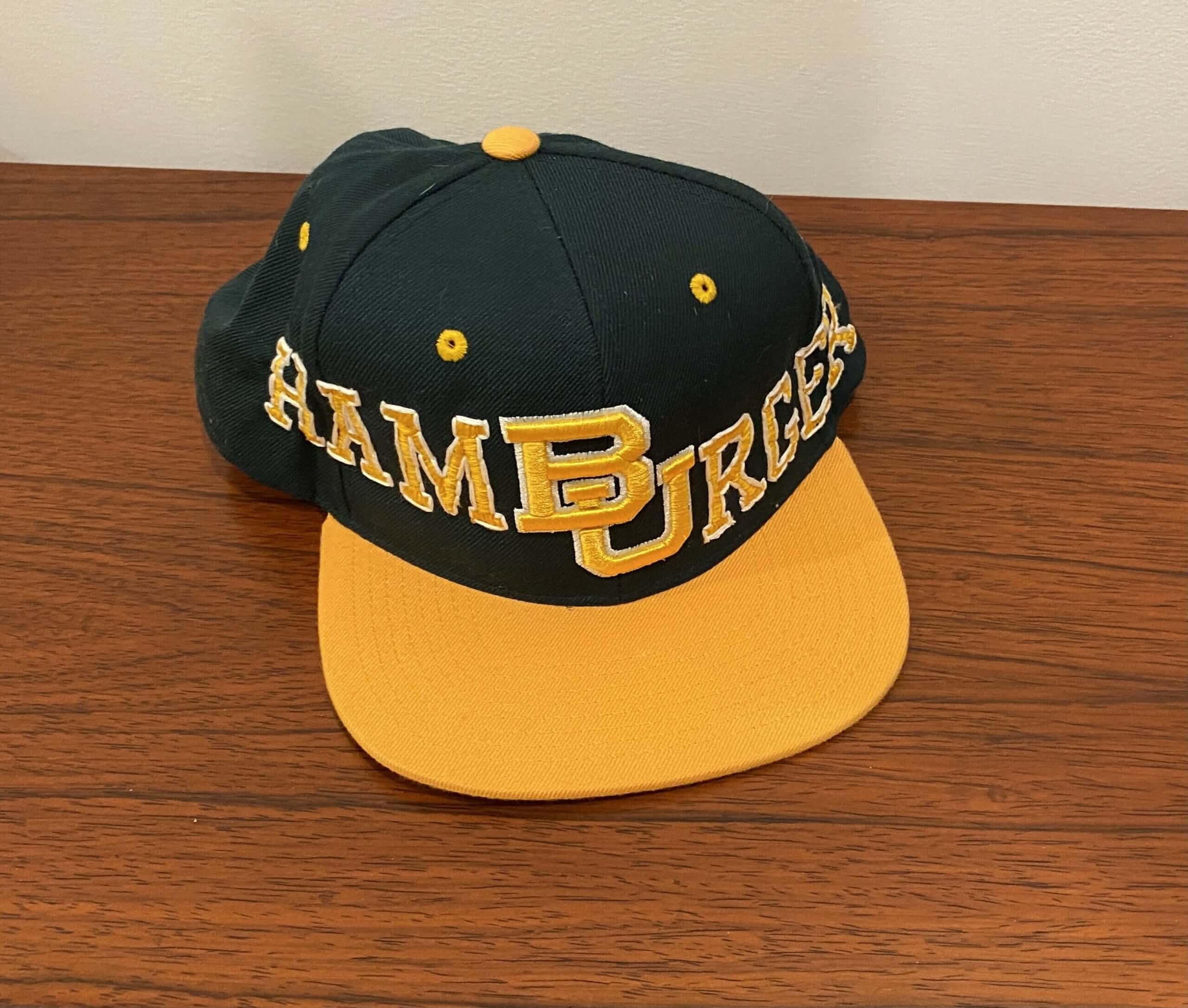
JM: I’ve been buying these spring training baseball hats. They have kind of a mesh-y material, and that’s very easy to work with. I can’t believe I’m talking about this! And then I made a hat for my friend David — it was a Baylor University hat, and I wanted to use the “BU” logo to for “HamBUrger.” That was a very thick, fitted baseball cap. And I must say, that was a definitely the hardest one I’ve ever done. Like, I actually was using pliers to like pull the needle through because it was so hard!
UW: You mentioned the little illustrations that you put on the side or sometimes on the back. For those, are you matching an existing image, like a photograph, or are you just drawing them freehand?
JM: For the eggplant, I just had the emoji on my phone and sort of copied it. I’m pretty good at drawings — I’m able to sort of sketch it out and, you know, trace, transfer it or whatever. For those, I usually do them because I’m trying to cover up a side logo.
UW: The manufacturer’s logo.
JM: Yeah, exactly.
UW: In some cases, it looks like you might have used a seam ripper to remove that logo..?
JM: Yeah. But for some of the mesh caps, I found that I was just damaging the hat. So yeah, I think the first couple of I did [on the side of the cap] were just to cover up a giant hole I had made. Then I figured out that I can just stitch over them to cover them up, instead of removing them.
UW: Have you become an expert at shopping for thread colors that match team colors?
JM: I found a graph online that matches Pantone colors to embroidery floss colors. I have used that to order thread online rather than go to a store.
UW: As you’re doing all this lettering, have you developed newfound or greater appreciation of typography and fonts and things like that?
JM: You know, I’ve always been interested in that. I didn’t take a class on typography in college or anything, but it’s always been something that’s interesting to me. But I do have a newfound respect for kerning — I’m always trying to make sure the space is equal in between the letters, which is very difficult to do with this particular project.
UW: What’s with all the food-based designs? Are you a big food guy, do you like to cook?
JM: Actually when I’m not writing, embroidering, or running, I am often cooking. This has been a very like food-centric year — I’d start thinking about what meal we were going to have for dinner at like 2pm. So yeah, food’s been on my mind. And also, it’s just so innocuous. Everything’s been so heated and charged and divisive. So it’s just funny to wear a hat that says “Lasagna” on it.
UW: And then there are the non-food designs. I was particularly interested in the shout-out to the documentary film Kony 2012, which seems like a pretty obscure reference. What was the story behind that?
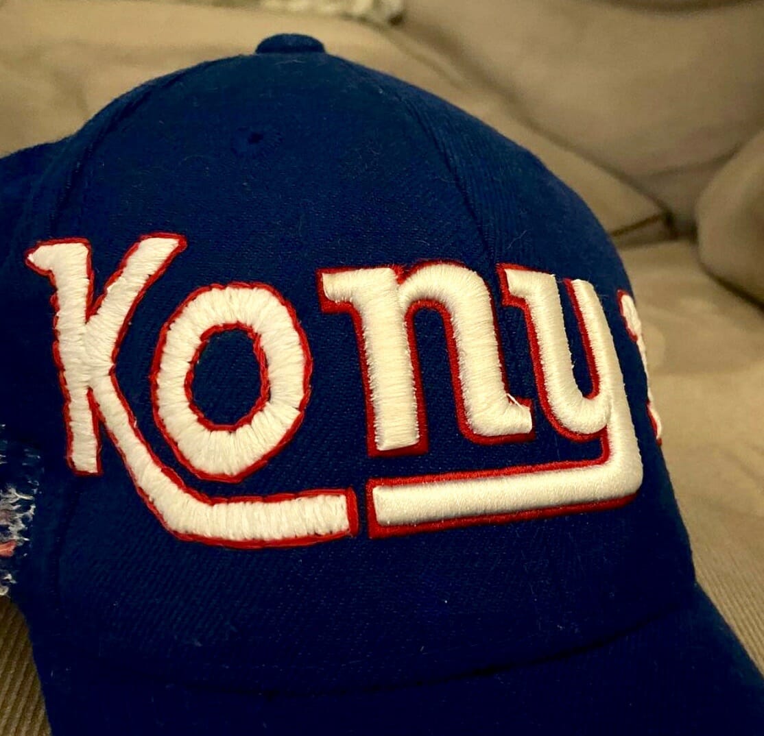
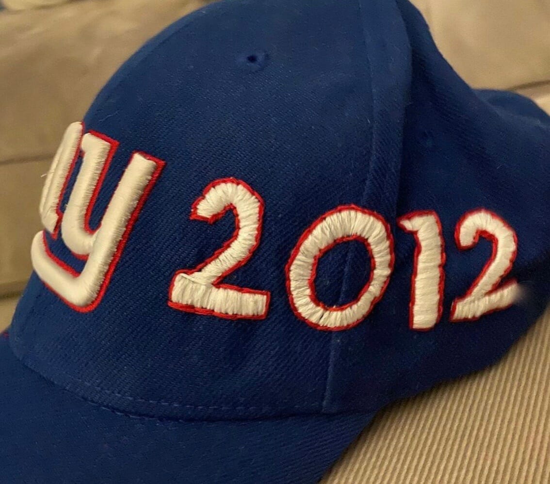
JM: There are certain words that just pop into my head when I see a logo and I just like, embrace it. So that one was the first one where I was just like, “Yeah, dope, Kony.”
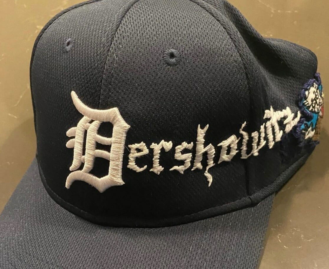
UW: What about the Alan Dershowitz one?
JM: That was actually a request from my buddy John, who for whatever reason did not want a food hat, he wanted an Alan Dershowitz hat. And I was also sort of testing the limits of my skill at the time, because I think that was only like the fourth or fifth I had done, and to try to an Old English font with such a long word was a challenge.
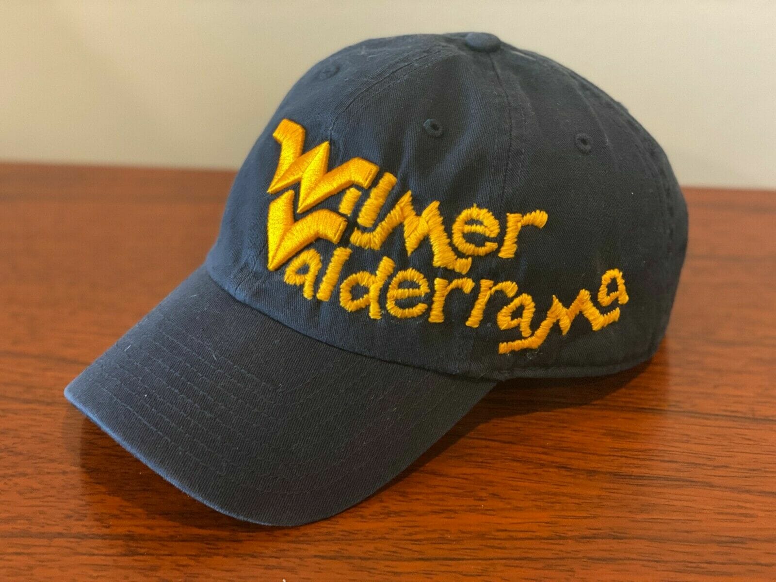
UW: What about the West Virginia one with Wilmer Valderrama?
JM: I was just going through the Fanatics website, trying to see what else I could do other than baseball teams, and I saw the “WV” and his name was the first thing I thought of.
UW: It seems like a streetwear or skatewear kind of shop would be all over this kind of thing. Have you heard from anyone like that?
JM: I haven’t. Someone sent me a thing on Instagram that there’s already someone kind of knocking off the idea, so I was not surprised to see that. Someone from New Era reached out to me and told me they were they were excited to see the Week of Hats and how it was raising money, so that was cool.
UW: Speaking of New Era, who made that little New Era-style logo for you?
JM: Just one of my followers on Instagram. The props department on one of the TV shows I work at is making me actual gold and black stickers that I’m going to be able to put on the hats when I send them out.
UW: I think that’s it from my end. Anything else you want me to know?
JM: No, I mean, just that it’s all for charity. And I did some research, trying to find five different charities that I thought were doing cool work, and I’m really excited about that. I’m pleasantly shocked by how much money these hats are raising.
UW: What are the last two hats that you’ll be listing on eBay on Friday?
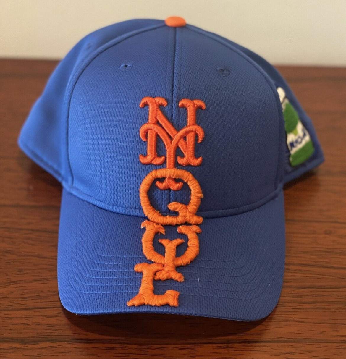
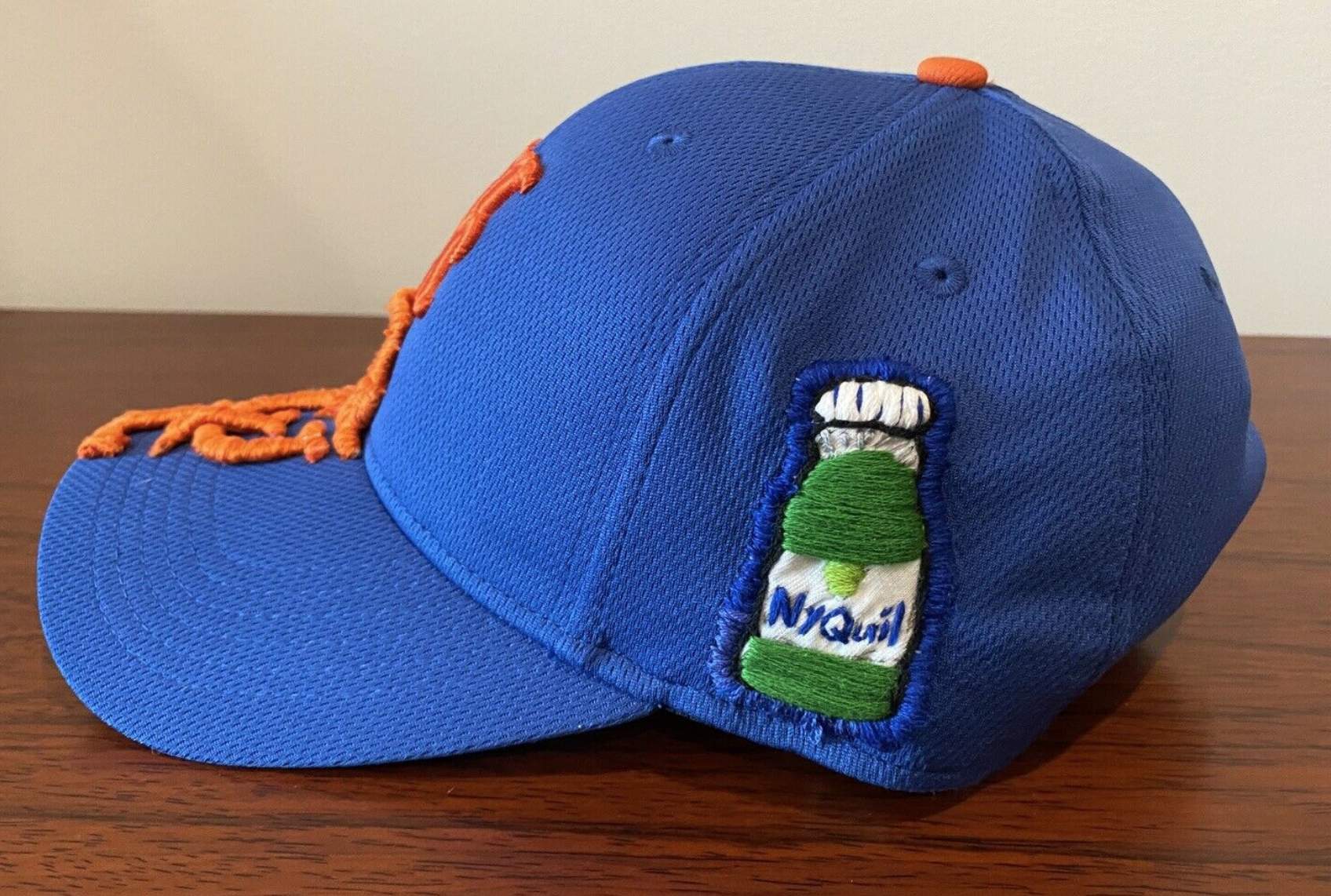
JM: One is a New York Mets hat. And then the final one is
an L.A. Dodgers hat where the person who gets it can choose whatever they want me to embroider on it, using the “LA” as part of the word.
UW: Cool — winner’s choice! [I was mentioning this to the Tugboat Captain and she immediately said she’d choose “Blah,” which isn’t bad, although there are tons of other options. — PL]
JM: Yeah, exactly.
———
And there you have it. It was a really fun interview — I especially liked the moment Joe was discussing cap fabrics and said, “I can’t believe I’m talking about this!” Welcome to our world, Joe!
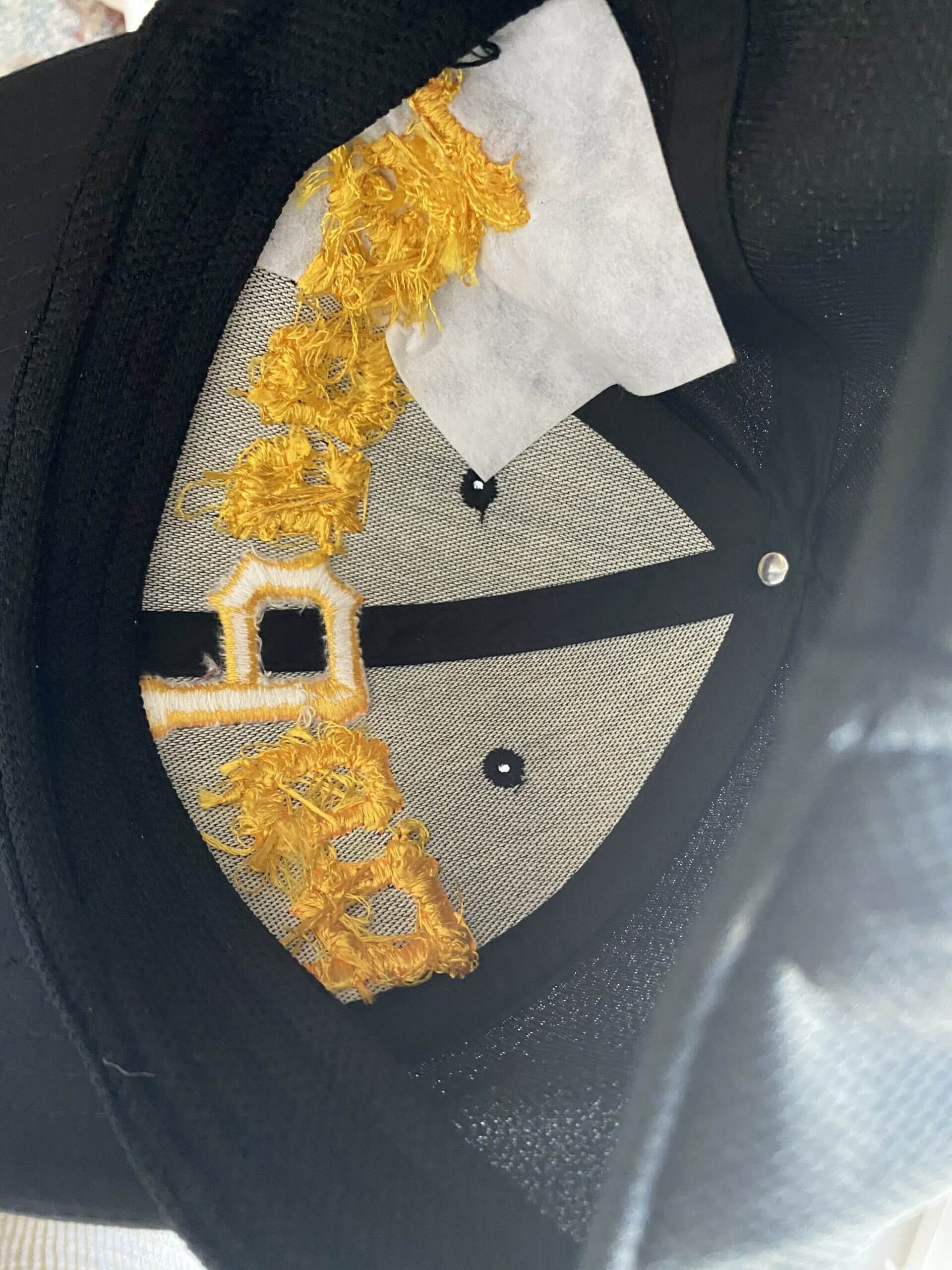
One additional item: I asked Joe if he could send me a photo of what the caps look like on the inside after he’s done embroidering them. As you can see here, he uses interfacing for added stability:
You can see the caps that Mande is auctioning off for charity on eBay (including the two new ones that are being listed today) here, and you can also see his caps on Instagram.
(Big thanks to Joe for sharing his story with me, and doubleplusthanks to Jeremy Cooper, without whom this entry would not have been possible.)
Click to enlarge
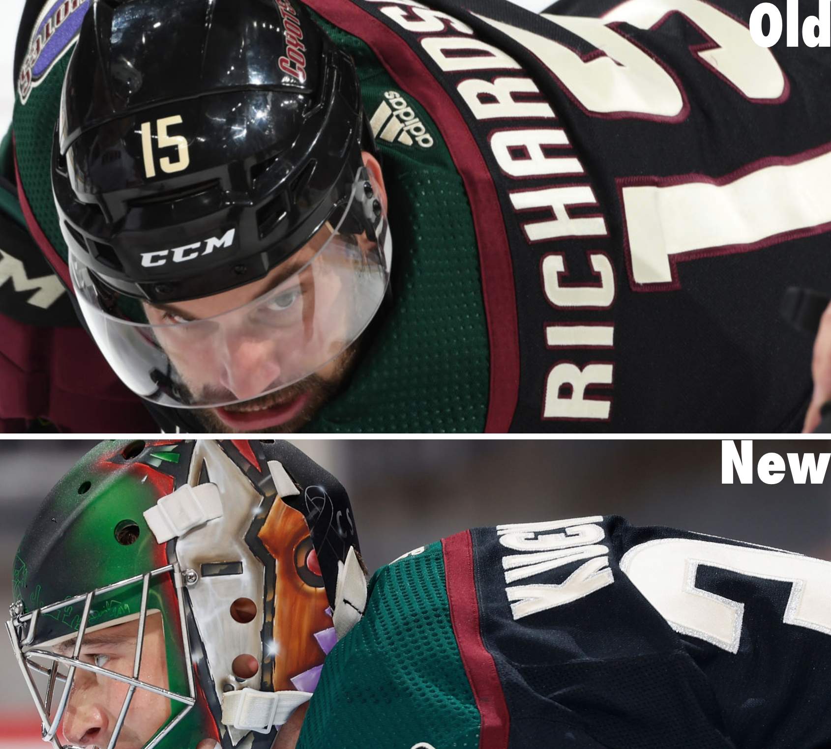
Silver anniversary: In a move that, to my knowledge, was not announced in advance, the Coyotes have changed the outlining on their Kachina jersey’s numbering and NOB lettering from red to silver. The team’s Twitter account indicated during last night’s game that this is part of the team’s silver anniversary celebration but did not respond to a follow-up question about whether the move was just for the season opener or if it will be maintained all season long.
We’ve seen teams use gold outlining to celebrate a championship, but I can’t recall a team changing its trim color to commemorate an anniversary. Are there any previous examples I’m overlooking?
The Ticker
By Anthony Emerson

Baseball News: Yesterday’s Ticker had an item about how Miller Park Way in the town of West Milwaukee would keep its name, even though the Brewers’ stadium is no longer called Miller Park. In a follow-up item, the part of that road in the city of Milwaukee (not the neighboring town of West Milwaukee) will be renamed as Brewers Boulevard (from Ray Barrington). … A Mickey Mantle card has set the new record for the highest price ever paid for a baseball card.

Pro Football News: Now this is odd: someone on eBay is selling an Adidas Drew Bledsoe and Lawyer Milloy Patriots silver jersey. Why is this odd? Because the Pats’ silver alternates didn’t debut until 2003, long after Adidas had stopped supplying the Pats and long after both Bledsoe and Milloy departed Foxborough. Hmmm (from Mike Malnicof and Andrew E. Haskell). … Bob Gassel notes that while the Dolphins’ throwback uniforms are great, they keep applying the helmet decals at the wrong angle. … Fan Controlled Football, a league backed by Richard Sherman and Austin Ekeler that will allow viewers to vote and decide which plays the team will run, has unveiled the jerseys for the four inaugural teams: the Glacier Boyz, the Beasts, the Wild Aces, and the Zappers.
College/High School Football News: A redditor tracked every jersey-helmet-pants combo every FBS team wore this year (from Mike Chamernik).

Hockey News: John Muir sends along a lot of fun uni notes from a 1994 barnstorming tour of Canada from CSKA Moscow. First and foremost, the team’s chest crest still contained the hammer-and-sickle symbol of communism, even though the Soviet Union had collapsed in 1991. Oddly low placement of captaincy patches forced the Russian Penguins patch down to the stomach of the jersey, instead of on the shoulder, there were inconsistent NOBs, with some nameplates being bordered in white and others not, and finally, the goalie wore an American flag decal on his helmet for some reason. Perhaps the decal, like the Penguins patches, were a nod to Pittsburgh Penguins owner Howard Baldwin, who had purchased a 50% stake in the club and even had it compete for some time in the North American minor leagues. You can find all the images John sent here. … As a ninth grader in 1993, Dave Kuruc drew a logo for the Washington Capitals and submitted it to the team, even getting a response. The logo Dave drew and the one the team adopted two years later and would use for over a decade are similar, no? … The Canadiens have unveiled their Reverse Retro schedule (from James Beattie and Moe Khan). … The Fox Sports ticker was showing team anniversary logos instead of just team logos for teams that have anniversaries this season (from Andy Tupman). … The OHL’s Oshawa Generals appear to be teasing a new sweater (from Darryl Knight).

NBA News: New Nets G/F James Harden will wear his usual No. 13 (from multiple readers). This has caused Nets G Landry Shamet, who previously wore 13, to switch to No. 20 (from Etienne Catalan). This is the second time Shamet has given up his number when a more prominent player had been traded to his team. In 2018, when he was with the 76ers, he switched to No. 1 when Jimmy Butler was traded to Philly and wanted Shamet’s No. 23. … Speaking of the Harden trade, a Houston car wash is offering free car washes to drivers who “trash” their Harden jerseys at the business (from Mike Chamernik). … Wizards rookie F Deni Avdija was parodied on the Israeli version of Saturday Night Live. The actor playing Avdija tried his best to get the look right, complete with the white band on his left arm, but it was ruined by the replica jersey and plain white shorts (from Jay Anderson). … A Sixers superfan is creating a new comic book cover-inspired design for each Sixers win this season (from Kurt Esposito).

Soccer News: The Montreal Impact have rebranded as Club de Foot Montréal, or simply CF Montréal (from multiple readers). … Bayern Munich shockingly went out of the DFB-Pokal to lowly Holstein Kiel while wearing an alternate kit inspired by the one worn from 1991 to 1993 — which were two seasons when Bayern also fell out of the Pokal early. Trikot-Fluch! (From our own Jamie Rathjen.) … Here’s a great set of Premier League Coke cans (from @ScottyBeats86).

Grab Bag: The Australian Football League’s Greater Western Sydney Giants have two new guernseys (thanks, Jamie). … The Russian National Handball Team, competing under sanctions from the World Anti-Doping Agency, have stripped all Russian national references from their kits and pre-match ceremonies, but still compete in national colors and their handball federation logo contains the white-blue-red of the Russian flag. Full article here (from Oleg Kvasha). … Bubba Wallace’s first paint scheme since his move to 23XI racing has been revealed (from Jakob Fox).

Yesterday I said I’d have an update today regarding Wednesday’s post about the Cavs’ 1990s/2000s uniforms. It’s taken me a bit longer than I expected to sort all of that out, plus I slept a little bit later than usual this morning, so that update has been bumped to Monday. Until then, stay safe and well, enjoy Phil’s weekend content, and I’ll see you back here on MLK Day. — Paul
“Fan Controlled Football, (…will allow viewers to vote and decide which plays the team will run), has unveiled the jerseys for the four inaugural teams”
Did the Fans vote for these atrocities too??
Edit needed on final paragraph….
“…I expected to sort all of that out, plus a slept a little bit…”
Thanks! Fixed.
I guess you really needed that sleep :)
Great article today – really enjoyed it and may start a project similar with the kids. We’ve been looking for ‘out of the box’ ideas and this is just wacky and hands on enough.
Those hats are amazing. It took me a second, but I finally recognized Joe from his small parts on Parks and Recreation. These are right in line with his character. Brilliant!
I’ve loved Joe Mande for a while, so this made my day. Awesome content all week Paul!!
This was amazing. He even talked about kerning!!!
The silver-sand combo makes the letters and sleeve numbers in particular look too chunky. Maybe the Coyotes should’ve used silver instead of sand for the primary letter/number color and left the red outline?
I’m kind of reminded of the cream/white combo used by the Bucks, but they only use the cream outline on the numbers, which are already uniquely blocky.
About the Oshawa General jersey tease. Yawn. That jersey does not look like it will be impressive.
Generals had a great alternate some years back. They should go back to this for an alternate. Complete with their signature 2-colour helmet, which should also make a comeback to be worn with their regular uniforms:
link
link
Loved the hats – these are amazing!
“Club de Foot”??
Am I the only person for whom this has struck me as really weird?
I assume that means something in French. C’est la vie!
I’m disappointed the league is moving away from their early nineties identities.
Remember “Miami Fusion”?
Now we get “The Honorable International Futbol Players de Miami Extra Super Athletic Club of South Florida” or some such thing.
For the uninitiated, each MLS team has an unofficial nickname. Atlanta is “The 5 Stripes,” Orlando “The Purple Lions,” NYCFC “The Cityzens.”
Montreal is now being called “The Snowflakes.” Not good.
If you read the comments on the MLS website, you can see that this change is universally loathed by Montreal, rival, and neutral supporters. Hardly a positive comment to be had.
Does anyone ever use these “unofficial nicknames”? Do people ever shout – “C’mon you 5 Stripes!”?
How about Tip-Tops, Superbas, and Beaneaters?
Yes, they do.
Many supporter anthems incorporate some version as well.
Reminds me of the movie Misery’s’ Terrifying Ankle-Bashing Scene
The 15-year-old in me snickered when I read “CF Montreal.”
Don’t know if it’s been posted already but the blog Puckstruck has a fascinating article about how Bobby Bauer is missing from the Boston Bruins’ list of historical team captains, and the visual evidence being used to prove his captaincy is two pictures of him with the “C” BETWEEN THE NUMBERS ONE AND SEVEN on his jersey, instead of the traditional location:
link
-Jet
Hadn’t seen that. Great stuff!!
Maybe Bobby Bauer was only an interim captain? I’m not a Bruins fan but I do know that Milt Schmidt was a Canadian soldier in WWII, so maybe somebody had to fill in.
Awesome project! I am continually impressed by the inspiration, design & execution talents of the Uni-Watch community.
For the question of any teams changing the trim color for an anniversary before, yes the Flyers had a special alt for their 50th anniversary for the 2016-2017 season.
link
Seems like a recent hockey trend, the Sabres did the same for their 50th.
link
Wow this is fantastic! Joe Mande totally Gets It! I love the food “menu” of hats but Wrestling is a triumph, with the STL perfectly centered. I love it all.
FWIW, if I won the customizable LA Dodgers hat, I think I’d have to go with falafel
Oooh, Falafal is a really good one!!
My favorites are fLAg and gLAm!
My first thought for the Dodgers hat was LAY-Z Q, from a Far Side panel. I wonder whom else would ever get that reference.
link
Great hats all around, and brilliant idea! Every time I look at a hat now I’m going to wonder what the insignia could be morphed into.
saLAmi on my hat, please
Joe’s hats are fantastic. Too bad his eBay listings aren’t available to Canucks.
The ‘52 Topps Mantle is not a rookie card. The ‘51 Bowman is.
Word “rookie” now removed — thanks.
I cannot count how many times I have watched the clip of Mande playing “Elon Faizon” on “The Kroll Show”. Sooooo great!
And this project is great too. Really different and executed well.
Holy crap I need one of those hats, they’re so great!
“…a team changing its trim color to commemorate an anniversary. Are there any previous examples…?”
The 2018-19 AHL Phantoms did so to celebrate their 5th anniversary in Lehigh Valley, though it was a one-off jersey:
link
For reasons that I still don’t quite understand, Kony 2012 went really viral in many prominent corners of the Internet when it came out, in many cases morphing into something other than the very serious original meaning into more of a less-than-totally-serious meme. So I don’t think that one is really super obscure.
I probably would have written “FuNYuns”.
Can’t believe this….fuNYuns was the first thing I thought of!
This is a truly great DIY project! Really great imagination and execution. Also answers the question I had the other day if anyone was doing DIY hats. So many great things you could do modifying existing jerseys, etc.
I’d love to find a cool project for unused hats.
I started deconstructing some a while back, but just ended up with scraps!
(I’m not very crafty…)
About the Miami Dolphins logo not positioned right on the helmet. The old logo back in the 60’s and 70’s was positioned on 1 type of helmet. Back then there wasn’t so many variants of helmets to choose from. They were a standard shell with a round ear hole on each side. The ear holes had a raised circle around them and the logo was positioned so that the tail would sit perfect on that ear hole area. You can see that here:
link
As the logo changed, the helmets hadn’t yet and into the 80’s they were still able to hold that feature in place.
link
Into the 90’s that still held true…
link
It also worked well with the fat cartoon logo of the early 2000’s…
link
Then the helmets started to change with the times and with that the nice little quirk started to no longer hold form…
link
Here you can see 2 different looks side by side:
link
In addition, I would imagine it got harder for the logo to sit right on the new shells given the height of it and the new angles the logo presented.
link
Given the new designs of the various helmets, and having the logos applied standard across the board, some will look off compared to others if they were angled differently. The angle itself isn’t that far off from the old versions but the new helmets make it look very different as well. If they angled it any more it wouldn’t look right at all, almost like it was doing a backflip. :)
link
Watched the Coyotes play last night and I quickly googled the meaning of the kachina. Wouldn’t this logo be considered native imagery?
The Pueblo of Zia has an issue with the State of New Mexico misappropriating the Zia Sun for the flag. I think this a similar circumstance, and one which has more subtle shading than Washington NFL Football and Cleveland AL Baseball. A few people are upset about the insignia of the Seattle Seahawks, too.
And the Vancouver Canucks orca
Yes, I forgot about that one. This particular argument interests me: Are detractors of the NM flag, Canucks, et. al., getting more blowback than those of the Braves and Chiefs because their argument is regarded by some as not to hold water?
I think the Canucks orca is a company logo which owns the franchise which in its own argument handles the thought.,the company that owns the team puts its own logo on their sweaters,..?weird.
I plead total ignorance for the logos of Washington NFL, Aunt Jemima, Uncle Ben, Chief Wahoo etc.
These were logos just recognized from me as like “hey I know that”.
Which brings me back to when the Coyotes came to the NHL with the Coyote with a hockey stick logo (at least that’s what I thought it was) …guess not.
Seems offensive now and I know a majority of the readers here are totally in favour of the kachina logo.
I can’t keep up with these protocols.
On a similar topic, it appears Indian Motorcycles is immune to the misappropriation argument. It could be that motorcycles are marketed to a segment of the population that glorifies the antihero, and as such get no benefit from appearing to capitulate to anybody. Just a thought.
This post is a reminder of what makes the comm-uni-ty so awesome! As a Parks and Recreation/Good Place fan, I’ve admired so much of what Mande’s done as a sitcom writer, and it’s fascinating to see him randomly pop up here and have such an awesome project!
I was surprised to see the Fan controlled football jerseys are made by Champion. I thought they were completely out of the jersey making game
I’m an LSU fan and didn’t even realize that they went all of 2020 without wearing the purple jersey (no non-conference games and no one made them wear them on the road). No special Nike uniforms either so they went with the same uniforms in all 10 games.
Catching up. A few days behind. Yesterday’s posts/replies re: a qanon Georgia Representative. So, on an Ode To Olympics web site in 1968, if there was one, wouldn’t want to mention why Kareem Abdul-Jabbar (his name then was Lew Alcindor) was absent from the USA basketball team, or why Jon Carlos and Tommie Smith behaved as they did on the victory stand or why …
It is never an option to keep your head in the sand.
Took this photo in 2012 at an O’s game, in a similar vein to today’s lead post
link
There was definitely a point in the early 00’s at which the NFL began selling inverted color third jerseys for all teams, even if they weren’t included in official uniform sets. Specifically, I remember black eagles jerseys and gold 49ers jerseys being sold. Both would be worn as on field jerseys far, far later but were definitely not worn at the time they first showed up at retail.
That shook loose a memory of a red Titan’s jersey my wife had from that time period.
I remember what you’re talking about.
Great post today. I can’t even pick a favorite hat.
Today’s lead story is absolutely great. Just wanted to say that.
I wasn’t crazy about it at first and then I saw the Roast Beef cap and I was in love.
I grew up in Charleston, WV, which used to have several locations of the deceased department store chain Hills. It was kind of like a Target but not nearly as nice, and was purchased by Ames in 1999, which then subsequently died in 2002. I haven’t set foot in West Virginia since about 2007, but I was poking around the old stomping grounds on Google Maps the other day and found that the plaza where my local Hills used to be is still officially called “Hills Plaza.”
link
My favorite comedian on my favorite website. Truly incredible.
Great stuff today, love when 2 worlds come together. Very pleasant surprise. Hats are all ver cool, very creative. I’m especially impressed with the Mets/NyQuil hat: how did sew through the bill, and how did he get the letters “puffy”? Props to Joe, was a fan of his acting/writing, now a fan of his hats.
The Angels swapped their silver halo for a gold halo for their 50th season.
Ah, yes — good one!
Here is Angels page
link
Great post! Hope Joe won’t mind if he inspires us to get crafty too!
Btw – someone is selling LASorda hats that are smart – (but not crafty).
Love Joe!
When I was in college, I worked for the school paper and we used to get free stuff related to new movies. It was always random — hats, T-shirts, posters. When the Keenan Ivory Wayans movie “A Low Down Dirty Shame” came out, they sent us a hat. I remember it was purple with black embroidery.
The hat fit me really well, but I didn’t want to advertise some movie. But with all those letters, I figured there had to be *something* I could do with it.
The best I could come up with: remove “A Low Down” and the “S” and “e” from “Shame” with some scissors. So, yeah, I would walk around with a hat that said “DIRTY HAM”.
These hats are great. I would have fun coming up with the wording, but no ability to embroider.
LAsorda……rip