For all photos, click to enlarge
I was recently tagged in a Twitter thread in which a guy named Spencer Heffernan claimed that his father, Mark Heffernan, had designed the uniforms that the Cleveland Cavaliers wore from 1999 through 2003 (shown above). That was the uni set that replaced the team’s infamous zigzag design.
Pro sports uniforms are rarely attributed to specific designers, so I was intrigued to hear Spencer’s claim that his father had designed the post-zigzag Cavs set. But he also made another claim: He said his father created an earlier design that was never used by the Cavs but, in his father’s view, had been ripped off by the SuperSonics.
Here’s the elder Heffernan’s never-used Cavs design concept, followed by the Sonics set that he felt was based on his work:
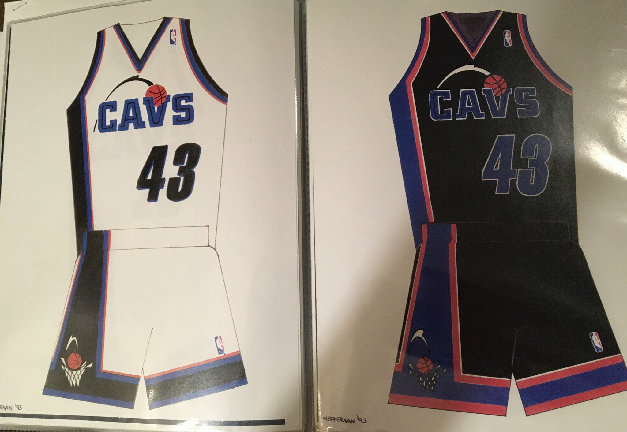
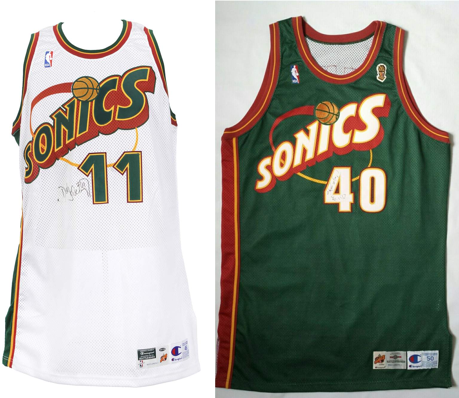
I should say here that while the two designs may have certain similarities, I don’t see all that a strong a connection between them. But Mark Heffernan apparently felt so strongly about it that he sent a letter of complaint to the league (more on that in a minute).
Mark Heffernan, unfortunately, died last March, so we can’t get his direct take on all of this. But Spencer, his son, was happy to talk with me. Here’s an edited transcript of a phone interview we recently did:
Uni Watch: First, if you could tell me a little about yourself, how old are you, where do you live, and what do you do for a living?

Spencer Heffernan [shown at right]: I am 22 years old. I live in Akron, Ohio, and I work at Fox Sports Ohio as a production assistant. And I also work with a minor league hockey team called the Florida Everblades, which is an affiliate of the Nashville Predators. I do a lot of social media and graphic design stuff for them.
UW: And tell me about your father, Mark Heffernan. I gather he was a designer?
SH: Not really. He was the director of game-day entertainment and services with the Cavs from, like, the late ’80s, up until when Dan Gilbert took over the team [in 2005]. So he was there throughout all the Mark Price years and all that stuff. Basically, his main job was getting fans involved with the game. So he would organize halftime shows, or stuff to do during timeouts, all that stuff.
One of his proudest moments was from a playoff game between the Cavs and the Celtics, when Larry Bird and Kevin McHale were on that team. The crowd was dead. And at the time, nobody was using like the jumbotron for, like, getting people into the game or that type of thing. So my dad decided to play the scene from Animal House where John Belushi is saying, “Was it over when the Germans bombed Pearl Harbor? Hell no!” He played that whole scene, and that got people all riled up and stuff. And then after the game, [NBA commish] David Stern was there and he came up to my dad. And he was like, “Hey, did you play that?” And my dad says yeah. And Stern goes, “How much did that cost you to get the rights to that?” And my dad said, “Well, it cost me $2.99 if I get it back to Blockbuster by two.” And Stern started laughing and walking away, like, “Please don’t tell me that!”
UW: So if he wasn’t even hired to be a designer, how did he have all these design skills?
SH: He was actually an art major in college. And I guess the closest he got to doing something with his major was designing uniforms.
UW: So how did he get into the uniform thing?
SH: The Cavs were transitioning from the Mark Price era with the uniforms that had the “V” that looks like a hoop [which was worn from 1983 through 1994], to the godawful jagged uniforms that they brought in [1994-1999]. And, basically, they showed that uniform with the jagged design to the team and everybody in the organization hated them. Everyone was like, “What?” Mike Fratello [the head coach at the time], Wayne Embry [the GM], they all hated it.
UW: But they couldn’t all have hated it. I mean, someone approved it, right?
SH: Yeah, somebody must have liked it. So my dad started designing these new uniforms. And Mike Fratello really liked them — he sent a letter [to ownership] about it.
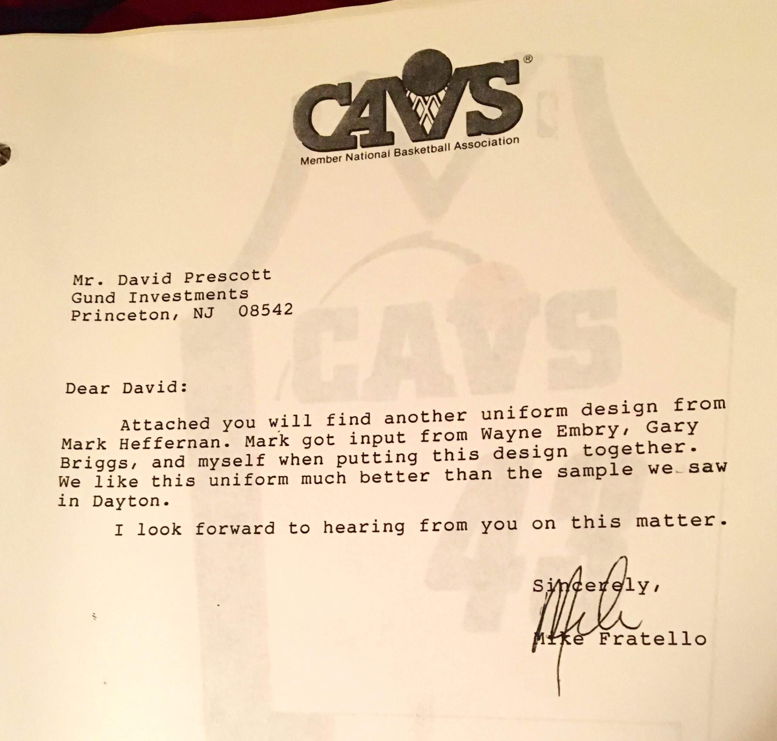
UW: So in that letter, when he says he liked your father’s design better than “the sample we saw in Dayton,” the Dayton sample was the jagged one?
SH: Yes.
UW: And so your father’s design — the one that has the ball going through the V, and there’s sort of a trail behind it — he created that as an alternative to the jagged design?
SH: Correct.
UW: So that design never made it onto the court. Why not?
SH: They scrapped it and went ahead with what they had already planned, and everybody kind of just let it go.
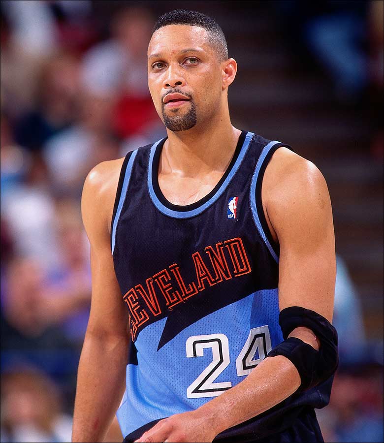
UW: So that was in 1994. And then, in 1995, the Sonics came out with their uniform — the one that your father believed was based on his design.
SH: If you look at them side by side, it’s a carbon copy of what my dad made for the Cavs. The only thing different is that instead of “Cavs,” it says “Sonics” on it. I mean, they just swapped out the logos.
UW: So when your dad saw the Sonics take the court in that design, he felt like his design had been poached, basically?
SH: Yeah, he felt like it was plagiarized, and that they took his design without giving him any credit for it. And so he basically said that to the NBA in a letter, and then they wrote him back, saying that any similarities between the two designs were coincidental.
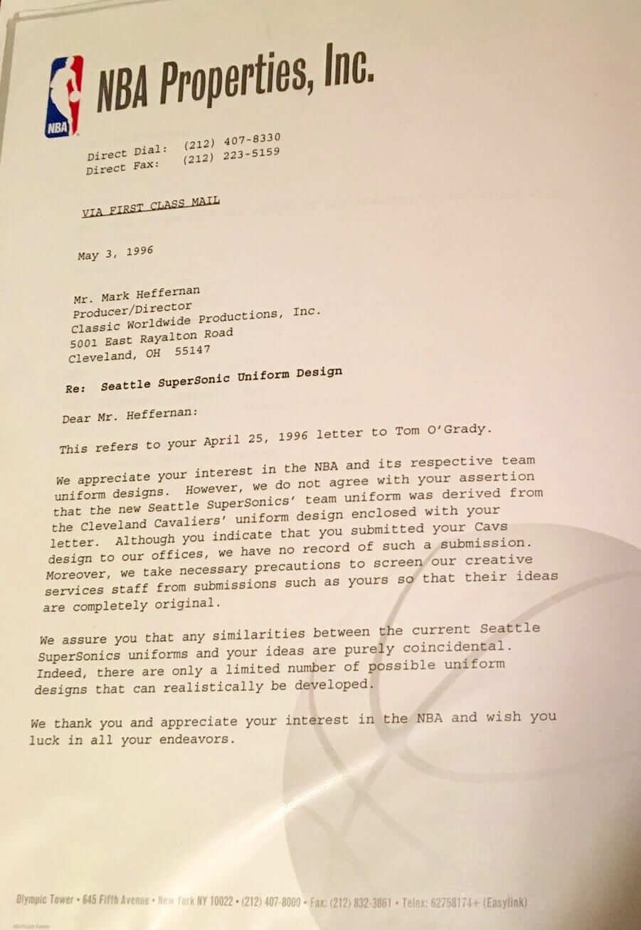
UW: Did your dad save a copy of the letter that he sent — the one that the NBA was responding to?
SH: I don’t think so. Or at least I haven’t found it.
UW: It’s okay — their response makes it pretty clear what he had said. And was that basically the end of it? Or did your dad keep trying to get satisfaction in some sort of way?
SH: That was pretty much the end of it.
UW: Was he bitter about it? Did he have, like, a chip on his shoulder about it?
SH: No, he never held any sort of animosity toward the NBA or the Sonics. He was the nicest guy on the planet, and he did not let things like that bother him.
UW: So what happened after that?
SH: In 1998 or ’99, everybody in the organization still was not a fan of the jagged one, and somebody told him to redesign it again. So he did.
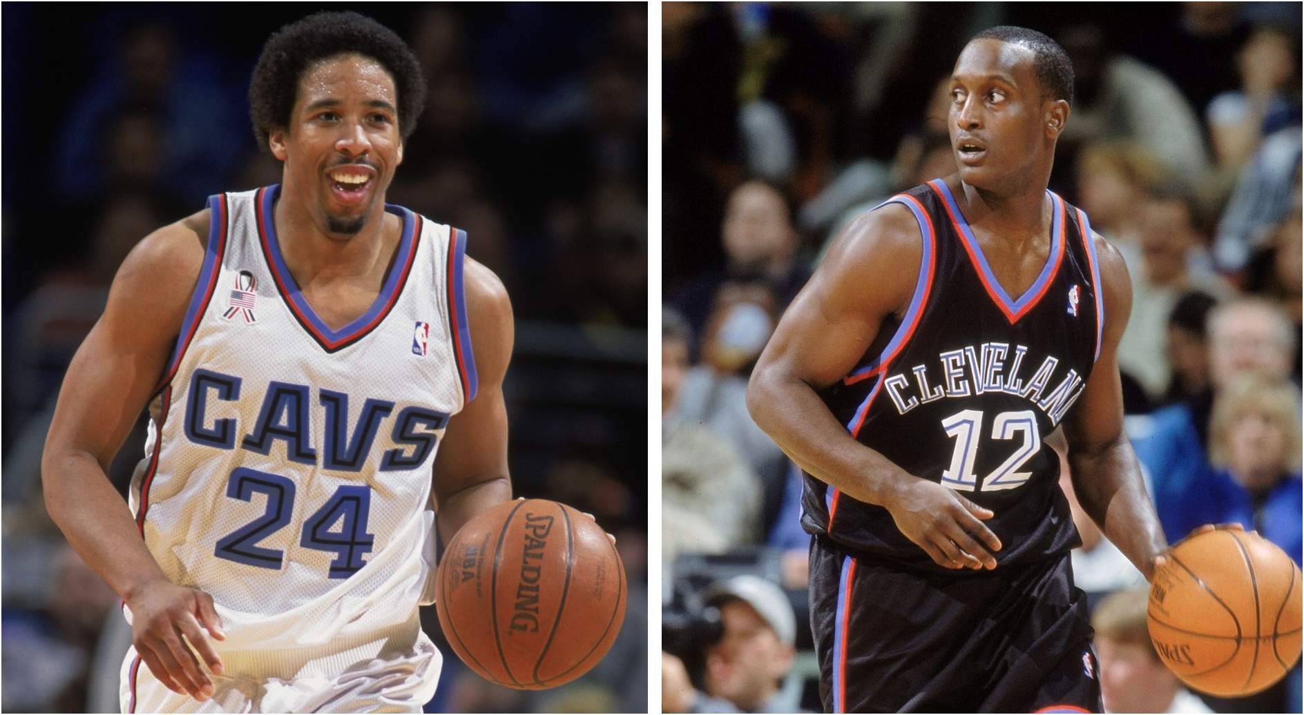
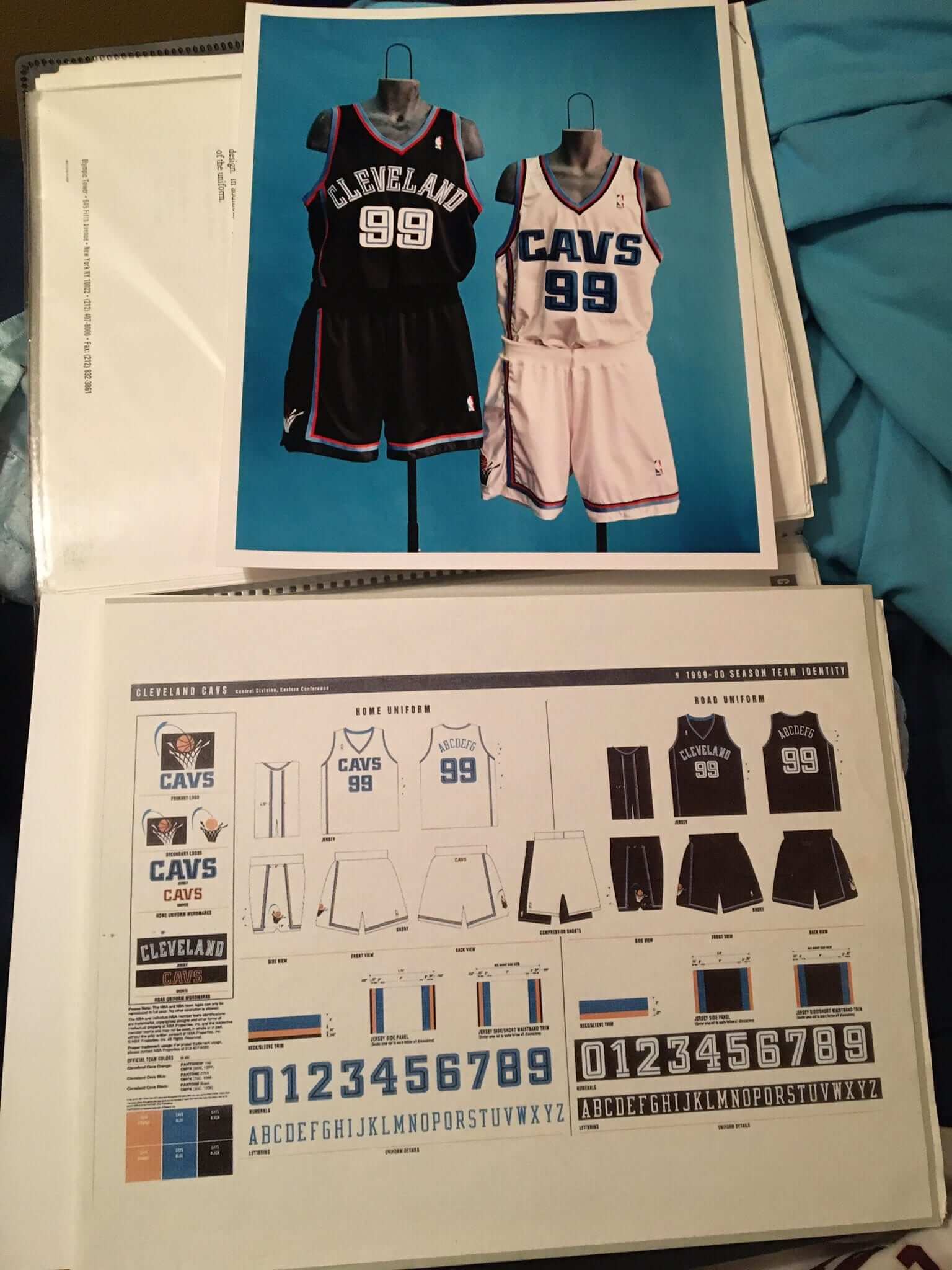
UW: So the uniform that they wore from 1999 through 2003 — he created that?
SH: Yes.
UW: So when the Cavs decided they weren’t going to keep the jagged one anymore, did they turn to your dad specifically and ask him to do a design because they knew he had done a good design in the past?
SH: I believe so. Because everybody liked his stuff better than what they had. But he had a right-hand man who still works for the Cavs, so you can check with him after you talk to me.
UW: Was there any consideration of going back to the concept he had come up with several years earlier? Or was the thinking that the Sonics had basically taken that idea, so that one basically wasn’t viable anymore?
SH: That was the thinking. Because if they were to do that, everyone would think that they copied the Sonics, which, you know, in reality, I don’t think that would be accurate. But he told me that they pretty much told him, “Hey, just make uniforms, don’t make any drastic changes. We just want the big, jagged swoosh out of there.”
UW: Was he publicly credited for this design?
SH: I think so.
UW: Did he get paid for it? Like? Or was the design task, like, folded into his job, so it became just another part of his job description?
SH: I think it was just another part of his duties. I don’t know if he had a paycheck on top of that for the design.
———
So that was my chat with Spencer. Again, I don’t really agree that the Sonics’ design was a “carbon copy” of his dad’s never-used Cavs design, but it’s still an interesting story.
My next step was to contact the “right-hand man” who Spencer referred to. That would be Dave Dombrowski, who’s now Cavs’ VP of broadcasting (and also, he says, the team’s “unofficial resident historian, because I’ve been here going on 32 years now”). I contacted him, sent him the same visuals that Spencer had shared with me, and asked if he’d be willing to chat. He readily agreed — here’s how it went:
Uni Watch: When you worked with Mark Heffernan, he was doing the game-day entertainment, is that right?
Dave Dombrowski [shown at right]: Yeah, and we also co-produced a monthly magazine-type show. Or maybe weekly, I can’t remember. Emmy Award-winning, I must say, two years in a row.
UW: Spencer says that Mark designed the uniforms that were actually worn on the court from 1999 to 2003.
DD: Yeah. After the years of just some really wild ones, we kind of went back to — if you remember back, and then black was like kind of the “in” color. Everybody was going black back then. And we decided to, you know, to take a drastic change from where we were.
UW: And so that’s true, he designed those those uniforms?
DD: I believe, yes, I believe we kept that in-house. And at the time he was our Creative Services Director. And, you know, his eye for art and drawing ability.
UW: Spencer also showed me another design, which was in one of the folders I sent you, which has the ball going into the “V” with sort of a trail behind it.
DD: Yeah, I haven’t seen that one before. I have no idea what that was. So back when what was going to be known as Gund Arena was being constructed, the ownership at the time, the Gund family, and the marketing folks decided we were going to do a total image change from the orange and blue uniforms that we had in the mid- to late ’80s. If you remember back in the early ’90s, Kentucky had a lot of whooshes and swooshes on their college uniforms. And again, I was not a big fan of it. And at the time, if I remember, neither was Mark.
I remember Mark speaking up in a meeting with ownership and everybody about the new [jagged/zigzag] design, and he said, “I may be putting myself on the line here, but these aren’t good.” And he pointed out all the flaws that he saw in them and was waiting for other people to react, and nobody did. And Gordon [Gund], who was blind, he said, “Mark, thank you for your your input, but we’re going to proceed with these” — something to that effect is what I remember.
UW: So Mark’s voice was a lonely voice.
DD: Yeah. There were others, myself included, who did not agree with the new design, but he vehemently disagreed. My biggest complaint at the time, if I remember, was that the lettering was not going to play well on TV. I remember everybody looking at these uniforms on a sheet of paper, and I said, “Guys, we need to look at this on-camera on a TV screen from far away. And lo and behold, I was right, but they still went with it.
I frickin’ hated that uniform. I still hate it. One of these last couple years, we did them as a throwback, and I remember telling our marketing team, “Well, I’m not gonna be part of any promotion of these — I hated them at the time and I still do!” But it’s funny — today’s kids love them. And we sold so many of those jerseys at our team shop. And I just laughed, because I remember how much I hated it.
I’m old-school. I sit in meetings and I tell them, “I like our old logo. I like our old wine and gold.” That’s our image. And I’m not telling you anything that I wouldn’t be telling my own people in my office, because I’m not a fan of us changing our logo and our our uniforms every two, three years. I know why we do it but that doesn’t mean I have to like it.
———
So that was my chat with Dombrowski. But wait — there’s more. Here are some additional notes:
1. There were apparently plans to add a blue alternate uniform to the 1999-2003 set that Mark Heffernan designed, at least judging by this style sheet that Spencer found in his father’s files:

To my knowledge, that uniform never made it onto the court.
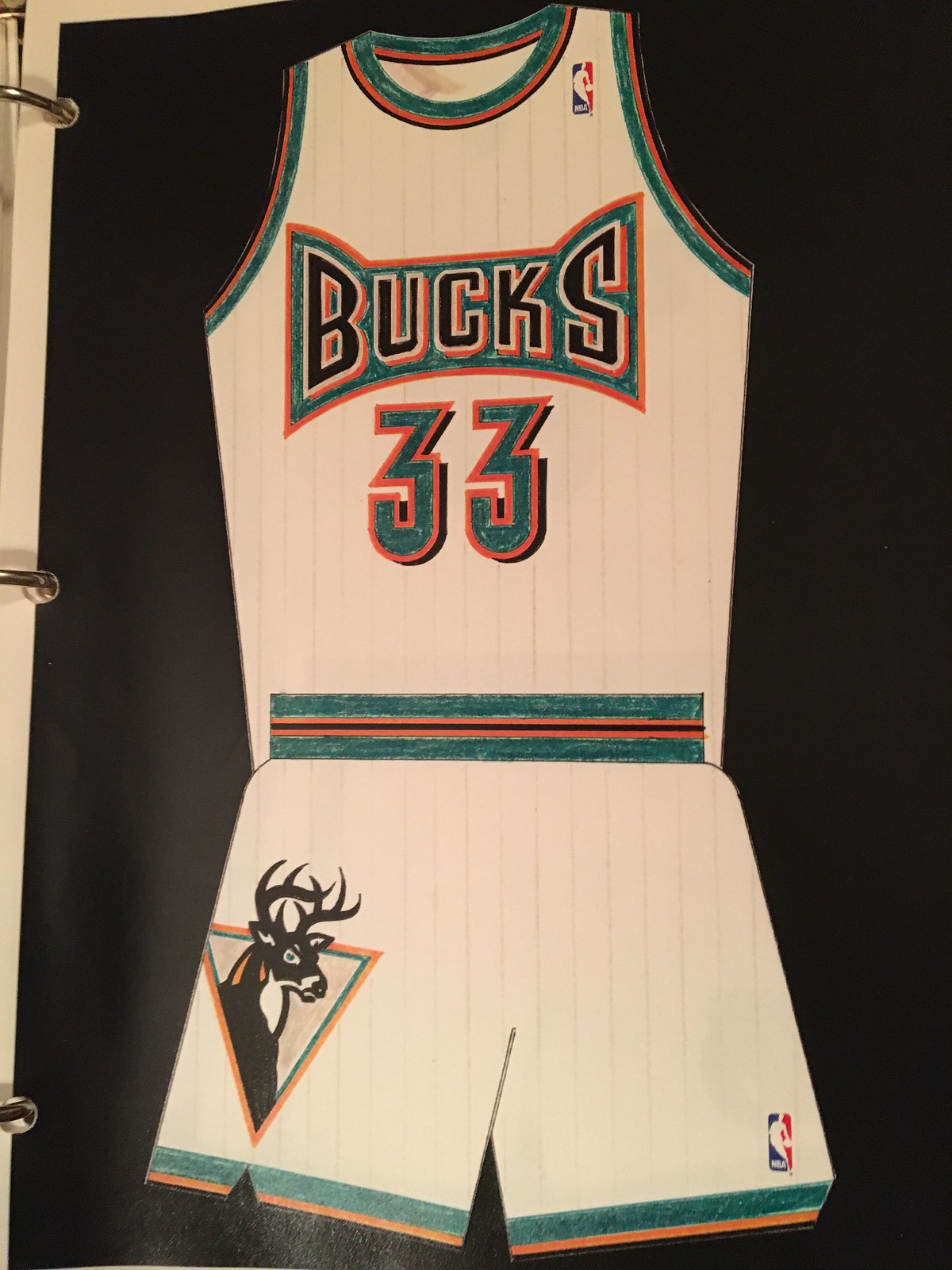
2. Mark Heffernan’s files also included several additional Cavs concepts that were never used. It’s not clear whether these were ever formally presented to team management:


3. Intriguingly, Mark Heffernan’s files also included logo and uniform concepts for several other NBA teams. Spencer says he doesn’t know if his father was ever in touch with any other NBA clubs, and Dave Dombrowski didn’t know anything about these designs either, so these might have been things that Mark did just for his portfolio — we’ll probably never know for sure. Here are some of the more interesting ones (you can see more of them here):


4. One final loose end: The letter that Mark Heffernan received from NBA Properties indicated that he had sent his letter of complaint — the one claiming that the Sonics’ design was poached from his never-used Cavs concept — to Tom O’Grady, who was the NBA’s creative director at the time. I contacted Tom and asked if he had any recollection of Heffernan’s claim. He said said Heffernan’s name and design concept were both unfamiliar to him (although, of course, it was nearly 25 years ago, so that’s not so surprising). He also said he didn’t think Heffernan’s concept had anything to do with the Sonics, which I agree with.
———
Interesting stuff, and a good reminder that the uni-verse includes all sorts of behind-the-scenes stories that we rarely hear about. My thanks to Spencer Heffernan and Dave Dombrowski for helping to bring this info to light.
Update/correction: After this post was published, new information came to light on two major points:
First, while Mark Heffernan does appear to have had a role in creating the Cavs’ 1999-2003 uni set, he was not the sole creator. Correspondence between the league and the team indicates that there were likely several Cavs people involved (including Heffernan), and that the final design was executed by NBA Properties.
Second, those concept designs for other NBA teams — the Hawks, Bucks, Suns, Knicks, etc. — were actually created by longtime uniform designer Tom O’Grady, who at the time was the NBA’s creative director, not by Mark Heffernan. Those designs were sent out to various teams, which is apparently how they ended up in Mark Heffernan’s files. When Spencer found them after Mark’s death, he mistakenly thought Mark had created them.
NHL Season Preview reminder: In case you missed it yesterday, the annual Uni Watch NHL Season Preview is now available on InsideHook. Enjoy!
The NHL season starts tonight.
What might have been: Chris Smith, who runs the great Icethetics site, has been dabbling in video lately, and he recently posted a good nine-minute look at NHL prototype designs that never made it onto the ice. Some of the production is a bit heavy-handed, but overall it’s a very solid look at the topic. Recommended.
(Big thanks to Ron Ruelle for this one.)
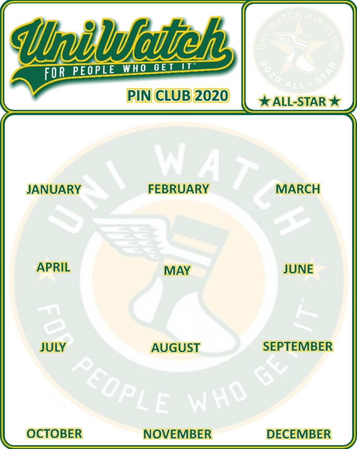
Pin Club update: Many people who collected all of last year’s Uni Watch Pin Club designs used reader Blake Pass’s display template to showcase their pins. But now that people are receiving the All-Star bonus pin, some folks have asked if Blake could update his template to allow for that pin. As you can see above, he’s happily agreed to do so. You can download this new version here.
Speaking of the Pin Club: Our curling-themed January design is now down to 55 pins remaining. If you haven’t seen it, it’s a beauty:
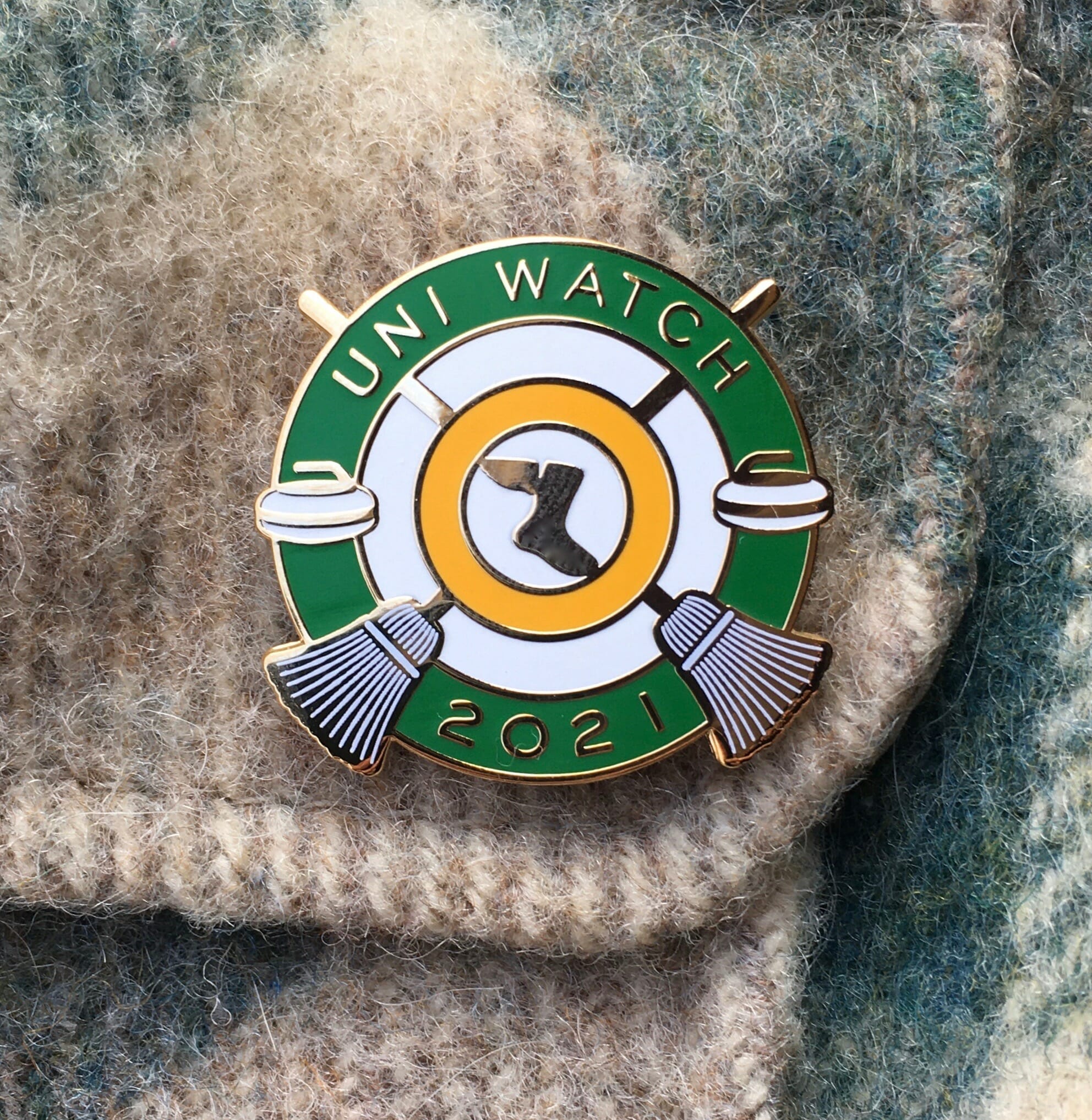
It’s available here while supplies last. Also, all of our remaining 2020 pins have been marked down from $13.99 to $9.99. You can find them in the Uni Watch Shop.
My thanks, as always, for your support and consideration.
The Ticker
By Lloyd Alaban

Baseball News: NYC Mayor Bill de Blasio wore a Mets jersey yesterday while announcing that the team’s stadium would be a vaccination site (from Davis Lyons). … A local DC sports station Photoshopped new Nationals OF Kyle Schwarber into a Nats jersey but kept him in his Cubs pants (from Dell Michaels). … The new PGCBL team in Batavia, N.Y., will be named the Muckdogs (from @BallparkHunter).

Football News: The Pro Football Hall of Fame has taken possession of Buccaneers WR Mike Evans’s jersey and gloves from the team’s Week 17 victory against the Falcons. In that game, Evans became the first WR to begin his career with seven consecutive 1,000-yard seasons (from Mike Chamernik). … Here’s a uniform history of the CFL’s Toronto Argonauts (from Wade Heidt). … In 12 games, BYU wore 10 different uniform combinations. … Take a look at the making of Alabama’s national champions logo (from Tyler Connor).

Hockey News: One day after the NHL announced a league-wide helmet decal for Willie O’Ree, the league’s first Black player, the Bruins announced that they will retire O’Ree’s No. 22 next month (from Mike Chamernik). … The Coyotes hired Shane Doan to the front office this week but didn’t use an official Adidas sweater for his announcement photo (from @MrNursfen). … Senators F Tim Stützle has decided to use the German spelling of his NOB (from Owen Shields). … New mask for Rangers G Keith Kinkaid (from Wade Heidt). … One more from Wade: The ECHL is getting two new teams in 2021-22 — one in Coralville, Iowa, and another in Trois-Rivieres, Quebec. … The Metropolitan Riveters of the NWHL have cardboard cutouts of players from the NWSL’s Sky Blue FC at the Lake Placid bubble (from our own Jamie Rathjen).

Basketball News: Warriors F Kelly Oubre Jr.’s NOB was straight instead of arched last night, and also had a large gap between “Oubre” and “Jr.” … Kentucky men’s wore No. 33 shooting shirts to honor teammate Ben Jordan, who died Monday night (from Griffin Smith). … Color vs. color for Duke and Virginia Tech men’s last night (from Andrew Cosentino).

Soccer News: Pumas’ third shirt has leaked (from German Cabrejo). … The next few items are from our own Jamie Rathjen: The NWSL Kansas City team doesn’t yet have a name, but it now has a crest. … Sacramento, Calif., will get an NWSL club in 2022. … Cross-listed from the hockey section: The Metropolitan Riveters of the NWHL have cardboard cutouts of Sky Blue FC players for their games at the Lake Placid bubble. … MLS’s Montreal Impact are changing their team name and colors. The official announcement is coming tomorrow.

Grab Bag: New logo for the former Boston Cannons of the former Major League Lacrosse. The club is now called Cannons Lacrosse Club (from Jack Goods). … New uniforms for Wisconsin women’s volleyball. … Swimmer Klete Keller, who won Olympic medals in 2000, 2004, and 2008, is alleged to have participated in last week’s Capitol insurrection while wearing his Team USA Olympic jacket (from Timmy Donahue). … Speaking of last week’s riot, here’s a guide to some of the symbols and logos that many of the insurrectionists were displaying. … And in yet another related item, Goldman Sachs had planned a lobbying event for small businesses called “Storm the Hill.” After last week’s riot, the company is asking employees not to wear T-shirts with that slogan. The event will now be called “Legislative Advocacy Day” (from John Cerone). … New title advertiser for English cricket Test matches and the County Championship (from Jim Vilk). … The European Union has its first uniformed service, the European Border and Coast Guard standing corps. They’ve released their uniforms. … The National Park Service is promoting mask wearing at parks via a series of animal-themed posters (from Kevin Rice).

Click to enlarge

What Paul did last night: I donated blood yesterday afternoon. Among the many benefits of blood donation (helping patients in need, giving back to your community, free Lorna Doones) is that it takes less alcohol to get you tipsy afterward. So yesterday’s cocktail session packed a bit more of a punch than usual. More bang for the buck!
I, for one, think the sonics uniform is clearly a ripoff of Mark’s design.
Mark’s other concepts are really awesome – shame we never saw them on the court!
Agreed on both counts
I agree. I know everyone sees something different when they look at a subject, but I struggle to see the position that Mark’s Cavs concept wasn’t…let’s say…strong inspiration on the Sonics’ design.
I agree that similarity is in the eye of the beholder in this context. Thing is, absent the original Mark Heffernan letter to the NBA, we can’t know his basis for the proposition that anybody from the Sonics organization would have had an opportunity to see his proposed Cavs jersey. Nothing we have in front of us right now indicates that the Sonics knew anything about Heffernan, let alone his jersey design.
And I think both steal the look from the Nasa Logo.
link
Ah giving blood. Reminds me fondly of my college days. Then, there were weekly “Master’s Sherry” events in my college house. We loved it during the blood drive, when we could give blood right before Master’s Sherry, and get roaring on a bit of Dry Sack.
When did you go to Harvard? And did you go to Adams House?
Quincy House, actually. Master’s Sherries were on Thursdays. I’m old. Graduated in 1983!
Interesting read on the 1990s unis for the Cavs today.
When I first started to pay attention to NBA basketball as a kid, those were the days when the Cavs were orange with blue trim. The zigzag uniform was a product of the 1990s. A lot a questionable, crazy designs so I cut then some slack for trying it. I thought the 1999-2003 was an upgrade because I liked the orange being incorporated more in the uniform trim. A throwback nod to use of blue and orange to a degree.
I am disappointed in the Cavs’ current primary look because I think they had it right in the prior version. Their wine and gold uniforms (no navy trim) had a classic feel:
link
Agreed, the “championship era” wine & gold uniforms will always be my favorite and something special to the franchise. I remember thinking we finally had a classic style uniform when they debuted… in the realm of Celtics or Bulls or Knicks. Nike went a bit overboard with the current set. As much as the zig zag uniforms were apparently hated amongst the organization, they’re still nostalgic to me, and to this day am still disappointed that my mom donated my Mark Price jersey from that era lol.
As a life-long fan of the Cavs, what I remember most about the 1999-2003 uniforms is the orange and light blue striping on the black jersey/shorts. When watching a game on television, the combination of the orange/light blue would appear almost pinkish. I hated how that looked. I always wondered if the organization TV-tested those uniforms before giving them the okay.
I made an error regarding Keller. He was an Olympian in 2000, 2004, and 2008, but he only won gold in 2004 and 2008. In 2000 he took a silver and bronze. He has another bronze from 2004 as well. My apologies.
Updated!
We have heard the rumours and have a good idea about the name, logo and colour changes for the Montreal Impact to be announced tomorrow.
I really wanted a new team name rather than an FC. Got to thinking. What if the team brought back the old NASL name? Seattle, Portland, and Vancouver have done this in MLS. However, was thinking could be a concern Montreal Manic might not be PC enough today. Then discovered the Montreal Manic name was brought back in 2020 as the name of a soccer academy:
link
Same. I’d have liked to have seen the team borrow from the great supporters. Like, “Bellringers FC” or “1642 Montreal.”
Bonne chance en 2021!
Great story! And great concepts! I think it looks close enough to be a rip off, but I can also see how easy it is for two separate people to follow the same fashion trends and reach the same conclusion.
Re: the NWSL cutouts in the NWHL arena.
Happy to see that the cutout on the far right is of Midge Purce, a graduate from Harvard who is currently in the U.S. women’s national team pool. She’s got a decent chance at the 2021 Olympics!
I believe she’s the only Ivy Leaguer to have been capped for the United States, but I’d have to try to confirm that with some folks.
Still, it’s good to see.
Is it me, or are some of the NHL helmet sponsor ad logos (I’m not using corporate speak until they pay me) noticeably bigger than the team logos they are replacing? The Red Wings, Canadiens and Penguins come to mind from what I can remember, but it isn’t like there was a “good one” that wasn’t garish and unsightly. Another step toward making the major leagues look like the minor leagues.
You are correct.
Honestly, I’d have more respect, in a warped and twisted way, if the teams went “all in” and changed their helmet colors to match those of their advertisers’ logos and word marks. I mea, why not just be brazen about it the whole thing? That way, they could truly be in bed with their corporate partners and get more bang for their almighty buck (pardon the pun).
And if anyone believes the NHL brass when they say this whole gross defacement will only be for this season, they’re fooling themselves.
-C.
Pretty funny that you found a non-baseball GM Dave Dombrowski!
Also have an NHL question – for the outdoor games, if both teams wear their Retro uniforms, the Boston-Philly game is yellow v orange. Is that gonna even work?
Excellent point! Guess we’ll find out soon enough.
I remember back when the Canucks wore yellow at home, and the Flyers would visit in their orange, that that was probably the closest opposing colours you were likely to see. But I didn’t think it was an issue.
It appeared to be more of an issue when the Boston Bruins visited the Canucks back when Vancouver wore yellow at home. Both teams having yellow socks. The Canucks were good sports to help out. Here is some footage of the Canucks wearing home yellow jerseys with black road socks during a home game against Boston.
link
The ’83 Penguins did that as well (yellow home jerseys, black road socks) when they hosted the Bruins:
link
I wonder if the Suns have ever worn their orange uniforms against the Lakers in yellow? Wouldn’t be a good look.
IMO Mark’s version of the Milwaukee Buck is pretty great, and his Suns concept is very cool.
“Indeed, there are only a limited number of possible uniform designs that can be realistically developed.”
That didn’t age well.
I had the same thought. I wish someone would return the letter to the NBA when I see a game and as a daily Uni Watch reader barely recognize the teams.
De Blasio is a huge Red Sox fan. (Say whatever else you want about the guy but I’ve always respected that he hasn’t hid that.) So I wonder how he felt about wearing that Mets jersey
Typo alert: In the baseball ticker: “The new PGCBL teeam …”
Thanks, Pedro! Fixed.
A certain uniform aficionado I love to read would advise that when talking about uniforms, the full uniform should be shown and not just the jersey. The full Cavaliers prototype uniform drawing was shown against the Sonics jersey only. If you look at the full Sonics uniform, you will see the design similarities. The designs are the same, just different colors/logos.
I prefer the current wine & gold colors for the Cavs, but it would be nice if they decided on either navy or black and not keep both. Or better yet drop them both, but I’m sure that won’t happen.
According to WaPo, Klete Keller was wearing *An* Olympic jacket, but nit wasn’t *HIS* Olympic jacket:
“The jacket Keller was apparently wearing at the Capitol — with ‘USA’ printed across the back and an Olympic patch on the front — does not appear to be one from his Olympic days but rather one worn by Team USA members who competed at the 2018 Winter Games in PyeongChang, South Korea.”
link
Take this for what it’s worth:
As a NE Ohioan and a Cavs fan of the era, I remember hearing a version of this story before. News? Well traveled rumor? I don’t have any idea. It went like this…
Q: “How did the Cavs end up with these awful uniforms?”
A: “They had a really gorgeous set designed, but the NBA/Sonics stole them”
Also are those pinstripes on the bucks jersey?? *flame emoji* Mark had a talent that’s for sure!
Blake and Paul, THANKS for the extra work to modify the pin club display sheet!
No worries! I enjoyed doing it.
Stories like this are why I keep coming back to this site every day.
Cheers Paul–really great piece today!
My thoughts exactly ! Thanks Paul!
Thanks for sharing your dad’s story, Spencer! He sounds like an amazing guy. You have my deepest condolences on his passing. I love his uniform designs! He definitely Got It(TM)!
And thanks, Paul, for bringing us this story! This is the kind of content I love seeing on Uni Watch.
The NBA has now gone the way of NCAA Football. With all the ridiculous alternate uniforms and colors its hard to tell which teams are playing. Years ago when you flicked on a Laker-Celtics or Knicks-Bulls game, those uniforms jumped out at you and you immediately knew who was playing. Today, more and more I need to look at the score box on the bottom of the screen to see who the hell the two teams are!
Interesting byproduct of the story of Mr Heffernan – his use of the Jumbotron may have been the first ever use of the Belushi /Animal House scene. It’s now used everywhere, by almost every tea that is losing.
Just as much to be proud of as the Un-selected uniform.
Thanks to Paul and interviewees for another great article.
Jumbotron. At Richfield Coliseum. Hmm…