Longtime reader/pal Jim Vilk was recently watching the 1972 Liberty Bowl on YouTube and noticed that the game featured an unusually large number of uni-notable details (plus it was a good-looking uni matchup), so we’re going to take a look at that today. You can see the first part of the broadcast embedded above, and I’ll provide links to the remaining segments at the end of this post.
Just to set the stage: This game took place at Memphis Memorial Stadium on Dec. 18, 1972. The two teams were Iowa State and Georgia Tech. Interestingly, ISU went 5-5-1 that year, and Tech went 6-4-1 — even back then, mediocre teams made it to bowl games!
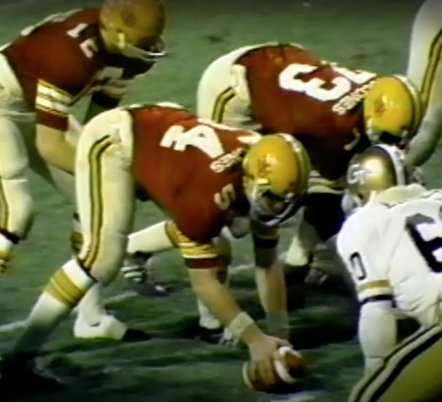
As for the uniforms and other visual aspects of the game, there are plenty of early-’70s details that were commonplace at the time but look strange to us now: two-bar facemasks, hip pads, straight-on placekickers, wide receivers setting up in three-point stances, and so on. But there were also lots of things beyond those period trappings — things that make this a particularly robust game for uni-watchers. For example:
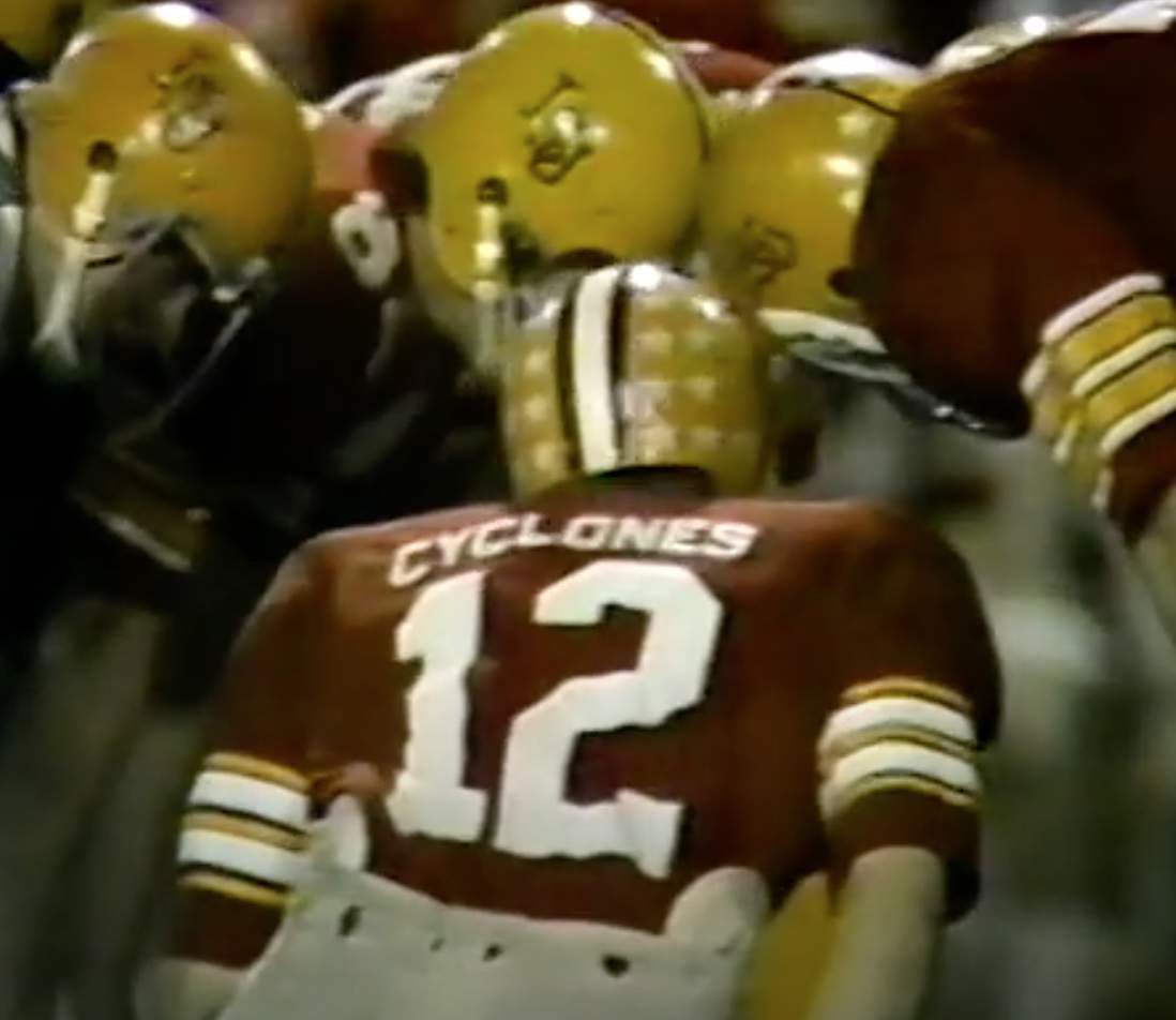
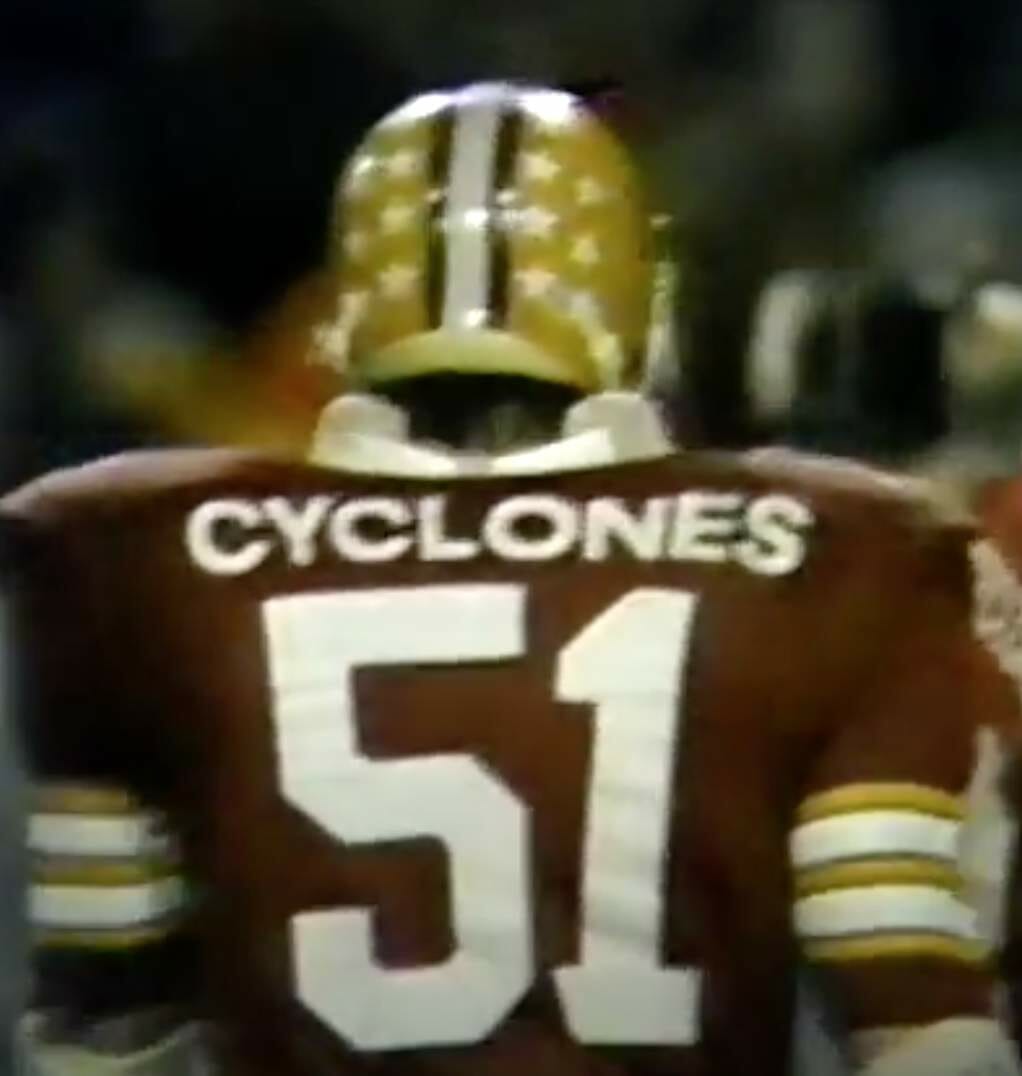
1. Iowa State wore TNOB — that’s team name on back. That would be interesting enough on its own, but they also had inconsistent TNOB fonts (for most of these screen shots, you can click to enlarge):
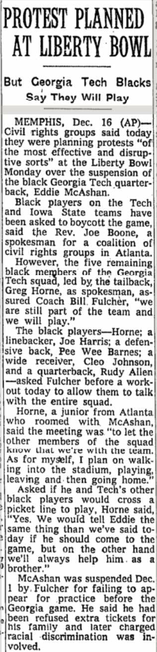
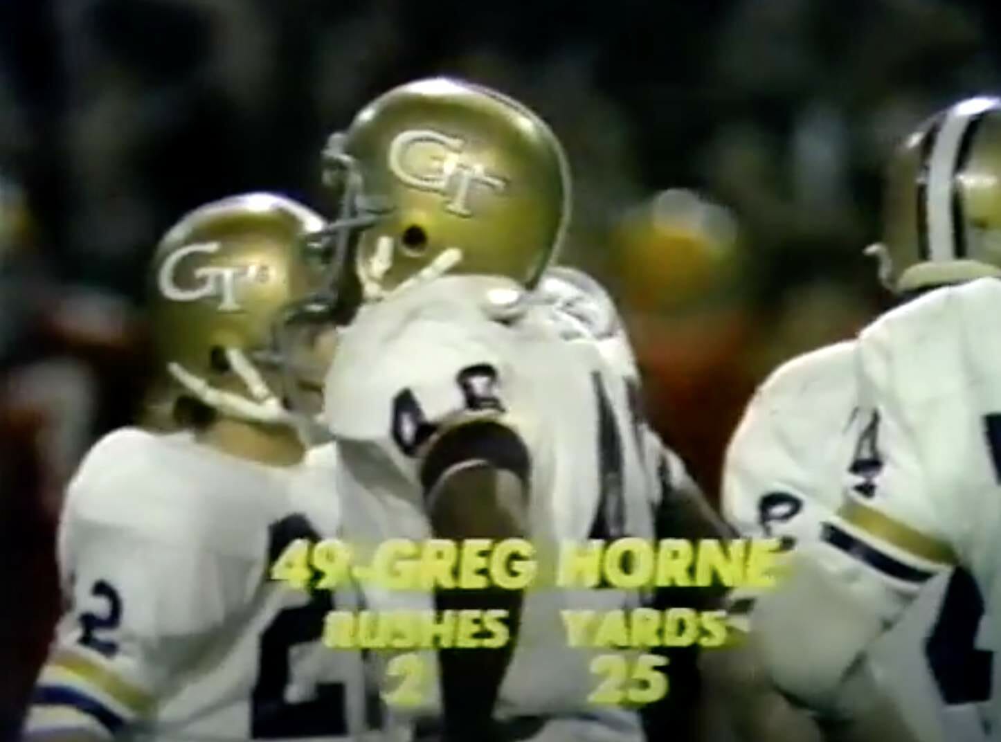
2. During the pregame remarks, broadcasters Chris Schenkel and Bud Wilkinson mentioned that Georgia Tech’s Black players planned to wear black armbands in support of star quarterback Eddie McAshan, who had been suspended from the team for missing practices prior to Tech’s game against Georgia. McAshan in turn said he skipped the practices to protest the denial of his request for extra tickets for his family, which he said was racially motivated.
Here’s Schenkel and Wilkinson discussing the situation prior to the game:
And here’s an AP wire story about the situation, which appeared in newspapers around the country on the day before the game:
As noted in the article, Tech had only five active Black players at the time, so it’s not easy to spot the black armbands during the game, but here’s a shot of running back Greg Horne wearing one, plus you can see his teammates’ sleeve stripes for comparison:
3. There were several interesting things about the officials’ uniforms. First, they wore the Liberty Bowl logo on the backs of their jerseys:
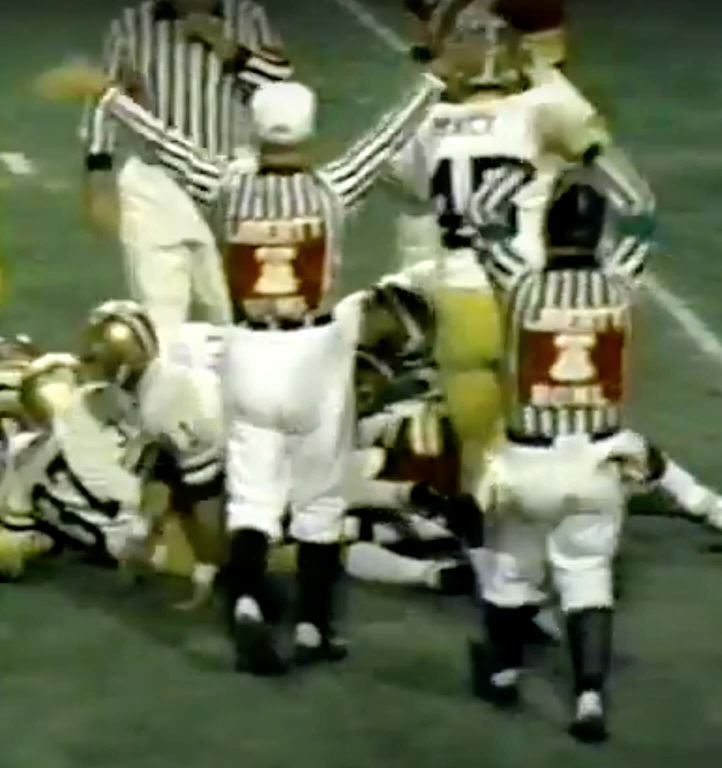
Second, you can see in that last photo that the officials were wearing stirrups, which was standard for football zebras at the time. But the interesting thing is that one guy had higher-cut stirrups than the others, creating a lack of hosiery uniformity, just like on the baseball diamond:
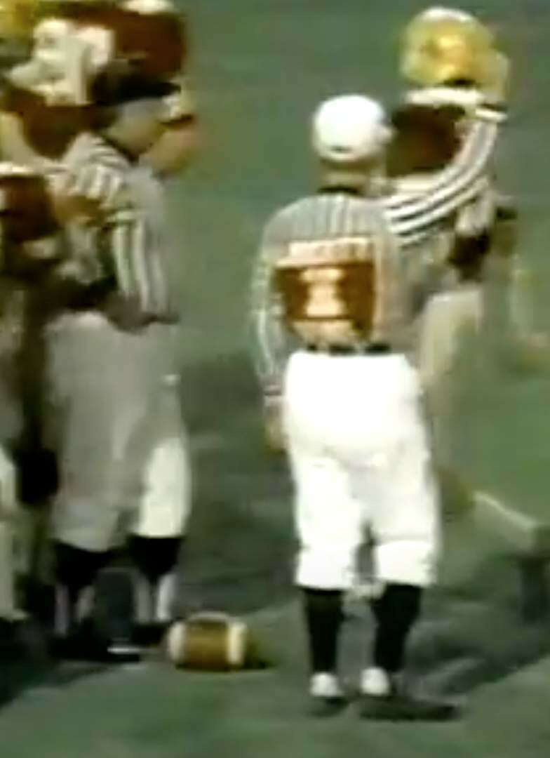
Finally, if you look again at those last two photos, you can see that one of the officials in the first shot had green armbands and the guy with the higher-cut stirrups had red armbands (much like a hockey referee). There were also at least two members of the crew with no armbands, as you can see in this group shot, which shows the full variety of sleeve stylings:
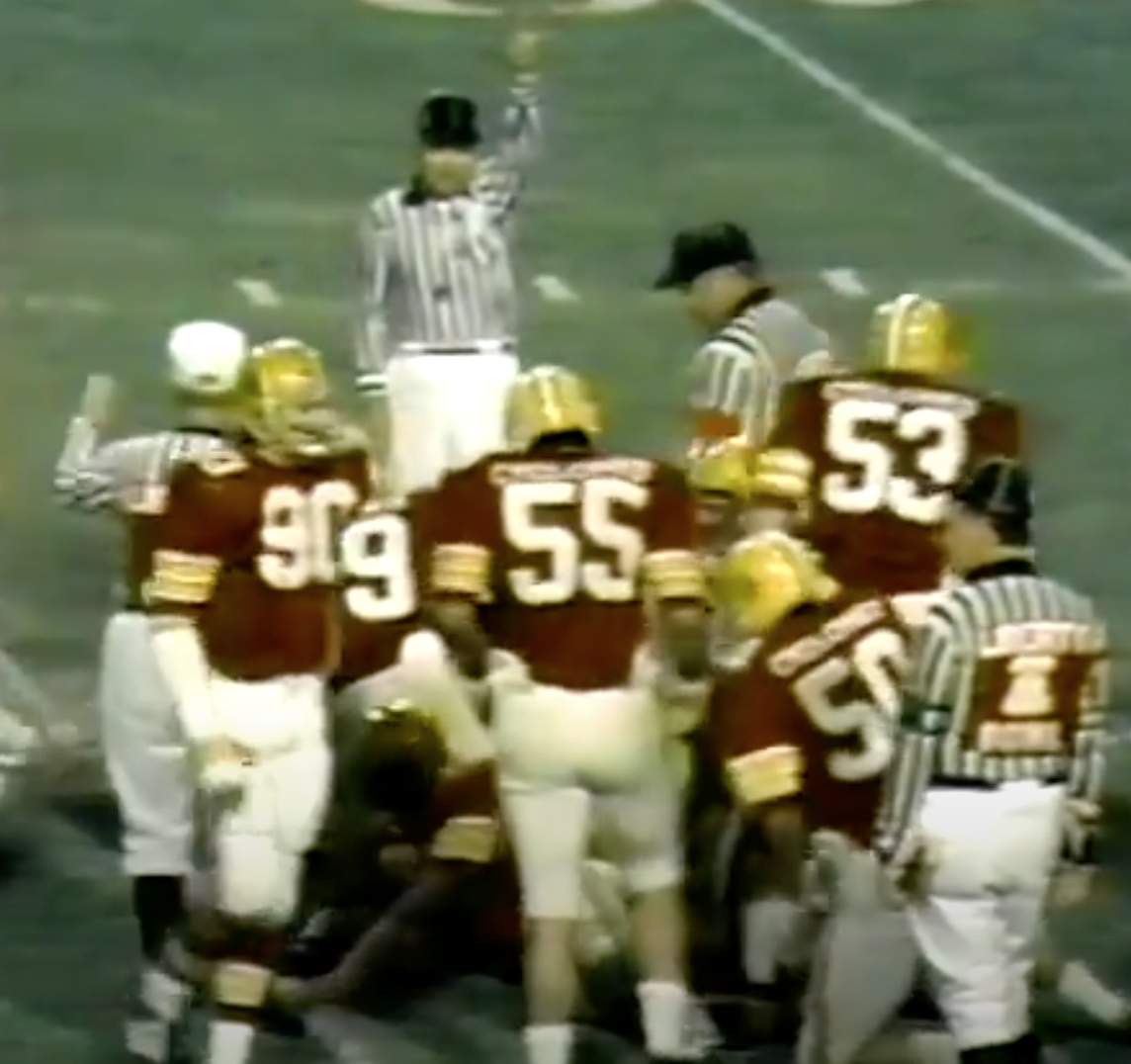
I assume the armbands were to designate certain positions (side judge, field judge, etc.), but I don’t know which color signified which position, nor did I realize that college officials wore these armbands in the early 1970s. Maybe it was just for the bowl game, because their rear-jersey numbers and/or position letters were covered up by the game logo..? If anyone knows more about this, please feel free to enlighten us in today’s comments.
That’s a lot of uni-notability for a single game (and I’m not even counting the many amazing commercials!). If you want to watch it yourself, here’s where you can find Part One, Part Two, Part Three, Part Four, and Part Five, along with a short highlight clip.
(Big thanks to Jim Vilk, who deserves most of the credit for this post.)
The Olynyk Klynyk was in session tonight 😤
19 Pts / 5 threes / 8 Rebs pic.twitter.com/raCaPYjJQp
— Miami HEAT (@MiamiHEAT) January 5, 2021
Failing gradient: The Heat debuted their ViceVersa uniforms last night. I’m on record as having a grudging respect for the audacity of the ViceVersa concept, but I was surprised by how bad their court looked last night. As you can see in the video embedded above, the blue-to-pink gradient in the lane wasn’t a gradient at all — it was three distinct colored sections. Or as one Twitter-er observed, it looked more like Neapolitan ice cream.
Interestingly, the court mock-up that the team released prior to the season did have a gradient:
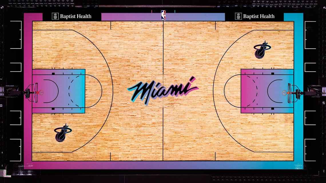
Odd that they didn’t stick with that original concept, which looked much better.
Click to enlarge
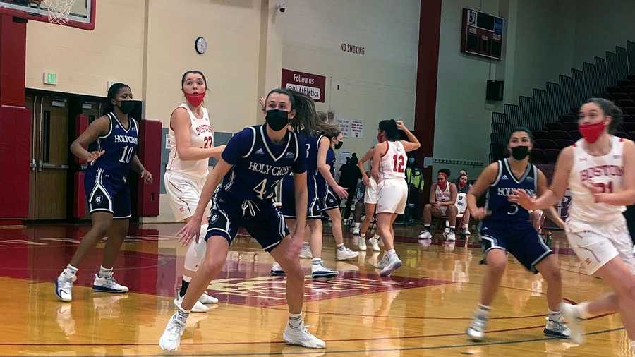
Covid chronicles, continued: Boston University, whose men’s and women’s basketball seasons began yesterday, is requiring all of its players to wear masks on the court both at home and on the road, and is also requiring visiting teams to do likewise when playing at BU. So with the women’s team hosting Holy Cross yesterday, all players on both squads were masked up.
Here’s a highlight clip, so you can see how it looked in action:
The men’s team also played Holy Cross yesterday, but on the road. So the BU players masked up, while the HC players did not:
The situation will be reversed today, as the BU women’s team travels to Holy Cross (so presumably only the BU team will be masked) and the men’s team hosts Holy Cross (so both teams will be masked).
(Thanks to Timmy Donahue and our own Jamie Rathjen for this one.)
Collector’s Corner
By Brinke Guthrie
Follow @brinkeguthrie
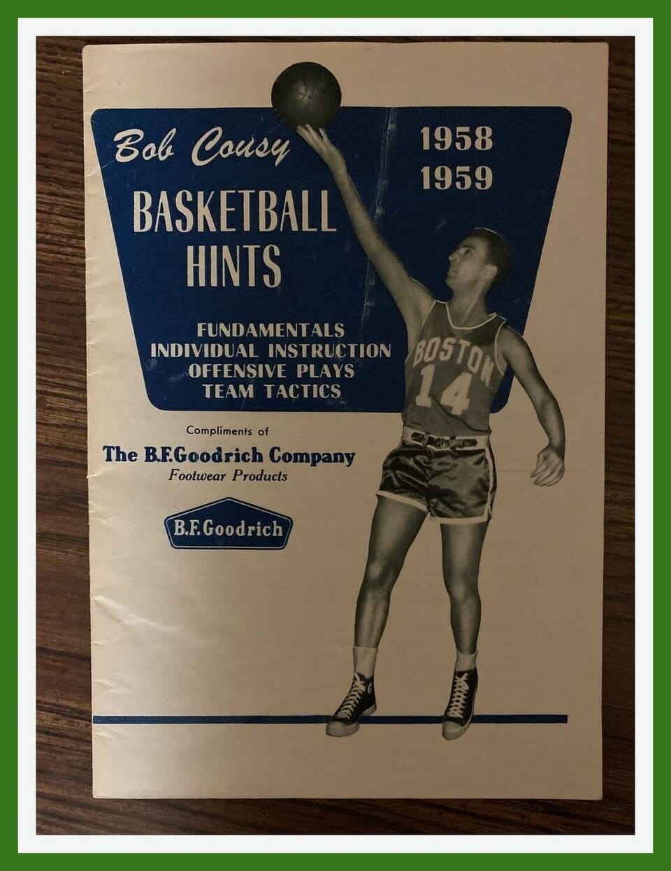
Back in the day, here’s how you learned from the best! Check out this 1958-59 Basketball Hints booklet from Celtics legend Bob Cousy and B.F.Goodrich, who made his “P.F.” high-tops. This booklet includes “Fundamentals, Individual Instruction, Offensive Plays, and Team Tactics.”
And something I never knew until now: The “P.F.” in “P.F. Flyers” stands for “Posture Foundation.”
Now for the rest of this week’s picks:
• The 1935 edition of Charlie White’s Little Red Book of Base Ball kept you up to speed on the baseball diamond. This was the “Only Publication Containing the Authentic Figures of Every Department of Professional Base Ball.”
• Here’s an interesting jacket on Etsy. It’s a 1960s “NFL Football Jacket” from a company called Sport Chief. On the outside, it looks like a blank varsity jacket. But the interior has NFL tagging, and the lining features a pattern of NFL team logos. Unusual! Anyone have any insights on this one?
• Next we have a 1950s-60s Detroit Tigers ashtray shaped like a baseball diamond. The seller notes that “the batter’s boxes and first and third base are the cigarette holders, as illustrated in last photo.”
• Here’s another Tigers auction, this time for a copy of the Tiger Tales newsletter from June 1963.
• Rayduhz fans will know it’s time to win, baby, with this Los Angeles-era Raiders alarm clock.
• Nice design on this 1976-77 Quebec Nordiques game program. Look how the hockey stick blade forms the cross on the “Q”!
• This menu for Mickey Mantle’s restaurant has a nice understated Yankees elegance to it, wouldn’t you say?
• Staying with the Yankees, this is a great example of the classic Starter Diamond Collection jacket. Perfect shape, worn just once.
• We’ve all seen the baseball helmet sundae cups. Here we have the same type of thing for NHL teams, with a hockey puck dish. This looks like a Canada-only Dairy Queen promo. (Note that the listing says you have to buy a decal sheet of NHL team colors to decorate them! Then you’d also have to buy a standings board to display them.)
• And here we have a set of four NFL Rubber Stamps — two for the Rams, and one each for the Packers and Raiders.
Click to enlarge
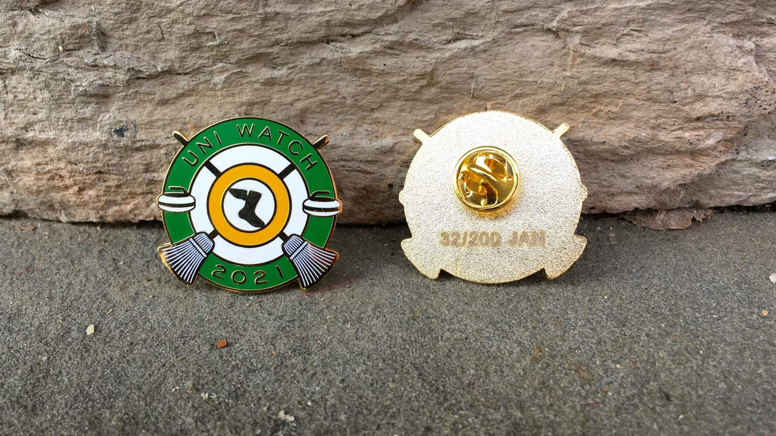
Pin Club reminder: In case you missed it over the holiday weekend, the Uni Watch Pin Club’s first pin of 2021 is now available. We’re going with a curling theme this time around — highly appropriate, since curling has a rich history of decorative pins. Hurry hard!
This is a numbered edition of 200 pins. As of this morning, there are 77 remaining. You can order yours here while supplies last.
Also: All of our remaining 2020 pins have been reduced in price from $13.99 to $9.99. In case you’ve forgotten what they look like, here’s a group shot (click to enlarge):
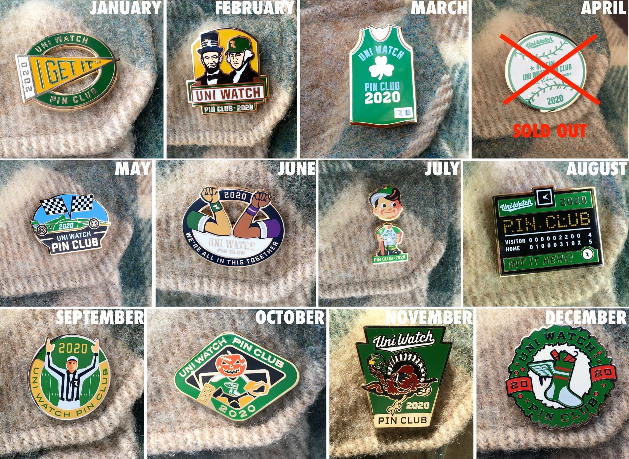
If you need to get caught up on any of those, here are the links for January, February, March, May, June, July, August, September, October, November, and December, along with the 2020 Press Pin.
My thanks, as always, for your consideration and support.
The Ticker
By Alex Hider

Baseball News: Here’s an interview with the man who created the new logo for the Ottawa Titans of the Frontier League (from @BallparkHunter). … Logo change apparently in the works for the Korean team Kia Tigers (from David Raglin and Jeremy Brahm).

NFL News: With the regular season in the books, it appears that teams wearing white slightly outperformed teams in color. … Winds at Mile High Stadium on Sunday made it seem as if the cardboard cutout Broncos fans were doing the wave (from Kary Klismet). … Staying in Denver, the Broncos’ live horse mascot wore a headdress with “21” on it to celebrate the New Year on Sunday (also from Kary Klismet). … Bills WR Isaiah McKenzie II was wearing leg warmer-style socks during Sunday’s game (from Kris Russell). … Jags WR DJ Chark Jr. is among the few players who wore the plastic Covid face shield during games (from Franklin Canterbury). … I never knew this: Shortly after moving to Baltimore in 1996, the Ravens presented first round draft pick Jonathan Ogden with a jacket, because their jerseys weren’t yet ready. It also appears that their logo wasn’t ready for the draft either (from Alan and @texastrevor). … The Titans Uni Tracker has been updated.
College/High School Football News: Northwestern’s student newspaper took a look at some of the uni combos the Wildcats have worn since signing on with Under Armour in 2012 (from Kary Klismet). … Auburn Uniform Database guru Clint Richardson takes a look at how the Tigers’ new coach could alter the team’s on-field look. … Stripes galore on these 1947 unis for Easley High School in South Carolina (from Ronnie Poore).

Hockey News: Lots of NHL teams announced their new helmet entitlement partners helmet advertisers yesterday. We’re not going to list them here, but Paul will account for all of them in his annual NHL Season Preview next week. … New mask for Jets G Connor Hellebuyck (from Wade Heidt). … We have an IRL look at the Coyotes’ 25th-anniversary patch (from Robert). … A photographer working in front of the glass at a Swedish Hockey League game wasn’t taking any chances — he wore an old-school goalie mask as he snapped photos of the action (also from Wade Heidt). … ESPN has an in-depth look at Arizona State’s equipment manager, who had to pack for a 36-day road trip earlier this season (from Paul Nitti). … Matthew Brooks spotted an unidentified New York Knicks player wearing a sweatshirt with a Devils logo on the bench during yesterday’s game.

Basketball News: This Reddit post takes an in-depth look at Nets PG Kyrie Irving’s sock situation (from @itstheshorts and Eric Bangeman). … New Grizzlies G Tim Frazier will wear No. 10 (from Etienne Catalan). … Never seen a basketball uniform quite like the diagonal stripes used by the boys’ team at Easley High School in South Carolina in 1947. That same year, the school’s girls’ team wore sleeves and point collars with a mix of numbers and logos on the front of the shirt (from Ronnie Poore). … Speaking of wild old uniforms, check out the fish-themed jerseys for the Astoria High School (Oregon) freshmen in the 1930s. That’s quite a catch! (From @retro_70s.) … Cross-listed from the hockey section: Matthew Brooks spotted an unidentified Knicks player wearing a sweatshirt with a New Jersey Devils logo on the bench during yesterday’s game.

College Hoops: The NCAA made it official yesterday: All March Madness games will be played in Indiana this year, with the games divvied up between Indianapolis, Indiana University, and Purdue University (from Kary Klismet).

Soccer News: Gross: Reports indicate that MLS will allow teams to sell advertising on masks this upcoming season (from Ryan Maquiñana). … Marcelino, the new coach for Spanish team Athletic Club, didn’t bother to take the tag off his cap prior to his introductory press conference on Monday (from Ryan Maquiñana).

Grab Bag: Belgian cyclist Wout van Aert will continue to ride a Bianchi bicycle for the current cyclo-cross season, even though his team is now being sponsored by rival bike manufacturer Cervélo. But while Bianchi bikes are typically finished in celeste blue paint, van Aert has repainted his bike black and yellow and removed the maker’s marks (from Jim Shemaria). … Here’s a full history of the Mazda logo. … The crew of The Silence of the Lambs tested out several mask styles before ultimately landing on the one worn by Anthony Hopkins’s Hannibal Lecter character (from Stephen Langdon). … Pro golfer Jon Rahm is switching from Taylor Made to Callaway. “Plenty of guys make equipment moves this time of year, but it’s a little unusual for a player so highly ranked to switch,” says Benji Boyter. “Having said that, he did play Callaway equipment in college.” … The Lacrosse Flash blog drew up some concepts for a Reverse Retro-style jersey program for the National Lacrosse League (from @PhillyPartTwo). … The rest of these are from Kary Klismet: Tennessee State University has updated its athletics logos. … USA Today’s latest piece in a series about controversial high school team names centers on the Robstown High School (Texas) Cotton Pickers.

My eyes went straight to Iowa State’s complete lack of uniformity on the sleeve stripes! Check the picture with #12 in the huddle.
Likewise. You can even see it in the first team shot.
Also if you watch the player introductions before the game the ISU wideout is also wearing a black armband, assumptively supporting the GT players protest.
Maybe we aged earlier in the 70s, but in the team introductions, the guys they introduced all looked like they were about 35, not 18-22…one had a most excellent pornstache as well.
I’m not a painter, but I am not sure how you could successfully “paint a gradient” in real life to match what is fairly easy to do on a computer, where it does by mathematical algorithms down to the last pixel. The lane is an area 16′ x 15′ (240 square feet), and the gradient is the only feature. It is visible to the rafters. How quickly do you have to change the colors and keep it consistent across the width of the lane? When the TB Devil Rays did it with their jerseys, the embroidery wasn’t perfect but from far enough away, it served its purpose. It is much harder to do painting a floor.
I would guess that most floors are done using wraps rather than an actual painting. These are easily printable from a computer.
Disregard. Looks like they are painted – but elaborate paint jobs with gradients are definitely doable: see: link
Instead of painting just 3 lines they could’ve done 6 or 12 etc.. & it would look better
On the ticker item about the Mazda logo: weird that they make no mention of the 30’s logo which had the word “Mazda” over a 3-diamond logo – typically associated with Mitsubishi…
link
“The Mazda lettering was used in combination with the corporate emblem of Mitsubishi, which was responsible for sales, to produce the Toyo Kogyo three-wheeled truck registered trademark.”
I like to imagine all uni-watchers have a comprehensive collection of Dover Edition books, and one of my favorites is “Japanese Design Motifs”. It appears to chronicle the birth of the Corporate Logo as an art form. Most of these motifs began existence as family crests. Among the 4,260 designs contained therein is the Mitsubishi “Three Diamond” crest.
Any time I hear the name Chris Schenkel it makes me smile. Loved him.
I miss him and Bo Burton on Saturday afternoons talking about Earl Anthony, Johnny Petraglia, and Amleto Monacelli.
I liked him too, but after rewatching this game, he was a lot better at bowling.
Something I forgot about 70s ABC coverage of football: the so-called “honey shots.” The camera crew used to search the crowd for women between plays. During one such moment you can hear Chris say “What a doll!” How things have changed…
Paul is right. Most of the commercials in these clips are amazing. Who knew George Blanda endorsed Brut before Joe Namath (who instead was in a Noxema commercial)?
Ok, so how is it that, in the record-by-uniform-type tweet, the total nets out to a league record of 250-256-2? That seems off.
Yeah that seems 4 games too low. 16 games * 32 teams = 512 total record. That adds up to 508. My initial reaction to this is, “duh”. There are more teams that wear white more frequently than color (cowboys, dolphins), so they’re going to have more total wins.
The total count is too low for sure. The overall league record must be x-x-y, where y is an even number (and obviously x=x), and 2x+y=512.
what about color rash games? wouldn’t some of them be color vs color?
Excellent point. That said, the overall league record must still conform to the constraints I laid out above.
If you add up all of the NFL team records it comes out to a totally mediocre .500 – I am sure back in the 70s and 80s when there were better teams the overall record was higher.
I see what you did there.
Surprised no mention of the AHL having 3 teams opt out and a few others temp relocating to play (though it makes no sense that Springfield is not playing due to “Covid” concerns but Providence is movibg to Mass temp for “safety”.
Broadly, I’m not sure indoor ice hockey makes sense. But if that ship has sailed, it “makes sense” to have your NHL and AHL teams in the same state. Same payroll at the end of the day, and maybe future teammates if necessary to cover an injury or exposure fast.
Binghamton Devils are also moving to Newark temporarily. Can you imagine, a Devil gets called up to play in New Jersey, then gets sent down…”Welcome back to New York State, Cuomo says it’s quarantine time.” That’s impractical, losing a AHL player like that. So that’s probably why.
It would make more sense to create several centralized locations (i.e. Hartford could have been an East hub along with Bridgeport) or in NY, there are several locations. But the lack consistency is across the board.
The NBA G leauge is doing the hub, so it is surprising AHL is taking this route (and I will miss the Admirals uniforms…among my favorite).
Providence will be playing at a practice facility in MA — no fans.
The reason Springfield opted out is because they wouldn’t be allowed to have fans.
I understand the benefit of wearing masks, but what’s the point when you don’t cover your nose, or with the men’s player not covering his nose or mouth.
The optics were terrible indeed.
I expected more players to wear those masks improperly since basketball is extremely aerobic; blocking air passageways during intense exercise is generally unsafe/a health hazard.
Just cancel the games…why play at all under these conditions?
I agree that it might be best to cancel the games. But just to push back on something you said: I’ve been going for an intense bike ride while wearing a mask nearly every single day for more than nine months now.
It’s not that hard.
I’m a safety professional, and even a N95 mask has very little air restriction. However even knowing this, I did a treadmill test right when the pandemic hit and I felt like I couldn’t breathe wearing a mask. It was all mental. Now I’m so used to it that I’m sure it wouldn’t bother me at all.
Agreed. It’s ridiculous. If opposing teams decided to not play under those conditions I suspect BU would drop the idea pretty quickly.
Why would a visiting team decide not to follow a public health rule that the home team is also abiding by?
Question: are their any uniform/logo-oriented podcasts? I ask because I’m pondering starting one (I work on a sports-talk radio station in Wisconsin, and a lot of us who work on the air are doing podcasts, and uniforms/stadiums/”sports aesthetic” stuff is more my niche), but I don’t want to do something that’s already essentially covered. Plus, I’d also like to listen to any uni-talk in podcast world just as a listener!
Hi, Hoffalu.
That would be cool, albeit it would require a lot of explanation about things like colors and stripe angles, since a podcast, by definition, does not require the use of visuals.
Perhaps a vodcast (i.e., with video, kind of like the Men In Blazers show on NBCSN, which is a variant on the MIB podcast)?
Soon.
Ready for this.
Very cool.
Go for it hofflalu. If you know your stuff, have a bit of a personality & willing to grind.
*thumbs up*
Wait. Does this mean a Uni-watch podcast is in the offing?!?!?!
Yes.
As a Designer and Uni-watch reader I’ve got gallons of blog content for uni critique. I would be down with dialog.
I apparently missed it previously, but is the NHL really using “helmet entitlement partners”? Really? Whatintheeverlovingfuck? George Carlin’s bit about the attempt to use language to make things sound more important/different than they are comes to mind.
A more impressive-sounding endeavor than “WE GOT ADS ON OUR HATS!!!”
link
Wait until you see what the NHL did today!
Vomit
Yes. Selling “sponsorships” for naming each division is quite something. “MassMutual Division” (East). Wow!
Regarding NHL helmet sponsors, the only one I may almost support, is if Gatorade sponsored Tampa’s helmets. It would just work?
Makes me think, are there other sponsors’ logos that would match the team’s logos?
Not sure if that would make it better or worse.
Washington Capitals helmet ads are by CapitalOne.
One of the protesting Liberty Bowlers was Pee Wee Barnes. There’s a nickname that sadly hasn’t stood the test of time.
I was looking through color vs color matchups and I found that in Week 2 of 1952 the browns played the steelers. The crazy thing: It was black VS brown in jersey matchups. That must have been a nightmare to watch on black and white tvs as well as playing.
Were they broadcasting NFL games in 1952? I’m sure they broadcasted some but probably not all so maybe that part wasn’t an issue.
Infrequent broadcasts began as early as 1939. Championships mainly from 1948 to 1958. Though LA and WSH broadcast all their games starting in 1950. Most regular season games were broadcast beginning 1959.
I was at the Iowa State Liberty Bowl game as a kid. I was not aware of any of the uniform items that were mentioned, but more important, I was not at all aware of the racial issues that were being addressed. I would suppose my parents sheltered me and my brother from those issues. That is a bit ironic in my case because my dad did make me aware that the previous year in the Sun Bowl, LSU did not have any black players on the team. Thank you very much for this article!
College football officials did wear colored arm bands in the 1970s to designate their positions. I don’t remember what colors designated what position, though. The back of college officials shirts were blank at that time. There was no number or position designation. Although, I do remember Big 8 basketball officials wearing a Big 8 logo on the backs of their shirts about that same time.
And so the downward spiral continues….
link
Opening line of the article….”With NHL revenues taking a hit during the COVID-19 pandemic due to lack of fan attendance, the league has brought on four sponsors for the names of the new four divisions in its re-aligned schedule.”
Gross.
Great. Now you’re NASCAR.
And I’m saying this as a big NASCAR fan. It’s the single worst part of the sport, and it bothers me weekly when the season is going.
Sharper people could figure a way to make money (and make up lost money) without damaging the integrity of the sport.
I still call it the Canadian Division.
That is regoddamneddiculous.
Two Banks, An Auto Manufacturer and and Insurance conglomerate. Fun.
I was at the 1996 NFL Draft and distinctly remember the Ravens’ generic navy-and-white signage, but have been unable to find pictures of it, or of the generic navy-and-white Penn State-like helmets and jerseys they wore in training camp before the uniforms were unveiled.
Between that court and those uniforms, the Heat are reminding me of playing old DOS games on a CGA monitor using palette 1.
Since satire has now superseded reality, I’m curious as to who will win the MassMutual Eastern Division in the Year of the Depend Adult Undergarment.
Great stuff today on the 1972 Liberty Bowl, Paul! As an Iowa State alum, I was aware that the Cyclones played in the game, although I am too young to remember it – something I don’t get to say very often anymore! It was fun to learn some historical and uni-centric details relating to my alma mater of which I was not previously aware. Thanks for diving into this, Paul, and thank, Jim, for providing the impetus!
I was thinking of you as I put this entry together, Kary, as you’re definitely the biggest ISU fan I know of!
WOUT VAN AERT! My boy! I saw the race at Hulst over the weekend and was like “What the hell is he riding” and now it makes sense. Ah, the great traditions of painting bikes… if anyone bothers to read this, there’s a great story about Andy Hampsten’s 1988 Huffy bicycle in the Tour de France that was actually a re-painted custom build…he was SUPPOSED to be riding a Serotta PAINTED as a Huffy (a sponsor) but had LandShark build him a custom bike and paint it as a Huffy. Wild stuff
link
The official’s armbands were not so much to designate positions for tv/spectators. Substitutes were required to report in to a particular officialas upon entering a game. The color arm band designated which official a player was to report to.
Really? All substitute players?
I’ve never heard of that in football, except for players wearing an ineligible receiver’s number who were reporting as eligible for a given play.
From a retired official, me: The arm bands were indeed for substitution as, back when that game was played, only two subs could enter at a time except after a change of possession. Even that was a liberalization of the one-platoon college football that reigned from about 1954 to 1965. Subs for each team had to report to an official designated by an arm band, red or green. The arm bands were abandoned when full free substitution, today’s rule, was instated in the 1970s.