For all photos, click to enlarge
Good morning and Happy New Year! Greetings from Uni Watch HQ, where all three inhabitants continue to be safe and well. Hope the same is true for everyone at your home.
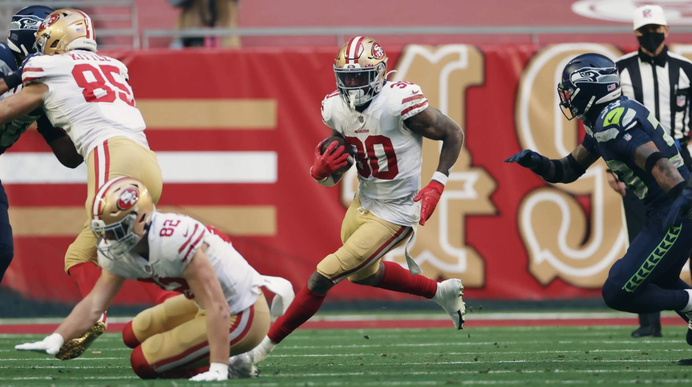
Now then: Unusual uni situation yesterday in Arizona, where the 49ers had a “home” game against the Seahawks. The Niners had originally planned to wear their white throwbacks for this game, but they didn’t bring the throwback unis with them when they relocated to Arizona because they thought they’d be back in their home stadium by this point. Since they’d already committed to wearing white, and Seattle had already planned to wear navy, the Niners ended up having to wear their primary white uniforms instead of the white throwbacks. According to the Gridiron Uniform Database, this was the first time the 49ers wore their primary whites (as opposed to a throwback) for a nominal home game since 1979!
In other news from around the league yesterday:
• I’ve written several times now about how the Bears have inexplicably opted not to wear a memorial patch or decal for Gale Sayers, who died in September. Last week they finally announced that they’d add a Sayers memorial graphic to the field for yesterday’s season finale against the Packers. Here’s where they chose to put it:
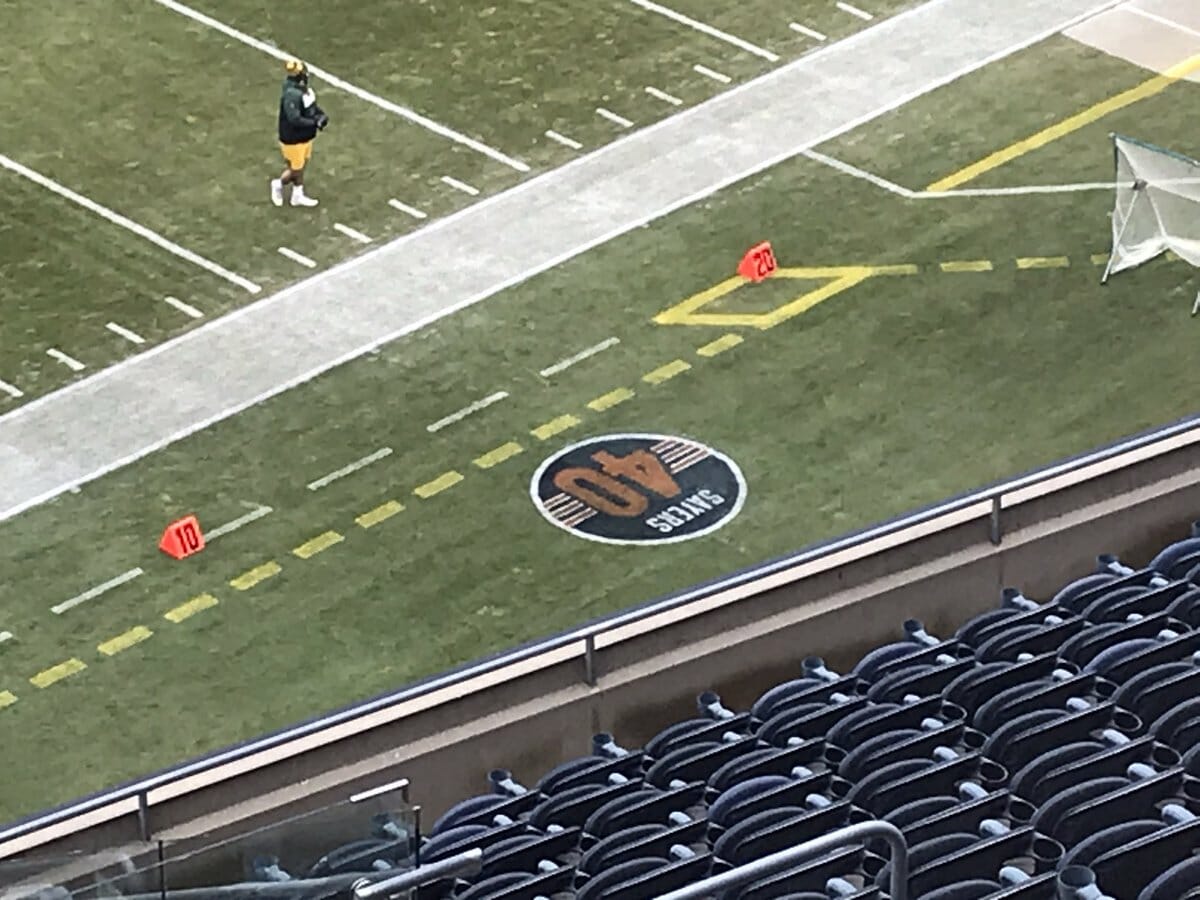
Yeesh. I was willing to give the Bears the benefit of the doubt until now, but this move really feels calculatedly disrespectful. It seems worse than doing nothing at all, like intentionally leaving a 50¢ tip. There must be more to the story that we don’t know. Depressing to see it play out like this.
• In a gesture more befitting a Hall of Fame running back, the Broncos added a “44” decal for Hall of Famer Floyd Little, who died last Friday:
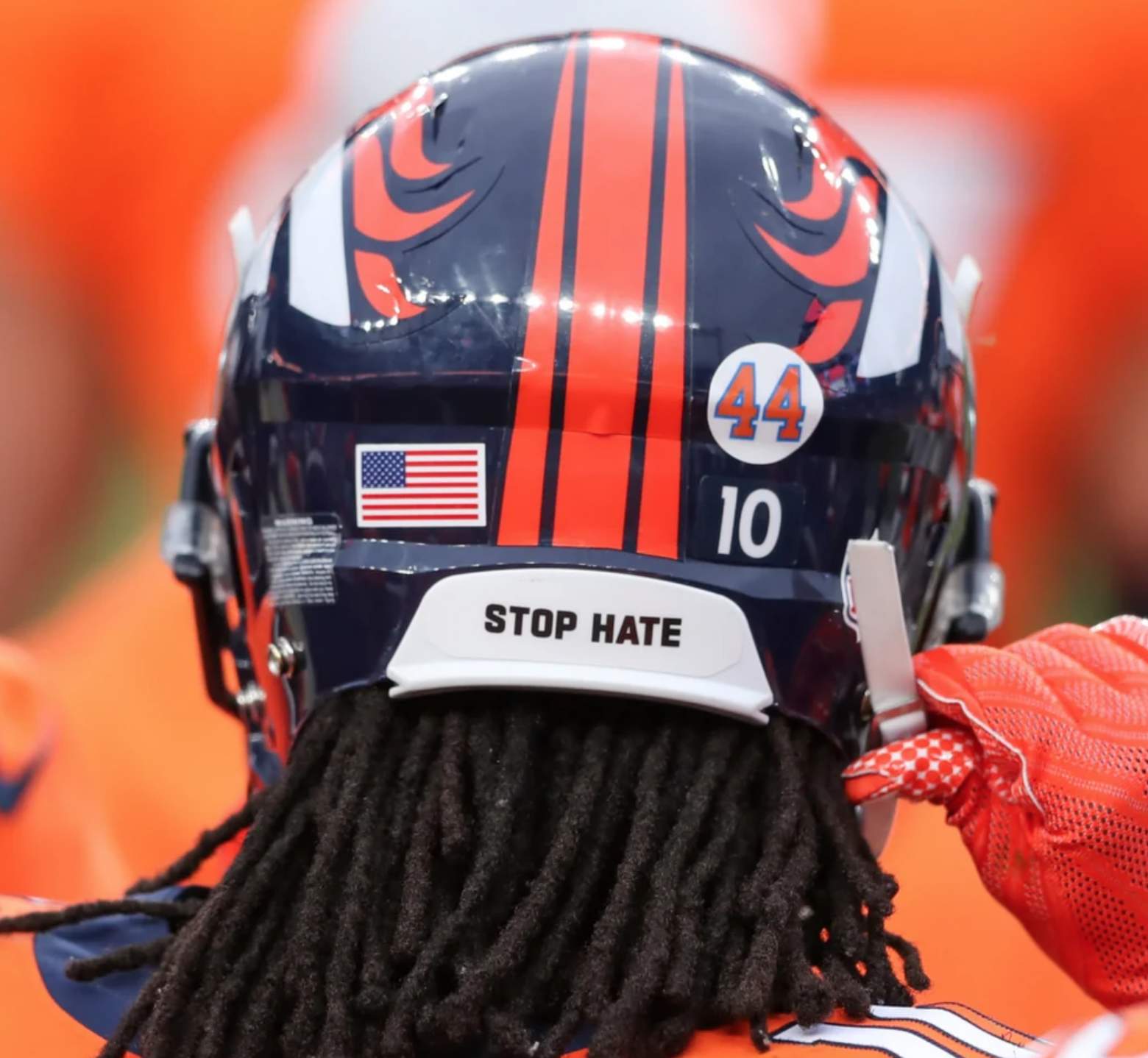
I particularly like that the memorial decal used the Broncos’ old shades of orange and blue.
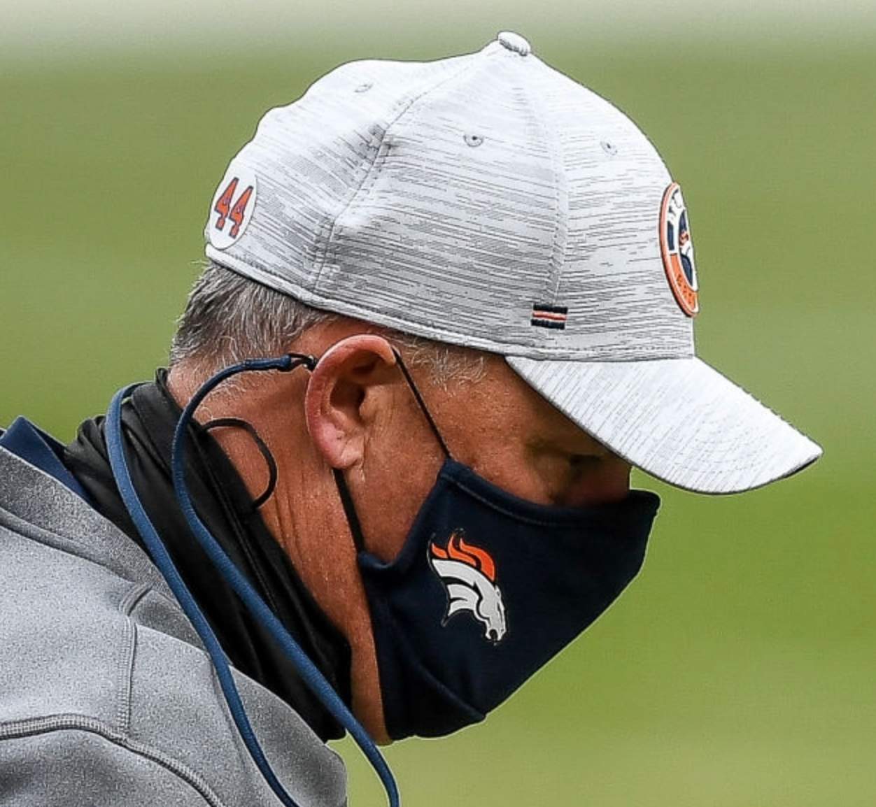
Broncos coach Vic Fangio also wore the “44” graphic on his cap:
Since the Broncos did not qualify for the postseason, yesterday was probably the only time that this memorial decal will be worn (they could carry it over to next season, but that’s uncommon for late-season NFL memorials). And yet the team still went to the trouble of doing it, and got it done within the 48-hour window between Little’s death and yesterday’s game. Kinda puts the Bears/Sayers thing in perspective, eh?
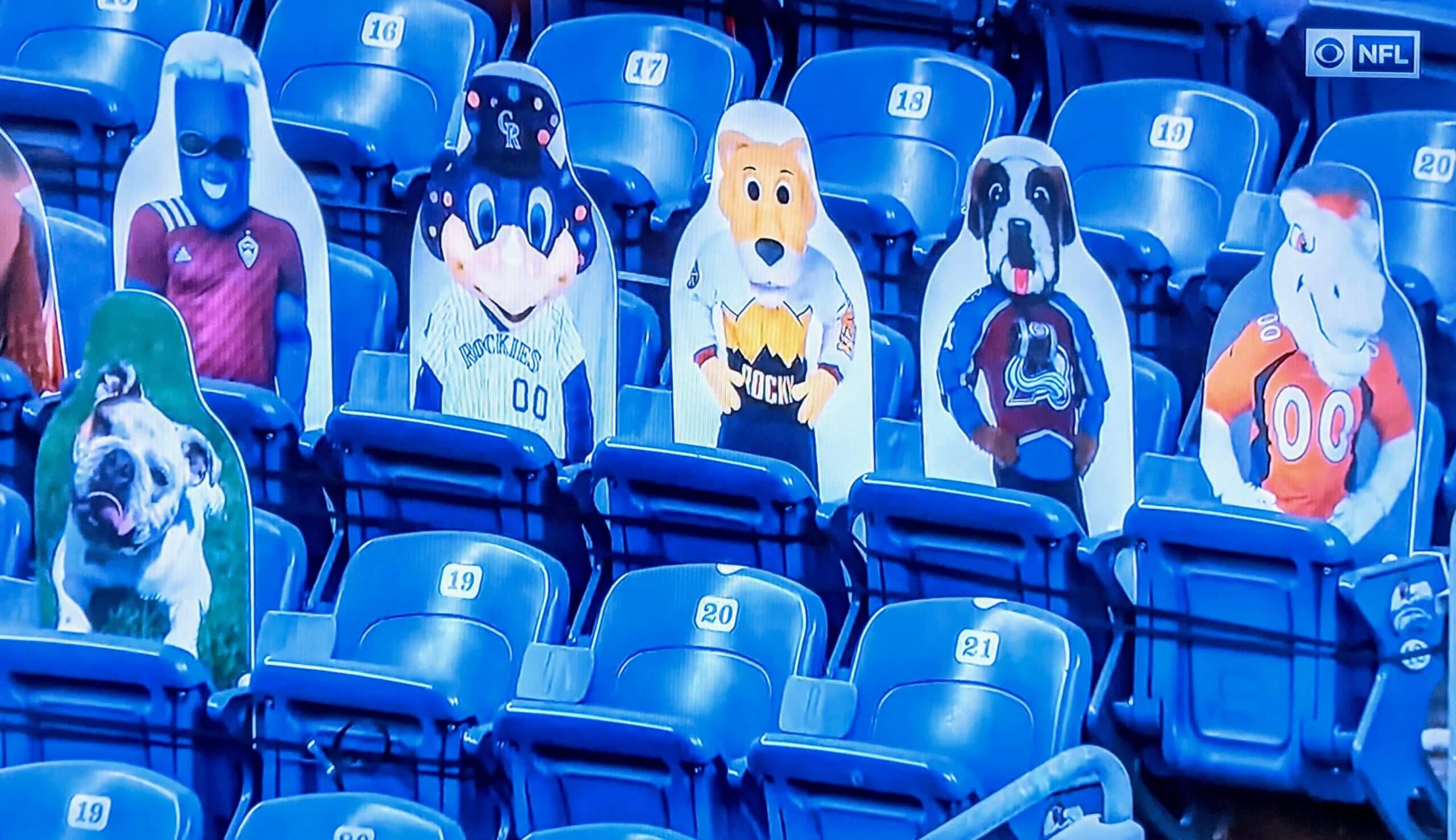
• In that same game, the cardboard cutouts in the stands at the Broncos’ stadium included costumed mascots for Denver’s five major pro sports franchises:
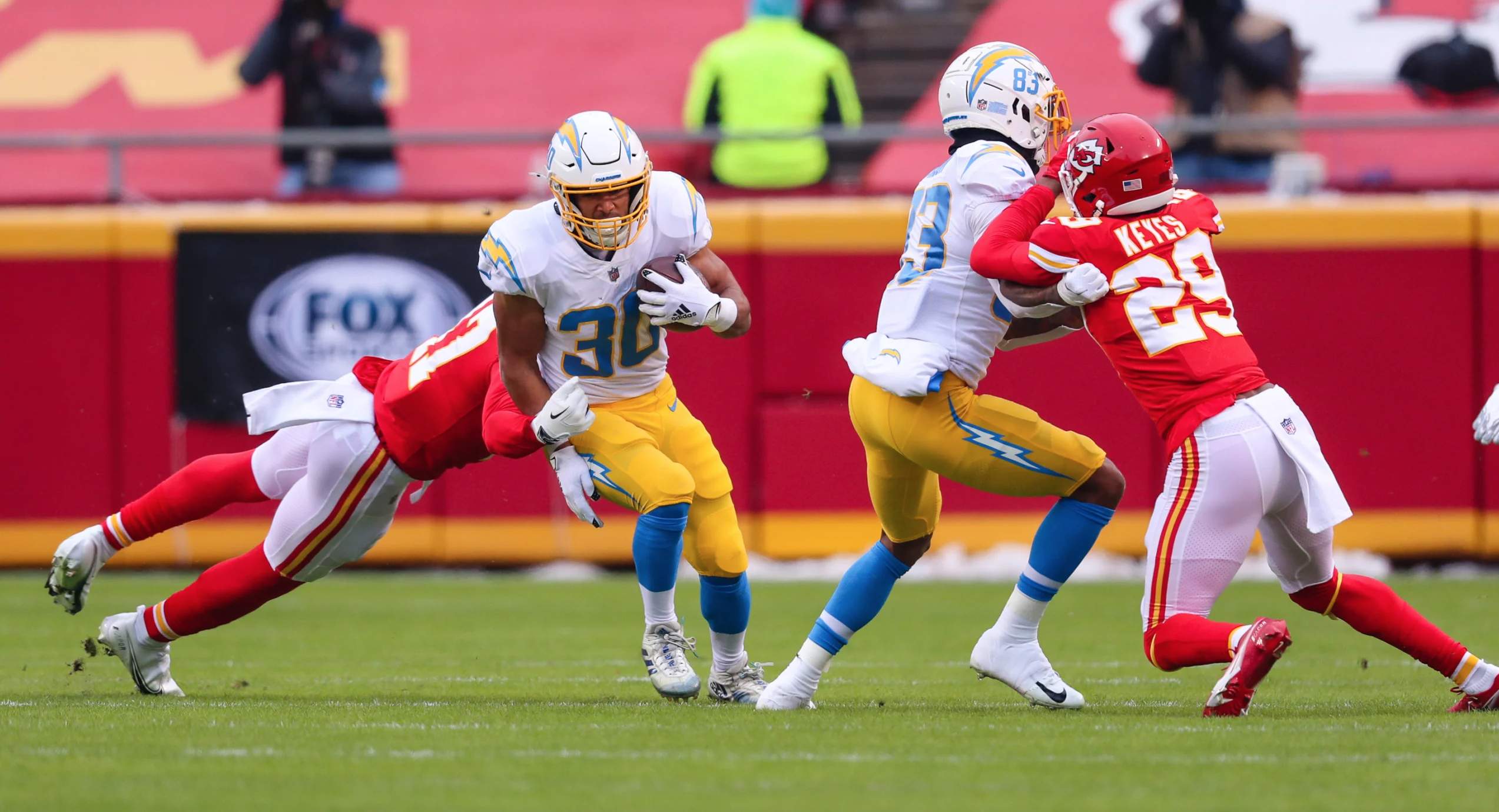
• Best-looking game of the day was in KC, where the Chiefs hosted the Chargers (lots of additional photos here):
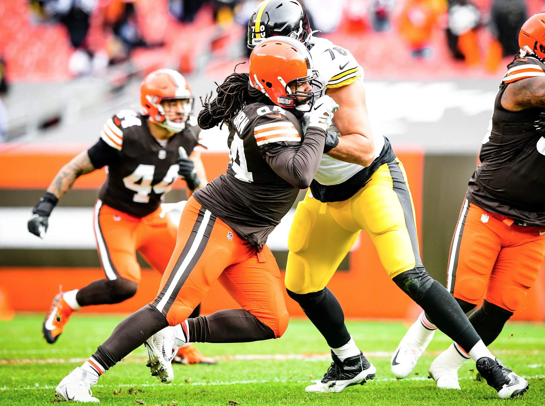
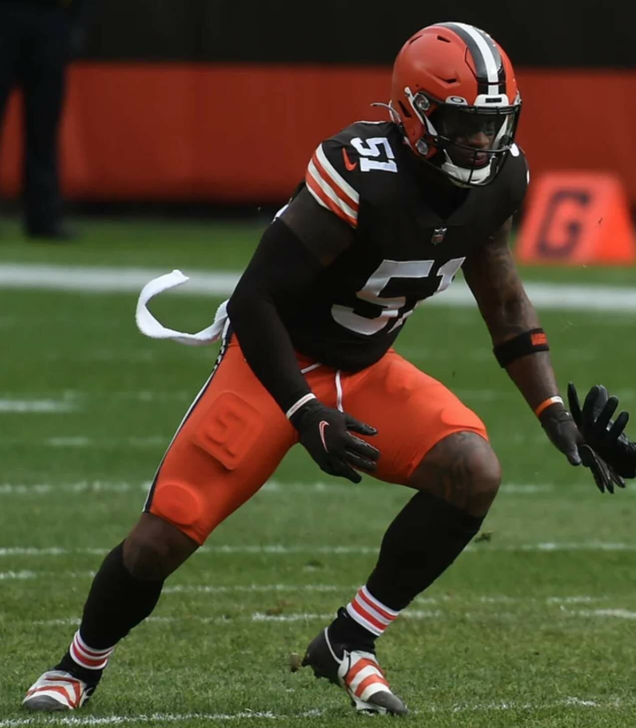
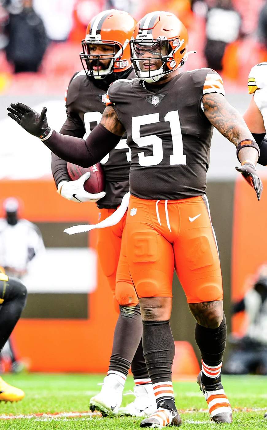
• The Browns were initially slated to wear brown over white, but shortly before the game they announced that they’d go with orange pants instead of white, making for a very nice-looking game against the Steelers:
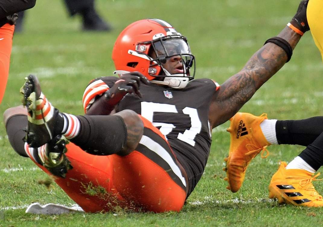
• From that same game: Nobody likes Cleveland’s sock/sleeve stripe pattern more than I do, but linebacker Mack Wilson might have taken things a bit too far by putting the striping on his shoes:
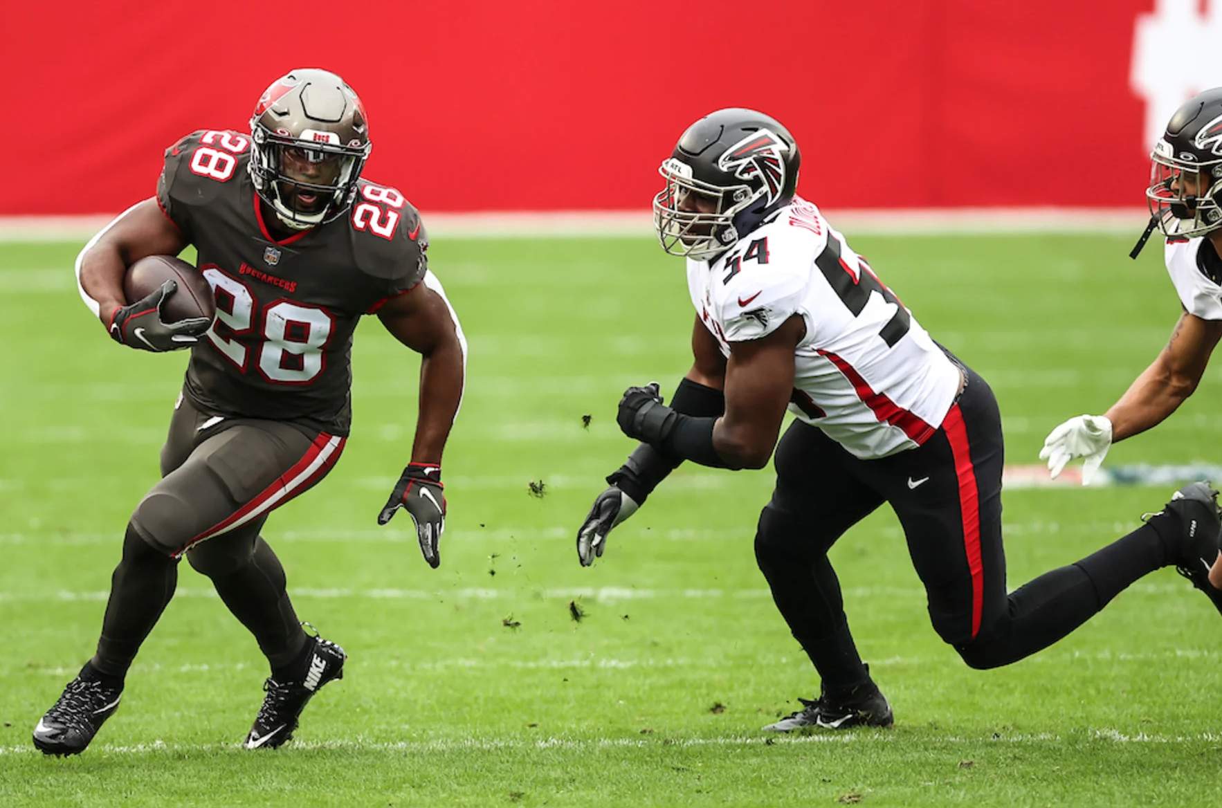
• The Bucs went mono-pewter:
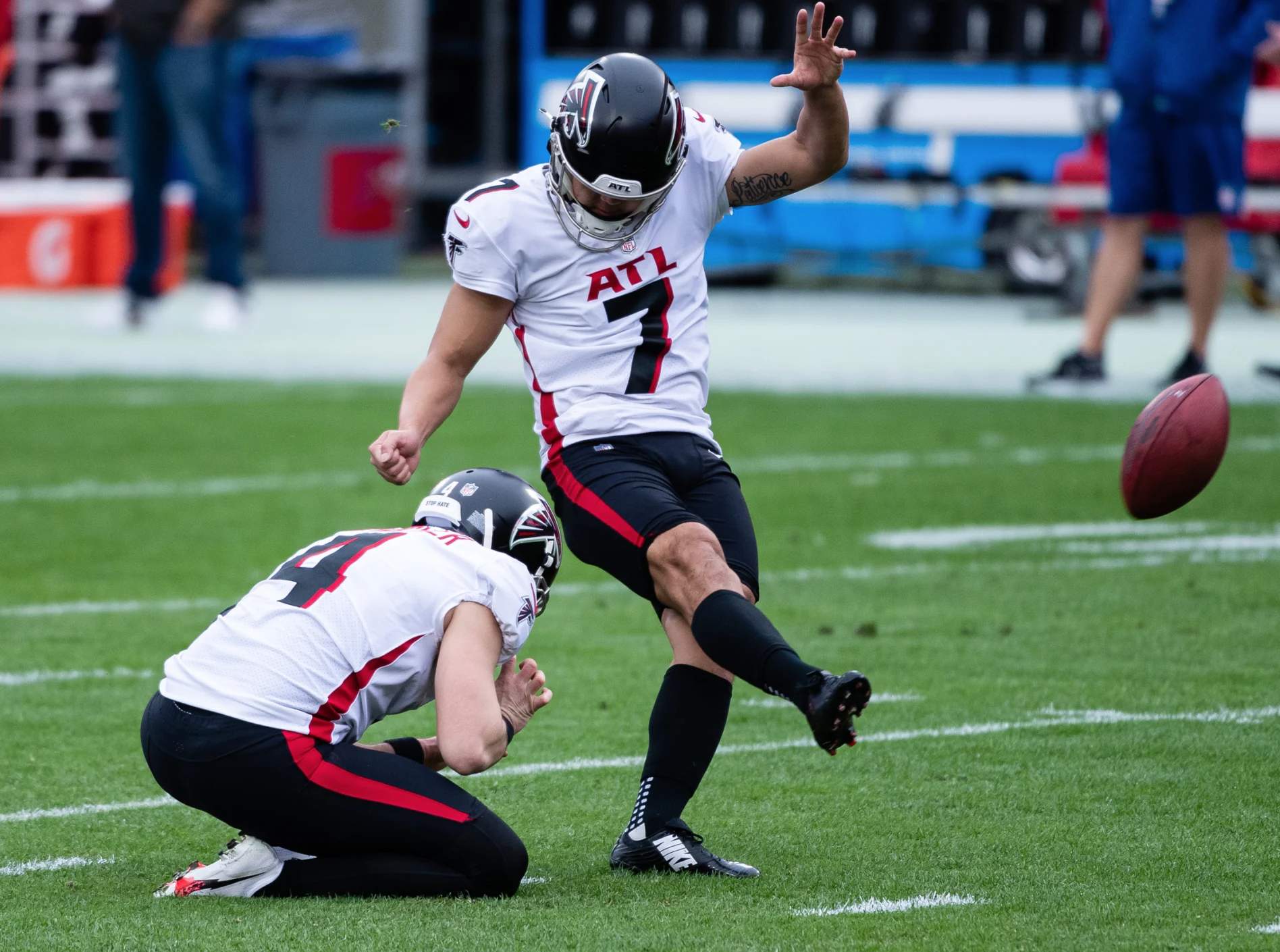
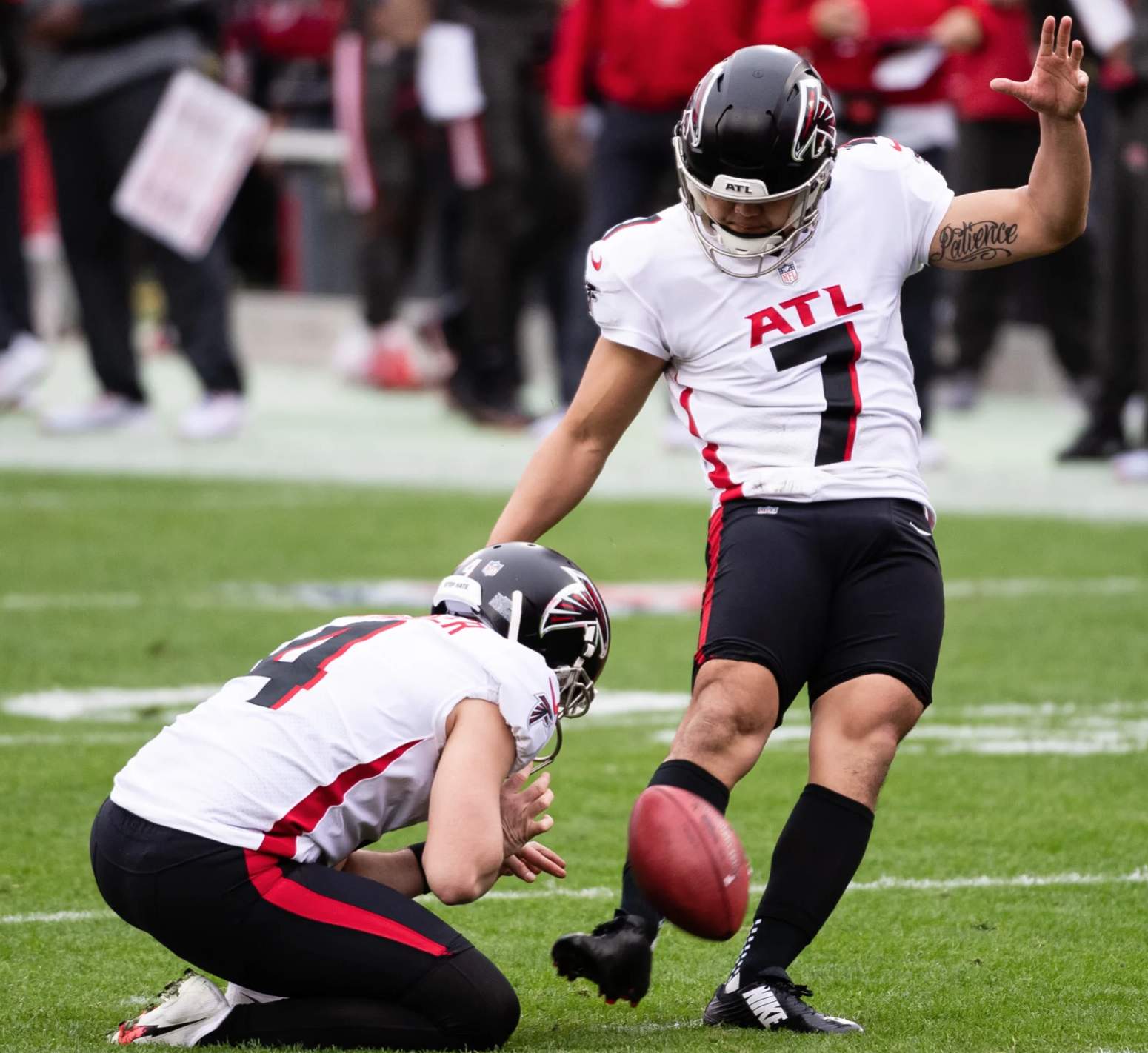
• From that same game: Falcons kicker Younghoe Koo has been pushing the envelope with his pants and socks all season long. But even by his own formidable standards, he really outdid himself yesterday:
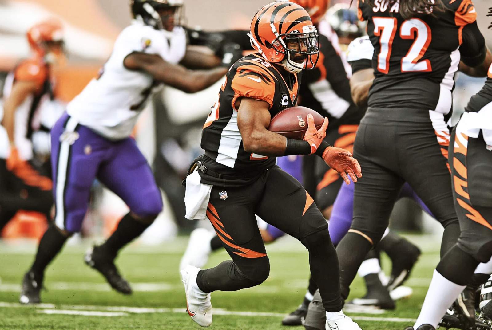
• The Bengals went mono-black:
• For the first time all season, the Saints went white over gold:
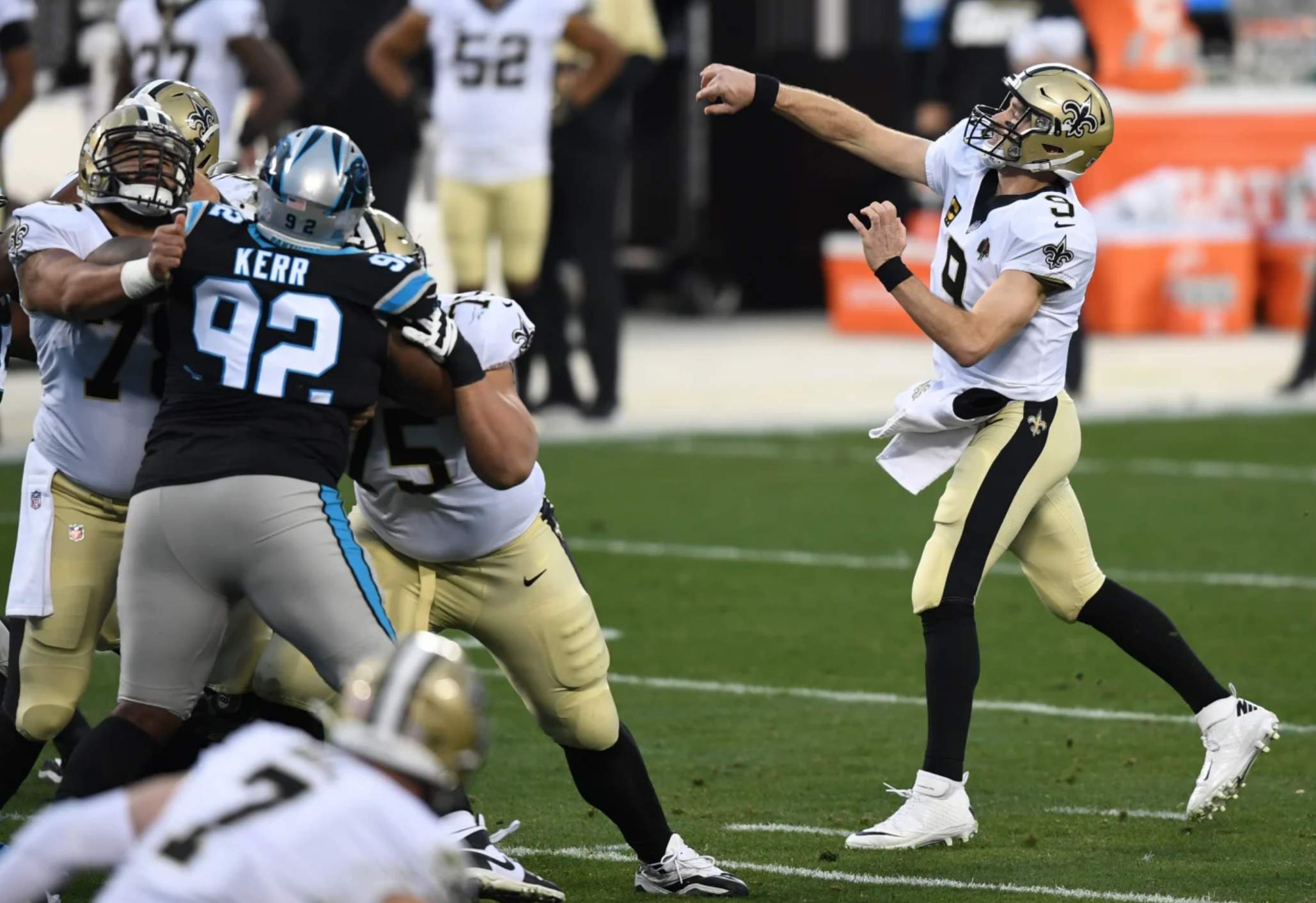
It’s such a good look, and so much better than their usual white-over-black road combo. Kinda sad that it’s now so rarely seen that it’s become noteworthy.
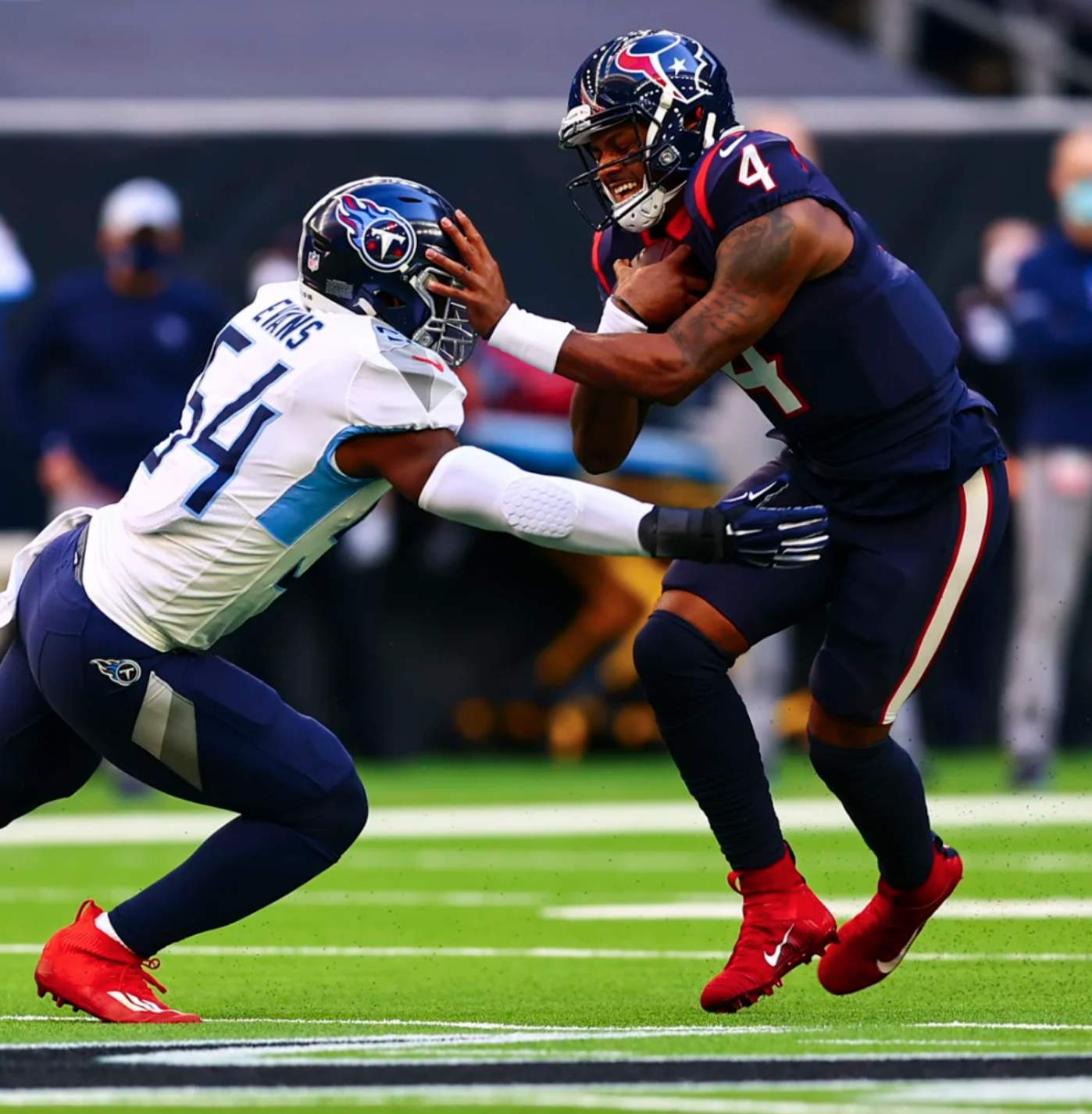
• Speaking of sad, the Texans went mono-navy:
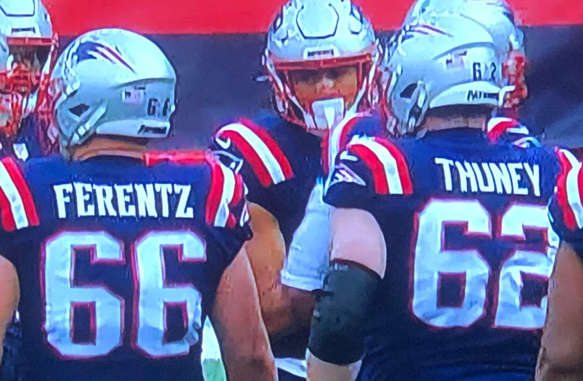
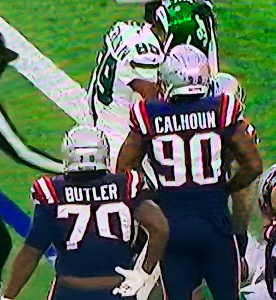
• Gotta hand it to the Patriots, who managed to have various players wearing last year’s number and NOB fonts all the way through the final game of the season:
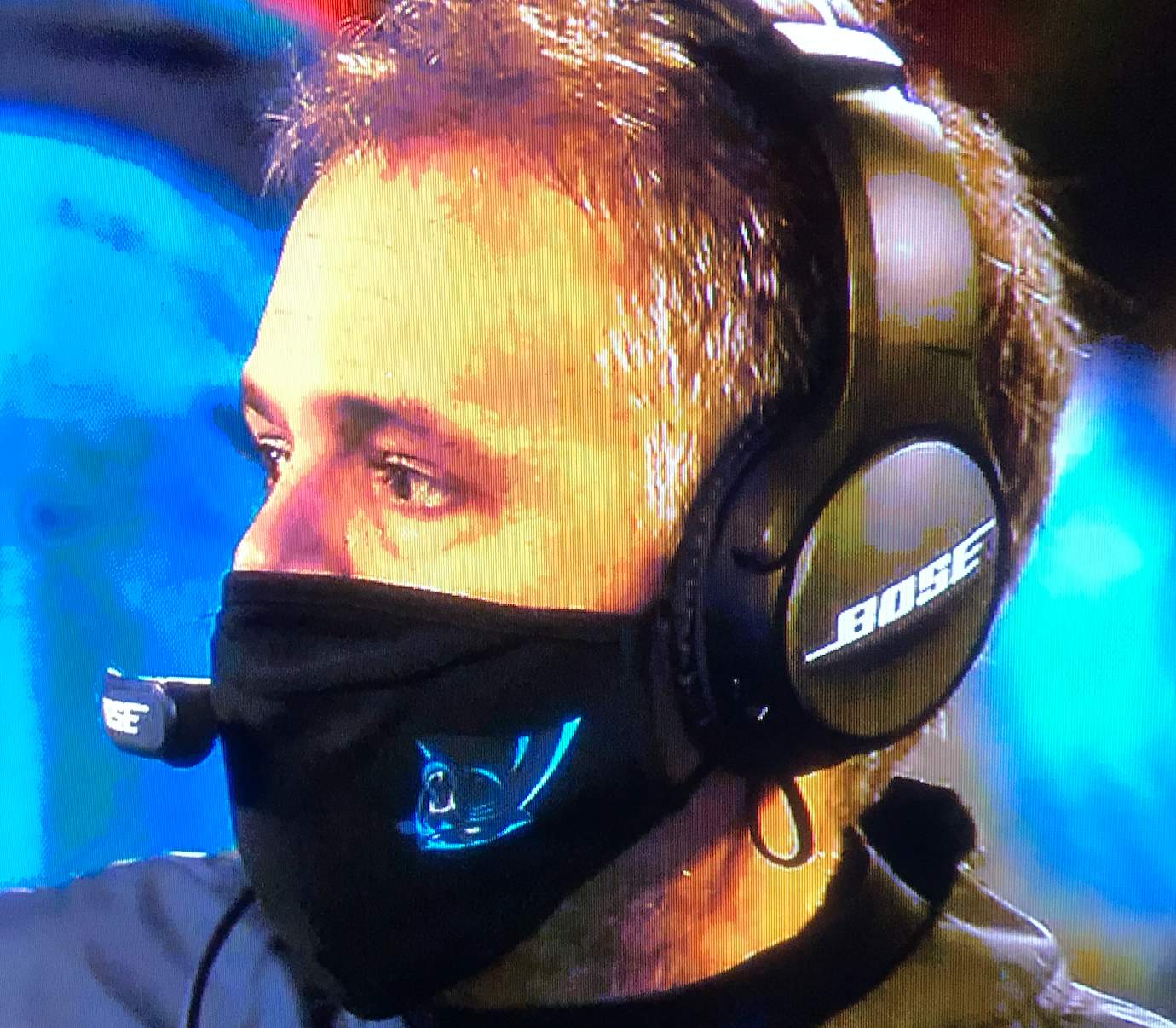
• Panthers coach Matt Rhule had his mask on upside-down:
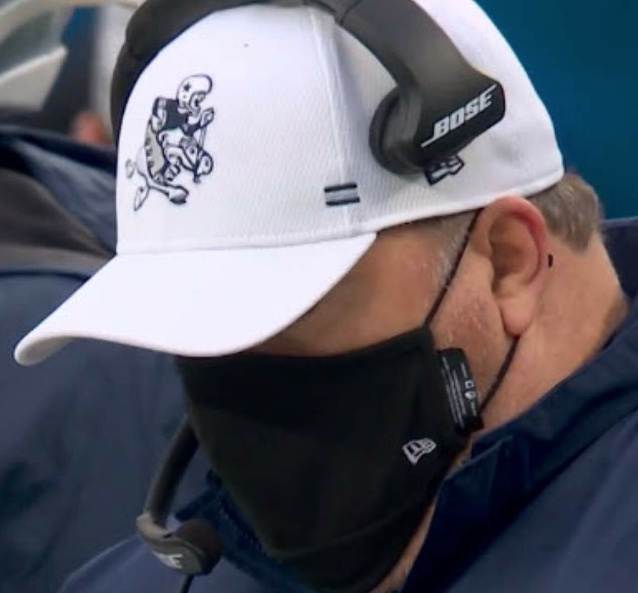
• Speaking of head coaches, Mike McCarthy of the Cowboys wore a cap with the team’s old “ride ’em cowboy” logo:
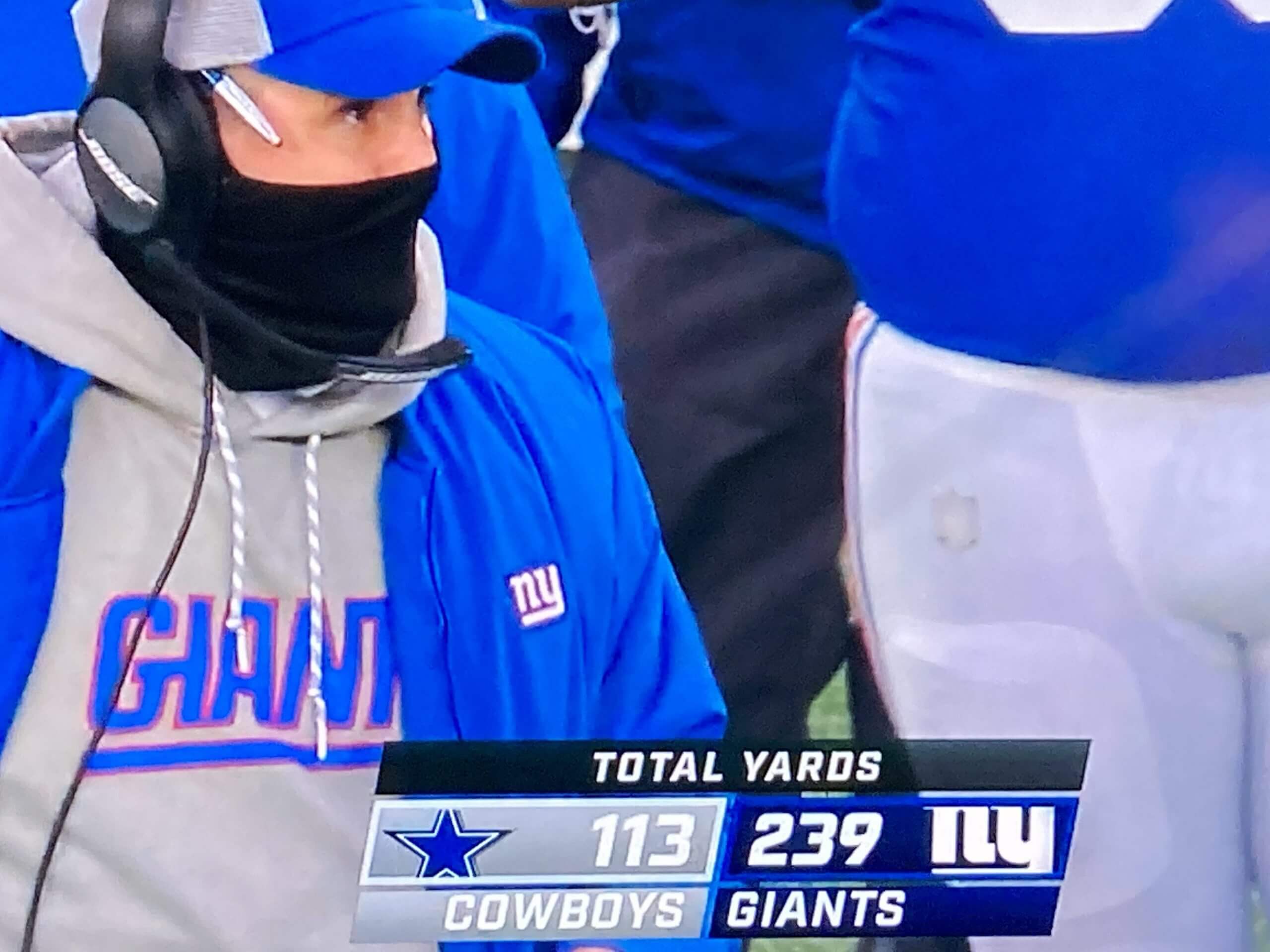
• In that same game, someone on the Giants’ sideline — not sure who — apparently had the NFL logo patch fall off of his pants:
• In a development that you don’t see every day, Bills wideout Stefon Diggs was flossing his teeth on the sidelines:
Just when you thought Stefon Diggs couldn’t get any more impressive… displaying phenomenal dental hygiene. #Bills pic.twitter.com/q4NWzBTxL9
— Bradley Gelber (@BradleyGelber) January 3, 2021
I can recall only one other instance of that — in 2016, by Cam Newton, who was then with the Panthers.
• Here’s something I missed until now: For the past few weeks, Jaguars cornerback Quenton Meeks has been wearing No. 5. I didn’t even realize that was a permissible number for a defensive back:
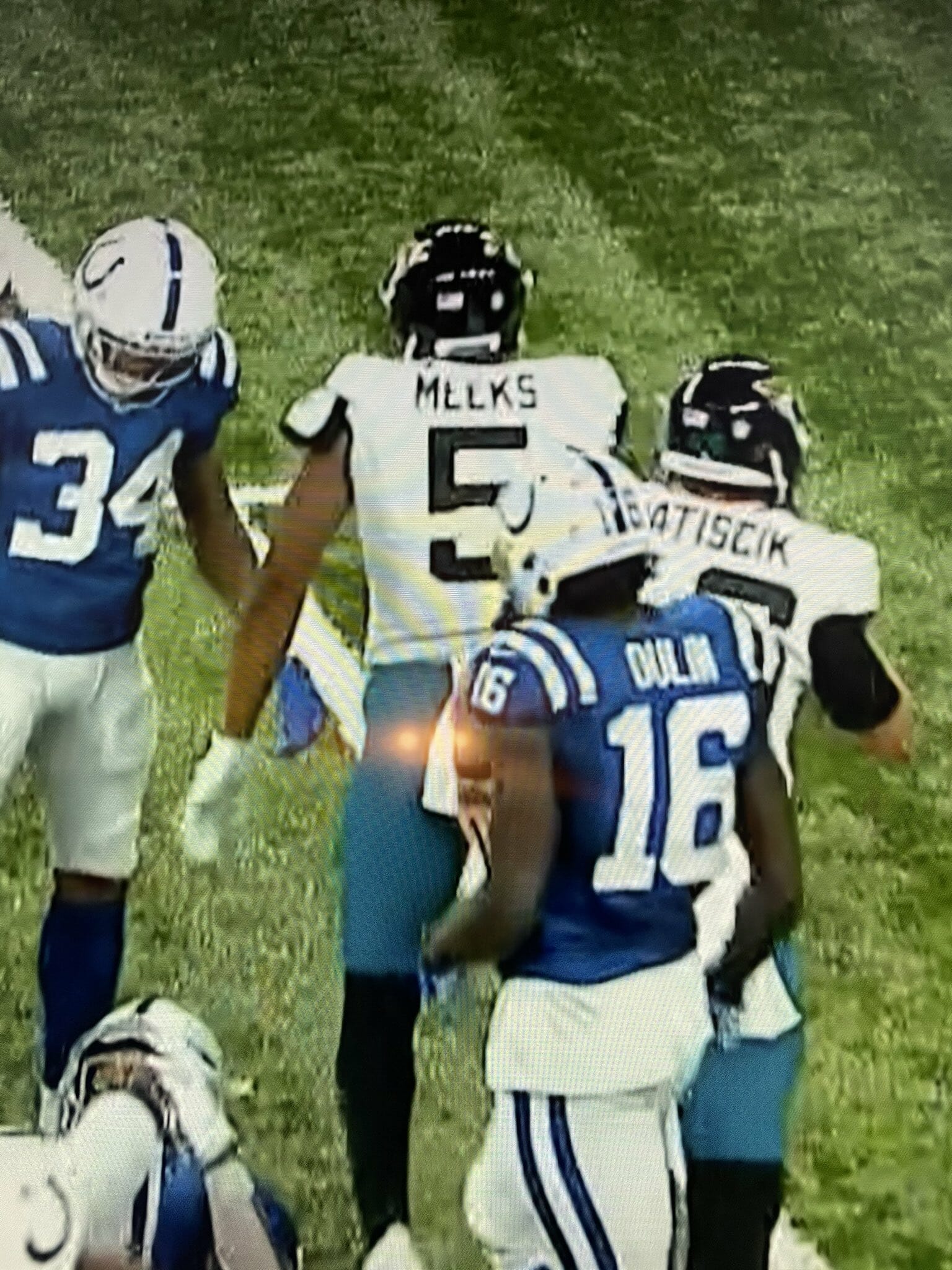
(Update: Reader/commenter Clint Richardson says, “On the Dec. 16 edition of the Jags’ Happy Hour show in which they bring on equipment manager Jimmy Luck to unveil that week’s uniform combination, Jimmy was asked about the number assignments with the large number of players coming and going due to injury and Covid. He mentioned that they had to receive permission from the NFL to assign players out-of-position numbers, so to speak.” Here’s that passage of the show.)
• The aforementioned 49ers were the only home team that wore white.
(My thanks to Matt Barnett, Mike Chamernik, Jesse Evers, Joel Everson, Joel Hooper, Kary Klismet, Michael Nowels, Pete Schwadel, @NFL_Journal, and our own Brinke Guthrie for their contributions to this section.)
Click to enlarge
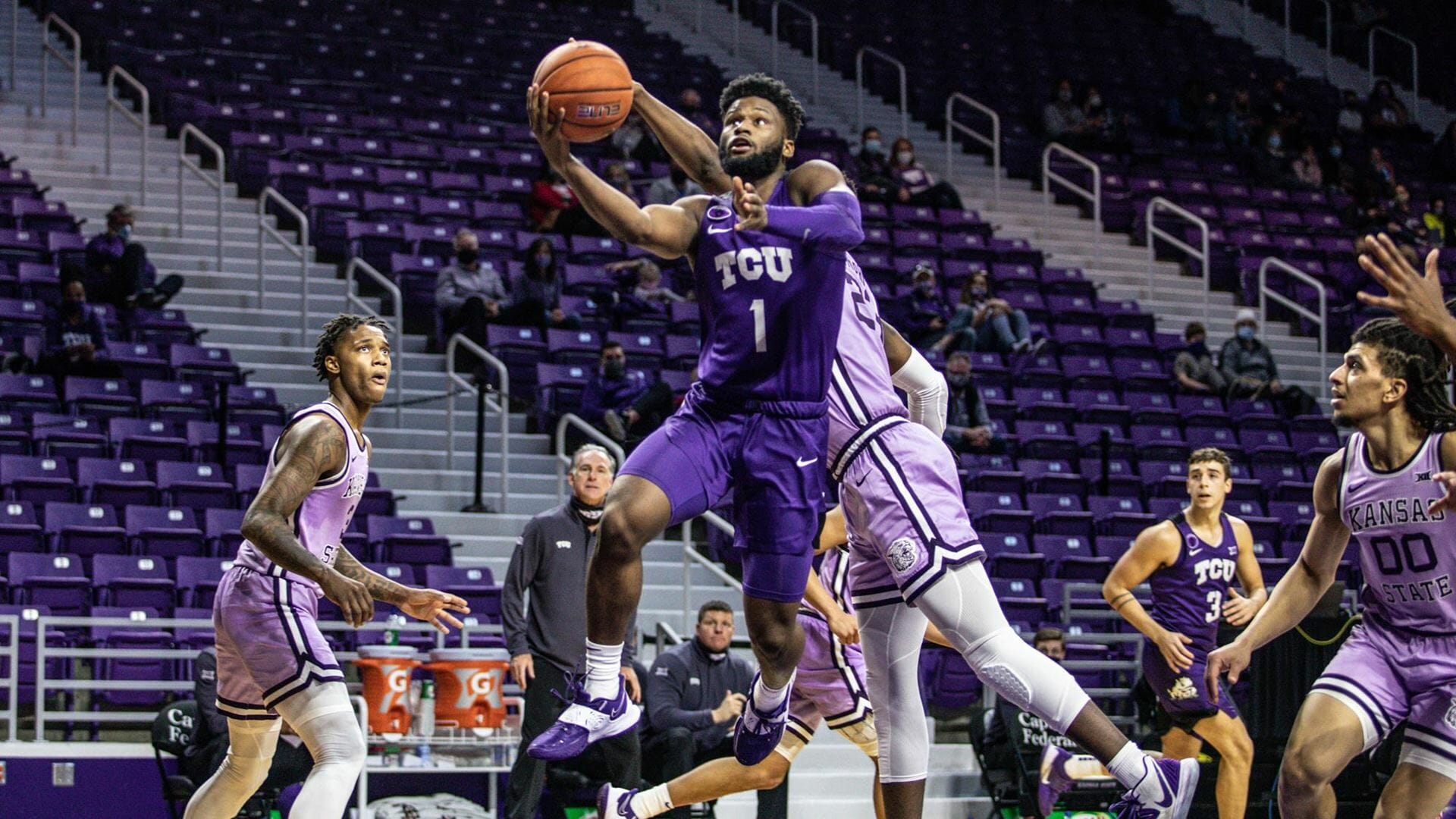
Please make it stop: My worst conceivable uni nightmare came to life on Saturday, as TCU and Kansas State played a purple-vs.-lavender game — with a backdrop of empty purple seats to boot (lots of additional photos here, if you dare).
Leaving aside the retina-searing aspect, it’s pretty surprising that this color matchup was permitted, no?
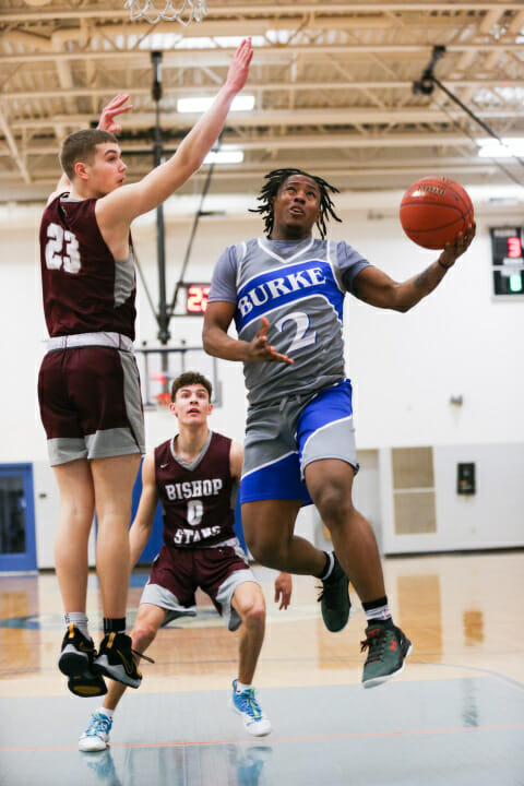
Dominique not unique: As of last February, when this photo was taken, Burke High School in Massachusetts was using the distinctive Dominique-era Hawks diagonal design template for its basketball uniforms. Pretty funny considering that the Hawks wore that design from 1982-1992, long before any of these high school kids were born.
This is the first time I’ve seen this template knocked off for a high school uni. Has it become a category unto itself, much like the tequila sunrise has for baseball?
(Big thanks to Marc Viquez for this one.)
Click to enlarge
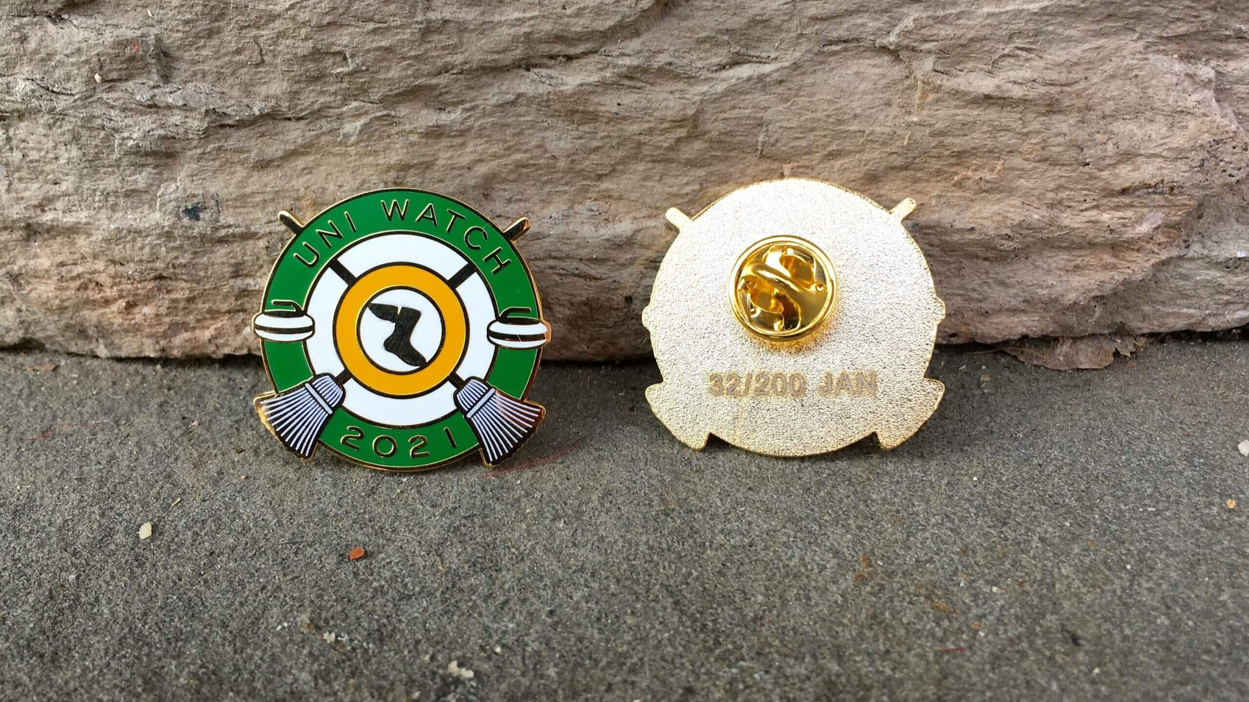
Pin Club reminder: In case you missed it over the holiday weekend, the Uni Watch Pin Club’s first pin of 2021 is now available. We’re going with a curling theme this time around — highly appropriate, since curling has a rich history of decorative pins. Hurry hard!
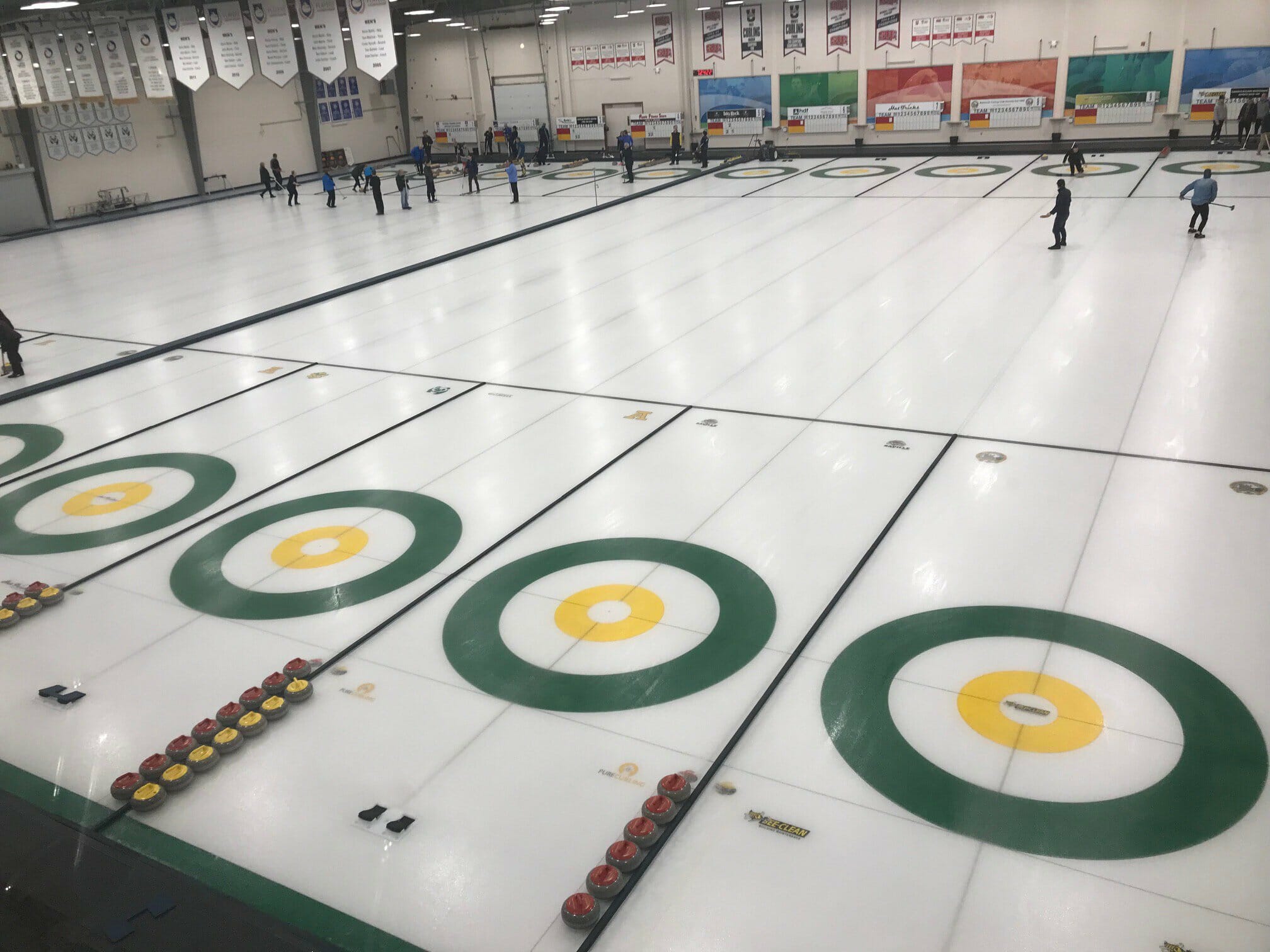
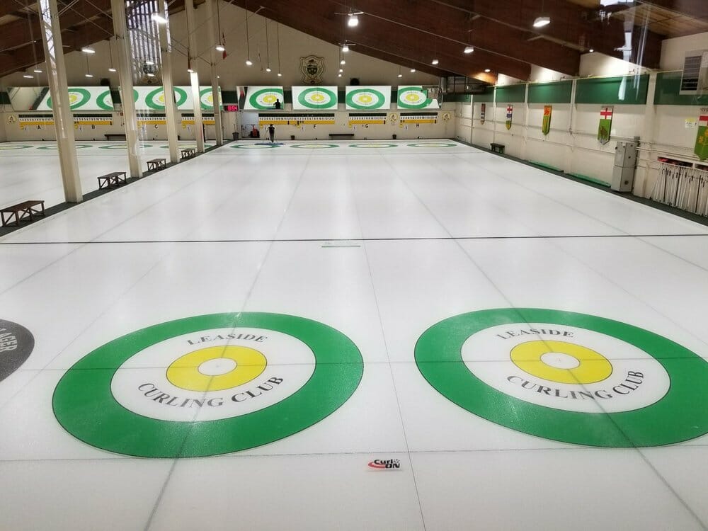
After I launched this pin on Friday, reader Wade Heidt pointed out that there are at least two Canadian curling clubs — the Saville Sport Centre in Edmonton and the Leaside Curling Club in Toronto — that use Uni Watch colors for their sheets, just like our pin (click to enlarge):
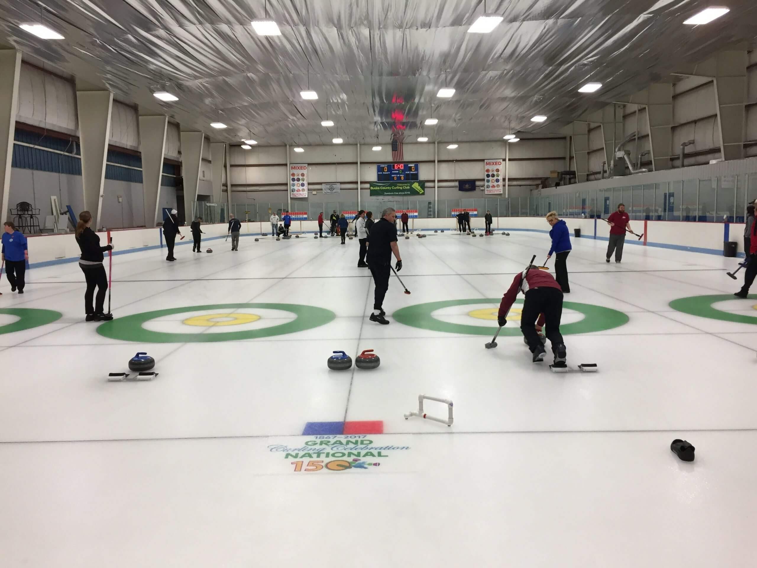
Love to see that — so cool! And then Phil told me that the Bucks County Curling Club outside of Philly also uses those colors:
Also: If you look again at the photo at the top of this section, you’ll see that this pin includes the words “Uni Watch,” but not “Pin Club.” That’s a change that designer Todd Radom and I have made for this year — all pins will include “Uni Watch” and the year on the front, with the month continuing to appear on the back. The words “Pin Club” will no longer be included on the pins themselves.
This is a numbered edition of 200 pins. As of this morning, we’ve sold through about half of them. You can order yours here.
Just like last year, we will have some sort of bonus prize for people who collect ’em all. (Speaking of which: If you collected ’em all in 2020, you’ll be receiving your bonus pin later this month.)
Finally: All of our remaining 2020 pins have been reduced in price from $13.99 to $9.99. In case you’ve forgotten what they look like, here’s a group shot (click to enlarge):
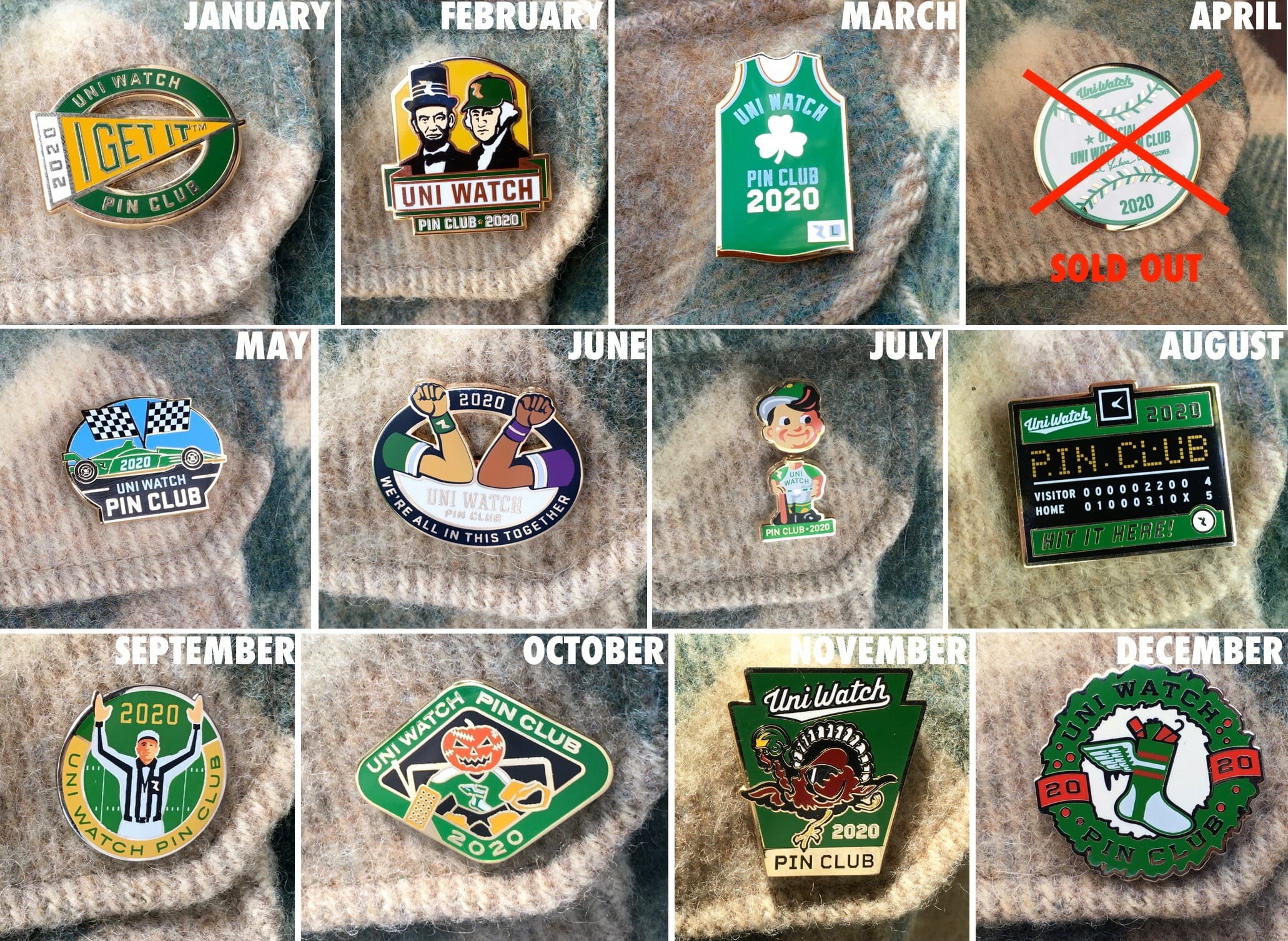
If you need to get caught up on any of those, here are the links for January, February, March, May, June (about 30 left), July (about 15 left), August (about 35 left), September, October (about 35 left), November (about 10 left), and December (about 15 left), along with the 2020 Press Pin (just a few left).
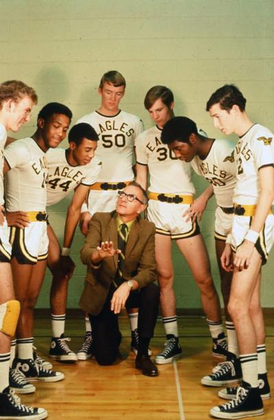
Too good for the Ticker: Oh baby, check out these gorgeous uniforms worn by the 1969-70 Hobbs High School Eagles in New Mexico. Love the colors, the matching socks, the matching Chucks, the belted shorts, and of course the sleeved jerseys. Best of all, they made good use of the sleeves by putting an eagle patch on the shoulders! Sign me up, pronto.
(Big thanks to @retro_70s for this one.)
For all photos to enlarge

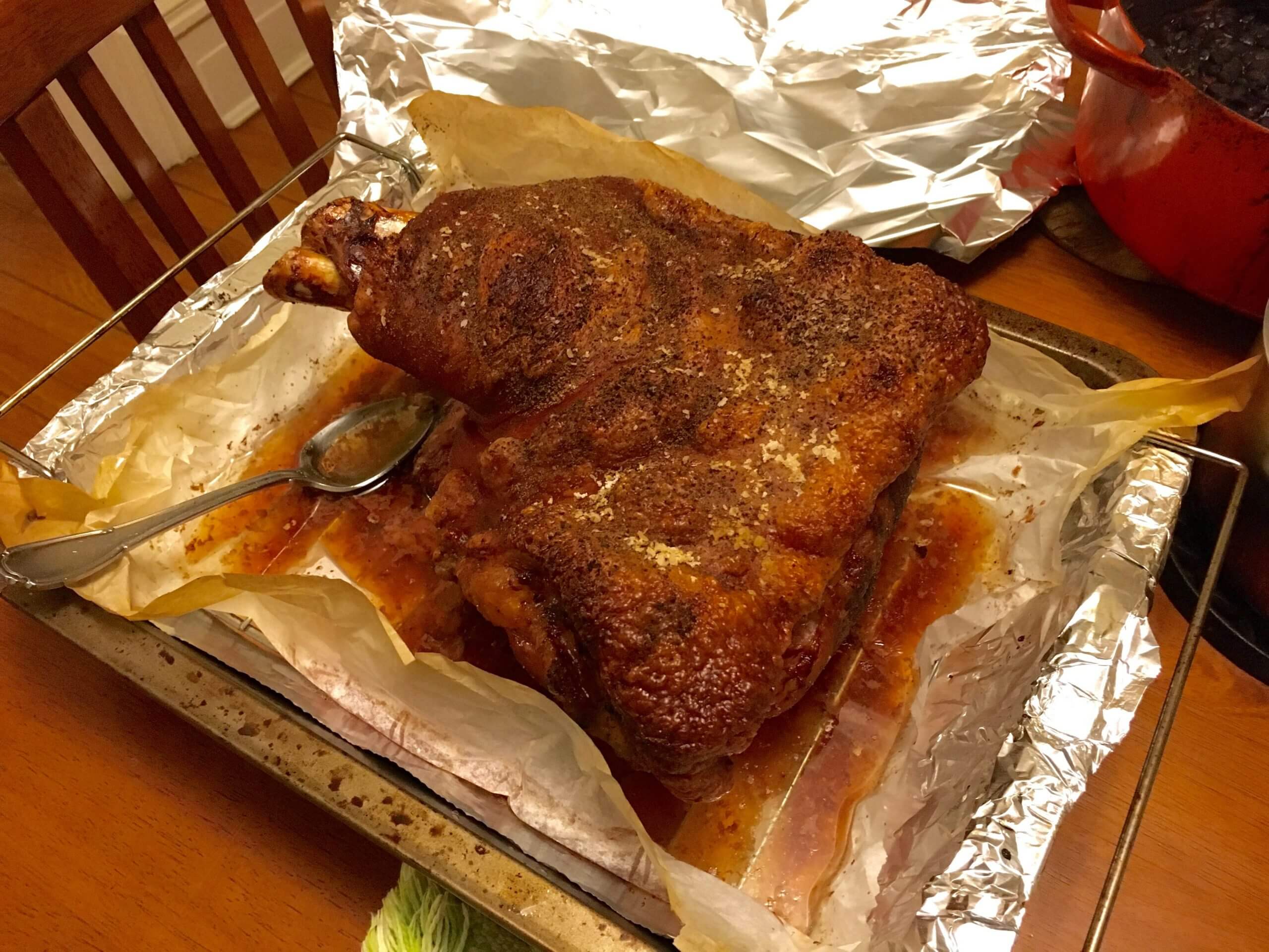
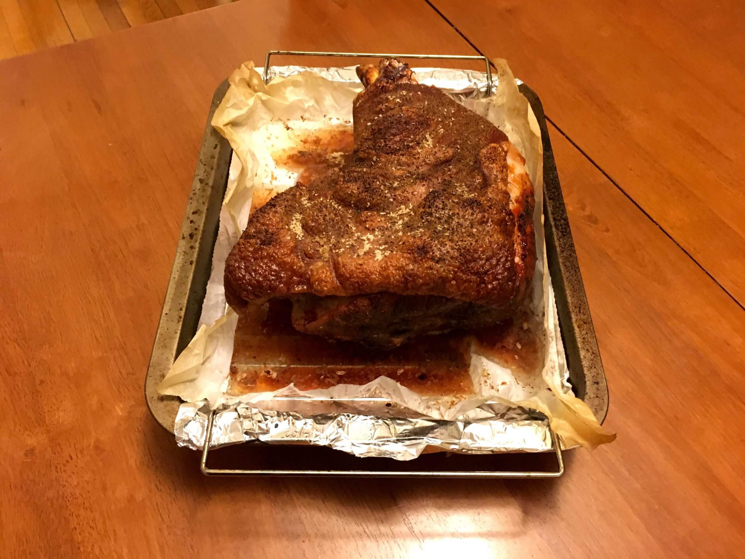
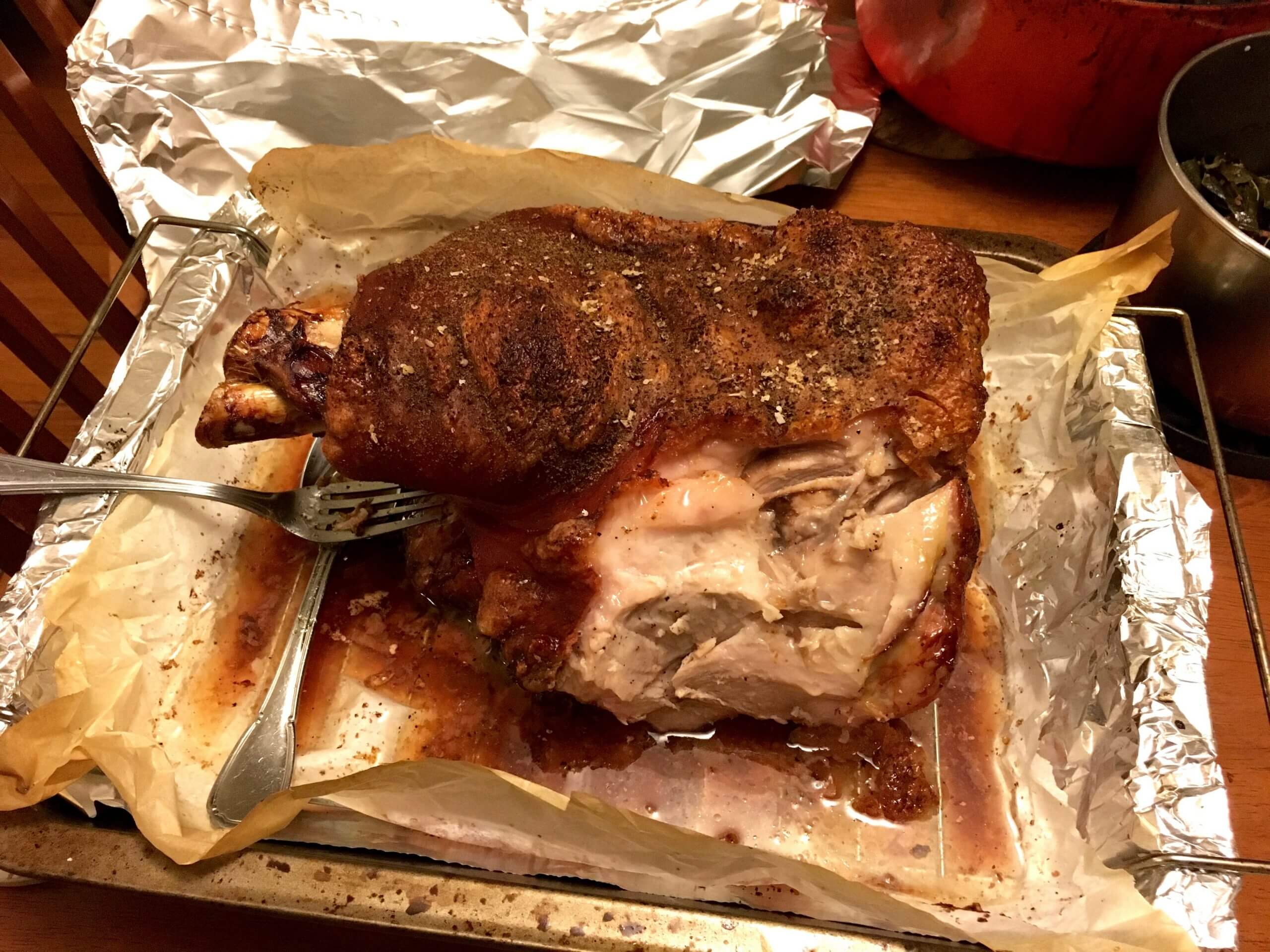
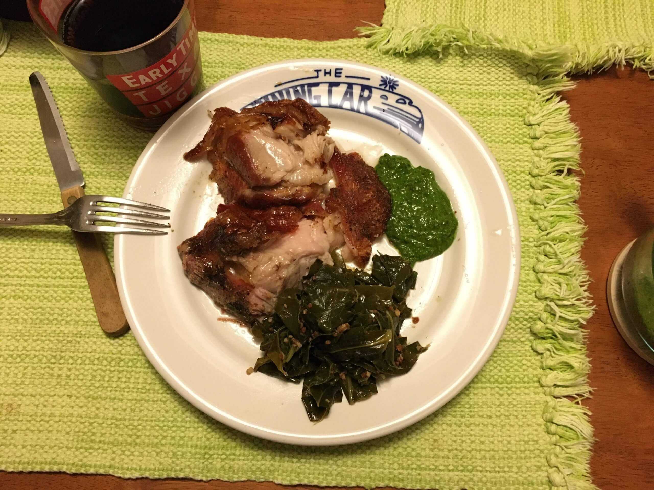
Culinary Corner: One of our semi-traditions here at Uni Watch HQ is to roast a big ol’ pork shoulder on New Year’s Day. This year’s edition was just just shy of nine pounds. We used this recipe from the great J. Kenji Lopez-Alt, which couldn’t be simpler: Season the meat with salt and pepper, stick it in the oven at 250º for eight hours, then give it a 20-minute blast at 500º to crisp up the skin. Works like a charm.
The Tugboat Captain made a great chimichurri sauce to go with the pork, along with some collards. A great feast! Dig:
The Ticker
By Jamie Rathjen

Baseball News: Dodgers P Clayton Kershaw’s wife commissioned an L.A. artist to make a painting as a Christmas present based on a photo of Kershaw celebrating after winning the World Series (from Kary Klismet). … Here’s another one of those “umps lost their luggage” incidents: The umps’ gear didn’t arrive in time for a 1967 game in Minnesota, so they had to wear usher’s pants and Twins jackets and caps (from Jimmy Lonetti).

Football News: Washington QB Alex Smith’s wife had his leg brace made into something like the Lombardi Trophy (from John Muir). … Left over from Saturday: The oranges in the Orange Bowl trophy were actually from California, not Florida (from Kary Klismet). … The latest CFL.ca piece that is at least theoretically a uniform history is for the Saskatchewan Roughriders (from Wade Heidt).

Hockey News: The Capitals have added the stars from their logo to their pants (from Ryan Burgess). … Here are the numbers for some of the new Caps players. … Here’s how the Avalanche’s 25th-anniversary logo looks as a jersey patch (from @Hashalanche). … Similarly, here’s our first look at the Wild’s 20th-anniversary patch (from Maverick Johnson). … Lightning G Andrei Vasilevskiy’s new mask glows in the dark in two places on top (from Wade Heidt). … Ben Wright, who was the Atlanta Thrashers’ social media manager from 2005-2011. did a Twitter Q&A yesterday. It starts here, and uni-related topics come up here, here, here, here, here, and here (from Michael Rich). … The Huntsville Havoc wore — well, see for yourself (thanks to all who shared).

Basketball News: The Celtics lowered their championship banners so they’re right behind the basket (from Mike Chamernik). … Georgia Tech’s men’s team wore white throwbacks yesterday, a few days after wearing gold versions (from @sonnylax). … Houston’s men’s team also debuted red alternates (from Ignacio Salazar).

Soccer News: Scottish club Rangers wore memorial text on their shirts for the 50th anniversary of the second Ibrox disaster. … One-third of the Scottish Premiership wore black armbands this weekend for a variety of reasons, including Rangers and Celtic for the aforementioned disaster anniversary, and Aberdeen and Dundee United in memory of former left-back Chic McLelland and former manager Jim McLean, respectively — though United’s could barely be seen because of their second shirt’s black sleeves. … Some of Scottish manager Tommy Docherty’s clubs also wore black armbands in memory of him. He’s credited with two contributions to the uni-verse while at Chelsea in the ’60s: changing their first kit to the present blue/blue/white and making them one of the first English clubs to wear numbers on their shorts. … New shirts for Argentina’s Belgrano (from Ed Żelaski). … Also from Ed: A Polish sports logos website wrote about the trends in recent new club and national team crests and league logos, with some appearances from clubs in rugby union and league as well. … Some animated TV characters’ shirts match up well with current or past soccer shirts (from Jeremy Brahm). … The Asian Football Confederation has updated the logos for all its major competitions (from Sy Hart).

Grab Bag: New jerseys for several cycling teams, including Jumbo-Visma, Israel Start-Up Nation, and SD Worx, who were renamed from Boels-Dolmans. … Australian Twenty20 cricket’s Perth Scorchers are wearing their Indigenous-designed shirt for all Big Bash League home games this season. It’s the same as that worn in the Women’s Big Bash League in November, but the WBBL team tucked in their shirts and obscured part of the design. … A Canadian sportswriter is holding a contest for the best logo among Canada’s sports governing bodies. The four finalists are basketball, fencing, field hockey, and football (from Wade Heidt). … Spider-Man switched sneakers from a well-known and recognizable pair of Jordans to Adidas in his new video game, a change that both Spider-Man fans and sneakerheads criticized (from Andrew Cosentino). … A proposed redesign of the palmetto tree on South Carolina’s flag is going to stay a proposal (NYT link) because it did not turn out well (from Kenny Ocker). … The Japanese Handball Association has struck a new outfitting deal with Hummel for its U-16 through U-24 teams (from Jeremy Brahm).

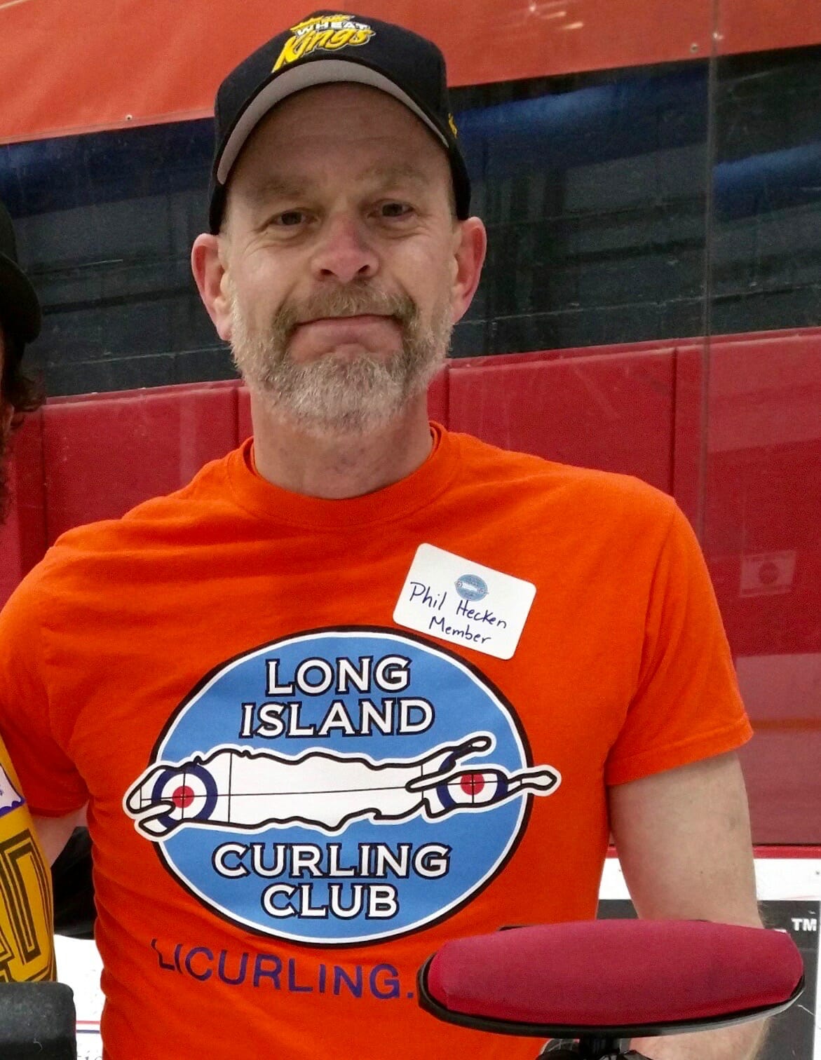
Birthday Boy: Phil was too modest to mention this in yesterday’s post, but Sunday was his birthday. Please join me in embarrassing him by making a big fuss over him wishing him the happiest of birthdays and nothing but good things in the year to come. Here’s to you, buddy! — Paul
Is it supposed to say “super” above the splash photo today?
Nope! Not sure how that happened. Fixed!
Small nit to pick, but in the ticker, identifying the gift givers as only “Clayton Kershaw’s wife” and “Alex Smith’s wife” is sooooo last century. As they say, they do have names (according to the linked articles, Kershaw’s wife is Ellen and Smith’s is Elizabeth).
For what it’s worth, when I submitted the Ticker entry, I included Ellen’s first name for the very reason you bring up here, Steve.
I’m pretty sure that Jeremiah Burke High School is either in Fall River or New Bedford, and definitely not in Boston. I know you’re a stickler for details, so you may want to change that line to, “in Massachusetts.”
Got it. Thanks!
Jeremiah Burke High School is in Dorchester, a neighborhood of Boston.
It says so on their website: link
Regarding the Jaguars’ CB wearing #5: On the Dec 16th edition of the Jags’ Happy Hour show in which they bring on equipment manager Jimmy Luck to unveil the weekend’s uniform combination, Jimmy was asked about the number assignments with the large number of players coming and going due to injury and Covid. He mentioned that they had to receive permission from the NFL to assign players out-of-position numbers, so to speak. The Jags have played like 83 players this season, and that doesn’t include the practice squad guys. Making sure each player has their own number has been a struggle it seems.
Here’s a link to that video (29:00 mark): link
Great info, Clint — thanks!!
The Jaguars have issued 32 players numbers between 20 and 49. As Clint/Jimmy said, the Jaguars have a huge number of guys in their system, and the matter isn’t helped by a bunch of LBs and their LS wearing numbers in the 40s.
There are two #22s, Ozigbo (Active) and Melvin (Opt Out). There are two #34s, Mabin (Active) and Thompson (IR). There are two #48s, Jacobs (IR) and Reyonds (Practice Squad). They did not issue Fred Taylor’s #28–can someone more Jacksonville-knowledgable say if they have at all since he left?
Anyway, not many numbers left for a defensive back. But if you’re going to double up three other numbers, why not for Meeks? #5 looks odd indeed.
Same thing happened with the Ravens this week. DB Nate Brooks played his first game for the team and wore #17. I was very confused seeing that number on defense.
Jimmy said in that same interview that he doesn’t like to issue the unofficial “retired” numbers. Fred Taylor’s #28, along with a few others, are in the “Ring of Honor.” They aren’t officially retired, but they’re removed from circulation.
Paraphrasing here: “I won’t ever issue #28, #32, #72, #82. That won’t happen,” Jimmy Luck.
Thanks for following up, Clint. Nathan Meadors on the practice squad is listed as wearing #32. Do you think he’d wear a different number if he were promoted to the gameday roster?
Re. Burke High’s Hawks knock-offs – the Hawks started using that design in 1982, not 1986.
Re. Culinary Corner – goddamn, that pork looks good.
Good call, Matt — fixed.
Coach Tomlin had his mask upside down in the Pittsburgh/Cleveland game for the first half. Fixed it for the second half!
– Thinking Cleveland Browns must be going with orange pants in their next playoff game.
– Re: Saskatchewan Roughriders uni history. A lot of fans will say their green and white with vintage “S” logo is their best look:
link
I love that look but not the best in my mind. The uniform is good as a throwback, but the vintage “S” logo has not aged well to be a good modern primary logo.
Vote me in as stating 1985-89 Riders uniforms their best. How can one not love the wraparound helmet logo:
link
link
McCarthy wore that throwback Cowboys hat on Thanksgiving, too :)
Similarly, Mike Tomlin has worn his gator thing upside down on a number of occasions this year
link
Not every time, but more times than not at least for the games that I’ve noticed. It feels intentional (except when it’s not) but I’m not really sure why it would be. I should’ve shared these earlier had I known they were looking to be documented here!
The 8 banners that the Celtics lowered were all significant to Tom Heinsohn’s career with the team as player, coach and broadcaster. From the Boston Globe:
The 1957 banner was Heinsohn’s first as a player, alongside Bill Russell. The 1965 banner represented Heinsohn’s last as a player. The 1969 banner was Russell’s last. The two championships Heinsohn won as a coach were lowered as well, 1974 and 1976. Heinsohn called the 1984 championship for CBS. He was the team’s broadcaster in 1986, and the 2008 title was his last.
That’s really stupid to choose a banner because he called the series for a national network.
The Saints’ white over gold look is FANTASTIC. I honestly don’t know if I’ve seen that before.
It seems like “Colored Helmet-White Jersey-Similarly Colored Pants” is a look that just works for so many teams…
Exactly. Lifelong Saints fan, Lifelong New Orleanian and game atendee. The Black pants are the bane of my non-serious existence. If they’d darken the Gold a bit, to contrast better with White jerseys, I’d take that over the Mono-Black or Jackass Junior College White-over-Black leotards.
Hoping they have finally “got” it over at the Saints’ Braintrust.
UGH
1. Mack Wilson’s shoe stripes are awesome.
2. I am surprised that the NFL hasn’t stepped in to police the epedemic of things like above-the-knee shorts and base layers that look like cummerbunds. For a league that is relentlessly image-conscious, it looks sloppy.
3. Going to try your version of the pork shoulder roast. Is 20 minutes enough for crispy skin? I hope so.
4. The Hawks’ 1980s look should be copied. I have been a Sixers fan since the womb but because of the uniforms (also Dominique Wilkins and Spud Webb… and their ubiquity on early basic cable), they became my 2nd favorite team.
5. White-over-gold and black-over-gold are the best Saints look, if we are not counting throwbacks. It’s a shame it took 17 weeks to get there. Monochrome white or black is so much worse.
6. HBD LI PH!
Going to try your version of the pork shoulder roast. Is 20 minutes enough for crispy skin?
Just follow the linked recipe. You’ll be fine.
I’m curious, Paul. What is the given reason that certain uniform numbers are “permissible” for certain positions, while others are not?
Is it purely an aesthetic thing?
Well, first there are numbers that are for eligible receivers and for ineligible receivers. But that only applies to offense, obviously.
I’ve never understood the rationale for position-based number ranges on defense. The NCAA is looser about it than the NFL. Anyone know more about the thinking behind this?
Surprisingly, Wikipedia has an entire page dedicated to exactly this question…
link
I think that the numbering by position thing was to better help television viewers identify what positions guys played. I believe it came about in the early 1970s, and guys whose numbers did not conform were grandfathered in (I think there were still guys active in the early 80s who were covered by the grandfather clause). You are right about the NCAA being much looser. I think their only rule is that offensive linemen need to wear 50-79, and after that, anything goes (I’ve seen defensive linemen wearing single digits, kickers wearing 90s, etc).
Packers-Bears was another good-looking back-to-basics game yesterday. Packers, their usual road white jersey and gold pants. Bears, dark blue jerseys and white pants.
While perhaps not visually appealing, the TCU game was fine from a contrast stand point, those lavendar unis are akin to a gray or other light colored uni. I’d be more bothered if a purple v. royal game was permitted.
I was really curious as to how the refs referred to each team when calling fouls, possession, etc. Do they just use the school names instead of colors?
If I’m not mistaken, yesterday was the first time the Seahawks wore Blue/Blue/Blue as road team. The franchise had been keeping that as the Home Only look. Apparently, they decided that Blue over White or Blue over Grey wasn’t going to cut it yesterday.
‘Hawks wear that combo a lot when playing the Cowboys in Dallas:
link
…and they wore it at the Jets in 2016:
link
…”chestier?”
That’s a really disappointing item.
Very disappointing to see that. Who cares?
A totally unnecessary mysogynistic remark in my opinion.
You know what? You guys are right.
I’ll remove it now.
Thanks for setting me straight.
How hard would have been for the Bears to paint the 40-yard line numbers orange as an on-field tribute to Sayers? Seems like a simple, elegant solution.
Also, it just struck me that for his entire college and pro career, Floyd Little wore 44 for teams in orange and blue. I’ve been trying to think if any other notable players have had that kind of career consistency.
And one last thing… can we get a closeup of that Dining Car plate?
Drew Brees? Wasn’t he black & gold, college and pro?
Brees was with the navy/yellow Chargers for a bit…and even got to wear those powder blue throwbacks:
link
Eli Manning (let’s not take into account his ‘stint’ with the Chargers).
Alex Smith wore red at Utah, SF, KC and Washington.
But did any of them wear the same number the whole time from college to pro? I’m too lazy to look it up. And not just a single color through the career, but a specific combination.
Regarding the purple vs. lavender game, from a tint/shade perspective, it’s still dark vs. light. No different really from a royal or navy blue vs. powder blue game, which has definitely happened before too.
Best-looking game of the day was in KC, where the Chiefs hosted the Chargers
If only the KC grounds crew would’ve added the Chargers helmet at midfield just like the Municipal Stadium days!
link
Falcons kicker Younghoe Koo has been pushing the envelope with his pants and socks all season long. But even by his own formidable standards, he really outdid himself yesterday
Looks bad indeed, but I’ll take a bare-kneed kicker over a barefoot kicker any day.
And I’ll agree with others in the comments: the TCU/KSU game was fine. It would pass the black & white TV test…dark jersey/white numbers vs light jersey/dark numbers.
Happy Birthday
old manPhil!I’ll be surprised if the Broncos don’t carry over the Floyd Little memorial to next season. His teams didn’t win much, but he was really loved by the fans and seems to hold a special place in the team’s collective heart. His 44 is one of only three numbers they’ve retired in their 60-year history.
I don’t have any insights into reasons for the NFL rules on permissible numbers by position, but I can say that from a fan perspective, I’ve always appreciated it. Especially when I was a younger viewer (many, many years ago), the numbers that player wore helped me to learn the different positions on the football field and what their functions were – on both offense and defense. I still find it useful from this standpoint even today. I think there’s a utilitarian design feature to it that is beneficial to the game.
And then there are people like me, who, after the initial shock, came to love the sight of CFL recivers wearing 70-79, USFL quarterbacks wearing 22 and WRs/DBs wearing single digits. And I’m really glad the NCAA joined the CFL in allowing 0 to be worn on the field.
I understand the concept of making it easy for the officials by setting aside 50-69 for ineligible receivers. But to be honest I’m fine with absolutely no numbering system at all. Well, no three-digit numbers or fractions…
To be clear, I have no issue with a wide-open numbering system from an aesthetic standpoint. I just find the numbering system functional from an organization of the game standpoint.
I always thought it was cool that Doug Flutie wore number 22 in college and was able to revive that number during his CFL days, for example. And Red Grange and Tom Harmon look pretty iconic in 77 and 98, respectively, numbers that they wouldn’t be allowed to wear if they were playing in the NFL today. That said, I don’t think I’ll ever get used to seeing QBs wearing numbers in the 60s, like they did under the AAFC’s numbering system:
link
Numbering ineligible players 50-79 is for more than just the officials. It is also very much for the defense, as at a glance they can tell which players they’ll need to cover and which they won’t.
I appreciate both sides of it. I like the utilitarian nature of the NFL system. But I also think that it’s just as appropriate that college football is basically a numerical free for all. That combined with the fact that college players can get away with not having their socks pulled up to the bottom of their pant legs, are two distinct visual giveaways that I am watching a completely different level of football from the NFL.
A HS in my hometown has been wearing the Hawks-style uniforms for the past 3-5 seasons.
link
The reason you normally don’t see that uniform template in high school is because it’s technically not a legal uniform.
From the NFHS Basketball Uniform regulations (link)
C. IDENTIFYINGNAME
1. Lettering with school name, school’s nickname, school logo name, player’s name and/or abbreviation of the official school may be placed on the front of the jersey.
2. Lettering must be placed horizontally and may be arched. Names may also be on multiple lines.
3. The first and last letters, either above or below the number, must be on the same horizontal plane. When above the number, the plane may not be below a plane extending through the top of the number(s). When below the number, the plane may not be above a plane extending through the bottom of the number(s).
I wonder if Jacksonville didn’t give that defensive back #5 to try to get rid of leftover Blake Bortles replicas at the team store?
How about the field elements for the 49ers game in Glendale. NFL logo at midfield hid Fiesta Bowl logo reasonably well. But video game console logo still visible at 25-yard lines and they painted red rectangles over Oregon and Iowa State in end zones, but the names still bled through.
Thought at first Niners just decided to roll with white because they felt like road team anyways, then realized those calls have to be made before season leaving the white Color Rush option available.
And Iowa State wore black again so no one confuses them with U$C.
“And Iowa State wore black again so no one confuses them with U$C.”
Black uniforms aside, based on the rest of Iowa State’s current uniform set, no one is going to mistake them for USC anyway:
link
link
link
link.jpg
Trying that last image link one more time:
link.jpg
One last time:
link.jpg
(I know it doesn’t matter, but still…)
Aaargh! link
There ya go, kary!
It’s really sad that the Bears finally memorialized Sayers in the last game of the season. And the placement of the memorial was terrible. Couldn’t they have put it on the 40-yard line at least?
I have no idea what those Huntsville Havoc unis are but they make Zubaz look like formal wear!
re: Gale Sayers
When I was a kid he was the only thing about the Bears that was classy & worth watching!
Duh Bears!
Never noticed, and it may have been mentioned before, that Mack Wilson’s thigh pad has his number 51 embossed on it.
I love that dark purple vs. light purple was allowed. It is much better than most color vs. color combinations because it’s sensitive to the limitations of the color-blind.
Am I the only one that would love to see the NFL Buccaneers wear Pewter jerseys over White Pants, maybe Black socks?
That might just be a pretty unique and cool look.
The proposed SC state flag design resembles melted Wendy’s plastic forks.