By Phil Hecken
Follow @PhilHecken
Greetings and a Good Saturday to you, Uni Watchers! Let me be the first twenty-seventeenth person to wish you a Happy New Year. I hope everyone had a safe and happy holiday and you’re all staying as safe as possible.
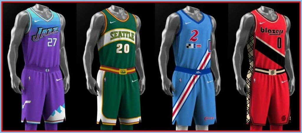
Weekday readers (which, I’m guessing, is everyone reading today) will recall a few weeks back, we learned a bit about the NBA’s upcoming 75th Season and what was a possible leak of what will maybe be the “Heritage” uniform for at least one NBA team. If you buy into that premise, it’s possible next season’s “Heritage” unis will feature elements of uniforms from a team’s past. It’s also possible teams will get straight throwbacks, fauxbacks, or even Frankenjerseys (or something else entirely) for their “Heritage” set.
You’ll also recall back in November, designer Mike Joseph approached me with the “City Edition Redesign Project,” where he and several other designers decided this year’s crop of “City” edition uniforms needed their own redesigns. Fast forward to today, where Mike and an even expanded group of designers (which they’ve dubbed “The Jersey Club”) have rendered their concepts for the forthcoming 75th Anniversary “Heritage” edition uniforms. Below, I’ve grouped them by designer (so they’re neither alphabetical by city or team), as each one has his/her unique take on what is to come next season.
It’s interesting to see how each designer approached the project, and I really like a bunch of the concepts here. Click on any image below to enlarge, and enjoy!
Here’s Mike…
The Jersey Club
By Mike Joseph
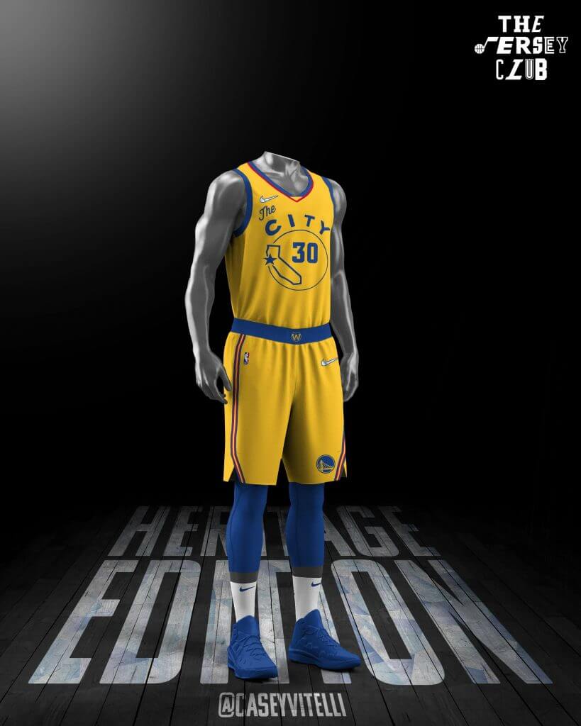
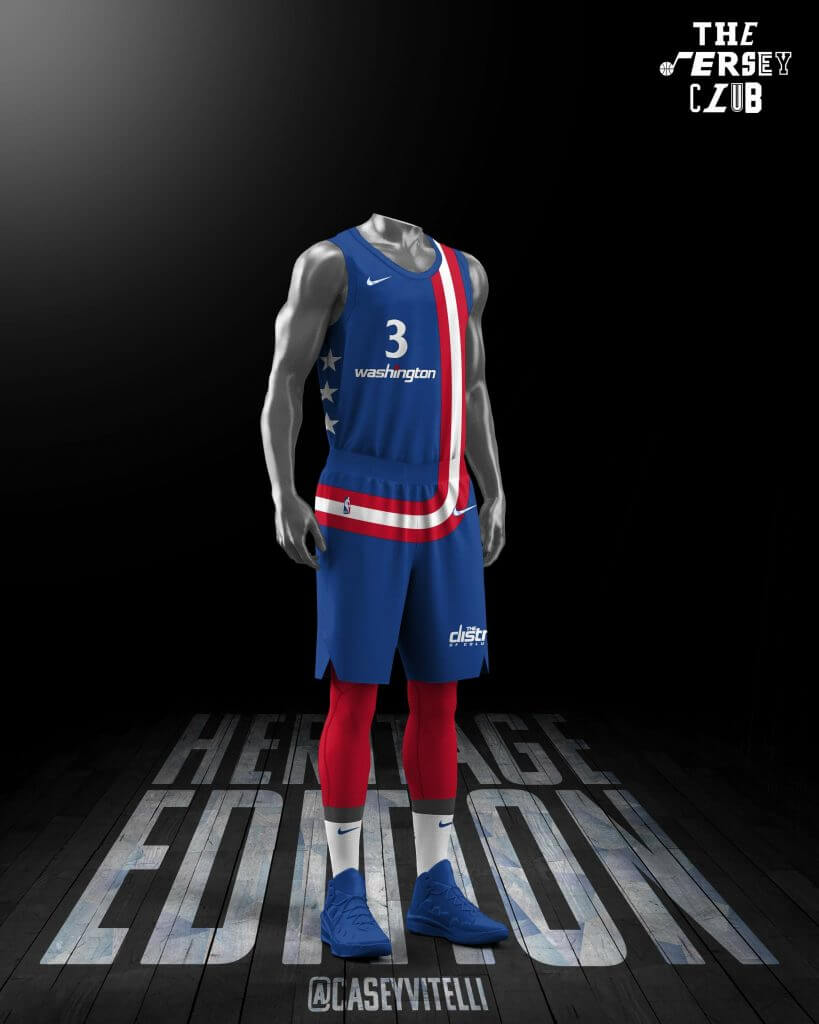
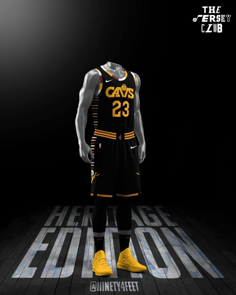
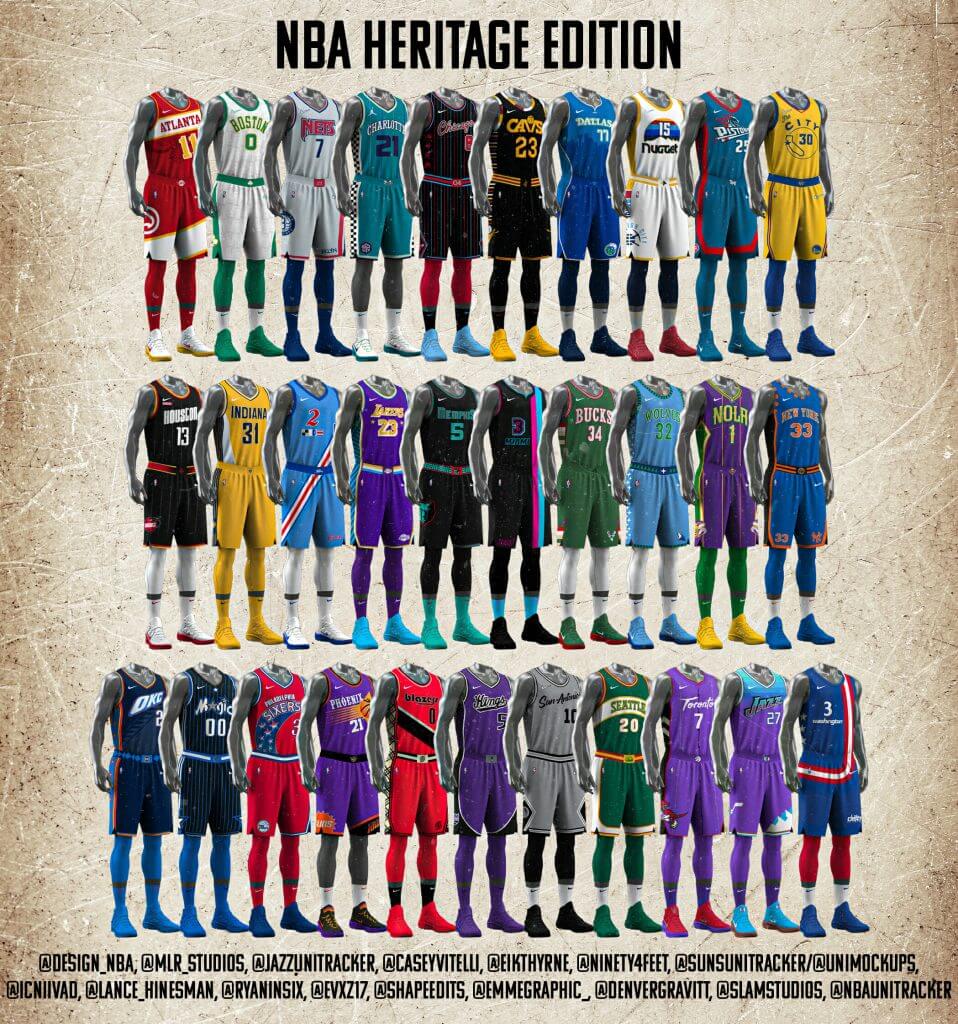
The same group that recently did the NBA “City Edition Redesigns Project” stuck together, dubbed ourselves The Jersey Club, recruited 5 new members and got back to work. Our new project? Create a mashup uniform for each NBA team, celebrating the uniform history of each franchise for the upcoming NBA 75th anniversary. The result? What we call the Heritage Edition uniforms.
This time each designer got two teams, plus Casey Vitelli and Mike Joseph (aka the duo that runs @NBAUniTracker) surprised the group with a bonus Seattle Sonics uniform just as we were finishing the project. Rather than a draft, we each picked our favorite team and another that we wanted and did a little haggling to settle on teams that everyone was happy with. What you see is our vision of what the ideal mashup uniform for each team would look like if it were up to us, pulling elements from most (if not all) of each team’s past uniforms.
As always, we hope you enjoy looking at them and discussing them as much as we enjoyed creating them. Our club grew by five, but really it’s a family. We love what we do and we all have goals in terms of design, but I think more than anything the bonds we are building in this group are the most valuable thing that could ever come out of it.
@SunsUniTracker
The Jersey Club:
Casey Vitelli — @caseyvitelli (Warriors and Wizards)
Seth Reese — @ninety4feet (Pacers and Cavs)
Mike Joseph — @SunsUniTracker (Suns and Hornets)
Evan Barcanic — @evxz17 (Grizzlies and Sixers)
Denver Gravitt — @DenverGravitt (Mavericks and Nuggets)
Joseph — @design_NBA (Thunder and Nets)
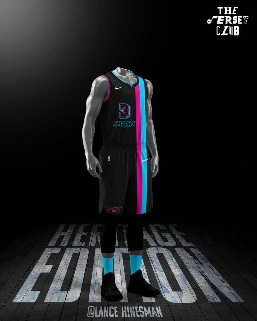
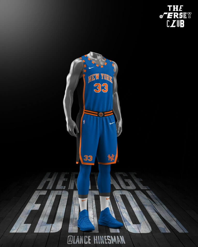
Lance Hinesman — @Lance_Hinesman (Heat and Knicks)
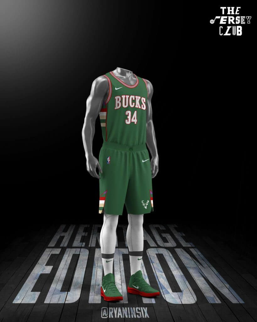
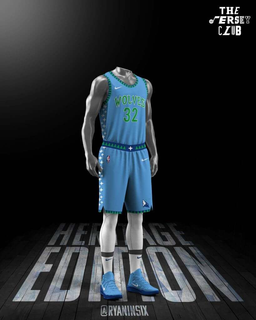
Ryan Meils — @ryaninsix (Bucks and Timberwolves)
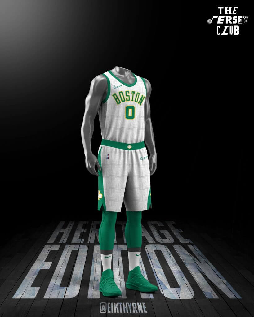
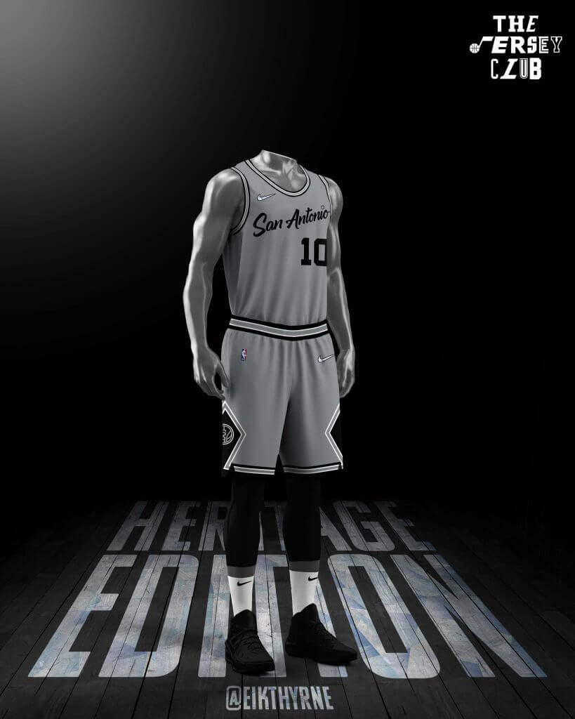
Tore — @Eikthyrne (Celtics and Spurs)
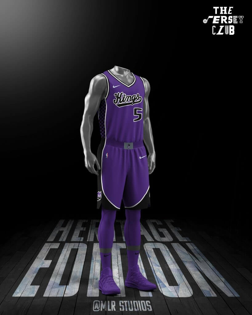
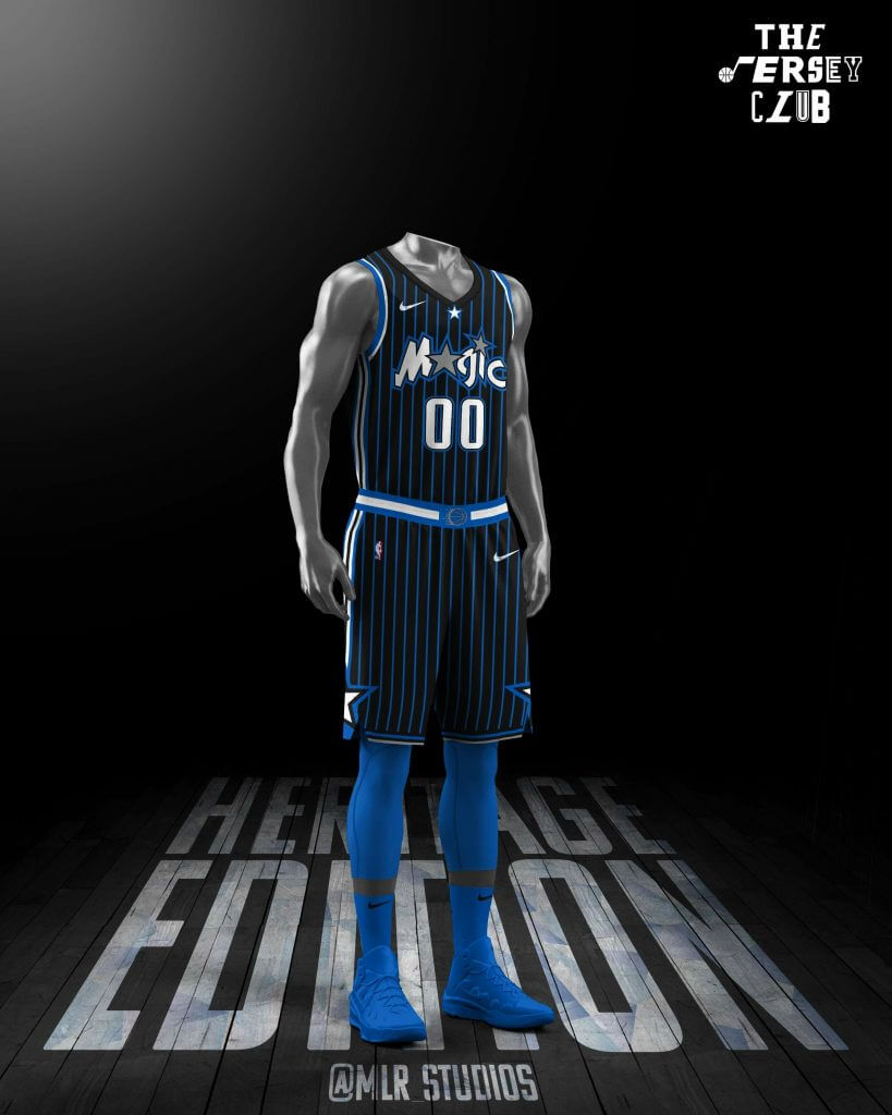
Nick Mueller — @MLR_Studios (Kings and Magic)
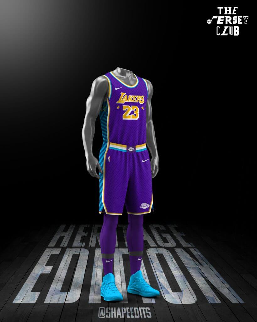
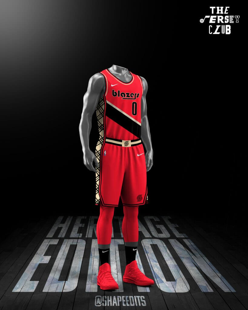
Shape Arts — @shapeedits (Lakers and Trailblazers)
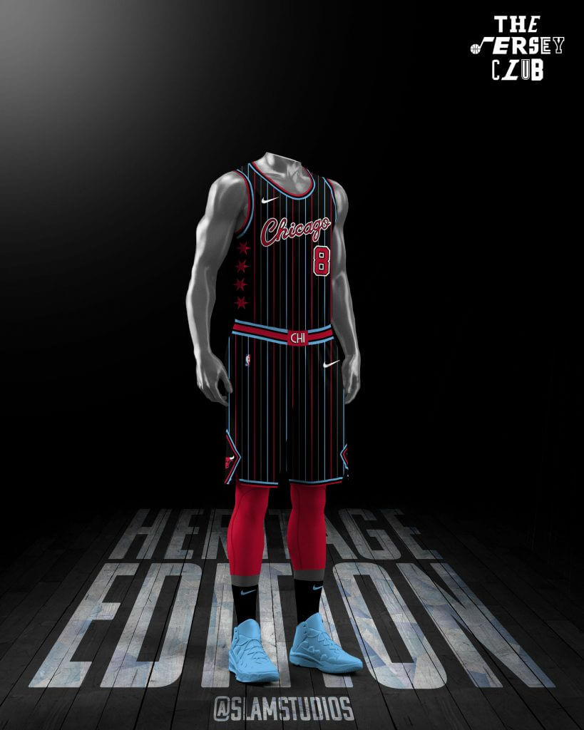
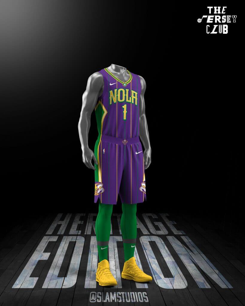
Slam Studios — @SlamStudios (Bulls and Pelicans)
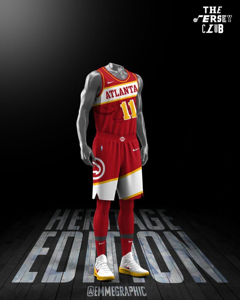
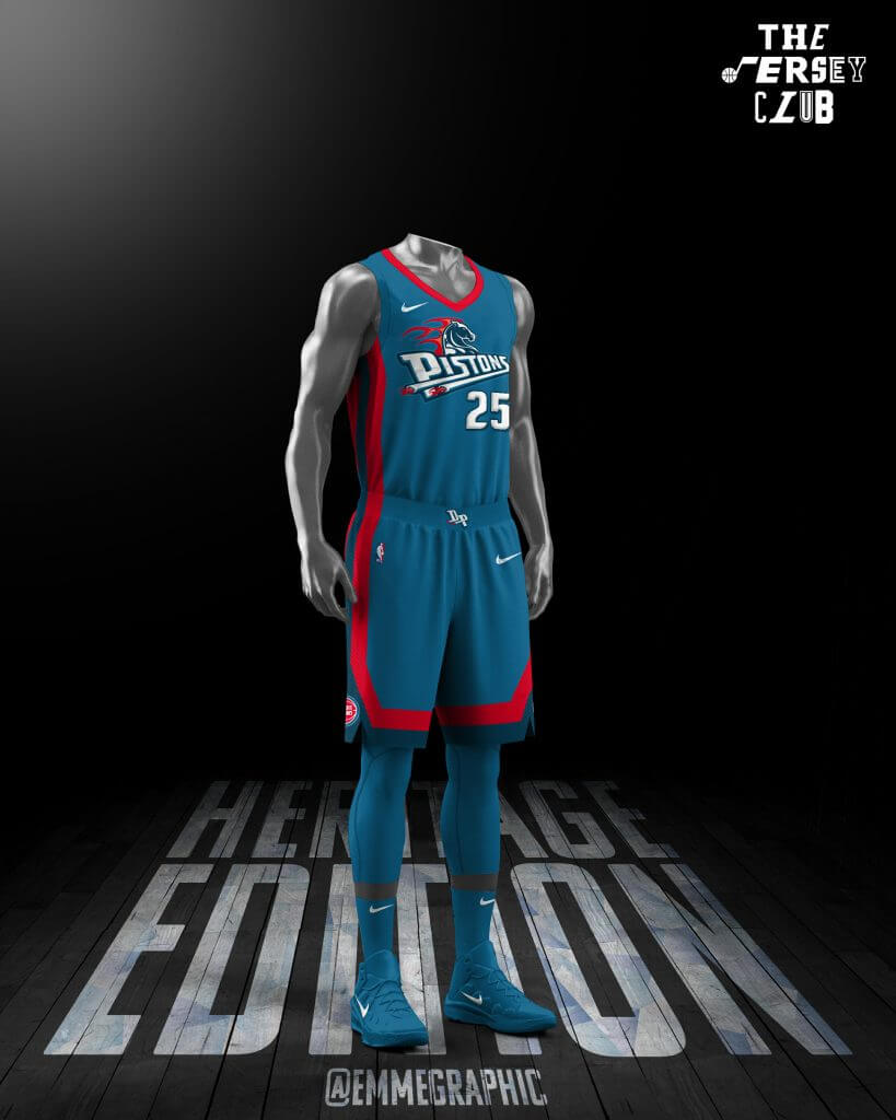
Emme — @emmegraphic (Hawks and Pistons)
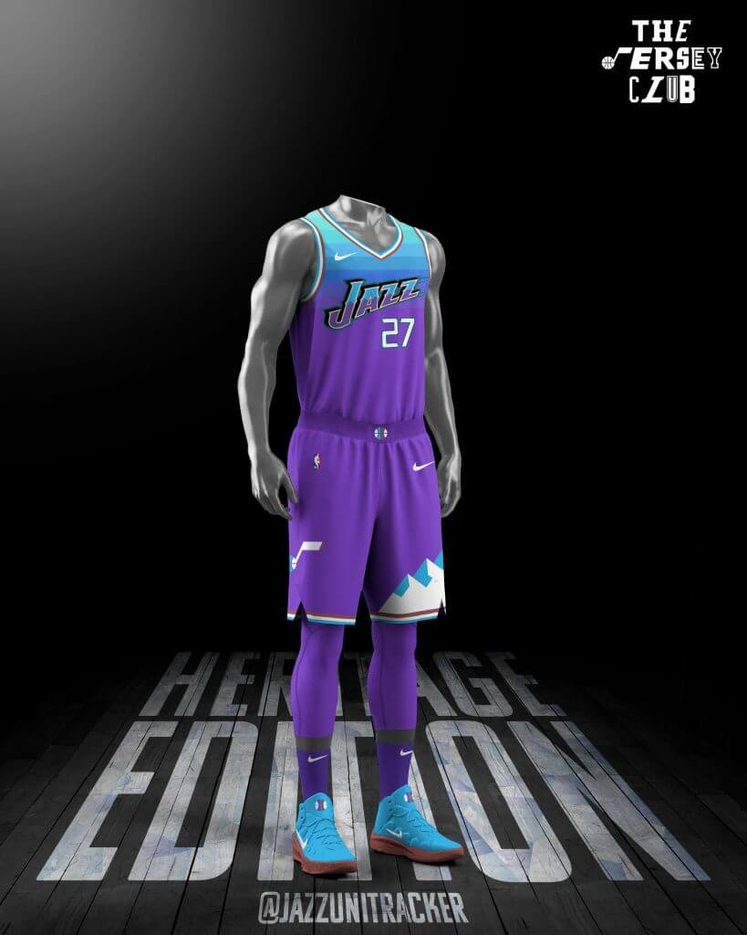
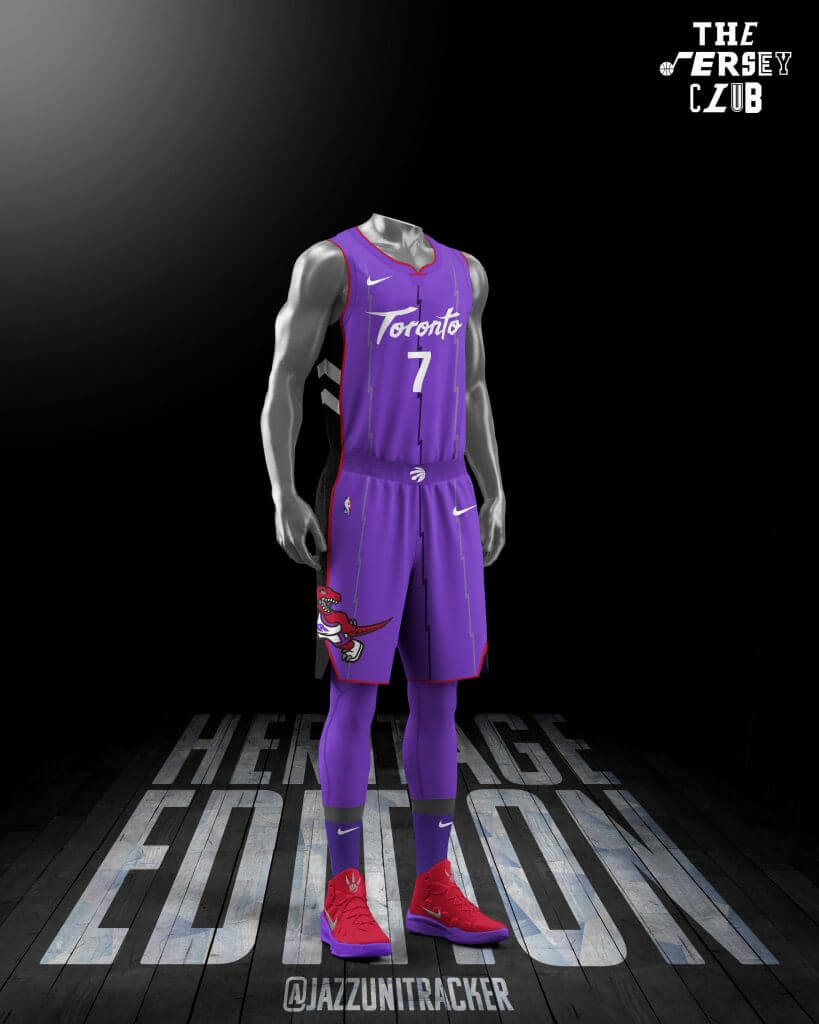
Jazz — @JazzUniTracker (Jazz and Raptors)
Bryan — @icniivad (Clippers and Rockets)
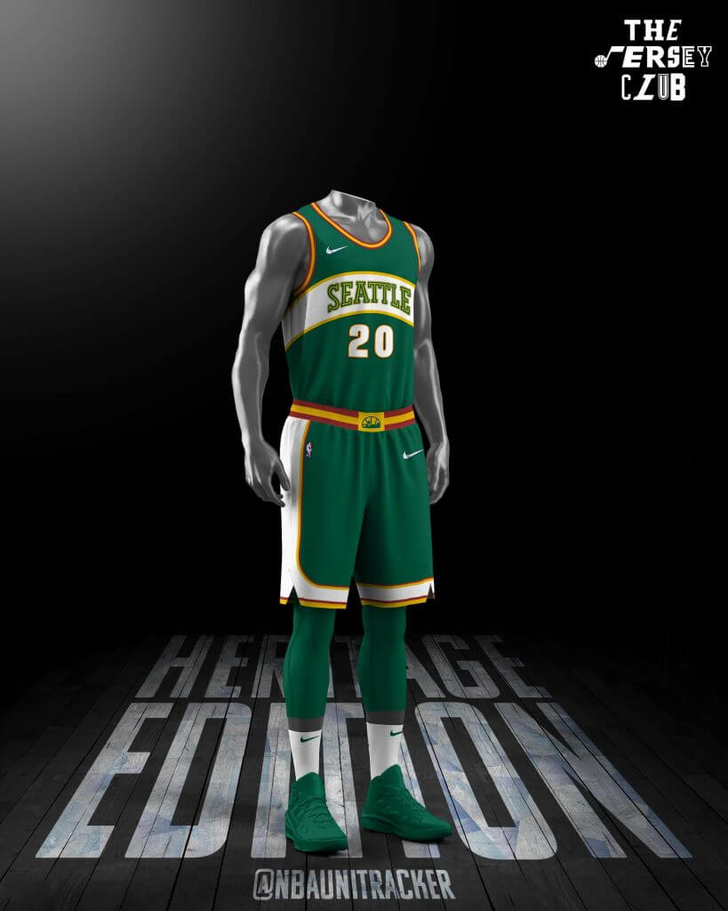
Bonus Design — @NBAUniTracker (Sonics)
Golden State Warriors/Washington Wizards
Casey Vitelli
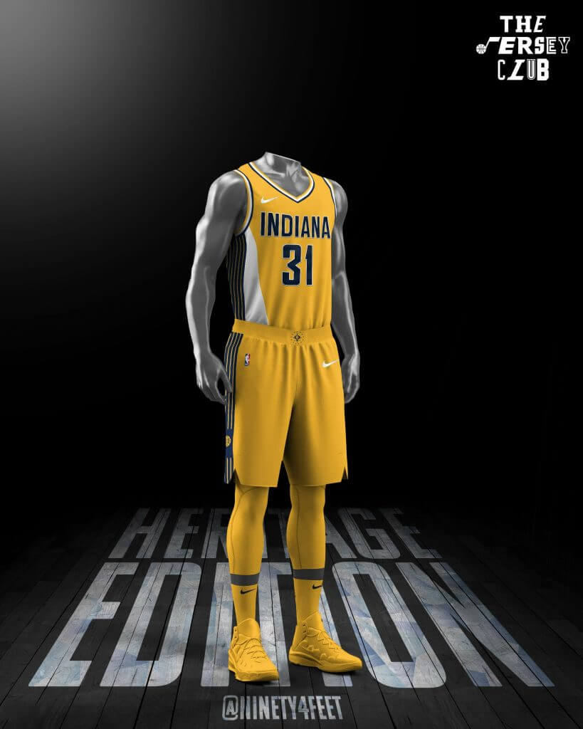
Cleveland Cavaliers/Indiana Pacers
Seth Reese
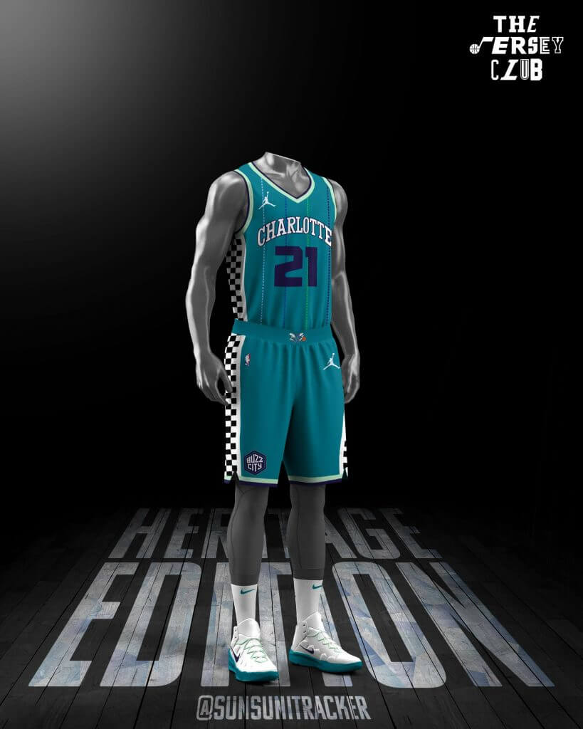
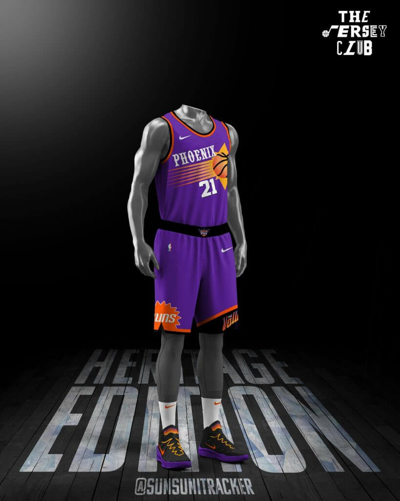
Charlotte Hornets/Phoenix Suns
Mike Joseph
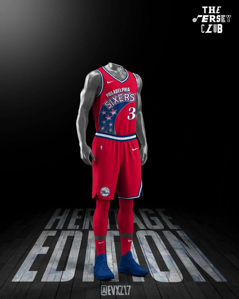
Philadelphia 76ers/Memphis Grizzlies
Evan Barcanic

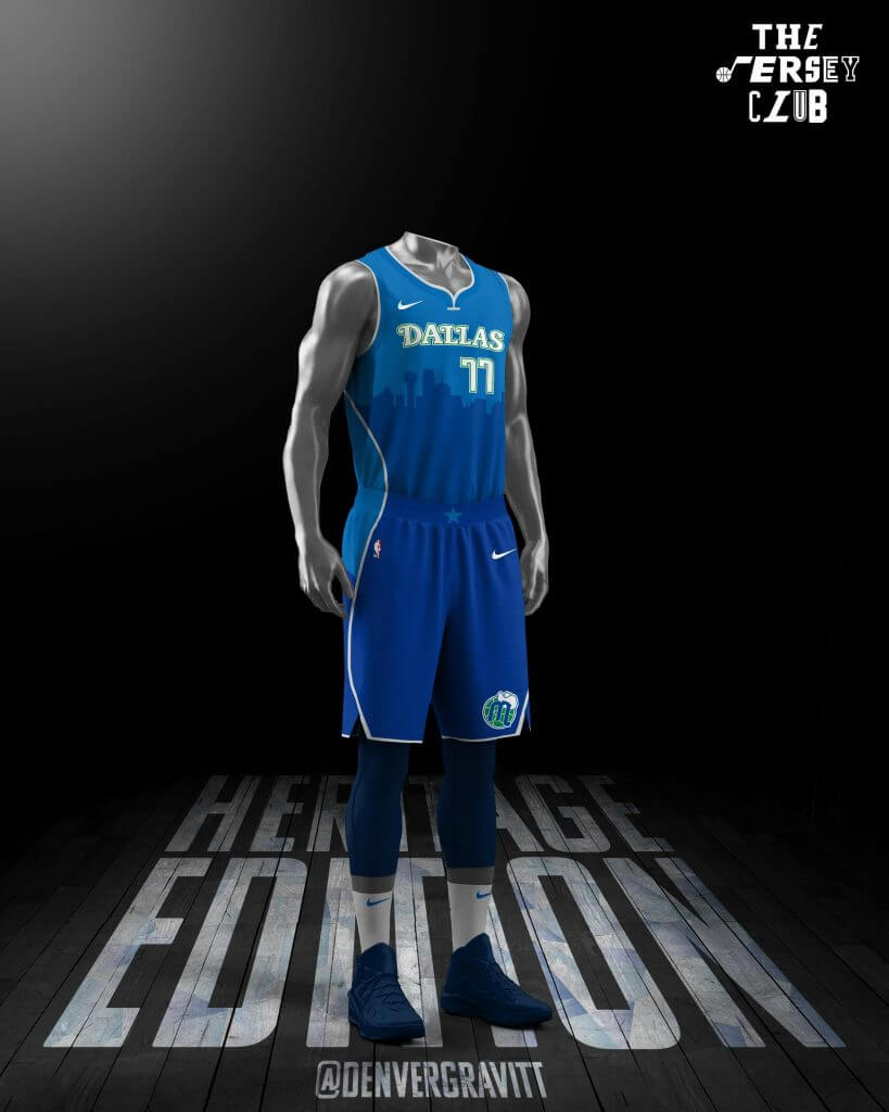
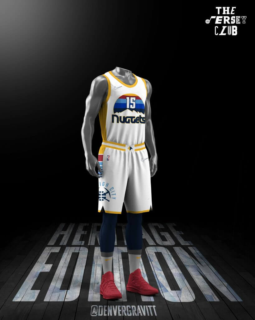
Dallas Mavericks/Denver Nuggets
Denver Gravitt
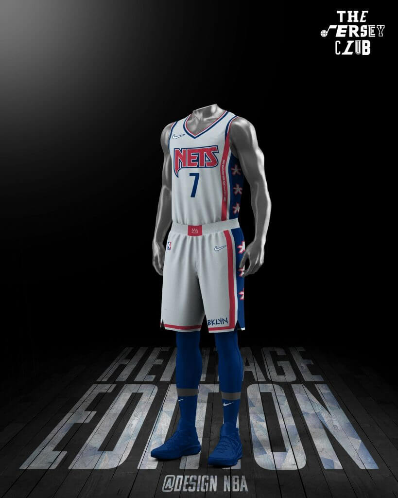
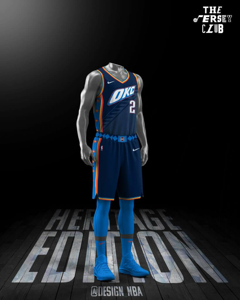
Brooklyn Nets/Oklahoma City Thunder
Joseph
Miami Heat/New York Knicks
Lance Hinesman
Milwaukee Bucks/Minnesota Timberwolves
Ryan Meils
Boston Celtics/San Antonio Spurs
Tore
Sacramento Kings/Orlando Magic
Nick Mueller
Los Angeles Lakers/Portland Trail Blazers
Shape Arts
Chicago Bulls/New Orleans Pelicans
Slam Studios
Atlanta Hawks/Detroit Pistons
Emme
Utah Jazz/Toronto Raptors
Jazz
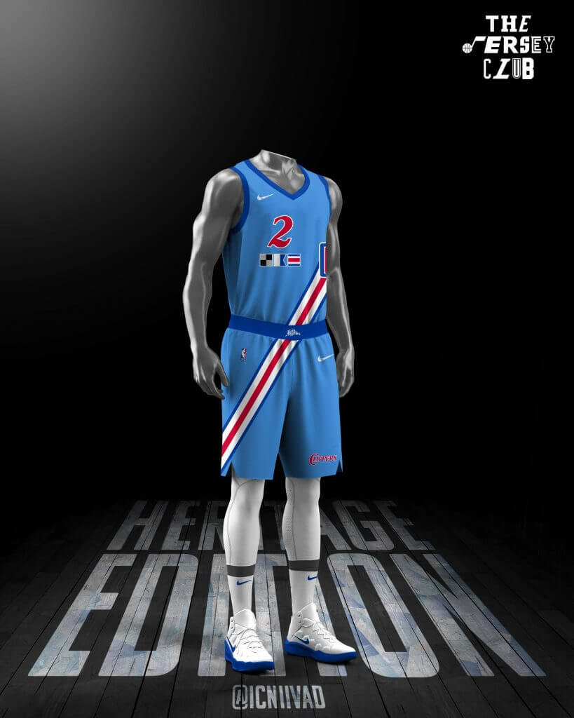
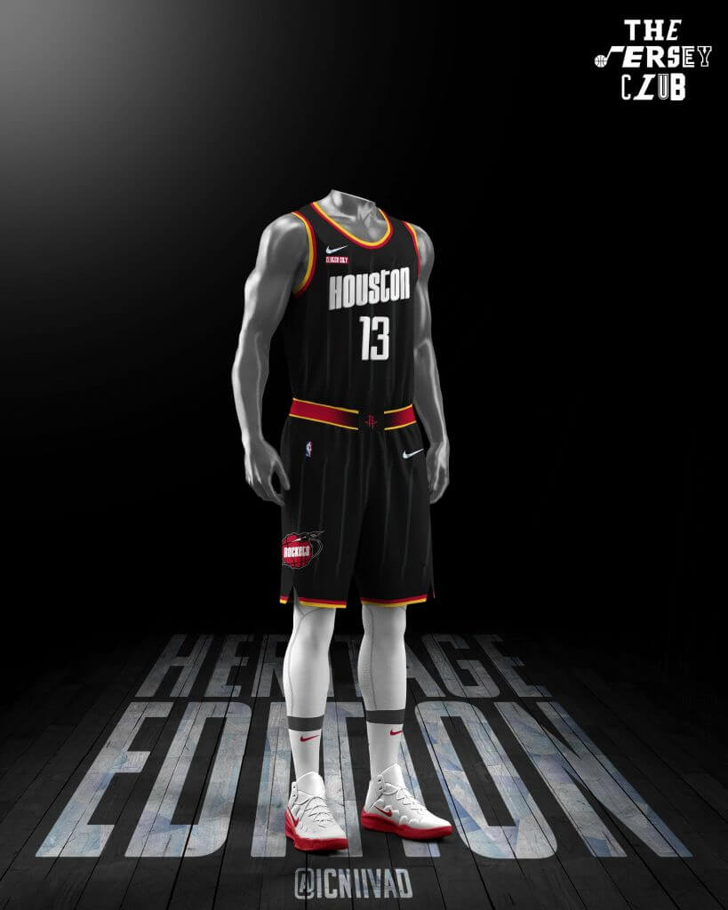
Los Angeles Clippers/Houston Rockets
Brian
Seattle Super Sonics
Bonus!
The Full Set…
Thanks, Mike (and the entire Jersey Club design team)! As I said in the intro, I really like quite a few of these. Please let the team know what you think of their efforts — I know they greatly value your feedback!


Guess The Game…
from the scoreboard
Today’s scoreboard comes from Mike Engle.
The premise of the game (GTGFTS) is simple: I’ll post a scoreboard and you guys simply identify the game depicted. In the past, I don’t know if I’ve ever completely stumped you (some are easier than others).
Here’s the Scoreboard. In the comments below, try to identify the game (date & location, as well as final score). If anything noteworthy occurred during the game, please add that in (and if you were AT the game, well bonus points for you!):
Please continue sending these in! You’re welcome to send me any scoreboard photos (with answers please), and I’ll keep running them.
The “BEST OF” Kreindler’s Korner
Hey guys & gals. You’ve enjoyed Kreindler’s Korner for several years now, mostly on the weekends, on Uni Watch, but with the recent coronavirus outbreak, Graig’s time is just too precious and he needs to tend to other things besides coming up with a new writeup each weekend.
So, going forward, for as long as the COVID-19 situation is bad in New York, I’m going to run a few “Best of’s” until Graig returns.
Here’s today’s offering:
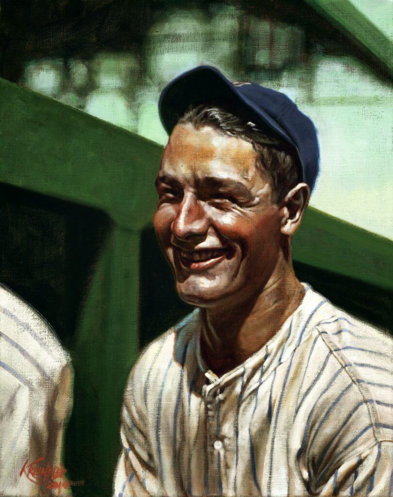
Title: “New Blood”
Subject: Lou Gehrig, 1925
Medium: Oil on linen
Size: 16″ x 20The Yankees were in trouble. Their 1925 season was only two months old, and the team seemed to be giving up already. By June 1, they were 15-26, good for seventh place in the American League. A year prior, at that time, their record was almost exactly reversed, with the team holding strongly onto the top spot of the league.
Their problems seemed to focus around their top drawing card and all-around greatest asset, Babe Ruth. During that time, the slugger’s private life was in shambles. With his womanizing becoming the stuff of legend, his marriage to Helen Woodford was falling apart. Ruth was seeing a woman who would later become his second wife, though it is possible that he had many more relationships going on at that same time. Towards the beginning of spring training, with his habitual drinking adding to the mix, the Babe began suffering from horrible stomach cramps and high fevers. During an April 7 stop in Asheville, North Carolina, he completely collapsed in a bathroom. Newspapers in London reported that he had died. His diet being the main culprit in his illness, writers referred to his episode as “the bellyache heard ‘round the world.”
It was discovered that the Babe was suffering from an intestinal abscess, and on the 17th of that month, he went into surgery. Upon his return to the team, Babe was still feeling the effects of his spring training ailment, as he was 30 pounds lighter, and appeared gaunt and wobbly-legged. Many writers felt that the Yankee slugger was through. At thirty years of age, and as a result of his life of consumption and over-indulgence, many felt that he seemed older than Ty Cobb and Walter Johnson did at that same age. They feared he was no longer able to continue being the same kind of player he was in the late 1910s and early 1920s.
The rest of the team faired no better. Their regular third baseman, Joe Dugan, was playing on a bad knee. Everett Scott, who had recently broken his consecutive game streak of 1307 games, seemed to be completely sapped of his strength. Both Catcher Wally Schang and second baseman Aaron Ward were having poor years, and were at the end of their tenure with the club. Wally Pipp, the first-sacker, was batting .244 with only three homers and twenty-three runs batted in. In fact, his average over the last three weeks of May was an anemic .181. Manager Miller Huggins thought it was time for a shakeup, possibly hoping that the threat of the regular starters losing their jobs would encourage better play and more hustle.
Facing the Washington Senators on Tuesday, June 2, he saw his opportunity. Ward’s second base was surrendered to Howard Shanks, while Benny Bengough took the mask and chest protector to behind home plate. And, with lefthander George Mogridge on the mound, Huggins put in the young Columbia University fence-buster Lou Gehrig to play first. Contrary to popular belief that Pipp was benched due to a headache, it was actually because of his ineffectiveness against lefties throughout that season.
It was the first starting job for Gehrig, though up to that point he had been under the club’s wing for two years. On April 18 of 1923, the same day that the Yankees opened their brand-new stadium, Gehrig was pitching for his university team against Williams College. Despite registering a loss, he struck out seventeen – setting a school record – and hit both a single and double. During that season of nineteen games, he hit .444, with six doubles, two triples and seven home runs. The tale of his homers became somewhat legendary at the school, where people said one of his blasts broke a window in Hartley Hall, while another flew 450 feet to smash a sundial dedicated by the class of 1885. He was thought of as “The Babe Ruth of the Colleges.” Yankee scout Paul Krichell had been interested in Gehrig’s bat and was the man responsible for the young man’s signing with the Yankees midway into that season. With Babe Ruth’s power driving New York, finding someone who could augment that was a no brainer. Such an offensive tandem could only mean better draws to the stadium.
Over the next two years, he flourished in the eastern league with the Hartford Senators, hitting .369, with thirty seven homers, thirteen triples and forty doubles in 1924. However, in September when he was called up to New York, he saw very limited playing time as a pinch-hitter. Huggins still had a very reliable veteran in Pipp. And, as long as he felt that the Yankees had a shot at the pennant – which they most certainly did in 1924 – he would play it safe. Very early during the 1925 season, there were even talks of Gehrig being traded to Boston for Phil Todt, another veteran first sacker.
But on that afternoon in June, because of Huggins’ need to shake things up, Gehrig finally seemed to get his chance to become more of a regular in the Yankee lineup. That day, he had two singles and a double in five chances, and was one of the main reasons the Yankees snapped their losing streak with a 8-5 win. Only three regulars from the prior year – Dugan, Ruth and Bob Meusel – started the game.
Pipp worked with Gehrig before each game there-after, helping him improve his technique around first base. He held out that he would win his job back eventually, but almost a month after sitting out, his hope was gone for good. On July 2, he was hit in the head by a Charley Caldwell high and inside fastball during batting practice. He spent a week at St. Vincent’s Hospital with a fractured skull and played very little for the rest of the season.
The Yankees finished the season with one of the worst records their franchise would ever produce, good for second to last place. Attendance at the stadium also fell off to 697,000 – over 30 percent off from the prior season. With all of his injuries and squabbles with Huggins, Babe Ruth only played in 98 games. He batted .290 and hit twenty-five home runs, and though those numbers would be aberrations for any mortal, it was Babe’s worst season in the majors.
Lou Gehrig, soon to be twenty-two years old, continued to play, and began to flourish as a starter. He played in each of the next 113 games, hit twenty home runs, hit .295, and batted in 68 runs.
Wally Pipp, now thirty-two years old, was traded to the Cincinnati Reds before the start of the 1926 season.
The Yankees had their new first baseman.
Thanks, Graig! You can (and should!) follow Graig on Twitter.
Click to enlarge
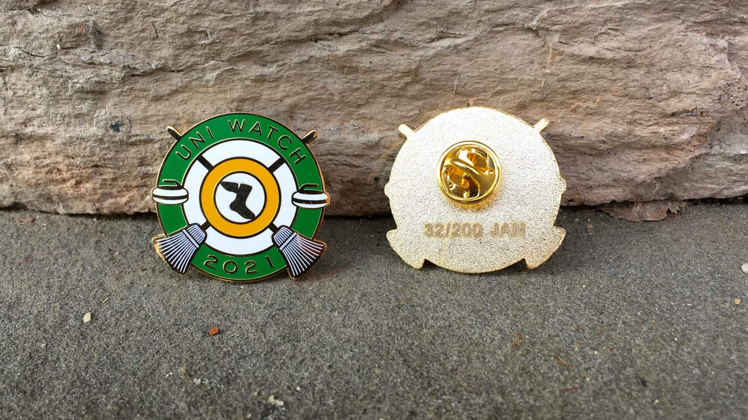
And now a few words from Paul: Hi there. Happy 2021! In case you missed it on Friday, the new year means it’s time for the Uni Watch Pin Club’s first pin of 2021. We’re going with a curling theme this time around — highly appropriate, since curling has a rich history of decorative pins. Hurry hard!
Also: As you can see in the photo above, this pin includes the words “Uni Watch,” but not “Pin Club.” That’s a change that designer Todd Radom and I have made for this year — all pins will include “Uni Watch” and the year on the front, with the month continuing to appear on the back. “Pin Club” will no longer be included.
This is a numbered edition of 200 pins. You can order yours here.
Just like last year, we will have some sort of bonus prize for people who collect ’em all. (Speaking of which: If you collected ’em all in 2020, you’ll be receiving your bonus pin later this month.)
Finally: All of our remaining 2020 pins have been reduced in price from $13.99 to $9.99. Here they are: January, February, March, May, June (about 35 left), July (about 25 left), August, September, October (about 40 left), November (about a dozen left), December (about 20 left), and the 2020 Press Pin (just a few left). Sorry, April is sold out!
Okay, end of sales pitch. Handing the baton back to Phil!
And finally… that’s all for today — sorry there’s no ticker, but Paul gave Anthony the New Year’s Day holiday off. I’ll be back with a full ticker tomorrow!
Big thanks to Mike Joseph and the entire “Jersey Club” for their 2021-22 NBA “Heritage” edition uniform concepts — some great stuff there, and a bunch of which I wouldn’t mind actually seeing on the court.
Everyone enjoy the last of the Bowls today (well, except for the Natty on January 11th), and I’ll have the entire SMUW crew, plus a guest 5 & 1 picker, tomorrow, as we tie a bow on the season with a Sunday Morning Bowl Wrap. You won’t want to miss that!
Stay safe and have a great Saturday.
Peace,
PH
Those are sick. I also am working on an NBA redesign, some new logos, and 5 new jerseys.
I don’t want to see the Thunder wear Sonics uniforms. Save that for a future Seattle team.
I’m not sure they can, if I remember the deal correctly. I think the Thunder took the team history with them, but left the Sonics name and colors.
Yes OKC Has The History, UNTIL SEATTLE COMES BACK, Then It’s A Cleveland/Baltimore Situation.
I don’t ‘want’ to see that either, but if the Thunder ever decide to do so, I’d be OK with it.
Sorry, Seattle.
Generally speaking these are very good. Though, the Clippers is a little Meh and the Wolves lettering is really hard to see.
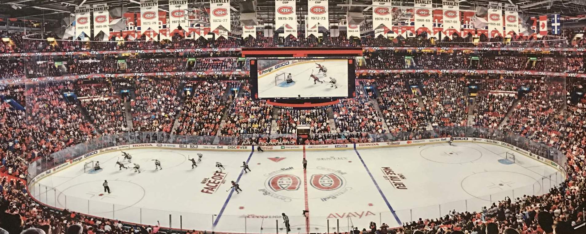
As for the center ice pic, I sort of miss the dual logos at center ice. my secret pet peeve about hockey visuals is how the red line splits the team logo.
I think the Nuggets is great. The Cavs, Kings and Pelicans are okay – not keen on the rest of them though.
Yes. Habs logo always looked particularly great in the dual form
GTGFTS: October 10, 2017. That’s Tomas Plakanec scoring Montreal’s only goal in their home opener, a 3-1 loss to Chicago.
The photo is the October 10, 2017 game between the Montreal Canadiens (at home in Le Centre Bell) and the Chicago Blackhawks. The Hawks won 3 – 1. This game was the home opener for the Canadiens, hence the NHL Face-Off 2017 (LNH Mise Au Jet 2017) logo on the ice.
You two scoreboard responders are correct! I took the picture myself because it’s the basis of a jigsaw puzzle I bought. I had fun tracking down the game in 60 seconds, so I thought it would be appropriate here. Everybody stay safe at home!
That looks like that puzzle would be incredibly difficult.
Love the frankenconcepts. All of them. No major quibbles. Good work all the way around.
These are very refreshing takes. My favorite from each designer: Wizards-love the Bullets, Pacers, Hornets are really good, 76ers, Nuggets, Nets, Knicks- never thought I’d like to see black again for the Knicks but what do you know, Bucks with red looks great, Spurs, Kings, Blazers, Pelicans, Hawks, Jazz is a bit too purple for my taste but at the same time I like it, and Houston. And bring back the Supersonics!
I love those concepts! While all are great, the Nets one really smashes. Great job!
I like the Nets look also, but wish the stars were historically shown on the front of the jersey, not a side panel. very nice overall mix of Jersey Nets and NY Nets
Today in the English Premier League, the Wolverhampton Wanderers are wearing not their usual orange/gold with black numbers and trim, but are wearing a deep maroon, white numbers and forest-green graphics for the kit sponsor. The combination is almost as unreadable as the the black Oregon uniforms of a couple of years ago. Wonder if there will be some pushback from the sponsor because it is not getting full value from its purchase of the ad space?
Agree that the sponsor logo was hard to read but during the game I was thinking this was one of the best red/green combos I’ve seen
Excellent work and thank you to all the Jersey Club members. Just one man’s opinion, but I really love the Hornets, Nets, Nuggets, Rockets and Hawks. The Lakers (with that blue side panel) is just a bit jarring to the eye. But thanks to all, especially when you see some of the dreck that many of the “professional” NBA designers are putting out there these days.
Love the Sonics concept. The ’90s era unis should be left to history, but that brick red was a welcome addition to the colors and works well here as a trim to balance the brightness of green and gold.
Wizards…lovely design; should be outright adopted as a more regular look.
Love the Clippers too–every un-Now.
The blue trim and shoes with the Lakers and Bulls is because……??
Like the Nuggets really well although I would have like to have seen the old miner incorporated in it.
Utah needs to send the Jazz name back to N.O. and come up with something else.
The blue trim for the Bulls is from the city of Chicago flag. The blue from the Lakers is a throwback to the Minneapolis Lakers when they were a royal-ish blue and baby blue.
The blue trim for the Bulls comes from the city of Chicago flag. The blue trim for the Lakers comes from their time in Minneapolis. They used to wear royal-ish blue and baby blue.
I really enjoyed the NBA Heritage jersey concepts. They are definitely much better than the clown designers that Nike employs. I absolutely loved the Sixers, Suns, NOLA, Bucks, Nets, Nuggets, and Spurs sets. The teams should adopt these designs like last week. I did not care for the Bulls, Clippers, Lakers, Heat, or Washington concepts, as well as using black for Houston (maybe this was a James Harden demand???) or the numerals used for the Cavs, Magic, or Kings, which would have been very good IMHO with better numbers. I know the designers were trying to incorporate a current aspect of the team’s uniforms. I just think the Cavs numbers are horrid and the Kings are not far behind them. The Shaq era Magic numbers are the best for that franchise. Again, fantastic overall though.
Why would you rebrand the worst Pistons jersey ever?