Click to enlarge
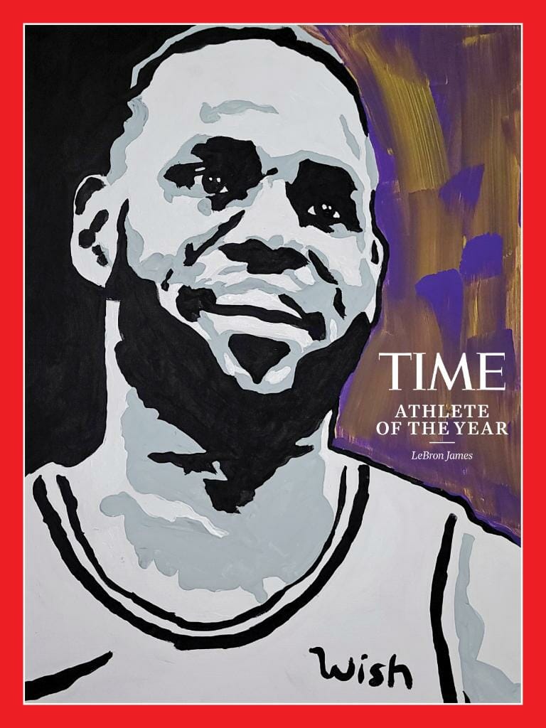
Time magazine yesterday named LeBron James as its athlete of the year and, as you can see above, marked the occasion with a portrait that showed the Lakers’ uniform ad patch, a portion of the Nike maker’s mark, and not even a hint of the Lakers’ chest insignia. As Time’s announcement tweet began circulating yesterday, more than a few people got in touch to say that this image felt like Everything That’s Wrong With the Uni-Verse (and maybe just the universe) in a nutshell.
That was my first reaction as well. But it turns out that it’s more complicated than that. And as is usually the case, you have to go beyond Twitter to get the full story.
First, I clicked through Time’s tweet to get to their article, where I learned that they were honoring LeBron in large part because of his activism. That made me wonder if they intentionally included the “Wish” logo as a gesture of hope — like, he’s wishing for positive change, he’s wishing for racial justice, and so on. Sort of an “I have a dream wish” sentiment. (To be clear, I don’t think riffing on an ad for that purpose would be a good judgment call, but I thought it was possible that they’d done it.)
The article also included a credit for the illustration: “Portrait by Tyler Gordon for Time.”
I had never heard of Tyler Gordon, so I googled him. Turns out he’s the partially deaf, stuttering, 14-year-old artist who’s recently gotten a fair amount of attention, and even a spot in a gallery show, because of his portrait of Vice President-elect Kamala Harris:
She called me!!!!!! @KamalaHarris called ME!!!!https://t.co/gseAc9L6p8
— Tyler Gordon (@Official_tylerg) November 26, 2020
I figured yesterday must have been a busy day for Tyler, what with his art being featured in Time and all. But it never hurts to ask, so I contacted him via Twitter DM, introduced myself, explained what Uni Watch is, and asked him (a) if there was any particular reason he included the Wish ad and part of the maker’s mark but not the Lakers lettering; (b) if his original art had shown more of the jersey but had been cropped by Time; and (c) if the inclusion of “Wish” was meant to be aspirational, like a wish for positive change.
To my surprise, he wrote back within five minutes. “No, none of that,” he said. “I thought I would be able to fit the jersey for the most part. But because I freehanded the painting, I just simply ran out of room.” He included a photo of the original artwork to show me what he meant (click to enlarge):
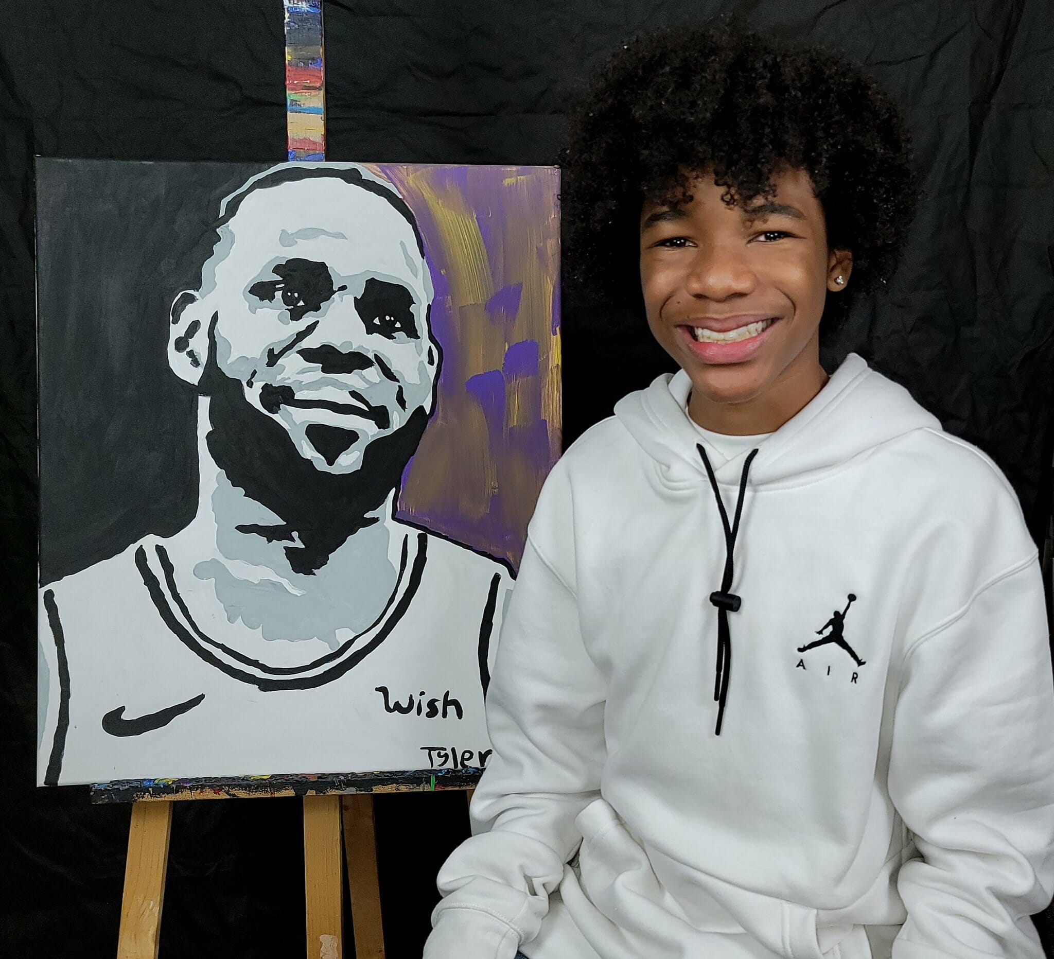
So Time did crop it slightly (which explains the partial maker’s mark in the published version), but otherwise it’s pretty true to Tyler’s vision.
It still makes me a bit sad that Tyler’s portrait shows the least important elements of the jersey, and it makes me even sadder to think that he’s part of a whole generation that will grow up with those elements having been normalized. But when you look at that photo of him with his painting, it’s hard to mind too much. He seems like a really great kid.
Meanwhile, there were two other notable developments yesterday regarding uniform ads. First, the Nets announced that they have a new uni advertiser — Infor is out and Motorola is in:
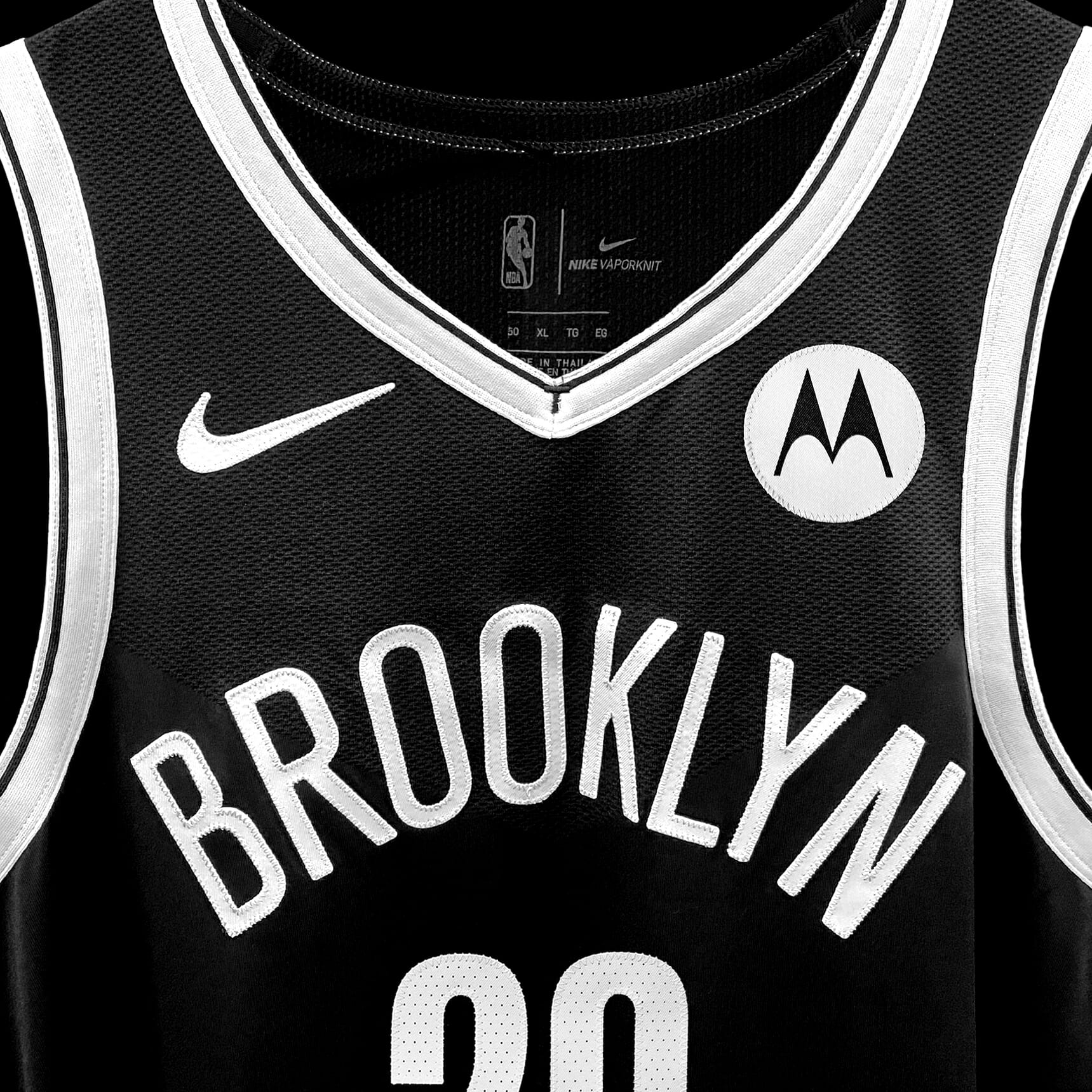
As you know, I usually don’t showcase new NBA uni advertisers because I see no reason to give them free exposure. But this one seems noteworthy because Motorola also advertises on the Pacers’ jerseys, so this is the first instance of a uni advertiser buying space on the uniforms of two different NBA teams. I was a bit surprised by that — I figured all the deals would be team-exclusive — so I emailed Pacers chief sales and marketing officer Todd Taylor to ask him about it. Here’s his response:
Motorola is still our jersey partner, and by all accounts happy to be so. They gave us a heads-up about the Nets deal. They are very complimentary about our partnership and indicated the Pacers performance was the main motivator to enter into a deal with the Nets.
Until they called us, I hadn’t really considered that two teams might have the same partner. Shame on me, I guess.
Now Motorola just needs to strike deals with the other 28 NBA teams and they can rename the NBA as the MBA. Done and done.
The other news on the uni advertising front is that the NHL is exploring the possibility of selling ad space on helmets for the upcoming season. Obviously, that would be better than jerseys, but it’s still really disappointing to hear.
For now, it’s just a possibility. Here’s hoping it doesn’t happen.
Knicks-splaining: Remember that godawful Knicks City alternate that leaked last month? To my knowledge, the Knicks never officially unveiled it — they’re the only NBA team not to do so with their City design — but yesterday its legitimacy was confirmed on Instagram by someone named Ronnie Fieg (see above).
Who’s Ronnie Fieg? He’s the founder of something called KITH. What’s KITH? Uni Watch reader Ben Garner explains:
I heard today via Instagram that the new Knicks uniform is the result of a collaboration between the Knicks and KITH, a pretty prominent streetwear brand. As someone who Gets It™, I’d seen the leaks when they first started circulating on Twitter and were posted on Uni Watch, but the KITH connection was not mentioned, (or if it was, I did not hear about it, and I consider myself to be fairly tapped into that sphere as well).
I was just curious to see if you knew about this collaboration, how it came about, or if it’s all just to appear more “street-conscious” and forward-thinking, à la the Cavaliers hiring Daniel Arsham as their “creative director.” Basically, is it uni-notable, or just the Knicks and Nike trying to generate hype for their piece-of-shit uniforms?
It’s just crazy because in my mind it’s gone from a shit jersey that I figured would be seen on the clearance rack at TJ Maxx (not trashing the clearance rack at TJ Maxx, some of my best buys have come from it) to a shit jersey that could very well be in high demand because of its perceived streetwear cred. We truly live in the most fascinating time.
As I explained to Ben, this was all news to me, but it seems similar to what the Nets have done with their Basquiat jersey design, and I also think he’s probably right about the Cavs/Arsham connection. Definitely seems in keeping with the direction that the NBA and Nike are going these days, for better or worse.
Still a shitty Knicks design, though.
Click to enlarge
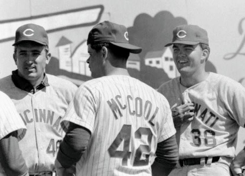
Too good for the Ticker: What’s cooler than wearing your ballcap backwards and having “McCool” as your NOB? Arguably nothing, and Reds pitcher Bill McCool achieved that distinction all the way back in 1968!
(Big thanks to Brice Wallace for this one.)
Click to enlarge
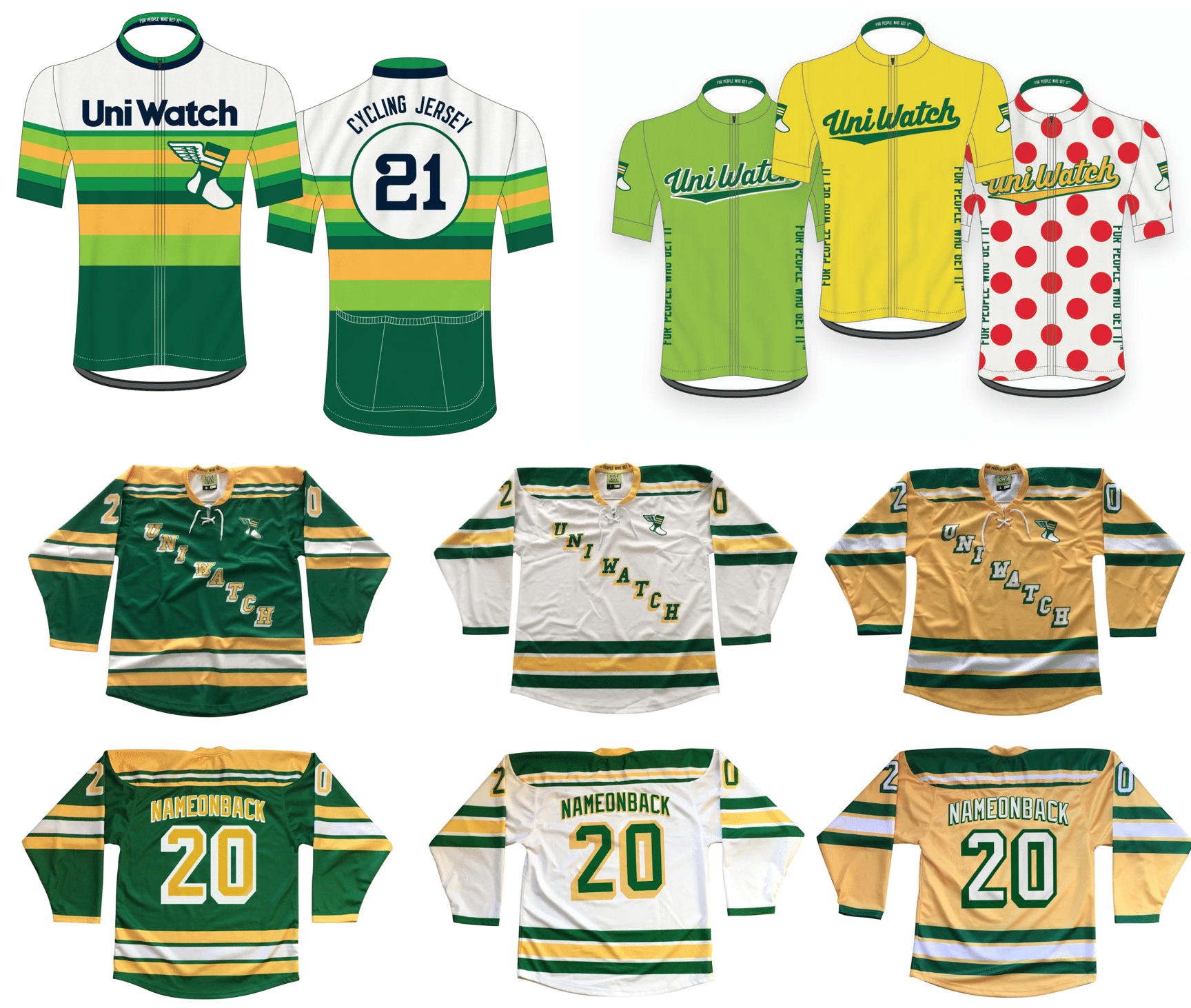
LAST CALL for the hockey/cycling jerseys: If you want to get in on the latest batch of Uni Watch hockey or cycling jerseys, you must get your pre-order in today. All jerseys are customizable with your choice of number and NOB. Get the full scoop here.
The rest of our fine Uni Watch products — baseball caps, toques, T-shirts, pins, cufflinks, patches, and plenty more — are listed here.
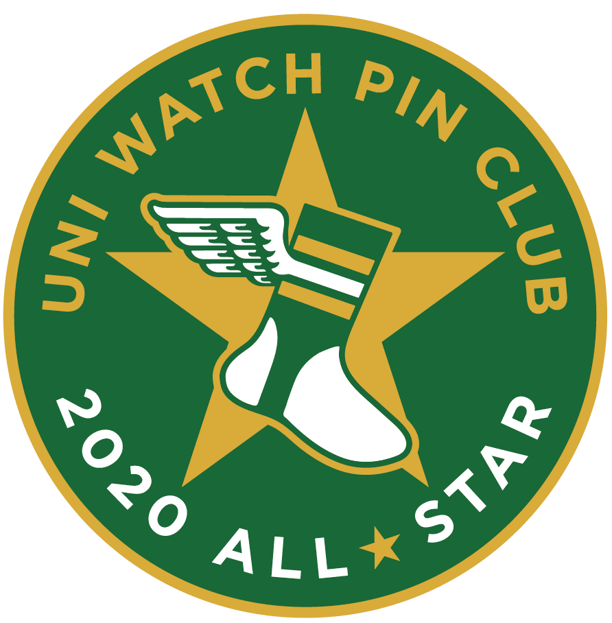
“Collect ’em all!” reminder: If you’ve collected all 12 of this year’s monthly Uni Watch Pin Club pins, you’re eligible to get our 2020 All-Star pin as a free bonus. But to qualify for the bonus pin, you must notify me asap by emailing me with (a) your mailing address and (b) some combination of photos of your pins, screen shots of your purchase receipts, or screen shots of your purchase-confirmation emails from Teespring to prove that you’ve purchased all 12 pins. In short: Collected ’em all? Great — prove it!
I will be ordering the All-Star pins soon, with the quantity based on how many people have emailed me their documentation. I’ll definitely order an extra dozen or so (because I know there will be stragglers and late-comers), but that’s it — a dozen extra, not 50 extra. So again, if you’ve collected ’em all, please prove it, pronto. Thanks!
The Ticker
By Anthony Emerson

Baseball News: The Cubs posted an Instagram of video of a logo-emblazoned dreidel to celebrate Hanukkah (from Jordan Cutler). … MLB’s Cut4 posted an Instagram gallery of “wardrobe malfunctions.” They posted a similar gallery on Twitter (from @realRosebud). … New videoboard for the Royals (from Mike Chamernik). … New logos and unis for the Hudson Valley Renegades, now that they’re the high-A affiliate of the Yankees (from multiple readers).

NFL News: Football Outsiders’ ‘Scramble for the Ball’ column took a look at the NFL’s unis (from Jerry Wolper). … The Rams’ beatdown of the Pats last night may have been the first time the Rams played at SoFi Stadium with yellow endzones. It must’ve been a purely aesthetic move, because the Chargers had blue endzones against the Pats on Sunday (from Moe Khan). … Here’s an examination of whether mono-white uniforms offer a competitive advantage (from Taylor Nicolaisen).
College/High School Football News: Someone found an old UNC game jersey at Goodwill. How come my Goodwill visits never result in anything that good? (From James Gilbert.) … Virginia Tech will go mono-maroon against Virginia, and LB Divine Deablo will wear Beamer’s No. 25 (from Andrew Cosentino). … Michigan State, responding to longstanding fan requests, will bring back its “Gruff Sparty” helmet logo this week (from many readers).

Basketball News: Goodness, I am so nostalgic for the aesthetics on these ’92-’93 NBA cards. And I wasn’t even born until 1994! … Terry Mark sends in these gorgeous 1980 rec league unis from Miles Laboratories. “I happen to like script wordmarks on basketball uniforms and “Miles” is rendered nicely here, though I noticed some inconsistencies in the angles of the wordmarks,” says Terry. … Buffalo’s Keishawn Brewton played last night without an NOB, as his transfer waiver was only approved on Wednesday (from @NYCKING). … The Wapello, Ia., school district has decided to allow its boys’ and girls’ basketball teams to wear alternate uniforms that do not include the district’s colors, going against a 2007 rule requiring all sports teams to wear the district’s colors (from Kary Klismet). … A blogger has listed 13 reasons why you should or shouldn’t retire an NBA number (from Allan Chandler).

Soccer News: Costa Rica has unveiled new jerseys, partially made out of recycled material (from Kary Klismet). … Also from Kary: Phoenix Rising FC of the USL Championship has unveiled renderings of its planned new stadium. … Millwall FC’s shirt advertiser donated its ad space to anti-racism charity Kick It Out on Tuesday. Last week some Millwall fans booed when Millwall players took a knee, and in 2018 Vice described Millwall as “historically synonymous with racism” (thanks, Jamie). … Also from Jamie: Some teams in the top two tiers of English women’s soccer will wear a patch for Kick It Out’s new campaign, Take a Stand. Not every club is doing it, but those that are doing it will wear it for the balance of the season. … New centennial logos for the Japanese Football Association (from @smntcsilverfox).

Grab Bag: The U.S. Olympic and Paralympic Committee has given its blessing to athletes who protest on the medal stand during the Tokyo Games next year. … Research in Australia has indicated that tight-fitting dress-like uniforms worn in netball — a sport similar to basketball played by women and girls in many Commonwealth countries — is driving new players away (from Kary Klismet). … CNN anchor Kate Bolduan caused a bit of a stir for wearing a sweater reading “facts first” during her broadcast yesterday (from Jason Hillyer). … Petco has a new logo, and it’s extremely bland and unimaginative. Looks like a car insurance company now. … The University of New Mexico and Dreamstyle Remodeling are headed to arbitration, as the school claims the company skipped out on its naming rights deal at the school’s basketball arena and football stadium (from Timmy Donahue). … Scotland has names for its snowplow fleet, and the names are fantastic (from Andreas Papadopoulos). … The Springboks, South Africa’s national rugby union team and current Rugby World Cup champions, will be wearing these kits for the 2021 British and Irish Lions tour of South Africa (from Sy Hart). … New uniforms for the Japanese women’s national volleyball team (from Jeremy Brahm).

That’s it for this week. I have some really good stuff in the hopper for next week. Until then, stay safe, enjoy Phil’s weekend content, and I’ll see you back here on Monday. — Paul
It looks like McCool’s uniform has pinstripes and his teammates’ uniforms are plain?
Almost certainly a spring training shot, based on the one guy wearing a windbreaker under his jersey.
Good call.
He’s also standing next to another player in home pins.
In regards to the Net’s jersey sponsor, Infor is now 100% owned by Koch Industries. The deal was closed on April 6, so maybe Koch didn’t want to continue the sponsorship?
Virginia will go mono-white against Virginia Tech.
Such a great story on Tyler and his artwork. An inspiring young man that I hope we see more of in the future.
Agreed. His “She called ME!!!!” tweet brought tears to my eyes.
China must be thrilled with Time.
Those 92-93 baseball cards are great looking!! In recent years, my favorite basketball card issue has been Court Kings, which always provide wonderful, colorful aesthetics. Unfortunately, the price of basketball cards has skyrocketed in the past 18 months. Most sets are way to expensive to delve into, which is a real shame.
I really don’t understand the hatred of that Knicks uniform. I think it is incredible!
I looked at it and looked at it myself to try to see what was “shitty” about it. I mean, I’ve seen so many that are so much worse…
It’s disappointing to see artificial turf in brand new stadiums. When the Giants opened theirs I was shocked that they chose the fake playing surface.
UEFA doesn’t allow teams with the same jersey advertiser to play each other (one team has to have something different on the front of the shirt).
I’m sure the NBA won’t do something like that because of the small ad patch and the colors.
Stil. . . I wonder if the NBA will think about that now.
That’s not the case anymore. According to Museum of Jerseys, the no-same-advertisers rule link.
To cite an example, Arsenal and PSG played each other in the Champions League in 2016 with no problem.
I feel like it’s some recency bias to see the Knicks design and Cavs partnership with Arsham as purely some sort of “street cred” plays that represent a new trend.
Recently there are plenty of examples, but it’s not like fashion designers are new to uniform influence or even NBA uniform design (Alexander Julian with Charlotte is the obvious example). To me, it actually makes more sense for a team designing a new uniform to partner with local creatives (particularly those like Fieg, Arsham, etc., that are world renowned artists and rep their cities very publicly) than a generic marketing firm like so many teams do.
Like or hate the design, having a preeminent fashion designer from your city, that’s a fan of your team, who uses local inspiration in the design, feels like the kind of thing uniform fans should be promoting.
Too bad Time removed Tyler’s signature from the view of the painting on the cover.
Actually, it’s pretty rare for an editorial illustration to include the illustrator’s signature.
Not saying that’s a good thing (or a bad thing) — just saying it’s fairly standard industry practice.
Doing some research on the Reds Photo from 1968. When is the last time you saw 19-year-olds pitching in the majors?
Billy McCool #42 – Signed in 1963 as an 18 year old. Relief Pitcher with the Reds at 19. Out of baseball at 25.
Gary Nolan #38 – #18 overall draft pick in 1966 out of high school by the Reds as an 18 year old. He started 32 Games as a 19 year old in 1967 and was 14-8. Out of the league in 1977 at the ripe old age of 29.
Jim Maloney #46 – Signed as a 19 year old, in the majors as a starter in 1960 as a 20 year old. Out of the league in 1971 at 31.
Very interesting post; good research. Thank you.
Surprised no precursor to Army Navy.
I am not looking for to the weekend write up after last years notes.
I am excited to see the rare return to the Hudson Valley and what the academies will bring to the best stadium in the nation!