By Phil Hecken, with Matthew Drake
Follow @PhilHecken
Hey UW readers! Hope everyone had a good week, and you and yours are staying safe and sane.
Last weekend, I featured NFL Concepts from Matthew Drake (if you missed that, click here), who graced us with his designs (or redesigns) for the NFL’s American Conference, for the East and North Divisions. Today we’ll look at his concepts for three more Divisions: AFC South and West, and the NFC East. There’s a lot to look at, so let’s go.
AFC SOUTH
Houston Texans
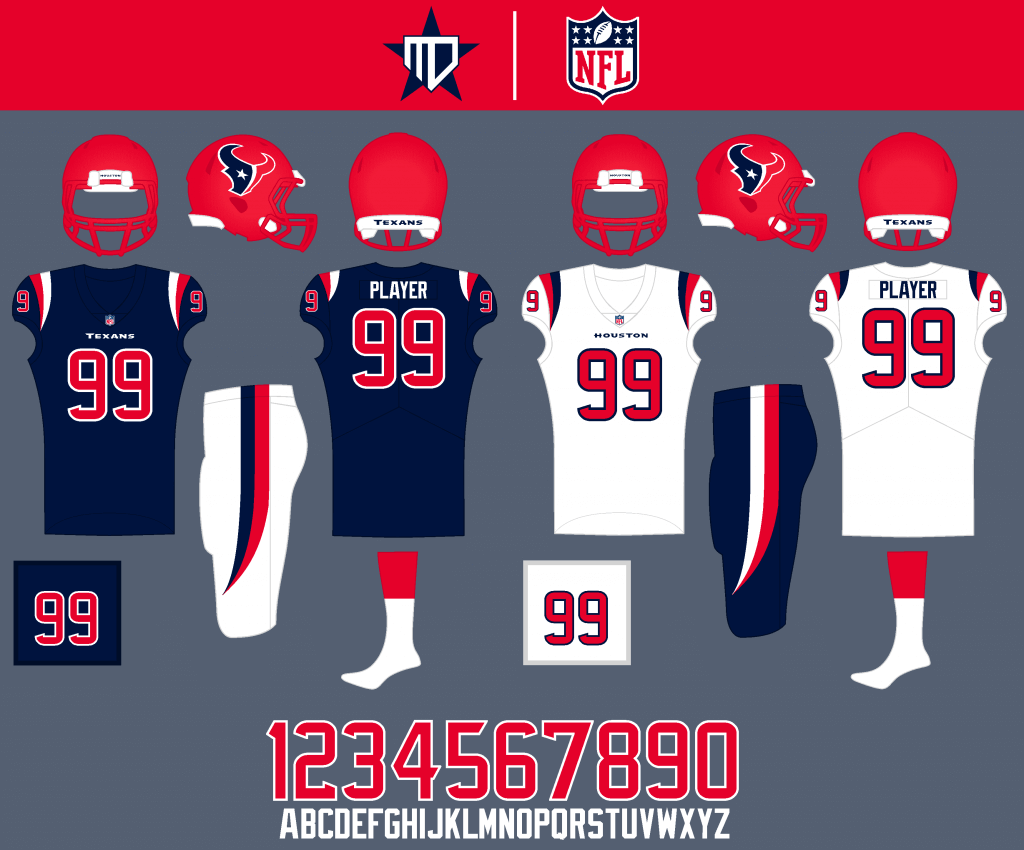
I went with a bright red helmet to give the team a more unique and aggressive look, as well as dual-colored striping to mimic the Texas flag and the primary logo.
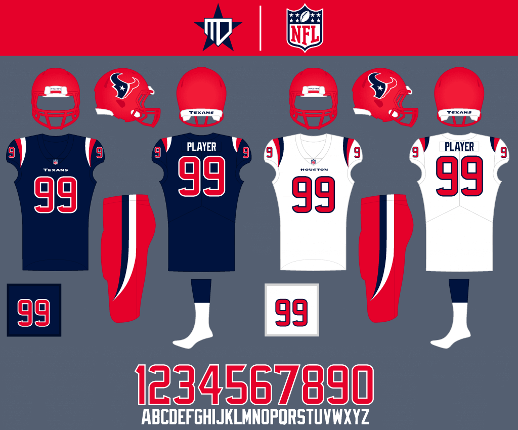
Red pants would be an occasional option, especially against navy-heavy teams.
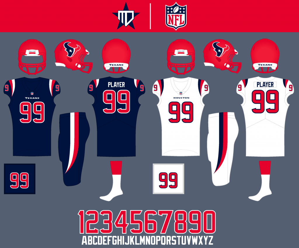
I’d also like to see monochrome on occasion.
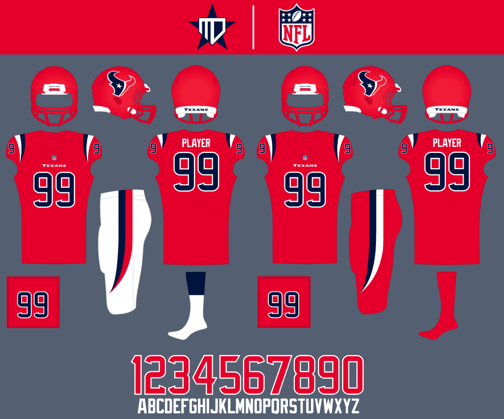
A “Battle Red” alternate as well as an all-red Color Rush give the Texans a multitude of combos.
Indianapolis Colts
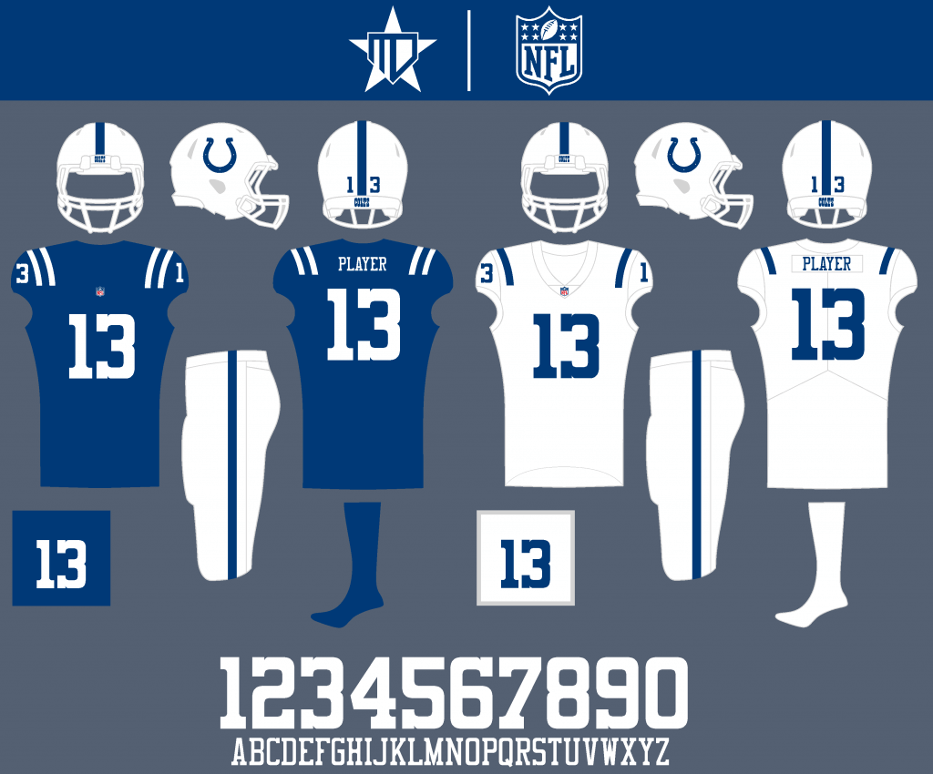
I made the stripes consistent across all backgrounds, and made the number font more rounded to match the logo.
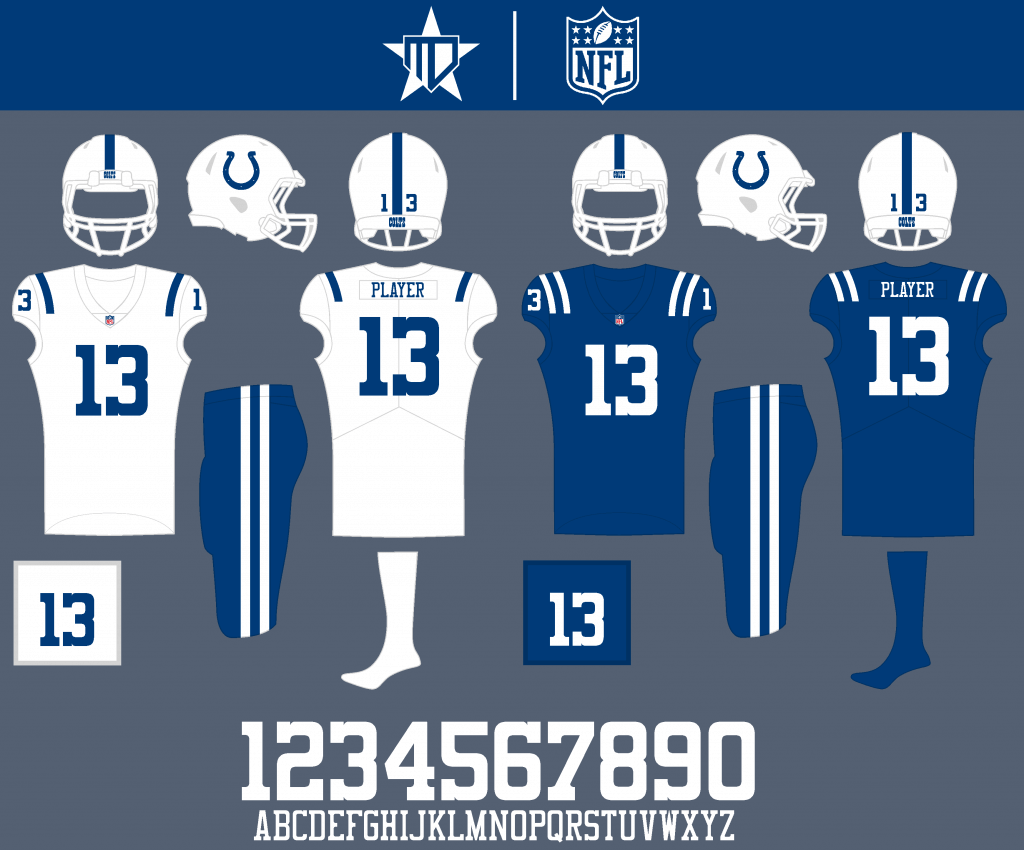
Blue pants can be worn at times on the road, as well as the all-blue Color Rush being an infrequent option.
Jacksonville Jaguars
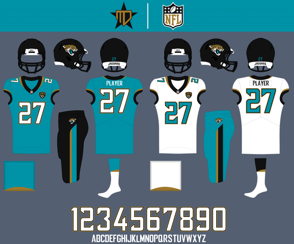
Basically a combination of the team’s past two uniforms, I decided to fully embrace teal as much as possible. I rounded off the edges of the number font to look closer to the inaugural uniforms, and to feel more sleek like a jaguar.

The black alternate has teal numbers and would be meant for primetime games. Teal is the obvious choice for the Color Rush.
Tennessee Titans
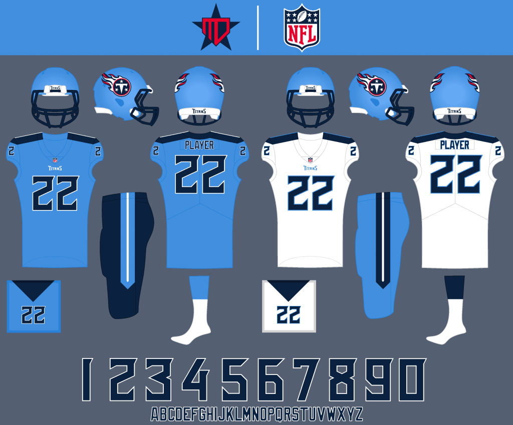
Like the Jags, these uniforms are basically a combination of the past two designs for the Titans. The striping is still inspired by a sword but is more subtle about it, eliminating the need for silver.
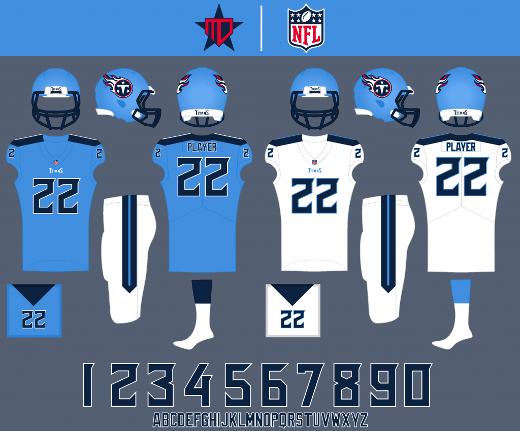
White pants are included as a secondary option.
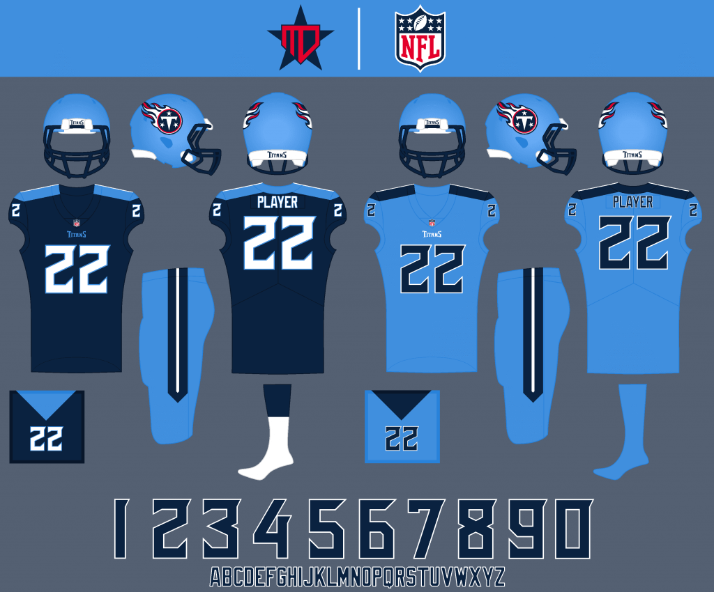
A navy alternate could be worn twice a year, and the Color Rush really emphasizes the team’s unique columbia blue.
AFC WEST
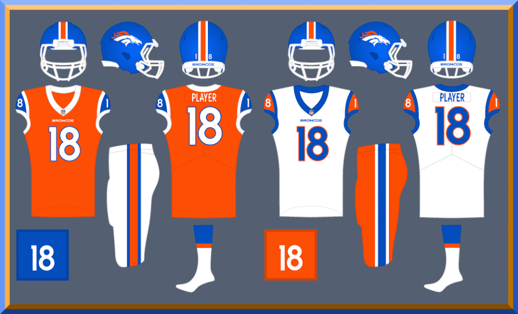
Denver Broncos

The uniform design is based on the 1966 Broncos, but with the modern logo and fonts. The orange and royal blue combo also makes a due comeback.
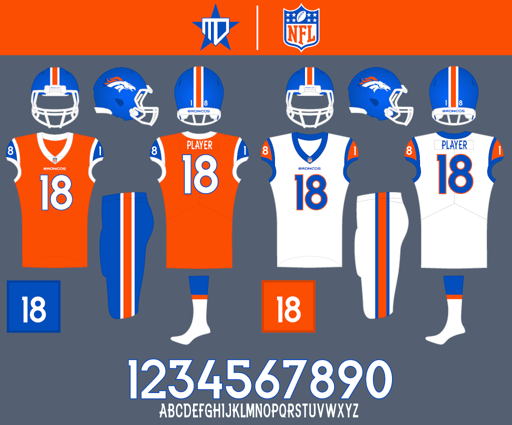
Alternate pant options can be worn on occasion.
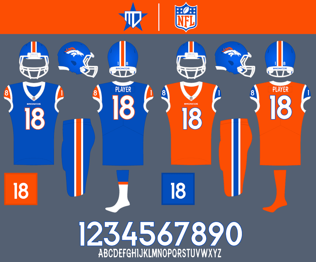
A royal blue alternate fulfills the same role as the team’s current primetime navy alternate, and mono-orange remains the Color Rush option.
Kansas City Chiefs
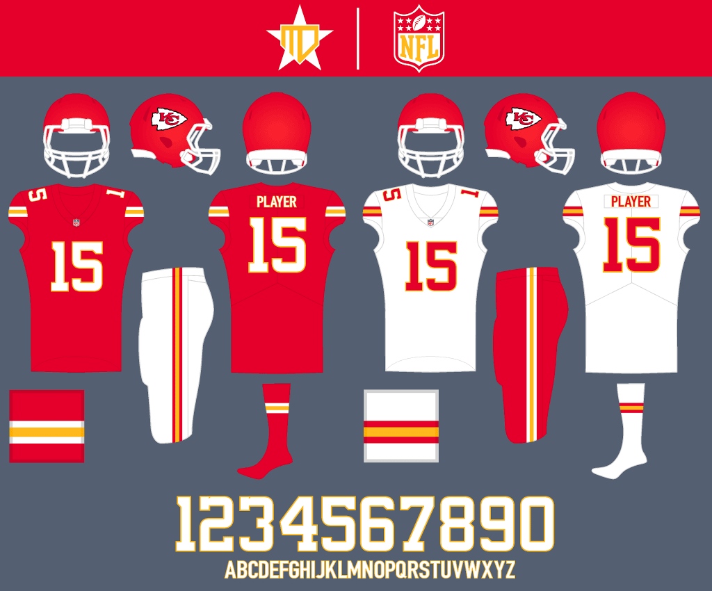
No major changes for the Chiefs, I just tweaked the number font to better match the logo.
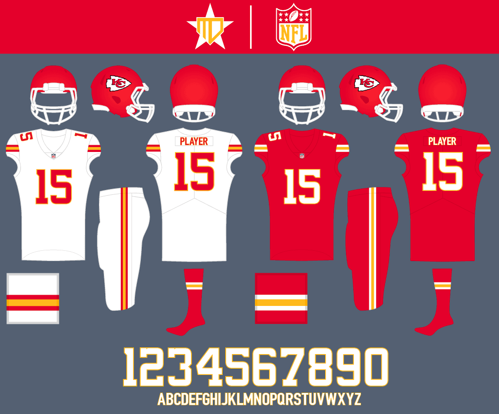
I don’t mind Kansas City in monochrome as much as I do most teams, so each of these combos could be worn about half of the time in any given season.
Las Vegas Raiders
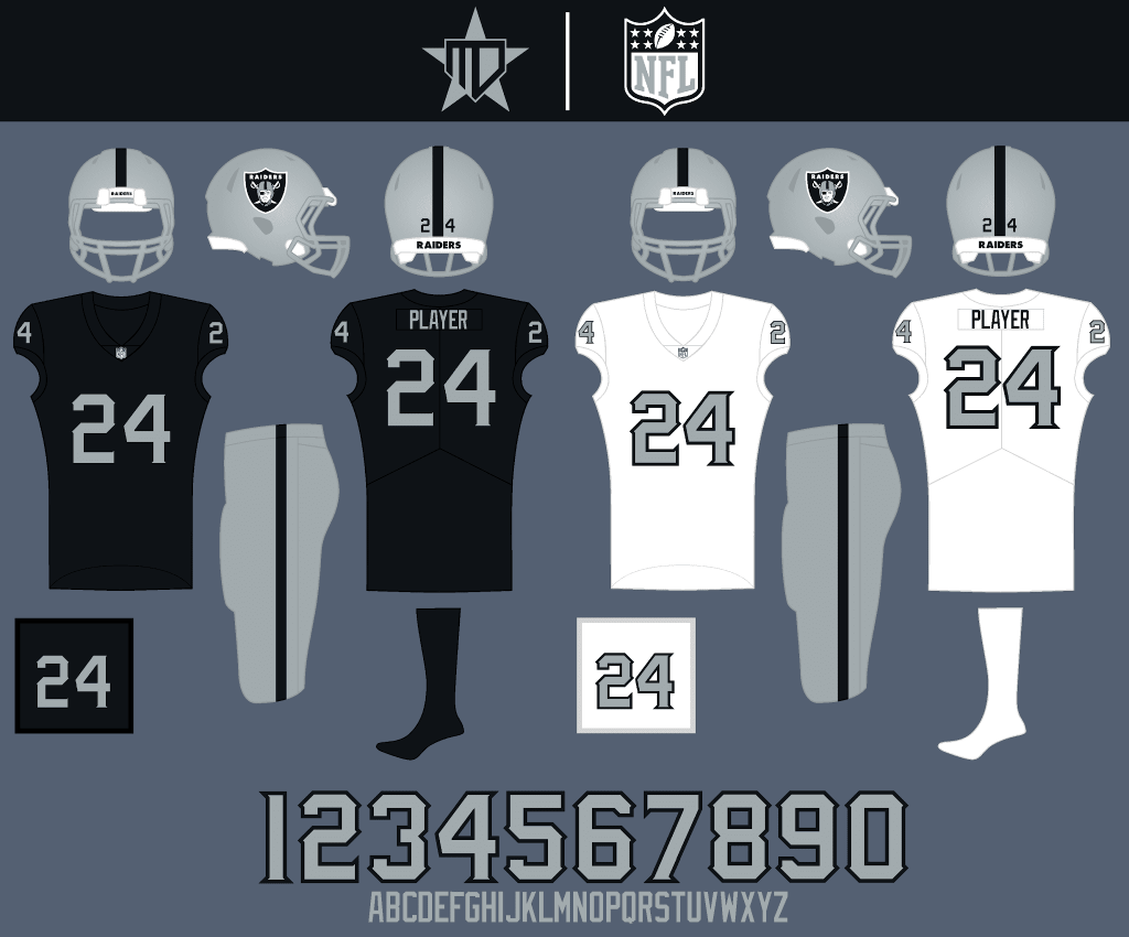
Similar to the Chiefs, I just updated the number font, this time to feel more menacing. I also went with silver numbers on the away.

The white pants would only ever be worn against another silver-heavy team such as the Cowboys. The all-black Color Rush creates an intimidating look for primetime games.
Los Angeles Chargers
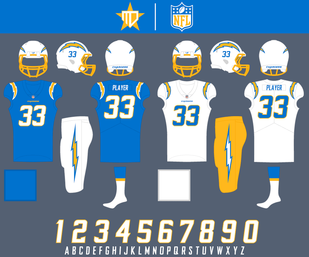
The Chargers new uniforms immediately became one of my favorites in the NFL, so no major changes. I tweaked the number font to match the “pointy-ness” of the old Agency font, and added the wordmark to the front of the jersey.
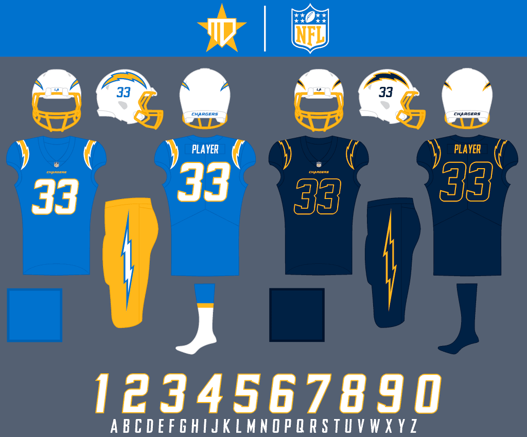
This might not be realistically visible enough, but I feel like navy numbers on the Color Rush could add a cool “primetime” feel to the look.
NFC EAST
Dallas Cowboys
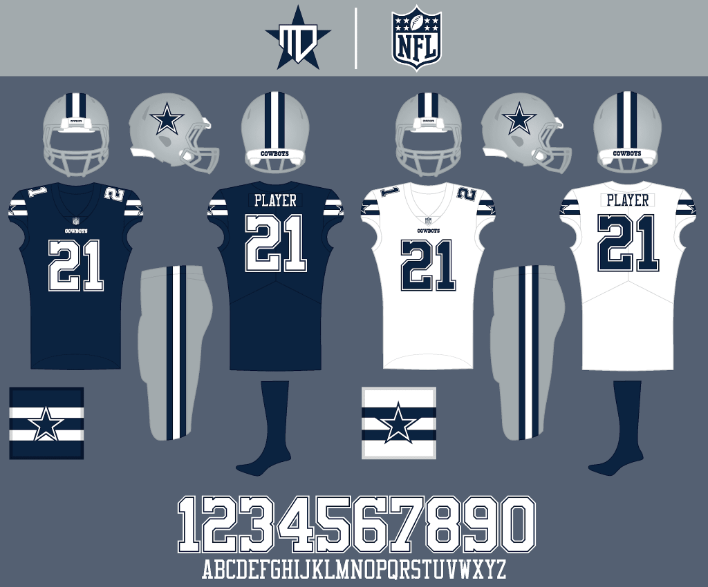
I went with a consistent navy and silver across both uniforms, and decided on a design that combines the best of both jerseys in a simplified manner.
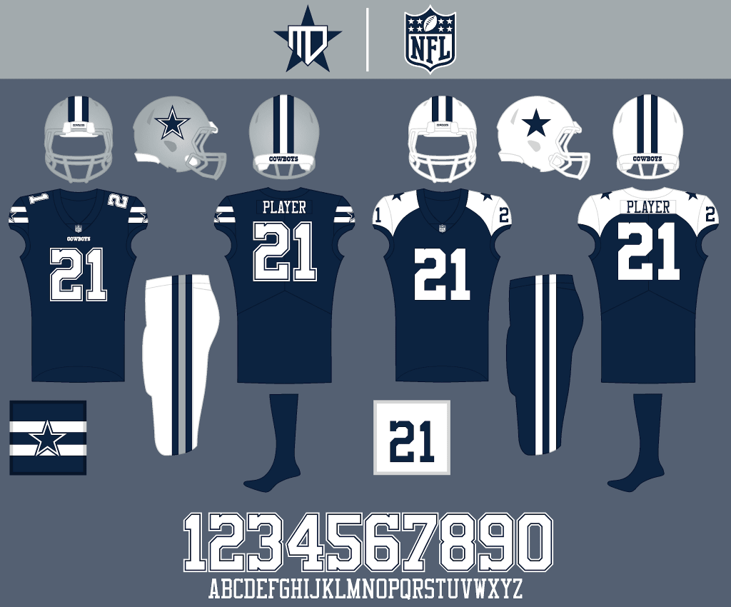
White pants would only be worn against other silver-heavy teams, and the Color Rush goes full-on throwback.
New York Giants
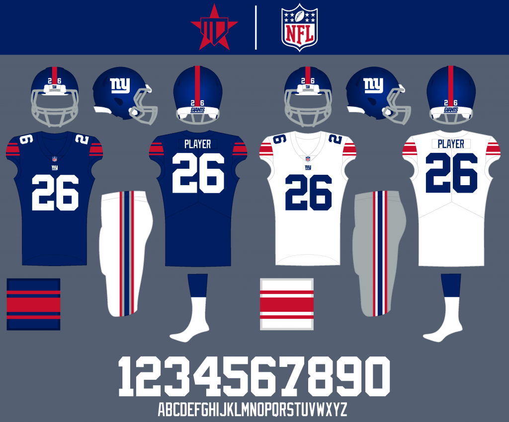
I added the red Northwestern stripes onto the home jersey, and went with blue numbers on the away to maintain a good color balance for both uniforms.

The alternate is a fauxback to the 1955 Giants uniform, and the Color Rush throwback remains intact.
Philadelphia Eagles

I kept the midnight green, but dropped black in place of more emphasis on silver. The number font is an updated take inspired by the wordmark.

Since silver is already so present in the other NFC East teams, I decided to make the Eagles unique by being the only team to have a silver jersey. Midnight green becomes the Color Rush.
Washington Football Team
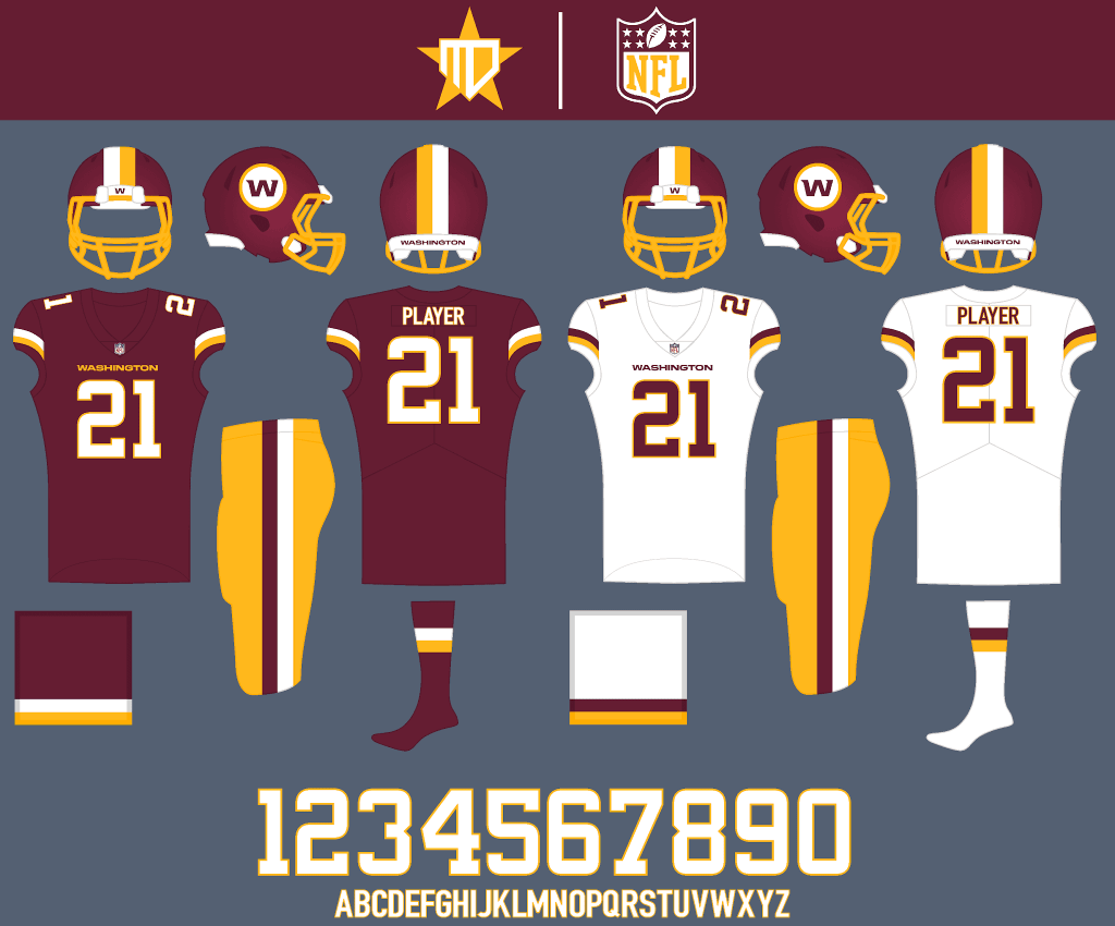
I decided not to bother with choosing a name yet for Washington, and just worked with the parts that they have currently. Uniform-wise, most things remain the same, I embraced the two-stripe pattern and went with a custom number font.

Alternate pant options to be worn about half the time.

I liked the athletic gold Color Rush jersey that never made the field, so I kept it as an alternate, but went with all-burgundy for the actual Color Rush.
Thanks, Matt! I’ll be back soon with Matt as we look at the last of his NFL concepts. Readers? What do you think so far?


Guess The Game…
from the scoreboard
Today’s scoreboard comes from Mike Wissman.
The premise of the game (GTGFTS) is simple: I’ll post a scoreboard and you guys simply identify the game depicted. In the past, I don’t know if I’ve ever completely stumped you (some are easier than others).
Here’s the Scoreboard. In the comments below, try to identify the game (date & location, as well as final score). If anything noteworthy occurred during the game, please add that in (and if you were AT the game, well bonus points for you!):
Please continue sending these in! You’re welcome to send me any scoreboard photos (with answers please), and I’ll keep running them.
The “BEST OF” Kreindler’s Korner
Hey guys & gals. You’ve enjoyed Kreindler’s Korner for several years now, mostly on the weekends, on Uni Watch, but with the recent coronavirus outbreak, Graig’s time is just too precious and he needs to tend to other things besides coming up with a new writeup each weekend.
So, going forward, for as long as the COVID-19 situation is bad in New York, I’m going to run a few “Best of’s” until Graig returns.
Here’s today’s offering:
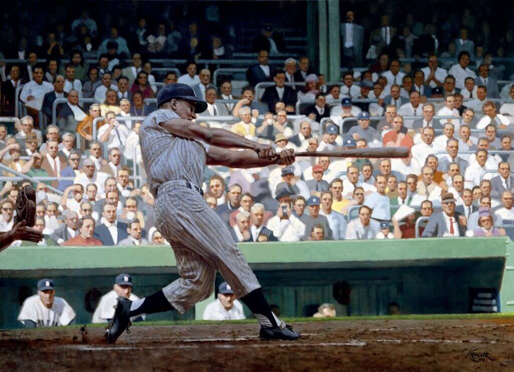
Title: “61”
Subject: Roger Maris, 1961
Medium: Oil on linen
Size: 38″ x 52″This is the first – and so far, only – painting I’ve done of Roger Maris’ famous home run in 1961. It’s also one of my favorite images of the moment. Sure, the poetry of the powerful swing is appealing, but for me, this one is all about the light and color. And I mean that as it pertains to the original black and white photograph too, as it was really easy to imagine how this would look on canvas in full color.
I guess it’s just easy to imagine Yankee Stadium in October on a sunny day: the blue sky with very few clouds interspersed throughout; the shadow of the triple-decked ballpark creeping across the diamond; cigar smoke wafting through the stands, the courthouse looming in right-center – seemingly endless motifs.
In this case, with the home run taking place in the fourth inning, Roger has been engulfed by the shade. And because of the angle of the photographer who took the photo, we see the first few rows of the third-base side bathed in that afternoon sun, creating a nice contrast between his silhouette and the action in the stands. Keeping the latter relatively high-key, comparitively warmer, and softer on the scale of edges, the cool notes of that bluish shadowed figure really work in giving the viewer an illusion of space. The fact that Roger is the tightest part of the painting doesn’t hurt either.
Like so many baseball fans, the footage of him doing the deed is so ingrained in my psyche, and despite the fame and scrutiny that it brought Roger, it’s refreshing to see it in a different light.
Thanks, Graig! You can (and should!) follow Graig on Twitter.
The Ticker
By Anthony Emerson

Baseball News: Kansas City has decked out one of their street cars with a Buck O’Neil-inspired livery (from Brian Hansen). … The Auckland Tuatara of the Australian Baseball League have new unis (from @caliglowin).

NFL News: Ryan Greene was trawling through old CBS archival footage and was able to grab a screenshot of the FNOBs for Broncos o-line brothers Doug and Dave Widell. The video Ryan pulled the screenshot from is here. … Apparently, head coach Brian Flores and “a lot” of others in the Dolphins organization prefer the throwback uniforms (from Mike Chamernik). … The New York Post photoshopped Trevor Lawrence into a Jets uni, but left his facemask Clemson white. “I prefer the white facemask so much more than the black,” says Patrick Sesty. Agreed! … The Iggles will wear white jerseys and pants at the Meadowlands (from Sam McKinley).
College/High School Football News: Ole Miss has teased some flag desecration unis for use today, in addition to a flag desecration field (from Kary Klismet). … Miami is going white-white-orange against Virginia Tech (from Josh Lefkowicz). … UNC is going with Carolina blue throwbacks for today’s game (from Christopher Jacques). … Kentucky is going with the chrome lids for the first time this season, along with blue jerseys and pants. … Sam Boyd Stadium has been decked out in New Mexico paraphernalia as the Lobos prepare to take on Nevada as the home team in Vegas, due to New Mexico’s COVID restrictions (from @roblmo). … The following are all from Phil: West Virginia is going with flag desecration helmets. … Northwestern is going black-white-black. … Illinois is going orange-white-orange. … Arizona is going white-blue-white against USC. … Anderson High in Austin, Tx., uses a soccer substitution board to call plays from the sideline (from David Wiechmann).

Hockey News: University of Nebraska – Omaha announced their captains for the forthcoming season, and the announcement video showed the equipment staff actually sewing the “C” and “A”s onto their uniforms (from Oleg Kvasha). … More Reverse Retro teases from Adidas: Rangers, Capitals, Blue Jackets (each from multiple readers).

NBA News: A bunch of NBA City Edition unis were officially launched yesterday, confirming previous leaks: The Spurs new “fiesta” City Edition unis, the Hornets unveiled a matching court design to their City Edition unis, the Bulls’ art-deco inspired unis, (all from Mike Chamernik) as well as the new City Edition unis for the Pelicans (from Ron Norman).

Grab Bag: As election night became election week, many people — myself included — became fans of MSNBC’s numbers guru Steve Kornacki. And now his trademark Gap khakis are selling out (from Tom Turner). … Did you know Richard Nixon had the Secret Service dress in uniforms? Looks like Tricky Dick got them on clearance from a Latin American dictator (from multiple readers). … I’m still calling it Fairmount Park (from @beerbythepool). … A Canadian political scientist photoshopped four of the country’s most famous Prime Ministers into period-appropriate trading cards (from Andreas Papadopoulos).
And finally… thanks to Matt for the NFL redesigns. I’ll have the final set for you guys in the near future.
That’s it for today — everyone have a good Saturday and I’ll be back with the SMUW Crew tomorrow for your Sunday Morning Uni Watch.
Peace,
PH
1. NFL REDESIGNS: as before, much more good than bad, no real quibbles with any of it. Not sure what was meant by “silver is so present in the other NFC East teams”; other than the Eagles, it’s only the Cowboys who wear silver. That said, silver over black for the Iggles every day of the week and twice on Sunday.
2. TREVOR LAWRENCE: they also forgot to photoshop in the Jets’ number font.
3. UNC: they’re not truly throwbacks; it’s the current number font with a thick drop shadow. I still find it fascinating that what UNC wore when I was in school there is now “old enough” to be a throwback. I am officially Old. At 44.
Needs to get rid of the midnight green of the Eagles and go back to Kelly Green.
You aren’t the first to mention that Jim, I’ve actually been surprised at the amount of people promoting the return of kelly for the Eagles. The reason I didn’t go back to it is because I already did for the Jets, and felt that midnight green is a more unique color than the Jets’ old forest green.
Thank you MJ! When referring to the abundance of silver in the NFC East, I was including the Giants in there as well, although they have seemed to scale back on the gray pants in the past few years. Still, in my design gray is an important part of their brand.
Matt did a great job with the designs.
1. As an Eagles fan, I think they are in dire need of an update. Their uniforms scream 90s makeover all the way down to the logos and fonts. I’ve been screaming for Kelly Green for years now. I hate their new black uniforms too. It’s amazing how dropping black from the current color set and putting more emphasis on silver changes the entire appearance of the uniform. I’d be down for these if they were to keep the Midnight Green.
2. Same goes for the Jets. Lose the black. The white facemask is 100% better than black.
3. The “mean” Bronco logo isn’t bad at all but going back to those colors would be HUGE for Denver. Too many NFL teams have a dark feel to them. IMO, Vibrant colors are the way to go, especially with our HD, 4K TV’s we get to watch the games on. They capture those bright colors so well now. Dark is just so bleh. Hence my strong dislike for BFBS/GFGS.
4. Love the UNC unis. Takes me back to Dre Bly, Julius Peppers and Ronald Curry days.
Agree 1000% on the Eagles. Kelly green > midnight green, minimize the black (or eliminate it entirely), and bring back silver pants. The font is too cutesy and definitely dated.
Thank you Patrick! To respond to your points:
1. Agreed completely on the Eagles. Given the love for kelly green, I might have to try a version of the set in that color scheme as well.
2. The white facemask really does look so much better in that Photoshop. Glad I went with it for my Jets set!
3. Completely agree. My main reason for going back to royal for the Broncos was to separate from the Bears, but having the set be brighter is a nice side effect to gain from it.
Before long we’ll have redesigns of the redesigns.
Probably, haha! I find that my tastes in these things tend to change slightly every few years.
This week and last is some of the best redesign work I’ve seen in a long time-well done and thank you, Matthew!
Washington is particularly well executed, especially the helmet… the circle (though I really dislike the W place-holder logo…put the numbers in there?) and the striping solves their current flaws.
The Eagles re-embracing the silver is a wonderful suggestion.
I think it’s time the Colts drop the gray face mask and balance is brought to the ‘boys-the presentations above makes their uniforms flow so much better.
While the Texans red helmet is a bit distracting(white would be easier on my eyes, or keep the red and throw on a navy mask?) the Titans blue one is a welcome switch and gives them the chance of throwing back to some of my favorite Houston Oilers uniforms.
Thank you so much, Chris!
I agree about the Colts, I’m really not a fan of the gray mask for them. Even blue would be better, in my opinion.
I understand the Texans helmet being distracting – in a way, that was kind of the point, as the red was partially inspired by it being the color that is associated with charging bulls, thus it makes sense that it would be the helmet color.
6 Stars for the Guess the Game scoreboard today.
(Curious to see who gets the reference)
The answer…no one.
Okai, let me run for rookie of the year .. because i got this one
The first link for Ole Miss goes to the WordPress login page.
Thanks. Should be fixed now.
Most people try to do too much with their redesigns. These are nearly perfect. Fantastic work, Matthew. These designs keep classics looking classic with tweaks to make them a touch more modern. I particularly like the way the added emphasis on silver and the removal of black from the Eagles set brightens up their depressing midnight green just enough to make it almost pleasant. I’d love to see what that would look like in the light of day.
Thank you Todd! That definitely encapsulates my overall approach to designs – not trying to do too much, but trying to capture what makes certain uniforms classic, while providing a bit of a modern twist. I appreciate it!
When the Bulls’ alternate jersey was first leaked, there was a lot of discussion about what influenced it. People mentioned Daniel Burnham, Louis Sullivan, Frank Lloyd Wright, art deco, and the Chicago Theatre. Now that the uniform has been officially unveiled, we see that most of those were wrong. The article linked above mentions art deco architecture and specifically the Carbon and Carbide Building, which was designed in 1929 by Daniel Burnham’s sons, Burnham Brothers (17 years after Burnham Sr.’s death) and the Chicago Board of Trade Building, designed in 1930 by Holabird & Root. The “No Little Plans” message on the jock tag is from Daniel Burnham, but he wasn’t involved in art deco architecture at all, so that is a bit of an anachronism.
The Nixon Secret Service uniforms ended up as band uniforms for a high school in Iowa. You can’t make stuff like that up
I’m a fan of the old D logo for the Broncos, but if they looked like this, I would not object to Matthew’s idea. Make it happen, Denver.
I don’t mind Kansas City in monochrome as much as I do most teams
Once a year, and that’s it. The rest of the season, the best looking team should go red over white or white over red.
I would love to see the “D” logo with the more modern horse replaced inside of it. If I had that, I probably would have gone with it on the helmet.
If the Chiefs stuck to each monochrome combo once a year, I’d be fine with that. Ideally they’d choose to do that during opportune matchups.
The Nixon uniforms were not for the Uniformed Division of the Secret Service, which had formerly been known as the White House Police Force. These are the people who man the entrance gates and protect the White House grounds. They have different duties than the plainclothes Secret Service (because honestly, how secret could the Secret Service be in those Music Man get ups?) and they still wear uniforms today, which look like regular police officer clothes.
The Broncos concept is PERFECT. All of the concepts are great, but that Denver look stands out.
Thank you Cort! The Broncos design is one of my favorites, too.
Love a lot of those uni designs! Some years back, I took part in an nfl jersey design contest and submitted an identical Giants jersey based off of their 1955 look. It really is an awesome design.
Thank you Adam! I love that Giants red jersey too, it would be perfect for a throwback.
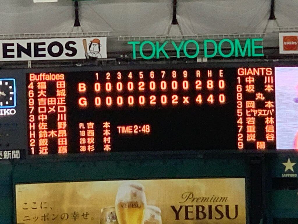
GTGFTS June 20,2019, Yomiuri Giants over Orix Buffaloes at the Tokyo Dome.
Congratulations!
I’m confused by the Giants’ alt: is that 1955 or 1932-1933? (I’m referencing GUD.)
Denver: YES! Love the old school design.
Iggles: bring back Kelly green!
Agree with coach Flores about the ‘Fins original unis.
Hey Chris, you are actually correct, I accidently misread “1933” in an image I saw as “1955.” My mistake. Thank you for noticing that!
Nice job with the uniform concepts, Matt! I enjoyed seeing them.
As a Broncos fan, I’m surprised at how much I like the retro uniform concept with the modern horse head logo. A lot of fans seem to prefer a return to the old school “D” logo while keeping the current color scheme with the navy blue (similar to the team’s current Color Rash uniforms, but with more traditional white pants). But Matt’s concept provides a compelling case for the color scheme being the thing that would make new uniforms pop. The royal blue really brightens up the look.
Thank you! I’m actually sort of ambivalent about which logo the Broncos go with, as I like them both. But yes, I definitely think royal blue instead of navy would be a drastic improvement for them.
One minor issue with the Colts redesign…Matt wrote that he kept the stripes constant, but the white jersey has one stripe on the shoulder while the blue jersey has two. Seems like the blue jersey should have one white stripe to keep everything constant.
Hey Jeff, so my reasoning was: since the Colts’ helmet only has one blue stripe (and, in my opinion, would look worse with two), I decided to make the one blue stripe consistent across all white backgrounds. In a sense, the blue jersey is consistent with that, too, as it also has one blue stripe surrounded by two white stripes.
Looking at it more though, I can probably admit that the real-life Colts have it better with keeping two stripes across all backgrounds. I’ll probably fix that with future designs.
Great work on the NYG jerseys. Awesome.
Thanks Liam!
Here are some hockey and other trading cards for Lester B. Pearson (Canadian P.M.):
link
Don’t know if “Rutgers vs. Syracuse” was supposed to be sarcasm, but Rutgers is still in the Big 10 and played Illinois yesterday.
Something I noticed on the packers instagram today is that the inside of the Packers jersey collars have numbers on them, along with an older packers logo. The interesting thing is that the numbers aren’t the same as the ones on the jersey. Aaron jones has 44 on his collar and Aaron Rodgers has 46. I’ve never heard anything about this before.
link
Size possibly? I thought the tags were usually below the collar, but I can’t see anything there, so maybe they’ve moved up?
Bills are wearing white on the road and Josh Allen has grass stains.
The scoreboard is Japanese baseball. The Giants is the key – the Yomiuri Giants play at the Tokyo Dome and are the most popular team in Japan.
Scoreboard is from Orix Buffaloes v Yomiuri Giants.
Thursday, June 20, 2019 at Tokyo Dome.
Winning Pitcher, Hirokazu Sawamura
HR by Yoshihiro Maru in the 6th.
Wasn’t at the game but was in Japan, and rooting for the Hanshin Tigers, a B’s victory would have been cool..