[Editor’s Note: Today we have a guest entry from longtime reader Bud Parks, who has an interesting NFL helmet proposition. Enjoy. — PL]
By Bud Parks
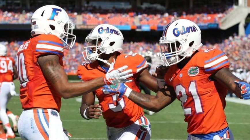
Football helmet design has traditionally hewed to the concept of symmetry, with the same logo design on each side of the shell. But in the last few years, we’ve seen an increasing number of college teams using non-matching logos, creating an asymmetrical look (like the Florida example shown above). This strikes me as an interesting concept — what they’re essentially doing is treating the two sides of the helmet as separate canvases, which can lend itself to exploring additional avenues for uniform creativity.
What if this idea caught on in the NFL? Which teams could make good use of that extra canvas without taking too much away from their primary mark? Which teams could try and mix and match some visual elements that don’t normally go together? And which teams have two separate logos that are so strong that they might, instead of choosing between them, say, “Why not both?”
At least for now, I’m only focusing on the helmets and not on other elements that tend to appear in matched pairs, like sleeve patches and hip logos, though some of the ideas I address here could certainly apply to those other elements as well. With that in mind, here’s a team-by-team look at how mismatched helmet logos might play out for NFL teams. As we’ll see, it works better for some teams than for others.
AFC EAST
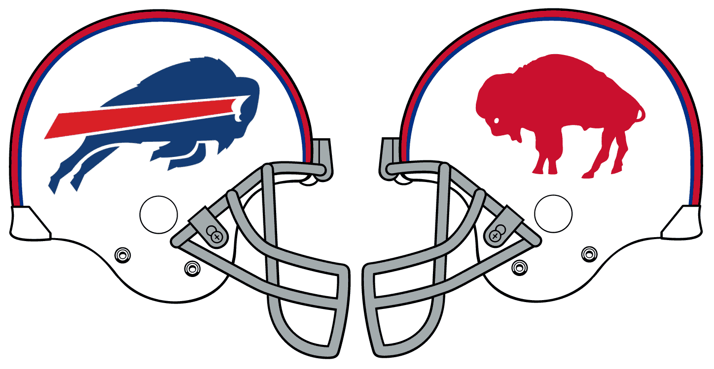
Buffalo Bills
The Bills’ throwbacks have been in their uniform rotation longer than their current standard set, and it’s puzzled me that they continue to have both given how similar they are to each other — so similar, in fact, that the difference in helmet logos is almost the only thing separating the two looks. Instead of keeping two separate but similar uniforms, why not just put both logos on the helmet?
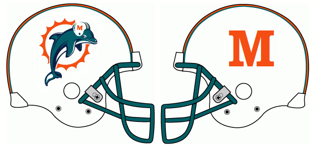
Miami Dolphins
The Fins don’t really have an alternate mark to go along with their current helmet logo. But with everyone begging them to make their throwbacks permanent, how fun would it be to finally have the “M” helmet — the one being worn by the original sunburst dolphin in what is now the throwback logo — come to fruition! I’d put the old logo on the right and the M logo on the left. Now, the more nitpicky readers may take note that regardless of which side the dolphin is on, he’ll always be wearing the opposite-sided design as long as you make him face forward. You can decide for yourself whether this is a fatal flaw or an endearing quirk.
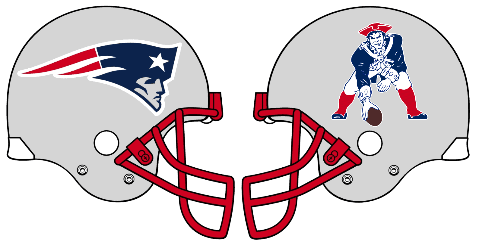
New England Patriots
The debate between the Pats fan base’s Pat Patriot and Flying Elvis camps has been raging for decades now. Why not bring both sides together by wearing both logos on the helmet? Some folks might think Pat would look odd on a silver lid, but Flying Elvis already has its own white outline, so I don’t see why Pat can’t have the same. The again, the concept might work better on a white helmet, instead of silver.
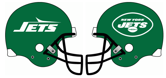
New York Jets
The striping that the Jets currently wear on their shoulders and pants is practically begging to be paired with the Sack Exchange logo of the 1980s and ’90s. It’s still kind of mind-blowing to me that they didn’t go that route after switching back to a green helmet. I also think they’re better off going with the full football-shaped primary logo on the other side (similar to their 1994 throwback look) instead of the partial logo they currently wear.
AFC NORTH
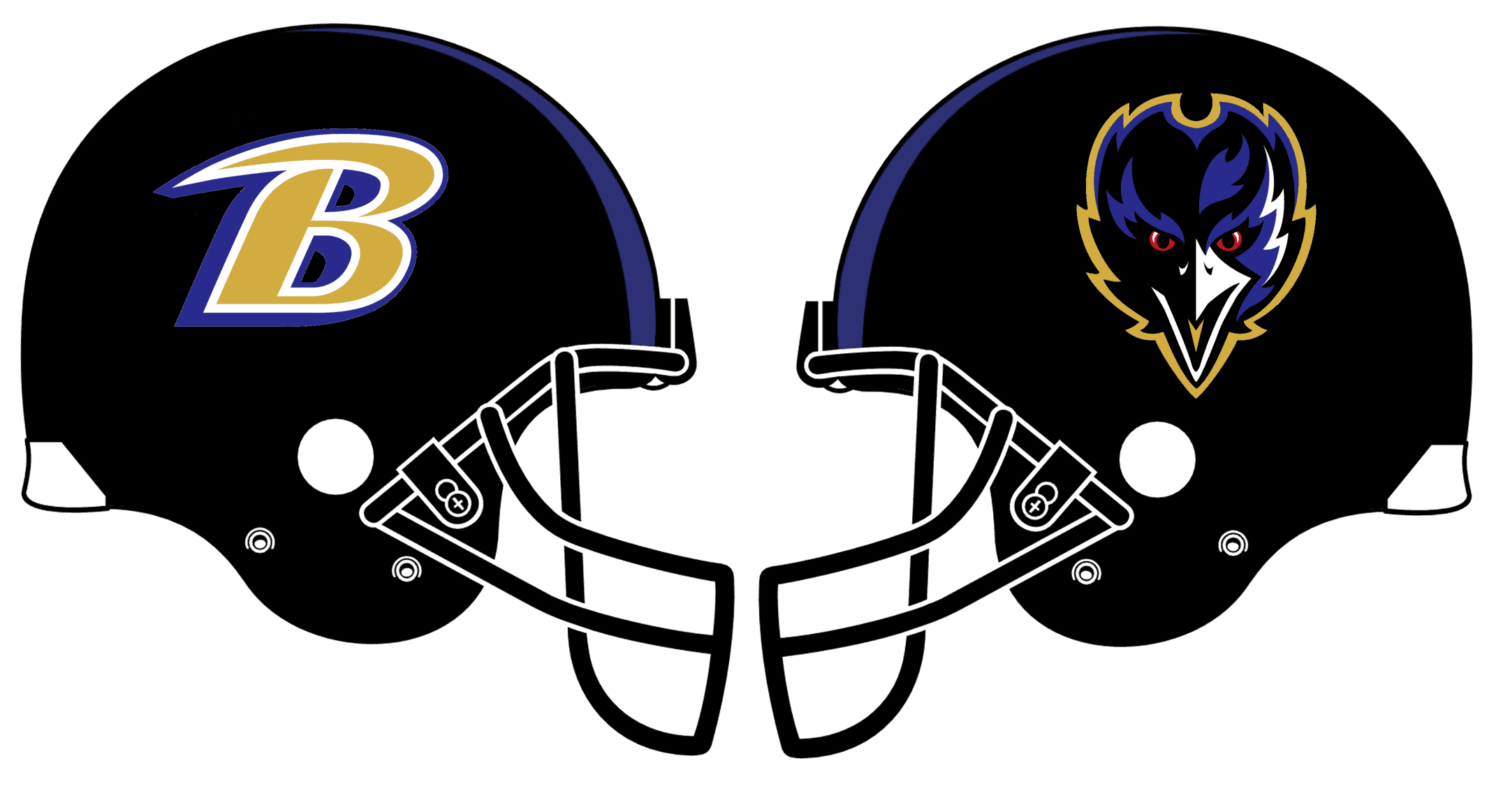
Baltimore Ravens
It surprises me that the Ravens are so in love with their primary logo when they’ve had so many good alternate logos. But pretty much all of their apparel and marketing uses the primary, despite its massive shortcomings when flipped for use on the left side of the helmet. I like the idea of deconstructing the primary logo into two of their alternates: the B on the right, the raven’s head on the left.
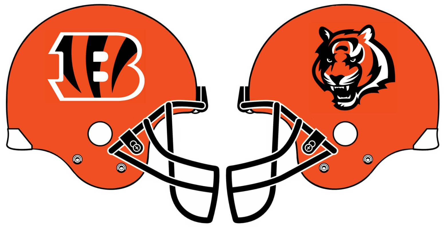
Cincinnati Bengals
The Bengals have a couple options they could use if they ever decide to get rid of their striped helmet. Personally, though, I prefer the existing striped design, so the example shown above is more of a “What if?” experiment, not a vote for change.
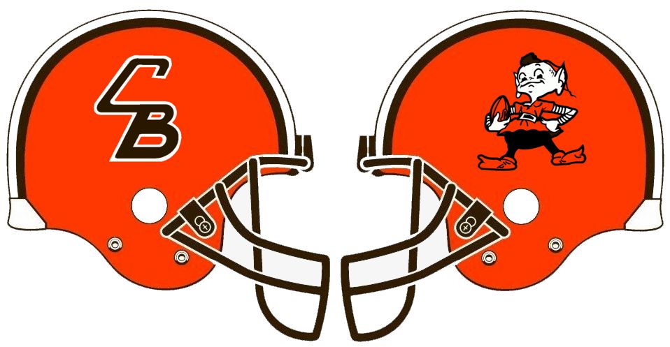
Cleveland Browns
Much like the Bengals, the Browns have had a few logos throughout their history that they could put on their lids, but that doesn’t necessarily mean they should put them there. I don’t hate the idea of finally giving the “CB” helmet logo its long-delayed audition, but leaving one side blank for tradition’s sake doesn’t work either because then they’re copying the style of the one team they don’t want to copy (cough-Pittsburgh-cough), so then Brownie has to be added to prevent that.
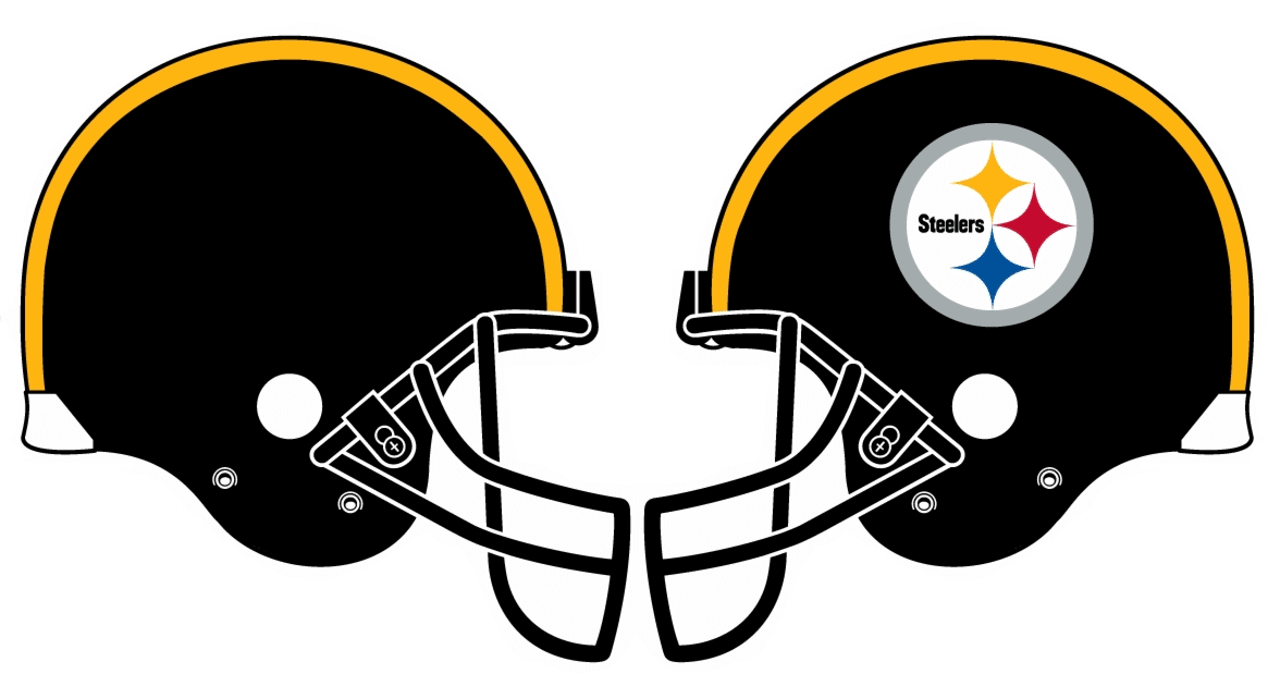
Pittsburgh Steelers
The Steelers, of course, are the only NFL team that currently has an asymmetrical helmet design. I actually love the plain-black side to their helmet — it’s one of the most underrated uniform elements in the entire league and it deserves way more attention and exposure than it currently gets. A good way to create this extra exposure would actually be to switch the side that the current logo is on, because most wire photos taken during games are from the right side. Having these photos start to show the blank side of the helmet would be a more noticeable change than people realize. Maybe they could come up with some sort of system; decal on the right for home, divisional, or night games or something like that.
AFC SOUTH
Houston Texans
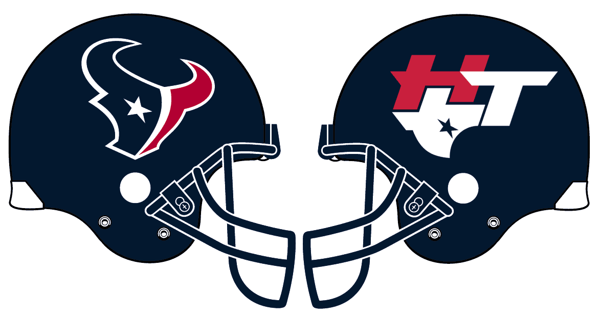
The Texans have always pushed only their primary logo, but something about it has always felt a bit off when it’s flipped for the left side of the helmet. According to SportsLogos.net they have an alternate logo that they’ve never really used, and this may be the perfect place to try it out to see if it’s really worth keeping around.
Indianapolis Colts
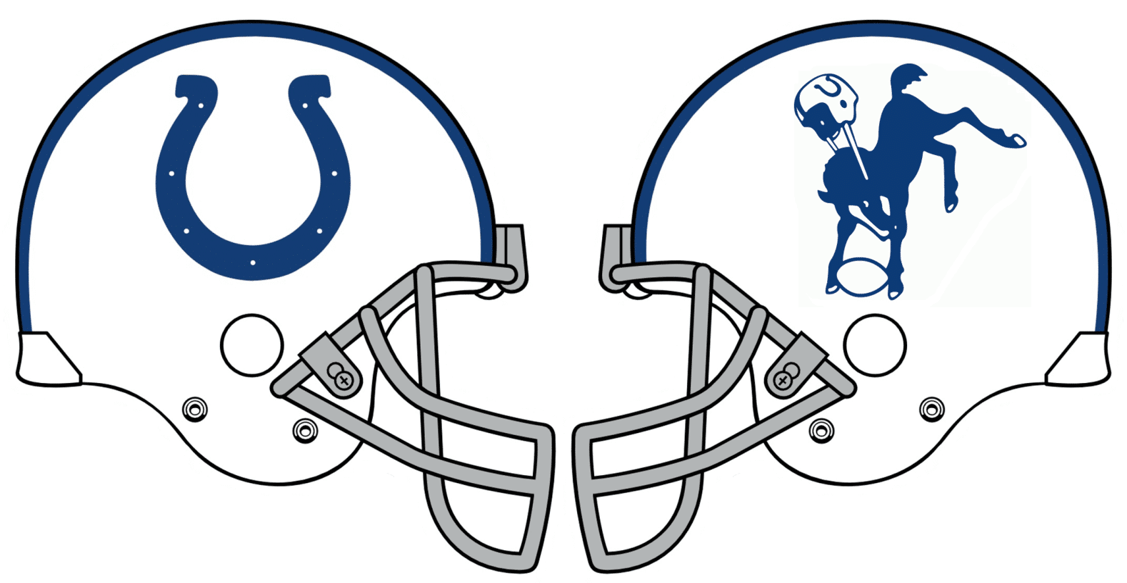
If the Colts paired their primary logo on the helmet with their current alternate logo, too many people would just assume it’s the same mark and wonder why one side isn’t rotated to look like a C. The better option is to go with the throwback bucking colt. Just as with the Dolphins, it’s up to the reader if it’s a fatal flaw or endearing quirk that the colt would always be wearing the opposite-sided helmet as the team.
Jacksonville Jaguars
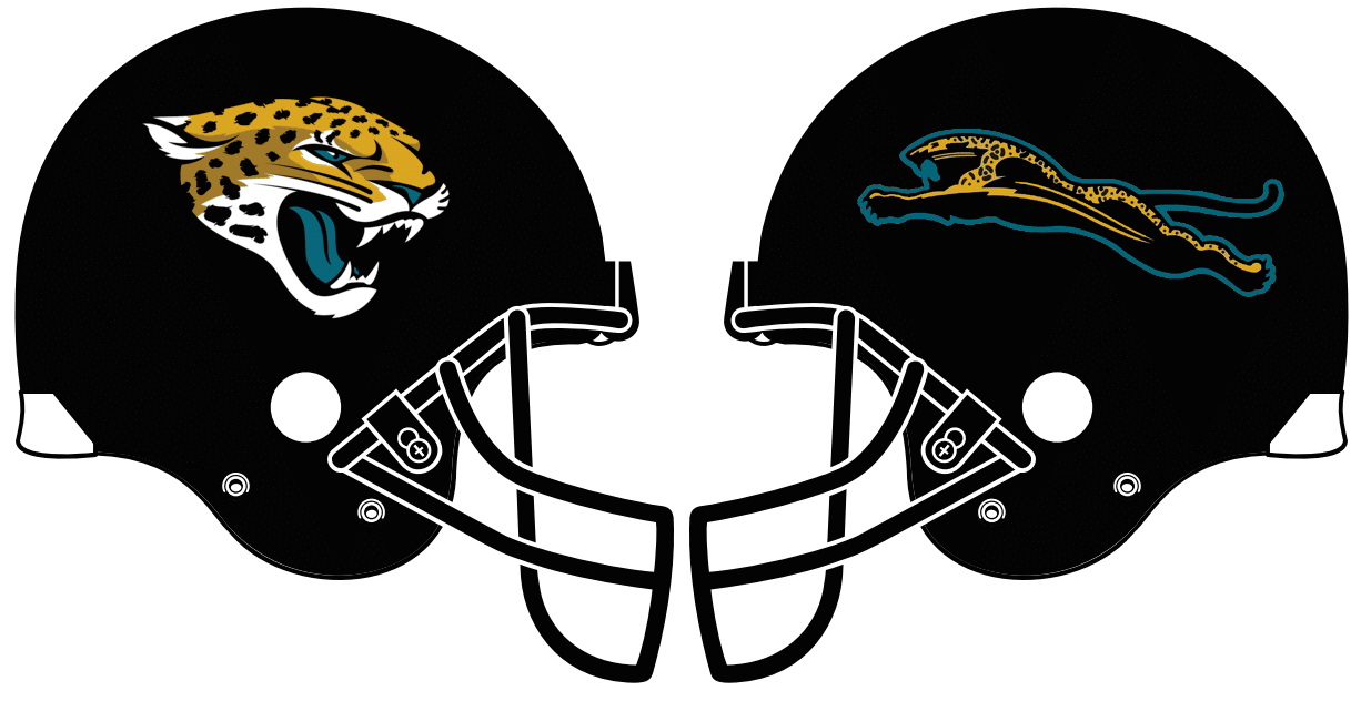
The Jags have had two very similar logos in their history, and no alternate logos to speak of other than wordmarks. While I prefer their original logo, I realize that putting it on one side and the current logo on the other wouldn’t work — they’re so similar that people either wouldn’t notice the difference or would think one version or the other was a mistake. So the only other option I see is for them to makie amends with the Jaguar car company so they can finally use their prototype “leaping jaguar” logo.
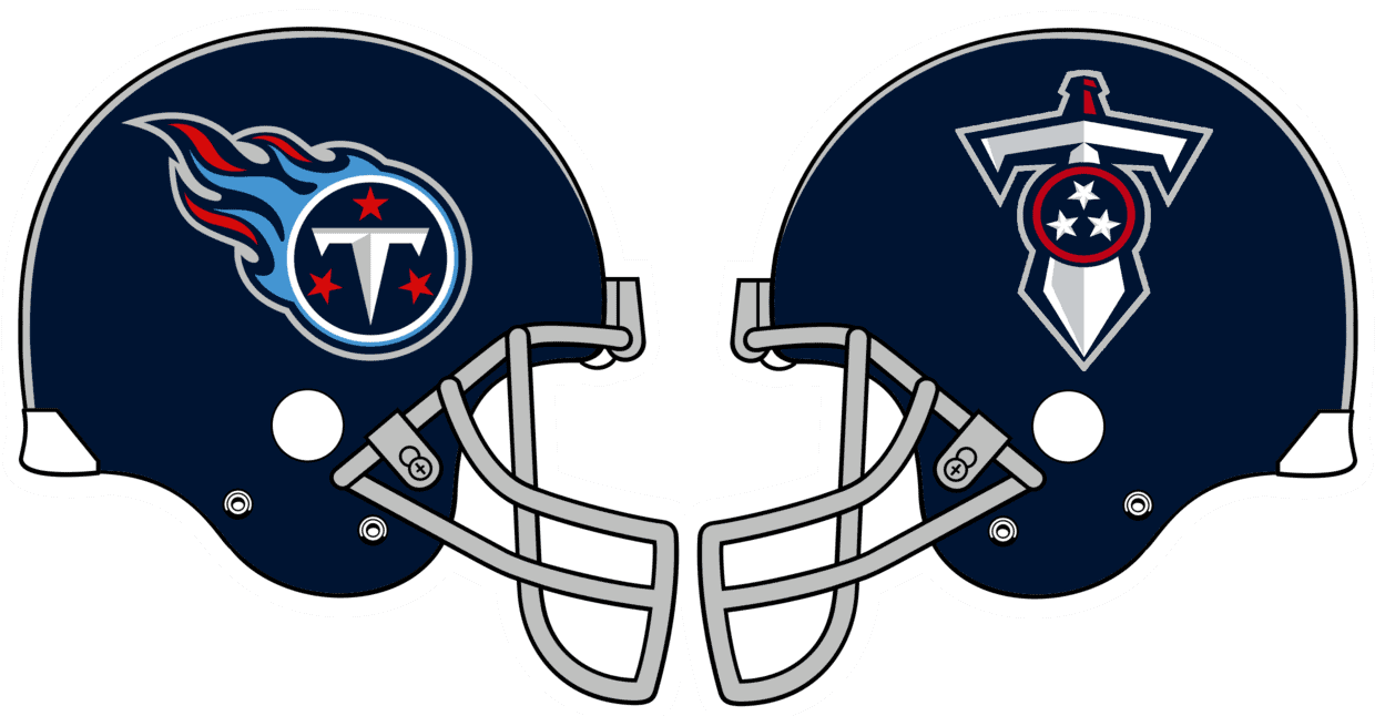
Tennessee Titans
Easy decision here: primary on one side, alternate on the other. Done and done. No need to overthink things.
AFC WEST
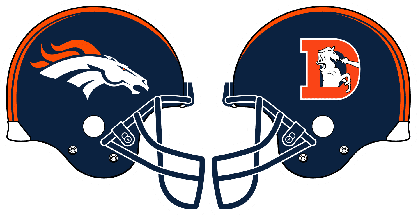
Denver Broncos
An easy call: the current Bronco head on one side, and the throwback “D” logo on the other. They’d probably do well to go with their Color Rash helmet striping full-time, instead of the current helmet striping, but that’s a discussion for another day.
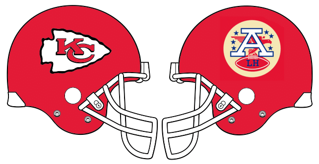
Kansas City Chiefs
The Chiefs have never really had an alternate logo (or at least not an acceptable one), but we could transform their Lamar Hunt perma-memorial from a jersey patch to one-side helmet logo.
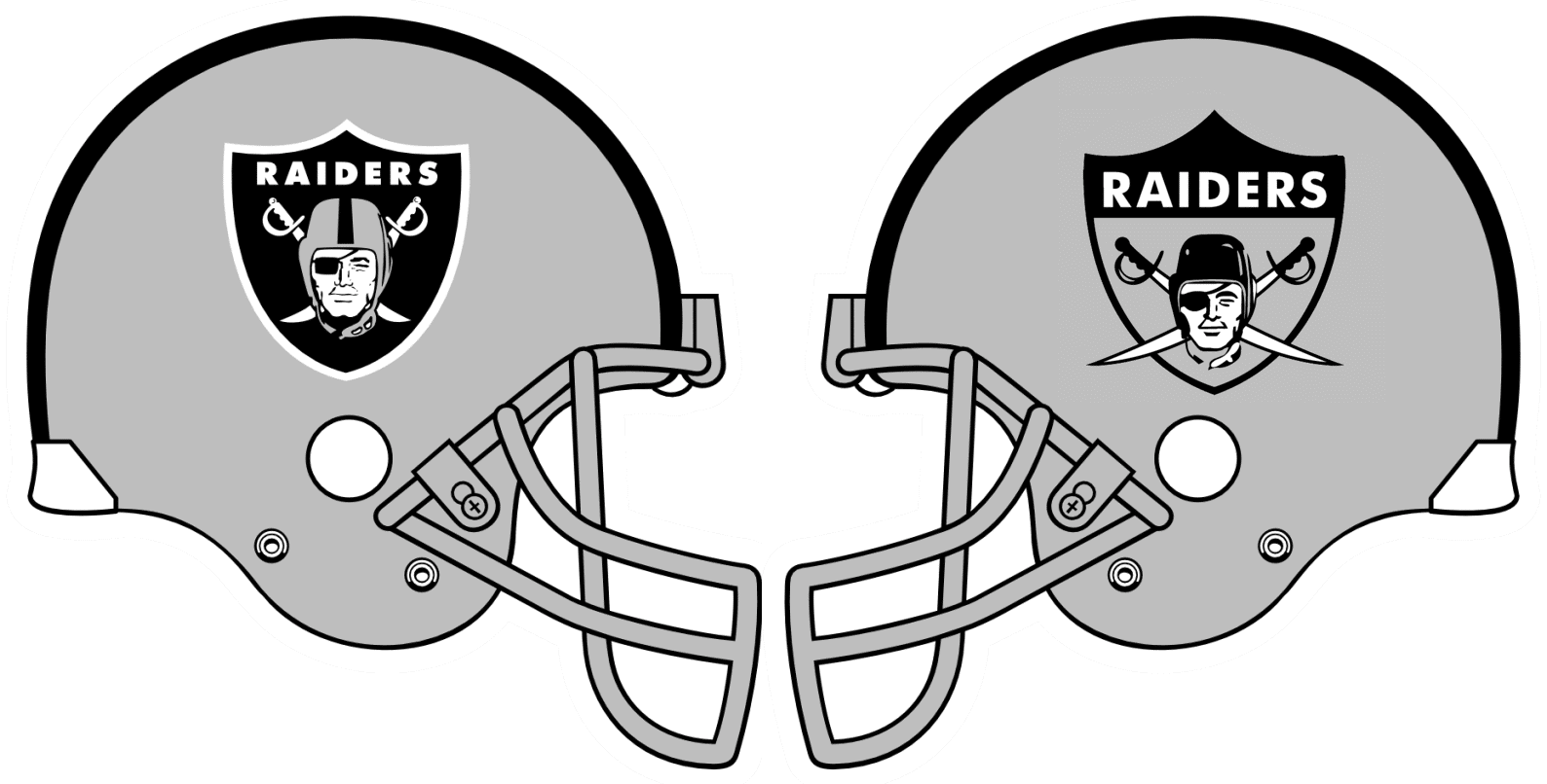
Las Vegas Raiders
Another team that’s never had much to offer in terms of alternate logos. So let’s try the current and throwback versions of their primary logo!
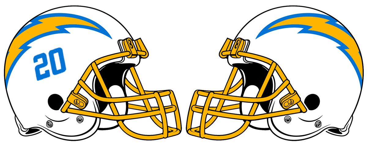
Los Angeles Chargers
Broadly speaking, the Chargers have taken two primary approaches to their helmet design over the years: bolts with numbers and bolts without numbers. Why choose one when you can have both?
NFC EAST
Dallas Cowboys
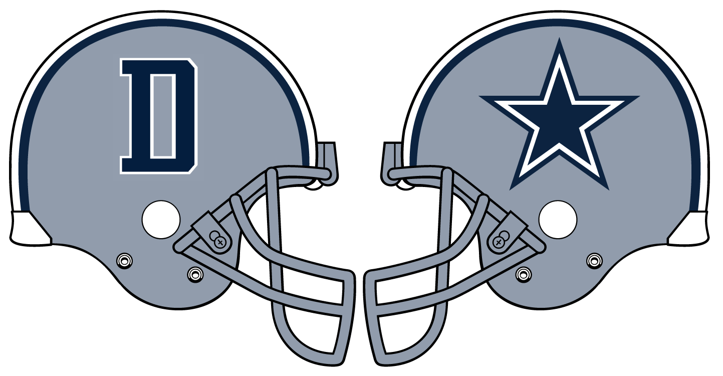
Despite not being a fan of Big D, I certainly recognize the brand power of the star. Their only real option as a replacement on one side, just as an exercise for this project, would be the “D” logo that can be found on some sideline apparel, but this is one helmet that probably shouldn’t be tampered with.
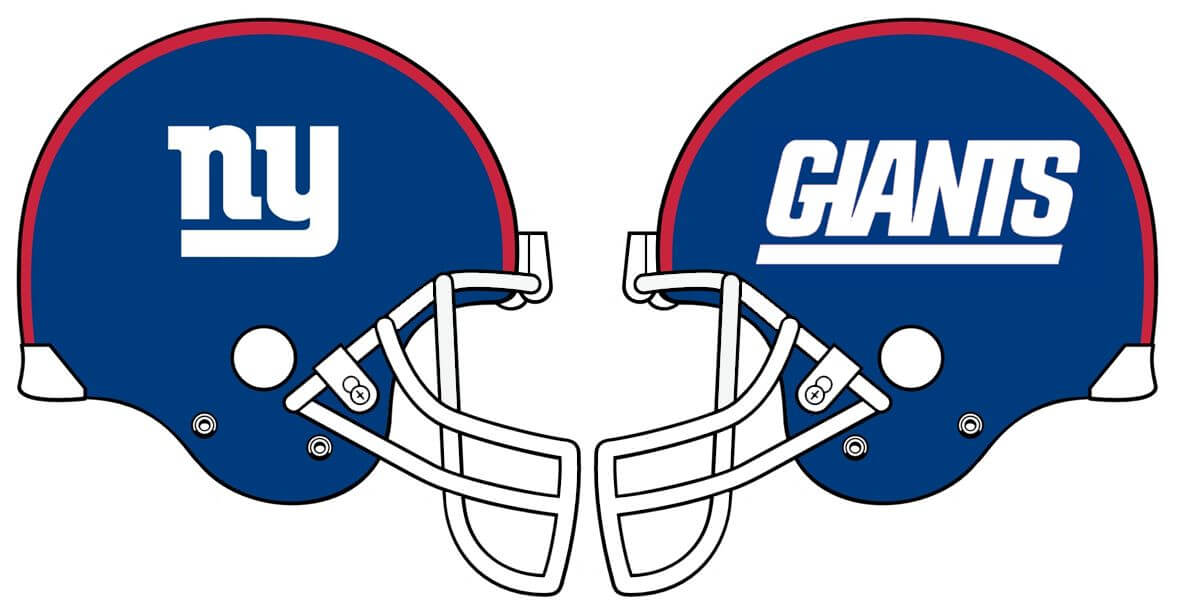
New York Giants
Another no-brainer: “ny” on the right, “Giants” on the left (preferably with the white facemasks, but I wouldn’t nitpick if this was ever done with a grey mask).
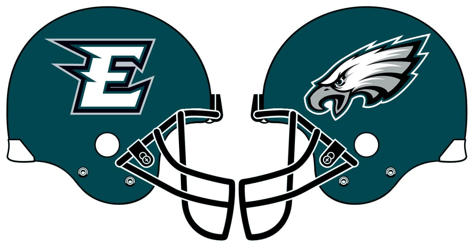
Philadelphia Eagles
This is another one that I’m showing just for the sake of this project, as the existing design with the wings are way better than what’s shown above. They absolutely 100% should not do this!
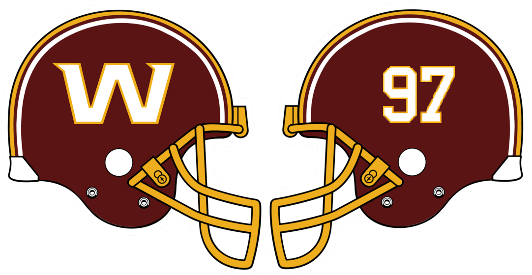
Washington Football Team
With the possibility that the placeholder name may be sticking around beyond this season, they’d do well to embrace the “W” they’ve been using while keeping the numbers on the other side. While they’re at it, they can have the helmet graphics white (to match the numbers on their burgundy jersey) and restore the old helmet striping.
NFC NORTH
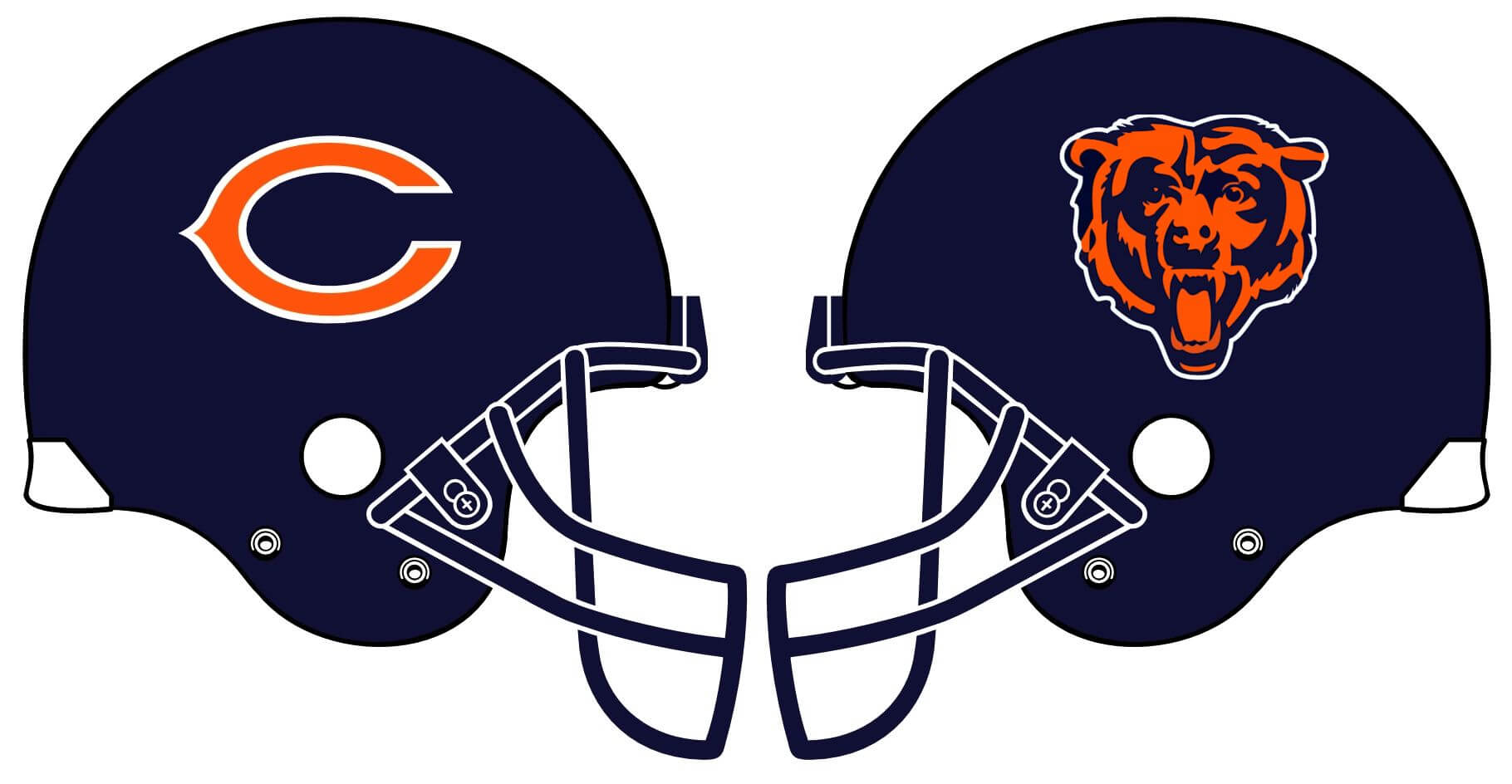
Chicago Bears
Another pretty easy choice, with the primary wishbone-C on one side and the alternate bear’s head on the other. They do have a third option with the script “B” logo, but having two different letters in two different fonts on a single helmet would set off too many internal OCD alarms for too many people.
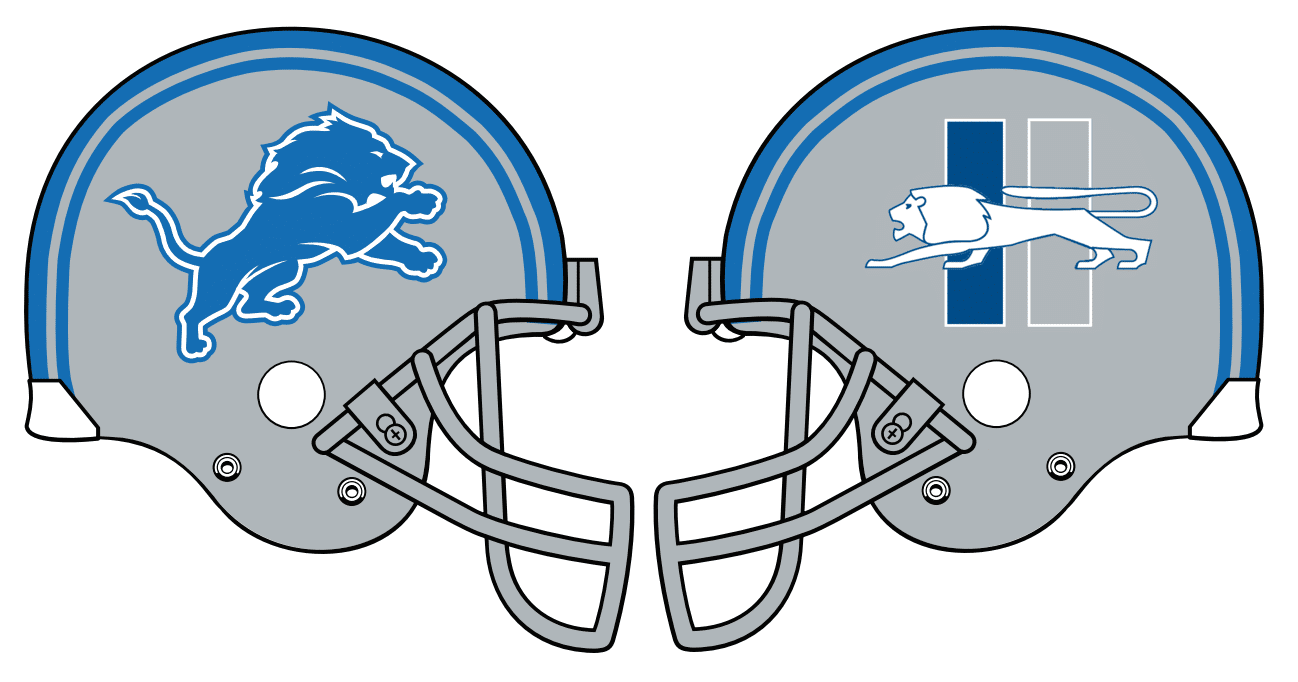
Detroit Lions
I think it’s time to showcase the Lions’ old 1960s logo on one side of the team’s helmets. It would fit nicely with the perma-memorial on their left sleeves, too.
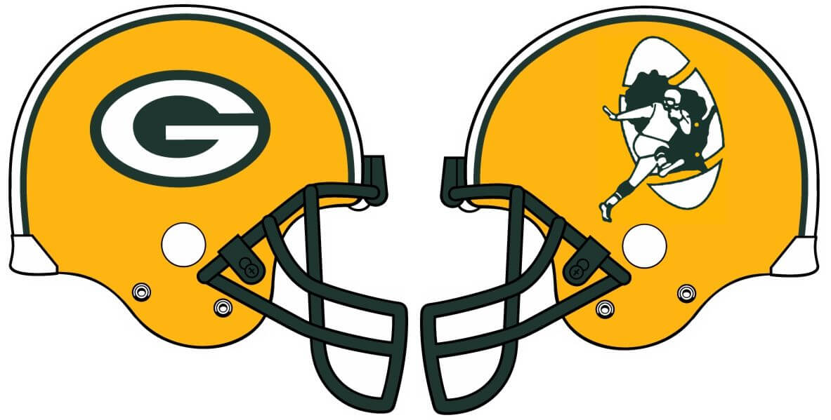
Green Bay Packers
An uber-traditional look that probably will never be significantly altered in the foreseeable future. So while it’s fun to play around with the idea of having the Pack’s “Wisky-Heisman” logo on one side of the helmet, it’s not likely to happen.
Minnesota Vikings
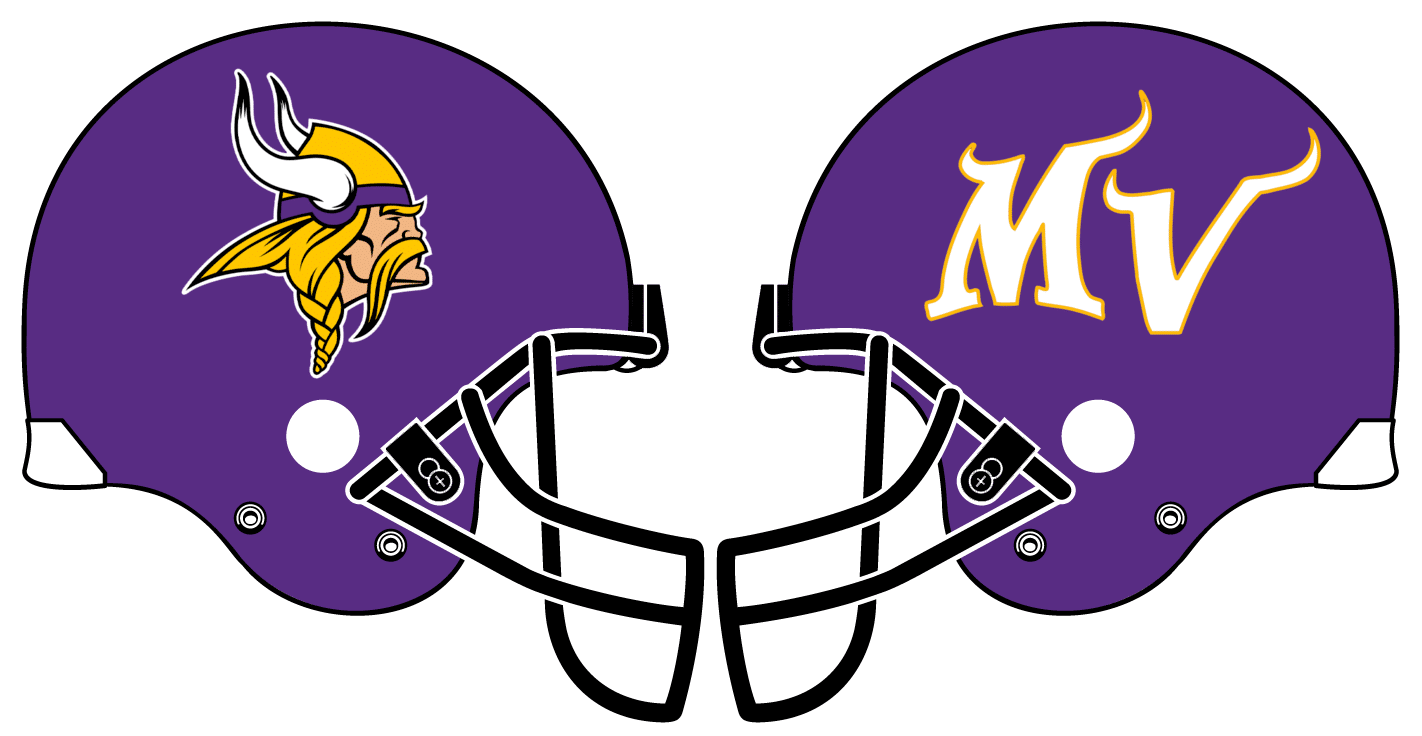
You wouldn’t really want to change the existing horns. But if you had to change them, you could put the Viking’s head on one side and the rarely seen stylized “MV” initials on the other.
NFC SOUTH
Atlanta Falcons
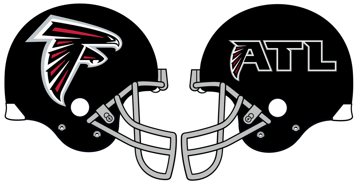
Instead of putting that big, honking “ATL” on the jersey chest, they might have been better off playing around with their actual ATL alternate logo on the left side of the helmet while keeping the primary falcon on the right side. The Falcon itself is also supposed to be an “F,” so flipping it for the left side of the helmet never really made a ton of sense anyway.
Carolina Panthers
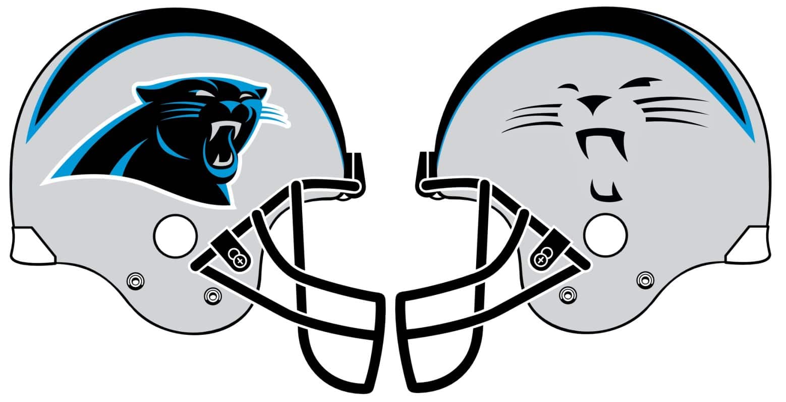
They have no current alternate logos to speak of, but they do sometimes trot out the panther’s facial outline on certain retail merchandise, so that’s an option for the other side of the helmet. [They could also resurrect this alternate logo. — Paul]
New Orleans Saints
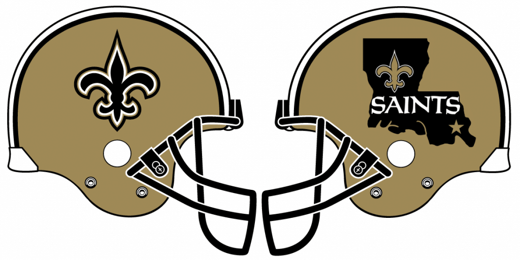
Back in the mid-aughts, the Saints had a Louisiana-shaped chest patch that I dearly miss. I’d prefer to see it restored on the jerseys, but it might also be worth experimenting with a black version on their gold helmets.
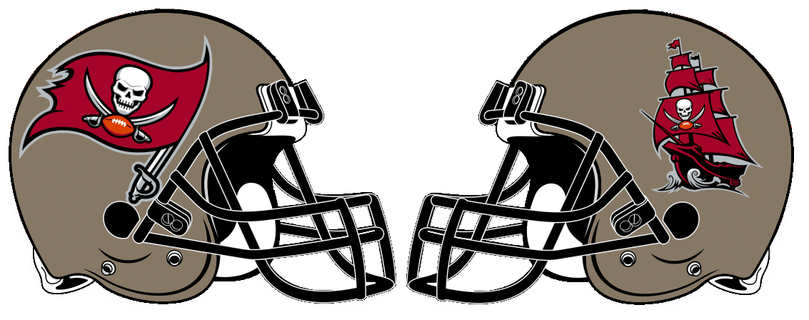
Tampa Bay Buccaneers
An easy call here. The current primary logo on one side and the alternate pirate ship (which I always preferred) on the other.
NFC WEST
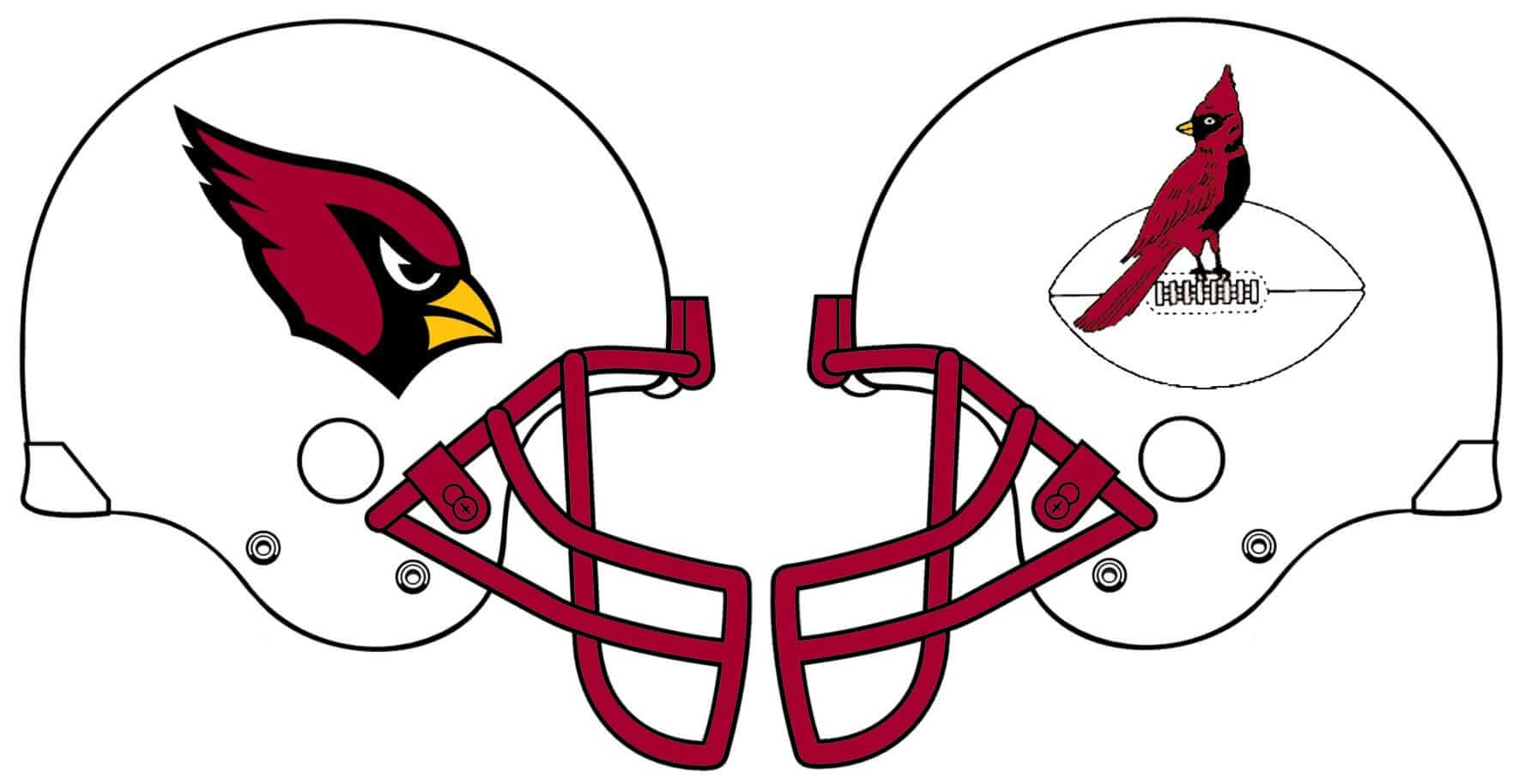
Arizona Cardinals
The Cardinals’ logo might be the only primary mark in the NFL that can be found out in the wild facing either direction, so having it on either side of the helmet generally looks more okay than most other logos would. They don’t have any alternate logos to speak of either, so their only real option is to look to the past for a throwback logo. I went with the 1940s Chicago logo. They’d do well to finally pull the trigger on a red facemask, too. [Personally, I’d love to see this old St. Louis Cardinals logo on the other side of the helmet (minus the Gateway Arch, of course). — Paul]
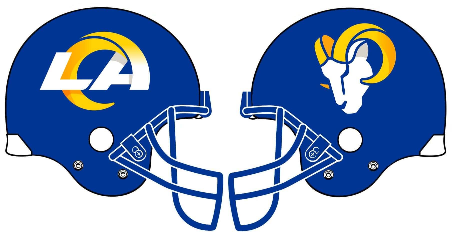
Los Angeles Rams
The Rams do have a primary and alternate logo, but neither of them is better than keeping the horns on the helmet. So the mockup shown above is not actually recommended, and was only created for experimental purposes.
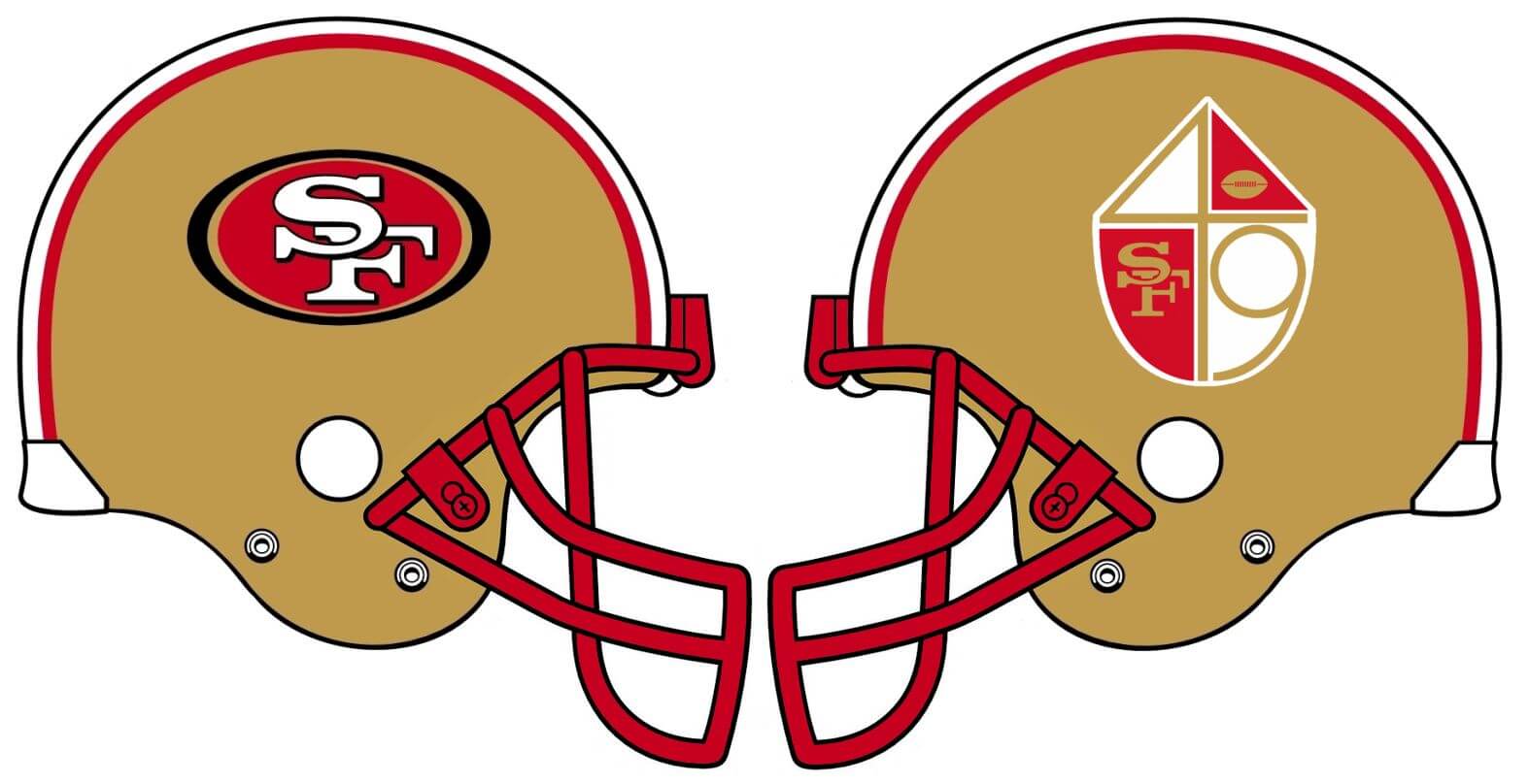
San Francisco 49ers
It would be fun for the Niners to finally use the abortive 1991 logo, but I think it would prove to be as unpopular today as it was back then. I think the better option would be to go with the team’s old quadrant-based logo. I do really enjoy the cherry-red facemask from that 1991 press conference photo, however, so let’s go with that.
Seattle Seahawks
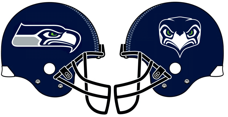
When the Seahawks got their most recent uniform overhaul in 2012, they finally connected the backs of their helmet logos so it’s actually one wraparound decal. If they ever foolishly decide to separate the decals again like they used to, the only other logo option they could play around with is the front-facing Seahawk logo.
———
Paul here. Fun project! Not sure I’d want to go this route, but it’s definitely interesting to think about and explore. What do you folks think?
(Bud Parks gives special thanks to Nic Schultz for his Photoshop assistance on this project.)
Click to enlarge
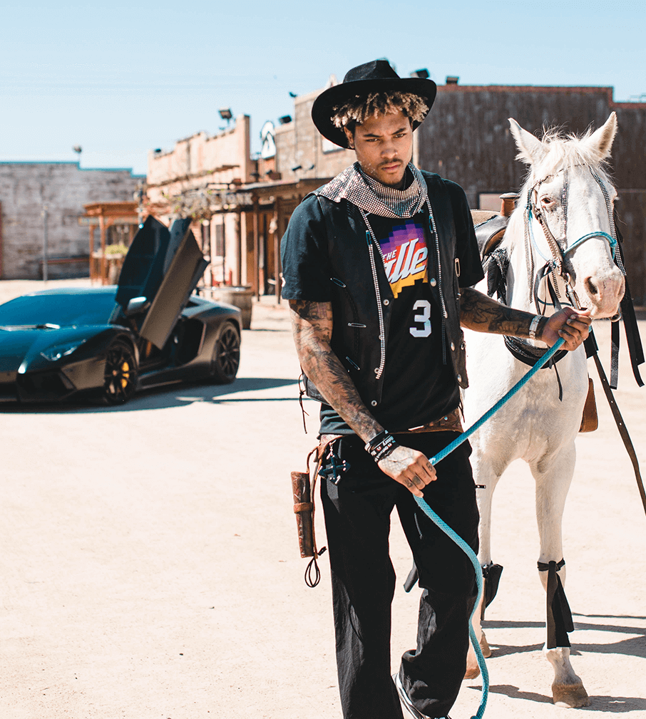
Horse of a different color: Here we have Suns forward Kelly Oubre Jr. showcasing the team’s newly unveiled City alternate jersey (which we first saw via a leak last week) by hiding it under a vest and wearing a gun holster with no gun in it while leading a horse with black ribbons wrapped around its legs through an old-timey Western town after getting out of a Lamborghini.
As one does.
This is so over-the-top crazypants that I kinda have to admire it. I mean, who approved the horse line in the budget? Genius! But if the horse isn’t featured at halftime during a few games next season, I’m gonna be seriously disappointed.
If you can get past all the silliness, I think it’s actually a pretty nice uniform:
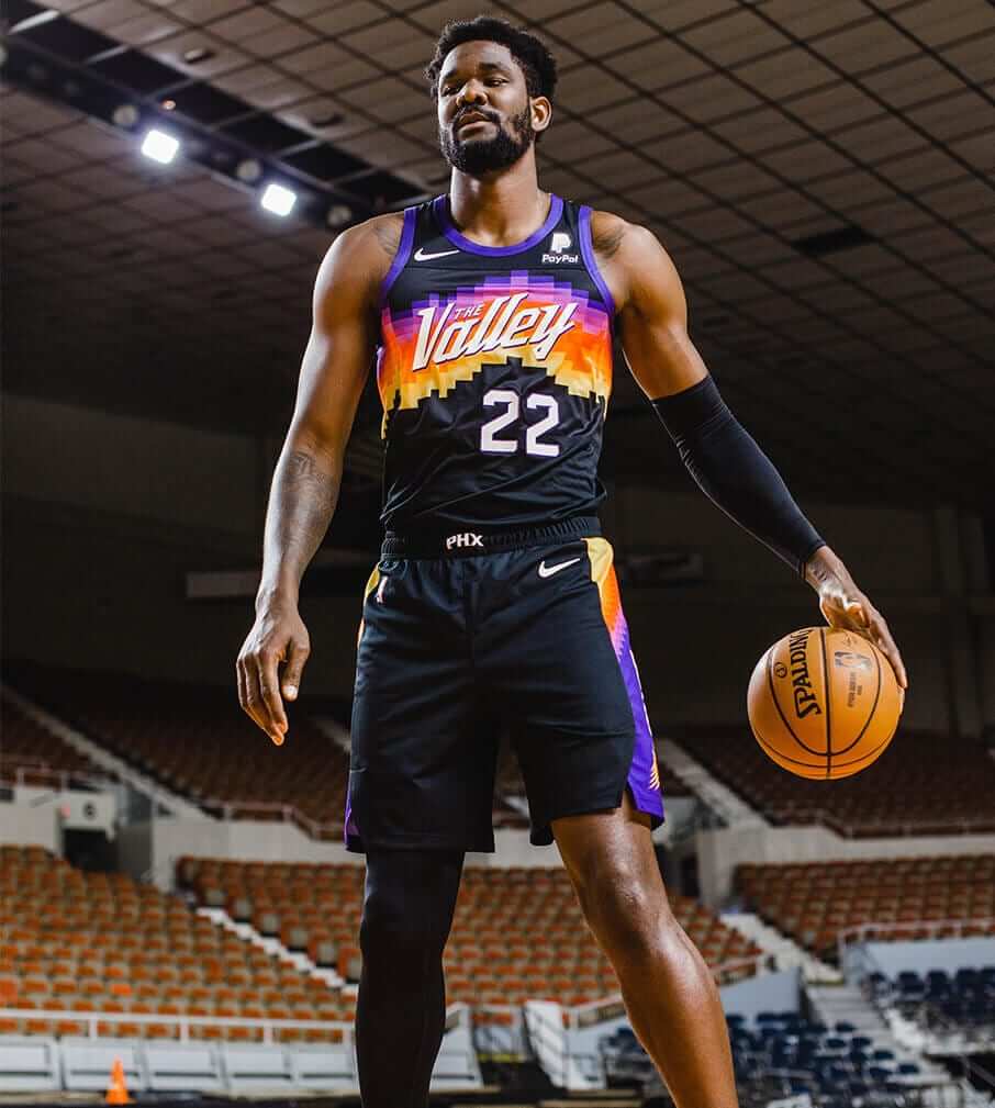
Now, is it a good Suns uniform? I’d say yes. Even without the team name or city name on the jersey, the colors feel identifiably Suns-y. Even the purple isn’t so bad when intermixed with all the other hues. Giddyup!
Meanwhile, the latest possible NBA leak is Jazz design that was sent my way last night by Twitter-er @chrispbacon13 (click to enlarge):
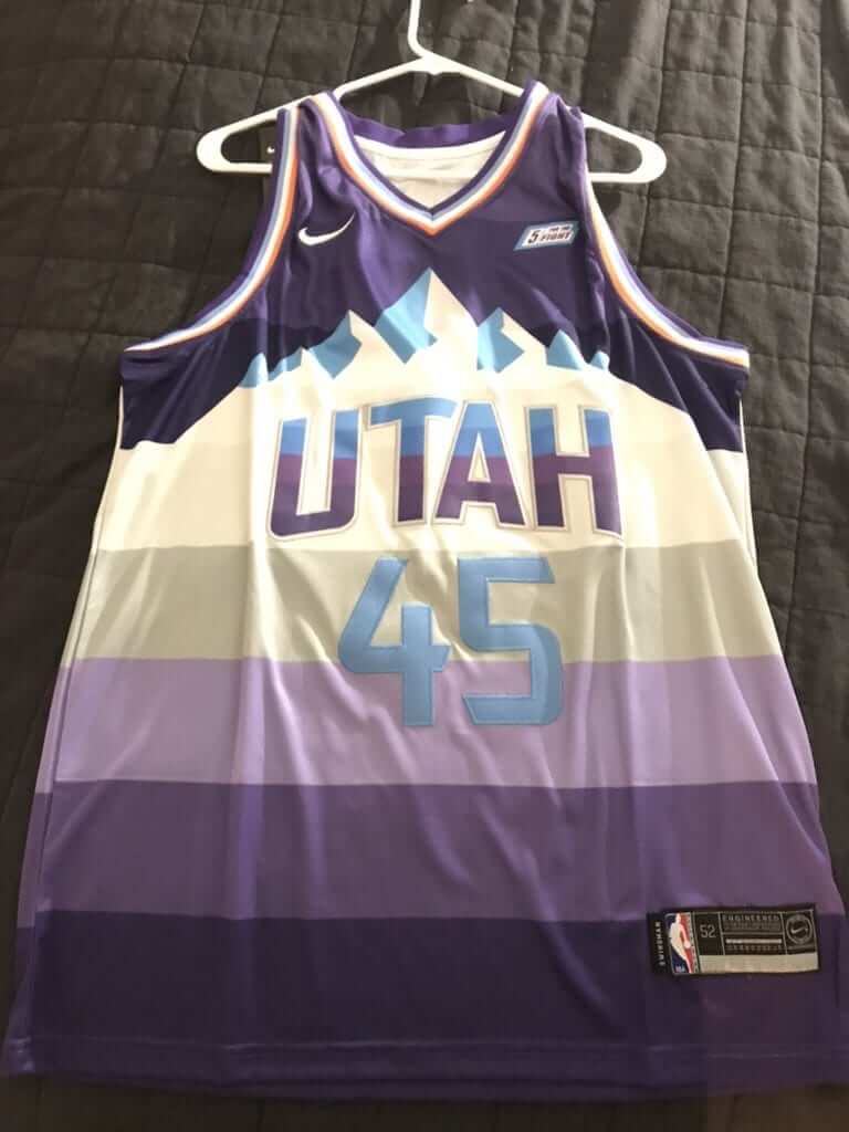
I cannot yet vouch for this design’s legitimacy (could be a prototype or some sort of wacky fashion jersey), but it’s an interesting mix of the team’s old mountain design and the horizontally striped “red rock” alternate. Seems pretty hideous, although I’m willing to reserve judgment until we see the full package with the shorts. But if the official unveiling doesn’t feature at least a wildebeest and a DeLorean, I’m gonna be really pissed.
Click to enlarge
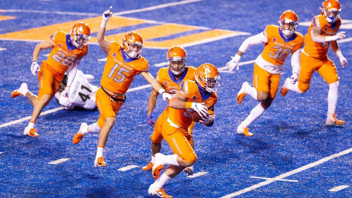
Orange you glad: Quite a look last night for Boise State, which went mono-orange on their blue field. Here’s how it looked in action:
Nick Crabtree Awareness Rating: 💯@piesmantrophy 🚨! 🥧#BleedBlue pic.twitter.com/BQ9rgAwhu7
— Boise State Football (@BroncoSportsFB) November 13, 2020
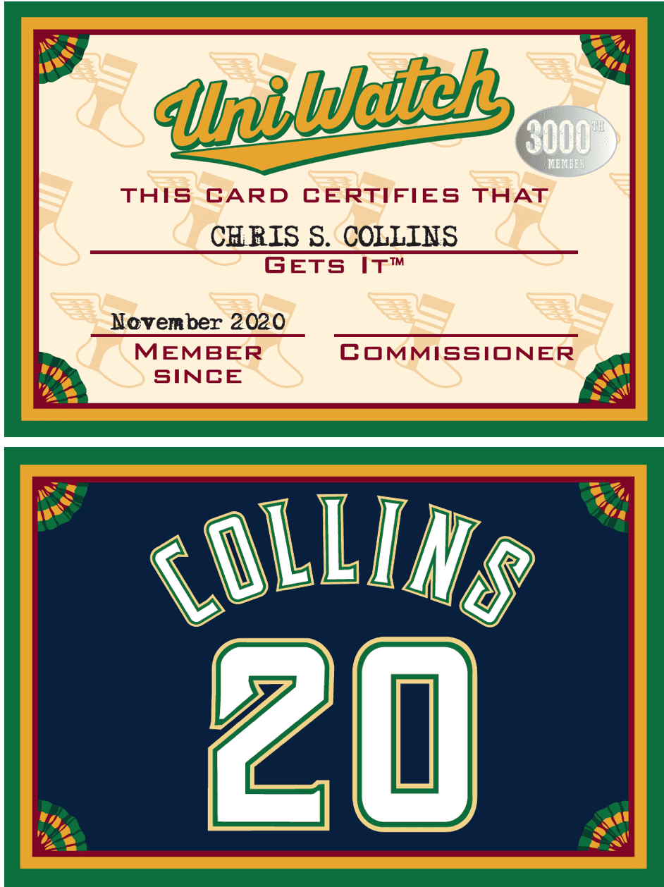
ITEM! Membership milestone: It’s rare that I show the front of a membership card along with the back, but I’m doing so for Chris Collins’s new card because it’s the 3,000th design to be added to the membership card gallery!
That’s a pretty amazing number. When card designer Scott M.X. Turner and I launched the membership program way back in 2007, we had no idea it would be so successful (or so much fun!). In fact, as longtime readers may recall, my original idea was that each enrollee would “own” a particular “roster number” — i.e., there’s be only one card with No. 1 on the back, only one card with No. 2, and so on — because I figured only about 100 readers would be interested. That plan ended up getting scrapped within a few days!
Scott and I are grateful to all the membership enrollees. It’s a really fun creative project that we enjoy working on and a great way to strengthen the bonds of the Uni Watch comm-uni-ty. We’re looking forward to the next 1,000 cards!
I also don’t mind saying that the membership program is an important source of income for Scott and myself. If you’ve been enjoying the site’s recent content, like my interviews with 76ers exec Chris Heck and NBA leaker Igor Coelho, or my rabbit-hole explorations of Carl Hubbell’s long pants and Oregon’s “Afro Duck” mascot, please consider ordering a card or donating one for me to raffle off. Every little bit makes a difference — really.
Remember, the price of a membership has been reduced from $25 to $20 until further notice, plus a Uni Watch membership card entitles you to a 15% discount on any of the merchandise in the Uni Watch, Uni Rock, and Naming Wrongs shops. (If you’re an existing member and would like to have the discount code, email me and I’ll hook you up.)
As always, you can sign up for your own custom-designed card here, you can see all the cards we’ve designed so far here (now more than 3,000 of them!), and you can see how we produce the cards here.
Finally, our latest membership raffle winner is Stile Smith (he was No. 2,999!). Big congrats to him!
The Ticker
By Anthony Emerson

Baseball News: In a graphic detailing the last 10 MVPs prior to yesterday’s announcement, the official Twitter account of Major League Baseball used an incorrect Brewers logo for Christian Yelich’s 2018 win — they used the current logo, adopted this year — but also used an era-appropriate logo for another Brewer, Ryan Braun, for his 2011 win. Strange (from @shwrth). … The Musgrave Pencil Company and Ebbets Field Flannels have partnered to create a new wool baseball cap with a slot to hold a pencil, and it looks just as a cool as it sounds (from Jose Herrera).

NFL News: An Amazon ad for last night’s Thursday Night Football game between the Colts and Titans featured Colts WR T. Y. Hilton in a white jersey with blue pants. Must be a photoshop mistake (from Nick Jones and Jarrod Ferguson). … CBS Sports has a brief article about the Rams’ next steps with their uniforms (from Kenny Kaplan and Ryan Emmitt). … A Miami Herald sportswriter has called for the Dolphins to make their throwback uniforms permanent. This Uni Watch Tickerer hereby joins that call! (from @NFL_Journal).
College/High School Football News: The Hokie wearing No. 25 this weekend will be DL Jarrod Hewitt, and Virginia Tech is going maroon-maroon-white in that game (from Andrew Cosentino). … Michigan State is wearing throwback helmets tomorrow in honor of coach George Perles (from multiple readers). … Virginia is going mono-blue (thanks, Jamie). … Marshall is going white-black-black.

Hockey News: Adidas and the NHL are beginning to tease more details from the upcoming Reverse Retro series. The league-wide unveiling is slated for next Monday. … Capitals G Henrik Lundqvist — I will never get used to typing that — has unveiled his new goalie mask. Here’s another look (from multiple readers). … Speaking of the Caps, these photos seem to reveal a new three-star motif on their helmets and pants (from Shawn Stepner). … New sweaters for the NWHL’s Boston Pride (thanks, Jamie).

NBA News: As reported earlier this year, the NBA’s official ball manufacturer will change from Spalding to Wilson after one more season. Yesterday Magic F/G Evan Fournier tweeted — then deleted — a photo of the new Wilson ball. While the Tweet was up, Fournier complained — in French — “The texture is different and the logo [and] seams are thicker. Less grip suddenly” (from Mike Chamernik).

College/High School Hoops News: James Madison has opened their new basketball arena (from Kary Klismet). … Also from Kary: Kentucky coach John Calipari has teased the new floor of Rupp Arena.

Soccer News: Sparta Prague will celebrate their 127th anniversary by wearing extremely nice retro shirts against České Budějovice. No ads or maker’s marks or anything! (from Ed Żelaski). … The USMNT wore social-justice themed anthem jackets before yesterday’s match against Wales (from Kary Klismet, Jakob Fox and our own Jamie Rathjen). … For that same Wales/USA match, Fox Sports used a Union Jack to represent Wales, rather than a Welsh flag (from @k0mmes11). … Another from Kary: Here’s a virtual tour of Austin FC’s new stadium. … And also from Jamie: Scotland’s senior and U-21 men’s teams wore poppy armbands during their matches yesterday.

Grab Bag: The New York Times has a really great article about how the Masters green jacket, which isn’t supposed to leave Augusta’s grounds, has become a holy grail collectible (from Tom Turner and Adam Herbst). … Leeds Rhinos, a rugby league side in England’s Super League, have unveiled their new home jerseys (from Kary Klismet). … Also from Kary: A new K-8 school in Colorado has selected the bear as its mascot. … One more from Kary: New logo for Mutual of Omaha. … VF Corp, which owns Vans, The North Face and Timberland, has purchased the Supreme brand, which is popular among NBA players, for $2.1 billion (from John Cerone). … New York Gov. Andrew Cuomo has pushed for a slight change to the state’s coat of arms — and, by extension, the state flag, which bears the coat of arms — by adding “E Pluribus Unum” to the ribbon that already has “Excelsior,” the state motto, written on it (from Shawn Hairston). … The graphic identity for President-elect Joe Biden’s transition team is unique in modern presidential history, according to political design writer Hunter Schwarz. … Also: After taking office, Biden may restore Air Force One to its classic blue livery. President Trump changed the plane’s livery to match the one on his private jet.

At the risk of tempting fate, today is Friday the 13th. This year has already been cursed in so many ways, so be extra-careful out there today. Stay safe, stay well, enjoy Phil’s weekend content, and I’ll see you back here on Monday. — Paul
Missing the Titans helmet mockup. The Ravens mockup is shown twice.
Thanks. Fixed!
Gotta be Bucco Bruce for Tampa …
Re: pencil hat.
1) What ever happened to sticking a pencil between you hat and head?
2) Behind the ear?
2a) Pocket?
3) The loop takes away the symmetry of the hat (no doubt coincidental to today’s post…on side different than the other)
I find this hat ridiculous. No sir, I don’t like it.
Yeah, I don’t get it either. Is there some historical precedent for a pencil hat deal like this?
Well, there’s Mike McCarthy!
link
The funny thing about Trump’s redesign is that the new AF1 won’t even be delivered until the last year of Pres. Biden’s first term. Plenty of time to tell Boeing that the old design will be fine.
Paint is easy, and I’m sure they have the old specs lying around someplace.
The light blue is a stately, gentle color, which is probably why Trump didn’t like it, as stately and gentle definitely don’t seem to match his style. It also has a very early 1960’s feel to it, which tells me that’s probably when the color was set (understandable, as that was the jet age) and most other presidents since just left it.
It wouldn’t be the worst thing in the world to consider a visual rebrand, but as with most things American, it should be tied to the symbolism of the country, not the person in charge. Given Biden’s calls for a re-establishment of normalcy, a return to the standard colors would make sense for him.
Indeed, AF1 got its iconinc paint scheme during the Kennedy administration. Prior to that, it had an eagle head motif. It was less stately, for sure: link
Exactly. Trump didn’t change the livery of anything, he changed the planned livery of an aircraft that’s currently under construction. The new planes won’t be delivered until 2024, and I expect that they’ll be delivered without livery to the Air Force, which will be responsible for executing the paint scheme after delivery but before the planes enter service.
Rory McIlroy, Brooks Koepka, Tommy Fleetwood, and possibly more are all wearing military colored clothes at The Masters today. And, Tiger Woods did yesterday, too. Leave it to Nike to take advantage of the millions of people who’ve put their lives on the line to protect our freedom for the sake of a sartorial gimmick.
they are just wearing brownish/tan shirts. no camo on them and no flags. I suspect they are just doing it because it is an autumnal colors.
This seems like you are projecting, Justin.
PS I loathe Nike and all their schtick but I dont see how any of the Nike crap at the Masters is military based at all
I have been visiting this blog or some version of Paul’s writing for my entire adult life (and I am 40) and this is the most beautiful and true thing he has ever written:
“But if the official unveiling doesn’t feature at least a wildebeest and a DeLorean, I’m gonna be really pissed.”
Thanks, Jared. Glad you liked!
Of the helmets, the only ones that look reasonably effective are Miami, the Chargers, Washington and the Giants. Every other one just does not mesh.
The stitch going across the chest on the Suns jersey looks so uncomfortable/irritating to wear in a basketball game. Wouldn’t the players be bothered by that in-game?
Now that you point it out, there are actually two seams — one on the upper chest and one on the abdomen:
link
Very odd. And, I agree, seems like it would be uncomfy.
“Suns forward Kelly Oubre Jr. showcasing the team’s newly unveiled City alternate jersey (which we first saw via a leak last week) by hiding it under a vest and wearing a gun holster with no gun in it while leading a horse with black ribbons wrapped around its legs through an old-timey Western town after getting out of a Lamborghini.”
The funny thing is, if you knew anything about Oubre’s on/off court persona, that picture is completely on brand.
Regardless of where folks stand on the issue, can we all agree it’s quite silly to have an empty holster??? I mean, put the wheel gun in it or just leave the holster off the belt…
Holsters without guns are very “Arizona”. Wilbur T. Wildcat, of the University of Arizona, used to have guns, but they removed them from the official logo.
link
What is he reaching for if there are no guns?
Unfortunately, I can’t find a picture of the guns anywhere online. They seem to have been scrubbed from all existance.
Totally reminds me of those awesome 1980s NBA posters (ICEMAN!!!!). They need to print this one up as a game day giveaway.
I was gonna say the exact same thing! I had quite a few of the NFL/MLB/NBA corny posters back in the 80s. I didn’t know any different at the time. Photo of Kelly Oubre Jr. just screams of those campy posters. I had to like it on nostalgia alone.
link Heck apologized for his comments to Uniwatch. They were not taken well in Philly.
Bummer.
Did I miss something? I don’t have any kind of social media, but I can’t think of anything he said that may have offended anyone. Can anyone fill me in?
I don’t mind the overall design, but why does a jersey that says “The Valley” show a peak?
Even if you are situated in The Valley, you can look around and see plenty of peaks.
In fact it’s kind of how you know you’re in a valley, when there are hills all around you, ;-)
I’m not a fan of these helmet non-matching side logos, except for the NY GIANTS. This should be done now as their permanent helmet design.
Couldn’t agree more. Love it!
I really like the Washington non-matching concept. In fact the “W” design by itself is a huge improvement over the current look. Definitely need to put the stripes back on the helmet too!
That Utah jersey is a well known counterfeit based on concept from someoene from CCSLC with changed trims.
Ah, thanks for clarifying — appreciated.
I love the Purple Tequila Sunrise jersey for the Utah Jazz. Next one has to be green, like the jerseys in Paul’s store!
Oh, and one of the first entries on my design site.
Agreed about the Jazz – so not only is this a 2020 City Edition that I don’t hate, it’s a Jazz uniform I don’t hate. Surprising on both counts for me!
Regrettably, it looks to be “a well-known counterfeit based on a concept from someone from CCSLC with changed trims,” according to poster Ahm 99.
Oh, well. Can’t have it all.
I about fell out my work-from-home chair with your comment:
“As one does.”
Having it stand alone as it’s own paragraph added to the punch! LOL
So the Utah Jazz. I wonder if there is ANY talk of renaming the team. As much as my memory of Utah’s team is wrapped in Stockton-to-Malone highlights and their purple unis, it just doesn’t fit to me that their team should still be named the Jazz. BUT I can’t imagine them having a team name that ends with an “S”. So I could imagine something like the Utah Range. Still a monosyllabic team name, no “S” on the end, and there’s already plenty of unis in their team history and present that have mountain ranges on it to draw from. What say ye?
Hear where you are coming from, but they have been the Utah Jazz since 1979. Would not be in favour of any name change. It’s been too long now. The identity is firmly established even if Utah is not particularly known for jazz. If we are thinking about doing that because the name doesn’t fit the location, then we should be considering changing the name of the Los Angeles Lakers too.
Would be in favour of the Jazz going back to purple with kelly green and yellow trim as their primary look though.
Yep, the list goes on with team names that fit their their original city better.
LA Lakers
LA Clippers
Memphis Grizzlies
Indianapolis Colts
Arizona Cardinals
Tennessee Titans
LA Dodgers
SF Giants
Etc.
…
Time to give the Utah Jazz a break. It’s just a name— a good one that should never change.
The pencil hat has precedent in that this exact concept/gimmick has been available from a number of brands for a while now just not an “athletic” brand. Typically you can find it from work or outdoor brands like Duluth or filson.
The rams uni plans would intrigue me if not for the disappointing way that fashion or high concept football unis usually look.
As the article stated, soccer tends to do this already, basketball does this as nauseum (city edition, earned edition, throwbacks, cultural pride editions, Christmas editions, etc) even baseball has new jerseys for every holiday (although they tend to be pretty low effort boilerplate changes). Football itself is dipping its toe with the throwback and color rush jerseys. I think maybe my concern is that football has struggled to actually think outside the box but rather mutate and mutilate the existing box. The Seahawks current unis or the buccos previous unis aren’t creative or innovative from a design perspective, they are essentially traditional football uni design but every detail of that traditional jersey is batshit crazy. Making the team name on the chest huge, or off center, or a slang abbreviation or putting it down the leg of the pants is not innovative, it’s just slightly different. Using wacky number fonts isn’t innovative it’s just slightly different. Using sublimated or subtle patterns within the striping or color blocking isn’t innovative it’s just slightly different. But if i imagine (and there are many concept artists out there who’ve mocked these things up) a really good fashion jersey from another sport as a football jersey, it works. Astros tequila sunrise, nuggets rainbow skyline, jazz orange gradient, magic reverse pinstripes, coyotes peyote coyote jerseys, white sox beach towel unis. All of these would translate very well to a football jersey if done right. But outside the Steelers bumblebees and a few ncaa unis (who have looser rules for helmets and number of unis) football has largely failed to make uniquely interesting uniforms. Very many classic uniforms, but very few successfully interesting ones.
I think two different logos on a helmet works only if the style of the two logos are similar. Having a newer logo with certain retro ones just clashes (e.g., the Bills concept).
I think the asymmetric look only works on character logo + letter logo on the other side. And even then, not in every case. In the case of Florida, they have a pretty iconic helmet with the Gators script, but the F logo has some historic relevance to it (..or at least _an_ F logo does).
For the NFL, I don’t think it works in most cases. I do like how it works with the Chicago and Washington helmets, though. I’m also pretty fond of the Giants NY/Giants, although I’d prefer them going back to the navy helmets with GIANTS on them.
I’m curious to see what Washington Nameless does next year. If they keep being the Nameless, do they lean into the W logo? Or do they just stick with the helmet numbers? I really like the idea of keeping the helmet stripes OFF of the helmet, but using the W on one side, numbers on the other.
My friend bought that jazz jersey from China last year, so I’m pretty sure it’s fake
Different logos for different sides of the helmet?
No.
Agree – NO!
With ever garish mono-tards, logo creep and adverts on everything in sight, network graphics crammed into every margin…My eyes are already sore enough from watching sports on TV…..which is *one* reason I ain’t watching anymore….
Asymmetry on football uniforms bugs me, even the Steelers’ insignia which I realize is a UniWatch favorite.
I couldn’t agree more, I don’t understand why it is such favorite. But, everyone has an opinion, and that’s what makes the uni-verse interesting
And stick with no logo on the Browns Helmet.
Carolina should definitely consider using this alternate logo-
link
Just here to say I feel like there was a huge missed opportunity with the 49ers helmet to use the one-day logo on one-half of the helmet.
If ever an NFL team could get away with a “What If?” game like they do with many MiLB teams do, the Niners strike me as the best candidate with that decal.
I’ve been pushing for years for the Niners to do this (on both sides of the helmet!) for one game. Would be so great! I’m a lifelong Niners fan, but my desire to see them do this has more to do with my being a uni fan, not a Niners fan.
Love the St. Louis era Cardinals logo running through the arch. Would do the Cards well to update that and maintain its quirkiness. Could replace the arch with a cactus or plateau in the background. Would love to see the franchise return to a classic look. Flashy, modern uniforms have no place in a franchise that’s been around since 1920.
1920? Try 1898.
And yes, they should look like the oldest team in the sport.
The “running Cardinal” logo link, could easily be cleaned up a little and used today.
Cincinnati recently did the different helmet side thing too…only with logo on one side and number on the other. Visually jarring.
link
“An uber-traditional look that probably will never be significantly altered in the foreseeable future. So while it’s fun to play around with the idea of having the Pack’s “Wisky-Heisman” logo on one side of the helmet, it’s not likely to happen.”
I prefer to call that old Packer logo the “Holstein Heisman”.
The G stands for Greatness
1 of Met fan pages I saw earlier had clip from 1980 game vs. Expos in July- pointed out Shea Stadium’s color scheme was still green at that point- apparently went blue for late-July home stand
Anyhow- point of this was that led me to watch the ’80 Jets-Colts season opener online from Shea and saw Bert Jones finished the game for Baltimore in a Greg Landry jersey- was commented on by Charlie Jones and Len Dawson- was cited as only backup jersey Colts had- video was cut-so no definitive idea on that- not sure if this had previously been touched on here
I was really struck by the leaping jaguar outlined in teal on the black helmet. Really great up-close. Probably invisible on TV.
We all love uniform concepts and the way artists present them. The Boston Pride sweaters are bad. Different fonts on the mock-ups and the numbers melding together on the back?
“The graphic identity for President-elect Joe Biden’s transition team is unique in modern presidential history, according to political design writer Hunter Schwarz.”
Biden is not technically the President-Elect until each state’s electorates officially vote for him. It isn’t determined by concession speeches or CNN or the NYT.
Please stop. There’s a centuries long tradition of referring to the president-elect as the president-elect when the election is over and the outcome is clear. It was done for Trump, for Obama, and everyone else. The end.
OK, so I have calmed down a lot since yesterday after learning the Vancouver Canucks are using navy blue for their reverse retros.
Didn’t want to see the Canucks wearing navy blue again, but it is only for a handful of games with this 4th jersey. Have to accept these jerseys are to be a bit more experimental.
Besides, it looks like other teams that wear a royal blue (Rangers, Islanders) will be doing the same as far as using navy for the reverse retros.
Fun helmet experiment. Largely indifferent to the proposals EXCEPT that “leaping jaguar” logo which looks superior to the current decal, IMHO.
It’s easily the best logo the Jags have ever had. Shame they can’t use it.
Because, you know, confusing an unreliable football team with an unreliable car make happens all the time.
After reading this today:
“Now, is it a good Suns uniform? I’d say yes. Even without the team name or city name on the jersey, the colors feel identifiably Suns-y. Even the purple isn’t so bad when intermixed with all the other hues”
I had to double check the byline and make sure that Paul actually wrote today’s entry!
I found the NFL helmet idea ridiculous, but a lot of fun to consider! And I agreed with most of the choices. But here are the ones I would change: Tampa Bay: c’mon, you MUST have Bucco Bruce on one side; Vikings: just the stylized “V,” not “MV,” would look great; Browns: gotta go blank on one side!; Bengals: must go with the good ol’ boring “BENGALS” on one side.
I see you deleted my comment about cultural appropriation. Nice censorship…
I think kelly oubre is culturally appropriating the cowboy image. How is that not the case?
Actually, I didn’t delete anything. Maybe your comment was caught in the spam filter.
I you think the Oubre photo is cultural appropriation, be my guest. Duly noted. I’m sure all the Lamborhini-driving cowboys will appreciate your advocacy.
I trust you’ll also be calling out all the other people who aren’t cowboys but nonetheless wearw cowboy boots, cowboy hats, etc. Better get busy — there’s a lot of those people out there for you to police.
Hey all, thanks for the great dialogue on today’s piece, I had fun putting it together!
I’m glad the Washington and Giants concepts were mentioned above, the Giants were actually one of the two teams that got me thinking about writing this (the other being the Dolphins) and Washington because of how surprised how much I liked it once I put it together. If I were to make a list of 3 or 4 teams out of the league to maybe give this idea a shot, they are definitely 2 of them.
I have a Vikings fan coworker that said the same thing about the V vs the MV as well, so that probably would’ve been the better option haha. But now I know! And the couple comments about the Jags surprised me too, but that tells me that the leaping Jag is a much stronger than I thought; probably why they wanted to use it in the first place, and also probably why the car company wanted to protect it.
Thanks again to Paul for lending me a portion of his platform for the day! Much appreciated, and looking forward to doing something like this again soon, if he’ll have me :)
Bud Parks
Longtime Saints’ fan here who nonetheless dislikes the ’80s Louisiana logo. The reason? The team insignia is a fleur-de-lys but the geographic placer on the map is a five-pointed star, and that has always triggered my OCD.
This helmet exercise was cool. Showcases how great the Steelers’ helmets are and helps illustrate how well the Eagles wings work as Paul pointed out. Miami ought to go with the plain M forever. Love the plain M.
My takeaway is how good Pat Patriot looks on a silver helmet. Tells me I’d have no problem with a retro red jersey even under the one-shell rule.
way late to the party, but I immediately thought for the Patriots, that it should stay silver and have Pat Patriot on one side, and the minutemen hat/jersey number on the other side..