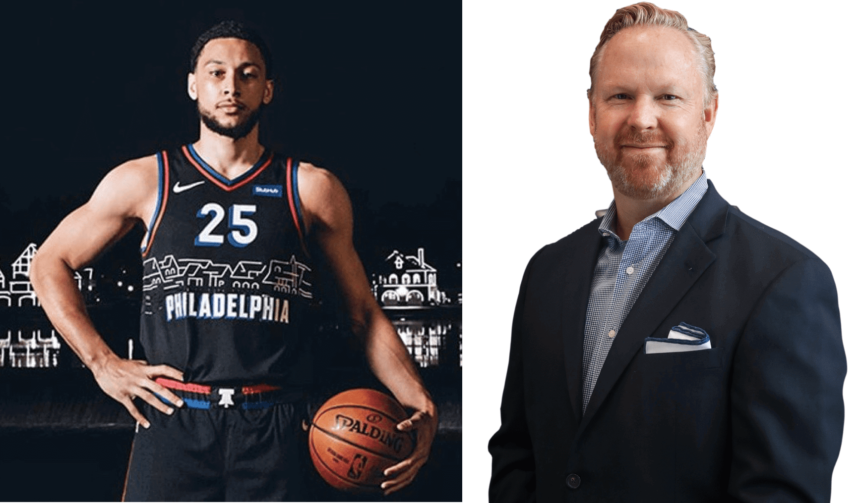
Click to enlarge
Yesterday I gave a negative assessment of the 76ers’ Boathouse Row-themed alternate uniform. Toward the end of the piece, I wrote, “The funny thing is that Sixers prexy Chris Heck loves to refer to things being ‘on brand,’ a phrase that’s almost the antithesis of this design.”
That prompted a very amusing tweet from Heck (above right), as follows:
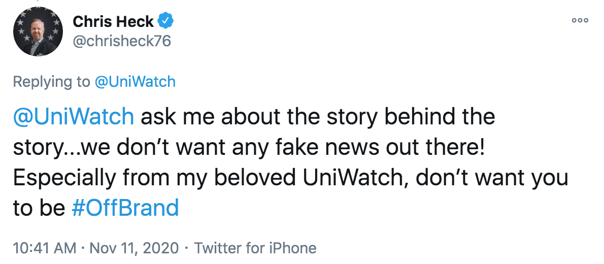
As you can see from that tweet, Heck is a Uni Watch fan. He and I have spoken a few times about uniforms, and I can attest to the fact that he really does Get It™. When I saw his tweet, I realized it had been two or three years since we had last spoken, so I sent him a quick note and suggested that we have a chat. He readily agreed, and we ended up talking yesterday afternoon. Here’s how it went (the transcript has been edited a bit for length and clarity):
Uni Watch: Good to be talking with you again!
Chris Heck: Sure. First of all, I’m obsessed with, not only our brand, but with Uni Watch. I love it, I read it every day, I absorb it.
UW: Seriously? I mean, I know you read it sometimes, but every day?
CH: I do, I do. And I think we’re pretty aligned. Now, I haven’t gone to the lengths of pulling out any logos from the makers of hats. I haven’t gotten there — I’m not saying I won’t — but I haven’t gotten there yet.
And I will say this: You inspire me and my constant reevaluating of fonts. I’ve always loved, and I’ve even read the history of it, what the Red Sox have.
UW: McAuliffe.
CH: Right, love their font. I think every font, though, has to fit the brand, for sure. So where I have gone back and forth was, like, our fonts, and in particular on our basic uniforms, and the shadowbox on the numbers and letters. Should it be deeper? Should it be the same? Am I overthinking it? And so on.
And then today I kind of broke my cardinal rule, which is never to respond to a tweet, or never speak out. But I felt, like, personally hurt that my beloved Uni Watch wasn’t completely aligned with what I was trying to achieve with this uniform. But I do understand different opinions, and even some of the thoughts that you put out there. And I was like, “You know what, I’ll see if I can give you a backstory for what it’s worth.”
UW: No, I appreciate that. And I appreciate hearing from you. Because I know you aren’t just a guy who says, “Oh, all our uniforms are great.” I know you do think about these things, so I value what you’re telling me here. By all means, go ahead and set me straight.
CH: So we have three basic uniforms, which we’re really proud of. And we really think that wasn’t as hard as maybe someone who had to rebrand or refresh your brand had to do with other teams or products out there, because we had great history. So we just took from the great history and assembled it together. Our classic blue, white, and red uniforms. And we’ve made some little tweaks here and there, like we did with the red last year on the “Phila” script. So it’s a little bit of a different look and feel, but mostly the same template. And so that’s like our basics, right? Stick to the basics. And, you know, be happy with it, which we are.
But last year we were also really super-psyched about the ’71 throwback uniform, because it was so unique and so cool. And it was old-school, but it also had a unique nuance to it with the script lettering. Even the tackle twill of the lettering was really cool. So okay, great, we had that.
And then we had a fifth uniform, which is the City Edition uniform. We have to do these things two-and-a-half years in advance. That’s when the process starts. It’s a little nuts, right? So our City uniform for next year is already done, completed already. So I am very excited for that one.
This one [for this season] was me trying to compromise. Because it’s not me alone making these decisions — we have a group of people who are all geeked out about uniforms, like I am, and we’re all coming from different walks of life. I’m 51 years old, I grew up in a certain era, I have a certain style and opinion and love of the brand. And then there’s a mother on maternity leave who’s 33 years old, and she is a local main-liner from Philadelphia, and she loves the brand as much as I do. And then I have another guy who is a native of St. Kitts and is an immigrant to the United States, and he’s now a lover of the brand in Philadelphia with us. And so the three of us make up this group where we all come from very different backgrounds and ages and appreciation for the brand. And we’re very like-minded in terms of what’s important, but not necessarily in terms of style.
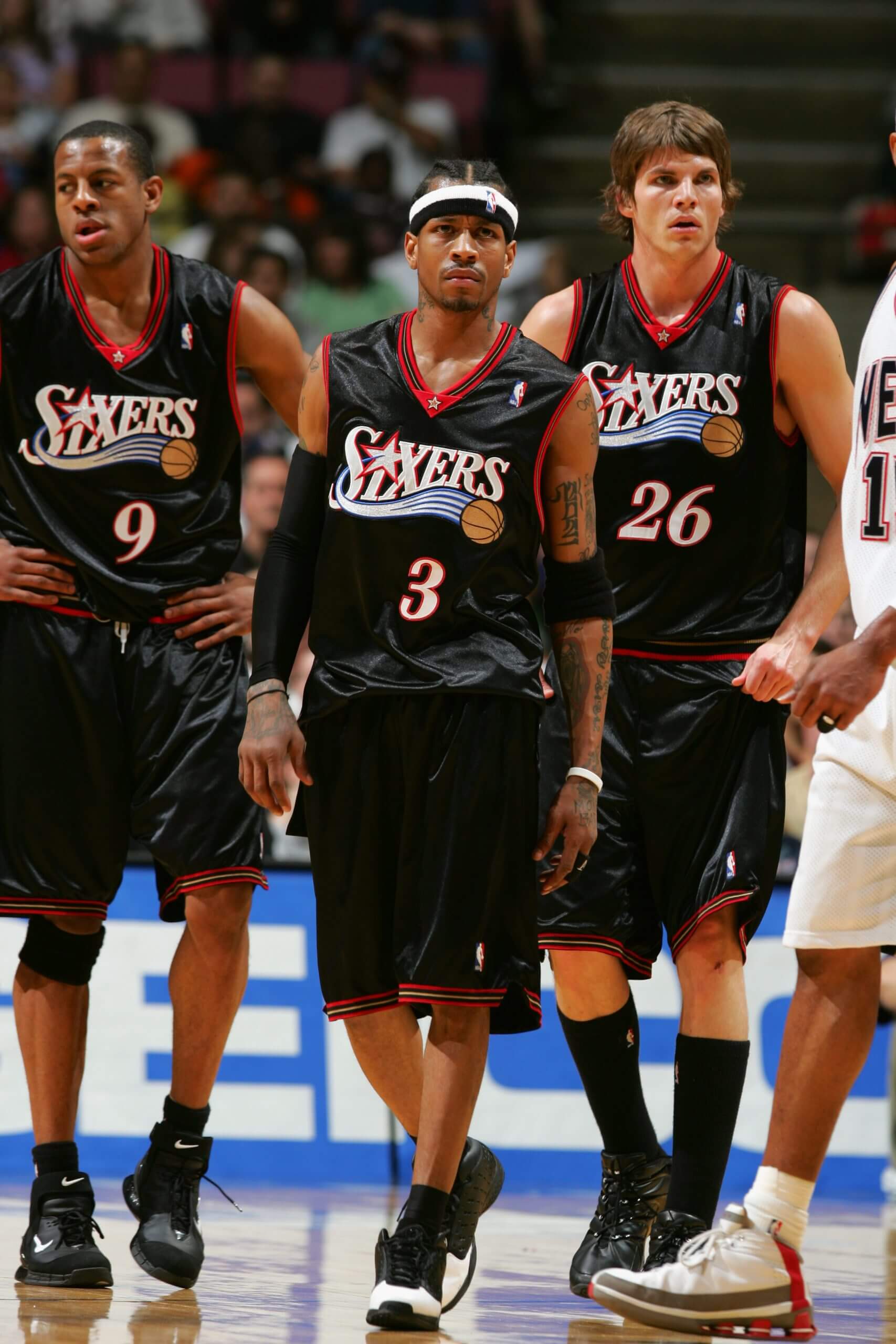
And so the two of them grew up in the era of Allen Iverson and the black uniforms. And I hated that uniform. Absolutely despised it. And the reason is that it wasn’t traditional, it was that ridiculous silk, the ridiculous larger collar…
UW: When you say “silk,” you mean the dazzle fabric..?
CH: Yeah, the shine to it or whatever. And then the blasphemy of having gold and silver in the 76ers’ logo, on top of it being a black uniform. I know I’m going on and on here…
UW [laughing]: Dude, believe me, I know a little bit about going on and on about this kind of stuff!
CH [laughing]: So that was the gist of it — they wanted the Iverson throwback and I said, “No, we’re not doing it. I think they sold out with that uniform, I think they were wrong to the brand, and come hell or high water, we’re not going back to that uniform.”
And finally it got to the point where we’re designing these [City] uniforms so often, and we use them only about six times a year and then it’s gone. So I said, “You know what? Okay, I’ll give you a black uniform.” Now, in my personal opinion, a black uniform is the ultimate cheap win. Like, if you’re Duke, do you need a black uniform? Absolutely not — but they have one. If you’re the Boston Celtics, do you need a black uniform? No. The Lakers? No. But they all have them. And I think they’re cheap wins, I do, and I kinda sold out. [Laughs.] So for that, I’m a little bit ashamed, but I also know I’m trying to be better as a person, learning to compromise and open up to new ideas.
So that was the compromise: We won’t go to the Iverson uniform, but we will allow for a black uniform for one City Edition, and we’ll do something that’s uniquely Philadelphia. But we’ll keep our three things — we always have three things in every City Edition uniform: One is the bicentennial “76,” which is always on the shorts. Two is the hidden snake. And three is the Liberty Bell, which is on the belt buckle. So all of those are on the shorts, and I love when you say, “This is a uniform, not just a jersey.” I get a little bit offended when people just talk about the jersey, because it’s really about the whole package.
And ultimately, the last point I made was that we have to always have something that’s iconic to Philadelphia with the City Edition. And people a couple years ago said, “You sold out with a fictitious character” with the Rocky jersey.
UW: Why did they say that was a sell-out?
CH: Because Rocky wasn’t a real person.
UW: So it’s not authentic to Philadelphia, because it’s just pop culture or something like that?
CH: Exactly. Then people criticized us for spelling out “Philadelphia” on a jersey, too many letters, or for the off-white color that was supposed to represent the parchment of the Declaration of Independence.
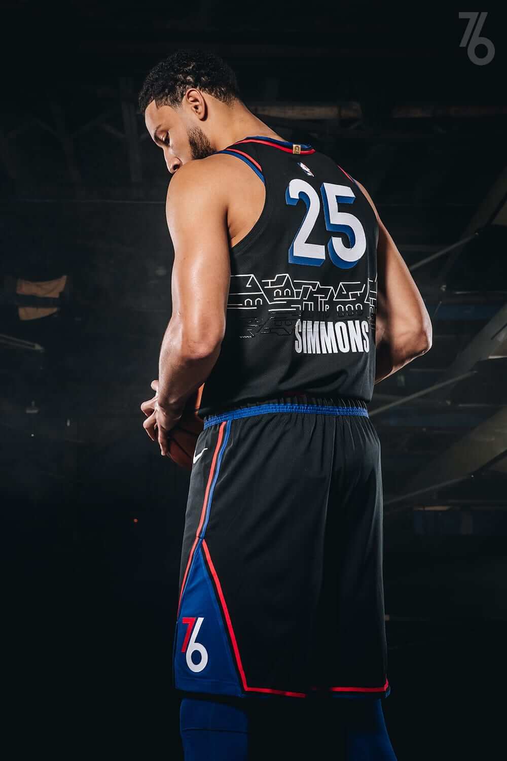
So then we do Boathouse Row, which is an iconic landmark in Philadelphia, and people say, “It’s elitist, it’s rowing,” and honestly, I’ve never rowed in my life…
UW: I just want to explain, when I wrote, “It’s hoity-toity, it’s fancy-shmancy,” I didn’t mean that as a criticism per se — I was just making fun of the fact that everyone always says Philadelphia is blue collar, it’s gritty, the Flyers’ mascot is called Gritty, and all that. So I was just making fun of that contrast. But I don’t have a specific problem with Boathouse Row.
CH: The whole blue collar thing is meant to be positive — I hear it all the time too. We actually don’t use the term “Philly,” because we think it’s lazy and undersells the city, and sometimes I think “blue collar” does the same thing. We refer to it as “New Philadelphia.” Blue collar’s important for the city, but it’s not the only component. New Philadelphia is about the arts, it’s about culture, it’s about education, it’s about diversity. We like that narrative more than the blue collar hockey thing. Which isn’t a slight on it, but we think we’re more than blue collar.
So these are kind of the themes and the mantras that we think about. So if I’m selling out with a black uniform, we better have a reference to the night life, and nothing shines brighter than Boathouse Row. That’s how we came up with it. I get that it’s polarizing — totally fair. I won’t go to the grave with this uniform. But I don’t dislike it — I just love our other ones maybe more. That’s my soapbox.
UW: I appreciate your candor. Can I ask a few questions?
CH: Of course.
UW: One thing I hear from fans about the City uniforms — not just yours, and in fact probably not so much yours until now — is that they turn on the TV and can’t tell who’s playing.
CH: I think that’s a great point. I’m with you on that. One thing I hope we never do is to lose our core colors, or to add colors arbitrarily. I thought black was as far as we could go.
UW: Another thing about the City designs — again, not just yours — is that a lot of people, myself included, think that the backstory on them is often interesting, and sometimes even educational — like, this new uniform of yours has taught me about Boathouse Row, and so I learned something. And that’s great — I love learning things! — but being interesting and educational is not always the same as being a good design. Do you think teams sometimes get too focused on the storytelling instead of the aesthetics?
CH: That’s fair. I have some conflicts with it, because I do think we’re in the storytelling business. But there is maybe — maybe that’s what Uni Watch should be doing, serving as checks and balances. When we go too far, you know, when we’re unrecognizable.
UW: So I can try to keep you guys honest, right?
CH: Right, I hear you — I love it.
UW: Also, my view of design in general and uniform design in particular is that it should be built to last, which is, obviously, kind of in conflict with the whole concept of the City program, where the designs, like you said earlier, are used for only one year, only for six games or whatever, and then are sort of disposable. So the approach is often, “Make a big splash, get in, get out.” So I admit that that may be my limitation, because I have a harder time looking at uniforms that way, because to me a uniform is — like, if it’s good, you want to keep it, not get rid of it after one year!
CH: I think that what the City Edition allows us to do is to be polarizing for a moment in time. It’s very much like going to an art gallery — do you go back to the same piece of art that you love for the rest of your life, or do you look at something that maybe is interesting, or even unappealing to you, but you have an opinion on it. So maybe that’s how we should look at this — as art.
UW: Or at least as a conversation starter.
CH: I agree. I agree.
———
And that’s where we left it. As I hope you can tell, Chris is a smart guy, fun guy, honest guy, and totally a uniform guy. Please join me in thanking him for sharing his time and insights — really interesting stuff.
Also: In yesterday’s comments, reader Jay said he thought Heck’s frequent use of the #OnBrand hashtag was a reference to Sixers GM Elton Brand. I asked Heck about that. “Ha!” he responded. “Just coincidence. Although I love Elton.”
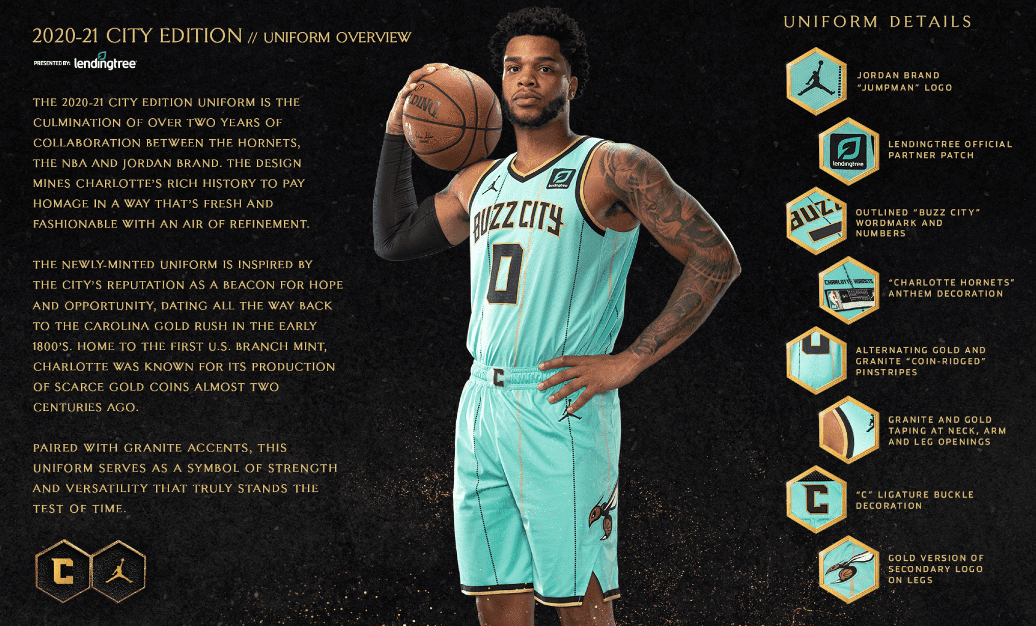
Click to enlarge
Minty fresh: The Hornets yesterday became the latest NBA to unveil a new City alternate. If you can wade your way past all the “storytelling” bullshit — which among other things conflates the color mint green with a branch of the United States Mint, a dubious sleight of hand that involves not only two different definitions but two different derivations of the word “mint” — it’s actually a really good-looking uniform. I like the color combo a lot — the tan/mustard trim works surprisingly well against the mint green. (Apparently the soccer team Inter Milan agrees.) Lots of additional photos, along with the usual marketingspeak nonsense, here.
As long as we’re talking about the NBA:
• The Grizzlies have gone ahead and officially unveiled their 20th-season-in-Memphis throwbacks, which leaked last week.
• Here’s a detailed look at the Mavs’ City alternate, which leaked last week. Or was it the week before? I can’t keep track anymore!
Alright, here they are. Real images of the upcoming Golden Knights #ReverseRetro jerseys. pic.twitter.com/m4Oh10q6Er
— SinBin.vegas (@SinBinVegas) November 12, 2020
Meanwhile, over on the ice…: As you can see above, there’s a new leak of what’s purported to be the Golden Knights’ upcoming RR jersey. Seems very AHL to me, but the Knights don’t have a team history to draw upon like the other NHL clubs do, so whaddaya gonna do.
Click to enlarge
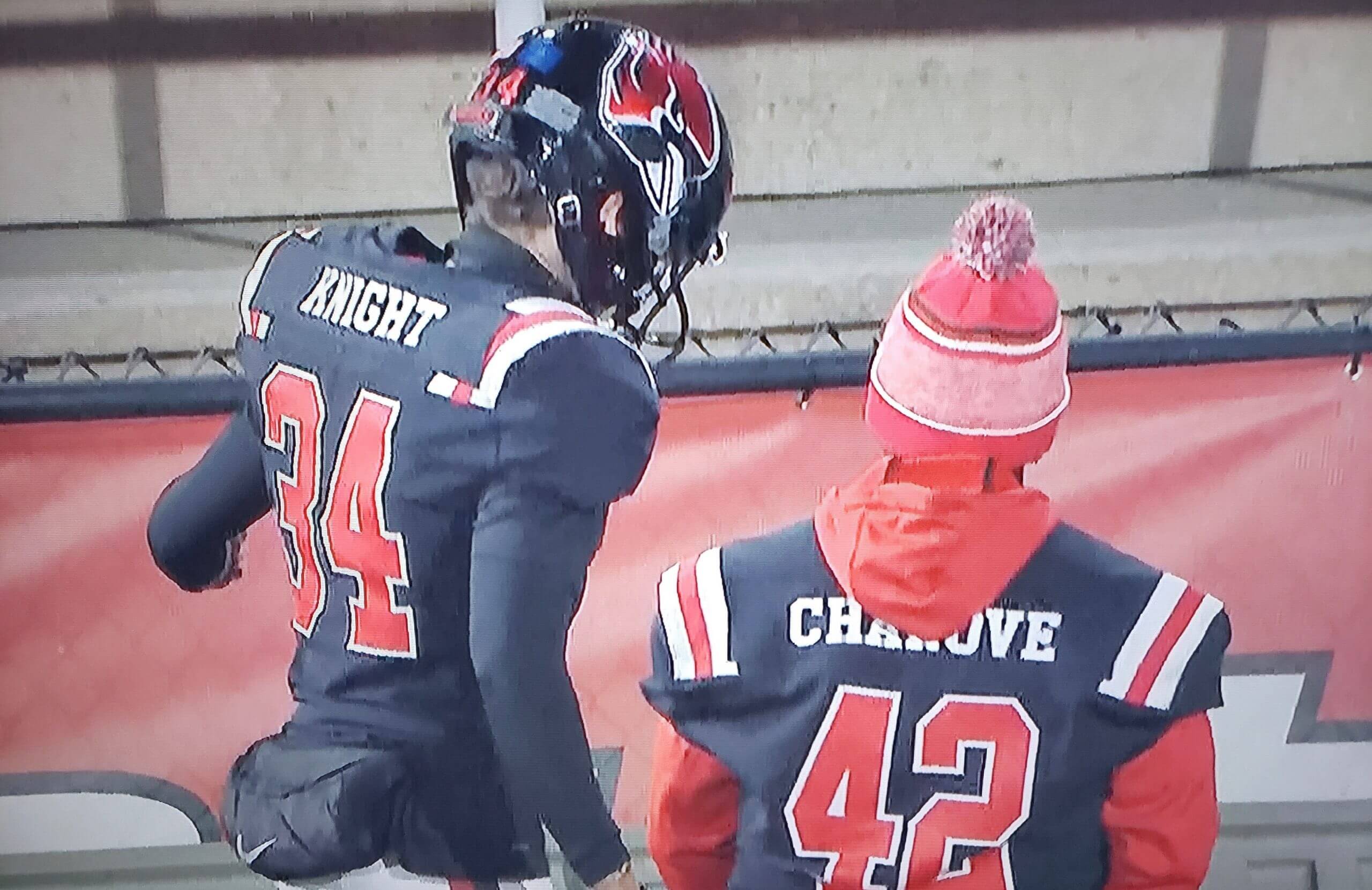
Too good bad for the Ticker: Embarrassingly amateurish look for Ball State in last night’s game against Eastern Michigan, as a bunch of players’ nameplates were so wide that they extended out over the UCLA stripes, even though the players’ names were short enough to accommodate smaller ’plates.
And it wasn’t just the two players shown above. Look at this (click to enlarge):
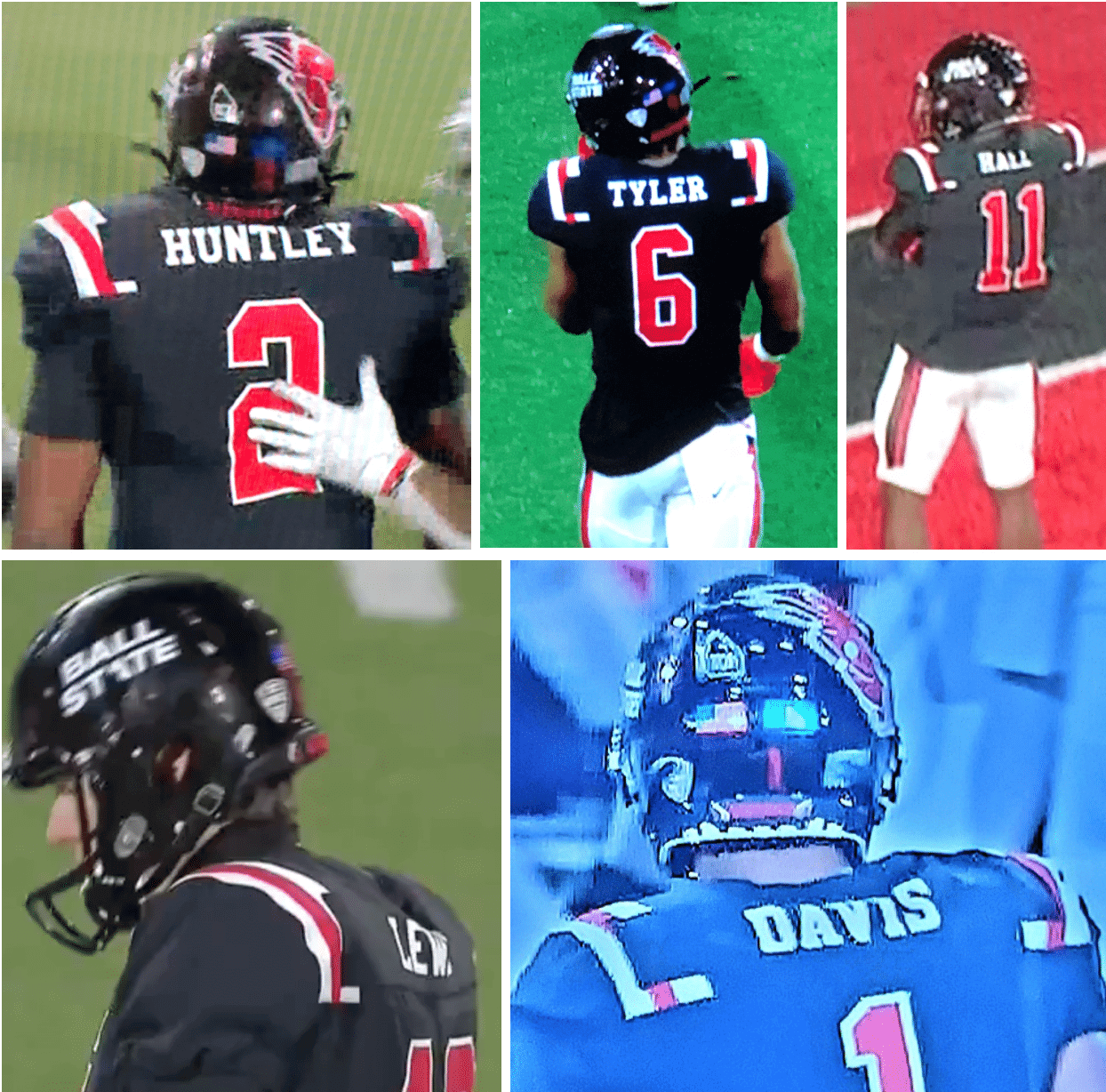
I can’t imagine any Division I equipment staff doing this out of sloppiness, so I’m assuming the nameplates were produced and applied at the last minute or something like that.
(My thanks to all contributors, especially L.J. Sparvero.)
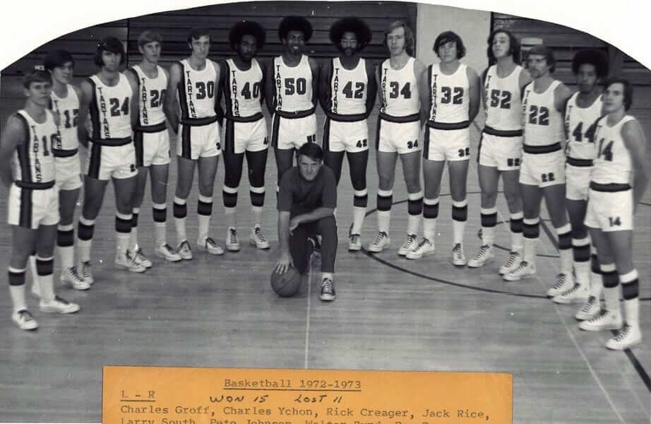
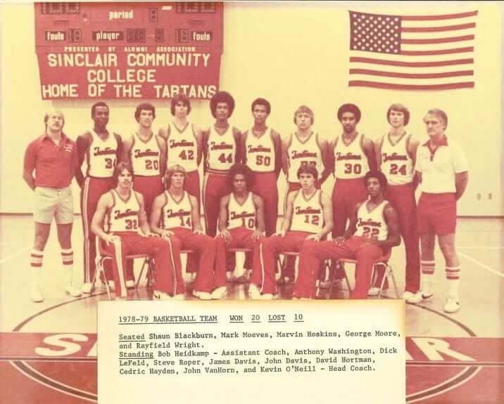
Click to enlarge
You can tell he ran a tight ship: The guy in the center of the team portrait shown above is Kevin O’Neill, who was the longtime basketball coach at Sinclair Community College in Dayton, Ohio. O’Neill, who passed away last week, was also the father of longtime Uni Watch reader Patrick O’Neill (the latter of whom I got to meet two winters ago in Cincinnati), so Patrick’s been posting some photos of him on Facebook. Love those uniforms! The vertical wordmark, the numbers on the shorts, the striped socks — good-looking squad!
Here’s another shot from later in the decade. I can only hope that the striped socks worn by the two coaches (that’s O’Neill at far right) were also worn by the players:
And get this: O’Neill actually coached future world heavyweight boxing champion Buster Douglas — really! You can read about that here.
My condolences to Patrick on the loss of his father. R.I.P.


ITEM! Another membership raffle: Reader Chris Collins has generously purchased a Uni Watch membership for me to raffle off, so that’s what we’re going to do today.
This will be a one-day raffle. No entry restrictions. To enter, send an email to the raffle address by 8pm Eastern tonight. One entry per person. I’ll announce the winner tomorrow. Big thanks to Chris for doing this!
The Ticker
By Paul

’Skins Watch: Union Public Schools in Oklahoma will no longer call their teams the Redskins. “Non-Oklahomans should know that this is a really big deal,” says Chris Newbury. “Union High School is one of the largest in the state, and their rivalry football game with Jenks High is frequently played at the University of Tulsa’s stadium in front of as many as 30,000 fans” (also from Sam McKinley and @spiders_six). … Also from @spiders_six: The Athol Royalston school board in Massachusetts has voted to scrap its cartoon Native American mascot character and will stop calling its teams the Red Raiders. … Central High School in La Crosse, Wis., will no longer call its team the Red Raiders. They changed the Native-themed mascot character back in 1994 but had kept the team name until now (from Jared Heintz). … The student government at John Burroughs High School in California is considering whether to change the school’s Native American mascot (from James Brooks). … Kahuku High and Intermediate School in Hawaii is dropping its Native mascot character and will no longer call its teams the Red Raiders (from Kary Klismet). … Remember my idea from a few years ago to rename the Atlanta Braves as the Bravest? Longtime Uni Watch readers/pals Marty and Chris Buccafusco, who are from Georgia, have taken that idea and run with it. Their campaign to get the team to change its name got a shout-out last week from USA Today columnist Bob Nightengale.

Working Class Wannabes™: An article about a high school football team in Pennsylvania says, “This is a blue-collar program and it never shies away from a fight.” … An article about high school football in Texas says that one player in particular “defines the blue-collar running back.” … Ohio State assistant coach Matt Barnes, talking about DB Cameron Brown, says, “I mean, he is a blue-collar, chip-on-his shoulder type of player.” … A high school football player who recently committed to NC State says, “State is a hard-nosed, blue collar, want to work football team. Going into that it’s perfect for anybody that loves football, loves to work and loves family.” … A high school girls’ basketball coach in Missouri says, “We want to lay the foundation of what we want our program to be — a blue collar mentality.” … A high school boys’ basketball coach in Missouri, talking about one of his players, says, “He has the ability to be the best defender on the floor and will look to be that blue-collar guy who makes every single hustle play.” … An article about the soccer team Real Madrid says, “They are a gold-collar outfit with a blue-collar work ethic.” … An article about Georgia football describes player Mark Webb as a “blue-collar defensive back.” … An article about the New York Giants says head coach Joe Judge “seems legit, a no-frills, blue-collar guy.” … Boise State football beat writer B.J. Rains says, ““They just have a blue collar attitude in the program. They literally have a tag inside of their jerseys that says ‘Blue Collar.’ They want to remember that’s where they’ve come from.” It’s not clear exactly where he’s referring to. … Indiana basketball coach Archie Miller says player Race Thompson “is a blue-collar guy. He plays hard and he’s our most physical guy in terms of being able to put his body in front of people.” … An article about high school football in Florida says a local running back “did a lot of the blue-collar work” for his team. … An article about Boise State football’s last game says WR Khalil Shakir’s play “exemplified the ‘Blue Collar’ mentality that has defined Bronco football.” … An article about Michigan football says coach Jim Harbaugh’s old Stanford team “was a blue-collar team.” … A Bowling Green hockey player says he chose that school because “It was hard-nose and simple, knowing this place doesn’t have all the bells and whistles that a top Big Ten or NCHC school might have, and doesn’t have all the money in the world. That’s what I like, that blue collar mentality.” … Ball State baseball coach Rich Maloney says one of his new pitchers “has a good arm, a blue-collar work ethic and loves to compete.” … Illinois State women’s soccer coach Brad Silvey says one of his new players “will provide energy, intensity, and a blue-collar mentality in the wide channels.” … An article about three new Texas A&M basketball players says one of them is “known for his physicality and no-nonsense, blue-collar approach to the game.” … North Dakota State basketball coach David Richman says one of his new players “is a hard worker with a strong, blue-collar mentality.” … Old Dominion basketball coach Jeff Jones says one of his new players “is a blue-collar player that has been extremely well-coached in junior college and really knows how to grind. Fans will grow to love his workmanlike approach.” … Purdue basketball coach Matt Painter says two of his new players “are blue-collar, hard-working, tough, unselfish winners.” … “Serial blue collar fetishizer Eastern Michigan has the dumbest ‘tradition’ ever,” says Josh Sandin. “Can’t let the 50-pound wrench touch the ground. EVEN THE PEOPLE WHO ACTUALLY USE THIS TOOL PUT IT ON THE GROUND! And it takes players’ attention away from the actual game.”

Baseball News: A Royals blog has ranked the best uniforms in the team’s history (from Kary Klismet). … P Marcus Stroman, who sat out this season due to Covid concerns, has accepted the Mets’ qualifying offer and will return to the team in 2021. That means he’ll presumably finally wear No. 0, which he wore last year in summer camp but not in the regular season. He’ll be the fourth hero of zero in team history (and the first pitcher), following OF Terry McDaniel and INFs Rey Ordoñez and Omar Quintanilla. … MLB.com Photoshopped P Trevor Bauer into an “FA” uniform — for “free agent,” get it? — complete with cap and jersey logo creep (from Chris Rhode).

Football News: Nine games into the season, the Jags have worn six of their nine possible uni combos. … Patrick Sharon spotted some Steelers tree ornaments for sale with a block number font instead of the team’s current font. And it’s not even the proper throwback font! … The Chiefs have asked the NFL to launch an inquiry after a union rep conducted an in-person meeting with KC players without wearing a mask. … Ball State’s costumed mascot wears a mask. Doesn’t cover his nostrils, though (from Mike Chamernik).

Hockey News: New goalie gear for Army’s Trevin Kozlowski. … New 50th-anniversary logo for the SMAAAHL’s Saskatoon Blazers (from Wade Heidt). … The main character in a mid-1990s comic strip about the game “Magic: The Gathering” was depicted wearing a Sharks cap (from @dignorant).

NBA News: Oh man, check out this sweet Celtics warm-up jacket Tommy Heinsohn was wearing in 1964 (from Milton Kop). … This supposed “Milwaukee Vice” alternate for the Bucks is obviously a phony Photoshop job, but it’s pretty funny (from Jerry Wolper).

College Hoops News: New uniforms for Charlotte women. … New red and navy uniforms for Ole Miss (from @OleMissUnis). … New uniforms for Virginia women. “They still don’t look quite the same as the men’s team, and I think an orange alternate is to come,” says proud UVa alum Jamie Rathjen. … Look at the bizarre shoulder strap seams in this UCLA photo. That can’t be right, can it? (From Jordan Teller.)

Soccer News: Austin FC will be revealing its inaugural uni set next Wednesday (from Paul Kos). … Female soccer players say they don’t want to wear white shorts because of menstruation-related issues (from Trevor Williams).

Grab Bag: Yesterday was Veterans Day, so all of the Sports Reference sites — baseball-reference.com, football-reference.com, etc. — added poppy icons to the pages of players who served in the military (from Tim Dunn). … Interesting article about the costumes in the chess-centric TV series Queen’s Gambit (NYT link). … A police officer in Christchurch, New Zealand, has become that country’s first officer to wear an officially issued hijab as part of her uniform (from Timmy Donahue). … The city of Waterloo, Iowa, is soliciting public submissions for a new police department logo (from Kary Klismet). … Here’s a shot of U.S. Attorney General William Barr wearing a mask emblazoned with the Dept. of Justice seal. … Pistol Pete’s Six-Shooter Whiskey, based on New Mexico State’s mascot, is the nation’s first collegiate-licensed liquor (from Griffin Smith). … “Australian rugby league has an annual State of Origin series between teams representing New South Wales and Queensland,” says our own Jamie Rathjen. “It usually takes place in June or July, but it was postponed due to the pandemic and is taking place now, so Queensland wore poppies on their upper sleeves.”

Can Chris come and work for the NJ Devils? They’ve ruined their current uniforms and I hate to see what they have in store for the reverse retros.
I’m surprised that “TTP” didn’t come up with your interview with Chris
The (kind of) funny thing of calling the Sixers black jerseys “selling out” is having my generation of fans who grew up watching AI be the only uniform we knew them with.
I’ll agree with the City Edition uni assessment. It is very meh, and hopefully it does scratch that itch to see an Iverson throwback, because some fans around here were really pining for it.
Awesome interview with Heck! He seems like a total stud! My question would be, why didn’t they do a reboot of those Iverson unis to his taste. So deconstruct and sharpen it up.
1. Non shiny material
2. Only use red, white, and blue for color scheme
If you look at the Grizzlies and Raptors, the modern day versions came out really sharp and interesting.
Since everyone was wanting those unis, seems like it would have been a perfect opportunity to see what they could of come up with.
Maybe a UniWatch contest in there somewhere?
Ok, I went back and messed with it on illustrator. took out the gold and only used red white and blue. Heck is right! Those uniforms and that Sixers front chest on there is terrible and totally offbrand!
I, for one, loved the parchment “Philadelphia” uniforms. They should come back into circulation instead of “PHILA.”
The Boathouse Row jerseys are cool, too.
Not that my opinion matters but I despised those Sixers uniforms too, the dazzle, the lack of tailoring they just screamed Glad bag. However, I do understand the popularity of them, They could recolour the logo and do something like the reverse retro NHL is doing.
Speaking of which, so the Islanders are basically producing the Oilers alternate jersey from last year?
The Devils and Wild need to run away from Christmas colour combos, hopefully the Wild fall in love with the North Stars colours and how their branding can evolve and be perfect in that scheme. I am very excited for the NHL releases.
Fascinating insight in the interview with Heck. Thank you for sharing!
Sixers definitely have a vocal element clamoring for the Iverson look to return to the court. Maybe I’m showing my age, but I don’t get the appeal. I’m going to chalk it up to youthful nostalgia, similar to calls for the Mets to reprise their black alternates.
Favorite part is Heck characterizing BFBS as an easy win.
I hope the NBA and the teams are happy with the dreck they push out to flood the marketplace. Because I just don’t care anymore. Too many here today gone tomorrow uniforms, too many colors that aren’t team colors, too many bullshit stories…I’m out! But seriously, what’s next? The Celtics make a yellow uniform to evoke the Boston Bruins and the yellow seats in the Garden? That’ll be hilarious against the Lakers.
Loved the interview with Chris. The Hidden Snake was new to me and I love it.
I remember attending a Steelers game in ’08 after a long hiatus from Heinz Field, totally keyed up to see the Steelers uniforms during warmups. Running to see the field, I was bummed when I saw white pants on our guys. Steelers wore their throwbacks vs the Giants that day. I was so disappointed. To this day, I believe it was the reason we lost that afternoon. So yeah, not a big fan of all these ‘cheap wins’.
I attribute the loss to needing a backup long snapper, not the uniforms.
Great interview with the 76ers president. Thoughtful questions and thoughtful answers. I learned a few things, and even started to appreciate (if only a little) the concept of a disposable city uniform. Thank you, Uni-Watch.
Really great main article today for so many reasons!
But I have to comment on the Vegas reverse retro jersey. First, I’m not sure I understand what the reverse retro concept is. The promo video made it look like all the teams would wear the same color blocked template but in different colors (and presumably different logo) but this jersey proves otherwise. Also the phrase reverse retro indicates that it’s either a “turn ahead the clock” type of gimmick, or a throwback jersey with the color scheme reversed. Is it any of those things?
Now to Vegas in particular: I hate this jersey and all the Vegas jerseys. Too many shades of too many colors, the material always looks cheap, the main (helmet V) logo is nice enough but the other branding is just awful. The jersey blocking is too busy but not conceptual enough (either go simple and classic, or do something thoroughly interesting), and Nevada is the silver state. They should be the silver knights for pride of locale, and to capitalize on local unity with the raiders who will no doubt always be silver and black.
Basically the idea behind the program is to create unis that incorporate several different elements from a team’s design history and put them together, often using a typically secondary color as the primary.
The Knights had to do something different though because they don’t really have any history to draw from.
Got it. I am always game for new unis and in particular ones with some sort of design parameter or theme where you can see each teams approach to the same concept. My thoughts on the vegas jersey stand though. The Tampa bay rays are a prime example of historical fiction in jersey design. And while it must be said that they did just copy and paste another teams design history, they did it very well.
Colgate is a brand.
Cheerios is a brand.
Dodge is a brand.
The Sixers are a team.
Please, Mr. Heck, enough of the marketingspeak.
-C.
This is a pet peeve of mine as well.
Actually Colgate is a university, Dodge is a city, and Cheerios are departure greetings.
See, everything has a perspective and a context. All are valid.
The Vegas Reverse Retro jersey is, quite literally, an AHL (well, IHL, but close enough) design. It’s based on the old Las Vegas Thunder jerseys, since the Knights themselves don’t have any history.
And I, for one, am fine with their use of the Thunder striping. I just wish they would use the block shadow numbers the Thunder used. On the one hand, I can see wanting to keep the numbers uniform across their brand, but on the other hand, this uniform is inherently different enough with the diagonal striping that having a different numbering style would not be out of place.
My take on the whole “BFBS” concept:
I’ve noticed that people often use “BFBS” in two subtly different ways. But even though the difference is subtle, it’s important IMO.
The first way it’s used is when a team actually changes its color scheme to incorporate black. I’ll use examples from hockey, since that’s what I’m most familiar with: The New Jersey Devils and Buffalo Sabres both did this in the ’90s. Black and red was the “cool” color combination of the day, so both teams removed preexisting colors (green in the case of New Jersey, blue and yellow in the case of Buffalo) and added black. This kind of BFBS is more objectionable because it comes off as faddish.
On the other hand, people also use “BFBS” when teams simply add black to a preexisting color scheme, such as the Calgary Flames have been doing for a while now. I don’t find this practice objectionable at all because technically black, like white, isn’t a color; it’s simply the absence of color. For a team like Calgary to add a black jersey (which they’ve done a few times over the years) is really no different than them having a white jersey. Their colors are still red and yellow. It doesn’t bother anyone that literally every NHL team has a white jersey, so I don’t see any reason why a team adding black to their color template should be bothersome.
I have exactly the opposite reaction to the two BFBS cases you describe. (And I think you did a great job describing the two cases.) My first preference for uniforms is that they align with the team’s real actual official team colors. So if a team wants to wear black, and changes its official colors to include black, and then wears black uniforms, I highly prefer that to a team that wants to wear black, doesn’t have black as an official color, and wears black uniforms anyway.
I’m rarely a fan of any black-inclusive team identity or uniform change precisely because it usually happens in the midst of some kind of cultural or marketing fad, but there are times when black is the right choice for a team. But I sort of have two general rules that come into play here: 1) Teams adopting black is usually dumb; 2) Teams wearing uniforms that don’t match team colors is always a crime. So a team adopting black and wearing black uniforms only violates one rule, whereas teams just gratuitously wearing black violates two rules.
Why does it matter what a teams official colours are though?
To use an example – I thought the 2000s Kansas City Royals, Toronto Blue Jays, New York Mets looked like total shit. My opinion had nothing to do with official team colours. I don’t know whether they ever added black to the official team colours and it doesn’t matter. If the team looks like shit, and you tell me “but they added black to the official colours”, my opinion isn’t changed in the slightest.
Those extra-long nameplates are bizarre, as it would be really easy to just trim them shorter before sewing.
Great interview today!
Paul –
I appreciate the kind words about my father in today’s entry. Uni Watch is more than a blog, it’s a community. Thank you again.
Really a nice segment and call out to the DDN news. Very thoughtful!
It’s hilarious that you got so fired up that they made a mint-colored jersey to represent the Charlotte Mint. I mean, do you honestly think it’s that far-fetched that they would use “mint” as a color for that?
I bet if they made it gold you’d say “that was a missed opportunity to use MINT as a color – that would’ve been unique, no? Shame on the NBA for making it so literal. Seems like another money-grab to me!” lol
Actually, I didn’t get “so fired up” (I just pointed out an absurdity), and I *never* refer to uniform releases as “money-grabs.”
Try again.
Paul, terrific and insightful interview with Chris Heck. I’m curious, since the rash of NBA leaks is in part how you connected with him, if you asked his thoughts on jersey leaks? I thought him mentioning that next year’s jerseys are already designed might have been a good opening.
Good point! I did not ask him about that, or about several other things I had hoped to touch upon — we had a limited time window. Hope I can do a follow-up with him soon (or at least soon-ish).
“New Philadelphia” is about the arts, it’s about culture, it’s about education, it’s about diversity.
New Philadelphia is a little town in Ohio. It’s about cheese and Amish culture.
Anyway…overall it was a good candid interview.
I can’t imagine any Division I equipment staff doing this out of sloppiness, so I’m assuming the nameplates were produced and applied at the last minute or something like that.
You’re assuming Ball State is deserving of its Division I status. As an Akron grad, let me tell you that the entire MAC is D-1 in name only…at least when it comes to football. The league would be much better off dropping a division or two in that sport.
“New Philadelphia is a little town in Ohio. It’s about cheese and Amish culture.”
This made me laugh out loud although as a fellow MAC grad (OHIO) I disagree with your D-1 football assessment. What would ESPN show on Tuesday nights in the Fall without MACTION!
They could show D-2 MACtion. ;)
The mid-90s comic in the ticker is about the card game “Magic: The Gathering,” not doing magic tricks.( “Illusions, Michael. A trick is something a whore does for money…” [sees children] “… or candy!” …”)
Fixed!
I tried to look at the Hornets’ page because I was curious about how mint uniforms would look. I got as far as “Presented by Lending Tree” on the splash page and was reminded of one of the reasons why I really hate the NBA.
I am so excited about the Atlanta Bravest campaign! As a lifelong Braves fan I’ve talked to several people within the organization and sponsors of the team about making moves away from Native Imagery. I know several like minded fans that will love to contribute to this. I’m going to do purchase a shirt and do whatever I can to help this campaign out!
I’ll admit my favorite part of this design is how little tinkering is done with the original product. The hatchet looks good, the script looks good. A handsome uniform stays handsome.
big kudos to Mr. Heck! reading uni watch every day should be a job requirement for people who deal with unis XD
Oh wow, don’t take this as a complaint, but the blue collar BS is becoming too MUCH for the ticker!
I saw that 50-lb wrench on TV and was too lazy (and flabbergasted) to point it out. I understand the social/team building concept, like I do the turnover chains and other sideline traditions that get started and work. Some of that stuff feels like it would be better if TV people didn’t make such a big deal about it.
Someone at Ball State dropped the ball (pardon pun) with those name plates. Damn shame because it’s a nice looking throwback style jersey.
Really enjoyed the interview lead story, nice to see someone else point out BFBS as it is, a gimmick.
When I first saw the new Hornets uniforms I immediately thought of the New York Liberty and their seafoam uni as seen in this link:
link
Not an identical match but close.
One more thing, Mr. Heck if you are reading the comments today. I know there’s a lot of love for Philadelphia to have a WNBA team. Would be a great addition to the city.
Paul, you were accidentally correct about the Vegas Golden Knights’ “reverse retro jersey”. It looks like a minor league jersey because the hemline design is based on the IHL’s Las Vegas Thunder:
link
“New Philadelphia” is trending on Twitter now – Chris must have struck a nerve…
Yeah, this interview has really blown up on Sixers Twitter. The response to Chris Heck is not positive. The feeling is that “New Philadelphia” is a term meant to focus on White Wealthy Philadelphia. He mentioned one of his colleagues being a main-liner, and this should be capitalized: The Main Line is an affluent, status-focused suburb west of the city where something like rowing might be more popular than, say, Allen Iverson. I can see how some of it comes through as tone deaf (not calling the city “Philly” feels a tad absurd). The idea that “New Philadelphia” is about the arts, culture, and education feels like a wink to White affluent Philadelphia.
For what it’s worth, though I can see where they’re coming from, I thought it was an interesting interview. I think Chris might regret his candor, based on the response, which is unfortunate. I wonder if he might engage with some of the critique to his comments.
(I think Boathouse Row is a nice attraction in the city, and don’t really feel one way or another about the uniforms. It’s kinda nice to have some Philadelphia imagery that isn’t another Liberty Bell.)
Also, there is a New Philadelphia in Pennsylvania. It’s a small town in a coal-mining valley, coincidentally near the source of the Schuylkill River (the river Boathouse Row is on). It is, to say the least, not similar to Chris’s “New Philadelphia”.
No good deed goes unpunished. Chris Heck may well regret breaking his cardinal rule (not responding to anything on twitter).
RE the Vegas Reverse Retro: For a second I thought I was looking at a new Calgary Flames uni.
Check out the jock tag of the Mavs City Edition jerseys. Just above the phrase “Legacy is Everything” … why does it look like the St. Louis arch has been added to the Dallas skyline? Am I nuts? Is anyone else seeing that?
Better yet: Look at the jock tag on the new Hornets alternate. See the phrase there? Instead of some cringeworthy slogan, it just says, “Charlotte Hornets.”
Wow, what a concept!
Best guess is the arch is supposed to represent Dallas’ Margaret Hunt Hill Bridge over the Trinity River. It’s a cable-stayed design with a unique arch shaped tower instead of the standard tower type you see (think Tampa Bay’s Sunshine Skyway)
Great interview with Mr. Heck! Thanks Paul! Another great day in the uni-verse !
Thanks Paul and thanks Mr. Heck. Great interview today, and great insight into the competing demands of uniform design. This is one of those posts that makes the site great.
Paul…
As a reporter/journalist, part of your job is to pick up the phone, make calls and ask “what are you doing/thinking?”.
In this case, in a manner of speaking, Chris asked you to call him.
Do you ever NOT want to call a source? If so (and not in this particular case, I don’t know what your internal thoughts were when you saw Chris’ tweet), what would be among the hesitations you’d be feeling?
Thanks,
Lee
Good question! I don’t really have the time or personal bandwidth to address it right now, but keep that one in mind for the next round of Question Time!
Hah, I actually was going to ask you when the next Question Time installment would be… but I always forget the question when you ask for submissions. I’ve actually had some good questions to ask over the years, but alas, lost to the ether.
Thanks!
Lee
Why isn’t there a McAuliffe font for football, soccer, hockey and basketball?
The CCM font is pretty close to the default for hockey (Canadiens, Oilers, Sabres still and a bunch of teams in the past).
Interesting to see that the Sinclair Community College 1972-73 uniform template was picked up by the Portland Trail Blazers three seasons later. Portland won the NBA title in 1977 wearing a very similar uniform to what the community college in Ohio had four years earlier.
Thank you, Paul and Chris, for this insight into the creation of the city jerseys. It was a fascinating peek behind the curtain. As a fan of a different team, I’d say that I really like the cream-colored “Philadelphia” uniform. I don’t know why Sixers fans may not have liked it, but I thought it was something that should be part of their regular rotation. Perhaps I interpreted his “selling out” comments on that one incorrectly. At any rate, I hope you can get another conversation with him here. It’s really fascinating stuff. Thank you!
The Chris Heck interview was AMAZING. Love that he’s a reader, love that you got his attention (and access so quickly). Seems down to earth, intentional and loved how he framed the idea that you can’t make everyone happy (people like different stuff).
The black AI era uni’s also had such brutal sleeve trim, like cut-off t-shirts not scooped arm holes. But that was the last time the Sixers were in the finals so sort of feels like that’s a deserving throwback (with different tailoring).
Crazy that they start the process (i.e., Nike) 2.5 years before launch. I’m super scared for 2023 already!
And as much as I hate just about everything Nike has done to the NFL (and the MLB swoosh) – the frequency of NUFNUS (new uniforms for new uniform’s sake) in the NBA is beyond ridiculous. Celtics are exhibit A, Lakers are exhibit B.
I don’t want to begrudge Ryan Heffernon his love of his team … but dear God, I detest this anti-aesthetic attachment to certain uniforms, however ugly, just because they coincided with an upturn in the team’s fortunes. They won BECAUSE THEY WERE A GOOD TEAM, people, not because their uniforms looked like ass at the time. Enough of this utterly misplaced nostalgia.
I used to read Uni Watch every day until I got tired of this stupid Working Class Wannabe stuff. But I checked in today, curious if there would be anything about all the reverse retro teasers yesterday. And here we have the guy who mocks the whole “blue collar” thing describing Philadelphia as “blue collar”. And then of course we get to the whole dumbass WCW section, which is, as usual, rarely uniform-related.
I don’t understand this comment. WCW appears once a week — usually on Thursdays. Hard to understand how it keeps you from reading the site “every day.”
And even if WCW appeared every day, you can, you know, scroll past it. What’s so difficult about that?
As for the Reverse Retro teasers, I had a whole sub-lede about that in Wednesday’s post:
link
Agreed, Paul. I read the blue collar sections for the first few times, but now I just scroll past it. That’s much like the soccer section, unless a scan reveals a team in which I have some interest. I loved it when you changed the format (how long ago now?) to the sports sections you use. It makes the blog so much more readable!
Great interview. I do like the new 76ers Boathouse Row unis–creative and very localized. I think some may be taking issue with the term “New Philadelphia” because Philly has always been diverse and layered– it has never been only “blue collar/gritty” or only “white collar/elitist”. It is probably the most storied city in US history and people from all walks find representation and community here.