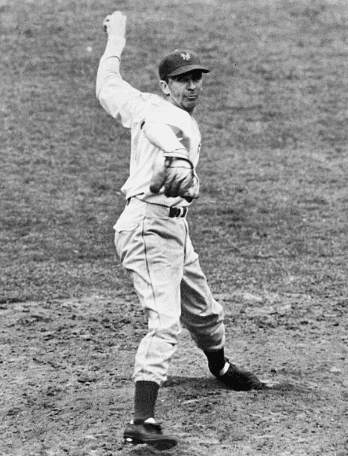
The photo above is from 1937. The gent on the left is New York Giants screwballer Carl Hubbell (most famous for striking out five consecutive future Hall of Famers in the 1934 All-Star Game). As you can see, his pant legs go down lower than those of teammate Gus Mancuso, who’s seated next to him.
Here’s another 1937 shot of Hubbell and Mancuso, this time accompanied by teammate Mel Ott. Again, Hubbell, who’s in the center, appears to be cuffing his pants lower than the others:
And here’s one more shot of Hubbell, this time posing with several other pitchers from the 1936 National League All-Star team:
That’s Hubbell, second from the right. Again, his pants are cuffed a bit lower than those of (from left) Van Lingle Mungo, Dizzy Dean, Lon Warneke, and Curt Davis.
Normally, I wouldn’t think anything of this. I mean, it’s not as though Hubbell was wearing pajama pants, right? His cuffs may have been a bit lower than everyone else’s, but they still seemed relatively era-appropriate.
But it turns out that Hubbell’s low-cuffery (relatively speaking) was neither random nor unnoticed. In fact, it was a major issue back in the day! We’re going to explore that rabbit hole today.
This topic first came to my attention when Baseball Hall of Fame curator Tom Shieber recently sent me an item that ran in the Aug. 6, 1942 edition of The Sporting News. The entire piece, much of which is about the Cubs’ then-groundbreaking uniforms, is worth reading, but the first two paragraphs are the ones that are of interest to us regarding Carl Hubbell and pant length, so let’s focus on those (click to enlarge):
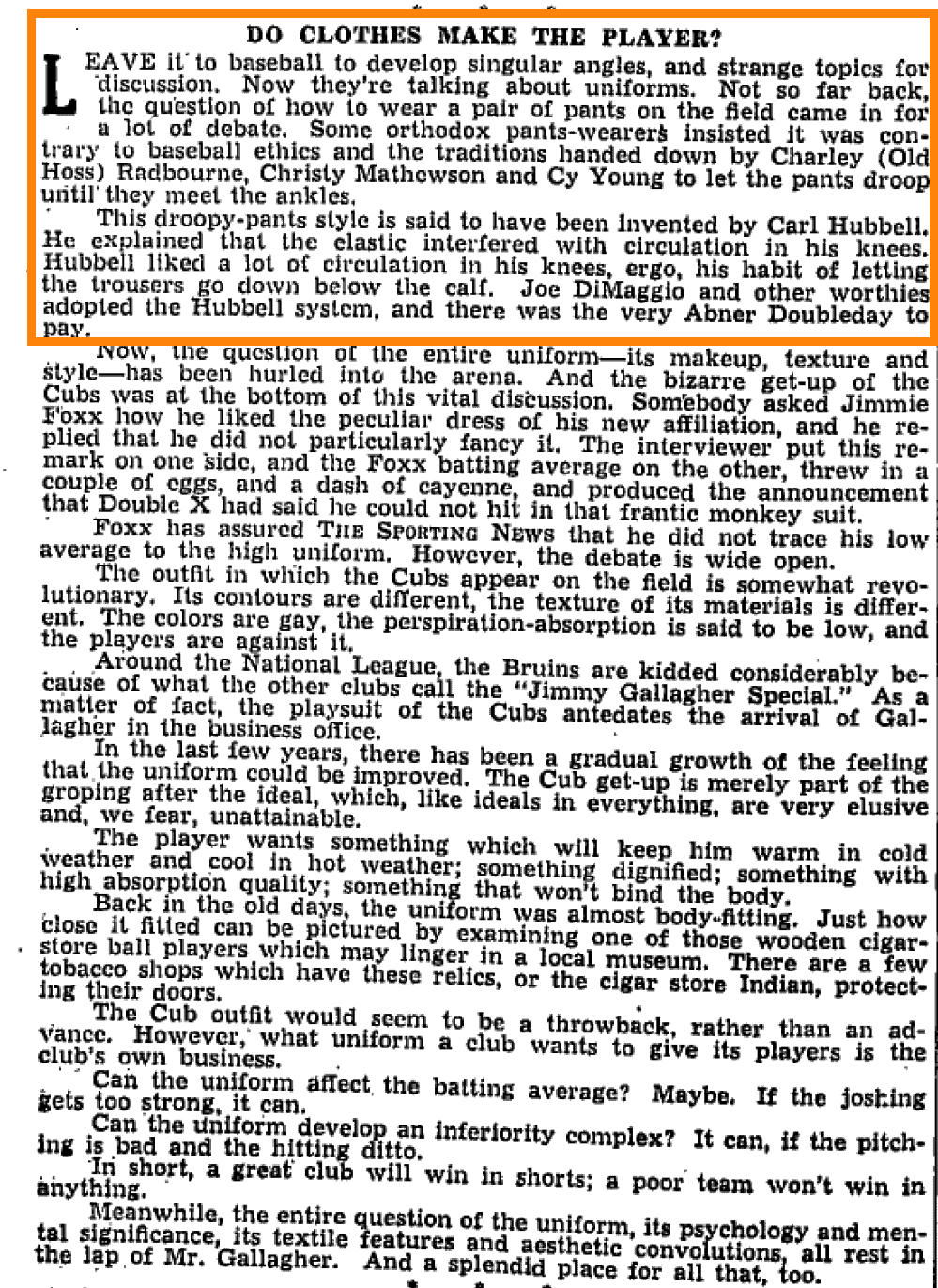
In case you’re having trouble reading them, here’s a transcription of those first two grafs:
Leave it to baseball to develop singular angles, and strange topics for discussion. Now they’re talking about uniforms. Not so far back, the question of how to wear a pair of pants on the field came in for a lot of debate. Some orthodox pants-wearers insisted it was contrary to baseball ethics and the traditions handed down by Charley (Old Hoss) Radbourne, Christy Mathewson, and Cy Young to let the pants droop until they meet the ankles.
This droopy-pants style is said to have been invented by Carl Hubbell. He explained that the elastic interfered with circulation in his knees. Hubbell liked a lot of circulation in his knees, ergo, his habit of letting the trousers go down below the calf. Joe DiMaggio and other worthies adopted the Hubbell system, and there was the very Abner Doubleday to pay.
Faaaaascinating! Of course, saying that Hubbell “let the pants droop until they meet the ankles” is an overstatement. Still, it’s interesting to hear that his inseam length was considered distinctive (and controversial!) at the time. I’d never heard that before.
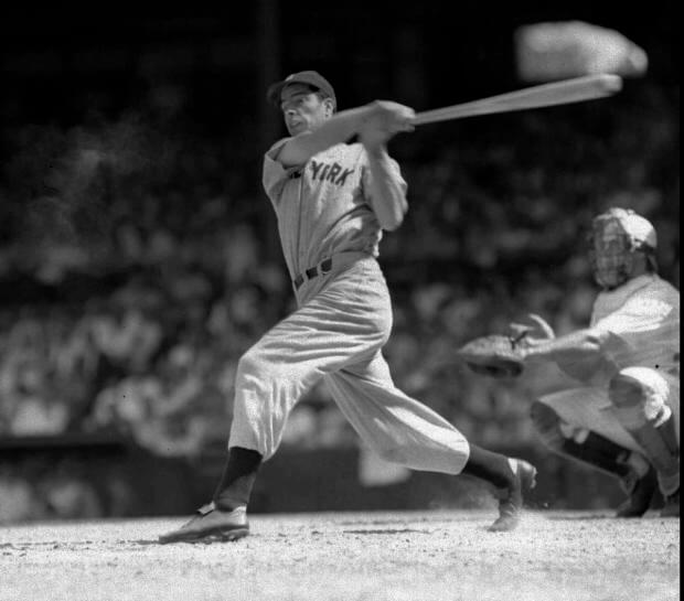
The DiMaggio reference is interesting as well, because I’ve always thought that for all of DiMaggio’s supposed stylishness and suavitude, his pants and stirrup stylings left him looking rather dumpy and uninspired on the field:
While looking for more photos, I found this shot of Hubbell showing a lower-leg style that does indeed look very much like DiMaggio’s (although, as the Sporting News piece suggests, maybe it was the other way around):
But was that Sporting News item just a random reference by one writer? I did a bit of digging and, to my surprise, found countless references to Hubbell’s pants in various 1930s and ’40s newspaper articles. One of the most amusing examples is this UPI article about Game One of the 1936 World Series that ran in many newspapers on Oct. 1, 1936, which makes it abundantly clear that Hubbell’s pants were a hot topic at the time (click to enlarge):
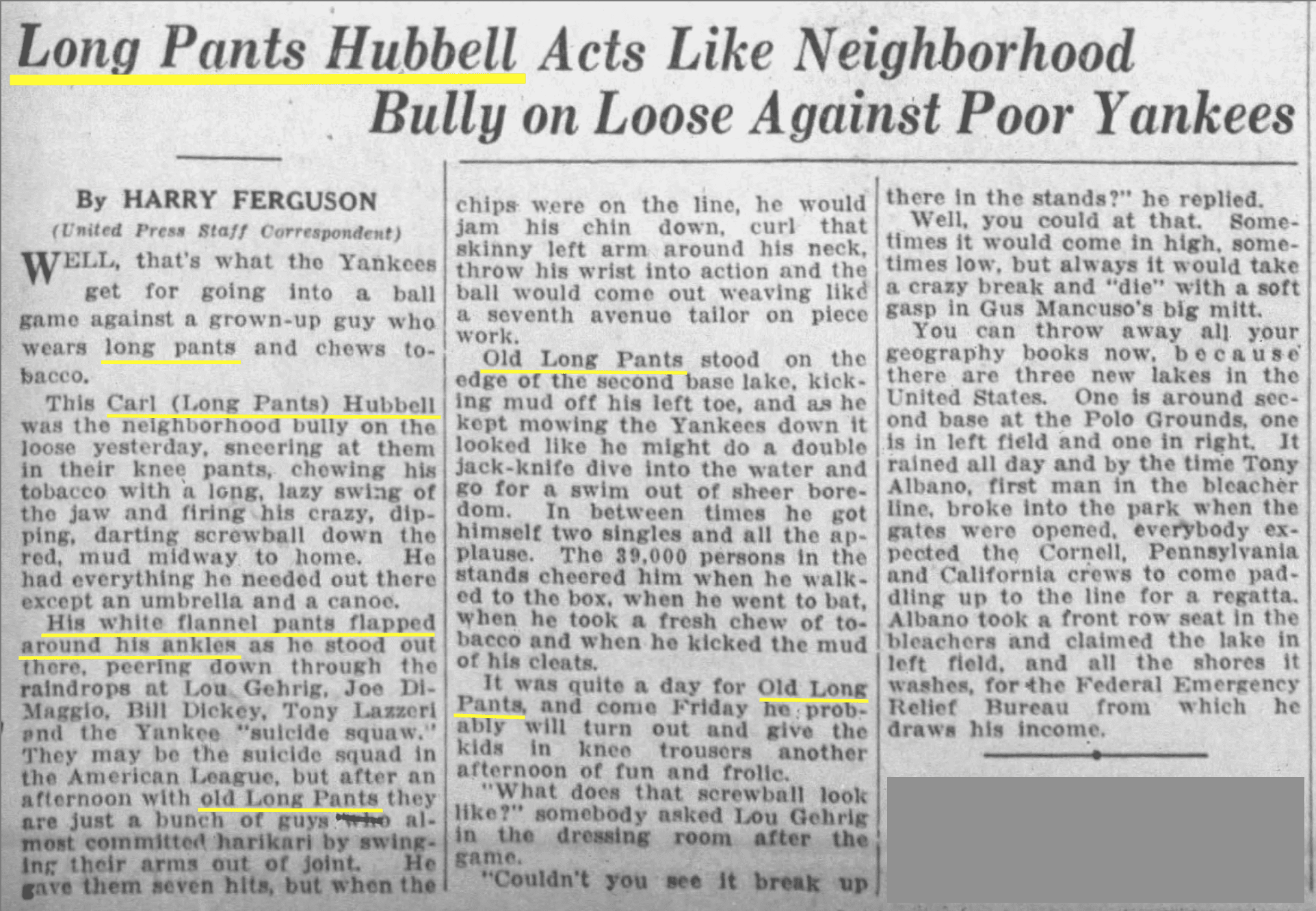
That writer was really laying it on thick, eh?
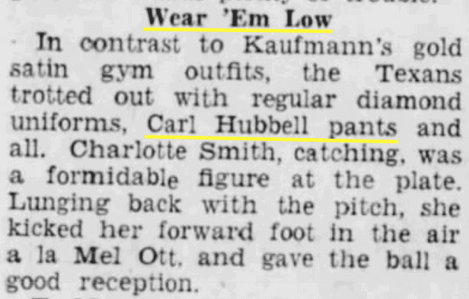
Hubbell was apparently so closely associated with long pants at the time that his name even came up in non-baseball contexts. An article about a women’s softball championship game that took place in Reading, Pa., in 1939, for example, described one team as wearing “Carl Hubbell pants”:
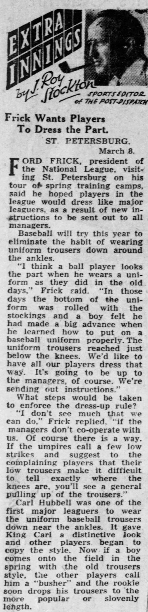
Hubbell retired after the 1943 season. But the influence of his notorious pants-droopery was apparently still being felt seven years later, at least judging by a St. Louis Post-Dispatch item from March 8, 1950, that uniform designer/historian Todd Radom turned up. It’s short and hilarious, so I definitely recommend reading the whole thing (click to enlarge):
This is fascinating on so many levels. For example:
• This item provides yet another example of a writer saying that Hubbell wore his pant legs “down near the ankles,” which still seems like an exaggeration.
• Although this item was published 70 years ago, Ford Frick (who would ascend from National League prexy to baseball commish the following year) sounded almost exactly like many of us still sound today, no? Frick wanted players to “look the part” by wearing the uni “as they did in the old days,” because that’s “how to put on a uniform properly.” Hmmm, sounds familiar!
• Similarly, the shoulder-shrugging inability to police pant lengths because players are gonna do what players wanna do also sounds like something that could be said today.
• The idea of going high-cuffed in order to maintain a higher strike zone is something that a few players and broadcasters still mention periodically today.
• The notion of big leaguers applying peer pressure in order to get young players to wear their pants lower is yet another thing that still goes on today. In 2010 I wrote an ESPN column that included the following:
If you want to see players wearing their cuffs up high, they’re not hard to find. First, watch some high school or college games, because many of the coaches are old-schoolers who require their players to go high-cufffed. Then check out some minor league action, because many MLB teams require high cuffs throughout their minor league systems.
All of which makes today’s young players associate the high-cuffed style with crotchety old fuddy-duddies who told them how to dress a certain way. Once they make it to the majors, they want to leave that style behind, just like they stop wearing double-earflapped batting helmets. And if a player doesn’t feel that way himself, he’ll often face peer pressure from teammates. Check out this quote from David Wright’s blog in 2006 (yes, Wright had a blog): “The veterans on the team give me a hard time about it when I wear the pants up. … I guess the general feeling is that the pants-up look is a high school or college type of style. Not that there’s anything wrong with that, but there’s a high value on looking and acting like a professional in this clubhouse.”
The more things change…
There are two things about all of this that I find particularly interesting, and sort of puzzling:
1. I’ve been writing about uniforms for over 20 years and had never heard about any of this. Todd Radom tells me he didn’t know about it either. Hubbell died in 1988 — were his pants mentioned in any of his obituaries? I looked up half a dozen obits from assorted major newspapers; none of them mentioned his pants. Neither does his Wikipedia entry (or, for that matter, his Hall of Fame plaque, but I guess we can forgive them for that omission, given the limited space). So for whatever reason, the notoriety of Hubbell’s pants faded and didn’t become part of baseball lore. It’s so odd to see which things become part of the game’s storytelling tradition and which things don’t.
2. If increasing pant lengths were already a topic of debate in the 1930s and ’40s, it’s surprising that they’re still a hotly contested topic today. Like, you’d think the long-pants partisans of Hubbell’s generation would have prevailed once Ford Frick and his ilk died off, right? That’s how these things usually work — younger people embrace a new style, older people gripe about it, and then the older people are eventually gone, creating a vacuum that lets the newer style take over. But the debate over MLB pant length seems to have gone in recurring cycles, never completely resolving one way or the other. Interesting!
In any case, those of us who detest low-cuffery can now lay at least some of the blame at the doorstep of Carl Hubbell. Who’da thunk? Here’s hoping that debate rages for at least another 70 years.
(Mega-thanks to my longtime pals/allies Tom Shieber and Todd Radom, without whom this entry would not have been possible.)
#BoltUp #RaiderNation
A number of great players in this clip and look at those uniforms! pic.twitter.com/TjcADWqC2d— Old Time Football 🏈 (@Ol_TimeFootball) November 4, 2020
Too good for the Ticker: The video above is only 10 seconds long, but those are 10 really good seconds. Those Chargers uniforms! Those Raiders uniforms (always loved the silver numbers on the white jerseys)! That field! That stadium! That scoreboard!
Very, very tasty.
Pin Club reminder: In case you missed it on Monday, the Uni Watch Pin Club’s design for November is now available. It’s a limited/numbered edition of 200, and as of this morning there are only 45 left. You know what to do!
Need to get caught up? Here are the January, February, March, May, June, July, August, September, and October pins (sorry, April sold out!), along with our 2020 Press Pin and our basic winged stirrup pin.
The Ticker
By Paul

’Skins Watch: After a Michigan high school agreed to change its team name from “Redskins” to “Red Wolves,” a nonprofit called the Native American Heritage Fund gave the school district more than $215,000 to help pay for the change in signage, uniforms, and so on (from John Chapman). … The Weyauwega-Fremont School District in Wisconsin will no longer call its teams the Indians (from Brian Kerhin). … Residents in Eaton, Colo., are voting on a new mascot and logo to replace the local high school’s cartoon Native American. … Wisconsin Indianhead Technical College is dropping the “Indianhead” from its name (from Timmy Donahue). … The CFL’s Edmonton Football Team — formerly the Eskimos — hopes to have a new identity early next year (from Wade Heidt).

Working Class Wannabes™: An article about the Minnesota Vikings says the contrast between WRs Justin Jefferson and Adam Thielen “is salt vs. pepper, age vs. experience, and blue-collar vs. sizzle.” … Miami Hurricanes defensive coordinator Blake Baker says, “We’re really encouraged by our freshman class. They’re blue collar. They come to work every day, don’t say much, quiet group, but they’re the real deal.” … South Alabama baseball coach Mark Calvi, talking about his new hitting coach, says, “”He is blue collar and has done an outstanding job recruiting.” … An article about a high school football player who’s committed to Georgia says, “He hopes to add a blue-collar work ethic and personality to the locker room.” … A high school football coach in Texas, talking about one of his players, says, “He’s as hard-nosed, blue collar as you could ever want.” … An article about the Eastern Michigan football team says, “This EMU program has been built on blue-collar attitude with hard work since the arrival of Chris Creighton seven years ago, with Rynearson Stadium re-labeled ‘The Factory,’ and the turf changed over to grey to match the floors of the automobile plants which dot southeastern Michigan.” … An article about “player of the week” candidates from last week’s high school football games in Pennsylvania says one school’s quarterback “turned in a blue-collar effort” in his game. … A high school girls’ basketball coach in Missouri, talking about one of his players, says, “She is a blue collar kid who isn’t afraid to roll up her sleeves and go to work.” Bingo!

Baseball News: A 1984 Padres prototype jersey is up for sale on eBay for a cool $1,900. But hey, free shipping! (From Jonathan Collura.)

Pro Football News: Interesting article on how NFL postgame jersey-swapping has been affected by the pandemic. … I’m sure Bears WR Ted Ginn Jr. will be glad to know that the official notice of his job being terminated was advertised by a car company (from several readers). … Disappointing news out of Buffalo, where it looks like the Bills will be going mono-blue this weekend. Their basic blue-over-white look is so good — such a waste to go mono (from Collin Wright). … Officials in the Spring League are wearing very unusual uniforms.
College Football News: Cincinnati is going black-black-white this weekend (from Chad Lehman). … Iowa State is going BFBS (from Sean Jankowski). … Whoa, look at this old Dayton helmet — love it! … Oops: Ohio QB Armani Rogers’s NOB was misspelled as “Rodgers” last night (thanks, Alex). … In last night’s Toledo/Bowling Green game, Toledo was flagged for having two No. 10s on the field at the same time (from Tyler Riordan).

NBA News: Here’s a rundown of all of the uniforms that have been officially unveiled so far for the 2020-21 season. … Looks like the new NBA season, which at one point looked like it would be pushed back at least until mid-January, will likely start on Dec. 22.

Soccer News: Second-tier English club Brentford wore their third kit at home the other night (from Stuart Davis). … A soccer jersey rendered as string art? Sign me up! (From Trevor Williams.) … The election director of Fulton County, Ga., made a public appearance yesterday wearing, of all things, a Portland Timbers lanyard (from @bryant_rf).

Grab Bag: As part of the whole Movember thing, the Pringles spokescharacter in the UK and KFC’s Col. Sanders in France are going clean-shaven. More info on the KFC switcheroo here (from Timmy Donahue). … The logo for next year’s Indy 500 has been revealed (from Roger Cooper). … Here’s a good look at “I Voted” stickers from all 50 states (from Alan Kreit). … Interesting piece about how much college athletes might earn from being allowed to profit off their names, images, and likenesses. … An amateur designer has come up with a good fix for the new Gmail logo. … New uniform for the Latvian Volleyball Federation (from Jeremy Brahm). … Under Armour is severing ties with more than 2,000 wholesalers and focusing on direct-to-consumer sales (from John Cerone). … Dixie Beer, a longtime New Orleans brand, has a new name (from our own Scott M.X. Turner).

I really thought the subject of low-cuffery in the 1930s had been broached here before. If not, how in the heck did I know about it?
I thought it was Ted Williams who originated it, though!
Sure, we’ve discussed certain players, but we never discussed Carl Hubbell being notorious for it!
It’s a great day when you can work “suavitude” into an article.
Typo:
“Lavian Volleyball” should be “Latvian Volleyball”
Thank you! Fixed.
I typically wore my pants high, at least to start the season in little league, middle/high school, college, and townball, however when I got into a slump superstition took over. First the left pant leg would drop down to the ankles if I broke the slump it would stay there for the year, otherwise that one would go back up and the right would drop down; you knew I was having a tough run if both pant legs were ankle high. It was always a fun one to explain to people who would ask why my pants looked odd and not so fun to explain to old-school coaches who would yell at you for having your uniform not looking how they wanted it.
I went to semi-pro baseball games in Emerson NJ and most of the time Carl Hubbell was in the stands
Always loved the Raider’s white jerseys with silver numbers outlined in black which originated in 1964 (according to Gridiron Uniform Database). Didn’t last, probably because there were still plenty of black and white TVs back then. The style has been resurrected from time to time. Wish the Raiders would go to that full time.
Liked it when the Los Angeles Kings used to do that too.
link
Would love to see the Kings go back to doing the same if they need to stay in silver and black.
Of course, I have been vocal about what the Kings should consider wearing again as their primary uniform. It ain’t silver and black.
link
Solid gold at home; solid purple on the road. Make it happen!
Definitely not solid gold! I hated that look. Gotta have the purple pants to avoid the pajama effect.
What I would want is that purple uni as home uni.
A new white uni based on that template for the road. Maybe has purple shoulder yokes. The jersey and sock stripes yellow trimmed in gold.
The yellow uni would be the 3rd (purple pants of course).
** meant jersey and sock stripes yellow trimmed in purple.
Make it so!
I must’ve been sleeping in class,….. I didn’t know Edmonton officially had dropped the Eskimo name. Though the CFL site shows them as Edmonton Football Team, there is still plenty of Esks merch in the CFL shop.
Hmmm. This tells me that Edmonton is likely to change its name to something starting with an E … Edmonton Eternals? Edmonton Easterners? (Not happening with a team from Western Canada) Edmonton Energy? (Hey! This might work!)
Estimators?
What a great look at the Raiders Chargers in the video, I especially like the size of the jersey numbers.
When the Cardinals have a uniform makeover hopefully they will increase their number sizes, they seem shorter than normal making out the player to have a shorter than average torso…if that makes any sense…but you know what I mean.
San Francisco had ridiculously-sized numbers in the 1950s. But nothing tops the University of Oregon last year.
San Francisco had
ridiculouslyproperly-sized numbers in the 1950s.(Fixed)
That video emphasizes maybe the only thing wrong with the current chargers uniforms. The Helmet number. Not big/bold and not black/navy blue.
I cried reading today’s entry seeing baseball players who look like baseball players and football players who look like football players.
All those tucked in shirts/jerseys!!
I think it’s about time the name ‘Skins watch is retired. Washington Football Team did their part, I think the Cleveland Indians are now on the clock.
There’s more tidbits in that article from Sporting News:
And the bizarre get-up of the Cubs was at the bottom of this vital discussion. Somebody asked Jimmie Foxx how he liked the peculiar dress of his new affiliation, and he replied that he did not particularly fancy it. The interviewer put this remark on one side, and the Foxx batting average on the other, threw in a couple of eggs, and a dash of cayenne, and produced the announcement that Double X had said he could not hit in that frantic monkey suit.
So here’s Jimmie Foxx blaming his lower than normal BA on the Cubs famous scalloped shoulder vests with powder blue road uniforms. There’s more on the apparent revolt of the players against it. The Cubs changed to a decidedly simplified set the very next season.
Even more:
“Back in the old days, the uniform was almost body-fitting. Just how close it fitted can be pictured by examining one of those wooden cigar-store ball players which may linger in a local museum.”
“In short, a great club will win in shorts(!); a poor team won’t win in anything.”
A great lede today, and that wonderful bit of writing about another writer cooking up a story with eggs and cayenne is the cherry on the sundae!
Honestly that Padres prototype jersey isn’t all that bad. Would’ve been cool to see the entire uniform.
I like the version with the red pinstripes, though.
They seem orange to me, against a tan background.
Interesting that the prototype jersey has number 9, but a name tape that says “Garvey.” Graig Nettles wore 9 for the Padres in 1984. However, he wasn’t traded to San Diego until the end of 1984’s spring training. Steve Garvey always wore 6.
Did Sand-Knit sew the numbers on upside down?
Naw. I think I’ll pay the $100K to get the first career grand slam jersey worn by Tatis Jr.
link
Those unis are great. Wish I had a spare $1900 laying around. That sleeve logo would make a great hat!
Also, I thought these prototypes were in the mix for the ‘85 season uni change. Maybe ‘84 was after the season.
Fascinating piece today. I have always referred to Hubbell as “Ol Square Pants,” which is something I must have heard when I was a kid. I assumed that was his most common nickname over “The Meal Ticket” or “King Carl.” Just came across this piece from Jim Murray of the La Times from 1988…. “They used to call him Old Square Pants because his knickers came well below the calf and flared out so they all but dwarfed his skinny ankles. If you’d put a raggedy straw hat on him, he could have scared crows. He was rawboned, weather-beaten, laconic. He always looked as if he had just came in from a cattle run through a sandstorm.”
USA Today’s Justin Toscano is on record with Ten Ideas for improving the Mets, per Steve Cohen’s suggestions: Number Three is “Black Jerseys.” Other ideas which might go down easier: 5. Bring Back Old Timers’ Day; 7. Retire David Wright’s Mumber; and 8. Bring Back Banner Day.
“Now if a boy comes onto the field in the spring with the old trousers style, the other players call him a ‘busher’ and the rookie soon drops his trousers…”
That’s some serious, old-school hazing right there. ;)
Fascinating read on the Hubble pants…..and that video of Chargers Raiders I can watch all day..the best uni set ever for both teams…..Thanks Paul
Plain and simple. It has to be Edmonton Elks and you cannot convince me otherwise.
The name has history. Edmonton Football Team once used that name for a brief period and played in Grey Cup with it way back. Fits with geography of Northern Alberta and is a unique name in pro sports. Real Canadian feel. They could keep the same primary logo, but I am envisioning an awesome helmet design for a third uniform featuring antlers.
That 1936 World Series article is absurd. Who writes like that?!
It’s not too late to eject Hubbell from Cooperstown.
Great story today. “Orthodox pants-wearers” is a phrase that will stick with me.
Just got started on this great research but stopped in my tracks by a typo – “regarding Carl Hubbell and pant legth” – Can’t wait to read on!
Thank you — fixed!
The thing that burning me up is where is that Raiders-Chargers game played. The grey numbers (According to Gridiron Uniform Database) were only worn from1963-1964. The chargers being in blue makes it a home game for them, which puts them in Balboa Stadium. The problem is, there is clearly a baseball infield in the shot, and I can’t find any evidence of baseball being played at Balboa. Same could be said if the Raiders were wearing white at home. That puts the game at Frank Youell Field, which I can’t find evidence of baseball being played there. Anyone have any better info?
I don’t know if this is accurate, but here’s one of the comments/responses to that video tweet:
link
Did some detective work. This is Raiders/Chargers, September 27, 1970 at San Diego Stadium. Game ended in a 27-27 Tie. The stadium was not a complete bowl in 1970. Also in September, the baseball cutout would have still been there for the Padres.
Per Gridiron Uniform DB, the uniforms match. For some reason the Raiders were in Silver numbered Road jerseys
link^2
And from Getty, there’s 2 images of Lamonica as QB, with the pictures specifically dated as 9/27/70.
link
Sorry for the screwed up GUD link. If you copy/paste the whole link (to include the ^2), it will take you to the GUD entry for that week.
1970 was apparently a one-off year for the Raiders wearing the silver numeral with the black outline. They also used “…nameplates…sewn in a serif font that the team only briefly used.”
Here’s an article from the Raiders website. They wore the 1970 uniform as a throwback in last year’s Thursday Night game.
link
THIS is why I read Uni Watch on a daily basis! Brilliant piece today, Paul!
Thanks, Kary — glad you liked!
Carl Hubbell was the last person I thought I’d be reading about today. Kudos.
Late to the site today, but great stuff Paul. Love the “rabbit hole” ledes.
Thanks, Pedro!
During my early days of watching baseball, it was always George Hendrick who wore his pants to around his ankles, and no one else was wearing them that low.
That 10-second video … Uni-Watch at it’s finest. Great content today!
I know I’m a day late to this, but are we just gonna blow by Van Lingle Mungo without noting it’s the greatest name in MLB history? Are we?
Touché.