For all photos, click to enlarge
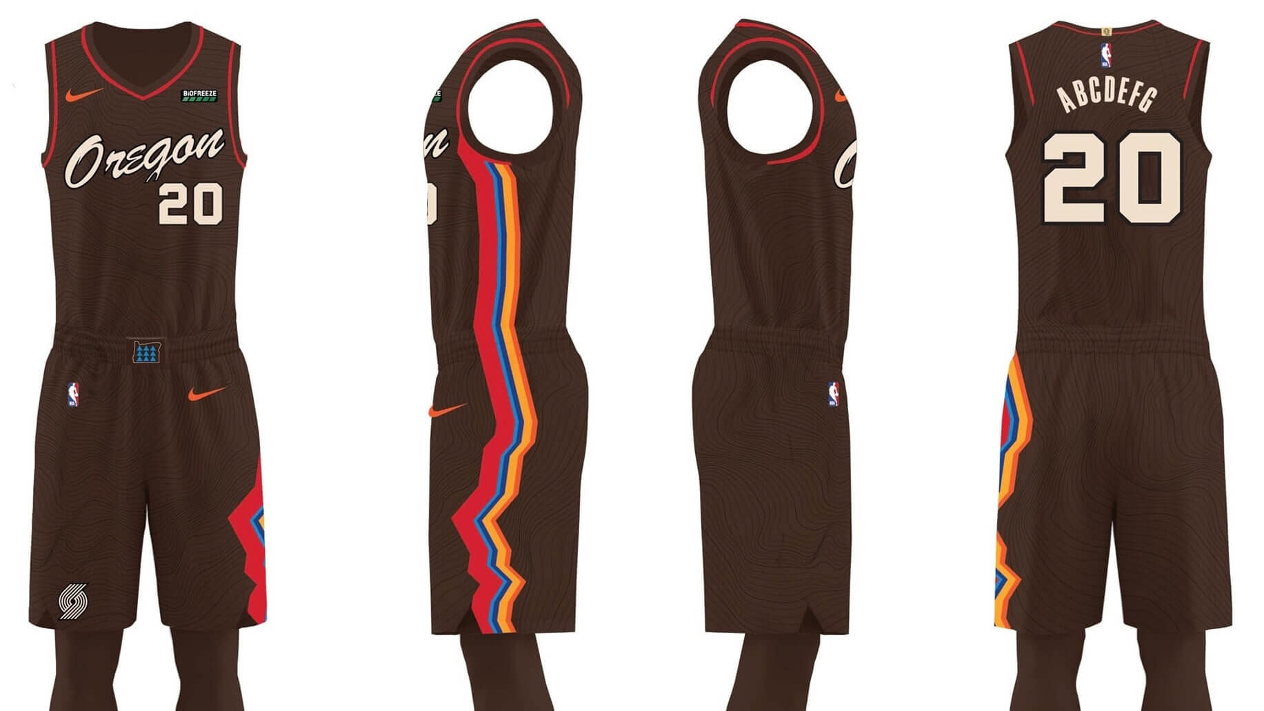
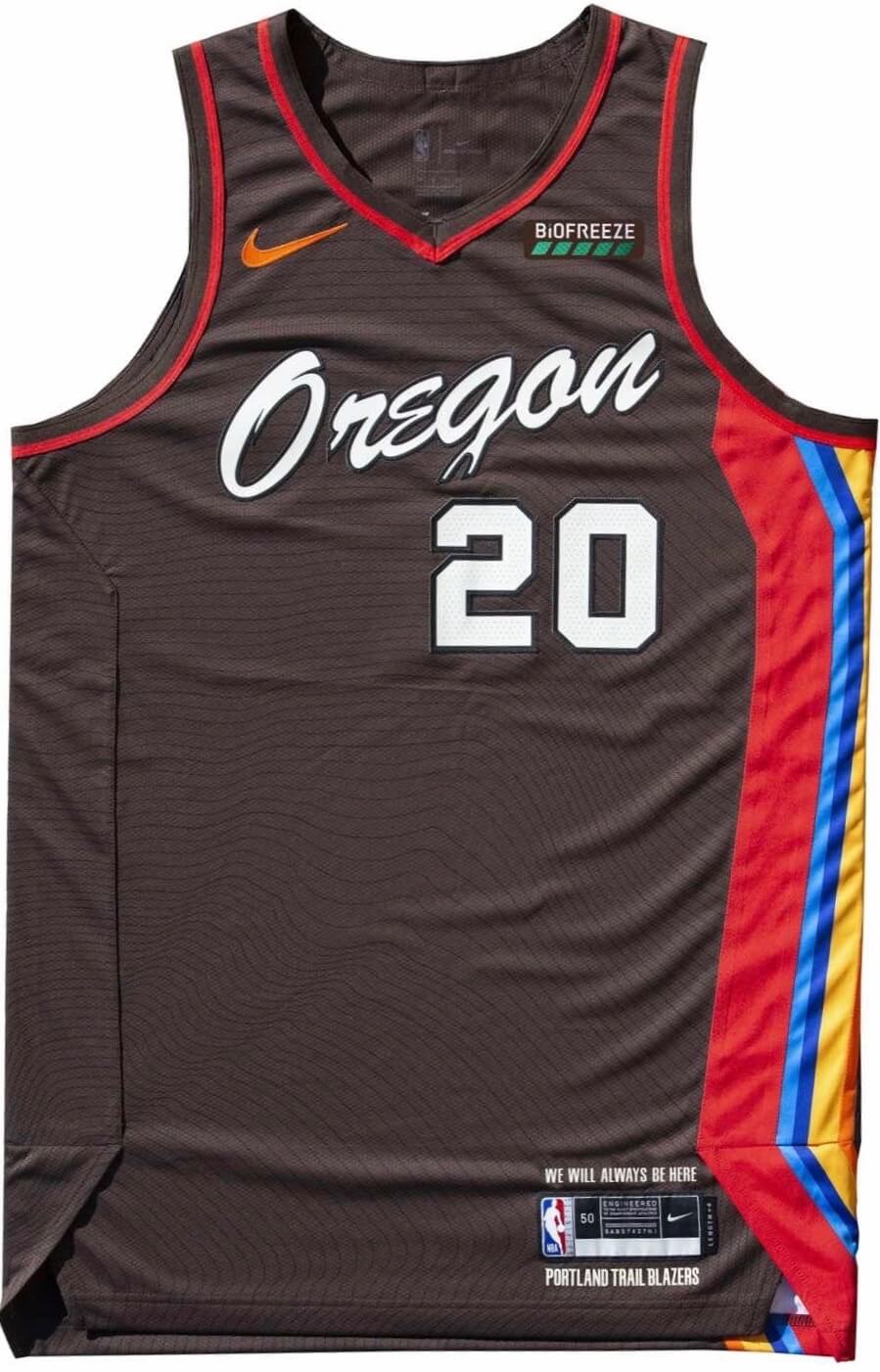
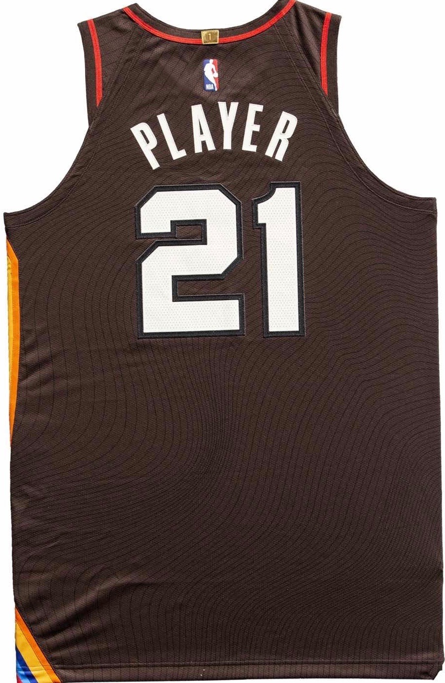
Well, that didn’t take long. One day after the Trail Blazers’ new City alternate apparently leaked, the team went ahead and officially revealed the new design. You can see various views of the full uniform (not just the jersey — thank you, Blazers!) above.
Some details and thoughts:
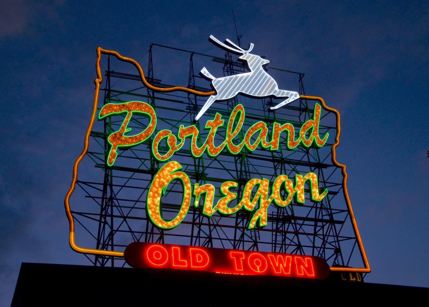
• The “Oregon” chest script, as I mentioned yesterday, is based on the White Stag neon sign in downtown Portland:
• The brown base tone supposedly represents the Oregon earth, or soil, or whatever. Symbolism notwithstanding, I can’t think of a previous brown uniform in NBA history. Has there ever been one before?
• Speaking of: The brown fabric is ringed with black lines. I figured these were sublimated, but they appear to be individually stitched:
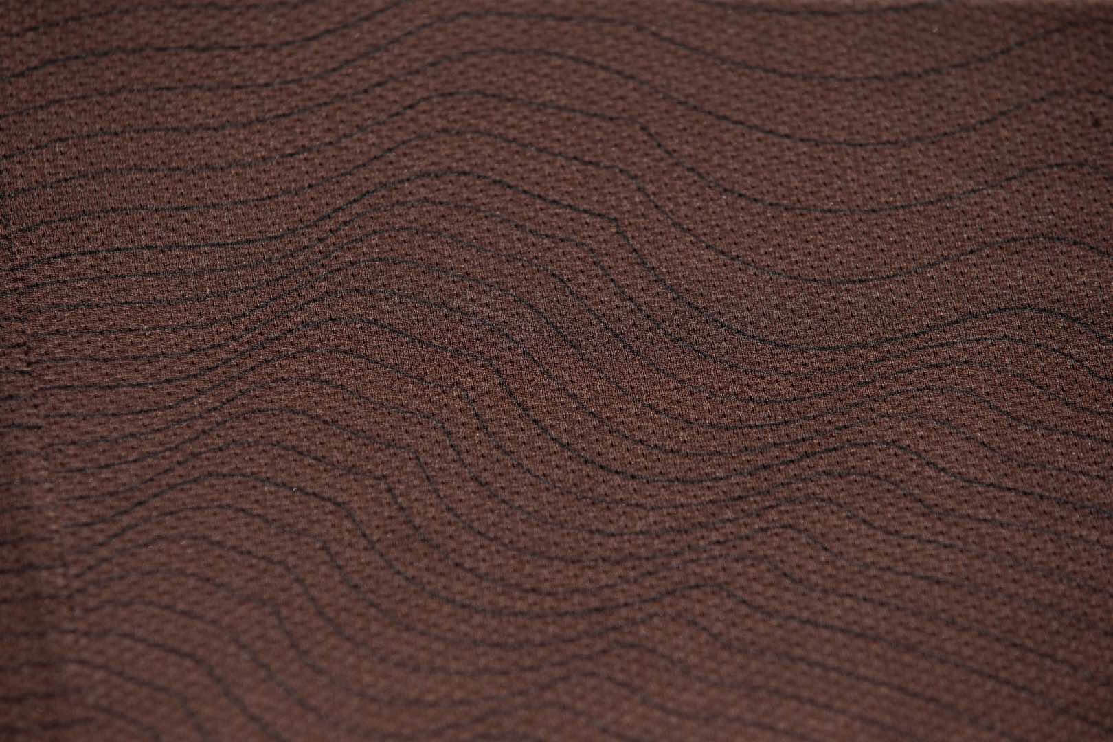
At first I thought this pattern was simulating tree rings (a total Brooklyn Branches rip-off!), but it’s actually meant to mimic the lines on a topographic map of Oregon. Either way, I’m very curious to know if all the extra stitching — if the lines are in fact stitched, as they seem to be — affects the feel of the fabric.
• The jagged, multicolored lines running up the left side of the uniform may look like a flatlining EKG readout (bring in the defibrillator panels, stat!), but they actually reflect the rugged Oregon landscape, with each color representing a different natural attraction within the state — one of which is a tulip farm! While I may not yet be certain about this being the first brown NBA uniform, I am certain it is the first NBA uni whose design references a tulip farm. Edgy move for a team that plays in the City of Roses. Let it never be said that today’s NBA shies away from inter-floral conflict!
• Interestingly, the multicolored lines also look a lot like the Montana license plate:
Plagiarists pic.twitter.com/cqiQeOiSNJ
— scott boehler (@slboehler) October 29, 2020
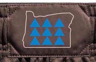
• An unspecified portion of the profits from jersey sales will be donated to a local Native American nonprofit. In addition, the waistband logo has the Oregon state outline and nine triangles, which according to the press release honors “the tribal nations throughout what is now considered Oregon who have called this land their home from the beginning”:
You can see more info and photos — including a photo of the tulip farm! — here, and there are still more photos here.
———
I think reasonable people can differ on whether this is a “good uniform” or a “bad uniform,” at least when viewed in a vacuum. But I don’t think there’s any question that it’s a very bad Trail Blazers uniform. For starters, the nature/landscape theme seems like a weak attempt to piggyback on Utah’s “red rock” alternate. More importantly, the design doesn’t reference the team’s usual colors, the team name, the city name, the “Rip City” nickname, the club’s longstanding use of diagonal lines, or any other Blazers-related visual cues (well, except for the little pinwheel logo at the base of the right shorts leg, which feels almost like an afterthought). As Todd Radom said shortly after the unveiling yesterday, “I have no idea what team this is, not even a breadcrumb of a clue.”
I’m sure there are people out there (including some Nike employees — hello!) who are saying, “Right, that’s the point of the City alternates, to come up with something different, something that doesn’t necessarily mesh with the team’s usual branding!” If you say so. But when there are so many alternates floating around out there that fans are saying, “I don’t even know which team this is when I turn on the TV,” maybe that’s a hint that you’re flooding the zone with too much product, and that all your carefully constructed “storytelling” about “lead design elements” is becoming a blur.
Also, while I don’t like to predict the future, I do like to play thought experiments. So let’s play this one: Several years from now, is this uniform likely to end up on a list of the Blazers’ best uniforms ever, or the worst? The City program’s best or worst? The NBA’s all-time best or worst? There’s no right or wrong answer. Just something to think about.
Meanwhile, remember that purported Suns leak from yesterday? Here’s another look, to refresh your memory:
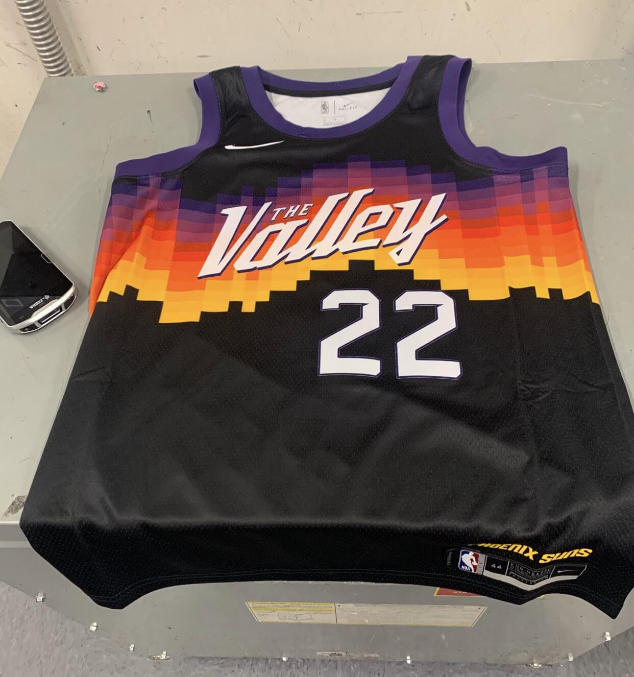
The team appeared to coyly but unmistakably confirm the leak’s legitimacy yesterday afternoon — or at least they tried to. Here’s the tweet they posted:
😉#WeAreTheValley pic.twitter.com/nCVouqu6UQ
— Phoenix Suns (@Suns) October 29, 2020
Depending on which platform you’re currently using, you may not be able to see the shirt that Kelly Oubre’s wearing in that photo. If so, click on the photo to see the whole thing.
And in still more NBA leak-related news, it appears that the Heat, having run out of conventional color combos for their Miami Vice-themed alternates, are now resorting to gradations, at least based on this shirsey:
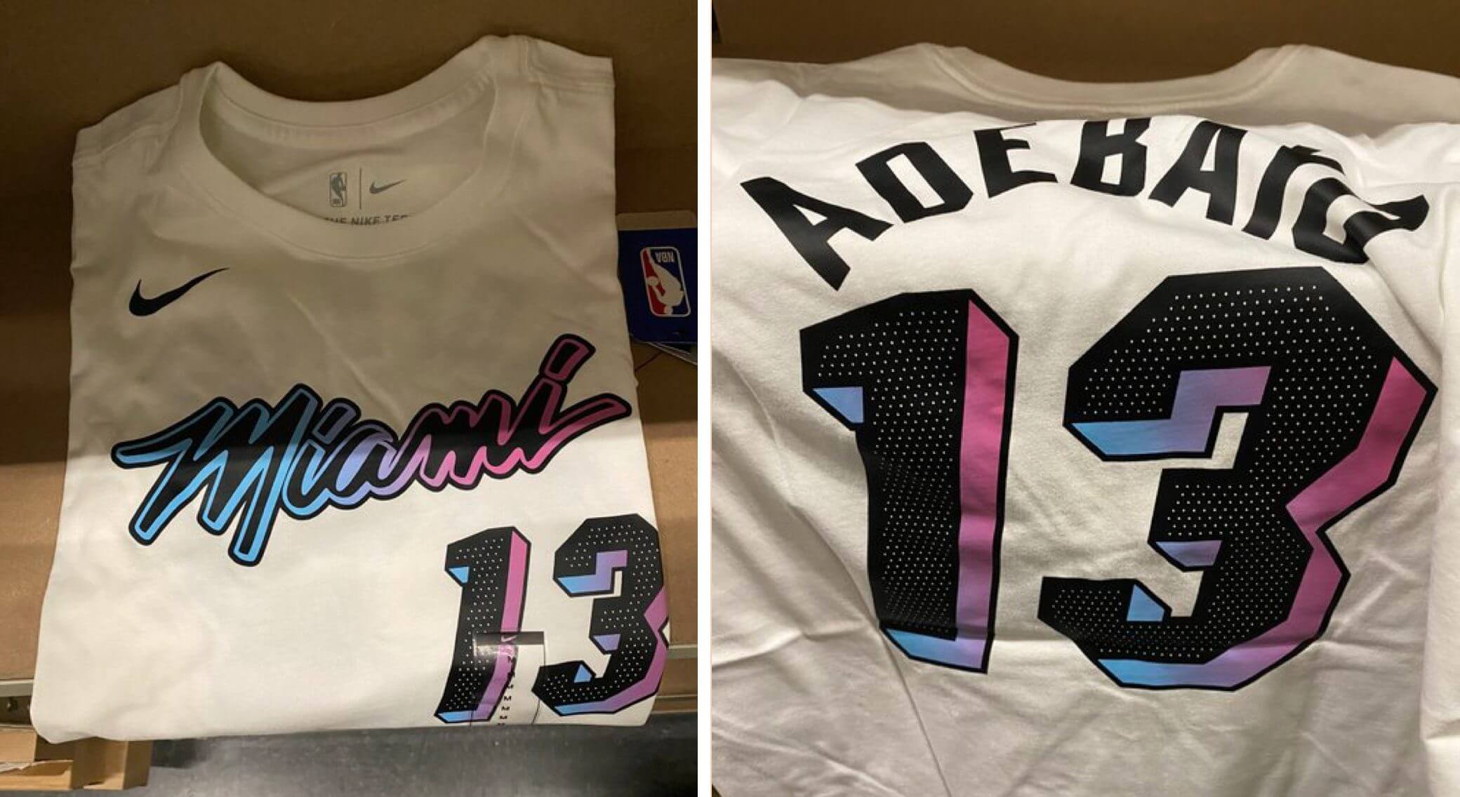
Retail shirsey leaks have proven to be extremely reliable indicators of forthcoming NBA uniform designs, so I think we can consider this one to be pretty solid.
(Thanks to Etienne Catalan and Josh Pearlman for their contributions to this section.)
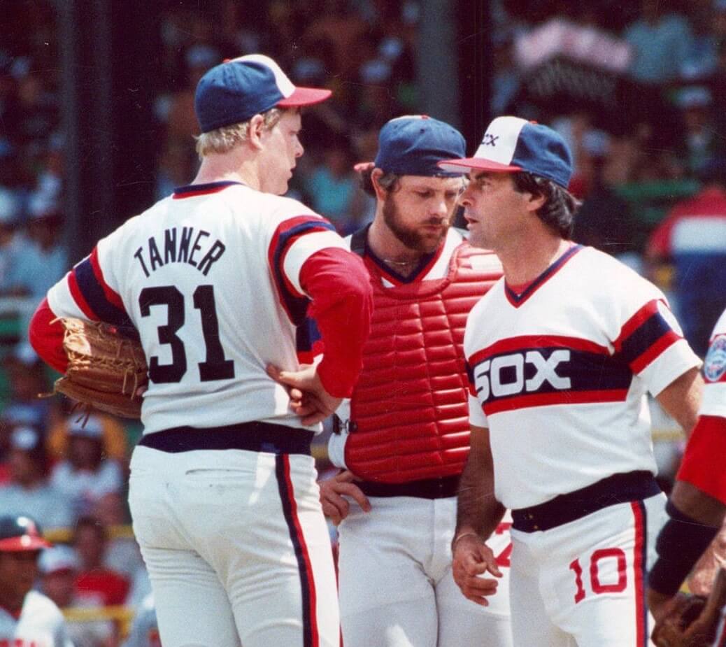
Beach blanket bingo: As you may have heard by now, the White Sox (re)hired Tony La Russa yesterday to be their manager. Much of the coverage of this news noted La Russa’s age, 76.
It’s true that La Russa will be one of the oldest managers ever to suit up in uniform (although he’ll have to hang in there for a while before he matches Jack McKeon, who was 80 when he skippered the Marlins in 2011). But I’m more interested in another uni-related aspect to this story.
To wit: Back in the 1980s, La Russa wore the White Sox’s beach blanket uniform (as seen in the photo above, which is from 1985). The Sox have worn that uniform as a Sunday throwback for the past eight seasons. If they carry it over to next year, La Russa will have the unusual status of wearing a uniform in its first go-round and then again as a throwback!
There have occasionally been players with this distinction (Craig Biggio in MLB, Kobe Bryant in the NBA, maybe a few others I’m not remembering). But has there ever been another manager who’s hung around long enough to wear the same design in its initial incarnation and also as a throwback?
I posted that query last night on Twitter, where Twitter-er @jay_es_one came up with Bobby Cox, who managed the Braves in 1981 and then wore that same road uni again as a throwback in 2010. Can anyone think of any other examples?
But wait — there’s more! According to Baseball Reference, La Russa, back in his playing days, appeared in five games with the A’s in 1968 — all home games. And according to Bill Henderson’s jersey guide, the A’s wore 1968 home throwbacks for one game in 1992, when La Russa was their manager. I couldn’t find any pics of La Russa either from 1968 or from that one ’68 throwback game, but he presumably wore that same uni both in its original incarnation as a player and as a throwback while he was managing. Another unusual distinction!
I know of at least two other managers who’ve done that:
• Larry Dierker pitched for the Astros in 1977, when they wore this tequila sunrise design. And he was managing the ’Stros 1999, when they wore 1980-81 throwbacks, which are essentially the same as the ’77 design. (The only difference is the collar trim and the lack of the number on the pant leg.)
Update/correction: Reader/commenter Rich Loup points out that I was mistaken about Dierker pitching for the Astros in 1977. He was with the Cardinals that year. He did pitch for Houston in 1975 and ’76, when they wore this version and this version of the tequila sunrise, but those are both clearly different from the 1981 version that the team wore as a throwback while he was managing. So: He almost qualifies for this list, but not quite!
• And just to bring things full-circle, Ozzie Guillen wore the original White Sox beach blanket uni in 1985 (his rookie year as a player) and then wore it again as a throwback while managing the Sox in 2011.
Again: Any other examples that you know of?
The Ticker
By Anthony Emerson

Baseball News: L.A.’s City Hall was lit up in blue lights after the Dodgers’ World Series championship (from Kary Klismet). … Once upon a time, new/old White Sox manager Tony La Russa appeared on an episode of To Tell the Truth. He wasn’t wearing a uniform, but his two impersonators were.
College/High School Football News: Reader Fran Doyle noticed that this year, Penn State has changed the design on their front nose bumper, going from a Penn State wordmark to the Nittany Lion logo. … Virginia Tech is going maroon-white-maroon this weekend at Louisville and LB Keshon Artis will wear Beamer’s No. 25 in that game (from Andrew Cosentino). … Duke is going mono-BFBS tomorrow (from Gabe Cornwall). … Carolina is going mono-white against Virginia tomorrow (from James Gilbert). … Rice is also going mono-white tomorrow (from Ignacio Salazar). … Also from Ignacio, Houston is going red-black-black tomorrow (also from Corey Buck). … Virginia is going mono-blue (thanks, Jamie). … Troy is going silver-white-white tomorrow.

Hockey News: Here’s our best look yet at the Kings version of the ‘I Voted‘ sticker given away at the Staples Center polling place (from Damon Hirschensohn).

NBA News: Here’s a great article about the urban legend around the Lakers having a giraffe logo (from Kary Klismet). … Speaking of the Lakers (and cross-listed from the hockey section): Here’s our best look yet at the Lakers version of the ‘I Voted‘ sticker given away at the Staples Center polling place (from Damon Hirschensohn).

College/High School Hoops News: New unis for Indiana State. But we all know there’s only one true Indiana State uni design (from Clay Bess).

Soccer News: During October, three different Arsenal teams — the men’s senior team, the women’s senior team, and men’s U23 — played Manchester City, and each wore a different uniform combination against the Citizens (from John Flory). … An AI-controlled camera ruined an Scottish Championship match between Inverness Caledonian Thistle and Ayr United by continually mistaking a linesman’s bald head for the ball (from Shawn Hairston).

Grab Bag: Jefferson Community College in New York has unveiled a new athletics logo (from Kary Klismet and Timmy Donahue). … Some field hockey notes from our own Jamie Rathjen: New unis for the Netherlands, the British women’s team has lost their ad, and Virginia always practices in costumes before Halloween. Here are this year’s entries. … New seal for the University of New Mexico (from Timmy Donahue). … The logo for the 2021 Indy 500 was unveiled yesterday (from Rob Altman).


Our latest raffle winner is Dylan Hill, who’s won himself a Uni Watch membership card. Congrats to him, and thanks again to Matt Cann for sponsoring this one.
That’s it for this week. If you have any Halloween-related activities tomorrow, enjoy them safely. Phil will have his usual content buffet over the next two days, and then I’ll see you back here on Monday. Stay well! — Paul
Is this the start of a BrFBrS trend?
I am so sick of the city alternates. As Paul said, they don’t represent the teams’ colors/name and it’s visually confusing when I turn on an NBA game. Throw in the uni ads and the weird cut off loop around the arm holes of the jerseys and you have a visual disaster. Their uniform program over the past few years has reduced my desire to watch a game. I don’t know who the home/road team is and I don’t know who’s playing.
I miss the days of white home, color road, and the occasional third alternate/throwback.
I am with you on this as are many others.
I clearly stated my thoughts about the new Portland uniforms in yesterday’s comments so I will not lodge any further complaints about it today.
Can’t say I am really pleased about the new Phoenix uniform either. It has gotten to the point with the NBA that when a team releases one of these uniforms, I do not pay much attention. It has lost its importance in their league with the abundance of gimmicky uniforms that do not represent the team’s identity. These uniforms are here today and gone tomorrow.
Direct quote from yesterday’s post. “ This one I recognized right away. The chest script is based on the magnificent White Stag neon sign in downtown Portland.”
Not a regular season NBA uniform, but one of the 2020 All-Star weekend uniforms paid homage to Chicago’s Brown Line El train.
Ah, yes — good one!
Re: The AI cameras.
This is a particular problem here in the U.S. as the National Federation and the cameramaker (Pixellot) have been offering free cameras to schools so that they can broadcast games on the NFHS Network. The problem is that the cameras don’t focus in on the action very well and they bounce from one area of the field to the other willy-nilly.
Maybe I missed it, but why exactly are the 82-86 Sox uniforms called “beach blankets”?
Because the jersey, with the big SOX banner across the chest, looks like a beach blanket.
I’m sure it was mentioned on Twitter, but if not, Kobe wore his original uniform as a throwback (the short shorts experiment) with a different number.
Ah, good one!
Connie Mack has Jack McKeon by 7 years; he managed until he was 87.
Yes, but not in uniform, which is what we’re talking about here.
link
Just kidding, I overlooked that factor.
I love the White Stag sign in Portland. In fact, the entire city is chock full of great neon signs, which makes sense given the amount of rain and clouds they get throughout the year…
For sure. When I visited there in 2008, I was really struck by how *everything* had a neon sign — not just places you’d expect, like bars and theaters, but hardware stores, Salvation Armies, everything! It was great. As neon fan who lives in the increasingly neon-bereft city of New York, I was envious.
Vancouver was once considered the neon capital of the world. Due to our rainy climate, the reflection of the signs on the streets at night was especially beautiful and made a lot of sense. Most of it is gone now.
Exactly, Paul. The neon gives the whole town a very distinct and somehow old school look and feel. Such a cool town…
Correction on Larry Dierker: He pitched for the Astros in ’75 and ’76 when the first two versions of the rainbows came out. He did not pitch for the Astros in ’77 because he was traded to the Cardinals in November 1976. He pitched for the Cards in ’77 but got hurt and was released in March ’78, which effectively ended his career.
So, unfortunately, he did not wear the ’77 version as a player.
link
Thanks for that catch, Rich. Will adjust text accordingly!
Thanks, Paul. The credit was not necessary, but I do appreciate it.
Close, but no cigar?
Cito Gaston wore the pullovers the Blue Jays wore when he was their hitting coach from ’82-88 (switched to the button-fronts in ’89… the year he was named manager); they revived that look for Friday home games in 2008 when he returned to manage for another 2 seasons.
Exactly — close but not quite.
I feel like the Lakers giraffe logo mystery deserves a more thorough deep dive investigation…preferably by Uni Watch/Paul? Obviously it was never in wide use but it’s clearly not purely an urban legend or an “Internet inside joke” as that blog post concluded. The Fleer cards from the early 60s are definitely real and we still don’t seem to have any answers as to why.
Paul, which uni did Vince Carter wear both in its original form and as a throwback? Racking my brain on this!
You know what? I think he actually played *against* a throwback that he wore in its first incarnation. He wore the Raptors’ Barney uniform and then played against the Raptors when they wore the Barney throwbacks.
My bad — I knew he had an original/throwback distinction, but I got the wrong one! Text now fixed.
RE the Suns’ alternate: it may just be me, but I find it a strange design given the wildfires in the West. I know they are not in AZ, but that jersey looks to me like a burning horizon. Anyone else see this?
I didn’t, but now that you point it out, I’ll never unsee it. I suppose the purple helps make it more sunset that raging fire, but it’s pretty fire-esque.
Good observation Tim
The color schemes of the new Blazers and Suns uniforms have me thinking about the Denver Nuggets instead of the actual teams they belong to. Both look pretty cool though.
The Miami Heat should just straight up change their colors to the Miami Vice colors. That white shirt looks great, and begs a white jersey like that…. and nobody else has those colors. Not that there’s anything wrong with the original Heat style and colors, but the new ones are more unique and look awesome. Black and red are all over the place; turquoise and pink aren’t.
In a vacuum, these uniforms look great: A lot of imagination went into the design. But they have no relevance to the teams wearing them.
I don’t have time to research this today, so maybe someone else can take up the challenge… Anyhow, along the lines of LaRussa wearing a regular uniform as a player, then again as a throwback as being manager, I might have another related example. In 2018 or 2019, the Pirates brought Omar Moreno in as a substitute first base coach for a few games while their regular coach was on leave for some family matters. I don’t know if Moreno coached any Sunday home games, but if he did, he would have worn the same “We Are Family” throwbacks that he wore as a player.
It appears that there are quite a few coaches who fit into this category. It’s still interesting, of course, but it’s not as uncommon as players or managers.
Ned Yost ~ Brewers catcher 1980-1983 / Manager 2003-2008
EXCELLENT, Neeko — hadn’t thought of him at all! And yes, he qualifies, as the Brewers wore early-’80s throwbacks twice during his managerial tenure.
That’s a Uni Watch deep cut right there. Nicely done!
Also~ Craig Counsell would’ve had that distinction this past season as the Brewers were set to have a 2000s & 2010s weekend as part of their 50th anniversary.
Another good one!
The only city alts that do anything for me are Miami’s – I think part of it is that I can “get” the connection between the design and the city even though I’m not from there. I don’t recognize the Dallas skyline, I love the new Phx design but I have no idea what “the Valley” is, I’ve never heard most of the city nicknames in conversation, but even as an outsider the colors and font just scream “Miami” to me.
You’ve hit upon something that I’m pretty sure strikes at the core of what the City program is about: It’s not supposed to appeal, to people who aren’t from the team’s city, or even make sense to them. It’s strictly targeted at local fans so they’ll purchase the jersey.
And if non-local fans don’t recognize the team when they turn on the TV, that’s just collateral damage. This is a merch program that happens to have an on-court component, not the other way around.
I’m a Miami native, and my favorite part of the Heat’s City program has been that it’s a throwback to their past. The script and colors are taken from Miami Arena, their original home. Yes it was bathed in the pink and blue neon reminiscent of Miami Vice, but the show just featured the city as it was. New glass and steel buildings popped up each year covered in colors.
Also years before the new City program, the Heat sold shirseys in those colors. As a fan, both colorsets and logos are part of our identity.
Hey, Paul… Could the striping down the side of the Blazers brown uni be based on the left/West/Pacific side of the State of Oregon?… Kind of looks like that to me at a glance.
Interesting idea! But I don’t think so.
How about now? :)
link
Also… Look closely at the left side view of the uniforms… The makers mark is NOT cut-off the shorts, when all other graphic elements on the uniform are… Ugh! #Entitled
Still doesn’t seem like a very close match to me.
How long has Tony LaRussa been in baseball? Since the Kansas City Athletics were a blue and red team.
link
OK seriously, he also wore the untucked “pyjama” jerseys for three years before the Sox switched to the beach blanket look, so if they throw back to that at any point he’ll have the chance to re-wear TWO separate throwback looks.
He played some pro ball in Canada too. 1968 Triple-A Vancouver Mounties.
link
link
No NBA team has previously worn a brown uniform, but the ABA’s Virginia Squires wore brown road unis during the 1974-75 season.
Did the Twins ever throwback to their pullover era non-pinstriped uniforms between 1986-2001? Tom Kelly wore that uniform briefly as a player in, I think, 1975. I honestly don’t remember whether the late-1990s or very early 2000s Twins wore throwbacks to their pre-1986 uniforms, but I think Tom Kelly is the only potential candidate for the Player > Manager uni/throwback thing.
If the Blazers used a team color more prominently, I think I’d love their City uniform. Like, make it black instead of brown. Or make red much more prominent in the various elements that sit on top of the brown.
Or, maybe better yet, change the team’s primary colors to red and brown instead of red and black. To my eye, this City uniform is beautiful. Just doesn’t look like the Blazers. Whose normal uniforms aren’t all that great. So, leverage the ideas behind this City uniform and make brown a team color!
One astute observer on Twitter pointed out another reason that the Blazers’ new alternate is poor design: the “Oregon” script across the chest doesn’t match the lettering style on the White Stag sign. Rather, it’s just a standard word processing font – Brush Script MT Italic – slightly modified to replace the lowercase “e” with a shrunken version of the uppercase “E”:
link
Compare that to the actual White Stag sign:
link
Lazy!
Reader Michael Ortman is having trouble posting a comment for some reason. This is from him:
Yes! The Padres wore 1984 throwbacks in 2004. So he managed in the same design he had worn as a player. Good one!
If it’s a “City” uniform, why is the Portland “City” uniform using the “State” of Oregon on the chest?
How about Larry Bowa?
He of course played for the maroon pinstripe/powder blue Phillies, and managed them in 2002 (they threw back to the powder blues at the Braves…maybe also to the pins when they played again in Philly?) and 2003 (pins against the Pirates).
Yes — good one!
Pete Rose would fit…
As a player (1972):
link
As a player/manager (1985):
link
As a Manager (1988):
link
But he never wore it as a throwback — they just kept the same design (with extremely minor tweaks) that whole time. It’s like Aaron Boone with the Yankees right now: He’s wearing the same uni he wore as a player because they haven’t changed it, but he hasn’t worn it as a throwback.
I see the distinction now. Throwbacks.
I thought he was includable because he left Cincinnati for Philly/Montreal and then returned as a player/player-manager/manager.
Happy Halloween!
And to you, Tim!
Paul, Cito Gaston wore the Blue Jays ’89 to ’96 design on the first go-around, then wore the home version of said design as a throwback (just once) during the 2009 season’s “Back to Back Weekend”. This is not the powder blue jersey, but the home whites.
link
Yes, confirmed — Gaston joins La Russa and Cox as managers who’ve worn the same uni in its original incarnation and as a throwback. Good one!
One thing to note is that while this counts as a throwback game, they kind of half assed it and only went with throwback tops. The hats were the same as they used with their powder blues, while the pants and belt were the same that they used with their standard home jersey.
Great find, Dan!
here’s one that nearly didn’t make it due to his short playing career with the team, and late season managerial promotion: Ryne Sandberg, became interim manager of the Phillies on August 16 2013, and they wore 1991 throwbacks on August 23. He wore a similar uni during his 13 games in 1981, though they did add a sleeve patch by 1991.
It’s interesting to see topographic contours showing up on major sports uniforms now (this Blazers’ set and Switzerland’s 2018 World Cup uniforms come to mind).
I’m a competitive orienteer and one common trend I’ve seen over the past decade in club and national team orienteering jerseys is the use of topographic contour patterns. I’ve lost track of how many there are now!
(I think I’m still the only Uni Watch member to have a card based on an orienteering jersey design, but it doesn’t involve contour lines.)
A few more thoughts about topography.
As someone who studies a lot of topographic maps, the contours on the back of the Blazers’ jersey don’t make a lot of sense to me. I suspect that they are stylistic contours, and not actually depicting true Oregon terrain. The contours on the front of the jersey are at least more plausible.
I’ve designed several orienteering jerseys for various clubs in the US and Canada, and for two designs, I used a contour line pattern, and in both cases, I used contours depicting the actual topography of the area (one for a Seattle-based club, another for a Vancouver-based club).
(Also, the link in today’s entry about topographic lines doesn’t work for me.)
The NBA seems to be taking a note from ALL soccer leagues with new unis every year, or at least attempting to straddle that line.
As a Blazers fan and RipCity resident, the team could have included so many of the elements from this alt and still had a Blazers feel. All of their city editions to this point have been pretty good.
Black as its base for instance, or maybe incorporating the green, yellow, or blue from the Portland city flag, or the yellow and blue from the Oregon state flag, or colors from one of the many Native American flags given the team’s subtle aim with this uni.
Not including the full White Stag sign is a miss. The brown is questionable as dirt isn’t specific to Oregon itself… mud nine months out of the year in NW Oregon perhaps.
I’m interested to see what this looks like on the court, and I’m hoping there may be an alternate floor design for this uni specifically given how much it will clash with the new floor the team unveiled today as well. link
I give it a C-
Steph Curry wore his rookie year jersey as a throwback in Oracle’s last home game.
My favorite City edition was the Sixers’ parchment-colored jersey with the word “Philadelphia” on the front. It was, and is, an awesome jersey that needs to be brought back.
Those lines on the Portland jersey don’t look stitched to me. Definitely looks sublimated. If it were stitched though, it would absolutely affect the feel and weight of the jersey.