Don’t look now, but the Big Ten football season, which was originally postponed back in August due to the pandemic (a decision that was later reversed), is about to get under way. The first game is tonight, as Wisconsin hosts Illinois, with all the other B1G teams playing tomorrow.
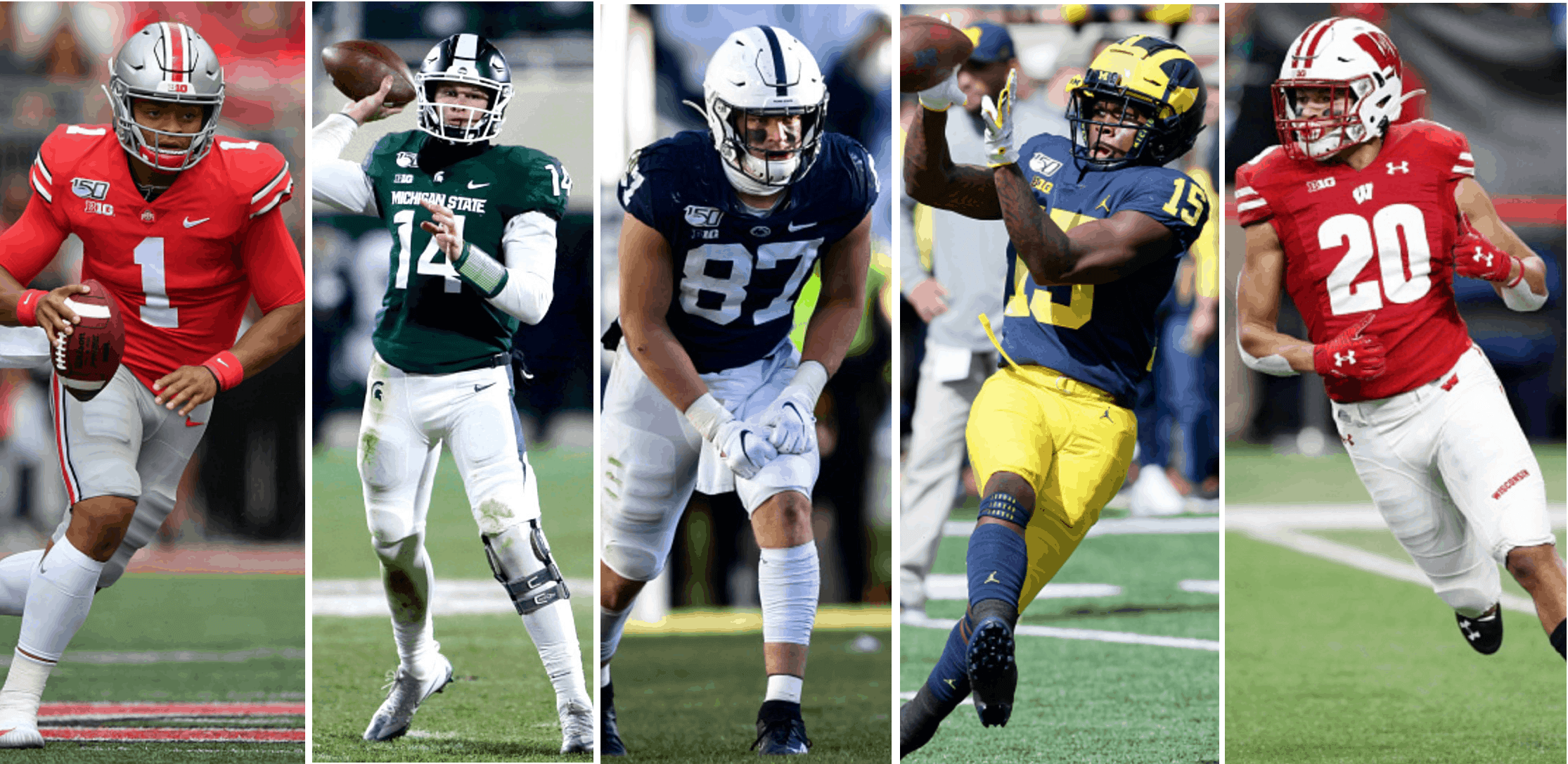
With that in mind, my latest piece for InsideHook is a ranking of B1G uniforms, along with a preview of uniform changes that some of the schools have made. You can check it out here.
Click to enlarge
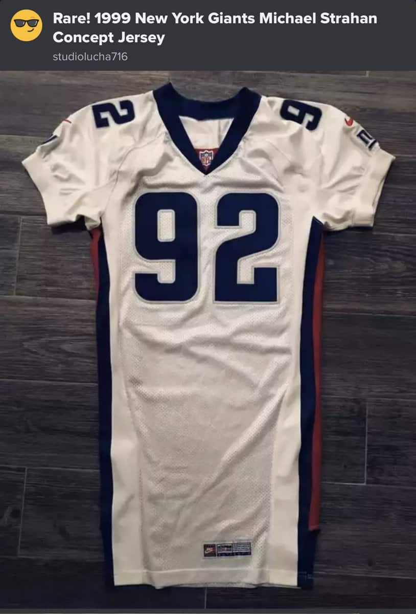
Too good (or at least interesting) for the Ticker: Here’s something I’ve never seen before. According to Twitter-er @WorstGuyOnHere, this is a prototype jersey for a redesign that that the Giants were considering in 1999, complete with the brutal side panels that so many teams foolishly used around that time. Good thing they didn’t go ahead with this one!
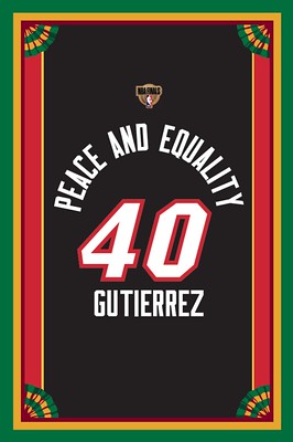
Membership update: Fun request by Jonathan Gutierrez, who requested that his latest membership card have a Heat theme, but with a 2020 NBA Finals treatment, complete with the Finals logo, the social justice statement, and the drop-down NOB. That’s a lot to include, so we gave him the rare vertical card treatment.
Jonathan’s card is part of a new batch that’s been added to the membership card gallery. I have one slot left on our current sheet before sending it to the printer, so the next person to sign up with get their card very quickly!
Speaking of which: Ordering a membership card is a good way to support Uni Watch (which, frankly, could use your support these days). And remember, as a gesture of comm-uni-ty solidarity, the price of a membership has been reduced from $25 to $20 until further notice, plus a Uni Watch membership card entitles you to a 15% discount on any of the merchandise in the Uni Watch, Uni Rock, and Naming Wrongs shops. (If you’re an existing member and would like to have the discount code, email me and I’ll hook you up.)
As always, you can sign up for your own custom-designed card here, you can see all the cards we’ve designed so far here (now more than 2,900 of them!), and you can see how we produce the cards here.
The Ticker
By Anthony Emerson

Baseball News: Reader John Kimmerlein sends along a set of 1964 World Series tickets that the Orioles printed but never distributed — truly phantom tickets. “The note is from my Dad’s buddy in the front office,” says John. … At the 8:06 mark of this video from World Series Game Two, you can see Rays P Nick Anderson’s broken necklace hanging out of his back pocket. Made for an odd sight as he delivered his pitches (from Ryan, who didn’t give his last name). … The Charlotte Knights, Triple-A affiliates of the White Sox, gave Sen. Kamala Harris personalized jerseys for her and running mate Joe Biden while Harris was in Charlotte campaigning (from Marcus Hall). … Kary Klismet sends along a great story about how Wrigley Field’s lack of lights before 1988 would have forced the Cubs to play at a different venue if they had made it to the World Series. … Here’s a shot of past and then-present Mets managers Casey Stengel and Yogi Berra wearing the Mets’ wool flannel and double-knit uniforms at the team’s 1972 Old-Timer’s Day event. The side-by-side shot really makes it clear how the shade of white shifted with the change in fabrics (from Scott M.X. Turner).

Pro Football News: A cloud of smoke descended on Lincoln Financial Field after a pre-game fireworks show during last night’s Eagles/Giants game (from Mike Chamernik). … Looks like the Alouettes equipment staff didn’t remove all of Fred Biletnikoff’s sleeve numbers when applying the sleeve logo (from Tommy Gough).
College/High School Football News: DB Chamarri Conner earns Beamer’s No. 25 jersey for Virginia Tech this weekend against Wake Forest. VT will go maroon-white-white in that game (from Andrew Cosentino). … UCF have unveiled new alternate unis inspired by outer space, featuring constellations in the uni numbers (from @CK_UCF). … Mississippi State is also launching a space-inspired uniform, which will make its on-field debut on Nov. 7 (from Romelle Slaughter II). … Illinois will wear a black “I” logo against Wisconsin tonight, plus a raised-fist rear-helmet decal, as a social justice statement (from @mrmichael21). … Iowa State is going white-white-red against Oklahoma State tomorrow (from Chad Lehman). … UNC is going mono-blue against NC State (from James Gilbert). … Michigan State going green-green-white this weekend (from @MSU_Uniforms). … Blue-white-white for UVA against Miami (thanks, Jamie). … Houston is going red-white-white against Navy (from Ignacio Salazar). … Tulane is going with throwback lids — and probably throwback unis — this weekend (from Nate Mueller). … New logo and corporate name for the Cactus Bowl. Dig the cactus goal posts! (from Joel Mathwig).

Hockey News: The Red Wings announced the uni numbers for six new players (from Brandon Weir). … Did you know, Bobby Orr didn’t always wear No. 4. He wore No. 27 in the preseason of his rookie year. “You can tell it is an exhibition game by the wire, instead of glass, on top of the boards,” says Bill Abley. … Also posted in the NBA section: The home of the Avs’ arena has a new corporate name (from multiple readers). … LIU teased powder blue sweaters yesterday (from Oleg Kvasha). … St. Cloud State’s women’s hockey team is hosting a series of intrasquad scrimmages which they’re calling the “COVID Cup” — complete with a logo (from Kurt Crowley). … The Islanders’ “fish sticks” logo lives on, repurposed for a printing company (from Sam, who didn’t give a last name).

NBA News: NBA 2K21 screenshots show the Lakers sans ad patch, as their deal with their previous advertiser has expired. Would be nice if the jerseys stayed that way, although that seems unlikely. … The Spectrum Center, home of the Hornets, has a logo for its 15th anniversary. Not yet clear whether it’ll appear on the Hornets’ unis (from T. Phillips). … Cross-posted from the hockey section: The Nuggets’ arena has a new corporate name (from multiple readers). … The name “Celtics” wasn’t always synonymous with Boston — New York once had a barnstorming squad called the Original Celtics. Note the shoes on Dutch Dehnert there! (from Marcus Hall).

College/High School Hoops News: New uniforms for Michigan State men’s (from multiple readers). … Louisville men’s new unis may have leaked. Hope you like giant shorts logos (from Mitch Wiley). … Arizona plans to wear a memorial patch for Lute Olson, but coach Sean Miller says “some of it is up to Nike,” (from Adam Vitcavage).

Soccer News: RCD Espanyol, Barcelona’s other team, have launched their 120th-anniversary kits. … MLS expansion team Austin FC have announced their sleeve advertiser (from Jim Howicz). … Mexican side Club Santos Laguna have unveiled their Día de Muertos kit (from Ed Żelaski). … The following are all from Kary Klismet: New logo for the Madagascar Football Federation. … Serbia’s Red Star Belgrade has a new kit for Europa League matches, inspired by their 1978 kit. … Austrian side LASK also have new kits for Europa League play. … Footy Headlines has found out the colors of Barcelona’s next home kit, for the 2021-22 season. … Footy Headlines has also listed the 10 worst kits in this year’s Champions League. I dunno, I think I’m the only person who digs that Inter Milan kit!

Grab Bag: The University of Michigan’s sports teams will all feature various social justice patches and decals, after a student-led movement to include them (from Brandon Weir). … Here’s something we haven’t seen much of during the pandemic: athletes wearing masks while playing. That’s Pitt and Notre Dame women’s volleyball (from Jeremy Brahm). … The logo for Denny Hamlin and Michael Jordan’s new team has been revealed (from Christopher Hickey and @GoinRounds). … Speaking of the new team: Driver Bubba Wallce will drive the No. 23 car for the Hamlin/Jordan team (from Nicklaus Wallmeyer and Jakob Fox). … Jesse Owens and Ralph Metcalfe looked awesome in their college track unis. I think modern track stars prefer the more form-fitting ones, however (from Josh Youstra). … Trio of items from our own Jamie Rathjen: Old Glory DC, the District’s Major League Rugby team, is moving its home games to Leesburg, Va., where the USL Championship soccer team Loudoun United play. … One of Australia’s Twenty20 cricket teams, the Sydney Thunder, added a small piece of Aboriginal artwork to their sleeves for the Women’s Big Bash League, which starts this weekend. The artwork was originally made in 2016 for the 150th anniversary of an Aboriginal team playing at the Melbourne Cricket Ground. … New kits for Colgate’s field hockey team. … Jack in the Box is offering chicken-scented facemasks for free today (from John Cerone). … Adidas is looking to sell the Reebok brand. Additional info here (from @walbergLines).

Not much to argue over on your B1G ranking. I just wish Iowa had used an “ANF” styled helmet sticker with the initials JHF as its Hayden Fry memorial.
My hope is the JHF tribute is a permanent fixture on the uniforms going forward. Fry is just too important of a figure to have just a season-long tribute. It should be like the Bears GSH tribute.
I have to say, perma-memorials make me edgy. There’s a difference between a tribute and idolatry.
Iowa fan here, and I agree with Paul. There are plenty of ways that Fry’s legacy is well-preserved and celebrated by the football program, the university, and the fanbase. Heck, the football uniforms themselves and the ANF helmet decals are in certain ways permanent memorials to him.
I find the sleeve memorial to be visually jolting. It’s fine for a year-long tribute to a coach who can justifiably be considered the most important in any sport in school history (although I think it could have been executed better). But as a permanent addition to the uniform? That would just look… off.
When I saw the rankings of the teams, 1-14, my initial reaction was, “Oh, I do not agree with this at all!” But when I read Paul’s rationale for ranking the teams where he did, I thought, “You know, for the most part, I think he’s right!” That’s the power of being able to explain your preferences in a well-considered manner! (Not that I would expect anything less of you, Paul!)
I’d still quibble over a few rankings here or there. Minnesota would rank several spots lower because of their recent Oregon wannabe tendencies since Fleck’s arrival (even if they did come to their senses and remove that god-awful, self-promoting oar from the helmets. I do love their cartoon mascot and color scheme, though.
I’d also rank Iowa a notch or two higher. Yes, Hayden Fry modeled the uniforms after the Pittsburgh Steelers in the late ’70s, but I would that the current iteration of the uniforms are more of an homage to Fry’s great teams in the ’80s than they are directly to the Steelers now.
When Pittsburgh switched from varsity block numerals to rounded italics in 1997, Iowa had link a couple of link that weren’t pure copycat designs. Kirk Ferentz returned the Hawkeyes to uniforms that were reminiscent of the team’s look from the ’80s as a way to return them to the program’s “glory years.” That included varsity block numerals at a point when the Steelers no longer wore them.
That obviously doesn’t change what the original inspiration was for the uniform change. But it does seem more self-referential now than pegged to the current iteration of the Steelers.
Thanks, Kary! I sort of surprised myself by putting Minnesota as high as I did. I initially thought they’d rank lower, but then I scrolled thru a bunch of photo galleries from last year’s games, and they looked better than I realized/expected. So I put them higher!
Hmmm… I might have to reevaluate myself. I know Minnesota has incorporated some link into their uniform program in ways that might work in a vacuum, but make their current set look inconsistent.
I also have always thought that Minnesota’s link (or athletic gold, if you prefer) numerals, going back link on the maroon jerseys. They’re one of only a handful of teams that can pull off colored numerals on dark jerseys without it feeling forced. (See your assessment of Illinois’ current uniforms for an example of when it does not work.)
That’s why Minnesota’s current set, with the white numbers bordered in yellow, feels like a downgrade to me. My feeling is if you can go with a color other than white on your dark jerseys and still have it look good, you should!
All that said, their base colors and logos give them an excellent starting point for uniforms, and they have some nice combinations. I just wish they’d cut down on the combos and choose a color scheme and stick with it – something I could say about a lot of college teams.
Not to sound like everyone’s curmudgeonly neighbor, but at a time when the economy is in the toilet, why are colleges continuing to trot out more uniform sets? It’s a waste of money to produce, and it’s an extravagance many people can’t afford when they’re worried about their jobs and their income. It just comes across as tone-deaf above and beyond the baseline of unnecessary.
And Nike deciding when and how Arizona honors Lute Olson is the surest sign yet that the End Times are upon us.
Now, get off my lawn. Whippersnappers…
Hi Paul,
Nice article on the B10. Penn State did announce their number 0 player a few days ago though.
link
Thanks so much, Joey — I missed that. I’ll get my editor to add that to the piece.
Wow, I LOVE that Giants jersey. The font is beautiful. And the white jersey actually features blue!
I think it is awesome too! Wish they would have gone with it. They have some of the most annoying and nondescript uniforms in the NFL.
It’s better than what they’re wearing now (non-descript/boring at home, annoying/ugly on the road) but they should never have changed the uniforms from the 80’s & 90’s – a perfect use of blue as the primary color, red and white as secondary colors, and block numerals. Bold yet retaining much of the tradition of the uniforms from the past.
It’s worth nothing that while it may not have been “featured” so to speak, the Giants road jerseys they DID switch to in 99/00 did have a LITTLE bit of blue compared to what they wear now haha
link
The NOB was also solid blue with no outline.
I have to respectfully disagree with you on that Giants prototype jersey from ’99. I can’t stand the number font nor that side striped panel. I agree the current white jersey could use some blue; but being a traditionalist I love the retro block number font and overall style.
Also is it just me who cannot think of the Giants using anything else but a block font for the numbers?
Gotta wonder if Nike was going to use their “storytelling” to claim the numbers were inspired by the curvature of the Giants’ “ny” logo or the “spirit” of past Giants teams…
Quiz on uniforms.
link
I got them all right except the two that dealt with jersey ads. I count that too my credit, actually.
Great job, as always, on the B1G preview. I must disagree with one point: I think Michigan’s road uniform, with the white pants, is the best looking uniform in college football.
Fair enough. I much prefer the maize pants, but the white ones aren’t bad-looking!
re: the three stripes selling off reebok – I’m still amazed how adidas managed to run reebok into the ground so quickly. from one of the top 3 brands in the western hemisphere in 2003 to a brand that seems to go out of its way to be irrelevant (puma still has it beat there). mismanagement from top to bottom.
Bacon company Hormel is giving people a chance to win a bacon scented face mask on their website. With their logo on it of course
link
While those side panels and number fonts make the Giants jersey look awful and like an arena football team by today’s standards, I don’t know if I would go so far as to say they were “foolishly” used. That was just the style back then. I’m glad they didn’t go with it. But at the same time, in another 20 years, who knows what the style will be? It could be that the new Patriots or Chargers uniforms have become outdated and look foolish. I know what you were talking about Paul, but the word choice seems a bit harsh.
I don’t know if I would go so far as to say they were “foolishly” used. That was just the style back then.
Yes — and like lots of other of-the-moment styles, it was bad design. Never looked good, always panned by Uni Watch.
Man, Fred Biletnikoff looking pretty haggard there in Montreal.
I thought that too, so I looked it up – he was only 37!!! I’m 49 and I look at least 10 years younger than he does in that pic.
It ain’t the years, it’s the mileage.
May be of interest. Biletnikoff was interviewed by Regina Leader-Post writer Rob Vanstone only a couple of months ago for a story. Story quotes him about his time playing in Montreal and he was asked what he recalled about his first visit to Regina to play the Roughriders.
link
“Did you know, Bobby Orr didn’t always wear No. 4. He wore No. 27 in the preseason of his rookie year.”
In fact, Bobby Orr wore No. 2 as a junior hockey player with the Oshawa Generals. He ended up settling for No. 4 as No. 2 was not an option with the Bruins. It was Eddie Shore’s retired number.
link
Here is Orr posing in a No. 2 Generals jersey with Eric Lindros while Lindros was playing with the Generals.
link
Iowa State is going white-white-red, not red-white-white.
Fixed.
In the split second after the picture had caught my eye but before I had actually started reading the section, I thought the Giants concept jersey was a Titans concept jersey. Just seems to have their look to me.
I was channel surfing last Friday night and there were 3 women’s college volleyball games airing at the same time. I found the variation in wearing masks to be startling:
Pitt at Notre Dame: both teams wearing masks.
North Carolina at NC State: UNC wearing masks, NC State was not.
Tennessee at Kentucky: neither team wearing masks.
1999 for that Giants jersey? I didn’t think Nike was involved in on-field then- thought it was Reebok by then?
NFL wasn’t exclusive with Reebok until 2002. Both teams from the 2000 season super bowl (Giants and Ravens) wore Nike that year.
Bud is correct. For further details, uni manufacturers are shown on the mighty Gridiron Uniform Database: link
Paul,
Regarding your B1G rankings, you are dead to me.
GO BLUE!
Best,
Gary
I would put Nebraska much lower because I can’t abide that boring, sans-serif, too-narrow “N” on their helmets when they have such an excellent, powerful Block N to work with. My guess is there’s some historical reason for it, but bleah.
But as a Spartan alum I have to say you nailed that one, and MSU is lucky to be ranked as high as you put them.
I have to confess my undying love for the Alouettes uniform that Biletnikoff is wearing.
Loved when that Als uniforms came back in 2010 as a throwback. Especially sweet when the visiting Saskatchewan Roughriders also wore their 1970s throwbacks in the same game (white version).
Some photos from that beautiful Aug 6, 2010 game for our enjoyment:
link
Was disappointed when the Alouettes decided to go with navy blue with red trim during the recent uniform redesign. Wanted them to go royal blue as the primary again. No royal blue helmets in the CFL currently.
Re: the Cubs article in the Ticker…
It was not “just after midnight” when the Cubs won the World Series. It was 12:47am Cleveland time or 11:47pm Chicago time.
The story is dramatic enough without this kind of “embellishment”.
Agree with Paul for the most part re the Big Ten unis. Nebraska #2? NFW. That’s TTUN’s spot, even with the white pants (I, too, prefer the maize ones). Also, I feel the reverse re Nebraska and Wisconsin’t helmet logos: Nebraska’s “N” is too simple and boring (I understand it’s traditon), but “Sconsin’s is too “extra”.
Minnesota bugs me with 1) the white numbers on the maroon jersey with a yellow helmet and pants (numbers should be primarily yellow also) and 2) their tendency to wear the dopey white pants at home (still doing that?).
The Nuggets’ arena has a new corporate name (from multiple readers).
I still call it “link.”
The Big 10 has the best uniforms. Michigan has dropped as my favorite CFB uniform because of the white pants with the road uniforms, and now I have my USC Trojans as the top uniforms. Outside of a few bad decisions by some schools, it’s too bad that so many schools have similar red uniforms. The Pac 12 is good about having no duplicate color schemes, and for that matter no duplicate mascots like the SEC. For some time ASU and USC looked the same, with ASU’s maroon being too light and looking like the Trojans cardinal red. Now they have darkened it up. Still wish when they came into the Pac 8 they had changed their yellow/gold to be a metallic gold to be enough different from USC.
Paul, you are not the only one who likes that Inter Milan kit. In fact I liked a few of those supposedly worst uniforms (though the top three were all pretty bad).
Cool, but that wasn’t me — Anthony Emerson wrote today’s Ticker!
Also great point about Iowa being graded down for wearing a copy of the Steelers uniform. For a long time both Iowa and Iowa State had copycat uniforms, with Iowa State looking like the USC Trojans. They have now changed their look enough to not be twins to the Trojans, without going crazy with an Oregon approach. I know it would be hard for Iowa to change, with the history of why Fry copied the Steelers, along with the uniform being a great look. They could do something subtle, but still not have people doing a double take thinking the Steelers were playing. Maybe a yellow/gold helmet, and change the stripes on the jersey.
So I guess the new font (no longer catalog block, and not Steelers italic either) isn’t enough?
I think it is. But others may disagree.
Iowa State’s uniforms from the late aughts through the mid-teens were not intentional copycats of USC. Yes, there were some similarities, but the shoulder stripes, number font, and lettering across the front of the jersey were all different. And Iowa State wore red or white pants on the road far more often than gold.
Question regarding the social justice patches for Michigan: are they required to be worn by every player? I couldn’t find this info in the link. -C.
The helmet decal is being worn by every player. I believe the slogans are optional.
Okay. Thanks, Paul. -C.
In regards to Indiana’s slightly too wide double helmet stripes, they are a direct reference to the program’s singular highlight of its only Rose Bowl appearance in 1968. While best matched with similar stripes on the pants, the current iteration is very close to doing the best we can do with the little we have.
Paul, in your Big Ten preview, you refer to OSU great Bill Willis as “Bob Willis”. Can you fix that? Bill was not only a Buckeye and Cleveland Browns legend but one of the first four Black men to reintegrate pro football in 1946. The role of nosetackle wasn’t what it is today but he played the middle of the defensive line and anchored the Browns D at not much over 200 lbs. Legend has it the at one of the Browns practices he jumped over the center and nearly sacked Otto Graham before he secured the snap. (Not exactly what happened, it turns out, but a fun tale nonetheless.)