Last night’s World Series game had lots of uni-notable details, beginning with the fact that the Rays wore their road greys for the first time in the 2020 postseason (in fact, for the first time since Sept. 21), setting up a traditional white-vs.-grey uniform matchup. Somewhat incredibly, it was first white/grey Series game since 2018’s Game Two, when the Red Sox hosted the Dodgers at Fenway. (There were no white/grey games last season, because the Nationals wore navy for all seven games.)
In other notes from last night’s game:
• Rays starter Blake Snell became the first pitcher with a single-digit uni number to appear in a World Series game since Julio Urías of the Dodgers in 2018, and the first American League pitcher to do so since Cleveland reliever Jeff Juden in 1997.
Blake Snell is bringing it. pic.twitter.com/YuMT0suDqe
— MLB (@MLB) October 22, 2020
I was hoping Urías, who’s still with the Dodgers, would get into the game as well (ideally while Snell was still in the game), so that the game would feature single-digitized pitchers for both teams, something that I’m not sure has ever happened before in the World Series. Unfortunately, that didn’t happen, but I’m still hoping it happens in Snell’s next start (likely to be Game Six).
• Looks like Rays third baseman Joey Wendle had some repairs made to his pants:
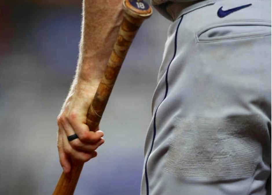
I’m a little surprised they didn’t just get him a new pair of pants. It’s the World Series, after all! I don’t mean that as a criticism — we all treat too many things as disposable, so I’m glad they just patched the damage. But it’s not what I would have expected.
• We all know by now that Dodgers pitcher Clayton Kershaw wears the same filthy, sweat-stained cap all season long. Or at least he does on the mound — he appeared to be wearing a brand-new cap in the dugout last night.
• MLB umpires have been wearing three separate left-sleeve memorial patches all season long (for umps Eric Cooper, Chuck Meriweather, and Rick Reed). With the addition of the World Series patch, the umps’ left sleeves are looking very crowded (click to enlarge):
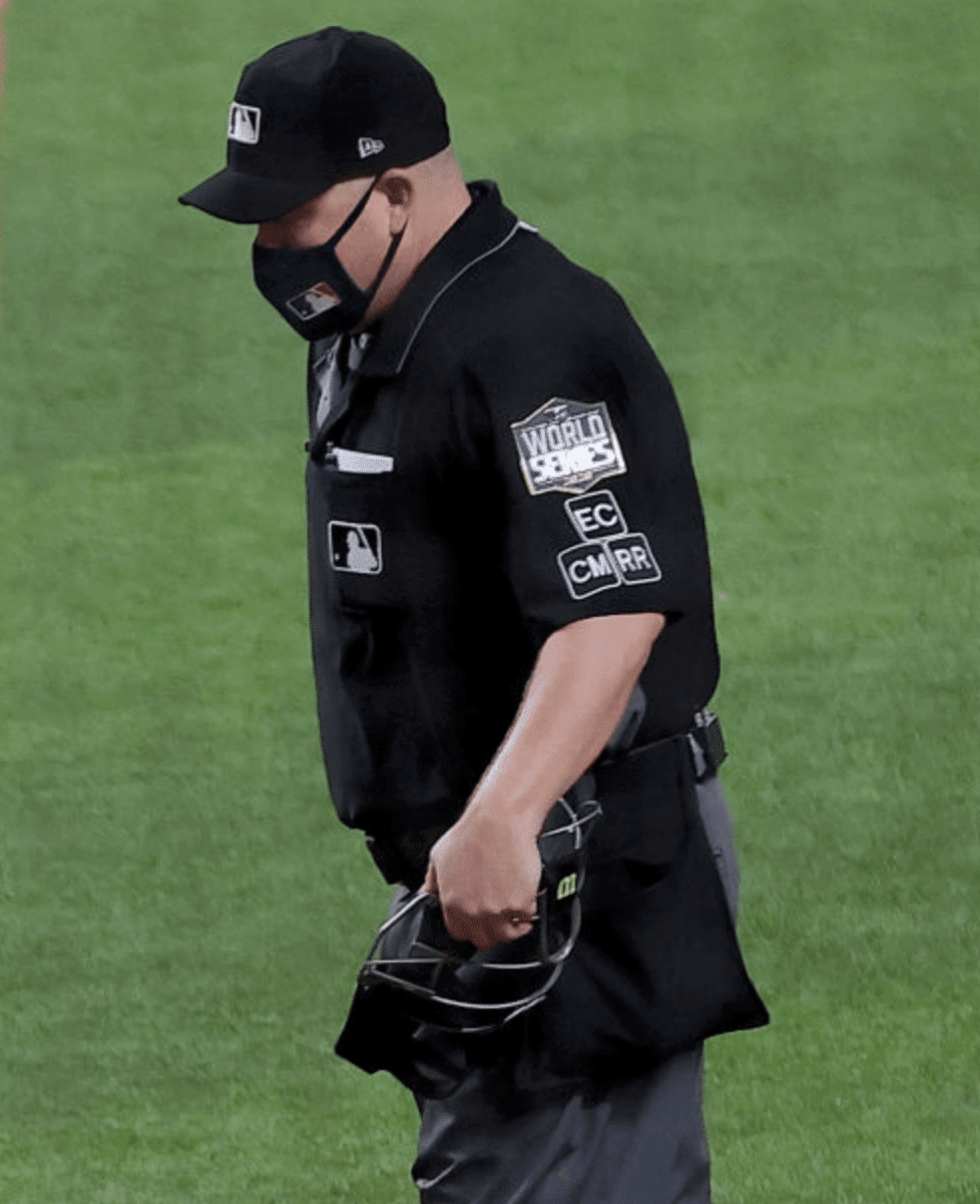
I was thinking they might add another memorial patch last night for former ump Derryl Cousins, who died on Monday, but they didn’t do that (at least not yet).
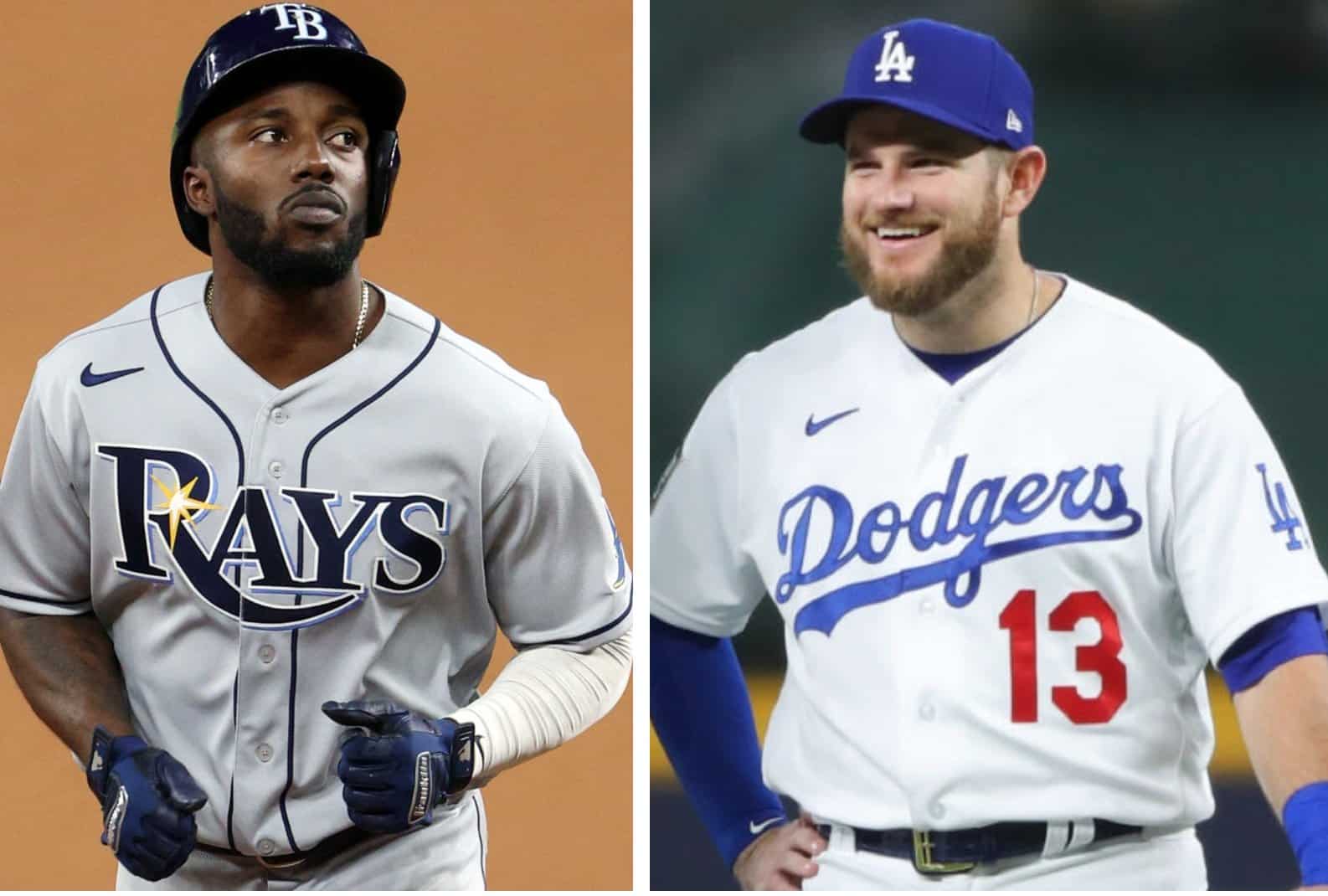
• As someone mentioned in the comments the other day — I think maybe R. Scott Rogers? — it’s interesting to see how the differences in the teams’ respective chest insignias results in the Rays’ maker’s mark sitting much higher than the Dodgers’:
• The small live crowd included former NBA player Magic Johnson, who wore a Dodgers mask:
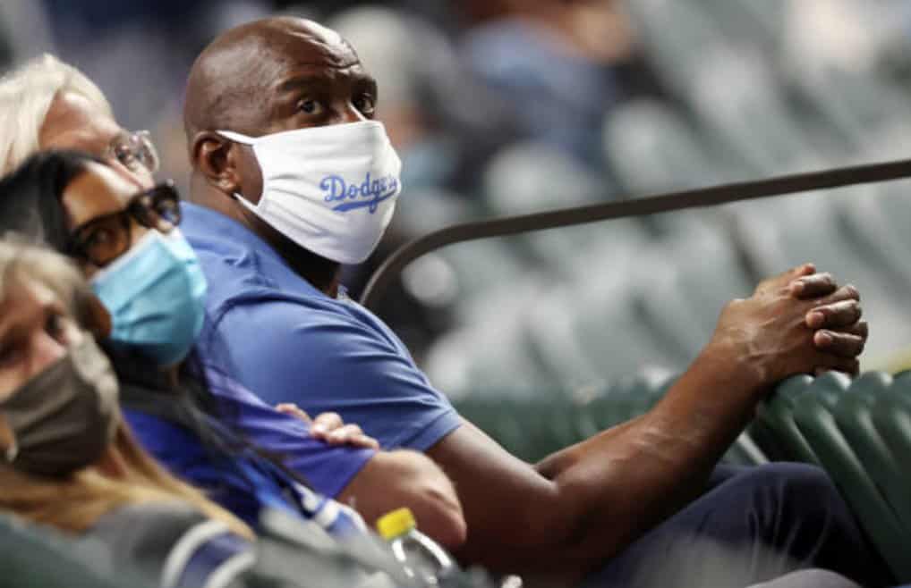
Update: Reader/commenter Keith A. informs me that Johnson is actually a part-owner of the Dodgers, which makes his presence a bit less remarkable.
Game Three is tomorrow night, with the Rays getting to be the home team for the first time. Will they wear white? I have my doubts, but we’ll find out soon enough.
(My thanks to Neal Dorfman for identifying when the Rays last wore their road greys.)
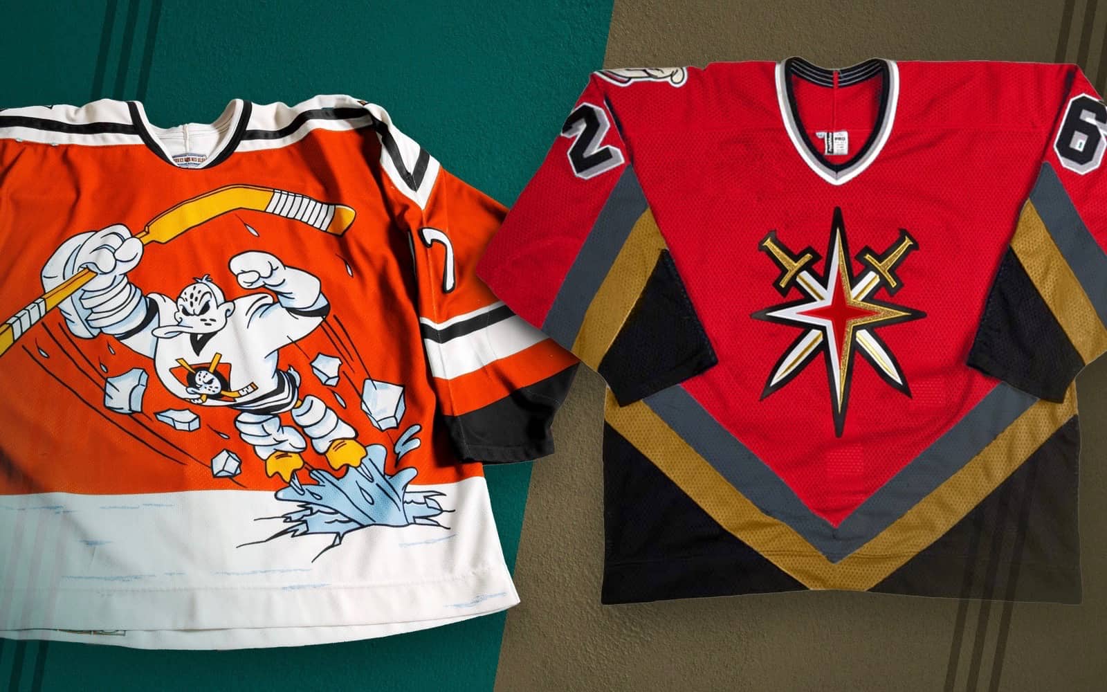
Photo via Icethetics; click to enlarge
More NHL leaks: The NHL “reverse retro” alternate jersey leaks keep coming. The latest designs to be circulating are for the Ducks (bringing back Wild Wing!) and Golden Knights (a real stinker), and Chris Smith of Icethetics says “there are reasons to believe they’re accurate.” He’s much more plugged in on this situation than I am, so read his full report here.
And then there’s this — I have no idea how legit it is (Icethetics hasn’t written about it, and it doesn’t seem to fit the “reverse” color-swapping theme), and I usually don’t like to post unconfirmed items, but this is so good that it clearly should happen:
#LEAK: My friend that works for #SapCenter just sent me pictures of the new Adidas San Jose #Sharks 30th anniversary jersey throwback for next season, a tribute to the California Golden Seals @UniWatch @SanJoseSharks @sportslogosnet @TealTownUSA #NHL #SanJoseSharks #Hockey pic.twitter.com/m1njtAPIno
— mark reeva (@soaka_supa) October 22, 2020
Click to enlarge
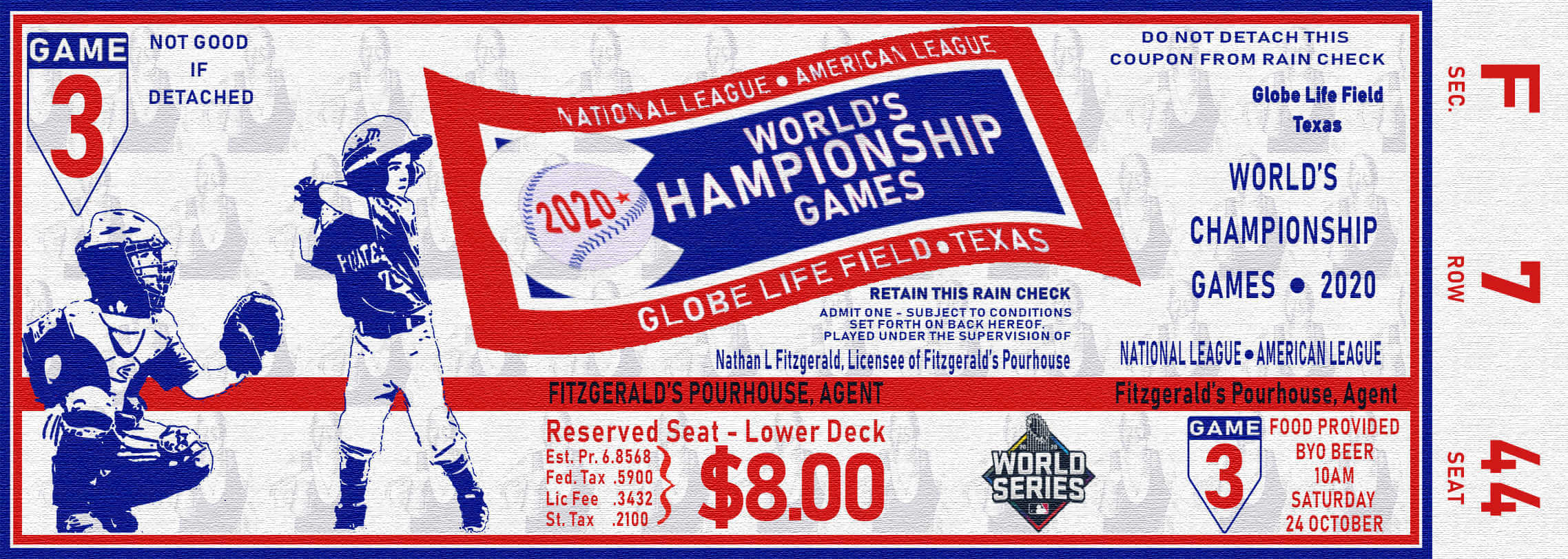
That’s the ticket: Reader Nathan Fitzgerald lives in Australia but is a big MLB fan. “It’s become a yearly tradition to celebrate the World Series by having my Fantasy Baseball League group over,” he says. “Here’s the ticket I designed for this year as an invitation, based on the 1964 World Series tickets.”
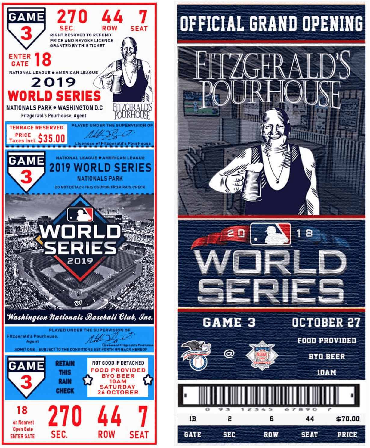
So cool! Nathan also sent along the ticket/invitation designs he created for the previous two years (click to enlarge):
What a fun little project! Also, imagine living in a country right now where you can safely have people over to watch the World Series (or for anything else). Sigh.
Click to enlarge
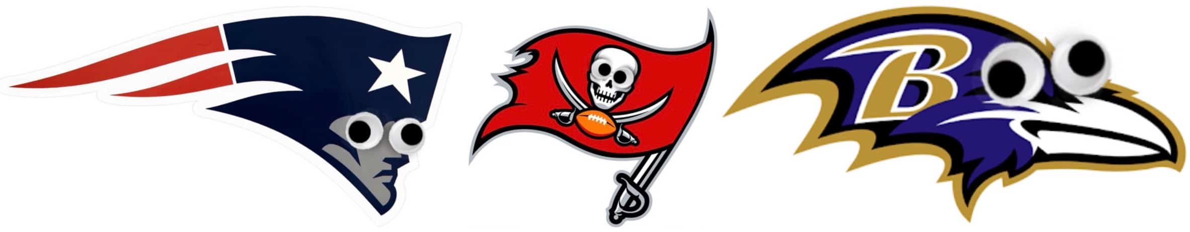
Too good for the Ticker: Everything looks better with googly eyes, am I right? Twitter-er @KC_Goddess29 took that simple truism and applied it to NFL team logos, with silly but entertaining results. You can see the full set in this Twitter thread — recommended.
(My thanks to @ArnoldPugg for bringing this one to my attention.)
The Ticker
By Paul

’Skins Watch: The Swedish hockey club Frölunda is soliciting public input on a new logo after scrapping its Native American-themed imagery (from Kary Klismet). … Also from Kary: The school board in Bucyrus, Ohio, is considering whether the local high school should stop calling its teams the Redmen. … Rutland High School in Vermont is scrapping its arrowhead logo and will no longer call its teams the Raiders (from Joe Merrill).

Working Class Wannabes™: A high school football coach in Indiana refers to his team as “black and blue collar.” … An article about a high school football player in Utah uses the terms “blue-collar play,” “blue-collar mentality,” and “blue-collar mindset.” Bingo! … An article about the Glenville State football team begins, “There is nothing more blue-collar in football than the work in the trenches by the offensive line. And in the world of college football, there is nothing more blue-collar than playing offensive line for Hall of Fame coach Rick Trickett.” … An article about the Oklahoma State football team says, “I can see more high profile players being recruited but never at the expense of the backbone of well evaluated and blue collar developing players that have built the program to its current state.” … A preview of last Thursday’s Saints/Chargers game said that the Saints’ defense ” has done blue-collar work against the run recently.” … A high school football coach in Georgia, referring to one of his players, says, ” He attacks every day like it’s a work day. He’s a blue-collar type of guy.” … USC football coach Clay Helton, talking about his freshman offensive linemen, says, “They are just a shut up and work bunch, a blue-collar bunch, and just work hard.” Bingo! … LSU basketball coach Will Wade, talking about this year’s squad, says, “[T]hey enjoy working and it’s a blue collar group which is more my type of crew. These guys are working all day.” … Alabama basketball coach Nate Oats says, “These first three days [of practice] we are really trying to get an identity set — defense, blue-collar, hard-nosed, toughness, a lot of defensive drills, rebounding drills, a lot of tougher stuff.” … UMass football coach Walt Bell says, “The vision of what we want this program to be is a very large, very long, very blue collar, run-heavy and physical football team.” … An article about Arizona Cardinals LB Dennis Gardeck says he “won’t change his blue-collar approach just because he had a few highlight-reel plays.” … A high school football coach in Florida says, “We’re just who we are. We’re North Fort Myers. That’s what we do. A blue-collar team that plays hard. The Stanford of Lee County.” … Illinois football offensive lineman Kendrick Green says, “We’re trying to be a group that comes to work every day. That’s just something we really take pride in, that blue collar mentality, man.” … Auburn football coach Gus Malzahn says his goal is “just getting back to playing good, hard-nosed, blue-collar, physical Auburn football.” … An article about an Oklahoma high school basketball team says they got off to a fast start last year thanks in part to “blue-collar bludgeoning on the boards.”

Baseball News: Agent Scott Boras thinks the World Series should always be at a neutral site (NYT link), which sounds like a truly terrible idea. … Oh man, gotta love this Phillies-style Wiffle Ball jersey design! … The latest episode of the great design podcast 99% Invisible is about sign-stealing. … The Single-A Lakewood BlueClaws are changing their name to the Jersey Shore BlueClaws (thanks to all who shared). … In 1999, D-backs P Randy Johnson ended up wearing a Giants cap during a benches-clearing brawl between the two teams (from @Finerific and @ejmaroun).

NFL News: Rough-looking NFL weekend on tap, as the Falcons will wear that awful gradient uniform and the Eagles will go mono-black. … Moe Khan was listening when Bucs coach Bruce Arians appeared yesterday on Dan Patrick’s radio show. “He said it will be a while before they can bring back their classic creamsicle uniform,” says Moe. “Hopefully next year if they loosen up the NFL helmet rules.” … Looks like newly acquired Chiefs RB Le’Veon Bell will keep wearing his familiar No. 26 with KC. … Here’s an article on what Bucs QB Tom Brady’s various jerseys over the years have meant to him (from soon-to-be birthday boy Nicklaus Wallmeyer).
College Football News: BYU will go mono-blue this weekend. … Purdue is adding a rear-helmet memorial decal for former athletic director Morgan Burke, who passed away in June (from Tommy Schorer). … New rivalry alternates this week for NC State (from Rex Henry). … ESPN has an article and a podcast episode about the 2010 fight between the costumed mascots for Ohio University and Ohio State (from Andrew Cosentino). … The Texas Longhorn Band won’t play “The Eyes of Texas” this weekend, after several band members said they’d refuse to play the song, which has ties to blackface minstrelsy.

Hockey News: The Coyotes are auctioning off three very cool-looking Dia de los Muertos goalie masks to commemorate Hispanic Heritage Month (from Wade Heidt).

Basketball News: Interesting article about an artist who makes art out of deflated basketballs (NYT link). … One of Kobe Bryant’s 2008 NBA Finals jerseys is now on display at the Smithsonian’s African American Museum. … Check out this Trail Blazers-themed “Vote” sign!

Soccer News: Fans — especially those watching games via streaming platforms — aren’t happy about the J-League’s new league-wide typeface (from Greg Franklin). … The NWSL’s Los Angeles expansion team confirmed that its name will be Angel City FC and released a placeholder logo (thanks, Jamie). … Australian side Lake Macquarie City FC has a new logo (from Kary Klismet). … Also from Kary: New stadium is in the works for FC Blau-Weiss Linz, a soccer team in Austria’s Second League. … New Remembrance Day shirt for fifth-tier English side Hartlepool United (from Ed Zelaski). … Liverpool-themed cupcakes? Sure, why not (from Jeremy Brahm). … Mexican side Club Tijuana wore a Day of the Dead jersey with a bone/skeleton-themed number font last night (from Matthew Reichbach).

Grab Bag: Rawlings Sporting Goods has acquired competitor Easton. … Rock band AC/DC has released an interactive program that lets fans see their initials in the style of the band’s familiar logo, much like one of our Uni Rock shirts. … Here’s a short video about the design of the “I Voted” sticker in Clark County, Nev. … New 95th-anniversary logo for the Grand Ole Opry (from John Cerone). … New alternates for Pitt volleyball (from @CantankerousRex). .. Here are the IndyCar liveries for this weekend’s race in Tampa. “Must be some sort of record for number of pink-themed cars in a race (four out of 24),” says Tim Dunn.

Our latest raffle winner is Ian McLarty, who’s won himself a Uni Watch membership card. Congrats to him, and my repeated thanks to Nicholas Bartel for sponsoring this one. — Paul
The futbol team with the Dia de los Muertes font is Club Tijuana (aka Xolos). Wore that kit in the first leg of the CopaMX final last night against Monterrey.
Thanks — I’ll add that to the text.
Pretty sweet ripoff of the Phillies wiffle logo from HRL Twin Cities in link.
Scott Boras wants the World Series at a neutral site? Heaven forfend. Fans who attend numerous games each year shouldn’t lose out on the opportunity of seeing their team in person playing for the championship and shouldn’t have to travel out of town (absent going to the opponent’s ballpark for those who can). This isn’t, and don’t make it, the Super Bowl. If weather is the issue, I’ve been colder at a July game at Candlestick than any World Series game at Yankee Stadium.
Whatever it is, I’m sure there’s something in it for Scott Boras if he wants the World Series at a neutral site.
Related to neutral site idea (sort of) I was listening to the Rays broadcast last night and they mentioned that Globe Life has essentially the same surface as Tropicana but that the Rangers / Globe Life has two different colors of grass. I assume this is how they achieve the “mowed grass” look in the infield and outfield. If so, clever. I hate turf (esp. for WS) but I’ll give it to the field designers.
(Note – I also hate that the Dodgers have essentially home field since they’ve been playing at Globe Life for all but the first round of the playoffs.)
I’m sure I’m not the only one who’s had that Sharks idea, but I made a concept of that exact idea in 2007 and the then-NHL-Tournament-of-Logos (now Icethetics) relegated it to a Freak Out Friday post:
link
(most of the way down)
But if Wild Wing is coming back, maybe it’s not a good idea, it’s just an NHL idea.
At least your concept has stripes that go all the way around should/armpit area like the Seals did.
Magic Johnson isn’t just a former NBA player, he’s also part owner of the Dodgers.
Ah — didn’t realize that. Thanks!
NC State is actually wearing those alternate uniforms on Nov 14 vs Florida State, not this week
Scott Boras can go pound sand. -C.
I can confirm that the wild wing logo is legit. However, the jersey won’t be orange. It’ll be more like the original one, green. The Vegas jersey is legit. The Sharks will be gray.
must be April 1st????
but hey this is the league that brings you Senators, Ducks, Penguins,and a Kraken as logos…..
Well I said earlier about being nervous about this retro reverse jersey program. The concerns are now real.
The Wild Wing jersey is infamously horrible. It mostly has to do with the front crest and the numbers. Horrible enough that if it needs to be brought back for some reason it should only be worn in warm-ups. Bringing a version of it back to be worn in games is insane.
NHL has been making good uniform decisions lately with recent changes, but this retro reverse jersey 4th jersey program feels like a dangerous slippery slope that the NBA has sledded down with all their alternate uniforms.
I am not really a fan of teams compromising the integrity of the original look of past uniforms just because of this new retro reverse program.
Better thing to do if there needs to be a 4th jersey? The 4th uniform simply a throwback. So many teams have a variety of great throwbacks and we do not need to reverse the colours or splash different colours on.
Could work really well. Just look at the Canucks as an example. They could keep wearing the black Flying Skate uniforms they brought back last year for the 50th anniversary. Can keep it around as a regular 4th which would make fans happy. Instead, who know what type of uniform they are cooking up in the lab as part of this?
“Better thing to do if there needs to be a 4th jersey? The 4th uniform simply a throwback.”
Agreed!
That rag the Flyers rolled out looks like something their AHL affiliate would wear…it’s no match for the original that it’s based on. White cuffs?
Wild Wing in orange! That will be in my “ugly” pantheon.
“LSU basketball coach Will Wade, talking about this year’s squad, says, “[T]hey enjoy working and it’s a blue collar group which is more my type of crew. These guys are working all day.” ”
So I’m wondering, is that bc all the Blue Chip kids he paid to play at LSU left? Or is he really that big of an SOB that he’s making light of the situation he created, and that the students he has left are “scrappy” guys, “high motor”, etc.
Strange that Le’Veon is being allowed to wear #26, as that number was most recently worn by Damien Williams, who is still on the team! Granted, he opted out this year due to Coronavirus; it begs the question of what the official status is of players who have opted out. Are they officially not NFL players while on the list? Their rights are obviously owned by their respective clubs, but they don’t even get a say in their uniform? What happens if/when they re-sign Bell and Williams comes off the list?! Chaos!
That’s a fascinating bit of info, Collin!
Reminds me of when Trot Nixon was briefly with the Mets in 2008. They have him No. 6, which was already assigned to another player (I forget who) who was on the 60-day DL and wasn’t expected to play again that year.
Highly recommend the just released 99% Invisible City book! A collection of city-centric design stories from the podcast, with unique illustrations!
link
Re: Sharks leak. Stop posting that crap from that guy. He’s been tweeting out bad fakes from China and crappy photoshops as “a friend who works at the SAP Center”, and none of it has ever been true. Best if you just block that guy as I think you’ve fallen for his stunts a couple of times already.
Didn’t realize. But like I said: That one *should* be true!
I apologize if my comment sounded angry. My frustrations are with the guy trying to pass off fake insider knowledge.
In any case, as proof this guy can’t be trusted, here is the Chinese website where he got those jersey concepts from:
link
Thanks. I don’t disbelieve you (or believe him). Like I said, even if it isn’t legit, it *should* happen!
I’m willing to see a few more logos if the TV cameras stop showing fans have their masks pulled down to their chins. Its so infuriating. They should be kicked out immediately if caught without a mask on.
The rules are your mask can be down when you’re eating or drinking. So if they have a hot dog, drink, etc. at their seat, they can have the mask off.
Urias is scheduled to start Game 4 for the Dodgers
Ah, didn’t realize. Well, if it’s an all-hands situation in Game Six, there’s still a chance that he and Snell could be in the same game!
For the record, I did not note the Rays swoosh placement in the comments yesterday. But I did notice it last night – I listened to Game One on the radio, but watched Game Two on TV – and it’s become one of those distracting un-unseeable things that drive me batty sometimes. As much as I dislike the Mark of the Beast on the jersey front, the regular placement is less bad than the up-the-shoulder Rays placement. When it’s in a consistent location from player to player, it’s easier for me to ignore it and have it basically disappear from view. With the Rays, the swoosh looks different on each player based on his physique, so it’s much more difficult for me to ignore it. When something is so visually inconsistent, each appearance carries a bit of surprise, which the eye locks onto each time. Ugh.
Googly eyes on NFL logos was the thing I needed this morning to remind me that not everything is terrible.
A small correction to the J-League item: the changes are being made for the benefit of fans on streaming platforms. Fans at the stadium loved the current custom fonts, numbers and color schemes of their J-League club, but on a small screen those details were lost.
If this new “Reverse Retro” program for the NHL is indeed for all 31 teams, I’m not sure how they could do the Panthers in the same sense as the Flyers and Penguins sweaters that have leaked. The Cats original design was worn exactly the same but in 3 different colors, so unless they do a yellow version of the original look (which would be a bit over-the-top), I bet they go with that same jersey striping and shoulder style from the 90s but use the updated (2016-present) versions of the leaping cat and sunburst shoulder logos. Navy as the base color would make the most sense as they haven’t had a blue jersey (or any 3rd jersey at all) since they retired those awful Penguins-knockoffs with the roundel logo 7 or 8 years ago.
I suppose another route is to do something like that Sharks/Seals hybrid, and do a version of the Miami Screaming Eagles WHA team that never came to fruition. Screaming Panthers? lol
If I had to guess, I’d bet the Florida Panthers would reverse-retro with the original white jersey (which was with red numbers and a red shoulder yoke originally) switched in favor of navy numbers and a navy yoke. Consistent with the current look, and just perfectly boring-throwback that the NHL would sign off on that. Call me cynical.
Could the NHL see a jersey sale resurgence the likes they haven’t seen since the 90’s era Hip Hop acts started wearing jerseys? The leaks we’ve seen except that red Vegas one have all been pleasant surprises. Let’s hope the Leafs bring back the jersey style from the 80’s
This weekend’s IndyCar race is actually in St. Petersburg as it winds through the waterfront around Al Lang Stadium (home of the Tampa Bay Rowdies) and Albert Whitted Airport.
They don’t call it the “Speedway 500” (the track is in Speedway, IN). They call it the Indy 500.
But I’ll agree in this case. The official name of this weekend’s Astor Cup championship deciding race is the Firestone Grand Prix of St. Petersburg. My bad.
Re: Jersey Shore BlueClaes.
The reason why Lakewood could do that is because a couple of shore-area independent baseball teams have gone belly-up in the last 20 years, including the Hammonton Blueberries and the Atlantic City Surf.
Also, I wonder what the folks in the town of Jersey Shore, Pa. would think …
Hammonton Blueberries was a much talked about baseball team, but I don’t think they ever played any games. It’s been more then a decade since the Surf existed.
I agree with Paul – that Sharks/Seals hybrid would be great. As for the umpires putting Derryl Cousins’ initials on their sleeves – although I hope they do, I wonder if his being a “replacement” umpire during the 1979 umpire’s strike will have any bearing on the decision?
Oh, wow — I didn’t even think about that regarding Cousins. But you could be right.
1) Interesting that a team from Sweden would use Indigenous American imagery
2) Unfortunately, it seems like the Working Class Wannabes section gets longer each week
3) The googly eye logo thread was just what I needed to see today. I hope she does other leagues in the future
In further ump-related news, we lost long-timer Derryl Cousins (ret. 2013) today.
First, foremost, and above all else: R.I.P., and God have mercy on his soul & be with his family.
Secondly, though: Inquiring minds must wonder if the WS crew’s left sleeves are about to get MIND-BOGGLINGLY crowded.
Someone didn’t read today’s lede very carefully!
Well, pooh. Question answered, though!
A quiz on Unusual Uniforms.
link
As someone who appreciates tradition, the Big 10 is the top conference when it comes to CFB uniforms. Yep, Michigan going with white pants on the road, has dropped them from my top spot for CFB uniforms. Always had them right before my USC Trojans. The one negative that jumps out is that their are too many red teams. I’ve always liked that the Pac10 doesn’t have schools with the same colors, or same mascots like in the SEC. USC and ASU in the past looked similar when ASU’s maroon looked more cardinal red, but they have darkened up the color recently.
RE: Sharks and the Seals, didnt the Seals move to MN to become the North Stars? and then they moved to Dallas to become the Dallas Stars (norm green sucks) shouldnt the stars be wearing the Seals throwbacks if they were legit?
No- Seals and NStars came into the NHL at the same time, as the “Second Six”.
You’re probably thinking of the cluster involving Cleveland Barons/ MN NStars. I don’t remember. The details, but I’m sure someone else will.