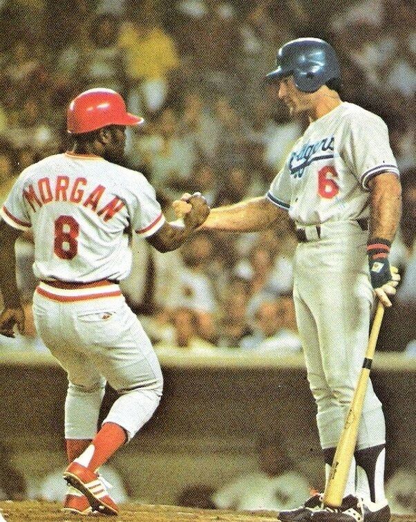
In Tuesday’s blog post about Joe Morgan’s uniform history, I mentioned that Morgan, along with some of his Reds teammates, occasionally dabbled with alternate shoe colors in All-Star Games. As an example, I included the photo displayed above, which shows him wearing red spikes in the 1977 Midsummer Classic. “A Red wearing red shoes may not look so outlandish today,” I wrote. “But at the time, it was unheard of!” That’s because of the Reds’ notoriously strict uniform policy, which among other things mandated plain black shoes.
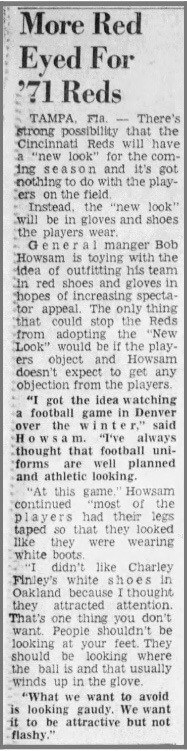
Now longtime reader Kenn Tomasch has unearthed some old newspaper clippings with the shocking news that the Reds were tinkering with the idea of red shoes — and red gloves! — in 1971. This is a really interesting storyline that contradicts the standard party line about the Reds’ aesthetic conservatism, so let’s take a look, beginning with this Cincinnati Enquirer article from Feb. 21, 1971, with a dateline from the team’s Florida spring training camp. It’s about Reds general manager Bob Howsam wanting to outfit the team in red shoes and gloves (the article is short, and it’s worth reading the whole thing):
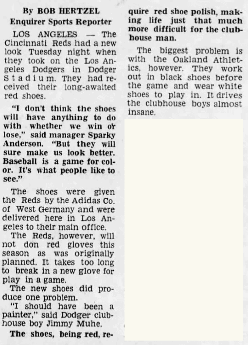
Interesting! So did the Reds go red-shod to begin the ’71 season? Nope! According to this May 5 item from the Enquirer, the red footwear made its debut on May 4, for a game against the Dodgers in L.A., and the red gloves never got off the drawing board (again, it’s worth reading the whole thing; click to enlarge):
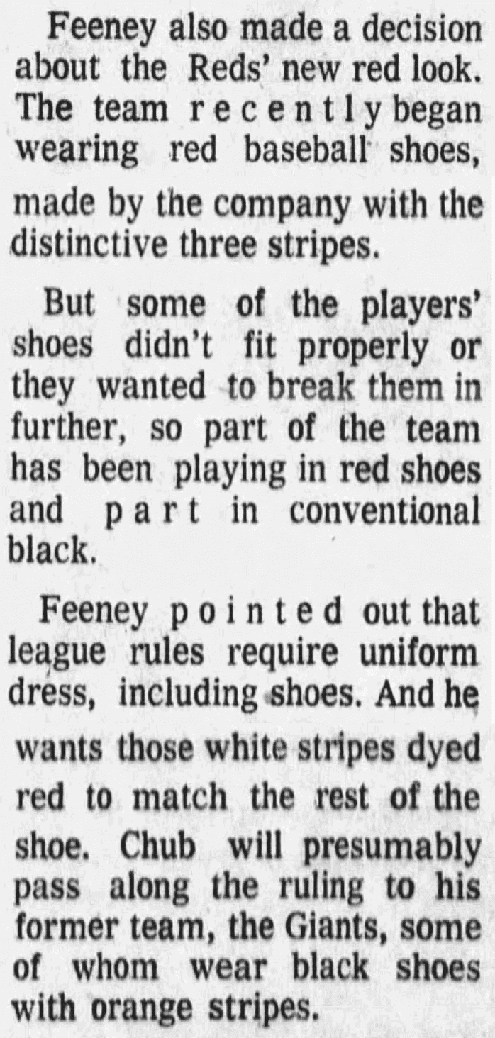
But some of the Reds apparently stuck with their black shoes on the field, because their new red ones either needed to be broken in or didn’t fit properly (get that team a Brannock Device!). That led to a footwear free-for-all that caught the eye of National League prexy Chub Feeney, who also had some concerns about logo creep. It’s all spelled out in this Dayton Daily News item from May 13 (click to enlarge):
Imagine that: Chub Feeney, anti-logo creep pioneer! We’ll have to reserve a spot for him in the Uni Watch Hall of Fame.
It’s not clear how the Reds responded to Feeney’s edict. Did they all start wearing red, with the Adidas stripes painted red to match? Or did they shelve the whole experiment and go back to wearing black? In any case, one of the Reds whose red shoes didn’t fit correctly was pitcher Ross Grimsley. In a June 5 Dayton Daily News item, he said his red shoes hurt his feet, so he wore his old black shoes instead — and the rest of the Reds had to do likewise (click to enlarge):
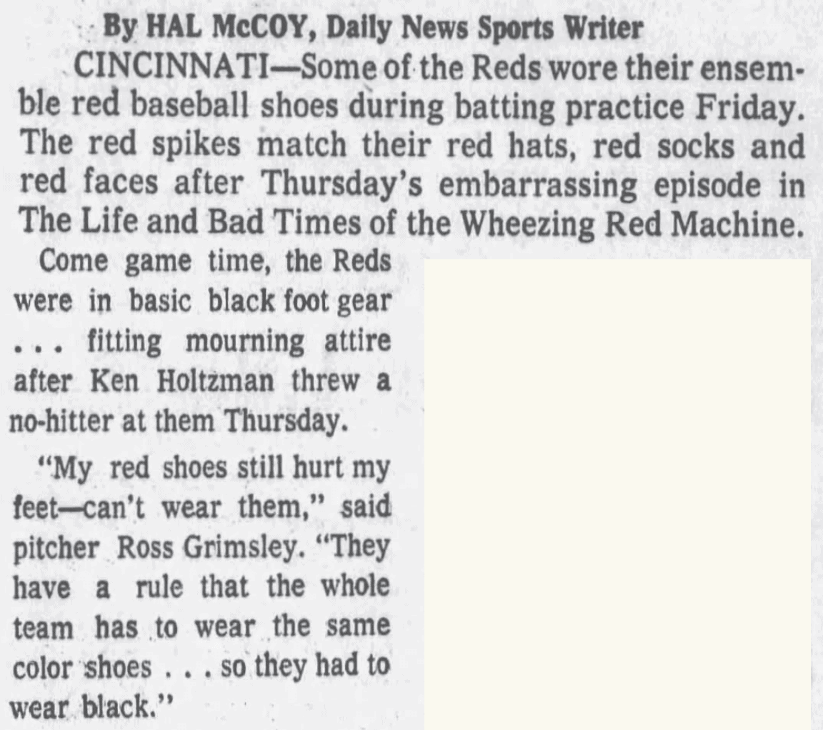
It’s not clear if Grimsley meant that the Reds would have to wear black shoes just for that one game, or for any subsequent games that he pitched, or if the entire red shoe project had already been scrapped because of him.
So: We know that at least some Reds wore red shoes on May 4 against the Dodgers, and that some of them apparently continued to do so for at least the next week or so, until Feeney weighed in on May 12. I spent a fair amount of time searching for 1971 photos of red-shod Reds from that period but came up empty. (It doesn’t help that most game photos from that era are black-and-white, making it hard to tell a red shoe from a black one.) If anyone has any photos documenting this apparently shortly-lived phenomenon, I’d love to see them. Ditto for any additional news clippings that could help flesh out the story.
(Huge thanks to Kenn Tomasch for bringing this interesting chapter in uniform history to my attention.)
Click to enlarge
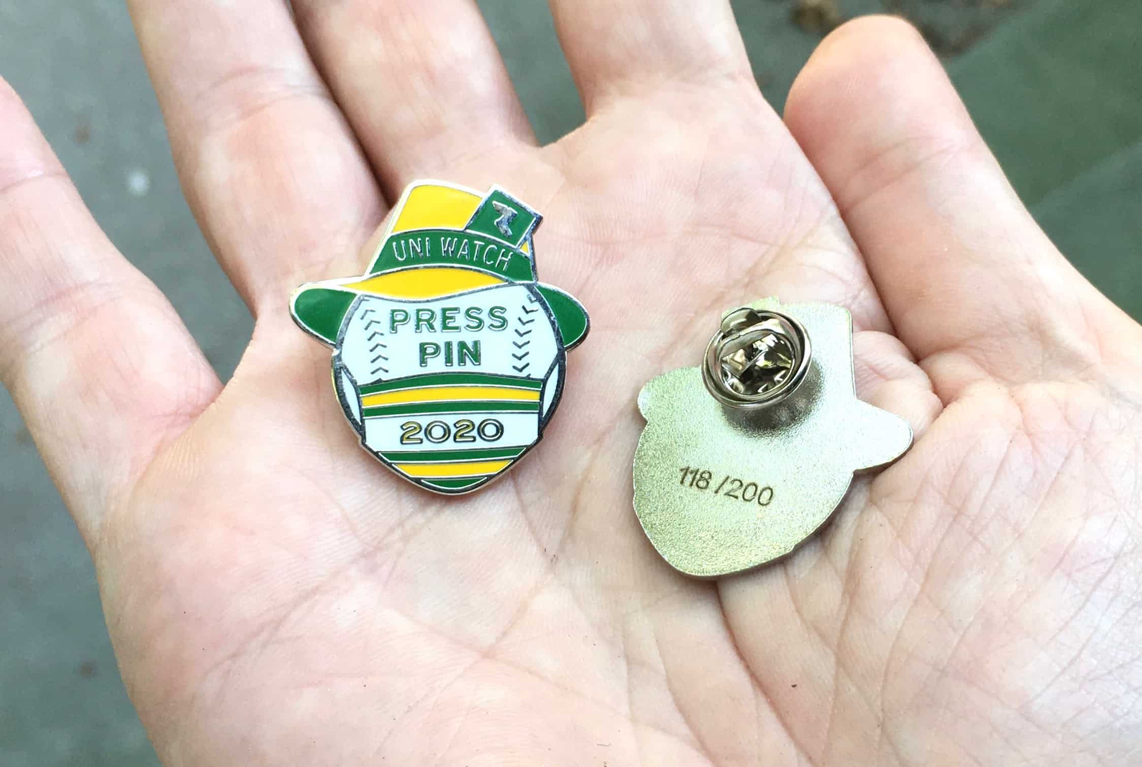
Press Pin reminder: In case you missed it on Wednesday, the 2020 Uni Watch Press Pin is now available. After one day of sales, fewer than 80 of the 200 pins are remaining.
Quick recap: Designer Todd Radom and I launched the Press Pin series last year, inspired by the longstanding tradition of World Series press pins. Now, you may be thinking to yourself, “Er, I’m not a member of the press.” Ah, but you are! All of you who scrutinize the uni-verse are essentially part of the Uni Watch media enterprise, whether you submit Ticker submissions or even just raise uni awareness by discussing uniforms with your friends. You’ve all helped make Uni Watch what it is today, and you’re all fully deserving of wearing a Uni Watch press pin.
As for this year’s design, it’s a riff on the 1951 Dodgers press pin, with a mask thrown in to capture the spirit of this crazy year:
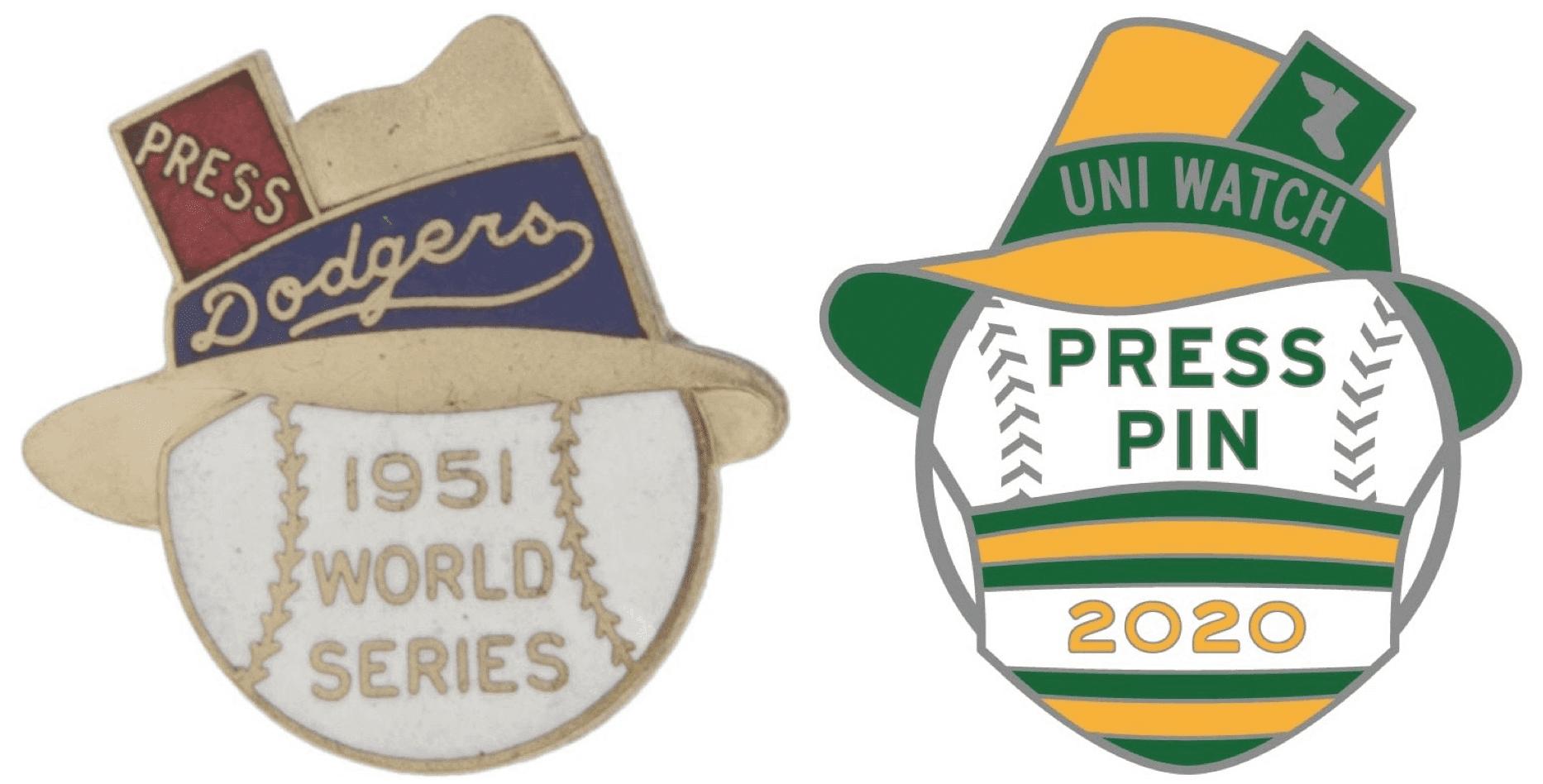
The Dodgers pin was a phantom, because Bobby Thomson’s “shot heard ’round the world” kept the Dodgers out of the Series, but it’s still a great design, and we’re proud to reference it with this year’s press pin, which is available here while supplies last.
Click to enlarge
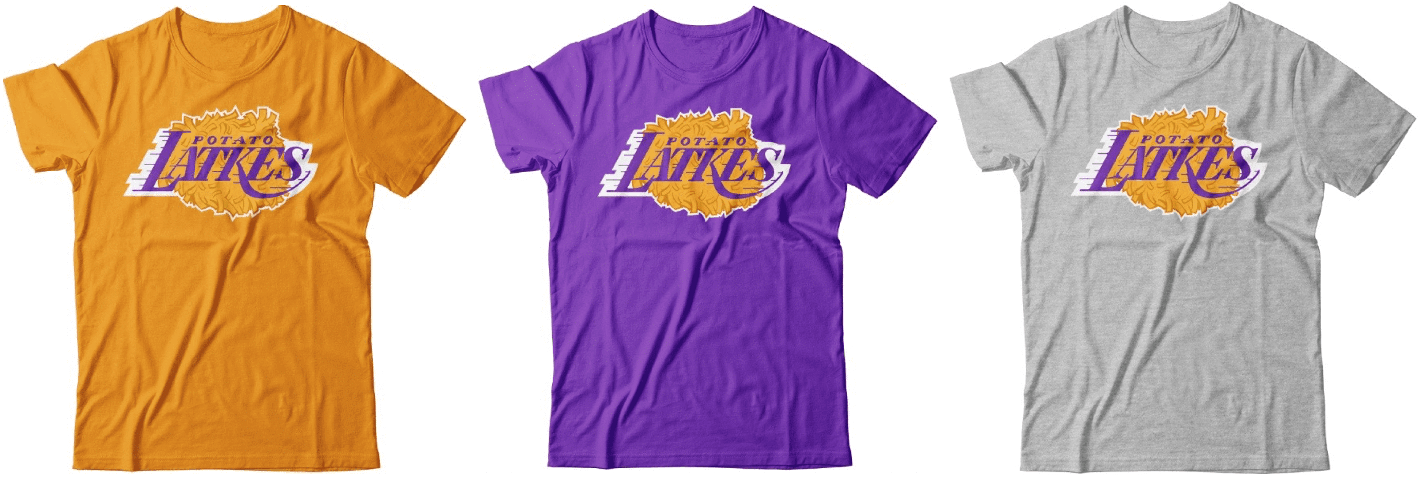
Theoretical reminder: Hanukkah is nearly two months away, but you can get a head start with the latest addition to the theoretical T-shirt menu — or at least you could if they were actually available for purchase.
Wouldn’t it be fun — you know, just hypothetically — if these shirts were available? If you’d like to talk about that — or about any of the other menu items — shoot me a note and we can discuss that lamentable state of affairs.
Color Remix reminder: In case you missed it on Tuesday, Uni Watch Color Remix merch is now available in Halloween colors. Let’s start with the caps (click to enlarge):
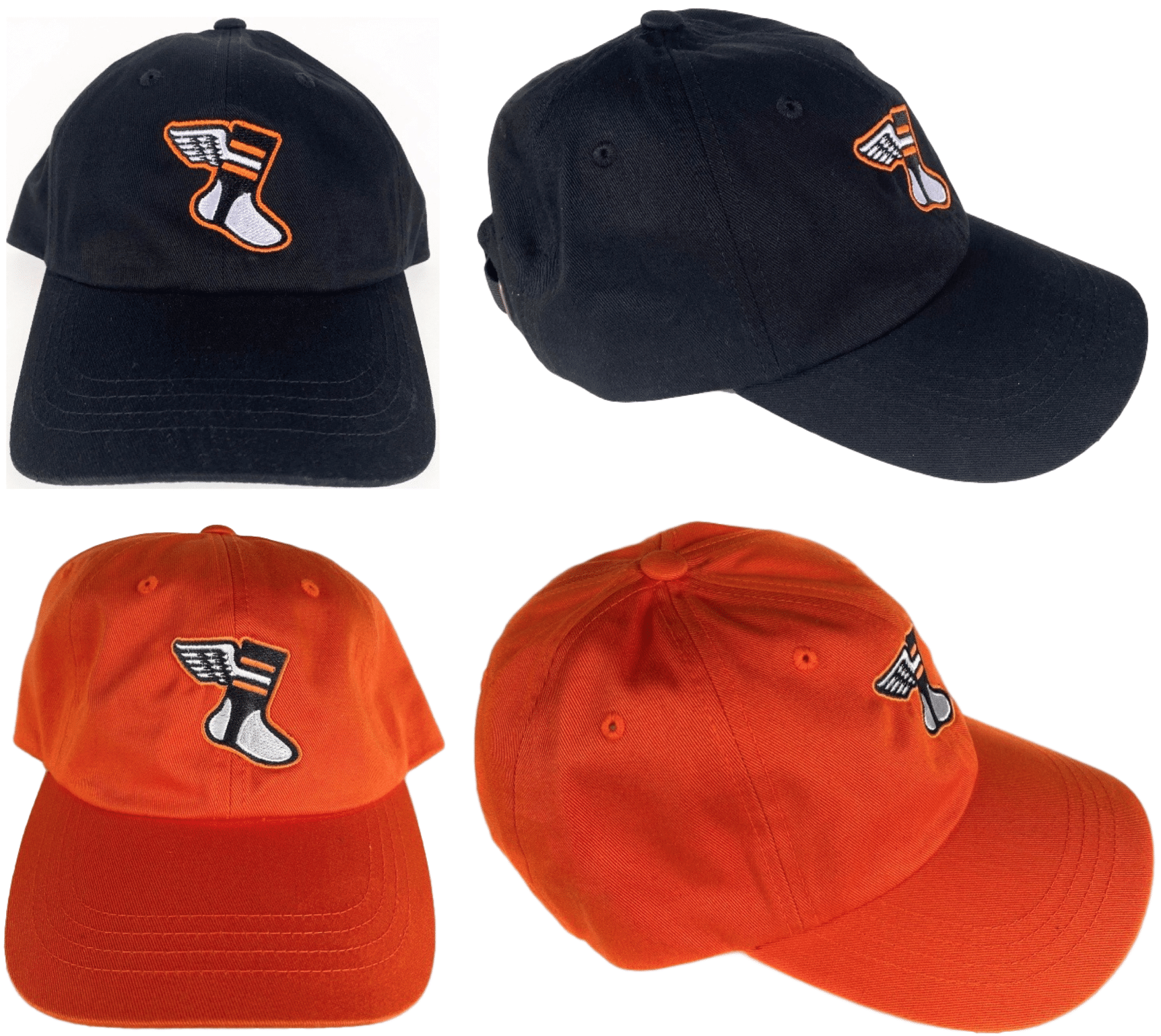
These will be available for a limited time here.
In addition, we have corresponding T-shirts:
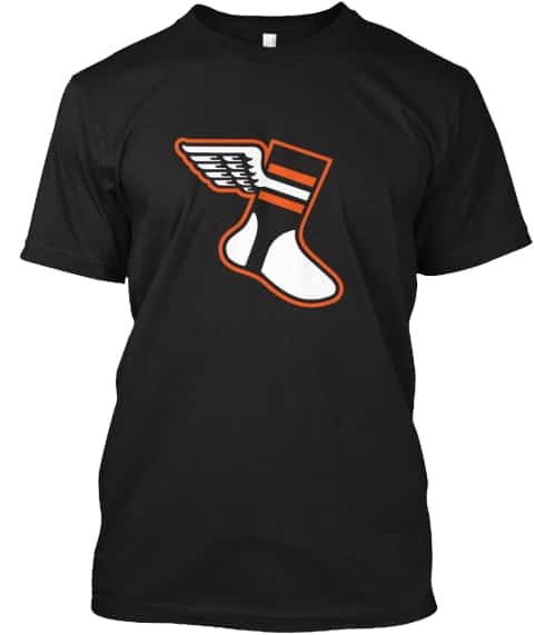
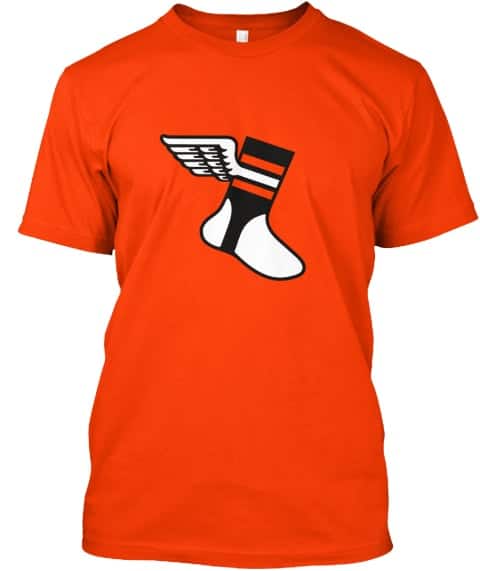
Here’s where you can order the black and orange versions. They will remain in the Uni Watch Shop for the foreseeable future.
Finally, this is the last week for ordering the first round of Color Remix caps, so move fast if you want any of those. Thanks!
The Ticker
By Paul

’Skins Watch: The Wahoo cap logo was apparently digitally removed from a recent Gatorade commercial featuring Cleveland Indians SS Francisco Lindor. … Speaking of the Indians, the local ABC-TV affiliate in Cleveland did a segment on the team’s search for a new name (from @spiders_six). … A Chicago Blackhawks statue outside the team’s arena was vandalized by pro-Native activists earlier this week. … John Jay High in Cross River, N.Y., has a new mascot after ditching their Native-themed one (from Timmy Donahue). … If you think a Native-themed logo or uniform is problematic, check out the player-intro tunnel at South Grand Prairie High School in Texas — yikes (from Chris Mycoskie). … Loveland High School and Bill Reed Middle School, both of which are in Loveland, Colo., have renamed their sports teams the Red Wolves and Wolfpack, respectively, replacing their former Native-themed team names (from Kary Klismet). … The Philadelphia neighborhood of East Passyunk is scrapping its Native-themed logo (from Michael Hochman). … Good article on how MiLB’s Peoria Chiefs long ago moved away from using Native-themed imagery (from Ben Zoss). … According to an analysis by FiveThirtyEight, 45 schools across the country still call their teams the Redskins, and hundreds more still use Native imagery (from Kenneth Traisman). … The video game Fortnite is offering refunds to players who purchased Washington Redskins uniforms for their characters now that the uniforms have been removed from the game following the team’s rebranding (Kary Klismet again). … Marion High School in Iowa will no longer call its teams the Indians (from Jay Wright).

Working Class Wannabes™: Here’s a doozy: Did you know that the lacrosse team at Brown — you know, the elite Ivy League school with a $4.2 billion endowment — likes to call itself “Brown State”? Team alums even wear “Brown State” jerseys. This 2016 article has good (read: cringe-inducing) info on the phenomenon, including this quote from then-coach Lars Tiffany: “It’s sort of evolved into the mindset and the attitude we play with. Blue-collar, edgy, tough.” … Jacksonville Jaguars DL Abry Jones, talking about how to get the team’s defense back on track, says, “I really don’t have a secret formula for you. That’s just the good old football, blue-collar grit. Go back to the drawing board, grind it out and make the results come on Sunday.” Bingo! … An article about Kansas State football coach Chris Klieman says he’s popular with the K-State community “both for his blue-collar nature and his on-the-field success.” … An article about Toronto Maple Leafs GM Kyle Dubas says Dubas “must find ways to mix more blue collar hockey with the slick Bay St. bankers now populating the Maple Leafs.” … A high school soccer coach in Ohio says, “We can’t just show up and just roll over teams. We’re blue collar. We’re workhorses.” … An article about a high school basketball player in Kentucky — a native of the Democratic Republic of Congo — praises “his blue-collar approach.” … An article about an upstate New York high school soccer team says they have a “blue collar attitude.” … An article about Boise State running backs coach Winston Venable says the team’s “traditional blue collar mentality is in his DNA.” … Navy defensive coordinator Brian Newberry describes the Temple football team like so: “They’re a blue-collar operation. They’re a tough, gritty football team with a big, physical offensive line.” … An article about NBA Finals standout Jimmy Butler says he has a “blue-collar approach to the game of basketball.” … The coach of the Commerce High School football team in Georgia says, “When you have kids who buy into [the importance of the offensive line], who are kind of blue collar workers in the weight room, workers on the field, they’ll get better.”

Baseball News: Cal Ripken Jr. is auctioning off a bunch of his personal memorabilia to benefit his foundation (from Mike Chamernik).
.
.

NFL News: Remember my recent post about how Oxford Pennant is celebrating Bills victories with new banner designs? The Bills had their first defeat of the season on Tuesday, losing to the Titans, so I asked Oxford co-honcho David Horesh what will happen to the banner that had been planned for that game. “This one was not specific to the Titans game or any particular narrative, so we’re going to put it in our back pocket for future use at some point down the road (but not this weekend),” he said. … Following up on an item from yesterday’s Ticker: The Rams’ jersey schedule, released prior to the season, called for them to wear bone dishwater this Sunday against the 49ers. But the Niners announced on Tuesday that they’ll be wearing white throwbacks, which means the Rams would actually be wearing blue (because you can’t have a white-vs.-dishwater matchup — not enough contrast). So did the Niners, who are the home team (but who don’t provide a full-season uni schedule, grrrr), change their jersey choice for this game? Is that even allowed? I checked with a Rams spokeswoman, who said their jersey schedule graphic was wrong, and they were actually planning to wear blue for this game all along. So that’s the explanation. … In a true loss for humankind, we won’t be able to make fun of the Pro Bowl uniforms this winter because the game has been cancelled. … The Jags will wear teal over white this weekend. … @lemaxb created some good Disney-fied NFL team logos.
College and High School Football News: Cincinnati will wear red-white-white this weekend (from @NatiFish). … Syracuse will go orange-navy-orange. … Richmond Academy in Augusta, Ga., is one of the country’s oldest high schools, founded in 1783. They have an “R” on one side of their helmet and their founding year on the other (from Jason Scherer).

Hockey News: The Golden Knights Photoshopped newly acquired D Alex Pietrangelo into their new gold alternate uniform, which hasn’t yet been worn on the ice (from Blake Noud). … Newly acquired D Justin Schultz will wear No. 2 for the Capitals (from Wade Heidt).

NBA News: The Nets finally confirmed the uni-verse’s worst-kept secret, namely that they’ll be adding 1990s tie-dye throwbacks to their wardrobe next season. … Another Raptors jersey — this time the new primary red design — leaked yesterday, prompting the team to finally go ahead and unveil/confirm its new uni set this morning. … LaMelo Ball, who may be the top pick in the next NBA draft, has signed an endorsement deal with Puma. … The next D League season might be cancelled.

College Hoops News: UCLA coach Mick Cronin wore a snazzy retro-themed jacket for the first day of practice (thanks to all who shared). … New uniforms for the Newman University women’s team (from Blake Cripps).

Soccer News: Reader Max Jones made a Louisville City pumpkin carving. … Wales’s shirt choice last Sunday was made to avoid a potential colorblindness issue (from @MikeDfromCT). … Belgian team Club Brugge has released renderings of its planned new 40,000-seat stadium (from Kary Klismet). … Argentinian club Quilmes has new preseason shirts. “Not often you see clubs release shirts just for that,” says Ed Zelaski. … D.C. United just added cardboard cutouts from most of the other D.C. pro teams — Nats, Caps, WFT, Wizards, Spirit, and Mystics (from our own Jamie Rathjen).

Grab Bag: New 100th-anniversary logo for the D3 Midwest Conference (from Jackson White). … The U.S. Air Force’s security forces are getting new ballistic helmets (from Kary Klismet). … Also from Kary: “Here’s an interesting piece that profiles the 30-year career of Northwestern University assistant equipment manager Meli Resendiz and examines her role in expanding the school’s ‘Gothic’ alternate uniforms across multiple women’s teams.” … Ooh, check out this photo of the city of Pittsburgh’s Traffic Division sign shop! Great stuff (big thanks to Nicholas Yon). … U.K.’s netball team Severn Stars have switched kit manufacturers, to Kukri. “I don’t think that manufacturer will have popped up on Uni Watch too much because they apparently don’t do any soccer teams, but they do do lots of other sports,” says our own Jamie Rathjen. … New logo for Facebook Messenger. … New logo and design scheme for the online publishing platform Medium.

New walkway looks very nice, Paul!!
On the Alex Pietrangelo photoshop they obviously don’t know what number he’ll wear. It will be interesting to see what that jersey looks like live, that picture definitely has a more mustardy look than some of the earlier pictures.
Re: Raptors – and agree with a previous comment made by Paul on the ever-changing Raptor look – i.e. interesting I’m living in a city that is experiencing the equivalent of the San Diego Padres of the 70’s and 80’s, but I do like that white uni. Although the chevron look – while I get it – pointing north – also kind of symbolizes mountains – and I can assure you – there are no mountains here – lots of ravines.
In regard to the porch photo, I guess a potential uni-watch pool option could be – when will the last leaf fall?
New Raptors uniform alright when compared with the old one, especially the white uniform. I’m digging the black alternate with the barbwire pinstripe.
I would have been for the Raptors going just red and white, but this is fine. Looks like there may be a purple uni coming. Interested to see that.
Years back, I was for the Raptors changing their name. Going with Toronto Huskies and wearing just blue and white like the original NBA team. However, the Raptors brand is established now, especially since winning the NBA title. I am not for a name change anymore.
Speculating here (no actual evidence of this), but I suspect the “we the north” was first conceived as part of the rebranding to the Toronto Huskies – it’s unfortunate that the team became good just at the wrong time, as while Huskies is a common name, it fits the whole “we the north” imagery and is a whole lot better than the Raptors.
I agree on the red and white – happy memories I think they like red/black because it’s tied to a lot of our national sports teams and they want to market themselves as “Canada’s team”
I still don’t know why the Raptors haven’t adopted the nickname “Torontosaurus”.
As per the Golden Knights’ official Instagram feed, Alex Pietrangelo has taken #7 for Vegas. For reference, old #27 as worn in St. Louis is worn by young star and Since Day One Knight Shea Theodore.
I grew up in the era of the Reds wearing all black shoes. I’d like to see them bring back all black at least for a couple games.
My favorite look was the Black spikes with red logos. This would’ve been around ’85/’86? I’m pretty sure it was in Rose’s stint as Player/Manager. The Reds players had been lobbying for several years against the team policy that required them to dye, color in, or remove their logos as it resulted in lost endorsement deals for them. I’m pretty sure the League stepped in and the Reds, while still mandated to wear black cleats, were allowed to have them adorned with a red logo. I didn’t last long as the Reds closed out the 80’s in Red shoes.
I thought the Nets’ throwbacks were tie-dye. I don’t remember them ever being faux denim like the 1994 USMNT jerseys, nor were they intended to be such.
It’s more of an airbrushed design, I’m guessing to tie-in with the numerous airbrush artists that the Jersey boardwalks are famous for.
It has never been referred to as airbrushed in anything I have read (although I do agree with you, it looked more airbrushed than it ever did tie-dye). It was referred to as “tie-dye” in 1990, and every press release announcing the return of the throwback has called it as such. And to be honest, East Rutherford is metro NYC, and not really associated with the Jersey Shore.
My bad — should have said tie-dye. Now fixed.
In this undated ’71 team photo you can see Ross Grimsley, Dave Concepción and George Foster wearing red/white 3-stripers:
link
I thought these pics were usually taken after the club comes back from spring training(?)
Nice find!
In the ‘Skins Watch section, you’ve got the wrong state for the item about the Marion Indians changing their nickname. It’s Marion, IOWA, not Ohio.
Thanks — fixed.
That Brown State Lacrosse photo confuses me so much. First, he’s wearing a Virginia shirt underneath. And second, there’s the ‘naked girl’ on the sleeve & shorts that is commonly seen on mudflaps of semi trailers. The guy looks like he’s in his 40s and there’s a huge range of people in the background. Whole thing looks like a pickup game.
A lot of lacrosse teams will play a scrimmage against the alumni. My high school team did it every year in the fall (off-season for lacrosse.) The varsity team was usually better (Considering many of the alums were in their 40s), but the alums would always cheat :) It was all in good fun.
The alum teams are not officially part of the school, so they can usually get away with uniforms that would not be allowed by the school.
The “naked girl” is actually the logo for Kappa Sportswear.
link
I laughed out loud at the “naked girl” comment, because I’ve been calling Kappa the “mud flap company” for years. They have link in global soccer, and have for link.
But still.
Lacrosse.
Ivy League lacrosse.
That’s Lars Tiffany; he’s a Brown alum and the then-Brown-coach quoted at length in the linked article. Why is he the ‘then-coach’? Because he’s now the coach at Virginia–hence all the UVA accessories. He’s 52; not a bad guess w/r/t age.
The photo (I reverse searched it) was taken at Lake Placid’s O-45 tournament, so those are fans/families. Brown State won!
I have no explanation for the mudflap logo.
I have one word to say about the Pittsburgh street sign shop photos:
POOP
Can’t wait to see that sign deployed in the city.
“I don’t think that manufacturer will have popped up on Uni Watch too much because they apparently don’t do any soccer teams, but they do do lots of other sports”
– do do (snicker, snicker)
“the article is shot, and it’s worth reading the whole thing“
Should be “short”?
Yes, thanks. Fixed.
It’s Marion High School in Iowa (not Ohio) which is dropping the name “Indians”.
Yup, already fixed.
LSU Volleyball going BFBS:
link
All of this year’s unis:
link
Compared to last year:
link
Never knew this about the Reds!
If we stumped Brinke on an early-’70s Reds story, that’s major!!
Well, to be fair, I was 11 and just discovering MLB, and about to ship off to Texas Rangers-ville. The Reds kicked in in 72, and I’ve never heard of this before!
I asked a friend who is a Dodgers fan if he knew whether the Dodgers have ever done this, i.e. worn blue cleats as a team and he said that he doesn’t know.
I can almost swear I’ve seen at least one person wearing blue cleats in recent years, but as a team? I can’t say that I’ve been paying attention to footwear that much, at least in baseball.
RE: ‘Skins Watch and especially the Cleveland Indians’ seemingly impending name change: I wish teams would just do the right thing and do it already. But also, that they would use it as an opportunity for community outreach and education, not as a response to pressure or virtue signaling.
Personally, I don’t have a problem with names like the Chiefs or the Braves, nor with tastefully used Native American imagery like the Blackhawks. However, that line is so impossibly hard to draw between “tasteful depiction” and “caricature” when many (most?) of the teams using NA imagery fail to have it designed by or approved by the actual people they are claiming to represent.
My solution is simple. Anything that is a direct reference to Native Americans has to go: the Blackhawks logo, the Redskins (obviously), the Indians and Chief Wahoo and everything similar. Anything that is a general reference to Native Americans – like the Chief’s arrowhead or the Brave’s tomahawk – can stay PROVIDED that they depict Native American’s respectfully and not as savages (in the same way we would “honor” the Vikings or Fighting Irish as positive attributed for athletic competition).
In all cases, the historical use of the names and logos should be retained. The Redskins won Super Bowl XVII, not the Washington Football Club, and the Indians lost the 95 World Series, not the Spiders. To do otherwise robs people of the opportunity to ask “why did the name change?” or “why was it ever okay to call a team what is pretty clearly a racial slur?” and covers over a complex history instead of owning both the troubled past and the eventual correcting of that past.
I’m shocked that the famous sports drink with a G and all those peak-performance electrolytes is no match for COVID-19. They should stop plastering its name on basketball competitions.
OK I was waiting for the Elvis Costello reference about the Reds, seeing none, here it is!
Oh, I used to be disgusted
Now I try to be amused
But since their wings have got rusted
You know the angels wanna wear my red shoes
(Had to put two of my favorite 70’s icons together…)
link
Nice!
What I see on the “Brown State” lacrosse player.
The shorts are Under Armor not Kappa.
I see the mud flap naked girl(no corresponding naked man) on the shorts, she is also on both sleeves.
I’ll take your word that it is related to Brown University, however because of the colors, the font, and a host of other indicators the uni reads UVA to me.
His whole uni seems to me to be one whole inside college joke, that out of context we are not privy to.
Funny to see the reference to “the Adidas Co. of West Germany.”
Latkes might be the best hypothetical shirt yet. It’s hard to top the simplicity of Meats, though.
I thought that was funny, too. Especially since the Dayton paper considered Adidas to be so well known that it could just be referred to by a description of its logo.
Like Brinke, you stumped me as well. Never knew about the Reds’ red shoes experiment. Great stuff.
That Cal Ripken auction has his helmet from a 1991 throw back game. That game has a notable uniform story that I remembered where Gregg Olson epically blew a save and then afterwards threw his whole uniform (shoes and all) in the trash in frustration.
link
You may have addressed this at some point and I missed it, but it feels like `’Skins Watch` should be renamed now that Washington changed their name/identity away from it. I’m not sure of what would be good to replace it, but maybe something more generic like the `Working Class Wannabes` .. `Indigenous Appropriators`. I don’t know.
This gets addressed probably twice a week. As long as there are teams out there at all levels refusing to give the “redskins” name, the category name stays.
About once a month it seems some team somewhere doubles down on it.
Did you read today’s installment? If so, then you know why the name “’Skins Watch” is still, unfortunately, appropriate.
The story about the “Polish” soccer club in the Working Class Wannabes section is actually about a high school team in upstate New York.
So it is! Thanks — will fix.
In reference to the Reds’ red shoes diaries, as a former minor league clubhouse manager, I can tell you that cleaning and polishing cleats (especially on a rainy night) was not the most enjoyable part of my job. If I had had to do two pair every night for every team member, I would not have been happy. Having said that, I had to deal with black, red and blue shoes regularly in teh 1980s Texas League.
I’ve been a Reds fan since I was a young boy in the 1970’s. And I never knew about the ballclub wearing red shoes briefly in 1971. Thanks for sharing this story. ⚾️