For all photos, click to enlarge
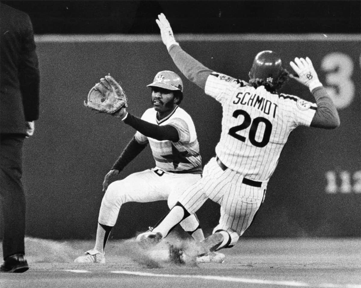
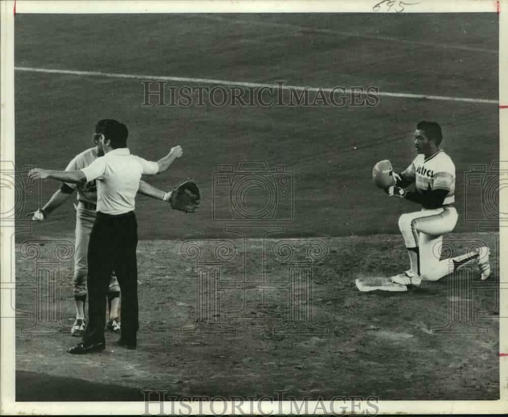
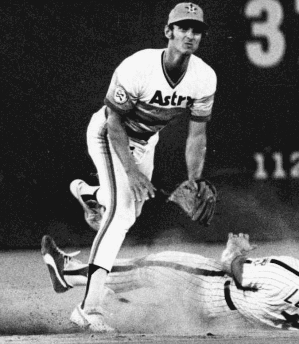
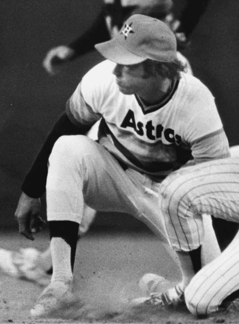
There are several well-known examples of MLBers wearing a batting helmet in the field, including John Olerud, George Scott, Dick Allen, and a few others. Until now, though, I don’t think I’d ever seen Astros infielder Larry Milbourne doing it — or any other middle infielder, for that matter!
That photo came my way yesterday from reader Andrew Woolley, who found it in the Temple University Library archives. According to the caption, the photo was taken on May 4, 1976. I did a bit of research but couldn’t find any other photos of Milbourne wearing a helmet in the field, nor could I find any explanation for why he did so in that one game. Anyone know more?
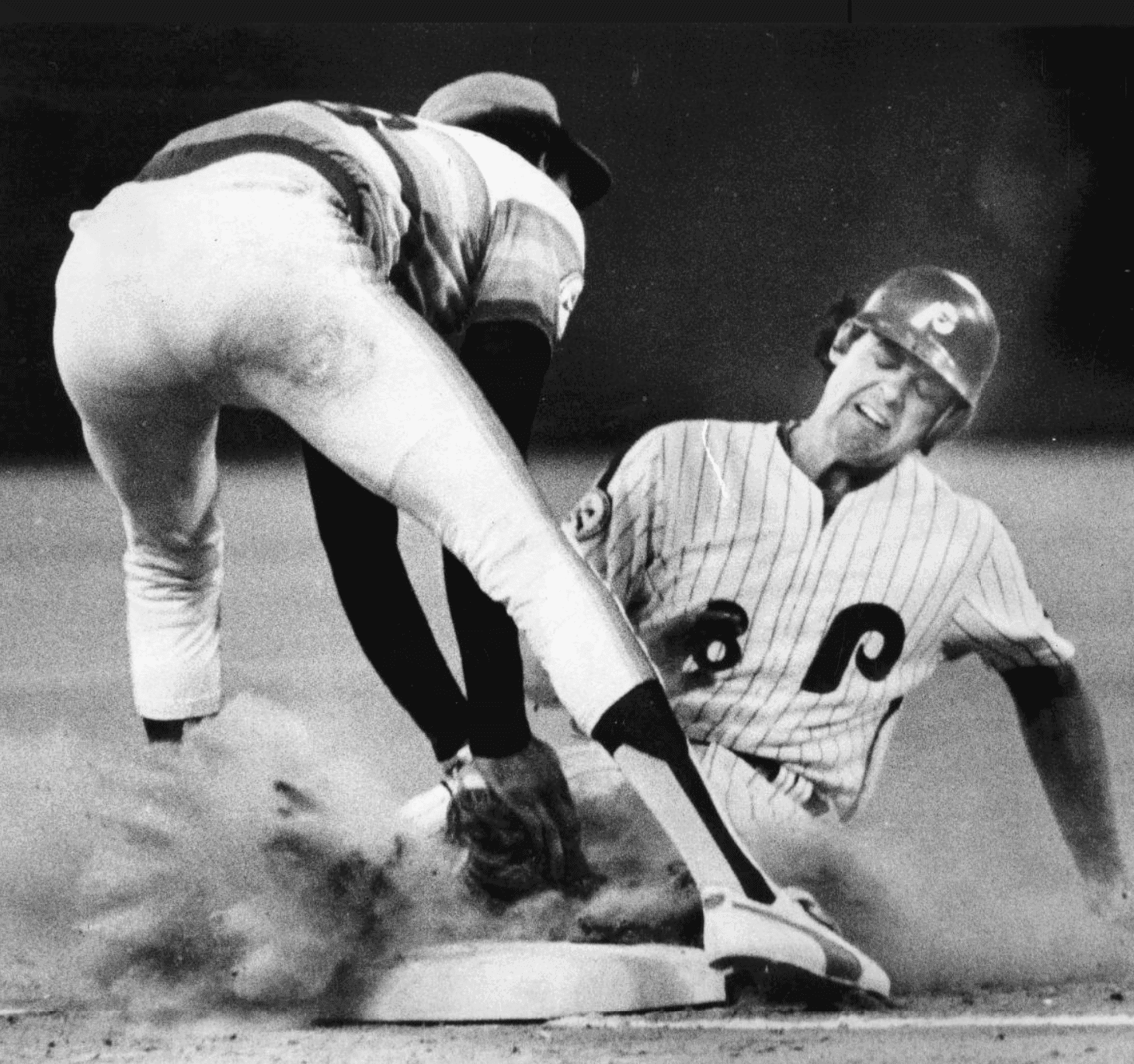
Ah, but the helmet is just the most obvious uni-notable aspect of that photo. Look at Milbourne’s stirrups. They look like two-in-ones, don’t they? They seem to have those telltale straight lines and corners that two-in-ones have, instead of the graceful curves of true stirrups. Let’s zero in on Milbourne’s hosiery compared to baserunner Mike Schmidt’s:
Definitely looks like Milbourne was wearing two-in-ones. I assume almost everyone reading this knows what that means, right? But just in case, here’s a quick primer on two-in-ones and how to spot them.
For most of the 20th century, baseball players wore stirrups over white sanitary socks. But at some point someone got the idea to combine those two layers of hosiery into one — hence the name “two-in-ones” — by knitting a simulated stirrup pattern into a sock (just like stripes can be knit into socks — same idea). Sometimes the pattern simulates a ribbon stirrup, in which case the “pattern” is essentially just a vertical stripe, and sometimes it simulates a more traditional, old-school stirrup. Here are examples of both — ribbon-style two-in-one on the left, traditional-style two-in-one on the right:
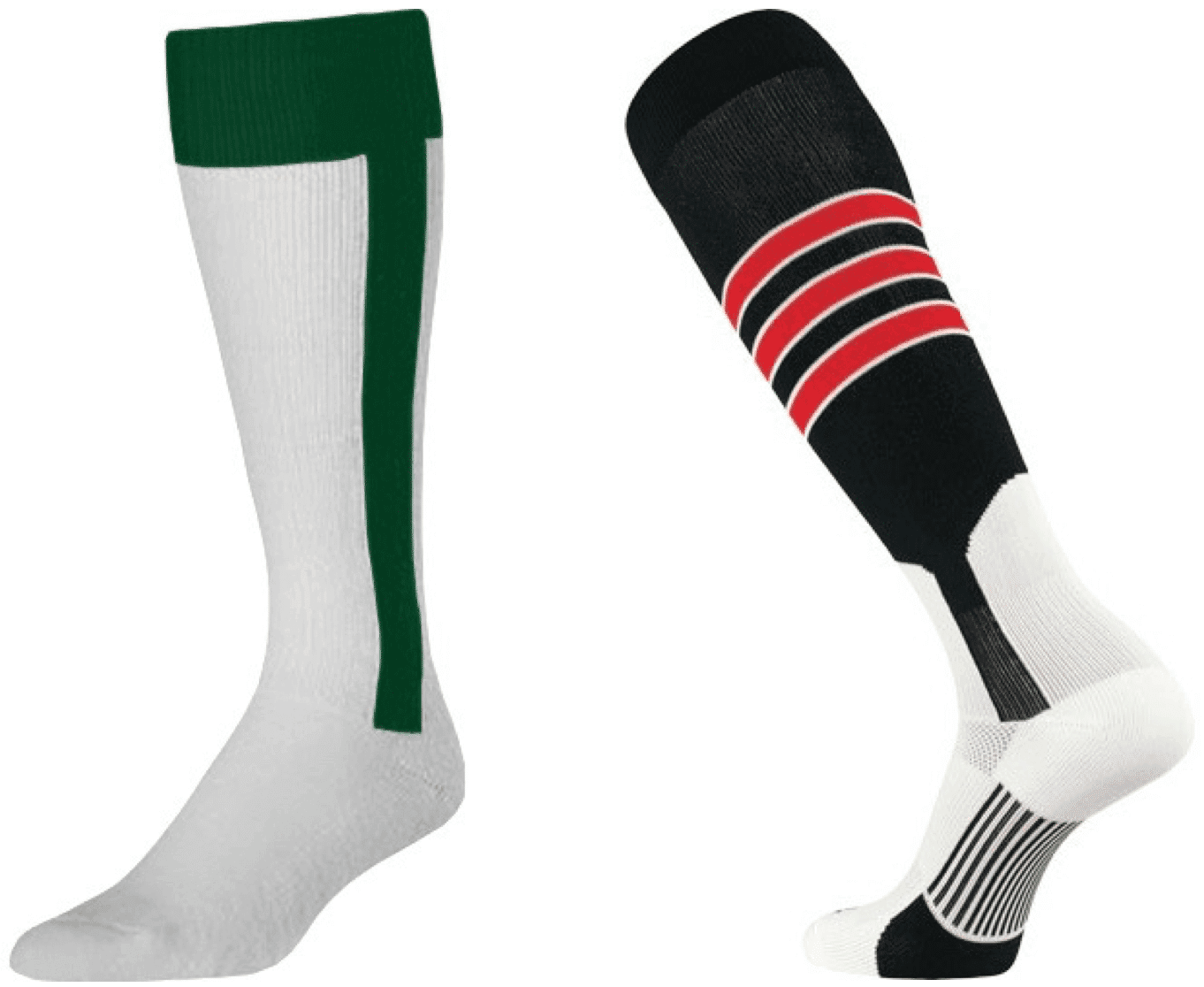
The good thing about two-in-ones is that they’re simpler and lower-maintenance. The bad thing is that they look like shit. For starters, as you can see with the ribbon stirrup, the stripe (along with the rest of the sock) tends to hug the contours of the player’s leg, resulting in a wavy line instead of a straight line. Moreover, one of the inherent limitations of knitting is that ornamentation can only go vertically or horizontally — there’s no way to create a true curve. So a true stirrup’s gracefully curved opening is impossible to duplicate on a two-in-one. Instead, the curves have to be simulated by a series of horizontal and vertical strokes. The result looks a lot like old-style low-res digital bitmapping, complete with jaggies:
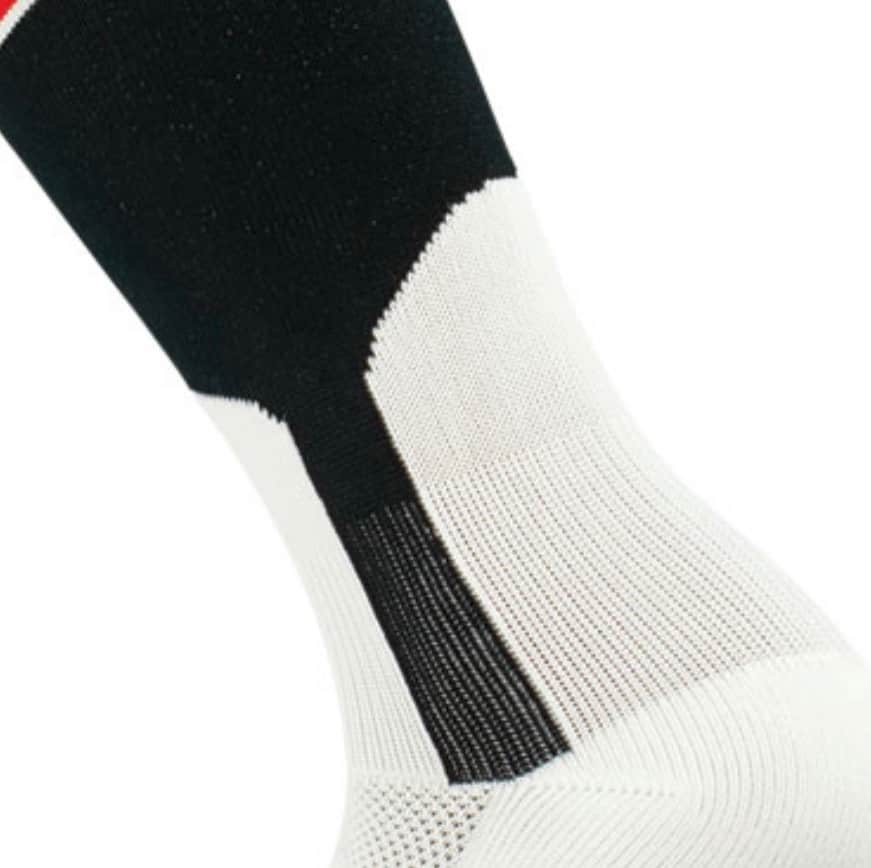
When viewed from a distance, the jaggies aren’t visible, so the line of color just looks diagonal. But diagonal lines are a poor substitute for genuine curves.
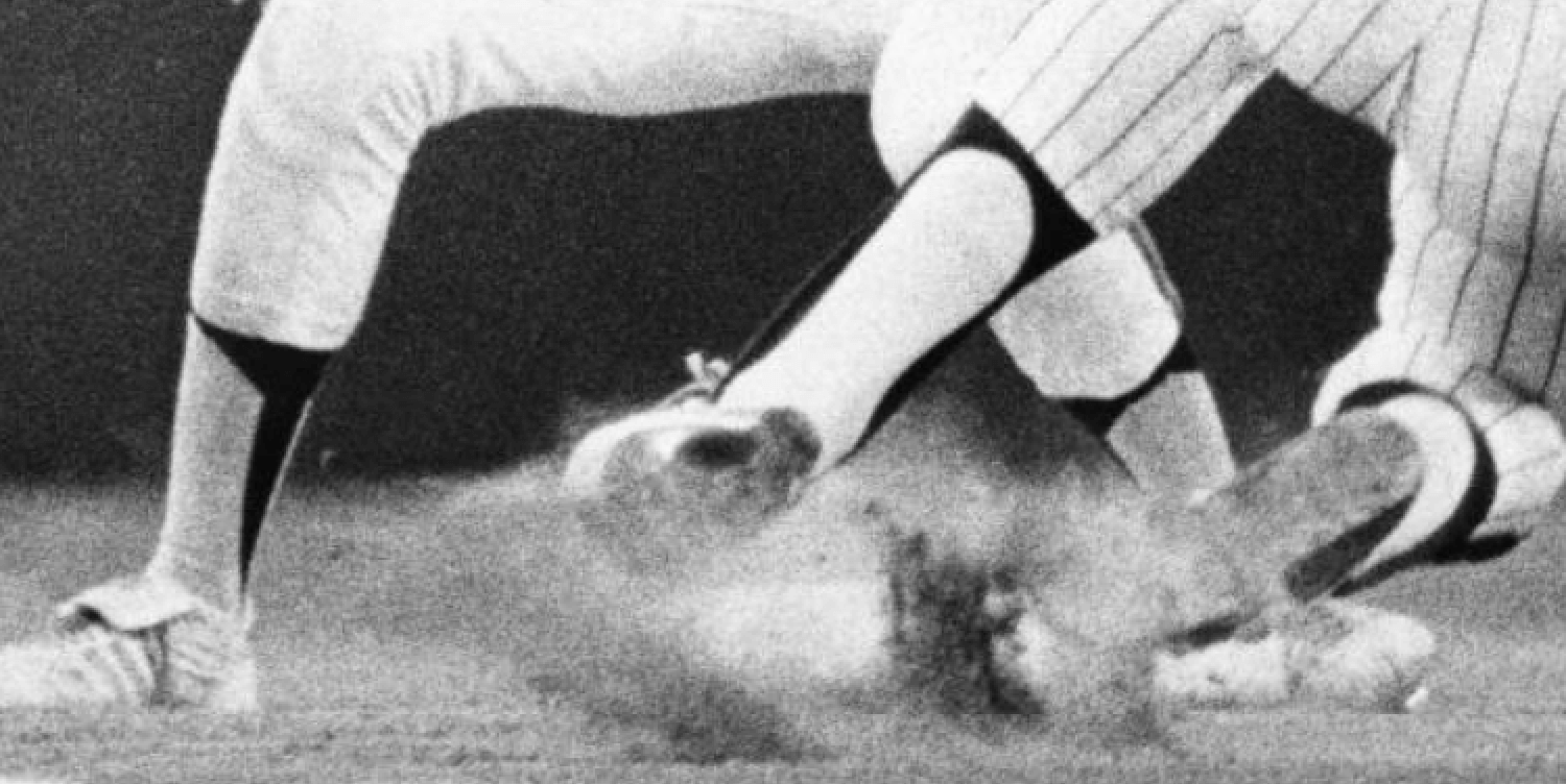
With all that in mind, let’s look again at Milbourne’s and Schmidt’s lower-leg stylings:
As you can see, Schmidt’s stirrup openings have real curves, while Milbourne’s have a series of angled lines. That’s the tell — he’s wearing two-in-ones.
Or at least that what it looks like. But when I saw that photo yesterday, I was still somewhat dubious. “Two-in-ones hadn’t yet been invented in 1976,” I thought to myself. “Milbourne must have been wearing some early form of ribbon stirrup.”
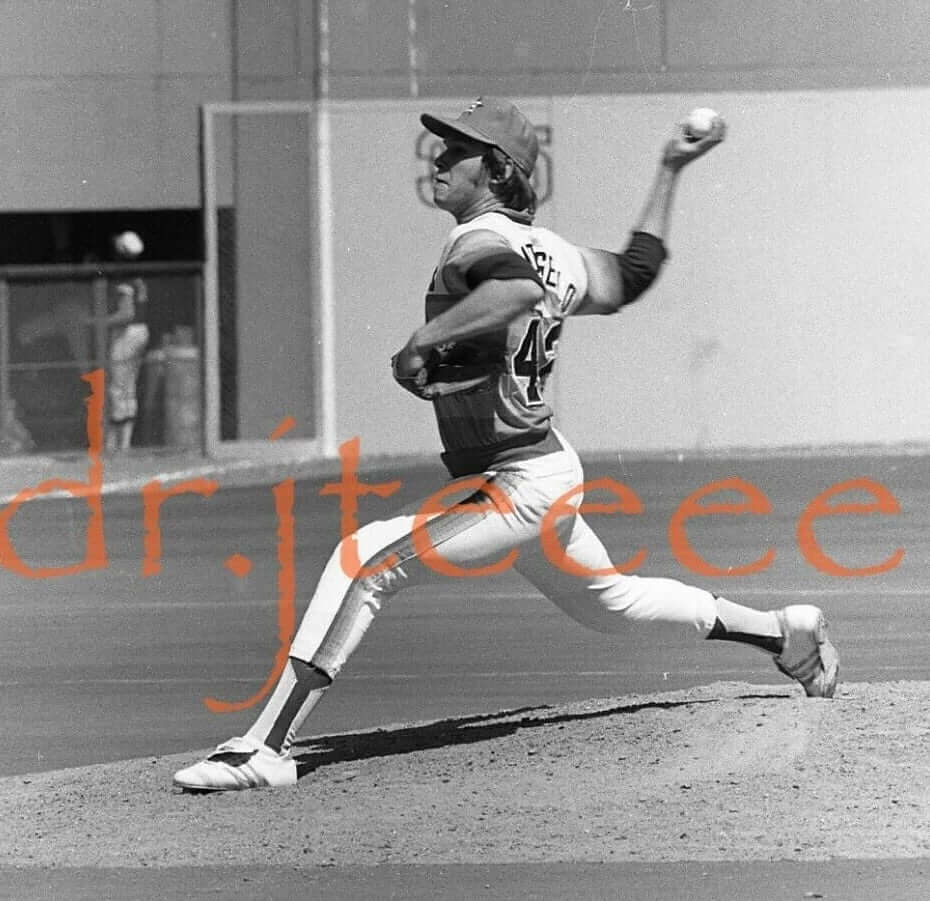
But then, literally about two hours later, reader Emil Frye sent me a 1977 wire photo of Astros pitcher Mark Lemongello — wearing two-in-ones! Check this out:

The blocky lines and corners are even more apparent on Lemongello than on Milbourne!
I have to say, I was watching a lot of baseball during this period (every televised Mets game, every televised Yankees game, every NBC Game of the Week, every postseason game, etc.) and was every bit as stirrup-obsessed then as I am now, but I have zero memory of the Astros — or anyone else — wearing faux stirrups. If you had asked me earlier this week when two-in-ones were invented, I would have said, “Somewhere around the late ’80s or early ’90s,” and then I would have said something about them being a scourge on this Earth ever since. But the ’Stros were apparently using them in the mid- to late 1970s — I had no idea!
I wanted to know if these two instances were just flukes, so my next step was to look for additional photos of Milbourne and Lemongello. Sure enough, here’s another shot of Milbourne with the Astros, purportedly from 1976. You have to click to see the full-size version, and even then it helps if you blow it up a bit, but he definitely seems to be wearing two-in-ones:
As for Lemongello, he’s definitely wearing two-in-ones in this shot (the photo is undated, but he wore No. 42 for Houston for only two seasons — 1977 and ’78 — so it’s definitely from the same time period we’ve been discussing):
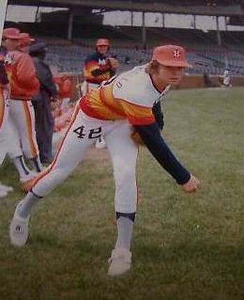
And here’s a color shot of Lemongello (also undated). If I hadn’t seen the other pics, I might not think he’s wearing two-in-ones in this shot. But in the context of the other images, I think he definitely is:
By this time I was convinced: Larry Milbourne and Mark Lemongello were definitely wearing two-in-ones for the Astros in the latter half of the 1970s. But were any other Astros wearing them?
I spent a good chunk of yesterday afternoon looking at Astros photos from 1975 through 1980 (I was so fixated on this topic that I even skipped my daily bike ride in Prospect Park!). I found that many of the Houston players from this period wore genuine stirrups. But quite a few of them were clearly wearing two-in-ones in 1976 and ’77. Those appear to be the only two seasons when the phony stirrups were in use.
Let’s start with some photos from 1976. These next two pics are of infielders Enos Cabell and Roger Metzger:
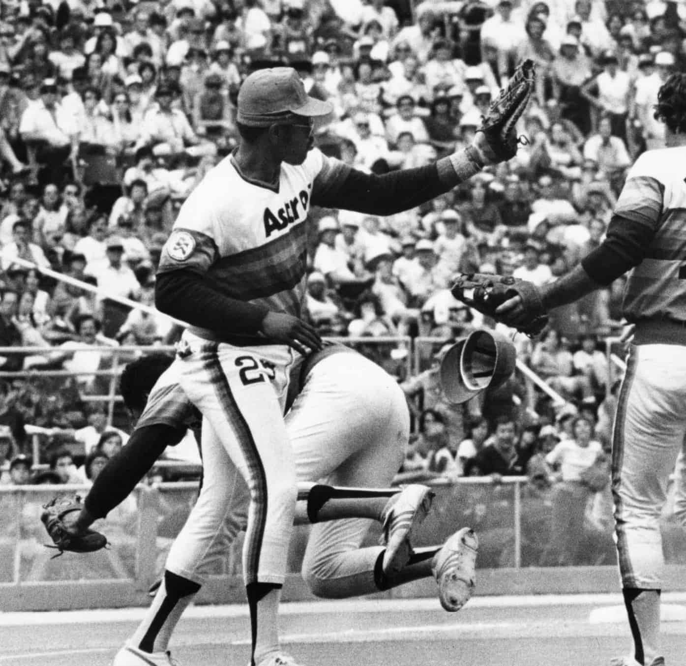
Next up is a doozy of a photo showing (from left) first baseman Bob Watson, pitcher Gilbert Rondon, and third baseman Jerry DaVanon all wearing the accursed faux hose:
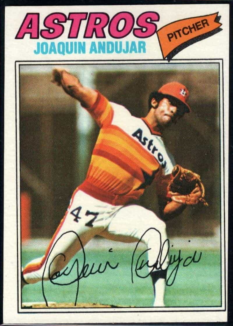
Here’s pitcher Joaquin Andujar’s 1977 Topps card, featuring a photo almost certainly from 1976:
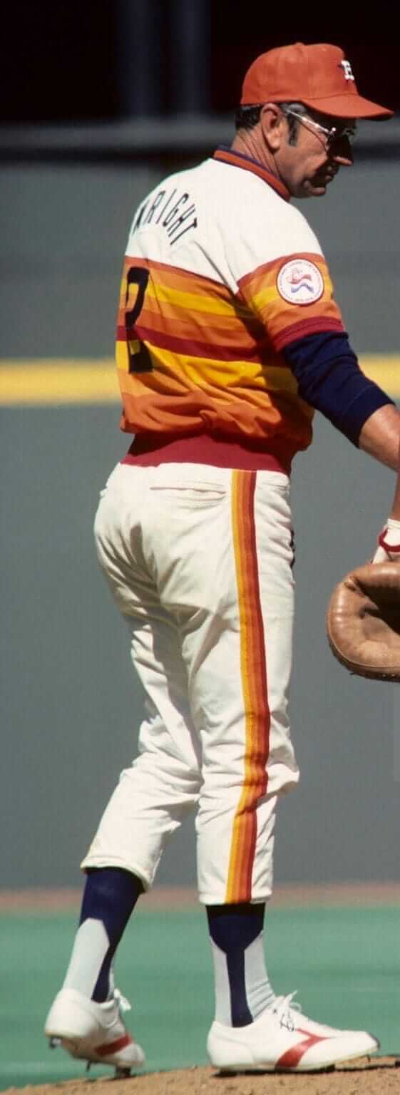
Even the coaching staff wasn’t immune, as you can see in this shot of pitching coach Mel Wright:
Moving on to 1977, here’s a shot of infielder Rob Sperring:
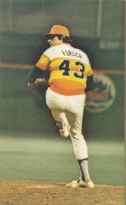
Here’s a color photo of pitcher Ken Forsch. The photo is undated, but that rear-jersey style was used only 1977, ’78 and ’79, and I couldn’t find photos of any Astros wearing two-in-ones after 1977, so I’d be willing to bet that it’s from ’77:
Looks like Cabell was still wearing the two-in-ones in ’77 as well.
———
I could go on, but you get the gist: The Houston Astros definitely had two-in-ones as a hosiery option in 1976 and ’77. Maybe some of you already knew that, but I sure didn’t, and my mind has thus been completely blown.
In some ways, this makes sense, because the Astros were pioneering all sorts of things in the uni-verse during that period, beginning with the groundbreaking tequila sunrise jersey. In addition, they had just become the first MLB team to put uni numbers on pants, the first modern team to use essentially the same design at home and on the road, one of the first two National League teams to wear white shoes (the Phillies were the other), and so on. When viewed in that context, it’s not so surprising that they’d also be the first team — as far as I know — to wear two-in-ones.
The funny thing about all this is that the Astros had two bona fide stirrup stalwarts during that time frame — guys who set a really good example for everyone else. The first, of course, was outfielder Jose Cruz, whose high-stepping high cuffery was the envy of the league.
And Houston’s other hosiery hero? This one might surprise you, but it was manager Bill Virdon, who knew a thing or two about how to wear the lower half of a baseball uniform:
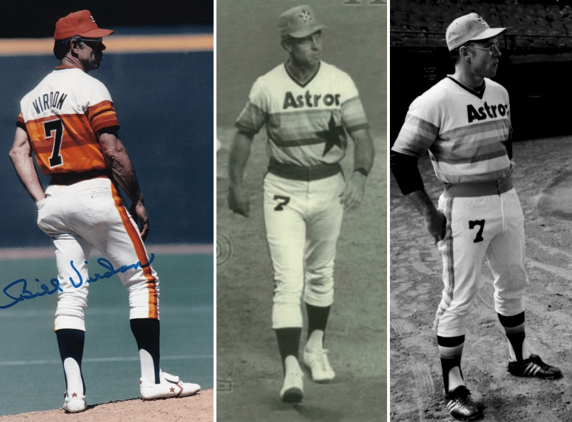
Even as a kid, I always admired the way Virdon wore his uniform. I mean, with a guy like that running the show, who’d want to wear anything else? But then I found this 1977 spring training shot — definitely two-in-ones. Et tu, Bill?
Anyway: I still don’t understand how I never noticed this before. Of course, it never would have occurred to me back in 1976 that faux stirrups could even exist, so I wouldn’t have been looking for them. Still, it seems like I would have noticed that Houston’s ’rups didn’t look quite right, and it definitely seems like this would have come up on Uni Watch prior to now. But it’s always good to be reminded that there’s still a lot to learn out there!
Meanwhile, we still don’t know who came up with the idea for two-in-ones, or how they became part of the Astros wardrobe, or why they stopped wearing them. If anyone knows more, I’m all ears.
Update: A few minutes after this post was published, the great Twitter-er @QuirkyResearch (aka Jeremy Snyder) found a 1977 Palm Beach Post article that extolled the virtues of the Astros’ uniforms, including the following:
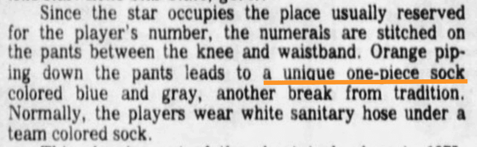
So the two-in-ones were definitely part of the tequila sunrise toolkit. Again, I’ve never heard about that before. Amazing stuff!
(Super-duper thanks to Andrew Woolley and Emil Frye, whose photo submissions yesterday led me down this very intriguing rabbit hole.)
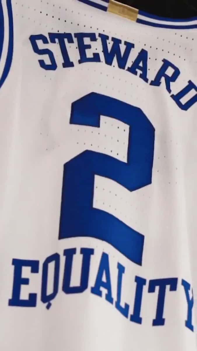
Q tip: The Duke basketball team yesterday announced that the word “Equality” will appear below players’ rear uni numbers. Irrespective of the messaging, what I found most fascinating about this was the letter “Q” — it’s basically an “O” with a little diamond at the bottom. Not sure I’ve ever seen a Q rendered in quite that way before. I really like it!
(I’m sure there’s some sort of pithy QAnon joke that could be made here, but let’s please skip that. Thanks.)
(Thanks to Ian Lee for this one.)
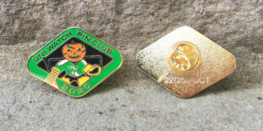
Click to enlarge
October Pin Club reminder: In case you missed it on Thursday, the Uni Watch Pin Club’s October design is now available. As you can see above, it features a jack-o’-goalie (complete with Gerry Cheevers-style stitch marks on his face!). It was produced in a limited/numbered edition of 250 pins, and we sold 124 of them yesterday. You can order yours here.
Need to get caught up? Here are our January, February, March, May, June, July, August, and September pins. (Sorry, April sold out!)
Also: I’m trying to get at least a ballpark sense of how many people have been collecting ’em all. If that’s you, and if you plan to purchase the remaining pins to complete the year-long collection (in which case you’ll qualify for a bonus pin, available only to collect-’em-all-ers), please shoot me a note. No need to provide any documentation or proof — that will come later. For now, I’m just trying to get a rough sense of how many people we’re talking about. Thanks!
The Ticker
By Anthony Emerson

Baseball News: The Cubs legal department may want to contact this trucking company (from Kevin Gahalla). … The Chiba Lotte Marines will wear 2005 throwbacks over the weekend (from @bigdaddy45_1969). … Speaking of NPB throwbacks, the Orix Buffaloes wore 1967 Hankyu Braves throwbacks yesterday (from Jeremy Brahm).

NFL News: Last night’s Thursday Night Football broadcast cropped the Broncos’ logo in a very odd way (from multiple readers). … The Broncos also have two guys on their roster with “III” on their nameplates, which might be the first time a team has had two players with that specific NOB permutation on the roster (from Adam Stockinger). … The Ravens will go mono-white in the battle of the Beltways (from Andrew Cosentino).
College/High School Football News: Memorial sleeve patches are rare in football, but Iowa has added one for former head coach Hayden Fry, who died back in December (from multiple readers). … Florida Atlantic has unveiled their new uniforms. Very Patriots-y, no? (From Ayden Pierce Maher.) … Penn State will award the No. 0 to a special teams player who is a “tough, dependable, disciplined, physical leader who inspires his teammates with his accountability and production” (from William F. Yurasko). … Vanderbilt will have a new helmet featuring a retro logo and the Nashville skyline. The rest of the ensemble can be seen here (from multiple readers). … Virginia Tech will wear maroon-white-maroon at Duke (from Andrew Cosentino). … Virginia will go blue-white-blue tomorrow (thanks, Jamie). … South Carolina will go mono-white against Florida (from Tyler Cronin). … Richmond’s equipment manager describes his job as “just spraying [sanitizer] all the time” in the age of Covid (from Tommy Turner). … On a similar note, Arkansas posted a video about what their equipment manager goes through to get game-ready during a pandemic (from Matt Snyder). … NC State will go red-white-red (from Gabe Cornwall).

College Hoops News: California University of Pennsylvania has a new floor (from Kary Klismet).
.

Soccer News: For the second year in a row, West Ham’s women’s team will wear pink shirts in October (thanks, Jamie). … Also from Jamie: New kits for Scottish third tier side Forfar Athletic.

Grab Bag: Two Irish hurling clubs with clashing colors usually both wear their second kits when they play each other. But this year, both their second kits are dark-colored, so they’re having a coin flip to decide who will wear what. That linked article also mentions the ways the clubs have solved color clashes in the past (thanks, Jamie). … Casey’s, an Iowa-based convenience store chain, has a new logo (from Kyle Treckey). … American University has put together a virtual tour of its athletics facilities for potential recruits who can’t visit in person due to the pandemic (from Kary Klismet). … Also from Kary: Major League Rugby’s Utah Warriors have announced plans for a 10,000-seat multi-purpose stadium in Salt Lake City. … Italian rugby club Zebre have some really crazy and totally awesome new kits (from Stephen Mason). … New logo for the Sailor Pen Company (from Scott Rogers). … New rugby union uniforms for Welsh sides Scarlets Rugby and Cardiff Blues (from Ed Zelaski).

Our latest raffle winner is Anthony Gonsalves, who’s won himself a Uni Watch Color Remix T-shirt. Congrats to him, and my repeated thanks to Zach Pearce for sponsoring this one.
Mary and I are getting our flu shots this morning. If you haven’t already gotten one, you should do it soon!
Enjoy Phil’s weekend content, stay well, and I’ll see you back here on Monday. — Paul
Another terrible thing about 2 in 1 stirrup socks is that the stripe ends at the ankle and can’t loop around the bottom. Pull your sock up too high and it’s a suspended floating stripe. Lame!
True. Although those Astros two-in-ones *did* extend properly into the shoe!
This is probably the reason we didn’t notice till now!
Another thing about 2-in-1s is that they aren’t woven (weaved?) with a difference in the front and back. at least I’m not seeing one.
Re. the Q on the Duke jerseys, is the little extension centered? Seems really weird; it should be slightly to the right, no?
The first thing I thought of! It’s pointed in the wrong direction. A Qtastrophy!
Cool article and investigation. That said, I would change the title and remove FAKE! It gave me the impression the picture was a fake and that the article was going to expose it. Especially the way you started about the helmet. It of course became obvious what you meant but I do not think the title needs this extra bit to pull the reader in.
I had the exact same experience. Took me until I was pretty much done reading for the headline to click. I kept waiting to find out what was fake about the photos!
It should be the “battle of the Beltways” plural. WFT plays inside and adjacent to the Capital Beltway. The Ravens play inside the Baltimore Beltway but closer to downtown.
MLB initially called the DC vs. Baltimore series Battle of the Beltway, but by 2010, went to the Battle of the Beltways.
BTW, The WFT stadium can be viewed from the Capital Beltway. I assume that the Ravens stadium is visible from Key Bridge along their beltway.
My web site link in my name has a post I wrote about it last year after a really bad MLB dot com headline and worse Nats performance.
Fixed!
Actually, you cannot easily see the Raven’s stadium (or Camden Yards which is right next to it) from the Baltimore beltway. You can see it easily from I-95, though.
For whatever reason, there are so many people that I know that refer to 95 or 83 as “the beltway”. I gave up on correcting them LOL
I’m amazed that a MLR franchise has enough coin now to build a RSS (rugby specific stadium). Or is this sharing hosting with a high school or Live Nation?
According to the article, “(t)he planned state-of-the-art facility will also play host to community, high school, concerts and other entertainment-industry events and serve as the vital anchor tenant for a live-work-play entertainment-style district in one of Utah’s Wasatch Front communities.”
So it sounds like they’re really counting on events other than rugby games to justify the construction.
Casey’s is awesome. I love that place. Its actually a gas station/convenience store, not a chicken restaurant, though the new logo really makes it look like one doesn’t it? I’ll miss the old logo; it reminds me of home and I have to say I wish they didn’t change it.
Paul, loving the night-time pandemic cocktail photo. Almost Halloweeny!
I didn’t see it mentioned above, but OMG how crappy did the Jets look last night (both on the field and more importantly, in terms of uni combo)? I hate the mono look anyway, but the all-black with solid socks looked silly. I wonder if they will ever pair the black jerseys with the green pants. That would certainly be better! I thought it looked particularly bad on Flacco. He’s tall and thin, and with his helmet choice he looked like a green-tipped ball point pen! No idea if there is such a thing. I can hardly express how much I hate the Jets’ uniform changes, the lone exception being the color of green on the helmet (that logo blows, though; so boring). Perhaps only three more years?
Thanks, Tim. Porch o’clock was later than usual last night, so the sun had already gone down. We prefer to have cocktails before dusk, although that will get increasingly difficult as the seasons change (and especially after the clocks back in November), so this photo is a foreshadowing of ones to come.
Re: the Schmidt photo:
1) Always up for a positive Temple U shoutout
2) The other “tell” is that on Schmidt’s left leg, you can see the gap between the stirrup and the leg. On Milbourne, you can’t.
A little more on that Q with the diamond. I work with graphic designers of an apparel company. There are some Full Block fonts that the Q comes like that. Whenever we see that Q used we fix it by removing the diamond & add a slanted bar. I suppose whichever company that designed the jersey graphics have different standards than we do.
I noticed the “III” on the Broncos as well and thought it was odd that in their proprietary font, it looks more like “111”. Trying to find a screenshot, but look here…
link
Yeah, because the letter “I” (which is used for Roman numerals) is odd in that custom font.
I put this in the comments yesterday, but figured I’d put up again since it was late. The cycling world was rocked by this kit reveal yesterday. I think it’s terrible and has no redeeming qualities, somehow some people love it.
link
Also to raffle winner Anthony, the proper spelling is Gonçalves! (joking! But I do have the original spelling as part of my name)
Posts like this make my day, core Uni-Watch stuff.
I am just here for the Mike Schmidt photos!
The Asterisks two in ones were probably one of those Uni-aware moments of my youth. I remember being at Dodger Stadium sitting in the old dugout boxes, seated right next to the visitor’s dugout. In the mid/late 70’s I was still playing youth ball, and always had stirrups that looked more like Frank Robinson’s (e.g, had cut the stirrups and inserted some elastic). We thought that was cool.
That game sticks in my head because of (1) the observation of the stirrups and (2) watching Cesar Cedeno of the Asterisks run over the Dodgers Catcher (I think it was Steve Yeager) to score a run.
Two in ones, as well as ribbons, should have been outlawed. Stirrups with sanitaries (the socks under the stirrups, for you kiddos out there lol), was the only way to go.
Paul, back in May 2019, you ran a piece about Keith Hernandez talking about stirrups and shoes.
In it he mentions Brooks shoes.
You said, at the time: ” Until now, I had never heard of Brooks Shoes. There’s a company by that name that makes running shoes, but it’s not clear, at least to me, if that’s the same company Hernandez was referring to.”
Now, I don’t know: but the picture of Astros’ coach Mel Wright in today’s lede shows him wearing shoes which are (given it’s the 1970s) similar enough to the logo of the modern Brooks running shoes
link
to suggest that he, at least may have worn Brooks cleats in the 1970s.
It’s got to be the same company, right?
link
Brooks was HUGE in the late 70s- 77 to 81 or so. They seemed to explode overnight. They took over for a time from Adidas and Puma, the MLB shoes of choice. (Nike was not yet a factor.) Staubach wore them during this period for the Cowboys, and I’ve seen Marino in a shot or two wearing them. Connors wore them for awhile in tennis, and I think Alajuwon wore them in the NBA.
That description of the Penn State special teams player that will wear #0 came SO close to making it to the Working Class Wannabes section, without quite going all the way there!!!
Until now, though, I don’t think I’d ever seen Astros infielder Larry Milbourne doing it — or any other middle infielder, for that matter!
Nobody remembers Horace Clarke of the early 1970s Yankees?
link
link
Good one!
Surprisingly hard to find a picture of him in the field…he played 2B.
I’ve seen that style of two-in-one before, (with the blocked arch.) I just can’t remember where.
While two-in-ones can, under very close inspection, usually be distinguished from real stirrups, they are more than close enough for this stirrups partisan. They look like stirrups, so they’re stirrups.
Strongly disagree. If you’re gonna do it, do it right! No ersatz substitutes!!
Paul, could part of the reason why the Astros’ early examples of two-in-ones not come to your notice is because of the lower resolution of standard-definition television signals in the 1970s? I think the fuzziness of the those old television broadcasts would have made the finer details of something like the curve of true stirrups vs. the digitized look of the knitted diagonals in two-in-ones almost impossible to distinguish.
For what it’s worth, in my mind, I’d always though of two-in-ones as a product of the 1970s, even though I’d learned of their existence long after the fact. I think that’s because they fit so well thematically with double-knit polyester, sansabelts, and pullovers. As such, I don’t think seeing the 1970s Astros photos would have phased me – they didn’t seem out of place. It’s almost like I have implicit memory of them without remembering any of these specific photos. Maybe that’s just a projection on my part.
In any event, I’m fascinated by this development in the story of the two-in-one’s origin? I did some quick Google searching to see if I could find anything on the subject. The only thing I could come up with that might suggest a 1970s origin before today’s lede was a 2011 article from the Philadelphia Inquirer:
link
Key passage:
“For decades, the stirrup revealed barely any of the white sock beneath it. In the 1960s, players like Frank Robinson sewed in extra fabric so the stirrup was nearly all strap, a thin line of color climbing up a white sock.
This led to the invention of the two-in-one, a white sock with a colored stripe down the side, an innovation that all but ensured the demise of the stirrup.”
This ties the two-in-one conceptually to the high stirrups look of the 1960s and 1970s and implies a temporal connection, but doesn’t provide any documentation. Maybe the writer knew about the Astros’ two-in-ones but didn’t specifically reference them?
Wow, this is something else! My earliest recall of 2-in-1s were the bash brother A’s teams with the green ribbon sewn into the gold sani. You can see them referenced in this archived version of the April 5, 1989 SI link on page 121 (and there is also a great pic earlier in the issue on pages 23 & 24 of Glenn Hubbard in a play at the plate). For me, this was my ultimate issue of SI growing up… I played catcher and I loved uniforms!
Now, this is going to sound like blasphemy to some of you, but to me, the 2-in-1s were the BEST. I HATED the feel of something under my foot, it was always like I had a rock in my shoe or something. Got my first pair at age 13 and honestly, never wore another stirrup until I stopped playing competitive baseball.
I know a lot of people are romantic about stirrups, but the purpose they originally served stopped being an issue decades ago and now we have baseball players that choose to go high socked using a full sock, so the fashion has gone full circle.
I knew I liked you for a reason…
Never understood the love for stirrups. Give me 2-in-1s or colored socks!
Mark Lemongello. One of the truly great player names.
Mark Lemongello later did time for kidnapping his cousins, pro bowler Mike Lemongello and lounge singer Peter Lemongello. In NYC, back in the 70s, Peter Lemengello’s TV commercials for his record albums were ubiquitous.
Criminal aspect notwithstanding, that’s quite a talented family!
I saw this game on Channel 9 WGN: link. Dutch Rennert ejected Lemongello and on the way back to the dugout the TV camera picked up Lemongello clearly shouting “f*** you!”
Here’s the tirade, with Jack Brickhouse on the call
link
“The Broncos also have two guys on their roster with “III” on their nameplates, which might be the first time a team has had two players with that specific NOB permutation on the roster”
I’m pretty sure Melvin Gordon III and Melvin Ingram III co-existed on the Chargers roster in recent years.
link
Great investigative reporting on the ‘Stros hose! Reminded me of the old Beer Frame days! That’s why I come here! Thanks Paul.
Extra info on the Orix Buffaloes wearing 1967 throwback uniforms: every player wore number 50 in honor of manager Yukio Nishimoto, who led that normally-bottom-dwelling team to its first ever pennant on this day in that year.
While it’s a nice gesture, seeing every player in number 50 deprives us of seeing the other digits rendered in their link. They had a few other distinctive number fonts (link) but eventually went back to block when they became the Orix Blue Wave, and have stayed that way since amalgamating with the Buffaloes (who also had link).