By Phil Hecken
Follow @PhilHecken
Greetings everyone — hope everyone made it through another week in the year from hell. Please continue to say safe and smart.
I’ve featured today’s graphic artist, Bowen Hobbs, several times on Uni Watch, where he’s shown off amazing logos and uniforms for major sports leagues, and most recently in August, where he redesigned MLB (click here to see the National and American League editions). We’re going to look at some of his new concepts for the NFL today.
But first…
I’ve been promising to interview Bowen for some time now, and I finally got a round to it, so we’re first going to hear from him, and then we’ll look at two divisions of the NFL. In subsequent posts, we’ll finish up with three and three more. There are six graphics for each team, so an interview and two divisions will be plenty for today. OK? OK.
Now let’s meet Bowen:
Uni Watch: First question I ask of everyone: how and when did you “discover” Uni Watch, and how long have you been a reader?
Bowen Hobbs: I first discovered Uni Watch in college, I think around 2005 or 2006. I’ve been reading ever since.
UW: How old are you and where do you live?
BH: I’m 36 years old. I currently live in Oshkosh, WI, although I grew up in the Milwaukee area and recently lived in Orange County, CA for five years.
UW: As readers know, I’ve always loved uniform concepts, and feature them often. When did you first begin designing unis?
BH: At least since I was six years old. The first football league I created at that age included teams named the Miami Monsoons and the New Orleans Jazz (without knowing about the former NBA franchise).
UW: When did you start designing unis on a computer?
BH: The first time I designed a uni on the computer was either 2006 or 2007. I did a Washington Pigskins concept as a self-guided project in one of my design classes.
UW: We’ve already seen your concepts for the NBA and MLB, and today we’ll look at your NFL concepts. Have you done designs for any other leagues, like the NHL or soccer?
BH: I have done the NHL, although I need to go back and revise Chicago and Kansas City. I’ve also developed some Minor League concepts and just completed a CFL redesign. No soccer concepts, however.
UW: Is this a hobby or do you do any of this professionally? If not professionally, would you like to try to turn it into a money making venture?
BH: Both. It’s mostly been a hobby up to this point, but I have designed the 2009 Midwest League All-Star Game logo for the Clinton Lumberkings. I’ve also done design work for Boston Pride Hockey (bostonpridehockey.org), a non-profit team that provides an environment for LGBTQ+ to play hockey, as well as RedZone Elite (redzoneelite.com), a prep football camp in Southern California. That said, I am a graphic designer by trade. I’ve worked for various design agencies and software companies since graduating college in 2007.
UW: What program do you use? I’m assuming it’s photoshop, but you know what happens when one assumes.
BH: I do use Photoshop on some projects, such as the helmet mock-ups. All of the logo work, uniform style sheets, and illustrations are done in Adobe Illustrator. I really like the idea of my work being infinitely scalable.
UW: How long does an “average” design set take? What took you the longest?
BH: On average, a concept takes about 10-20 hours, sometimes a little more on the difficult ones as I am creating a full logo set, a custom font, and uniform designs. The illustrations usually take 8-12 hours per illustration. Usually, they are spread out over multiple days, but sometimes I can knock one out in a day, such as my Pistons redesign.
The concept that took the longest, however, would be the 2009 MWL ASG logo. I would come home from my 9 to 5 everyday for two weeks and work on the logo, applying fresh rounds of feedback from the team.
UW: One of the things that strikes me is how you come up with a new and unique font for almost every design you create. How do you select which font to use? Is this random, or are you influenced by past unis or what? And do you create the font first and then find a team to “match” it, or do you specifically design each font for the team you’re redesigning?
BH: Each font is crafted for the team specifically. For example, the Celtics font combines elements of Celtic lettering with an athletic block font. Other times, I modernized a classic style, such as my take on the Blue Jays inline font. I usually try to fit the font to the overall aesthetic I’m trying to achieve, such as the über-modern space font for the Astros, or the western style spikes on teams like the Mavericks or the Rangers.
UW: Also, you created brand new logos for all or most teams. Where do you get your inspiration?
BH: I try to approach each team as if I were given the project by the client. From there I look at the team’s history and try to see if there’s a style or element to build from. Other times, I’ll focus more on the mascot, looking at pictures of animals in various poses. I’ve also had a number of long held opinions that have been waiting to be exercised, like how MLB might look with fewer than seven navy-and-red teams.
UW: I see you have taken the Chiefs away from the Native American imagery and the Washington Football Team (obviously) has been renamed. Likewise you made similar changes during your MLB redesigns. We’ll see these at another time, but I’m curious as to the thought process there. Can you tell us more?
BH: I’ve been calling them the Washington Football Team for more than 15 years, so I’ve been thinking about how they could move forward name-wise for a long time. As I’ve read Uni Watch over the years and have studied the subject, I’ve also come to feel that there just isn’t a good way to have a Native mascot. The Peoria Chiefs provided an extra spark of inspiration for Kansas City specifically.
UW: I see for the NFL, you’ve created a pretty detailed helmet design (which obviously wouldn’t apply to baseball or hoops). Did you ever think about creating 3-D designs for the rest of your uniforms, as opposed to the 2-D look you currently use?
BH: The helmet template was made by Fraser Davidson and CUB Studios, so the credit should go there for their amazing rendering.
UW: Where can we see more of your work? Do you have a website or blog? We can obviously follow you on twitter but do you have any other social media presence(s)?
BH: I post all of my sports design work on my UNOFFICiAL ATHLETIC website (unofficialathletic.com), as well as on Facebook and Instagram (@unofficialathletic). I post on Twitter under my own name as of now.
UW: Great! Thanks, Bowen — let’s take a look at some of your work and your descriptions!
Now it’s time to check out the AFC, with the East and Central Divisions our featured segments today.
Click any image to enlarge. Images are the helmet, specs, signature logo, alternate logo, primary home & away unis, and alternates.
NFL Redesigns, Volume I
By Bowen Hobbs
Hi everybody! It’s Bowen Hobbs back with a collection of redesign concepts I developed for the NFL. Each team has a team signature (primary logo + team name), primary icon/logo, secondary logo, “coaches cap” logo (minimal typographic logo), a custom font, and four uniforms (home, away, alternate, and throwback). As with my other series, one of my goals was to make each redesign feel like the team without using any of their current symbols, except on throwback uniforms. I also changed the one-shell rule to a two-shell guideline to allow for more accurate throwback designs.
AFC East
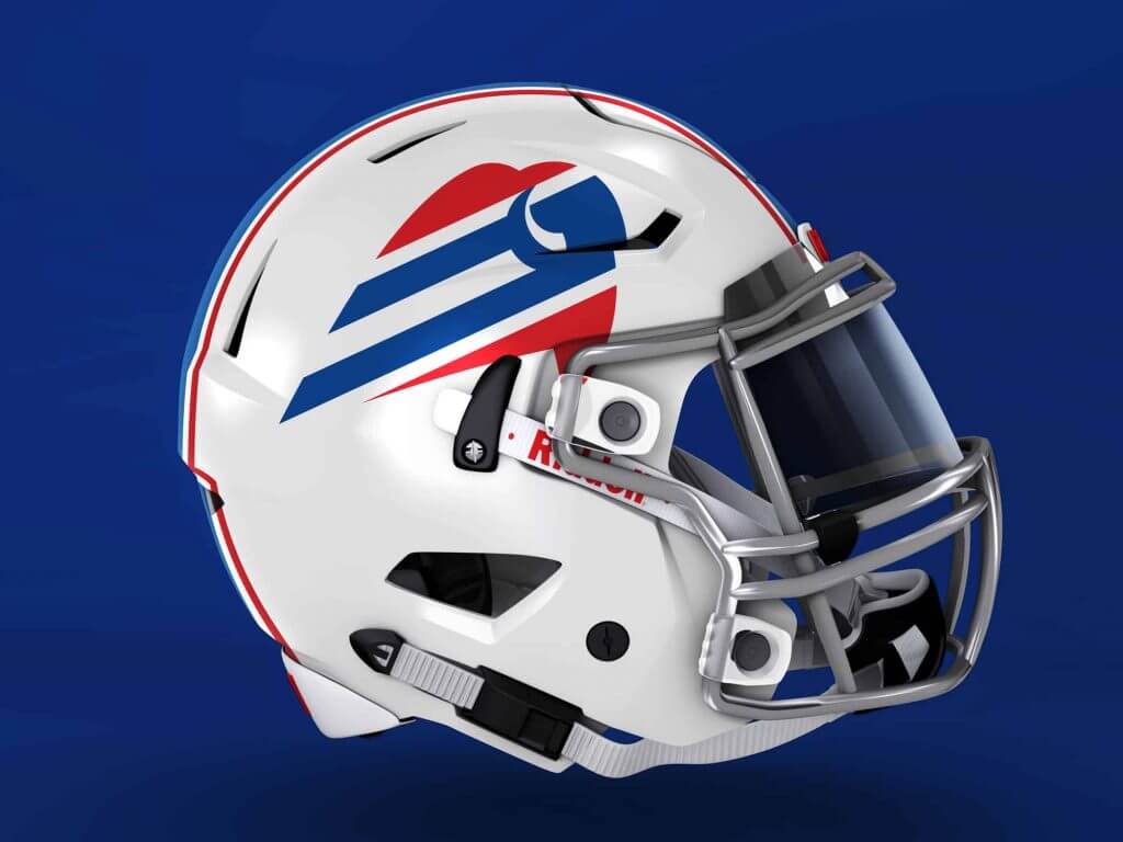
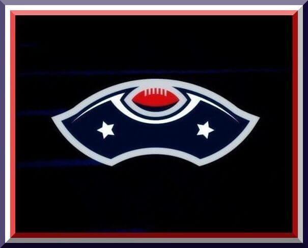
Buffalo Bills
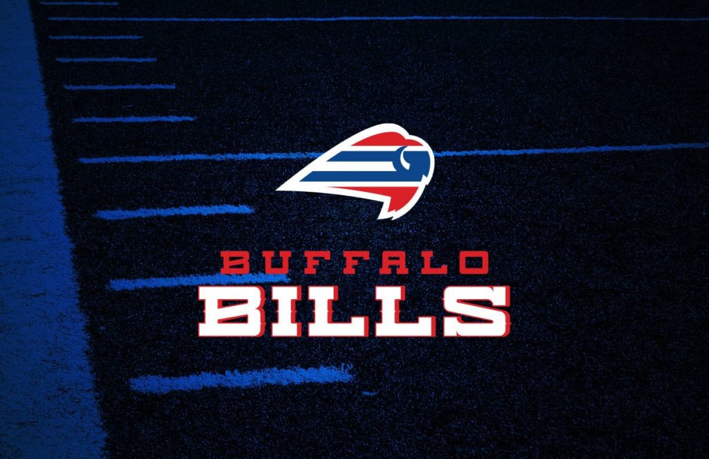
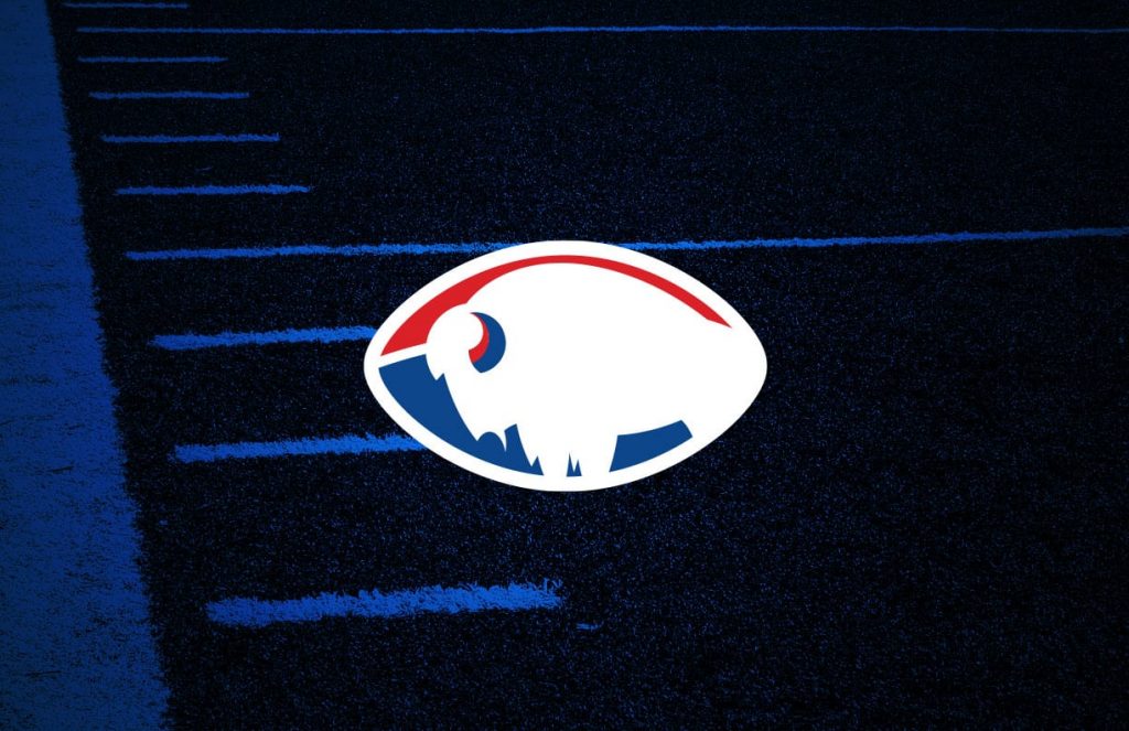
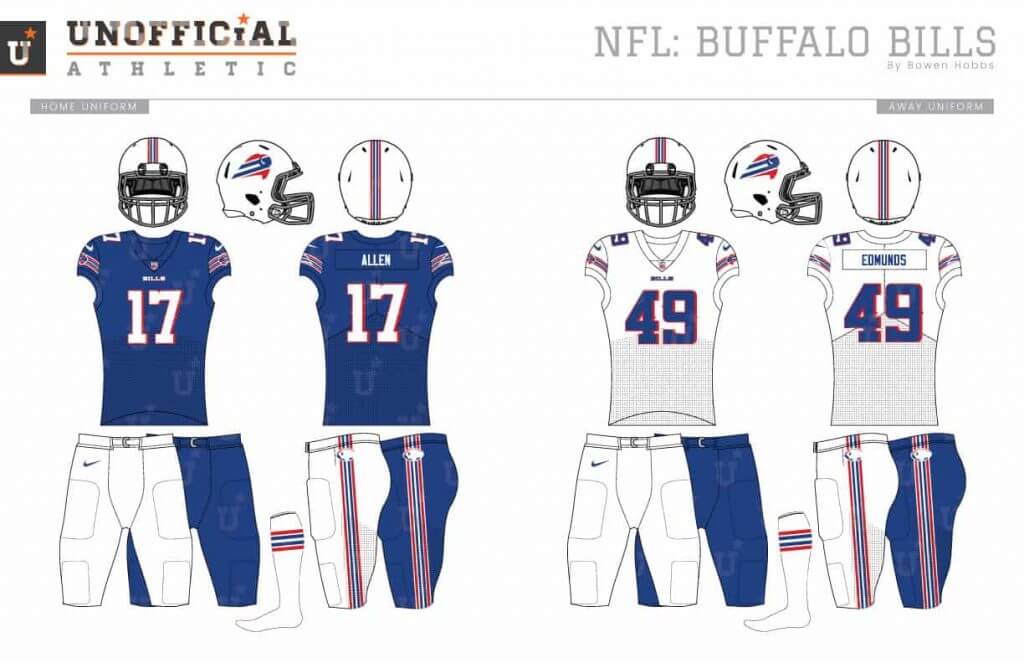
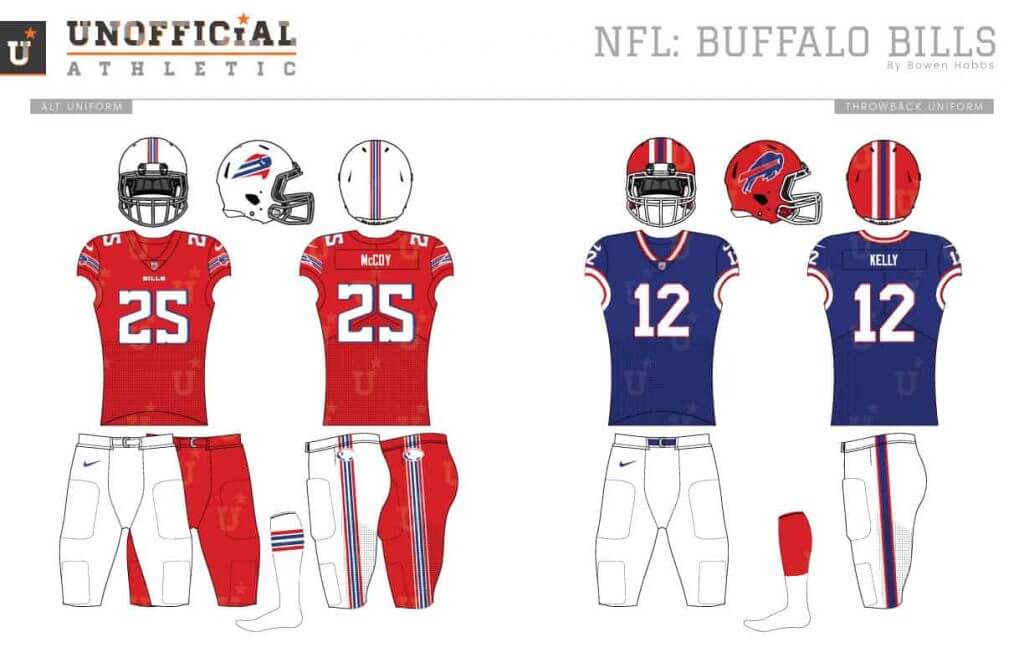
I know, I know, this Bills logo is similar to the Buffaslug. But my version is made to fit on a helmet and includes the team’s classic striping. The secondary logo places a standing buffalo inside a football. The typeface has rustic details to reinforce the Buffalo Bill theme. The uniforms place the new primary icon against matching sleeve stripes.
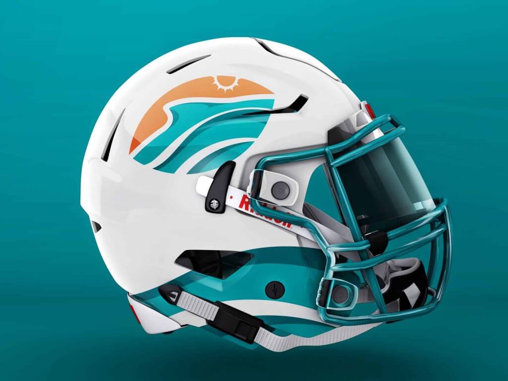
Miami Dolphins
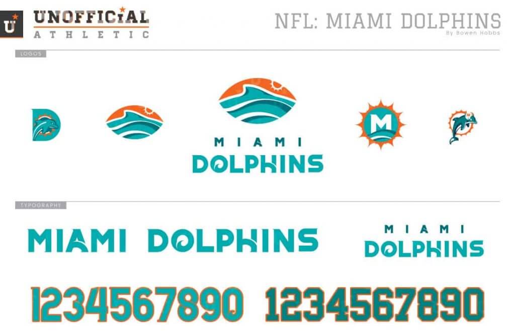
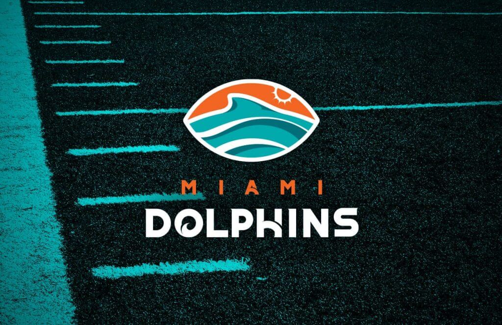
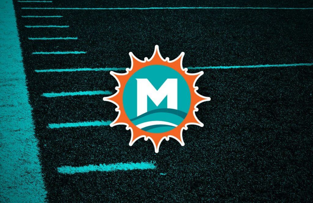
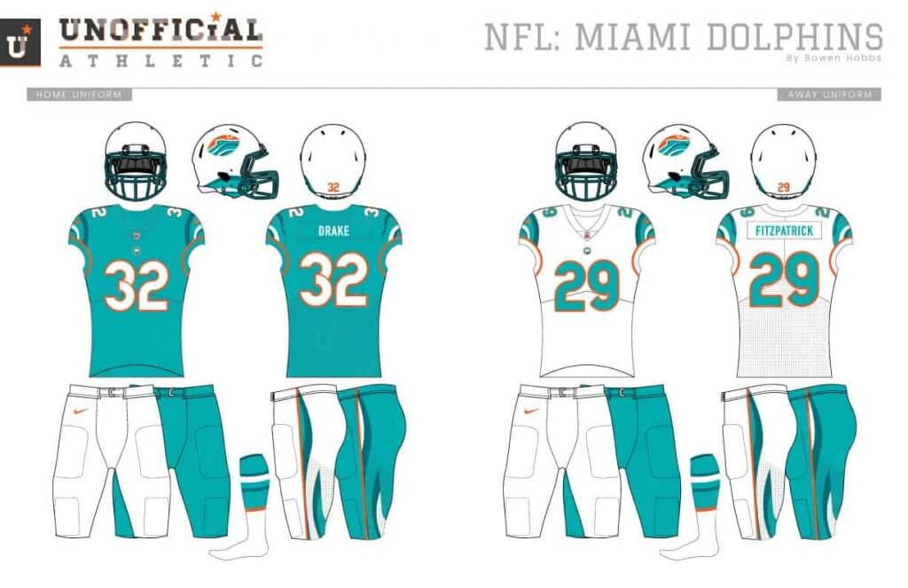
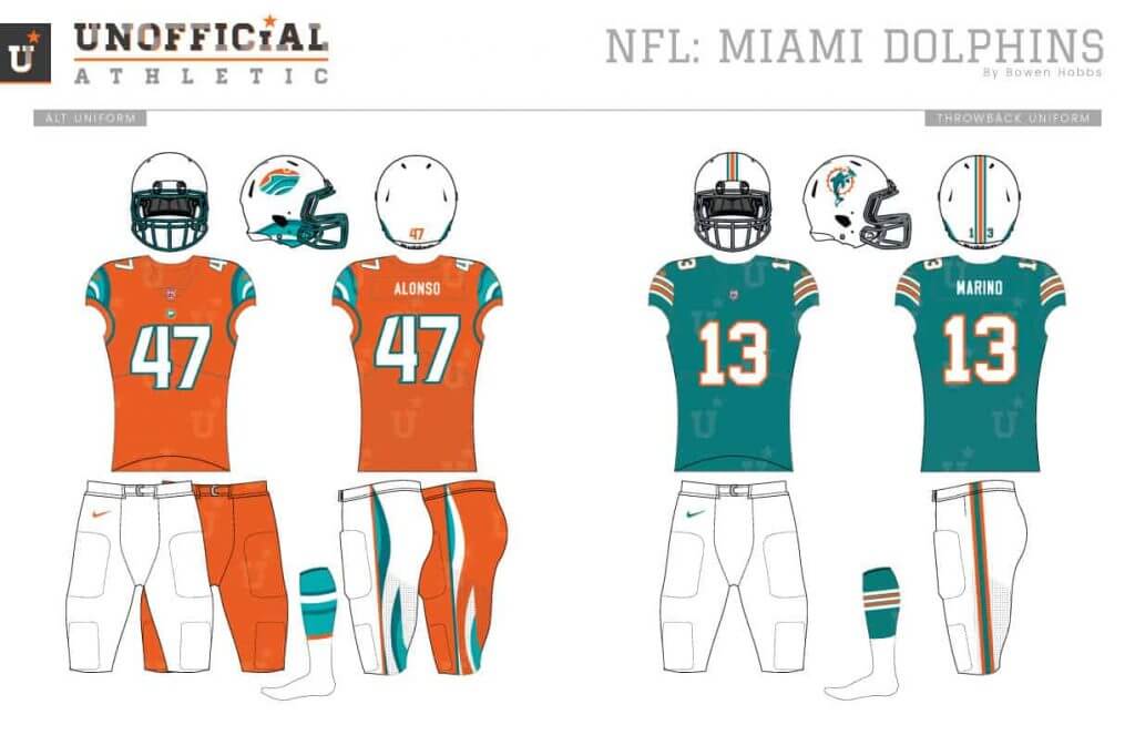
Miami is an avant garde city. So it makes sense that the team would embrace a more eclectic design. My redesign features a football with a fin above the waves on a sunny day and an M-sun mark as the secondary logo. The wave theme is used throughout from helmet accents, to cap sleeves and pant stripes.
New England Patriots
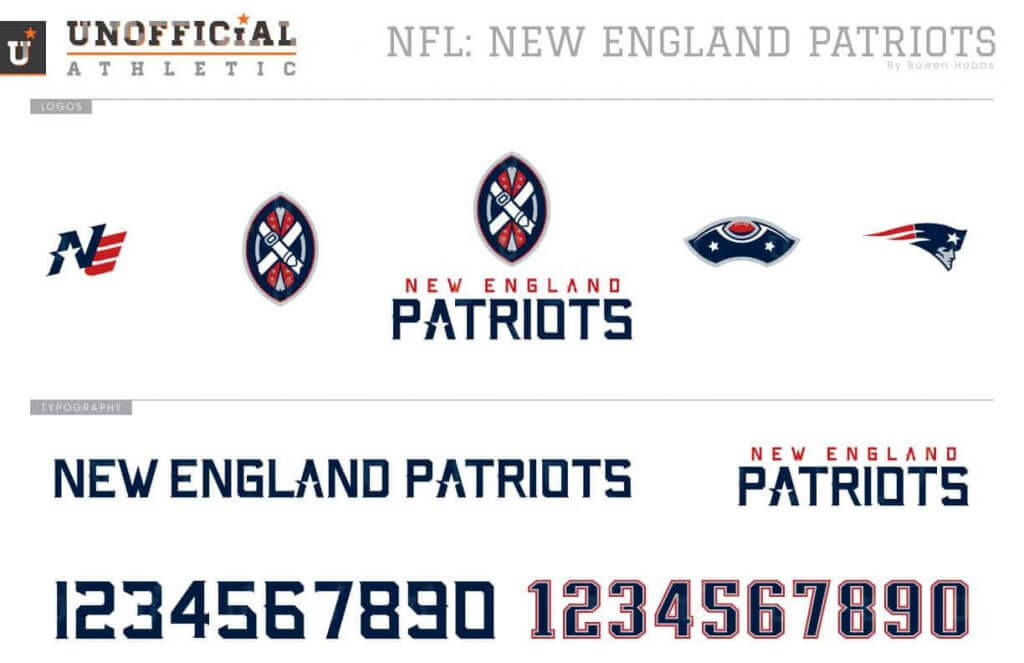
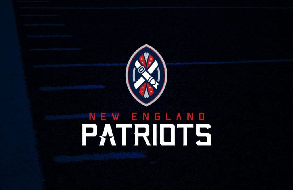
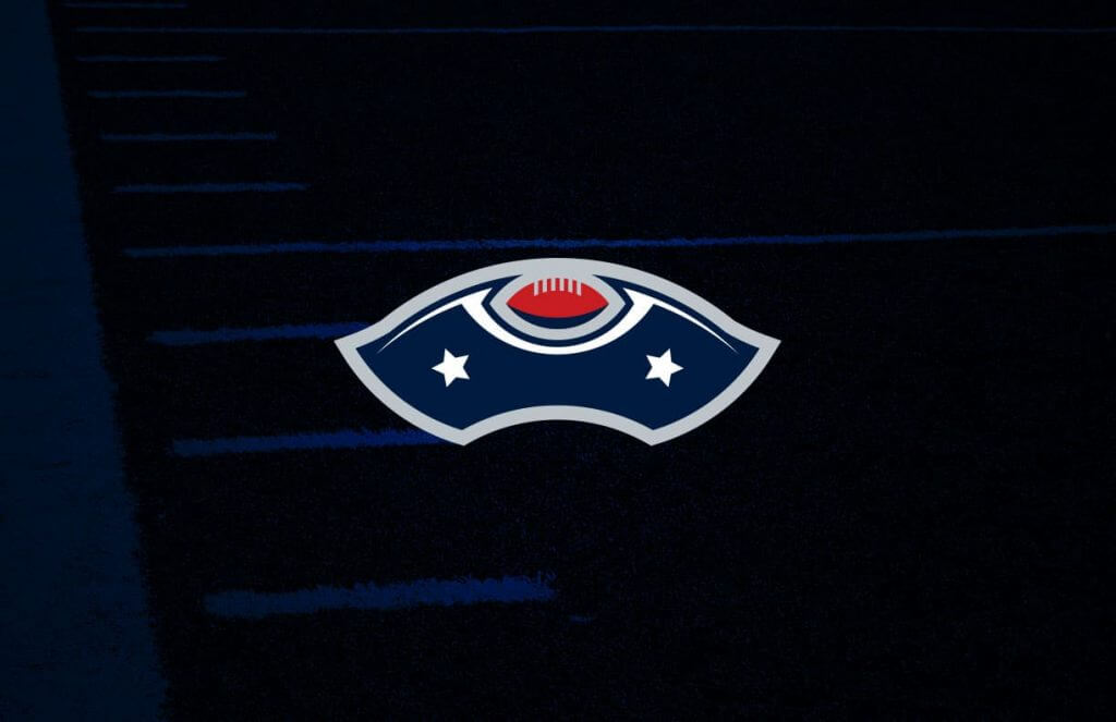
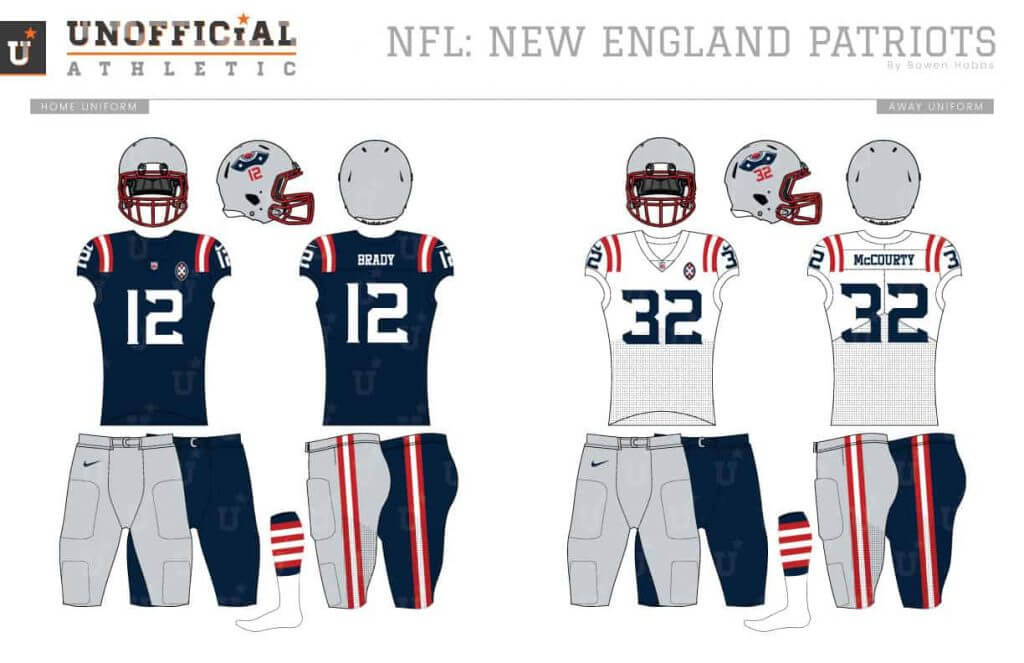
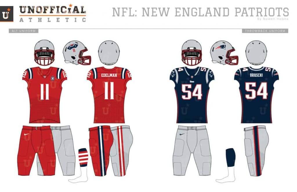
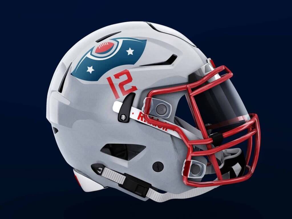
The Patriots’ newest uniforms have a solid foundation, using red-and-white stripes on navy to mimic the American flag, but the execution wasn’t as good as it could be. My concept starts with a football styled like a Continental Soldier’s uniform, with a tri-corner hat secondary mark. Getting back to the uniforms, the shoulder and pant stripes are always red and white, whether on navy, white or silver (except on the red alternates). I also added stripes to the socks so each side of the player has 13 stripes representing the original colonies.
New York Jets
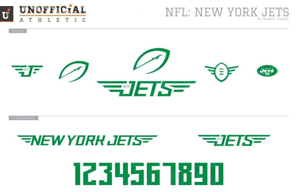
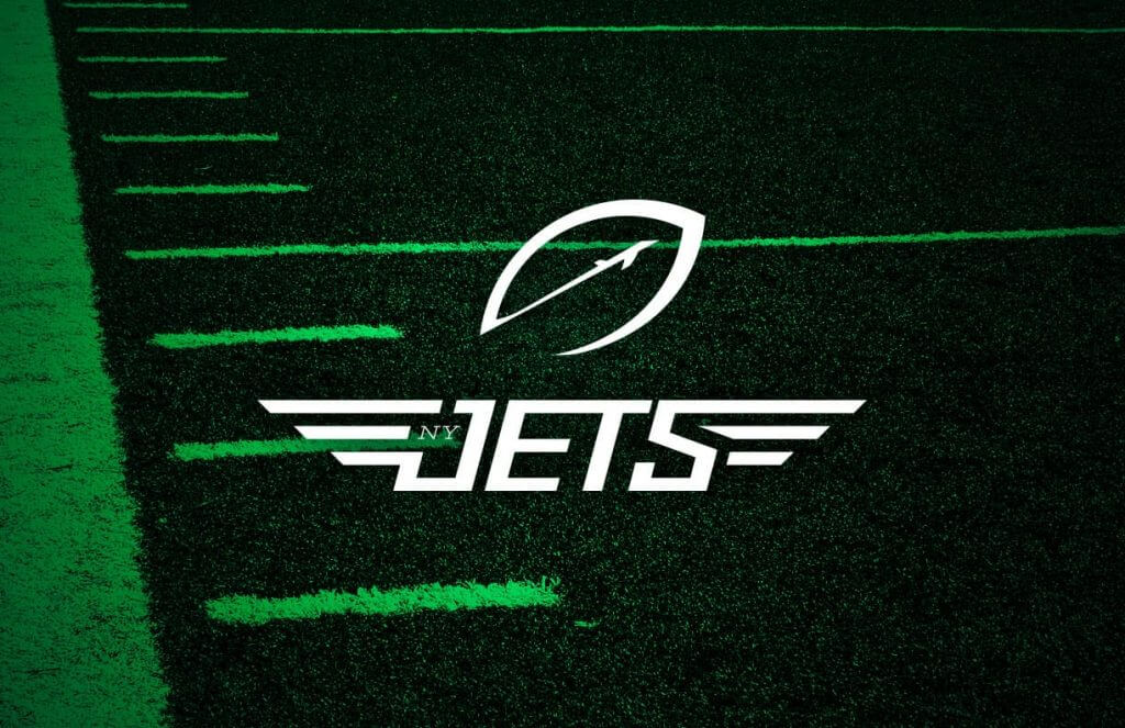
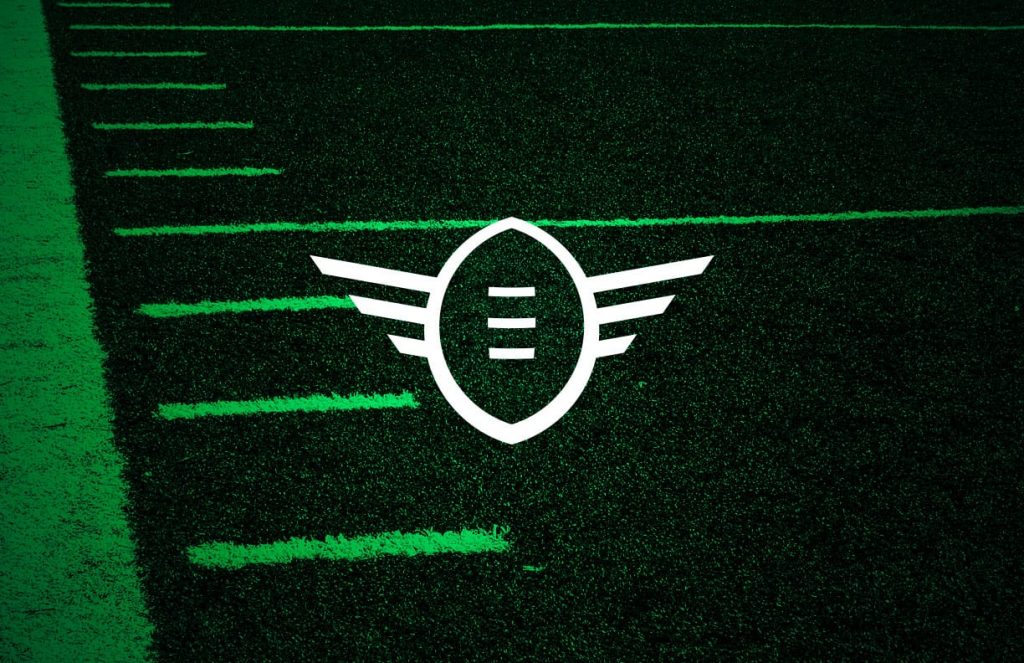
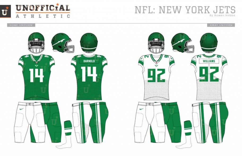
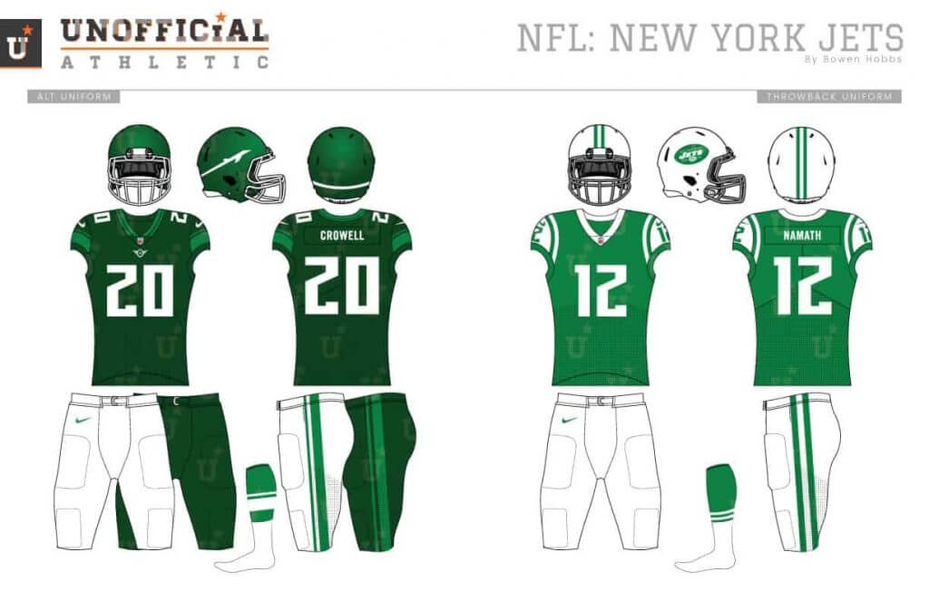
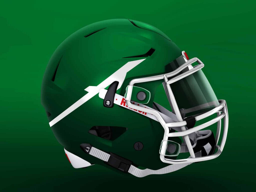
For the Jets, I wanted to develop a primary logo that wasn’t a wordmark. I started with an abstract jet emitting a trail taking off within a football, complemented by a pilot-winged ball as the secondary. The font is modern and slightly angular. The uniforms feature a unique thick-thin striping pattern applied to the jerseys, pants, and socks. The helmets contain a satin finish and the abstract jet.
AFC North
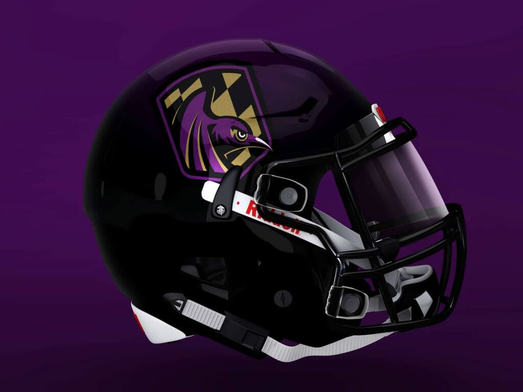
Baltimore Ravens
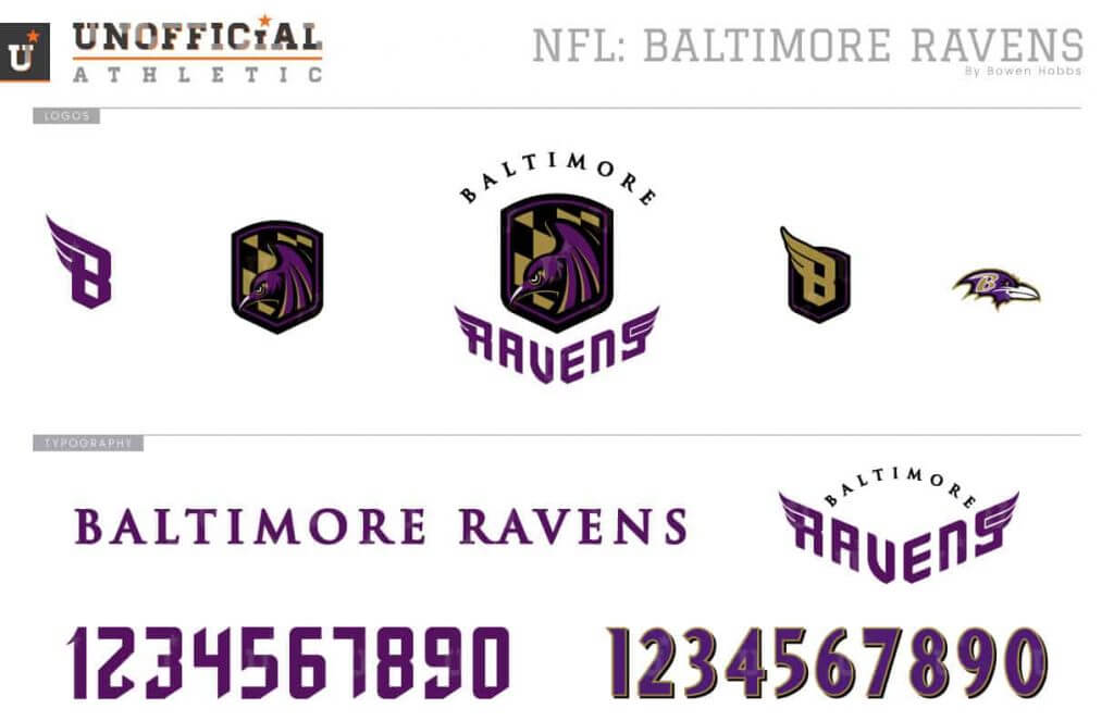
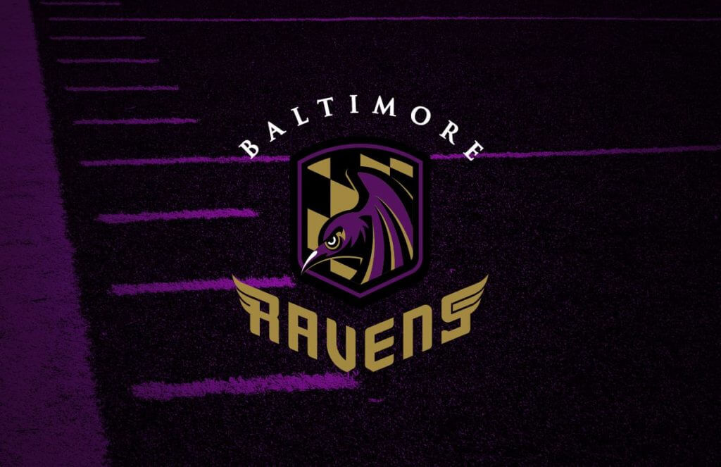
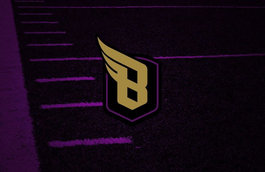
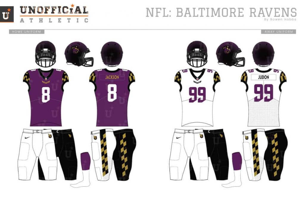
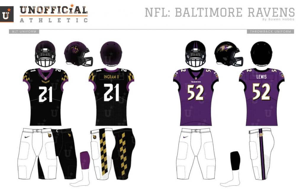
My first job with the Ravens was to customize their purple to make it uniquely their own. The new darker and warmer purple pairs with black and old gold, while the red touches were removed. The primary logo places a determined raven waiting to strike within a shield containing the angular checkered pattern from the Baltimore flag. The fonts include Trajan, as well as a custom typeface that blends block letters with calligraphic details. The helmets are black with a purple metallic flake and the checkered pattern is used on the cap sleeves and pant stripes.
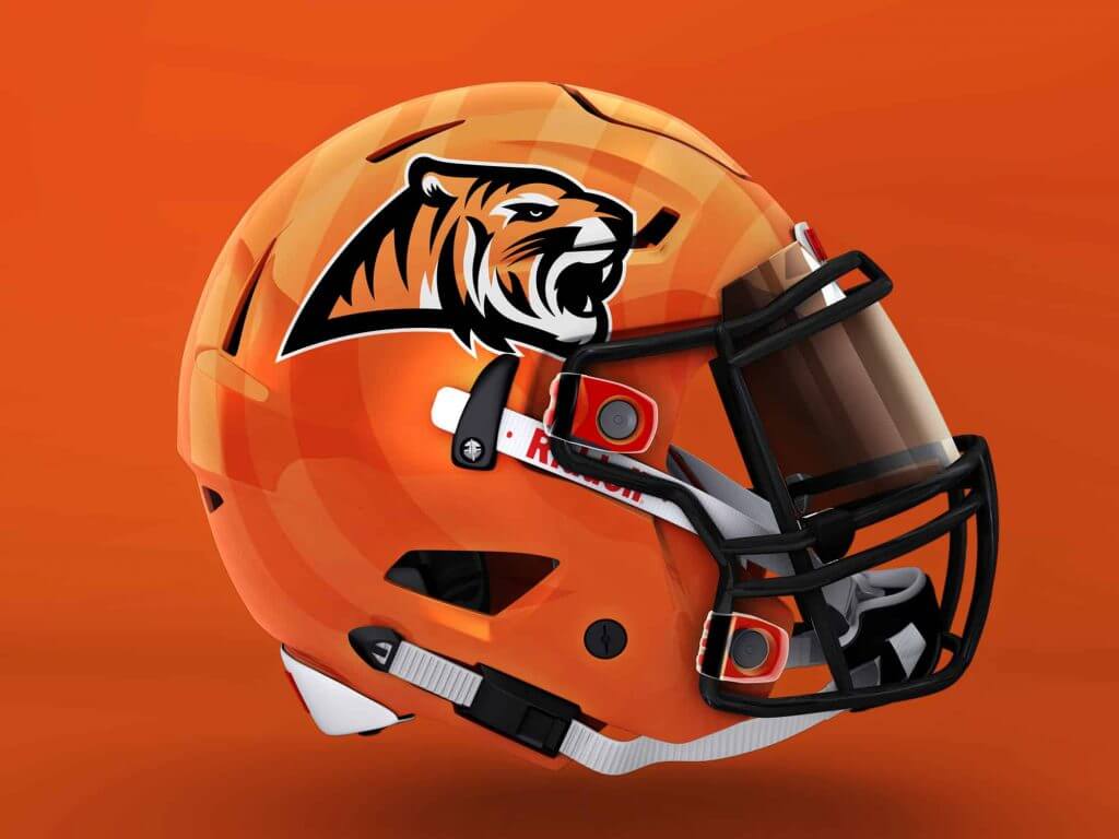
Cincinnati Bengals
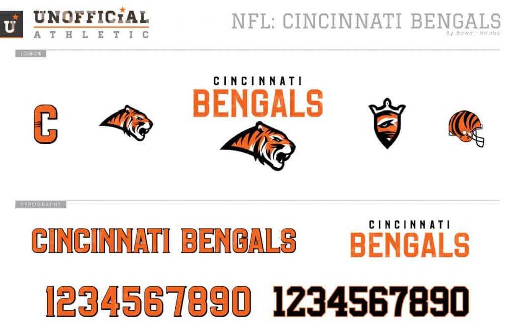
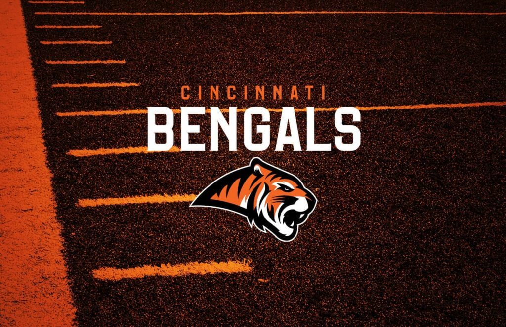
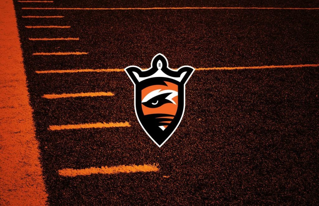
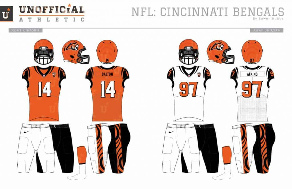
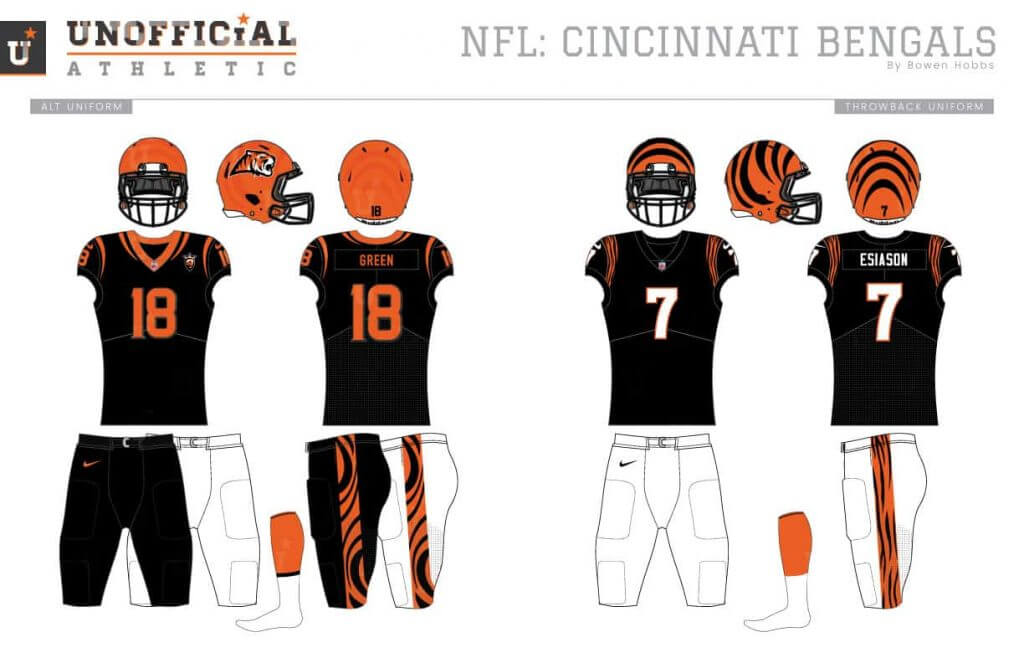
This Bengals redesign starts with a new take on the team’s tiger head logo, using a profile angle instead of a three-quarters perspective. The secondary places the tiger’s eye inside a crowned shield, while the font contains subtle serifs for added sharpness. The uniforms build on the current set with an orange primary home jersey and simple stripes around the shoulders and collar to hint at a tiger’s stripes, while the pants opt for more overt tiger striping.
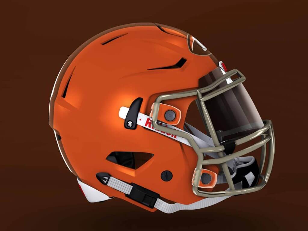
Cleveland Browns
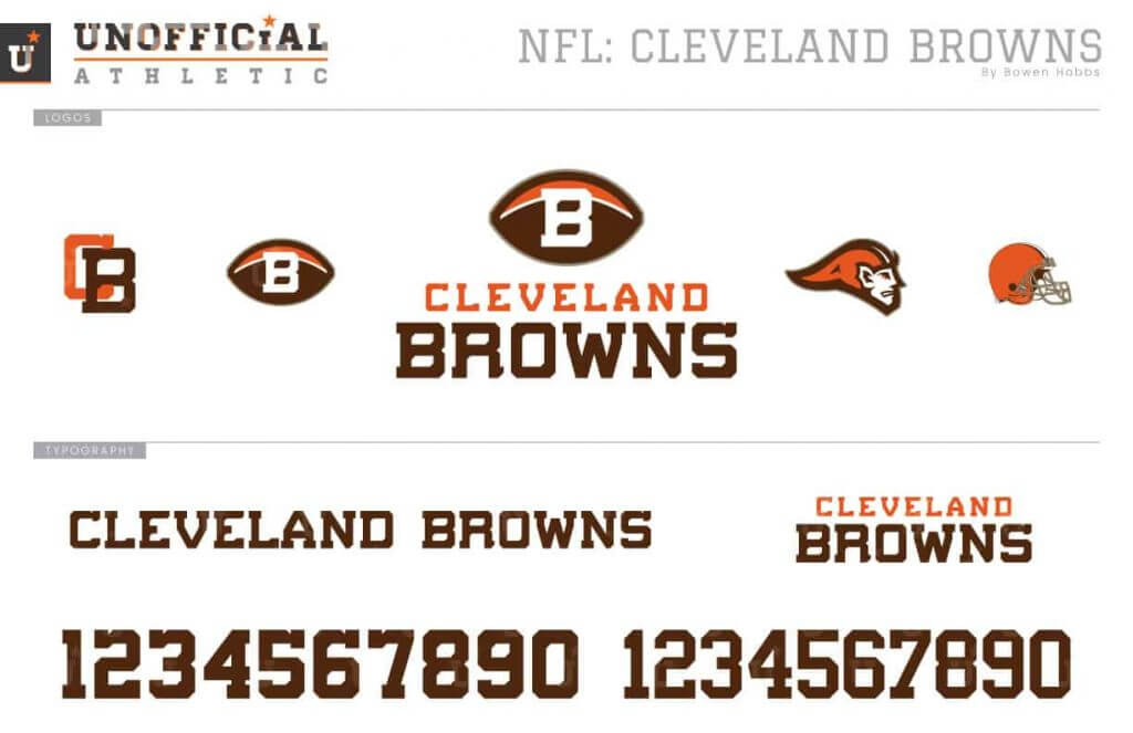
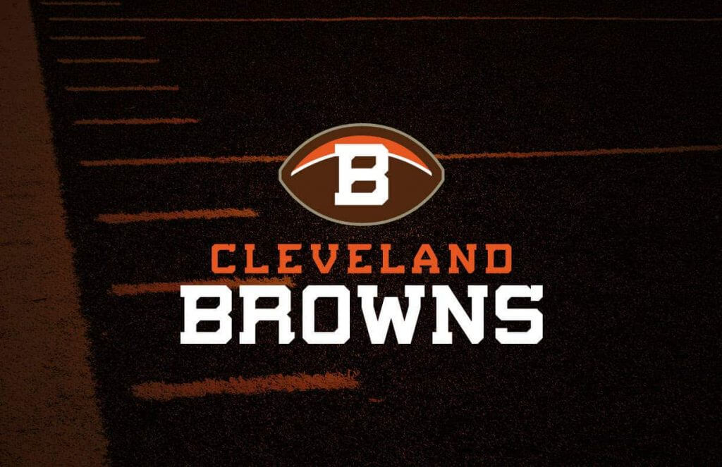
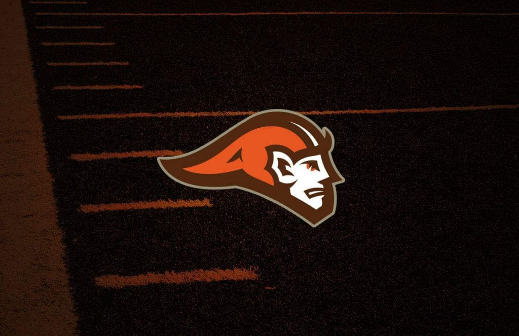
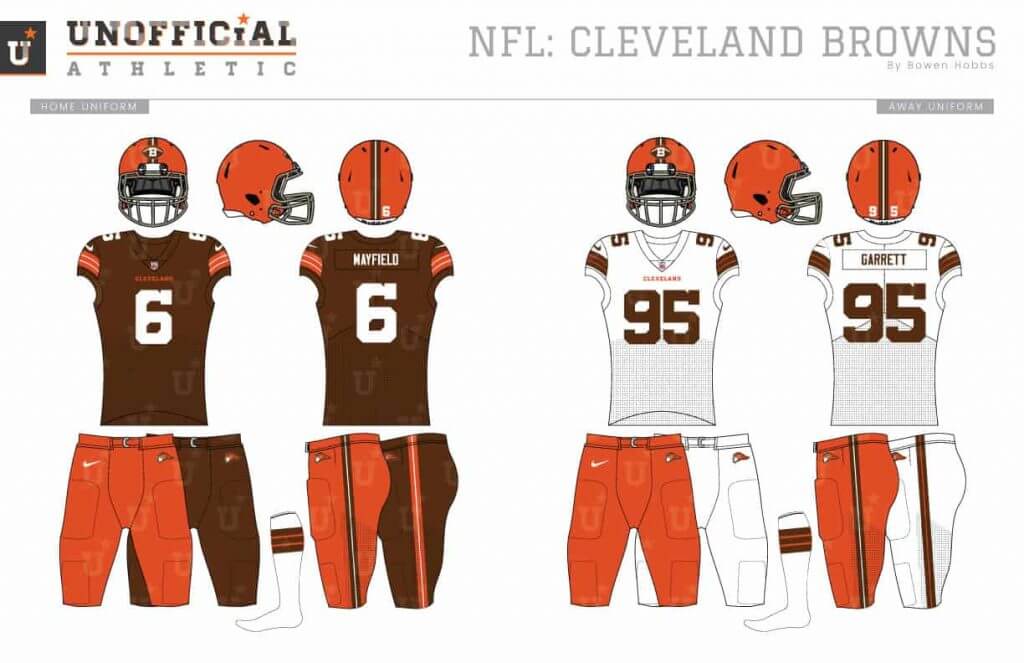
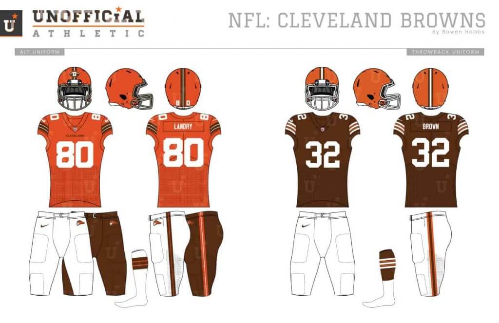
With the Browns, I wanted to update their logo without playing into the bulldog look. I chose a modified B-football mark, with a modernized Brownie the Elf as the secondary logo. The helmets do have a logo on them, but the mark is small and on the front of the helmet so that the profile view is unsullied. Lastly, the striping weight has been altered for a custom look.
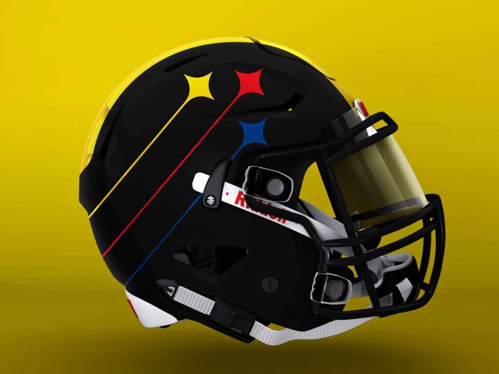
Pittsburgh Steelers
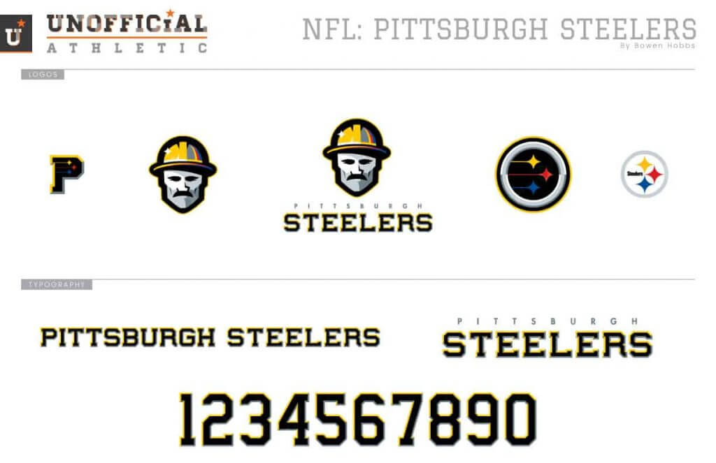
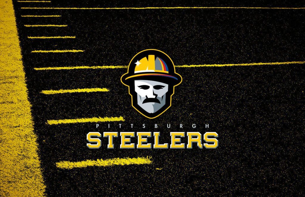
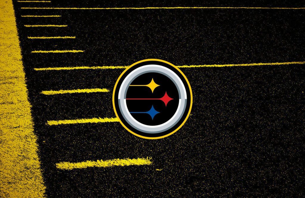
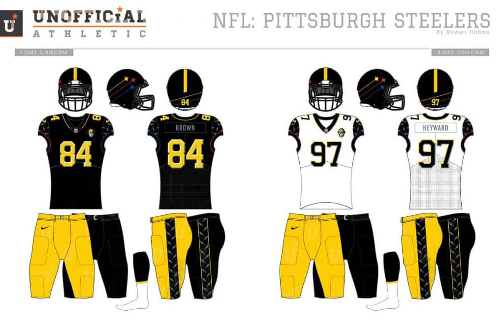
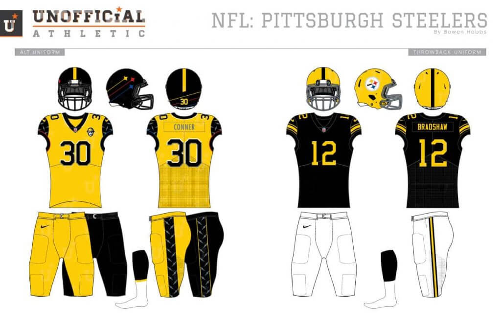
I wanted to try something unexpected for the Steelers, starting with the logo. The primary icon is of a grizzled steelworker and features red-yellow-blue accents and a hypocycloid on his helmet. The secondary mark updates the current mark with a black background and streaking hypocycloids. The helmet applies those streaking diamonds, but only on the right side to maintain the one-sided helmet tradition. The uniforms use diamond plate cap sleeves and beveled numbers.
Thanks, Bowen — both for the interview and the first set of NFL redesigns. That’s quite a lot to chew on — I’m guessing you’ll have some fans as well as some diehards who may not be so into some of the changes you propose. But either way, it’s a tremendous effort.
Readers, what do you think?


Guess The Game…
from the scoreboard
Today’s scoreboard comes from our own Jamie Rathjen.
The premise of the game (GTGFTS) is simple: I’ll post a scoreboard and you guys simply identify the game depicted. In the past, I don’t know if I’ve ever completely stumped you (some are easier than others).
Here’s the Scoreboard. In the comments below, try to identify the game (date & location, as well as final score). If anything noteworthy occurred during the game, please add that in (and if you were AT the game, well bonus points for you!):
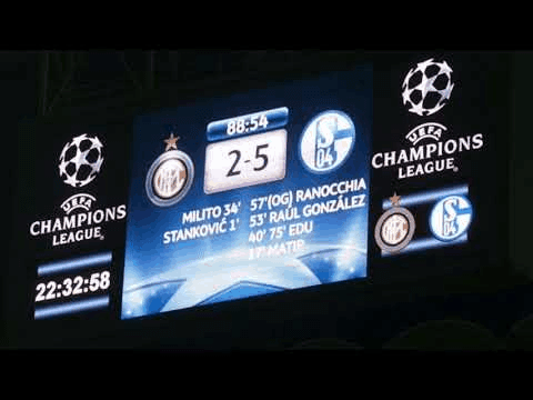
Please continue sending these in! You’re welcome to send me any scoreboard photos (with answers please), and I’ll keep running them.
The “BEST OF” Kreindler’s Korner
Hey guys & gals. You’ve enjoyed Kreindler’s Korner for several years now, mostly on the weekends, on Uni Watch, but with the recent coronavirus outbreak, Graig’s time is just too precious and he needs to tend to other things besides coming up with a new writeup each weekend.
So, going forward, for as long as the COVID-19 situation is bad in New York, I’m going to run a few “Best of’s” until Graig returns.
Here’s today’s offering:
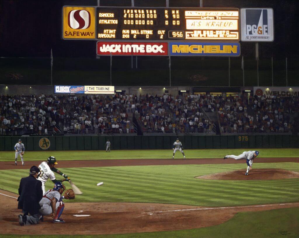
Title: “Untouchable at 43”
Subject: Nolan Ryan, 1990
Medium: Oil on linen
Size: 40″ x 32″At 43 years old, Cy Young was in his last full year in the big leagues, straddled by a large belly that impeded his movement off the mound. When Walter Johnson was the same age, he had been retired from pitching for four years. Bob Feller, with his last good season at the age of 35, quit a month after turning 38. Sandy Koufax and his arthritic elbow both pitched their last game at the age of 30.
Admittedly, the lifespan of an effective power pitcher is not a long one. Unless your name is Lynn Nolan Ryan. On June 11, 1990, he proved just that. 33,436 fans filed into the Oakland Coliseum on a mild evening to witness history, as the aging fireballer tossed the sixth no-hit, no-run ballgame of his storied career.
Perhaps it came as a surprise to most. At that point, Ryan’s 24th year in the majors had not been the kindest to him. He had just recently gotten off of a stay on disabled list due to a sore back that had been hampered him since an early May start. Upon his return – coincidentally also against the Athletics – he gave up five runs in just as many innings in a 5-4 loss. In his previous six starts, he had gone 0-3 with an 8.86 earned run average. In fact, he had not won since April 26.
Also, on the other side of the battery was John Russell, who had never caught Ryan before. Veterans Geno Petralli and Mike Stanley were both injured, so the assignment was handed to Russell, who had been given a Triple A contract by Texas in May. In fact, only six weeks prior to that June night, he had been helping coach a high school team in suburban Philadelphia.
Add to that the fact that the Rangers were facing Oakland again, who were in first place and seemed well on their way to a third straight World Series appearance, it seemed like the ingredients were very much an unlikely combination for a stellar effort.
However, the opposing Athletics failed to come even close to getting a strong, clean hit. They only twice provided anything that could even remotely be considered a big scare to the defense, with Willie Randolph flying out to the warning track in left to open the fourth inning, and then Rickey Henderson’s liner to center with one on in the sixth.
Ryan’s first two strikeouts of the night came in the opening inning alone, with him wracking up another twelve by the game’s conclusion. Each of the fourteen was of the swinging variety, showcasing how great the combination of his fastball and changeup was. The latter carried him early on, as his stiff back was preventing him from hitting 90 mph on his heaters. Though flinching and grimacing with pain throughout the entire contest, he managed to strike out the side in the fifth on 11 pitches, and according to the Athletics, eventually reached the mid-90s on his fastball in the final three innings.
Offensively for Texas, Julio Franco came through with a pair of two-run homers, and even John Russell contributed with a solo blast of his own, but Ryan was the star.
He started the ninth by striking out pinch-hitter Ken Phelps. A check-swing by Rickey Henderson led to a slow roller and a strong, off-balance throw by Jeff Huson to get the speedster at first. And finally, on a 2-0 pitch, Willie Randolph flew out to shallow right in foul territory. Ruben Sierra made the catch at 9:56 to end the game and begin the celebration. Ryan jubilantly pumped his right arm into the air as he was mobbed by his teammates, who would carry him off the field. Partisanship be damned, the Oakland crowd was with the Texan starting in the seventh inning or so, even chanting “Nolan!” over the course of the ninth. They showered him with a well-deserved standing ovation and raucous cheering when the final out was recorded.
In the clubhouse, Ryan told reporters that the accomplishment was a special one because it came so late in his career, and that it really meant something to have the team so emotionally involved. Even Oakland manager Tony La Russa said, “You had a feeling early this would be something special.
That idea could not have been further from what Nolan was thinking. Before the game he had claimed that his back felt ‘about the same,’ which in other words, was still hurting. Sure, he was rolling his hips and twisting his trunk between pitches to provide some relief, and strolled to the back of the mound to give his body more time to recover. And the next morning, he was to have his back examined in Los Angeles.
But on that Monday night, Nolan was untouchable.
Thanks, Graig! You can (and should!) follow Graig on Twitter.
Click to enlarge
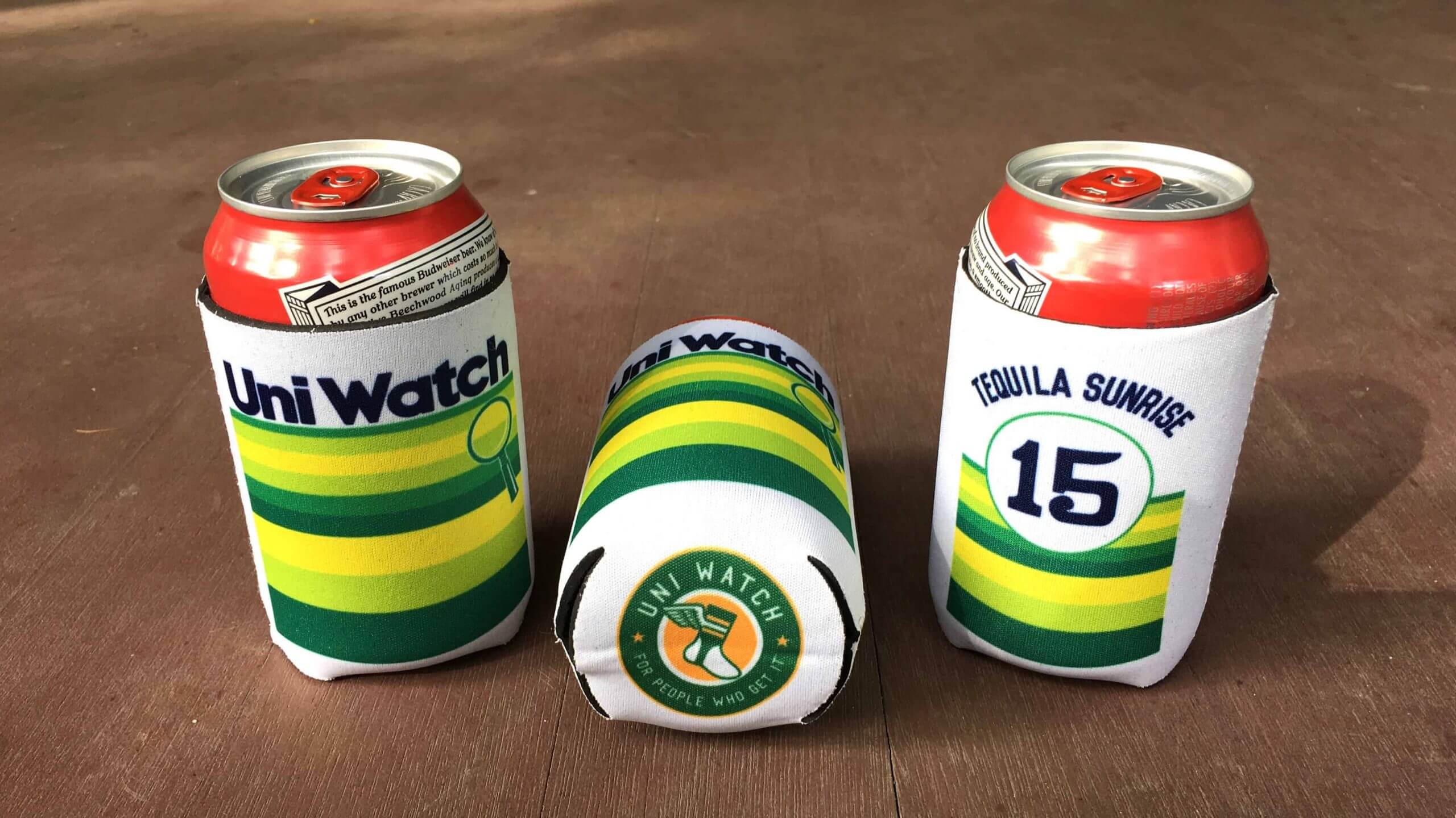
ITEM! New Uni Watch Koozies: Paul here. I’m happy to report that after getting loads of requests, we now have collapsible Uni Watch Koozies available! They feature our tequila sunrise design on the front and back, along with the Uni Watch circular logo on the bottom. Full ordering details here.
Also, in case you missed it this past week, a new item — Ribs — has been added to the menu of theoretical T-shirts (click to enlarge):
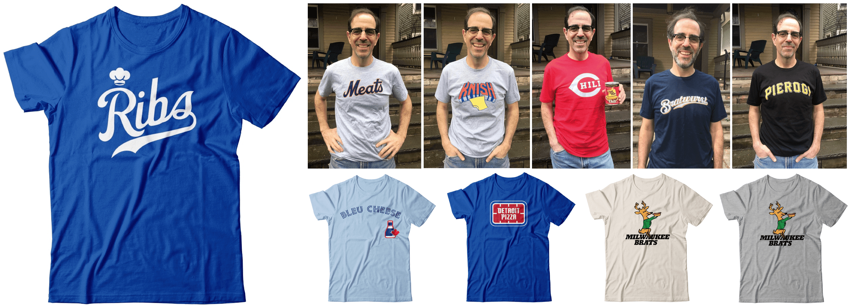
Wouldn’t it be fun, just theoretically, if these designs were actually available? If you agree, let’s discuss.

Also! Teespring is running another one of its 10%-off sales. That means you can save some coin on Uni Watch merch and we’ll still make our full profit — a win-win!
This discount applies to everything in the Uni Watch, Uni Rock, and Naming Wrongs online shops. To claim your discount, use the checkout code GOLDEN for any orders you make now through this Monday, Sept. 28.
My thanks, as always, for your support and consideration. That’s it from me — now back your regularly scheduled Phil-fest!
The Ticker
By Anthony Emerson

Baseball News: Red Sox P Chris Mazza Gets It (from Nicklaus Wallmeyer). … Cleveland P Carlos wore a dual-color belt during last night’s game (from Cody Reeder). … The Brewers were technically the home team during last night’s game against the Cardinals in St. Louis, but the Cards wore their home whites and Milwaukee their road greys (from Daniel Fregoso). … We’ve seen brightly-colored football fields and basketball courts, but Edison High in New Jersey has scarlet turf on their baseball field (from @BallparkHunter).

NFL News: Towards the end of this article, the author ranks all the Ravens uni combinations (from Andrew Cosentino).
.
.
College/High School Football News: Arkansas will wear “Equality” chest patches at least for the home opener, maybe for the entire season (from Taylor Crabtree). … Also from Taylor: Tennessee is going mono-white against South Carolina. The Vols are also wearing a Johnny Majors memorial patch and a patch depicting fists locked together. … Southern Miss is going black-black-gold in the Battle of the Bell. … Army will go memorial helmet decal in honor of Pat Dye.

Hockey News: Here’s a shot of Mike Bossy wearing a, ahem, unique two-color CCM helmet during his junior hockey days with the Laval National. Thankfully this look never took off (great find by Wade Heidt).
.

NBA News: Knicks G Dennis Smith Jr. will switch his uni number from 5 to 4. He wore 4 at NC State (from Mike Chamernik).
.

Soccer News: Museum of Jerseys has written about the decline in Premier League sleeve ads, just four seasons after their introduction (thanks, Jamie). … Udinese have gone full highlighter with their new third kit (from Ed Żelaski). … Also from Ed, Greek side PAOK have a blue third kit to honor 200 years of Greek independence. … USL League One side Forward Madison has had some unique kits, but their tropical-themed new keeper kit might be the most wild of them all (from Scott Rogers and @FTCUTD).

Grab Bag: The Houston Gaels, a GAA club, have their own tequila sunrise jersey (from Colm Heaney).
.
.
And finally… big thanks to Bowen for the interview and the concepts. I’ll be back with him again soon with more NFL redesigns.
Yesterday was nice and warm, at least for the end of September, but we ended up having sun and mostly clouds all day — so sunset was a bust. But as so often happens, the gloaming still provides some nice colors to the post sunset sky. And yesterday wasn’t too shabby:
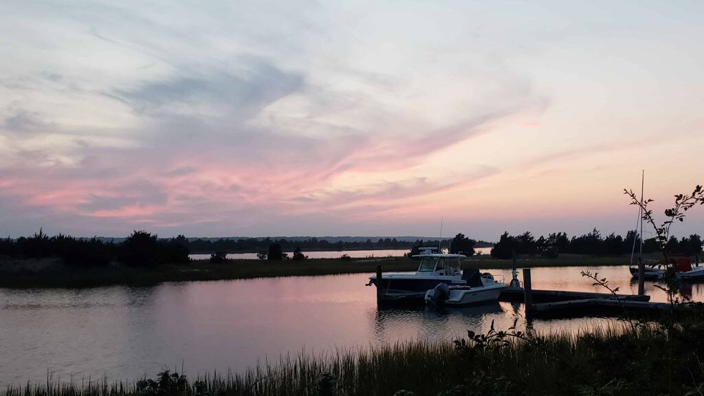
I love how the pinks and light purples just kinda dance off the clouds and water.
Everyone have a good Saturday and I’ll be back with the SMUW crew tomorrow, with the SEC in action, so we should have some nice looking games and more to track and discuss. Till then…
Peace,
PH
Great ideas from Bowen, although the ‘modernized’ Brownie Elf looks a bit too much like the Flying Elvis to me.
I applaud the effort with the redesigns. However, the majority look like they are based on flying Elvis. Not a fan. The Jets logo looks very much like a spear
Bowen, your work on the NFL designs is straight fire. Even the presentation of the layout is great. Love the way you used the Pat Hat from the original 1960 helmet. You got them all right. Putting the MD checkered flag Pattern was well done. Browns gray face mask, thumbs up. Jets wraparound logo on the helmet, bitchin. Did I miss the Falcons and Bucs? Curious as to why you went with AB but did not use number 7?? Geez I’ve been going over these all morning. Thanks Phil. Great interview.
You didn’t miss the Falcons or Bucs, they are on their way. As for AB, I made this concept before his Raiders and Pats stint. Would use a different player if I re-made it today. Thanks for the kind words!
Correction, for an error that might be my fault: Forward Madison FC is in USL League One, not USL Championship.
Got it. Thanks, Scotty!
The game in the GTGFTS scoreboard is April 5th 2011 first leg of Champions League Quarterfinals between Inter Milan and Schalke 04 at Guiseppe Meazza stadium in Milan. The game ended 2-5 and Schalke won the global score 3-7. They went on to be eliminated in the semifinals against Manchester United.
“Army will go memorial helmet decal in honor of Pat Dye.”
Army, or Auburn? All the Army link goes to is its uniform combo, and there’s no mention of a decal.
Some hits, some misses in these redesigns.
I liked the ‘Fins redesign quite a bit. Very Miami. I like the Bills logo too. The Jets logo is pretty cool – but that helmet…I can’t see that looking like more than a line on the field.
Some misses – that Ravens’ number font is awful. Same with the Browns. And the Steelers – I could see a change in uniforms, but the primary logo and the helmet? I know you had to do something different – but that’s a little too radical for me.
Very creative designs by Bowen. The ones I’d swap out over their current sets are the Jets, Bengals, and Patriots. I like to see the “jet emitting a trail taking off within a football“ on the Jets helmet. I like how the football is pointed up, like a long pass or punt.
That Ravens blog wasn’t wrong.
Black over purple is their best combo.
Bowen – Your uniform concepts are super! The AFC East should just take your concepts and use them en masse. I also really like the Steelers. The Dolphins logo is so subtle and creative! You could throw that onto some Teespring stuff and it would sell out immediately.
Thanks!
Scoreboard from Champions League match played on April 5, 2011 at San Siro.
Schalke 04 (5) comes back to defeat Internazionale (2).
Stankovic scored stunning goal 24 seconds into the game for Milan.
Game is 2-2 at the half, but Schalke gets two second-half goals, plus an own goal to win 2-5.
They go on to take second leg at home 2-1, before losing to Man U in semi-final, 6-1 (on aggregate).
Guess the game: inter vs Schalke, Quarterfinal 1st leg Champion’s League. Location Guiseppe Meazza April 2011. result 2-5
No offense at all here, and I really enjoyed most of the concepts, but that Steelers helmet should be launched into the sun.
First item in the ticker, I believe that would be Mr. Carrasco to you, Anthony.
Well, maybe the second item. ♂️
As a Bills fan on sabbatical—I like the abstract logo quite a bit. Something both retro and modern about it. Might be cool for an alternate.
Overall, the concepts are very impressive. Well done!!
30 years later and still kicking myself for giving away tickets to the June 11, 1990 Rangers-A’s Ryan No-no game. Last out was in front of where my seats were.
At least my in-laws enjoyed it
A for effort on the redesigns?
NFL Redesigns….
Try again. Awful.
“I’ve also come to feel that there just isn’t a good way to have a Native mascot.”
This issue has only recently caught my attention, so I’m way behind the curve on all the discussion/viewpoints/ramifications… but this quote seems bothersome.
As I understand it, the push to remove Native American imagery from sports comes from the perspective of not wanting to offend people. That’s admirable. But if the goal is to not offend certain people, then it seems like the most important foundational action would be to find out what those people want. And simply saying, “We should never have a Native American mascot, period” would seem to be the exact opposite of that.
The impression I get is that one side seems to be pretty firmly entrenched in the position of “We can do what we want with our teams, and anyone who’s offended needs to just get over it.” And the other side seems to be pretty firmly entrenched in the position of “Unless you are Native American yourself, you can’t acknowledge their existence in any way because that’s cultural appropriation.” (Am I exaggerating a bit? Sure. But I think I’m closer to the truth than a lot of people are willing to admit.)
As I’ve asked here before, why can’t we just engage the Native American community – especially those in any given team’s local market – find out what they want, and then do that? If they want all Native American imagery removed from a team, do that. If they want imagery that they deem respectful and honorific to be included as part of the team, do that.
Is that just too much effort? It seems so simple to me. What am I missing?
Bowen, what would you do if your client were the FSU Seminoles, or the University of Utah?
I understand you’re trying to redesign, but the Steelers design is terrible. The current uniforms and logos work because they are staples, not in spite of it. While not only is the new Steelers mascot unappealing, it would quickly yield to a new trend and become outdated. The streaks on the hypocycloids are interesting and could be fun if incorporated into some sort of patch or ball design, but there’s no changing the helmets.
As a long time Steeler fan, I have to agree. I would add the thowback can be nothing but the 70s Steelers uniform.
Bowen’s steelworker mascot looks a lot like Bill Cowher.
Purposeful?
Forgive me, but isn’t a redesign supposed to be a redesign? I mean, if you have a gripe with the design itself, fine. But this just sounds like “This new design is bad because it’s a new design.”