For most of today’s photos, you can click to enlarge
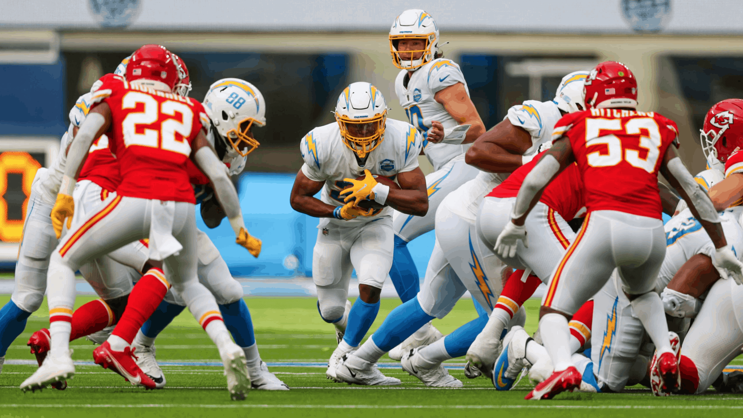
Good morning, and welcome to our second Monday Morning Uni Watch report of the 2020 season. As you can see in the photo above, the Chargers (wearing mono-white for their home opener for the third consecutive season, and the eighth time in nine seasons) added a jersey patch for yesterday’s game against KC. As soon as I saw it, I thought, “Oh, it must be an inaugural-season patch for their first game in the new stadium,” and then I felt stupid for not having seen any news items or even tweets about it.
But then I went looking for confirmation, and it seems that there were no announcements about the patch, and it wasn’t even mentioned or shown on the team’s social media feeds. So I emailed a team rep to see if he could send me a good high-res photo of the patch — no response. What a bizarre way to promote — or, rather, not promote — a new uniform element. Anyway, here’s the best view of the patch I could find. If anyone else has a better photo, please feel free to share it:
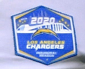
Interesting that the Chargers opted to wear a patch for the new stadium, but the Rams (who opened the stadium last week) did not.
Meanwhile, here’s a doozy from that same Chargers/KC game: KC running back Clyde Edwards-Helaire’s NOB was misspelled. He must have been wearing a different red jersey this week than the one he wore last week, because the spelling was correct in the season opener. Here’s a comparison:
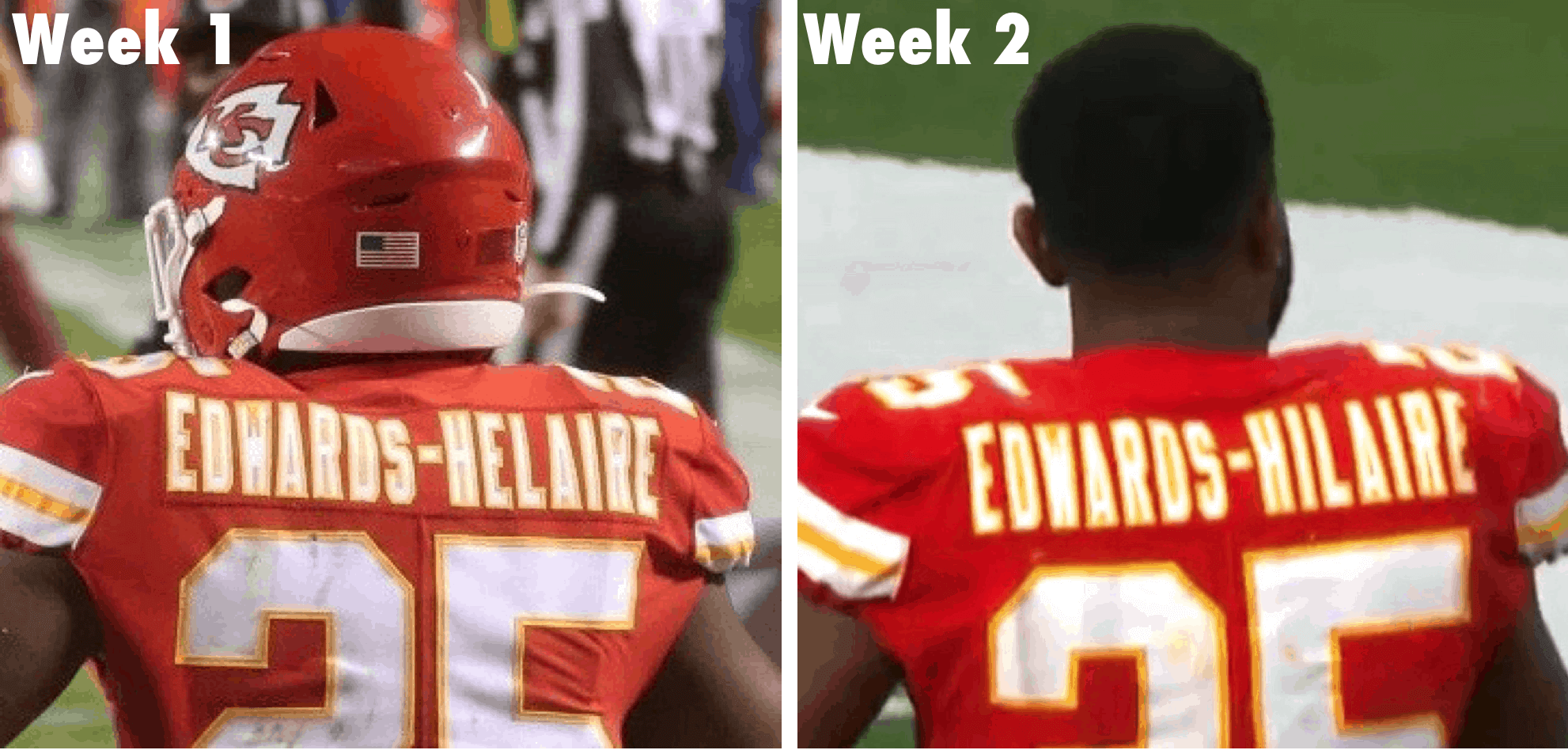
Granted, he’s probably used to having his name misspelled. But you’d think his own team could get it right!
In other news from around the league yesterday:
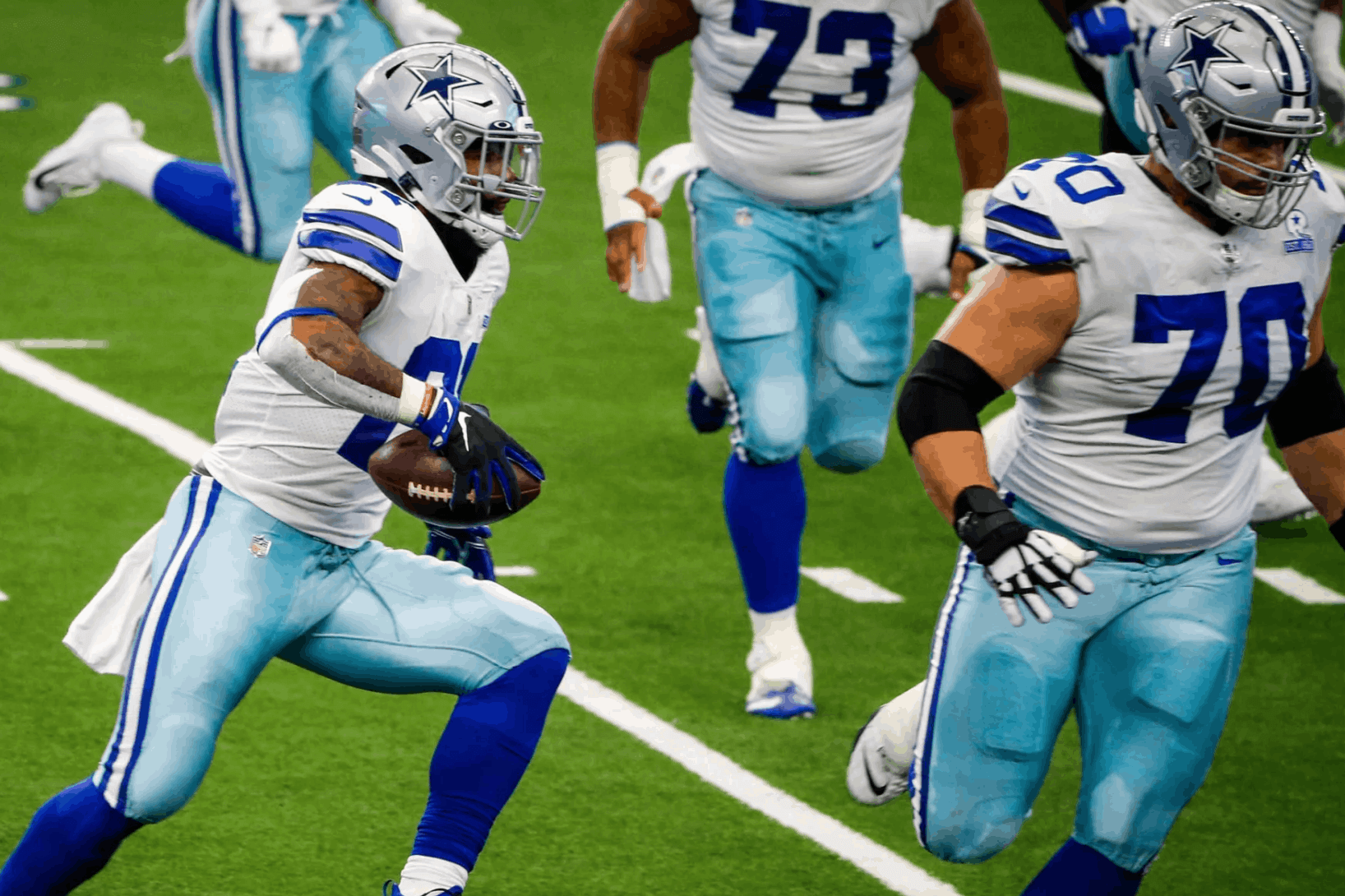
• I heard from several readers who thought the Cowboys’ seafoam pants, which they were wearing yesterday for the first time this season, looked bluer than usual — or, if you prefer, less green than usual. Personally, I’m not so sure. Here’s a photo from yesterday (you can see lots of additional game pics here):
And here’s a photo from a game that took place in Dallas late last season:
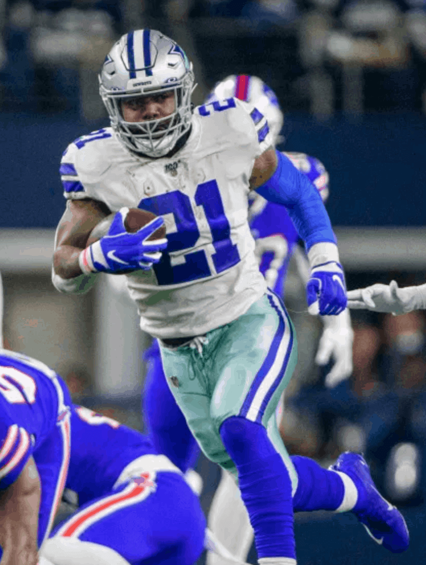
Is it different? Maybe a smidge. Is it that different? Not to my eyes. Maybe it was the lighting..? There must have been something going on, because a bunch of people mentioned it — too many for it to have been just a random coincidence. But I’m not really seeing it.
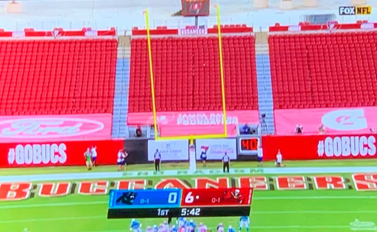
• The Panthers wore their blue alternate jerseys on the road against the Bucs, who wore white at home:
• In that same game, it sure looked like one of the goalposts in Tampa was badly misaligned:
• The Cardinals went blood-clot, and that game also gave us our first look at Washington in their white jerseys:
• We got our first on-field look at the Patriots’ new white-over-navy look (additional photos here):
• Packers cornerback Jaire Alexander sported yellow base-layer sleeves during pregame activities. Kinda surprising the Packers don’t do this more often:
Ja 💰@JaireAlexander | #GoPackGo pic.twitter.com/6o60SbVGPm
— Green Bay Packers (@packers) September 20, 2020
He didn’t wear it in the game, however.
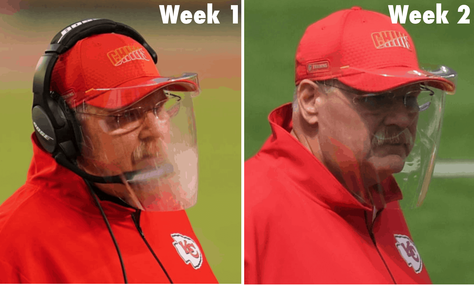
• After having trouble with his face shield fogging up during the season opener, KC coach Andy Reid used a defogging product this time around (I guess he really doesn’t want to wear a cloth mask). It seemed to work — here’s a comparison:
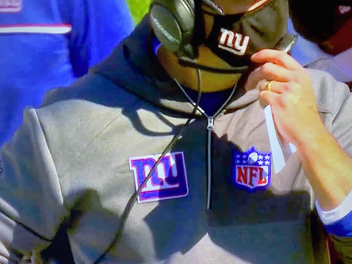
• It appears that Giants coach Joe Judge, who was previously on the Patriots’ coaching staff, was wearing an old Pats hoodie with a Giants logo sewn onto it. You can see the outline of the old Flying Elvis logo patch:
• In addition to the aforementioned Chargers, Bucs, and Cowboys, four other teams wore white at home: the Jets, Dolphins, Titans, and Texans. That means fully half of yesterday’s 14 home teams wore white.
(My thanks to all contributors, including John Hayes, Scott Lederer, Scott McKechnie, Lenny Vangilder, Vinney Williams, and @AndrewNewts.)
Click to enlarge
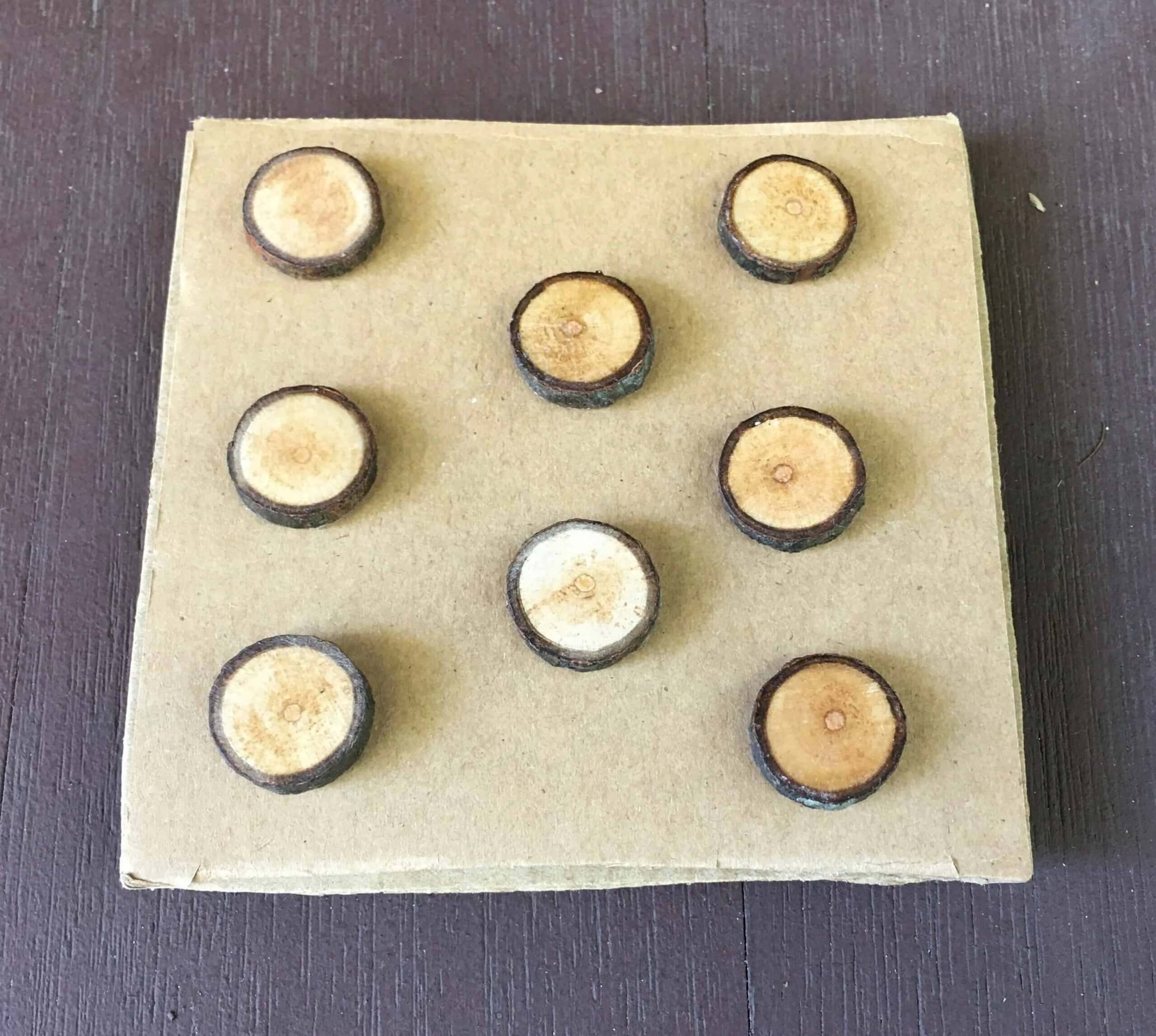
ITEM! Brooklyn Branches update: When the great DIYer Wafflebored made the one-of-a-kind Brooklyn Branches jersey, complete with wooden buttons made from Branch Rickety itself, he had some extra branch sections left over, so he turned them into lapel pins, complete with standard butterfly clutches on the back:
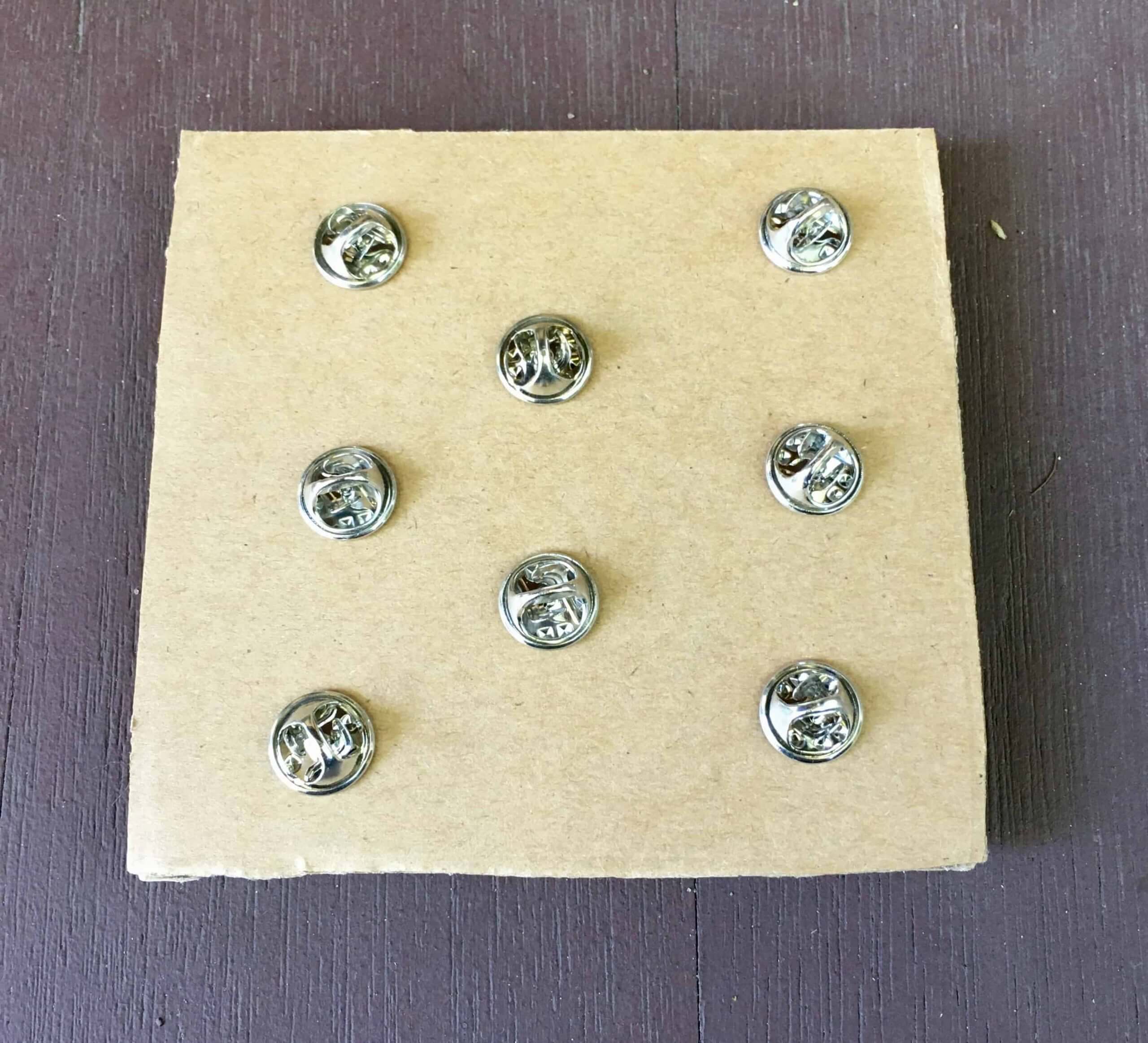
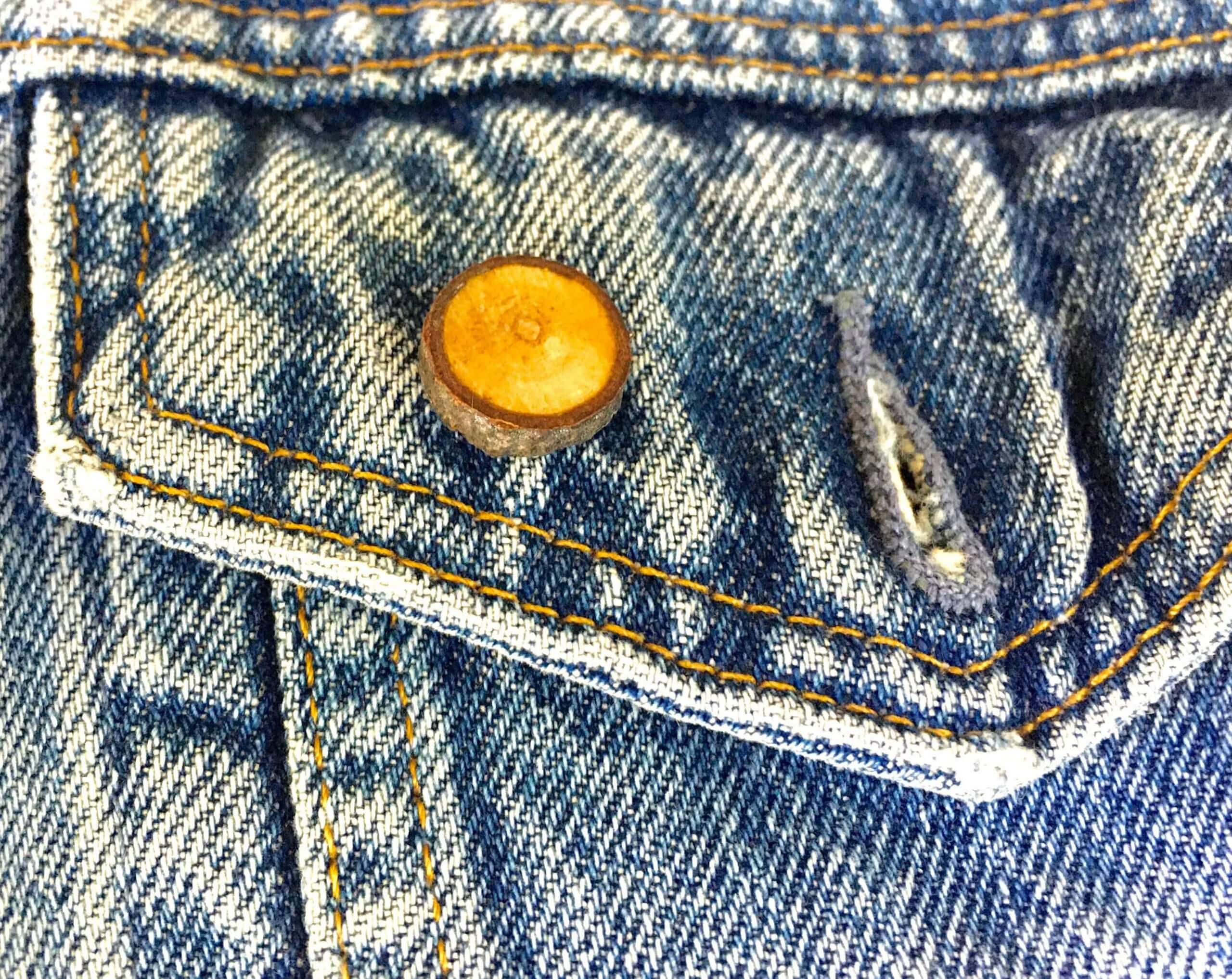
One of the pins went to Rick Wessley, who won the auction for the jersey; another went to Branches mastermind Ron Ruelle; and Wafflebored sent the rest to me here at Uni Watch HQ, where the Tugboat Captain and I have each taken one for our jeans jackets:
That leaves six pins remaining, which I think I’ll probably give away as part of the year-end raffle. The legend of Branch Rickety lives on!
Meanwhile, remember that we have Brooklyn Branches T-shirts available in home white, road grey, green alternate, and brown alternate.
Click to enlarge
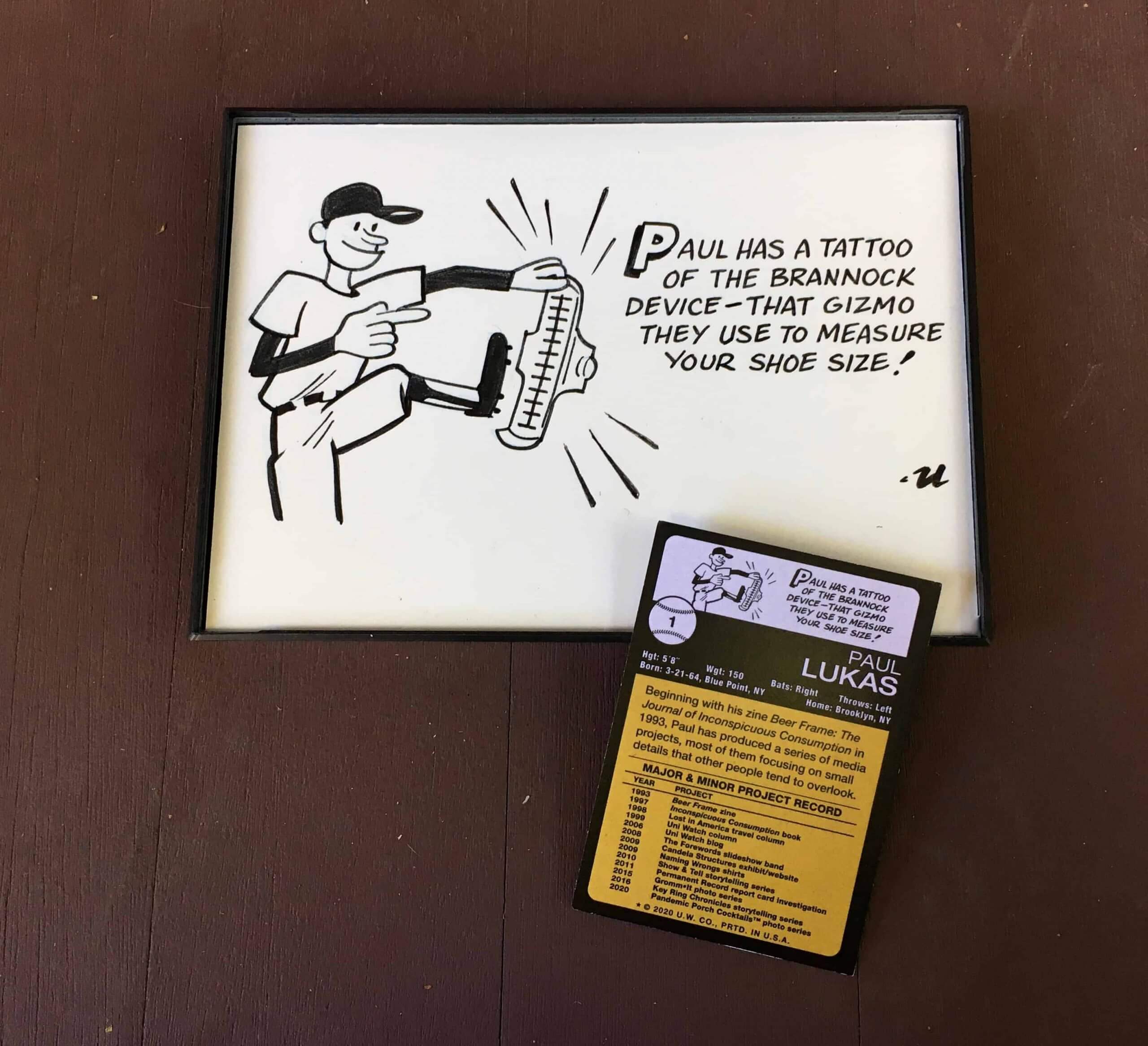
ITEM! Trading card update: Illustrator extraordinaire Rob Ullman, with whom I collaborated earlier this year on the Uni Watch Trading Card, recently sent me the original artwork that he used for the cartoon that appeared on the back of the card. Wasn’t that nice of him? I popped it in a frame (had to trim it ever so slightly to get it to fit — sorry about that, Rob!) and plan to display it on the wall here at Uni Watch HQ.
If you look closely, you can see that the “gleam lines” surrounding the Brannock device on the artwork don’t match the ones that were printed on the card. That’s because Rob’s original version of the cartoon didn’t include the lines:
I loved the cartoon but asked Rob if we could see how it would look with gleam lines added. So he added the lines digitally to the back-card design, and we agreed that it looked stronger that way. But since he never added the lines to the real-life physical cartoon, they were missing when he sent the original art to me. I asked if I could send it back to him so he could add the lines by hand, and he said, “Once I sent you the original art, I realized I had forgotten to add the lines to it. It’s been bugging me ever since!” So I sent the cartoon back to Rob, he added the lines, and then he sent it back to me. I kinda like that he didn’t quite match the printed version — a nice document of the whole back-and-forth story.
Rob is open to doing commissions. Would you like him to make a “fun fact” cartoon about you (or about someone else, so you can give the cartoon as a gift)? If so, give him a shout and the two of you can work out the details.
Meanwhile, I still have about 200 of of the Uni Watch Trading Cards remaining, including I think four of the green-signed cards. They’re available here.

Membership update: Remember how we talked a few weeks ago about how Tom Seaver always ended up with a dirt smudge on his right knee? Reader Charles Meisse used that as the basis for his membership card design request — a Mets No. 41 treatment, complete with a dirt smudge. It’s not on the knee, of course, but still a very cool request.
Charles’s card is one of several that have been added to the membership card gallery, as we close in on our 3,000th member!
Ordering a membership card is a good way to support Uni Watch (which, frankly, could use your support these days). And remember, as a gesture of comm-uni-ty solidarity, the price of a membership has been reduced from $25 to $20 until further notice, plus a Uni Watch membership card entitles you to a 15% discount on any of the merchandise in the Uni Watch, Uni Rock, and Naming Wrongs shops. (If you’re an existing member and would like to have the discount code, email me and I’ll hook you up.)
As always, you can sign up for your own custom-designed card here, you can see all the cards we’ve designed so far here (now more than 2,900 of them!), and you can see how we produce the cards here.
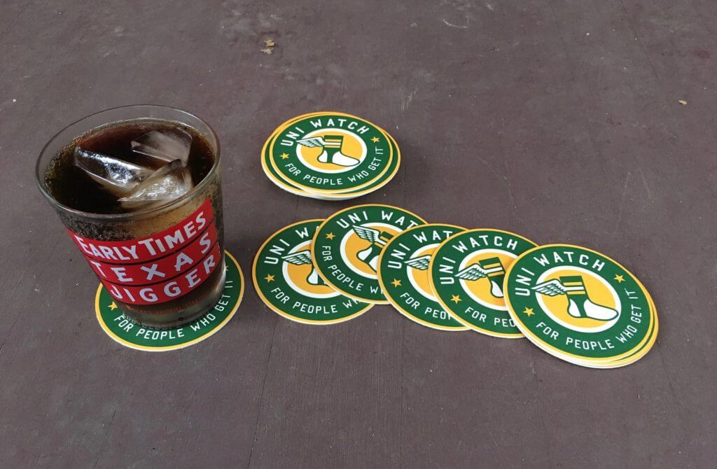

ITEM! Coasters raffle: Uni Watch coasters are currently sold out, but longtime reader/benefactor Max Weintraub has generously purchased two sets for me to raffle off. Each set has three coasters.
This will be a one-day raffle. No entry restrictions. To enter, send an email with your mailing address to the raffle address by 8pm Eastern tonight. I’ll announce the two winners tomorrow. Big thanks to Max for sponsoring this one!
The Ticker
By Jamie Rathjen

Baseball News: Marlins P Braxton Garrett wore the team’s batting practice cap for one inning of yesterday’s game (from multiple readers). … Two items from Joanna Zweip: Reds 3B Eugenio Suárez recently missed time for the birth of his child and came back wearing a hospital bracelet. … New White Sox P Garrett Crochet has an unusual pant-cuffing style.

Football News: Pitt’s new alternate uni that was teased last week has been released. It features a steel motif with multiple shades of grey and is slated to be worn next weekend (from multiple readers).

Hockey News: The AHL’s Bridgeport Sound Tigers revealed their name and first logo 20 years ago yesterday, and the team wrote about how they came up with the name (from @OlegKvasha).

Soccer News: French club Olympique Lyonnais on Friday had the men’s team commemorate on their sleeves the women’s team recently winning the Champions League by adding “Bravo” and then a player’s first name. … Also in France, Paris Saint-Germain wore NOBs in Mandarin, which is something they usually do for Chinese New Year (from @jaysappletree). … Italy’s Serie A added a “Keep Racism Out” sleeve patch and captain’s armband. … Scottish teams Ross County and St. Johnstone regularly play blue-vs.-blue matchups, perhaps against better judgment, and did again this weekend. The shorts are the way to go to tell them apart. … The NWSL’s Orlando Pride, who played their first game of the year after not participating in the league’s Challenge Cup, added a Black Lives Matter symbol and various NOBs of support to their warm-up shirts. Orlando coach Marc Skinner also wore a shirt featuring a BLM symbol for each Black player that has played for the Pride. … Meanwhile, the Portland Thorns wore “Vote” warm-up shirts. … D.C. United held a moment of silence for Supreme Court justice Ruth Bader Ginsburg and put her picture on the scoreboard during their game on Saturday.

Grab Bag: Australia’s National Rugby League held a Women in League round this weekend, which featured some instances of pink socks and other pink accents. The North Queensland Cowboys’ half-blue, half-pink shirt for this round created a partial clash with the Penrith Panthers’ second shirt, which is already pink. … Also in Australia, here are the designs (click to enlarge) worn by Super Netball teams this weekend for the league’s Indigenous round. The same “Free the Flag” warm-up shirts worn by Australian Football League teams last month, referring to the Aboriginal Australian flag being copyrighted, also appeared. … Two Japanese volleyball teams have new uniforms: the men’s Suntory Sunbirds and the women’s Hisamitsu Springs (from Jeremy Brahm). … Virginia volleyball has new uniforms, but their court hasn’t yet been updated — it’s in a publicly accessible gym. … Wake Forest field hockey also has at least one new shirt. … If you weren’t aware, when Supreme Court justices pass away their seat and the door to the courtroom are traditionally draped in black crêpe, which was upheld this weekend for Ruth Bader Ginsburg even though the court isn’t open to the public (thanks, Anthony). … Tour de France cyclists Tom Dumoulin and Tony Martin were fined for wearing rainbow striping — the mark of a former world champion — midway up their long sleeves for last Saturday’s time trial. Rules stipulate that the rainbow stripes can only be on collars and sleeve cuffs (from Ted Kerwin). … South African high school Diocesan College’s rugby jerseys have no numbers (from Graham Clayton).

Happy birthday to ace DIYer and all-around great guy Wafflebored. Hope it’s a good one, buddy! — Paul
Crochet pegs his pants. I quit doing that to my jeans in Reagan’s second term.
Am I going crazy? I can’t see the flying Elvis in joe judge’s hoodie at all. Where is it?
You can see the outline of the left edge of Flying Elvis to the left of the “ny.”
Not a big fan of the Chargers’ white-over-white. Too much white, not enough contrast.
Patriots’ white-over-navy looks pretty good.
Washington’s “new” getup would look better, I think, if they’d kept the helmet stripes.
I agree with all three of these statements. Much preferred the Chargers’ white jersey when paired with the yellow pants.
I still don’t like the powder blue number treatment on the helmet. Needs to go back to the Navy Blue.
The Chargers would have made that game look a lot better with the yellow pants. Agreed.
I really like the all white look of most teams that have white helmets. Chargers and Colts are 2 of my favorites. I wish the Cardinals would redo their uniforms and get rid of the red shoulders on their white uniforms.
I thought some of the “Uni rules” I learned on this site were the leotard look looks terrible (Patriots last night) and that the color of the pants should never be darker than the helmet? Maybe it all depends on the team. The Chargers with a white helmet and yellow pants look good, as I guess it’s a light enough color for the pants. Back when they wore navy pants on the road it looked pretty bad imo.
Really interesting about Joe Judge. The NFL gives gear out to coaching staffs like popcorn, so it seems a little odd that he’d go through that extra effort on that hoodie. I’m guessing it’s a discontinued model that he really likes – otherwise, why bother?
Maybe he’s superstitious?
Re: Wake Forest University’s field hockey kit.
I wonder if this is going to be a trend; most of us call the school “Wake” instead of “Wake Forest.”
The Chargers not wearing Blue tops yesterday was very disappointing.Best uni set in sports.Gotta get them in as much as possible. Love your website.
As noted in today’s post, they routinely wear white for their home opener. And we’ve known for weeks that the powder blues won’t be worn until next month, as spelled out on their jersey schedule:
link
Glad you like Uni Watch!
Interesting that Lyon used the masculine form @bravo” for the women since they should have used the feminine form “brava.” Even if it is Italian, you would think that a team that is French would be aware of that.
Bravo as a French word is only a masculine word, there’s no female gendered version. You say “bravo” for men and women, it’s just an interjection, not an adjective in the language.
The Cowboys (home) pants are nowhere near the color they were before. I wonder if this is part of Nike’s aversion to making pants that aren’t matte colors. What the Cowboys wore yesterday looked almost identical to what the Titans wore when they redesigned their look after the move from Houston. More Columbia or Carolina blue than the bluish-green the Cowboys used to wear. And not shiny at all – the old fabric at least sorta resembled the silver helmets. Some teams need metallic pants (UGA, Saints, 49ers, Raiders; Eagles if I may overreach for a second), and the Cowboys are one of them. They aren’t a gray team.
Great points!
Agreed on the change. No doubt the Cowboys changed their pants color from greenish-silver to blue. Yes, I’d also prefer the pants to be metallic-blue than matte blue…..but still, IMO it’s a big improvement.
Agreed. As a long time fan who’s seen practically every Cowboy game either on TV or in person over the last 35 years, that was the first thing I noriced. The blue-ish color reminded me of the Staubach-era pants to a degree, and a welcome change.
Count me in as someone who noticed the Cowboys pants being much bluer & less seafoam yesterday. It jumped out to me immediately as soon as I switched over to that game. I saw that others had alerted you via Twitter, so I didn’t bother mentioning it. It was very noticeable.
Re: Pitt’s gray uniforms
Just an abomination of a uniform. Between that and whatever costume Louisville takes to Heinz Field this should be a brutal game to watch.
So true. They finally got it right and now they’re doing this. I know it is probably a one-off, but c’mon, Pitt. Be better. This uniform makes me think “air pollution and smog with a little bit of steel thrown in”, rather than simply “steel”.
Pitt, your current uniforms are gorgeous as is. I get it’s only a one-off for this weekend (hopefully), but the grey/steel just looks so blah knowing what they usually wear.
Here’s the best image I’ve seen of the Chargers jersey patch: link
Thanks, Scott! I’ll swap that in.
The more that I look at the images from yesterday’s Cowboys game, I’m pretty convinced that they did change the shading of their pants…more blue tint and no seafoam green tint. Still doesn’t match the helmet shell, but looks much better IMO.
I was shocked by how much better the Pats’ new whites looked on the field last night compared to the reveal photos before the season started. I actually liked them a lot. The reverse-color pattern UCLA stripes actually work. Good-looking game in Seattle last night!
I also have to admit that while I hate the new Rams LA logo, their new unis are growing on me. Still a downgrade from their classics, but the new blue helmets and rubberized numbers pop in the afternoon sun. Imagine if they were white instead of dishwater!
There was a Ticker item the other day about the Bears field having a horizontal mowing pattern – link
But watching the game yesterday, it looked like the field had the grass stripes following the yard lines like usual –
link
Numberless uniforms aren’t uncommon in South Africa School boy rugby. At most schools, only the 19As (the top squad) will have numbered uniforms while every other side they play in numberless kits. Some of the more snobby (usually English speaking) schools don’t use numbered kits for the 19As.
Alos, in rugby context Diocesan College is referred to as Bishops.
Alex,
Which schools don’t have numbers for their 19A teams?
Oh no Paul, the Cowboys most assuredly changed the pantone color of their pants. Their pants are now much more like the grey-blues they wore from the mid 60s to the mid-80s than silver green ones they’ve donned for the last few decades.
To me, the change is quite conspicuous. I’d look into it if I were you. This is MAJOR news for Cowboy fans who’ve been waiting years for this change!
The cowboys pants looked different as soon as i saw them. i wish they would go back to gray/silver
Other than 1971-1973, the Cowboys home pants have always been either silver/gray-blue or later on, silver-green. Of course their road pants (with the blue jerseys) have been sliver-gray, but their home pants have always had some blue or gray tint to them.
The Cowboys pants now resemble the metallic light blue they wore 1978-1985. Not ideal, but a huge step up.
What they should have worn:
Tampa Bay and Carolina both wore white pants yesterday: link
They should have worn pewter and silver pants, like they did in 2012: link
Air Force’s 2020 Airpower Legacy uniforms, honoring the Red Tails:
link
At least the Chargers wore powder blue socks instead of totally going all white.
Some NFL uniform thoughts this afternoon.
New England Patriots could have the exact same new uniform they have now, but should have considered a switch to a white helmet. White helmet and they could still keep Flying Elvis on it. Added white pants to wear with the navy jersey. Could still wear the navy pants with white jersey.
Some minor tinkering but a couple of advantages:
A more distinct change for the move to a new uniform rather than just adopting the Color Rash as the new primary for the dark uniform.
However, the most important one with the one-shell NFL. They could wear throwbacks if they had the white helmet.
I too noticed the Cowboys pants being more blue than silver-green, as in years past. I don’t mind the silver-green as it is unique but it just never matched up with their unis.
The Chargers patch looks like the team is an expansion team. The wording says “Inaugural Season” and I hate when teams do that. Are they not allowed to mention the stadium name if it has a corporate sponsor?
Re: Cowboys Pants
It’s true!
link
RIP sea foam green pants. We’re back to the light/silver-blue. As god intended.
Funny about the Pats logo on Joe Judge. I was watching RedZone on Sunday, and could have sworn I made out the silhouette of a SuperBowl logo (under where the NFL shield is on the right chest). I can’t find photo proof of it, but I’m sure there;s one somewhere.
Yes, it’s definitely an old Super Bowl hoodie that he was wearing.