[Editor’s Note: Paul is on his annual August break from site. Deputy editor Phil Hecken is in charge from now through the end of the month, although Paul may be popping up here occasionally.]
By Phil Hecken, with Walter Helfer
Follow @PhilHecken
Hey folks! Hope everyone is surviving this week. We made it to Friday…and not a moment too soon!
I’m back once again with longtime reader and contributor Walter Helfer, who you may recall recently penned one of the most in-depth looks at MLB belt loops you’ll ever find anywhere. That post is a good example of Uni Watching 101! Not to be outdone, Walter is back with another article — this one not quite as deep a dive, but still pretty out there.
Quick: when you think of teams with orange and yellow athletic gold as their main (or at least prominent) colors, how many come to mind? Sure, the Astros in their tequila sunrise days, and maybe you thought of the Taco Bell Padres, but there really aren’t all that many, are there? Well, there are a lot more than you’d think. And Walter has done his best to unearth a good number of them.
I’m personally not a fan of the use of only orange and athletic gold, if only because they are fairly close together on the spectrum, which probably explains why not too many teams use both colors prominently. Individually, I LOVE orange or athletic gold, as both can pair with any number of darker hues quite well. But it’s hard to get them to pair well with each other. Which might explain why there aren’t many teams to use them together. But, as I said, there are more than you think…
Here’s Walter.
Orange and Yellow Team Colors
By Walter Helfer
If frequent visitors to this site know anything about me, it’s that my tastes are outre. (Unlike a certain webmaster) I enjoy the spectacle of new teams, colors and designs of upstart pigskin leagues, I’ll root for any team called the “Indians”, I’m all in on baseball V-necks and sansabelts, I cherish the missteps of struggling franchises looking for new mojo in a misguided set of “boss threads”, and I like my college football playoffs-friendly.
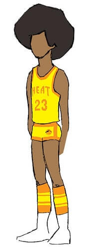
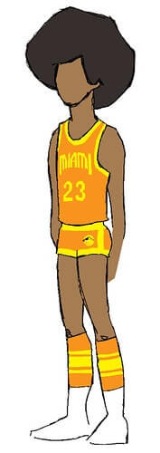
As this Miami Heat fauxback suggests, I’m drawn to the colors of nacho cheese and taco sauce. And I made it my mission to root for teams that were daring enough to use this most untraditional combination of hues (not being a well-read soccer fan, I can’t vouch for deliberately dissonant clash kits and keeper uniforms). A few years ago, this might have been a litany of teams crazy enough to use neon green; it’s as common as clay in 2020.
University of Montana
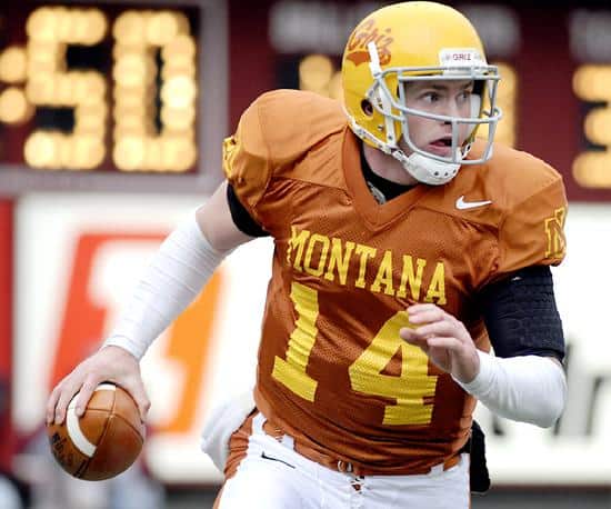
The official colors of the Grizzlies are “Copper, gold and silver”. The inability to locate a stable copper dye resulted in UM’s decision to wear maroon uniforms for much of its history. In 1967, AD Jack Swarthout polled his coaches and returned with a choice of Texas Orange (terra cotta) and gold (yellow) which the Griz wore for the next thirty years.
Philadelphia/Vancouver Blazers
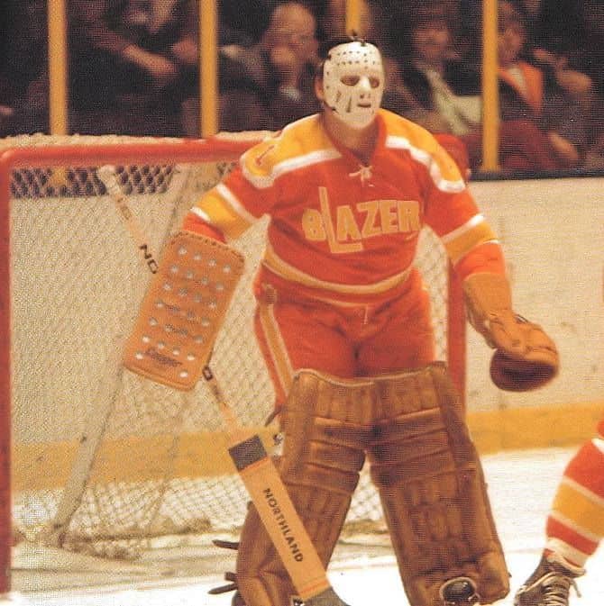
This charter member of the WHA donned the orange and yellow, and added black breezers to the formula when they moved to British Columbia. Presumably, light-colored breezers change color when they get wet.
San Diego Padres
The Friars oft-ridiculed brown and gold uniforms of the ’70s got an upgrade in 1980 when orange was added to the palette. They looked good enough to earn a four-season tenure; an eternity for this ever-changing team. Steve Garvey said he looked like a taco and I think that’s high praise, turning aside the scatological descriptions more commonly associated with the Pods’ team colors. Interesting trivia: San Diego played in the 1984 World Series with a one-year-only uniform, adding superfluous buttons and belts to an outfit which was better-served by pullovers and cummerbunds.
Vancouver Canucks
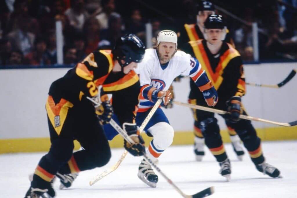
Media guides will attempt to influence you the orange in the 1978 Vancouver sweater is “Canucks Red”, but don’t be fooled: It’s as Orwellian as the “Forum Blue” in the Lakers’ uniforms. I cheered lustily for these loud uniforms, even buying a jersey; the hockey fans in my college thought I’d lost my mind (Islander territory, doncha know). Black, orange, and gold adorned the Canucks until 1989, when Canucks Red became real red.
Houston Astros
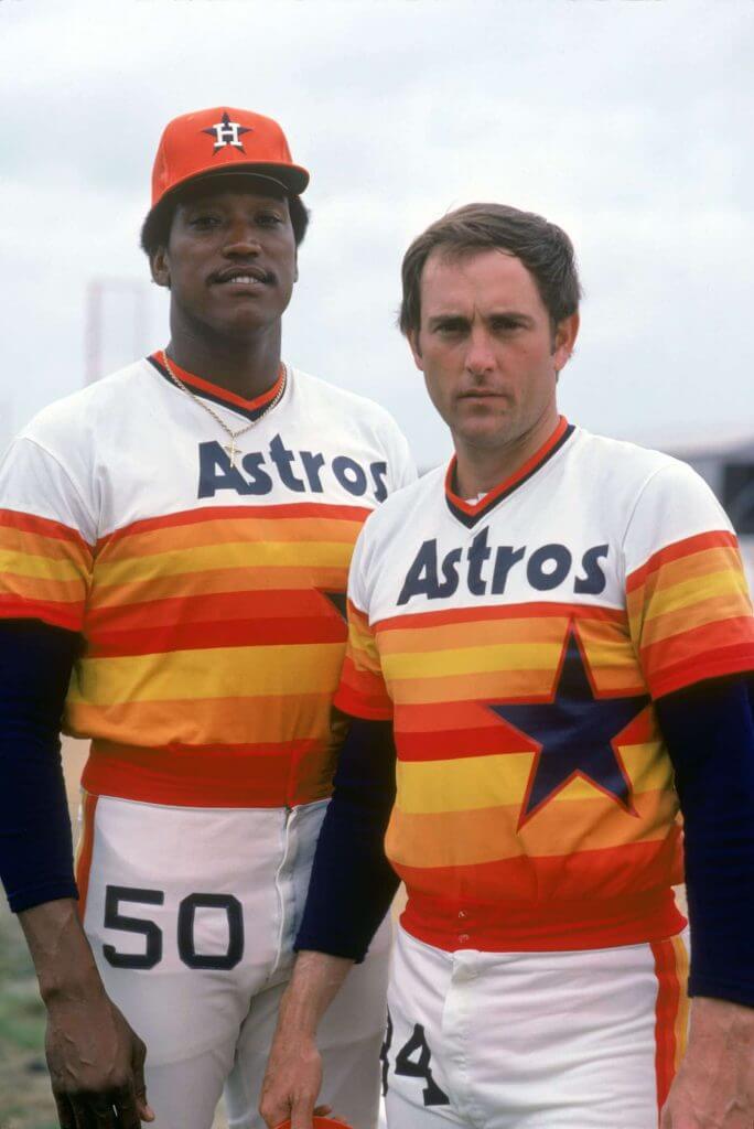
Even during the glorious rainbow-guts tenure, the official Astros’ palette was white, navy blue and orange; the augmenting hues of red, burnt orange and yellow were chosen for their relationship to orange and to make an evocative, sunset-inspired jersey. Best year: 1977, when they finally got the rear numbers right. My favorite overlooked detail is the four-colored pants stripe.
Oklahoma City Thunder
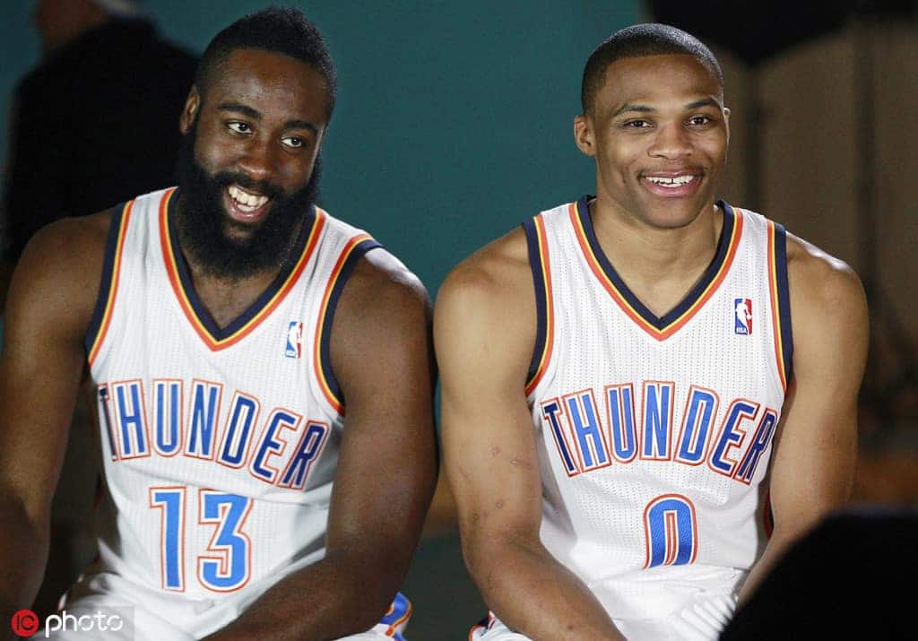
New teams have a broad palette, and OKC’s is pretty crowded: White, navy blue, Columbia Blue, gold, and orange. That’s a whole box of magic markers, right there. The Thunder have an orange uniform in their arsenal, but their use of yellow is sparing.
Golden State Warriors
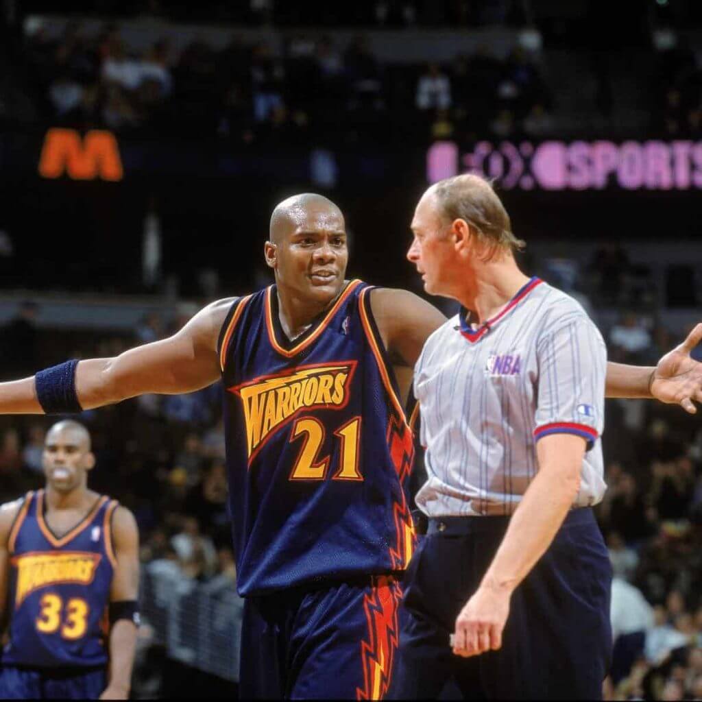
In 1997, Golden State tweaked their appearance with two shades of blue and added orange to augment the traditional gold, when they added a futuristic warrior hurling a thunderbolt. Obviously, Clay Bennett was impressed because the colors and part of the mascot went onto his new team when they relocated from Seattle.
Hawaiians
When the associate at Gerry Cosby’s showed me this WFL jersey in the ’80s, I could have sworn the colors were brown, orange, and gold. But I have an inclination to misremember things (think twice before calling me as a witness) and the Internet assures me the orange stripes were really scarlet. Dang!
Fort Lauderdale Strikers
See above. But those were some sweet-looking kits!
San Francisco Giants
When los Gigantes moved to their new park beside McCovey Cove, they massaged the team colors to include off-white home uniforms, and a 49er-gold drop shadow to their graphics. It’s difficult to see next to the saturated orange trim, and I have to wonder if anyone would miss it if it were removed. If I liked a complex color scheme on the Astros and Padres, why was I resisting it on San Francisco?
Connecticut Sun
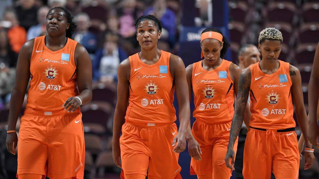
Team colors are orange, blue, red, and yellow. The colors of the uniforms, though, seem to be orange, dark blue and white.
L.A. Kiss
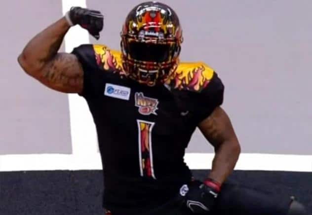
I admit Arena Football is a pretty deep dive, but this short-lived squad enhances my argument. Team colors were given as “black, flame, gold, chrome and white.”
Bakersfield Blaze
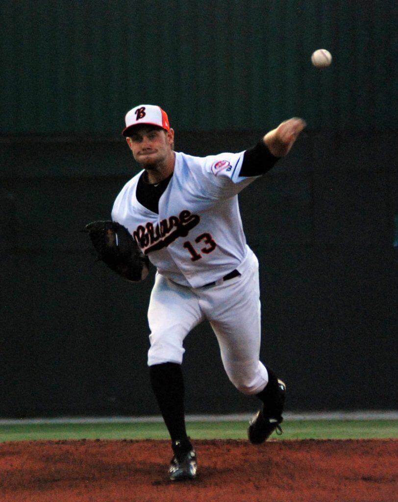
Single A Baseball, which leads me to believe more ambitious rock-turning would turn up other teams to support my thesis.
Miami Marlins
In 2012, the erstwhile Florida Marlins adopted an Art Deco-influenced “M” with a neon-looking fish. Yellow was in the logo but it was not an official team color. The fish were basically a white, silver, orange and black team.
Thanks Walter. That’s quite a list — and as you mentioned, not all of them quite fit the orange/athletic gold scheme, but they’re pretty close. Nice look at those who have used the pairings!
ITEM! New project in the works: Paul here, I want to tell you about a very cool new project I’ve been working on.
Here’s the deal: Over the years I’ve had many people tell me, “I’d love to buy a Uni Watch cap [or T-shirt, or whatever], but I’m a big SF Giants fan, so I can’t wear something with A’s colors.” Or, “I’m a big Bears fan, so I can’t wear something with Packers colors.” My response has always been, “I totally understand that, but green and yellow are Uni Watch’s colors. That’s just the way it is.”
Fast-forward to a few weeks ago, when I was chatting with graphic designer Bryan Molloy — the man who created our winged stirrup logo. He said he’d been pondering the possibility of doing some color-swapped caps. “You’re a Mets fan,” he said to me. “So how about if we did a winged stirrup cap in royal blue and orange?”
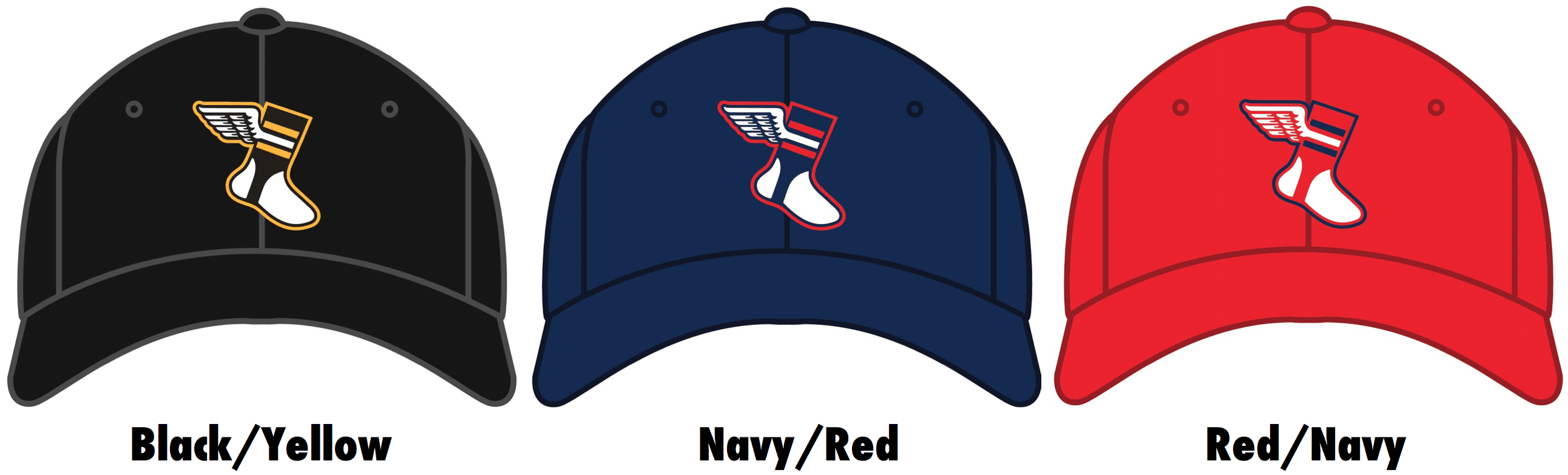
Hmmmm — intrguing question! Here’s the answer (click to enlarge):
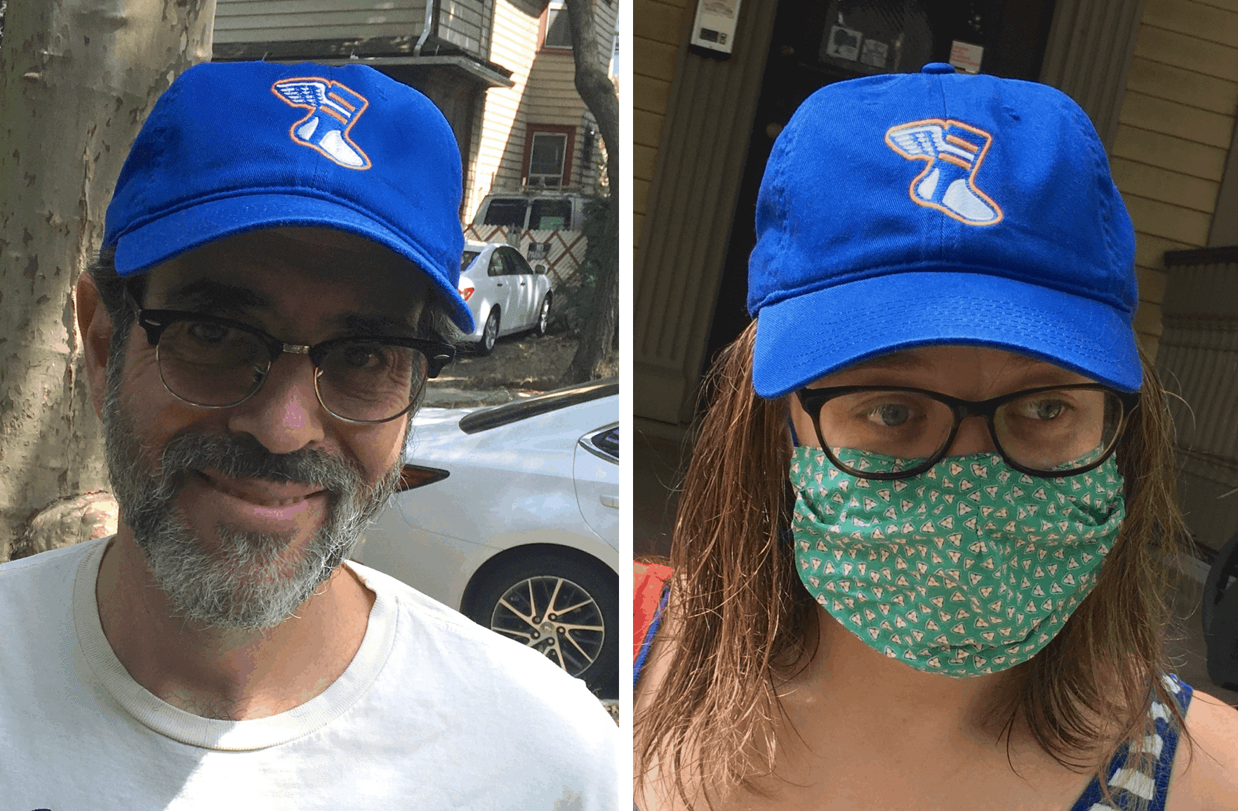
That’s a prototype cap, and I have to say it looks pretty damn good! As Bryan suggested, it has Mets appeal, but it could also appeal to fans of the Knicks, Islanders, or Boise State — or to anyone who likes the royal/orange color combo.
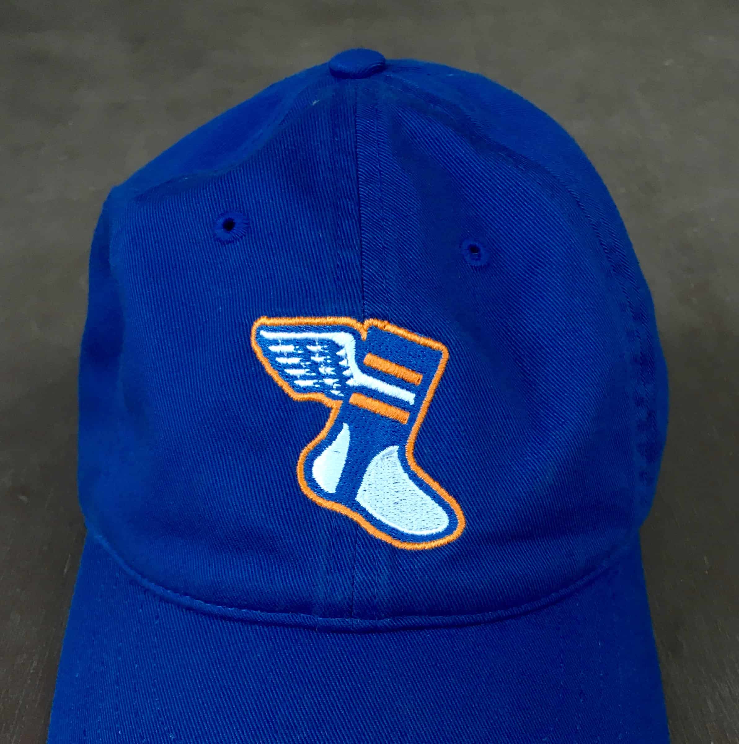
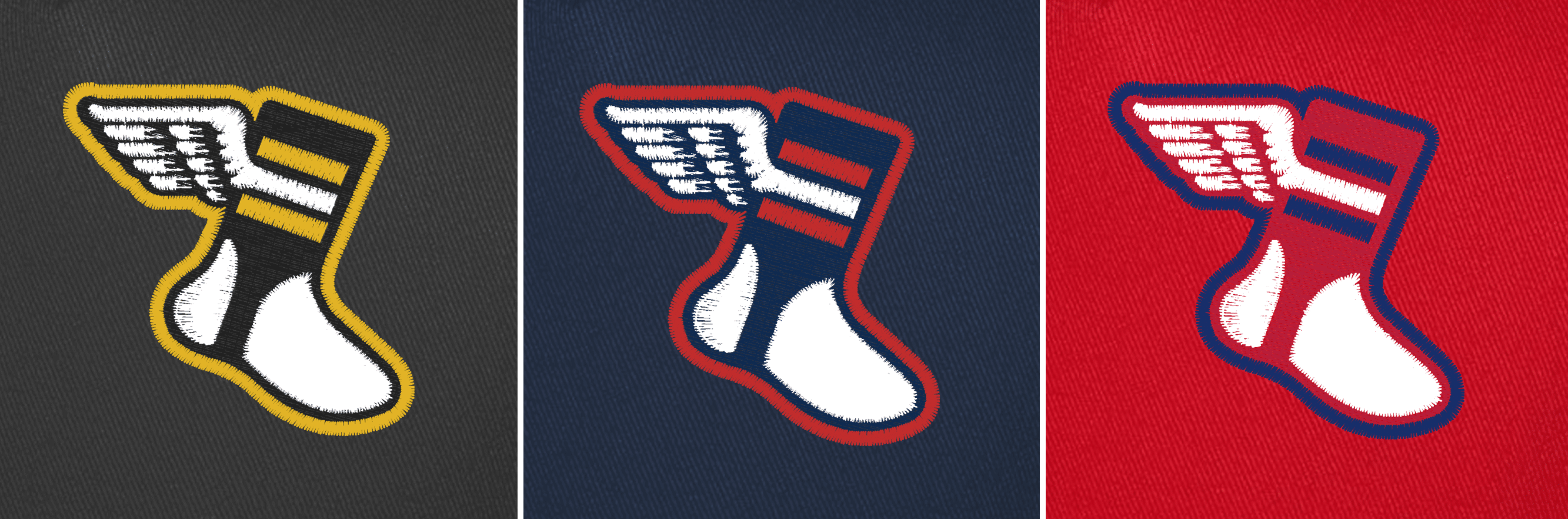
Here’s a closer look at the logo (click to enlarge):
That prototype is the start of what we’re calling the Uni Watch Color Remix Series, which will be a monthly program of limited-edition cap releases. We plan to start in mid-September, probably on Sept. 15, with four caps — the blue/orange one shown above and also these (click to enlarge):
We don’t yet have the prototype samples for those, but here are some digital simulations to give you a sense of how the embroidered logos will look (click to enlarge):
The initial four designs will be available for a month, and then we’ll release three or four more limited-edition designs in mid-October, a few more in mid-November, and so on. I’m not sure how long the project will last, but we envision lots and lots of color-combo possibilities here, so I’m thinking we’ll keep the monthly cycle of new releases going for quite a while — maybe as long as a year.
You probably have questions. Allow me to anticipate some of them:
Will the caps be fitted, flex-fit, snapback, or what?
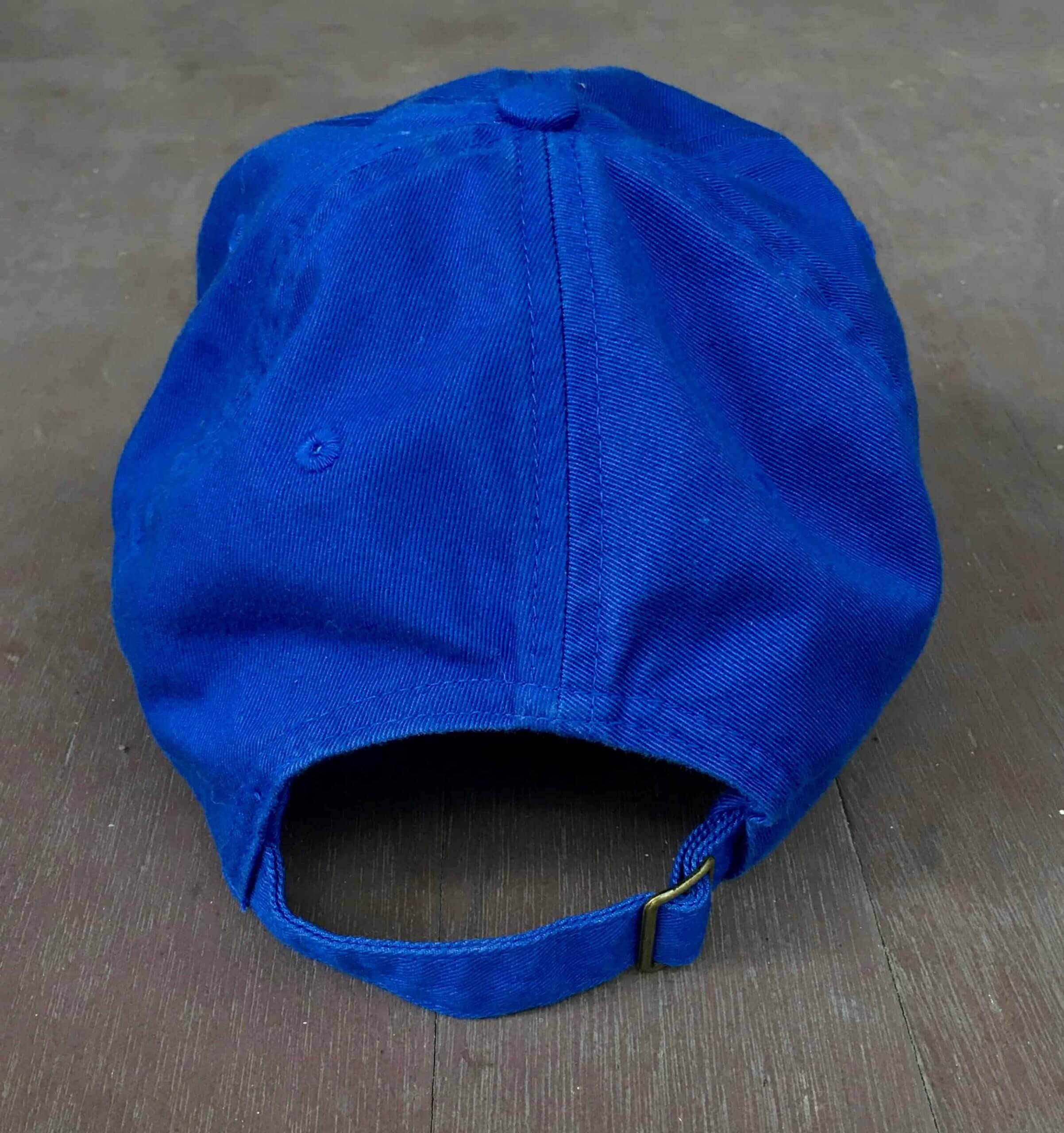
We’re going with cotton strapbacks (often referred to as “dad caps,” although I hate that term). Here’s how the royal/orange prototype looks from the back:
I realize some people only like fitted, or only like snapback, or only like high-profile, or whatever (if there’s one thing I’ve learned from selling caps over the past couple of years, it’s that you can’t please everyone!), but this product makes the most sense for us in terms of production, so that’s what we’re going to use. If it’s not your favorite format, I’m sorry — that’s how it goes sometimes!
Which cap brand are you using?
Depends on the base color. Some will be Econscious (including the prototype shown earlier) and some will be Yupoong. But all will be unstructured cotton twill strapbacks, and the two brands’ iterations of that stock item are more or less identical.
Will the caps have a visible maker’s mark?
Surely you know better than that by now! Like all Uni Watch products, this one will have no visible logo creep.
These first four caps are in four different base colors — royal, navy, black, and red. Will there be any other cap colors in the mix?
Yes, we expect to do green caps and orange caps as part of this series, and possibly a few other cap colors as well.
What color is the underbrim?
Same color as the rest of the cap.
Can you use contrasting colors for the brim, squatchee, or eyelets?
No. These are solid-colored stock caps, so we can’t mix and match those design elements. Probably just as well — I’d rather keep things simple.
For the various color-remixed logos, you’ve changed the color of the stirrup and the color of the top/bottom stripes, but the middle stripe always stays white. Will it always be that way, or will you sometimes change the center stripe color too?
The center stripe will always be white, because it connects to the wing, which will likewise always remain white. But the top and bottom stripe colors will change quite a bit (although they will always match each other).
Could the top/bottom stripes change to white, creating a design with three white stripes?
Yes, that’s definitely a possibility. A royal stirrup with three white stripes might appeal to Colts or Maple Leafs fans, for example, and a red stirrup with three white stripes might be good for Red Wings fans, and so on (plus those designs would just be good-looking and fun). So that type of thing will definitely be in the mix.
What about the sanitary sock — will that also always remain white, or could you change it to a different color, like the Brewers and Giants did in real life back in the day?
Changing the sock to a different color is definitely a possibility. For now, though, we’re sticking with white for that element.
In addition to changing the colors, can you also change the number of stripes on the stirrup? That way, for example, you could match the Cardinals’ stirrup design.
Fun idea, but that would be taking too many liberties with our logo. The base design will remain as a white-winged stirrup with three stripes, the middle one of which will be white. We’ll be playing around with colors, but not with the base design itself.
The designs you’re planning for September all show the stirrup in the same color as the cap — a royal stirrup on a royal cap, a black stirrup on a black cap, and so on. Will that always be the case?
No, we definitely want to mix things up. For example, consider the design featuring the navy stirrup with red stripes — it looks great on the navy cap, but it would also look good on a red cap, so we’ll probably offer that option at some point. For now, though, we’re keeping things simple by having the stirrup color match the cap color. (And as you’ve probably noticed, the logo’s outline color matches the top/bottom stripe color.)
Will you do anything involving purple?
Not until next year’s Purple Amnesty Day.
You said these will be limited-edition — so once they’re gone, they’re gone?
We’re trying to keep things manageable, both for ourselves and for the shop that’ll be producing the caps for us, so for now we don’t want to have too many different colorways available at once. But if there’s enough demand for a particular design from a previous month, we’ll bring it back. And it’s possible that certain designs — like the ones we’re launching the project with in September — could become available on a permanent basis. We’ll have to see how that plays out in terms of demand, logistics, and so on.
How soon will you do my favorite team’s colors?
Again, we can’t please everyone — at least not all at once! — but we’re definitely interested in hearing from you regarding which designs you’d like to see. We already have a fairly long list of possibilities, but we haven’t yet decided the sequence in which we’ll roll them out, so your feedback is welcome. If it takes us a while to get to your favorite team’s color combo, just be patient — we’ll likely get to it at some point!
Will you also do Color Remix T-shirts?
Quite possibly! For now we’re focusing on the caps. But again, we’d enjoy hearing your feedback on this — let us know if you’d be interested in shirts.
What will the price be for the caps?
Probably $28-ish. They’ll be sold through Bryan’s site, Popcorn Ink.
Will there be any sort of “Collect ’em all!” incentive?
Probably not. We’ll likely be doing several dozen different designs here, so purchasing all of them could end up costing more than $1,000, which is a greater commitment to Uni Watch — and to headwear — than I can realistically expect from anyone. But if someone out there wants to take a shot at it, give me a shout and maybe we can come up with some sort of prize, or make you the project’s poster child, or something like that. There’s no denying that having all of the caps displayed on a wall would look very cool!
Obsessive collecting aside, my hope is that people will be tempted by some of the designs that don’t necessarily align with the favorite teams. That black/yellow version, for example, looks so sharp that I’ll probably wear it myself, even though I don’t root for any of the Pittsburgh teams. So even if nobody wants to collect ’em all, it’ll be fun to see how many different caps people are willing to acquire, which designs are most popular, and so on.
I think that’s it. If you have any additional questions, feel free to post them in today’s comments. Thanks for listening!
Click to enlarge
College Football Season Preview reminder: In case you missed it on Thursday, the annual Uni Watch College Football Season Preview is now available for your enjoyment.
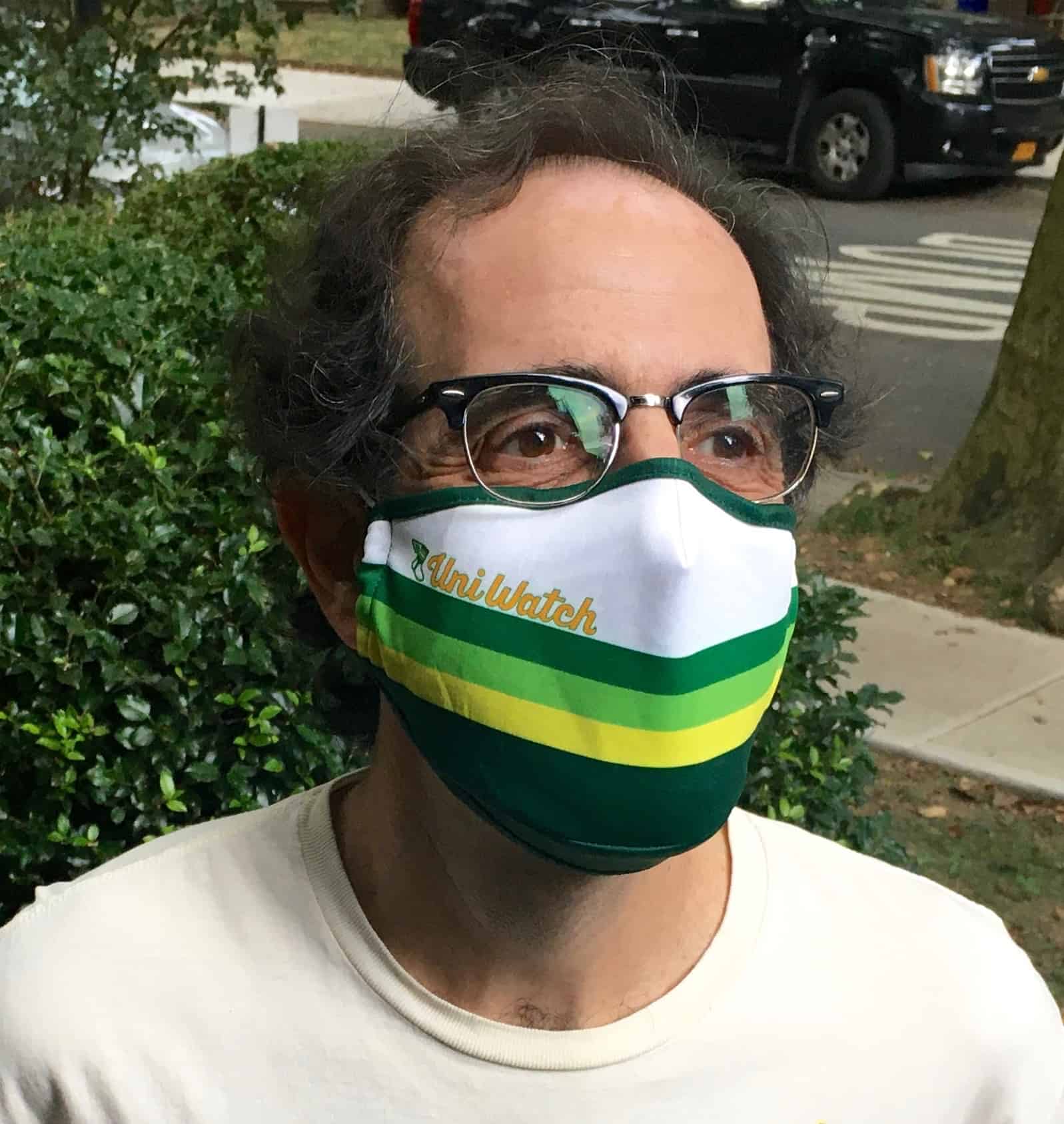
Mask update: As of now, we have about 70 remaining Uni Watch Tequila Sunrise Masks (which means we’ve sold nearly 430 of them and raised more than $2,200 for the National Alliance to End Homelessness!).
As you may recall, this mask was originally available in two sizes — S/M and M/L. The larger size has now sold out, so all that’s left is S/M.
You might think that S/M is just for kids or people with tiny faces. But just for reference, the original Uni Watch masks that we offered earlier this summer — the ones that sold out, twice, in about no time flat, and that everyone said they loved — were S/M. That design was produced in only one size (at the time, I didn’t even know another size was available), so it wasn’t labeled as S, M, L, or anything else — it was just your basic mask size. So if you liked that one, you’ll be fine with our remaining Tequila Sunrise masks as well. Basically, S/M is normal size, and M/L is, like, super-sized. You can still get a S/M mask here while supplies last.
Okay, that’s it for me today. Back to you, Phil!

Guess The Game…
from the scoreboard
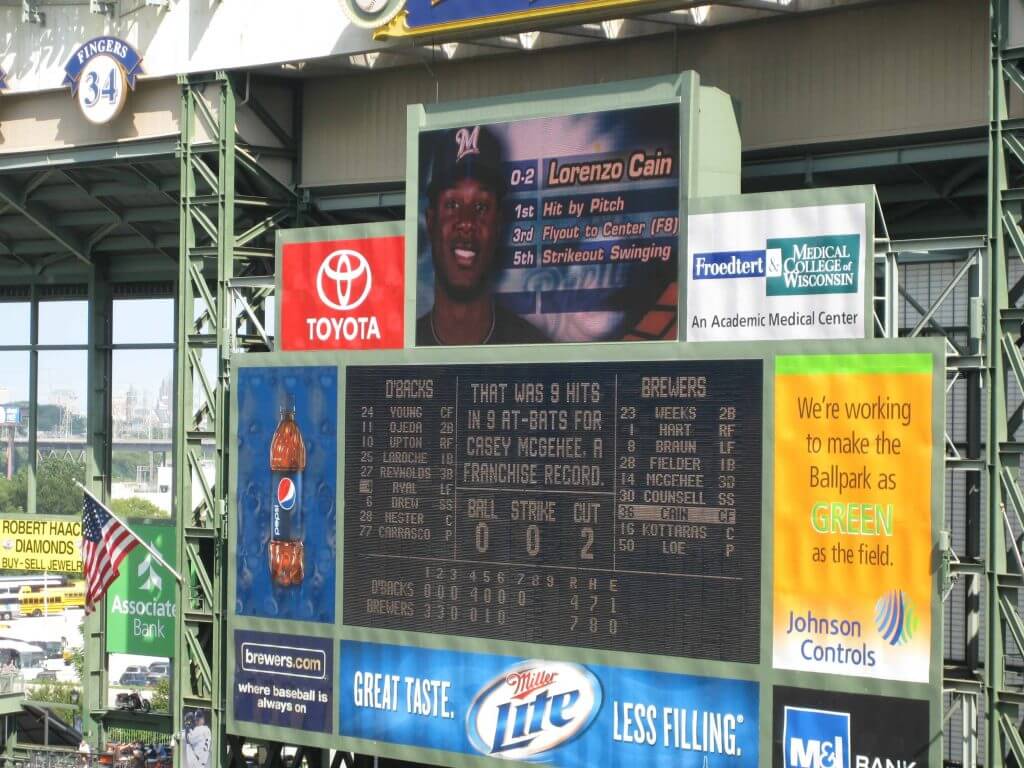
Today’s scoreboard comes from Mike Chamernik.
The premise of the game (GTGFTS) is simple: I’ll post a scoreboard and you guys simply identify the game depicted. In the past, I don’t know if I’ve ever completely stumped you (some are easier than others).
Here’s the Scoreboard. In the comments below, try to identify the game (date & location, as well as final score). If anything noteworthy occurred during the game, please add that in (and if you were AT the game, well bonus points for you!):
Please continue sending these in! You’re welcome to send me any scoreboard photos (with answers please), and I’ll keep running them.

Uni Concepts & Tweaks
Time for more Uni Tweaks from the UW readership.
I hope you guys like this feature and will want to continue to submit your concepts and tweaks to me. If you do, Shoot me an E-mail (Phil (dot) Hecken (at) gmail (dot) com).
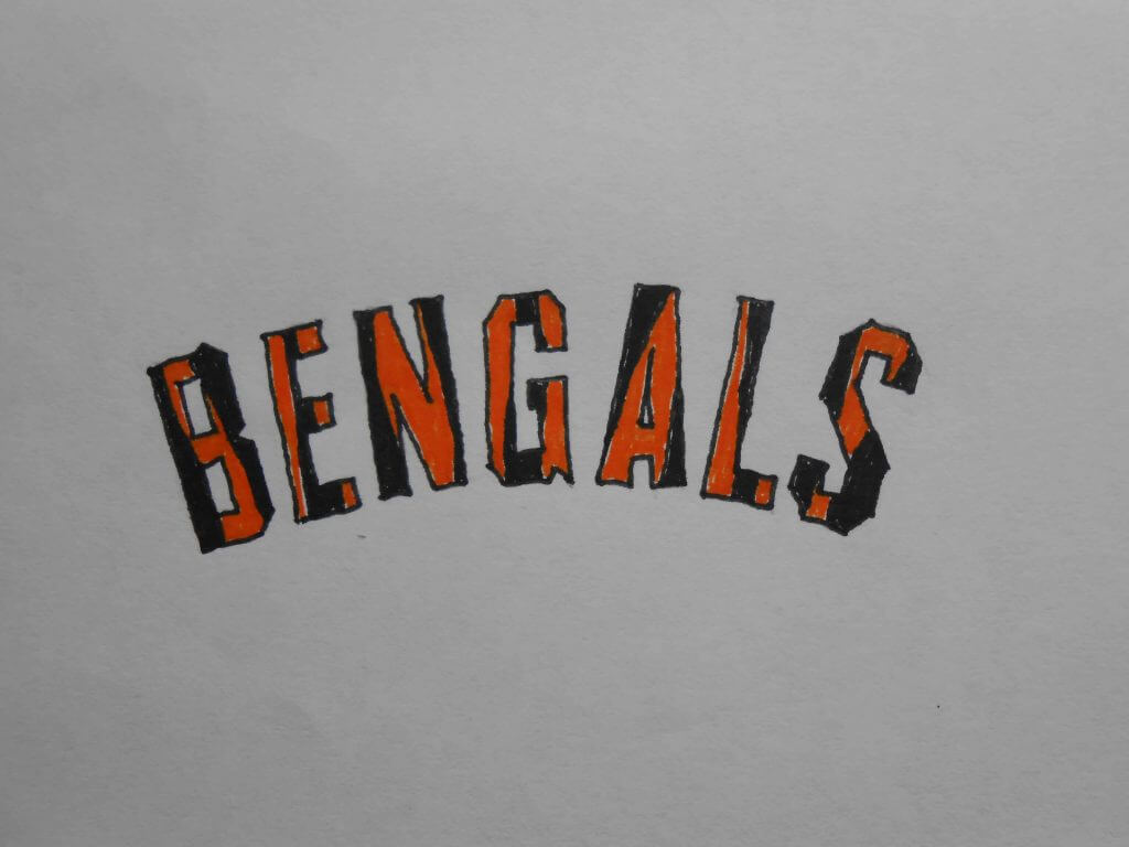
Today’s set of concepts come from Walter Helfer, who has taken on one of the NFL teams most in need of a redesign, the Cincy Bengals (click on any image below to enlarge).
He writes,
Dear Phil,
Let’s see how brief I can be:
New uniforms for the Bengals. Helmet is influenced by the USFL Panthers; a lot of people think that was the best pro football helmet, myself included. Team logo based upon original Bengals helmet decal. Black jersey and orange pants for home uniform, orange jersey and white pants is home alternate. Stripe pattern based on Dazzle Camouflage used in WWI.
Can’t wait to see this on Uni-Watch. Thanks!
-Walter
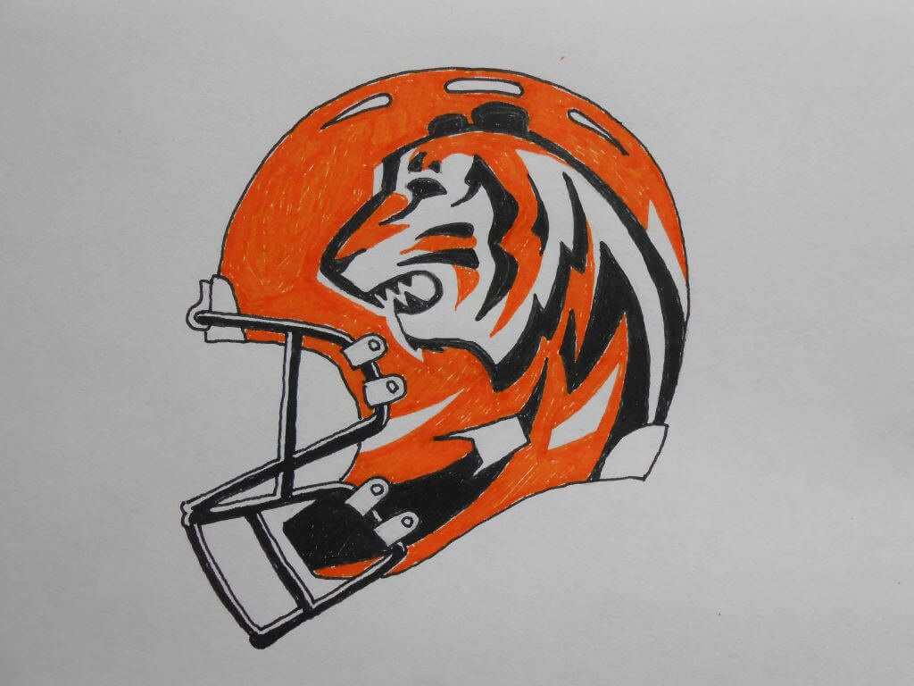


Thanks Walter!
OK readers (and concepters). If you have some tweaks or concepts, shoot ’em my way with a brief description of your creation and I’ll run ’em here.
The Ticker
By Anthony Emerson

Baseball News: The Mets and Marlins took the field for a 42-second moment of silence before boycotting. The Marlins left a Black Lives Matter T-shirt over home plate. … Cardinals IF Tyler O’Neill wore the team’s batting practice cap rather than his game cap during Wednesday night’s game against the Royals (from Nick Maher). … The CTBC Brothers of the CPBL will have special uniforms for their Pili Nights promotion. Pili is a Taiwanese glove puppetry show (from Jeremy Brahm).

NFL News: Another year, another Madden, and another set of bad loading screen uni photoshops. Except in this case, it looks like they added the Pats’ new UCLA stripes to Devin McCourty’s uniform in MS Paint, not Photoshop. Also, check the chest logo: the Pats last wore that logo in 2015! (from Ben Oship). … A couple of old screenshots from @NFL_Journal. The first features three different NOB styles for the Cowboys, and the second features two FNOBs for the Cardinals.
College/High School Football News: Kary Klismet has found a blog that tracks Southern Miss’s uniforms. …
.

Hockey News: The Hockey Diversity Association wants their logo on the ice for the rest of the playoffs, and wants teams to wear special “blacked out” warm-up jerseys (from Geoff Ng). … Lightning G Curtis McElhinney has a poignant, protest-motivated new mask, featuring several Black athletes including Willie O’Ree, Jackie Robinson and Muhammad Ali.

NBA News: The Hornets have delayed their new uni launch in the midst of the sports strike and social unrest following the shooting of Jacob Blake. The launch was supposed to happen yesterday (from multiple readers). … The Mystics’ bullet-hole shirts worn two nights ago before the WNBA walked off were designed by the team’s coach, Mike Thibault (from Andrew Hoenig).

Soccer News: ESPN ranked the 39 worst kits in history (from Nicklaus Wallmeyer). … Manchester City’s new third kit is inspired by “music culture.” This is surprising, because it looks more like cotton candy vomit (from @Billonthedoor). … Yeovil Town’s new home kit is, um, pretty unique (from @texastrevor). … New home, change and third kits for Italian side Napoli (from Ed Żelaski). … The Portuguese national team will unveil their new kits on September 1 (from Chris Corbaz). … Northern Irish side Larne FC and English second tier side Birmingham City have basically identical kits. Thanks, Nike! … The following are all from our own Jamie Rathjen: the blog “Museum of Jerseys” has an interesting post suggesting that teams should have yellow third shirts, or blue for teams whose primary color is yellow or gold. This would prevent most matchups where a visiting team’s primary, second, and third kit all clash with the home team’s primary kit. … New logo for the Dutch women’s league. … Spurs have leaked the new Premier League match ball. … English fifth tier side FC Halifax Town has unveiled their three new kits (from Neil Barraclough and @SimStrength). … Spanish side Real Valladolid have unveiled new purple change kits. … Real Madrid Feminino have unveiled their new home kits.

Grab Bag: Ahead of the Belgian Grand Prix, F1 drivers George Russell and Pierre Gasly have added a memorial decal for Anthoine Hubert to his helmet. Hubert died at last year’s Formula 2 Belgian Grand Prix. Gasly’s helmet also features photos of Gasly and Hubert. The Renault team — for whom Hubert raced — have added the same decal to their livery. All racers in Formula 2 will also have the decal, while Hubert’s No. 19 has been retired (from Omar Jalife). … Tiger Woods missed a belt loop while playing yesterday (from John Stark). … The first regulations issued by the US Space Force are on how to properly wear the Space Force’s camouflage uniform (from Timmy Donahue and Kary Klismet). … Also from Kary: Payette High School in Idaho is getting new band uniforms thanks to a $20,000 grant from a charitable foundation based in the state. … One more from Kary: a new logo commissioned by the Australian government to promote business has been scrapped due to its similarity to the structure of a coronavirus virion.
And finally… big thanks to Walter (for both the orange/gold lede AND the Bengals tweaks — that they ran on the same day is actually purely coincidental, but it’s a nice coincidence).
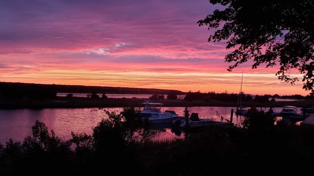
We made it to Friday in what was another week from hell for many of us. Let’s hope the worst of it is behind us. I won’t complain about my weather yesterday, what with a major landfalling hurricane and wildfires blazing elsewhere, but it was one of the weirdest weather days I can remember. It started out very cool for August (58° when I awoke at 7 am), rained a bit before my run and power walk, then got really hot and steamy (close to 90°). Around 4:00, just as I had begun my (early) evening walk, the sky got as dark as I have ever seen it, and by 5:00 through sunset, it intermittently downpoured with thunder and lightning (we were under a tornado watch from early evening through 8:00 pm, although I don’t think any touched down, thankfully). As I type this it’s still thundering. Like, a LOT. All of which is to say, no sunset photo from yesterday.
But as I had hinted yesterday, there was one of the more amazing post-sunset scenes I’ve witnessed out here last summer, and I want to share it with you today. This is completely *unretouched* — straight off my phone — and yes, Paul’s favorite color took center stage. I love this one:
Everyone have a good Friday and a better weekend. I’ll be back for one more weekday visit this coming Monday, after which the calendar flips to September and Paul will again take his rightful place running the weekday show. Till then,
Peace,
PH
Love it. I can empathize with this poster and salute him for being resolute. I guess, because of my Browns’ fandom, I’m partial to teams with brown in their scheme. Give me Wyoming and Bowling Green and throwback Bruins and Padres all day any day.
Mad love for Wyoming: My favorite Division 1 football program (ever since Hawai’i discontinued the rainbows).
“Black, orange, and gold adorned the Canucks until 1989, when Canucks Red became real red.”
It was in time for the 1992-1993 season and not 1989. The minor uniform update part of which saw the orange become salmon red.
link
link
Good catch. In my haste, I cut a few corners going back and forth between some of my favorite references. Totally forgot about the cuff trim on the breezers, too.
CANNOT WAIT for the color-swap caps! I’ve been looking for some new caps but have not wanted to give any of the big leagues my money lately.
Don’t forget Bhutan! Their flag is orange and yellow, and all of their national teams wear that color combination.
How beautiful! Love the dragon, too.
FC Barcelona and Welsh Pro 14 team Scarlets had similar ideas for change unis a couple of years back..
link
link
Scarlets play rugby union, btw, sorry for the omission
A Fort Lauderdale Strikers appearance! Love seeing my dearly departed boys. I actually designed those uniforms (circa 2016 shown in today’s piece – I also designed the 2012 & 2013 sets, I was the in-house designer with the modern version of the club for it’s entire all-too-brief existence). Sorry to burst your bubble, but that’s red, not orange (PMS 1807 to be exact. With the red & yellow next to each other it does create a bit of an optical illusion).
The interesting wrinkle about that years kits was it was there first time we had a red shorts option. We also had the traditional black shorts to pair with the hooped top (a look dating back to 1977).
Yeah, I know. I had the same misconception about the ’70s Strikers.
Guess the game from the scoreboard:
Aug. 12, 2010.
The Casey McGehee stat made it pretty easy for me.
A lot of great names in the box score for the Brewers! I loved looking it up.
I forgot that Lo Cain and Jeremy Jeffress both started their careers with the Brewers, left, and came back
Today gave me flashbacks to one of my favorite sodas growing up, Cactus Cooler
link
Don’t forget Reese’s Peanut Butter Cups or Taco-flavored Doritos.
Re: orange/gold in the minor leagues
Current teams that use the combo are the Las Vegas Aviators (who have a very Astros-esque sunset motif) and the Frederick Keys, who use a sun-ray logo with an Orioles orange to gold gradient. The Albuquerque Isotopes have some orange to yellow gradient in their logo as well.
I’m glad you mentioned the defunct Bakersfield Blaze. Their butterfly-on-fire logo is a great example of the color combo.
link
The Tucson Toros had their audacious color combos in the early eighties.
link
link
The Toros (and other Astros affiliates of the time) also borrowed the tequila sunrise design. In the nineties, there aren’t as many examples as you might think, but lots of teams (Toros, El Paso, Albuquerque, Akron, etc.) used scarlet-ish (or orange-red) and gold combo. A good example from the 2000s is the Salt Lake Stingers. My eyes have a hard time discerning if their base color was Angels red or more of a dark orange.
link
Honorable mention to the Norwich Navigators, who started out in the 1990s with a black/purple/green/gold/tan combo, but then added in orange elements when they became a Giants affiliate in the 2000s. But I don’t think the orange and gold ever touched.
link
Any others from the minors that I’m missing?
Well, what colors didn’t the Toros use?!? Two things I love about that team: 1. Rather than design their own hats, they just wore AJD trucker caps with the team logo, and 2. They had an orange uniform which may have been the Astros’ original plan for a road uniform in 1975.
I had to stop somewhere, so I avoided teams with multicolored logos that were not gold-or-orange teams, like the Chicago Blackhawks, or any team using a rainbow, like the Denver Nuggets.
That makes good sense. You can only open so many cans of worms.
I love those Toros caps too. The late 70s-early 80s was a very weird time for the minors, and there are a lot of uni pieces that look straight off the rack at the local sporting goods store. Most minor league teams were on life support financially – kept afloat by MLB parent clubs – but at the same time, you could see teams like the Toros, Diablos, Columbus Clippers, etc. steering the minors into what they would become in the post-Bull Durham era.
I love the color remix caps–looking forward to seeing the combinations you come up with.
The design of the stirrup logo looks so perfect on a cap–it really looks like it could be a vintage minor league baseball cap to people who aren’t in the know. (Or don’t Get It™)
Also, regarding the ticker item from Jamie about the new Premier League ball–I think they had been announced a few weeks ago, but the Tottenham twitter post about them is just the first time the team has used them in training.
Special request on color swap hats…….I always have to have shirt and cap match. I love the “back to brown” Uniwatch shirt that came out of the San Diego party. I would love to wear it more often but have no desire to get a Padres hat, a team I have no connection with. I had actually thought of recommending you have a project like this for just that reason. Bottom line: brown hat. soon. Please.
You have to add in the Baltimore Blast!!! Orange and gold were a huge part of their look in the 80’s
link
It’s funny how with all of these resources at my fingertips, I can still overlook an important memory. My favorite indoor team was the Cincinnati Kids. What is more surprising is there still is a team called the Baltimore Blast!
Great stuff today, Walter! I love your examination of an underutilized but striking color combination in sports. It can be tricky to pull off well, but when it is, it makes for distinct and memorable sports uniforms.
As a show of orange-and-yellow solidarity, I thought I’d highlight a couple of the uniform concepts I drew as a kid:
link
link
I was tracking with you long before either of us knew it!
Those are awesome. I love the Talons.
Was the Firebirds concept a proposed redesign of the old Pacific Coast League team?
Both designs are from a series of illustrations I created as part of imaginary leagues and teams I came up with in my teams. Paul featured them a couple of months ago:
link
I think I was vaguely aware of the existence of the Triple-A Phoenix Firebirds at the time. My uniform concept wasn’t meant as a redesign of the minor league team, however. I was just borrowing the name for my imaginary major league team because I liked it. With the lack of internet access, I don’t think I even knew what their uniforms looked like until years later.
I did have one of their caps in the mid-’90s that looked like this:
link
A friend got it for me on a visit to Arizona. I loved it because it reminded me of my uniform concept from so many years prior. Sadly, I can’t seem to find it anywhere. I’m not one to get rid of caps very often, so I’m hoping it’s in a storage box in my garage somewhere, along with about a dozen other caps I haven’t seen in years.
I was surprised the Real Phoenix Firebirds of the PCL used red instead of orange; they were one of the teams I was planning to feature. But, like me, you were plainly in thrall of the Blue Jays by putting a center crest on their jersey. And the Talons owe a lot to the Buccaneers. Tampa Bay is a whole other can of worms, b/c as rare as orange and gold is, orange+red is even scarcer!
Yes, there’s definitely an ’80s vibe to my Firebirds concept (well, both concepts, really). I borrowed heavily from the Blue Jays and the Astros, which isn’t hard to tell!
As for the Talons, the old Buccaneers influenced the jersey color, no doubt. I think the rest of the concept – including the name and the color scheme – came about after I had already created the Firebirds design. I had a thing for unified themes for teams from the same cities (a la the St. Louis football and baseball Cardinals and the Pittsburgh teams all wearing black and gold), so the similarities between my two Phoenix teams is not coincidental.
The best thing about orange+gold? It makes me hungry!
Speaking of red and orange as a color combo in sports, boy that is a rarity, isn’t it? Outside of the Buccaneers, there aren’t many examples. I guess the Houston Astros’ rainbow guts-era uniforms included red and orange (along with yellow and blue). And maybe the Utah Jazz’s current alternates with the striated sandstone look qualifies?
link
Those are the only ones I can think of.
Original Miami Heat uniforms had the red and orange trim. The orange trim has been replaced by yellow. I liked the original Heat colour scheme better. The first black uniforms were great.
Good pull, Wade! I forgot about the original Heat uniforms.
Love the caps, Paul. How would you do a team with a two-color scheme? I think of the Yankees and their navy/white scheme and can’t see that translating to a visually interesting hat, as much as I’d like it to be.
We’re not necessarily trying to do a color combo for every team. We’re just trying to come up with fun, good-looking designs that happen to align with certain teams’ color combos.
Makes sense to me, Paul. Trying to match every team’s colors is a crazy-making exercise. Personally, I’d just end up buying colorways that appealed to me, no matter whose color schemes they remind me of.
AND Penn State! I’d be interested in Color Remix T-shrits too!
The Sun City Rays of the Senior Professional Baseball Association
link
Didn’t all those SRBA teams play in Florida? Must have had a brainfart, b/c those St. Petersburg Pelicans’ uniforms are usually close to my cerebral cortex.
There was a San Bernardino team for a spell, but it was basically a Florida league.
Great article by the way! Can’t expect to get all of them.
Not sure if Paul monitors the comments during August, but…
I assume you’ve got some sort of deal worked out for the hats, but have you thought of using a company like Printful to produce your hats? You don’t have to keep stock of hats, and people can basically just order from your website, and Printful produces and ships then. This would give you the opportunity to offer an infinite number of color combinations (kind of like your Naming Wrongs shirts) without worrying about whether or not they’d sell.
We have a similar setup with another company.
No Athletic Gold in the Bengals’ redesign? It was right there for the taking! Either way, these would be a huge improvement for the team.
Had I done both projects at the same time, there might have been some gold in Cincy’s uniforms. I was trying to tamp down some of the Bengals’ wilder impulses, and jazzing up the color scheme didn’t fit in with my plans.
Listening to the TALKIN’ BASEBALL MLB PODCAST from yesterday right now and they are throwing lots of love to Inside Hook and briefly discussed the MLB uniform rankings article that Paul wrote. Pretty cool.
My thanks to Phil for allowing my contributions to run after such an auspicious day for sports, specifically, and America in general. Please allow me to extend my admiration for Dominic Smith, Andre Iguodala, Doc Rivers, LeBron James, Colin Kaepernick, Tommie Smith, John Carlos and any other influential athletes I may have overlooked. Your contributions to your country are priceless. You are True Patriots in the best sense of the word. As we speak, my American flag is flying for the March on Washington and the funeral for Emmett Till. I will now step down from the soapbox.
If you put out a remixed version of the UW cap in White Sox black and silver I would buy it in a heartbeat.
We will likely do black/white and also black/silver-grey.
I mostly avoid this style of cap, but I’d probably buy one in a navy and yellow scheme.
Navy/yellow will definitely be in the mix.
That’s one I’m excited for.
And royal/athletic gold, and a Padres-inspired brown and athletic gold.
Love these remixes!
Stirrup caps: Maybe an orange & black for Halloween. Or some combination of red & green for Christmas (and for fans of the Milwaukee Bucks and New Jersey Devils when they used that beautiful combo.)
I’d gladly pay for a Columbia Blue/Sheridan Red Color Remix cap and/or shirt…or a reasonably close approximation (i.e.: Houston Oilers colors).
I love orange and gold uniforms! Nice piece. WHA Blazers were definitely better before they added the black.
Another deep-dive topic could be hockey teams with light-colored breezers. Interested?
Yes! I’m already havimg visions of white Washington Capitals breezers in anticipation!
That McElhinney mask is extra interesting because it means that he’s wearing the logo of his current opponent (the Boston Bruins). I wonder how often that has happened outside of the context of a goalie wearing their old gear after a trade.
Re color re-mix caps: I didn’t see any prior comment about these possibilities, but I would think a tan/khaki hat and a grey hat, with pretty much any winged-stirrup logo (blue, green, red) would be sharp. A tan and/or grey cap would actually be my preference.
Cowboys in ‘traditional white’ 14 times and navy just once???
Blah…
Great stuff today! Paul: the current green trad cap is what I ordered. Not the Ebbetts field version. The crown is just a tad small for me. Will these new caps be from the same manufacturer? Thanks!
Hi, Steve. Are you referring to the green cap with the “Gold Circle” logo? That is an Econscious cap, which is one of the two brands we’ll be using, yes.
If you’re referring to something else, let me know!
Will you be able to let us know the cap manufacturer before we order?
Yes, definitely.
Thanks Paul. Yes, that’s the one. The typical dad cap is too small for me.
I’d happy buy a cap in the Cubs color scheme.
Paul, I love your new Color Remix caps, specifically the Black and Gold version. Not because of any affiliation with a Pittsburgh team, but because those are my old high school’s colors.
I can’t wait to see what the Scarlet and Gray version will look like. And offering Color Remix t-shirts seems like a win-win option to me. Thanks!
FINALLY – so excited for these non-green Uni-Watch options. Green is one of my least favorite colors so while I enjoy a lot of the creative merch, I don’t purchase it cuz I know I likely won’t wear it too much.
Marylebone Cricket Club in London also uses yellow/orange in their color scheme, as well as red (sometimes).
Also known as “egg & bacon”
I know cricket has its fans, but it’s a bit outside of my ken.
Just wondering: why would the U.S. space force need camouflage which is green and brown? If you were hiding in space, wouldn’t you want to wear black?
Just wondering: why would the a Space Force need camouflage which is green and brown? If you were hiding in space, wouldn’t you want to wear black?
I don’t understand Walter’s comment about the Canucks’ “orange” changing in 1989. I see where he corrected the date in the comments above, but still… how was that color ever orange? Looks like pretty standard red to me.
Since we’re on the topic, let me just put in a plug for the Canucks’ 1985-86 flying-skate yellow set. Prettiest uni they ever wore IMO, and doesn’t get nearly enough attention nowadays.
I’m color blind, with a proclivity to fudge the red/orange threshold. My sister pointed this out in 1969 when I tried to show her the “orange” Chevy Camaro.
I love that Paul had thought to answer so many UniWatch type questions about the caps. With each question my smile got wider.
I try to anticipate the questions that people may have! Also, a lot of the FAQ mirrored the questions Bryan and I asked ourselves as we developed this project.
A few of my favorite NASCAR paints schemes use orange and yellow:
The ‘Laundry Detergent’ Ride of Darrell Waltrip and later Rickys Rudd and Craven.
The ‘Hot Dog’ Mobile of Ryan Newman.
And I think all 3 of Cale Yarborough’s Cup championship cars were also orange and yellow…at least partially.
I wonder what the Space Force football uniforms will look like. Air Force vs Space Force is sure to be an epic rivalry in the future.
With everything going on…..reading today’s post and seeing people discussing the uni-verse, things felt good, normal, and reminded me that while we all care about our world these days, it’s still OK to take a few mins and escape.
Will Color Remix be an option for Uni Watch membership card designs?
Hadn’t thought about that, but sure!
Jackie Robinson jerseys for everyone in MLB today… was this something that was announced would happen and I missed it or was it or a last-minute thing?
Actually… is it everyone? Cubs-Reds and Sox-Royals are all 42s.
Yes, it was announced a while ago that Jackie Day would be rescheduled for today (anniversary of the 1963 March on Washington for Jobs and Freedom).
So glad to see those photos of Yount and McCovey in my favorite Milwaukee and San Francisco uniforms.
All these years I thought Uni Watch colors were green and yellow, little did I know that yellow is the new athletic gold. RIP yellow..
No wait!
I still call it yellow.
Baltimore Blast of the MISL had a tequila sunrise inspired orange and gold scheme
link
For its COVID-19 messaging, The University of Texas at Austin is using a color scheme of burnt orange (natch) and yellow (which isn’t normally part of the UT palette).
link
UT and terra cotta are genetically joined; it’s unnatural to think of one without the other.
Lovin’ the hat remix Paul – looking forward to a possible red / white or powder blue and something!
There is something about that Bengals helmet that reminds me of the Michigan Panthers. That a good thing.
Orange is a wondrous color, shamefully underused.
Using the USFL Panthers motif was my specific intent. It’s surprising how many animals- over half of the NFL- that design will work with. And I like the Bengals’ current helmet. But you gotta start somewhere and Cincy is as good as any locale.