[Editor’s Note: Paul is on his annual August break from site. Deputy editor Phil Hecken is in charge from now through the end of the month, although Paul may be popping up here occasionally.]
By Phil Hecken, with Bowen Hobbs
Follow @PhilHecken
Good Thursday Uni Watchers! Hope everyone is doing well — we’re almost done with the week (in fact, after today, I am done, as Paul will return tomorrow for a special, one-day only, column, and then I’ll finish out the August weekdays starting next Monday). So if you miss Paul (and we all do!), make sure to check back in tomorrow morning.
I’m back once again with the amazingly talented graphic artist Bowen Hobbs, whom I have featured on this blog several times, most recently with his work redesigning the junior circuit of MLB.
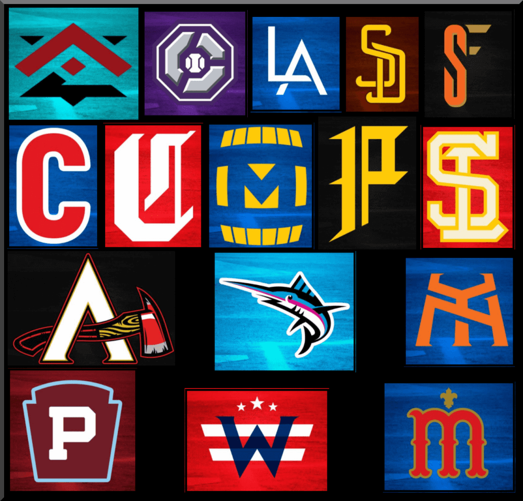
Today, we’ll be treated to Bowen’s redesigns for the National League (you can check out the American League here). If you’re not familiar with his work, you’ll note he creates his own bespoke fonts and logos for each team, and the uniforms are all unique as well. It’s quite an undertaking, and a brilliant one at that. Click on any image to enlarge. Upper left would be the main uniform(s), upper right are the alternates. Middle left is the cap logo. Middle right is the team logo, and the bottom image is the logo slick. All original, all amazing!
There’s a lot to get to today (all 15 teams, plus one *bonus* team), so let’s get right to it.
MLB Redesigns — National League Edition
By Bowen Hobbs
Hi everybody! It’s Bowen Hobbs back with a collection of redesign concepts I developed for MLB. Each team has a handful of logos, a custom font, and six uniforms (home, away, throwback, home alternate, away alternate, and BP/training). One of my goals in this series was to find a way to deal with the overabundance of navy and red teams, which account for roughly one quarter of MLB with seven squads (BOS, CLE, MIN, LAA, ATL, WAS, and STL) wearing that one color palette.
NL West
Arizona Diamondbacks
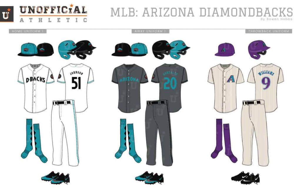
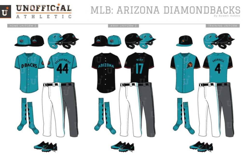
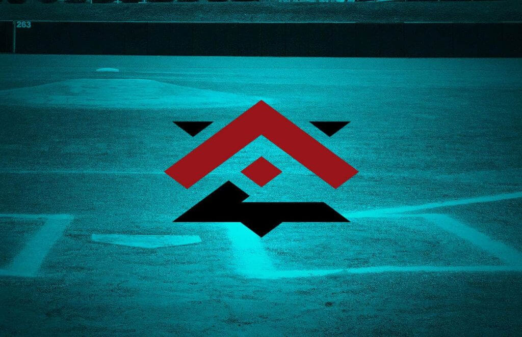
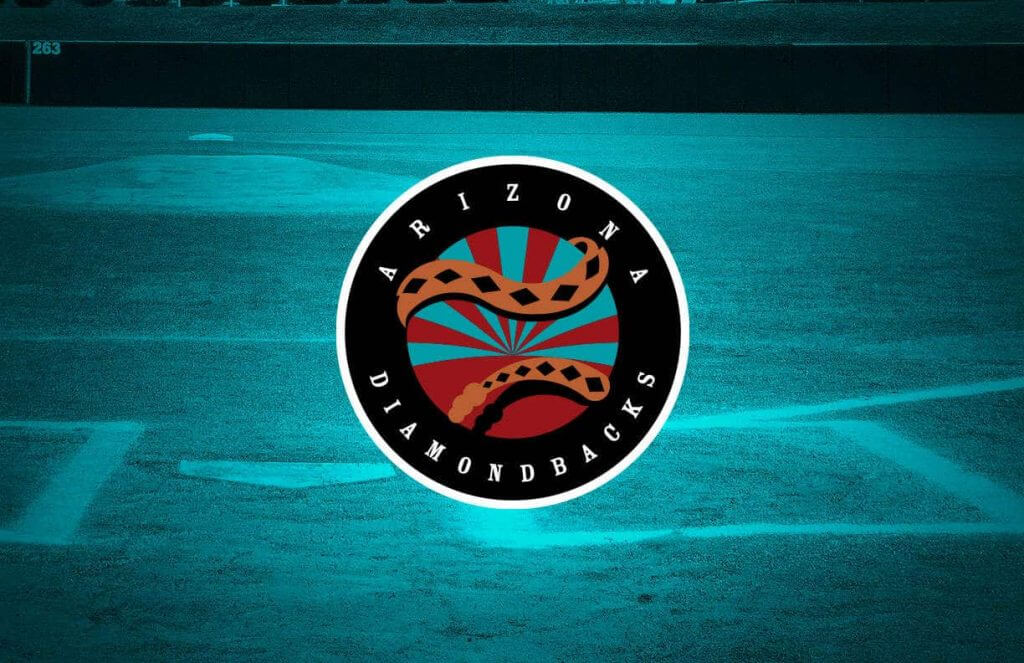
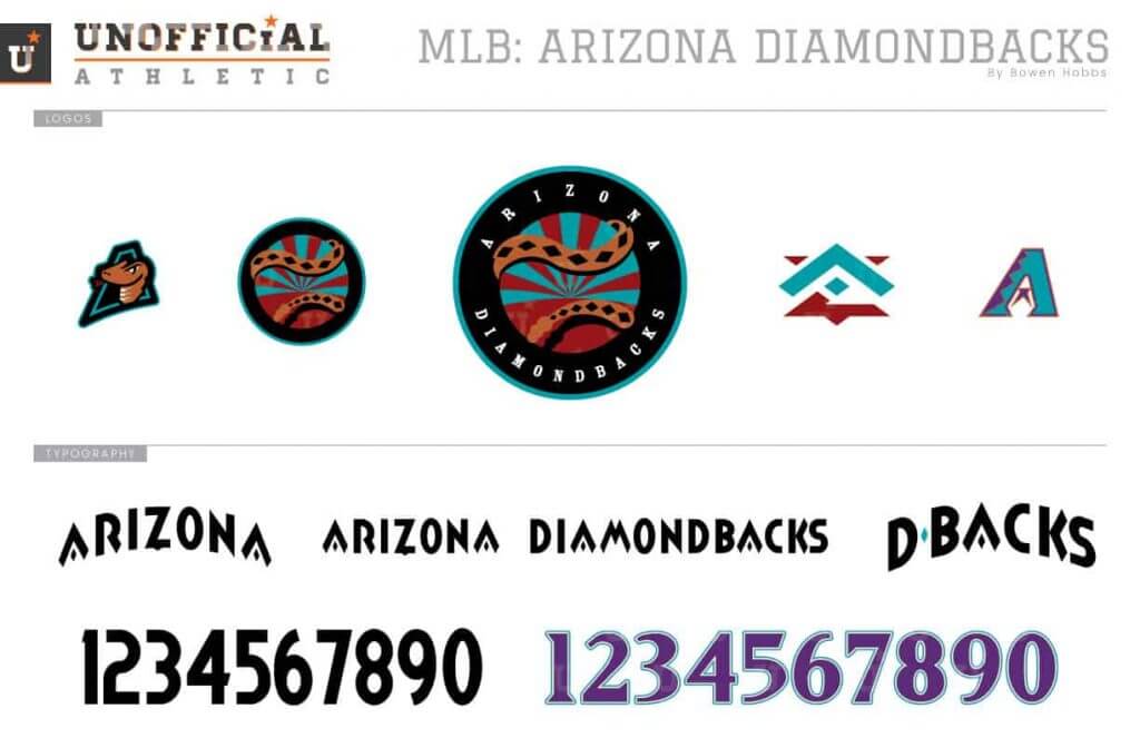
Arizona always seems to be chasing the next rebrand. Personally, I would love to see them with a more unique color scheme that they can make their own without relying on black as much. From there, I developed a turquoise, sedona red, black, and copper scheme and applied it to a primary logo of a snake wrapping around a circle containing a sunset. The cap logo is a southwestern geometric AZ. A turquoise and a black cap are used with the home, away and alternate uniforms, all of which contain diamond trim along the sleeve cuffs. The away uniforms are charcoal grey, while the alternate jerseys are turquoise and black. The diamond pattern is also used on the pants as well as the custom socks.
Colorado Rockies
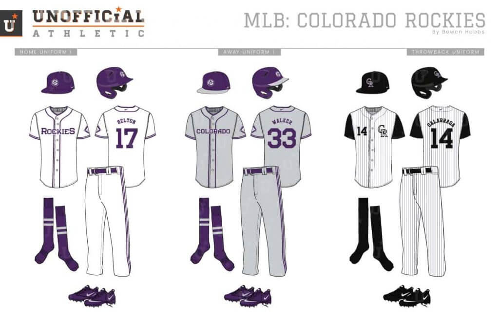
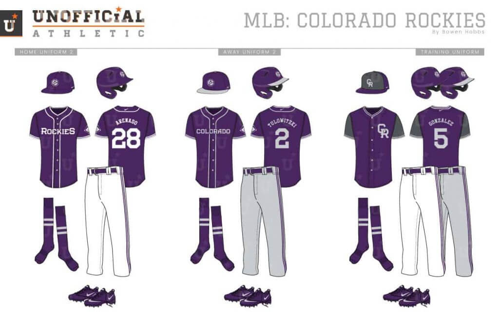
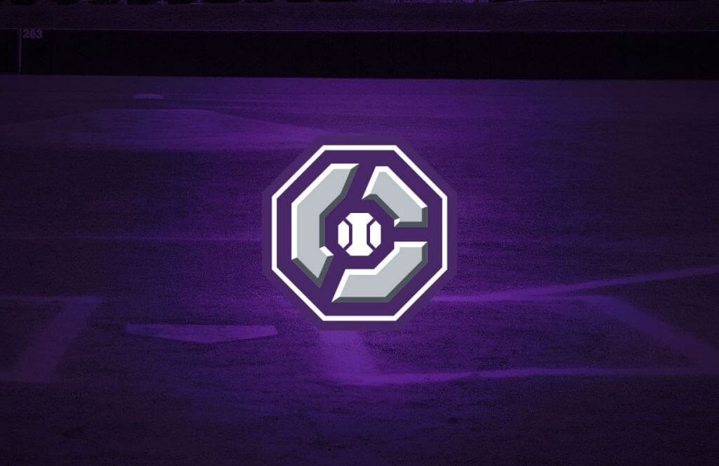
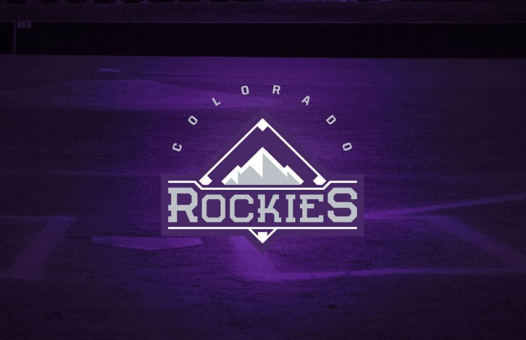
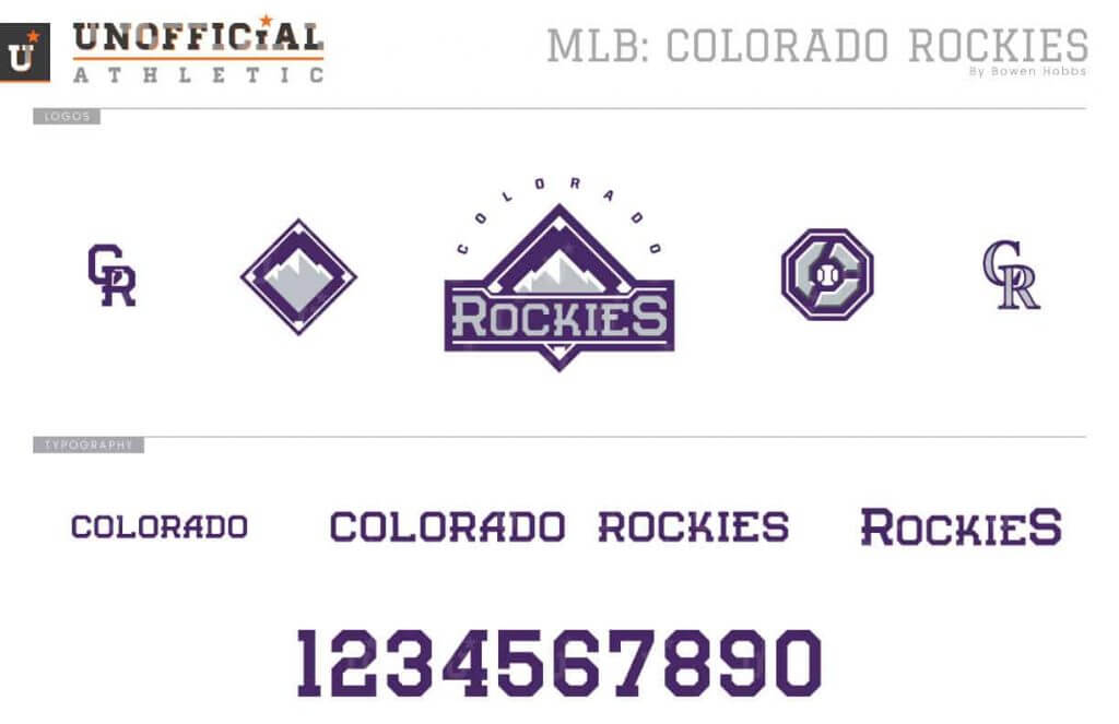
The Rockies have a lot of potential, but so far have mostly stuck to wearing black and silver at home. My redesign drops the black for a purple and silver scheme with touches of charcoal grey. The primary logo pairs a diamond mountain icon with the team name. The cap logo shows an octagonal C wrapped around a baseball inspired by the Colorado state flag. The uniforms go for a modern classic take, letting the purple and silver take center stage against a traditional design consisting of double piping along the sleeves, headspoon, and pants legs.
Los Angeles Dodgers
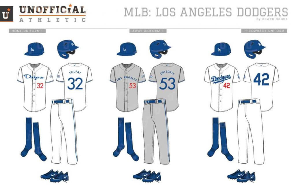
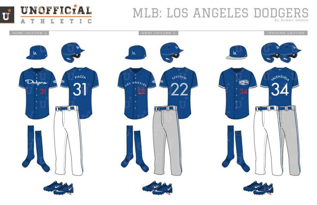
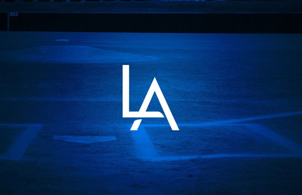
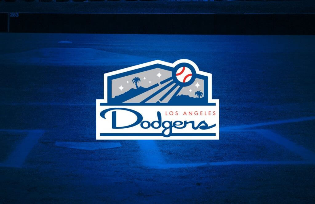
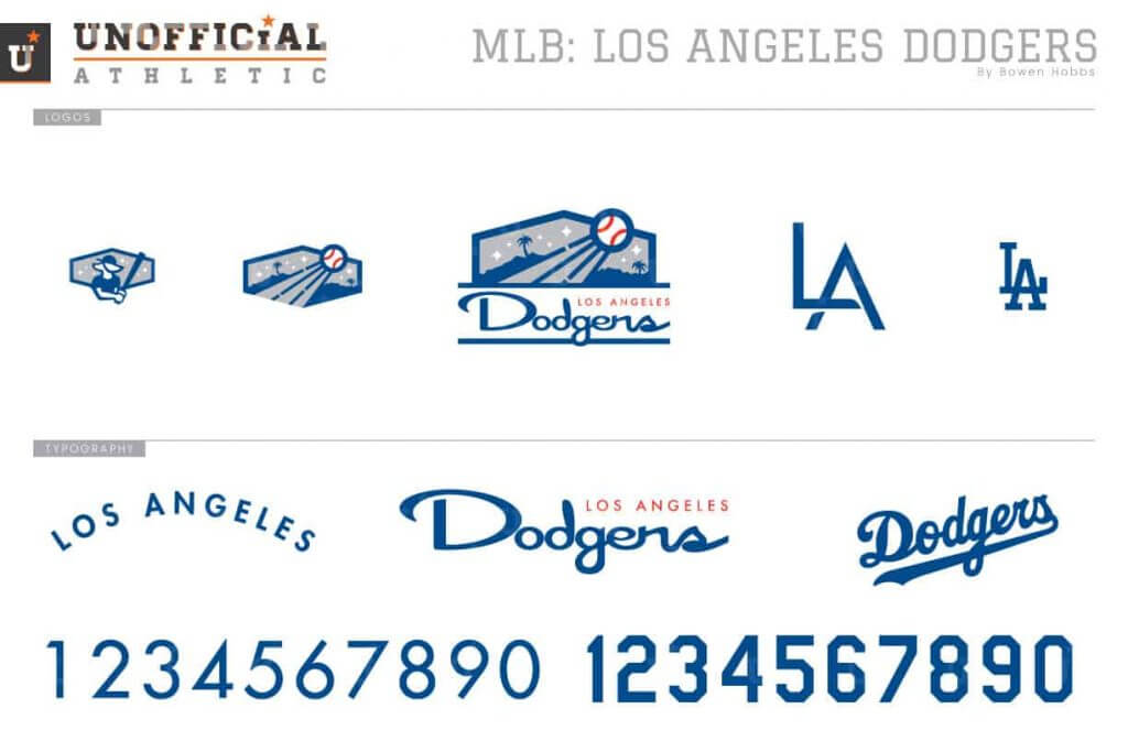
The Dodgers’ branding is as classic as it gets. My concept tries to give it a little more fun by embracing Dodger Stadium and using a Los Angeles mid-century style. The primary logo shows the ball flying out past the LA hills within a hexagonal shape used by the team’s scoreboard. Meanwhile, the LA is a minimal sans serif with nuanced shading. After going back and forth, I decided to keep the red front number on the uniforms in all their non-uniform glory. I did, however, add blue trim to the sleeves. This is the only concept that doesn’t use custom numbers, as Futura was too perfect not to pair it with the custom mid-century script.
San Diego Padres
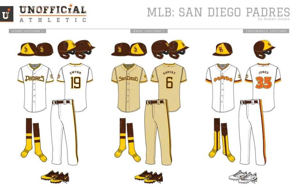
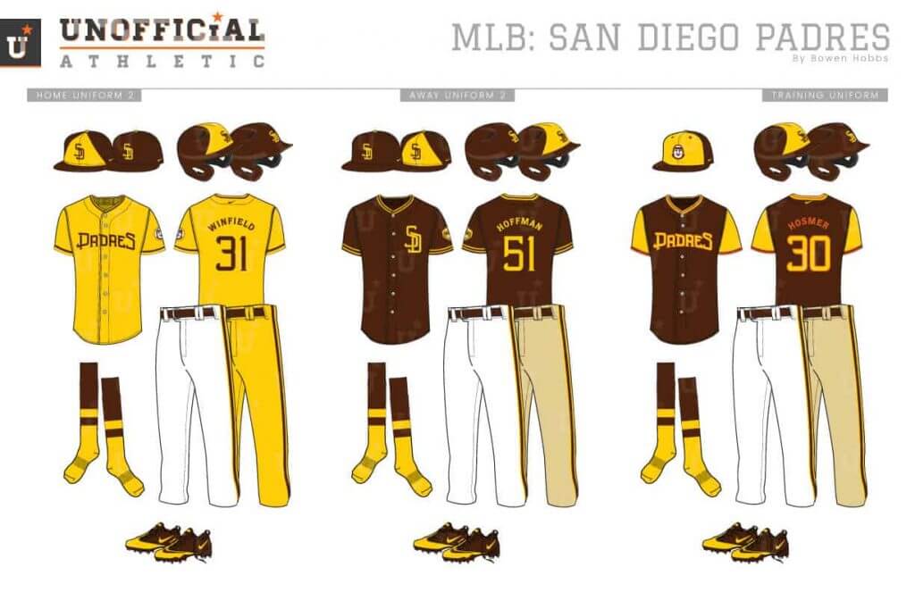
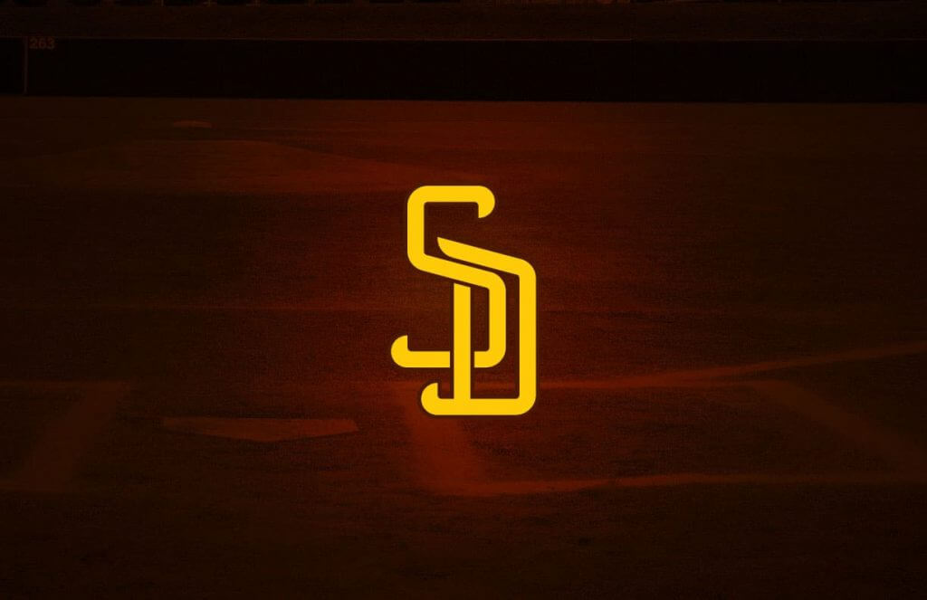
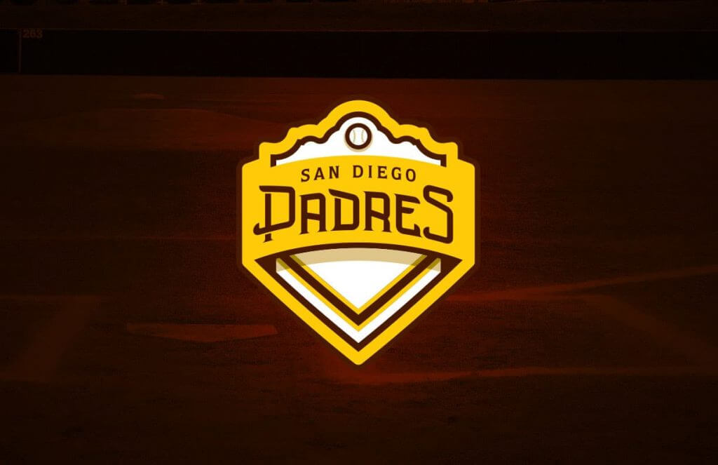
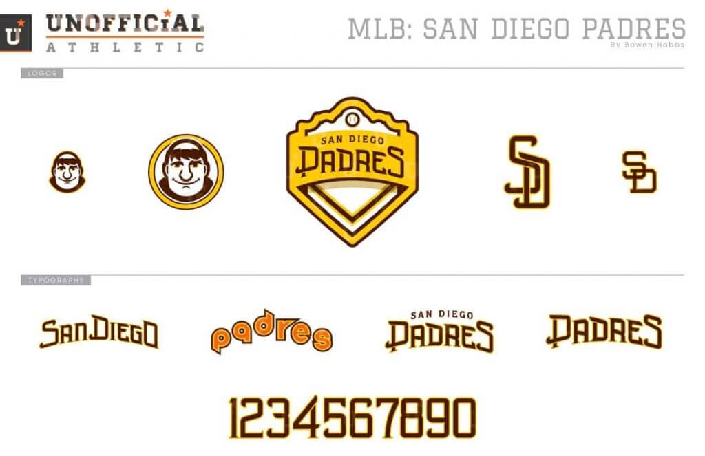
Rejoice! The Padres are back in brown. My concept was developed before they pulled the trigger, and expands the color scheme to include metallic gold and sand as shading tones. The primary logo blends home plate with a Spanish mission that represents San Diego history. Both caps contain SD on the front, but one has a brown SD against a yellow front panel, while the other places a yellow SD against a solid brown cap. The home uniforms remove the pinstripes for a solid white uni with brown and yellow trim, while the aways use sand as a base color. There is also an option for a full athletic gold alternate uniform.
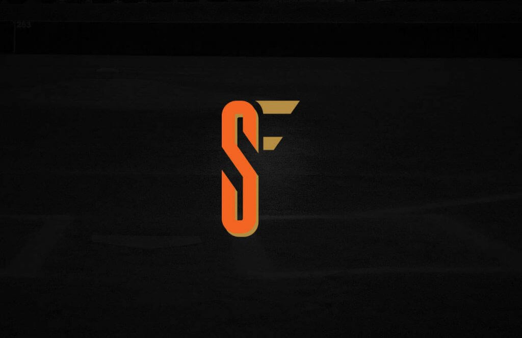
San Francisco Giants
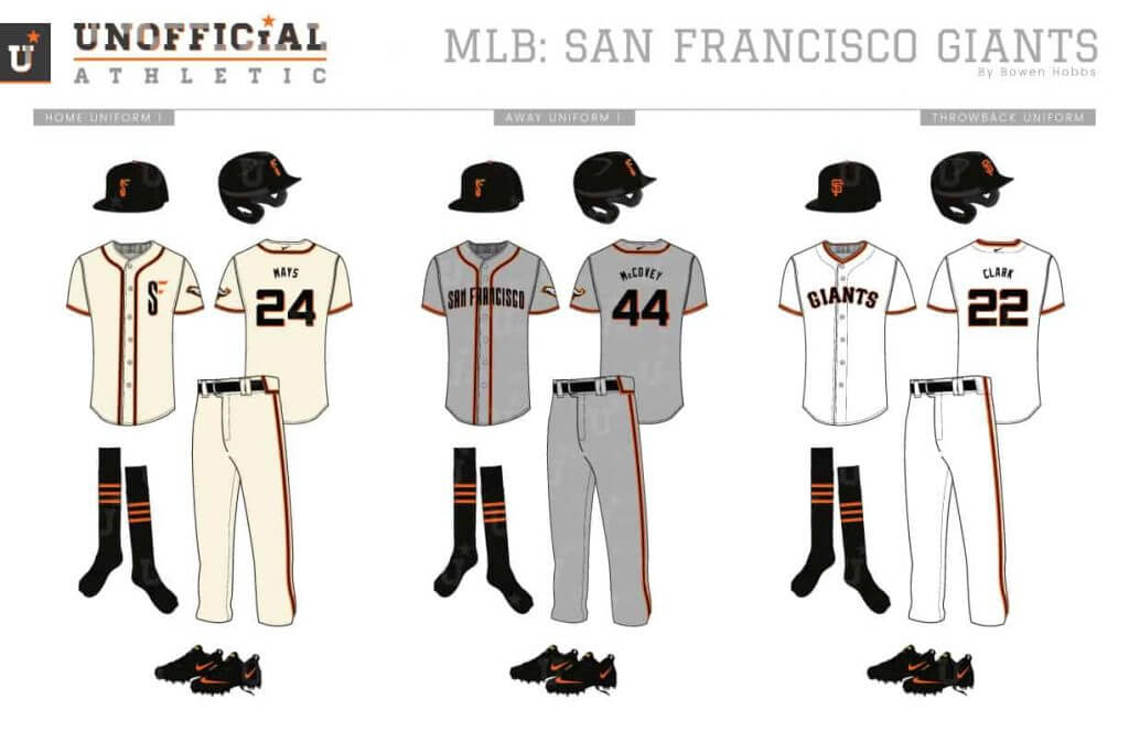
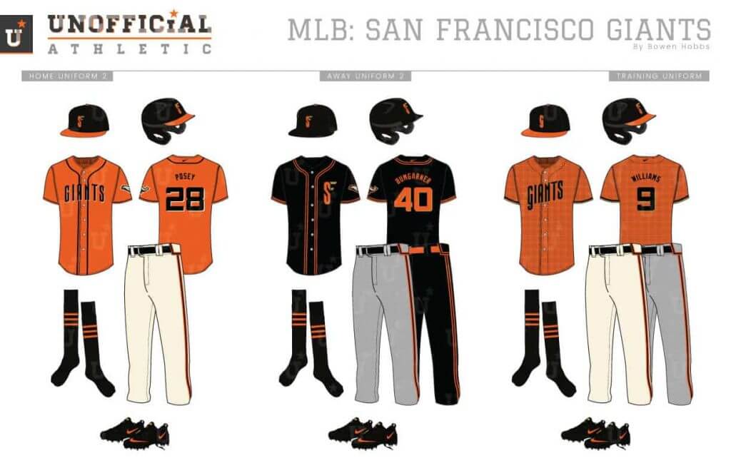
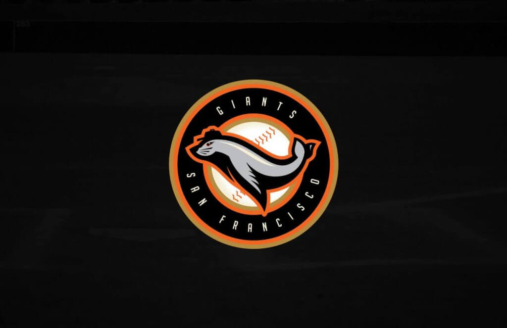
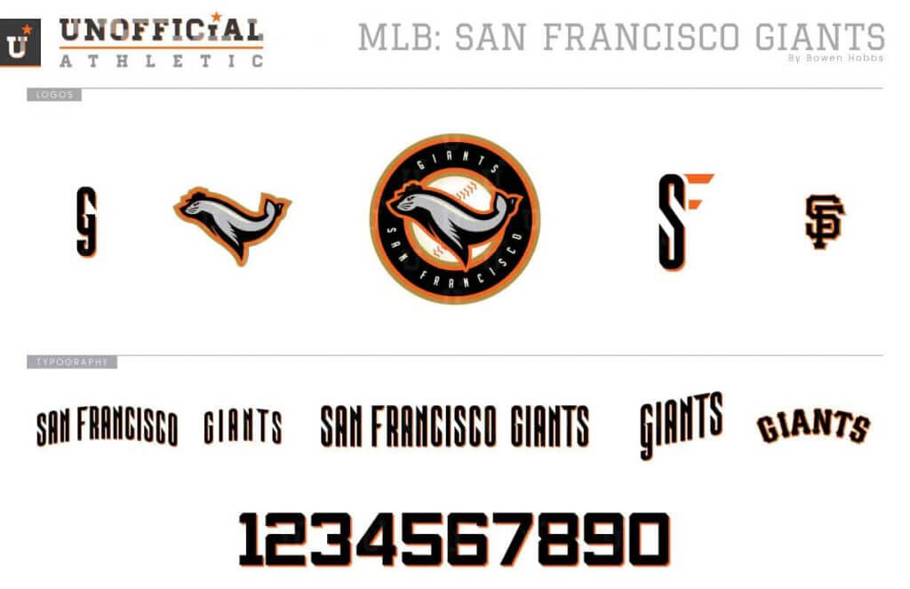
My Giants redesign focuses on the team’s mascot Lou Seal. The seal is placed in the middle of the primary logo against a baseball roundel. The lettering is tall and skewed to mimic the buildings in San Francisco, while the jersey numbers are a nuanced block font. The uniforms use orange and black piping against cream for home and faux-flannel grey on the road. The black alternate jersey can combine with black pants for an all-black look, while the spring training jersey uses plaid to honor the 1916 team.
NL Central
Chicago Cubs
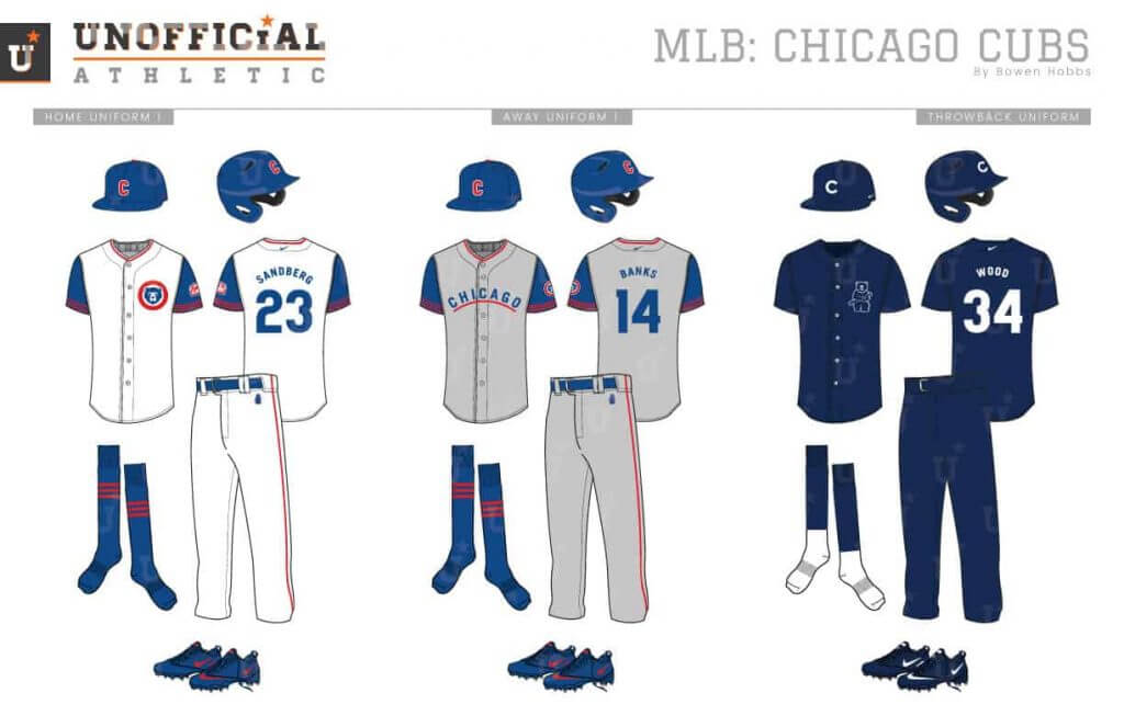
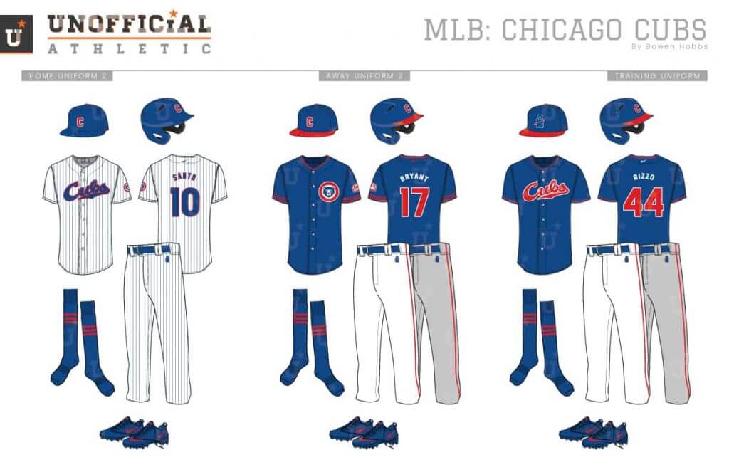
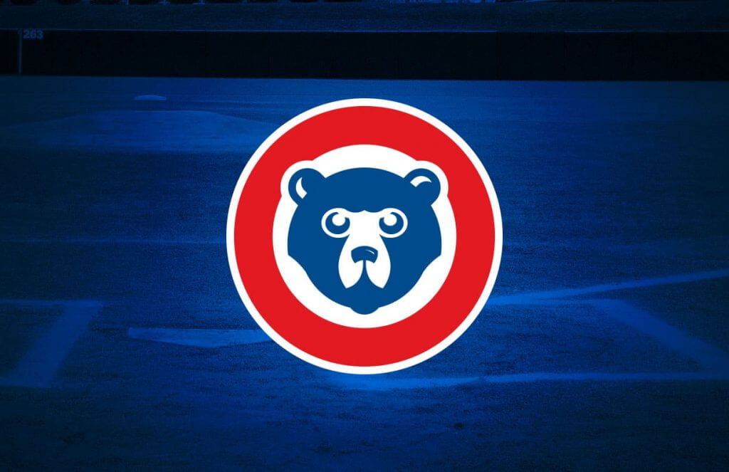
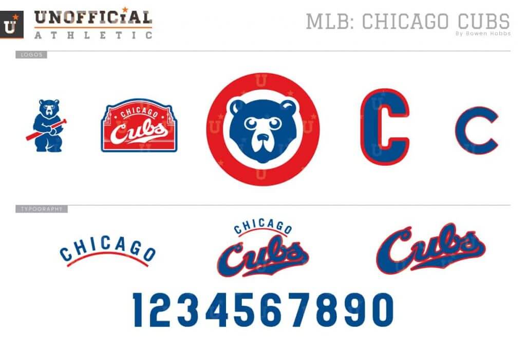
The Cubs have so many iconic details in their uniforms. My goal was to create something that still felt like the Cubs but used custom symbols. To that end, I developed a new cub head circular logo and swapped out the round C for a taller version. To support the brand, I also developed a Wrigley-themed sleeve patch and a modernization of the early-1900s standing cub. The home and away uniforms play on the 1950s teams with vests and blue undershirts. The home alternate opts for the familiar pinstripes, in addition to the royal softball top, which can be worn at home or on the road.
Cincinnati Reds
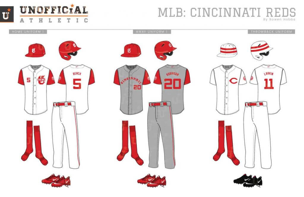
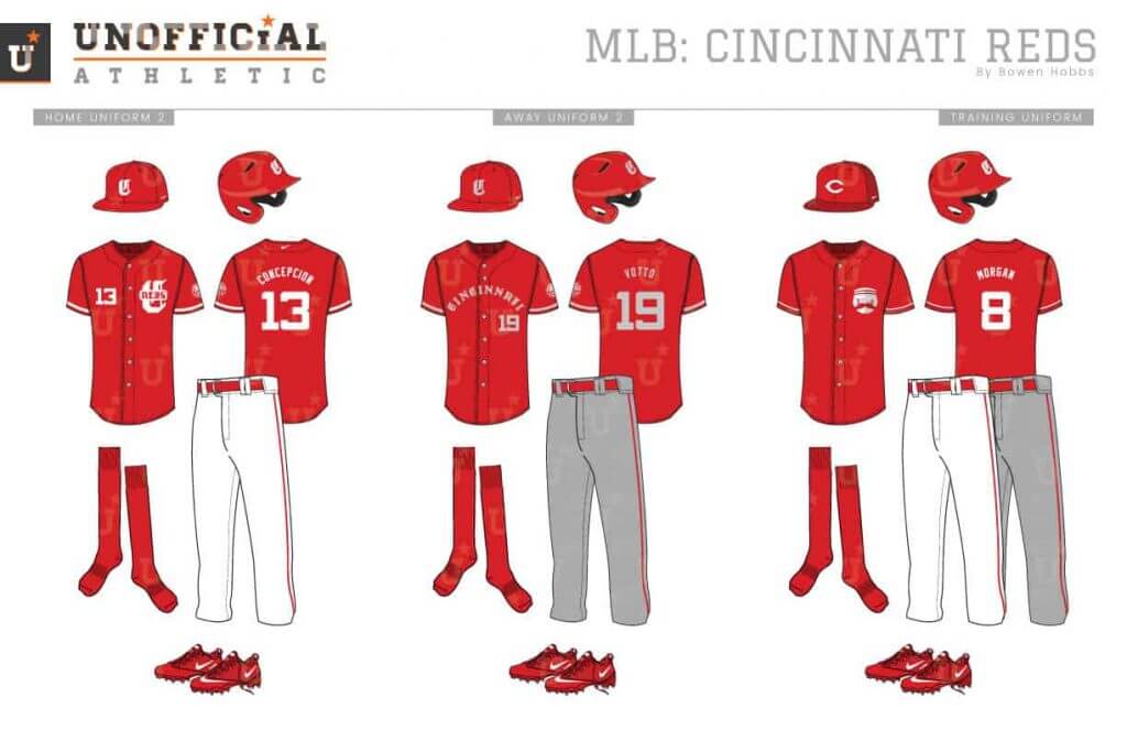
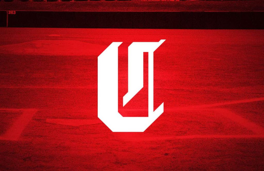
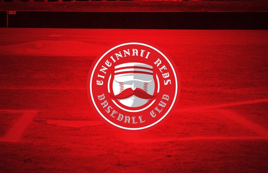
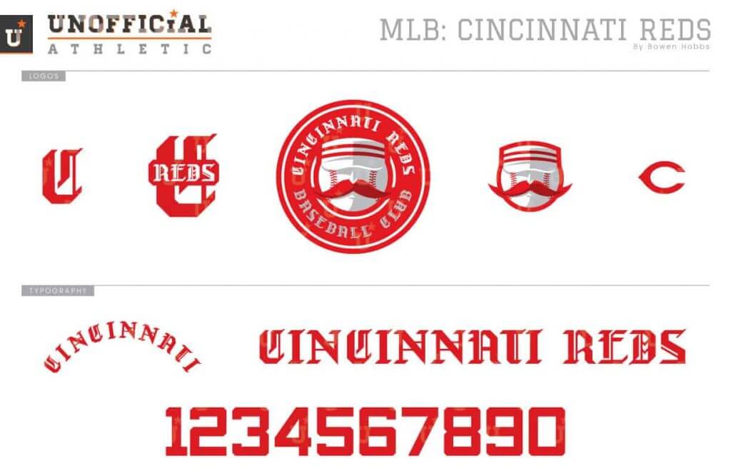
The Reds have a rich visual history. From that history, I drew on the Olde English-C and Mr. Redlegs. Mr. Redlegs is the foundation of the primary logo, shaded with light grey and burgundy for a stoic vintage appearance. An Olde English-C also appears on the caps, modified with industrial angles. The custom blackletter typeface is expanded beyond the C to develop custom wordmarks for the jerseys. The numbers are a squared block font. Simplicity is applied throughout the uniforms, from the home whites to the faux-flannel road greys and the red softball tops.
Milwaukee Brewers
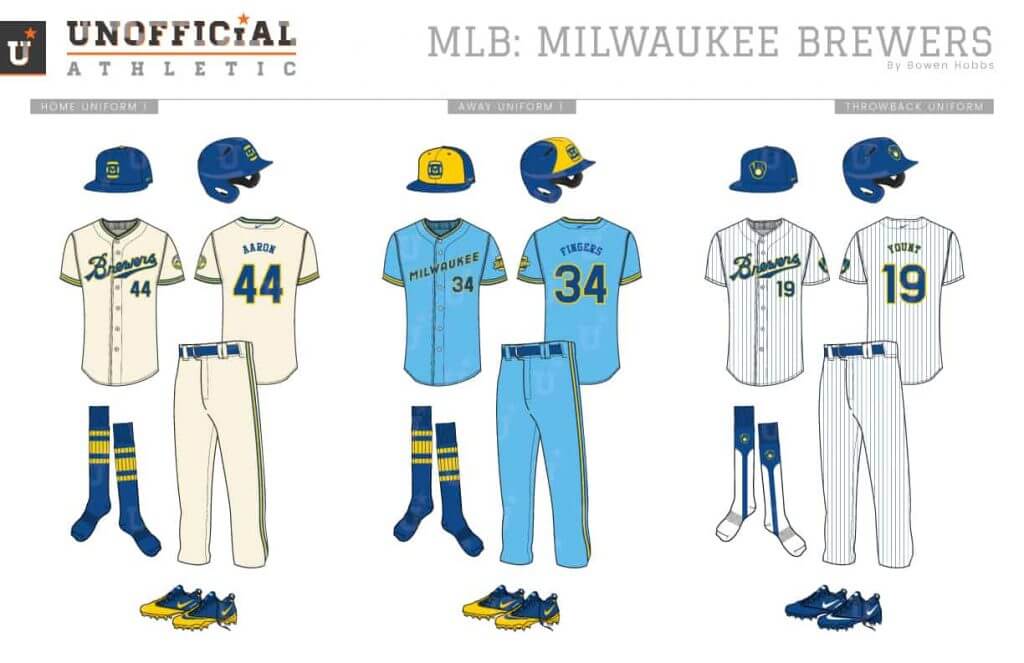
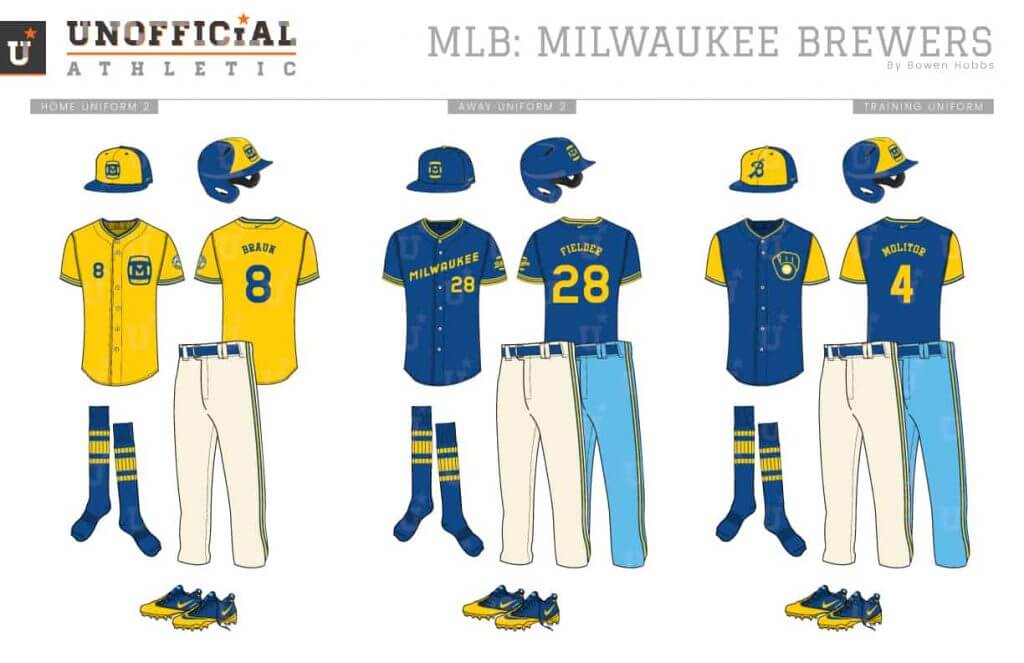
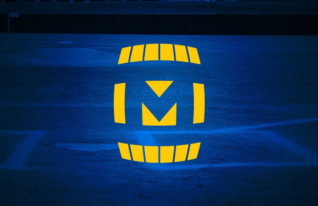
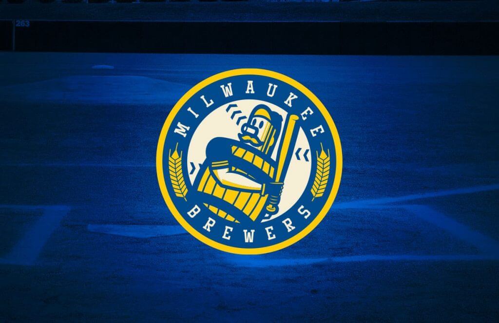
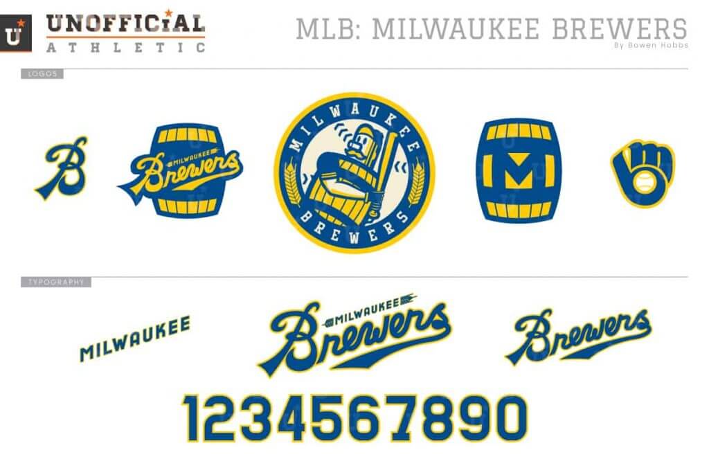
As a lifelong Brewers fan, I love their latest redesign. That said, I developed this concept before the newest era was unveiled, and there is definitely some overlap. Opting for royal over navy, I focused on barrels and barley. I developed a primary logo of Barrel Man placed in a roundel accented by the aforementioned barley. The cap logo is a Barrel-M mark while the team script takes inspiration from vintage beer can design. The cream homes pair with a solid royal cap, while the away powder blue uniforms team up with a yellow-front “cheese wedge” cap. The gold alternate jersey is meant for home games only, and the royal jersey works for home or away games. Lastly, the socks are striped to give the illusion of barrels on the players’ calves.
Pittsburgh Pirates
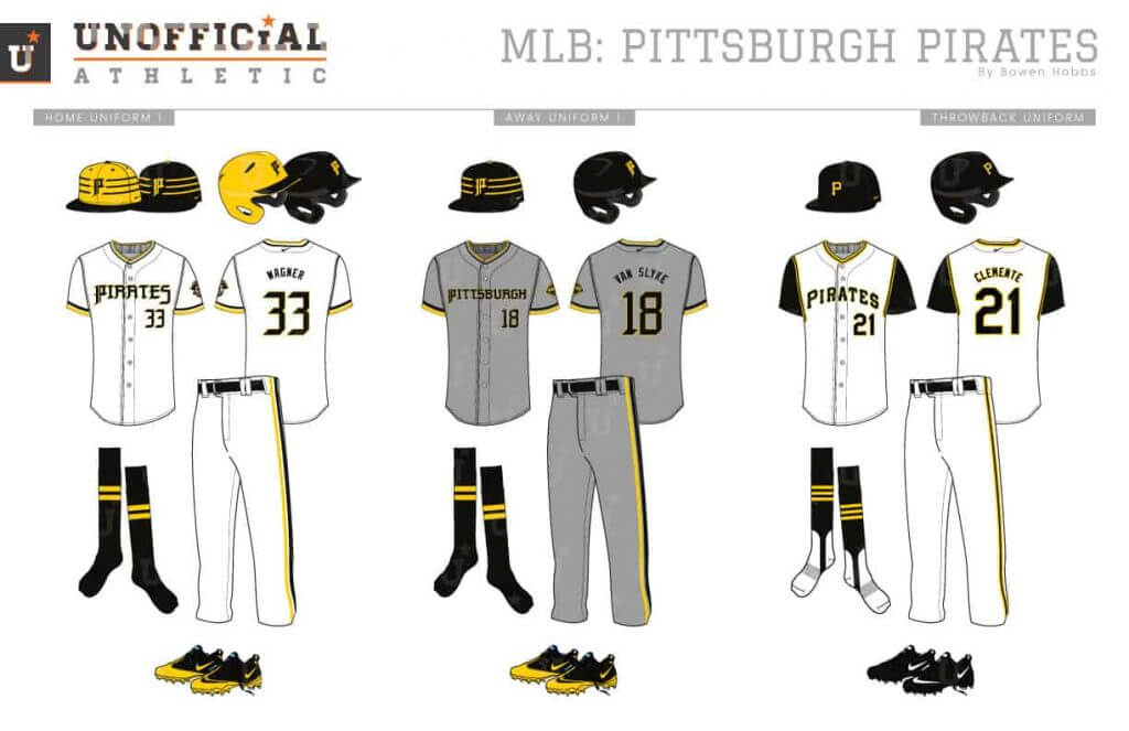
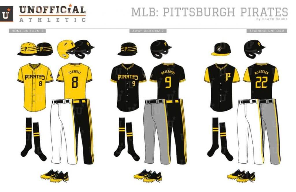
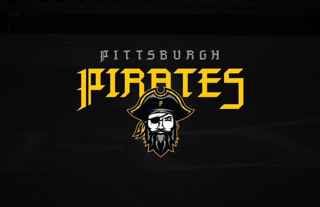
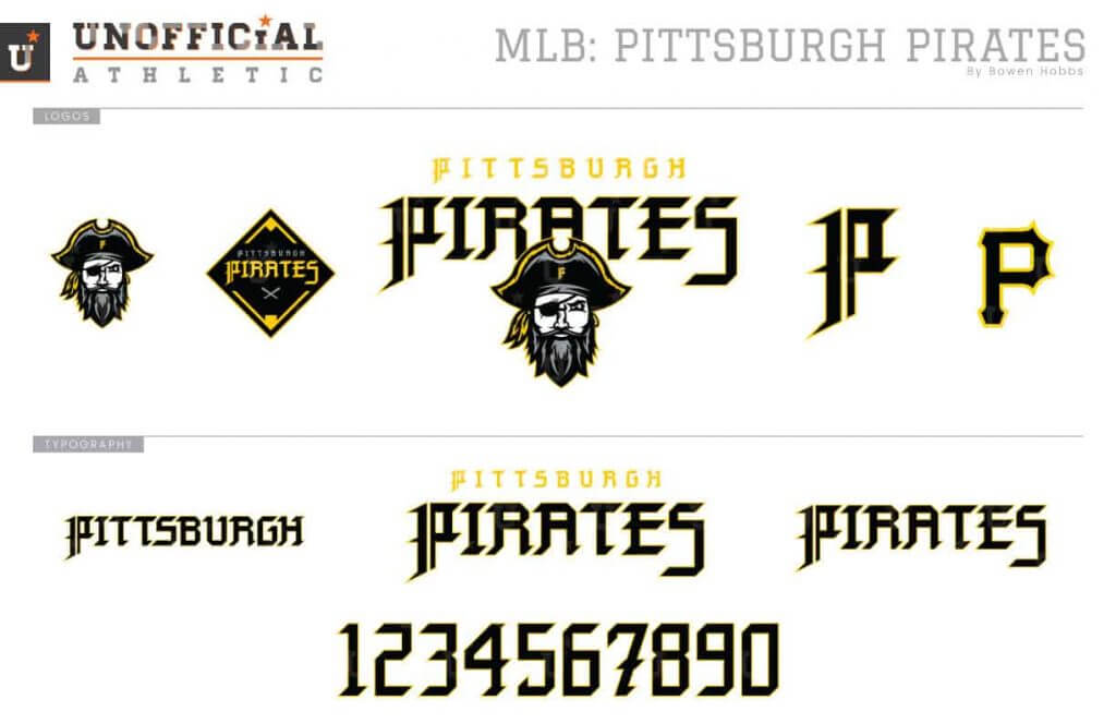
With a name like Pirates, I would have expected stronger offerings in term of mascot logos from Pittsburgh’s MLB team. But they’ve mostly stuck with their P logo. My redesign focuses more on the pirate with the buccaneer staring directly at the viewer. A new blackletter font replaces the old font, including the P on the caps. Speaking of the caps, the black and athletic gold hats contain a modified pillbox style with three rings accenting the cap logo. As a nod the the steel industry, the road greys are darker than the standard shade, but not as dark as Arizona’s charcoal roadies. Both alternate jerseys have the option of pairing with black pants to honor the “We Are Family” team of 1979.
St. Louis Cardinals
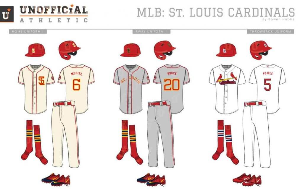
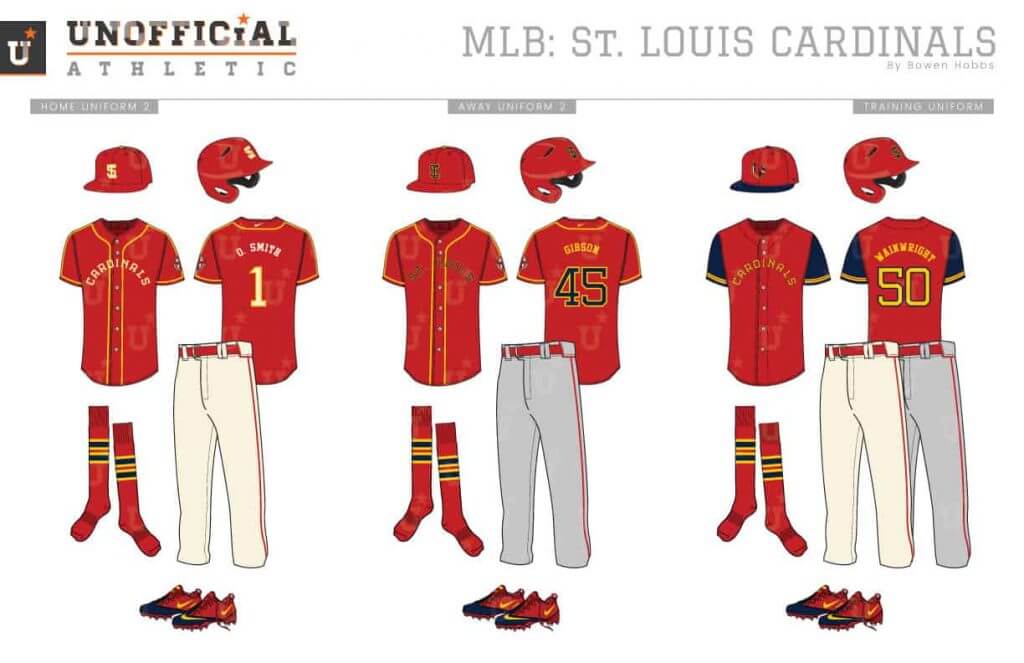
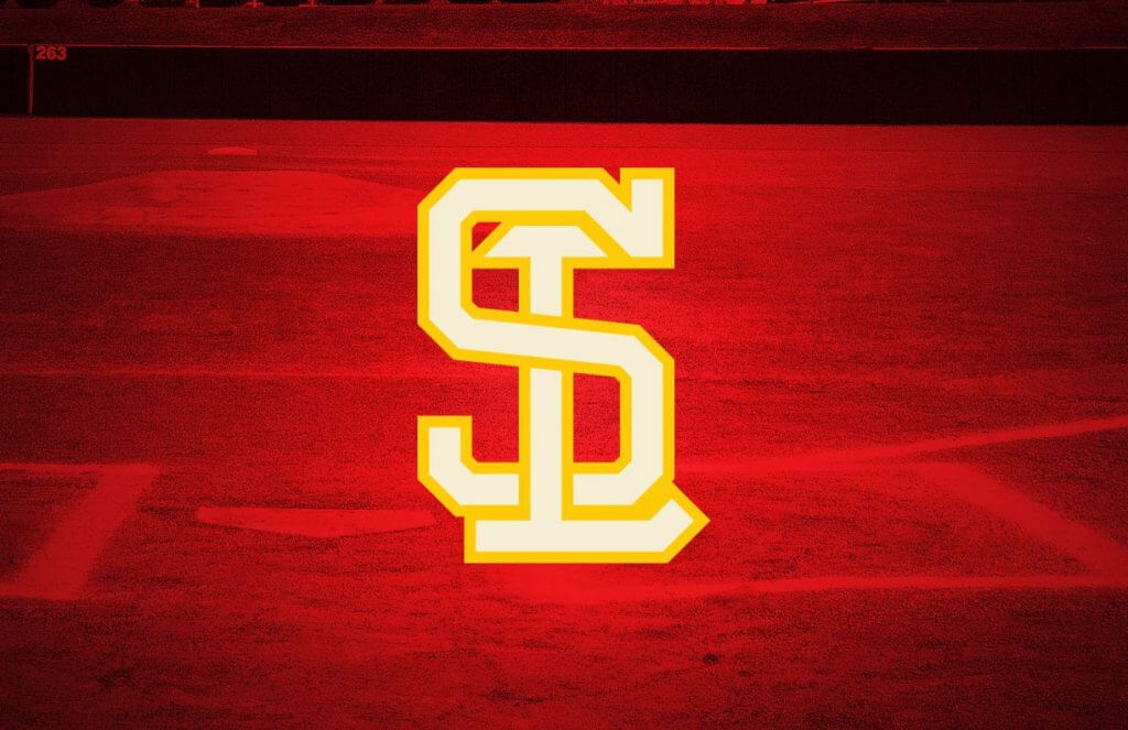
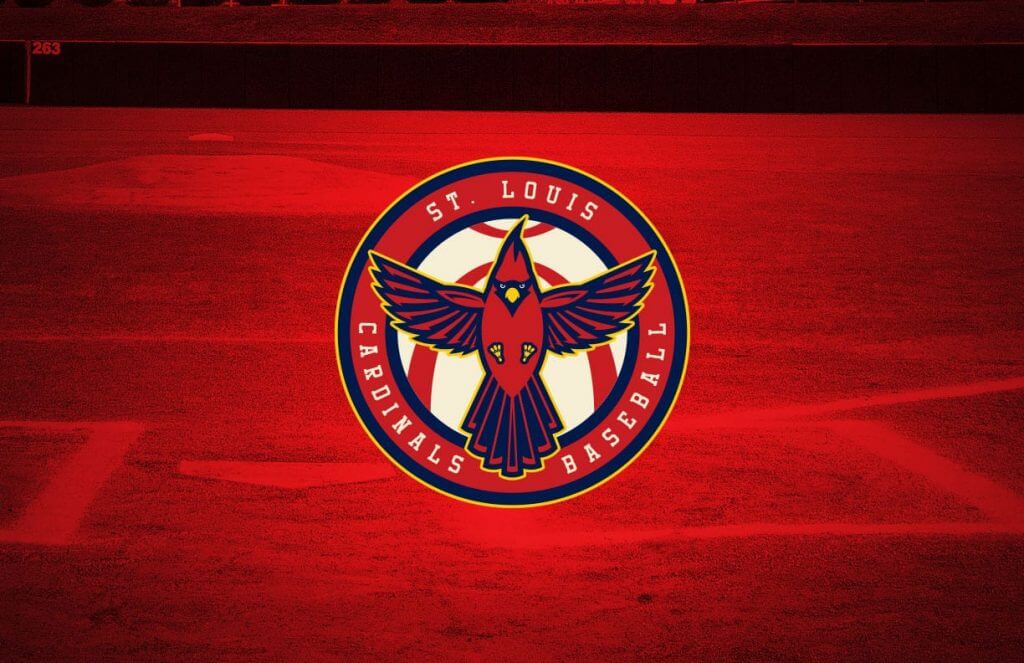
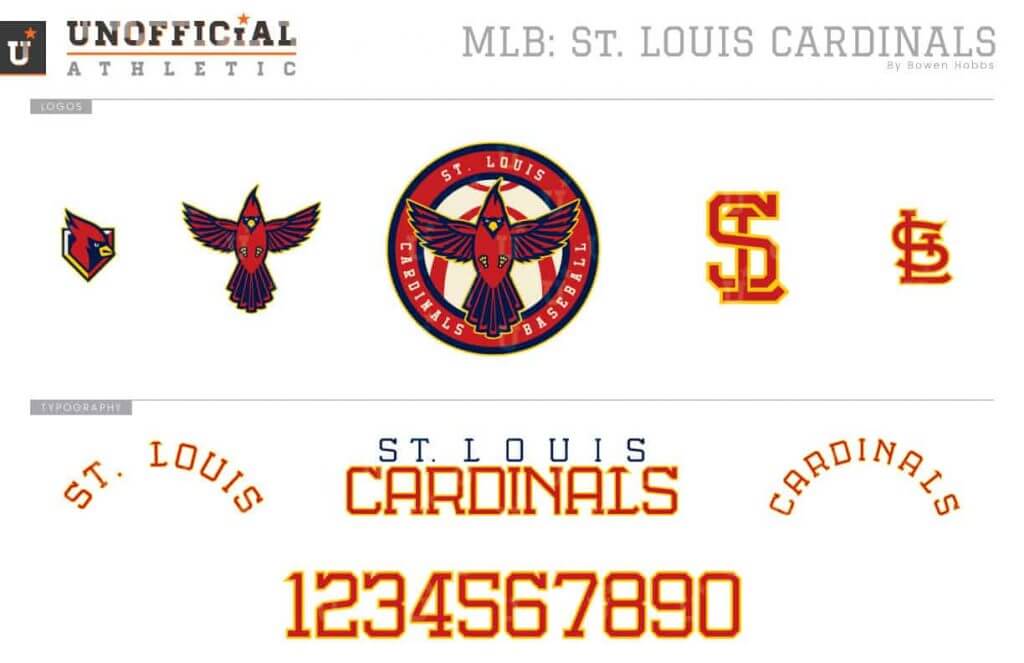
It’s impossible to beat the birds on a bat design, so I took my Cardinals concept in a different direction. For the primary logo, I placed a rising redbird against a baseball in which the seam doubles as the Arch. I also developed a custom font that worked as an interlocking SL as well as applied to the team name. The uniform piping between the headspoon and sleeve cuffs is connected to honor the Lou Brock era. The homes are cream, while the aways go for the standard grey. There are two red jerseys to match the home and away caps.
NL East
Atlanta Braves
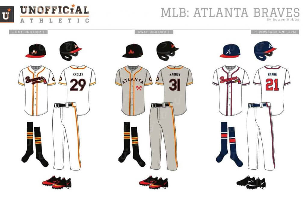
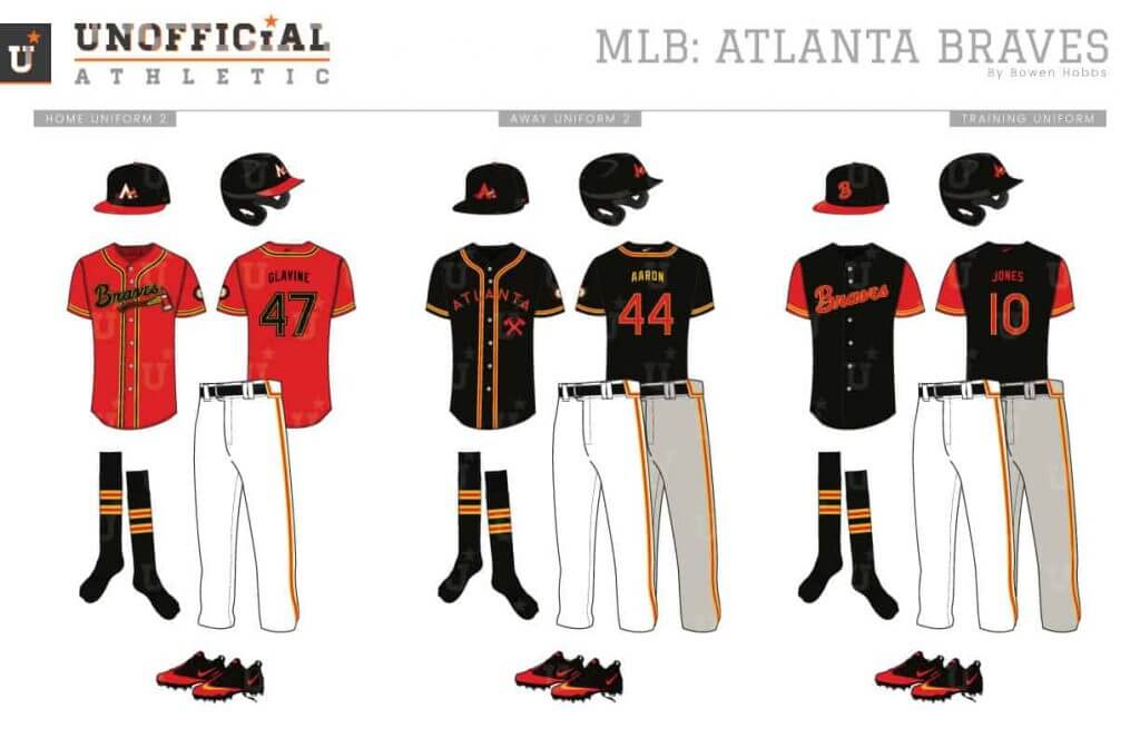
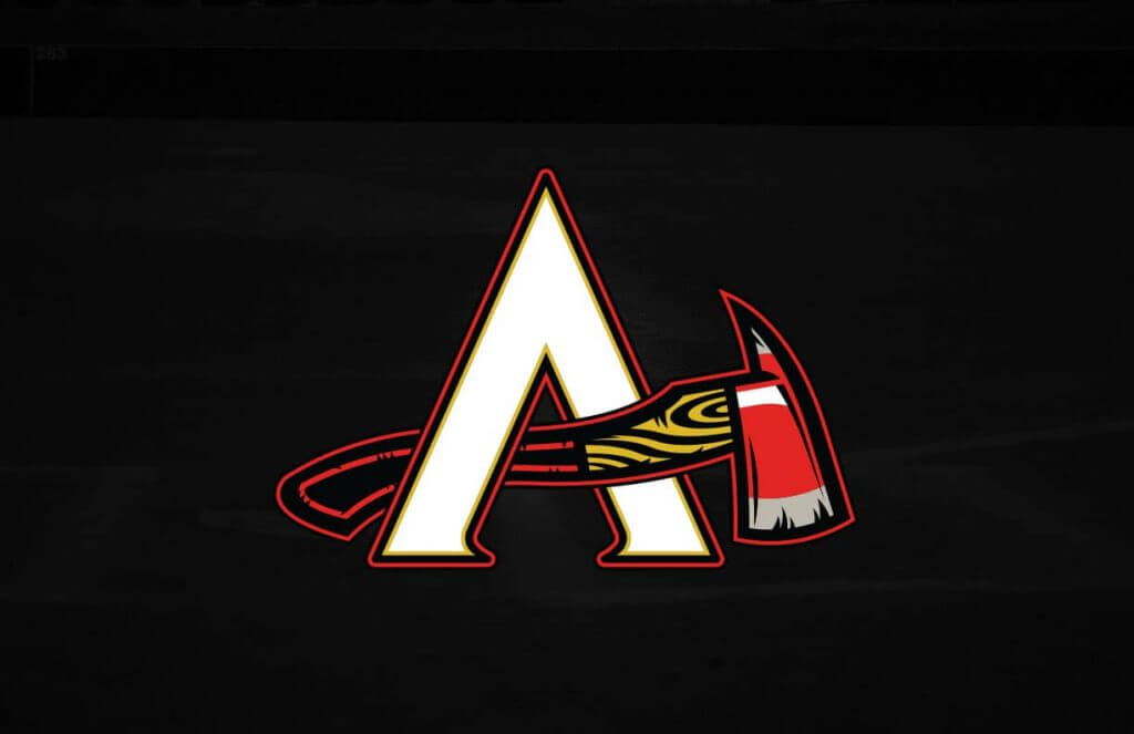
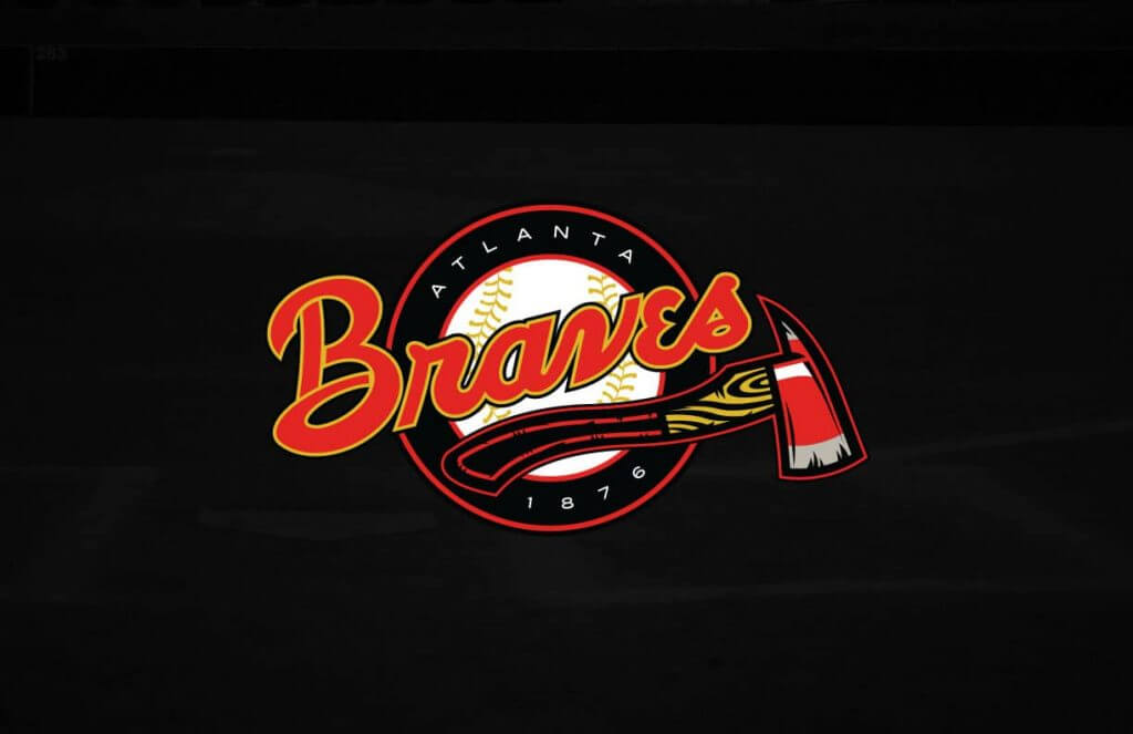
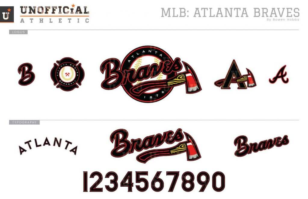
The Braves’ current design is culturally insensitive. My concept posits the idea that Braves can still exist as a name if the imagery is not explicitly making a mascot of indigenous people. In the context of my design, Braves refers to the city’s firefighters, and the tomahawk is replaced by a fire axe. Black replaces navy in the design to better connect the team to the other Atlanta teams. The number font is derived from the lettering on the AFD’s trucks.
Miami Marlins
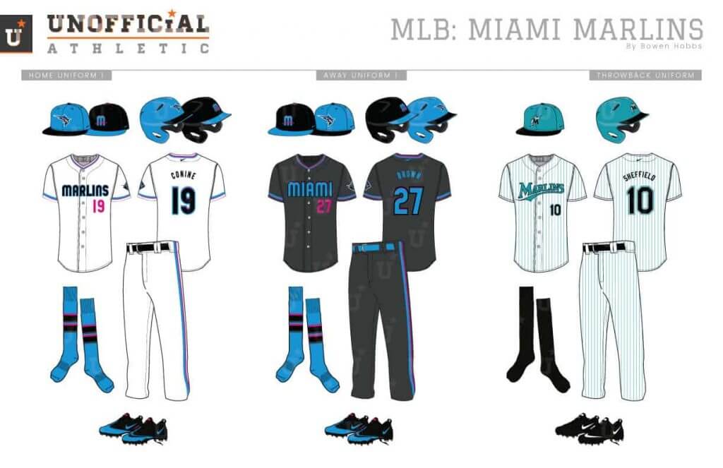
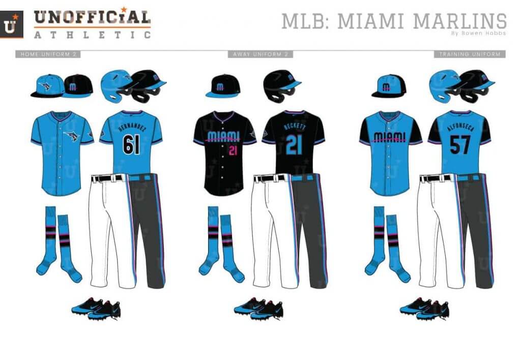
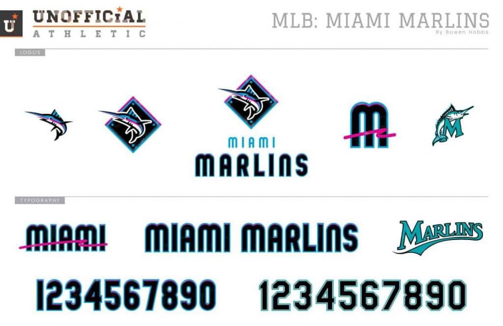
While I appreciate the Marlins teal uniforms from the 1990s, I think their current color scheme is close to where it should be. Just replace the caliente red with hot pink and it’s perfect for Miami. My concept uses the electric blue, hot pink, and black scheme and re-renders the marlin so it’s visible on a black background. The standalone marlin appears on the electric blue caps, while the neon-accented M is used on the black caps. The home uniforms are white with mostly black type aside from the hot pink front number. The aways use a charcoal grey base to help make the blue and pink appear brighter. The alternate jerseys come in electric blue and black.
New York Mets
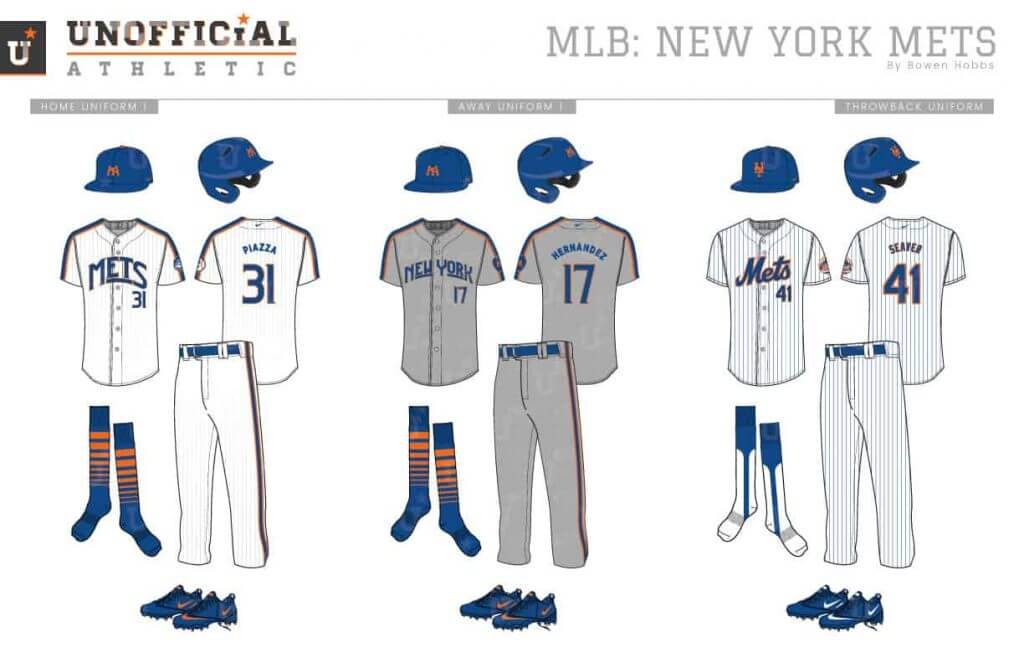
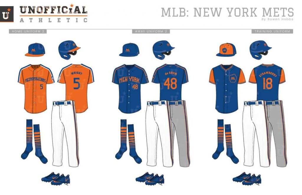
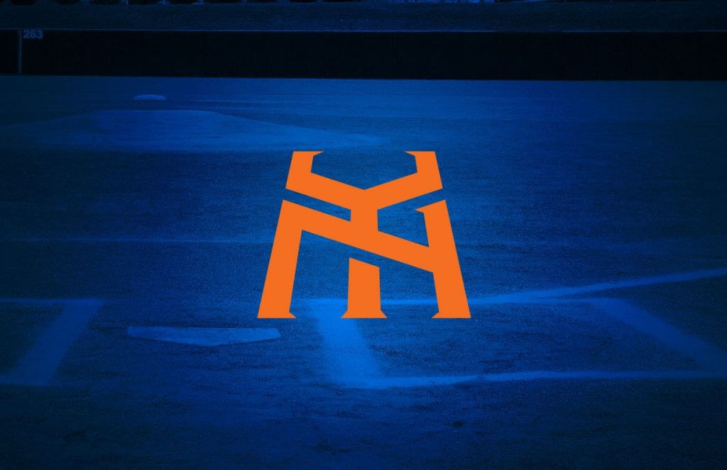
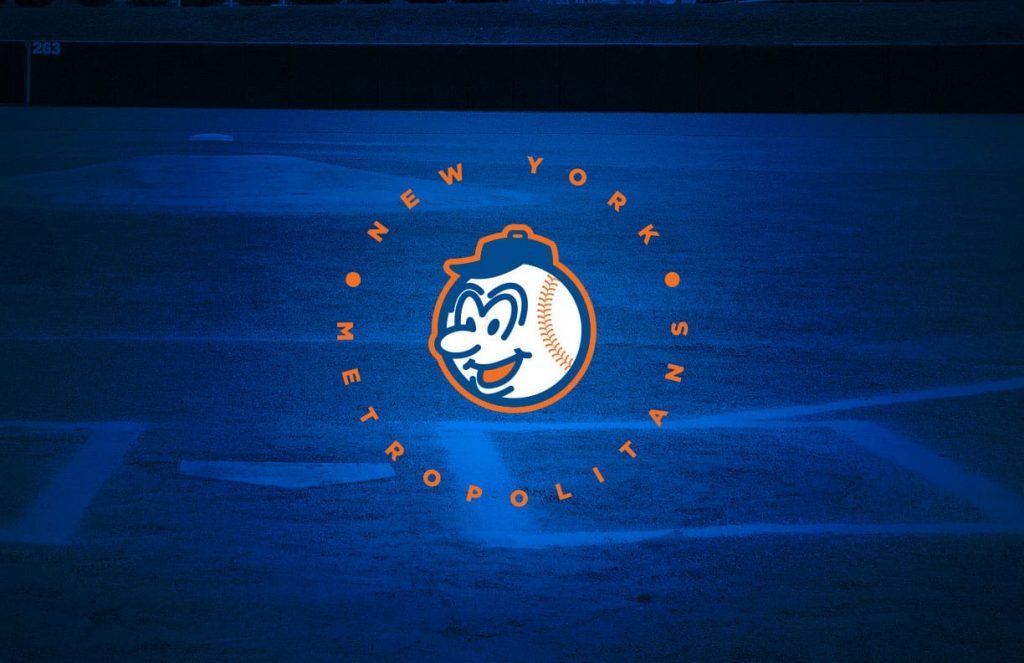
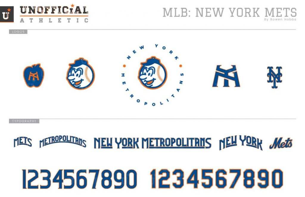
I wanted to bring a sense of whimsy to the Mets brand, so I focused my concept on Mr. Met. Mr. Met appears at the center of the primary logo, surrounded by NEW YORK METROPOLITANS. The revised NY mark applies a low-angle perspective to imply height. The homes feature sublimated fading pinstripes that disappear around the belt but remain secondary to the racing stripes. The aways opt for the faux-flannel treatment. The orange alternate jersey is accented by royal and white, while the royal jersey only has orange accents so it can be worn at and away from Citi Field.
Philadelphia Phillies
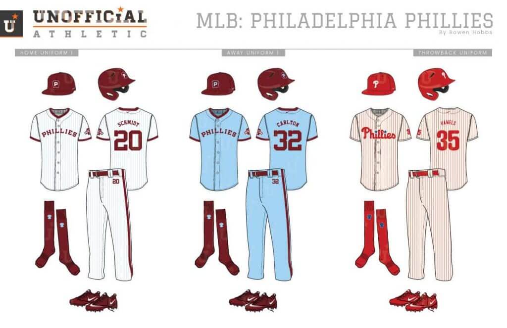
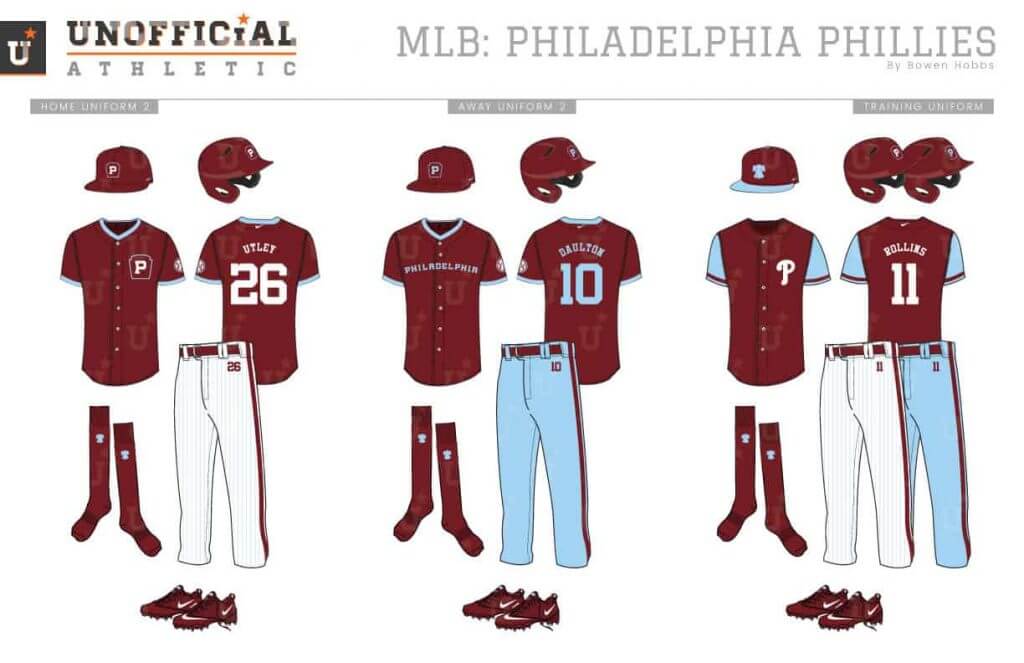
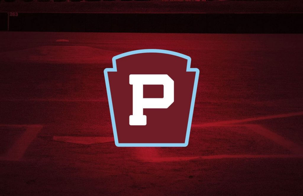
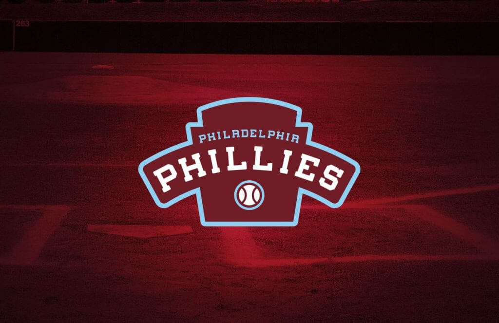
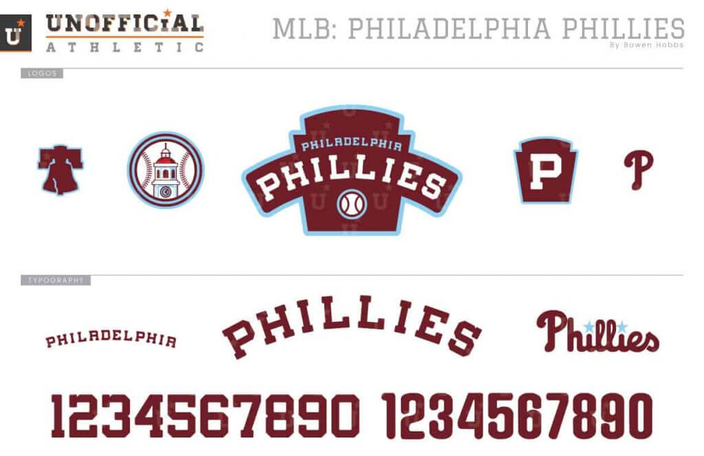
The Phillies belong in burgundy and powder blue. It’s a unique color scheme that only they can claim in MLB. My redesign starts with a keystone primary logo and a custom block font with rounded corners. The caps pair the primary logo down to a keystone-P mark, while Independence Hall is the focus of a sleeve patch. The home uniforms combine bold burgundy sleeve and collar trim with powder blue pinstripes, while the aways are solid powder blue with burgundy trim. The home alternate uses the cap logo on the left chest, while the away alt spells out PHILADELPHIA in powder blue letters. The Liberty Bell patch is kept on the socks.
Washington Nationals
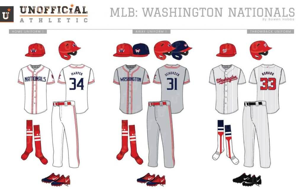
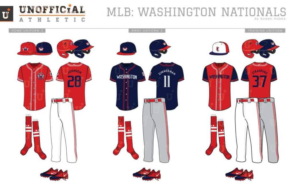
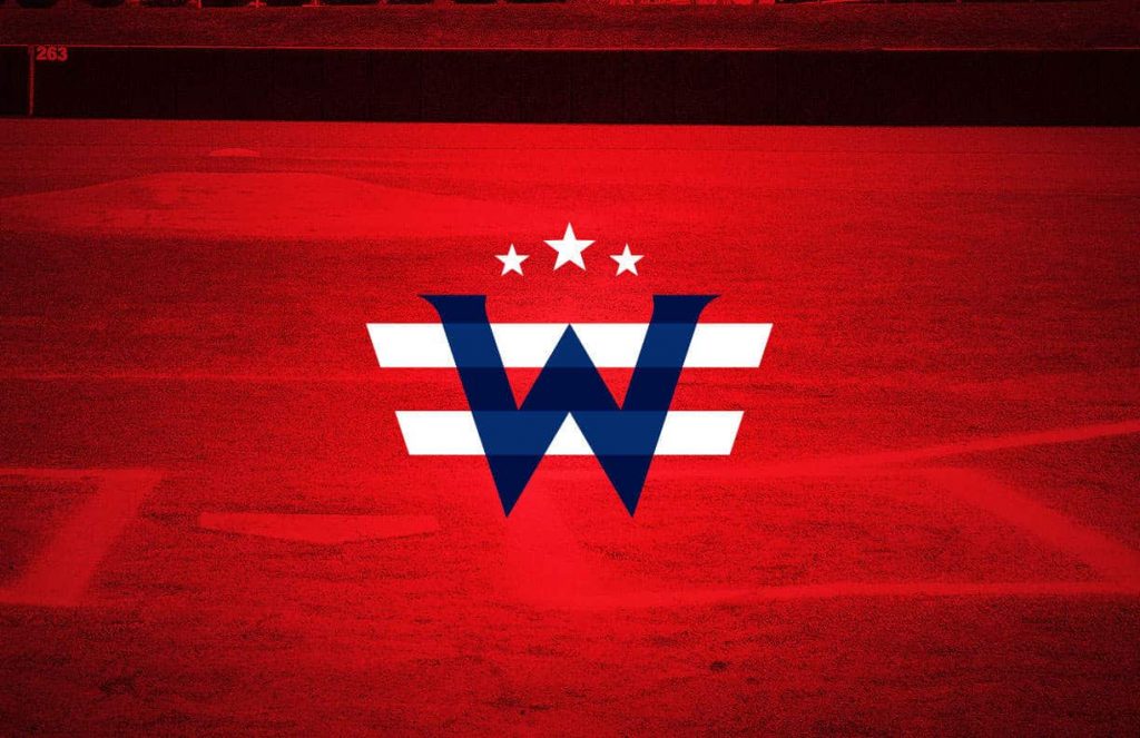
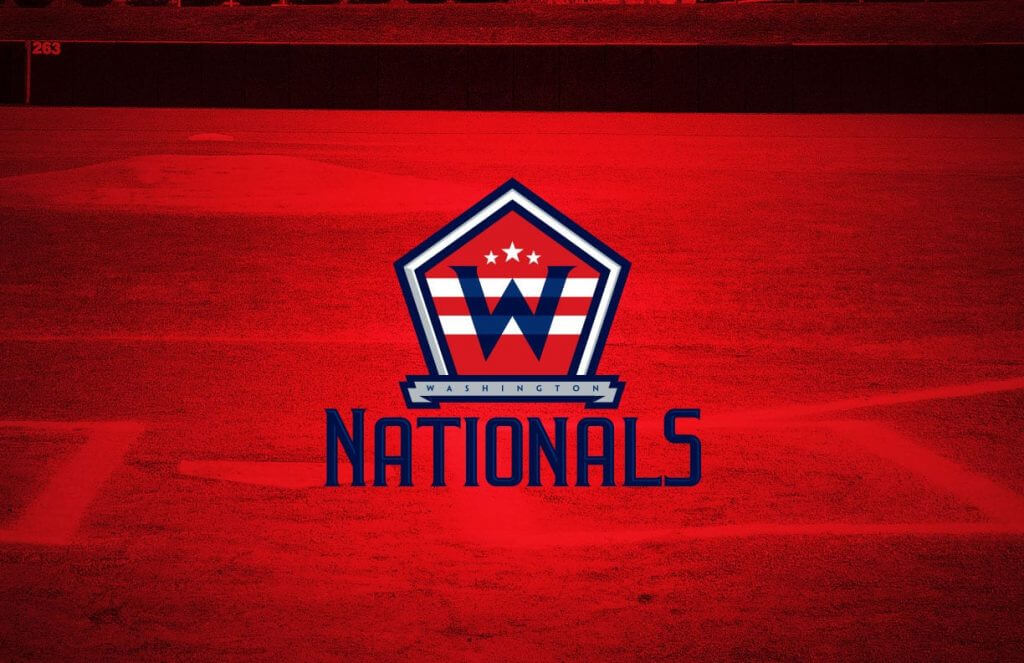
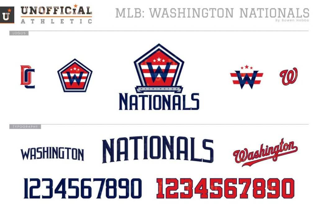
The Nationals revived the curly-W, but my concept goes for a more monumental feel. The primary logo features a serifed W and two stripes and three stars within a pentagon over the team name. The cap logo focuses more on the W, stars, and stripes. The font is tall and slightly serifed, giving it an engraved look. The uniforms showcase a double stripe of piping throughout with a trio of stars above the trim on each sleeve cuff. To help differentiate them from other navy and red teams, the Nationals are the only team in this series that uses navy type on a red-dominant scheme. The socks use the two stripes and three stars from the DC flag.
*Bonus*
Montréal Expos
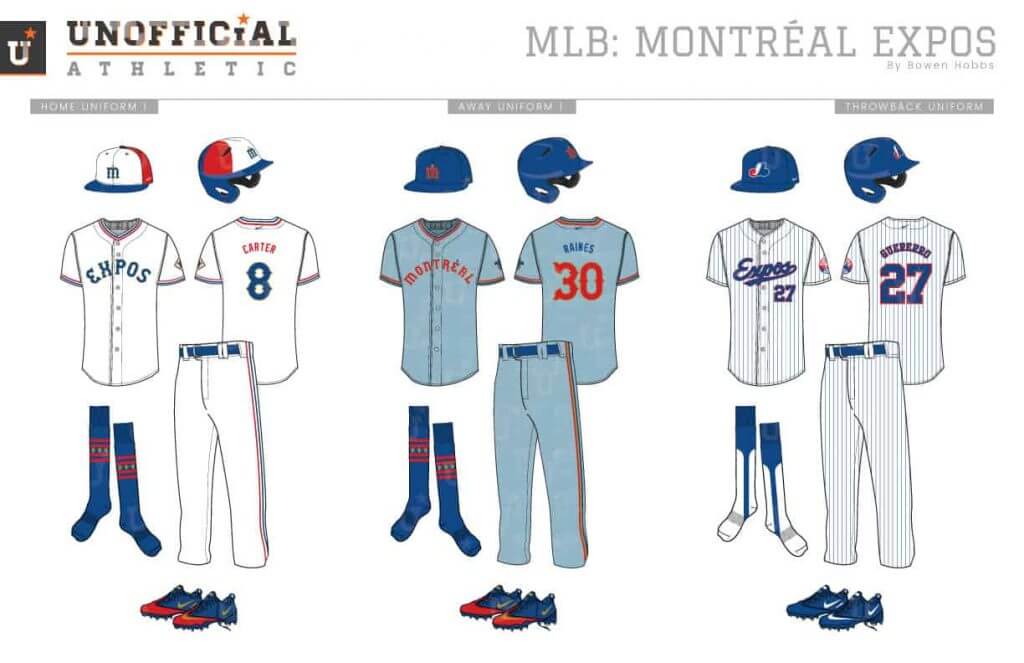
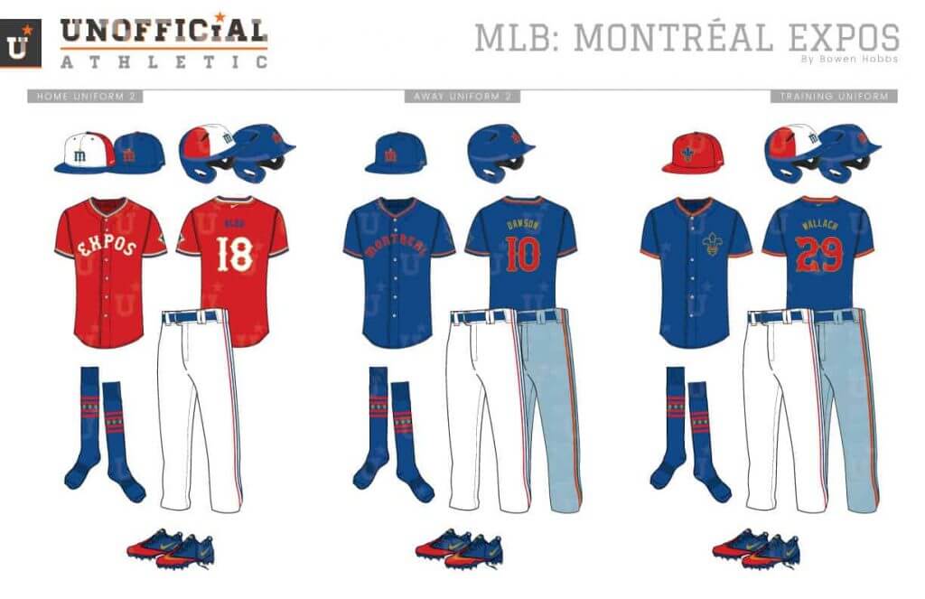
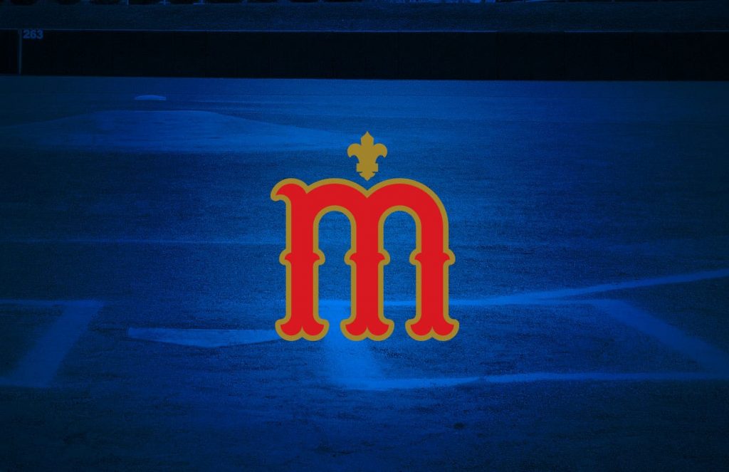
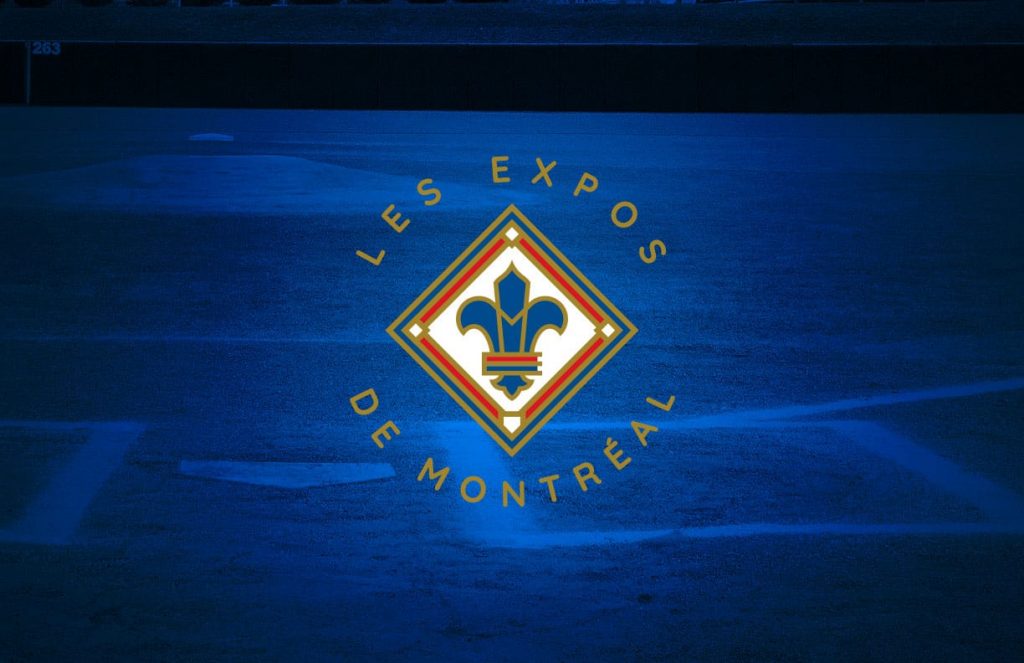
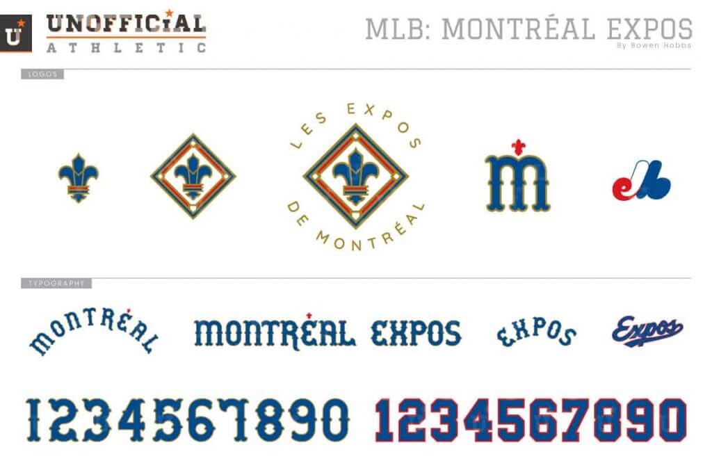
While the Expos haven’t played since becoming the Nationals, they live on in our hearts. And with Tampa Bay possibly moving north, an Expos concept is as relevant as ever. My Expos concept goes heavily in a mid-century direction with gold trim designed to mimic pins of the era. The primary logo places a fleur-de-lis-ME mark inside a baseball diamond. A stylized M with a fleur accent is the cap logo. The pinwheel caps return to the home uniforms, which are white with red, white, and blue trim. The greyish-blue faux-flannel aways are paired with a solid blue cap. The alternate jerseys are red with white type and blue with red type.
Holy Schnikes! Thanks (once again) Bowen. Those were fantastic.
Readers? What do you think? Please let Bowen know in the comments below!
Tailgating Aesthetics
What’s that jersey above?
Well, it happens to be something that was worn at the Brodey Brewer Funday Extravaganza (BBFE). And what is that, pray tell?
I got a note in early August from reader Caleb Bentz which explains it all. I’ll let Caleb take it from here:
Hello Phil,
I have included a link to the visual history of Brodey Brewer Funday Extravaganza (BBFE), a light-hearted tailgate that will celebrate its 20th year in a few weeks.
The event informally started in 2001 with a handful of high school buddies. Last year (BBFE 19), nearly 150 attendees enjoyed the annual tailgate in the (Robin) Yount Lot.
I have previously attempted to condense this aesthetic history into paragraph form and it gets REALLY long. Perhaps a year-by-year bullet point would work – if you deem worthy, of course.
Here’s the link.
Thanks for all you do for the commUNIty,
Caleb Bentz
Thanks Caleb. If you guys are interested, More BBFE info can be found here. That’s a pretty cool tradition — hope this year’s event goes well considering the COVID-19 pandemic.

Guess The Game…
from the scoreboard
Today’s scoreboard comes from Mike Chamernik.
The premise of the game (GTGFTS) is simple: I’ll post a scoreboard and you guys simply identify the game depicted. In the past, I don’t know if I’ve ever completely stumped you (some are easier than others).
Here’s the Scoreboard. In the comments below, try to identify the game (date & location, as well as final score). If anything noteworthy occurred during the game, please add that in (and if you were AT the game, well bonus points for you!):

But that’s not all — we have a DOUBLE SHOT today — since I am off tomorrow. This one is also from Mike. See if you can guess BOTH scoreboards in the comments below.
Please continue sending these in! You’re welcome to send me any scoreboard photos (with answers please), and I’ll keep running them.

Click to enlarge
ITEM! Rare pandemic reader meet-up!
Paul here. Who’s that gent with the old-school Marlins cap and the good-looking pooch? None other than Uni Watch reader Stephen Shoemaker. He recently ordered a seam ripper from me and I noticed that his mailing address is right near a spot I bike past every day on my way to my daily exercise ride in Prospect Park, so I asked if he might like to have me deliver the ripper to him in person. He agreed and met up with me yesterday afternoon. You can see him holding the ripper — a red one — in his left hand, which means that maker’s mark on his cap may not be long for this world!
It’s always a privilege to get to meet my readers. But with social activities nearly wiped out by the pandemic, meeting up with Stephen, even if only for a few minutes, was a particularly nice treat. Thanks, neighbor!
As for the pooch, that’s Iggy, who’s three years old. A very sweet boy! Naturally, I gave Stephen a bit of shit about the purple muzzle, but the green leash makes up for it.
Incidentally, I’ll be taking a rare August turn at the site’s helm tomorrow, as Phil takes a well-earned day off. See you then!
From The E-mail Bag…
Got an e-mail from Austin Ledley that’s kinda long for the ticker, so I’ll run it here:
Hi Phil,
My name is Austin. I’ve been a reader/contributor to Uni Watch for the last couple of years. I usually email Paul but I know it’s his break month. So I saw this video that just came out on the NFL YouTube channel showcasing players in their new practice uniforms for the first time (which is notable as it is). The moment that the Bengals popped up, it kinda got me riled up. Why would they wear normal, clean looking block numbers on their practice jerseys only to wear a clown suit on Sundays when the season begins? I’m not sure if they do this every year or if this is new this year. Maybe it’s a sign of much needed change to come next year with their hideous uniforms. Anyway, I thought it might be noteworthy. Link is below. Thanks for all your hard work!
Austin Ledley
Thanks Austin! I am admittedly not that careful a watcher of practice unis, so I don’t know if they do this every year (but I believe so). And you’re far from the first person to think the Bengals are in dire need of new unis!
The Ticker
By Alex Hider

Baseball News: MLB threatened Reds P Trevor Bauer with ejection if he chose to wear custom cleats in support of Dodgers P Joe Kelly, who threw at Astros players earlier this season. He ended up taking the mound in black Nike cleats. Bauer, of course, has a long-running feud with Houston. … Orioles RF Anthony Santander used DH Renato Núñez’s bat during the first inning yesterday — and got himself a double (from @JTS65). … Twins SS Ehire Adrianza’s 3D batting helmet logo went crooked during Tuesday night’s game against the Brewers — and the logo was still crooked as of last night (from Kurt Rozek and @royalty414). … On-field Chief Wahoo spotting: Indians DH Carlos Santana was wearing Wahoo on his undershirt, which poked through his jersey on Tuesday (from John Flory). … Tigers CF Jacoby Jones was wearing the team’s batting practice cap during Monday night’s game (from Daniel Rebar). … Eric Bangeman found this “Arlo & Janis” comic from 1999 (!) that comments on potential MLB jersey ads. … Here’s a “Miami Vice” uni concept for the Marlins (from @unimockups). … Speaking of concepts, here’s a “Charm City” mockup for the Orioles (from Adam Vitcavage). … New Kids On The Block will play a concert at Fenway Park in 2021, but their poster for the show doesn’t include the Sox most recent World Series banner (from Nicholas Neilling). … ESPN displayed Casey Mize in his Auburn hat, even though he turned pro in June, 2018 (from Mike Enriquez). … Minnesota Twins pitcher Lewis Thorpe wore a throwback jersey last evening that seems to have a rather off-center “43” (from Kurt Rozek).

Pro Football News: A auction house is attempting to sell Michael Strahan’s game-worn Super Bowl XLII jersey. The only problem? Strahan believes he still owns the jersey, and that it’s hanging in his house (from Brian Smith). … The NFL and the NFLPA have removed language that specifically prohibits jersey swaps from this year’s agreement — but they still won’t be permitted. Anyone with bench area access is prohibited from sharing personal items — including clothing (from Jeff Ash). … The J.J. Watt Foundation provided new uniforms for a middle school team in Cleveland, Oklahoma (from Kary Klismet). … Also from Kary: New uniforms for the Spokane Shock of the Indoor Football League (from Kary Klismet). Kurt Rozek thinks the ghost of the throwback Seahawks logo made an appearance as a burning log in his fire last weekend. Anyone else see it? … The XFL 2.0 may be no more, but that still doesn’t mean we can’t rank the helmets.
College Football News: New road uniforms for Stephen F. Austin (from Timmy Donahue). … Jimmy Duncan found this photo of Florida State wearing gold jerseys and pants in the 1983 Peach Bowl media guide. Apparently, they wore them for only one game that season, against Cincinnati. … Houston has added a memorial decal for longtime coach Bill Yeoman, who died on Aug. 12 (from Ignacio).

Hockey News: In yesterday’s Ticker, it was noted that Tim Horton’s would soon be giving away hockey-themed Barbie dolls. However, the dolls won’t be given away until November, due to production issues with the Black hockey player doll (from Wade Heidt). … Chris Doran spotted a typo on NBC Sports’ scorebug during yesterday’s Jackets/Lightning game. … The Winnipeg Jets have put up a memorial to former player Dale Hawerchuk outside their arena. Hawerchuk died on Tuesday (from James Beattie). … New mask for Anders Lindbäck of KHL club Jokerit (from David Kemper).

Basketball News: The Lakers wore MAGA-style caps prior to Tuesday’s game that called for justice for Breonna Taylor (from Kary Klismet). … Virginia has new practice jerseys (from Jamie Rathjen). … New floor for Dreher High School in Columbia, South Carolina (from Andy Shain). … The Sydney Opera House Trust is increasing the cost it’s charging to the Sydney Kings of Australia’s National Basketball League to use the landmark in its logo. Other sports teams in the city that incorporate the landmark in their logos may face similar cost increases (from James Gilbert). … Anthony Davis stopped the game he was playing in last night to point out that Dwight Howard’s dunk tilted the rim (from Mike Chamernik).

Soccer News: Leeds United of the Premier League have new jerseys (from Jamie Rathjen). … New jersey for German club Borussia Dortmund (from Jakob Fox). … New jerseys for FC Akhmat Grozny of the Russian Premier League. Dan Bloom thinks they look like Rorschach tests. … Ed Zelaski sent along several new kit unveilings from soccer clubs across Europe. Head to his Twitter account to see the latest.

Grab Bag: Strasburg High School in Ohio has new marching band uniforms (from Kary Klismet). … Also from Kary: This report details the process (and price tag) that the Nyack school district in New York went through to move away from Native American imagery. … Online shopping platform Farfetch has a new feature that allows shoppers to try on sneakers virtually (from Tom Turner). … John Cerone passes along a series of new company logos: UCS Comic Distributors, Liberty Travel Plazas (which is rebranding as Onvo) and Owens Corning, which is celebrating 40 years with using the Pink Panther as its mascot. … Couple of international notes from Jamie Rathjen: New primary jerseys for Leinster of Pro14 rugby (also shared by Ted Kerwin), and Australian Rules Football clubs Melbourne and North Melbourne have unveiled new Indigenous jerseys. … NASCAR Cup driver Jimmie Johnson’s Darlington throwback paint scheme will honor both Richard Petty and Dale Earnhardt (from Chris Hickey and Jakob Fox). … This chart redesigns state flags based on state name etymology (from Johnny). … Golfers Justin Thomas and Bud Cauley will wear custom cleats for the FedEx Cup as part of a charitable competition (from Griffin T. Smith). … The Army is investigating after two soldiers appeared in uniform during the DNC; wearing uniforms to a partisan political event is prohibited (from Timmy Donahue). … Also from Timmy: The city of Kaukauna, Wisconsin, has a new logo. … Iowa State volleyball is using a net with embedded vinyl in order to prevent the spread of COVID-19 (from Jeremy Brahm). … New logos for Northwestern College in Iowa (from Jacob Russo). … Paul would appreciate this sign, spotted by K.C. Kless in Cincinnati. Ohio doesn’t like purple because state officials use the color to designate counties with the highest transmission rates of COVID-19.
And finally… Big thanks (once again) to Bowen for the amazing MLB concepts, this time for the NL. As mentioned above, I’m off tomorrow, so Paul will be making a very rare August appearance Friday (and I’ll re-take the reins again on Monday). So I’ll wish everyone a good and safe weekend now.
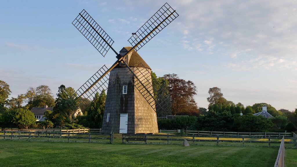
I’m back out east again (drove out late this afternoon), so I got in some late kayaking and then walked about the town. Unfortunately I was too late to get back home and catch a sunset at the summer place, but I was able to capture yet another windmill pic during my evening 4-mile walk. This may look similar to the Hook Mill I posted the other day, but it’s actually a different one: the Gardiner Windmill (if you’ve ever heard of Gardiner’s Island, it’s the same family). The sun hadn’t yet set when I approached it, but you can see the long shadows that mark the end of the day (I hope) in the photo below.
That’s all for me for this week. Everyone stay safe and I’ll catch you on Monday.
Peace,
PH
Great work again, Bowen! The full/official logos you create are fantastic, and your presentation is top notch. Phil, great content. I didn’t comment the last couple of days, but enjoyed reading about corners of the uni-verse previously unknown to me.
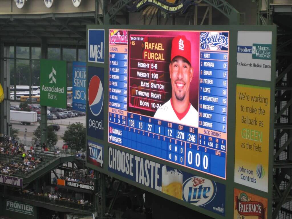
GT(baseball)GFTS: August 1, 2011 – Brewers 6, Cardinals 2.
Craig Counsell tied the non-pitcher record for consecutive hitless at-bats at 45. (He got a hit in his next at-bat, 4 days later.)
link
I believe the baseball scoreboard is from 8.1.11, but I’m not yet sure what’s notable about it.
It was notable because I was there, haha
Sorry, game in Milwaukee, Brewers beat the Cards 6-2
Not being argumentative, just picking nits since that’s the prime directive around here. The Cardinals redesign notes “The uniform piping between the headspoon and sleeve cuffs is connected to honor the Lou Brock era.” Dressed To The Nines shows the final year for that style piping to be 1950, more like the Stan Musial era. The URL from Dressed To The Nines has a question mark in it, so it might get truncated. If so, my apologies.
link
Hmm. Just a suggestion, maybe change the GTGFTS image names so that the answer is not given away in the name?
I submitted them like that. My mistake.
Not a single Bowen Hobbs uniform is better than the original.
Counterpoint: as a Brewers fan, I’d trade the current Brewers logos for his concept in a heartbeat.
On the Brewers, I tend to agree, though for different reasons. Chance, I believe, hates the updated Ball-in-Glove logo. Personally, I don’t mind it, but I also think the general concept of the Ball-in-Glove is pretty poor by MLB standards. The barrel-M solves both of our otherwise contradictory objections! It’s a fantastic design, exactly the kind of thing that ought to be the building block of the Brewers whole look and feel. The only thing I’d change is that I’d rather see the Brewers in navy than royal. The yellow in the uniforms this year just pops so much better than it ever did with the royal, where a general brightness sort of washes out the whole scheme. Plus Milwaukee will never really “own” royal sharing a division with the Cubs.
As a Nats fan, I’ve sorta kinda made peace with their uniforms. I loved their original 2005 bevel uniforms, and I’ve come around to accepting the curly W, and the team has accidentally evolved its post-bevel uniform set into something that almost functions as a unified look and feel. It’s B-minus at best, though some individual uniform elements are A-plus on their own. So OK to good, not great. Bowen’s Nats revision is about on par for me, taken as a whole, but there’s marginally more unity and coherence among all the uniform elements, and that counts for a lot. Also the cap logo is heads and shoulders superior to the curly W.
And I’m especially impressed by the Dodgers. I regard the basic Dodgers home uniform as the single greatest uniform design in sports history. I wouldn’t call Bowen’s Dodgers uniforms clearly better – though give the script an upward tilt and I might! – but Bowen’s concept is awfully close to on par. If the Dodgers started wearing Bowen’s uniforms tomorrow, everybody would whine and moan, but in five years fans wouldn’t even remember a time when they didn’t think the new uniforms are the best the team has ever worn.
You are correct – I don’t prefer the BiG in general, I would prefer a variation on Todd Radom’s excellent 1997 design.
But even if I don’t love the BiG, I absolutely loathe what they let the owner’s kid do to it. Everything that was good about the design has been swept away in a clumsy “update”.
If they are to use the BiG, it should at least be the better version of the design. But this barrel logo? I’d take that in a heartbeat.
It was a mistake including throwback uniforms. In every case they look better than his.
I disagree about the “look better” aspect, but I agree that too many uniform concepts include too many alternate uniforms. No real-life team should have more than two alternate jersey options and one alternate cap option, and no uniform concept should present more than this.
I agree. Still ticked off that I was not able to view the White Sox unis the last time and I even went back and they still show as broken links on my phone and computer. The majority of the number fonts for the AL were exactly the same. Why use such a decorative number font for multiple teams??? Also, way too many logos that looked like the walmart or walgreens version of a pro team they couldn’t get licensing for. And today….well, I couldn’t even make it past Arizona without voicing my displeasure. Besides the “I want to get away from blue and red, too many teams have it, blah blah blah,” and then going right back to blue and red…this time he said he wanted to create a unique color set for the Diamondbacks and get away from the use of so much black….he went right back to it!!! Every darn uni except the original throwback set (which I agree makes the concepts look like trash) is just turquoise and black, with only a tiny bit of sedona red being used in the logo on the hats, which are too blurry to see anyway. How about ditching black except for trim and going turquoise and sedona red or the original purple and turquoise??? No The only other team that uses purple is the Rockies and so what if they are in the same division? So for all the hate, but it grinds my gears when you say you are going to do something and then don’t do it.
What is the octagonal Rockies’ cap monogram supposed to be?
Bowen threw back to the wrong Expos’ and Phillies’ uniforms.
Old English should never be all-caps, even when the A’s did it.
Giants and Mets are a hot mess, though I’m interested in the fading-pinstripes pattern.
Futura numbering looks nice on the Dodgers.
I can warm up to the concept of Postal Abbreviations for teams named after states (AZ, MN, CO)
1. The section headlines for the NL concepts says “American League.”
1a. The concepts this time around are excellent again. It is a monumental task to redesign 30 teams, many with different colors, all with bespoke number/letter fonts and none with elements of today’s uniforms. A lot of time and thought went into these.
2. Many NFL teams wear practice uniforms that don’t look like their game uniforms. Some teams simplify their numbers (Eagles eliminate the outline and the drop shadow but use the bespoke font). Others change it up entirely (Seahawks wear the font from the end of the royal blue/green era, Bengals go simple Varsity Block). Not sure how much thought teams put into the practice gear, since they can’t sell them as merchandise – or at least haven’t started to. Yet.
Gah! Thanks, now fixed.
Not just NFL teams in football that may have different number font from practice jerseys to game jerseys. Happens in CFL too. BC Lions as a recent example. Have this number font for some time for practice jerseys and different from game jerseys.
link
link
Gotta say I’m a lot jealous. Watching NFL teams in training right now while the CFL is sitting out this entire season due to COVID.
This! ^
Nice job once again Bowen! I think some of these are better than others, but you said it yourself that part of the challenge here is re-imagining teams who have long established visual identities.
That said, I LOVE the updated Dodgers word mark. It just screams LA to me. The Marlins and Pirates redesigns are also really good, and I love that you put the Reds back in vests. Bravo!
The Dodger one is indeed clever.
Even if they can’t replace the actual on-field logos, some of these could absolutely be adapted into anniversary or special-event logos.
What he said.
Normally I wouldn’t mess with the Dodgers at all, but the mid-century-modern look is so Southern California that it’s perfect.
Love the barrel M look for the Brewers also, and I like what you did with the Pennsylvania teams. The keystone NEEDS to be incorporated into someone’s uniform, and your number font is better than what the Pirates are using now.
On the whole, great stuff, Bowen!
“The keystone NEEDS to be incorporated into someone’s uniform…”
Don’t the Pirates lettering and numbering already do so (this may have been a topic of discussion/a ‘deep dive’ before)?
link
As awkward as the appearance of some may be (like the 7), I generally like the font the Pirates use for their numbers.
Agreed on that Pirates number font; it looks much better than what they have now!
The one thing I dislike about these concepts is that there are far too many NOBs, particularly on throwback jerseys and other uniforms designed to look like classics. Bowen gives the Cubs a variation of my single favorite uniform ever — the 1900s-1910s all-navy with the bear logo — but it would look infinitely better without the NOB. When each team gets four or five uniforms, there is plenty of room to have NOBs some of the time and number-only other times.
Getting back to what I do like: the idea of “Metropolitans” spelled out in full on a Mets jersey. Why hasn’t this been done before? And the white Cincinnati cap with wraparound red piping looks so good.
The Cincinnati Bengals have been wearing practice jerseys with standard block font for years. It certainly has not been unique for just this season. Quarterbacks in orange jerseys with black numerals trimmed in white, while the other position players wear either white jersey in black numbers or black jersey with white numbers – both trimmed in orange.
Thanks for the info. I could only hope that it was a sign of things to come, but I guess it’s just another strange choice by a strange franchise. Oh, and thanks Phil for featuring my contribution today!
Proofreading: In the Basketball section, I think it should be the “Sydney Kings,” not the “Sydney Queens”
Thanks. Fixed.
He also referred to the Cubs’ sleeveless era as “the 50s”. Try the early 40s.
I’d like to think anyone with an interest in MLB uniforms and designing them would utilize Dressed To The Nines often. I guess not.
2/10/2010. Magic 107 Bulls 87. The clue is that this is the last year that the Bulls had a #52 (Brad Miller).
Magnificent work, as always, Bowen. Thanks for all the time, effort, & thought you put into these resdesigns (and thanks, Phil, for sharing this all with the rest of us).
A friend here in Seattle just posted a video to Facebook that shows an empty Ebbetts Field Flannels store front……. I am hoping that they are not out of business. Can someone investigate?
They’re not out of business, they’ve just closed their storefront.
I believe they sent this update out to their email subscribers a couple weeks ago.
Also, I believe they hope to reopen with the store and warehouse together in a new location.
Yeah, he said that the physical store had to close but the online business is very strong.
Sad to see it, but hopefully they can weather the rest of the storm.
Lewis Thorpe’s 43 looks fine to me. The jersey is askew on his body.
On-field Chief Wahoo spotting: Indians DH Carlos Santana was wearing Wahoo on his undershirt, which poked through his jersey on Tuesday (from John Flory).
New York CBS News affiliate runs a crawl of out-of-town scores during Sports, using outdated logos; Wahoo for Indians, Miller-Park lettering for Brewers, navy blue Padres logo, etc.
Really like the Cubs redesign until the script Cubs part… it’s like you read my mind as a Cubs fan. I like the Cincinnati away font! Love the Dodgers font! Unique ideas… except for the Cardinals, I cringe on that one (sorry). Whole series is cool to see!
It should “Tim Hortons” not “Tim Horton’s.” This quirk is because in French-speaking areas of Canada, the “apostrophe s” possessive is seen as an English abomination, so they trademarked the name without the apostrophe.
Disappointed to see Bowen sticking with bad Native American/indigenous/First Nations imagery with the Braves uniform set. Kind of disappointed with Phil for running it, too, TBH.
Please ignore the last post I made, which I made before rereading the description for Atlanta.
I apologize for my post and criticism of Bowen and Phil.
I apologize for correcting you. We’re all friends here.
Guess again. I hate virtually all posters and contributors here.
I have universally hated Bowen’s designs. They are terrible.
Finally, I’m was ecstatic to see the Chief Wahoo sighting. Great logo.
Yes! JJ?
As in Joe “BC” Johnson?
Glad you’re back! Haven’t heard from you since Paul interviewed you.
Looking forward to future performances.
Did you read his description for Atlanta and look closely at the redesign?
That’s a fireman’s hatchet, not a tomahawk, which Bowen addressed in the blurb accompanying the uniform. Were you okay with the Kachina motifs in the Diamondbacks’ uniforms?
Like I said, I screwed up with my original post. I emailed Phil to apologize as well.
Eh, the Braves mockup doesn’t really do enough to distance itself from the offensive indigenous imagery.
Perhaps, but it’s still a good design. Paul’s website is a study of athletic aesthetics, not ulterior motives.
Bowen,
The NL redesigns were sooo good. I love them. All of them. Especially enjoyed you throwing in the Expos. Let’s make some wall art of your redesigns. Having the Pirates using gold in their batting helmets was spot on. Thanks for sharing your work, I love it.
Enjoyed the Phillies redesign, especially going to burgundy and powder blue.
Perhaps on the road uni, you would consider “PHILA” instead of the full name? I believe they had this in the 30’s.
Thoughts on Bowen’s redesigns:
Diamondbacks-A good effort, if this was the Florida Marlins.
Rockies-At least it’s not flag-inspired.
Dodgers-That script! Those numbers! Nicely done!
Padres-They look so good now that anything else looks bad.
Giants-They have a mascot? And it’s a seal? Didn’t know that.
Cubs-Pretty good, though there’s no need for gray pants in the alternate set…white pants, royal tops, please!
Reds-Yes, they are olde-timey but I prefer something more Big Red Machiney. Or a sleeveless option ;)
Brewers-Love the return to royal and the updated BarrelMan.
Pirates-See my Padres comment.
Cardinals-See my Pirates comment.
Braves-BFBS? No, thanks. Better to emphasize the red to align with the “city colors”.
Marlins-Way better than their last 2 sets. My Favorite (even if it’s not teal).
Mets- Is that Mr. Met or a Smurf? New NY logo seems devilish.
Phillies-Agree that they alone should feature burgundy, but the barely-there pinstripes and hip numbers have got to go.
Nationals-Or is it NATIONAL_S? As much as I dislike the curly W, those cap logos are a poor replacement.
Expos-I disagree with the premise that if Tampa Bay moves there they get to lay claim to the franchise name and/or history, but their original number style should be a uniform feature if MLB returns to Montreal (it’s a pity the Nationals didn’t carry those over).
I particularly enjoyed the Expos design. Although, anything substituted for the Brave’s Tomahawk seems out of place. The Redskins moniker needed to go for obvious reasons, but advocating to abolish the current Braves unis and/or name is going too far. Thus opening the door to a heavily restrictive era resulting in an array of generic designs.