[Editor’s Note: Paul is on his annual August break from site. Deputy editor Phil Hecken is in charge from now through the end of the month, although Paul may be popping up here occasionally.]
By Phil Hecken, with CJ Fleck
Follow @PhilHecken
Greetings all — it’s hump day. Hope everyone is still safe and well.
One of the things, amongst the many, that the COVID-19 took its toll on this year was the Summer Olympic Games. And while we can probably say many negative things about the Olympics in general, I’ve always loved watching it. My earliest memories were the 1972 Olympics with the gold medal performances of Olga Korbut and Mark Spitz (I remember watching on a 12″ black and white TV in my parents room!) and of course the horrible Munich Massacre which forever scarred the six year old boy watching — even if I didn’t understand what it was all about, I still remember it. Every four years since then I would get excited to watch the games (and I was crushed when the USA decided to boycott the 1980 games). Then it got even better when in 1994 the powers that be decided to move the Winter Games to a different year from the Summer Games, so it became a biennial thing for me. I probably watch more Olympic events (especially now with all the different stuff available on different channels and online) than any other international competition.
All of which is to say, I was disappointed when this Summer’s Games were postponed. I had hoped to line up a slew of “reporters” to write about different sports (as I did in 2012 and 2016) as I usually cover the entire month of August. Obviously 2020 changed all that. But there is one sport we pretty much only see during the Olympics — fencing — that we’re going to learn more about today. For that, I will bring in guest author CJ Fleck. If that name sounds familiar, it’s because he and Kyle Evans have been covering most of the major soccer uni unveilings with me over the past several years. But CJ is putting his boots away and donning … well, whatever they call that white suit and beekeeper-mask type thing the fencers wear for this one. And I’m sure he’ll teach all of us (especially me) something about this rather obscure sport we only get to witness on our TVs during the Games (or if one has the Olympic Channel). Here’s CJ:
International Markings in Fencing
By CJ Fleck
August is the perfect month to spend some time discussing one of those Olympic sports that only pops up on our televisions and timelines every four years: fencing. It is a sport that has been in every modern Olympics, and one that I have been involved with for over half of my life in many different capacities. I have been reading Uni Watch as long as I have been fencing, and I have always been fascinated with certain elements of the fencing uniform. In particular, with the Olympics and Paralympics postponed, I wanted to give an insight into the international designations worn on the fencing uniform in international competition. As well, since I am now involved in wheelchair fencing (or parafencing) these days, there is an extra uniform element worth exploring in the Paralympic version of the sport. Let’s start with the basics.
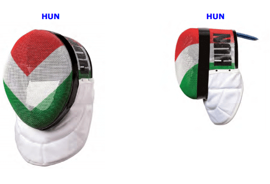
Perhaps the most visible and most recognizable part of the fencing uniform is the mask. In international competition, fencers are permitted (but not required) to wear masks with designs approved by the international governing body of fencing, the FIE. Only those designs that are approved are allowed to be worn. As an American with some international competition experience, I’ll use the USA and Hungary as my examples for masks. Here, we can see what mask designs the FIE has allowed, taken straight from the rulebook.
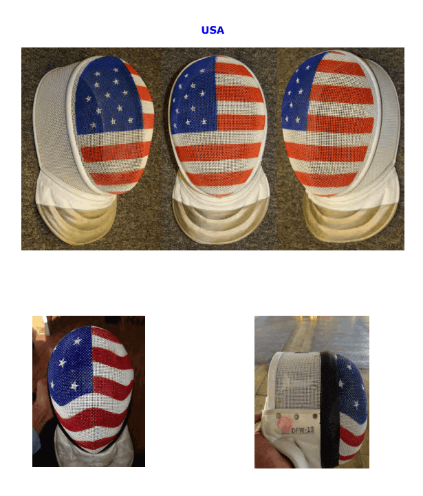
In my experience, getting to see all of the different mask designs at a tournament is quite fun, but I guess that’s the Uni Watcher in me. If you’re curious about other countries, the FIE makes that very easy by collecting every approved mask design in one PDF.
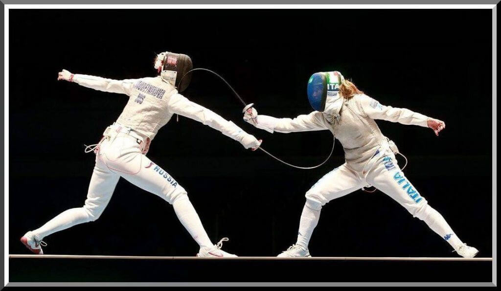
Here’s an action shot (with a bonus look at the Canadian elements!), which will lead us to our next element.
The fencer on the left is an American, right? How can we tell? I’ve already told you about the mask, an admittedly easy giveaway, but as I’ve said those are not a required element of the uniform in international competition. However, two visible elements in that shot are required: the name and country code on the back of the jacket, and the country designation on the thigh. Country codes are used throughout many sports, but the thigh design is a specialty in fencing.
Without getting too much into the intricacies of the competitive rules of fencing, the three different weapons have different rules and different equipment to go along with them. However, the area covering the thigh remains the same and also visible through all three. Thus, all international competitors for the United States are required to have this design on the thighs.
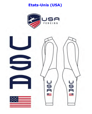
Of note, the United States does not include anything on the arms. Some countries do, some don’t. In one weapon, saber, the sleeves are covered by another jacket, so that element would be lost. But as I said, the thighs are always visible, so that’s where the logo is placed. Here are some other designs:
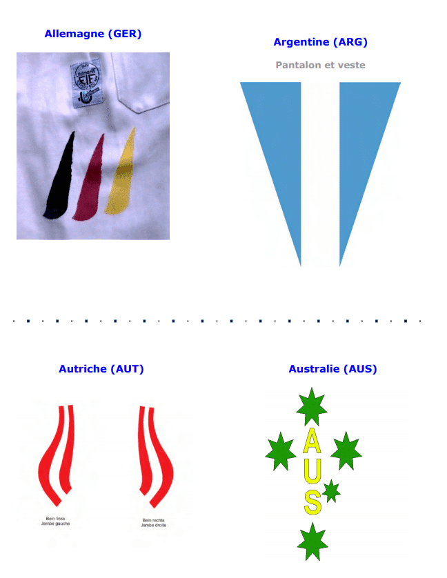
As with the mask designs, country logos are collected in a PDF by the FIE so that uniformity may be achieved.
Eagle-eyed readers will notice the enforcement of the American flag orientation. This will pop up again!
Parafencing/Wheelchair Fencing
Now, let’s jump into the Paralympic version of the sport, wheelchair fencing. For an overview of the sport, and to get to see it in action, this primer is a good start.
Lots of different country designations in that video, for sure! But we also get to see two other things worth exploring: the epee skirt and wheelchair spoke covers.
The epee skirt covers the lower half of the body in epee in wheelchair fencing, as that is not considered a target area. Since that covers the country designation on the thighs, the fencer’s country code must be placed on the skirt. There’s not much design to it, but it is an important function in identifying competitors quickly at a glance.
The spoke covers are what sparked my interest in writing this piece. As you can see in this action shot, the spoke covers are essentially part of the uniform!
The 2020 Parafencing Nationals will be held in St. Louis from April 17-19 in conjunction with the Div I Nationals and April NAC.
Full details: https://t.co/QgxReFDmtL pic.twitter.com/CGpS5j5I4o
— usafencing (@USAFencing) December 28, 2019
Here’s the design from the rulebook:
Of note: our American spoke covers follow the same flag orientation rule as the thigh logos. You don’t want to get your wheels mixed up, that’s for sure.
Much like masks and logos on the thigh, the spoke cover design is regulated by IWAS, the wheelchair fencing governing body. Yet again, every design is collected in a handy PDF format, though I quite enjoyed seeing all the different designs at my first international competition. Here are some from the rulebook:
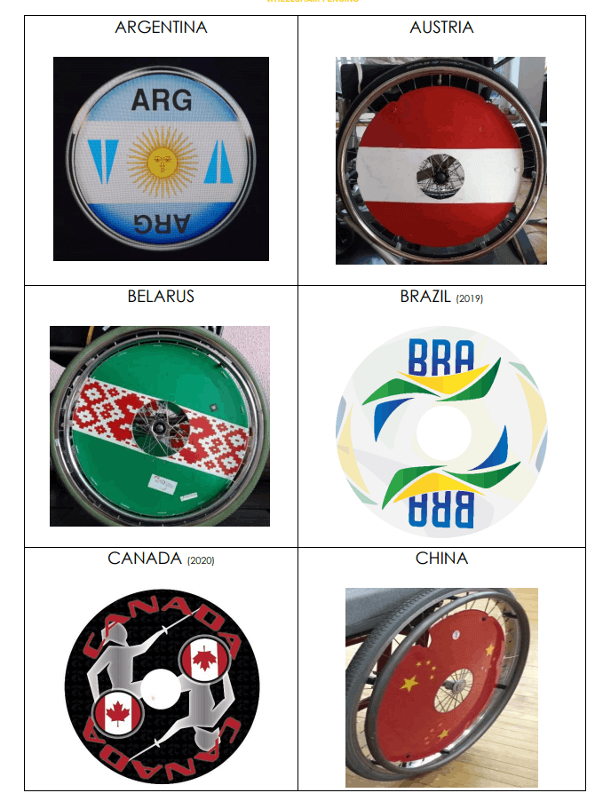
I find it appropriate that the wheelchair, which in wheelchair fencing is unique to each competitor and made to strict specifications, includes another marker telling us who they’re competing for. I know I’m proud to have the flag design when I get the opportunity to represent my country, and it is great seeing all the creativity from across the globe.
In case you wanted to see the designs for other countries, here are the links for the most recent designs. From time to time, countries may update their logos, which requires athletes to update their uniforms.
I hope you enjoyed this look into a lesser known sport, and the Paralympic version of it as well.
Thanks, CJ! Great write up. Sadly we won’t be seeing any fencing this summer, but hopefully we’ll get to see them next summer when the 2020 Tokyo Games are rescheduled. Readers? What say you?

Uni Concepts & Tweaks
Time for more Uni Tweaks from the UW readership.
I hope you guys like this feature and will want to continue to submit your concepts and tweaks to me. If you do, Shoot me an E-mail (Phil (dot) Hecken (at) gmail (dot) com).
Today’s set of concepts come from Jonathan Martin, who brings us five fictional teams…
He writes,
Heya Phil,
Coming back at you with 6 new uni concepts (I did those Astros concepts a few months back if you recall). First, some backstory for you on these, and I’ll also be as brief as possible for each concept:
A couple months ago, a buddy of mine who runs the Let’s Get Two podcast teamed up with the B4 The Pitch podcast and had a fun idea: invite some friends and redraft the entire MLB, only no cities that currently have a team could be redrafted into the league and the locales ultimately had to make sense. 6 rounds, 6 teams each, snake draft. Things got a little crazy once international teams came into play, and no location could be chosen twice.
In the end, I scooped up Salt Lake City, Tokyo, Little Rock, Montreal, and Brooklyn.
Then we had to come back a couple weeks later and show off our newly minted teams, logos, names and all. The following is how I branded each and the unis I made. Full disclosure, I can come up with basic logo designs and wordmarks, but illustrated logos I needed to modify from what I could find online. So giving credit to the logo sources I modded in the descriptions.
Tokyo Ronin:
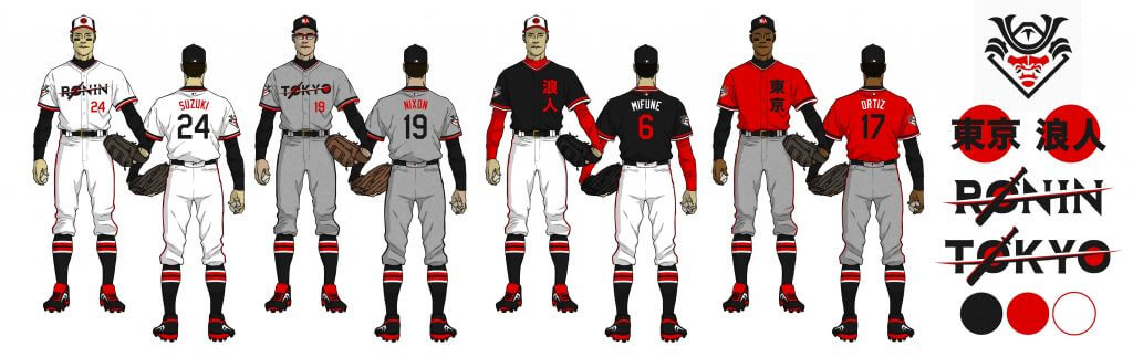
Went all in on the samurai motif, but “Ronin” seemed fitting for a baseball team, considering a team is just a squad of free agents playing under contract and a ronin is, in fact, a masterless samurai who goes from job to job… just like a ballplayer. I also incorporated the “rising sun” imagery of the Japanese flag, that looks great on a baseball uniform. The baseball bat is actually a hybrid samurai katana/bat, that is slashing across the wordmark. The home cap reads “Tokyo” in Japanese, and the road cap reads “Ronin.” Red, White and Black was the color scheme.
Little Rock Niners:
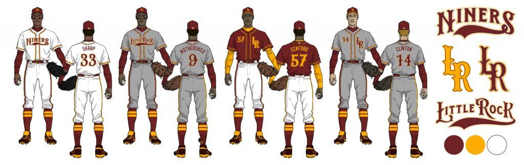
Paying tribute to both my great grandfather who played independent league ball in Little Rock in the 30’s, and the “Little Rock Nine” who broke the segregation barrier, I named the Little Rock squad in their honor the “Niners.” Everyone on the show seemed to dig this tribute (what say UniWatch readers though?), so that was nice. Anyway, I kept things nice and simple here, with a little bit of flair to the wordmarka that gave an old school, handlebar mustache and pillbox cap feeling to the proceedings. The “L” and the “R” interlock for the crest and cap, while the colors were Burgundy, Gold and White.
Montreal Cirques:
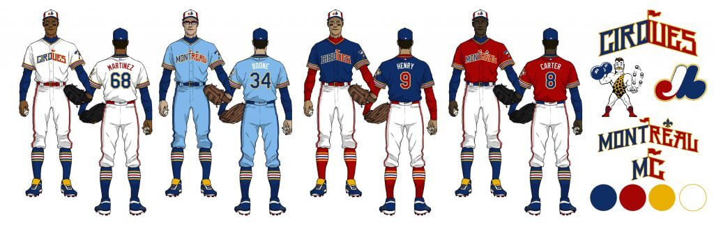
Bringing baseball back to Montreal, I’m personally in love with the name. It has that same odd uniqueness as the “Expos” did, while still being distinctly French and local to Montreal, as Cirques is French for “Circuses” and of course, Cirque du Soleil originates from Montreal as well. So I went with a more circus theme on this, while of course, bringing back the iconic Expos cap (although I scrubbed out the “E” in it) and powder blue away uniform. “Montreal” and “Cirques” form a circus tent in how they’re arched on the wordmark, and the mascot is an old school circus strongman, juggling baseballs while hoisting a barbell. Really went all out on the sleeve piping here to create that “Ringmaster” look as well. The colors chosen were Royal Blue, Red, Gold and White.
Brooklyn Carnies:
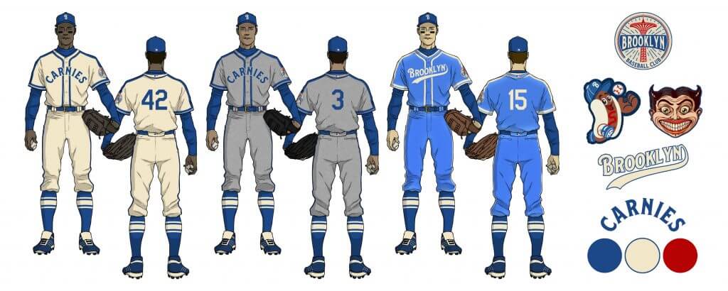
Shouting back to the vintage Dodgers of yesteryear, kept things real simple while having fun with the Coney Island imagery. The away blues are adorned in satin, while the home is a nice cream compliment by a flanneld gray. The colors were Blue, Cream and Red (as an accent). The “Brooklyn” wordmark pays homage to the Dodgers while also creating a sublte rollercoaster climb as it swoops upward. There was some debate over whether “Carnies” was offensive or not (we asked a carnival worker who said it wasn’t…but maybe? My apologies if so), so I settled on “Coneys” as a backup if needs be. (Brooklyn baseball logo and “Freak” logo is modified from the Coney Island Brewing Co. logo and the Hot Dog logo comes from Ryan Hungerford on Dribbble.)
Utah Gulls:
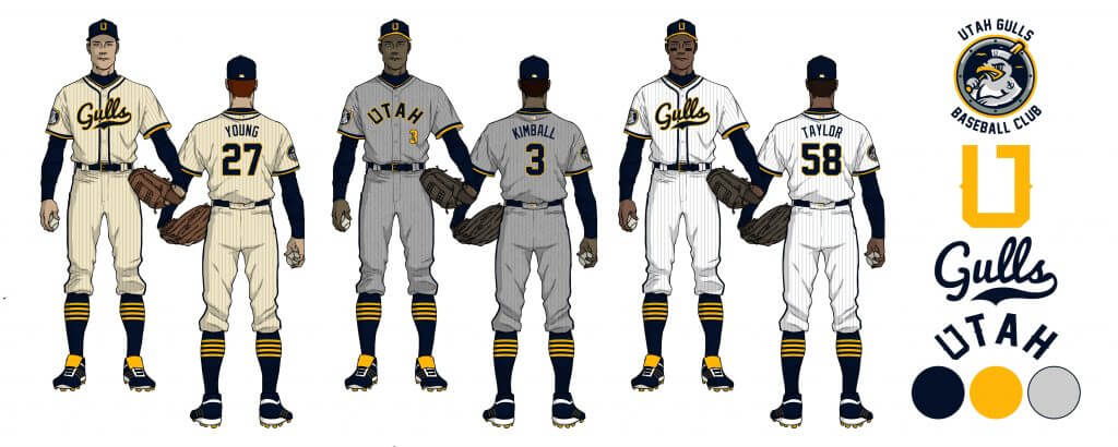
Bringing back the old school name of the Salt Lake minor league squad, I went a little overboard on this one, creating six uniforms for the team. The colors are Midnight Navy, Gold and Gray, with a variety of home options. The Gold ties into the golden beehive used often throughout Utah as “The Beehive State.” The “U” in the cap and logo hides the state of Utah within it, as it does in the “Utah” arching wordmark as well. Most don’t realize the seagull is Utah’s state bird, hence the name. While simple, I went with what I felt was a timeless look, with a primary cream home and flanneled away that are pinstriped, with the non-pinstriped look as an option as well. Being my home state now, had to give it that extra love… plus, I’m the designer for what may become the new state flag next year, so had to go all in! (Seagull logo borrowed from Zilligen Design Studio on Dribbble.)
__________ Final notes:
• I love me some proper piping and striping on a baseball uniform. Hosiery, sleeves, you name it.
• Most cap squatchees have an alternate color to the cap base.
• Next time, I promise Paul that I’ll do a green and gold scheme on a concept.
• On the whole, I tried to go for something timeless in these designs rather than something so obviously “out there” that there’s just no way you’d see it anywhere but a beer league softball team. I also wanted the uniforms to look like they could be on a pro field today. I hope it pleased those so inclined to enjoy and met their approval.
Right, so that wasn’t as brief as I’d like to be, but is what it is as there’s some stuff to unpack there. I’m sensing a trend with me here… apologies!
I hope you enjoy, and let me know if it’s worthy of a spotlight down the line!
Thanks!
Jonathan Martin
Thanks Jonathan!
OK readers (and concepters). If you have some tweaks or concepts, shoot ’em my way with a brief description of your creation and I’ll run ’em here.

Guess The Game…
from the scoreboard
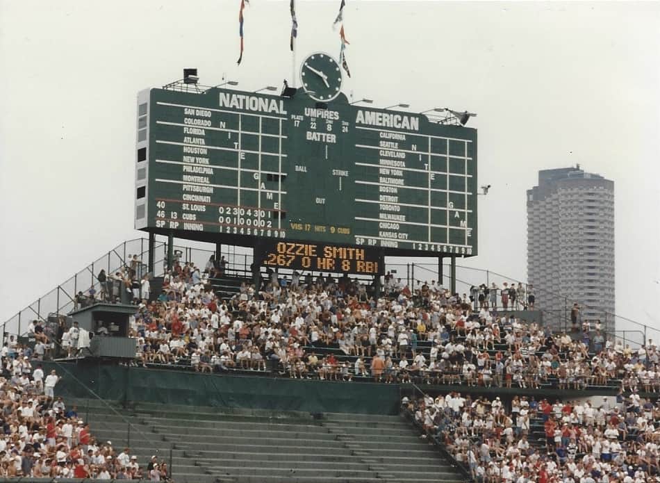
Today’s scoreboard comes from TJ Brennan.
The premise of the game (GTGFTS) is simple: I’ll post a scoreboard and you guys simply identify the game depicted. In the past, I don’t know if I’ve ever completely stumped you (some are easier than others).
Here’s the Scoreboard. In the comments below, try to identify the game (date & location, as well as final score). If anything noteworthy occurred during the game, please add that in (and if you were AT the game, well bonus points for you!):
Please continue sending these in! You’re welcome to send me any scoreboard photos (with answers please), and I’ll keep running them.
The Ticker
By Lloyd Alaban

Baseball News: Because of the cancelled game on Sunday and an off-day yesterday, the Pirates wore Negro League patches last night (from Noah Kastroll). … Dodgers RF Mookie Betts wore cleats with the tri-star mark of Tennessee’s state flag last night (from Jakob Fox). … New uniforms for the Rakuten Monkeys of the Chinese Professional Baseball League for Armed Forces Nights (from Jeremy Brahm). … The new Atlantic League team in Gastonia, NC, is asking fans to give suggestions for the new team’s name (from @BallparkHunter).

Football News: Florida State is going back to the white numbers (and white ACC logo) this year. Old version on left, new on right. … The University of Cincinnati now has vertical stripes down the side of their pants instead of horizontal ones across the thigh (from Gage Goodwin). … Here’s why the Giants’ practice jerseys are NOB-less during training camp. … New unis for Louisiana-Lafayette. … New black-on-black helmet for Louisville. … New unis for SFA (from Chris Mycoskie). … 7-Eleven is selling cups commemorating the Cowboys’ five Super Bowl wins. But they’re forced to use generic championship logos instead of the actual Super Bowl logos (from Edgar Estrada). … Reader @jamesesiddall found a DIY bike helmet modeled after Ohio State’s helmet. … Bryce Thompson will wear jersey No. 0 for Tennessee this season. He is the first Vol to ever wear the number in Tennessee football history.

Hockey News: Mattel has released new Tim Hortons hockey-themed dolls (from Timmy Donahue).
.
.

Soccer News: Manchester United’s third kit has leaked (from Anthony Emerson). … New kits for Hellas Verona of Italy’s Serie A (from multiple readers). … New shirts for Cagilari (from Ed Zelaski). … Also from Ed: New second and third shirts for Pogon. … One more from Ed: New away shirt for Dynamo Dresden. … New kit for Mansfield Town (from our own Jamie Rathjen). … New national kit for Armenia (from Chris Obenshain). … New second kit for spanish second tier Real Oviedo (from multiple readers). … There’s been a push against commercialization of soccer in Germany. So much so, that two sides from North Rhine-Westphalia played a match nude, with squad numbers painted on players’ backs (from Bridger Deschamps). … The BBC interviewed the UK’s first Muslim female soccer referee, who wears a hijab while officiating both men’s and women’s amateur matches (from our own Jamie Rathjen).

Grab Bag: New logo for the Daytona 500 (from @Cruz384). … New shirts for FC Tokyo men’s volleyball (from Jeremy Brahm). … New uniforms for the Riley County (Ks.) Police Department and the Tulsa County Sheriff’s Department (from Kary Klismet). … Also from Kary: New uniforms for the Riley County (Ks.) Police Department and the Tulsa County Sheriff’s Department. … One more from Kary: San Diego State has broken ground on its new 35,000-seat stadium in the city’s Mission Valley district. The stadium will be used for the school’s football, lacrosse, and soccer programs. … New logo for the Sun Belt Conference. Old logo on left, new logo on right. … The Democratic National Convention is in Milwaukee, Wisc., this year. The DNC has released a shirt with the city’s nickname, “Cream City,” on it (from John Cerone). … The commission tasked with deciding on Mississippi’s new state flag has narrowed the selections down to five options (from Anthony Emerson).
And finally… Big thanks to CJ for the fascinating look fencing markings and a better understanding of the sport. I miss seeing the obscure Olympic sports!
Once again I was back at the home office yesterday, so the photo below is actually from 2017. The pumps are part of a rustic general store about a mile or so away from my summer place. I probably took it on a bike ride that day (sadly, I haven’t kept up biking the past couple years, but I’ve made up for it by running and rollerblading — yes, I still rollerblade). I don’t think the pumps have worked in decades but they’ve kept them in the parking lot (during the day, when the store is open, those pumps are always blocked by cars) so I took this shot in the late afternoon. They haven’t put the flag — a 48-star version — up since 2017, so I particularly like it:

That’s all for today — everyone have a good one and I’ll be back tomorrow, and on Friday, Paul will make a one-day only appearance for the remainder of August. Catch ya Thursday.
Peace,
PH
Phil I’ve been getting into biking this summer and on my usual morning route I’ve seen a couple rollerbladers and one roller-skier. So you’re not alone! In fact, every time I see someone rollerblading I think about how fun it looks.
Yeah, I’ll occasionally see another blader or two when I’m out, but it’s much much less than it was say 20 years ago. It’s more fun than running, and a lot easier on the knees. Just a bit less cardio.
I’ve been thinking of taking it up; my knees can’t take running anymore.
I feel the same way about biking–more fun than running. And I like that I can go further on my bike. I’m not sure why I like that, but I do.
Apropos of nothing – Tim Anderson’s name on his jersey seems to have much more radial arch than it used to:
Old: link
Recent: link
July 12, 1996 for the scoreboard. Cards hit seven homers to beat the Cubs 13-3 in what would be Ozzie Smith’s final season.
Good chance I was at this game, but it’s possible it was the Sunday one, marking Ozzie’s last trip to Wrigley. The Cubs presented him with a gift before the opening pitch.
Doubtful it was a Sunday game. All the other games on the scoreboard indicate “Nite Game.”
The links to the new sheriff’s uniforms in the grab bag section are dead.
Re: Mississippi flag.
I’d vote for No. 2, but the design process misses out on a wonderful State of Mississippi coat of arms. Oh, well. Magnolia it is.
Coats of arms may be beautiful, but they’re too busy for flags.
But then again, Mississippi seems to have chosen the busiest possible designs for its finalists. That, plus their bizarre insistence on shoehorning text into the design (to say nothing of what text) means that the end result will inevitably be sub-par.
Interesting that the people in charge handed out Ted Kaye’s link at their first public meeting, then proceeded to ignore absolutely everything in it.
The design specs Mississippi adopted ensure that the absolute best-case will be a flag as good as Iowa’s. Solid B, good but not great. And the five finalists for me range between C-minus and B. So Mississippi appears bound to get what its legislators wanted: A new state flag that falls somewhere between mediocre and OK.
It kind of boggles me that the state adopted requirements that seem almost perfectly designed to exclude the link that’s already widely adopted and displayed.
Yeah, that text mandate is wrong on so many levels.
I tweeted a couple of Cowboys practice uni updates for the ticker; QBs are now wearing red practice jerseys for the first time ever (unless they wore them during the Landry-era) and players are also wearing NOB on their practice jerseys for the first time ever.
Some Dallas QB’s did wear red practice jerseys in ’84…:
link
…and ’86:
link
That was a good article about Thousand Oaks and the old Cowboys. Thanks for posting it.
Let’s play “Guess the SCORE by the Scoreboard.” Has anyone noticed there is a lot of information on the Wrigley Field scoreboard including the umpire numbers, who the relief pitcher is in a game across the country, even the division standings (the flags are raised in order)… but they do NOT actually tell you the score of the game you are watching live in person.
“It was my understanding that there would be no math.”
Good point. (Native Chicagoan here)
This is one of those maddening th8bgs about the old days. There were a couple of matrix boards on the facing of the upper. Deck, but they had info about the batter number, count, etc. At no place in the stadium could you see the actual score. You had the add ‘em up, inning by inning! Sorry, TJB.
That’s not quite true. In areas where the overhang of the upper deck obscured your vision of the scoreboard, they had a few electric scoreboards installed. Very simple; showed the score, inning, and count.
A modern photo, but it illustrates the point.
link
Magnificent post by CJ Fleck. Thanks for giving us this peek into another fascinating, yet oft-overlooked, part of the uni-verse!
Seconded. Bravo!
My favorite thing about fencing was that it was the part of the training regimen of Bruce Dickinson, the singer for Iron Maiden.
The “Cream City” DNC shirt is interesting. The Bucks have reinvigorated the old nickname, that was fairly obscure even a couple years ago.
There’s another thing the DNC is doing that I absolutely love. They’re using link in their link for the link, even though it has never been officially adopted by the city.
Sorry for the duplicate post; my browser crashed and I thought the original was lost.
Re Cream City: Huh. I’ve known about that for a long time, despite having little connection to Milwaukee until pretty recently. But the connection I did have included a college friend of my wife’s who lived in Milwaukee, and her husband at the time was a (possibly not metaphorically) insanely obsessed civic booster. So it’s possible that I learned about the Cream City nickname from one of a very small group of people who would have known and cared back in the 1990s & early aughts.
The local political objections to adopting the People’s Flag seem to come mainly from two different schools of thought, both of which I find absolutely infuriating. I hope that the DNC’s use of it helps push toward official adoption.
I think there’s a little bit of blame that belongs on all sides with that one, even with the People’s Flag organizers. Their decision not to include the city (or the community) in the process pretty much ensured that it would later get snared in politics.
A little more inclusion at the beginning, and it would probably be official today. The best they can hope for at this point is that it becomes so widespread that a future Common Council will have no choice but to adopt it.
Cream City is appropriate for Heels Up Harris
Not quite sure that is an appropriate post for Uni Watch, would expect more than a childish comment from those that support the site. I dont get how name calling has become the it thing for this President and his followers. Disappointing.
Cream City is appropriate for #HeelsUp Harris.
The DNC shirt is cool. The Bucks have reinvigorated the old “Cream City” nickname that was largely obscure just a few years ago.
The other thing that the DNC is doing, and that I absolutely love, is using link on the link for the link, even though it hasn’t yet been officially adopted by the city. Awesome.
I’m surprised those pumps are still there. The tanks underneath must be up to code still or the EPA would have had them yanked out.
Who am I kidding?
There’s no EPA anymore.
Nevermind.
Correct on both counts – or the authorities hadn’t really known about them until Phil just publicized them.
I’ve been hit with a very busy stretch at work, but I wanted to check in to say the last two days’ features have been fantastic! Sorry, Skott, that I wasn’t able to mention it yesterday, but I loved your deep dive on football facemasks. I’ve always been fascinated by them, but often didn’t know the proper terminology. Your article was extremely educational!
As for CJ, great stuff today on the elements of fencing uniforms! Once again, it’s the masks that really fascinate me. (Maybe it’s a sign of the times…) I love that pop of color on the otherwise largely white canvas of the fencers’ uniforms.
And great job, Phil, on curating (and generating) some great content during Paul’s sabbatical! As per usual in August, the site isn’t missing a beat!
Agreed! I’m really grateful for today’s fencing feature. I dabbled in foil ages ago in high school, and my gosh standards have changed (and for the better). I’m pleased to see a little bit of personal and/or team expression not just allowed but embraced. Maybe because it’s a bit of a “niche” sport, but I’m pleased to see that there’s A) some personality to uniform design but B) Nike hasn’t found a way to ruin the Team USA designs.
I really liked the Utah Gulls concept, but the one thing that wasn’t mentioned with the state-in-the-U logo: it also forms the lower half of the letter G.
I also played with a Jazz version…
link
I like your abstract representation of Utah’s northeastern notch in these graphics.
Nice job by Jonathan Martin on his uni concepts. All are aesthetically pleasing and well thought-out in terms of tying the nomenclature and identity to this history and culture of the represented region. I agree with him that “Cirques” would be a fun name for a new Montreal franchise.
3 days in a row for a chicago scoreboard…..too bad this was cubs but the old scoreboard was one of best things about the place. I was thinking it was 93-95 because the marlins and rockies were on the board and the angels were labeled as california and not anaheim, but when I looked it up, they used california through the 96 season. Probably not a sunday bc of the afformentioned night games.
Yep it was a Friday afternoon at Wrigley
Love these concepts! Each one better than the last.
FYI: the Coney Island “freak” is called link.