[Editor’s Note: Paul is on his annual August break from site. Deputy editor Phil Hecken is in charge from now through the end of the month, although Paul may be popping up here occasionally.]
By Phil Hecken, with Walter Helfer
Follow @PhilHecken
Hey watchers of uniforms — I’m back again with another great guest piece, this time from longtime reader Walter Helfer, whose eye for detail and minutia is the very definition of an obsessive study of the athletic aesthetic. Walter approached me about penning a piece “on Belt Loops/Tunnels if that catches your fancy. … The genesis of the piece is how baseball uniform redesigns nowadays focus on hats and jerseys, neglecting everything below the waist.” Intrigued, I told him I’d love to see what he would come up with…and BOY did he ever go into exacting and excruciating detail! This is actually the first of two pieces Walter has submitted, and I am expecting to share the second one with you before the month is out. But we start here. Sit back and enjoy. Here’s his article, which he calls…
Below the Equator
by Walter Helfer
Which teams are the exception to the plain belt-tunnels standard? I find it mildly frustrating when a new uniform design comes along, and you can guess how the pants, socks, and shoes are going to look after seeing only the jersey. I would like teams to color a little outside the lines, if only to break the monotony. So while the Diamondbacks eventually drew back on the bloody-ankle trousers with the truncated middy trim (and eventually the entire anthracite-colored away uniform), I applaud the effort.
A little outside-the-box thinking can go a long way. Marc Okkonen’s books were a revelation, but lacked information about tunnels/loops and the appearance of the back of the player. I also came to appreciate the difference between middy and soutache trim: Middy is a bit fatter and it doesn’t shine as much.
Angels:
The list starts with an oddity. The Angels never varied from traditional belt tunnels before and after the Pullover Era, but their first Sansabelt, in 1972, was conspicuously narrower than anybody’s. It was the same width as the vertical pants stripe, and I suppose it wasn’t too comfortable because the fat ones were in use in 1973.
Braves:
When the Braves adopted their tomahawk-emblazoned uniforms in the ’80s, they went to a classical and extravagant style the team wore while in Milwaukee. There were no more pocket flaps to embellish, but Atlanta’s broad, two-toned trim graced all three of the pants’ belt tunnels. It looks sensational and is one of the Braves’ trademarks. Less sensational were the dumbed-down ones made to be worn with Atlanta’s navy road jersey. A question, though: why didn’t Atlanta wear Sansabelts between 1972 and 1980?
Brewers:
The year Milwaukee dropped the pinstripes, they went to a design with belt loops (the Todd Radom years). Before long, they adopted a design with middy trim on the belt tunnels. The design never seemed to gain any traction; the Brew Crew adopted Notre Dame’s color scheme (old gold, navy, and forest green). It roughly coincided with the time Milwaukee switched to the National League, and the Brewers adopted yet another design.
Cardinals:
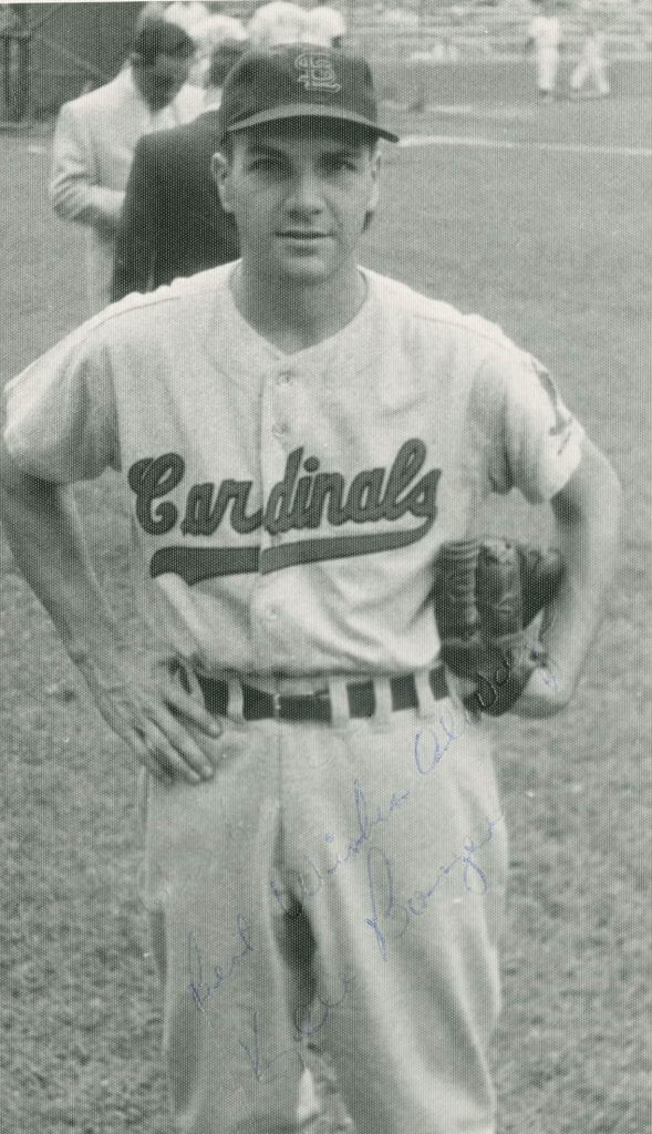
A good example of a gone-too-soon uniform, the one year the Redbirds forsook the birds-on-a-bat script (1956) took the additional step of trading belt tunnels for loops.
Diamondbacks:
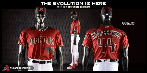
When Arizona put actual diamonds on the backs of the uniform in 2016, they gave the belt loops a tapered cut, resulting in the belt appearing in paralellogram shapes against the fabric.
Expos:
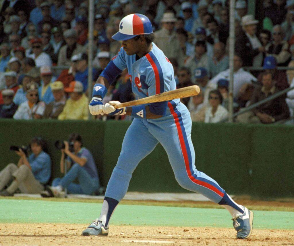
When they adopted the red+blue stripe describing the players’ outline (the racing stripes) in 1978, the stripe went over the tunnels so it would be continuous.
Indians:
Between 1989 and 1993, Cleveland used the racing-stripe motif which spanned the tunnels.
Mets:
When the Mets wore the racing stripe, it spanned the belt tunnel. You really notice the gap when it’s there; it stands out like Alfred E. Neuman’s smile. Keith Hernandez spoke of the importance of suiting up, and how time spent getting the stripes to line up was well-used.
Orioles:
Adopting a new uniform in the 1990s, once they dropped their Sansabelts, they went with Detroit-style belt loops. Frank Robinson pointed out that he had to tutor his young players to thread their belts through every loop. In case you haven’t checked, baseball pants have nearly twice the number of loops as a pair of Levis!
Phillies:
Philadelphia is the team responsible for inventing the player-circumscribing stripe in 1970. Some time after the fabric changed from flannel to polyester, they corrected the belt-tunnel gap in 1981.
Pilots:
This really surprised me, and I only noticed after watching a Mariners’ game with Pilots’ uniforms. Home uniforms used loops, road blues used tunnels. We were denied the possibility of seeing the fancy belt decorations that purportedly wound up being edited out of their 1969 uniforms. This is the team that became the Milwaukee Brewers, using carryover Seattle uniforms in 1970 an ’71. Milwaukee is responsible for more than its share of entries on this peculiar list.
Rangers:
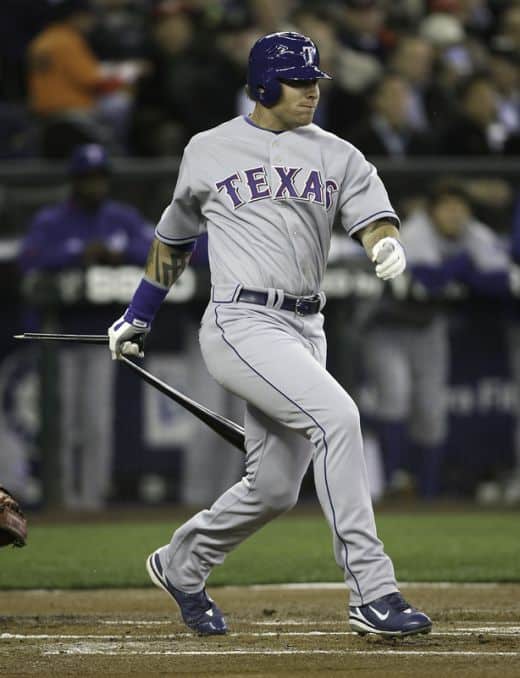
Around the time Texas began experimenting with sleeveless jerseys, the Rangers wore blue soutache on their belt tunnels, a la the Braves.
Reds:

When Cincinnati dropped the pinstripes in the ’60s, they became a loop team, and would remain so until the Big Red Machine years.
Royals:
The year the Royals discontinued the pastel blue road uniforms, they adopted a home uniform where the middy trim curled over the top of the trousers, a small detail I picked up on. Ordinarily, the belt tunnel overlaps this piece of trim, resulting in a stripe which abruptly disappears a few inches from the player’s waist. I reached the conclusion it’s a cost issue, since the unfinished look is far prevalent. In any case, this design was superceded by one using loops, which has the added benefit of exposing the soutache trim.
Tigers:
For as long as anyone can remember, the home uniforms have sported belt loops. The road unis went Sansabelt when orange was introduced as an accent color, but brought the loops back one year before the Bengals began experimenting with racing stripes. Features once in wide usage which end up being retained by one team can be considered that team’s intellectual property: McAuliffe Numerals > Boston Red Sox, Football helmet with no logo > Cleveland Browns, Belt loops > Tigers. When MLB began placing Jerry Dior’s logo on the trousers, Detroit used a single belt tunnel to create space.
White Sox:
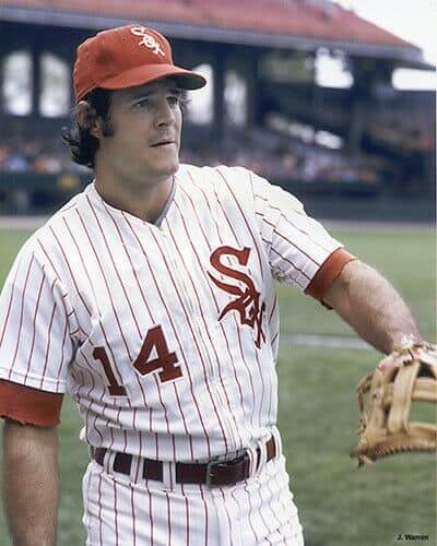
The South Siders were dependable loop-users from 1959 through 1975. When the belted pants returned in 1987, they had tunnels, which have remained ever since.
In 2019, players began to get creative with their belting, resulting in a two-tone appearance and player numbers stitched into the leather. The other day, Yoenis Cespedes wore a sparkly gold one. It reinforces the custom that belts, shoes, stirrups and stockings are now looked upon as accessories, rather than uniforms. To some, it’s a bug, to others, a feature.
Thanks, Walter! I’m sure none of us (ok, most of us) never gave as much thought and attention to the many different belt loop styles out there. Great piece and excellent observations.
Texas A&M Unveils New Uniform
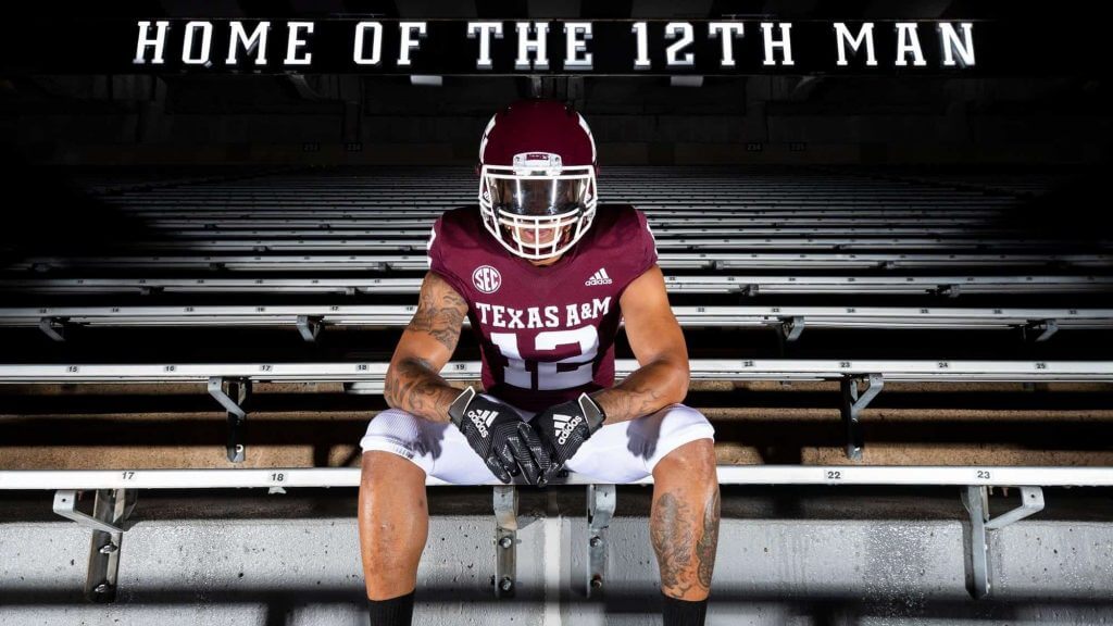
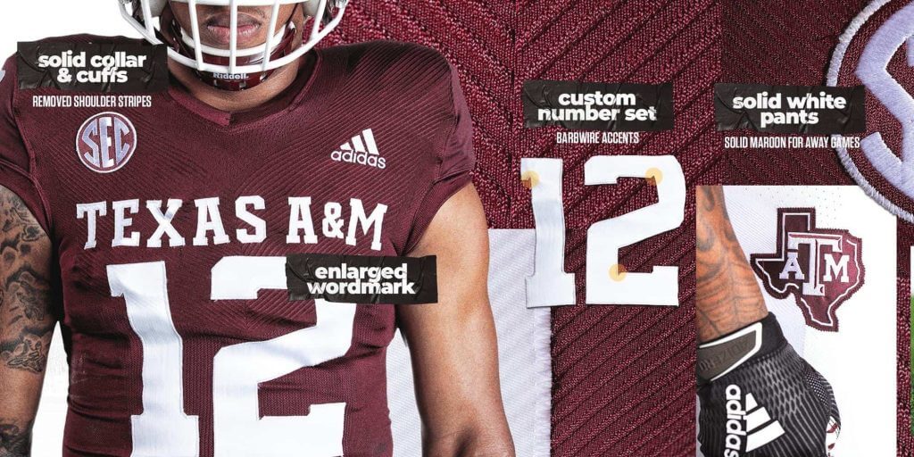
The Texas A&M Aggies unveiled a new uniform yesterday, which is essentially a throwback to the uniform the team wore in the 1980s and 1990s. It’s a great look, and even though it’s a throwback, it’s also addition by subtraction, as the shoulder stripes and bevel-shaded numbers are now gone, and the jersey returns to the much cleaner look from a couple decades ago. And what’s returning is the classic Texas A&M wordmark across the chest. They also added a pair of maroon pants (and removed the maroon stripe from the white pants).
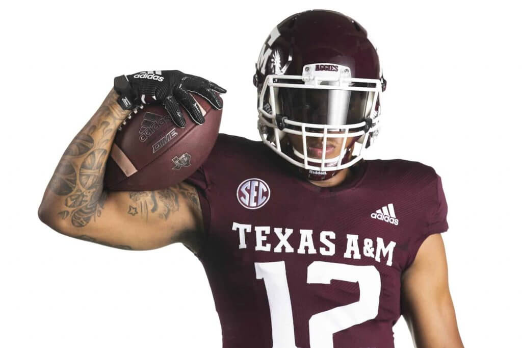
The team also released a new white jersey. According to the team, “The traditional maroon home jersey is rounded out with a solid maroon collar and arm cuff while the white away jersey features the reverse appearance with a solid white collar and cuffs. The look will be completed with the return of the solid white pants at home and an option for maroon pants on the road, keeping the Lone Star A&M logo on the hip.”
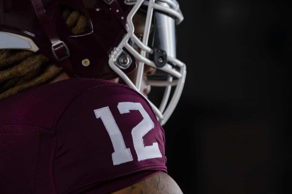
Here’s a closer look at the shoulder number detail:
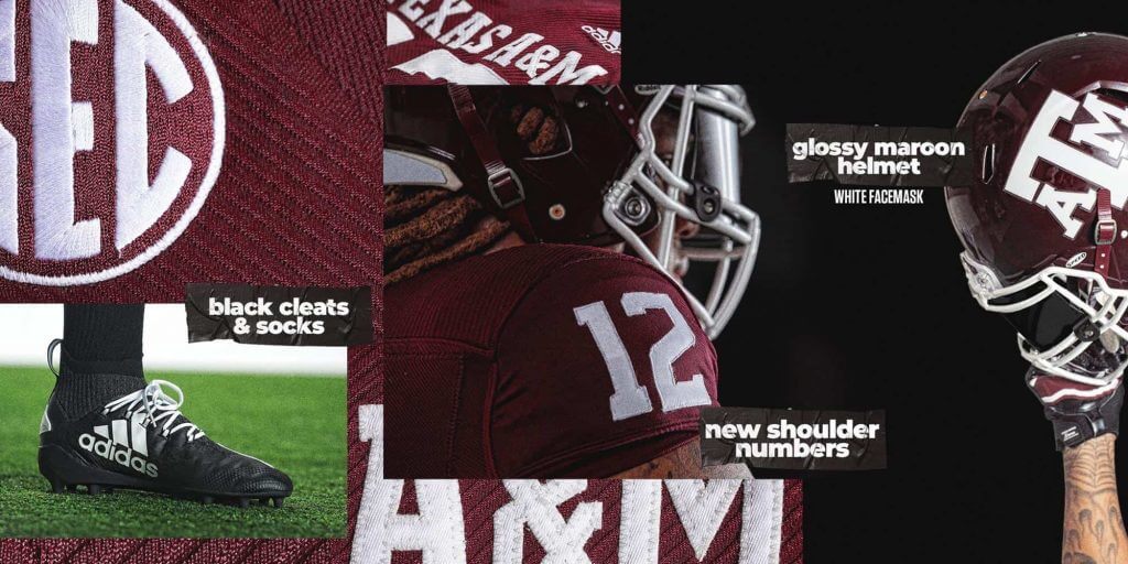
The team has also returned to a solid maroon helmet with a white facemask and solid white A&M logo on each side:
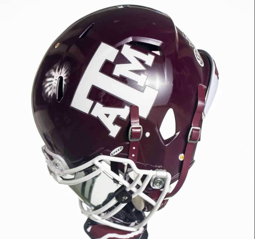
According to the team, “the updated helmet shell features a solid deep maroon paint reminiscent of the non-metallic painted helmets of the late 60s, early 70s and mid 80s.”
You can get a better feel for some of the details with these nifty graphics:
You can get a better sense of the uniform with the hype video(s):
@adidasFballUS | #GigEm pic.twitter.com/zwwT0GXd3S
— Texas A&M Football (@AggieFootball) August 12, 2020
Player approved ✅#GigEm pic.twitter.com/fiNSNEpogk
— Texas A&M Football (@AggieFootball) August 12, 2020
As most of you know, I (usually) enjoy “classic” or “traditional” uniforms, and these fit the bill quite nicely. I didn’t hate the old unis, but removing the number bevel is a huge plus. I didn’t mind the shoulder stripes, but I prefer the solid look, so that’s a win too.
Good job a&m! Now…let’s see if the SEC actually plays football this fall (already the B1G and PAC-12 have canceled their seasons, leaving just the SEC, ACC and Big 12 among the Power 5; other conferences and schools have also canceled their seasons). Whenever these are worn, the Aggies are going to look good on the gridiron!

Guess The Game…
from the scoreboard
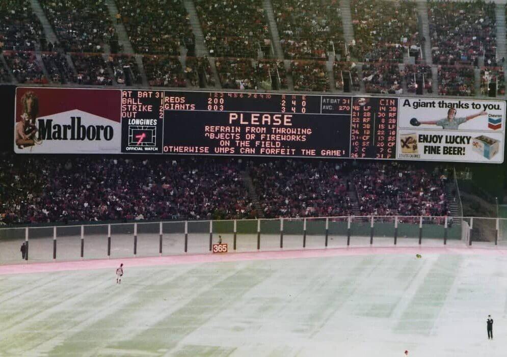
Today’s scoreboard comes from Cherry Garcia.
The premise of the game (GTGFTS) is simple: I’ll post a scoreboard and you guys simply identify the game depicted. In the past, I don’t know if I’ve ever completely stumped you (some are easier than others).
Here’s the Scoreboard. In the comments below, try to identify the game (date & location, as well as final score). If anything noteworthy occurred during the game, please add that in (and if you were AT the game, well bonus points for you!):
Please continue sending these in! You’re welcome to send me any scoreboard photos (with answers please), and I’ll keep running them.
And now a few words from Paul
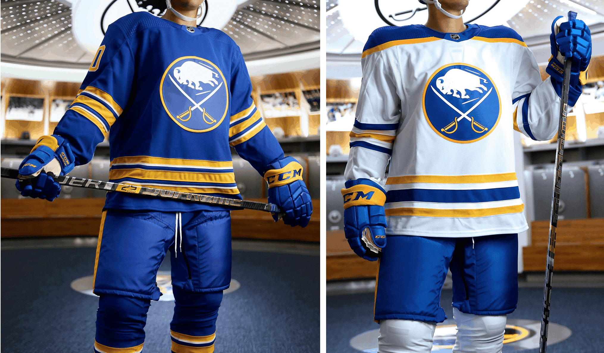
Hello! Phil had excellent coverage yesterday of the Sabres’ new uniforms, but a few people got in touch to ask what I think of the new set.
So: I love it. I mean, seriously, what’s not to like? The real question is what took so long. Think of all the design nonsense this team’s uniforms have been saddled with over the past quarter-century: the giant buffalo’s head with the silly side panels, the third jersey embarrassment, the slug, the idiotic front numbers, and on and on. And now, after all that crap, they’ve tacitly acknowledged what anyone with half a brain knew all along: They already had a perfectly good uniform to begin with, so they’re going back to it. It’s not that hard, people: If it ain’t broke, don’t fix it.
Meanwhile:
• Thanks to everyone who checked out yesterday’s Zoom panel discussion about the use of Native American imagery in sports. I saw lots of Uni Watch readers’ names on the list of people logging in, and a few people followed up with me afterward with some good feedback. The event was recorded, so the video should be posted soon — I’ll provide the link for that once it’s available.
• I don’t know why the hell I never did this before, but now — finally — there’s a basic winged stirrup tee available in the Uni Watch Shop. At present it’s only in grey, but if you want another color (and/or if you want it as a tank top, a V-neck tee, a women’s tee, a kids’ tee, etc., shoot me a note and I’ll hook you up).
That’s enough for today. Let’s have a standing O for the great job Phil’s been doing this week!
The Ticker
By Paul (pinch-Tickering today for Alex Hider)

Working Class Wannabes™: A high school football coach in Michigan describes his preseason practices like so: “We’ve got blue-collar guys who go to work every day.” … A college baseball player at the University of Texas–Rio Grande Valley says he and a high school teammate “talked about the blue-collar mentality” when deciding which colleges to attend. … An article about the NHL’s recent Lightning/Blue Jackets six-hour marathon game says, “If Columbus is supposed to be the epitome of the NHL’s blue-collar ethos, then the Lightning were working-class heroes.” … Sticking with the NHL, an article about the Maple Leafs says, “On a roster filled with high-paid superstars, they could have used a blue-collar player like” former Leafs captain Nick Foligno.

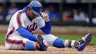
Baseball News: Phillies OF Andrew McCutchen has been giving foul balls to fan cutouts, which is more entertaining than it sounds (from Mike Chamernik). … ESPN’s graphic promoting the McGwire/Sosa 30 for 30 installment had blatant uni errors, including an incorrect NOB style for McGwire and the wrong squatchee color for Sosa (from Steven Dodell). … What do you get if you remove the first and last letters of the Pirates’ wordmark? This pin (from @DieZombieScum). … Here’s something I don’t think I’ve ever seen before: an ump wearing eye black! That’s from a 1982 game in Japan (from Dustin Meador). … Today is the 25th anniversary of Mickey Mantle’s death, so The New York Post ran an article about that — with an accompanying photo of Mantle wearing No. 6, instead of his more familiar No. 7. Very odd choice (from @1NepC).

NFL News: As usual, the Packers used blank jerseys — no numbers or NOBs — for Photo Day (from Garrett Van Auken). … Good photo of former Browns RB Earnest Byner wearing goggles, and also wearing the team’s one-season 1984 uniform (from Brian Klein).

Hockey News: Not exactly a surprise, but Senators exec Anthony Leblanc says the team will release new uniforms in the coming months (from Matthew Barlow). … Bruins studio host Dale Arnold wore binder clips on the back of his suit jacket yesterday, apparently to make it look trimmer or less billowy (from Justin Hicks). … The remaining teams in the NHL postseason have added an “Stanley Cup Playoffs” helmet decal (from Wade Heidt).

Basketball News: New uniforms for the Ryukyu Golden Kings of the B.League, Japan’s top basketball league (from Kary Klismet).
.

Soccer News: Manchester United’s new away shirt has apparently leaked (from Charles George). … New away shirt for English side Nottingham Forest (thanks to all who shared). … New away shirt for Serbian side Red Star Brigade (from Ed Zelaski). … A bunch of old U.S. Soccer jerseys are being turned into masks (from Jordan Cutler). … New home shirt for fourth-tier English side Exeter City (from Ed Zelaski). … Also from Ed: Three new shirts for Italian side Sampdoria. … It appears that Austrian club SCR Altach actually has a betting company ad as part of its crest (from Josh Eernisse). … New logo for Hyderabad FC of the Indian Super League (from Kary Klismet). … The new St. Louis MLS franchise’s team name and logos will be revealed today at noon Eastern (from Jacob Bischoff).

Grab Bag: New logo for Rugby ATL of Major League Rugby, the top-level U.S. rugby circuit (from Kary Klismet). … Big events, few fans: The Masters, postponed to November, will be held without guests or spectators, and the Kentucky Derby, rescheduled for next month, will allow only a small fraction of its fan capacity. … New 125th-anniversary logo for the Essex County (N.J.) Parks & Recreation Dept. (from John Cerone). … Bubba Wallace, the Black driver who helped convince NASCAR to ban the Confederate battle flag, has inked a new deal with Columbia Sportswear. … A Florida sheriff has ordered his deputies and staff not to wear masks while on duty (from Timmy Donahue). … “One of the most prominent places the new UVa logos have appeared is on the field hockey team’s new practice jerseys,” says our own Jamie Rathjen. … With the rescheduled Indy 500 coming up on Aug. 23, here’s a spotter’s guide (from Tim Dunn). … Simon Fraser University — the only non-American school in the NCAA — will no longer call its teams the Clan (from Wade Heidt). … Biker shorts — which I have never worn despite being a daily cyclist for well over 20 years now — are having a moment as fashion apparel (NYT).
And finally… Big thanks to Walter for that deep dive into MLB belt loops — great stuff!
Everyone have a good day and I’ll be back on tomorrow to round out the week. Everyone be safe!
Peace,
PH
What’s the difference between “middy” and “soutache” trim?
GTGFTS: June 20, 1978, when the Reds won 6-3 to move within a game of the first-place Giants in front of 55,920 fans.
Nicely done. Curious how you figured this one out. There wasn’t an out of town board or anything in the advertising boards that would narrow this down. There was such a long timespan when they had AstroTurf at the Stick and the Reds were playing there 9x every year
When I saw the Reds’ lineup with Driessen at 1B and Rose at 3B, that immediately narrowed it down to 1977-78. Then Don Werner at C spelling Bench makes it 1978. Unlike BurghFan I stopped there but the Reds’ lineup really narrowed it down.
The Reds’ lineup really narrows it down. Driessen and Rose at 1B and 3B means it’s 1977 or 1978. Don Werner catching makes it ’78. Unlike BurghFan I stopped there but the year is easy if you are (or were, in my case) a Reds’ fan.
I was a little slower than BurghFan, but also noticed from the box score that George Foster hit for the cycle.
From the boxscore – it appears that George Foter was a single short of teh cycle.
link
Since you asked: It was clearly late ’70s from the lineup, and No. 26 for the Giants was John (the Count) Montefusco. So it was a matter of looking at his home starts vs. the Reds that could have been 3-2 in the third.
Thanks
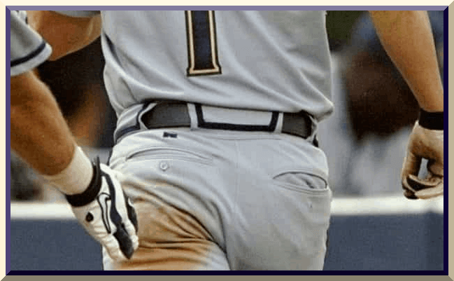
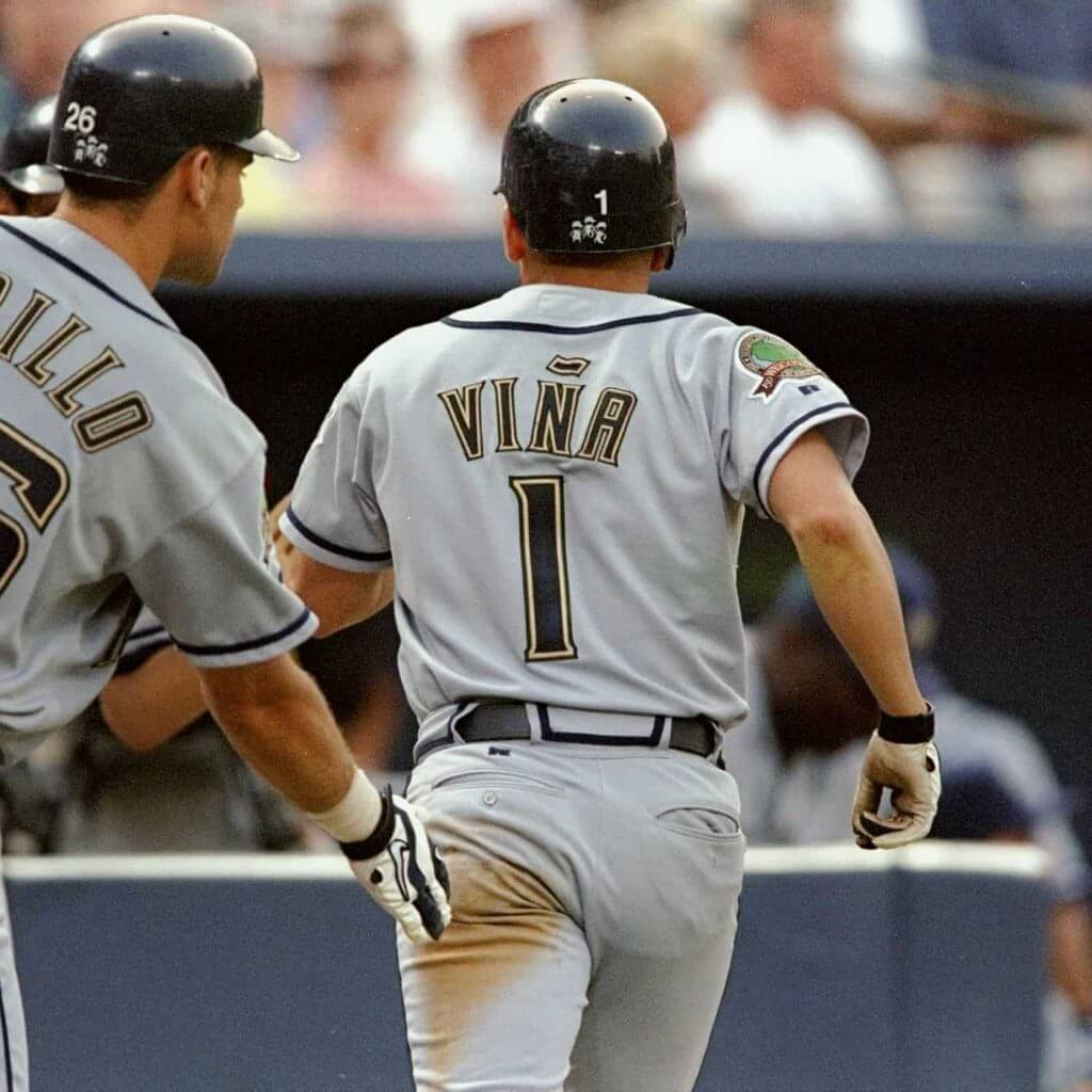
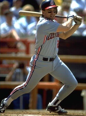
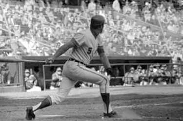
“Middy” material is (usually) fat and matte-finished. The picture of Fernando Vina is an excellent example of middy fabric. Soutache has a more elegant, shimmery quality and is rather thin. A recent trip to Dick’s Sporting Goods revealed that off-the-rack baseball pants use middy piping instead of soutache, so I’d guess soutache is also more costly.
I don’t think soutache is necessarily shimmery, is it? Baseball uniform piping isn’t necessarily shimmery.
A 1979 Red Sox replica home jersey I bought at Twins Enterprises had especially shiny soutache, which I’ve come to think has a cleft running down the center, and thread angling out from the cleft in a herringbone pattern. But almost by definition I think of soutache being one-color, so the trim on the Braves’ (for example) uniform has to be middy, shiny or not. Then again, I’m not really an expert on fabrics or trim.
A check of my closet showed my 1989 Mariners’ jersey indeed had thin middy trim, perhaps showing that genuine soutache material is considered too spendy for jerseys of recent vintage.
Thanks.
It appears that Austrian club SCR Altach actually has a betting company ad as part of its crest
They have an ad in their name, so that’s what that is, but you’ll still commonly see “SCR Altach” or “Rheindorf Altach.”
Also, in the item about Red Star, “Belgrade” is meant (the city).
Dale Arnold has recently lost weight, and his suit coat is probably now too big. That’s most likely why he was using the binder clips.
Lost in Translation
Even without any weight loss, link to streamline clothing with clips. Women and link.
The thing is with the goat head and the slug the Sabres were really trying to be modern so when they changed to the set they just replaced they still wanted a modern touch to the classic uniforms hence the navy, silver and front numbers (And this was still around the time when so many royal blue teams were now navy). And people loved them at the time since the buffaslug was a disaster.
Deeming those 1956 Cardinals jerseys as “A good example of a gone-too-soon uniform” could be the case among disinterested baseball fans. Among Cardinals fans, they are more likely to be deemed “a good example of a gone-not-soon-enough uniform.” We are devoted to our birds-on-the-bat donchaknow.
I would have felt blessed to put those uniforms on my own team, if I had one. The 1956 “Cardinals” script is one of the most elegant ever to grace a jersey. Too bad it suffers in comparison to the traditional birds on the bat.
The script is indeed beautiful.
It suffers in comparison to some of the past birds-on-bat, but it’s much better than the clunky birds-on-bat they wear today.
I don’t believe the 1995 Brewers had midi stripes on their belt tunnels – I think they just had double belt loops in the front.
You are correct.
From 1994 through 1996, the Brewers had link. The belt tunnel detailing came as part of the tweaks in 1997, with the move to soutache.
For authority, I checked Bill Henderson’s Jersey Guide (I know, I know: No pants in the jersey guide) and the belt-looped Milwaukee uniforms actually started in 1994. He says soutache was used on the shirts so by extrapolation it was probably on the pants, too.
The Brewers first adopted belt loops in 1990. But since they wore pinstripes, link. The road pants, however, had link (blue always facing front), starting at the cuff and ending at the belt loop.
In 1994, the Brewers dropped their pins in favor of piping, and the pants got a thin stripe from cuff to waist (link at home, link on the road), going under the belt. No big side loops.
In 1997, the Brewers tweaked their uniforms to replace the thin trim with thick blue trim on both link and link, including outlining the wide belt loops.
The Brewers changed again in 2000. They kept the wide belt loops but replaced the thick blue trim with link that link.
When the Brewers added an alternate jersey in 2016 trimmed in athletic gold rather than metallic gold, the golds clashed so the club link pant stripes link rather than create an alternate pant to match. AAARGH.
Which, of course, brings us to 2020. The Brewers link, where the pants all march in unison (straight up the side, stopping at the wide loops) but none of the jerseys have matching stripes.
Thanks for clarifying this. I had not known that the Brewers had worn tunnel trim with that uniform set. Another point in favor of that as one of the most under-rated uniforms in MLB history.
I’ve posted a deep dive on the various Brewers’ pant stripe treatments, but it’s stuck in moderation.
Sorry Chance — freed now. Was on the road for most of the afternoon.
No worries, Phil – didn’t mean to complain, just really excited to join the conversation! Thanks again.
Absolutely!
One more reason to pine for those’97-’99 Brewers uniforms…Gone Too Soon.
I have to admit I’m very curious to see the St. Louis MLS branding unveiled. In the past St. Louis clubs have used the statue of St. Louis in the crest (St. Louis Athletica, Scott Gallagher). While many look to this statue with pride, it has also been questioned during the BLM movement, pointing to questionable legacy of Louis IX of France. As you can imagine it’s a touchy subject, one I would think this team’s ownership and the MLS would prefer to avoid.
The new St. Louis MLS franchise’s team name and logos will be revealed today
I’d love to see them Bring Back The Steamers, and I’d love love love to see them be called the Archers, but my money’s on either FC or United.
I can’t separate the Steamers from the old Checkerdome/Arena when that was the hottest ticket in town around 1980. Don Ebert, Carl Rose, Tony Glavin, and Slobo Ilijevski. Not sure how well it would translate to the outdoor game.
Archers is too on the nose. Not a fan.
As well, St Louis FC is already a team. They wear navy and green. And please not another United in the league.
I’d almost prefer they go with “Soccer Club” in the name. I;m indifferent about a nickname. Let that informally bubble up like Loons for Minnesota United.
It’s link. Barf. The crest spells it “St Louis,” though.
St Louis City SC? SLCSC?
The name and the crest/logo seem pretty boring, unimaginative, disappointing. I can see the arch reference in the crest, but at the same time it seems so generic.
Using City in the name is odd to me, given the fracture between St Louis (city) and St Louis (county) that has gone on for way over 100 years. Google “The Great Divorce” for info on that.
It would almost be better if they did use the worn out “United.” In this instance, it would have significance to the metropolitan region.
Oh well. It’s MLS, so look for a rebrand in about five years.
Don’t know why you’d think that.
MLS has only had four teams change their name, and none in the past decade.
Not to mention that three out of the four were shedding the terrible Nikefied names they were saddled with at the league’s debut.
Chance, are you counting Kansas City twice? :)
KC Wiz, KC Wizards, Sporting KC.
I think Tom’s point was that there isn’t much history or tradition tied to MLS franchises, so we’ve seen franchises fold up (Fusion, Mutiny) completely update their name branding (Burn, Metrostars, Wizards, Clash, Chivas) or update their crest (Chicago, Columbus, among others) frequently.
No, I was counting Dallas (formerly Burn), San Jose (formerly Clash), the MetroStars (twice, kinda), and KC (as you note, twice).
The point is that MLS clubs have been fairly stable ever since the first few years, and most of the major changes since then have been fixing those early errors.
Originally I was going to post a poll with the guesses FC, United, SC and City, but I didn’t want to come across as too snarky. After this news, apparently that’s the same poll MLS uses with their focus groups…
MLS is really in a no-win situation with team naming. For me, the current ways are fine, although derivative, while the original use of more conventional American team naming also made the league seem minor league in comparison to other world leagues. I don’t have a clue of how they *should* do it, just pointing out the lose-lose position the league is in with this stuff
The pink-ish hue is clearly a nod to the WAP of the owner.
The pinstripe on each belt loop on those Phillies trousers is and outstanding detail.
*White Sox. Duh. Not enough coffee this morning.
What do you get if you remove the first and last letters of the Pirates’ wordmark? This pin
Love the “irate” pin. I recall a short-lived fad around NYC in the 1980s where punks wore Rangers hockey sweaters with the first and last letter roughly torn off.
Every NY hockey fan knows you get a surprise message when you lop the ends off of all three teams: Anger, Slander, and Evil. Believe it or not, apart from the Pittsburgh “Irate”, I’ve never killed a rainy afternoon by doing this to every team. All I’ve got is “Ed” for Reds, and I admit that is weak sauce.
Too bad the new Seattle hockey team can’t hit homers, because you’d get the Rake.
Meanwhile and still in the NHL, I’m a Habs fan (our team is probably the worst playoff team anybody has ever seen) so I won’t throw stones from my glass house, but the Calgary Lame makes me giggle. (Their logo would probably be a C with a brown side, and a trail of blow-out birthday candle smoke following it.)
Milwaukee has UCK, Minneapolis has WIN, and Oakland’s baseball team has no name at all when you trip the first and last letter. Maybe just an apostrophe, if we’re feeling generous.
Minnesota is the only one I know of that actually link, though. Easy with that word, I guess.
If you remove the first and last letters of St Louis’ new MLS franchise, you get “it”…
In the early 2000’s I remember seeing quite a few fans at PNC Park wearing DIY t-shirts that read(IIRC): ‘Irate Fan, Rebuilding Since 1992.
Anything is better than the “ill” shirts styled in Phillies’ script I encounter.
Good job TAMU. Now just get rid of the remaining beveling and you’re back to perfection. As I said when the Kraken stuff came out, beveling just does not work on most unis and the trend is away from it, not more of it.
Can I ask a question that may offend Sabres fans? Is the buffalo in the logo dead? It looks like it’s laying down dead. If it were rotated a couple of degrees clock-wise I think my eye would register that he is running, but as it is, I can’t not see him as dead.
I’ve always seen him as charging, head down.
That makes sense. I see that posture when I look at the Buffalo Bills, back legs straight. But the way the Sabres’ buff has the legs curving back. Maybe it’s mid-jump. Thanks for replying!
In the blue collar section of the ticker … Nick Foligno is the captain of the Blue Jackets (not a former Maple Leafs captain).
The Expos adopted racing stripes in 1980, not 1978.
You are right, sir. An oversight on my part. And the 1979 blues had AMAZING lettering.
Re: Indy 500 spotter’s guide…
I don’t follow IndyCar closely, but I recognize some of the car number fonts from NASCAR.
The Rick Ware Racing #51 entry team is using the same style that they use on one of their Cup cars, and the #88 pays tribute to Dale Earnhardt Jr. by borrowing ‘his’ font (team owner Mike Harding is a big Junior fan).
Does anyone know the connection/reason why Sage Karem’s ride employs a #24 which seems to the same design most fans associate with Jeff Gordon/Hendrick Motorsports?
Scoreboard is from June 20, 1978. Cincinnati Reds vs. San Francisco Giants at Candlestick Park. Reds won 6-3. I may have been at that game, as I recall seeing the Reds play the Giants that season a couple times. I don’t recall anything remarkable.