
Click to enlarge
[Editor’s Note: Good morning! Today we have a guest entry from Miles Crowther, who’s going to tell us about a new uni-centric book he recently acquired. Enjoy. — PL]
By Miles Crowther
Over the past few months I’ve become increasingly interested in Japanese baseball and started keeping an eye on the Nippon Professional Baseball league. I’ve leaned heavily on the r/NPB subreddit and its corresponding Twitter account as a resource to break in as a new fan.
I’ve always loved baseball hats, especially the National League’s 1976 pillbox caps, so one of the subreddit’s tweets particularly caught my eye:
A look at the hats worn by each team during the 1979 NPB All Star games https://t.co/GjiD1DUTaM #npb
— NPB on reddit (@NPB_Reddit) June 28, 2020
The tweet included a link to a Yahoo Japan article. After using Google Translate and following some subsequent links, I arrived at an Amazon Japan listing for a book touted as a Japanese “Baseball Cap Encyclopedia,” which was published in early June. It seemed like a really cool insight into the visual history of Japanese baseball, so I knew I had to get it.
The book starts with a few pages of notable Major League Baseball caps. The first example is a personal favorite, the Pittsburgh Pirates pillbox from the 1970s:

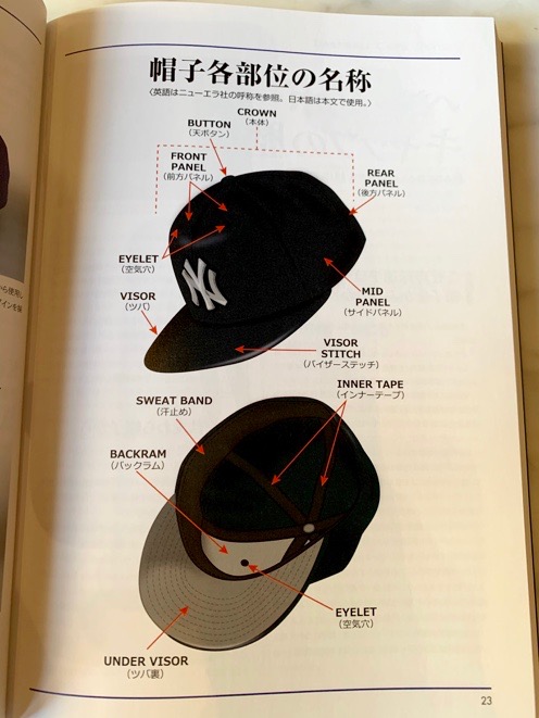
There’s is a diagram that serves as a sort of “anatomy of a baseball hat.” The authors apparently don’t know about the term “squatchee,” or maybe it just hasn’t caught on in Japan:
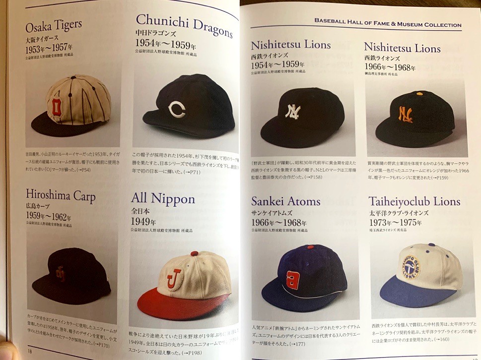
There are a few pages with photographs of historic Japanese hats, all of which are classic and beautiful. Even if you don’t read Japanese (I can’t read it myself), the images alone make the book worthwhile:

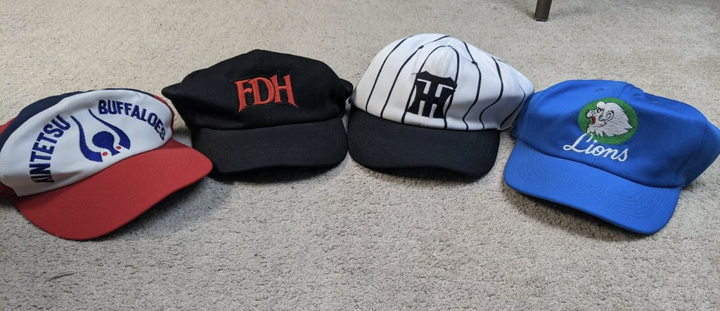
As someone who ranks the Expos’ pinwheel hat among the top five in MLB history, I particularly like the Kintetsu Buffaloes hat shown here, with its quirky five-panel construction and abstract buffalo logo:

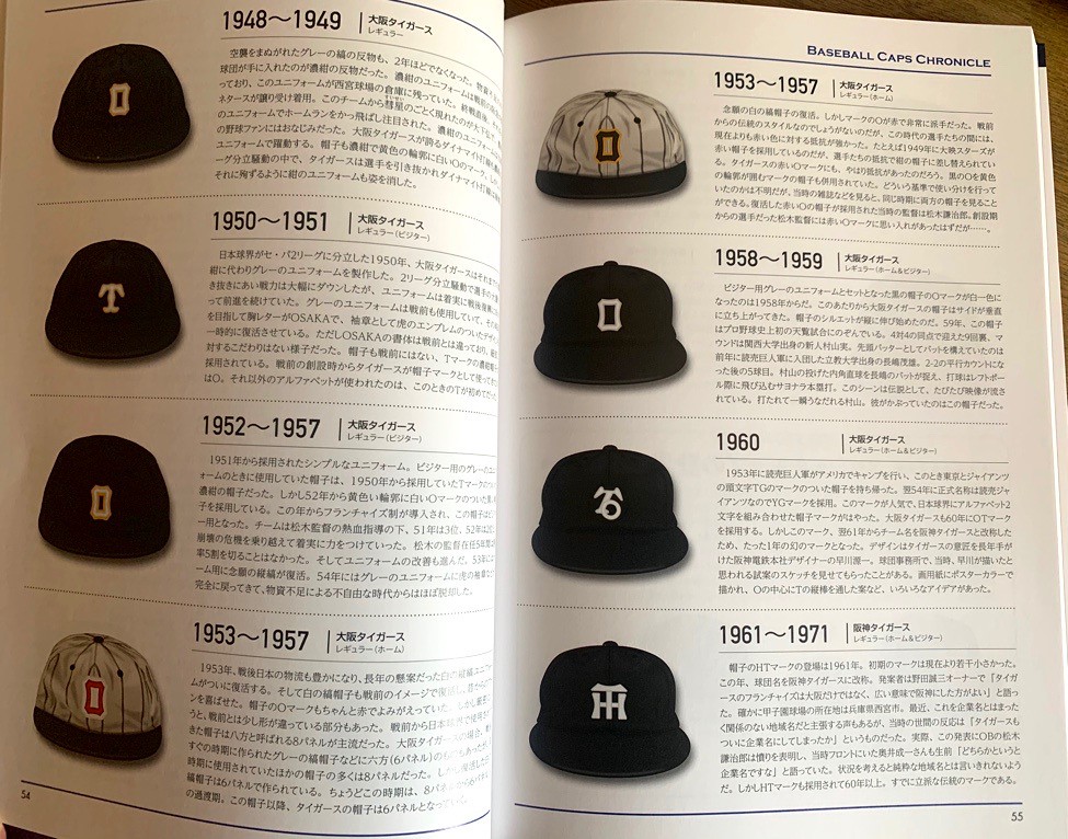
The book then presents a series of team-by-team cap chronicles, showing every hat worn by all 12 active NPB teams, a few defunct teams, a handful of examples of farm league teams, and the national team. I really like how the illustrator depicted the physical style of the caps evolving over the years, making sure it was evident that the crown and brims shifted as materials and aesthetics changed.
One interesting aspect of the league is that NPB teams are owned by companies, and the company ownership is part of the team identities. A team like the Hanshin Tigers play in Osaka and are owned by the Hanshin Electric Railway Co. They used an “O” on their cap for a period in the early decades of the league, but now have one of the most iconic logos in NPB, an “HT,” signifying Hanshin Tigers:
Another example of this is the Tokyo Yakult Swallows and their “YS” logo:

There are a few pages dedicated to the All-Star hats (which is what brought this book into my life in the first place, thanks to that tweet I referenced earlier), and man are they beautiful! A treasure trove of late-’70s goodness:

There’s a section dedicated to various hat manufacturers, like New Era, American Needle, Starter, ’47 Brand, and Ebbets Field Flannels. There’s also a cool step-by-step graphic showing how a New Era hat is manufactured.
The book’s illustrator is Masataka Iwai, and the book concludes with a a few pages showing his collection of American minor league caps. He owns a bar in Osaka called Ballpark Bar, which I will absolutely make a point of checking out if I’m ever able to visit Japan.
So even if you can’t read Japanese, this book is still a valuable addition to any collection of visual histories of sports uniforms. If you want to order a copy, it’s available here.
———
Paul here. Big thanks to Miles for sharing this with us. And here’s a nice coda: Shortly after he wrote this piece, he managed to score some vintage NPB caps on eBay, including the Kintetsu Buffaloes design that he liked so much:
Good thing Earl Weaver isn’t around to see this: In a classic sign of the times, Pirates manager Derek Shelton and plate umpire Jordan Baker engaged in a masked, socially distanced argument yesterday.
Coming soon: Batter socially distantly charges the mound after being plunked.
Guaranteed to raise a smile: The great illustrator/collagist Stephen Kroninger posted this on Facebook yesterday. I’m just gonna leave it here. Enjoy.
Click to slightly enlarge
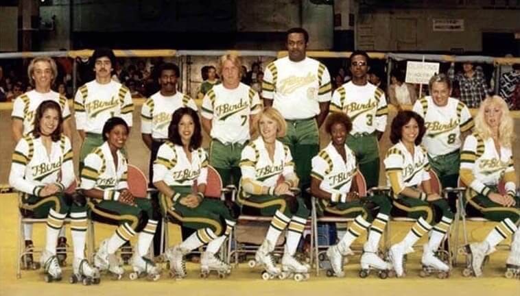
Too good for the Ticker: Oh baby, it doesn’t get much better than this team portrait for the 1980 Los Angeles T-Birds, an old roller derby squad. The colors, the shoulder inserts, the white jersey over the green pants, the striped socks — a visual feast!
You can see more of the T-Birds’ team photos from throughout the 1980s here.
(Big thanks to Dennis Alpert for this one.)
ITEM! Uni Watch key rings now available: As many of you know, I’ve always been fascinated by key rings (I even have a whole side project about them), so I’m excited to offer these Uni Watch key rings, featuring our winged stirrup logo rendered in sturdy, flexible PVC rubber (see video above).
One very cool detail that’s hard to make out in the video is that the graphics are 3D. Green is the base color, and then the white and yellow portions are raised, as you can see in this photo (photo from our own Brinke Guthrie; click to enlarge):
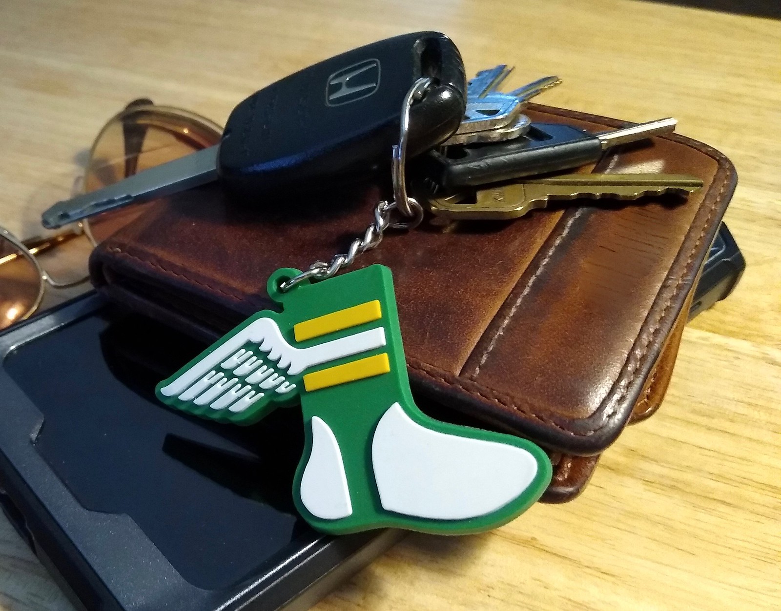
Cool, right? I’m reeeaally happy with the way this item turned out!
Each key tag measures 2.25″ long by 2.25″ wide and features a short chain that leads to a 1″-diameter split ring. Each one comes sealed in its own plastic pouch.
Want one? Here’s what you need to know:
1. The price is $7.99 apiece. Limited supply, so no more than three per customer. Shipping in a secure bubble mailer is $5.
2. Tally up the total for your purchase and then send me the proper amount via Venmo (use @Paul-Lukas-2 as the payee), Zelle (plukas64@gmail.com), or Google Pay (plukas64@gmail.com). If you’d rather use Apple Pay or a paper check, contact me and I’ll give you the info you need. Sorry, no PayPal.
3. After sending payment, email me with your mailing address.
4. If you’re outside of the USA, contact me so I can calculate the shipping charge and arrange an alternate form of payment for you.
That’s it. Thanks!!
Click to enlarge
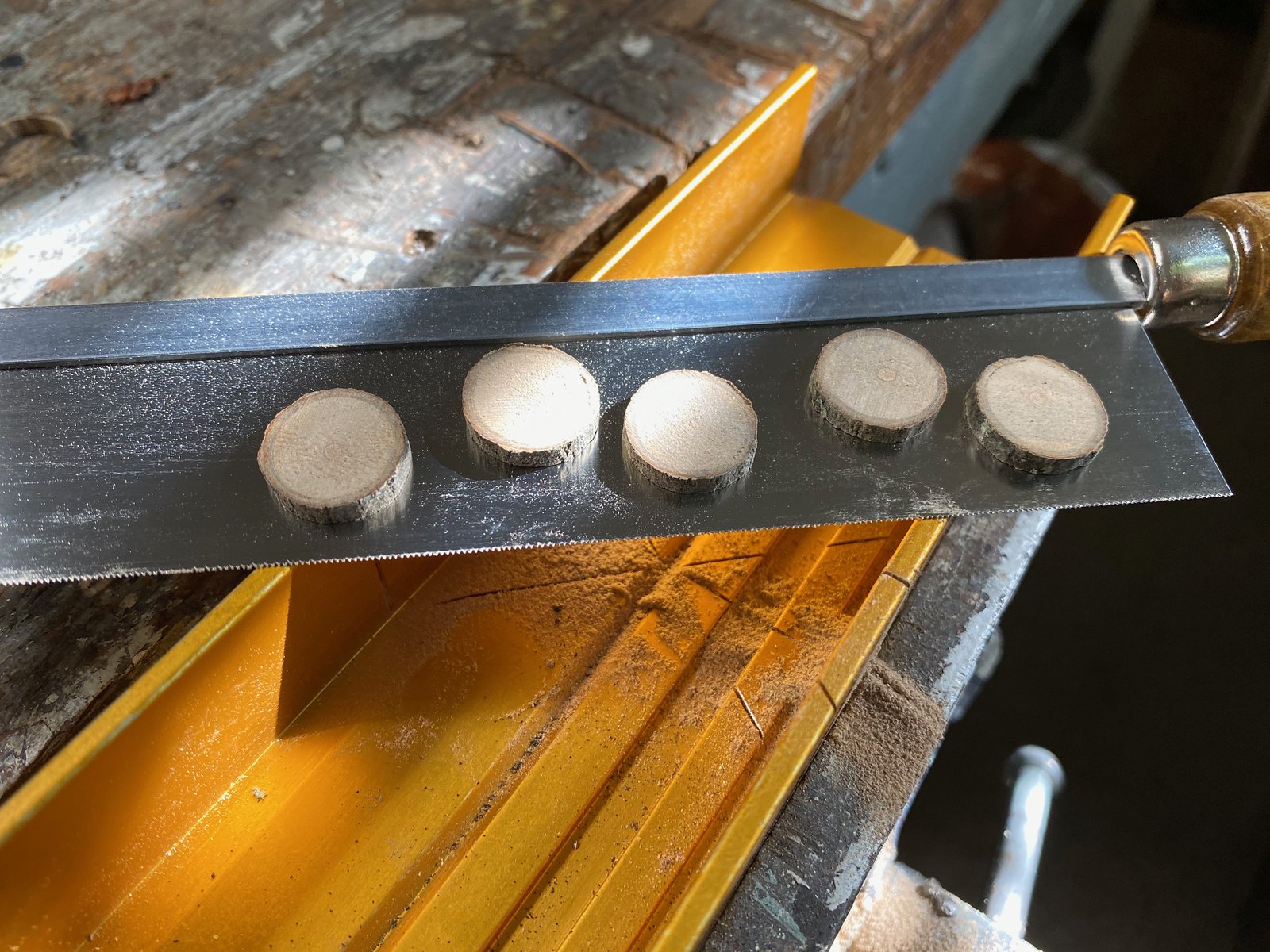
Brooklyn Branches update: As I mentioned a week or two ago, I recently sent pieces of Branch Rickety to DIYer Wafflebored, who’s going to use the wood to create buttons for a Brooklyn Branches jersey. What you see above are small branch slices that are destined to become buttons!
“The wood is very hard and dense, with no damage or rot — perfect for buttons,” says Wafflebored. “The branch must have been dead for a while, as the wood is not green. If the tree was a soft wood it would have been much more difficult.”
As you can see, there’s still bark on the wood! “I’m going to try to keep it on, but it seems to flake off and not be very stable,” says Wafflebored. “I will be applying liquid super-glue to penetrate and stabilize it. If that doesn’t work, the bark-free ones will still look really good.”
More updates to follow. When the jersey is done, we’ll auction it off, with the proceeds going to the Arbor Day Foundation. Stay tuned!

ITEM! New raffle: Reader Pedro Naranjo has generously donated $30 for a lucky Uni Watch reader to use for a membership card or any of our merchandise. If you want something that costs more than $30 (a cap, for example), the $30 prize will go toward your purchase and you’ll pay the remaining amount.
“If possible,” says Pedro, “I’d like the winner to be someone who’s been wanting to make a purchase but couldn’t for whatever reason.” So if you’ve been wanting to support Uni Watch but have resisted doing so because of finances or other reasons, this raffle is for you.
This will be a one-day raffle. To enter, send an email to the raffle address by 8pm Eastern tonight. No need to say what you’ll spend the $30 on — the winner and I can work that out later. I’ll announce the winner tomorrow. Big thanks to Pedro for this one!
The @UniWatch Pin Club just went next level. If this isn’t the coolest pin I’ve ever seen I can’t recall what would top it. #GetsIt pic.twitter.com/0Zt3NimlP3
— Brett Baker (@BrettSBaker) July 16, 2020
Bobble-pin update: As of this morning, there are 72 bobble-pins remaining from our numbered edition of 500. They’re available here while supplies last.
The August pin will have a soft launch on Twitter this weekend, with a more formal announcement next Monday, Aug. 3. This pin design doesn’t have any moving parts, but I think you’ll like it all the same.
Need to get caught up? Here are the January, February, March, May, and June pins (sorry, April is sold out), along with our basic winged stirrup pin.
And remember, if you order multiple pins and/or Uni Watch cufflinks and get hit with multiple shipping charges, give me a shout and I can get you a partial refund on the shipping.
My thanks, as always, for your consideration.
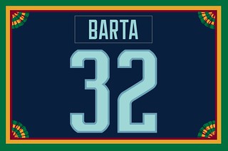
Membership update: The announcement of the Seattle Kraken’s name had barely taken place when we received our first Kraken-based membership card order, which came from Uni Watch reader Alan Barta. His design is one of several that have been added to membership card gallery.
A note to others who may be considering a Kraken card: At present, the only numerals we’ve seen in the team’s number font are 0, 2, and 3. So if you want a Kraken-based card, the uni number must be some combination of those numerals. (If anyone has seen the full number font, please let me know. Thanks.)
Ordering a membership card is a good way to support Uni Watch (which, frankly, could use your support these days). And remember, as a gesture of comm-uni-ty solidarity, the price of a membership has been reduced from $25 to $20 until further notice.
As always, you can sign up for your own custom-designed card here, you can see all the cards we’ve designed so far here (now more than 2,900 of them!), and you can see how we produce the cards here.

Theoretical menu: I don’t know about you, but the return of sports has made me hungry. If you feel the same, let me know.
The Ticker
By Jamie Rathjen

Baseball News: The Korea Baseball Organization’s Samsung Lions wore throwbacks yesterday (from Benjamin Dallman). … The Orioles wore black jerseys and their normal road caps for the second day in a row (from Andrew Cosentino). … The Mets used three different mound logos in three days. … The fake fans at Dodger Stadium left early on Saturday (thanks, Anthony). … The Rangers’ announcers wore team-themed powder blue blazers yesterday (from multiple readers). … Cleveland’s Plain Dealer ran a column yesterday supporting the retention of the “Indians” team name (from Bob Moon). … Interesting article about how MLB’s TV broadcasts are different this season, and how that could affect the TV production industry (NYT link). … Blue Jays rookie INF Santiago Espinal wore No. 72 in summer camp but was issued No. 5 when he made the final roster cut. It look a few games for his batting helmet to catch up with his uni number. … Some plate umpires are trying to prevent virus spread by wearing clear shields in the lower part of their masks. It’s similar to the shields we’ve seen being developed for football (from Jakob Fox).

Football News: Reader Ayden Pierce Maher is back with another connection between Belgrade businesses and American sports team logos: a meat market uses the Texans logo.

Hockey News: Oilers players all wore No. 12 during a team scrimmage on Saturday in memory of Colby Cave, who passed away in April after playing for both the Oilers and the AHL’s Bakersfield Condors this season (from Jakob Fox). … The NHL wrote an overview of the changes being made to the arenas in Edmonton and Toronto to accomodate the playoffs (from Wade Heidt). … The rinks also have a all-purpose center-ice logo featuring the Stanley Cup (from @VintageOilers and Moe Khan). … A Redditor made hockey jersey concepts for Formula One teams (from Douglas Lee). … During a radio interview, Kraken CEO Tod Leiweke revealed that he didn’t know what a kraken was when it was first suggested as the team’s name (from Tim Dunn).

Basketball News: It appeared that all WNBA players wore Breonna Taylor’s name below their NOBs as the league started its season this weekend. … Players also left the court before the national anthem, because it was felt to be a stronger statement than kneeling, then returned and stood silently with their backs — and Taylor-augmented NOBs — facing the TV cameras. … NBA numerologist Etienne Catalan tweeted some new uni number assignments for us. … The Canadian Elite Basketball League is holding a shortened season in St. Catharines, Ont., and the ball for the tournament is partially in the league colors of black and gold (from Wade Heidt). … NBA box scores will have a new notation when the season resumes: “NWT,” which stands for “not with team.” It will be used for players who are self-isolating due to the pandemic.

Soccer News: Premier League teams can wear a kit for next season in the last game of the current season and several did so, but the only team that did with a kit that hadn’t been revealed before yesterday was Brighton and Hove Albion (from Josh Hinton). … You can see more soccer items besides those listed here on Josh’s Twitter feed. … Wolverhampton Wanderers midfielder Diogo Jota was wearing a variation of the team’s shirt promoting their foundation yesterday, which seems like an oversight because those were worn two weeks ago (from Jakob Fox). … Next season’s Liverpool shirt was spotted in a store in Columbus (from Danny Kraft). … In Germany, there were new shirts for Eintracht Frankfurt (first) and Bayern Munich (second), and in the 2. Bundesliga, Greuther Fürth released two new shirts and a third/cup shirt (the latter from Ed Żelaski). … New second shirts for French team Nantes and English League Two team Northampton Town. … Scottish League One teams Clyde and Cove Rangers released first shirts, but Cove said their shirt’s intended design was delayed until next year by Adidas because it’s to coincide with Euro 2020. … The NWSL’s Challenge Cup has its own trophy, but it’s not clear if it’ll ever be seen again after yesterday’s final.

Grab Bag: England’s men’s Test cricket team held an annual charity promotion on Saturday in which both they and the West Indies wore red numbers and NOBs, and England wore red caps before play started. … Australia’s National Rugby League’s Melbourne Storm added a large patch saying “Our home, Victoria” to their shirts — Melbourne is in a second period of lockdown, forcing the Storm, Super Rugby’s Rebels, 10 Australian Football League teams, and two Super Netball teams to play in other states. The Storm also released their indigenous-designed shirt. … A hurling club in County Clare, Ireland, turned their shirts inside-out to solve a color clash. … Also posted in the hockey section: A Redditor made hockey jersey concepts for Formula One teams (from Douglas Lee). … Richland (Texas) High School changed its team name from “Rebels” to “Royals” (from Timmy Donahue). … Also from Timmy: The high school and middle school in Prince William County, Va., named after Stonewall Jackson changed their name to “Unity Reed” and “Unity Braxton,” referencing significant local school system personnel, and the high school changed its team name from “Raiders” to “Lions.”
Click to enlarge

What Paul did last night: It would be fair to say that I am not a fan of hippies or hippie culture. So I was bit taken aback when I walked into the Uni Watch HQ bathroom yesterday and saw what appeared to be a tie-die tank top on a hanger suspended from our shower rod.
Turns out the Tugboat Captain had been trying her hand at a bit of tie-dye — or, more specifically, tie-bleach. She took a black tank top and used bleach to knock out some of the color. You can get an idea of the results in the photo shown above.
And I have to admit, it turned out really nicely:

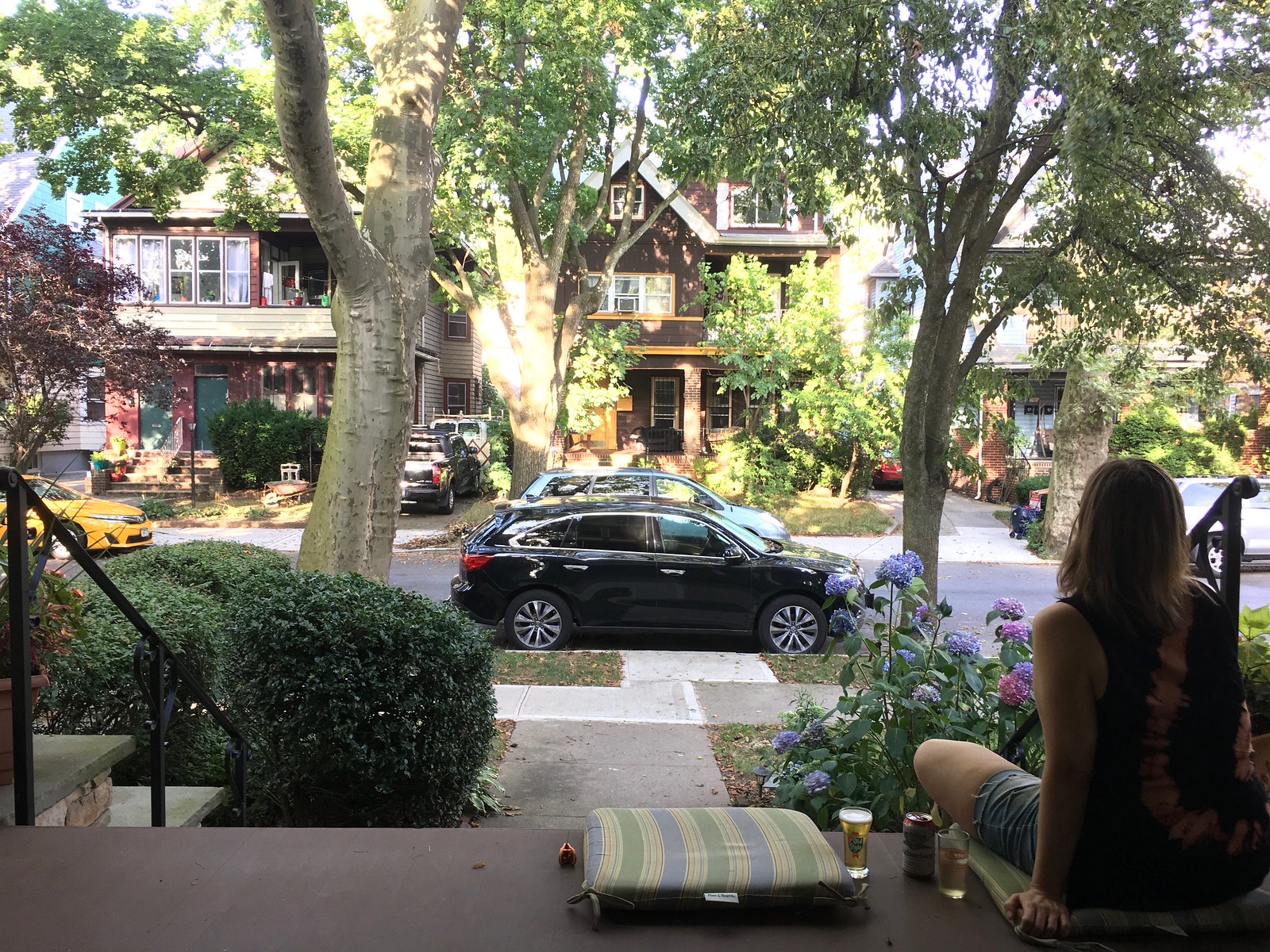
As always, you can see the full set of daily Pandemic Porch Cocktails™ photos — now over 130 of them — here.
That Sgt. Pepper’s album montage background is tremendous.
And tie-dye is friggin’ awesome. Just sayin ;)
It looks like the Houston Rockets have the NBA’s best uniforms at the moment since they are sans an ad patch. I could not find anything via google search that Rockets and Rokit parted ways.
Was not aware of that!
Yup! If you do a search for the pictures from the Rockets’ scrimmage game over the weekend, you’ll see the beautiful, clean space where the ad patch used to be.
Paul, did you miss the Mets game on ESPN last night? The announcers were bemoaning the players’ low-cuffed bell bottom pants. I apologize, I don’t remember the inning (but it had to be early, before the score got way out of hand).
Mets fell behind early and the broadcasters were brutal (who thought it was a good idea to put a mic in front of Chipper Jones?), so I muted it and then just turned it off. Sorry I missed that!
I’ve listened to Chipper in interviews before, and he’s normally good for that. When I was watching last night, I felt like he wasn’t sure where he was “allowed” to try and talk. Early on one of the other guys interrupted him a few times…frankly it doesn’t surprise me. I’d rather listen to the Braves on the FSS broadcast than the ESPN broadcast anytime.
Last night was his 3rd broadcast ever, maybe cut the guy some slack. It has got to be harder to pick up on non verbal cues from broadcast partners when working from home via zoom.
He won’t be the next great color commentator or anything, but had some good takes on attacking pitchers, what pitches to look for, and breaking down swings last night.
A-Rod isn’t much better. He was on the SF/LA broadcast on ESPN last night. He routinely can’t pronounce the letter S, was wrong on pitch selection prediction almost 75% of the time, talks about himself constantly, etc.
He did, however, comment on Mookie Betts’ HiSox and Shoes.
Thanks Miles. Enjoyed it. Pics were awesome.
So often here at Uni-Watch, whether it be in a story, a Ticker item, or even in the comments, I will lean something new. Particular jargon from one slice of the world or another–sports or non. In the Japanese “anatomy of a baseball hat” photo I saw the word “backram”. Never heard the word before so a googled it.
Turns out the real word is apparently “Buckram” with a ‘u’. And is a millinery term for a type of stiff fabric used in hat making.
I never thought about that stiff stuff in the front of a ballcap before.
The more you know.
The buckram is relatively easy to remove from New Era 5950 caps to create an unstructured hat. Takes about 25 minutes to remove from a cap with a pair of tweezers and scissors.
We have now had a look at the Texas Rangers in action with the pwoder blues. The Rangers would look better wearing their royal blue hats with the powder blue uniforms. They should consider ditching the powder blue hat.
Sometimes a new hat which seems like a good idea just doesn’t work out. Remember the Blue Jays in the graphite hat at home?
link
I tend to think that teams who wear powder blue at home should wear white pants as well. All powder blue should be reserved for the road!
I’ve always liked teams that have a white or gray crowned hat in their rotation, but similarly, they tend to look better when worn with an alternate jersey. For example, if the Pirates wore a gray crowned hat with their black alternate road jersey, or if the Reds broke out their white crowned cap with their red home jersey.
“God morning” could probably use an edit.
Indeed. Thank you!
In for a key chain, Paul, they look great. Looking forward to it.
Thanks! The whole process for this producing item was smooth and pleasurable — good experience all around.
I need to see video of the digital fake fans leaving the Dodgers game in the 7th inning. Whoever set that up probably get fired, but totally worth it. And the Sgt. Pepper fan montage is fabulous. I’m enjoying the bizarre visual aspects of some of this season so far.
I’ve very rarely ever missed a Giants game on TV. I only caught them on radio when in the car. However, as the local affiliate also streams the games, I’ve found listening to them at home on the browser a better experience. The empty stadium is too jarring, and I’m also sick of looking at a smiling Mary Hart the last four days in LA.
It’s as if her expression never changes.
They did have Mike Brito, the guy with the radar gun and panama hat, there too.
In the basketball section, I want to point out that the WNBA players left the court before the national anthem, rather than during it. It is fair to say that they were not on the court for the anthem, but I think it is misleading to say that they left during the anthem.
Well stated. Fixed.
In reference to the Brooklyn Branches, I’m sorry if I missed this, but did something finally come of the branch dangling from the large tree across the street from Paul?
Yes. If you go to the Brooklyn Branches post that’s linked in today’s post, you’ll find a link to what happened to the branch.
Thanks, not sure how I missed it.
Amazing how long it was up in the tree. Great to see how your doing something with the branch to honor its memory….
I’d like to keep the Cleveland Indians’ name, but I’m not sure I’m buying Mickey Edwards’ argument for the team’s fair use of said name. Has Cleveland ever supported a benevolent Indian cause (like the American Indian College Fund or the Association of American Indian Affairs), or has it all just been lip service the way it is with Washington NFL Football? I can’t help thinking Cleveland has come up short on good-faith efforts to continue calling themselves the Indians.
I’m not sure the writer of the article made the right move by citing the Chiefs and Braves as “good examples.” I’m admittedly not very knowledgeable about any Native American causes they may support, but the fact that they support and encourage the tomahawk chop cancels any good will out.
The Japanese term for the squatchee can be translated to “sky button.” I love it.
Ha! That’s excellent. Thanks for translation!!
After digging into it a bit more, “crown button” is probably a more accurate translation (the character has multiple meanings). But I’m still going to think of it as the sky button.
If “squatcho” can become “squatchee,” “crown button” can become “sky button.”
I concur with “crown button” or really just “top button”. The word ten means sky most of the time, but it’s also used to mean “up” when talking about the orientation of things like boxes (as in “this end up”).
What a wonderful book!
I watched a bit of the Giants and Dodgers last night and noticed the Giants do not have a 3-D batting helmet logo, did they not just switch to 3-D logo two seasons ago?
Giants switched to matte helmets, but not 3D logos.
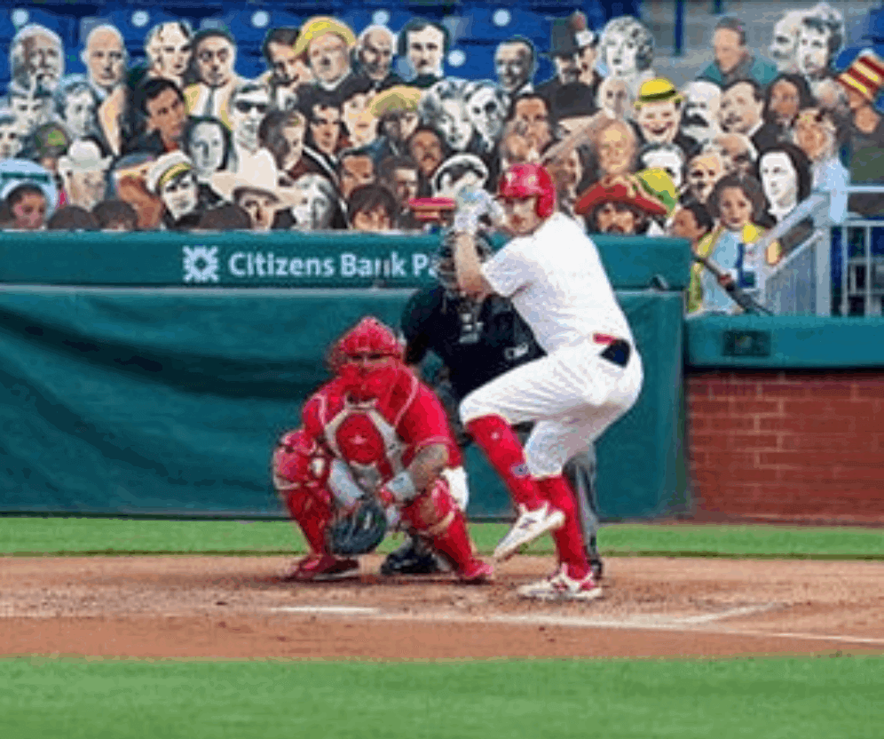
Sign of the times: watching Phils-Marlins yesterday and noted that Comcast superimposed a sponsor’s logo/advert onto the pitcher’s mound as seen from the center field camera. They do this for NHL games onto the glass, first time I’ve seen it employed on a baseball telecast.
The sign in the seats among the cutouts behind the plate was also fake and I think the tarp on the right field seats was superimposed. At one point there was an ad logo projected onto Joe Girardi’s sleeve during the season opener. I know they’re looking for as much ad revenue as possible to offset empty stadiums, but where does it end?
July 22, 2003…scoreboard…don’t see anything to startling in the box score.
Dag Nabbit! I looked at the blog at 9:30 EST
Seats at the Detroit Baseball Stadium that low have the names of season ticket holders at where the seat number would be. I was there last September and sat in maters Cleaves’ seat.
I’ll try and find a photo from that roadie and will post it to your twitter machine.
The cover of the Japanese cap guide has at least 7 Mexican winter league teams(LMP) on it.