
By Phil Hecken
Follow @PhilHecken
Greetings from the summer place, where it’s HOT HOT HOT, but I have absolutely no complaints. Hope everyone is safe and staying cool, wherever you may be. And a good Sunday morning to you all.
As you might have heard recently, the Washington Football Club has, 20 years too late recently found itself in a bit of controversy over its (now former) name, and as you may have read Monday, has officially jettisoned the name by which it went since 1937 (and technically since 1933, but the team played in Boston until 1937). The team has not yet announced a replacement name, although word on the street is that team owner Dan Snyder has already made his selection, and may announce it before the team’s first game of the season, scheduled to take place September 13, against the Eagles. Even if the new name isn’t official by then, it’s highly unlikely the team will have new uniforms. As many have speculated, the team will probably just remove the helmet decals and jersey wordmark and play without either.
So, with things that usually take 18-24 months being compressed into a much tighter schedule (new name and uniforms), I wanted to bring you two reader concepts for rebrands for the Washington Football Club, before anything has been official. I’d like to stress that neither I nor Uni Watch is endorsing either of these proposals (including the names and imagery), but am simply placing them out there to the readership as concepts from the two designers.
Today we’ll look at a rebranding concept from Chad Buley, who would like to rename the team “Redtails” and another by Mike Joseph, who has chosen “Redspears” as his name of choice. Both designers will give their rationales and descriptions of their proposals below. We’ll start with Chad (for all images below, you may click to enlarge):
“Redtails” (A tribute to the Tuskegee Airmen)
By Chad Buley

Hi Phil!
With the Washington Redskins officially moving to ditch their 87-year-old name, I wanted to tackle rebranding the team. The name that’s been generating the most buzz online is “Redtails” (A tribute to the Tuskegee Airmen), and I decided to base my rebrand off of that name.
I wanted to create a design that could call back to football unis from the 1940’s, while still feeling sleek and modern. I started with burgundy and gold, but the gold wasn’t popping like I wanted, so I changed the gold to white. The “Tuskegee Tribute” alternate is meant to look like the P-51 Mustangs the Tuskegee Airmen flew in WWII, hence the gray (GFPS – Gray For Plane’s Sake?). Enjoy!
(I made photorealistic and schematic renderings of the unis, so feel free to pick and choose which ones to post on the website!)
Best,
Chad B.
And here’s a look at Chad’s uniform proposals:
Home & Away Primary:


Home and Away Alternate:


Tuskegee Tribute:


[Editor’s Note, 10:05am: The second concept presented in this post did not meet Uni Watch’s standards for publication and should not have been promoted on the site. It has been removed from today’s entry. — Paul]
OK readers — I know a few of you like “Warthogs” and there are a bunch of other alliterative names still bouncing around (like “Warriors”), and we’ve also seen Redtails, Redspears and other “Red”-based names. What are your thoughts? What do you think of Chad & Mike’s concepts? Please let us know in the comments below.
If any other readers have any Washington Football Club redesigns/rebrands — please send them to me ASAP, as I’d like to run them (either as part of a lede or in the concepts section) before the team has settled on a name. Once a name has been chosen, then uniform redesigns using the new name will be in order (and perhaps a design contest).


Guess The Game…
from the scoreboard
Today’s scoreboard comes from Pretty Peggy-O.
The premise of the game (GTGFTS) is simple: I’ll post a scoreboard and you guys simply identify the game depicted. In the past, I don’t know if I’ve ever completely stumped you (some are easier than others).
Here’s the Scoreboard. In the comments below, try to identify the game (date & location, as well as final score). If anything noteworthy occurred during the game, please add that in (and if you were AT the game, well bonus points for you!):

Please continue sending these in! You’re welcome to send me any scoreboard photos (with answers please), and I’ll keep running them.
The “BEST OF” Kreindler’s Korner
Hey guys & gals. You’ve enjoyed Kreindler’s Korner for several years now, mostly on the weekends, on Uni Watch, but with the recent coronavirus outbreak, Graig’s time is just too precious and he needs to tend to other things besides coming up with a new writeup each weekend.
So, going forward, for as long as the COVID-19 situation is bad in New York, I’m going to run a few “Best of’s” until Graig returns.
Here’s today’s offering (click to enlarge):

Title: “Jimmy Claxton, 1932” (color study)
Subject: Jimmy Claxton, 1932
Medium: Oil on linen mounted to board
Size: 5” x 7”Jimmy Claxton owns the distinction of being the first African-American to appear in professional baseball during the 20th century. Growing up in Tacoma, WA (though born in British Columbia), his family had been classified as white, black and mulatto by various census-takers – his background consisted of black, Native American, Irish, English and French ancestry.
In 1916, as a teenage pitcher in Oakland, California, he came to the attention of Herb McFarland, secretary for the Oakland Oaks, a club in the Pacific Coast League. He was introduced to the club as part of an Oklahoma Native American tribe, and was summarily offered a contract. By late May of 1916, Jimmy had broken into professional ball when he pitched in two games of a doubleheader – allowing three runs, four hits and four walks in two and a third innings. Within a week of that performance, a friend of his revealed that he had both Native American and African American ancestry, and Claxton was released by manager Rowdy Elliott on June 3rd as a result. He hadn’t even been with the Oaks for a week.
He went on to pitch for semi-pro clubs up and down the western coast in the 1920s as well as cities in the Midwest, such as Good Thunder, MN and Eureka, SD. He found himself with the Cuban House of David (later the Cuban Stars) in 1932 before eventually barnstorming again with clubs like the Nebraska Indians and Chicago Union Giants. He continued to throw into his 50s for the South Tacoma Pines of the Valley League, and then finally called it a career after throwing in a few frames during an old-timer’s game at age 63 in 1956.
Here Jimmy is pictured with the Cuban House of David in 1932. This is one of 200+ such paintings of mine that were on display at the Negro Leagues Baseball Museum in the spring of 2020.
Thanks, Graig! You can (and should!) follow Graig on Twitter.

Click to enlarge
And now a few words from Paul
Hi there. In case you missed it on Thursday, Adelph Wear’s Nathan Haas and I have come up with a line of new Tour de France-inspired Uni Watch cycling jerseys: yellow (for the overall leader), green (Points Classification leader), and polka dot (King of the Mountains).
Each jersey can be customized with your choice of number (there’s a bib-style panel on the back for that) and/or NOB — or you can skip those elements and leave the back blank. Up to you!
We’re taking pre-orders from now through Friday, July 24, which should allow us to get the finished jerseys to you by Aug. 29 — the first day of the Tour de France.
Full details, including rear views, a sizing chart, and more, here.
While I have you here:
• We’ve now sold through more than two-thirds of the Uni Watch Pin Club’s bobble-pin design. I can’t stop smiling when I see how much people are enjoying them:
The @UniWatch Pin Club just went next level. If this isn’t the coolest pin I’ve ever seen I can’t recall what would top it. #GetsIt pic.twitter.com/0Zt3NimlP3
— Brett Baker (@BrettSBaker) July 16, 2020
Isn’t that great? You can get yours here.
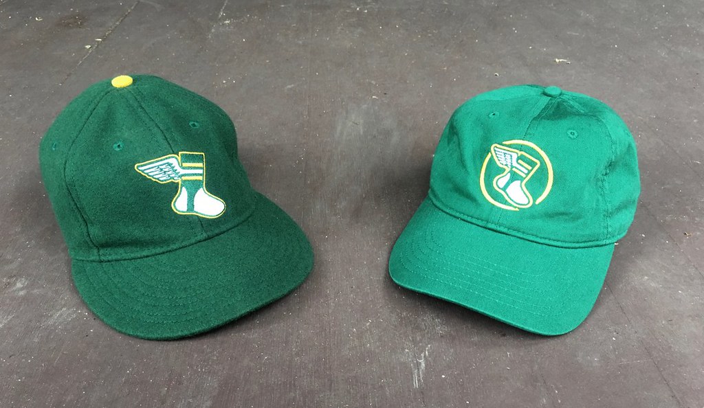
• All fitted sizes of the Uni Watch Classic Cap (shown at left in the photo below) are once again available, and our cotton “gold circle” strapback cap (below right) is back for another round of orders as well. We will probably stop offering the gold circle cap after this weekend, so move fast if you want one.
• All colors of Uni Watch seam rippers are still in stock, but I’m almost out of green and blue. So if you want those (or any of our other colors), you know what to do.
My thanks, as always, for your support and consideration. Now back to Phil.

Li’l Help?
Hey guys…
As you’re aware, Paul usually takes a month-long sabbatical from Uni Watch during August (sometimes he travels, and the remaining time he spends preparing his massive NFL and NCAA Football previews). This year, however, due to the COVID-19 pandemic, those plans have changed — he won’t be taking the entire month off, but will definitely be taking a much-deserved couplea-three weeks off.
For the past four years, I’ve hosted the Griffins Jersey design contest, and I had hoped to again do so this August, but … also due to the COVID situation, the team will be taking a break from the contest this year (they will return to partner with UW next August). So, while that usually took up a couple of posts, I won’t be able to bring that content and contest to you this time around.
So, I will be doing several weeks (Paul and I haven’t quite decided on our schedules yet) during August, so without the Griffins contest and also the Olympics (which I’d also hoped to cover), I am in search of content. That’s where you guys come in.
I’d love to feature some articles from you, the readers, as I have during past Augusts. So if there is a uni-related subject or topic you feel passionately about, and would like to share with your fellow obsessive students of the athletic aesthetic, give me a shout at Phil (dot) Hecken (at) gmail (dot) com and we can discuss the parameters. Many of you have submitted guest pieces in the past, and some of them have been really outstanding. A couple of you have already contacted me to express interest, but I can always use more — so please HOLLA if you have a uni-related column idea!
OK? OK! Looking forward to running some of your guest entries next month!
Uni Watch News Ticker
By Phil

Baseball News: No pic, but a note from reader Caleb Gerbitz: “In all Brewers intrasquad games thus far, the “Blue” team has been wearing the blue alternate uniforms with the primary all blue BiG hat. So far as I can tell, they have not worn the alternate blue hats with yellow front panels once during either the spring or summer despite announcing that pairing for the blue uniforms at the unveiling.” … (Of course it had to be a Mets cap…): “Got this email from lids for new era centinal hats with this patch on it,” says Cory Harrington. “How long to use your seam ripper on this. Charging an extra $2 just for this.” … Dave Dombrowski (he of 2 World Series winning teams) is trying to bring an MLB expansion team to Nashville (NYT link). From Tom Turner. … Check this out from the 1980 ASG at Dodger Stadium — Ken Griffey with a Stargell Star in the middle of the “C” on his Cincinnati Reds Hat. He’s wearing it at the Announcement of lineups and when he’s awarded ASG MVP (from Tim Dunn). … Those were the days: In this photo from Detroit’s Tiger Stadium (circa 1985) the lady right behind the boy with the camera is smoking. “Remember when smoking was allowed at stadiums??” asks submitter Nick Stamo. … “I love these old Giants warm-up jackets with the trolley-themed numbers on the shoulders, reminiscent of similar number stylings for the San Francisco Warriors,” says Kary Klismet. “I don’t recall these ever being mentioned on Uni Watch before, but if so, another look doesn’t hurt! (Also, nice Croce reference!)” … “Sorry to be the deliverer of shitty news but we’ve got more corporate douchebaggery afoot,” proclaims Andy Bronson. “Check out what’s going on behind in mound at Citi Field prior to (last) night’s game. I feel like I could puke. The guys are seemingly arguing about positioning but I was hoping they’d be arguing about refusing to paint it in.” For good measure, he concludes with, “Corporate assholes.” … The Mets are using animated Todd Radom fake logo again on official Instagram story, according to Gabe Toledo. “I attached photos from the clip. It has an animated shine in the video they shared. It’s the same one as mentioned in this article.” … Army Outfielder Hurtubise signed $20k deal w/ Reds. He becomes the 1st baseball player to receive a pro offer since the DoD changed policy to allow academy athletes to delay service & pursue a pro career after graduation (from Timmy Donahue). … With Canada not permitting the Blue Jays and MLB to play in Canada, here is a modification of the Blue Jays logo in they have to play in Buffalo (from Jeremy Brahm). … New helmet-mod for the Mets? “IDK if you or any other readers mentioned this but it appears the Mets are going with a metallic orange decal set on both the front and rear of their batting helmets. Thoughts?” asks Sal X Traction. … Speaking of the Mess…is there anything redeeming at all cardboard cutouts substituting for fans? Seriously, at LEAST if you’re going to do that shit, get lifesize/proportional cutouts so it has a modicum of believability.

NFL News: So you think ranking NFL logos is easy? So easy even a 12-year old could do it? … Contained within this tremendous old NFL Pro Bowl game video footage show Franco Harris wearing #33 (from Tomlin Reactions). It’s the “6th Annual” Pro Bowl, FWIW.
College/High School Football News: The Native American-themed mascots of several local high schools have faced some scrutiny lately, after Washington, D.C.’s football team announced they’ll be dropping the ‘skins name. … The Texas A&M football team is set to add a new layer of personal protective equipment to its helmets this season in an effort to curtail the spread of COVID-19. … Oregon has unveiled its Rose Bowl championship rings (from Kary Klismet). … Purdue Boilers Football put the “P” logo on its helmet in ’71. Since then they have worn 3 helmets that didn’t have the P on both sides. ’06 throwback, ’15-’16 3x & ’18-’19 2x one side had flag other side P (from Blaise D’Sylva).

Hockey News: Yesterday, there was a notable sight at St. Louis Blues practice. Wade Heidt notes G Jordan Binnington “out there wearing solid black pads and gloves. Not sure reason to don the all black pads.” … Also from Wade, ICYMI: The new logo for the Ottawa Senators leaked. It is much like the original logo when the Senators returned to the NHL as an expansion team in 1992. Chris Creamer has done a good write-up about it. … And more from Wade (this time on the Twitter): “A uniform was designed when the team was wearing Cooperalls. Now a switch to short pants and socks. Interesting dilemma can happen. What to wear for socks? WHL Brandon Wheat Kings started w/ yellow socks in ’87 before quickly changing to black.”

NBA News: Exhibition games for the NBA down in Disney’s “bubble” begin this coming week, and according to this article, teams will be wearing their “usual regular-season uniforms” for the games. … Denver guard Will Barton said Friday that he decided against wearing a social justice message on the back of his jersey at the NBA restart because he does not believe it those actions will make enough of a real impact. … Speaking of “no statement” NOB — the Miami Heat’s Jimmy Butler won’t be wearing one either, and he hopes the NBA won’t make him wear his own last name on his jersey either. Guess a lot of guys are following LeBron’s lead. … In more jersey NOB news, ESPN’s Adrian Wojnarowski was suspended by the WWL for saying “Fuck You” in an e-mail to US Senator Josh Hawley. Hawley, you may recall, stated if the NBA wanted to promote something, it should promote the troops or the police force. … Chris Grosse found this gem while summer cleaning. Any ideas what year it’s from? (Twitter seems to confirm it’s 1995-96).

Soccer News: ICYMI: Olympique Lyonnais unveiled the club’s new jerseys for the 2020/21 season during a friendly match against Glasgow Rangers at the Groupama Stadium on Thursday. … R. Scott Rogers tweeted, “I just realized that the dark teal & dark orange of the beautiful @FCBelvOasis jersey are close to the color-wheel opposites of @ForwardMSNFC’s light pink & light blue. Well done!” to which the team replied, “Yeah…we did that on purpose.” … New digital camp home shirts for Śląsk Wrocław (from Ed Żelaski).

Grab Bag: Not quite sure how this fits with unis, but it’s so bizarre I’m gonna run it anyway, from Tom Turner: A vintage vampire slaying kit has come up for auction (NYT Link). … For some reason, the State of Minnesota has a baffling collection of Confederate High School mascots — more even than Vikings ones. … Interesting story about how an attempted logo redesign by students at San Marcos High School in Santa Barbara, Calif., has created an ongoing conflict with alumni loyal to the original. (Amazingly, this story doesn’t involve Native American for Confederate mascots!) — from Kary Klismet. … Another satisfied customer (Kurt Rozek)!: “Okay, so maybe it’s not the right shade of green, but these masks are better than I could have hoped! I have a huge head (7 3/4) but the adjustable side straps are perfect! Perfectly perfect!” … The Gallatin Cnty MT sheriff is reviewing the history of the Dept’s patches which depict a Native American w/ long hair & white feathers. The review is to determine if the image is offensive (from Timmy Donahue). … Brazilian women’s volleyball team Sesc Rio de Janeiro has partnered with @Flamengo and presented their new look in Flaengo’s red and black hoops (from Jeremy Brahm). … Even if you’re not a philatelist, you’ve gotta love these Handball stamps from various countries (from Jeremy Brahm again). … One more from Jeremy: check out the poster for the 6th Team Handball World Championship in 1967.
And Finally… Big thanks to Chad & Mike for sharing their Washington Football Club rebrands. Please let them know what you think of their efforts in the comments below. Also — what do you guys think the former ‘skins should choose for a new name and why (or why not — if you oppose any of the current possibilities)? Love to here what you guys like (or don’t like) and why!
Everyone stay safe and cool and I’ll catch you again next weekend. You guys have a good Sunday!
Peace,
PH
June 6, 1980 on the scoreboard challenge. White Sox won in a 9th inning walk off 8-7
Best scoreboard ever.
Ed Farmer, longtime Sox radio announcer who recently passed away, got the win
I agree. I think 1980 was the last year of this beauty as Veeck sold the team that year.
HOT HOT HOT -Buster Poindexter
“Hot, Hot, Hot!”
-Buster Poindexter
-MICHAEL SCOTT
The Cure wrote a better version.
The Buster song is actually by Arrow. But in case you didn’t know, my comment is an Office/Wayne Gretzky reference.
I love the Redtails logo, but definitely miss the gold/mustard/whatever it is. I’m also still not sure if renaming to Redtails would be more of a good thing or more of a bad thing (for reasons previously discussed here). I also find it weird for a city to name their team for something from a different city. I’m guessing Tuskeegee will never get an NFL team, but doesn’t seem quite right to me. I love the use of gold for the Redspears, but while that takes care of Paul’s “low hanging fruit,” it doesn’t solve the larger of problem of retaining misappropriated imagery. Sorry Mike, but I don’t think you can consider long standing misappropriation to be “Native American heritage.” (you forgot to capitalize. Also, I don’t get why so many of the new names being tossed around begin with red (i.e. Redwolves instead of just Wolves). Easier to say? To keep the R logo?
I agree regarding all the “Red” names. Just start fresh. How about the Washington Swifts, after Chimney Swifts (it’s a bird). I don’t know how common or important the bird is to Washington D.C., but they at least exist in the D.C area. And just Google “chimney swift wings” and take a look. I might be crazy, but when they are at rest (especially when clinging to walls, it seems) their slender wings cross over each other and it looks tremendous. Someone could make it into a great helmet logo. Seriously. Look it up.
I don’t think Tuskegee has any exclusive claim on the Redtails. That’s where they trained, which isn’t nothing, but it’s not where they served. Besides, they fought for the whole country, what could be better than them representing that country’s capitol city?
Besides, they were commanded by a born-and-need Washingtonian, and their members disproportionally came from the District.
I think “Washington Redtails” has ample historical justification.
That’s a good point. Although I do believe Tuskegee comes from the Creek, who were defeated by the guy who founded the town, so in a less obvious way, that wouldn’t solve the problem of misappropriation, either. Good grief, history is complicated. That should have been a part of my original post.
I may not be a huge fan of the red spears name but using the DC flag as shoulder striping is genius. At least that name would keep in the theme of vegetable team names (asparagus).
I really like Mike’s Redspears concept and what he did with logos and uniforms. Nice blend of old, current and new. If I was a Washington football club fan (and I am decidedly NOT), I could get behind it.
The second concept shown in this post did not meet Uni Watch’s standards for publication and should not have been promoted on the site.
That second concept used Native American imagery. Uni Watch’s longstanding position is that teams should not use Native American imagery. That includes spears, feathers (which are sacred to Native Americans), and so on.
That second concept has been removed from today’s post.
In your disclaimer in the body of the entry, you referred to the site as SHITE. Which it isn’t. ;)
Thanks. Fixed.
The uniforms of the second concept still appear in the picture at the top of the story.
This is not a complaint. I am super happy the Ottawa Senators are changing to the new logo and appear to be going back to black uniforms as their primary.
However, the new logo just has some gold where red was before. If there were going to use a “new” primary logo, would have preferred they promote and use the updated, upgraded 2-D logo that never was seen on uniforms for some reason.
link
Washington Redtails.
Use the “throwback” jersey with the gold numerals and the dark burgundy, a matte helmet, and use the goggle helmet decal that the Iowa Barnstormers have used.
And you’re done.
Of course, this won’t ever get done because the Redtails were Army Air Force, and DC is a Navy town (Annapolis being nearby).
Was surprised to see a concept with Native American imagery. I like the Redtails, but I don’t see any chance of them changing their colors from burgundy and yellow to red and white. Also this appeared to be like a college uniform with the socks.
There is no way the Washington football team is going to go with anything like Redspears, so I’m not even sure why that’s even being discussed? They may have gotten away with that “compromise” 10 years ago, but not now. That said, I do like the overall feel of that uniform better than the feel of the Redtails uniform, which looks a little like Iowa State to me.
So, I am all for not throwing the baby out with the bathwater and taking a lot of the elements of the jersey — number fonts, sleeve stripes, colors, etc. However, there’s definitely not going to be a spear or feathers in the new logo.
The more I hear Redtails the less I like it. It just feels cheesy and forced. If Tuskegee were in the market, it would make sense, but it’s in Alabama and that just feels weird.
I think it’s probably going to be Warriors and I don’t love that either. It feels like an arena football league name — like it was originally designed to be. However, that’s probably their safest choice.
I really liked the idea of calling them to Washington Americans, and using native designed iconography, but I understand why they are reluctant to do that.
I have actually warmed up to the idea of calling them the Washington Pigskins. I hated that at first, but the more I’ve considered it, my opinion has evolved. To me, that actually checks off a lot of boxes and retains their history well by having a good relationship to the word “hogs” and “skins.” Yes, it would feel awkward and weird at first, but anything is going to feel awkward and weird at first. I think it would be a very natural long-term answer.
Warthogs also works, IMHO. There are a lot of cool logo possibilities with that.
I realize it’s trendy to bash corporations, and call them “douchbags” and “assholes.” But the beef for the mound ad shouldn’t be with Ford, it should be with the MLB and the Mets. It’s not like two Ford employees hopped the fence with cans of spray paint and a stencil. Just like with the NBA jersey ads, MLB no doubt made the space available.
Hopefully it’s just a one-year thing, helping teams pay employees in a year where their revenue is crashing.
I agree. It’s the fault of the leagues selling out the field of play. Seeing a logo on the field of play is just so gross. I was going to watch MLS but they had put a computerized adidas logo in the center circle.
I wonder what it would look like to have the entire soccer field, or football field, or baseball diamond, covered in ads? Would that be gross enough for fans to actually say, “this is bulls***!”?
There’s plenty of blame to go around. Everyone involved in this deserves to be called out for it.
hear, hear
Since Nike is involved (they ARE involved, aren’t they?) in the rebrand of the ‘Skins, I hold out little hope that changes to the uniform will be done with a tweezers when a sledgehammer would suffice. I’ll put my chips behind the “Warthogs” nomenclature, though really, any well-researched and well-vetted name works for me. (I have a personal attachment to “Thunderbolts”, “Meteors”, and “Skylarks”.) A yellow (gold) “W” on the helmet that looks like Weezer’s stolen “Van Halen” logo would suffice, but I like the style of the elongated “A” and “N” from the old Pro Bowl helmets; even better, inscribe it in an oval like Brigham Young’s “Y”. Tough-looking and bold. For the shoulders, burgundy+gold Air Force signifiers (the circle with the bars on either side) with a “W” where the star would go. And that’s it. Perhaps it doesn’t meet with Paul’s preference not to resort to half-measures, but the greater good is respecting the feelings of veteran ‘Skins’ fans. Some sugar with the medicine is called for. Any thoughts?
Thanks for the Jimmy Claxton piece. He was born in Wellington, BC – about a mile from where I grew up – which is now a part of Nanaimo. Back then, it was a coal mining town in which his dad worked. Sadly, many here don’t know about Claxton although there is a small local movement to have him honoured in some way.
I did not know that about Jimmy Claxton. I live about and hour up the road in Port Alberni. As you say – a mining town. That was my thoughts when I submitted the name Canaries to the new West Coast League team in Nanaimo, slated to play in 2021.
If you’re a ‘Skins’ fan and you can stomach the potential headline, “Cowboys Kick Redtail’s Red Tails Back to D.C.” after a divisional rout, you’re a better man than I.
Redtails’ > Redtail’s
I love the metallic logos on the batting helmets. Hopefully they stick around.
I can’t say the same for the Ford ad on the mound.
Redtails in the hands of a man like Daniel Snyder… it’s not a great look. That’s all I’m going to say. Red Wolves would be a better option in my opinion.
Agree 1000%!
“Remember when smoking was allowed at stadiums??” asks submitter Nick Stamo.
Unfortunately, yes.
Man, that’s something I don’t miss. As Billy Joel said, the good old days weren’t always good.
Last time a fan was smoking next to me in a ballpark, at least as far as I can recall, was in 1998 at St. Paul Saints. But I’m sure smoking was probably still allowed in general seating even after that.
Redtails and Redspears – No and no. The Washington Football Club’s owner does not deserve the use of the Redtail name. It would be a “look at me and see how enlightened I’ve become” moment for him. Undeserving in my humble opinion. As for Redspears – can we not just move away from the Native American imagery etc. and start on a new path. Let it go please.
As an African American, Redtails has significant historical meaning, but as a long time (50 years) Redskins fan I can’t support it as the new name. To begin with, I can’t accept the red uniform. We are burgundy and gold and NOT red and white. Looks like the defender uniform from the XFL. Secondly, the “Redtails” name is just not commanding. I can only imagine the signs and posters that would invade our home stadium making fun of the name, especially if we are getting our “Redtails” beaten on the field. RedWolves, Wolves, or even Warriors is better.
So much to comment on today. First, regarding the Redtails’ concept, maybe it’s just me, but the first thing that stuck in my head was the lack of serifs on the T. Given the heavy serifs on the other letters, it just sticks out like a sore thumb.
Jordan Binnington: it’s not uncommon for NHL goalies to try out stuff in training camp that will never see the light of a regular season NHL game, so – considering this is around the time where manufacturers normally would send out new gear – I guess it’s not that surprising to see someone trying something different. Given Binnington’s position as the reigning Cup winning goalie, he’s under contract to wear the gear he’s been wearing since the season began.
Smoking at the ol’ ball game? Continued long after it was prohibited; there were still people lighting up at Tiger Stadium in its’ last year, 1999.
Also from the hockey section: always bugged me that they made sure to keep the Senators name. So why have do they have a Roman soldier in their logo? Should’ve gone with the original Peace Tower logo.
Finally, Cooperalls weren’t around for more than 3-4 years, and goalies continued to wear breezers and socks even then. Chances are they still had socks floating around the equipment room from previous years.
Yeah, that NBA notebook/whatever in the Ticker is from ’95-96. First year of the Grizzlies and the T’Wolves and Jazz changed their logos for 96-97.
IMO – forget the nickname. Call the team the WASHINGTON FOOTBALL CLUB for the 2020 season, and be done with it. Keep the colors, go with a W or WFC logo for the helmet, and deal with it later.
That’s definitely the right move for this season. Take your time and get it right. Announce you are going to be Washington this year and wear Burgundy and Gold. That is plenty for your team identity. Tell everyone the new name will come next spring/summer for the draft. At this point any name announcement would look like a cynical attempt to change the subject or piggy back on a social movement, which it probably would be. In the end you would be associating the new name with all of the Team’s current controversies as well as the pandemic and a possibly incomplete season. It would be bad feelings all around and set the new identity up for failure.
Dan Snyder is totally going with Redspears.
I remember going to Tiger Stadium and during night games, there would be a ring of smoke around the lights by the 6th inning. The corridors also smelled like cigar smoke. It sounds disgusting, but it was actually part of the charm.