By Phil Hecken, with Mike Joseph
Follow @PhilHecken
Hey everyone — hope you’re all doing well this fine Sunday. Got a real treat/thought-provoker today from my buddy Mike Joseph. Now, this concept isn’t new — people have been doing “color swaps” for years, but Mike has, to borrow a line from Emeril Lagasse, taken it “up a notch” here. I’ve always thought of teams primarily in terms of their colors, rather than their uniform design (even the tequila sunrise Astros and beach blanket bingo ChiSox were still more about color than design, IMO). Like, the Mets are an orange and blue team; sure, they may have pinstripes or alternate jerseys or design changes over the years, but they’re still blue and orange. To me, colors define a team as much or more than anything.
That’s why I’ve always hated it when teams rebrand (see: Diamondbacks, Arizona or Rays, Tampa Bay) and change colors. Any association we had with the team is lessened when new colors (I’m talking a wholesale change, not the addition of a single color) are introduced. And that’s also one of the reasons I really don’t like NBA uniforms these days — almost every team has five or six different uniforms, and some of those have colors that are completely “different” than their official set. If the NBA were actually playing, you could turn on a game and have NO IDEA which two teams were playing if either or both are in their alternate unis. But as bad as the lack of color uni-formity is, seeing your favorite team’s RIVAL wearing YOUR colors is well…wrong.
But that’s not quite what today’s post is about — and it’s pretty in depth — so I’ll just let Mike take it from here…
NBA Rivals
By Mike Jospeh
The template:
UniMockups Lead Designer Stefan Vasilev built this thing from scratch and we’ve probably been testing and tweaking for a month. All of these were done during the testing process which was great for working things out, so if you see anything that looks a little weird, that’s why. There are things in these images that have since been changed in the templates. I went alphabetically by city name (for the most part) so you can kinda follow the evolution that way.
This is obviously just the jersey front, but we’re also releasing it as a front/back, a front/front (home/away) and then both of those options with shorts as a full uni set. All options will be on sale at UniMockups.com soon — jerseys today, shorts possibly as early as today, but definitely by later this week. The look is sort of a combination of the styles. Stefan and I both love the 90s cuts but I wanted a bit of today’s fit in there so I think it lands somewhere in between where it’s not as baggy as things were in the 90s but not quite as tight fitting as some of the players are wearing today. We’ll have a wider range of looks in the future.
The Rivals theme:
The jersey swap concept is always centered on the player changing teams, but what if your favorite team wore the colors of your biggest rival? I wanted to do something that would make people cringe, and many of these will definitely do that, but surprisingly some of these actually look pretty nice. Many of the big rivalries really hurt the eyes, and some others feel like a reach because some of these teams just haven’t really been good for a long time or haven’t been around very long. The other challenge is that not all rivalries go both ways: the Suns’ biggest rival is the Lakers, but the Lakers’ biggest rival is not the Suns. I used knowrivalry.com as well as a pretty spotty Bleacher Report article for many of these, but also did some polling on Twitter and Reddit to help figure some out (Blazers, for example). Some are based on classic/historical rivalries, some more recent rivalries and some maybe just based on my gut I guess. I’m sure not everyone will agree with the choices. I also tried to use some classic jerseys and some modern as well as mix in some white (sparingly) to break things up when some teams were getting repetitive (Knicks, Bulls) or just because it felt right (Grizz as Clippers).
Lance:
I want to thank Lance Hinesman (IG: lance_hinesman) for putting together the jersey swap images of Magic/Bird, LeBron/Steph, MJ/Ewing as well as the backdrops for the jerseys. Lance is an up and coming designer that I’ve done some collaborations with over the last year and he recently finished 2nd in our Jordan 1 Design Contest with an awesome Spider Verse design. He’s only 16 and hails from eastern PA, his favorite player is Dwayne Wade and his favorite design that he has done personally is this Detroit Pistons concept. He hopes to design NBA uniforms someday. He’s only been doing this for a little over a year and he’s extremely talented so I really wanted to help him get his work in front of more people any way that I could. If you’re reading this, please give him a follow on Instagram as that is where he is mainly focused.

The Rivalries
Atlanta Hawks – Magic

This one is definitely odd to look at but probably won’t make anyone angry since neither team has been very good lately.
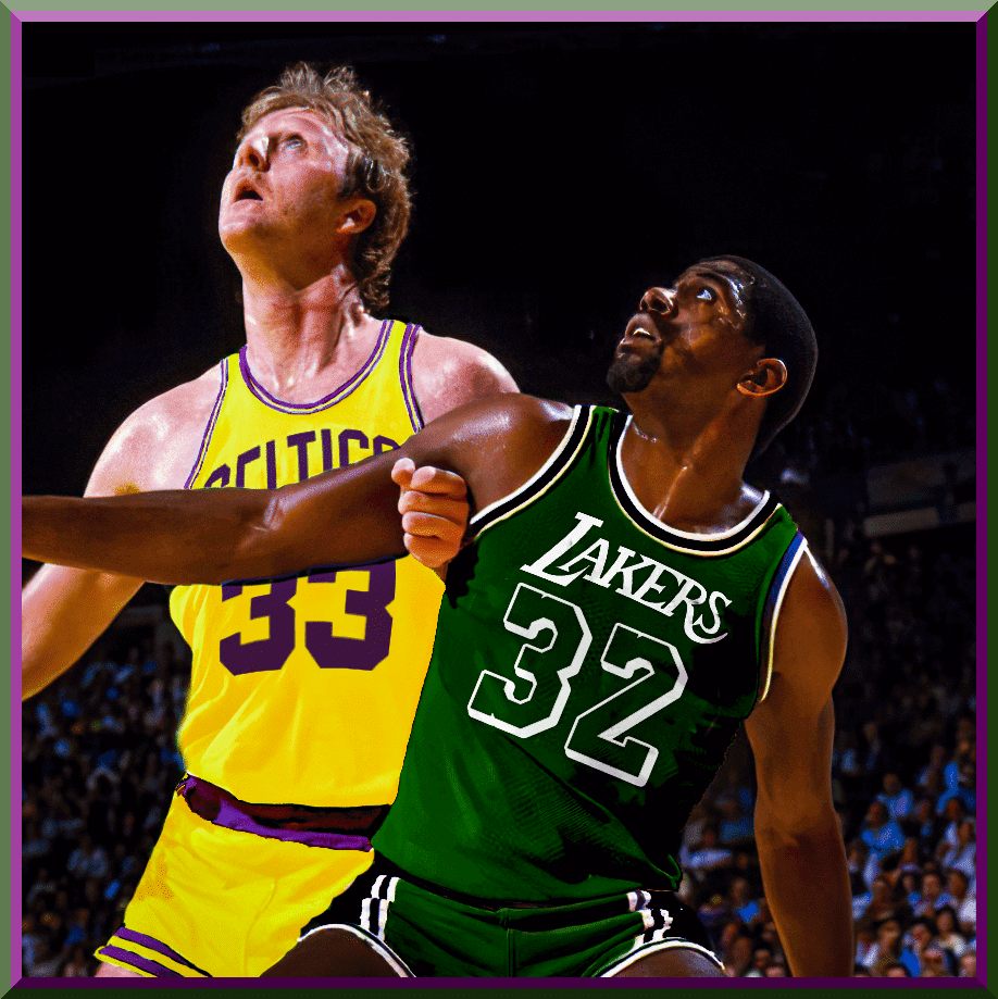
Boston Celtics – Lakers

Insert puke emoji here. Man this is hard to look at. And that swap of Bird that Lance did makes my head spin. Just plain wrong.
Brooklyn Nets – Knicks

KD has still never played for the Nets or Knicks, but here’s a jersey for both.
Charlotte Hornets – Magic

I remember the old Zo vs Shaq days. Really glad I got to use the black Magic jersey from the 90s. Total classic.
Chicago Bulls – Knicks

MJ almost went to the Knicks. Knicks and Bulls jerseys are very similar, so it would have looked like this. Lance’s swap is cool because Patrick isn’t actually in this pic, Scottie is. Patrick’s jersey here is white/red/black but you have to look close to see it – very similar to Knicks colors due to lighting.

Cleveland Cavaliers – Warriors

This one is pretty cringe-inducing and the swap makes you do a double-take for sure.
Dallas Mavericks – Spurs

I had fun recreating the wordmark here by downloading a font, flipping the A’s and straightening the whole thing out a bit. Took all of 5 minutes and was an exact match.
Denver Nuggets – Blazers

This one just looks cool and was fun to do with the skyline and the color banding. I think the Blazers may have the best uniforms in the NBA and the colors lend themselves well to any set.
Detroit Pistons – Bulls

Not too far off from the normal colors, but it does still look odd without the trademark blue. I’m sure Isiah would hate this.
Golden State Warriors – Cavs

I’m not sure if it’s the colors that make this work or if the design is just so good it would work with just about any colors, but it just works.
Houston Rockets – Spurs

Weird. This one got the Spurs side panels added just to make it a little more interesting. May need to ask Lance to swap Hakeem into this because I just can’t see it in my head.
Indiana Pacers – Knicks

This one I find really hard to look at. I loved watching Reggie kill the Knicks [So did Jim Vilk. I saw this game — and many others — live and Miller became public enemy #1 in NY — PH]. This is the only one where I actually cut the wordmark and numbers out of a picture of an actual jersey, which is why it looks a little wavier than some others. I thought it was fun.
Los Angeles Clippers – Lakers

Okay, I like this one. The Clippers need a new look so bad. They already share a city and arena, can’t they just share colors, too?
Los Angeles Lakers – Celtics

Again, BARF. Just makes your head hurt. The swap of Magic isn’t as bad since it’s basically Michigan St. colors, but still.
Memphis Grizzlies – Clippers

Meh. I didn’t really know this was a rivalry. The jersey is pretty boring but I didn’t want to use the old Vancouver throwback because there was definitely no rivalry back then. Hopefully something more interesting is coming for Ja and Co. in the future.
Miami Heat – Knicks

Another hard one to look at. So many intense battles between these teams. I probably should have used 33 on the jersey since Wade wasn’t really part of those battles but I love him too much.
Milwaukee Bucks – Bulls

I think this one looks great in these colors. This rivalry was big before my time so I have no nausea over this one.
Minnesota Timberwolves – Spurs

Another one that’s not really too far off from the original and doesn’t look bad. Wasn’t a huge rivalry so I don’t see anyone gagging over this.
New Orleans Pelicans – Mavs

This is a reach. When a team moves and changes its name, then another team picks it up, who carries on the rivalry tradition? And in this case it wasn’t much of a rivalry to begin with so I decided to have fun and use the Mavs already nauseating City edition jersey for the Pelicans. GROSS.
New York Knicks – Bulls

As stated before, this whole orange/blue to red/black thing isn’t that far off when you do it on white and I actually think this one looks pretty good but I’m sure Knicks fans will hate it.
Oklahoma City Thunder – Warriors

I think this looks nice. I’m sure Thunder fans will disagree.
Orlando Magic – Heat

The best Magic jersey ever, the best Magic player ever (he still is, right?) in the colors of the other Florida team that same player won a title with. Ouch, Magic fans.
Philadelphia 76ers – Celtics

Man, Dr. J would probably not like this. I know I don’t.
Phoenix Suns – Lakers

Okay, as a Suns fan this one was really hard for me. It was also the hardest one as a designer. Such a complicated logo with all the angles and gradients. I know most of Nash’s years with the Suns weren’t in this jersey, but some were and he had some great battles with the Lakers and I really wanted to use this jersey, so here it is.
Portland Trail Blazers – Nuggets

Portland’s colors work on any jersey and it turns on their jersey works with any colors.
Sacramento Kings – Lakers

I kinda hate this one. Then again, I kinda hate the Lakers, so… [It also shows just how shitty this particular Kings jersey is — no matter what the colors, it’s just bad — PH]
San Antonio Spurs – Mavs

This one is interesting because I strongly dislike both teams but somehow kinda like the jersey mashup.
Toronto Raptors – 76ers

This could be a strong rivalry for some time, but you can’t really go wrong with red, white and blue. Definitely doesn’t fit with the Raptors, though.
Utah Jazz – Bulls

Many would say this should be the Lakers, but when you lose to a team twice in the Finals I’d say that’s your rival and I really liked the big contrast with the red.
Washington Wizards – Cavs

Tapped into an old Bullets/Cavs 70s vibe here since the Wizards don’t really have much in the way of a rivalry other than some recent beef with the Celtics that Stefan reminded me of.
Wow. Thanks (I think) Mike! That’s just a whole lot of … wrong. But a great effort. I’m sure the readers will have some thoughts on this as well. So… readers? What say you? Which of these is the most cringe-inducing? Which doesn’t actually “look so bad” (especially if you’re not a fan of either team”?
How important are a team’s colors? Does seeing your team in another color scheme (especially if it’s your biggest rival) just make you want to wash your eyes out?
Please share your thoughts on this one — and give Mike a big hand for the effort.


The “BEST OF” Kreindler’s Korner
Hey guys & gals. You’ve enjoyed Kreindler’s Korner for several years now, mostly on the weekends, on Uni Watch, but with the recent coronavirus outbreak, Graig’s time is just too precious and he needs to tend to other things besides coming up with a new writeup each weekend.
So, going forward, for as long as the COVID-19 situation is bad in New York, I’m going to run a few “Best of’s” until Graig returns.
Here’s today’s offering (click to enlarge):

Title: “Jackie Robinson, 1945” (color study)
Subject: Jackie Robinson, 1945
Medium: Oil on linen mounted to board
Size: 5” x 7”
Jackie Robinson spent only five months with the Kansas City Monarchs in 1945. He had joined a squad that had come off of a sub-par year in ‘44, going only 35 and 51 for fifth place in the league.Robinson was signed at the recommendation of pitcher Hilton Smith, who had seen Jackie play at Fort Hood. Monarchs owner J.L. Wilkinson supposedly sent him a contract sight unseen, what with his team being decimated by WWII – Buck O’Neil, Hank Thompson, Ted Strong and Willard Brown were all still in the service.
The ‘45 edition sported Jackie at shortstop primarily, and at a salary of $400 a month, he made his debut with the club on May 6, 1945, going 1-4 with an RBI double in a 6-2 victory over the Chicago American Giants.
By the end of the season, Jackie was leading the team with a .345 average, complete with ten doubles, four triples and five home runs. He was even selected for the East-West All-Star Game. During that season, he had also began trying out for various Major League clubs, including that infamous workout with the Boston Red Sox. It was in August at Comiskey Park in Chicago that Jackie was approached by scout Clyde Sukeforth on behalf of Branch Rickey and the Brooklyn Dodgers. By the time Robinson had met Rickey in his office on Montague Street in Brooklyn on August 28, baseball would finally become the national game.
Here Jackie is pictured in his ‘45 Monarchs home jersey. This is one of 200+ such paintings of mine that were on display at the Negro Leagues Baseball Museum in the spring of 2020.
Thanks, Graig! You can (and should!) follow Graig on Twitter.

Guess The Game…
from the scoreboard
Today’s scoreboard comes from Billie Sundae.
The premise of the game (GTGFTS) is simple: I’ll post a scoreboard and you guys simply identify the game depicted. In the past, I don’t know if I’ve ever completely stumped you (some are easier than others).
Here’s the Scoreboard. In the comments below, try to identify the game (date & location, as well as final score). If anything noteworthy occurred during the game, please add that in (and if you were AT the game, well bonus points for you!):

Please continue sending these in! You’re welcome to send me any scoreboard photos (with answers please), and I’ll keep running them.

Uni Concepts & Tweaks
Time for more Uni Tweaks from the UW readership.
I hope you guys like this feature and will want to continue to submit your concepts and tweaks to me. If you do, Shoot me an E-mail (Phil (dot) Hecken (at) gmail (dot) com).
Today’s tweak comes from Trey Gorman, a student with a couple new looks for the Cleveland and Atlanta baseball teams…
He writes,
With all the things going on in the world, I decided to rebrand 2 MLB teams with Native American imagery, the Indians and Braves. For Cleveland they became the Spiders, with pinstripes to emulate the webbing of a spider. Same reason for the cursive. No NOB for all but the blue to pay homage to old timey baseball. The primary spider logo appears on the sleeve of the home and away, the “C” web on the blue alt.
And here’s a look at Trey’s new Clevo concept:

Trey continues…
The name Braves isn’t bad (in my opinion), but the tomahawk is. It has been changed to a fireman’s axe. No NOB again to pay homage to their past, and the state outline with “ATL” appears on the home and away, with the crossed axes on the red alt.
And here’s a look at Trey’s new Atlanta concept:

Thanks Trey!
OK readers (and concepters). If you have some tweaks or concepts, shoot ’em my way with a brief description of your creation and I’ll run ’em here.
And Now a few words from Paul
Hi there. In case you missed it over the past few days, we’ve had a lot of merch news, beginning with the Uni Watch Pin Club’s July design. As you can see in the video above, it’s a bobblehead pin whose head actually bobbles! This is a limited/numbered edition of 500 pins, more than 200 of which were snapped up in the first two days. You can get yours here.
Need to get caught up? Here are our January, February, March, May, and June pins. (Sorry, April sold out!) If you order multiple pins and get hit with multiple shipping charges, contact me and I should be able to arrange a partial shipping refund for you.
Meanwhile, after a long period of not having any Uni Watch caps available, we’re now offering two different versions (click to enlarge):
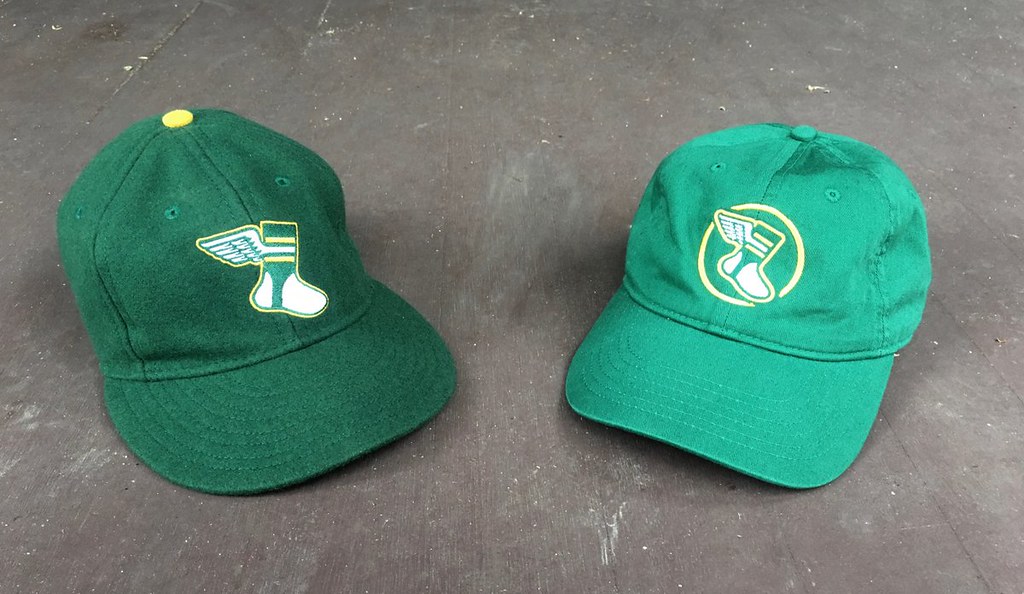
All fitted sizes of the Uni Watch Classic Cap (above left) are available here, and our cotton “gold circle” strapback cap (above right) is back for another round of orders as well.
My thanks, as always, for your consideration. Now back to Phil!
Uni Watch News Ticker
By Phil

Baseball News: Chief Wahoo may officially be gone, but that doesn’t mean he’s gone-gone. “I don’t know if you should even bother with this for the ticker,” writes submitter Jen Hayden It will probably draw out negativity. The comments on the post are loaded with “Maga” stuff. I edited out the store name.” … Thirty years ago yesterday, the Chicago White Sox played what is widely considered to be the first Turn Back The Clock game ever, launching a promotion that still resonates today and in which almost every team participates. … And speaking of ChiSox throwbacks, this article lists three throwbacks the author would like the team to wear. … My curling buddy (and oftentimes rink-mate) Johnny Lusardi writes, “Found some old commemorative coins in my grandmas house, figured you’d enjoy seeing them.” … Here’s some cool aerial drone footage of recently completed renovations to Dodger Stadium (from Kary Klismet. … Speaking of which, the Dodgers’ Max Muncy says his recent injury from being hit by a pitch was the result of changes to the stadium’s batter’s eye made during those renovations, which have made it harder for hitters to see pitched balls (also from Kary Klismet). … Still more from Kary: Here’s one commentator’s list of the ten worst jerseys uniforms in Major League history. … Is there anything worse than a Mets (or Yankees) fan wearing BOTH teams gear (even if it’s on a gameshow)? From Shawn Hairston. … Did you realize the D-Backs were almost the Arizona Rattlers and would have taken the AFL team’s branding? If you didn’t know. Now you know (from Adam Jacobi). … Oooohhh: A Houston man unearthed his grandmother’s fascinating home movie of Astrodome’s 1965 opening weekend (from Ignacio Salazar).

NFL News: You can now add DeShaun Watson to the growing list of NFL players who think that not allowing post-game jersey swaps between players is silly. … Dwayne Haskins is in favor of these Washington Red Wolves jerseys. … I guess this one is technically more golf, than NFL, but I’m putting it here anyway: “Check out Aaron Rodgers’ hat at the American Century Championship…El Chapo’s Taint..The Toughest Two Hole Stretch In Mexico,” writes Scott B. … For anyone who missed it, Paul was interviewed by Andrew Beaujon of The Washingtonian about the potential logistics behind the Washington football club’s name change (from Kary Klismet). … More from Kary: NBC Sports Washington has compiled a variety of fan-created logo and uniform designs of potential new names for the Washington football club (although many of them will certainly not be selected since they involve Native American imagery, which the team has indicated its new visual identity will not include). He adds, “What say you, readers? Do any of them hold a candle to Brittain Peck’s contest-winning Warriors design we just dusted off in yesterday’s Uni Watch entry?” … Still more from Kary: And speaking of “Warriors” as a possibility for the Washington football club’s new name, a recent op ed in USA Today explains why the Washington football club shouldn’t rebrand itself as the Warriors because of the term’s longtime association with Native American-themed team names. “Sorry, Brittain! It’s just one columnist’s opinion!” adds Kary.
College Football News: You guys know that Oregon is known probably as much for their uniforms as their football (which isn’t necessarily a bad thing). But did you know that current and former players have a good deal of input into what Oregon wears. Several former players have gone to work for Nike after graduation and have a hand in designing the teams unis. … There hasn’t been much College Football uni news (and it’s possible there won’t even be a season), but the Texas Tech Red Raiders have unveiled new uniforms. … Oklahoma Football’s 1st logo was round font interlocking OU introduced by 1st year coach Jim Mackenzie in ’66. He would only coach 1 year as he passed away from a heart attack in ’67. OU changed the logo in ’67 to a block font (from Blaise D’Sylva).

Hockey News: Small news item (and update to something mentioned during third period of recent KOTP): LA Kings will not be wearing chrome helmets next season with their silver jerseys. While that was originally the idea, sounds like they didn’t mesh with those sweaters as well as hoped (from Jakob Fox).

NBA/Hoops News: In case you missed it, U.S. Senator Josh Hawley of Missouri doesn’t think the NBA should limit its “social justice” messages on NBA uniforms to just BLM and similar movements. In fact, he’d like to put stuff like “Support our Troops” and “Back the Blue” on the backs of NBA jerseys. … LeBron James says he will wear his name, “James,” on the back of his jersey in NBA restart (from Mike Chamernik). … Here’s a bit more on that (from Brinke and Nicklaus Wallmeyer). … As NBA teams prepare to resume play in the league’s carefully secured “bubble” in Orlando, a couple of different graphic designers have come up with whimsical Disney-themed uniform concepts and logos, respectively, for the occasion (from Kary Klismet). … Looks like Frank Session on the tournament team Overseas Elite had an extra S on his nameplate that they tried to blackout (from Josh Berger). … Byron Scott wore a NNOB #00 jersey on Nov 23rd, 1988, Lakers-Heat 1st matchup ever. The reason? They lost his jersey (from Hit The Glass).

Soccer News: The Coumbus Crew have added a couple existing advertisers to their kits for the MLS is Back Tournament in Orlando, Florida. … Speaking of adding jersey advertisers: the Colorado Rapids have also added a pair for the MLS is back tourney. … Four figures of Icelandic legend are embedded in a newly designed national sports team logo — an eagle, giant, bull, and dragon, each abstracted and then combined (from K. C. Kless). … New home and away shirts for Lorient (from Ed Żelaski). … Also from Ed: new home shirt for Livingston FC. … From Josh Hinton: “I love USL more than 99% of the average American soccer fan, given that the only team in my state (@LouCityFC) play in the USLC. But it drives me crazy that Indy Eleven play at Lucas Oil Stadium with Indianapolis Colts markings all over the pitch.” … Here’s a look at Man U’s home and away kits. … And same for Arsenal.

Grab Bag: It is not just the N.F.L.’s Washington team that could get a name change. A number of schools are also reconsidering nicknames, though some are resisting any switch (NYT link). … The Sprint Center in Kansas City will be renamed to T-Mobile Center in August. Submitter Kyle Eilts adds, “It was a Naming Wrong to begin with. My guess is that we will not be seeing any “I’m calling it Sprint Center” Naming Wrong shirts in the foreseeable future.” … The Premier Lacrosse League launched their inaugural season last year with 6 teams, Redwoods Lacrosse Club (LC), Atlas LC, Chaos LC, Whipsnakes LC, Archers LC and Chrome LC. For 2020, they added a seventh team, Waterdogs LC and new uniforms. Submitter Jared Buccola “A third party lacrosse organization called Lacrosse All Stars took it upon themselves to rank the new 2020 jerseys for all seven teams, which made for an interesting read!” … Construction has been completed on a 60,000-seat stadium (known colloquially as the “pomegranate flower” for its exterior appearance) in X’ian, China, as a host venue for the country’s 14th annual National Games in 2021 (from Kary Klismet). … New badges for the Firefighters of the Greensburg (IN) Fire Dept. The new badges replace the version the department had used for nearly 40 year-old (from Timmy Donahue). … Also from Timmy: dams County (CO) Sheriff Deputies can now wear badges to support cancer awareness. Besides the standard badge, deputies can now wear blue & pink ones in support of prostate & breast cancer awareness. … Still more from Timmy: John Jay HS (NY) has chosen Wolves to replace its Native American mascot. According to the district’s website, Wolfpack won the vote over Ravens, but they found use of the phrase in connection w/ the Central Park 5 case that led to choosing just Wolves. … David Monahan thought we’d be interested in this comment from Dan Shaughnessy in his most recent Boston Globe column, “Will sports re-starting really work? And other thoughts.”
And Finally… Big thanks to Mike Joseph (and Lance Hinesman) for the color swap piece! Again, please let him know what you think of these in the comments.
I hope everyone continues to stay safe. I may have mentioned this before, but I’ve been a weather buff for quite some time (in fact, I was a moderator on a weather board before Uni Watch), and I’m noticing that it’s going to be trending much warmer (like 7-10 degrees hotter than it is now) for much of the lower 48. And I know it’s been really hot in a lot of places, especially recently — and it’s going to get a lot hotter. Next week at this time we are likely to have broken all sorts of high-heat records (either single day, days above 90 or even 100, consecutive days over average, etc.). It all has to do with a migrating Sahara heat mass (yeah, it’s complicated). Well, it IS 2020. Why shouldn’t extreme heat have its way too, right?
Everyone have a good Sunday — stay cool and safe and I’ll catch you next weekend!
Peace,
PH
The scoreboard is from Baltimore’s Memorial Stadium on September 19, 1958.
China knows how to name stadiums. I hang hear Musberger now. . “You are looking LIVE at the Pomegranate Flower!”
Friday 9/19/58. Mickey Mantle error opens door to the 5 run ninth inning.
I really can’t detect any point to the “what if your team wore their rival’s colors” projects other than to sear deeply cursed images into the brains of basketball fans, which is hilarious
Didn’t see one of the rivals colors I liked at all.
Fun project, Mike, and nice job with the fine details on the uniform renderings. In a vacuum, several of the designs don’t look bad with the color changes. But with context added, as it always has to be, several of them make my toes curl! :-)
Even with the context added, I find the New York Knicks uniforms rendered in red and black to be a surprisingly solid look. I know, I know, it could never happen, but it really doesn’t look bad.
In 1979 the Knicks changed from blue and orange to dark blue and a maroonIsh red so I wasn’t as shocked with the Knicks in red and black as some of the others. Also, the Nets look better in blue and orange than BFBS.
We need a football version of this! I want to see the Bears Packers crossover
I grew up and lived my first 33 years in Southern California, and the last 30 years in Arizona. My first love is the Lakers, Magic Showtime and Jerry West years, but I’m also a big Suns fans, with the Barkley and Nash eras being a really great time to follow them Suns. The Suns colors of purple and orange isn’t that far off from the Lakers purple and yellow. What makes this look odd is using the yellow uniforms, mainly because of a purple flaming sun. The Suns in purple uniforms with yellow trim, with a flaming yellow sun, would look really great, and not that far off from what the Suns uniform looked like.
Nice find by Jen Hayden on that goofball Chief Wahoo “tribute” shirt. I find it amusing that Chief Wahoo’s most ardent supporters apparently don’t even know the history of the team or the logo well enough to know that the logo did not debut in 1915, but rather 1947. But hey! Why let the truth get in the way of a good narrative, right?
Also, one of the rows of laces on the baseball are going in the the wrong direction; very apropos.
Those Arsenal kits make it look like the players participated in a mass murder before taking the pitch.
I’m going to assume they are trying to evoke the marble halls of Highbury, but they just look very Patrick Bateman.
Apropos of today’s lede, Arsenal should not wear white, that’s Tottenham’s color.
Not sure where the Denver/Portland rivalry concept came from. The Jazz are really the modern day rivalry for the Nuggets.
Re: Dan Shaugnessy’s column.
He’s right. Does any of you think this is going to end well, especially with all of the hiccups in Major League Soccer?
Warriors is just about the only potential new name for Washington’s NFL team that will prevent me from becoming a hardcore supporters. Not because a Warriors name would represent an obvious effort to enable fans to continue wearing racist gear and to continue engaging in racist rooting behavior, which is true. But because the American armed forces, and our civilian political culture, have a dangerous warrior problem. The defining ethics of American military service for over two centuries were the concepts of citizen-soldiers and the profession of arms. Soldiers fight when necessary and only in the name of a worthy cause. Military professionals owe loyalty to ideals that transcend mere barbarism. A warrior, on the other hand, fights to fight, and fights without regard to the justice of his purpose or limitations on his violence. Warriors make war as an expression of their character, and warriors obey orders as a primary virtue. For a warrior, war crimes aren’t crimes, they’re just war. When the military adopts the language of warrior to describe itself and individual servicemembers – “wounded warriors” for example – it turns its back on centuries of American heritage and values and sides with the German Hessian mercenaries who fought for King George III in the Revolution, with the German SS troops who fought for Hitler in WWII. If our armed forces are made up of warriors, we cannot have a republic for long. To maintain a republic, those who bear arms for defense must see themselves as citizens or professionals, not as warriors.
Any alternative but Warriors and I’ll add Washington’s NFL team to the list of teams I root hard for (which includes every other DC-area team). But if the new name is Washington Warriors, with an overt military-celebration theme, the franchise will remain on my list of names so objectionable that I just can’t.
Well-stated, Scott, and I agree with you for these precise reasons. I admire the historical mission and culture of the American military of “citizen soldiers” called upon, when needed, to “protect the realm” and who retire to civically-engaged civilian life when their duty is done. In other words, the model followed by George Washington after the ancient Roman example of Cincinnatus and mythologized afterward by generations of the American public.
If a military themed-name for the team is inevitable, I could support something like Sentinels or Defenders (or even Redtails, potentially). But Warriors would too closely enmesh itself with all the disturbing trends in military culture and a public that is all too often unwilling or unable to pause in their unquestioning adoration of the military to recognize those trends.
I attended that Turn Back the Clock game 30 years ago. Day game on a work day so I played hooky. It was great. The White Sox turned off the PA and electronic scoreboards. Had a guy with a old fashioned cone-shaped megaphone announce the lineups before the game. Had a Dixieland quartet entertaining before the game and between innings. Rolled back prices on some food items if I remember correctly. The only bummer, White Sox lost to the Brewers by a big margin.
While Lakers – Celtics is arguably one of the greatest rivalries in all of sports, I always wondered what a Lakers – Bulls jersey swap would look like, e.g. Kobe vs. MJ and MJ vs. Magic wearing each others’ colors.