
By Phil Hecken
Follow @PhilHecken
Hey everyone! After the Independence Day weekend off (Thanks, Paul!), I’m back today. Hope everyone is doing well (and staying safe!) and had a good — or at least as good as can be had during today’s trying times — 4th of July. Things here on Long Island seem, at least COVID-19-wise, to be improving, but I know that’s not necessarily the case elsewhere across the States. Please, everyone, social distance and wear a mask in public! I think I speak for everyone when I say we don’t need to go through this shit again, so don’t fuck it up, ok? OK! Now then…
You guys may recall in a couple “Too Good For The Ticker” segments over the past couple months, I featured the tremendous artwork of today’s featured artist, Bowen Hobbs. Bowen not only created the posters you see in today’s splash (and will see individually below), but he’s also a logo (and I believe possibly uniform) designer as well. And in the coming weeks, we’ll get to see more of his work and get to know him better. But for today, I asked Bowen if he could share the work he’s done on “posters” — I have run I think two of the ones below as TGFTT entries, but here’s the whole group. And as someone who has quite an affinity for the powder blue unis that many teams wore in the 1970s and 1980s, I especially love these posters for the choice of uni, as much as the subject matter. And if you’re a fan of Milwaukee, you’re in for a special treat today.
OK — let me turn this over to Bowen now. Enjoy and please let him know what you think in the comments below.
The Illustrations
By Bowen Hobbs
Hi everybody! Bowen Hobbs here. I’m a graphic designer originally from the Milwaukee area and have also lived in Oshkosh, WI and Orange County. Over the past decade, I’ve done rebranding concepts for every team in the NFL, NBA and NHL, as well as MLB. I’ve even taken a shot at a few defunct teams. But today we’re going to talk illustration. Two years ago, I started illustrating some great players wearing some of my all-time favorite uniforms. All these illustrations are rendered in Adobe Illustrator and, as a result, are scalable with no loss of quality.
Giannis Antetokounmpo

Giannis is the subject of my first sports illustration. I started with an image of the Greek Freak flexing and showing his dominance, and I rendered that moment in a comic book style. In the background, I featured two silhouettes of Antetokounmpo against his number 34. The outline uses a Greek Key pattern of G’s to reinforce his Greek Freak moniker.
Rollie Fingers

Rollie Fingers not only wore my favorite baseball uniform of all time, he’s also my mustache idol. Between those two reasons, I knew I had to illustrate him. Although I retrofitted the piece into Padres and Athletics versions, the Brewers version was the original and proudly features The People’s Flag of Milwaukee.
Nolan Ryan

I can’t claim to illustrate all-time great uniforms without including the Tequila Sunrise. I imagined “The Ryan Express” as a rocket with this ’80s space theme.
Mike Schmidt

This Polyester Era design of Mike Schmidt acknowledges the Phillies’ use of Helvetica as a number font with their burgundy home pinstripes as the background.
Kareem Adbul-Jabbar

Fun Fact: I share a birthday with Kareem. To wish him a Happy 73rd, I developed this illustration of him as a member of the Bucks. The dot pattern calls back to the mesh of the old Sand Knit uniforms.
Hank Aaron

To celebrate the anniversary of Aaron breaking Babe Ruth’s home run record in 1974, I whipped up this graphic of that night in baseball history.
Robin Yount

I’m sure you’re noticing the plethora of Milwaukee-centric designs so far. I originally designed this piece to post on 414 Day, a celebration of all things MKE. In it, Yount is at the tail-end of his swing against a stylized portrayal of The People’s Flag of Milwaukee.
Reggie Jackson

Feeling nostalgic for baseball while sports have been on hiatus, I decided to illustrate one of the most clutch players in MLB history. To go along with the theme, I placed Mr. Jackson against falling leaves and the Yankee Stadium facade.
Bo Jackson

Perhaps the greatest two-sport athlete of all-time, Bo Jackson was one of my favorite athletes growing up. So it only felt natural to illustrate him in the Royals’ beautiful powder blues.
Gary Carter

When I began this project, I wanted to highlight some of the best uniforms of baseball’s Polyester Era. The Expos’ powder blues are very high on that list. And who better to show those threads off than Gary Carter.
Alex English

I also wanted to highlight some of the NBA’s best uniforms from the ’70s and ’80s. And who better to model Denver’s rainbow unis than the Nuggets’ leading scorer, the sneaky-good Alex English.
Sidney Moncrief

Speaking of great NBA uniforms from the 1980s, here’s Sir Sid wearing my personal favorite Bucks uniforms. I like these uniforms so much that my Uni Watch membership uses the design.
Ken Griffey Jr.

Although this illustration is not a part of the Polyester Era, the tel jersey is iconic for baseball fans in the Pacific Northwest. And Junior made it iconic.
Vince Carter

Speaking of ’90s uniforms, the Raptors’ inaugural design is still popular today. And nobody made it look more electrifying than Vince Carter. The typography is influenced by airline travel, reinforcing the Air Canada theme.
Thanks to everyone who took the time to view my art and read my ramblings, as well as Uni Watch for giving me this platform to show my work. If anyone would like to view my other pieces, it’s all at unofficialathletic.com.
Thanks, Bowen! Great job on those posters. Love all that powder blue too! OK readers — what do you think? Please let him know in the comments below. I’ll be back with more from Bowen soon!

Warrior Redux?

Waaaaaaaaaaaaaaaaaay back in March of 2012, I announced a contest on UW to Re-name and Redesign the Washington football team and Cleveland baseball team. It was quite controversial then (and it still is today), and at the time it set a record for the most comments ever for any UW post (and this was a weekend post). In light of recent events which Paul covered earlier this week, it would appear Washington will most certainly be jettisoning their current moniker (although whether the team will have new name in time for the 2020 season remains to be seen). There are also rumblings that Cleveland’s baseball team may also be searching for a new name as well. It’s possible I’ll be revisiting a new contest in the future — much of it depends on how fast things move on this front.
Anyway, the end result of the Washington football portion of the contest was a series of submissions which were voted upon, and the winner back in 2012 was Brittain Peck. I don’t think I’d spoken to Brittain for years (the last time was probably when I was in J-school, for my Capstone Project), but a little over a week ago Brittain got back in touch. He reminded me (although I hadn’t forgotten) of his winning submission. I think it’s a good time to take a look back at that now. Here’s what Brittain said in his recent e-mail:
Hey guys!
Been a long, long time! I hope you’re well.
It’s amazing to think that there a new wave of very promising momentum around the need to change the Washington NFL franchise’s name!! With that in mind, I thought it might be a great time to dust off that old Washington Warriors design (attached) from the contest 8 years ago and see how it’s received in 2020.
One aspect of the design that I am especially curious about its reception in our current times is the military association, primarily for its potential to appeal to folks on either side of growing social and political divide.
Anyways, just wanted to bring it up and let y’all know that as always, you have my full permission to republish it. If you’re interested, I may even be able to create some additional assets to accompany its re-release. Merchandise maybe?
Thank you, thank you, thank you for your support of my work and the opportunities you’ve opened up for me. Please stay safe and take care.
Brittain
To refresh everyone’s memory, here’s what Brittain created back then for the contest:


Brittain also created some closeup of the uni details. Given how Dan Snyder and Riverboat Ron Rivera had both seemed to express support for “Warriors” (and lets be honest — those who oppose the name change probably won’t be happy with anything, but “Warriors” might be the most ‘sellable’ to anti-name-changers). It’s also seemingly the “clubhouse leader” as far a new names go.
Brittain added this in a separate e-mail:
And lastly, there’s also these. I thought this all might be even more relevant given the statement that the team and Coach Rivera put out and how it included a somewhat cryptic mention of honoring the military. I’m personally curious to see what they’re thinking with that.
Brittain
Here’s the closeups of the details:


And the full uni…

Thanks to Brittain for getting back in touch and it will be interesting to see how this all plays out.
And Now a few words from Paul
Hi there. In case you missed it over the past few days, we’ve had a lot of merch news, beginning with the Uni Watch Pin Club’s July design. As you can see in the video above, it’s a bobblehead pin whose head actually bobbles! This is a limited/numbered edition of 500 pins, more than 200 of which were snapped up in the first two days. You can get yours here.
Need to get caught up? Here are our January, February, March, May, and June pins. (Sorry, April sold out!) If you order multiple pins and get hit with multiple shipping charges, contact me and I should be able to arrange a partial shipping refund for you.
Meanwhile, after a long period of not having any Uni Watch caps available, we’re now offering two different versions (click to enlarge):
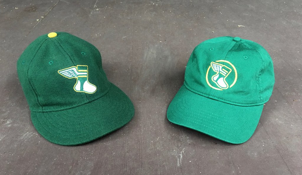
All fitted sizes of the Uni Watch Classic Cap (above left) are available here, and our cotton “gold circle” strapback cap (above right) is back for another round of orders as well.
My thanks, as always, for your consideration. Now back to Phil!

Guess The Game…
from the scoreboard
Today’s scoreboard comes from Loose Lucy.
The premise of the game (GTGFTS) is simple: I’ll post a scoreboard and you guys simply identify the game depicted. In the past, I don’t know if I’ve ever completely stumped you (some are easier than others).
Here’s the Scoreboard. In the comments below, try to identify the game (date & location, as well as final score). If anything noteworthy occurred during the game, please add that in (and if you were AT the game, well bonus points for you!):

Please continue sending these in! You’re welcome to send me any scoreboard photos (with answers please), and I’ll keep running them.
The Ticker
By Anthony Emerson

Baseball News: Cleveland considered changing their name to the Spiders in the early ’90s. I just think there’s so much one could do uniform-wise with that nickname (from Kary Klismet). … Here’s a great article about how Pinnacle’s 1996 “Christie Brinkley Collection” of baseball cards came into existence (from Michael Rich).

NFL News: There’s a rather shocking Titans-related tidbit in this article about Washington’s potential name-change — Floyd Reese, who was Tennessee’s executive vice president following the relocation from Houston, said the team was considering adopting the name “Rebels”, before he received a call from a woman claiming to be James Earl Ray’s ex-wife — Ray assassinated Martin Luther King Jr. “She said, ‘That would have been a name [Ray] liked, and he’s a staunch racist and you can’t use that name,'” Reese said. “I said, ‘I’ve got it, ma’am.'” (from Paul Friedmann). … Here’s a good story about the year the Cowboys added a red helmet stripe, in addition to their white and blue ones, to celebrate America’s bicentennial (from Kary Klismet). … Also from Kary: Formula 1 driver Lewis Hamilton has decided against wearing a helmet with a message of support for Colin Kaepernick, after being warned that doing so would result in “consequences.” … Patriots head coach Bill Belichick is famous for his hoodies with cut-off sleeves on the sideline, but CBS Sports reminds us that the three Super Bowls he’s lost as head coach came when he wore cut-off sleeves (from Tod Meisner). … The Jaguars’ stadium will be only at 25% capacity during the 2020 NFL season due to the pandemic. And yes, everyone’s already made the joke you’re about to make.
College/High School Football News: Apparently, once upon a time, mid-aughts teen fashion brand Aéropostale was also outfitting college football teams (from Timmy Donahue).
.

Hockey News: The OHL’s Guelph Storm have unveiled their 30th anniversary logo (from Wade Heidt).
.
.

NBA News: New Nets numbers from Etienne Catalan: G Jamal Crawford will wear No. 1, F Michael Beasley will wear No. 30, and PF/C Donta Hall will wear No. 45. … There is a GoFundMe effort to help save the West Oakland, Ca., home of Lloyd Canamore, which he has decked out in Warriors merch (thanks, Brinke).

Soccer News: La Liga side Osasuna has a new kit celebrating the Festival of San Fermín, which culminates in the running of the bulls in Pamplona, where participants wear white with red scarves. Yes, Osasuna plays in Pamplona (from Ryan Maquiñana). … The Scottish Professional Football League has a new font. Here’s a look at the old one (from Ed Żelaski). … English fourth tier side Walsall unveiled their new kits yesterday (thanks, Jamie). … English third tier side Fleetwood Town have extended their kit deal with Hummel, and wore their alternate red shorts rather than their usual whites ones for the second leg of their playoff fixture against Wycombe, even though there was no clash between the usual white shorts and Wycombe’s navy (from Mark Gillingham). … USL Championship side San Diego Loyal has released a really nice looking Black Lives Matter kit. … Vancouver Whitecaps have a sleeve advertisement for the MLS is Back tournament (from Wade Heidt). … Atlanta United will have an advertisement in every permitted space during the MLS is Back tournament (from Gabriel Hurl). … San Diego Earthquakes created a space on their jerseys to allow players to write a personal message, with many players using the opportunity to promote social justice causes (from Blake Jackson).

Grab Bag: CNN had several Black artists from Mississippi give their takes on what the state’s new flag should look like (from Jason Hillyer). … The New Zealand Warriors, who play in Australia’s National Rugby League, have a shirt called “the bush shirt,” whose black-and-gold colors match Wellington’s flag. A “bushshirt” is a heavy wool jacket worn by many Kiwis (thanks, Jamie). … All cars at the NASCAR All-Star Race will have neon underglows (from Wade Heidt). … Ohio Lt. Gov. Jon Husted has started a social media campaign trying to get athletes to use the hashtag “#IWantASeason” to get people to wear masks, practice social distancing, wash hands, and genuinely do other things to get the pandemic under control (from Timmy Donahue). … Florida’s pro sports teams have united to promote mask-wearing, by photoshopping masks onto their logos (from Chris Fernandez and Ayden Pierce Maher). … New Mexico Gov. and potential Joe Biden running mate Michelle Lujan Grisham has been wearing a mask that says “Governor” on it, which is what I call a power move. … Arkansas Gov. Asa Hutchinson has been wearing Razorbacks-themed masks in recent weeks. … The cover art for a number of PlayStation 5 games have leaked online in recent days, giving us our first look at how Sony will brand the PS5 on the games itself. … The Premier Lacrosse League has released color hex codes for each of the league’s seven teams (from @Bogosianorris).
And finally… Big thanks (again) to Bowen for those tremendous posters, and for Brittain’s Warriors concept from 2012. Everyone have a good Saturday and I’ll catch you guys tomorrow.
Peace,
PH
Welcome back, phil!
GTGFTS: Sep 27, 1968. Giants 3, Reds 2 in 15 innings. First game of the last 1968 regular season series.
Those placeholders for the 1969 expansion teams are great.
I get a kick out of seeing how old analog scoreboards were altered to make room for MLB expansion. I hadn’t seen that late season 68 Reds scoreboard with the four “placeholder” expansion teams. But it shows they finished the new layout at the end of the previous season instead of doing the alteration work during the off season.
Or did they? If you look closely at the four placeholders, it seems they’re painted directly on the scoreboard in the area that “National” and “American” had been. They moved “INN R P 1st” to just under the game line score area. But it doesn’t look like score boxes in the board were cut out yet. Another clue is when the expanded play began, the metal signs for San Diego and Kansas City actually read: “SD.” and “KC.” They left the first period off of each abbreviation. The stenciling was done correctly in the mock-up, but check out the board from link “N.Y.”,”L.A.” and “ST.L.” – correct. “SD.” and “KC.” – good enough until we move to the new stadium!
San JOSE Earthquakes, not San Diego.
Welcome back!
Yep – and I believe the space on the jersey is a league-wide thing. Every team not just the Earthquakes.
Yes.
San Diego has the Sockers, San Jose has the Earthquakes.
Really enjoyed the artwork. That is some good stuff Bowen! The uniform worn by Sidney Moncrief is my favourite Bucks uniform too. That colour scheme is so great and better than what they are wearing now.
YES.
I liked the green/red Bucks unis, but I LOVED the green/green Bucks unis.
I always picture Sidney Moncrief in the green/red unis, but I too prefer the green/green unis. Their Best Ever Look.
Fabulous stuff today. If I had room on my walls I’d buy seven of these posters!
I really do like the Warriors concepts, and even more I hope Washington chooses a name to honor the military!!!
I love Bowen’s work! I actually spent a couple hours looking through his Instagram page after seeing him featured on TGFTT a couple weeks ago.
The powder blue unis are also my favorite. I’d love to see a picture of Bo breaking his bat over his leg in the Royals powder blues. Something like this picture
link
And although it may be sacrilege for a Wisconsin guy, an illustration of Desmond Howard in the Heisman pose would be great in his illustrative style!
Keep up the good work, and I can’t wait to see more illustrations!
Apparently someone hasn’t heard of Jim Thorpe.
At least he didn’t say Deion Sanders was the greatest two-sport athlete of all time…
As far as I know, we’re still in the “polyester era”.
I would consider Washington Generals as an alternative to Warriors to avoid any misunderstandings. One could still use the logo with the starts above to “W”
My preference for the “Generals” moniker goes back to the team Donald Trump owned. I would like an unused name for the NFL team (Sorry, I don’t consider the Globetrotters’ longtime foils a Major League team).
Trying to obtain the “Warriors” name is going to be a fraught exercise because of Golden State’s head start, going back to 1946. Other shared names (Panthers, Jets, Kings, Lions, Cardinals, Rangers, Giants) exist either on a basis of conceiving the names in close proximity, resulting in confusion of whose came first; or the naming of a new team after a popular minor-league antecedent. The only exception is the Texas Rangers, who chose the name to take advantage of a long association of the two words created by the group of lawmen.
I like “Generals” too (and I liked the team when it existed), and would love to see that logo on Washington’s current helmet.
The problem is that the company that owns the Globetrotters also owns the name “Washington Generals” as a registered trademark.
…which, incidentally, is also how the hockey team got its name. Sort of. Madison Square Garden III (the current edifice’s predecessor on 50th Street) opened in 1925, home to the New York Americans. A year later, Garden president G.I. “Tex” Rickard formed a second team, which came to be called “Tex’s Rangers.” The rest, as they say….
Thanks – I didn’t know that history. The famous “Rogers’ Rangers” of the French and Indian War operated mainly in upstate New York, so I’d always assumed the Rangers name to be a reference to that New York history.
Great job Bowen…Schmidt would look much better with a zipper front jersey though.
Agree, Schmidt wore the button top only during the last few years of his career.
Re: NASCAR neon.
This is worse than the FoxTrax glowing puck. Wonder what happens when neon catches on fire?
When those babies hit 88 MPH, you’re gonna see some serious…
; )
I think I read somewhere that the colors will be manufacturer-specific(All the Fords will be lit in blue?).
I’m all for switching the venue for the All Star race around like the other majors do.
For those of us with good memories: Aren’t we glad the Washington team didn’t change their name to the “Griffins”?
Washington has already said that they are keeping their colors – so are they going to keep their current uniforms, and just put a new decal on their helmet?
I still like “Renegades” better than “Warriors,” because of (a.) the ability/option to keep their current visual program, including secondary logos, and revive the Lombardi-era “R” primary or the ’60s “spear” helmet if they want; (b.) the option to use or move to a non-Indian visual motif; (c.) the USFL connection (Orlando via Washington); and (d.) there’s not already a major pro team in another sport by the same name.
I’d also be happy with “Generals” which also has a USFL connection (and a great logo), but the name “Washington Generals” is owned by the company that owns the Harlem Globetrotters, so the IP issues as well as the patsy perception would count against that.
“Renegades” sounds pretty XFL to me.
USFL.
If having a great logo could keep a team alive, we’d still be watching the Oakland Invaders!
Ugh, not really; the Invaders’ helmet logo was a piece of clip art! Completely true – there’s a company called NEBS (New England Business Services) that sold office supplies, including business forms that could be customized with a name and logo. The Invaders’ logo was one of the clip art logos available for electrical services.
IMHO, the Michigan Panthers logo and look was vastly superior to the Invaders – or any other team in the league, for that matter.
Ugh, no; the Invaders’ logo was literally a piece of clip art pulled from a mail order outfit.
The Michigan Panthers logo and uniform was far and away the best look in the USFL.
Ugh, no; the Invaders’ logo was literally a piece of clip art selected from a mail order book for office supplies.
The Michigan Panthers’ logo and uniforms were far and away the best look in the USFL.
Washington RedHawks with the old yellow R helmet and instead of an Indian feather have a similar but distinctive hawk feather. RedWolves is also good choice again go back to yellow R helmet
The only problem with that is the Seahawks; does the NFL want two teams that can be called “the ‘Hawks” for short?
Yeah, I can’t see the NFL going for that. Also, one of the teams in the division is already named after a bird, the Eagles.
Good stuff today! I love Bowen’s posters. The bold graphics, the deeply saturated colors, everything about them is just about perfect!
Brittain Peck’s contest-winning Washington football club uniform design is a fun trip down memory lane. The entire concept has a lot of professional polish, especially the presentation. The logo could be adopted by a major league team in Washington and automatically be the best (or at least among the best) in the area. I would prefer seeing how the design concept would like in the ‘Skins’ current color scheme, though, as the colors in Brittain’s design feel a little washed-out to me.
Thanks, Phil, for bringing all this uni goodness together today in one spot! Nice work, sir!
Replying to Graf Zeppelin and walter: the Michigan Panthers’ logo and uniforms were far and away the best look in the USFL. The Invaders’ logo was literally a piece of clip art selected from a book of office supplies.
I don’t see it mentioned by any commenters; did no one catch the fact that – in the link about Jacksonville selling only 25% of capacity – that CNN used a photo of the old black and gold gradient helmet that the Jags abandoned after the 2018 season?
I agree about the Panthers, the helmet especially. I also love the 1984 Arizona Wranglers (wish the Cardinals would adopt that color scheme), and the Jacksonville Bulls also had a great color scheme. The Generals had a great logo but not a great uniform.
The USFL did not want for great uniforms; the hand clutching the thunderbolt just resonated with me in a positive way. The Panthers had AMAZING helmets which were very labor-intensive to decorate, but one could imagine the motif working with lions, broncos, falcons, buffaloes, etc. I’ll do you one better: I was a fan of the Oklahoma Outlaws, whose raison d’etre appeared to be the Anti-Cowboys.