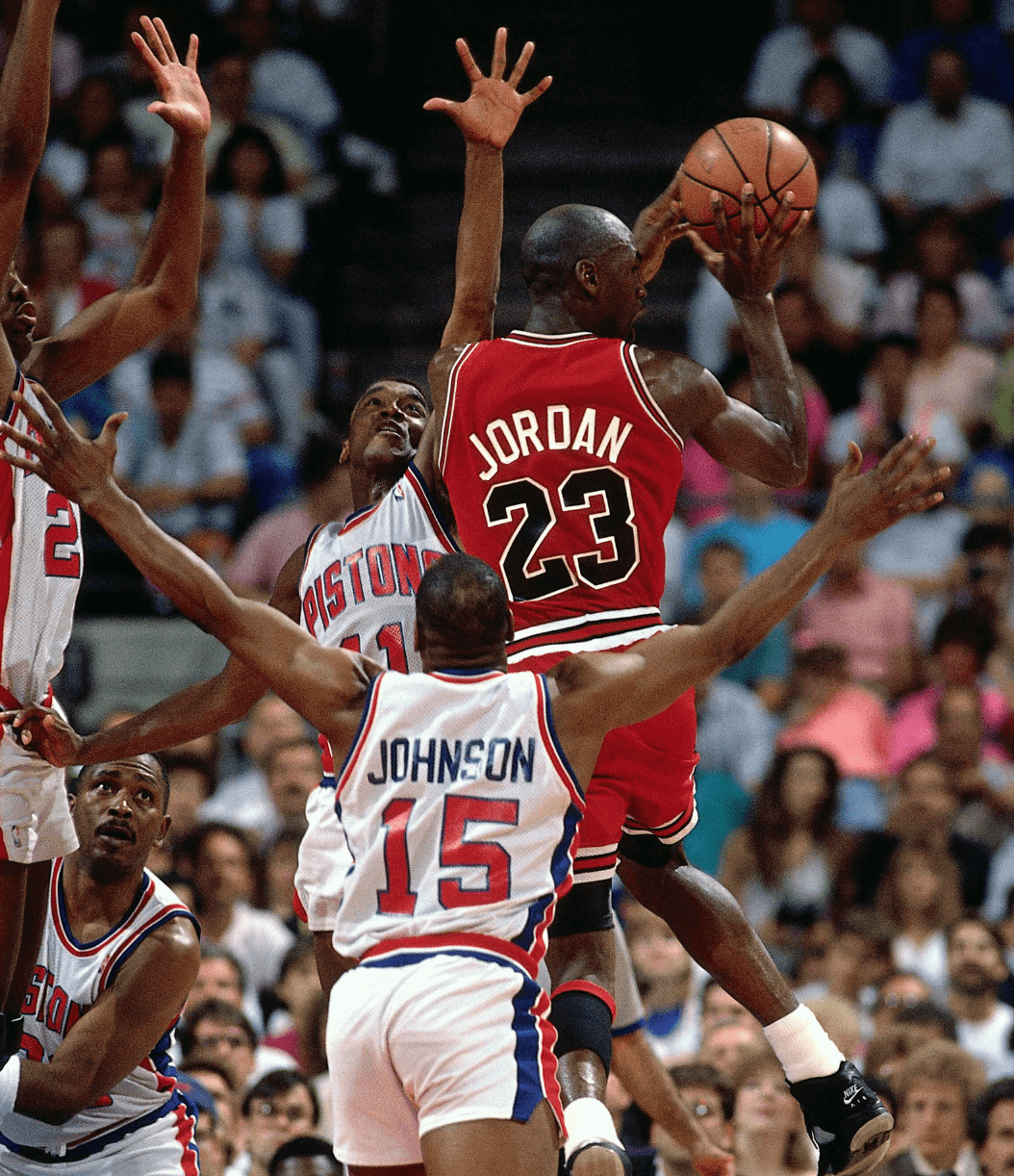
Notice anything uni-notable about this old photo of Michael Jordan about to break some hearts in Detroit?
Here’s the part that interests me: For both teams, the color of the NOB lettering doesn’t match the color of the uni numbers. I haven’t come up with a snappy name for this phenomenon yet, but for now let’s call it CMOB — color mixing on back.
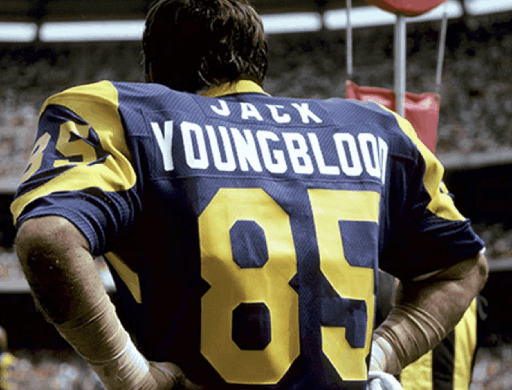
CMOB is one of those things I’ve always kind of liked but have never thought too hard about, at least until now. I was reminded of it earlier this week, when we Ticker-linked to a great uni-centric interview with former L.A. Rams player Jack Youngblood. At one point in the interview he says, “I also liked that our name was in white lettering [instead of matching the yellow numbers] on our blue jerseys. I thought that made it stand out for some reason. I think the Steelers and us were the only teams that did something like that.”
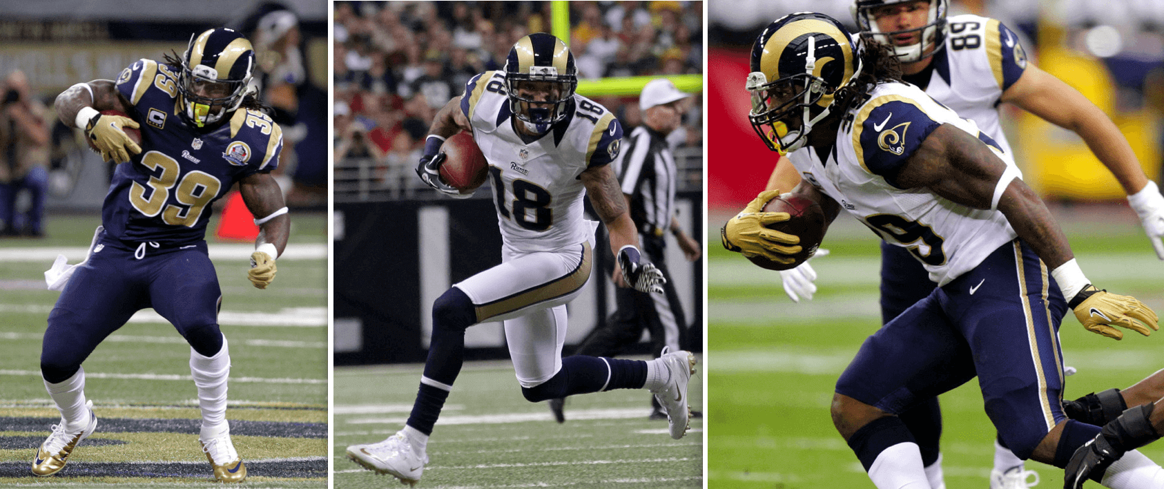
Four decades later, the Rams are once again using CMOB on the blue jersey of their new uni set:
All of this got me thinking a bit more about CMOB. It’s not common, but it’s not quite rare either. How many teams currently use it? Today’s post is an attempt to answer that question.
Before I get to that, though, two caveats: First, there are lots of jerseys where the NOB and number are the same base color but the number is outlined in a secondary color while the NOB lettering is not, like this:
As far as I’m concerned, that is not CMOB. While the type treatments may not be quite the same, the base colors are the same.
Second, I’m also not counting it as CMOB if a team has a contasting nameplate or a contrasting shoulder yoke, since those design elements pretty much require a different NOB color. I’d say those are cousins to CMOB but not quite the same thing.)
With all that in mind, here’s a look at teams that are currently going the CMOB route in the Big Four pro leagues:
MLB
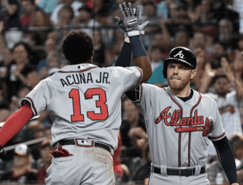
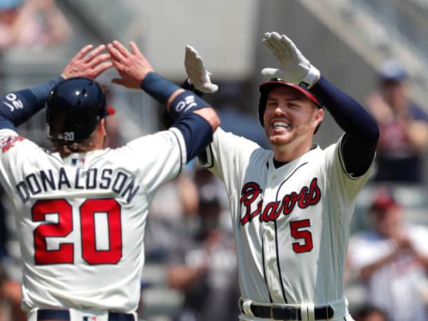
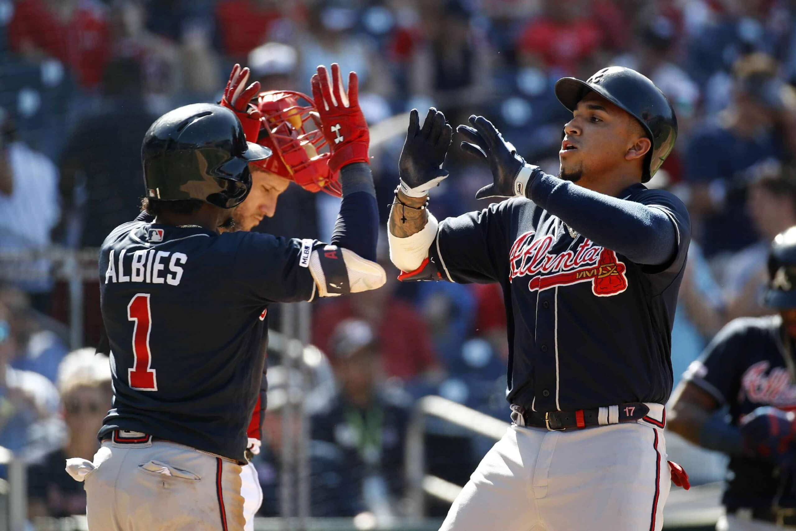
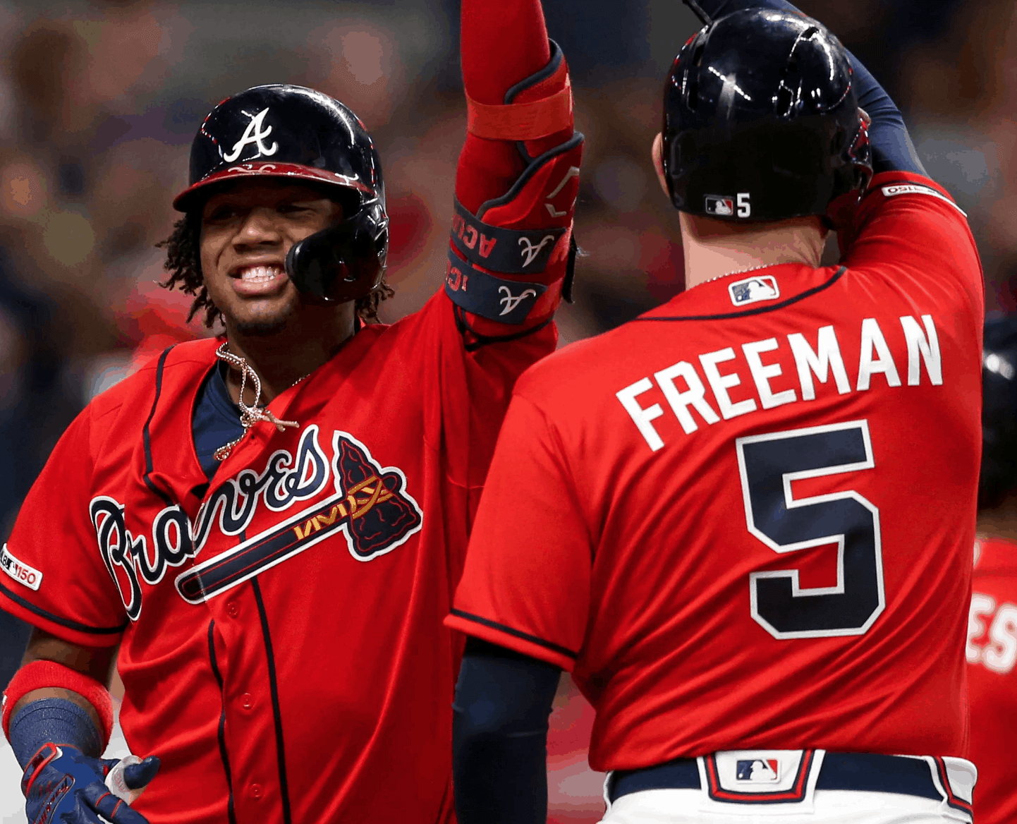
The Braves are the current undisputed kings of CMOB. All five of their current jerseys have color-mixed NOB lettering and uni numbers:

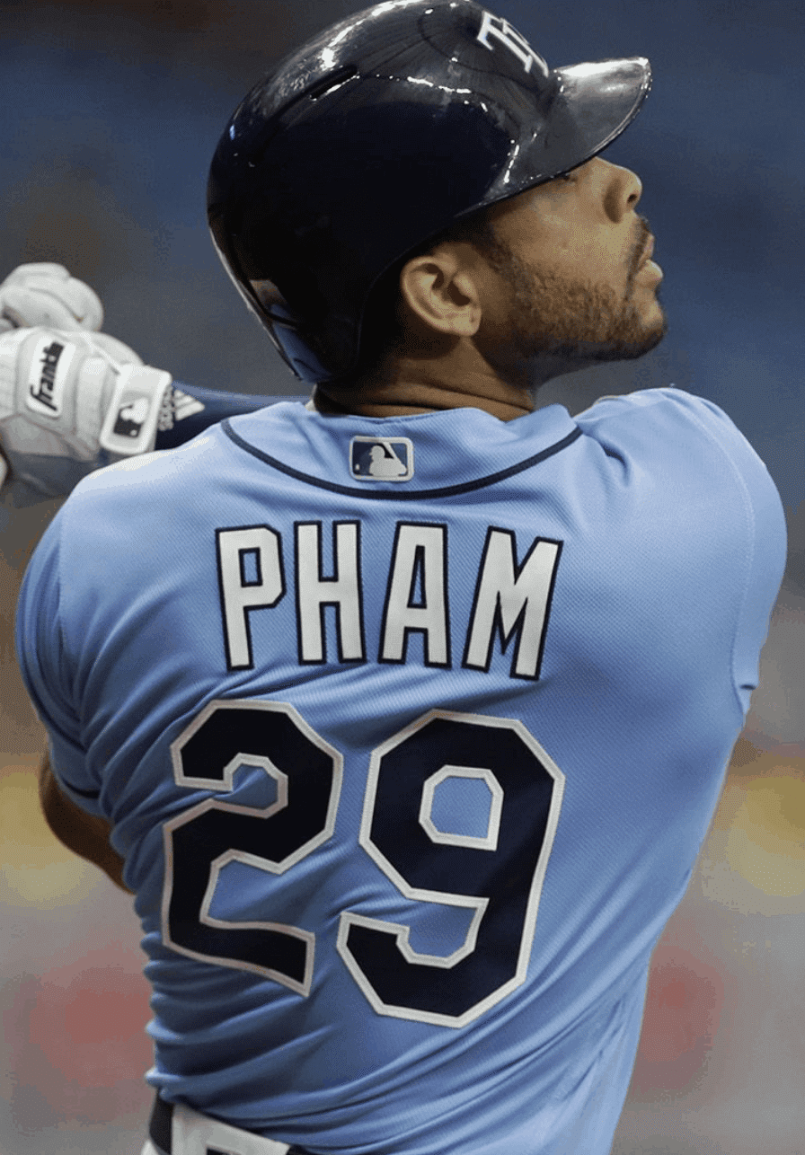
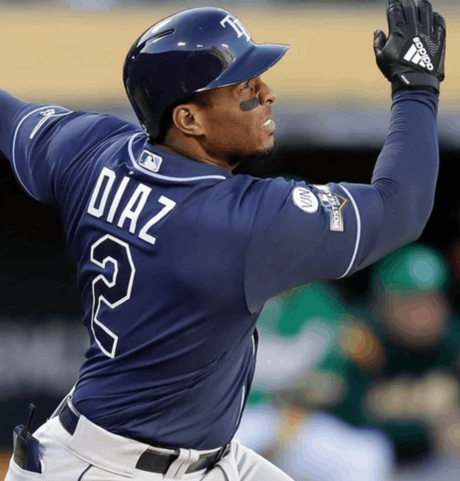
No other MLB team comes close to matching the Braves’ five CMOB combos. The Rays are a distant second, with two:
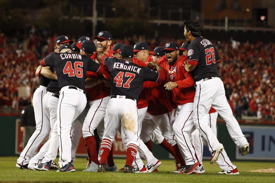
The Nats will also have two this season — their good-luck navy alternate and their new white alternate:
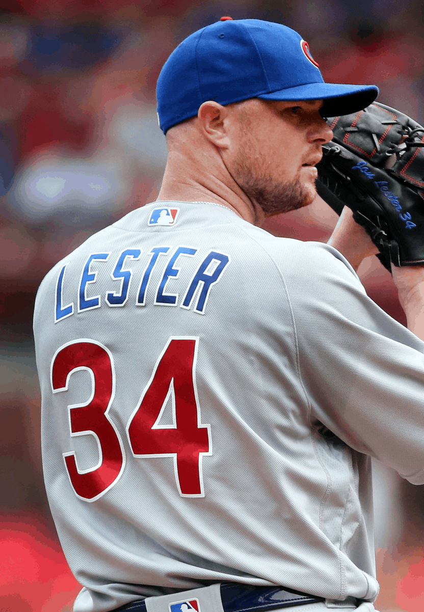
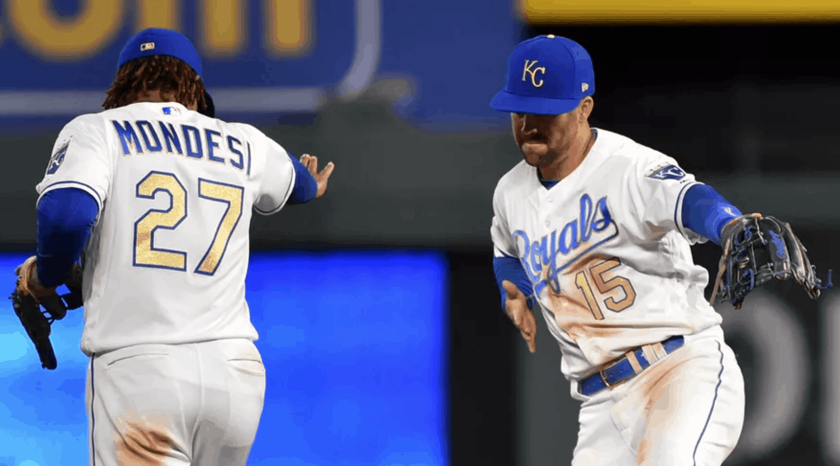
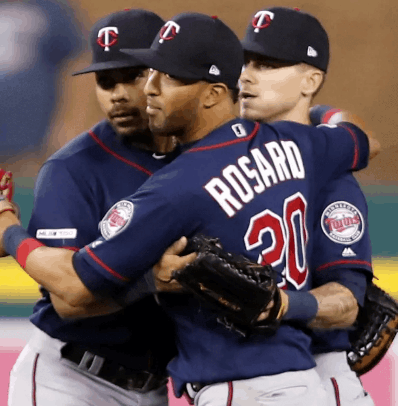
And then there are a few other CMOB examples from the Cubs (one of my favorites), Royals, and Twins:
So those are the current examples of CMOB in MLB. There are lots of previous examples, though, and an inordinate number of them have come from the Diamondbacks. By my count, they’ve had at least 16 different CMOB jerseys during their existence (you can hover over this slideshow to see the navigation arrows, or you can go straight to the full photo set:

NFL
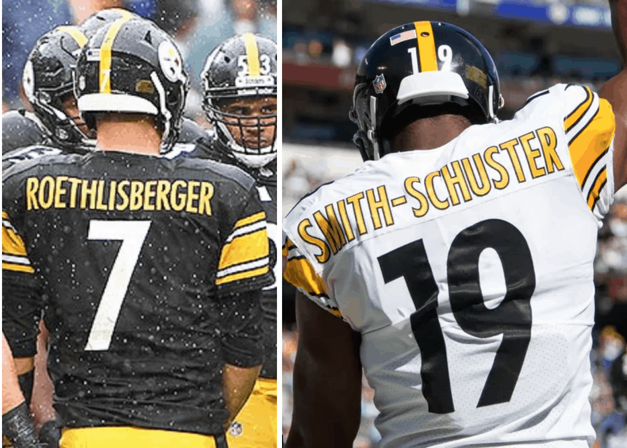
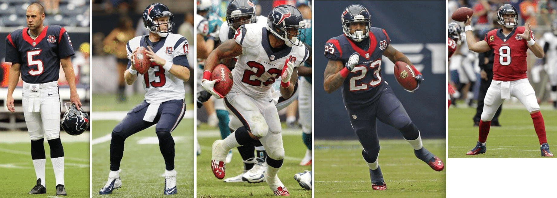
As Jack Youngblood noted, the Steelers went CMOB, just like his Rams did, back in the day. And they still do today, on both their black and white jerseys:
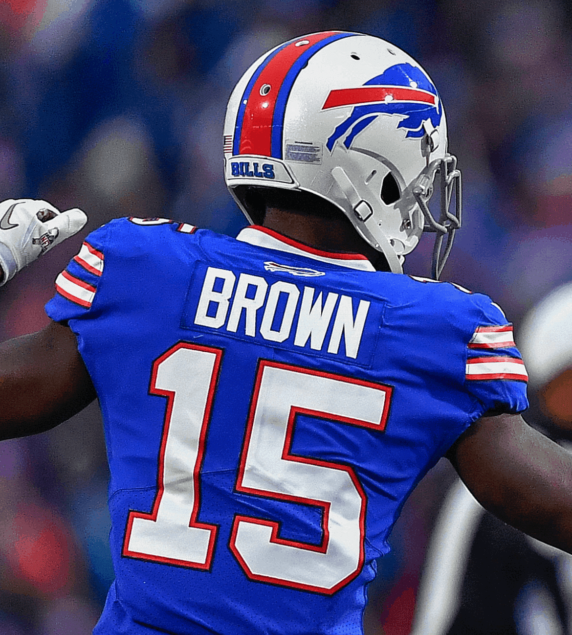
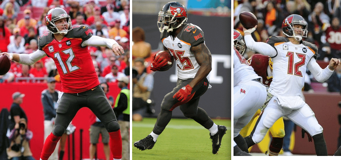
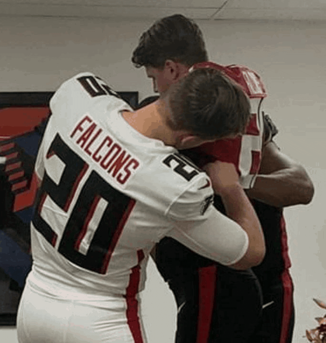
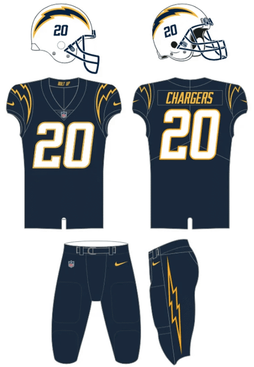
No other NFL team currently has multiple CMOB jerseys, but seven teams have one. That includes the Bucs, Falcons, Chargers and aforementioned Rams, who all used CMOB as part of the new uni sets they unveiled a few months ago:
NHL
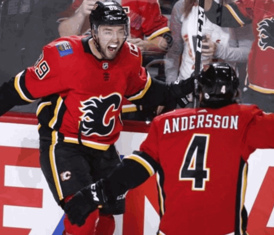
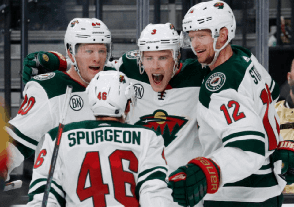
By my count, there are currently five NHL teams that have a CMOB jersey in their wardrobes: the Flames, Oilers, Senators, Wild, and Islanders:


NBA
As always, it’s more difficult to do NBA research because there’s no good visual database of the league’s uniforms. One thing I know is that the Heat have gone CMOB with a bunch of their Miami Vice-themed alternate uniforms:

I’m sure there are many, many other current NBA examples. Feel free to post them in today’s comments.
———
So that’s the current state of CMOB in the Big Four pro leagues. There are also countless non-current examples in all four leagues (here’s one golden oldie apiece from MLB, the NFL, the NBA, and the NHL). Maybe we can try to document all that history at a later date.
As I look at all these CMOB examples, I think the vast majority of them look really good. I like how the different colors provide a bit contrast, a bit of pop.
That said, however, I can honestly say that I’ve never once looked at a uniform and thought to myself, “You know what this design needs? A different color for the NOB.” For me, CMOB seems to be something I don’t really think about until it’s right there in front of me, at which point I tend to like it. But if it’s not there, I don’t miss it.
As you all know, my favorite team is the Mets. I suppose they could go CMOB by changing their blue NOBs to orange. But do I want that? Not really. I suppose they could alter their blue jersey by changing the orange NOBs to white. That would probably be an improvement to the blue jersey, but I don’t really like the blue jersey to begin with, so it doesn’t feel like a particularly substantive change.
Maybe some of you Photoshoppers out there could show us how various current uniforms might look if they went CMOB..? Or maybe that’s a Pandora’s box better left unopened. In any case, it’s an interesting design phenomenon — surprising that I haven’t addressed it until now!
Click to enlarge

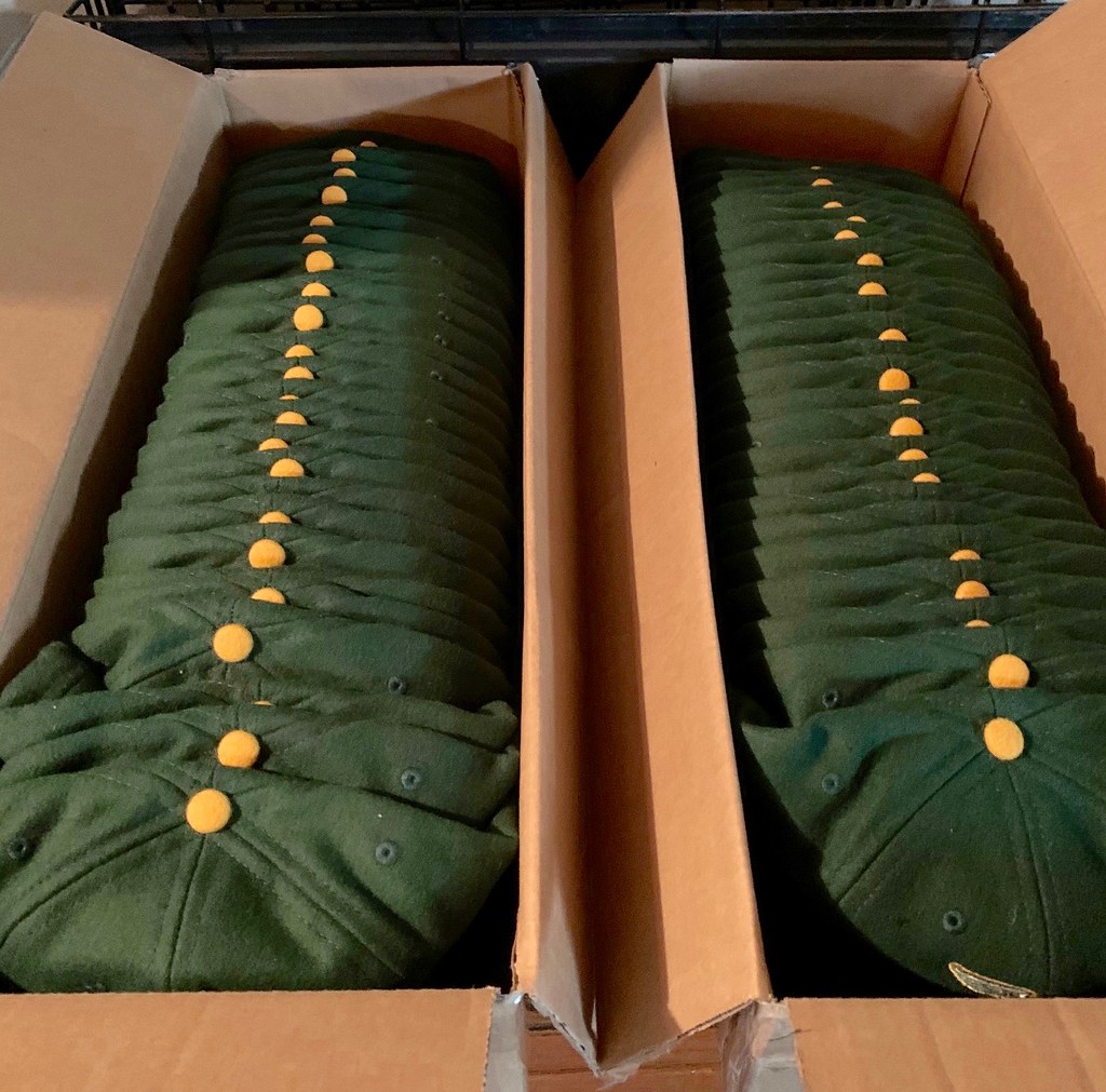
ITEM! Caps back in stock: Ahhh, isn’t it satisfying to see all those contrast-colored squatchees lined up like that? That’s a new shipment of Uni Watch caps, which (finally) arrived yesterday at cap-fulfillment manager Mark LaFountain’s house.
We’d been out of stock for several months due to a pandemic-related factory shutdown, but now we have plenty of inventory in all fitted sizes (and we should have adjustables in another two weeks or so). You can order them here — Mark is eager to ship your cap out to you!
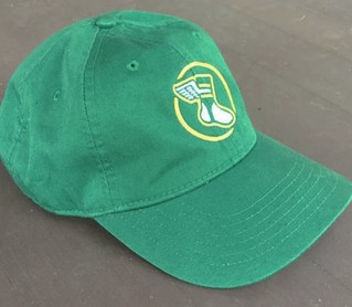
Speaking of, check out what Mark chose as the NOB for his Uni Watch hockey jersey:

Lookin’ good, Mark!
But wait, there’s more. remember our lighter-weight “gold circle” strapback cap, which was briefly available last year? Designer Bryan Molloy and I have just reactivated that one for another round of orders. Unlike the Classic Cap, which is always available (well, except when the factory shuts down), this one will only be available for a limited run, so move fast if you want one. You can order yours here.
My thanks, as always, for your consideration.
ITEM! The best pin ever: I know many have been waiting patiently and anticipatorily for the Uni Watch Pin Club’s new design for July — a bobblehead pin with a pin that actually bobbles! Check out the video above (much better than the one I showed last week) for the full effect! You can order it here.
Here’s a closer look:


I want to take a minute to explain how this pin came about. Pin designer Todd Radom and I hadn’t thought of doing a bobblehead pin (although we really should have — it’s such a good idea!), but back in April I got an email from reader Chris Callan. He’s the guy who guest-wrote an entry back in 2018 about restoring old bobblehead dolls, plus he made a couple of Uni Watch bobbles. Anyway, Chris said (I’m paraphrasing here), “Love the pins! You’re gonna do a bobblehead version, right?” He even attached a design concept for how it could look.
Todd and I agreed that it was a really good idea, so Todd whipped up his own design for a very handsome Uni Watch bobble character. But then I wondered: The basic pin would be fine on its own, but would it be possible for the head to move? That would put it over the top! So I poked around a bit on YouTube and discovered that yes, such pins do exist. I asked our pin manufacturer if they could do that, they said yes, and that was that (well, except that it took a bit longer at the factory than it was supposed to).
All of which is a long way of saying that this pin wouldn’t have happened if not for Chris Callan. Thanks, buddy!
Again, the July pin is available here.
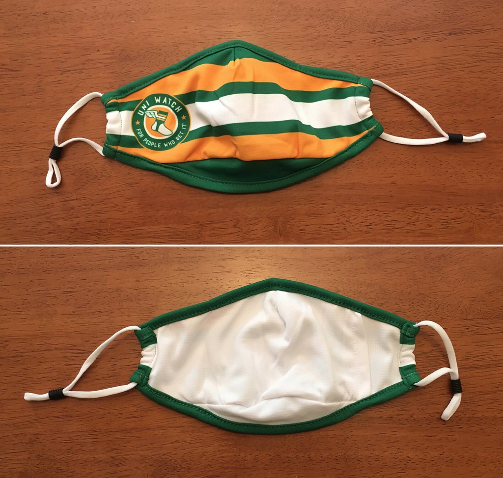
ITEM! Masks available again: The new batch of 300 Uni Watch masks is now available. Just like with the first batch, the price is only $6. Teespring will keep $2 as a warehousing/fulfillment fee, and I’ll donate the remaining $4 to charity — this time to Feeding America.
You can order here. Since these are very popular and we have a limited number of them, please try to order no more than one or two, so other people can have a fair shot. Thanks!

Membership update: Yesterday afternoon, shortly after I finished writing today’s lede, designer Scott M.X. Turner sent me the latest batch of membership cards. That included Jason Galloway’s new card, which is based on the early-1980s Texas Rangers’ powder blues. Look — CMOB!
Jason’s card is one of several that have been added to membership card gallery. If you scroll through the gallery, you can see lots of CMOB designs — and they tend to look pretty good!
Ordering a membership card is a good way to support Uni Watch (which, frankly, could use your support these days). And remember, as a gesture of comm-uni-ty solidarity, the price of a membership has been reduced from $25 to $20 until further notice.
As always, you can sign up for your own custom-designed card here, you can see all the cards we’ve designed so far here (now more than 2,900 of them!), and you can see how we produce the cards here.
The Ticker
By Paul

’Skins Watch: Amazon is the latest retailer to stop selling ’Skins merch. But Fanatics and NFL.com will keep selling it (thanks, Brinke). … Whatever the team’s new name turns out to be, it will reportedly not include any Native American imagery. … ’Skins owner Dan Snyder created a charitable foundation in 2014 to support Native American communities, but public records and new reporting suggest that the foundation has been something between a bust and a scam. … The Chicago Blackhawks say they intend to keep their name and logo. … Pressure is building on the CFL’s Edmonton Eskimos to change their team name, with a major sponsor threatening to sever ties with the team.” It is the CFL, so every dollar counts,” says Wade Heidt. The club is now saying it will provide an update on the team name by the end of the month. … Anderson High School in Ohio will no longer call its teams the Redskins (from our own Alex HIder). … Another Ohio high school — Parma High, near Cleveland — is reassessing its “Redmen” team name (from @nordeckian). … Some fans of Exeter Chiefs, a rugby club that’s been at the top of the Premiership in England for several years and uses Indigenous imagery and the tomahawk chop, have started a petition calling on the team to stop misappropriating Indigenous culture. … The Saanich Junior Braves — that’s a Junior B hockey team in Victoria, B.C. — will no longer be called the Braves (from Jim Wooley). … Two high schools in New York State’s Hudson Valley are considering whether they should stop calling their teams the Indians (from Peter K.). … Braintree (Mass.) High School is facing renewed calls to stop calling its teams the Wamps, which is a reference to Chief Josiah Wampatuck, leader of the Mattakeesett Tribe in the 17th century (from Kary Klismet). … Also from Kary: The school board in Guilford, Conn., has decided that the local high school’s teams will no longer be called the Indians. … And yet another from Kary: We had reported back in March that the school board in Paw Paw, Mich., had decided to stop calling their tames the Redskins, and now they’ve chosen their new name: Red Wolves.
Working Class Wannabes™: An article about the Virginia Tech football team says, “While the lunch pail may be used less often [with the retirement of defensive coordinator Bud Foster], the hard work, blue collar mentality is ingrained in the core” of the team. The article also describes the team as a “national power with a blue collar, lunch pail mentality.” … An article about the NFL’s New York Giants says, “A[n offensive] line also needs some blue-collar overachievement” in order to be successful. … An article about new UGA associate head football coach Matt Luke describes him as a “blue-collar coach,” which is literally a contradiction in terms. … Former Pittsburgh Steelers coach Bill Cowher says the team has “always had a very sort of working-class, lunch-pail ethos” (from Seth Clarke). … An article about Texas high school football says the coaching staff at Round Rock High “is optimistic about a blue-collar bunch that has plenty of savvy.” … An article about LSU football describes an offensive line prospect as a “nasty, blue collar, effort player.” … An article about EPL matchups says Sheffield United “continue that blue-collar approach of high work rate and look to grind opponents down.” … The baseball coach at Central Catholic High in Ohio says his 2011 squad was “just a bunch of blue-collar workers, a bunch of tough guys.” … A player on a team in The Basketball Tournament says his team has “that go-getter, blue collar mentality.” … The new girls’ basketball coach at Pen Argyl High in Pennsylvania says he’s excited to be coaching there because “I’ve been told that this is a blue-collar group, who will work hard every day.” … An article about notable freshmen on the Nebraska football team describes offensive tackle Turner Corcoran as a “blue collar type guy and the type of lineman we need.”

Baseball News: The Pirates have modified their logo to encourage masking up. … A small number of fans will be able to “attend” Cubs games on the rooftops of the buildings across the street from Wrigley Field. The city of Chicago has approved those venues to be open, but at only 25% of their usual capacity. … Mets P Marcus Stroman designed some uniforms for a youth team (from @thatgirlondeck). … Samuel Barrett has proposed a set of protocols and uniforms for a traditionalist model of baseball (Google account login required) — what the ballpark should be like, what the fans should eat, what the players and umps should wear, etc. There’s also a team-by-team breakdown of what would be the most traditionalist uniform and ballpark for each MLB team. … Dodgers 2B Max Muncy, who was injured after being hit by a pitch during an intrasquad scrimmage on Sunday, says he didn’t see the pitch because of the new batter’s-eye backdrop at Dodger Stadium. … Remember when A’s P Mike Fiers wore a strange “cat tail beard” last September? That facial hair styling has now been immortalized on masks that some A’s are wearing (from A’s vendor Hal the Hot Dog Guy).

Pro Football News: Here’s some cool drone footage of the new Rams/Chargers stadium, which is nearly complete. … If fans are allowed to attend Steelers games this fall, they’ll be required to mask up. … Not exactly a surprise, but QB Cam Newton will wear No. 1 with the Patriots (from Andrew Cosentino). … Two very interesting examples of cross-sport facemasks: First, here’s an Edmonton Eskimos player wearing a bizarre football/hockey hybrid cage, and then there’s Robbie Ftorek of the WHA’s Cincinnati Stingers wearing a football lineman’s facemask (from Matt Mandrusiak and Dwayne White, respectively).
College Football News: Here’s a detailed look at LSU’s championship ring design. Frank Mercogliano notes that the reference to LSU’s “interlocking” logo is inaccurate, since the letters actually overlap, not interlock. … Wake Forest’s stadium has a new advertised name (from James Gilbert). … Here’s something I didn’t know: At some point in the past — maybe in the 1980s? — the ACC experimented with having officials wear shorts (from James Gilbert).

Hockey News: Cross-listed from the pro football section: Two very interesting examples of cross-sport facemasks, beginning with a player from the CFL’s Edmonton Eskimos wearing a bizarre football/hockey hybrid cage, and then there’s Robbie Ftorek of the WHA’s Cincinnati Stingers wearing a football lineman’s facemask (from Matt Mandrusiak and Dwayne White, respectively).

NBA News: The most popular option so far among NBA players who’ve chosen a social justice message to replace their NOB is “Equality.” … Meanwhile, here’s a look at what Kings and Trail Blazers players will be wearing.

College Hoops News: Siena College’s coach announced that the team will add a black alternate uni this season as part of a social justice initiative (from Timmy Donahue).

Soccer News: Contrary to earlier reports, Inter Miami did not have a primary shirt advertiser as MLS returned to action last night. … Speaking of ads, an Adidas ad roughly the size of a house was digitally superimposed at the center of the pitch. … Scottish side Rangers are updating their crest (from Germán Cabrejo). … The new NWSL team in Louisville will be called Racing Louisville FC. Additional info here (thanks to all who shared). … New summer kits for J-League clubs Cerezo Osaka, Kawasaki Frontale, Shimizu S-Pulse, and Jubilo (from Ed Zelaski). … Burnley wore a one-off fourth kit for yesterday’s match against West Ham in order to avoid a kit clash. … Gross: Two new shirt advertisers for NYC FC. … Philadelphia Union apparently has — or at least is selling — a new away kit. … Belgium’s top tier has a new logo (thanks, Jamie). … Also from Jamie: “Some NWSL supporters’ groups have been sending banners to be displayed at the Challenge Cup.” … Here’s a good look at how MLS players will be able to add a personalized message to their shirts during their first match when play resumes (from Jakob Fox). … AS Roma added a memorial patch yesterday for Italian composer Ennio Morricone, who died earlier this week (from @retroray12). … New shirts for French side Angers (from Ed Zelaski).

Grab Bag: The school district in Lufkin, Texas, will no longer require K-8 students to wear uniforms. … Following up on a storyline that has appeared several times in the Grab Bag, the police department in Gettysburg, N.D., is no longer using a logo featuring the Confederate battle flag. … MLL has a new ball design (@PhillyPartTwo). … Speaking of lacrosse, new jerseys for the PLL’s Waterdogs Lacrosse Club (from Liam Murphy). … A Redditor has been designing flag concepts for universities (from Jeremy Baker). … New use for curling pins: holding a mask in place (from R. Scott Rogers). … Good article about the only boxing ref in Vegas who’s currently wearing a mask. … There’s a new website where you can shop for team-issued apparel from college student-athletes who are selling off their team gear. … White House coronavirus task force member Dr. Deborah Birx is trying to encourage people to wear masks by making her masks a fashion statement (from Alan Kreit). … The Richland County (S.C.) sheriff’s department has added the term “Peace Officer” to deputies’ uniforms and patrol cars (Kary Klismet again). … Also from Kary: Parkwood High School in North Carolina will no longer call its teams the Rebels. … My friend Jonathan, one of the world’s foremost digital typographers, has designed the new typeface for presumptive Democratic presidential nominee Joe Biden’s campaign. … New Jersey Gov. Phil Murphy has been wearing a variety of NJ-themed masks (from Timmy Donahue).

Click to enlarge

What Paul did last night: If you look closely, you can see that we had a bowl of grapes on the porch with us yesterday evening. I really like grapes, but for some reason we rarely have them in the house, which is really stupid. Note to self: Buy more grapes!
Anyway: This was the first time we’ve had grapes on hand for Pandemic Porch Cocktails™. Perfect, I thought — I can drop some in my beer so they’ll bob around and look festive, as I sometimes do with raspberries. But to my surprise and mild disappointment, it turns out that grapes don’t float:

In that photo, they look more like olives!
All of this is basically a long-winded dodge to avoid admitting that I can’t remember the name of the dog in the main photo.
As always, you can see the full set of daily Pandemic Porch Cocktails™ photos, dating back to mid-March, here.
When the Steelers first debuted their new jerseys with the rounded font in the 1997 season, their names were black just like the numbers. I remember seeing it and thought it didn’t look right, thankfully someone with the Steelers thought the same and they went back to gold names the next season.
Good point — I’d forgotten about that! The black-on-black was only for the 1997 season:
link
Am I the only one who didn’t realize until today that the Steelers’ change from block numbers to rounded numbers in 1997 was to match the style of numbers on the back of their helmets?
I wouldn’t say that’s why they did it. It isn’t even a true match — the jersey numbers are italic, while the helmet numbers are not.
And then in ’98, under the old NFL shoe rules (black or white at the entire team level), they switched to black. I thought it looked so much better. Alas, the team went 7-9 and my guess is superstition switched them back to the white cleats.
“Eskimos QB Dwayne Mandrusiak wearing a bizarre football/hockey hybrid cage, …”
Holy smokes! He’s got it all!! And taped together with athletic tape to boot!!
I was just going to mention the steelers black nob. Added insult to injury with the new font.
link
In the Cincinnati Stingers photo of Robbie Ftorek, why the ‘R’ in ‘R. Ftorek’? I can’t find evidence of another Ftorek on the team. Was the FiNOB on all players?
FiNOB was the norm for the Stingers for at least part of their history. Here’s another example – a Paul Stewart game-worn jersey:
link
Re: CFL photo – Dwayne Mandrusiak is Edmonton’s longtime equipment manager. Not sure who the player with the crazy mask is
Based on the jersey number and apparent time period, best guess for the player would be offensive lineman Bill Stevenson
link
Sorry, my bad. Will fix!
He is Mandrusiak still at work for the Eskimos in more current times. No more mullet and ‘stache. Sideline gear a little different today for staff. I think I prefer his striped shirt from back in the day.
link
Love the color mixing names on back piece. Should be bonus points for when the NOB matches the trim on the numerals
see link:
link
Ladies and gents, I should point out here that this commenter, John Turney, is the guy who did the great Jack Youngblood interview that ultimately led to today’s blog post. Thanks, John!
Bonus bonus points if the NOB lettering is vertically arched.
I like one-color NOBs that match the trim rather than the body of the numerals.
The Braves look particularly good with this, with those big bold easy-to-read numbers and then thin black NOBs that don’t get in the way. Imagine if those NOBs were two-color; they’d look horrible. Or if they were red like the numbers are. Neither of those look as good as what they have.
We got to see a lot more of this style with the Father’s Day, Mother’s Day, Independence Day, etc. holiday jerseys last season; I *think* every NOB-using team had single-layer NOBs, often using the trim color, even when their NOBs were normally multiple layers.
For me true CMOB is when the body of the NOB is a color that the numbers don’t use at all, like the Cubs’ blue NOBs atop red numbers on their gray road jerseys, or the Steelers’ yellow NOBs atop white digits.
CMOB! Great post today, Paul! I LOVE CMOB. Current Bulls whites went back to CMOB recently and look amazing. I’ve always preferred CMOB. Glad it’s getting it’s due!
I love CMOB for teams with a strong secondary color, not so much for teams primarily defined by one primary color. So I’m glad the Yankees and Dodgers have SCOB (single color on back) uniforms, and I think CMOB is a mistake for the Royals. But Cubs, A’s, Braves, Rangers, Nats, and suchlike should do more CMOB (the estimably CMOB’ed Braves excepted).
Also, dark jerseys make CMOB almost mandatory, unless the number is white. You can rely on color contrast to make the big number legible on a dark jersey, but the much smaller NOB lettering usually needs to be white.
More than that!
The 2019-20 Bulls had 3! CMOB jerseys.
Red:
link
White:
link
Black:
link
Indeed the current team does more color mixing than the early Jordan Bulls because the NOB on the white jersey at that time was red not black.
That shot that includes Nikola Mirotić #44 on the Bulls illustrates another big benefit of single-layer NOBs: it’s easier to include accent marks. And with more and more players coming to the major sports from places where they speak languages that have these, we’re only going to be needing a greater variety of accent marks.
Paul, has anyone ever done a study of the first player NOB to have each kind of mark? Years ago I only ever saw tildes (Peña) and apostrophes (O’Brien); the Hispanic players weren’t putting acute accents in (Urías) and in hockey the many European players who really needed things like hačeks (Miroslav Šatan comes to mind) didn’t get them.
(The Mets didn’t always have apostrophes on hand, and I remember poor Charlie O’Brien had to suffer with a rotated tilde instead of an apostrophe! Can’t find a photo, but I remember it!)
I’ve seen umlauts in the NBA recently. Are there any Romanian guys with breves (ă)? Have we ever seen a macron (used for long vowels in Latin, Sanskrit, and romanization of Japanese; Shōhei Ōtani could have one if he wanted)? How about an aspiration mark (classical Greek and romanization of Chinese; Chin-Hui Ts‘ao could if he liked)?
I’ve always liked the Cubs mismatch, but I always thought the colors should be flipped. I thought the numbers should be the more dominant blue. These days… I actually like how they do it.
I love seeing the pics of the dogs, but I hate seeing my bias. Not one of them is as cute as my little Linda.
“a bobblehead pin with a pin that actually bobbles“
For a second, I was squinting to see if the bobblehead pin was wearing its own pin in some sort of infinite regression pattern.
Just wondering if the Philadelphia Flyers count towards CMOB status, or is that nullified by the contrasting nameplates?
Orange sweaters have white numbers, and black names on a white background.
White sweaters have orange numbers, with white names on a black background.
Someone didn’t read the introductory text very carefully!
;)
Indeed I didn’t. Consider me chagrinned.
You missed on NHL CMOB: The Islanders’ third jersey:
link
Ah, good one. I’ll add that.
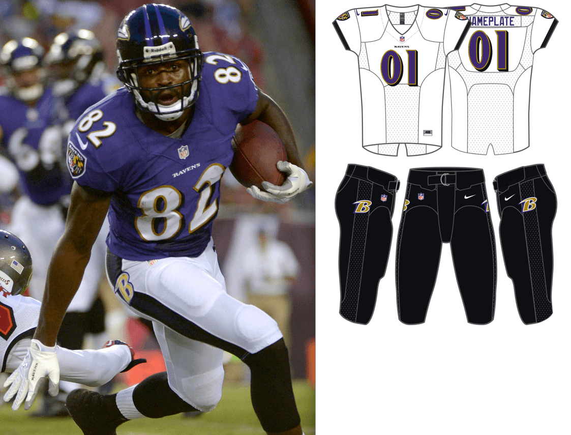
I’ve never really been a fan of the mismatch. But if a team to use it, I think I prefer the darker color over the lighter color, like dark blue name over red numbers, black name over orange numbers, red name over light blue numbers, etc. Something else that bugs me is light unit top over dark bottoms, especially when the numbers are lighter than the pants. A prime example of this is the Ravens’ white jersey over black pants. The numbers are purple. It just doesn’t work for me.
(The Ravens are in desperate need for a uniform overhaul)
The Chargers’ new navy uniforms are also CMOB
Right you are. Let me add that!
When the Calgary Flames brought back a red jersey in 2003 (prior to that, they had a black horse head jersey and a white flaming C, and that was preceded by the diagonal set), the NOB lettering was black too. Lasted about a month, then they tweaked it to CMOB as it has been since.
With any luck, here comes a discussion thread on some other board, complete with a Getty image action shot:
link
I feel like CMOB isn’t a great abbreviation to use, because it could also refer to Color Matching On Back, which would be contrary to what you are trying to convey.
Interesting point!
Any suggested alternative?
I was thinking about CCNOB – Contrasting Color Name On Back, but the colors aren’t always contrasting, sometimes they’re complimentary. Acronym still works, though.
Contrasting Name and Number.
Has CNN ever been used?
Would prefer to avoid something that already has strong cultural currency in a different context.
I was just kidding.
My principal said I need to stop doing that. To some extent.
Contrasting colors on back = CCB
Contrasting colors on rear = CCR
Opposite: “Same” = SCB/SCR or “Non-” = NCB/NCR
This avoids CBC and NBC! ;-)
Differentiated
Color of
Number and
Name
On
Back
DCNNOB…which if pronounced as written probably isn’t good…
Color
Difference
Between
Name and NOB
CDBNNOB…sounds like you might be selling a CDB Oil…
Color
variance
between
Name and Number on back
CVBNNOB… Oh boy…I might need another cocktail now…
Different Colors on Back? DCOB
Only, “Color Matching On Back” isn’t exactly a thing; it’s the default setting.
Twins road jersey immediate past and present have CMOB in addition to their road softball top.
Current
link
Past
link
Here’s CMOB in college: UVa’s basketball teams do it for every single one of their uniforms as of last season.
Both do link on white. The men’s team does link on blue, and the women’s team flips the blue uniform so it’s link. These also have the same treatment on both the back and the front.
When the women’s team wore pink alternates last season it was link, as with the women’s link, but only on the back, not the front. (You can also see Wake with black name/gold number in the last picture.)
So, a real commitment to CMOB, but it might all go away with new uniforms next season.
Also, examples in soccer are escaping me except for a contrasting yoke that apparently doesn’t count, but I don’t want to say there are none in the entire world. We can say there are none in MLS and NWSL, but in 2018 the NWSL used link in the same color for number and NOB.
Iowa football has CMOB home jerseys (a la the Pittsburgh Steelers):
link
…although that has not always been the case, as this 2001 photo reveals:
link
I don’t know for sure when it changed, although I may have to do some digging and try to figure it out.
Interestingly enough, the Hawkeyes have always worn SCOB (Same Color on Back) for their road uniforms (black):
link
…unlike the Steelers, who as Paul noted above, use yellow NOBs outlined in black and black numbers on their road jerseys.
Proofreading in the Grab Bag: TERM “peace officer” (not “team”).
Thanks. Fixed.
FWIW, the Google Docs link to “a traditionalist model of baseball” requires a Google account login to view.
Didn’t realize — thanks for the heads-up.
Proofreading in the Grab Bag: Gettysburg, N.D should be Gettysburg, S.D.
Is CMOF more or less common in baseball than CMOB? And then there’s teams like the Dodgers that do one (CMOF) but not the other (CMOB)…
I’ve been a Braves fan for hell probably 25-30 years now, so I’m definitely used to the CMOB. I hope they never go away from it, it’s a nice touch on the uniforms (I agree RS Rogers above, that it works particularly well when teams have strong secondary colors that they incorporate).
The Browns’ previous white jerseys had CMOB
Maybe a name for the phenomenon of dogs walking by that you don’t know the name of…that fits this comm-UNI-ty
“NNOD” No Name on Dog ?
My favorite uniforms, the Canucks’ Flying-Vs, came out of the box with orange player names on both home (black #s) and away (gold #s) sweaters.
The 1999 Lakers took pains to have the player name (and team name) contrast with player #s, an homage to their 1966 uniforms which introduced the gold and “Forum Blue” color scheme. I often wonder why the 2001 alternate white uniforms didn’t continue this policy.
It also hasn’t escaped my attention that Nike does the NBA player names on the cheap: Choose one of two fonts, no outlining, no vertical arching.
It also hasn’t escaped my attention that Nike does the NBA player names on the cheap: Choose one of two fonts, no outlining, no vertical arching.
This is more of an NBA thing than a Nike thing. They’ve been streamlining their NOB typography over the past decade or so, encouraging teams to stick to a limited number of font options. Directive came from the league office when Adidas still had the contract.
I’m curious if you know why this was done, Paul. Was it a legibility thing? Branding? If the former, it makes functional sense, but the proposal to allow players to wear social justice-themed phrases on their jerseys in place of NOBs seems to run counter to the functionality rationale.
As it was explained to me, they wanted more of a unified (uni-fied?) look.
July pin is finally available!
link
Order placed!!!
Pin and gold circle cap ordered! Double dose of goodness today!
Though they were worn before my time, I’ve always liked the old Orioles jerseys with black player names & orange numbers. I would like to see them go back to that. If I ever get my act together & buy a membership card, that would more than likely be my basis for design.
Get a card Will.
It’s dead easy, even for me here in the UK.
And it arrived last week and it’s very pleasing
Will mentioned the classic, late 60’s O’s home jersey with orange numbers/black trim and black lettering. The team has worn them for a few TBTC games but I really wouldn’t mind seeing them switch to an updated version at home or as an alternate. And it was also my first thought for my membership card but I went with the Baltimore Blast goalkeeper jersey treatment instead.
Love the bobble head pin but would love (and buy) a real life UW bobble head doll for my desk.
How ‘bout it, Paul?
NBA Breakdown:
Hawks: No
Celtics: Black Jersey only
Nets: No
Hornets: All three
Bulls: All three
Cavs: Red and black only
Mavs: White and Royal only
Nuggets: White, Navy, Mile High
Pistons: White and Blue only
GS: Throwbacks and the City?
Rockets: No
Pacers: No
Clippers: White only
Lakers: No
Grizzlies: No
Heat: standard white and Vice
Bucks: No
TWolves: White and green
Pelicans: NOLA style only
Knicks: Standard white and blue
Thunder: No
Magic: No
Sixers: City edition only
Suns: White and purple
Blazers: No
Kings: No
Spurs: No
Raptors: No
Jazz: White, blue, and gold
Wizards: White, red, navy, DC
We don’t have NOB on our uniforms, but when we went to update this year and still maintain our ‘visual identity’ we went CMOF with our school and number.
link
Old version:
link
Uni Watch Masks also now restocked:
link
got one!
Re: Rangers
the most interesting thing is they have a new crest that will never appear on the jersey, as per tradition, as they go for a baseball style monogram: link
Washington moving away from Native imagery is the right move but it seems to ensure that they will go with some aggressive over the top “patriotic” imagery to pacify the disgruntled conservative fans. It will almost certainly be a jingoistic stars and stripes camouflage disaster.
I have trouble imagining a G.I. Joke design dovetailing well with the burgundy and gold color scheme.
Any chance Uni Watch stickers will return?
Plenty available here!
link
Speaking of stickers, Uni Watch used to offer custom sticker sheets based on the back designs of membership cards. Are those still available?
No, unfortunately. Became a bit of a hassle working out the logistics for each sheet with StickerYou.
Just don’t share the grapes with the dogs, Paul. They are poisonous to the puppers.
You know, those Marcus Stroman-designed baseball uniforms are pretty sharp! Who knew he was such a Renaissance man?
Another favorite uniform of mine with CNOB: 1978-84 Padres’ home uniform. Player names in brown (and vertically arched!), player #s in gold in ’78-’79, orange in ’80-’84.
I Bring you CMOB in Canadian Football League in 2019:
-Toronto Argonauts home and away:
link
link
-Ottawa Redblacks away:
link
-Montreal Alouettes away:
link
Fantastic post! I have been a hug fan of the colors of the name matching the color of the numbers on the back of jerseys! I’m glad to see this get more attention!
However, I hate to be an online nitpicker in the comments. But CMOB immediately reads to me as “color match on back” as in the colors for the names and numbers on the back of the jersey *do* match. The “M” standing for “mixing” is just not clicking. I don’t have a “design” background so maybe the term mixing is used a lot more than just for us laypeople.
For me, MMOB seems more intuitive and my brain quickly identifies the acronym as “mismatched on back” as in the colors for the names and numbers on the back of the jersey are mismatched.
So CMOB immediately reads as “color match on back” whereas MMOB immediately readas as “mismatched on back”
Just my two cents… Love this site!
*huge fan of the colors of the name NOT matching
As a native American it is saddening to hear the Redskins are not going to use native imagery. It feels like the easy way out, wiping it clean and acting like it never happened. I would’ve loved to see them rebuild the brand with a conscious approach that builds up the imagery instead of only borrowing it.
What about this article from 8 years ago, when you seemed to embrace the CNN name. . I knew this felt like deja vu.
link
Wow — I completely forgot about having written about this subject before! Great job finding that old post.
But I still don’t like CNN, at least now.