For all photos, click to enlarge
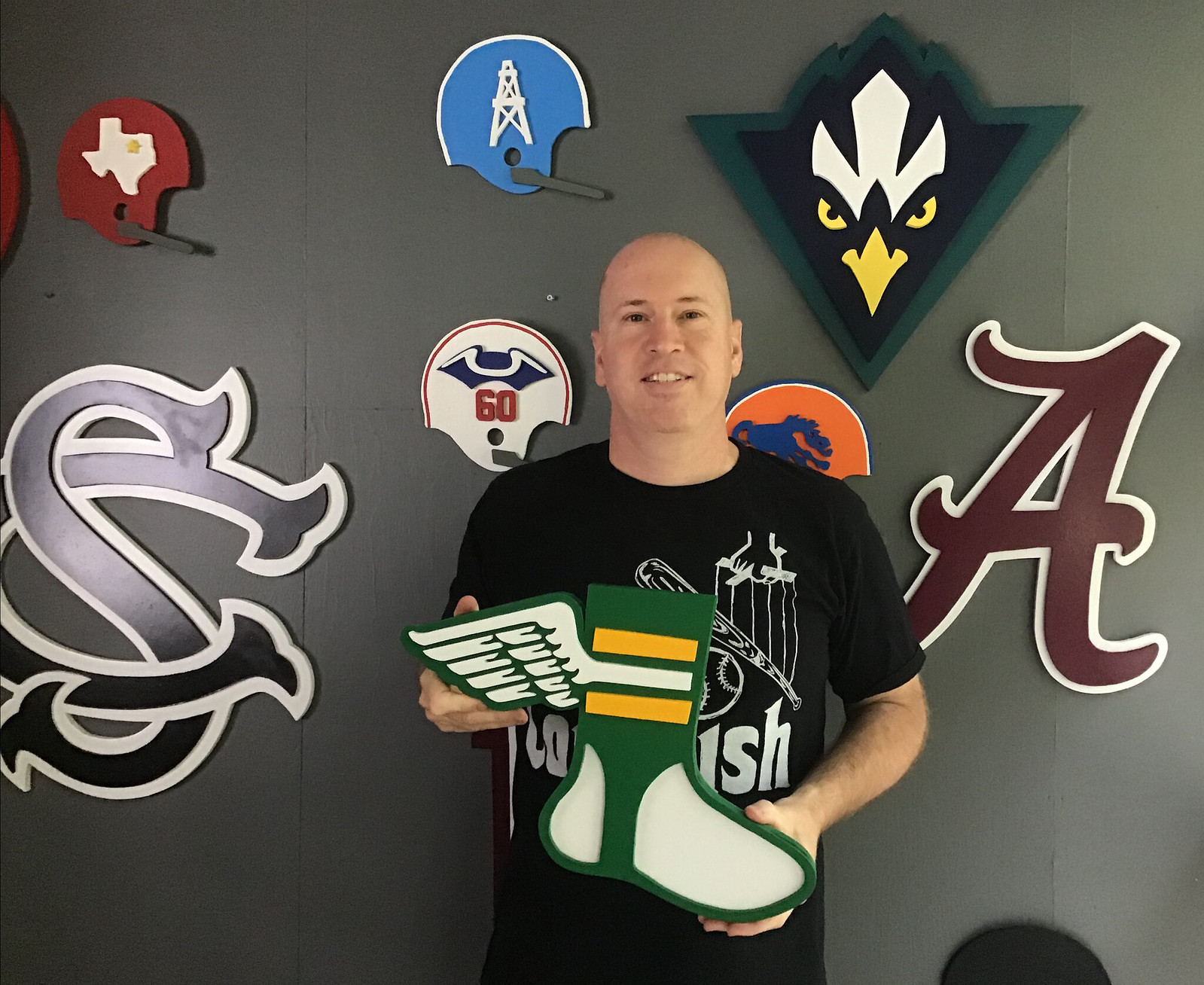
[Editor’s Note: Today we have a guest entry from reader and card-carrying member Kevin Cearfoss — that’s him above — who’s going to tell us about a sensational series of DIY projects he’s been working on. I know everyone will like this one! Enjoy. — PL]
By Kevin Cearfoss
The obsession started at Shop ’N Save. I would beg my mom for a quarter to drop into the gumball machine to score an NFL gumball helmet. She was so great about it — she even helped me collect and display all the little helmets. Then I wanted all the NFL helmet hats. And as an adult, I’ve continued my interest in collections of NFL merch, including NFL helmets, NFL sticker albums, NFL belt buckles (which then led me to discover NBA, MLB, and NHL buckles), IHOP helmet magnets and standings, and on and on.
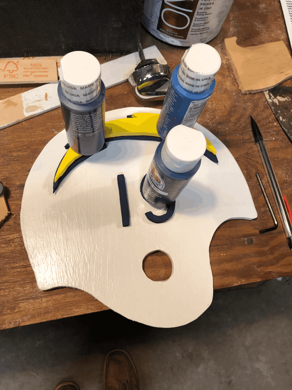
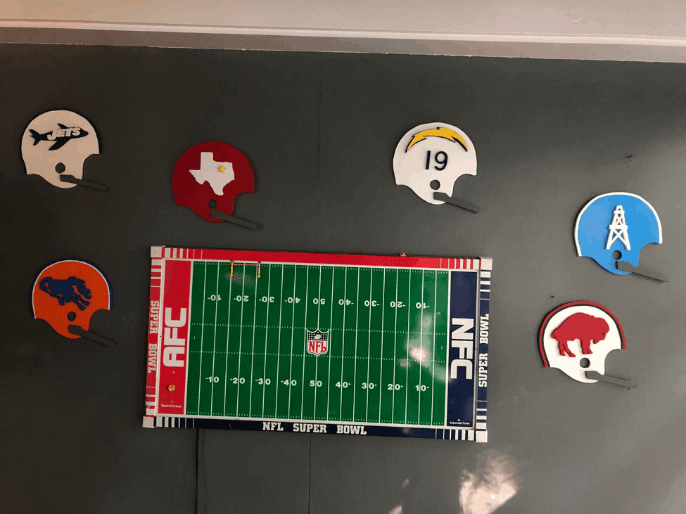
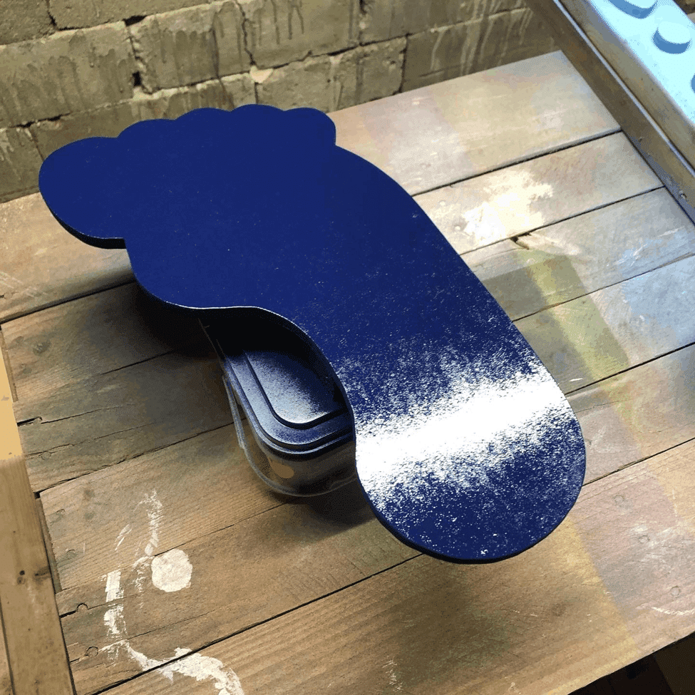
I recently decided that I wanted to make helmets from wood, starting with some of the old AFL designs — Bills, Chargers, Dallas Texans, and Oilers. I did some research, bought some plywood and a jigsaw, cut some logos, and painted them.
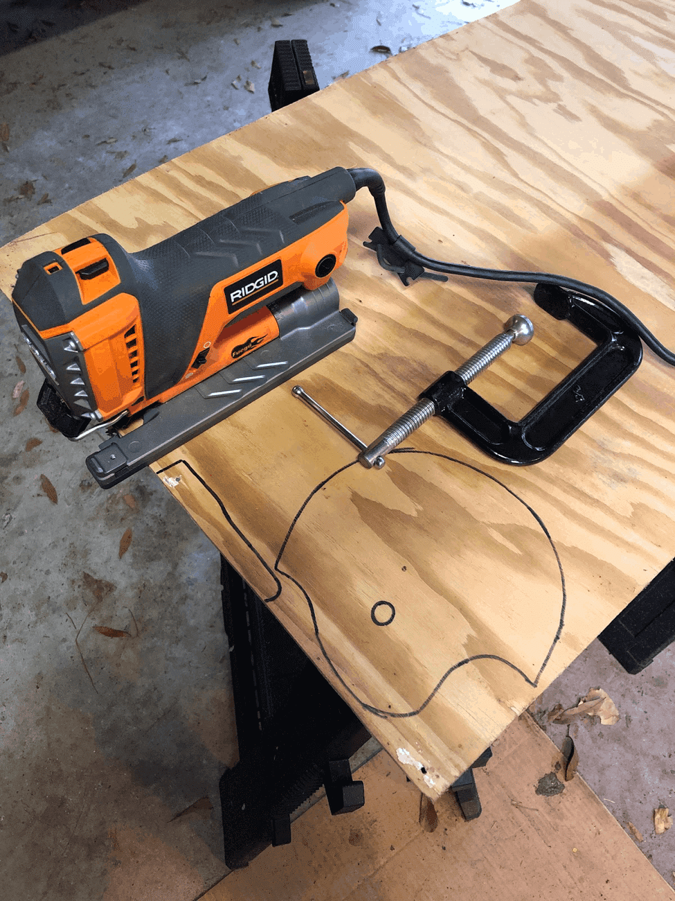
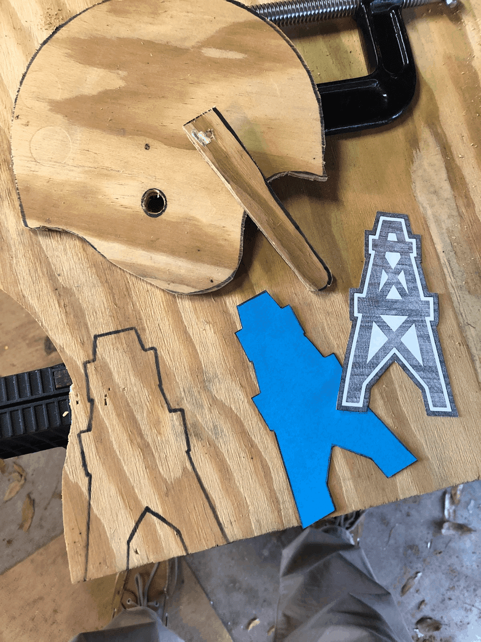
It was a good start, but I didn’t really have the proper tools and equipment, so I grew frustrated and the logos sat around the garage collecting dust for over a year. Then I found my old electric football board and thought I could hang it on the wall in our sun room with the AFL helmets displayed around the board.
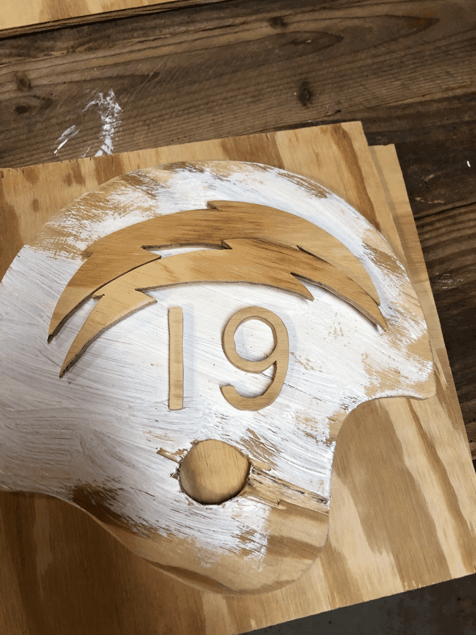
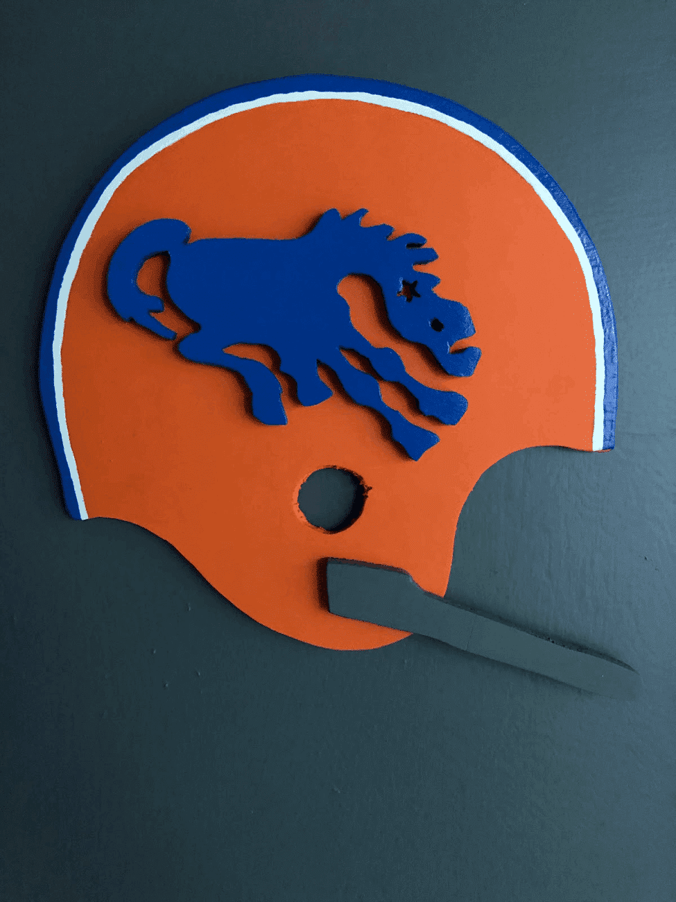
That got me hooked again. l found an inexpensive scroll saw and got to work. Mark, saw, sand, paint, glue, hang, repeat — I loved the whole process. And as I researched the helmet designs, I learned about all sorts of cool trivia, like the blue Broncos wearing the blue horse logo at the beginning of the 1964 season, and the Jets wearing an actual jet logo in 1963.

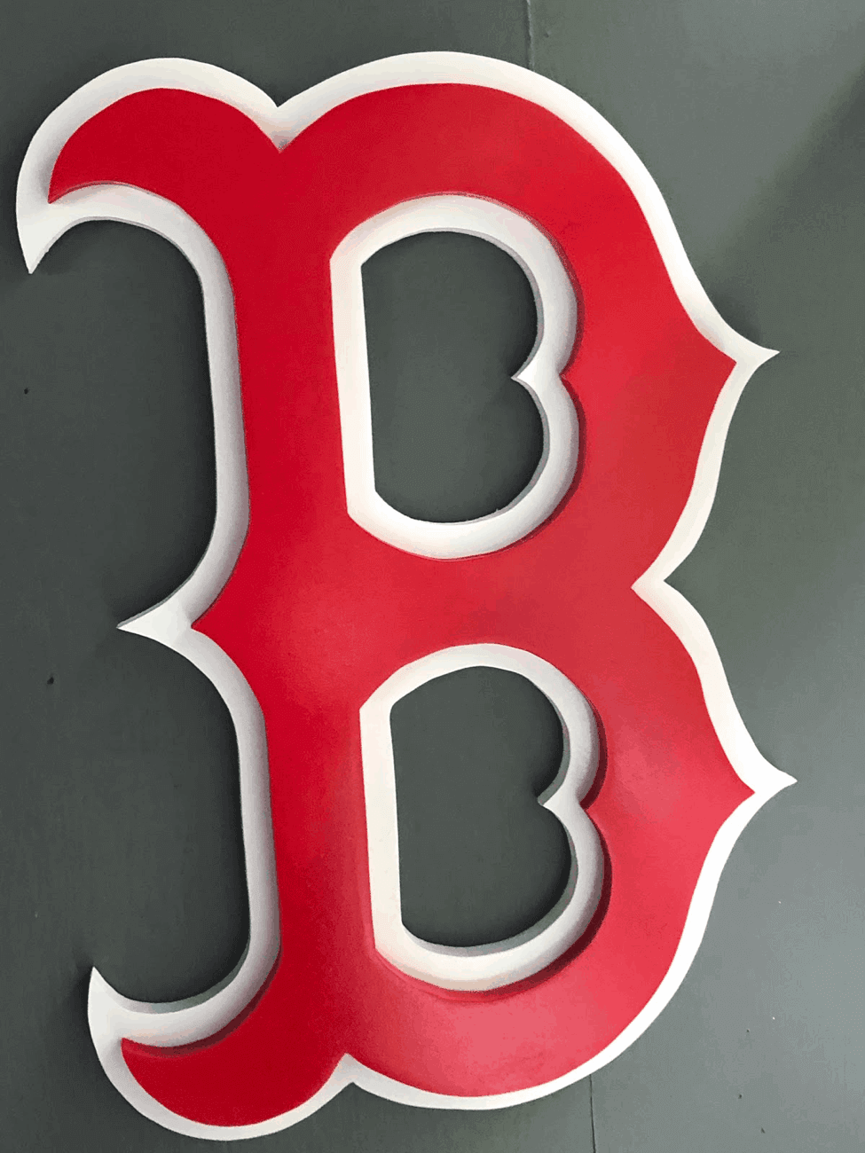
I wanted to make a larger 3D wall art based on team logos, not just football helmets. After an early experiment with the Arizona Cardinals’ logo, a friend from my fantasy baseball league who saw photos of that project asked me to make him a Red Sox “B” logo to hang in his office. I researched again and decided that medium-density fibreboard (MDF) was a better option than the plywood I had used for the helmets. For the Red Sox wall art, I used half-inch MDF (if working with MDF yourself, wear a mask to protect yourself from the large amounts of dust that result from cutting):
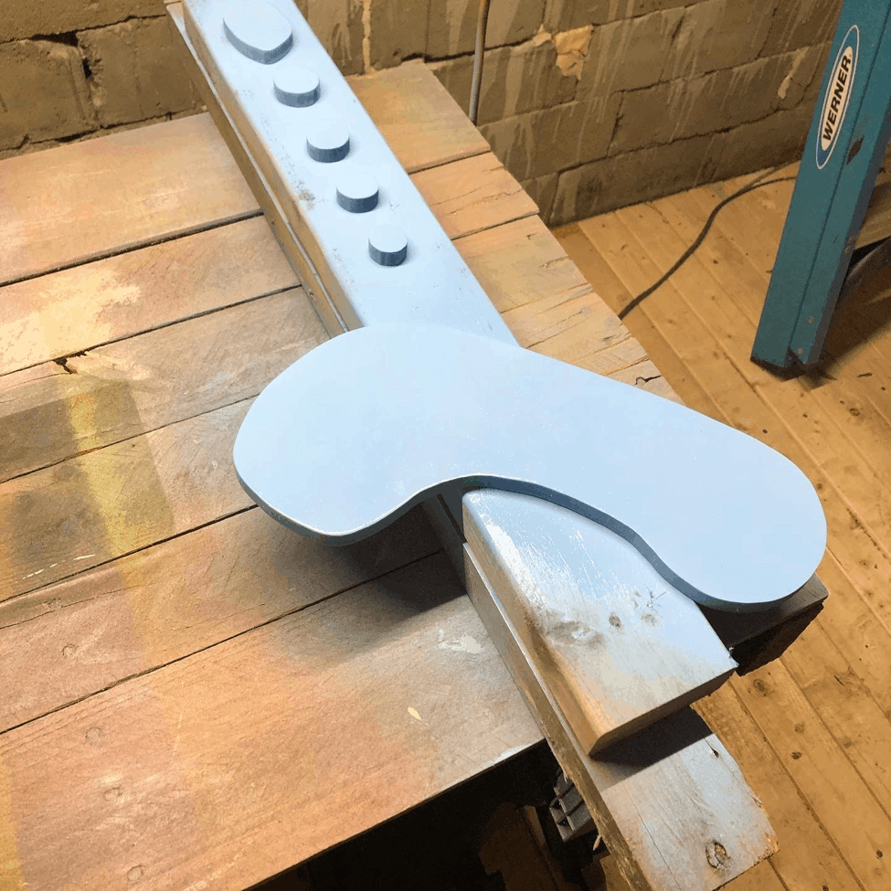
And so another obsession was born. Over the past few months, I’ve been copying and saving logos on my iPad. Once I decide on a logo, I’ll make the outline on the MDF and run the pieces through the scroll saw in my garage.
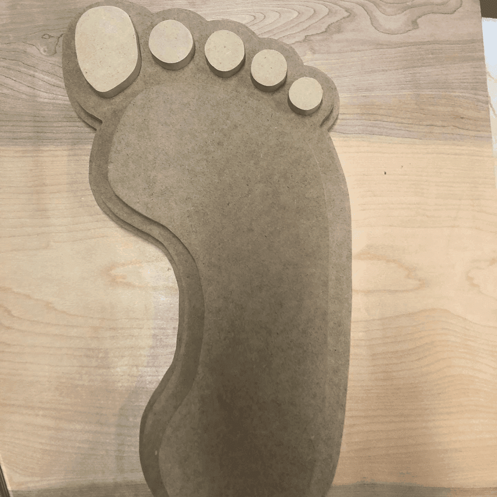
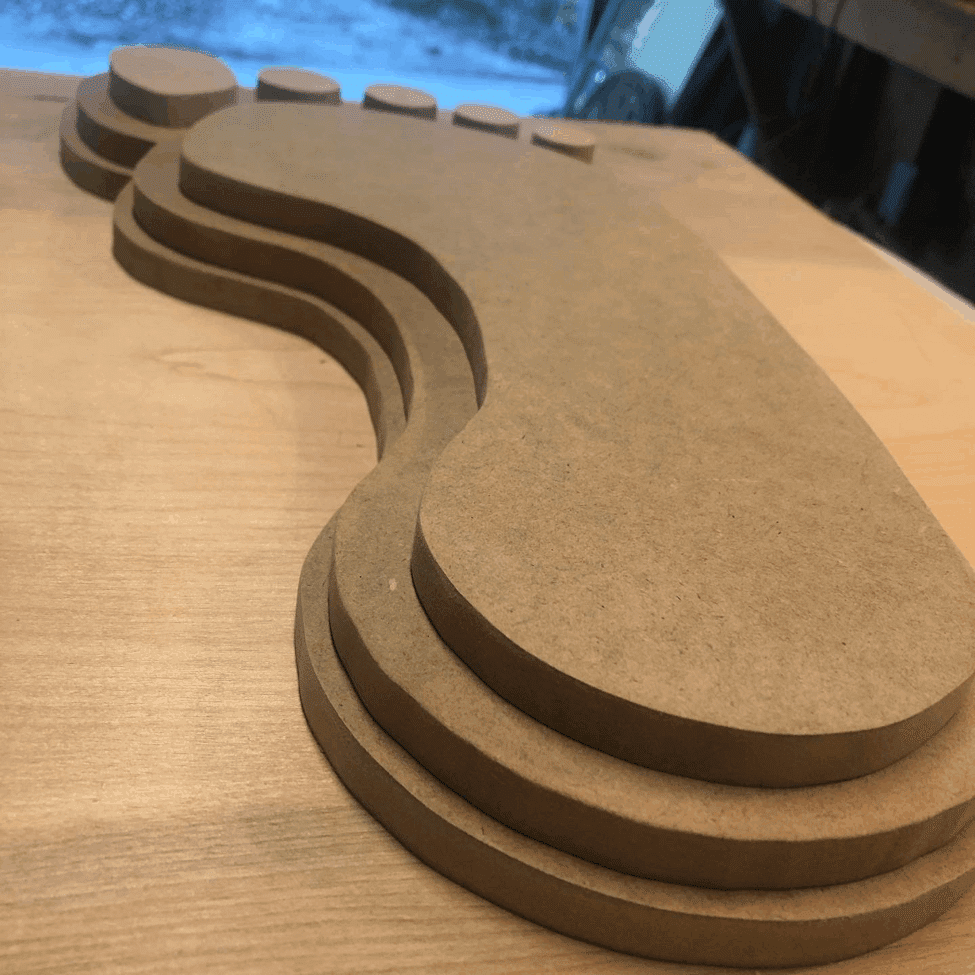
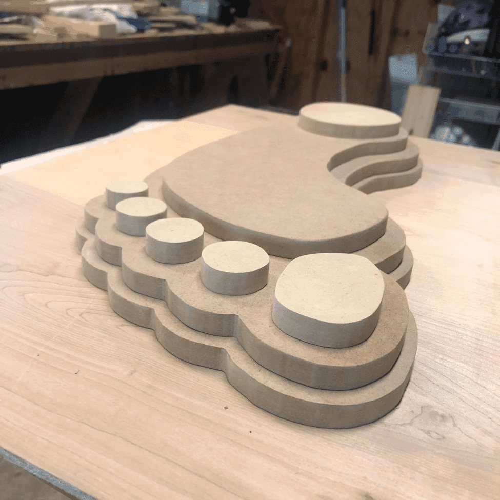
Next, I sand the edges and imperfections with sandpaper and a corded sander. During this step, I also use a router to make keyholes to hang the wall art. The humidity at the beach (I live in Wilmington, N.C.) can play tricks with MDF, so overnight I store the sanded pieces in a small room with a humidifier.
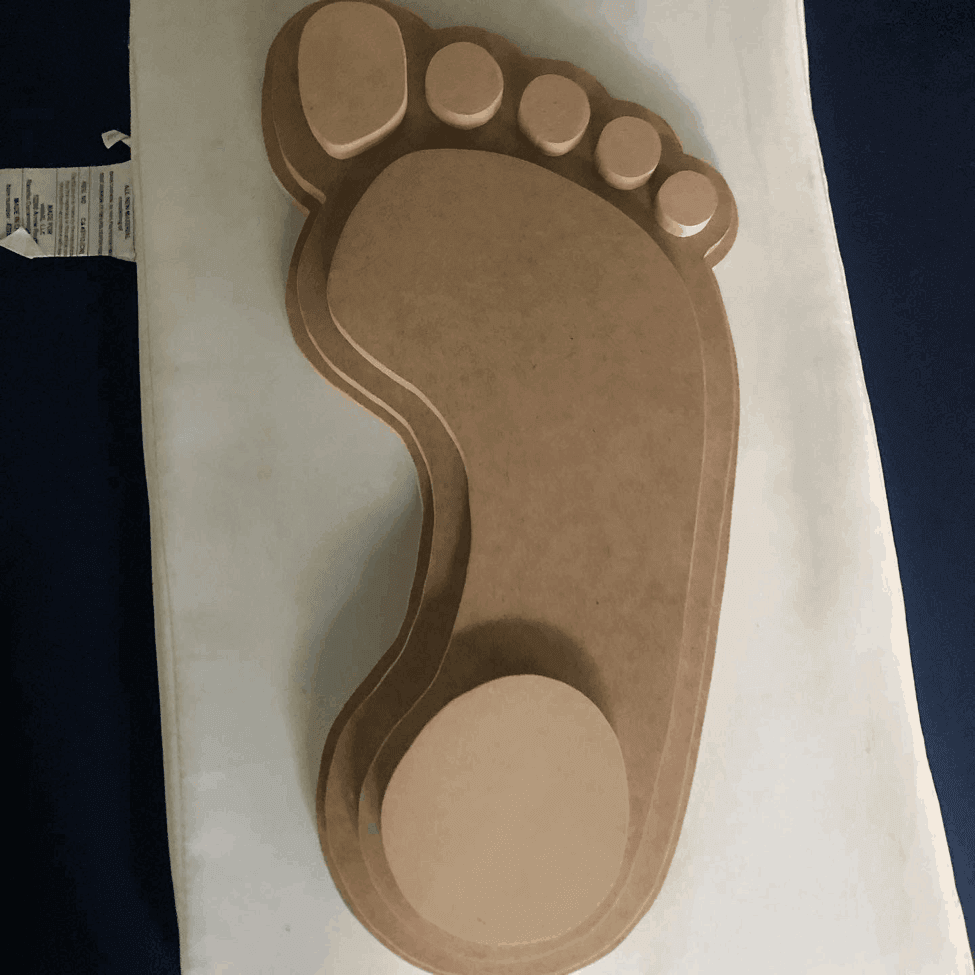
Once the pieces are ready, I position them on blocks of wood and paint them. (Over time, the wood blocks have accrued some cool-looking color combos from the paints.) I prefer using paint with a gloss finish, but a few clients have requested a satin finish.
After painting, I’ll take the dogs for a walk. When I come back, I’ll take the painted pieces to the room with the humidifier to let the paint cure. Then I repeat the paint steps until I’m satisfied with the look.
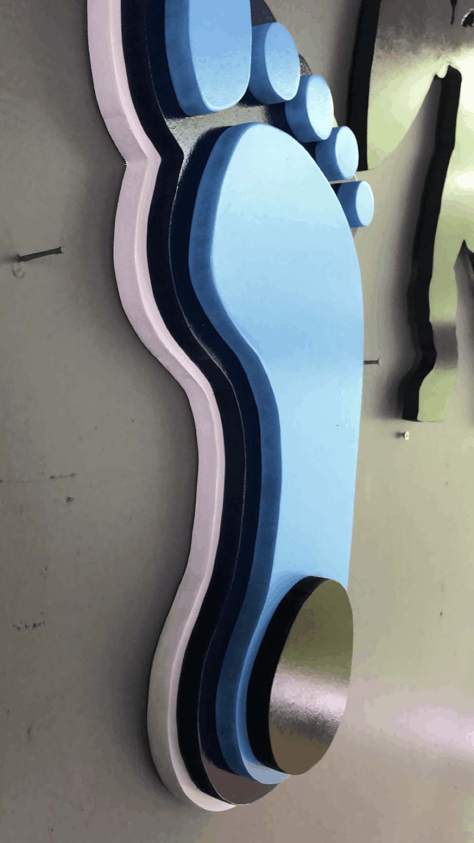
Now comes the best part: assembly and display. I prefer gluing the pieces together rather than using hardware:
From start to finish, each project takes about a week and presents its own set of problem-solving challenges (which often result in the purchase of a new tool). Here are some of the ones I’ve been working on [in each case, you can hover over the the embedded slideshow and use the directional arrows to click through the photos, or click on the bold subhead to go to the full photo set — PL]:
Arizona State Sun Devils

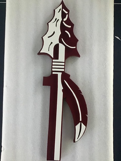
Florida State Seminoles
Uni Watch Winged Stirrup

Sharing project updates and photos on social media has been interesting — people will comment and respond with other ideas and logos they’d like to see. I want to make them all! I’m going to ride this wave until it’s over. Then I’ll paddle back out and wait for the next wave of obsession to roll in.
You can see more of my work and my collectibles on Twitter and Instagram. If you’re curious about a particular piece I’ve done, DM me. If you have questions or suggestions about my process, feel free to post them in today’s comments. Looking forward to reading your feedback!
———
Paul here. I cannot even begin to describe how much I love this project! There’s something extremely satisfying about seeing two-dimensional designs rendered as three-dimensional objects. Kudos to Kevin for coming up with this idea, and mega-thanks to him for sharing it with us.
And in case you’re wondering, I had no idea Kevin was doing a 3D winged stirrup — he just went ahead and did it! Once I saw it, I asked if he’d be willing to part with it, so we agreed on a fair price and he sent it to me. It arrived earlier this week and looks great. He even signed it on the back (“Gashouse ILM” refers to the name of Kevin’s fantasy baseball team [Gashouse Gorillas] and his local three-letter airport code [ILM]):


I haven’t yet hung the logo on the wall, but I’ll do that soon and share a photo once it’s ready to go.
Meanwhile: As I was working with Kevin on this entry, I learned that he has another notable DIY project — one that dates back to his childhood. It’s soooooo good, and I’m looking forward to sharing it with you in a week or three. Stay tuned.
Click to enlarge
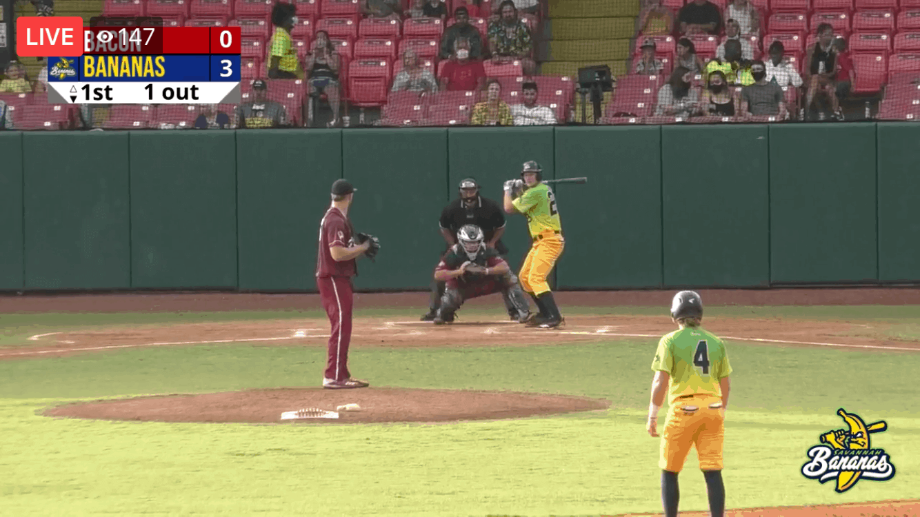
Bacon-wrapped Bananas: The Macon Bacon and the Savannah Bananas went color vs. color (and how!) last night, in one of the few live sports events in the country with fans in attendance. They play in the college wood-bat Coastal Plains League.
(My thanks to Steve Vibert, aka Boxcarvibe, for this one.)

Click to enlarge
Pin Club update: I love how longtime reader Bill Hetrick has been putting all his Uni Watch pins on his Uni Watch “gold circle” cap. You might even say it’s a Hetrick hat trick!
Speaking of pins: As we speak, the Uni Watch Pin Club’s inventory for July is on its way to Uni Watch HQ (they’ll arrive either today or tomorrow). They were a little late shipping from the factory, but I think you’ll agree that they’re worth the wait — check out this video that the factory folks sent me:
How great is that?! A bobblehead pin that actually bobbles! Todd Radom and I are super-excited about this one, and you probably are too now that you’ve seen it.
Once the pins arrive here in Brooklyn, I’ll still have to forward them to Teespring, so we won’t be ready to take orders until sometime next week. Sorry, no pre-orders, but don’t worry — I ordered 500 of this one (all the previous pins have been editions of 250, 300, or 350), so we should have plenty to go around.
Meanwhile, we still have a couple of dozen June pins left, along with the May, March, February, and January pins. (Sorry, April is sold out.) And remember, you can get 15% off with the checkout code COMMUNITY. Same goes for everything in the Uni Watch Shop and the Naming Wrongs Shop. My thanks, as always, for your consideration!
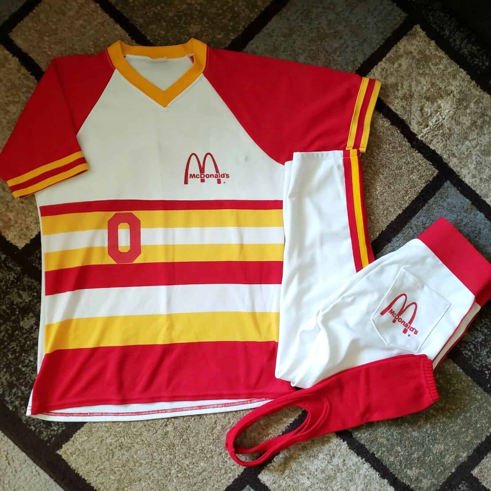
Click to enlarge
Too good for the Ticker: What have we here? It appears that Mickey D’s had its own company softball team back in the 1980s, complete with a tequila sunrise jersey!
The great Wafflebored spotted that uni for sale on eBay (the listing includes a bunch of additional pics). The only disappointing thing is that the stirrups aren’t striped!

Membership update: Now that’s a handsome card! If you can’t quite place the design, which was requested by reader Adam Bogan, that’s because it’s from a fairly obscure team: the short-lived Sacramento Surge, which played in the WLAF in 1991 and ’92.
Adam’s card is one of several that have been added to the membership card gallery, which now has more than 2,900 designs!
If you’d like to help us reach the 3,000 milestone, ordering a membership card is a good way to support Uni Watch (which, frankly, could use your support these days). And remember, as a gesture of comm-uni-ty solidarity, the price of a membership has been reduced from $25 to $20 until further notice.
As always, you can sign up for your own custom-designed card here, you can see all the cards we’ve designed so far here (now more than 2,800 of them!), and you can see how we produce the cards here.
The Ticker
By Paul

’Skins Watch: This section is usually about high schools, but today ’Skins Watch actually has several items about the ’Skins, beginning with this: Eighty-seven investment firms and shareholders worth a collective $620 billion have asked Nike, FedEx, and PepsiCo to stop doing business with the ’Skins until they change their team name. That article is registration-required, but there’s a good breakdown by the article’s author in this Twitter thread, and additional info here (from Lee Wilds). … In addition, former NFL coach and current NBC studio analyst Tony Dungy says he will no longer say the ’Skins name on TV … The ’Skins currently play in Maryland, but team owner Dan Snyder wants to have a new stadium within the DC city limits. Federal officials say that will never happen unless he changes the team’s name (WaPo link). … Meanwhile, new ’Skins coach Ron Rivera, when asked on a radio show about the team’s name, said that should be “a discussion for another time.” … Newington High School in Connecticut will no longer call its teams the Indians (from Keith Owen). … Alums of Huron High School in Michigan want the school to stop calling its teams the Chiefs (from Kary Klismet). … There’s a growing push to end the use of Native American-based team names and mascots in Massachusetts high schools (from Paul Friedmann). … Shady Side Academy in Pittsburgh will no longer call its teams the Indians (from Timmy Donahue). … The Athletic’s Chicago Blackhawks beat writer, Scott Powers, has a long, thoughtful, deeply reported piece on whether it’s time for the team to drop their Native American logo. Lots of voices from both sides of the issue — recommended reading (from Anthony Nuccio). … Arlington Martin High School in Texas will no longer use its Native American headdress logo. Its teams will still be called the Warriors (from Clint Dickinson). … I’ve donated my vintage Lane Tech sweater, which I hadn’t worn in nearly a decade, to the Mitchell Museum of the American Indian in Illinois. Big thanks to reader Ken Traisman, who’s on the museum’s board, for connecting me with the right people to make that happen. I still need to donate my Lane Tech jacket (the Mitchell said they only wanted the sweater), but I have a lead on that, so I hope to make it happen soon.
Working Class Wannabes™: Michigan State RB Donovan Eaglin’s high school coach describes Eaglin like so: “He’s not a limelight guy, he’s a blue collar guy. He’s going to go to practice with his lunch pail.” … The new coach at Union City High School in Michigan says he likes to coach the Wing-T offensive system because “It’s a very blue collar system, I like to say we are a very blue collar team based on discipline.” … An article about Oklahoma Wesleyan women’s soccer player Makayla Zendejas describes her as a “gritty defender” who displays “blue-collar hustle.” … An article about girls’ high school basketball in Montana says, “Butte is a hard-working, blue-collar town, and nobody epitomized that on the basketball floor more than Lexie Nelson.” The headline refers to her as “Blue-collar Lexie Nelson.” … A high school football player who’s been recruited by Iowa says, “I like Iowa because it is a tough, gritty program. … Being from Wisconsin, I have that blue-collar mentality, and I really like that.” … The NBA’s Cleveland Cavaliers posted a tweet that described former player Mike Sanders as one of “the blue-collar guys” on the team (from Sean Spitzer). … An article about an American Legion baseball team in Michigan says they had “a blue-collar, grind it out approach” in recent games. … A high school baseball coach in Wisconsin says his 2016 championship team was a “bunch of blue collar mudders, the whole group of them.” … An article about high school football championship rings says the 1990 Peabody (Mass.) High School team is remembered for its “blue collar demeanor.” … A new study indicates that TV broadcasters of European soccer matches tend to use different descriptors when referring to white players and players of color. Among the differences: “When announcers do refer to the white athletes’ physical accomplishment and/or attributes, they often highlight two factors — the players’ intellectual and cognitive prowess, and a strong, blue collar-like work ethic.” … An article about a high school football player in Michigan describes him as having a “blue-collar mentality.” … A longtime member of UMass Lowell’s athletics communications department, who also does radio broadcasting for the school’s hockey team, says the university “is a blue collar school,” which makes literally zero sense when referring to a university. … A high school basketball coach in Ohio who’s getting set to retire says he’s been lucky to have coached lots of “blue-collar kids that worked hard.” … The Long Beach State women’s soccer coach says one of his new incoming freshman players “brings a blue collar, hard-working mindset” to the game. … An article about Washington State hoops player Tony Miller says he is “gritty” and has a “workman-like demeanor” with “blue-collar, lunch-pail cred.” Bingo!

Baseball News: Pirates RF Dave Parker wore a wild “Dave Parker” cap during the lead-up to the 1982 MLB All-Star Game (from Steve Schapansky). … Some good new White Sox concepts here. … The dispute over the Triple-A Worcester Red Sox’s logo, which strongly resembled the logo of a team in the collegiate summer Cape Cod League, has been amicably resolved. … Some new chain-link fencing has mysteriously appeared around the Mets’ ballpark (from Shannon Shark). … With the minor league season now officially scotched, some MiLB teams are planning their own summer leagues. One of them, called the Lemonade League, will use yellow baseballs (from BallparkHunter). … An aerial photo taken yesterday at Wrigley Field shows giant Sloan ads on the field. The Cubbies’ spring training facility in Arizona is called Sloan Park, so let’s hope this is just a way for the team to honor the terms of that naming rights deal, and that the ads will be removed when the regular season starts. … Check this out: Corey Buck found an old Corpus Christi Raspas cap at Lids with a naked squatchee. Never seen that before. … In response to yesterday’s post about the Brooklyn Branches, David Murphy blogged about how Atlanta’s minor league and Negro League teams played for many years in Ponce de Leon Park, which had a magnolia tree located in deep centerfield — in play! “Legend has it that only Babe Ruth and Eddie Mathews hit balls into the tree,” says David. … Following up on a Ticker item from yesterday, the Baseball Writers’ Association of America, which votes on MLB’s annual MVP awards, will discuss whether former commissioner Kenesaw Mountain Landis’s name should be removed from the awards. Several former MVPs have called for that to happen, citing Landis’s support for baseball’s pre-Jackie apartheid system. … MLB’s “Field of Dreams” game, which was supposed to feature the Yankees vs. the White Sox in Iowa this August, is still scheduled to take place, at least for now, but the Cardinals have replaced the Yankees. … The Mexican Baseball League is the latest sports organization to cancel its season due to the pandemic.

Pro Football News: The Raiders provided a look at their new practice facility in Vegas (from Wade Heidt). … Madden 21 already has QB Cam Newton in a Pats uniform. … Here are the uni numbers for the Jets’ draft picks. … Princess Anne High School in Virginia apparently uses NFL-style captaincy patches (from David Pottel). … The CFL’s Montreal Alouettes are selling face masks made from old jerseys (from Jeff Tillbrook). … Steelers LB Devin Bush is working out with a new helmet model (from @MrBudziszewski). … The massive videoboard at the Rams’ new stadium is ready to go (from Wade Heidt). … What if you took a city’s NFL and NBA teams and swapped their team identities, including their uniforms? You’d get something like this (thanks to all who shared).
College Football News: An Iowa fan got a Tiger Hawk-shaped tattoo of fans in Kinnick Stadium doing “the wave” to patients at the adjacent Stead Family Children’s Hospital. It’s a good story, or you can scroll down toward the bottom of the piece if you just want to see the tat (from Kary Klismet).

Hockey News: New mask design for Golden Knights G Robin Lehner (from @MyBees).
.
.

NBA News: If the NBA and the players’ union go ahead with the plan to add social justice messaging in place of jersey NOBs, that messaging reportedly will not include the names of police brutality victims (thanks to all who shared). … Junior welterweight boxer Alex Saucedo, who’s from Oklahoma City, wore a No. 140 Thunder jersey for his prefight intro two nights ago. The number refers to the junior-welter weight limit (from Alex Shirley). … The Pelicans are reportedly in the market for a new uniform sponsor advertiser (from Jeremy Poursine). … Speaking of the Pels, F Zion Williamson has been named the second of the three box-cover players for NBA 2K21. …New NBA uni number assignments from Etienne Catalan: Lakers SG/SF J.R. Smith will wear No. 21, Mavs G Trey Burke will wear No. 32, Trail Blazers PG Jaylen Adams will wear No. 10, and Wizards G Jerian Grant will wear No. 22. … Cross-listed from the pro football section: What if you took a city’s NBA and NFL teams and swapped their team identities, including their uniforms? You’d get something like this (thanks to all who shared). … The Pistons’ training facility in Detroit is the latest NBA venue that will soon be turned into a polling place. The article mentions that the Bucks have offered to do the same with their arena. The Hawks have already arranged to do the same with theirs.

Soccer News: The three-month break in the EPL season has created complexities with shirt ads. Chelsea’s new ad deal with Three began yesterday, for example, so they now have a new shirt, which debuted in yesterday’s game against West Ham. This means LB/LWB Marcos Alonso is now wearing the same number fore and aft (from DTABR). … Oh, good: MLS teams are expected to wear additional shirt advertising (WaPo link) when play resumes. … New shirts for Dutch side FC Twente (thanks, Jamie). … Several MLS teams are building new, privately financed stadiums (NYT link). … Priorities: The NWSL’s new Louisville expansion team, set to begin play in 2021, doesn’t yet have a name, crest, or colors, but it now has its first shirt ad (thanks, Jamie). … Mexican international Jürgen Damm announced he’s joining Atlanta with a video showing him with the shirts of the different clubs he’s played for (from Ed Zelaski). … New crest, shirt, and even a proprietary font for Iceland’s national teams. Use the “English” toggle button on that page. More info here (from Nate Rathjen and Andrew Rader). … Portuguese side Sporting CP celebrated its 114th anniversary by replacing the players’ NOBs with player names from the team’s past (from @MikeDfromCT). … The rest of these are all from Josh Hinton: New away kit for English club Derby County. … New home kit for Dutch side PSV Eindhoven, plus their away kit has leaked. … New home kit and outfitter for Scottish club Rangers. … New home/away kits for Mexican club Puebla.

Grab Bag: New logo for the mapping app Waze. … Ever wonder what the Buick logo signifies? Here’s an explainer. … New logo for the financial advice firm Motley Fool. … Nike and Michael Jordan are being sued for allegedly poaching an indie fashion brand’s logo. … Early data suggests that playing in empty stadiums can negate the home-field advantage (NYT link). … Amid accusations of discriminatory work practices at Adidas, the company’s top HR exec has resigned. … New athletics logo for Swan Falls High School in Idaho (from Kary Klismet). … Cross-listed from the basketball section: Junior welterweight boxer Alex Saucedo, who’s from Oklahoma City, wore a No. 140 Oklahoma City Thunder jersey for his prefight intro two nights ago. The number refers to the junior-welter weight limit (from Alex Shirley). … Reprinted from yesterday’s comments: New athletics logo and wordmark for Southeast Missouri State (from Derek Jackson). … Bit of a blunder Down Under, as the “Australian Made” logo, used to identify Aussie-produced goods, was set to get a new design that looked like a virus. … Following up on a Grab Bag item from a month or so ago, the town of Gettysburg, Pa., is urging the town of Gettysburg, S.D., to stop including the Confederate battle flag in its police department logo (from Kary Klismet). … New logo for the 2021 Ford Mustang Mach 1. … DC mayor Muriel Bowser has been wearing a mask with a logo promoting DC statehood. … Finland’s air force command has removed the swastika from its logo. The swastika had been part of the air force’s logo for nearly a century, long before its association with Nazi Germany, because it was considered a symbol of good luck. … Boston University may change the name of its mascot, Rhett, because of its connection to the Gone With the Wind character Rhett Butler, who fought for the Confederacy (from Timmy Donahue).

Click to enlarge

What Paul did last night: There are these two little lookalike dogs in our neighborhood. I don’t know what breed they are — something small and bushy (not Pomeranian, but something of that ilk). The best part is their names: Cannoli and Napoleon.
Cannoli and Napoleon belong to this couple that lives down the block from us. The husband is usually the one who takes them out for a walk, but yesterday it was the wife. Instead of calling them Cannoli and Napoleon, she referred to them as Noli and Poley. We really liked that!
Sorry, no Noli/Poley photo, but I’ll try to get one the next time they go by.
As always, you can see the full set of Pandemic Porch Cocktails™ photos here.
Oh wow, those Savannah Bananas look great! I normally don’t love gradients, but I love their yellow uniforms with a little bit of green. Like a minor league team, those players aren’t quite ripe yet!
Just wait until they wear their “special” yellow and white retro jerseys …. Banana Sunrise?
Banana daquiri sunrise?
I’d Drink That ; )
link
There’s also an “English” toggle on the Iceland redesign page (first link) – highly recommended – spectacular all around.
In fact, their new crest would be an awesome (albeit tricky) MDF project, Kevin!
Ah, thanks. Text updated!
Wow, so much good stuff today. Kevin’s logo project is great. Interesting how his early AFL set never actually matches up to a specific year, as Texans and Jets never existed at the same time.
The Bananas uniforms are great, and while solid color in baseball is bad, gradients are bad, for some reason it just works well here as a minor league team and the greenish ends on a banana.
The bobblehead pin is wonderful, can’t wait to add it.
Solid color in baseball is bad? I must have missed that weird memo.
NBA and NFL teams swapped their identities! The NFL team look great in my opinion.
Could this site itself stop using “‘Skins” name or promoting it in anyway shape or form? Over the weekend, there was the HS football feature and there were 2 instances of Native American teams (one w/the offending name) and the issue was not even addressed by the author.
It sends a mixed signal from Uni-watch as a whole on what standards are acceptable and what are not. If we are to move to forward and truly eliminate any all usage , then please do not feature any team using it or at minimum, spell it out.
The word “Redskins” itself is not off-limits. Sometimes it’s necessary to use it when sharing a simple news item. Example: “The school board in Anytown USA has decided that the local high school will no longer call its teams the Redskins.” That is a perfectly acceptable use of the term here on the site.
I do my best to use “Washington” most of the time and sometimes “’Skins” in the ’Skins Watch section when referring to the NFL team.
There is nothing new about anything I just stated. It’s been that way on the site for nearly a decade now.
“R-word”?
I don’t believe in that. I don’t believe in using “N-word” either. The word is the word. Yes, it’s an ugly, vulgar word — that’s why we should avoid saying it. But when saying it becomes unavoidable for explanatory/reporting purposes, I believe in using the actual word, not a fig leaf.
I know he is not able to sell those because of Intellectual Property, but damn Kevin’s work is incredible. Thank you for sharing!
He can make them for people who know him (which is a lot more now) and just ask that they pay him back for materials ;)
here in CT, first we had Newington change their name, now Guilford High School seems to be following suit. The weird thing is they used to be called the Rams up until the 40’s and changed to the Indians. Seems like there is some pushback, but hopefully they still move forward. link
Re: Mickey D’s.
God, that’s ugly. A uniform can have raglan sleeves or Rainbow Guts. Not both! I can’t unsee it! Aaugh!
The government has pulled this move on the Washington team before. Permission to use what is now RFK Stadium was refused until the team integrated.
And it worked!
Interesting that Robin Lehner’s new mask doesn’t seem to include any In Flames references. Maybe re-recording Clayman material was a deal-breaker for him.
Kevin,
Those 3D logos look fantastic. Loved reading about your process in creating and refining them!
Proofreading in ‘Skins Watch section: It’s Huron High School in New Boston, Michigan, not New Boston High School.
Got it — thanks!
The humidity at the beach (I live in Wilmington, N.C.) can play tricks with MDF, so overnight I store the sanded pieces in a small room with a humidifier.
Wouldn’t a DEhumidifier work better? ;)
Love the single bar facemasks, by the way, Great project!
It appears that Mickey D’s had its own company softball team back in the 1980s, complete with a tequila sunrise jersey!
OH. MY.
I’d wear that.
If the old Red Barn restaurant had a similar jersey, I’d *buy* that.
If you can’t quite place the design, which was requested by reader Adam Bogan, that’s because it’s from a fairly obscure team: the short-lived Sacramento Surge, which played in the WLAF in 1991 and ’92.
…and morphed into the Sacramento Gold Miners of the Canadian Football League.
link
I think comedian Steven Wright said it best when he said to put a humidifier and a dehumidifier in the same room together, and let them fight it out.
some MiLB teams are planning their own summer leagues. One of them, called the Lemonade League, will use yellow baseballs
That looks much better than Charlie Finley’s orange baseballs. The yellow contrasts well with the stitching. I like the idea of orange baseballs, but you’d have to use black stitching to get a comparable level of contrast.
Atlanta’s minor league and Negro League teams played for many years in Ponce de Leon Park, which had a magnolia tree located in deep centerfield — in play!
Across The Pond in Kent, England, the Kent Cricket Club had a tree in play until fifteen years ago. Hopefully its replacement will be in play when it gets bigger.
link
Those White Sox uniforms need to be implemented YESTERDAY. They are sharp! An overlooked feature of their best uniforms is the white squatchee. Did the designer mean to use belt loops instead of tunnels?
In a related issue, has Uni-Watch ever done a feature of baseball’s most overlooked piece of apparel: The belt?
Ah, Ponce de Leon Park! God bless it.
Another fun fact about that ballpark: it was there that Bob Montag of the Crackers hit the longest home run in pro-baseball history. (The ball landed in the coal car of a passing train, and went all the way to Miami.)
Dave Parker pulled off a similar feat when he was playing minor league ball in Charleston, WV. That ball was recovered in Columbus, OH, so it “only” went about 150 miles, instead of the 650 or so miles that Montag’s ball went!
Did you open an account to read the article on the Blackhawks? I’m going to go ahead with an opinion expressed a few years ago about the way Native American iconography is used in professional sports. In my eyes, the Atlanta and Cleveland baseballers, along with the NFL Washington squad, have no leg upon which to stand, given their hamfisted misappropriation of said symbols, and the lack of remorse or generosity shown to American Indians. (I’m pulling for the “Atlanta Skylarks”, “Cleveland Spiders”, and “Washington Pathfinders”.)
The Kansas City Chiefs and Chicago Blackhawks, on the other hand, seem to have a lighter touch. Offhand, I can’t give you tangible evidence, but it doesn’t take a genius to see how welcoming the country was to the Chiefs owing to its Super Bowl victory and its emerging star, Patrick Mahomes.
No, I did not open an Athletic account just to read that article. I’ve had an account for a long time.
@Walter, for Washington, I’ve felt renaming the team Washington Pride would go a long way
walter, I agree that there are gradations of how “bad” certain misappropriations of Native American identity and imagery are in the sports world. Certainly the Washington football team and the Cleveland Indians have been the most egregious offenders because of the former’s use of a racial epithet as a team name and the latter’s use of a highly racially stereotyped cartoon caricature as a logo.
That doesn’t make even the least inflammatory examples of misappropriation okay, though, without sign-off from someone (and preferably a lot of someones) who can speak up for the people groups being depicted. This is true not only because it’s the right thing to do to get approval from someone before using their name and likeness, but also to make sure that the people you’re depicting don’t think the representations are overly stereotyped or offensive.
The “Skins logo, for example, isn’t nearly as “bad” as the team name. It’s a fairly straightforward image of a Native American man that seams reasonably respectful and doesn’t engage in the type of over-the-top caricaturizing that Cleveland did with Chief Wahoo. But it could be argued (and I have heard it argued from voices within the Native American community) that it has the effect of reducing the wide variety of individuals within the Native American community to a stereotyped image of a stoic “brave,” similar to what you would see on the obverse side of an old Indian Head nickel.
On the flip side, the Cleveland Indians’ name isn’t nearly as “bad” as the (mostly but not quite entirely) retired Chief Wahoo logo. But the name still represents the lumping of a culturally, ethnically, linguistically, and geographically diverse people group into a single stereotyped depiction.
Putting aside the term’s obvious status as a misnomer with mixed acceptance across the Native American community, it’s still a pretty fumbling attempt to shoehorn an enormously broad group of people under a single name. It’s sort of like calling a team the Asians, the Africans, or the Latinos. An attempt to find logos and imagery to summarize these other, similarly immense categories of diverse people would inevitably lead to reducing those differences down to cringe-worthy stereotyping.
As for the Blackhawks and Chiefs? While I would agree their names and imagery don’t evoke quite the same level of controversy that the above examples do, that shouldn’t be read to assume that there aren’t many well-reasoned criticisms of them.
The origins of the Blackhawks’ name are complicated and probably involve a reference to a U.S. Army division from World War I. But there’s no denying that it ultimately derives from the name of a leader of the Sauk people who historically lived in the Upper Midwest and Western Great Lakes region. As fondly regarded as the team’s logo is among hockey fans, its detractors find similar problems to the Washington football club logo. While it seems reasonably respectful in its rendition, it can be seen as using generic, stereotyped imagery of a Native American man to depict link.
The Kansas City Chiefs, to their credit, have done a lot of work to clean up some of the racially insensitive and stereotype-promoting aspects of their team name’s history (which were very much intentional when the name was chosen). They’ve gotten rid of link of Native American characters that fell link of being as blatantly insensitive as Chief Wahoo. But their arrowhead logo (like the Braves’ tomahawk on their baseball jerseys) represents a cultural stereotype that does not necessarily accurately reflect, with historical accuracy, the diversity of cultures represented under such a broadly-applied name. Besides, the arrowhead logo makes it clear that the team’s name is really a stand-in for Native Americans in general rather than referencing a specific group of tribal leaders.
Moreover, the Blackhawks’ and Chief’s team names and imagery has lead many within their fan bases to conclude that they can use stereotype-furthering displays with impunity and no cultural repercussions. These include the “Tomahawk Chop,” historically inaccurate “war chants,” and link of link (a sacred item for many Plains Indian nations, the trivializing of which they consider deeply offensive).
And just to be clear, there were plenty of discussions around the time of the Super Bowl earlier this year about the appropriateness of the Chiefs’ name and imagery. Some of it was covered here on Uni Watch (especially in The Ticker). A Google search will easily turn up many more articles that came out around that same time.
The Blackhawks have likely immunized themselves from greater criticism by forging relationships with Native organizations and advocacy groups and making efforts to promote Native American history and culture in ways far beyond what most other major professional sports teams in the U.S. with Native-based team names have done. I do recall, however, some articles questioning their name and logo when they were winning their three Stanley Cups last decade.
All that to say, the Chiefs and Blackhawks aren’t as “bad” as some of the worst offenders of Native appropriations in the sports world. But they haven’t been completely exonerated from a certain amount of scrutiny.
Thanks for the thoughtful reply. I was puzzled when Ralph Lauren and Brixton Apparel recently issued Indian chief-emblazoned clothing, and found it particularly tin-eared.
Some of these teams (Washington, Cleveland, Chicago, Kansas City) are among my favorites, complicating the issue.
That article on the Buick logo leaves out the most important bit… the Tri-shield logo design represents the 3 models that debuted in 1959… The Electra, Invicta, and LeSabre. Even though a few years later additional models would be added to the lineup, the three shields have remained a constant. (Source… I used to drive a ’59 LeSabre, and it freaking rocked.)
I don’t have an Athletic subscription, but if it isn’t mentioned there, this logo designed by a First Nations artist is far superior to what the ‘Hawks currently wear:
link
Damn, that is awesome. I got chills when I saw it.
WHL’s Portland Winterhawks wear a similar logo to the Blackhawks. Late last year they introduced this 3rd uniform with new crest. I think it would be a proper decision and probably a likely one for that team to change to the logos on their 3rd uniforms for their primaries.
link
Kevin — Those are amazing. You’re inspiring me, but I worry my complete and utter lack of artistic talent would leave me with a bunch of awesome tools, and crummy 3-d logos!
Awesome post today.
Kevin,
That’s an outstanding project. I know what it’s like to start and stop something. 95% of the time it never gets finished. Kudos for pushing through.
Excellent details on the helmets. That star in the middle of the Broncos one must have been difficult/frustrating. Also, very wise shift to MDF.
Question, how do you draw out your logos? Freehand?
You give inspiration to all us DIY folks out there that don’t have laser etchers/cutters!
I have a bit of jealously towards the staff that got to make masks out of old Montreal Alouettes jerseys. I would have loved a chance to go all Chris Sale on the old jerseys that were busy monstrosities.
link
Kevin, this is outstanding stuff! Thanks so much for sharing it with us! I love all the pieces you’ve made so far, but I’m particularly impressed with the fine detail work on the Florida State logo. Really impressive!
If you don’t mind questions from the novices in the peanut gallery, what makes medium-density fiberboard a better option for projects like this than plywood or other types of wood?
Do you (or would you) mix up the materials you use depending on the project?
I love those White Sox uniform concepts in today’s Ticker. They’re well though-out and very professionally presented. Interestingly enough, it appears that the designer who made them, a guy named Andy Cusack, has been kicking around similar concepts in his head for several years. In fact, he shared some designs with Uni Watch back in 2013:
link
It’s cool to see how he has refined his ideas and improved his rendering skills over the years. His designs in 2013 looked nice, but the latest ones are eye-poppingly gorgeous!
Hmmm… well that link didn’t seem to work! Let’s try this again:
link
Kevin, your logo creations are tremendous. Absolutely great stuff.
Andy Cusack’s White Sox unis are also fantastic. The only item I can do without is the black pants on one of the alternates. The jersey itself is fine, though.
Kind of crappy that when Nations of people complained about the Redskins it was a “get over it” attitude, but once it cost them money, they may make a change. It would be good for them to get rid of it, either way, but I wish they had done it earlier.
Does Kevin take commissions on those 3D logos? I’d love to pay for a Mets logo to hang in my office.
If you want to contact him, you can DM him via his social media feeds.