
For all photos, click to enlarge
Good morning! Greetings from Uni Watch HQ, where all three inhabitants continue to be safe and healthy. Hope the same is true for you.
We have a lot of content today, kids, so let’s get started: In 1971, when I was seven years old and just starting to become sports-aware, a publication called Todays 1971 New York Mets appeared on the magazine rack at our local five and dime shop. It was priced at 39¢, which was a lot for my pint-sized budget (a comic book cost only 15¢ at that time), but somehow I acquired a copy of it. I don’t recall if I saved up my allowance (15¢ per week) or if I convinced one of my brothers to buy it for me. Probably the latter.
I lost or discarded the publication at some point during my youth, but I was recently reminded of it when I saw it mentioned on a Mets Police blog post. All sorts of memories came flooding back. I thought, “Huh, maybe I should pick up an old copy on eBay.” So I did! Turns out it’s an odd item, so we’re going to take a take a very detailed look at it today, beginning with the cover, which is shown above.
Let’s start with the first word of the title — it should be “Today’s,” with an apostrophe, but it’s just “Todays.” So it’s grammatically incorrect right out of the box.
On the plus side, there are all those “Official” seals running down the left side. I remember being captivated by the arched lettering (which, with five decades’ worth of hindsight, looks really weird).
I also loved the cover illustration. There were no team logos on the uniforms, but the team at bat was wearing blue caps, undershirts, and stirrups, so that was clearly the Mets — or so I thought. The other team, wearing red, was presumably the Cardinals or the Reds. (The artist’s signature appears to be “R. Zenner.” Anyone know more about who that might have been?)
Okay, now let’s look at the inside front cover:

Ugh, look at that first line — they added the apostrophe but didn’t capitalize “today’s”! The rest of the text is fairly a straightforward recap of the team’s then-short history.
Next up is a page of perforated sheet of stamps. Fortunately, the vintage copy that I found on eBay still has all of the stamps intact:

Stamps are an odd category of collectibles — less than a card, more than a sticker. They were popular in the early 1970s.
Anyway: I love how it says “Free” at the top of the page. Even as a kid, I understood that was bullshit — like, the stamps were the main thing being sold, not a bonus throw-in. (I also wondered at the time why Nolan Ryan’s portrait was so dark compared to the others. Maybe it was a foreshadowing of him later being traded to the Angels.)
The back of each stamp had info on the player:

Ryan got the short end of the editorial stick here too, as his bio says he “Won key game in 1969 AL playoffs.” That should be NL, obviously. (But I didn’t know that back in 1971.)
The next page has stats for those same players:
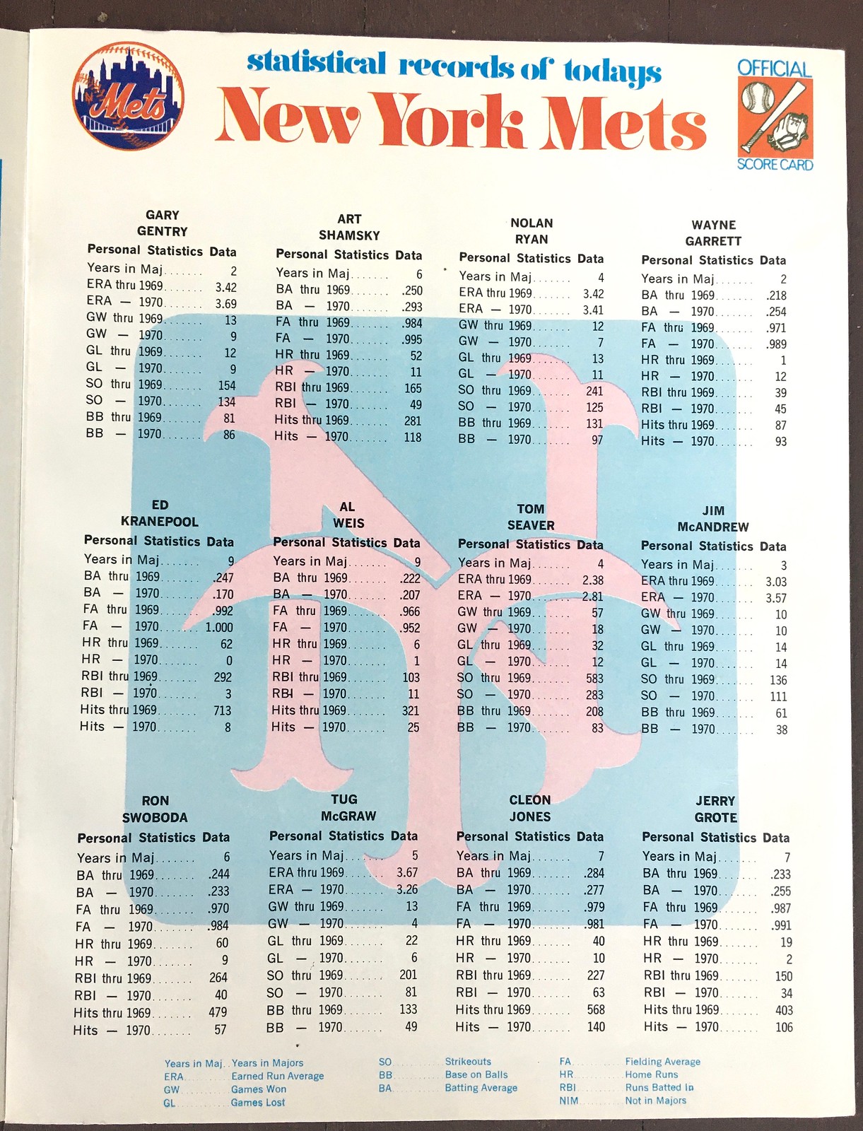
I didn’t notice this at the time, but look at that “NY” logo — it’s all wrong! All of the flared serifs on the “N” are improperly oriented except for the ones at lower-left, and the “Y” isn’t quite right either. I don’t recall if I noticed this when I was a kid, but I’m stunned by it now. Why would they use such a crummy knockoff logo on a licensed product?
Also: Note that they’re back to using “todays,” without the apostrophe, at the top of the page. And that line of display type is all-lowercase — soooooo early-1970s!
The next page features a timeline of National League history:

I didn’t realize this as a kid, but there’s some seriously bad history on this page. Look at the very first timeline entry: “1876 — The National League is founded, just four years after the end of the Civil War.” Sounds momentous — except that the Civil War actually ended in 1865 (or, if you prefer a fringe-historical approach, 1866). How could they get something like that so wrong?
Next we have another perforated sheet of stamps. Here are the front and back, along with the corresponding page of stats with the weird knockoff logo in the background:


I remember being very confused about Dean Chance, Ray Sadecki, and Bob Aspromonte being shown in non-Mets uniforms, and that my brother explained that those players were new to the team and didn’t have time to pose in their Mets unis (an explanation I found unsatisfying). I also remember poring over the bio for Tommie Agee, who was my favorite player at the time, and being sort of mortified that it mentioned his “agonizing 1969 slump” — like, come on, can’t you just stick to the positives?
I was also confused by the fact that Agee’s signature on the front of the stamp said “Tommy,” even though he was always listed as “Tommie.” I later learned that although his given name was Tommie, he was inconsistent about how he signed it, sometimes using his given name and sometimes using Tommy.
Next comes the page that kinda blew my mind back in 1971:

Until I got to that page, I didn’t realize that they did a separate edition for each team! Although I couldn’t fully articulate it, that really bugged me — it made my Mets edition feel less special, less unique. Not only that, but they used the same cover design for all of the National League teams, and a separate all-purpose design for all the American League teams, which seemed really lame-o. Plus they didn’t even change the uniform colors to match the team — it was always red vs. blue! So the cover illo didn’t actually show the Mets, as I had thought — it was just a lucky coincidence that one team happened to be wearing blue. (Good thing I wasn’t a Giants, Pirates, Padres, or Astros fan.)
Next is the inside back cover:

Man, what a mess. Couldn’t they at least get photos of these older players wearing Mets caps? And what’s with Dick Selma’s photo being backwards? When I asked my big brother for an explanation, he just shrugged and then pointed at the photo of Marv Throneberry. “That’s the worst player who ever lived,” he said.
The back cover has a very oddly formatted team schedule:
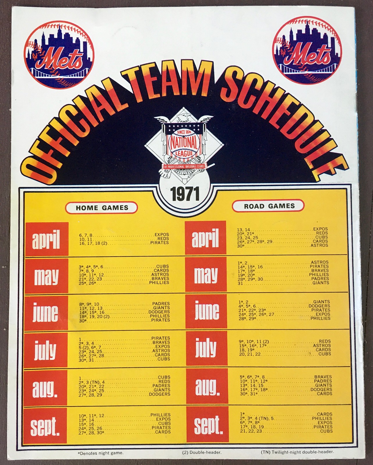
Why format it that way, instead of going with the basic calendar-based design? So weird! Also, note the all-lowercase names for the months — again, soooo early-’70s.
So that’s it — but wait, there’s more! Stapled into the center spread is this envelope:


Love all the team logos on the front of the envelope. Note that there’s no indication of who a check or money order should be made out to, nor is there any way to pay by credit card — so I guess they just expected people to send cash through the mail..?
Thanks for indulging me on this little trip down memory lane. What a strangely shoddy publication! If you’re curious about your own favorite MLB team (assuming it existed in 1971), just go to eBay and search on “todays 1971 [full team name]” — there are lots of copies floating around for most teams.
(Big thanks to Mets Police honcho Shannon Shark, whose blog post reminded me about this item in the first place.)
The best four minutes you’ll spend today: Friday was the 50th anniversary of Pirates pitcher Dock Ellis’s famous LSD no-hitter. But I didn’t realize that when I published Friday’s blog entry, so I foolishly neglected to post the great 2009 No Mas animation Dock Ellis and the LSD No-No. I never get tired of watching it — so good! Enjoy (and R.I.P., Dock).
Anthem issues: There’s a lot of chatter in sports circles these days about the national anthem. Several prominent athletes and coaches have said they’ll kneel in protest during the anthem when sports return. And as I mentioned in Friday’s post, MLS has decided to avoid that issue altogether by not playing the anthem when the league returns to action because no fans will be on hand anyway.
Now New York Daily News sportswriter Stefan Bondy has published a piece in which he argues that it’s time to eliminate the anthem from sports altogether. When I tweeted the link to that story yesterday (as per my usual habit, I didn’t say anything positive or negative about the article — I just shared the link), I was stunned by how much positive response it got. It’s fairly uncommon for any of my tweets to garner as many as 100 “likes”; this one got more than 350. Similarly, I thought the tweet might generate lots of negative comments, but most of the responses were positive. Obviously, responses to one tweeted article aren’t necessarily indicative of a similar inclination among the full population. Still, I would never have guessed that so many people would be ready to do away with the playing of the anthem at sporting events.
A few of those commenters mentioned that playing the anthem at every game makes it less special. That reminded me of a short item I wrote for The Village Voice way back in 2001. Here’s the key passage:
According to James Charlton‘s The Baseball Chronology, the first instance of [“The Star-Spangled Banner”] being played at a ballgame was on May 15, 1862, during the Civil War at Union Grounds in Brooklyn. Over 50 years later, during World War I, a military band played the tune during the seventh-inning stretch of a 1918 World Series game. “From then on,” reports the Chronology, “the song [was] played at every World Series game, every season opener, and whenever a band [was] present to play it.”
Playing the anthem didn’t become more the rule than the exception until World War II, when public-address systems — which were installed at stadiums in part for civil defense reasons during the war — became sufficiently widespread to enable recorded versions to be played. Even then, there were some holdouts — as late as the mid-1960s, the Cubs played the anthem only on holidays like Memorial Day and the Fourth of July, because team owner P.K. Wrigley felt that playing the song at each game effectively trivialized it. And Royals owner Ewing Kauffman cited a similar rationale in 1972, when he ordered that the anthem be played only “on Sundays and special occasions,” because it “was not receiving the respect it deserved.” Public reaction, however, was highly negative, and Kauffman quickly relented.
There’s some additional info in this article, which states:
In 1954, Baltimore Orioles general manager and World War I veteran Arthur Ehlers decided not to play “The Star-Spangled Banner” before each game and opted to save it for special occasions. He said that frequent repetition “tends to cheapen the song and lessen the thrill of response” and complained about fans not behaving respectfully during the anthem.
Under pressure from the public and the Baltimore City Council, Ehlers eventually changed his mind.
It’s interesting to see how the anthem was initially treated sort of like most MLB teams now treat “God Bless America” (i.e., only for special occasions) and then spread. Anthem creep, you might say.
I don’t know as much about the anthem’s history in other sports and leagues. But that article with the Orioles info also links to this 1945 New York Times article about about then-NFL commish Elmer Layden (the man responsible for the league’s high-sock rule, don’tcha know) visiting President Harry Truman at the White House, which concludes like so:
Layden also disclosed that he will instruct all teams to make the playing of the Star-Spangled Banner a permanent part of every game.
“The playing of the National Anthem should be as much a part of every game as the kick-off,” he said. “We must not drop it simply because the war is over. We should never forget what it stands for.”
(A somewhat astonishing side note: According to that article, no American president had ever attended a pro football game as of 1945!)
So that is apparently the origin story of the anthem’s use at NFL games. I don’t know anything about the NBA, NHL, or NCAA. Anyone..?
One question I haven’t seen anyone address yet, so I’ll raise it here: Assuming the anthem is still being played when fans are permitted to attend games again
— whenever that turns out to be — will we see large groups of fans kneeling (or declining to stand, or raising a fist, or making some other gesture of protest solidarity) during the anthem?
My rink is open and I have my first stick and puck this afternoon. Picked out the best socks I could find to match my new @UniWatch sweater. I’ll try to get some on-ice pics as well. pic.twitter.com/InKkHW5b8K
— The Casserole Casanova (@the_casserole) June 12, 2020
ITEM! Icy whites greens: Reader Zach Spencer recently received his Uni Watch hockey jersey and liked it so much (as did his pooch, Sergeant Pepper) that he decided to give it a test drive at his local rink, the Carolina Ice Palace in Charleston, S.C.
“They’re taking social distancing very seriously at the Ice Palace, including new, larger ad hoc locker rooms and temperature scans at the door. I was on the fence about it, but I got comfortable with what they did.”
And how did the Uni Watch threads look on the ice? Dig (click to enlarge):

Obviously, we’re going to need to get Zach a new color-coordinated bucket. Aside from that, though, he’s lookin’ sharp! I’m pretty stoked to see him repping Uni Watch on the ice — thanks, Zach!

Meat + Fire = Mmmm: My latest piece for InsideHook isn’t about uniforms — it’s about how to cook a steak with a blowtorch (a topic I’ve occasionally mentioned here on the blog, although not in as much depth as I’ve done with this new article).
The article features only a few of the photos I provided (and none of the videos), which really does a disservice to this very photogenic cooking method. So if you want to see more, here are a few dozen photos, along with the video shown above and an additional video here. Almost all the pics and both videos were shot by the Tugboat Captain. Enjoy.
A dog’s life: On Saturday night Mary and I watched a new movie called Marona’s Fantastic Tale. It’s a French animated feature about a dog telling the story of her life, and it’s the best piece of art I’ve seen this year.
The animation is mind-blowingly good. It keeps changing from one style to another and is loaded with endless little details, flourishes, and Easter eggs. You can get a hint of how great is is from the trailer embedded above.
As for the story, it’s by turns sweet, sad, profound, and clever. It’s not easy (we both cried a fair amount), but it hit me square in the heart, with heaping helpings of joy and sorrow — just like real life.
The movie is available for streaming here. Don’t miss.

And now a few words from Phil: Phil here. Sunday is Father’s Day, and I’ll once again be posting photos of Uni Watch readers’ “Dads In Uniform,” a tradition that began in 2013 (and has continued in 2014, 2015, 2016, 2017, 2018, and last year). This is always a very special day, and I’d love for as many readers as possible to participate — especially those of you who haven’t done so before.
To take part in this annual tradition, select one photo of your father (or grandfather or uncle) in uniform (it can be sports, military, work — as long as it’s a uniform) along with a short description of 100 words or fewer (refer to our prior years’ entries to get a feel for the style of the descriptions). Then email the photo — again, only one, please — and text to phil.hecken@gmail.com with the subject line “Uni Watch Father’s Day 2020” by this Thursday, June 18, midnight Eastern. I’ll run all of the submissions this Sunday. Thanks!

ITEM! Yet another membership raffle: Reader Gavin Whitehead recently purchased a membership for me to raffle off, so we’re going to do that today.
This will be a one-day raffle. To enter, send an email to the raffle address by 8pm Eastern tonight. One entry per person. I’ll announce the winner tomorrow.
Big thanks to Gavin for sponsoring this one!
The Ticker
By Jamie Rathjen

Football News: Here’s some views inside the Raiders’ new Las Vegas stadium. The field currently has one end zone, with “Las Vegas” squeezed into it (from Moe Khan). … Saints RB Alvin Kamara attended NASCAR’s Dixie Vodka 400 yesterday and wore Bubba Wallace apparel. Wallace is the NASCAR driver who last week successfully urged NASCAR to remove the Confederate battle flag from its events and then ran a Black Lives Matter-themed car.

Soccer News: Along with the Premier League’s other initiatives, Tottenham Hotspur said they’ll wear Black Lives Matter warm-up shirts this week. … In Scotland, Aberdeen midfielder Funso Ojo encouraged his fellow Scottish Premiership players to kneel when games resume, saying he’s prepared to pay a fine if it comes to that (though nobody’s suggested that there are to be fines or punishment). … Players from German 2. Bundesliga team Darmstadt 98 posed with a Black Lives Matter banner yesterday. … The next three items are from Spain: Real Madrid left-back Marcelo, who is Brazilian, knelt after scoring yesterday. Real also moved to their reserve and women’s teams’ stadium while the Santiago Bernabéu is renovated. … Atlético Madrid striker Diego Costa celebrated a goal yesterday by holding up the shirt of Virginia Torrecilla, a midfielder for Atlético’s women’s team who recently underwent surgery for a brain tumor. … Leganés left shirts and flowers on the seats of season ticket holders who passed away during the gap in sports. … Aston Villa’s women’s team, newly promoted to England’s Women’s Super League, moved their home games to local League One team Walsall’s stadium. … Two new shirts for the Scottish Premiership’s St. Mirren and a new kit for the Scottish Championship’s Alloa Athletic. … The NWSL’s North Carolina Courage are releasing a new shirt today. … FC Cincinnati have an “experience center” where visitors can see models and renderings of their future stadium, but bizarrely it has seats with the logo of the USL incarnation of the team (from William Hughes).

Grab Bag: Cross-listed from the football section: New Orleans Saints RB Alvin Kamara attended NASCAR’s Dixie Vodka 400 yesterday and wore Bubba Wallace apparel. Wallace is the NASCAR driver who last week successfully urged NASCAR to remove the Confederate battle flag from its events and then ran a Black Lives Matter-themed car. … Australian Football League team Port Adelaide wore throwbacks known as the “prison bars,” their primary design before joining the AFL in 1997, for their 150th anniversary. While they can’t wear that design full-time because of opposition from Collingwood, the AFL’s original wearer of black and white stripes, South Australia premier Steven Marshall came out in support of at least letting the design appear for rivalry games against Adelaide. … Players knelt before all seven AFL matches this weekend; here’s some examples from Brisbane/Fremantle, Carlton/Melbourne, and St. Kilda/Western Bulldogs. … Elsewhere in Australia, players knelt before several National Rugby League games, including Parramatta Eels/Penrith Panthers and South Sydney Rabbitohs/Gold Coast Titans. … Super Rugby’s Chiefs, based in Hamilton, New Zealand, wore a “Women in Rugby jersey” for their first game in Super Rugby Aotearoa, a mini-season for the Super Rugby New Zealand teams. The competition began with fans in attendance, which is believed to be the first large-scale sporting event with no restrictions since March. … Germany’s public broadcasting organization, ARD, has a new logo this year (from my brother Nate Rathjen). … A Marine veteran was arrested for attempting to impersonate federal law enforcement agents, including by wearing insignia that he was a federal agent, at a protest in Las Vegas (from Timmy Donahue). … A clever San Francisco-based artist has suggsted that people who want to avoid having their photo shared can do so by wearing a mask with the Getty Images watermark — although her photo of herself wearing such a mask has now been shared over 7,000 times, so she may have outsmarted herself. … Supercross racer Malcolm Stewart wore a “Black Lives Matter” butt patch during Sunday’s race in Salt Lake City (from John Flory).

Click to enlarge

What Paul did last night: Like a lot of people these days, we miss our friends and have been wrestling with how to see them without compromising anyone’s safety during the pandemic.
Yesterday our friends Nate and Heather invited us to hang out in their back patio, so we biked over to their place. They were willing to have us scamper quickly in their front door, through their apartment, and out onto the patio, as long as we wore masks. But they’re not yet willing to let anyone else use their bathroom, so our visit was limited by our bladder capacity. (They eschewed the bathroom as well during our visit, out of solidarity.)
We stayed socially distant on the patio — or at least most of us did. Nate and Heather’s dachshund, Murray, had other ideas:

After a few hours, we said good-bye, biked back home, used the loo, and then hit the porch. Not a bad day.
Meanwhile: The branch is still there.
As always, you can see the full set of Pandemic Porch Cocktails™ photos (now up to 90 of them!) here.
Interesting note about the NFL and the anthem. Particularly timely as we are grappling with anthem issues and kickoff rule changes simultaneously!
Going back to when I was a kid, I never understood why the anthem is played at sporting events. Lets save it for special occasions.
Seconded.
thirded
As a former printer, I can tell you with near-absolute certainty that the reason for the red/blue color scheme is that two-color offset printing is considerably cheaper than anything remotely full-color. Lame, for sure, but like you pointed out, not the only lame thing about some of the older baseball literature.
But the cover illos *is* full-color, no?
Sure, but the whole thing needn’t be one- or two- color to realize some savings. This is why a lot of old literature might have a full-color cover, and maybe even some inside pages in full-color (the centerfold, for example), while not being full-color throughout.
Basically, in offset printing, each page required a separate plate for each color, and each page (or pair of pages, in anything bound like a magazine) had its own set of plates. So money could be saved if a bunch of pages (or pairs) could be something less than full-color.
With the advent of digital printing ~20 years ago, a lot of these concerns became trivial.
Responded much more extensively earlier, but it was lost in the ether. Short (re-)answer: the cost is per-page. If half of the pages are full-color (with the other half one- or two-color), it’s cheaper than full-color throughout. Basically, there is one plate per color per page in old-school offset printing.
Hmmm. Maybe we’re misunderstanding each other here.
I totally get why it’s not four-color throughout the interior.
My question/gripe/etc. is why they used the same uniforms colors, regardless of which team the bon the cover illo (red team vs. blue team), regardless of which team the publication was for. That’s a 4C illo, so they could easily have swapped out the cap/stirrup/undersleeve colors to make the cover design more team-appropriate in each case, no?
Paul: weird that there’s no reply link on your comment. Anyhow, yes, I see what you mean, and I did misunderstand.
FYI, the youtube video for the steak section is set to private. I’m very intrigued by this. I’ve tried something like it before and my food had a horrible propane aftertaste. I wonder what I did wrong?
Oh, weird. Stand by, will fix.
Steak video links/embeds now fixed!
Funny you mention that. I’ve had the exact same problem with the propane aftertaste after doing this the first time a few months back. Maybe it was cooked for too long beforehand? Really have no idea.
I’ve never had a problem with the propane aftertaste. But maybe we all just have different tolerances/sensitivities for it..?
The photos inside Allegiant Stadium show the Raiders logo on the artificial turf. I thought that UNLV were using the artificial turf and that the Raiders will use natural grass?
I thought the Raiders were using a natural grass field like the Cardinals, where it’s on a tray that will go outside to get enough sunlight.
The stadium website says “19M LB RETRACTABLE ROLLING NATURAL TURF”
From what I’ve read: the Raider decorated artificial turf is only there for visual purposes, ie. pictures, tours, etc. Raiders will not play on artificial turf, natural grass will be rolled in only for games. UNLV will have their own turf for their games. I couldn’t find pictures, but here’s a local news segment from Vegas that shows UNLV’s field.
link
This article says they will be playing on natural grass. It says that this branded articulations turf will be used for tours. I wonder if this is the same turf that UNLV will use, and will it still have the Raiders logo on it?
link
See above.
Having turf only for tours and non-game purposes seems like a giant waste of turf and/or a really lame excuse to overcharge for the tour.
We toured University of Phoenix Stadium when my wife and I went to visit her grandparents in Arizona about eight years ago. The grass tray was outside the building. We walked on the concrete floor of the stadium bowl. I didn’t feel cheated.
Bob Aspromonte, now that’s a name from the past. I looked him up, he’s still alive, he will be 82 this Thursday. He was from Brooklyn. Re: schedule – 2 scheduled doubleheaders – as a kid they always seem to be the ultimate.
The silver cars are making their presence felt.
His claim to fame: He was the last active MLB player who had played for the Brooklyn Dodgers.
The last original Houston Colt .45, also.
Willie Stargell: ‘Dock was a teller of tall tales. What happened was he took the LSD on Wednesday night prior to the Friday night game. He was probably still feeling the effects of it in some way, but he wasn’t tripping hard like he claims. He acted normal the entire game.’
I can’t find this interview on youtube, but I saw it when Ellis first claimed it happened.
Who knows for sure though?
Part of the last man standing club? Which includes in the equipment wing: Bob Montgomery and Craig McTavish and in the wing that Aspromonte is a part of Bartolo Colon.
Exactly!
Had the Todays 1971 Reds and loved it. I took outthe player stamps and would arrange them on a table in the form of a defensive lineup on the field. May-Helms-Concepcion-Tolan-Bench, all of ’em.
Of course you did. I should have known and asked you about these!
and in fact I had to look up the 71 lineup just now to see who in the world played 3B. It was the Beeg Dog, who they moved over to 1B when they traded Lee May, Tommy Helms and Jimmy Stewart to Houston for….Joe Morgan and Dennis Menke and Ed Armbrister. Got the better deal there. I remember where I first saw these, too. It was a Cubs or White Sox version we saw in a Holiday Inn gift shoppe. I always loved looking in those on family vacas. But I thought, there has to be a Reds one.
Interesting tidbits regarding the origin of the anthem at sporting events. Yesterday being flag day I was doing some reading on the flag, and found how similarly it went from really being only used as official signal for the military or US property, etc. to widely displayed symbol of patriotism after the Civil War. In other words private institutions or residents rarely displayed the flag before the Civil War.
I miss No Mas. Remember when they sponsored my second pinewood derby car? They hooked me up. I purchased many a shirt from them, but I lament the fact that I never got the LSD No No tee. “Tripsburgh” on the front, “Ellis, D.” on the back.
I will never understand how in 50 years he never acquired the nickname Ellis D or EllisD or something similar. It seems so obvious.
That had never even occurred to me, but you’re so totally right!
No Mas did it first!
And I never got the joke until now. Me = idiot!
link
Jimmy buffett sings Ellis Dee
In rugby, anthems are only played before test matches. That makes sense to me.
Bob Uecker & Mr. Belvedere were ready to end the National Anthem for MLB games in 1988: link
I would argue that there IS an apostrophe in today’s, albeit with artistic license. It is as if the tail of the Y and the ‘ meet and connect. It looks less clunky.
It would be about time that my patriotism isn’t questioned at the beginning of a sporting event. I have always hated that anyway. Save the anthem for national teams.What do any of the teams playing have to do with America, they are corporations. I don’t say the pledge or otherwise stand at attention for military flyovers before I go to work. It is ridiculous. I can’t wait to read this article.
also, the pictures from the backward phillie section…the tommie agee is from the 1970 who’s who in major league baseball 1970″. i am positive of this because i cut one up, and adorned my 1970 strat-o-matic season with that mag. i also used microfiche newspaper cartoons and pix, si px, etc. but that tommie agee pic stands out, and i bet the people putting it together used that as a resource because at the time, where were you going to find pictures of every major league player in one source? the udget makes it cool, and it’s not like they had the net for layouts.
Best use of Anthems is in International Test Rugby where all the players sing. Loud and Strong.
However, I would agree. If we’re going to sew discord at the beginning of a game via a song, said song should be skipped. I’m at a ballgame to escape the daily grind, not be reminded of it.
Love that 71 Album. I had the Brewers version.
Separating the home games and away games is link. I always presumed it started as a breakdown between “games you might attend” and “games you won’t.” It persisted link, and then (for the Brewers at least) was replaced by the calendar-style link. Surprised to see it here, as late as 1971.
I was legitimately wondering the other day if you still cooked your steaks this way. Looks amazing. Let’s Go Meats.
One question I haven’t seen anyone address yet, so I’ll raise it here: Assuming the anthem is still being played when fans are permitted to attend games again
— whenever that turns out to be — will we see large groups of fans kneeling (or declining to stand, or raising a fist, or making some other gesture of protest solidarity) during the anthem?
I think you can count on it. And if teams/leagues stop playing the anthem, it will be because they want to avoid protests.
On a related note, I hear rumors that NYCFC is considering what to do with its “Tunnel of Honor”, where representatives of the NYPD and FDNY link. What had seemed like an apolitical gesture now takes on slightly different overtones.
I had the same thought about the Mets’ 9/11 pregame first responder caps.
What struck me is they only printed pictures of 2 black players, even though Donn Clendenon and Ken Singleton were on that team.
“Assuming the anthem is still being played when fans are permitted to attend games again
— whenever that turns out to be — will we see large groups of fans kneeling (or declining to stand, or raising a fist, or making some other gesture of protest solidarity) during the anthem?”
I suspect there will be some small show of protest by fans, but it will not out-number those who are otherwise pre-occupied with their phones or contemplating the beer selection while occupying their place in the concession line.
The NASCAR Cup race yesterday did allow fans (while not a large group); the TV coverage that I saw didn’t show anyone gesturing/kneeling during the performance of the National Anthem. Newly-minted fan Alvin Kamara recently made statements indicating that he would kneel…I’m curious if he did.
It looks like the “NY” logo was what MLB licensed as the same design was used on the 1968 – 1976 Fleer Cloth patches as well as the 1977 – 1979 Glossy Stickers. In 1980, the Fleer Mets sticker finally had the the flared serifs on the “N” correctly oriented.
Here is a look at the Mets Cloth Patches:
link
I had a dream last night that involved a flying Brannock Device (UFO style) and I am pretty sure this website had something to do with that.
A…flying UFO Brannock Device? Now, if PL could work up a drone to look like a BD……
I envy your dreams!
That watercolor-ish painting of the National League historical events seems wrong too. The stands in the background look like they belong behind home plate yet it appears there is a play at the plate due to the cutout and the players positioning. All kinds of wrong!