[Editor’s Note: The days tend to bleed into each other during the pandemic, so you might not realize that Memorial Day is now just a few days away. With that in mind, I’ve decided to rerun the interview I did a year ago with former U.S. Marine and MLB front office employee Nick Francona. While MLB obviously won’t be playing on Memorial Day this year, it’s still a powerful read. Enjoy. — PL]
Monday is Memorial Day — the day when we remember and mourn fallen military members. As most of you know, I’ve been critical of the way Major League Baseball has handled this holiday in recent years, for reasons that I won’t belabor here. (I’ve also given MLB credit for having a better approach to the holiday this year.)
I’m not the only one who has had issues with MLB’s treatment of this holiday. One of MLB’s most prominent Memorial Day critics is a man named Nick Francona, who has repeatedly questioned MLB’s handling of camouflage uniforms and merchandise. His thoughts on the intersection of MLB and Memorial Day are particularly notable because of two prominent entries on his résumé: He has served in the Marines and he has worked in the front offices of several MLB teams, all of which gives him more insight, perspective, and moral authority on this topic than the average observer.
Francona, who is the son of Cleveland manager Terry Francona, no longer works in baseball. His most recent MLB gig — assistant director of player development for the Mets — ended last summer. He says he was let go because of his criticisms of MLB’s handling of Memorial Day. MLB has said there’s no truth to that; the Mets have simply said they wish him well.
I’ve been aware of Francona and his thoughts about Memorial Day but had never communicated with him until last week, when he commented on something I had tweeted. With MLB teams having just worn camouflage for Armed Forces Day, and with Memorial Day right around the corner, I thought this would be a good time to pick his brain. We spoke on the phone earlier this week. What follows is an edited and slightly condensed transcript of our conversation.
Uni Watch: First, please tell me a bit about yourself. How old are you, where do you live, and what do you currently do for a living?

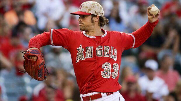
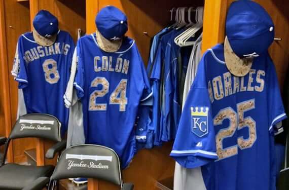
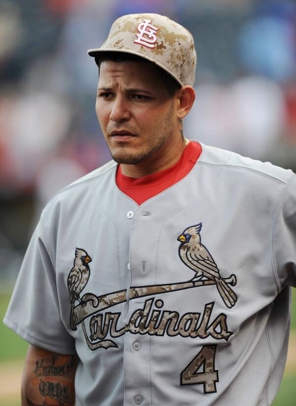
Nick Francona [shown at right; click to enlarge]: I’m 33. I live in New York now, moving to Boston soon. And I’m waiting to hear from some grad schools.
UW: I know you were in the Marines. When did you serve, and in what capacity?
NF: From early 2009 to 2012, I was an officer. My MOS — that’s military occupational specialty — was ground intelligence officer, and my role was scout sniper platoon commander.
UW: Where did you serve?
NF: I was stationed in California, and then I did a deployment to Afghanistan.
UW: I’m sorry to ask such a sensitive question, but did you personally serve alongside anyone who died in combat?
NF: The battalion I was in — 3rd Battalion, 4th Marines — lost five Marines during the deployment to Afghanistan in 2011. No need to apologize for asking. It’s the reality of it.
UW: I know you’ve also worked for several MLB teams. Which teams were they, and what did you do for them?
NF: I was coordinator of major league player information for the Angels, and then I was the assistant director of player development for the Dodgers and the Mets.
UW: I know you’ve had concerns with how MLB distibutes the proceeds from sales of Memorial Day apparel. Could you please summarize those concerns for me?
NF: Before getting to the proceeds and the financial aspect, I want to step back a bit. Memorial Day should be a dignified way to honor those who’ve fallen during service to our country. And I think any reasonable observer would say that that’s not even remotely close to what’s been happening with Major League Baseball.
UW: How do you mean?
NF: If you go back and look at it through the recent years, the one consistent theme is that it’s a commercial campaign to sell apparel. I don’t see how anyone could look at this and say, “MLB is honoring the fallen by pushing camouflage hats on people.” It’s just not the case.
UW: But they would probably say — and this brings us back to the financial aspect — that they’re donatiing their profits to military charities and so forth. But I gather that that’s what you’ve been taking issue with, either in terms of their transparency or their follow-through.
NF: Right. But making a charitable donation and coming up with a dignified campaign don’t have to be mutually exclusive. I think a lot of people started looking at all this with a little more skepticism after Brandon McCarthy [MLB pitcher who was then with the Dodgers, now with the Rangers] sent out that tweet a couple of years ago.
generations of soldiers died protecting our country and its freedoms- don't forget to buy an official baseball hat to say thank you
— Brandon McCarthy (@BMcCarthy32) May 29, 2017
I had actually put together a document that proposed how MLB could do this the right way. I highlighted a lot of the issues where we were totally missing the boat with it. Like, just for one example, the Dodgers sent out photos of players in their Memorial Day hats, and it said, “Fresh,” with a fire emoji.
Fresh. 🔥 #MDW pic.twitter.com/H4KtEQwNZN
— Los Angeles Dodgers (@Dodgers) May 27, 2017
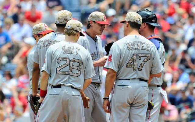
It’s like, really? That is so tone-deaf. I mean, that is just patently offensive, to suggest that that’s even approaching anything like a dignified way to memorialize people. And now it’s not just camouflage caps and jerseys — you have the camouflage eye black, the cleats, the socks, the arm sleeves. It’s turning into dress-up at Halloween. And what you don’t see, through any of this, is any acknowledgment of “This is so-and-so who died. This is their name and their story.” These are real people who died, they have families left behind. And when you actually talk to the families, they care about their lost loved ones’ stories and keeping their names alive. They don’t care about camouflage.
And it’s not just the camo itself — it’s how it’s presented. When you have to really dig and find the fine print that says they’re donating the proceeds — and even then, the fine print is basically “Take our word for it, we’re donating to charity” — that’s problematic. Nobody would look at that and say it looks like a benevolent charitable campaign.
UW: Do you have similar concerns about the proceeds of sales from MLB’s Independence Day merchandise, which have also been targeted for military charities, or just Memorial Day?
NF: There are a lot of overlapping concerns there, but I’ve focused more on Memorial Day.
UW: Let’s talk more about how the proceeds from the camouflage merchandise are handled. MLB says it donates its profits from this apparel, but of course they’re not the only ones profiting. Let’s say, for example, that Lids is selling a camouflage Yankees cap from Armed Forces Day for $40. Now, their web page for that item says — and this is the fine print you were referring to — “Major League Baseball will donate its licensed royalties from the sales of such items to MLB Charities to support programs for service members, veterans and military families.” Do you happen to know roughly how much of that $40 retail price goes to Lids, how much goes to New Era, how much goes to the Yankees, and how much goes to Major League Baseball as a royalty? Because only that last part, the royalty, would be targeted for charity, while the rest would still be taken as profit by the other participants in the supply chain, right?
NF: You have hit the nail on the head, and that is the issue I’ve asked about very specifically. I mean, that’s a very simple question: How much of this is going to charity? MLB has refused to answer that question, and so I couldn’t give an answer to Gold Star families who wanted to know. It’s embarrassing that they refuse to provide that information.
UW: So there’s no transparency there about how they slice up the pie.
NF: Exactly. And if you look, even the language of the fine print has changed.
UW: Right, it used to say “net proceeds,” and before that it said, “a portion of the proceeds.”
NF: This is the first year they’ve mentioned “royalties.” They’re very lawyerly about it, but they won’t even say how much the royalty is. And I am positive that they are making money off of this directly, because MLB also serves as a retailer in various shapes and forms. Plus there’s an enormous economic advantage to having your partners profit, whether through volume discounts or whatever. There’s economic value there. But there’s no transparency.
UW: Let’s assume that the designated royalties do indeed go to MLB Charities. What do you know about MLB Charities, and how do they, in the words of the fine print, “support programs for service members, veterans and military families”?
NF: That’s a really good question. I do know that they’ve made some donations in the past. How much, and when, and where, is an open question. Which is pretty remarkable, because that’s not usually how charities function. I spent a lot of time trying to research MLB Charities’ paper trail. From the best I can tell, for a while it was being done through the McCormick Foundation, which had a program called Welcome Back Veterans. But when I started digging into it, what I found is that Welcome Back Veterans is basically a phrase and a program, but there’s no entity, no organization, no board — nothing by that name. And I asked MLB, “Who’s in charge of this? Who runs Wecome Back Veterans?” And they had no earthly idea, because there isn’t anyone in charge. It’s not a registered entity — it’s just a tag line.
MLB would ostensibly give this money to McCormick to distribute, but one of the problems is that the McCormick Foundation is so large — they do charitable programs on orders of magnitude larger than MLB — and there’s nothing earmarked as “this is the MLB money.” And I reached out to McCormick on many occasions and never got a response.
And again, these should be easy questions. This is not “gotcha” stuff. If you’re selling a product and saying the profits go to charity, that’s elementary. There’s so much smoke and mirrors behind it.
When I drew up that document to show how they could take a better approach, I thought they’d eagerly embrace it because they were catching hell over the whole thing on social media. And the response was basically, “Stay out of our business.” It was very defensive. And when people would ask questions, it would result in almost this comedy of lawyers and and PR gurus, off-the-record briefings for reporters, all this stuff. Like, guys, this shouldn’t be so hard.
UW: If you could run the program involving MLB’s military-themed apparel and how the funds are channeled to charities and so on, what would you change from the way it’s currently run?
NF: Again, a lot of it is in that document. From an aesthetic standpoint, I’d probably do away with the camo. But most importantly, regardless of the aesthetics of the uniforms or caps or whatever, there would be complete financial transparency.
UW: One issue with charities and nonprofits of any kind, military or otherwise, is that not all charities follow through on their mission statements and not all of them spend their donated funds efficiently. For example, the Wounded Warrior Project sounds like a good organization, but it had a scandal a few years ago regarding lavish spending on parties, which resulted in several of its executives being fired and even led to a Congressional investigation. If a Uni Watch reader doesn’t want to buy a hat but does want to contribute to a military charity, are there any good ones that you can personally vouch for or recommend?
NF: I would encourage people to go a bit deeper than “military charities” in general. There’s a lot of different types of things out there — veterans transitioning to the civilian world, guys that are wounded, stuff for families, stuff for children of people who’ve died in combat. And within each of those categories, there are hundreds of organizations, if not more. So there are lots of areas.
One that I particularly like is the Travis Manion Foundation. The guy it’s named after, Travis Manion, was a Marine lieutenant who was killed in Iraq. And one of the things they do is help veterans participate and play meaningful roles in their communities, and really bridge the gap between the military and civilians. And one thing I love about them is that it’s not limited to veterans — civilians can go join that as well. That gets to the bigger picture of what I think is missing in a lot of this discussion, creating that bridge between the military and society. Like, instead of supporting our troops by buying a hat, how about if we support them by being educated voters on the issues that affect them.
UW: Leaving aside the question of money and charities, I’m curious to know how you, as a former Marine, feel about the use of camouflage sports uniforms as a sort of all-purpose military signifier. One of my readers, a guy named Scott Rogers, recently posted a comment about this on my website. It’s fairly long, but I’d like to read it to you:
I object to the spectacle of teams signaling their patriotic commitment by forcing their athletes to play dress-up in soldier costumes.
American pro athletes can be divided into two categories:
1) Citizens of foreign countries, whose loyalty in the event of a conflict would properly align with their home countries, and so no decent American would seek to force them to pantomime wartime loyalty to the United States; and
2) American citizens who are young; who are spectacularly physically fit; who are highly trained and capable in teamwork and small-unit physical and mental coordination; and who are, mostly, college graduates. That is, they are exactly the people who should be serving in [the armed foces].
But because we do not have compulsory service, these young athletes have chosen not to serve their country. Which is fine; we allow young people to make that choice. But having made that choice, it’s obscene for any of these young Americans to play dress-up in soldier costumes. Want to wear camo uniforms? Want to wear the flag on your sleeve? Great! Go find your local Armed Forces Career Center. If you can play at even a minor-league professional level, you will almost certainly qualify to become an officer in the armed forces of the United States, and you can serve for a short enough term that you’ll still have plenty of years left to pursue professional sports after your discharge.
Any thoughts on that, or on the sports world’s use of camouflage in general?
NF: I would start by saying it’s probably overstating things to say that any professional athlete is automatically qualified to serve in the military, and it probably undersells the officer corps a little bit there too.
But aside from that, there are some really good points there. I’ll start by addressing the foreign players, because that is something that stood out to me from the get-go. I mean, I’m a proud, patriotic American, and that’s why I served, but when I worked in baseball I was always a little uncomfortable with the idea of forcing people from other countries to wear American military camouflage. It’s something I brought up with Major League Baseball. I mean, if someone made me wear another country’s military pattern, that wouldn’t sit well with me, since I’ve worn a real American military uniform.
Anytime this point is brought up, the responses usually devolve into, “They’re making milliions of dollars, they should be grateful” type of thing. Which I don’t think is a particularly useful conversation. I just think there are better ways to go about this, in a way that can be meaningful to families. So last year, when I was still with the Mets, there are lots of Dominican players in MLB, and specifically on the Mets. And there’s also a large Dominican-American community in the New York area, and quite a few of them have been killed in combat.
So I matched up players with local families, based on shared commonalities in their backgrounds — where they were from, where they went to school. For example, there was a Dominican individual who was killed, and his family was matched with Amed Rosario. There was a Venezuelan with Wilmer Flores. It’s a lot more organic and personal. And the players, it was very emotional for them, but they loved it. And the families, it meant the world to them — that people who would never have heard their loved ones’ names were now hearing them.
And the players all had these metal Memorial Day bracelets for the people they were honoring. In case you’re not familiar with those, it’s a stamped-metal bracelet that shows the person’s date of death, unit, location, and so on. It’s something very recognizable in the military community. And it was a big success — the families loved it, the players loved it. Everyone wins, eveyone looks good.
UW: In the past, I’ve been critical of MLB for using camouflage uniforms on Memorial Day, because Memorial Day is a day of mourning, not a day to celebrate. This year they’re using remembrance poppy jersey patches instead of camouflage, and they’re not selling any of the Memorial Day uniform merchandise this year, both of which I think are big improvements over their previous practices. What do you think?
NF: It’s definitely a step in the right direction. But to me it’s nakedly transparent that they wouldn’t have made this change if they hadn’t come up with this other holiday, Armed Forces Day, that lets them sell camo stuff. So I don’t think the folks at MLB sat down and said, “How do we appropriately celebrate Memorial Day?” I think it was more like, “How do we sell camouflage hats and get away with it, now that we’ve been criticized for how we handle Memorial Day?”
———
So that was a year ago. I got in touch with Nick earlier this week and am happy to report that he’s doing fine. He offers this follow-up on our interview:
The mystery still remains as to how much of this money is donated, where it goes, what percentage is donated, etc. After you posted that update when a reader sent in some info about MLB’s practices flagrantly violating the best practices of charity watchdog groups and even state regulators, I dug into it a little more and was shocked by how bad it actually was. But I found out that these regulations are almost never enforced, so organizations just tend to do whatever they please.
I ended up gathering a variety of the statements made over the years by MLB, individual clubs, media outlets, and apparel partners regarding the donations, and put them together in a short video:
MLB’s campaign to sell apparel and profit off of those who’ve served is not only distasteful, it’s unlawful (in multiple ways).@NewYorkStateAG, I’m sure you’re busy so I tried to make this easy for you.
Take a look. And then take action. pic.twitter.com/pUcWuVXeuZ
— Nick Francona (@NickFrancona) June 6, 2019
It’s easy to see how the statements are entirely meaningless, often mutually exclusive or contradictory, and basically show an attitude of carelessness. It is pretty stunning not only that an organization as large and visible as MLB can be so reckless in the first place, but that they have done it with a free pass.
Thanks, Nick. Keep fighting the good fight.
Your suggestions wanted: My next piece for InsideHook is going to be about throwbacks. Specifically, it will address the question “Which uniforms that have never previously appeared as throwbacks should be brought back as throwbacks?”
So, for example, Bucco Bruce and Pat Patriot would not qualify, because they’ve both appeared as throwbacks. But Wild Wing and Burger King would qualify, because they’ve only been brought back for pregame activities, not for an actual game.
Here, I’ll get us started. In addition to Wild Wing and Burger King, I’d like to see the following:
• MLB TATC
• Quebec Nordiques (although we might be seeing those soon, or at least soon-ish)
• North Stars green (the white has already been done)
And so on. Many of these, of course, are just garish designs that frequently and deservedly show up on “Worst Unis Ever” lists, which is part of why it would be fun to see them again on the field. But there are also overlooked classics that deserve to see the light of day again, including some that our own Alex Hider has spotlighted in his “Gone Too Soon” series, like the early-1980s Cavs and the early-1940s Pirates.
What about you? Which throwbacks would you like to see? Any Big Four pro uni is eligible, along with NCAA uniforms. Post your suggestions in today’s comments!

Click to enlarge
Building the future: Lots of people design uniform or logo concepts, but designer Alan Beam has created a ballpark concept — in this case, for the A’s. He envisions a new stadium with a fairly standard amount of foul territory down the third base line and a more generous amount — mirroring the Oakland Coliseum’s famously expansive foul territory — down the first base line.
“Even though the extremely large foul territory is a nuisance to most teams (and their stats), it would honor the past, provide a one-of-a-kind quirkiness to the entire lower bowl, and create an intriguing dynamic for teams that were built to play there (especially in the era of the shift),” says Alan.
I’m not sure I’ve ever seen a ballpark with this type of asymmetrical grandstand design around the infield. It’s a clever idea — I like!


Another membership raffle: Readers Logan Irons and Jeremiah Allyn recently donated to memberships for me to raffle off, and reader Ben Garner donated two memberships. So we’re going to raffle off all four of those today.
This will be a one-day raffle. To enter, send an email to the raffle address by 8pm Eastern tonight. One entry per person. I’ll announce the four winners tomorrow. Big thanks to Logan, Jeremiah, and Ben for making this one possible!

Membership update: One of the most interesting Purp Walk membership requests we received was from reader Matthew Happen, who wanted a purple sumo mawashi. It was a tricky request, but card designer Scott Turner and I were excited to have our first sumo-based card, so we went ahead with it. Turned out nicely!
Matthew’s card is one of several that have been added to the membership card gallery, as we continue to make our way through the purple onslaught.
Ordering a membership card is a good way to support Uni Watch (which, frankly, could use your support these days). And remember, as a gesture of comm-uni-ty solidarity, the price of a membership has been reduced from $25 to $20 until further notice.
As always, you can sign up for your own custom-designed card here, you can see all the cards we’ve designed so far here (now more than 2,700 of them!), and you can see how we produce the cards here.
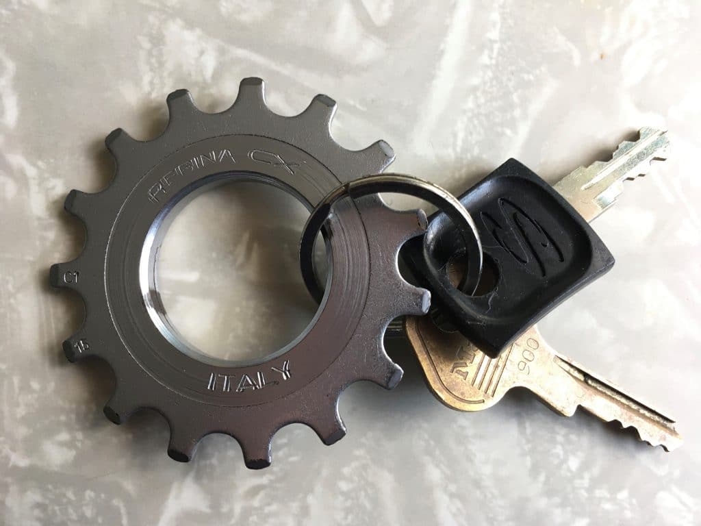
KRC update: It’s been a while since we had a new Key Ring Chronicles entry, but there’s a new one today, about a cog from a bicycle. Check it out here.
The Ticker
By Lloyd Alaban

Baseball News: The Pirates are selling a new shirt featuring a modified “Jolly Roger” logo wearing his bandana as a mask to help to raise money for coronavirus relief efforts (from Timmy Donahue).
.

Football News: This image from Browns WR Jarvis Landry’s Instagram shows him wearing the team’s new uniform with orange pants. The team released no photos of orange pants when they unveiled their new uniforms last month (from our own Alex Hider). … A photo was released of Bucs QB Tom Brady practicing with his new teammates. Brady is wearing the team’s new helmet with the new black facemask, while his teammates are still wearing the old helmet with the chrome facemask (from @WTHelmet). … Gridiron Uniform Database researcher Bill Schaefer found this 1981 photo of Cowboys S Charlie Waters with an unusual red “Dallas” nose bumper plate. … Here’s a neat story about how the Rams have donated tablet computers and hoodies inspired by their new uniforms to a namesake youth team in Watts, Calif. (from Kary Klismet). … U.S. Sen. Mike Crapo (R-ID) has a plush toy of Spuddy Buddy, the mascot of the Famous Idaho Potato Bowl, on his shelf (from @S_SquaredESQ). … Here’s a good thread of quarterbacks wearing custom facemasks to protect their injured jaws.

Hockey News: The NWHL has announced the name of its newest team, the Toronto Six (from multiple readers). … CCM is unveiling a women’s-only equipment line this week (from @OlegKvasha). … Here are four equipment-related style suggestions from a hockey writer (from Wade Heidt). … Also from Wade: As selected by NHL.com writers, here are the top goalies to wear No. 31. … In the TV series The Americans, a season two episode featured a closeup of two tickets to a 1982 game between the Blackhawks and Capitals. However, the tickets are not historically accurate, as there are no team names or team logos on the tickets. The Capitals colors are also inaccurate for the time period (from Max Weintraub). …The boards at Calgary’s old Stampede Corral, where the Flames used to play, were higher than at other NHL arenas.

Soccer News: Here’s every kit ever worn by Sporting Kansas City (from Kary Klismet). … Polish side Wisla Krakow traveled to training camp wearing facemasks with the team’s logo on them (from Ed Zelaski). … EPL team Everton has struck a new kit deal with Hummel (from Casey Hart).

Grab Bag: A sportswriter asked Twitter to post a picture of celebrities wearing sports-related clothing, and Twitter delivered (from LoLo Phymarski). … A graphic of New York’s sports team logos was shown onscreen during Gov. Andrew Cuomo’s daily coronavirus briefing yesterday. Oddly, the graphic omits the Buffalo Bills and Buffalo Sabres, which are both in the state, while including the NFL’s Jets and Giants, which both play in New Jersey. It also uses the Jets’ old logo and the cap logo for the Yankees, instead of its usual media and press logo (from Brooks D. Simpson). … Someone gave the Tokyo 2020 Olympics logo a coronavirus treatment (from Jeremy Brahm). … NHRA Pro Stock motorcycle rider Shawn Gann died last weekend. Gann was known for wearing superhero-themed leathers (from David Firestone). … Here’s the famous “I Heart NY” logo modified for social distancing (from our own Anthony Emerson). … Australian Football League team Richmond revealed their indigenous-themed guernsey, designed by forward Shai Bolton, that was supposed to be worn this weekend (from our own Jamie Rathjen) … The remaining items in this section are all from Timmy Donahue: Battle Mountain High School in Edwards, Colo., has tweaked its husky logo after it drew comparisons to the University of Washington’s husky logo. … The New Jersey State Democratic Committee has released its “Don’t Be a Knucklehead” T-shirt campaign, drawing on iconic Garden State imagery, to encourage social distancing and benefit the New Jersey Pandemic Relief Fund. … New patch for the Seneca Falls Police Department in New York. The patch design highlights parts of Seneca Falls history, including symbols of women’s suffrage — the Justice Bell and “XIX” for the 19th Amendment to the U.S. Constitution.

Click to enlarge

What Paul did last night: Last night’s porch session got off to a rocky start, as we had a petty squabble over something stupid (hey, it happens). But then something rare happened: The guy who owns the car that was parked in front of our house came out, got in the car, and drove off. Looking back on the full set of Pandemic Porch Cocktails™ photos, this is only the second time that parking spot has been unoccupied.
We guessed how long the spot would remain vacant. The Tugboat Captain said four minutes; I said five. It turned out to be six.
Anyway: Bud for me, white wine for her, delicious raspberries for both of us. They looked nice bobbing in my beer:

The branch is still there.
Cushion tags are still there too.
Actually, I removed the longer, more annoying cushion tag.
Want to see green Minnesota North Stars throwbacks!
When did the whites ever hit the ice as throwbacks? Are we counting the Wild/North Stars alumni game around the Stadium Series game? If that’s the one time those throwbacks hit the ice, I’d say it still “hasn’t been” used as a throwback yet.
Pirates bumblebee pinstripes
Check Bill Henderson’s book, but I think Pirates bumblebee pinstripes have been done or at least the tops have been done.
I’ve been ready to see the Astros’ 1971 and 1972-74 uniforms (because of the orange Astros shooting star wordmark), and the Astros were going to do the ’72-74 uniforms this year. But the pandemic has probably wiped that out.
You’re right! My bad. Thanks for the correction! Will adjust the text.
When did the Pirates do a throwback of the bumblebee pinstripes?
2004
link
A few throwback suggestions:
-University of Cincinnati’s sleeveless T-shirts
-Early ’80s Cavs Stepien throwbacks. link
A great interview to run again. A lot of great looking purple additions to the membership card gallery!
Just because it was written here, and I’ve heard it numerous times recently (but, it does happen regularly)…at what point is “Big Four” no longer referenced?
Paul, I know you’re not a “soccer guy,” and that’s okay. It’s not a knock at people who aren’t “soccer people.”
But, is there a time when soccer is actually accounted for in the major sports in the US? Soccer has major numbers and has a big presence in the US. Depending on the metrics that are compared, it does surpass some of the “Big Four” in certain categories.
Why do people continue to neglect it?
It’s likely because our *domestic* soccer league(s) is not the top level in the world, unlike the “Big 4” sports. Unlike the NBA/NFL/NHL/MLB, it exists in a truly competitive global landscape for the sport and is judged by that metric. It’s not even close to the best league and players in the world, and as a result it doesn’t have the nationwide interest level the other sports have (and the TV ratings show it.
As an example, the first ever Inter Miami CF game earlier this year, on a major national TV network and after SIX YEARS of hype and buildup, apparently drew local ratings worse than several random midweek Marlins games (which air on a regional network) from last year. Nobody (relatively obviously) cares about, for example, the Chicago Fire outside of Chicago. But the Cubs, Bulls, Bears etc. likely have millions of fans all over the country.
The sport is absolutely massive in the US. It’s my favorite sport. Realistically it’s probably the most popular *sport* after American football. But our local teams aren’t at the same level on the global stage as their American sport counterparts (it can be argued that we lag behind the rest of the world because we’ve insisted on “Americanizing” the sport – with franchises instead of clubs, salary caps, no promotion and relegation, and for a time, screwing around with the rules).
Well stated, Derek.
Derek:
I get all that. I’m a soccer guy.
But, the continued neglecting by media members as relegating it, will continue to push it as an afterthought.
None of that addressed the question as when is “Big Four” no longer referenced and it (soccer) becomes referenced as a major sport in the US?
A prime example in NY, where a “Stop the Spread” ad was used for sports — all pro teams were referenced except Red Bulls and NYCFC.
link
I think the answer to your question was implicit in what Derek said: MLS will become part of a future “Big 5” only if/when it becomes the best soccer league in the world, as the other four clearly are for their respective sports.
That describes MLS, but you’d have a really hard time arguing that the NWSL/USWNT is not the best women’s league/team in the world, and of course the USWNT in particular gets a lot of attention. The last two Women’s World Cup finals apparently drew more viewers than basically every “Big Four” championship game except the Super Bowl (and some World Series/NBA Finals games).
I think we’re past the point where you can use “Big Four” without somebody like me or ThePonchat pointing out that you’re missing soccer, but I’m not sure when that became the case. I’ve seen a lot of WaPo multiple-sports articles leave out D.C. United (such as, a few years ago, articles saying that people born after 1992 like me had “never seen a championship” until 2018, which obviously is untrue if you include DCU) and that absence of DCU seemed to always be pointed out.
Right, and we don’t really need to compare any of the sports with the majority of NCAA — even DI outside the “Power 5.”
Just to note, this is the first time I’ve ever heard “Big Four” referenced as “best [insert sport] league in the world.” It’s almost been exclusively utilized as the popularity of the sport in the US, not as a world comparison of leagues.
Maybe I have been missing out, but that is new to me.
Meanwhile the WNBA, NWSL, NWHL,etc. continues to be left out of the conversation…
I’d agree with Derek in that MLS is essentially a minor league as far as the sport is concerned, whereas NFL, MLB, NHL, and NBA are the top leagues in the world. Also, regardless of how popular soccer is or has become lately, I’d say you still don’t hear it in small talk or water cooler talk, or however you want to describe it. I don’t know that I’ve ever heard someone say “how about that _____ (game, play, shot, finish)” for an MLS, or really anything outside the world cup, when it comes to soccer. The only people I hear talk about soccer are professed soccer fans who actively watch, yet you hear casual fans discus other sports in passing.
So in addition to “MLS is not the top tier” I think it also just hasn’t penetrated to casual viewership levels yet.
On the other side of coin you could argue that the NHL may have lost a lot of this casual fan talk ever since ESPN blackballed them when they lost the broadcast contract.
Haven’t seen the Mets 1978-81 henley jerseys as a throwback yet…
I’d like to see the Dodgers 1944 satin uniforms. I know they wore a powder blue variety, but not the satins. I’d also be interested to see other baseball teams wear throwbacks with old nicknames – Phillies as the 1944 Blue Jays, Dodgers as the Bridegrooms or Superbas, Yankees as the Hilltoppers, etc.
Also, the NJ Devils might want to wear the Colorado Rockies.
Lastly, similar to the satin unis, I don’t know if the current throwbacks that baseball teams wear are flannel, but that would be neat, as well.
Oddly, the graphic omits the Buffalo Bills and Buffalo Sabres
Yeah, and NYRB, NYCFC, and the Liberty…
Do the Senators’ barberpole jerseys count? An exact throwback has been worn before by the AHL’s Binghamton Senators, but not by the NHL team.
Also, since you said “NCAA uniforms” without specifying a sport, may Nate and I suggest some stylings from UVa men’s soccer’s ’90s period of success, including an link and link.
Bennay in that shirt is WILD
Regarding the hockey tickets in the ticker item- WTH is Game 7 of the Fall Classic in hockey? And both tickets have the same seat number? Not well done
And the tickers have rain checks, were they thinking this was an outdoor series?
As to throwbacks – how about the Detroit Lions dressed up as the Michigan Panthers. If they can wear those horrible grey dishwasher set – they can wear the Panthers.
While I consider it ‘wrong’ for teams to throw back to history which is not their own (i.e.: Mariners dressing as the Pilots, the recent clamor for the Texans to dress as the Oilers), there is one exception:
I would love to see…though it will never happen…the NFL roll out a USFL ’84 throwback weekend!
To add to the incorrectness, I suppose the Falcons would have to be the Stallions, the Cowboys become the Gunslingers, the Chiefs play as the Outlaws, and the 49ers would have to claim the Invaders identity. Problem: Which LA and NY team dons the Express and Generals uniforms?
Express-Rams.
Generals-Giants.
Who gets the Breakers… Pats, Saints or Seahawks?
Dolphins could be the Renegades.
Jags = Bulls
I would love to see the Pats throw back to their original 1960 uniform. Yes the red jersey has been worn before. But the helmet, featuring a tricornered hat and the player number, has not.
I don’t think I’ve seen the Detroit Pistons throw back to teal. Holy shit that’s a weird look in their history, and isn’t that the point?
The 1990s Florida Panthers jerseys would be awesome to see comeback. The Cats haven’t had a 3rd jersey since the 2016 rebrand (and they do have a modernized version of the old Leaping Cat logo as an alternate), it would be perfect for them to bring those back.
Very disappointed to click on the link and see that Everton will not be dressing as Hummel figures as hoped.
Throwback I want to see, the Pistons teal uniform. It would at least give me a reason to tune in as the team isn’t currently worth watching on its own.
For the NHL, I’d like to see the uniforms of the Cleveland Barons, Kansas City Scouts, California Golden Seals, Brooklyn Americans, and the Atlanta Flames. For the NFL, I’d like to see the patriots in Boston Yanks uniforms.
Agree with those NHL ones with the exception of the Brooklyn Americans.
Don’t think much of the ones used during the franchise’s final season known as the ‘Brooklyn Americans’; any of the New York Americans stars and stripes jerseys would be a great choice.
Some new throwback suggestions:
– NY Jets “Sack Exchange” era (1978-89).
– Original Oakland Raiders (1960-62).
– Houston Oilers silver helmet era (1966-71).
– Steelers “Batman” jerseys (1966-67).
– Cardinals late St. Louis era (1982-87).
– Original Jaguars (1995).
– Eagles Jaworski/Vermeil era (1974-84).
– NY Giants 1975.
AAGBPL – whether singlet skirts or uniforms based on what male coaches wore, as Chance Michaels proposed for the Brewers in 2018 link. It’s great that so many teams honor Negro Leagues forebears with throwbacks, but the 1940s pioneers of womens’ sports should also be honored.
I don’t see any “team colors” at all on those The Americans ticket stubs, so I don’t see how the team colors can be said to be “inaccurate.” The predominant colors on the tickets are blue and red, real actual 1982 Caps colors, but the two colors are used generically as highlights, not to indicate anything about the teams. The most anomalous about the tickets as a theatrical prop is the “fall classic” label.
I’d like to see the white Mets hats from 1997.
I thought I’d be the only one to suggest a return of the Ice Cream Man Mets unis! Honestly the only look for them in the late ’90s/early 2000s I don’t find awful now.
“stupid squabble”….in my house that’s called Monday.
throwbacks, years approximate:
1981-83ish Oakland A’s home
1976-83 San Diego Chargers home/away (blue helmet, yellow facemask)
1979-87 Seattle Mariners (vertical sleeve stripes)
1969-73 Houston Oilers (silver helmet years)
For a throwback I would like to see, how about the Blues’ original rejected uni design?
link
Another throwback I’d like to see is for the Nats to wear 1967 Senators uniforms with white caps and plain white socks in honor of the white-cap stunt the Washington Senators pulled in Kansas City:
link
They could do this in either Oakland or KC, or in Washington against either team, during interleague play.
Cmon, RS…
Haven’t the Nationals ‘celebrated’ enough DC baseball history already?
;)
The Expos throwbacks worn last season were spectacular to finally see back on the diamond – just stick with those for the occasional TBTC game.
A few suggestions for throwbacks (i could be wrong in that some of these may have already been worn):
NHL
– NY Islanders Fishsticks
– TB Lightning storm uniforms
MLB
– Late 80s Padres Brown/Orange
– Nationals -> Expos uniform
– Angels Early 60s halo caps
NFL
– Late 80s/Early 90s Seahawks (stupid single shell rule)
– Broncos Orange Crush
– Late 80s/Early 90s Eagles
NBA
– Milwaukee Bucks late 90s Big Buck alternate
– Thunder – any supersonics uniform
– 76ers early 90s stars uniforms
– 90-91 Nets gradient uniform
The Nats (finally) wore Expos throwbacks in July 2019: link
The players seem to have been enthused by the uniforms, and I’ve seen several Nats players wearing their Expos jerseys and caps during the offseason and when doing webcasts during the lockdown.
Right – I forgot about those! I was thinking of the 90s Pedro/Vlad version in my head. Thanks!
The Angels have also worn their 60s halo caps as a throwback on a few occasions, most notably during their 50th anniversary campaign where they brought back a number of older designs. I do miss them, though.
Best hat ever.
Watching the 9th episode of “The Last Dance” I thought the uniforms the Pacers wore on Reggie Miller´s Rookie year were dope. So much better than any other design since.
link
That doesn’t look like Tom Brady with the black face mask.
I’ll let my link stand as my answer for a throwback I’d like to see.
Perused the membership gallery and was stoked to see someone else opt for the Cubs retirement flag treatment!
Perused the membership gallery and was stoked to see someone else opt for the Cubs retirement flag treatment!
Also, it’s Jeremiah Allyn, not Jeremy.
Fixed!
Throwbacks I’d like to see:
Winnipeg Jets early 90s before they moved
Colorado Rockies hockey- either the Devils or Avs ca wear them
And since Citi Field was designed in homage to Ebbets Field — Brooklyn Dodger throwbacks for then LAD visits!
-that’s when LAD visits.
One more—Rams blue and white of the 60s
The purple/black mid-90s Sacramento Kings unis should definitely be part of this
I’d love to see the original Seattle Seahawks uniforms back on the field again (even if the team was trash for much of their existence).
YES!!!
As a child, I loved those uniforms. I even had the Sears replica child jersey no. 80 for Steve Largent. So even as an adult and 49ers fan (I had to choose between the two when my then-favorite AFC team rejoined the NFC West), I would love to see the original “happy” 1970’s Seahawk retake the field.
Trash? The Seahawks were the gold standard for early success until the Carolina Panthers happened on the scene. Their first three seasons were 2-12, 5-11, and 9-7.
I think everyone will admit the best-ever expansion-year team were the Vegas Golden Knights.
1970-73 Philadelphia Eagles. The Kelly green with white helmets. Also the sheer simplicity. It was pretty much the St. Louis Cardinals’ uni of the day, but done in green instead of red.
It’s an underrated look in the team’s history, but not unlike the Steelers’ Batman era, the Eagles were awful during this stretch and it probably keeps the look moth-balled
I want to see the early 90s Run ‘n Shoot Houston Oilers again with the red face masks. That was the best uniform look they ever had to me. The blue helmet and silver shell looks were ok, but that last version with Warren Moon to Haywood Jeffires and Ernest Givins. Classic.
96-06 Buffalo Sabres, specifically the black set
kelly green eagles uniforms with the wing helmet design
Here’s 2 I’d like to see:
Philadelphia Phillies 1938 (blue and yellow, with that Billy Penn patch).
Washington Redskins 1959-1964 (feather center stripe).
I disagree strongly about the Redskins. They should not wear the 1959-64 uniform as a throwback. They should wear it as the standard uniform. Among the best uniforms in football history, and by far the best the Skins have ever worn.
1979-83 New York Knicks.
So weirdly distinctive they have to be in this conversation.
YES.
EXCELLENT uniform! If for no other reason than that great number font.
My random celebrity entry:
link
The Bills and Sabres omission didn’t go unnoticed in Buffalo, where the usual bad actors are using it as proof that Cuomo doesn’t care about the region and therefor he is a tyrant, a dictator, and all around no-good bad guy in need of spiting. This virus has honestly brought out the worst in far too many people.
the extremely large foul territory is a nuisance to most teams (and their stats)
The *lack of* foul ground is a nuisance to the pace of play. Countless foul balls that would’ve been caught in the old days become yet another souvenir and yet another addition to the pitch count now.
#BringBackFoulTerritory
Maybe so, but to arbitrarily add extra foul territory to “honor the past” is nonsense.
I disagree — I think it’s really clever!
3 more from Philly I’d like to see:
1938 Phillies (yellow and blue scheme with the pitching Billy Penn patch).
1991-1994 76ers (shooting stars).
1984-1997 Flyers (black piping…white at home, orange on the road).
Paul,
GREAT follow-up piece with Nick Francona! Thanks for updating it – hopefully it will lead to some positive change (but I somehow doubt it). And on the subject of COVID-inspired modified logos, can we all agree that the Pirates just dropped the mic and everyone else should just give it up?
Pirates and Twins are kind of jointly dropping the mic:
link
Throwbacks?
1) The Air Coryell Chargers
2) The Seahawks original royal, green, silver.
That photo of Brady with the new helmet really shows the size difference in the new helmet logo as well as the mask color.
Wait, when exactly have white North Stars jerseys been worn in a game since the franchise moved to Dallas? I remember Mike Modano breaking one out for a postgame skatearound in Minnesota after his final game with the Stars in 2010, but I’m pretty sure the team has never worn them in an actual game.
And alumni games don’t count.
I’m not from SoCal, but I’d have to say an iconic throwback for me would be Naked Gun era California Angels. Reggie Jackson’s finest role.
Throwback idea — A game between the Flyers and Hurricanes (in Whalers uniforms) wearing Cooperalls.
I’m not sure if this counts but…
The white/color rush 49ers duds can be looked at two ways; as a throwback of the original 55-56 block-shadow uniforms, or as a throwback of the 94 interpretation of those throwbacks. A throwback of a throwback, if you will. After all, when the Niners wore block-shadow numbers the first time, they had red (and then white) helmets.
So to me, their current version is not trying to throw back to the 50s (even though I know they currently couldn’t even if they wanted to), but a deliberate attempt to recreate the ’94 interpretation, since that’s the nostalgia they were trying to capitalize off of by bringing it back.
In that vein, I’d like to see the red version of that 94 uniform return. I miss it terribly.
Another throwback that I don’t think has ever been done and that I wouldn’t mind seeing:
The New Orleans Saints “Dome Patrol.”
Points in favor:
1) It’s feasible. Keep gold helmets, just get big fleur de lis decals that aren’t double-outlined. (If the NFL has a one-shell rule, you gotta think of that.)
2) It eliminates the black pants. Awesome!
3) It brings back the Louisiana logo, which I happen to like. Haven’t seen that logo ever since it was over the heart one year after Katrina. Louisiana’s pro team at the Louisiana Superdome, I dig it.
4) White numbers on a black jersey, that’s different enough to justify a new purchase from the gift shop but still look good. (I’m a Uni Watcher and I have a MBA…please forgive my cynicism!)
5) The Dome Patrol was good! No Super Bowl, no playoff victories, but that was the first era that didn’t totally suck. Add the recent passing of Vaughan Johnson, and you have a good throwback option that looks good, makes people happy, marks a relevant chapter in Saints history, and is easy to do.
These are probably the greatest uniforms in franchise history, and inexplicably, they’ve never been brought back.
In addition to being worn by the greatest collection of linebackers ever assembled (let’s face it, no team will ever send 4 LBs to the Pro Bowl in the same year again), these uniforms celebrate the unique connection the Saints have to Louisiana, and the Gulf Coast region in general. No team is as intertwined to the fabric of its city’s culture like the Saints are.
I would LOVE to see any version of the Bucks’ Irish Rainbow uniforms, whether it’s the original ’77-’81 set, the ’81-’85 set with revised wordmark or the sans-red ’85-’93 set.
I can’t be the only one, I see a lot of Bucks fans clamouring to bring it back and it’s baffling why the team refuses to do so.
1986-1995 New Orleans Saints “Dome Patrol” unis. Can’t beat the Louisiana state logos
For throwback, I know the Bills have worn their “Standing Buffalo” throwbacks a couple of time but they’re usually paired with white jerseys and white pants. I’ve not seen any pictures of them with blue jerseys and white pants.
The Bills actually had blue jersey versions that they wore in 2009 and 10, according to GUD. The blue jerseys re-created the thin red outline on the white sleeve stripes accurately. But they stopped wearing the blue ones and have kept the white ones, which are horribly inaccurate. They settled for two sets of red and blue stripes on the white jerseys and it makes the Bills look bad to claim they’re wearing a “throwback” that they didn’t actually wear.
The blue jerseys would be nice, since they got it right back in 2009.
Marquette. Untucked. Pick the design.
Thanks for sharing the link to the “Knucklehead” shirts. My Jersey-born friends are having a field day arguing over the website’s use of “Taylor Ham” instead of pork roll.
Well, the package design they mimicked is literally the Taylor Ham package, so there you go!
You can really tell the difference in the size of the flag on the Bucs helmets with that pic.
double stripe charlotte hornets – Baron Davis era
1939 Texas Tech football red and black – black shoulder caps with stripe going all the way down the sleeve, white numbers, I believe red satin/sheen pants, striped red and black hosiery.
I failed to mention there was a big black stripe with white trim down the back of the pants. I have photos if needed.
I third the Seahawks!
Have the St. Louis Browns every made it into a throwback?
I love those uni colors, and really wish an MLB team wore brown and orange.
Yes, Orioles have worn Browns throwbacks.
The North Stars’ whites have never been worn as a throwback in a real game. I see some of the earlier commenters mentioned that they wore it in an alumni game (which I didn’t know because I don’t typically pay attention to such things), but I’m 99.99999% sure they’ve never been worn otherwise.
Some throwbacks I would like to see are Alabama football in white helmets and Alabama vs. Tennessee back in color vs. color.
Thank you for providing context behind the branch. I missed when it was brought up & been staring at every porch picture for a branch on the ground.
You’re welcome! I figured that might be the case, so I’ll link to the video from now on.
Throwback suggestions:
-1936 Green Bay Packers link
-Michael Finley-era Wisconsin basketball link
As a veteran, I very much appreciate the sentiment of today’s post.
As a cohabitator, I very much appreciate the acknowledgement of petty squabbles over stupid things.
I have to believe pieces like the Nick Francona piece are the reason why there is no Paul Lukas Topps baseball card. You lost your position at ESPN for complicated, mostly economic reasons, but I am sure your ethical stance on cynical commercialization makes you at least a tiny bit less employable to the big media conglomerates that do business with the leagues. Leagues have put pressure on ESPN decisions before (the NFL most famously). I doubt anyone leaned on ESPN about you, but that isn’t the only way to effect personnel decisions. You should be very proud of your work in this area. I know it makes me proud to be a reader of this site.
Thanks, Michael — appreciated.
The 1974-76 Penguins blue “Chevron” jerseys. Totally forgotten uni set, great shade of blue too and an awesome sleeve design.
So many possibilities, so little time: Colorado NHL Rockies, Atlanta Flames, Atlanta Thrashers 1999 white uniform, 1979 St. Louis Blues, Cleveland NHL Barons, Cincinnati WHA Stingers, Expansion-year Jacksonville Jaguars, 1975 NY Giants, 1976 Seahawks, 1984 Browns, 1981 Falcons, 1977 Padres road uniforms, Expansion-year Blue Jays white uniform, 1977 Pirates bumblebee (top AND bottom), 1970 Indians, St. John’s Redmen with rickrack stripe, 1977-78 76ers, Indiana Pacers FloJo uniform.
I don’t think that Jarvis Landry pic has him in the new jersey with the orange pants. I thought the new jerseys had rounded numbers. That pic shows varsity/block numbers.
1. LA Dodgers in the Blue Satin Uniforms from 1944 (Not a copy that’s cotton)
2. NJ Devils wearing KC Scouts throwbacks. Colorado Rockies throwbacks for that matter.
3. Baltimore Orioles wearing a correct St. Louis Browns Throwback (they’ve worn an incorrect one in the past).
4. LA Rams Throwback to the 1949 Red/Yellow set.
5. LV Raiders do a Throwback to the 1960-61 Raiders who wore Black/Gold and FNOB.
Re: throwbacks. I’ve always dreamed the White Sox would throw back to the 1932-35 home jersey with its drool-worthy chain stitched front logo.
link
As a Flyers fan, it saddened me greatly to read that “top goalies to wear #31” piece; Pelle Lindbergh could have easily topped that list or at least been part of the discussion.
No disrespect to Pelle, but the NHL has a long history of goalies who shone very brightly very briefly and then were mediocre for the rest of their career (Jim Carrey, Trevor Kidd, Arturs Irbe, Andrew Raycroft, Bob Mason, David Aebischer… I could go on. It’s actually a quite fascinating subject that I’ve never heard a good explanation for.) Lindbergh certainly could have gone on to be one of the all-time greats, but I think he just as likely could have gone on to a few sub-.900-save-percentage seasons and early retirement. There’s plenty of precedent for both.
1. 1998 Arizona Cardinals white
2. 1981 Cincinnati Bengals black
3. 1991 Detroit Lions blue
4. 1999 Jacksonville Jaguars teal
5. 2019 Los Angeles Chargers powder blue (technically it can be a throwback now)
6. 1998 Minnesota Vikings white
7. 1996 New England Patriots blue
8. 1982 New York Jets green
I want to see the Cowboys wear late 70s throwback. Serifed numbers and maybe even the red stripe on the helmet. Matching blues.
For throwbacks”
Steelers Batman
NYR Liberty
Cleveland Barons (With the Ohio patches on elbows)
Terrific interview. I wish only the best for Mr. Francona. He’s in a great position to turn up the heat on MLB on this despicable play-soldier campaign.
As for throwback candidates: I’m pretty proud that the K.C. Chiefs and K.C. Royals pretty much got it right the first time and (except for the Royals’ dreaded black drop shadow/vest/gray cap era) most of the tweaks have been minor and for the better. Too many teams (and frankly, players) forget that it’s called a U N I F O R M , which, by definition requires consistency. That consistency, uniformity, sadly is lacking. As w/ the camo gimmick, much of the multiple looks is driven by merchandise sales.
Context here on the Buffalo Logo omission. Literally the day before, Governor Cuomo was in Buffalo (yes that’s right Buffalo ….. he was here …. in Buffalo … in the flesh) where he put up a slide saying how much he hopes the Bills play soon and he misses watching the Bills. And he showed their logo. The next day, he was in Long Island so showing the logos of the NYC/Long Island Big 4 teams make sense. Buffalo fans want to complain about everything. And I’m from Buffalo and live there. It’s just so non-sensical.
It’s gotta be the Houston Rockets uniforms of the mid-90s to early 00s. link
Almost every other terrible 90s NBA uniform has resurfaced as a throwback, why not these beauties?
I would love to see the 1980’s Cincinnati Bengals Black Home Jerseys come back. Also the Dallas Cowboys need to go back to their 1970’s Uniforms. That Blue Uniform is a great look. The numbers on their 70’s jersey’s looked much better as well.
The 2001-2007 Tampa Bay Devil Rays. The team has really been all about the 1998-2000 look lately, but the green era is underrated.
Although we already have the best throwbacks in NFL -the lowly Detroit Lions…
I wouldn’t mind seeing the Barry Sanders blue pants, white jersey combo circa 1994 with “Bubbles” the Lion on the helmet to harken back to our “Glory Days” of the Wayne Fontes era.