
By Phil Hecken, with Jimmy Parker
Follow @PhilHecken
I’m back today with Jimmy Parker (who you can find on the twitter as @BeautyOfAGame, and who, besides being a gentleman and scholar, is also a Design/Advertising professional exploring The Beauty of Sports through the lens of art, design, photography & the maker community. I’ve feature Jimmy on Uni Watch a bunch of times over the past couple years, and he’s now back with yet another fantastic piece, this time on the art and artistry of Karl Hubenthal.
Please, sit back and enjoy!
Karl Hubenthal
By Jimmy Parker
In today’s era of sports, full of stylized photography, cutting edge video editing and flashy social media graphics, it’s easy to overlook illustration’s historical contributions to the visual aesthetic of sports. In the 20th Century, before color photography became commonplace, the realm of athletics was home to a large stable of illustrators who helped Americans identify and appreciate their sporting heroes. While many of these illustrators gained national prominence thanks to newspaper syndication of the day, perhaps none is more identified with a specific locale than Karl Hubenthal in Los Angeles.
Hubenthal graduated from Hollywood High School in 1935 and later that year joined the Art Department of the Los Angeles Herald-Express newspaper. Shortly after, Hubenthal was hand picked by William Randolph Hearst himself to contribute editorial cartoons to Hearst newspapers. This background in editorial cartooning, where the idea being conveyed is equally as important as the artistic execution, served Hubenthal well and would later help his illustrations stand out in the sports world.
Karl enlisted in the Marines during World War II, contributing cover illustrations to The Leatherneck, the magazine of the Marine Corps. Following his military service Hubenthal worked as a freelance illustrator, later returning to a Hearst newspaper staff in 1949. Over the next 3 plus decades, Hubenthal would contribute political and sports cartoons to Hearst papers, covering a wide variety of topics. Throughout the years, these cartoons usually had a California bent to them, from this UCLA piece (featuring Jackie Robinson) from the 1940s, this Bill Veeck piece from the 1950s, this Pete Reiser Dodgers piece from the 1960s, to this NFL piece from the 1970s:

In the first half of the last century Los Angeles was home to a variety of sports teams at both the collegiate and professional levels. It’s here that we find some of Hubenthal’s earliest sports work outside of newspapers, in program and yearbook cover designs for the NFL’s Los Angeles Rams and the AFL’s Los Angeles Chargers. In the 1958, 1959 and 1960 Rams Yearbook covers we can glimpse the beginnings of Hubenthal’s evolution as a cover artist. Where the ’58 cover is more or less simply an illustration (albeit a beautiful one), the ’59 cover shows a style more akin to Hubenthal’s editorial work, using more humor and visual wit. The 1960 cover shows this style in full bore, as we see a grimacing ram’s head biting the chin strap of a Rams helmet:

The following year Hubenthal uses this more editorial style of illustration to great effect in a series of game-day programs for the Rams. For each game the cover design uses a single color to give graphic impact to an image depicting the two teams mascots squaring off visually. It’s interesting to note that not all covers depict the Rams as the superior team. In particular, the wraparound cover for the December 17 contest between the Rams and the Green Bay Packers shows a meat packer standing proudly behind a counter with various cuts of Ram and other NFL teams:

But Los Angeles sports were really put in the national spotlight when major league baseball’s Brooklyn Dodgers and New York Giants each left their homes for the West Coast in 1958. And it’s with the Dodgers that Hubenthal did some of his most lasting work, in a professional relationship that flourished for the better part of the following 2 decades.
Throughout the 1960s and ‘70s Hubenthal contributed cover designs for a variety of Dodger publications – among them Gameday Programs, Yearbooks, Scorecards and Media Guides. Perhaps most notable of Hubenthal’s Dodgers work is this classic program for the 1965 World Series between the Dodgers and the Minnesota Twins. Evoking the space race of that era, Hubenthal depicts the two teams manning spacecraft orbiting a smiling planet Earth. Virtually everything about this cover — the whimsical illustration, the typography, the colors and the “Out of This World Series” play on words — contributes to its visual strength as a whole. Today, over 50 years later, the design is still heralded as one of the best Program covers in World Series history.
Hubenthal would often contribute illustrations that were repurposed across a variety of Dodger publications for a given year, as evidenced by this 1967 Yearbook and Media Guide. While the Yearbook cover utilizes the full color illustration, it’s reproduced in black and white on the less important Media Guide cover. It’s also interesting to note that the Media Guide is one of the few instances where Hubenthal’s work is not signed with his full signature, but with only the initials “K.H.”
Other highlights of Hubenthal’s Dodger work include this 1970 Scorecard, featuring 1969 NL Rookie of the Year Ted Sizemore, along with a nod to previous Dodger RoY winners. The 1971 Yearbook is another example of Hubenthal at the height of his illustrative prowess. Here he depicts a birthday cake filling Dodger Stadium in celebration of that park’s 10th anniversary. However, a closer look shows that the Dodger script masthead isn’t the team’s logo, but is in fact made out of the negative space between the names of Dodger players from the team’s previous 10 seasons:

During this time when Hubenthal was producing so much great work for the Dodgers he was by no means sitting idle outside of Chavez Ravine. Hubenthal also worked a bit on the hardwood, illustrating cover designs for Harlem Globetrotter programs in 1961, in 1965 and in 1967. Oddly enough, the only Hubenthal work I’ve found for a Los Angeles basketball team is this 1967 brochure promoting Lakers radio broadcasts.
Looking back at Karl Hubenthal’s work gives us an appreciation of a simpler time, when sports held a different place in the American psyche. When we as fans didn’t have 24 hour access to teams and athletes. When the day’s events on the field, the diamond or the court didn’t have to be instantly turned into a social media post. When a program cover’s artwork could tide us over, until we returned to the stadium to cheer on our heroes again.
Thanks, Jimmy! Fantastic job (as always). As a special bonus, Jimmy included tons of additional examples of Hubenthal’s work, which I’ve placed into several flickr albums, for your viewing pleasure. Check these out:
• Los Angeles Rams Yearbook covers
• Los Angeles Dodgers program covers (pt. 1)
• Los Angeles Dodgers program covers (pt. 2)

The “BEST OF” Kreindler’s Korner
Hey guys & gals. You’ve enjoyed Kreindler’s Korner for several years now, mostly on the weekends, on Uni Watch, but with the recent coronavirus outbreak, Graig’s time is just too precious and he needs to tend to other things besides coming up with a new writeup each weekend.
So, going forward, for as long as the COVID-19 situation is bad in New York, I’m going to run a few “Best of’s” until Graig returns.
Here’s today’s offering (click to enlarge):

Title: “Sandy’s No-No”
Subject: Sandy Koufax, 1964
Medium: Oil on linen
Size: 24″ x 33″This was a tough painting to pull off. With the background element of the lit scoreboard, I knew that most of the contrast had to come from those lit numbers, which because of that difference in value, was where the viewer’s eyes were going to go first. In this case, that was fine, though I couldn’t have them dwell TOO long there, as I still wanted Sandy to be the focal point. The best thing I could do to facilitate that was to make sure my edge control was just right. Each number had to stay on the softer side, with very few – if any – hard edges. And most of the nuance would go to Koufax and that mound he was on.
I had a good guide, as the photo the painting was based on (by the master, Walter Iooss) had some of that work done for me. Even though I changed elements of the scoreboard itself (making the scene from a later inning and including final scores from out-of-town games), it retained a lot of the original characteristics found as a result of his lens. But when these images enter the realm of color via paint, it can – and should – change some of those dynamics. I was able to separate Sandy from the background even more with the surface texture I could develop with the medium (while keeping the scoreboard flat and smooth by comparison), in addition to making him more three-dimensional with the manipulation of his edges. It also didn’t hurt that he was the most recognizable human element of the piece, as we are often drawn to that detail above others if one is presented in an image.
However, there was also a bit of an issue with the player in the background. This is one of those situations where if I had to do something over or make a change, I would have done so. I placed center fielder Willie Davis in the picture, which in itself was the right way to be, but I believe he’s probably a bit too big. Reason being, I made him that size as it would have been a bit more true to how we would see him with the naked eye, rather than how compressed he becomes because of the camera. Though as a result, and because we don’t see Dick Tracewski in frame, most viewers might assume that I mistakingly depicted a left-handed second baseman. I often have to explain that when I post the painting on social media, but even then, shouldn’t have made the decision that required me to do so.
A tough painting to pull off, indeed.
Thanks, Graig! You can (and should!) follow Graig on Twitter.

Uni Concepts & Tweaks
After being dormant for a while, the Uni Tweaks/Concepts have returned!
I hope you guys like this feature and will want to continue to submit your concepts and tweaks to me. If you do, Shoot me an E-mail (Phil (dot) Hecken (at) gmail (dot) com).
Occasionally I’ll have some concepts tweeted at me. A couple weeks ago I got some New York Football Giants concepts from Joseph Guzman, which you can see here.:


A bit later on, Joseph added to those concepts, and here they are:

(He notes to check out the “Wild 1933 inspired color rush at the right.”)
And here’s a closeup of the stylized “ny” on the helmet:

Thanks. OK readers, tweeters (and concepters). If you have some tweaks or concepts, shoot ’em my way with a brief description of your creation and I’ll run ’em here.

Guess The Game…
from the scoreboard
Today’s scoreboard comes from Avalon Ballroom.
The premise of the game (GTGFTS) is simple: I’ll post a scoreboard and you guys simply identify the game depicted. In the past, I don’t know if I’ve ever completely stumped you (some are easier than others).
Here’s the Scoreboard. In the comments below, try to identify the game (date & location, as well as final score). If anything noteworthy occurred during the game, please add that in (and if you were AT the game, well bonus points for you!):

Please continue sending these in! You’re welcome to send me any scoreboard photos (with answers please), and I’ll keep running them.
Click to enlarge
And now a few words from Paul
Hi there. Lots of stuff to tell you about:
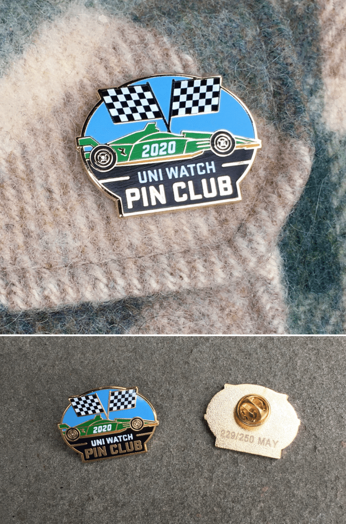
• As you can see above, the Uni Watch Pin Club’s design for May has launched. Designer Todd Radom and I came up with the Indy500 theme back in early March, before the world turned upside-down. But even though the race has been postponed due to the pandemic, it’s still a cool-looking pin! We’ve produced this one in a numbered edition of 250, and more than half of them sold on the first day, so move fast if you want one — it’s available here. (And if you need to get caught up, the January, February, and March pins are still available. April is sold out!)
• In case you missed it on Friday: I had previously mentioned that the folks at Topps were going to enshrine me on my very own official trading card. Now it turns out that it’s not going to happen after all — but not because of the pandemic. It’s a story of corporate pettiness (not by Topps), and you can read all about it here.
• In case you missed it earlier this week, here are the Uni Watch MLB Power Rankings — my first-to-worst assessment of all 30 current MLB uniform sets.
That’s it. Now back to Phil!
Uni Watch News Ticker
By Phil

Baseball News: “While watching a replay of the 1989 ALCS between the Oakland A’s and the Toronto Blue Jays, I was reminded of the uniqueness of the painting of the yellow brim on the A’s green batting helmets,” writes Kurt Rozek. “The yellow paint ends before the brim meets the round part of the helmet. I have included a side view of Tony Phillip’s helmet and a head-on view of Mark McGwire’s helmet.” He continues, “The front view reminds me of a Nazi WWII helmet, which I think is called a Stahlhelm, or the helmet worn by that little green martian from the Flintstones. It also reminds me of the short-brimmed batting helmet that Brooks Robinson wore.” … OK, I’m not a gamer, but this is pretty cool: Uniform malfunctions apparently happen in the virtual world too. Max Muncy lost a letter from his NOB in MLB 9 Innings ’20 (from Braxton Crisp). … Terence Kearns asked (Paul & me on Twitter) “have yous heard of this amazing Independent League team??!! ” Can’t say that I have. … Interesting “time warp” here for the Minnesota Twins: “is this Spring Training 1987? They’re wearing their 70s-80s pullover uniforms and matching pants (and you can see the powder blue jersey in the back), but they’re wearing the M logo hat that came with the 1987 redesign” (from kirby killebrew). … SB Nation’s Houston Astros blog has just concluded its eight-part series on the history of the team’s uniforms. All eight entries can be found here (from Kary Klismet).

NFL/CFL/AFL News: Former Steelers (and like six other teams, it seems) player Antonio Brown is still trying to make it back to the NFL (assuming there’s a season), but that hasn’t stopped him from photoshopping himself in a Ravens uniform. … A paywalled article from The Athletic has ranked all 32 NFL uniforms, from worst to first. … “The CFL draft was April 30,” notes Wade Heidt. “The Ottawa 67’s decided to welcome the draft picks of the Ottawa Redblacks to the city. Did so in a fun way. Showing their names on the back of an Ottawa 67’s jersey.” … Also from Wade Heidt: We have seen pro teams start selling team branded masks during the pandemic. This has carried over to the CFL now. The Toronto Argonauts are selling a mask with proceeds going to a good cause. … Paul’s detective work is mentioned in this article entitled, “How Ted Thompson’s modeling skills prevented a Packers uniform disaster.” … The longest play from scrimmage during the NFL’s 1978 season was a 92-yard TD catch by Frank Lewis, while sporting a NNOB jersey for some reason (from Bill Kellick). … The “stupid helmet” (a Green Bay Packers lid with gray facemask) was one of the most amusing elements from That ’70s Show during the Fox sitcom’s history. Here’s a look at everyone who wore it, and why. … NBA free agent Jamal Crawford auctioned off one of a kind Seattle Seahawks jersey for COVID-19 relief (cross posted in NBA section). … The Toledo Bullfrogs were to be a professional arena football team based at the Lucas County Arena in Toledo, Ohio. They were scheduled to begin play in the af2, the developmental league of the Arena Football League, in 2010, until that league folded in 2009. Next week, there will be a uniform reveal that never happened (from Wren). … Still no word on the Rams new uniform drop date, although it is still expected to be sometime this month. … Da Bears have assigned numbers to their rookies (from intern emeritus Mike Chamernik). … So you can buy Brady Patriots tank tops now (from MMB Sports.
College Football News: Hoosier daddy? If you’re a Hoosier, or even a fan of Indiana football, this article, “The Best and Worst IU Football Uniforms of the Decade” is for you. I’m not quite sure I agree with some of those “worst” picks though. … The Notre Dame Fighting Irish made a significant change to their football uniforms in 1984, forgoing the “Madonna blue” with stripes for a navy uniform that recalled the Ara Parseghian era. Submitter Jude Seymour (who wrote the piece) adds, “I talked to Gerry Faust, the head coach. Unfortunately, he’s 84 and has no recollection of the switch. I’m still hoping someone comes forward!” . … It’s bad enough that Tennessee has those GFGS “Smokey” Gray unis, but now there are some players calling for more BFBS uniforms (some may recall that black jersey for Hallowe’en more than a decade ago. … The MSU Spartans have photoshopped every player they had drafted by the NFL in their new team’s uniform — except one was shown in the old Pats unis, and one new Saints player was shown wearing gold pants (which were, as of last season, mothballed — who knows if those will return this year). … Many would argue the Arizona Wildcats current unis are a mess (though they’ve been worse), but they have had some good ones over the years. … You know what we need more of? Star Wars themed concepts for college football helmets. … (Mini) Helmet guru Blaise D’Sylva writes, “Army Football has worn special helmets vs Navy 6x, first in 08 (TL), & then 15-19. 15 (TR) had 17 versions w/right side logo representing 17 branches of Army. 16 (BL) had 7 versions w/insignia of 82nd Airborne Division Units. 17 (BR).” … Kary Klismet writes, “Here’s a couple of potentially Ticker-worthy, thematically polar-opposite college football articles from The Athletic: 1. A fascinating behind-the-scenes look at Oregon’s ever-changing uniforms from the team’s football equipment manager. 2. A strident defense by longtime college football columnist Stewart Mandel of football programs like Penn State and Alabama whose uniforms don’t constantly change.” … Also from Kary, Montana State has unveiled renderings of what its new stadium expansion project will look like.

Hockey News: I’m not sure of the date of this video of the Providence Friars winning the inaugural Hockey East Championship — but that’s not important. What is important is the fact that the team did so wearing Cooperalls! Gotta be early 1980s, right? (from Bill Abley).

NBA News: The Phoenix Suns have had a wide array of creative designs on their uniforms over the years. Whether it be the iconic “sunburst” throwbacks, the retro expansion “western font” uniforms or any of their blindingly bright orange kits, the creativity has been mostly consistent throughout the years. This article asks the reader to name a favorite. … It’s somewhat hard to believe, but the Toronto Raptors have been around for 25 seasons. So here are 25 things you didn’t know about Toronto Raptors jerseys. … NBA free agent Jamal Crawford auctioned off one of a kind Seattle Seahawks jersey for COVID-19 relief (cross posted in NFL section). … Jorge Cruz asks, “Is this a Magic practice jersey or was it photoshopped to make printing and adding graphics easier never seen a white with no pinstripe Shaq rookie Jersey before”? … DS wonders if this graphic noting how “Mavericks” was just one of several names from a mail in campaign to call the new NBA team from Dallas, Texas. … Jorge Cruz was “watching the “Bad Boys” 30 for 30 just noticed Rodman’s t-shirt Having an “L” of a time. Love the trolling of the Chicago Bulls and love that no one knew just got how true it would become for Rodman just a couple years later! Awesome foreshadowing.”

Soccer News: There are some questions I never thought would need to be asked, but yet, this article asks one: Why do we continue to purchase new soccer jerseys? … Which CONCACAF team has the best jersey? … “BFW” (Bavarian Football Works) has compiled a list of “Our all-time favorite FC Bayern Munich jerseys.” … What’s the best USA kit of all time? … Mike Tyson’s cannabis company, Swissx are apparently in talks with Everton to be its main shirt advertiser for next season (from our own Anthony Emerson). But there seems to be a bit more to the story (from our own Jamie Rathjen).

Grab Bag: The Big Blue Bug is a Rhode Island landmark and in support of fighting Covid-19 has been recently outfitted with its own protective mask (from Jon Vieira). … “I’m so sorry” was the subject line of an e-mail from Jason Hirschey, who sent in a video describing how colors are used in video games. You’ll never guess what the color of “corruption” is (I think that was more for Paul than for me). … Interesting/cool branding for this “neighborhood run club” from Fuquay-Varina, NC (from Alex Cook). … Tom G. writes, “With the recent release of Wayne State’s new logo, it would be a good time to play #NameThatCat“. … As it did with several major sports cities, The Athletic conducted a survey of what Denver sports fans think of their teams’ uniforms. Most surprising takeaway: the Nuggets came away ranking as the best-dressed! (from Kary Klismet).
And finally… hope everyone is having a good weekend! It was absolutely gorgeous here on Long Island (and NYC) yesterday, and it looks like most of the States are experiencing nice weather as well. After more than a month of COVID-quarantine, I saw lots of folks out and about (at least in my limited time outside); most people are doing great with masks and social distancing but there have been some (including this “West Village” tweet that trended yesterday) showing folks blatantly flouting the rules. Everyone hates the precautions we’re asked to take, but they’ve been working. Let’s not blow this and have to start all over from scratch again! Please stay safe and smart people. We’ve all got cabin fever. But it’s a lot better than having COVID-19.
Big thanks again to Jimmy Parker for the piece on Mr. Hubenthal. Great job buddy.
Sorry again for the (sorta) short post, but I still have a couple final papers & projects due this week. Everyone have a great Sunday and a better week, and I’ll catch ya back here again next Saturday!
Peace,
PH
In the hockey section, the Cooperalls were from the 1984-85 season (and it’s the Friars, not the Flyers)
GTGFTS: July 26, 1939. All the scoring was done by the time the photo was taken in the Yankees’ 14-1 drubbing of the Browns. Bill Dickey hit three home runs for New York.
link
Time of game 1:56. In today’s game both pitchers could be working on perfect games and you still couldn’t get thru the sixth inning in 1:56.
1971 was the 10th SEASON of Dodger Stadium. The 10th ANNIVERSARY would have been in 1972.
Anniversary? Season? Math is hard. link
The Chicago Dogs have been mentioned at Uni Watch since the announcement of the team name back in 2017:
link
One of the great names and logos in all of baseball, to be sure!
Such disrespect shown to the Great Gazoo! Dummies!
Dum Dums
That visor paint peculiarity was unique to that model of Rawlings helmet MLB went to for a few years. Never cared for that bubblehead look myself. I always thought the ABC helmets were a much cleaner look.
I think part of the problem people have with the player in the background of the Koufax picture is that they’re familiar with the famous shot from Don Larsen’s perfect game, which shows second baseman Billy Martin.
link
Looks like Willie Davis is playing short center field. With Bobby Wine at bat (.212/.274/.304/.578 that year) it may have been justified.
Looks to me like a 2nd baseman standing directly on the bag waiting for a pickoff throw. It’s the kind of thing that, were it hanging on my living room wall for 15 years, I’d probably not notice the glove on the fielder’s right hand.
It’s a fantastic painting though. The whole site is great today!
Re: RI’s big blue bug. The big black bug bled black blood.
Scoreboard Game played July 26,1939 at Yankee Stadium.
Bill Dickey hit 3 HRs and NY scored in every inning.
Game played in 1:56; Red Ruffing was the winning pitcher, going nine innings and allowing only 3 hits.
Great post today. Thank you!
Thanks. And be sure to thank Jimmy too!
Yes!! All of it :) Jimmy’s part is great, with great links to start rabbit holes with.
Thanks! Glad you enjoyed it.
Like that NYG concept a lot. Clean and simple, no superfluous junk.
A very nice update, but I prefer the single red helmet stripe.
That rams helmet drawing kinda has that sunset orange the new logo has….in the ticker, that shaq Jersey was not a practice jersey but the cheap replica champion made back in the day…I had a black penny hardaway one that also didn’t have the pinstripes…champion stepped up their replicas a few years later…..
The Hubenthal material is pure gold, Jerry…ur, I mean, Phil. Thanks for posting it! I’ll have to see if Vintage Brand has any of those Rams program covers available.
I’m just the conduit, John — thank Jimmy!
It’s no Mindy’s, but thanks John! Glad you enjoyed it.
I’ll never understand why people insist on ranking uniforms when they know that teams are in the process of updating them. The best time to do this each year would be June at the earliest.
Love the illustrations in today’s post. Artwork like that is sorely missing from today’s sports world. Nowadays we have slick graphics and animated robot football players.
Nice uni concept for the Giants but I can’t help but wonder…why they use lower case letters for the logo? I mean, they are the Giants after all. Shouldn’t the helmets have NY instead of ny?
My guess is the original designer was enamored of the calligraphic qualities of minuscule “ny”; how the “y” is little more than the “n” flipped over with a swash added. But I’m sure in 1975 somebody asked the same question you did and experimented with caps. Ultimately the result was an “Ny” monogram because the right side of the “N” linked economically with the left side of the “y”.
In the movie, “The Natural”, it seems the person in charge of designing the N.Y. Knights’ cap logo also liked the Giants’ “ny”, because they rendered it in a tidy Old English font.
Glad you liked the Hubenthal illustrations Patrick! They were definitely lots of fun to research.
Re: The Hockey Ticker. It’s the Providence Friars, not Flyers.
Also, Saturday, March 16, 1985.
This may have been a “(sorta) short post,” but it had a lot of interesting stuff in it. Good job by Mr. Parker on Hubenthal.
I also enjoyed the Notre Dame story linked in the ticker. I understand why ND went back to the navy blue, but I always liked those “Madonna blue” uniforms. However, as stated by a couple commenters on the story, they did look a lot like the Pitt uniforms at the time.
Glad you liked the Hubenthal article Mike! Thanks for your comments.
Finally had a chance to view the MLB Uniform Power Rankings – it’s eerie how much you and I think alike, Paul. I have reasons for the Cardinals and the Athletics being my favorite teams (one from each league), but none of those reasons have to do with their uniforms. That is just a happy coincidence. The only thing you and I don’t really agree on Paul, is the color purple. I love it, although it took my son playing for a team that wore purple to win me over. But, purple does not belong with black. Little bit of gold or white is all that is necessary.
Another reason why the Hubenthal classic “Out Of This World Series” program cover is fantastic: 1965 was also the year the first space rendezvous took place featuring U.S. spacecrafts Gemini 6 and Gemini 7! What’s amazing is that the rendezvous took place IN DECEMBER, well after the program was published.
The ’65 World Series program is a classic, but I didn’t know that about the Gemini rendezvous. Thanks for the info!
While the Packer helmet in the scene for That 70’s Show is correct in having a gray facemask; it’s clearly a more modern facemask that wasn’t worn during that time. I hate when movies or TV shows depicting sports from the past or inaccurate like that. Remember The Titans is guilty of such inaccuracies. Players in the movie clearly wearing face masks not yet used or even created in 1971!
Two interesting tidbits about the scoreboard in Guess the Game – Yankee left fielder George Selkirk was wearing “3,” and the Browns only run was driven in by second baseman John Berardino – who went on to a long TV career playing Dr. Steve Harty in the soap opera “General Hospital.”