[Editor’s Note: Anthony Emerson, who compiles the Tickers that appear on Fridays and Saturdays, has written a sensational guest entry for us today. Enjoy. — PL]
By Anthony Emerson
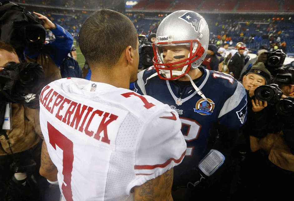
Tom Brady is one of the most decorated players in the history of American professional sports. He’s the only player in NFL history to have played on six Super Bowl-winning teams; he’s won three MVPs, four Super Bowl MVPs, been an All-Pro five times; you get the drift.
But Brady has also been decorated in another way — a way that has gone unacknowledged until now but is of particular interest to us here at Uni Watch. While there’s no official recordkeeping on this, my research indicates that Brady has worn 20 distinct jersey chest patches during his career — almost certainly the most in NFL history.
Brady’s patch total is all the more impressive because the the Patriots — the team with which he spent his entire career until recently signing with the Buccaneers — have never worn captaincy patches. By comparison, Peyton Manning wore 18 patches during his NFL career, but nine of those were different captaincy patches — including camouflage, pink, and so on — which padded his total. Brady hasn’t had that luxury. If New England had worn captain’s patches during his tenure, his league-record patch total of 20 would be even higher. (And since the Bucs wear captain’s patches, now it presumably will get higher.)
Brady has played in nine Super Bowls, so that’s nine patches right there. His prodigious patch prowess has also benefitted from the Patriots’ habit of celebrating Super Bowl Championships with patches during the next season’s home opener, which added another five to his total. He’s also worn a Gene Upshaw memorial patch (which he was wearing when he infamously received his ACL injury in Week One of the 2008 season); a Patriots 50th-season patch; an AFL 50th-season patch; an NFL International Series patch (twice, but we’ll count it as one, since it was the same patch both times); a memorial patch for Myra Kraft (the wife of Pats owner Robert Kraft); and a Pro Football Hall of Fame 50th-anniversary patch.
To put that in perspective, Brady’s 20-year NFL career has included just five patchless seasons: 2000, 2002, 2006, 2010, and 2013. Here’s a look at all 20 of his patches, one at a time:
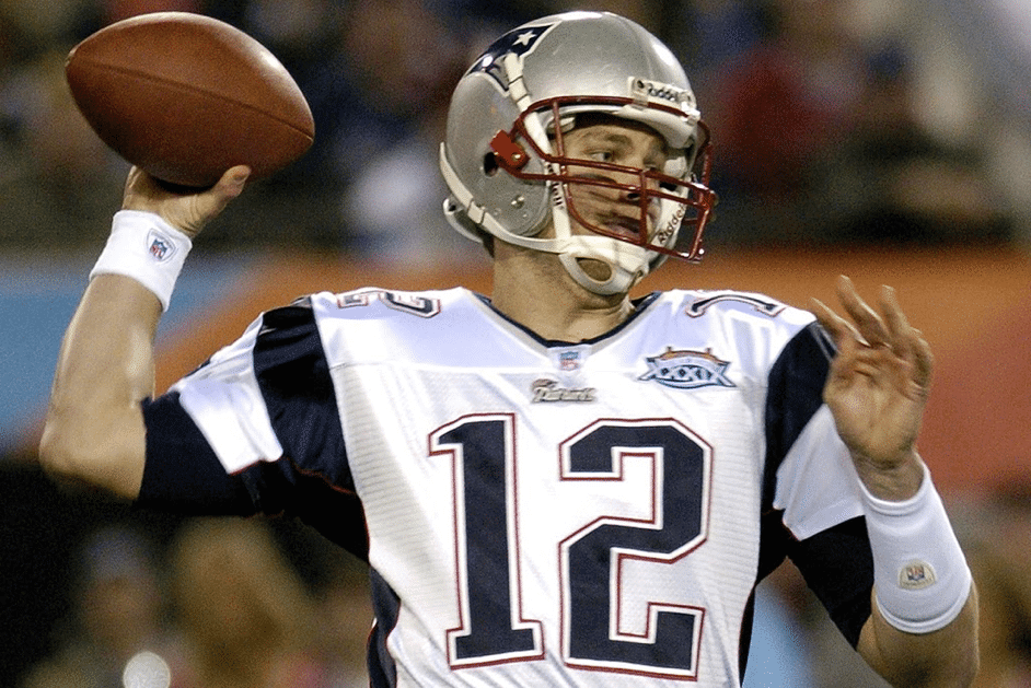
1. Super Bowl XXXVI
Brady’s first patch was, of course, a Super Bowl patch, as he marshalled a team that had gone 5-11 the previous season to a title against the “greatest show on turf.” Fun fact: The logo for that Super Bowl was originally supposed to be a New Orleans-themed design, but it was changed following the Sept. 11 attacks.
———
2. Super Bowl XXXVIII
This is my favorite Super Bowl logo — and not just because it was for the first Super Bowl I stayed up and watched in its entirety. I love the colors, which made it pop on both the Pats’ navy and the Panthers’ white. The space-inspired design evokes Houston and has a bit of the collegial, fun-loving feel that is totally gone from the NFL now.
———
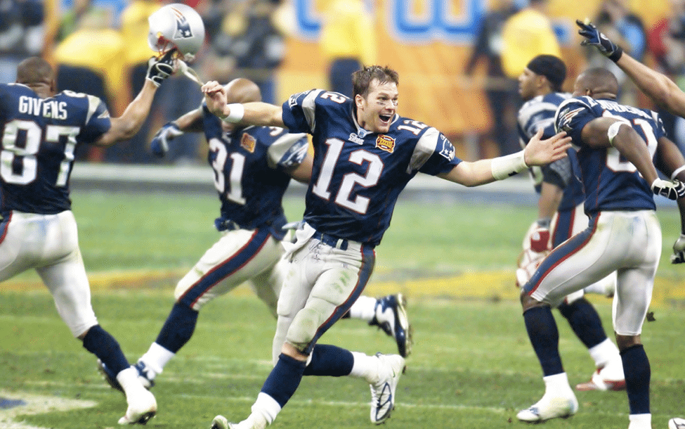
3. Super Bowl XXXVIII Champions (2004 Week 1 vs. Colts)
The Patriots’ — and the NFL’s — first-ever championship patch was somewhat drab and boring, depicting the Roman numerals over the Lombardi Trophy and bracketed by “Super Bowl Champions.”
———
4. Super Bowl XXXIX
The design of Super Bowl XXXIX’s logo was inspired by Jacksonville’s Main Street Bridge, one of seven spans in the city. I love this logo now, but at the time I thought it was nothing special. Of course, I never imagined the NFL would stop doing unique logos for Super Bowls.
———
5. Super Bowl 39 Champions (2005 Week 1 vs. Raiders)
This patch is similar to the one worn after the Pats’ Super Bowl XXXVIII championship, but with the Roman numeral swapped out. I think the typeface used for “XXXIX” is at least inspired by the one used on the Super Bowl logo itself.
———
6. Super Bowl XLII
The last of the unique Super Bowl logo patches. The patch’s shape sort of evokes Arizona, where the game was played, although many people at the time thought it looked like a sliding minivan door. Okay, now let’s never mention this game again.
———
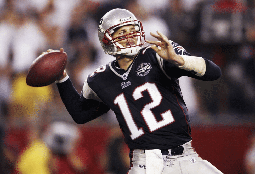
7. Gene Upshaw Memorial (2008 Week 1 vs. Chiefs)
Apologies to my fellow Pats fans for two painful images in a row. Every team in the league wore the “GU63” memorial patch for NFL Players Association president Gene Upshaw during Week 1 (though Upshaw’s former team, the Raiders, kept it for the entire season, and the other teams converted it into a helmet decal).
———
8. Patriots’ 50th season (2009 season)
Brady didn’t play in the Pat Patriot era, but he did manage to wear Pat for an entire season — Pat was just trapped inside an anniversary patch. Not a particularly inspired patch design, unfortunately.
———
9. AFL 50th season (2009 Weeks 1, 5, 6, and 15)
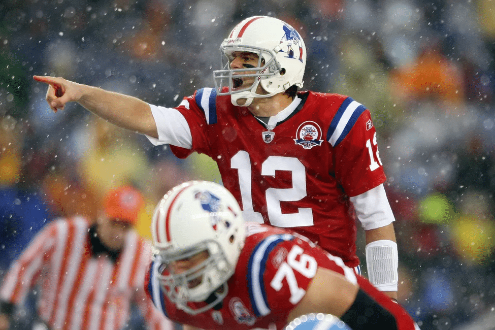
The above photo is from probably the best-looking game of Brady’s career. From the Pats’ unis, to the Titans’ unis, to the refs’ unis, to the Foxborough snowfall — a visual feast. Brady wore those patch-clad throwback unis and their even more gorgeous road counterparts a combined four times in 2009.
———
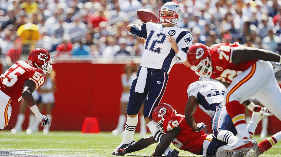
10. NFL International Series (2009 Week 7 vs. Buccaneers)
This game, played in London, marked the first time Brady wore the red “NFL International Series” strip. (Fun fact: Brady later wore this same patch for a London-based game against the Rams in 2012. The NFL stopped using the patch for overseas games after that.)
———
11. Myra H. Kraft memorial (2011 season)
Following the death of Patriots matriarch Myra Kraft in the summer of 2011, the team honored her with a patch — the first memorial patch in Pats history. While Myra had little to do with the football operation, she was ever-present by her husband’s side during the first 15 years of Robert Kraft’s ownership tenure.
———
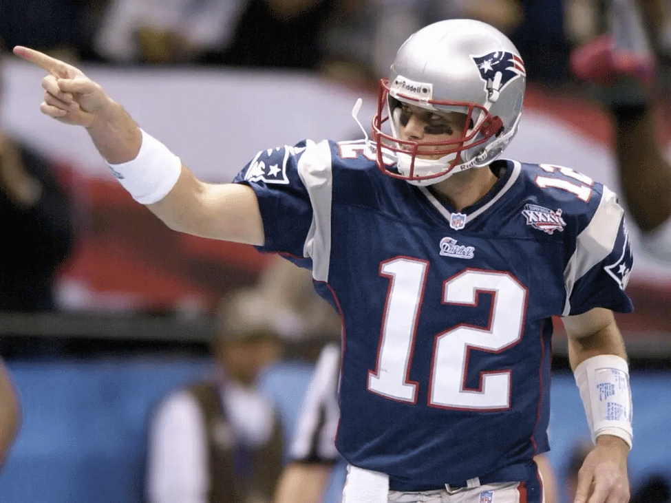
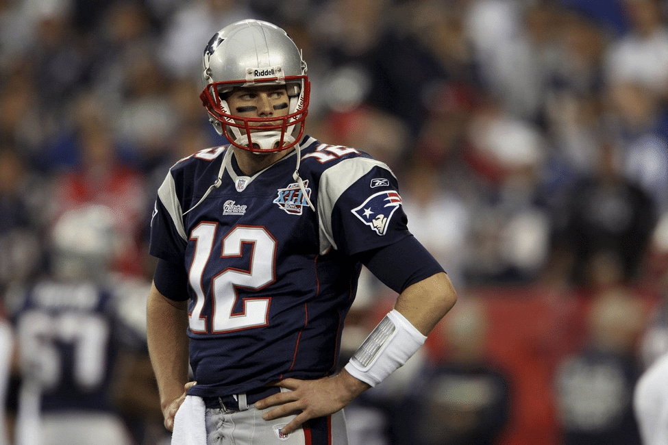
12. Super Bowl XLVI
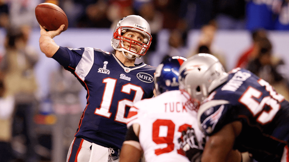
The second straight Super Bowl loss to the Giants, and the first time Brady wore the generic Super Bowl logo shape.
———
13. NFL Hall of Fame Anniversary (2012 Weeks 14 and 15)
All 32 teams in the league wore a patch honoring the Hall of Fame’s 50th anniversary for two weeks late in the 2012 season.
———
14. Super Bowl XLIX
I own a Rob Gronkowski jersey with this patch on it. This patch is slightly different than the one worn in Super Bowl XLVI (aside from the change in Roman numerals), as this one features an outline of University of Phoenix Stadium behind the Lombardi trophy.
———
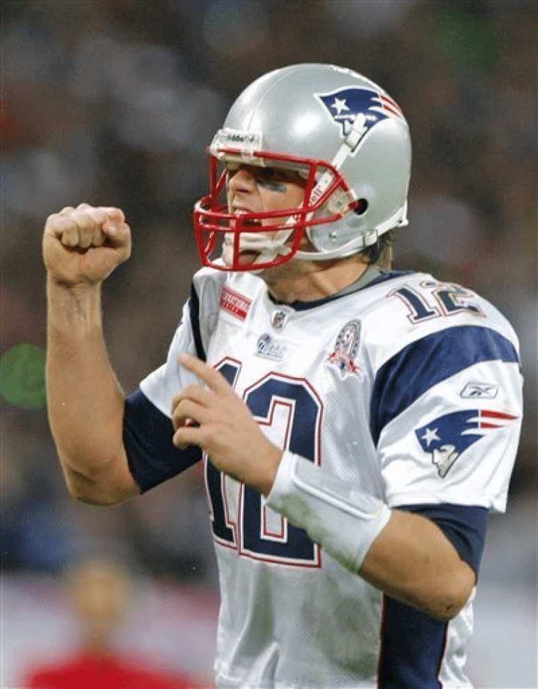
15. Super Bowl XLIX Champions (2014 Week 1 vs. Steelers)
The Patriots finally livened up their championship patch, adding more color. The red ribbon kinda-sorta looks like University of Phoenix Stadium, so this patch design was likely influenced by the Super Bowl logo itself.
———
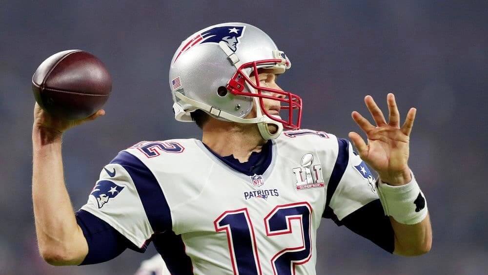
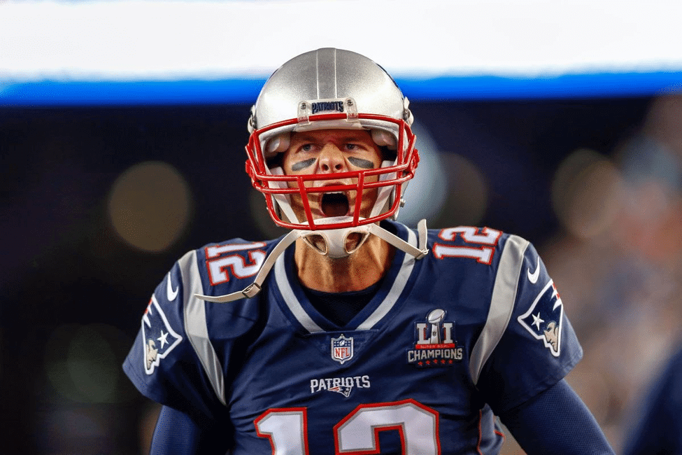
16. Super Bowl LI
This season ushered in a new Super Bowl logo template, with the Lombardi Trophy depicted between the “L” and the succeeding numeral(s). The red tint on this logo looked much better on the Falcons’ uniforms.
———
17. Super Bowl LI Champions (2017 Week 1 vs. Chiefs)
The Pats kinda got lazy here, basically just using the Super Bowl logo, and adding the word “Champions” with five stars. I love the star motif, but not the rest of it.
———
18. Super Bowl LII
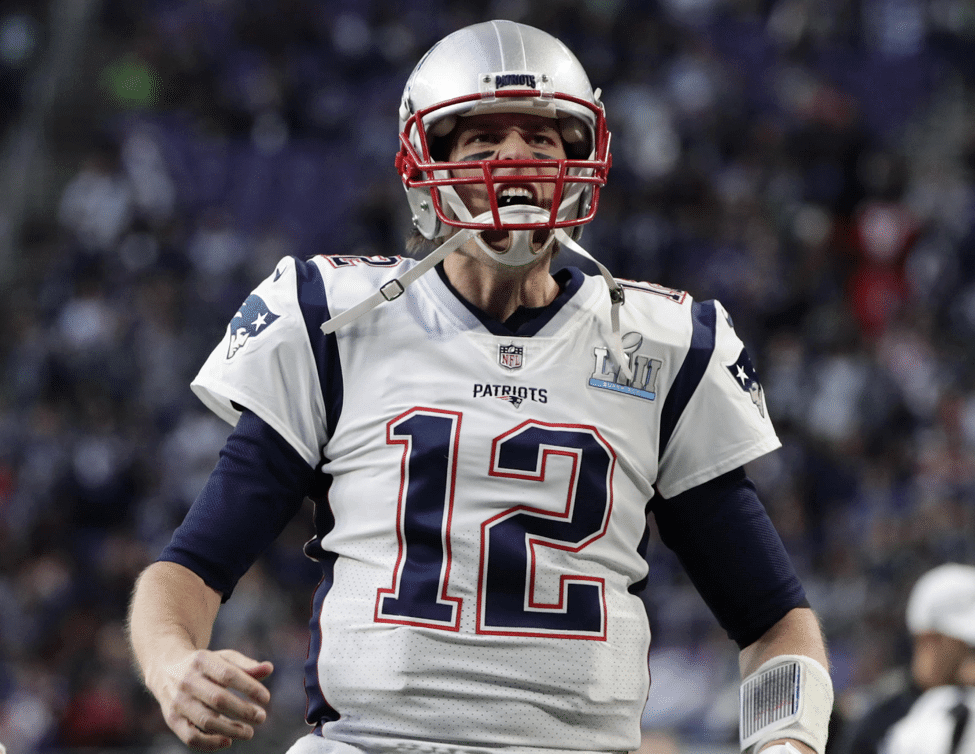
It’s the same logo as LI, but another I and a bluish tint. Next.
———
19. Super Bowl LIII
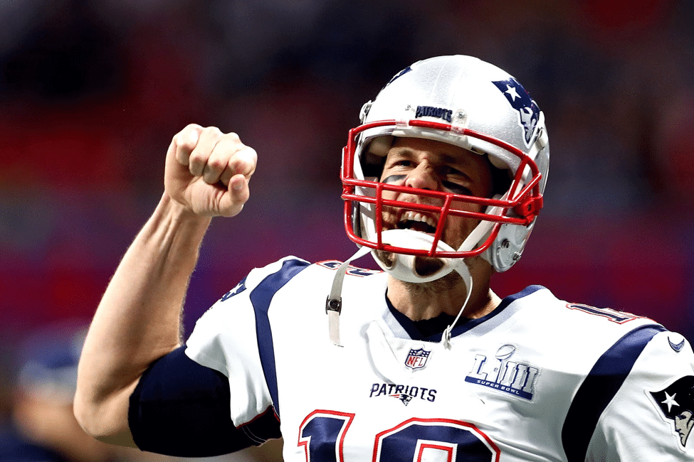
Third verse, same as the first, but with another I. Next.
———
20. Super Bowl LIII Champions (2018 Week 1 vs. Steelers)
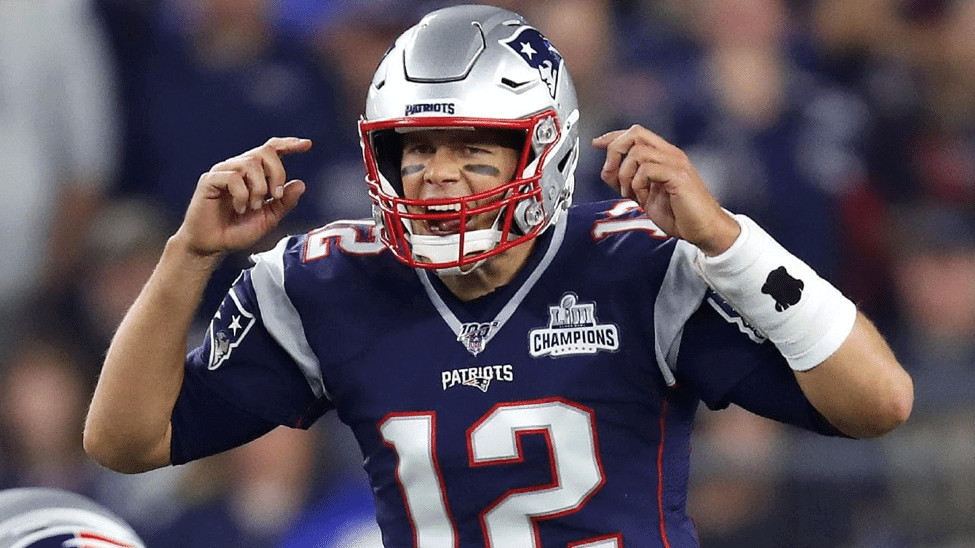
Similar to the Super Bowl LI championship patch, but with another star and an updated Roman numeral. Also, the negative space on the plastic isn’t transparent like the LI patch — it’s white (a downgrade, in my opinion).
———
Paul here. Please join me in thanking Anthony for this superb piece of work. Such a great topic — wish I’d thought of it myself!
As Anthony mentioned near the beginning of the piece, there are no official records about patches, so it’s possible that something may have slipped through the cracks during his research. If you know of any additional patches that Brady wore, and/or of any other NFL players who could rival Brady’s patch total, feel free to let us know.
Meanwhile: Who would hold the patch record in the other Big Four leagues?
Uni Watch on the air: Big day for Uni Watch on the airwaves yesterday. First, in the morning, I appeared on The Dan Patrick Show. You can see that segment above.
Later, in the early afternoon, I appeared on Cleveland Browns Daily. You can hear that segment by skipping ahead to the 25:56 mark here.
Meanwhile, Phil was interviewed yesterday by The Sports Network Radio. You can check that one out here:

Click to enlarge
Browns on the brain: In the midst of all the Browns hubbub yesterday, I opened up a pack of peanut M&M’s, and I swear these were the first two that came out of the bag.
After I tweeted that photo, the best responses came from @yeah_good_okay, who said, “I thought there was a one-shell rule.” That quip gets Uni Watch’s highest rating!

Membership update: Eight new designs have been added to the membership card gallery (including Rhys Bangeman’s, which is based on his high school rugby club jersey), as we continue to work our way through the recent spike in orders.
Ordering a membership card is a good way to support Uni Watch (which, frankly, could use your support these days). And remember, as a gesture of comm-uni-ty solidarity, the price of a membership has been reduced from $25 to $20 until further notice.
As always, you can sign up for your own custom-designed card here, you can see all the cards we’ve designed so far here (now more than 2,500 of them!), and you can see how we produce the cards here.
Inventory running low: I’m running low on certain merchandise items and have no way to restock them due to the pandemic. If you’re interested in any of the following, I suggest moving quickly:
• For the Uni Watch Classic Cap, I have ample supplies of sizes 7 and 7-7/8; I have only three 7-1/4s and three 7-1/2s; and everything else is sold out. I have orders in place for new inventory, but Ebbets Field Flannels’ factory is currently shut down, so there’s no telling when those orders will be filled. If you want one of our remaining sizes, you can order here.
• I have one red seam ripper and three white seam rippers. Everything else is sold out. I ordered 100 new rippers a month ago, but they’re coming from China, so who knows when they’ll arrive. If you want one of the ones I still have on hand, you can order here.
On the plus side, Teespring continues to operate normally, so everything in the Uni Watch Shop and the Naming Wrongs Shop continues to be available. And remember, you can save 15% on anything in those shops by using the checkout code COMMUNITY.
The Ticker
By Anthony Emerson

Baseball News: ESPN’s Tim Kurkjian has named the greatest player ever to wear the uni numbers 1 through 55. I’m sure people will have more disagreements the higher the number (from multiple readers). … Check out the socks on the 1898 University of Tennessee baseball team! Someone convince the Vols to bring these back! (From Kary Klismet.)

NFL News: Reader Moe Khan notes that the Nike logo on the pre-2015 Browns unis was brown on the white jerseys and white on the brown jerseys. Now it’s orange on both. … The league is sending draft caps for all 32 teams to the 58 prospects who are participating remotely in the draft, so that they can still put it on after being drafted. Rumors that Paul is sending each of them 32 seam rippers could not be confirmed at press time (from Patrick Finley). … Steve Sillers made himself this awesome Cowboys-themed cowboy hard hat, complete with a Dymo label and green dot! … Reader Paul Rizzo writes in: “When I was a kid, I asked my parents to order some Broncos playing cards, thinking they were trading cards and I had very few Denver players. The attached shows what I received. I loved the colorful cards and they are my go-to playing cards to this day.” … Based on this audio clip, it sounds like the Chargers’ new Color Rash uni will be mono-navy — something like this. We’ll find out for sure on Tuesday, when they’re slated to present their new uni set (from Geoff Fienberg).

Hockey News: Ohio Hockey Digest is asking readers to vote on which high school in the state has the best hockey sweater (from Ben Kelly).
.

Hoops News: Here’s an excellent, if brief, video showing a number of early Charlotte Hornets logo and jersey variations. … It looks like Georgetown might be adding a new throwback to the mix (from @bryanwdc). … While watching 1994 Dream Team highlights, Bryan Beban noticed that the Angolan national basketball team went country name on back and last name on front. Bizarre! Also note that the front numbers and back numbers are different fonts.

Soccer News: Ever wonder why in some countries centrebacks tend to wear No. 6, while in others it’s No. 4? This YouTube video goes into different numbering methods of different countries, and how they evolved (from Ben O’Connell). … Barcelona’s fourth kit has leaked. In case you’re wondering, yes, it does bear a close resemblance to their primary kit (from Josh Hinton). … Union Omaha of USL League One has unveiled their new kits. Here’s a video explaining the new kits as well (from multiple readers). … The Athletic has published a tribute (paywalled) to Piero Gratton, who designed Roma’s famous wolf badge, among others (from Darin Doughty). … Scottish side Aberdeen have cut a tribute to the UK’s National Health Service into the Pittodrie Stadium grass (thanks, Jamie).

Grab Bag: The home jerseys of the MLL’s reborn Philadelphia Barrage have been revealed (from @PhillyPartTwo). … Sam Houston State has unveiled its new athletics logo set (from Mike Lucas). … Here’s another article about a sportswear company, Savage Apparel out of Richmond, Va., pivoting to PPE production during the pandemic (from Tom Turner). … And another one: Kokatat, out of Arcata, Ca., is doing the same thing (from @mikeobs). … Allan Jennings sends along this 1960 film about marketing. It’s not sports-related, but it is fascinating. Highly recommended. … New logo for the Rugby Federation of Bahia state in Brazil (from Kary Klismet). … Also from Kary: Wichita State has received permission to demolish 74-year-old Cessna Stadium — home of the Shockers’ track and field teams — and replace it with a smaller, multipurpose venue. … The U.S. military is advising current and former servicemembers not to turn old uniforms into homemade facemasks, especially not uniforms treated with fire retardants or insecticides (from Timmy Donahue).
Click to enlarge
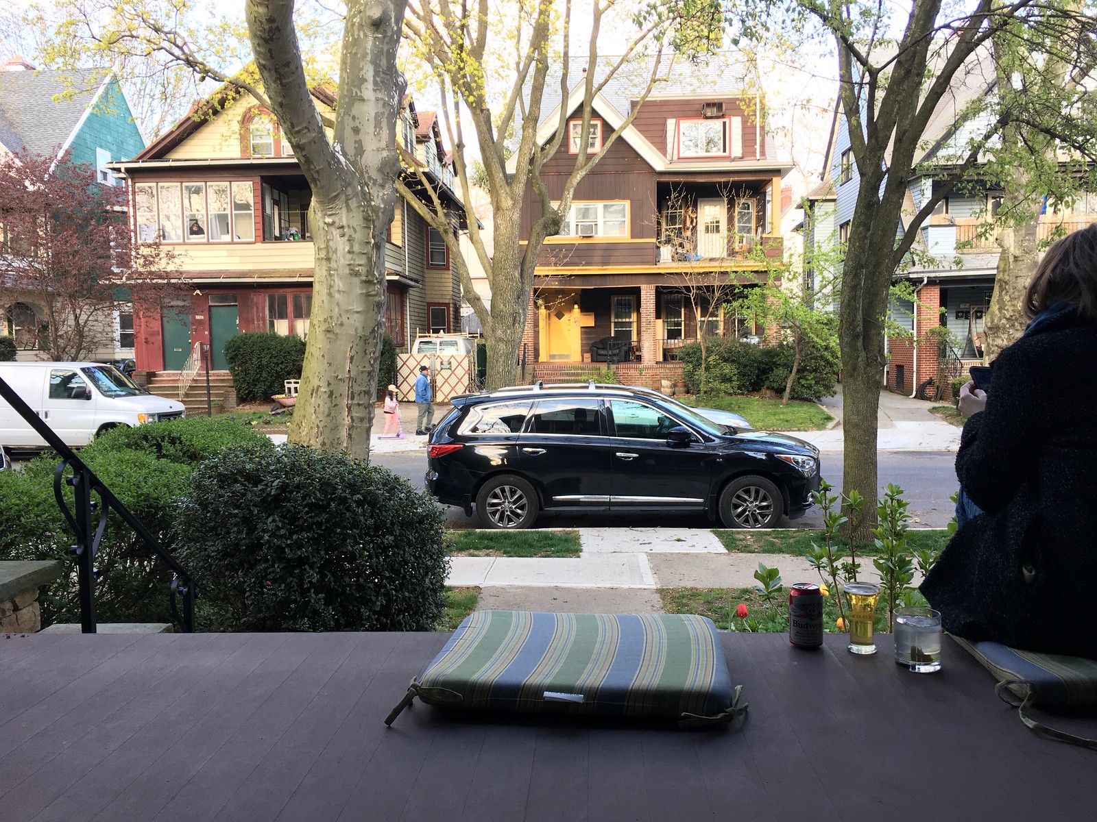
What Paul did last night: Bud again for me yesterday evening, and a vodka gimlet for the Tugboat Captain. I love the splash of color provided by our neighbor and his daughter across the street.
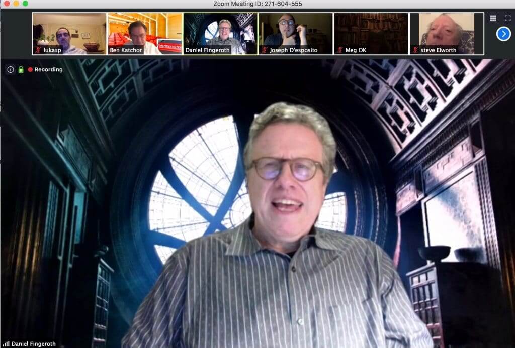
After cocktails, we went inside for dinner (the Captain makes really good chili), and then I checked in for a Zoom lecture/presentation by Danny Fingeroth, author of the recently published biography of Marvel Comics founder Stan Lee. This was originally scheduled as a live event (part of a long-running weekly series of comics-related lectures at the Parsons School of Design that I’ve been attending for years), but of course that wasn’t possible, so they turned it into a Zoom thingie. In a nice touch, Fingeroth used Dr. Strange’s sanctum sanctorum as his Zoom background:
The presentation lasted 90 minutes and was really interesting! Not as much fun as being there in person and walking around the corner for drinks afterward at our favorite Spanish taverna, but still a nice diversion, which I definitely needed.
Our latest raffle winner is Patrick Archer, who’s won himself a membership card. Congrats to him, and thanks again to Jay Palmer for sponsoring this one.
Everyone stay safe and sane this weekend. Enjoy Phil’s Saturday and Sunday content, and I’ll see you back here on Monday. Peace. — Paul
Comparing the 2014 Browns’ jerseys to the 2020 ones, the size of the white-orange-white-orange-white striping on the brown “home” jersey is now consistent with the size of striping on the white jersey. It used to be that the white stripes were bigger than the orange stripes on the brown jersey (classically it was always so), but they’ve “fixed” the “issue” and the orange stripes are now bigger.
Feel like this change is not going noticed.
Kudos to you for the Interview on the Dan Patrick show.
You represented yourself well.
Thank you!
Great to hear you on CBD talking Browns uniforms, Paul!!
This interview was great.
Great job with the segment on the Dan Patrick Show. Only wish you had more time on there! I think there are a lot of good point that have been raised on here the last week plus amid all the NFL releases, discussing fault in the “new for the sake of new” approach and the popularity of historic, relatively uncharged designs of teams like the Yankees, Dodgers, Cardinals, Packers, Raiders, etc. Wish you had more time to discuss that.
Paul….two questions: which color of the houses across the street do you like, the green and red to the left or the brown and yellow across?
Second question: what type of chili does the TBC make ? Turkey? Ground Beef? Chili?
I am fascinated by diff chili recipes for some weird reason.
*which do you like BETTER, I meant. I have to go with the brown / yellow.
The green one, of course!
This batch of chili had ground beef, beans, corn, hot chili peppers, and more. SO GOOD! She’s a really good cook (much better than I am).
Great spot with Dan Patrick!
What did you think of his pronunciation of Uni Watch? I’ve always said “unee-watch,” but he seems to be saying it more like “una-watch.” How do you pronounce it when saying it aloud?
Yeah, I cringed when he did that (and when anyone else does), but I didn’t want to correct him on-air.
I’ve always pronounced it with a short i vowel sound (as in “if” or “pit”) as opposed to a long e vowel sound or a schwa sound. I don’t think I’ve ever said you-knee-form in my life, and I’ve always thought it lazy to pronounce uniform with the schwa sound. (No offense to those who do; it’s just one of my opinions with regard to speech, diction, and enunciation.)
Oh, crap. I’ve always pronounced it (in my head anyway, don’t know if I’ve ever said it out loud) like Patrick.
Unee Watch sounds so much better than UNA Watch, but the funny thing is we call teams outfits UNA FORMS and not UNEE Forms.
I don’t know how it sounds when it leaves my mouth, but I do not say “una-form”. I say “uni-form” (not unee-form).
OK, thats cleared up.
Lee
corn in chili so underrated! you seem pretty handy when it comes to cooking from what you’ve shared over the years, don’t sell yourself short.
I just downloaded Cleveland Browns Daily to hear your hit from yesterday, very excited.
IMO corn is generally underrated addition to lots of stuff… soups, TACOS, casseroles, burgers, salads.
Roasted is even better.
Lee
I always eat M&Ms two at a time and then decide what team (usually NFL) the colors represent. I think I may have mentioned it here before.
I’m one of those dorks who sorts his M&Ms by color. I’m not a Browns fan, but for some reason I almost always place the brown and orange ones side by side and think of the team’s color combination. I would imagine there are many who do strange color-sorting things with colored candies (Skittles, M&Ms, etc.). Probably a good psychological study to be had there.
Same here. Broncos, Packers, Browns, Chiefs, Rams, Bucs (throwbacks), Seahawks (throwbacks), Bills/Giants/Pats (throwbacks). Any I am missing?
Chargers?
If things get too repetitive I might fudge things in my mind and yellow can be “gold” and brown can be “black”.
For all those people wanting a logo on the Browns helmet, a “m” would look good on it but I doubt the Browns fans would forgive Art Modell.
My wife has an allergy to red food coloring so she sorts M&Ms and Skittles. I end up with the red and orange ones.
Regarding the Uni-watch classic caps, if anyone would like an adjustable, I have one that I would trade for a 7 1/2. It is new and unworn.
Great article on the patches. Could even include the ones TB wore during the Pro Bowls in which he actually played.
In the NHL, longtime Montreal Canadien Andrei Markov had at least 13 special patches, and that’s just what I can think of in the middle of my morning coffee.
1. A V for an old vintage hockey jersey program in 2002
2. NHL Cares for Katrina, every team did so for a game in 2005
3-4-5-6. A string of jersey number retirements that all had patches, 2005-07: Dryden, Gainey, Robinson, and Roy
7-8-9. Habs ASG, 100 seasons, and 100 years, around 2008-09
10. Jean Beliveau memorial
11. Winter Classic in Foxboro
12. NHL100, 2017
13. Guy Lapointe jersey retirement, 2014
More? Probably a Hall of Fame game vs Leafs in Toronto sprinkled in there, and like I said I’ve barely processed my coffee, so maybe I’m forgetting one!
Though honestly, thinking about it, Zdeno Chara probably has a fair patch collection too.
1. Senators, link
2. Once again, Katrina Cares
3-5. Bruins Winter Classics, link, link, link
6-8. Bruins in the Cup Final, beat Vancouver, lost to Chicago, lost to St. Louis, those all have patches
9. Bruins wore a Cup Champs patch on the home opener next year
10. Bruins had a 90th anniversary patch
11. RIP Milt Schmidt
12. NHL100
13. Boston Strong
14. An international game in Prague
The moment that Tom Brady signed with the Bucs, there was a rush to photoshop him in the 2019 Bucs jerseys. Uni-Watchers all knew that was a waste of time. Following the Bucs uni reveal, I thought for sure there would be a second wave of photoshopping with Brady in the 2020 uni. Crickets. Anyone else surprised by that?
After reading those column and being a hater of the NFL’s degradation of Super Bowl logos, I just had a theory behind the possible reasons that I hadn’t thought of before. It came to me specifically when looking at the SBXLII patch. In retrospect, it stands out as being the end of the line for having design characteristics unique to the host location. However, even going with the shape of the host state is somewhat weak and lacking in creativity, especially compared to the gorgeous logo of Arizona’s first Super Bowl, SBXXX.
Since the universe of host cities is relatively small and most sites end up as repeat hosts, is it possible that the league felt it would run out of themes or ideas that are unique for each city? Take Houston, for example: I always thought the SBXXXVIII logo was a western theme that looked like a lasso across the Roman numerals instead of a space theme like the author saw. Past western and space though, what other themes would be unique to Houston? They could go with the shape of Texas or the state flag but eventually designers would run out of ideas also.
I think this idea bears out, seeing as the end of location-related designs were the football designs of XLI (pylon), XLIII (field), and XLIV (upright), which all took place in Florida (albeit one in Tampa Bay and the other two at the Dolphins’ stadium), the state that has hosted the most Super Bowls and would arguably run out of ideas first.
I don’t think that was the reasoning behind it, nor do I think a good designer would run out of good and unique local flavor logos. In addition to specific cultural things (beach, space, mardi gras, etc.) a designer could always draw on local architecture for the logo, and that says nothing about being able to come up with very different logo designs based on the same local flavor. And at worst there are plenty of somewhat generic designs that can be used that take advantage of the local team’s color scheme.
It seems much more likely this wasn’t out of concern for running out of good designs, but a desire to have a standardized design.
Paul, I’m pretty certain the Barcelona jersey you mentioned in the ticker is supposedly next season’s home shirt, not this season’s 4th.
The headline on the article says it is to be worn for “special games”, so it is some sort of alternate.
Looking forward to
Paul’s haikus on Monday morn
Cheers to uni watch
Yes, there will be a new one on Monday!
Yes there will be a…
(Seven syllables go here)
…new one on Monday
If what Bosa said is true, that would seem to confirm that they are staying with a white helmet as well. I don’t see them pairing a powder blue helmet with an all navy color rush. The “making things a lot simpler” has me worried about them going with the minimalist look. Dropping the bolts from the jersey and or pants? I hope that’s not the case. As a Charger fan, the anticipation is killing me. I’m equal parts hopeful and scared.
If the Chargers simply replaced all the navy from their existing uniforms with powder blue that would be great. Hopefully the changes are minimal.
I have seen a few people persistently insist the Chargers helmet will be powder blue. Not only can they not (or won’t I suppose) offer any evidence or solid speculation beyond their own insistence, to me, it wouldn’t even really make sense. It would limit any ability to incorporate either royal or navy blues elsewhere in the uniform, plus they have never worn that color as a helmet, and while the one helmet rule is in place, I’d be shocked if they changed it at this point.
Anyways…
Lee
Ordinarily, I would say there’s no way the Chargers would take the lightning bolts off the jersey. HOWEVER, I worked for the San Diego paper, the Union-Tribune in the early ’90s, and one of the sportswriters who had been there for a few years told me that when the Spanoses bought the team, they actually had planned on taking off the bolts from the jersey and going with a plainer blue and gold uniform; fortunately, some team executives were able to talk them out of it. I do expect the bolts to stay on the jerseys, but remembering that story, there’s still that very small possibility, and I sure wouldn’t put it past the Spanoses to do that.
… right after the change to navy blue they did remove the bolt from the pants for a couple seasons and replaced it with Navy/Gold striping. This was right after the Spanos purchase, I believe? I thought that looked all wrong. Kind of mismatched. Like game jerseys with practice pants.
Brady’s “prodigious patch prowess”. Awesome.
Quick question, Paul. With Cleveland resuming an itineration of their classic look, and the discussion of what their fans prefer; Brown over white vs white over white (Jim Brown era vs Sipe/Kosar eras) do you think it would be wise for a team like Cleveland to adopt a focal uniform schedule?
Example that comes to mind:
Brown over white-home division opponents (Steelers, Ravens, Bengals)
White over white-home non divisional opponents
Orange pants- MNF and/or playoff appearances (big assumption)
The more I think about it the more I think certain squads could benefit from this type of schedule. Dolphins, Chargers, Rams, Bills. It’s a way to honor rivalries and more importantly gives rhyme and reason to what teams trot out wearing each week. The current method seems rather random.
I actually prefer the randomness and am not a fan of having specific protocols. But that’s just me.
I believe I like the idea of structure because the uniforms mean something. For instance, I don’t particularly like to see the Bears wear throwbacks against say, the Panthers. Uniforms choices should have meaning; partially since they mean so much to us. That being said, I remember fondly as a kid the anticipation of heading to any pro sporting event with “I wonder what they’re wearing today.” So I can’t argue with your enjoyment of the randomness. Brings the excitement for those actually attending.
I wouldn’t mind seeing the Bears reserve white-over-white for divisional road games, Green Bay in particular. Honoring the black-and-blue division with their Butkus/Sayers look.
Nestor,
That concept is right up my alley! Just a subtle visual nod to the past within division. That is a brilliant idea!
I generally prefer randomness of the uniforms that teams choose to wear.
I’ll admit there are some “rules” I might be in favor of (Cleveland white/white at home, Washington white/burgundy at home vs NFC East teams, Miami white/white for their 1st 4 home games, Seattle ALWAYS blue tops at home, etc…)
What I really wish teams would do is coordinate with their opponent on what teams wear against each other.
Like always, the home decides. But then, their opponent chooses something that isn’t redundant.
For example, Baltimore is at home, and they choose to wear purple/black. And their opponent is New Orleans. Well then I wish they;d wear white/white, or white/gold. Anything but white/black. Too much black.
Also, for the life of me, I don’t get why teams choose to wear throwbacks against teams like Tennessee or Jacksonville, as those type of teams don’t have (or wouldn’t wear) ‘old school’ uniforms.
Lee
I agree on all accounts. Contrast is our best friend in these matchups. I like to see those distinctions as well. It’s even more maddening on Saturdays when two schools that boast multiple helmet designs wear the same color.
I’ll never understand throwbacks against newer clubs or even random teams. I can understand a Niners/Cowboys throwback game because their success has made them rivals. A nice throwback should have some thought behind it. In my opinion.
Always thought the Super Bowl XLII logo looked a Rebel Snowspeeder from The Empire Strikes Back.
There must have been something going on last night as I made chili as well!
I listened to the DP show last night to catch the uni segment and realized I have never heard Paul Lukas’ voice. I don’t know what I expected but was suprised. As I read your work on this site, I hear a voice but evidently it was mine and not Paul’s. I will now read uni watch with the dulcet tones of Paul Lukas in my mind. Great voice for radio. Thoroughly enjoyed the segment.
I think you meant a great face for radio, right? ;)
Seriously: Thanks, Dustin. It’s always interesting to hear a writer’s voice for the first time — like you, I’ve been surprised (sometimes pleasantly, sometimes less so) on many occasions!
It’s sort of like when you see the movie version of a novel. You had already decided in your mind what the characters looked and sounded like — but then the movie versions of those characters usually turn out to look/sound completely different!
Much like hearing a writer’s voice for the first time, I found it even more jarring seeing the faces of radio personalities for the first time. I suppose this isn’t as big a thing in the internet days, but as a kid I would say there were few, if any sports radio voices that actually matched how I pictured them in my head.
re: Cleveland Browns Daily,
not sure if Paul is ever going to be allowed to step foot in Atlanta ever again… Atlanta is going to umbrage to being called a “Pepsi team” with Coke being headquartered there. even if you wanted another soda, it’s a “coke” there
That’s funny — I hadn’t even thought of that. But you’re right!
It would be 21 if you count the practice jersey Gilette logo creep.
“He’s the only player in NFL history with six Super Bowl championships”
Paul, this is a pet peeve of mine, and since you don’t mind being corrected for the sake of accuracy…
Tom Brady doesn’t have Six Super Bowl championships. He was a member of a team that won six Super Bowls.
Fixed!
Thanks, you have no idea how much it irritates me when in a sports debate somebody says “MJ/TB won Six Titles!” I hear it all the time on sports radio especially.
Pats uni updates dropping Monday 4/20 link
If the side panels go, that would be a big upgrade IMHO.
it’s worth reiterating that brown is just dark orange. sort of like pink is just light red.
That’s actually… not true.
Orange is a mixture or red + yellow, and if you do not add any others colors, you will never get brown out of red + yellow no matter the ratio.
Well you have to add black to it, but yes, as a painter, I can confirm that brown really is “dark orange”.
As a colorblind former art major, I would humbly suggest that there are many paths to brown. I still remember an exasperated painting professor looking silently at my canvas for a moment before asking “Why do you always use so much brown?” As far as I knew, I hadn’t used any.
Is there a recording of the Danny Fingeroth Zoom presentation anywhere? Sounds fascinating.
Not that I’m aware of, but I’ll check.
Appreciated!
Late to the party, but here goes:
Regarding Scott Johnston’s post of Tuesday, April 14 in which he said, “That (serifed number) font was worn by the Colts, Eagles, Cowboys and Saints in the past with a modified version worn by the Packers in the late 50s – early 60s.”
There was another team wearing the serifed font: The 1960-67 New York Titans/Jets during their AFL days.
link
link
And a couple more:
link
link
I appreciate the thoroughness of Anthony’s article. I did not appreciate the image of Brady’s knee injury used for the Gene Upshaw Memorial trophy. I’m sure there aren’t many images of him in that game since he was injured in the 1st quarter, but I think perhaps a graphic image warning or something of the like.
I’m surprise that my comment is the first to mention it. Maybe I’m overly sensitive to images of fractures and dislocations relative to the rest of the Uni-Watch community.
I really enjoy all your food related posts! You say “the Captain makes really good chili”. Would you mind sharing the recipe and/or what you feel separates it from just “good”? Personally, I’m sort of stuck in some chili doldrums. Thanks!
Doh! Just saw some of the comments about the chili! I’ll riff off that! Keep the food posts coming!