
By Phil Hecken, with Matthew Drake
Follow @PhilHecken
I hope everyone is hanging in there as we continue to fight the coronavirus pandemic.
Over the past couple weeks, a few designers have reached out to me to share their concepts, and in light of the dearth of much uni news, I’m going to be running a bunch of these concepts over the next several weeks, so long as there’s no action on the field (obviously if there is any new or breaking uni news, I’ll either lede with that, or have it as a sub-lede — and of course, minor uni news will always be found in the ticker). One of several designers to contact me was Matthew Drake, whose designs will be featured today and also in the future. Here’s a portion of the e-mail he sent:
Hello Phil,
I understand you have been in correspondence with both Tom Juettner and Dave Pinto recently about their respective MLB concept designs. I am the “Matt” they spoke of when referring to the MLB City Edition Series we all collaborated on a few years ago.
I just wanted to take the opportunity to show you what I’ve been working on recently in regards to my own personal MLB designs, in case you or Paul Lukas would be interested in showing them on the Uni Watch site.
I have the entire league pretty much finished, so feel free to let me know if you and Paul would be interested in showing them on the site, and I can send you the rest of the designs as we go along!
Thanks, and stay safe,
-Matthew Drake
I was intrigued, as Matt actually sent me an example of the Arizona Diamondbacks (which we’ll get to another time). What particularly piqued my interest was his creation of “the “Cooperstown Collection” uniform, a faux-back for each team that includes elements from their past identities.” Matt also included new spring training/batting practice designs for every MLB team as well. Matt ended up sending me a shit-ton of designs for every MLB team, and while almost every concept differed slightly from what the teams currently wear, there were some very interesting alternates in some cases. But what I liked best was the “Cooperstown Collection” and ST/BP concepts. I considered just running those, but in many cases the tweaks to (or additions to) the standard home/roads and alternates are certainly worth a look-see.
With all the designs and writups, it’s probably too lengthy and unwieldy to include every concept from each league, as I usually do when showing off league-wide redesigns. What I’ve decided to do, then, is to break these out into the six different divisions, and I’ll run two divisions each time. Today we’ll check out the AL East and NL Central.
Here’s Matt:
Starting off with the AL East designs:
Baltimore Orioles

There aren’t too big of changes to the main Orioles set, beyond an updated Clarendon number font from the old Expos, to fit in with the old-timey feel the Orioles have. The sock pattern is also adjusted slightly.

The alternates flip around the colors a little bit to add some more differentiation from the Giants. White outlines are added on the black alt to further this distinction.

The Cooperstown Collection uniform is based on the 1901 Baltimore Orioles (which I believe would later become the Yankees.) The Spring Training jersey features the iconic cartoon bird, along with an orange front-panel cap.
Boston Red Sox

Similarly, not too many changes for classic Red Sox, other than added piping on the sleeves reminiscent of the earlier uniforms. The road uniform’s wordmark colors are flipped, with piping brought back in to imitate the 1936 uniform.

The alternates just get piping brought back in order to feel more complete.

The Cooperstown Collection brings back the 1975 set, probably my favorite uniform in Red Sox history. The Spring Training set is based on the famous sock pattern from that set, inspired by @SFGiants58’s take in his Project 32 Series on the SportsLogos.Net forums.
New York Yankees

No need to mess with the iconic pinstripes. I don’t mind the road uniform either, so I just updated the wordmark for the line weights to be more even.

The Cooperstown Collection is based on the 1912 uniform, which the team threw back to a few years ago. The Spring Training jersey brings back the BP design from the late 90’s/early 2000’s which I love.
Tampa Bay Rays

Since I don’t really love any uniforms from their history, I decided to go for the faux-back look the Rays showcased a few years ago as a full-time set. An embrace of columbia blue, raglan sleeves, and paneled caps gives the Rays an old-school identity that would hopefully still feel cool in the modern day.

The navy and columbia jerseys could both be worn either home or away, with both of the navy options being shown here.

The Cooperstown Collection uniform embraces the gradient that has been popular in recent years, and the Spring Training Jersey embraces the yellow from the team’s palette.
Toronto Blue Jays

Not much to change with the Blue Jays beautiful set. I even kept the navy outline around the away wordmark because I love that little touch.

The blue alternate can be worn at home or away.

I’m keeping the powder blue alternate on board, albeit with royal staying instead of navy. I did decide to make the Spring Training jersey use more navy, though.
And now the NL Central:
Chicago Cubs

The classic home stays the same, while the away goes back to the 1964 design, the best Cubs road uniform, in my opinion.

The alternate copies the striping of the away, with just the regular “C” logo on the chest.

The Cooperstown Collection is a fauxback of the 1940’s design, while the Spring Training cap uses the 80’s cub logo.
Cincinnati Reds

The Reds go back to the basics and drop black, and go back to a striping style similar to the Big Red Machine uniforms. The away uniform uses a modified block font that matches well with the number font I’m using, designed by @SFGiants58, based off of UNC’s number font.

Like the new alternate the Reds released for this upcoming season, The “Reds” script adorns the chest, with an added white cap for occasional use at home.

The Cooperstown Collection is a fauxback to the 1936 design, complete with red pants, and the Spring Training jersey proudly showcases Mr. Redleg on the jersey and cap.
Milwaukee Brewers

I honestly love the Brewers’ most recent redesign, so not many changes to be seen here. The home uniform just matches to the sleeve striping style of the away now. The socks also have a Packers-style striping pattern that is once again inspired by @SFGiants58.

The pinstripe alternate goes back to royal blue to embrace its roots a little bit more. The navy alternate now has sleeve stripes that mimic the socks, as well as a yellow brim on the cap to add some flair.

The Cooperstown Collection gives the Brew Crew a powder blue away option, complete with a yellow front-panel cap, and the Spring Training goes a bit further with the yellow, along with a Barrel Man cap.
Pittsburgh Pirates

I loved the road uniform with the “Pittsburgh” wordmark to match the home, but it seems like about the right time to go back to the script, so I kept it. Other than that, the only thing is the pirate’s bandanna is recolored yellow.

A yellow alternate is added to the rotation, and the black alternate replaces the double-outline script with a solid yellow one.

A yellow cap is added as an occasional home option, and a gray crown occasionally on the road.

The Cooperstown Collection brings back the mustard gold for Sunday afternoons, and the Spring Training utilizes the pirate logo on the cap.
St. Louis Cardinals

The best uniforms in baseball don’t change, other than a custom number font I designed to match the cap logo.

Clash cap options are provided for when the Cardinals play red-heavy teams such as the Reds or Angels.

The Cooperstown Collection keeps the powder blue, but is more of a true throwback in regards to striping, while the Spring Training is inspired by a Cardinals’ BP uniform from the 80’s.
Thanks, Matt! Some of those “Cooperstown Collection” (and BP/SP uniforms) are pretty interesting. Readers? What do you think?
I’ll be back with Matt again, when we look at the AL Central and West, and NL East and West.

More Rams Uni Concepts
We’ve seen a bunch of “guesses” at what the Los Angeles Rams would wear since their logo was unveiled a couple weeks ago, and we’re all (or most of us are) waiting with bated breath for the actual unveiling, which should be some time this month.
Yesterday, UW pal Conrad Burry tweeted out his proposed unis, based off of the newly released logo, and let me tell you, I’d be pretty OK if the team were to go with something along these lines.
Home:

Road:

Alternate:

I can’t say I love the alternate, but it certainly beats the mono-banana unis they’ve trotted out for CR. Interesting use of the rams horn “twisty” striping on the pants too!
What do you guys think?
The “BEST OF” Kreindler’s Korner
Hey guys & gals. You’ve enjoyed Kreindler’s Korner for several years now, mostly on the weekends, on Uni Watch, but with the recent coronavirus outbreak, Graig’s time is just too precious and he needs to tend to other things besides coming up with a new writeup each weekend.
So, going forward, for as long as the COVID-19 situation is bad in New York, I’m going to run a few “Best of’s” until Graig returns. This one appeared in 2018…

Kreindler’s Korner
I had the distinct pleasure of featuring the wonderful artwork of artist Graig Kriendler on two occasions over the summer and fall of 2017.
For those who don’t wish to click the links, Graig paints baseball heroes (and regular guys) from the past, and is an immense talent.
Occasionally, I will be featuring his work on Uni Watch.
Here’s today’s offering (click to enlarge):

Title: “Birds Sweep Series”
Subject: Brooks Robinson, Dave McNally and Andy Etchebarren, 1966
Medium: Oil on linen
Size: 32″ x 40″From the outset of the 1966 World Series, it was fair to say that not too many people gave the Baltimore Orioles much of a fighting chance. Though they carried the American League MVP and Triple Crown winner Frank Robinson, they had a very young pitching staff inexperienced in October baseball. Additionally, facing the premiere National League dynasty of the 1960s in the Los Angeles Dodgers, the Baltimore underdogs had quite the mountain range to surmount – stalwart hurlers Don Drysdale and Sandy Koufax being the most daunting of those peaks. Having swept the Yankees in an improbable performance in 1963 and winning a hard-fought battle against the Twins in 1965, The Dodgers proved that their two great pitchers and stellar staff could silence any line-up, as both opposing American League teams were held to an anemic total of 14 runs in eleven World Series games.
For the first two games at Chavez Ravine in Los Angeles, the Orioles took this ideal to heart, winning both contests with spirited performances from 23-year old Dave McNally in the former and 20-year old Jim Palmer in the latter. After a day off, coming home to Baltimore for the third game provided the blueprint from which they would hope to emerge victorious in the series, with the young Wally Bunker shutting out the Dodgers on a six hit performance.
Returning to the mound in Game 4 was opening game winner McNally. With only one run scored by a solo home run from World Series MVP Frank Robinson, the contest was a pitcher’s duel from start to finish. In the hopes of redeeming himself for a poor Game 1 start, Dodger pitcher Don Drysdale gave up only one run; though unfortunately for Los Angeles fans, it was the only one that mattered in the 1-0 Oriole victory. Pitching brilliant ball, McNally allowed a measly four hits and no runs against the boys in blue. The lefty’s performance was indicative of that of the entire Baltimore pitching staff during the postseason, as the Dodgers were held without a run for the last 33 innings of the World Series.
Pictured is the precise moment after the last out of the series – a catch by Oriole centerfielder Paul Blair – which spread jubilation across the field in Memorial Stadium, as well as all of Baltimore. With the ecstatic crowd beginning to rush their heroes to join in the celebration, Brooks Robinson is shown emphatically jumping into the arms of winning pitcher McNally, and the Bird’s rookie catcher, Andy Etchebarren.
Baltimore would see their team reach the top of the American League standings every year from 1969 to 1971, capturing the title again in 1970. The Orioles talented pitching staff and smooth defense would come to define their era, the likes of which had not been seen in the American League since the New York Yankees. Certainly, this dynasty was a far cry from the woeful performances of the hapless St. Louis Browns, the team which in 1954, was embraced by Maryland when they became the Baltimore Orioles.
Thanks, Graig! You can (and should!) follow Graig on Twitter.

Guess The Game…
from the scoreboard
Today’s scoreboard comes from Alex Cheremeteff (although he didn’t submit it as such).
The premise of the game (GTGFTS) is simple: I’ll post a scoreboard and you guys simply identify the game depicted. In the past, I don’t know if I’ve ever completely stumped you (some are easier than others).
Here’s the Scoreboard. In the comments below, try to identify the game (date & location, as well as final score). If anything noteworthy occurred during the game, please add that in (and if you were AT the game, well bonus points for you!):

Please continue sending these in! You’re welcome to send me any scoreboard photos (with answers please), and I’ll keep running them.
In Case You Missed It…
A couple days ago Paul posted a video created by my buddy, Andy Brown, with whom I’ve done several posts over the years, and whom I met last September at a Mets game at Shea CitiField (at *some* point, I’ll have another in-depth look at Andy’s work, as he not only painted every MLB Stadium in 2019, but many MiLB ones, in addition to stadia in the Far East). He’re we are at that game…

I had the pleasure of watching Andy create the CitiField painting (shown above) from scratch, and he’s just an immense talent. As I said, as some point, I’ll have a lot more on that for you fine readers.
Anyhoo, more recently, Andy has been creating some MLB player mashups, and he recently completed an incredible piece made entirely from suggestions of twitter users — evolving from one player/day to the next.
Dig:
'Dream Team'. A painting created over 2 weeks during the #COVID19 #lockdown. Made entirely from suggestions of twitter users – evolving from one player/day to the next. More here: https://t.co/zXGhI1Tu3n #timelapse @PhilHecken @UniWatch @thorn_john @baseballhall @BoogSciambi pic.twitter.com/y5fgDY21ws
— Andy Brown (@andybisanartist) April 4, 2020
As I write this, Andy’s at work creating another painting of the Yankees “dream team” (again, using players suggested by Twitter users) and so far it’s looking great. Do yourself a favor and follow Andy on the Twitter! You won’t be disappointed.
And now a few words from Paul
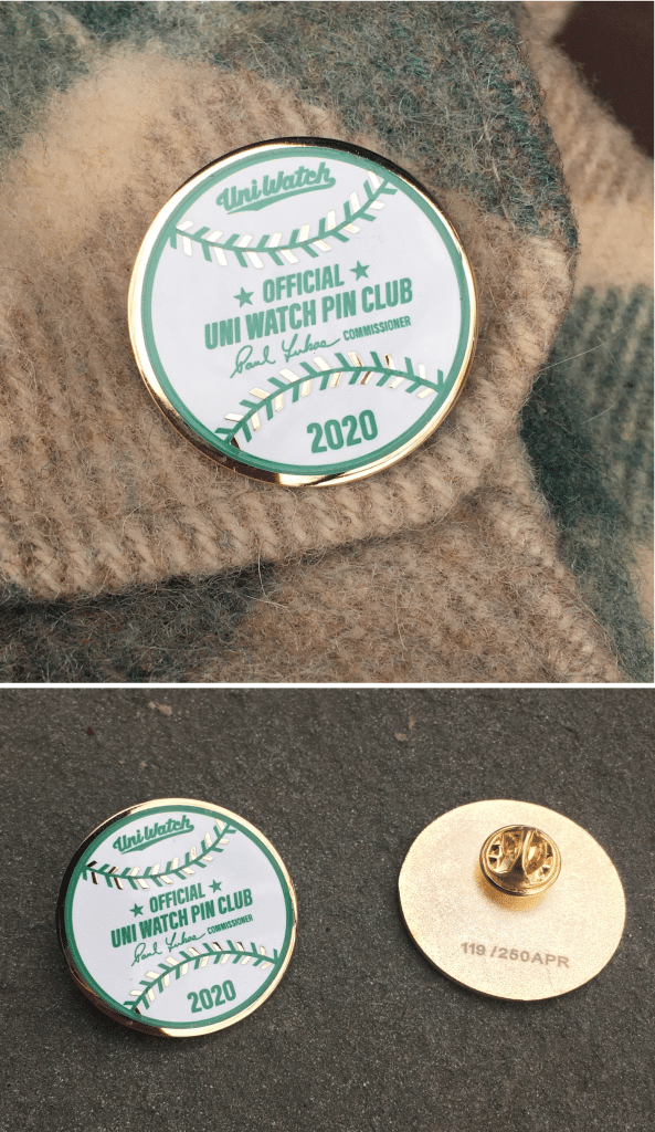
Hi there. In case you missed it last week, the Uni Watch Pin Club’s April design is now available. As you can see, it’s based on an official Rawlings/MLB baseball, complete with my signature as the “Commissioner.”
This is a numbered edition of 250 pins and there are now fewer than 65 remaining. So if you want one, I suggest that you move fast.
If you need to get caught up, here are the January, February, and March designs, all of which will remain available until they sell out (no reprints!). You can get a 15% on all of these pins, and on everything in the Uni Watch Shop and the Naming Wrongs Shop, by using the checkout code COMMUNITY.
And while we’re at it, several other discounts are in effect until further notice:
• The Uni Watch Classic Cap, usually priced at $39.99, is now $35.99.
• Uni Watch seam rippers, usually $6, are now $4.
• And custom-designed Uni Watch membership cards, usually $25, are now $20.
If you’d rather support Uni Watch via a donation, here’s now to do that.
My thanks, as always, for your consideration and support. Stay healthy, safe, and sane. Now back to Phil.
More Signs…of the times
My physical contact with others is non-existent these days, and I try to practice social isolation/distancing as much as possible, but I also need to get outside and walk around (particularly when the weather cooperates) or I’ll go stir-crazy. I also recently began running again (4 times in 8 days 5 of 9), which is good. It only took me 3 runs to get well under 9 minutes per mile (yesterday was 8:40/mi. with almost no wind), which is about as fast as this old body can run anymore.
During a morning walk, I noticed this yesterday:

Anyhoo, I’ve begun noticing signs popping up around my neighborhood, thanking those who are going above and beyond in fighting the coronavirus these days. I also occasionally walk by my local hospital, which is about three blocks away, and not only have they recently erected two giant “tents” (for lack of a better word) to increase capacity, I will also notice the doctors, nurses and other health care employees outside the hospital, taking much-needed breaks. I feel silly, but from a safe distance I either raise an arm and extend a big “thumbs up” or voice a “THANK YOU” in their direction. Seems like the least I can do. When I run, I pass the hospital as well, and the other day I stopped my gait and kind of hop/skipped sideways (crab style) and clapped at the small gathering of workers (spaced six feet apart!). To a person, they waved back — I think they probably smiled too, but I couldn’t tell since all were wearing PPEs.
It warms my heart to know that at least in this (very affected) part of the country, everyone is doing their part — whether it be the front line workers (all of whom are too numerous to name and thank) or those who social distance when they must be outside. I’ve taken to wearing a bandanna when outside now, and almost everyone I see is wearing gloves and a mask of some sort — whether store-bought or homemade.
All these signs have sprung up organically in the past few weeks, but have become more numerous of late. This one, which I would assume was created by a youngster, really encapsulates the feelings of my neighborhood.

Yep. These are the signs of the times.
Uni Watch News Ticker
By Phil

Baseball News: Brian Weingartz noticed these different number fonts on ‘79 Astro’s tequila sunrise uniforms. Cesar Cedeno with the wrong font and Craig Reynolds with what appears to be the correct font. … “It was mentioned back in February that Arizona Diamondback officials visited Vancouver to look into the city being an contingency spot for them,”: writes Wade Heidt. “This article just written delves into the situation in more detail. including indication there was broader discussion about the viability for the city long-term for Major League Baseball.” … Matthew Algeo was doing a little research on the Phillies 1970s uniforms; When they were unveiled in Dec. 1969, the placement of the numbers on the front was lower than when the uniforms actually debuted on the field in 1970. … A Chicago architect is making a cool 3D rendering of what Comiskey Park looked like when it closed in 1990 (from Mike Chamernik). … Las Mayores Instagram posted a picture of Bartolo Colon in front of a home jersey from all of the teams he played for. But the expos jersey is white with the “Montreal” script from the grey road jerseys (from Billy King). … Ugh. The Mets’ Pete Alonso has become the latest NY Met player who wants the team to bring back the black jerseys. Those are the worst jerseys the Mets have ever worn, with the sole exception being the even worse camopander jerseys the team sported for a spell in the early 2010s. … “MLB Cathedrals did an interesting study of flipped MLB ballparks,” says Andrew Cosentino. BTW, that account is run by the great Mark Anderson, who I have profiled on UW a few times, and most recently we did an article on his proposal for a new A’s stadium. He’s a great follow! … Check out this awesome “doodle” of Earl Weaver from Squatchee on Top.

![]()
NFL & College Football News: We still don’t yet have a date for the Cleveland Browns new uniform unveiling (or whether it will be done “live,” or virtually, or … however?), but this article thinks the reaction will be polarizing. … Also no dates for an Atlanta Falcons uni unveiling, but this article does have some juicy nuggets, including why it took so long to come up with a new uni and how they’ll unveil the new unis (hint: it won’t be at a live event). … The Rams’ Kevin Demoff read “mean tweets” on air because the Rams raised over $2.3m for the LA United Way & the LA Food Bank during their recent ABC7 telethon (from Jerry). … Ever wonder how the LV Raiders would look with Buccaneers helmets? Me neither, but this Madden glitch does just that (from Joe Abraham). … “Feels like a whole new theme for Uni Watch to enjoy while have a lack of uniforms in games to look at — ticket concepts!” says bryanwdc. … What if every NFL team wore soccer uniforms? (from Andy Connelly). … UW Stalwart Gene Sanny observes, “Came across a pic of the old North Texas helmet design, and after disregarding the tail and foot area, and focusing on the head and wings, with the gap between forehead and beak working its way back to an eye, and the three wing lines going back until a little upturned point, I think the designer of the Washington Federals logo was pretty heavily influenced by their logo.” … Brinke says, “nice looking 75 reds unis” in this Reds tweet. … Which Phillies uniform is your favorite? … You know the Stillers “batman” jerseys? Here’s the story behind them (from John Turney).

Hockey News: Another organization stepping up to combat the coronavirus: the Syracuse Crunch have lent their disinfectant machine to an upstate New York hospital. … Former NHL goalie and NHL Network analyst Kevin Weekes selected his 4 choices for best NHL jersey of all-time (from Wade Heidt). … Also from Wade Heidt, there is a report the sources within the New Jersey Devils organization that a green alternate jersey is in the works. … “Here’s a couple screen grabs I took while watching a you tube recording of the 1985 Stanley Cup Quarter Final, Game 7 between the Montreal Canadiens and the Quebec Nordiques,” writes Fred Teigen. “The player in question is Canadien Mario Tremblay wearing a helmet with an unusual single-bar face mask which I had never seen before. I hope you find this interesting.”


NBA/College/HS Hoops News: “Congrats to Rudy Tomjanovich on being elected to the Naismith Hall of Fame. I wonder — which mask will he wear on his plaque?” asks Ron Ruelle. He adds, “All kidding aside…is this as good a time as any for a retrospective of protective masks in the NBA?” … Check out the interesting number placement on the 1957-58 South Dakota Coyotes (from Matt Campbell). … “My favorite feature of the (Girls) state basketball tournament was not the uniforms, but the scoreboard map that hung in old Vets Auditorium in Des Moines,” writes Zac Christensen. “All 99 countries have two lights. At the start of the tournament, the 8 teams in a class would be lighted in accordance with their home county. As teams lost, their lights were turned off until only one team, and one light remained. The link is a ‘where are they now’ about the venerable sign.”

Soccer News: West Ham United’s sleeve advertiser — Basset & Gold — have gone into administration. Coincidentally, they are the third WHU sponsor to go under in recent years (XL and Alpari suffered the same fate). From Josh Hinton. … Also from Josh, further images of the 2020/21 Tottenham Hotspur home and away kits have leaked. … Ed Żelaski writrs, “a uni anomaly I’ve always thought about. Soccer clubs generally don’t wear numbers on the front, except in Asia. I’ve never seen a reason for that. MLS used to 10-15 years ago, but went away from it. Pic is from (yester)day’s Tajik Super Cup.”

Grab Bag: So, uh…what kind of uniform is this? According to Inside Hook (who as you know host a number of Paul’s uni previews and design contests, it’s the uni of the Renaissance Plague Doctor. … Don’t have a bandanna? Or a mask? Well, you can always use a t-shirt (from Jimmer Vilk). … Apparently the Fox Sports guys sales guys still don’t have a donut advertiser for virtual post race burnouts (from James Gilbert).
And finally…
Once again, I hope everyone is safe and making it through this most difficult time. My best to everyone out there — please Stay Home and Stay Safe! New York (which as you all probably know is still ground zero for the coronavirus in the States) is expected to hit the “apex” in the next four to eight days, and we’re still waaaaaaay short of ventilators, our hospital staffs, doctors, nurses and all personnel are in desperate need of PPE’s and other vital equipment, many of our hospital staffs are desperately short due to sickness — many of those on the front lines have already contracted COVID-19. It’s bad. And scary. But I have faith we’ll all get through this together, somehow.
I also want to offer my thanks to the many out-of-state volunteers who have come to New York hospitals to help us in this time of need, as well as Jack Ma, Joseph and Clara Tsai, and the Great State of Oregon for sending us just over 1,000 ventilators — if you’re not aware, ventilators help people continue to breathe if their lungs fail, and are crucial for treating patients suffering from extreme symptoms of COVID-19. I lived through 9/11 and Superstorm Sandy, and this is way way worse.
To anyone who is directly affected by the pandemic, my prayers are with you and your families. To everyone else, please be well. #AloneTogether.
Peace,
PH
That Red Sox road jersey is basically my ideal one. Disappointed that both times the Sox have changed their roadies in the last decade or so they didn’t go with it — though the 2009-2013 roads were allegedly based off the positive reception of an 80s-era throwback in 2007 and the 2014-present ones were basically a restoration of the original 1990-2008 with a few small differences (sleeve patch, removal of sleeve piping, different shade of grey).
Anyway, if I was in charge, I’d basically adopt the jersey Matthew designer here.
Thank you Anthony! I agree — I was never a fan of the 2009-2013 road, there wasn’t nearly enough red to set them apart from the Yankees. I don’t mind the 2014-present version, as it updates the prior version in a nice way, but it still strikes me as a bit plain. The 1936 design felt like a nice balance between the two.
I may be twisted, but I’d like the see the “B O STON” roads brought back.
I’ve just got an itty-bitty quibble with Mr. Kriendler calling the Dodgers the “premiere National League dynasty of the 1960s”. They won 2 World Series in 3 trips and had a .545 winning percentage through the decade. The Cardinals also won 2 in 3 and won at a .550 clip from ’60-69. So maybe “co-premier” lol
“The best uniforms in baseball don’t change, other than a custom number font I designed to match the cap logo.”
Um…and the fairly large change made, putting “St. Louis” on the road jersey, instead of “Cardinals.”
You’re right Rob — that is one change I forgot to mention. It felt like a natural move to make, with the “St. Louis” wordmark appearing on the Cardinals’ creme alternate.
May 15, 1958 for the scoreboard. Milwaukee Braves at Philadelphia Phillies. Game was rained out.
Braves would repeat as NL champs that year, but would lose the World Series to the Yankees in seven after leading 3-1.
Umm…. who is Roberto Colon? That’s Bartolo Colon.
D’OH! Sorry Jay — now fixed. How could I do that to Bartolo?
As punishment, you must watch link on a continuous loop for the rest of the day.
1. Pretty sure that’s an Expos road jersey, just looking very pale with the lighting.
2. Love the majority of the concepts. The Cubs and Reds could swap out their current sets for the main sets in here tomorrow and it would be an upgrade. The only one I think is a major step back is the Cardinals. A team this steeped in history doesn’t need a custom font. And this did nothing to solve the problem with the shape of the Pirates “7” in their number set. I do like the faux backs.
Yeah, I’d change the Pirates’ number font, too. Other than that, I love the Bucs designs.
In fact, you pretty much knocked the whole thing out of the park! Just don’t let me down when you do the AL Central… please make sure Chicago has white socks.
Great work by everyone today.
Thanks Jim! I wouldn’t worry much about Chicago having white socks… ;)
Thank you MJ! I appreciate the feedback.
I understand not wanting the Cardinals to adopt a custom number font, since they’re so steeped in tradition. Part of my reasoning was that, since I was barely changing anything else, it’d be worth a shot to make something that is more cohesive with the rest of their identity.
I also agree about not being a fan of the “7” in the Pirates number set, I might try to find a way to improve on that in the future.
That is some good stuff from Matthew Drake. I like a lot of that. Except would say the Rays one is a little too unconventional to be realistically considered as an everyday uniform.
Thank you Wade! I agree, it is definitely one of the most “out there” designs of the series, but something about it felt fitting for Tampa Bay. Part of that just came from not really being sure of any other direction to take them.
Guess the scoreboard:
It’s obviously from the 1964 Chik Fil A Bowl when Woody Hayes clinched his first national championship as his beloved Univ of Michigan Wolverines steamrolled Adolph Rupp’s UK Wildcars
Matthew, your concepts are pretty cool! You said you didn’t change the Cards unis but you failed to mention ‘St. Louis’ on the away uni, which is long overdue. I wouldn’t mind some 80’s style pants piping for them like the Rangers are using this year. Keep it up!
Thank you Brent! I did forget to mention changing the Cards’ away to say “St. Louis.” It felt like a natural change to make at this point. Although I didn’t incorporate 80’s style stripes beyond the throwback for the Cardinals, there will certainly be other teams that incorporate larger striping into their sets, as I’m definitely a fan of that style. The 80’s were honestly a huge inspiration on the style of the series as a whole.
Best idea for a new Rays jersey: Move the team to Montreal and become the Expos.
I swear, if I live to be a thousand years old, I’ll never understand what people like about that cheesy ball-in-glove Brewers logo. As a graphic designer and baseball fan since 1969, all I can say is ‘Yeah, nostalgia but come ON.”
Amen. I must vigorously protest each time it’s described here as “the logo everyone loves”, or some such wording.
While I have no love for the Mets black jerseys, their worst jerseys were the 93-94 home jerseys with the abomination Mets script. Every time I see that M it makes me nauseated.
How is the “M” different?
Could be the M was a further distance away from other letters?
M_ets?
link
Matt, don’t hate what you did with my Buccos at all. Not 100% how a gold alt over white pants will look on field but willing to give it a try! I also like the early 70s original pullover/sansabelt/double knits with the mustard cap as your Cooperstown Collection choice. Will I grew up with and loved the pillbox mix-and-match era, I was bummed when these lost their Sunday status. I would have like the team to actually keep both looks and rotate them but I guess there’s only so many Sunday home dates!
Other faves: I love the modern take on the reds pullovers.
Blue Jays BP, a navy alt would be very nice to mix in with the royal and powder looks. And in Toronto tradition, could be a bit of a borrow from the Argos and their “double blues”
Thank you Kek! I agree that the loss of the “We Are Family” throwbacks was a bit disappointing to see. I imagined the “Cooperstown Collection” uniforms to operate in a similar manner to the “City Edition” uniforms of the NBA, where although the pillbox mix-and-match yet might not be part of the rotation this year, it definitely could be for next year!
A bit disappointing to see the Yankees redesign still include pinstripes. That look is so dated.
Correction to Kreindler’s Korner:
Dave McNally was not the winning pitcher of Game 1 of the 1966 World Series. McNally only pitched 2.1 innings and was relieved by Moe Drabowsky who pitched the rest of the way, striking out 11 Dodgers including a Series record 6 in a row.
Why do Phil and Paul hate the Mets black jerseys?
I can’t speak for Phil or Paul, but as a Mets fan who doesn’t hate the black jerseys but would prefer to never, ever see them again, the problem with the Mets’ black jerseys is (a) they simply don’t look good; (b) black is not (or at least, as of 1998, had never been) a Mets color; (c) having a black jersey for the sake of having a black jersey (i.e., “BFBS” in uni-speak) was a bad trend when it wasn’t worn-out and tired, mainly because it was/is driven by merchandising rather than aesthetics; and (d) the Mets’ primary uniform, as-is, is gorgeous.
Aesthetically-speaking, and viewed in a context-free vacuum, the black jersey — viz., actual Mets colors blue and white and orange, set against a black ‘canvas’ — isn’t that terrible-looking, notwithstanding the modifications to the “Mets” script (the dreaded so-called “Wilpon script” that you can’t un-see once you see it) and primary logo. My problem was not so much with the black jersey itself but with the infiltration of black onto the rest of the uniform (and the two-tone cap becoming the de facto primary cap) which destroyed the look, particularly the road greys which, without the black, are IMHO the best-looking uniform in MLB.
Personally, I’d be fine with the black jersey appearing once or twice a year as a “throwback” starting in, say, 2022, 10 years after its last appearance. But any step back toward the link the Mets created from 1998-2011 would be a step in the very, very wrong direction.
The players who are pulling for the black Mets’ uniforms to return are doing so because that’s what they wore when these players were kids.
Plague doctor? That’s nothing but a Marty Scurll outfit. (I kid, I kid)
Attila, perfectly alright to kid. Every club needs a villain ;).
Phil–I love the Kreindler’s Korner entries. Today’s especially, as that image has been part of my baseball memory for so long it feels like an old family photo.
That scoreboard… Is it Reading Phillies?
That’s an absolutely gorgeous Graig Kreindler painting. As a Dodgers fan, that series was a dagger to my heart, followed shortly by the retirement of Sandy Koufax, my all-time favorite player. But it’s still a great painting.
Good re-design work, Matt!
There’s an over-abundance of blue in the AL East…I’d bring back green for the Rays.
Instead of using the old Expos number font (which I’d love to see the Nationals put to use)for the Orioles, why not have their numbers look like the Camden Yards clock topper?:
link
Favorite Phillies uniform? No question…it’s the cream alt’s.
Thank you Chris!
You make a good point, I might have to try green for the Rays.
While I love the idea of using the Camden Yards clock topper as inspiration, that font looks a little too “western” to me if that makes sense, and wouldn’t quite jive with the wordmarks as well as I think the Expos font does.
I agree, I do love the creme alt for the Phillies.
I agree with Matthew Drake (and liked many of his re-designs) that the Cubs should give us back that beautiful 60’s (thru 68) road uni! Hell – return the cute blue and cream, non-aggressive Cubbie patch too.
Thanks Michael! Yea, I think the 60’s road uni is far superior to the boring uniform they have currently.
I like the Cubs concepts except for the alternate uniform. The current Cubs C with the bear inside is a classic logo.
Thanks Tim! Yea, I honestly don’t dislike the current logo like some people seem to. I might have to try a version of the set that includes it.
Hi Matthew,
I really enjoyed the AL East and NL Central re-designs. It was interesting to see the change to the number font on the Orioles uniforms. It really reminds me of the Expos uniforms like you said. I like that unique feature of that uniform. Also, I think reversing the Spring Training hat colors for the Yankees would be better. Making the crown white and the brim navy instead. Small quibble.
Overall, excellent work and thank you again.
Thank you Matt! Yea, maybe a white-crowned Yankees cap with pinstripes could be a good Spring Training option.
Some of these redesigns I really love, and others are meh. But the good ones are really good.
Complaints first: The NNOB teams have the numbers too far down the shirt, as if there had been a NOB and it was just taken off. Way too many NOBs on my Cubs’ uniforms, particularly on the throwback home and ’60s road, neither of which had them. The beautiful powder blue Jays uniforms didn’t have them, and don’t need them either.
Now for the good… I love that ’30s inspired look for the Reds, with alternating red jerseys and pants for home and road. The light jersey / colored pants look is far too rare in baseball. It was seen in the 1860s before baseball was even organized, yet it’s gone now. Bring it back!
The all-black Orioles uniform looks nice, especially with that distinctive number font. I associate it with the Expos even though other teams (Oakland?) also wore it. Speaking of fonts, I like the customized version of Futura Bold on the Rays’ faux-’70s jerseys. The “1” looks good with no serif (the Cubs used to do this, as the Bears still do) and the “2” seems to have a slanted edge in the bottom right corner. Everybody hates the Pirates’ goofy-looking “7”; how about having the top corners be sharp instead of rounded, but putting a line (or diagonal slash) through the middle of it?