Click to enlarge
Today was supposed to be Opening Day for Major League Baseball — the Holiest of Holies, as Comrade Robert Marshall likes to call it. Obviously, that won’t be happening, but baseball fans and uniform fans still have something to celebrate today, because we’re going ahead with the 22nd annual edition of the Uni Watch MLB Season Preview, which breaks down all of the new uniforms, logos, and related visuals you can expect to see on the field this season — whenever that turns out to be. Check it out here on InsideHook.
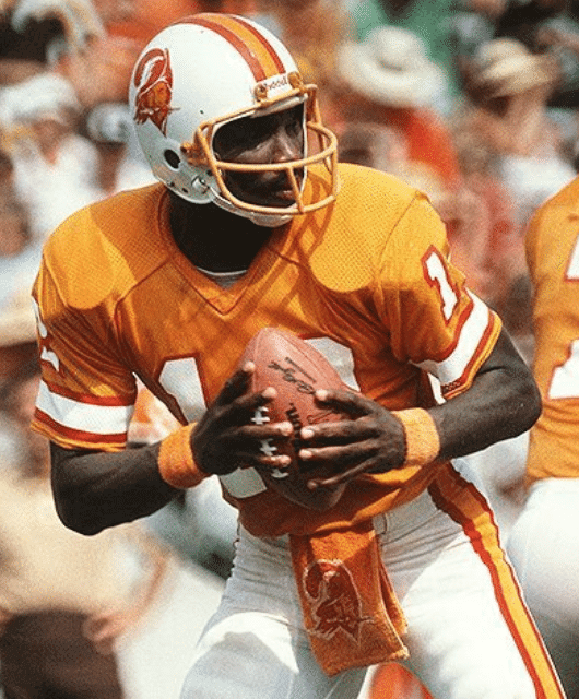
Shell game: There was a bit of a stir yesterday when Buccaneers coach Bruce Arians was reported to have said on Dan Patrick’s radio show that the NFL would be lifting the one-shell rule in 2021, which in turn would allow the Bucs to wear the Creamsicle throwbacks.
I wanted to know more, so I contacted NFL spokesman Brian McCarthy, who rained — or at least drizzled — on the parade: “There will be no change for the 2020 season. There are ongoing discussions for a potential change for the 2021 season, but no decisions have been made.” (He apparently later gave the exact same quote to several other media outlets.)
So it appears that Arians may have jumped the gun a bit. But it’s interesting to learn that the issue is being discussed this far in advance.
All of the media coverage of this news that I’ve seen has focused on how repealing the rule could pave the way for the return of classic throwbacks. Yay, Bucco Bruce! Yay, Pat Patriot! Seahawks quarterback Russell Wilson even tweeted a mock-up of himself wearing a royal/silver throwback. While I’m at least as excited as the next guy about the potential return of those retro designs, I’m also aware that the one-shell rule has had the unintended but nonetheless beneficial effect of limiting the NFL’s Nikefication. If the rule is lifted, I do worry a bit that we’ll see an avalanche of alternates, much like in the NCAA and the NBA. Would that be a worthwhile trade-off for being able to see the Eagles in Kelly green for a game or two? Maybe — but be careful what you wish for.
As an aside, this is the second time in as many months that Arians has spoken, unprompted, about previously undisclosed uni-related matters. In late February, he said that the Bucs’ new uniforms would be “closer to the Super Bowl look,” which turned out to be accurate. Keep putting a mic in front of this guy!
Color on color … on color! In yesterday’s comments, reader Michael Claxton posted a link to this highlight video from an A’s/Rangers game that took place in Arlington on April 12, 1975. It opens with the amazing scene shown above, which has all sorts of uni-notable elements. Por ejemplo:
• Both teams were wearing colored jerseys with white pants.
• Those powder blue jerseys were part of the Rangers’ 1975 road uniform — but in this game they were wearing them at home! We’ve seen photos of that before, but this is the first time I’ve seen video of it.
• Rangers catcher Jim Sundberg was wearing a flapless catcher’s helmet, which was standard for him at the time.
• The umps were wearing maroon blazers (standard in the American League at the time) and neckties.
• The base umps were all wearing the American League’s “AL” cap, while plate ump Bill Haller wore a short-brimmed cap with no logo. He also had the old-style “balloon” chest protector, which most American League umps were still using at that time.
• A’s coach Bobby Winkles wore a white cap, as all A’s coaches and managers did during this period.
Great stuff. Again, you can see the entire highlight segment here.
Too good for the Ticker: Reader Steven Schapansky found this great report on the Canadiens’ first day of training camp in September of 1984, and it’s pure gold. Among the uni-notable details: the players were wearing cheapo practice versions of the Habs’ white and red jerseys, with NNOB; the team’s classic “Ch” logo was oddly positioned on the red jerseys; at least one player wore a white helmet with the red jersey (sacre bleu!); one goalie was wearing a yellow Cooper helmet XL7 helmet with a cage; and even the nets looked a bit weird. Well worth watching!


ITEM! More memberships to raffle off: Reader Jim Ellwanger won a membership that I raffled off last year and has decided to pay it forward by purchasing a membership for me to give away, plus I have another membership contributed by an anonymous benefactor, so we’re going to raffle off both of those today.
This will be a one-day raffle. To enter, send an email to the raffle address by 8pm Eastern tonight. One entry per person. I’ll announce the two winners tomorrow.

Advice needed: Uni Watch team member Lloyd Alaban, who compiles the Tickers that appear on Wednesdays, is looking to buy a new road bicycle and asked me for advice. But although I’m a daily cyclist, I’m more of a “guy who bikes” than a “bike guy,” if you know what I mean, and my own bike is 10 years old, so I’m not really up to date on the hot brands, the latest designs, etc.
So: If you’re knowledgeable about the bike scene and are willing to give Lloyd some guidance, please contact him here (but not in the comments, please). We’d both be very appreciative! (
Incidentally, Lloyd and the rest of the Uni Watch team have all been terrific during this difficult period. That includes Ticker assistants Jamie Rathjen, Alex Hider, and Anthony Emerson; “Collector’s Corner” columnist and Facebook page manager Brinke Guthrie; membership card designer Scott M.X. Turner; proofreader Jerry Wolper; cap fulfillment manager Mark LaFountain; Photoshopper Nic Schultz; and, of course, deputy editor Phil Hecken. Please join me in thanking all of them for continuing to make the production of Uni Watch possible during the pandemic — we should all be grateful for their hard work.
Click to enlarge
Cap reminder: In case you missed it on Wednesday, the Uni Watch Classic Cap, which was briefly unavailable while cap-fulfillment manager Mark LaFountain was indisposed, is once again available, with all fitted sizes plus the adjustable version in stock (but we currently have only one adjustable left, so move fast if you want it, because we won’t be restocked on those for another month). Update: Adjustable now sold out! And until further notice, the usual price of $39.99 is now cut to $35.99.
And that’s not the only discount currently available on Uni Watch merch:
• You can save 15% on everything in the Uni Watch Shop and the Naming Wrongs Shop by using the checkout code COMMUNITY.
• A custom-designed Uni Watch membership card, which usually costs $25, is now $20.
• A Uni Watch seam ripper — perfect for those shelter-in-place logo-removal projects — which usually costs, $6, is now $4.
If you’d rather support Uni Watch via a donation, instead of a merch purch, here’s how you can do that.
My thanks, as always, for your support and consideration.
The Ticker
By Paul

Baseball News: The cover of the latest issue of Sports Illustrated Kids shows Angels P/DH Shohei Ohtani wearing a red Angels cap. But because of the red lighting being used, it looks like the cap also has a red maker’s mark. If only (from Jakob Fox). … MLB commish Rob Manfred, apparently looking to ruin even more things about baseball, gave an interview yesterday in which he declined to rule out the possibility of seven-inning doubleheaders when MLB returns from the pandemic.

Football News: In yesterday’s comments, there was some chatter about whether the Chargers’ new logo uses a new shade of powder blue. I checked with longtime sports color guru Donovan Moore, who confirmed that the Chargers are using the exact same Pantone colors for both their powder blue and yellow tones, even if it looked different in some of the on-screen graphics. In short: No color change, except for the removal of navy. … Former Rams RB Eric Dickerson says he doesn’t like the team’s new logos any more than the fans do, and he plans to speak to management about it (thanks, Brinke). … New uniforms for the CFL’s Ottawa Redblacks (from @jayappletree). … A Packers blog ran a contest to design the team’s new throwback alternates (from Shaun Meulemans). … For now, the NFL draft is still scheduled for April 23-25, even though the league’s GM subcommittee recommended that the date be moved back. There’s also some concern that the 2020 season won’t start on time.

Hockey News: The NHL has postponed its draft, scouting combine, and season-ending awards event. … A middle school in Tacoma, Was., has ripped off the Caps’ logo. … Bauer has stopped making hockey gear and started making anti-pandemic protective gear (from @OlegKvasha). … Here’s an oddity: The Hartford Whalers’ NHL logo on a WHA’s New England Whalers uniform. “That’s from a Whalers Gift Shop catalog,” says Gabe Rosa.

Basketball News: Dr. Anthony Fauci, who’s emerged as one of America’s most authoritative and trusted voices during the pandemic, played high school basketball in the late 1950s. Here he is in his Regis High School uniform (from Paul Friedmann). … Clippers owner Steve Ballmer is buying the Forum, which should allow the team to build its own arena. … Here’s a thread on UConn’s uniform history during their time in the Big East (from Dan Ferguson).

Soccer News: Tottenham keeper Paulo Gazzaniga posted a video in which he showed off his goalie-themed carving board (from Peter Gaston). … Paris Saint-Germain has released an “All Together” shirt for French healthcare workers (from @jayappletree).

Grab Bag: The internet is having fun with the Spanish army’s rather revealing uniforms. … With the Olympics postponed by a year, the U.S. swimming team has a good new logo (from Mark Dziak). … Auto makers Audi and VW have revised their logos to promote social distancing (from Kary Klismet). … Penn State had some pretty good-looking women’s lacrosse uniforms in 1978 (from Jeremy Fallis). … Good piece on the design history of the now-essential N95 respirator mask (from Tom Turner). … People across America are pulling out their sewing machines and making surgical masks for local hospitals (NYT link), which is nice, although it’d be a lot nicer if we’d had an adequate stockpile of masks to begin with (from Timmy Donahue). … Speaking of, nurses at a NYC hospital had to turn black trash bags into makeshift protective apparel because of the lack of adequate protective gear. … Jeremy Brahm reports that several international volleyball teams are encouraging people to shelter in place by showing their team logos inside of a house. Jeremy’s retweeted a bunch of these on his Twitter feed. … A Japanese designer has created a line of miniature furniture for cats. … Really good article, with some great photos, about the old Presidential Fitness Test.

Click to enlarge
What Paul did last night : Another cold evening on the porch yesterday. We’re kinda sick of having to get bundled up and would like to get some warmer weather, but we’re determined to maintain the ritual no matter what.
You see those flagstones in front of the Tugboat Captain, leading around to the side of the house? A few moments after I snapped this photo, one of our neighborhood stray cats trotted by and went right on that flagstone pathway. He always does this, and it cracks me up — it’s like he’s obeying an unseen “Stay Off the Grass” sign.
You can see the full set of porch cocktail photos here.
Bike advice for Lloyd (and anyone else who wants it).It’s really hard to go wrong with most major brands these days, and even base models (like the Specialized Allez, which is what I ride) are really good and more than enough for most people.If you’re looking to ride recreationally, the frame geometries of entry level bikes are going to make it easier to ride in a more relaxed position versus “race” bikes (honestly, you can race on anything though). And I guess these days an indoor trainer to use when you can’t go out is also highly recommended lol (although due to my work/family schedule, I do more riding indoors than outdoors)
You’ll probably get a lot of recommendations saying something like “you should only buy shimano 105 and better” (talking about shifting components here) and that’s really based on old dogma. Shimano Claris (their entry level which is 8 speeds in the rear) is most definitely good enough for a majority of folks. As with any hobby, there’s a lot of gear snobbery, and the thing is the bike is a tool and that it’s the rider who makes it fast, so I always tell folks to work on the fitness side of things and leave the marginal speed gains of wheels and stuff to the pros who have to win by seconds.
Good luck to anyone who wants to get into this!
“Would that be a worthwhile trade-off for being able to see the Eagles in Kelly green for a game or two? Maybe — but be careful what you ask for.”
Excellent point, if the NFL wanted to do a throwback weekend over thanksgiving every year, and dump all other alt uniforms I’d be down with that, if not I fear the same thing you do. And we know with merchandise dollars available the NFL will surely have home, white, alternate, color rush, and throwback uniforms for everyone.
Careful what you wish for indeed. CFL just switched to one shell rule last year, but in the last decade we ended up getting teams wearing home and road helmets. I hated it.
The home helmet was the traditional team helmet colour. We ended up getting different colour road helmets from teams that many fans did not like. Black Stampeders helmet, dark green Eskimos helmet, white Roughriders helmet (as you can see in the link) for most all road games just did not look right.
link
I’m so clueless about the CFL, I didn’t even realize they had a one-shell rule. Thanks for mentioning that!
No problem. Really happy the teams went one-shell. Does not really affect if teams wanted to do throwbacks too much. Teams are wearing the helmet colours that they have worn for many years and way back in the past in most cases.
A few interesting things about the Stampeders helmets that you could only pick up from up close, the black helmet had red flecks in it, which really stood out when you were up close to it, but couldn’t notice on TV. The red helmet had gold flecks in it, which again really stood out up close, but not on TV. And finally the Labour Day helmet that was half red/half black and then had a chrome logo. They would actually take a chrome helmet and then paint the red and black on it, the logo was what was left showing from the original chrome.
Paul, interesting tidbit from sportslogo.net interview with the Rams:
“However, those concepts always led back to the horns, which is why they play such a prominent role across both logos — and can event be used as a standalone mark. The horns also give the Rams flexibility, which is why neither the LA logo or the ram head are considered by the franchise to be its primary mark. ‘We really wanted to be strategic and smart about not necessarily utilizing one mark of the other, so while the NFL may designate the LA as the primary mark in terms of a logo slick, we don’t really consider it that way,’ Befort said. ‘That’s why the horn has the same shape and form across the identity, and that’s something we felt really strong about looking back into the historical side of things.’ Along those same lines, the Rams have already created stencils that would allow them to paint either logo at midfield.”
link
Anyone get the sense the Rams are already reacting to the onslaught of negative responses to the LA logo and quickly backtracking from having that as their primary logo?
With the Doug Williams creamsicle photo in today’s article, it might be a good time to take another look at his ‘Shark Tank’ facemask: link
So the Rangers must have decided to showcase those powder-blue jerseys because they were on the NBC Game of the Week that day. Also, I think that other photo you linked to is from a game in Arlington based on the background of the wall. Maybe that photo is from the April 12 game.
link — 1975 MLB National TV Schedule/Commentators
link — photo Paul linked to
I never really noticed how off-center the word “Braves” is on their jersey (due to the tomahawk placement). Huh.
The “Swingin” A’s were coming off Back-to-Back-to-Back World Championships and would finish 1975 with their 5th straight AL West title but lose to Boston in the ALCS to end their amazing run.
White shoes, Orange Baseballs, a Mule Mascot (hold over from KC) It was a magical, tradition-breaking time for baseball.
The lack of actual sporting events seems to be resulting in a spike of uni and logo-related coverage across the sports world.
This is a good thing…
Guessing the Whalers thing was from prior to the Hartford Whalers’ first NHL season. They would have had a logo but not uniforms yet. It looks like it’s just superimposed on the New England jersey in the picture.
I cannot believe how much negativity has greeted the Rams’ logo refresh. It seems completely out of proportion to me. People are acting like they suddenly changed the team colors and name, rather than introducing some really fairly minor tweaks to existing designs plus the LA logo which to me seems pretty inoffensive. The “everything retro is good, everything new is bad” energy has never been stronger in the uniform world I think. For better or worse I get the feeling this is going to lead to teams being ever more risk averse with their designs and only make changes that have some kind of throwback/nostalgia element to them. Personally I think it’s a shame
Have you followed the uni-verse over the past, oh, decade or so? “Risk-averse” is not how I’d describe it.
I actually don’t fully agree with that, though some clarification is probably needed for me to explain what I mean. I agree that teams/leagues have gone crazy when it comes to there being more versions of alternates than ever before, particularly in the NBA and college football. But when it comes to teams redesigning their actual primary identities (which admittedly might be slightly overall less important than it once was, since teams wear throwbacks and alternates of all kinds much more often), I do actually think they are more risk-averse than they once were. I can’t remember the last one in a major sport that didn’t in some way try to tie itself to the past. Maybe the Nets?
You’re kidding, right? A few examples just off the top of my head:
– Titans
– Marlins
– Bucks
– Clippers
– Suns
– Hawks (!)
– Diamondbacks
The only ones in that list that I would personally consider a complete break from the past – meaning, in my own personal definition that I know not everyone would share, a design that totally eschews rather than just tweaking any old logos or wordmarks and/or changes a color scheme completely – would be the Marlins, Hawks, and Clippers. Definitely not the Titans or D-backs, both of those were very “evolutionary.”
We’re gonna have to agree to disagree on your definition. And your *originally stated* standard was about risk aversion, not about “breaking with the past.” Can you honestly say the D-backs, with the snakeskin, truncated pants piping, bloody pant cuffs, etc., were risk-averse? Can you honestly say the Bucks, who added two new colors and a completely distinctive typeface, were risk-averse? Can you honestly say that the Titans, who changed their helmet color and introduced a completely distinctive typeface, were risk-averse?
Come on — by your own stated standard, the uni-verse has taken plenty of risks lately.
And we haven’t even addressed the issue of whether risk-taking is necessarily a good thing — that’s a separate issue. But I think it’s clear that there’s plenty of risk-taking going on.
I think a lot of Rams fans are concerned with changes to the uniform. In hindsight they should of released both at the same time.
It is amazing how many times this critique of critique is thrown out. I have seen plenty of technical critiques of the new rams logos that point out various design flaws as well as the connects to Chargers, Trumps hair, etc. I am sure that there are many people who fall into a category of all new is bad or all new is good, but to apply that to this seems to miss a lot of the criticism that is out there.
Keep the Tarrant Theory in mind here…assuming these logos survive the NFL’s five-year window, they’ll be considered “classics” in 2055.
Interesting video on the Habs. Looks/sounds like they’re describing a young Patrick Roy in the video.
Aah, the ol’ Presidential Physical Fitness test.
In my day it consisted of: pull-ups, sit-ups, the standing broad jump, the shuttle run, the 50-yard dash, the softball throw, and the 600-yard run.
As a small, sickly, asthmatic I was actually pretty darned good as almost all of these events. EXCEPT that darned 600 yard run. That one about killed me every year. No patch for me.
link
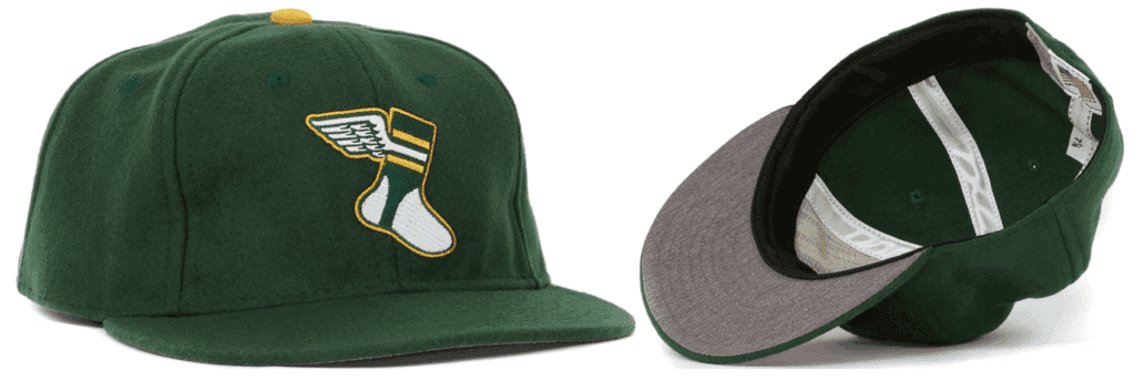
I keep waiting for the one-shell rule to be repealed so I can see these again.
link
I saw some other people comment similar “be careful what you wish for” in regards to Nike, getting rid of one-shell rule, etc. But so long as the NFL maintains their current alt/throwback rules, I don’t think we have anything to be worried about.
Wow on that pic from that Rangers/A’s game! As a former catcher that preferred the brimless helmet I am always happy when I see one in an MLB game! But so many other Easter egg-type goodies!
Paul’s comment about the nets in the Habs video reminded me that fans used to be able to tell where a game was being played by looking at the net. Each team had its own distinctive net design until (IIRC) the late 1980s, when the nets were standardized. Before that, the nets could be wonky, even in NHL arenas. Jacques Plante, the 1950s Canadiens’ goalie, complained in the late ’50s that the crossbar on the nets in Montreal, Toronto and Detroit hit his back two inches higher than the nets in Boston, Chicago and New York, giving those goalies an advantage. When the NHL checked to prove Plante wrong, it turned out Plante was right: the Boston / Chicago / New York nets had welded the crossbar between the goal posts instead of on top of them, where they were supposed to be. The NHL ordered the incorrect nets fixed right away. This was probably a manufacturer’s mistake, as Plante said that he noticed during exhibition games in non-NHL arenas that the nets were incorrect in many of them.
Habs training camp footage is amazing. They did wear the crests unusually high in the late 70s on their game jerseys. And I believe the yellow helmeted goalie is none other than a young Patrick Roy, who Savard mentions in the interview. His junior team the Granby Bisons wore black and yellow.
Later on, the Granby Bisons changed colours and had the logo based on the Canucks’ Flying Skate. The uniform a weird marriage between the Dallas Stars and Canucks.
link
Man I love those jerseys.
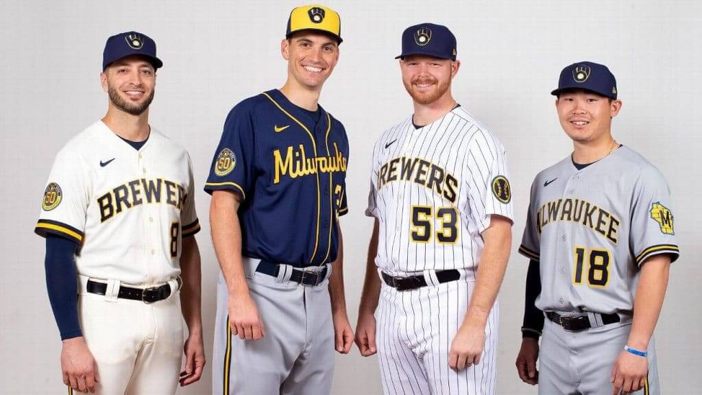
My thoughts on the MLB Preview:
1) The white squatchee on a white background in the Dodgers section made me think for a moment it was missing. I thought maybe they had just taken a photo of notorious squatchee hater David Price’s cap used in the other featured photo.
2) I think the Pirates Road Script is a huge upgrade, but it would’ve looked better with gold lettering on the black alternate. I also had never noticed that the “P” on their home whites was larger than the rest of the letters.
3) San Francisco dropping the interlocking SF from the road jersey rotation is a downgrade.
4) I really like the DG memorial patch the Royals are wearing.
5) The Nats now have WAY too many combinations.
6) I was thinking I’d seen something about the Phillies cleaning up the script on their jerseys? Or was that last season?
7) The Twins need to get rid of the gold trim.
8) I like the new Reds red alternate much better than the outgoing one.
9)…and finally, the Swoosh. I didn’t think I was going to mind it, but it is especially jarring seeing it on the more traditional/historical jerseys. Especially the Yanks, Cardinals and Cubs. One reason it is so bad for the Cardinals is its being positioned so close to the top of the Cardinal head on that side.
Yea the swoosh is way worse than I expected. But also – there seems to be a renaissance of powder blue uniforms. I hope that presages a return to the colorful pants that you see from the 70s. Love it if the A’s wore green pants with gold tops, and vice versa.
The 70’s were a great era! I loved the pullover jerseys with the striped elastic waistband pants. Padres, Indians, A’s, Pirates mix and match sets. The Astros and the Tequila Sunrise. The Powder Blue Cardinals and Cubs (pinstriped!!). The powder blue Phillies with the zippered Jersey. The racing stripes on the Expos and Mets that showed up in the 80’s were also great. It was a great looking era.
The Nats should add one more set to the rotation:
link
I’m hoping the Marlins will favor the blue alts this season.
Paul, today is National Purple Day. How will you be celebrating?
That’s your body’s natural biological calendar telling you it’s time for the start of baseball season.
My body clock is still set for the first Monday of April. And next year, if the NL gets the DH, my alarm will be turned off altogether.
Man, those Brewers unis (with the exception of the swoosh) look sweet.
I do a small cringe whenever I hear about the NL adopting the DH (no offense if you support the DH, that’s just me). Makes me glad my local team is in the NL.
The little league teams I grew up with never had a DH, and most leagues still don’t. I can’t imagine what having a DH would do to those leagues. I think the shared experience that *all* players in a little league lineup, including the pitcher, also have to bat creates that much more of a shared experience. If a league-wide DH trickles down to the minors and high school and the little leagues, that just cheapens the experience for future little leaguers. For me, the little league experience is both fielding and pitching, and I’d imagine if you’re a coach at that level you’d want to impact that on kids too.
I do an exceedingly large cringe when I hear about it…
I just assumed all minor league and college teams had the DH. Glad to hear the kid pitchers still hit.
Seahawks need to go back to Royal and Silver ASAP
I don’t know how they’ll do the birds on the sleeves from the Dave Krieg years.
YES. One of the best looking uniforms of all time.
It was nice to see the U. of Connecticut uniforms from the ’70s. I admit they were a bit of a laughingstock during the glory days of St. John’s and Georgetown; the perils of being a public school in the Big East. I’d also forgotten they used the Douglass numerals featured on the site a few days ago.
I’m all for 7-inning ballgames. The game was never intended to be a test of each team’s bullpen depth. Playing 7-innings simply acknowledges the fact that the average starter length is now only 5 1/3 innings. And I don’t think it was a coincidence that far more people watched baseball on TV back when it was only around 2.5 hours a game.
Ugh, these are athletes being paid lots and lots of money. Doubleheaders should not be trimmed to seven inning games. Next thing you know Manfred will think that all games should be seven innings. Bad idea.
The game was never intended to be a test of each team’s bullpen depth. Playing 7-innings simply acknowledges the fact that the average starter length is now only 5 1/3 innings.
You’re being very selective about which changes in the game you find acceptable which ones you don’t. One could just as easily say, “The game was never intended to have starting pitchers go only 5-1/3 innings.” In other words, if starters stayed in the game longer, the game *wouldn’t* be a test of bullpen depth.
Managing styles and strategies may change, but nine innings shouldn’t.
One consequence of the Majestic logo leaving the left sleeve… the Rockies’ Mountain Crest logo will now sit lower on the sleeve like it always had prior to being bumped up bu the Majestic logo. This includes pinstripe jerseys as well as non stripe jerseys with piping above the cuff.
Time for MLB to resurrect the HEALTH sleeve patch.
Best idea I’ve heard all week!
I wonder if the Dodgers will still wear their All-Star patched uniforms this year? Could possibly fall into the category of unused logos ala the Super Bowl after 9/11.
I have two hopes for MLB’s uniforms this season:
1. As mentioned above, I am 100% behind the idea of a return of the HEALTH sleeves patch for the 2020 season.
2. I hope MLB is smart enough to reschedule Jackie Robinson Day.